
Designing for Children Kathakali, but also highlighted Theyyam and Neolithic art in the Edakkal...
15
Designing for Children - With focus on ‘Play + Learn’ Amazing India – A State-by-State Guide Challenges in designing an informative a book for children Anita Vachharajani, Freelance writer, Mumbai, India, [email protected] Amit Vachharajani, Freelance illustrator and filmmaker, Mumbai, India, [email protected] Abstract: In this paper we talk about the challenges we faced while writing, illustrating and designing a pictorial book on India for children. We talk about the kind of research we did, the illustration issues we faced, and the challenge of creating a layout that would accommodate varied elements. Linked to all of this was the very real challenge of presenting information on India that projects it not as a monolithic whole, but as a kaleidoscopic and prismatic entity – in other words, as ‘Amazing India’. Key words: Publishing for children, Designing an informative book for children 1. Introduction Amazing India – a State-by-State Guide is a 72-page book on the 28 states and 7 Union Territories of India. It aims to pique children’s interest in the large amount of diversity and variety that exist in this geo-political space that we call India. In creating this book our aim was to write about and illustrate those aspects of it that are not normally found within the scope of the school text book, so that there is an active imagining of India in children’s minds which goes beyond the immediate and the obvious. We wanted – very specifically – to draw our readers’ attention to the amount of differences there are in this country – from variation in geography and art, to variation in cultural practices, flora and fauna. In a world that is getting increasingly homogenized, this celebration of differences was, to us, very important.
Transcript of Designing for Children Kathakali, but also highlighted Theyyam and Neolithic art in the Edakkal...
Designing for Children - With focus on ‘Play + Learn’ Amazing India – A State-by-State Guide Challenges in designing an informative a book for children
Anita Vachharajani, Freelance writer, Mumbai, India, [email protected]
Amit Vachharajani, Freelance illustrator and filmmaker, Mumbai, India, [email protected]
Abstract: In this paper we talk about the challenges we faced while writing, illustrating and designing a
pictorial book on India for children. We talk about the kind of research we did, the illustration issues
we faced, and the challenge of creating a layout that would accommodate varied elements. Linked to
all of this was the very real challenge of presenting information on India that projects it not as a
monolithic whole, but as a kaleidoscopic and prismatic entity – in other words, as ‘Amazing India’.
Key words: Publishing for children, Designing an informative book for children
1. Introduction
Amazing India – a State-by-State Guide is a 72-page book on the 28 states and 7 Union
Territories of India. It aims to pique children’s interest in the large amount of diversity and
variety that exist in this geo-political space that we call India. In creating this book our aim
was to write about and illustrate those aspects of it that are not normally found within the
scope of the school text book, so that there is an active imagining of India in children’s minds
which goes beyond the immediate and the obvious.
We wanted – very specifically – to draw our readers’ attention to the amount of differences
there are in this country – from variation in geography and art, to variation in cultural
practices, flora and fauna. In a world that is getting increasingly homogenized, this
celebration of differences was, to us, very important.
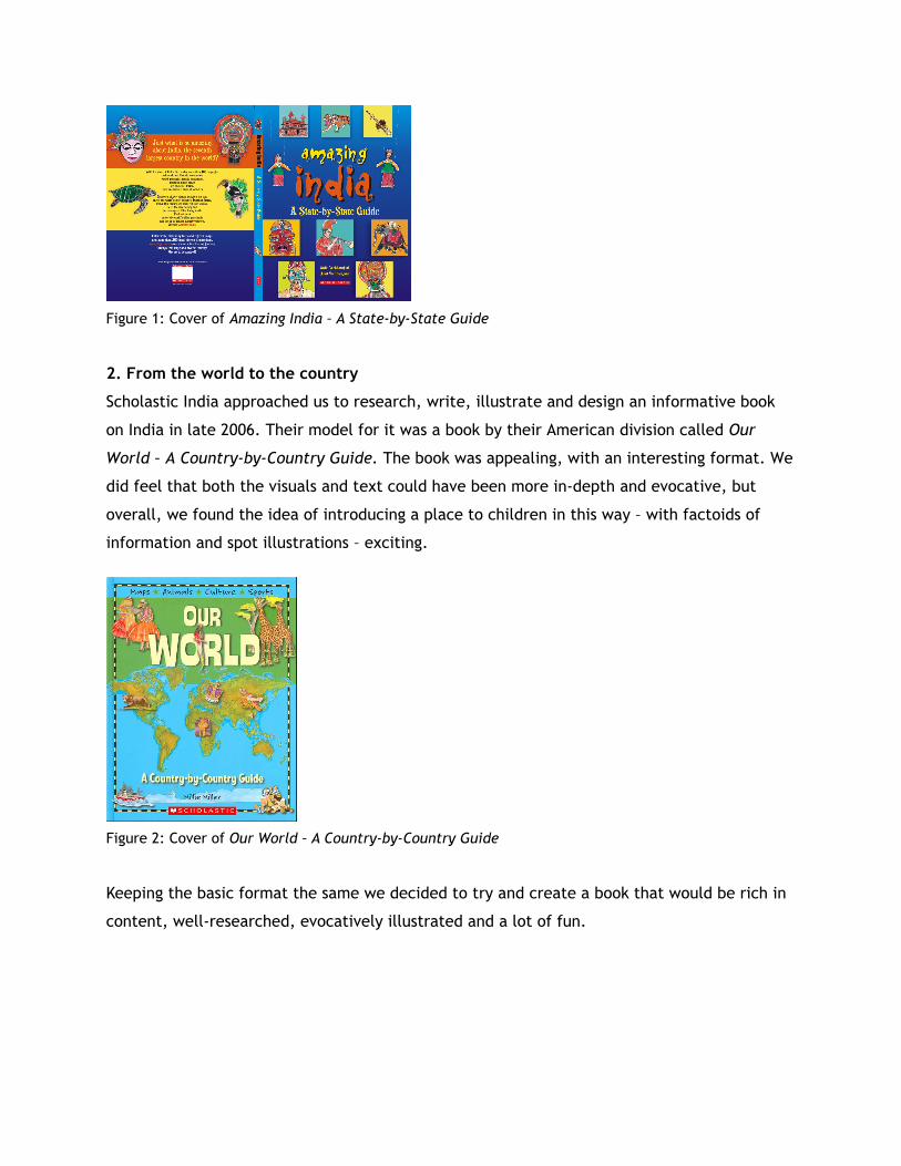
Figure 1: Cover of Amazing India – A State-by-State Guide
2. From the world to the country
Scholastic India approached us to research, write, illustrate and design an informative book
on India in late 2006. Their model for it was a book by their American division called Our
World – A Country-by-Country Guide. The book was appealing, with an interesting format. We
did feel that both the visuals and text could have been more in-depth and evocative, but
overall, we found the idea of introducing a place to children in this way – with factoids of
information and spot illustrations – exciting.
Figure 2: Cover of Our World – A Country-by-Country Guide
Keeping the basic format the same we decided to try and create a book that would be rich in
content, well-researched, evocatively illustrated and a lot of fun.
3. Method: The challenges before us
3.1 Research: informative as well as visual research
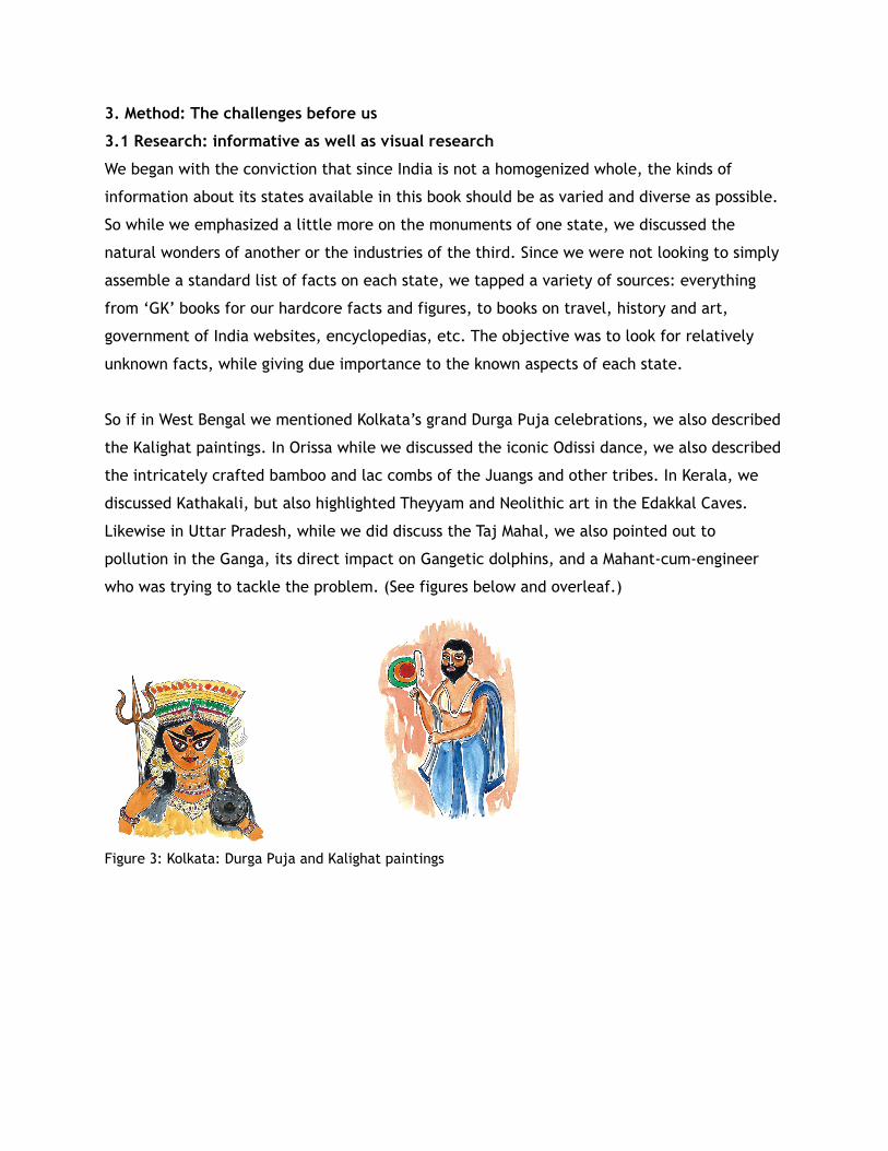
We began with the conviction that since India is not a homogenized whole, the kinds of
information about its states available in this book should be as varied and diverse as possible.
So while we emphasized a little more on the monuments of one state, we discussed the
natural wonders of another or the industries of the third. Since we were not looking to simply
assemble a standard list of facts on each state, we tapped a variety of sources: everything
from ‘GK’ books for our hardcore facts and figures, to books on travel, history and art,
government of India websites, encyclopedias, etc. The objective was to look for relatively
unknown facts, while giving due importance to the known aspects of each state.
So if in West Bengal we mentioned Kolkata’s grand Durga Puja celebrations, we also described
the Kalighat paintings. In Orissa while we discussed the iconic Odissi dance, we also described
the intricately crafted bamboo and lac combs of the Juangs and other tribes. In Kerala, we
discussed Kathakali, but also highlighted Theyyam and Neolithic art in the Edakkal Caves.
Likewise in Uttar Pradesh, while we did discuss the Taj Mahal, we also pointed out to
pollution in the Ganga, its direct impact on Gangetic dolphins, and a Mahant-cum-engineer
who was trying to tackle the problem. (See figures below and overleaf.)
Figure 3: Kolkata: Durga Puja and Kalighat paintings
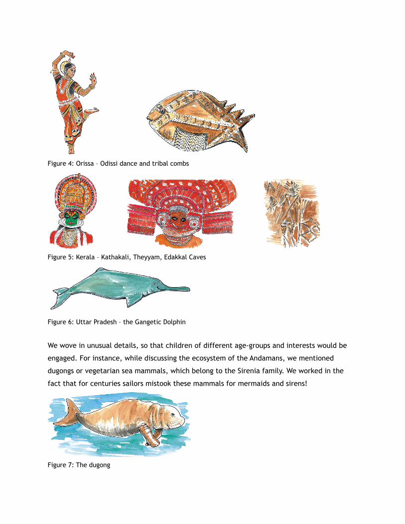
Figure 4: Orissa – Odissi dance and tribal combs
Figure 5: Kerala – Kathakali, Theyyam, Edakkal Caves
Figure 6: Uttar Pradesh – the Gangetic Dolphin
We wove in unusual details, so that children of different age-groups and interests would be
engaged. For instance, while discussing the ecosystem of the Andamans, we mentioned
dugongs or vegetarian sea mammals, which belong to the Sirenia family. We worked in the
fact that for centuries sailors mistook these mammals for mermaids and sirens!
Figure 7: The dugong
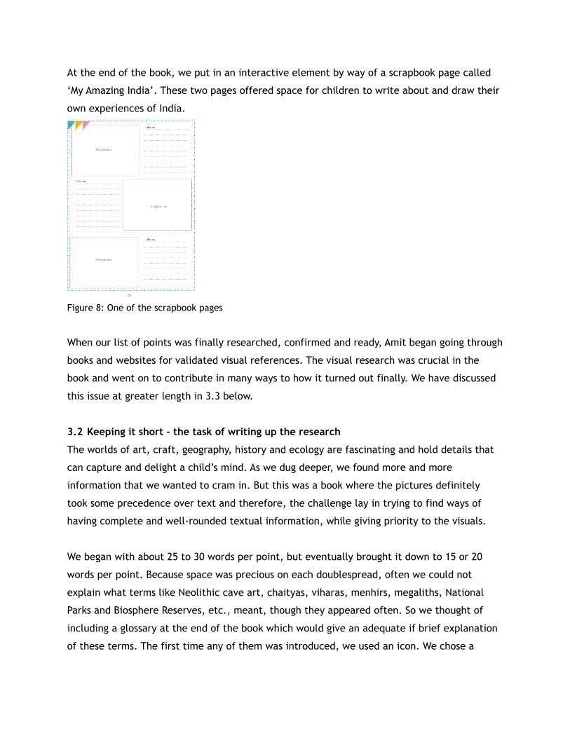
At the end of the book, we put in an interactive element by way of a scrapbook page called
‘My Amazing India’. These two pages offered space for children to write about and draw their
own experiences of India.
Figure 8: One of the scrapbook pages
When our list of points was finally researched, confirmed and ready, Amit began going through
books and websites for validated visual references. The visual research was crucial in the
book and went on to contribute in many ways to how it turned out finally. We have discussed
this issue at greater length in 3.3 below.
3.2 Keeping it short - the task of writing up the research
The worlds of art, craft, geography, history and ecology are fascinating and hold details that
can capture and delight a child’s mind. As we dug deeper, we found more and more
information that we wanted to cram in. But this was a book where the pictures definitely
took some precedence over text and therefore, the challenge lay in trying to find ways of
having complete and well-rounded textual information, while giving priority to the visuals.
We began with about 25 to 30 words per point, but eventually brought it down to 15 or 20
words per point. Because space was precious on each doublespread, often we could not
explain what terms like Neolithic cave art, chaityas, viharas, menhirs, megaliths, National
Parks and Biosphere Reserves, etc., meant, though they appeared often. So we thought of
including a glossary at the end of the book which would give an adequate if brief explanation
of these terms. The first time any of them was introduced, we used an icon. We chose a
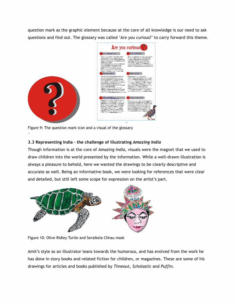
question mark as the graphic element because at the core of all knowledge is our need to ask
questions and find out. The glossary was called ‘Are you curious?’ to carry forward this theme.
Figure 9: The question mark icon and a visual of the glossary
`
3.3 Representing India – the challenge of illustrating Amazing India
Though information is at the core of Amazing India, visuals were the magnet that we used to
draw children into the world presented by the information. While a well-drawn illustration is
always a pleasure to behold, here we wanted the drawings to be clearly descriptive and
accurate as well. Being an informative book, we were looking for references that were clear
and detailed, but still left some scope for expression on the artist’s part.
Figure 10: Olive Ridley Turtle and Seraikela Chhau mask
Amit’s style as an illustrator leans towards the humorous, and has evolved from the work he
has done in story books and related fiction for children, or magazines. These are some of his
drawings for articles and books published by Timeout, Scholastic and Puffin.
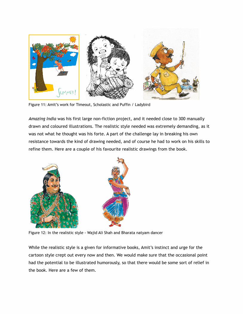
Figure 11: Amit’s work for Timeout, Scholastic and Puffin / Ladybird
Amazing India was his first large non-fiction project, and it needed close to 300 manually
drawn and coloured illustrations. The realistic style needed was extremely demanding, as it
was not what he thought was his forte. A part of the challenge lay in breaking his own
resistance towards the kind of drawing needed, and of course he had to work on his skills to
refine them. Here are a couple of his favourite realistic drawings from the book.
Figure 12: In the realistic style - Wajid Ali Shah and Bharata natyam dancer
While the realistic style is a given for informative books, Amit’s instinct and urge for the
cartoon style crept out every now and then. We would make sure that the occasional point
had the potential to be illustrated humorously, so that there would be some sort of relief in
the book. Here are a few of them.
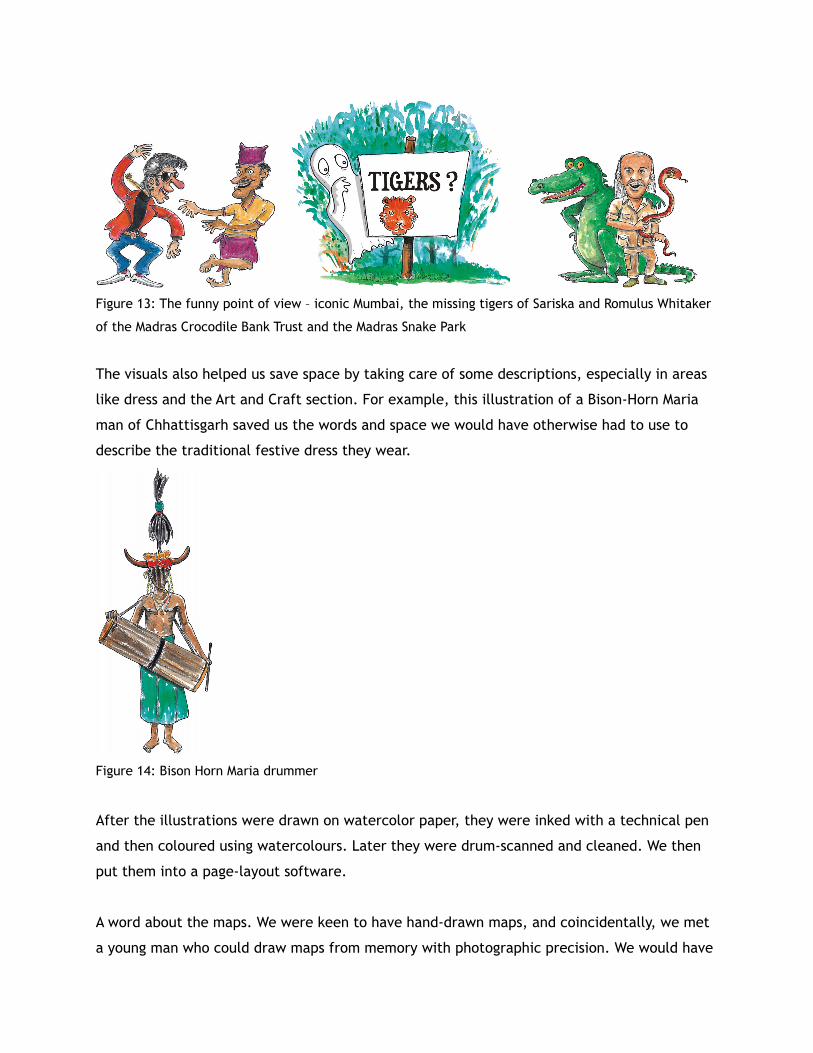
Figure 13: The funny point of view – iconic Mumbai, the missing tigers of Sariska and Romulus Whitaker
of the Madras Crocodile Bank Trust and the Madras Snake Park
The visuals also helped us save space by taking care of some descriptions, especially in areas
like dress and the Art and Craft section. For example, this illustration of a Bison-Horn Maria
man of Chhattisgarh saved us the words and space we would have otherwise had to use to
describe the traditional festive dress they wear.
Figure 14: Bison Horn Maria drummer
After the illustrations were drawn on watercolor paper, they were inked with a technical pen
and then coloured using watercolours. Later they were drum-scanned and cleaned. We then
put them into a page-layout software.
A word about the maps. We were keen to have hand-drawn maps, and coincidentally, we met
a young man who could draw maps from memory with photographic precision. We would have
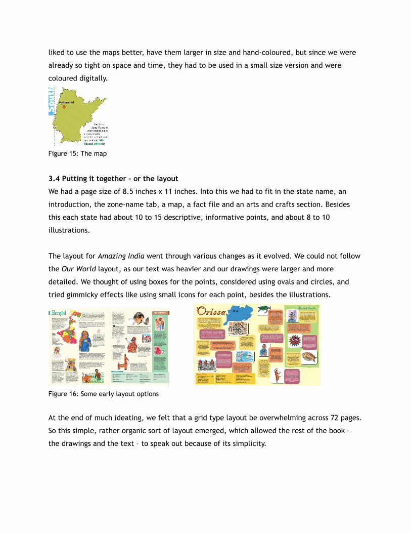
liked to use the maps better, have them larger in size and hand-coloured, but since we were
already so tight on space and time, they had to be used in a small size version and were
coloured digitally.
Figure 15: The map
3.4 Putting it together – or the layout
We had a page size of 8.5 inches x 11 inches. Into this we had to fit in the state name, an
introduction, the zone-name tab, a map, a fact file and an arts and crafts section. Besides
this each state had about 10 to 15 descriptive, informative points, and about 8 to 10
illustrations.
The layout for Amazing India went through various changes as it evolved. We could not follow
the Our World layout, as our text was heavier and our drawings were larger and more
detailed. We thought of using boxes for the points, considered using ovals and circles, and
tried gimmicky effects like using small icons for each point, besides the illustrations.
Figure 16: Some early layout options
At the end of much ideating, we felt that a grid type layout be overwhelming across 72 pages.
So this simple, rather organic sort of layout emerged, which allowed the rest of the book –
the drawings and the text – to speak out because of its simplicity.
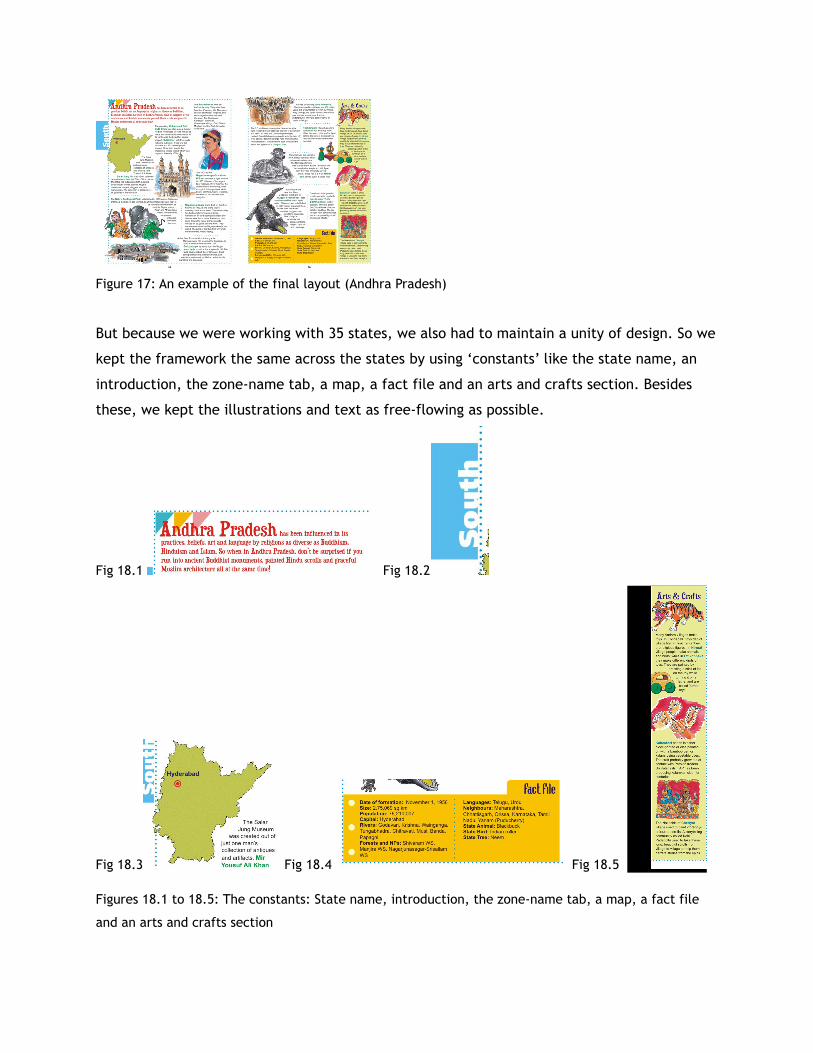
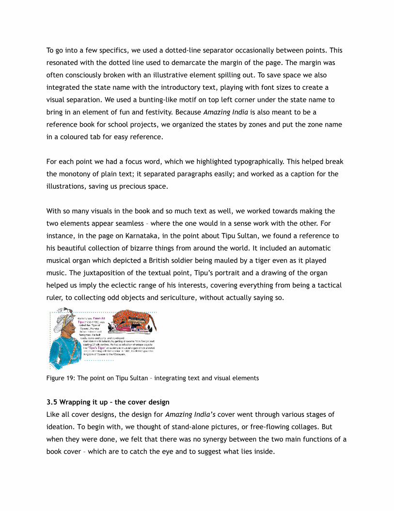
Figure 17: An example of the final layout (Andhra Pradesh)
But because we were working with 35 states, we also had to maintain a unity of design. So we
kept the framework the same across the states by using ‘constants’ like the state name, an
introduction, the zone-name tab, a map, a fact file and an arts and crafts section. Besides
these, we kept the illustrations and text as free-flowing as possible.
Fig 18.1 Fig 18.2
Fig 18.3 Fig 18.4 Fig 18.5
Figures 18.1 to 18.5: The constants: State name, introduction, the zone-name tab, a map, a fact file
and an arts and crafts section
To go into a few specifics, we used a dotted-line separator occasionally between points. This
resonated with the dotted line used to demarcate the margin of the page. The margin was
often consciously broken with an illustrative element spilling out. To save space we also
integrated the state name with the introductory text, playing with font sizes to create a
visual separation. We used a bunting-like motif on top left corner under the state name to
bring in an element of fun and festivity. Because Amazing India is also meant to be a
reference book for school projects, we organized the states by zones and put the zone name
in a coloured tab for easy reference.
For each point we had a focus word, which we highlighted typographically. This helped break
the monotony of plain text; it separated paragraphs easily; and worked as a caption for the
illustrations, saving us precious space.
With so many visuals in the book and so much text as well, we worked towards making the
two elements appear seamless – where the one would in a sense work with the other. For
instance, in the page on Karnataka, in the point about Tipu Sultan, we found a reference to
his beautiful collection of bizarre things from around the world. It included an automatic
musical organ which depicted a British soldier being mauled by a tiger even as it played
music. The juxtaposition of the textual point, Tipu’s portrait and a drawing of the organ
helped us imply the eclectic range of his interests, covering everything from being a tactical
ruler, to collecting odd objects and sericulture, without actually saying so.
Figure 19: The point on Tipu Sultan – integrating text and visual elements
3.5 Wrapping it up – the cover design
Like all cover designs, the design for Amazing India’s cover went through various stages of
ideation. To begin with, we thought of stand-alone pictures, or free-flowing collages. But
when they were done, we felt that there was no synergy between the two main functions of a
book cover – which are to catch the eye and to suggest what lies inside.
In the course of researching, writing and drawing this book we had also felt a sense of wonder
and awe at the history, the ecology – both human and natural – the geography, and the art of
the subcontinent. We needed something which would highlight the kaleidoscopic nature of
the book, the various concerns and issues it raises, and of course, the fact that it is a
colourful celebration of the diversity of India.
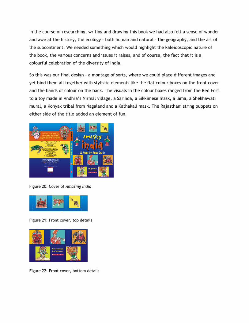
So this was our final design – a montage of sorts, where we could place different images and
yet bind them all together with stylistic elements like the flat colour boxes on the front cover
and the bands of colour on the back. The visuals in the colour boxes ranged from the Red Fort
to a toy made in Andhra’s Nirmal village, a Sarinda, a Sikkimese mask, a lama, a Shekhawati
mural, a Konyak tribal from Nagaland and a Kathakali mask. The Rajasthani string puppets on
either side of the title added an element of fun.
Figure 20: Cover of Amazing India
Figure 21: Front cover, top details
Figure 22: Front cover, bottom details
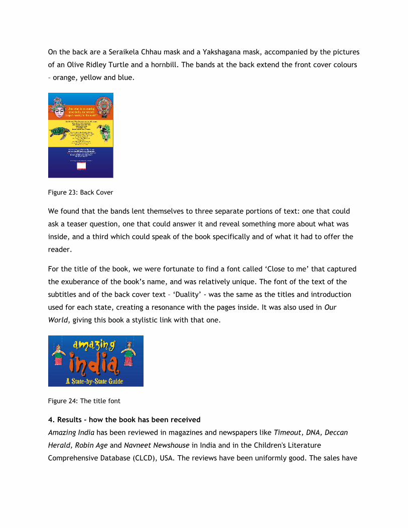
On the back are a Seraikela Chhau mask and a Yakshagana mask, accompanied by the pictures
of an Olive Ridley Turtle and a hornbill. The bands at the back extend the front cover colours
– orange, yellow and blue.
Figure 23: Back Cover
We found that the bands lent themselves to three separate portions of text: one that could
ask a teaser question, one that could answer it and reveal something more about what was
inside, and a third which could speak of the book specifically and of what it had to offer the
reader.
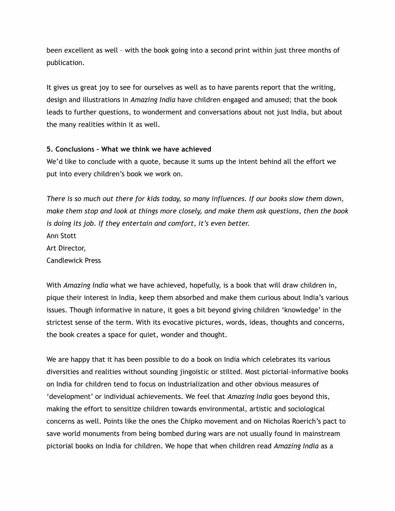
For the title of the book, we were fortunate to find a font called ‘Close to me’ that captured
the exuberance of the book’s name, and was relatively unique. The font of the text of the
subtitles and of the back cover text – ‘Duality’ - was the same as the titles and introduction
used for each state, creating a resonance with the pages inside. It was also used in Our
World, giving this book a stylistic link with that one.
Figure 24: The title font
4. Results - how the book has been received
Amazing India has been reviewed in magazines and newspapers like Timeout, DNA, Deccan
Herald, Robin Age and Navneet Newshouse in India and in the Children's Literature
Comprehensive Database (CLCD), USA. The reviews have been uniformly good. The sales have
been excellent as well – with the book going into a second print within just three months of
publication.
It gives us great joy to see for ourselves as well as to have parents report that the writing,
design and illustrations in Amazing India have children engaged and amused; that the book
leads to further questions, to wonderment and conversations about not just India, but about
the many realities within it as well.
5. Conclusions – What we think we have achieved
We’d like to conclude with a quote, because it sums up the intent behind all the effort we
put into every children’s book we work on.
There is so much out there for kids today, so many influences. If our books slow them down,
make them stop and look at things more closely, and make them ask questions, then the book
is doing its job. If they entertain and comfort, it’s even better.
Ann Stott
Art Director,
Candlewick Press
With Amazing India what we have achieved, hopefully, is a book that will draw children in,
pique their interest in India, keep them absorbed and make them curious about India’s various
issues. Though informative in nature, it goes a bit beyond giving children ‘knowledge’ in the
strictest sense of the term. With its evocative pictures, words, ideas, thoughts and concerns,
the book creates a space for quiet, wonder and thought.
We are happy that it has been possible to do a book on India which celebrates its various
diversities and realities without sounding jingoistic or stilted. Most pictorial-informative books
on India for children tend to focus on industrialization and other obvious measures of
‘development’ or individual achievements. We feel that Amazing India goes beyond this,
making the effort to sensitize children towards environmental, artistic and sociological
concerns as well. Points like the ones the Chipko movement and on Nicholas Roerich’s pact to
save world monuments from being bombed during wars are not usually found in mainstream
pictorial books on India for children. We hope that when children read Amazing India as a

reference book, they will also take from it respect and admiration for India’s diversity. And an
awareness that this diversity – whether human or ecological – is seriously fragile.


![[XLS]ksfecma.comksfecma.com/UserFiles/kecma/KSFECMA ENTRANCE LIST(1).xls · Web viewROHINI GOPALAN EDAKKAL HOUSE, MANNATHOOR PO, PAMPAKUDA RAHUL K ANIYAPPAN KALLOLICKAL HOUSE, KOOTHATTUKULAM](https://static.fdocuments.us/doc/165x107/5ae0d2ce7f8b9ac0428de988/xls-entrance-list1xlsweb-viewrohini-gopalan-edakkal-house-mannathoor-po-pampakuda.jpg)

