Designing an Interface and Path Translator for a Smart...
81
Designing an Interface and Path Translator for a Smart Phone- Based Indoor Navigation System for Visually Impaired Users Hend K. Gedawy CMU-CS-11-125 December 2011 School of Computer Science Carnegie Mellon University Pittsburgh, PA 15213 Thesis Committee: M. Bernardine Dias, Chair Manuela Veloso Yonina Cooper Submitted in partial fulfillment of the requirements for the degree of Master of Science. Copyright ©2011 Hend K. Gedawy This research is funded by a faculty seed research grant sponsored by the Qatar Foundation. The views and conclusions contained in this document are those of the author and should not be interpreted as representing the official policies, either expressed or implied, of the sponsor or the U.S. Government
-
Upload
phungkhanh -
Category
Documents
-
view
213 -
download
0
Transcript of Designing an Interface and Path Translator for a Smart...

Designing an Interface and Path Translator for a Smart Phone-Based Indoor Navigation System for Visually Impaired Users
Hend K. Gedawy
CMU-CS-11-125
December 2011
School of Computer Science Carnegie Mellon University
Pittsburgh, PA 15213
Thesis Committee: M. Bernardine Dias, Chair
Manuela Veloso Yonina Cooper
Submitted in partial fulfillment of the requirements for the degree of Master of Science.
Copyright ©2011 Hend K. Gedawy
This research is funded by a faculty seed research grant sponsored by the Qatar Foundation.
The views and conclusions contained in this document are those of the author and should not be interpreted as
representing the official policies, either expressed or implied, of the sponsor or the U.S. Government

Keywords: Indoor navigation, orientation and mobility, blind users, Android phone, Interface, narrative maps.

Abstract
According to the Braille Institute of America [1], there are 15 million blind and visually impaired people in the United States. They have different important daily needs including navigation. Visually impaired people rely on different tools and skills to navigate. They usually rely on their white canes, seeing-eye-dogs and other skills acquired over time to aid their navigation. Many technologies have been developed to assist blind users with different navigation needs. These include obstacle avoidance technologies as well as routing technologies. Any routing technology for blind requires different components including localization, map representation, path planning, interface, and a component to translate the planner output into meaningful instructions. The focus of this work is on developing the interface and the translator component of a full smart phone-based navigation system, called NavPal. The application improves on previous work by giving better quality instructions, and giving more flexibility to the user in choosing the level of verbosity and using different input/output modalities. The application tries to keep a good balance between the quality of the navigation instructions and the automatic production of these instructions. The interface was tested with eight blind users who traversed three routes, each. The results indicated that 75% of the twenty four navigation tasks were accomplished successfully, while relying only on the interface instructions. The users provided feedback on all components of the interface and provided suggestions for improvement, which will be considered in future work.


Acknowledgements
I would like to thank my project advisor M. Bernardine Dias for her support and guidance throughout the year. I would like to also thank my other committee members: Manuela Veloso and Yonina Cooper. Many thanks go to all participants who helped in guiding this work with their valuable input and feedback. I am also thankful for the technical help provided by Nisarg Kothari, M. Freddie Dias, and BalajeeKannan. I would like to thank PenniTelleck, Cynthia Ingraham, Joseph Cioffi, and Paul McGann for the information they provided based on their experience in the Orientation and Mobility ( O&M) field for blind and deafblind. I would like to also thank Sarah Belousov and Ermine Teves for their help in facilitating communication with partners and users in the needs assessment process. My thanks also go to Todd Reeves for his/her help in interpreting communication during one of the important interviews that I did during Needs Assessment. Many thanks go to Anna Kasunic, Chet Gnegy, and Evan Glasgow for their help in the testing process. I also would like to thank Deborah Cavlovich, CatherineCopetas, and Peter Steenkiste for their assistance in fulfilling the fifth year Master’s program requirements. Finally, I thank my family and my undergrad CS faculty at CMUQ for their encouragement to finish this Master’s program successfully.


Table of Content Abstract .......................................................................................................................... 3Acknowledgements ........................................................................................................ 5Table of Content ............................................................................................................ 7ListofFigures ................................................................................................................. 8ListofTables .................................................................................................................. 9Introduction ................................................................................................................ 11
1.1 Thesis Outline ............................................................................................... 11Related Work ............................................................................................................... 15NavPal System ............................................................................................................. 18Needs Assessment ........................................................................................................ 21
4.1 Passive Observations ......................................................................................... 214.2 Interviews ........................................................................................................... 214.3 Online Blogs ...................................................................................................... 244.4 Instruction Models in Other Projects ................................................................. 25
Interface ...................................................................................................................... 295.1 Interface Features ............................................................................................... 295.2 Components ....................................................................................................... 30
Navigation Instructions ............................................................................................. 396.1 Assumptions ....................................................................................................... 396.2 Terminology ....................................................................................................... 396.3 Instructions List ................................................................................................. 39
6.3.1 Directions ............................................................................................................... 39
6.3.2 Vibration Algorithm ............................................................................................... 40
6.3.3 Contextual Information Phrases ............................................................................. 42
6.3.4 Landmarks List ............................................................................................... 42Translator ..................................................................................................................... 45
7.1 Pseudo Code ....................................................................................................... 457.2 Example ............................................................................................................. 48
Testing ........................................................................................................................ 548.1 Procedure ........................................................................................................... 548.2 Results ................................................................................................................ 58
8.2.1 Interface Usability .................................................................................................. 58
8.2.2 Navigation Instructions .......................................................................................... 67
Conclusion ................................................................................................................... 75Future Enhancements ................................................................................................... 77
10.1 Interface ........................................................................................................... 7710.2 Instructions ....................................................................................................... 78
References .................................................................................................................... 80

List of Figures
Figure 1: An Overview of the NavPal System components and this thesis work focus ...................................................................................................................................... 19
Figure 2: The twenty indoor narrative maps that I examined in the Needs Assessment ...................................................................................................................................... 26
Figure 3: The four phone buttons in the Nexus One Android phone ........................... 30Figure 4: Welcome Screen for the NavPal application ................................................ 30Figure 5: Image for the current map view ................................................................... 31Figure 6: Navigation Menu Options ............................................................................ 31Figure 7: The Destinations Menu ............................................................................... 32Figure 8: Adding a new Destination with Voice recording ......................................... 33Figure 9: Getting instructions (a) instructions levels menu (b) gesture drawing screen (c) defined gestures ...................................................................................................... 34Figure 10: Landmarks initial menu and adding a landmark ....................................... 35Figure 11: directions menu to which user gets forwarded after selecting a landmark 35Figure 12: Adding an Obstacle option ......................................................................... 36Figure 13: the Talking Dialer ...................................................................................... 37Figure 14: The list of vibration patterns ...................................................................... 37Figure 15: Features of route nodes on which the Translator depends ......................... 45Figure 16: Psuedo Code for "Translate Route" function ............................................. 46Figure 17: The Psuedo Code for FixDirection function .............................................. 46Figure 18: The Psuedo Code for OrientUserOnPropperSide function ........................ 47Figure 19: The Pseudo Code for TakeActionAtCurrNode function ............................ 47Figure 20: The Psuedo code for TransitionToNextNode function .............................. 48Figure 21: Three navigation routes in CMU- NSH-FloorA ........................................ 49Figure 22: The Translators output for Route1-High Level .......................................... 49Figure 23: Translator’s Output for Route 1- Intermediate Level ................................. 50Figure 24: Translator’s output for Route1-Low Level ................................................ 50Figure 25: Translator’s Output for Route2-High Level .............................................. 50Figure 26: Translator's output for Route 2- Intermediate Level .................................. 51Figure 27: Translator's output for Route 2- Low Level ............................................... 51Figure 28: Translator’s Output for Route3-High Level ............................................... 51Figure 29: Translator's output for Route3-Intermediate Level .................................... 52Figure 30: Translator's Output for Route3-Low Level ................................................ 52Figure 31: Trial Route in Floor 3 of NSH .................................................................... 56Figure 32: Tape placed on the phone buttons during testing ....................................... 59Figure 33: The number of participants who made it to the goal in each Route .......... 68Figure 34: the percentage of success in getting to Goal using the application ............ 68Figure 35: Travel Time (minutes) for the 24 navigation tasks with the different instructions levels ......................................................................................................... 69Figure 36: The average travel time for the three routes ............................................... 69Figure 37: The number of Navigation instructions for all routes at the three levels ... 70
ListofTables
Table 1: Preferred I/O Modalities by the participants ..................................................... 23 Table 2: Barriers that keep paticipants from adopting new assistive technologies .......... 24 Table 3: Clues and information blind/deafblind people pay attention to during navigation .......................................................................................................................... 25 Table 4: Instructions List .................................................................................................. 40 Table 5: Vibration Patterns for Instructions...................................................................... 42 Table 6: Contextual Information List ............................................................................... 42 Table 7: Landmarks List ................................................................................................... 43 Table 8: Technologies adopted by the participants........................................................... 54 Table 10: The level of instructions selected for users to navigate the three different routes ................................................................................................................................. 67


Chapter1
Introduction According to the Braille Institute of America [1], there are 15 million blind and visually impaired people in the United States. They have different important daily needs including navigation. Navigation and way finding is crucial for the blind population, as for any other. Visually impaired people in new environments may feel totally disoriented or isolated. These people can easily end up in dangerous and confusing situations as they move in unknown places. Pressing navigation-related problems blind people face include determining one’s position, heading or moving direction, and the detection of close objects (most probably mobility barriers) [2] Visually impaired people rely on different tools and skills to navigate. They usually rely on their white canes, seeing-eye-dogs and other skills acquired over time to aid their navigation. Visually impaired people, that are able to perceive sounds, tend to learn how to identify audible landmarks. In general, people supplement their loss of sight by becoming better with other senses, even smell [3]. As supported experimentally by Jacobson [4], their cognitive mapping skills are flexible enough to adapt to the sensory loss. Even people who are blind from birth can deal with spatial concepts and can find their way through different spaces. Many technologies have been developed to assist blind users with different navigation needs. This includes avoiding obstacles like laser canes and other handheld devices that transmit laser or ultrasound beams to detect objects ahead of the user and give audio or vibration feedback that varies according to how close the objects are ([42], [20]). Other technologies developed were to help with localization and tracking the user’s current location, like RFID Tags and GIS ([6], [4], [16], [11], [12]). These technologies were integrated in some applications or systems to help with routing and giving the necessary instructions to get the user to his/her destination. Some of these applications we developed on cell phones and others introduced new handheld devices, which is less preferred by most blind users. There are a number of limitations with the work done to date in this field. Section 2, “Related Work”, gives more information about the previous work and highlights its main limitations.
1.1 Thesis Outline The target group of this research project is blind people with no major cognitive disability. This group as mentioned before relies on using other senses. Their needs include having instructions that help them build a mental map of the surrounding space. This also includes pointing out to them landmarks that they can detect with their reliable senses, such as sounds, textures, smells, etc. This work addresses different navigation needs of this group through a smart phone-based navigation application for the blind. The application provides an adaptive interface with better

quality instructions than previous work. This application is to be used along with the conventional white canes, which helps the user avoid obstacles. Developing a navigation application on smart phones, such as Android phones or iPhones, is preferred to introducing a new handheld technology specific to navigation for several reasons [2]. First, smart phones have built-in compass and pedometer that help with navigation and localization. Second, they are also a general-purpose device that most people already use. Third, smart phones are an increasingly affordable technology. Based on their needs assessment, Mau et al. [2] qualified mobile phones as “the single most valuable piece of technology for the blind.” For all of these reasons, the goal of this project is to develop a mobile phone-based navigation tool for guiding blind users. Any navigation technology has five main components. First is the map representation which provides a way to represent a multi-floor building map. Second is the path planner which plans the user’s route in the building. Third is the localization component which tracks the user’s location during navigation. Fourth is the interface which handles interaction with the user. Finally is a component that translates the path planner output into meaningful routing instructions. The focus of this thesis work is the interface and the translator components. The work of this project is divided into four main parts: a) Needs Assessment: The first part is the needs assessment process which includes gathering information about suitable interface design, instructions and landmarks that are important to guide a blind user in a new indoor environment. This process involved interviewing blind users and experts in the Orientation and Mobility (O&M) field. This also involved observing blind children navigating and using technologies, reading online blogs by deafblind people about their experience in navigation, and finally studying narrative maps of other navigation projects. The needs assessment also included testing process and getting feedback from users about what is good to keep in the application and what needs to be enhanced. Section 4, “Needs Assessment” provides more details about the testing process. The goal of the needs assessment process was to answer different questions like: How should the user indicate their destination(s)? What input format would the user be most comfortable with? What is the proper output format to use for giving navigation directions to the user? What vibration patterns can be used to communicate different messages to the user? How much information should be given to the user at each stage of the route? How should we organize components of the navigation application in logical menus? What kind of landmarks or clues are of interest to the user? What kind of information about the surrounding environment is necessary to help the user get a mental map of it? b) Interface: The second part of this thesis work was to design and implement the indoor navigation interface on a mobile device based on needs assessment. The interface allows the user to do different navigation tasks. The interface also supports different input/output modalities that fit the user's abilities. These modalities include voice recording, gestures, haptic feedback and audio feedback. c) Translator: The Third part is the translator. It is built on assuming existence of a

map representation that is able to tag landmarks and some contextual information about the environment. d) Navigation Instructions: The fourth part of this work is the navigation instructions and the information or landmarks necessary to guide the users in a new indoor environment. This component also defines other contextual information that gives the user more context about the surrounding environment to help the user build a mental map of it. This information and landmarks defined are important to be captured in any map representation. The main motivation of this work is to enhance the state of the art in assistive technology that can increase independence and quality of life for the blind population. Our goal is to provide an affordable technology tool that enhances a capability that is critical to their social and professional life.


Chapter 2
Related Work
Facilitating indoor navigation for people with visual impairment has been considered for decades. There are different technologies used to address the five mentioned components of any navigation technology. New hardware or physical technologies were mainly introduced in the localization and interface components. Many of the navigation systems for visually impaired used different technologies for localization and tracking such as Global Positioning System (GPS) ([5],[9],[4]), Geographic Information System (GIS) ([6], [4], [16]), Wi-Fi or Bluetooth devices ([18], [19]), AM radio signal transceivers [7], ultrasound ([9],[26]) or infrared transmitters [10], and Passive Radio Frequency Identification (RFID) tags ([11],[12]). Some of these technologies, such as GPS, required clear line of sight and they are not suitable for indoor navigation. Others such as RFIDs require pre-installed infrastructure, and changes to the environment require changing this infrastructure [13]. Some approaches with sophisticated sensors, such as the ones using laser-rangefinders, are expensive [14]. The interface of any navigation system is critical to its success. The type of interaction the user has with such systems can have an important impact on its usability. Buttons, gestures and speech recognition are common for blind user input [8]. Most electronic mobility aids for visually impaired users rely on audio-based interfaces, using speech (Text-To-Speech [39]) and/or sounds as output mechanisms to direct the user and inform him about routes and locations. Some systems combine audio instructions with a visual interface that presents useful navigation information such as a site map, the start and end locations of a route, and a path to follow [8]. Others use different types of spatial displays including virtual speech, virtual tone, haptic point interfaces (HPI), and bodypointing [6]. Instead of virtual sounds, spatial language is also considered for corrective information (e.g. 60° to the right) [40], and iconic sounds are used to inform users about their location [41]. Researchers have also considered the needs of people who are not totally blind, and have designed interfaces with minimalistic graphics and strong color contrast [41]. The main limitation of the previous navigation technologies is the quality of the instructions provided and the flexibility. Giving more context about the surrounding environment and about clues and landmarks is very necessary to blind travelers. Also, allowing the user to have the flexibility to choose the level of details he/she prefers for the instructions is necessary. This is besides the flexibility in choosing the input/output modality. Sometimes, the users could suffer from temporal disability in their senses that they rely on. For example, their hearing could temporarily be blocked in a noisy environment so audio feedback is not enough. Supporting it with tactile feedback is a good idea in this case. The user should also have the flexibility to add things to the map as he/she comes across them. This includes adding landmarks or obstacles if the map representation did not have this information tagged.

There are a number of technologies developed to help blind and deafblind users with obstacle avoidance. Some electronic canes, called Laser Canes, use laser beams to detect obstacles. Thiscane uses either audio signals or vibrations of part of the handle to indicate when objects are infront of the user. The level of sound or vibration varies to indicate the distance from the objects([42], [20]). Another mobility assistive technology is the “Handheld Mobility Device” which also givesaudio or vibration feedback about objects in the direction where the user points the device [20].The “Sonic Mobility Device” is used for the same purpose and gives the same feedback to theuser but is mounted on the user’s head [20]. The “Wheelchair Pathfinder Navigating Device” isanother technology for object avoidance that is useful for a person using a wheel chair. It hasa set of small transmitters attached to the device that transmit laser and ultrasound beams tothe front and sides of the chair. They give tactile and audio feedback once they detect an object [42]. Finally, the “Polaron Lightweight” can be used as a handheld or chest-mounted tool wherea vibrator gets located around the neck and creates vibrations that become more intense as theuser gets closer to objects [42]. The user will use the NavPal tool in combination with a white cane or some other obstacle avoidance aid. This chapter discussed related work and highlighted their limitations. In general, there are some critical points that need to be improved. First, the quality of the instructions provided to blind users need to be improved. Most of the navigation technologies to date provide routing instructions that are missing landmarks and/or information that gives the user context about the environment. Second, flexibility and allowing the user to adjust elements based on his/her preference is also missing. This includes flexibility in choosing the level of verbosity for the instructions, having different input/output (I/O) modalities, and adding tags to the map as the user comes across obstacles and landmarks. Third, using inefficient tools, like RFID tags and expensive sensors, is a major issue. Fourth, some technologies introduce new handheld devices that are less preferred by blind users. In this thesis work, we try to improve over the interface and the instructions aspects. The interface provides different input/output modalities. If the map does not indicate the existence of an obstacle or a landmark that is of interest to the user, the interface allows the user to add this to the map. Also the interface gives the user the flexibility to select the level of verbosity he/she prefers for the instructions. Based on the level of verbosity that the user selects, the interface gives necessary information about landmarks or about the surrounding area. The following chapter gives an overview of the full navigation system, which this thesis work is part of.


Chapter 3
NavPal System
The work presented in this thesis is part of a full navigation system called NavPal. Figure 1 presents an overview of the NavPal system and highlights the parts that have the focus in this thesis work. The NavPal navigation system is part of the TechBridgeWorld non-profit organization at Carnegie Mellon [44]. This organization’s interest is to design and develop technologies that help serve the needs of developing and underserved communities. The NavPal system is designed to be an indoor-capable navigation application for people with different disabilities, such as deaf, blind, people using a wheel chair, and deafblind. These different people have different interface requirements and navigation needs. This should be taken into consideration in the path planner, the navigation instructions and the landmarks. This system is still under development. The NavPal system has five main components: interface, localization, map representation, path planner, and a routing translator. First, the map representation component is responsible for giving a convenient demonstration that includes landmarks and contextual information about the environment. This depends on the additional component, depicted in Figure 1, which defines landmarks and information about the environment that is necessary to help the user build a mental map of the environment. Second is the path planner which is responsible for producing a route given the map representation, a destination, and the user’s current location. The path planner output may differ for different disabilities. A person using a wheelchair, for example, will be guided so as to avoid steps and non-automatic doors. The path planner output will also differ in emergency situations. Third, tracking the current location of the user is the responsibility of the localization component. Fourth is the interface which is responsible for the interaction with the user. This includes getting the user’s destination, marking some locations as locations of interest and adding them to the default destinations list, communicating the navigation instructions to the user, adding landmarks to the map as the user comes across them, and adding new obstacles that the user comes across to the map.

Figure 1: An Overview of the NavPal System components and this thesis work focus The final component is the translator component which is responsible for converting the path planner output into meaningful route directions that could guide the user in an indoors environment. The instructions include landmarks and also give contextual information about the environment. Most of the previous work generated narrative maps of low quality that did not include landmarks and cues about the environment. For example, the BlindAid application gives high level routing instructions, e.g. hallways level, throughout the route. The points of interest are start, goal, and hallway intersections. It is only the final hallway where the destination exists that more information is given to the user [8]. At this final hallway, a count of the doors on the way to the destination is given. Additional landmarks are not taken into consideration [8]. In the NavPal system, by adding more landmarks and cues to the map representation and by using the translation component, higher quality route description and instructions can be generated. As discussed in the previous chapter and as presented in Figure 1, the focus of this thesis work is the interface and the translator components. It also includes defining the suitable instructions, landmarks, and contextual information needed to guide a blind user in an indoor environment. This thesis work is built on assuming the existence of the three other components. The next chapter presents the needs assessment process which was used to gather the necessary information needed for the design and implementation of the interface and the translator parts.


Chapter 4
Needs Assessment The needs assessment process was conducted in four different ways. The first method included a number of passive observations to navigation lessons for blind children in Western Pennsylvania School for Blind Children (WPSBC). Second interviews were conducted with blind people and some experts in the Orientation and Mobility (O&M) field in different institutes such as Helen Keller National Center (HKNC), Western Pennsylvania School for the Deaf (WPSD), and WPSBC ([25], [27], [28]). Third, online blogs, written by deafblind users about their experience in navigation, were examined ([29], [30], [31], [32], [33], [34], [35]). Finally, instruction models and narrative maps provided in other navigation projects for the blind, such as ClickAndGo, were studied [36].
4.1 Passive Observations As part of “Ethnography: Analyzing How Context Affects Technology Use” course that is offered at Carnegie Mellon, I was able to observe indoor navigation lessons for students in the WPSBC. I did a total of two hours of passive observation to different navigation activities inside the building of the school. First, I observed a navigation training session for a person with limited vision and using a wheelchair. Second, I observed another navigation training session to a young child who is totally blind but is able to move and use the white cane to navigate. In these two sessions the teacher took the student around the building to different areas, reminding him of the different tactics and guides he/she should follow to safely and correctly navigate and localize himself in the building. Finally, I was able to observe a fire drill evacuation process. These observations helped in understanding landmarks of interest to end users but they did not add a lot to the decisions on the interface design and the navigation instructions for several reasons. First, the lessons had techniques about orientation, safety and obstacle avoidance rather than routing instructions. Second, the students had a mental map of the place so they were navigating smoothly. Third, the school had adaptations and landmarks in the environment that don’t usually exist in all buildings. Some of the landmarks, however, were common in other buildings and the users used them during navigation lessons. These observations, therefore, were useful for understanding some landmarks that the users pay attention to during navigation.
4.2 Interviews The interviews involved interviewing blind users to learn about their navigation experience and their interaction with technologies, and also interviewing O&M instructors and consultants. The interviews were conducted in accordance with the

regulations of the Institutional Review Board (IRB). The IRB number for the NavPal study is HS11-419. The interviews focused on learning about the following aspects: • The interfaces of successful technological interventions adopted by the visually
impaired community In particular, we concentrated on those interventions that could be directly related to our navigation domain or mobile devices.
• The learning and familiarization processes related to the use of mobile technology Along this direction, we were interested in learning experiences that provided cues as to how visually impaired users could adopt mobile navigation aids.
• The type of interfaces preferred or rejected by visually impaired users who were already familiar with mobile devices This aspect included input and output modalities applicable to navigation systems, as well as features related only to the information given by navigation aids (e.g. level of verbosity).
• The type of activity for which a visually impaired user would like to get navigation assistance (e.g., shopping, emergency evacuation)
• Impediments for the adoption of electronic travel aids For example, trust levels in current technology, fears about being lost or confused, independence, lack of motivations, etc.
As part of an Ethnography class, I interviewed three blind users who are all staff members of Blind & Vision Rehabilitation Services of Pittsburgh (BVRS) [43]. The questions asked included:
a) Do you currently use any mobile phones? If the person uses a mobile device, i. How do you interact with the device? Which input/output modalities
do you use? (touch, audio, etc.) ii. What do you use your phone for? (calls, texting, games, music,
navigation, education, etc.) iii. What preferences do you have for mobile device applications?
b) Do you use any other electronic devices? If the participant does, i. What type of devices do you use?
ii. What type of interfaces do you prefer? (e.g., regular or six-key braille keyboard, voice commands, touchscreens, refreshable braille displays)
iii. How do you interact with your devices? Which input/output modalities do you use? (e.g., touch, audio)
iv. Do you use applications where you depend on a menu to switch between different tasks? Is this confusing?
v. Would specific gestures facilitate giving input or starting an application?
vi. Do you use applications where you have to follow carefully a set of instructions? How are the instructions presented?
vii. Do you use headphones or speakers to receive output from the devices?
c) How long does it take you to get familiar with new technology? What helps familiarizing quickly?
d) Is there a specific technology you use for navigation? Are you interested in help for self-localization and navigation? Do these preferences change depending on your knowledge and familiarity with the environment?

e) Which level of verbosity in the system do you prefer for navigating? Would turn-by-turn instructions be effective? Should verbosity change depending on the situation? Would an initial, high-level description of the route help?
The blind interviewees reported the adoption of different technologies. This ranged from using conventional mobile phones to using smart phones. The participants also used different technologies such as GPS devices, mp3 player, Mobile Speak screen reader, barcode reader, “Pen Friend” for “sticking labels on things”, a PDA called “Freedom Scientific” with Braille display, a scanner with OCR technology, a Braille printer (“Braille Embosser”), and Text-To-Speech (TTS) technologies. One of the participants indicated preferring to use headphones because he has trouble with TTS in loud environment ([46], [47], [48], [49], [50], [51], [52], [53], and [54]). The participants also clarified their preferred input/output interaction method with technologies. All participants mentioned they like systems that speak out menu items and their respective shortcut keys. Participants 2 and 3 (P2 and P3) recommended sound notifications as simple alerts. For example, beeps could be used to give an alert about low battery. Vibration patterns should be basic and easy to remember according to P2. P1 mainly uses buttons as input modality. He/she is reluctant to learn particular gestures for each task. On the contrary, P2 finds gestures very useful, because they save him/her a lot of effort with respect to going through menus or using keyboards. P3 highlighted the problems of voice recognition in crowded and noisy areas. Table 1 summarizes the participants’ I/O preferences. Preferred Input/Output Format
Audio feedback
Vibration patterns feedback
Voice input
Buttons input
Gestures input
Participants All P2 P2 P1 P2 Table 1: Preferred I/O Modalities by the participants There was interest from the interviewees towards systems with different levels of verbosity (e.g., 2 or 3). Different levels of verbosity could be used by a navigation aid depending on position of the person with respect to the route. For example, an initial, high-level description of the entire route could be given before step-by-step instructions. Participant 2 mentioned that the screen reader JAWS adjusts the details level of its instructions according to the type of user (beginner, intermediate or advanced). This feature is helpful when following the instructions to configure the system. Different barriers, including price, portability and how much they block the users’ other senses, make the adoption of electronic travel aids difficult. P1 complained that data plans for latest generation mobile devices are expensive, and he/she does not want to pay more. GPS and color identification devices were also mentioned by P2 as costly aids for visually impaired people. Not all applications follow the same guidelines. For P2 the standard guidelines are the ones used by Microsoft, and any other application that works differently is difficult to use. Also, the number of hands they need to use to operate the device is significant. P1 said that when he/she relies on his/her dog for navigation, sometimes he/she has to stop walking to use the device with his/her both hands. The weather was mentioned as a barrier for using mobile devices and navigation aids. P1 liked the small size of mobile devices because they

could be put in a pocket if the weather conditions required it. Visually impaired users need to pay attention to their surrounding environment. A good option to avoid blocking their hearing capabilities is to place electronic aids near one of their ears. Bluetooth speakers are a good alternative according to P1. Table 2 summarizes all the barriers that participants mentioned. Barrier Price portability Blocking other
senses Not following same guidelines
Size of Device
Participants P1 P1, P2 P1 P2 P1 Table 2: Barriers that keep participants from adopting new assistive technologies Participant 2 expressed interest in knowing how the environment looks like, especially indoors. When using travel aids, he/she would like to know where the elevators are located, where is the front desk of a building and the size of the steps of stairs. Other landmarks mentioned during the interviews include fire alarms, doors, walls, corners and tables. This interest was also highlighted during the testing phase form a number of other participants. Section 8, “Testing”, gives more details about the testing process. I also interviewed four experts in the O&M field. During the interviews, I asked several questions related to navigation needs and interface input/output modalities that work for the target user. The focus was more on the instructions and describing routes to end users. The questions included:
a) What challenges does the target user face while navigating indoors? What input/output, such as tactile, visual, or audio, modalities does the target user use while interacting with technology?
b) What clues or landmarks do they look for in a building during navigation? c) How would you describe a route to a blind person? d) How to express routing instructions to remove confusion from the end user? e) What kind of destinations, in a school setting, would be necessary to include
in a default destinations menu? f) How should the application handle when the person is lost and require help
from a sighted person?
4.3 Online Blogs As part of a project for deafblind, I was able to extract information from the blogs related to navigation. The project was part of a class called V-Unit and it focused on designing a navigation interface for deafblind. The blogs include information about different landmarks and environment clues that give the user more context about the surrounding environment and help him identify where he/she is. There were different quotes that helped me know what the deafblind person pays attention to during navigation to help him know where he/she is. I also was able to understand some of the challenges a deafblind person faces during navigation. Even though the quotes are by deafblind users, most things apply for blind as well. The only things missing from the quotes are things where the user relies on his/her hearing ability. The quotes include:

• “I moved around a couple corners, down the hall, past two doors... I kept my hand on the wall so I would know what I was passing”[29]
• “Unfortunately I wasn't able to mentally map the layout of the building. I was too busy trying to find a familiar landmark”[29]
• “…. I realized I was not where I should be. The approach was wrong. So was the angle of the door handle”[30]
• “The rubber mat felt right....I followed the edge of the mat with my cane ….. But the mat ended too soon”[30]
• “The feel of the rubber mat tells me that I am nearing the bulletin board and need to be ready to cross the hall”[30]
• “Every time I go to class, I walk down that hall and pass that location. And every time I do, I smell coffee right before I hit the rubber mat”[30]
• “I know the campus does deep cleaning during breaks... The halls can be a mess. It makes it extra hard for me to get around …. The mess covered up all my landmarks” [31]
• “But the wind was also interfering with my ability to use scent and touch ... Because of the constant wind against my skin, I couldn't feel the displacement of air as people moved past me...” [32]
• “I'm mostly deaf. I only hear environmental sounds with my old cochlear implant. I can't understand speech…. I can hear the chatter of people, the rustling of papers and the sound of doors being slammed shut. Or I can hear the silence” [32]
• “I can smell the scent of people... Sometimes I smell food, as someone eats a snack near me. I can often determine my location by scent, as well. Hallways smell bland and stale. I can smell coffee near the snack room.” [32]
• “Touch and the displacement of air give me more useful clues. There is a slight movement in the air when people walk past... Or I can feel a "whoosh" of cold or fresh air when someone opens the building doors.” [32]
The following Table, i.e. Table 3, summarizes the information blind/deafblind people pay attention to, based on information from the blogs.
Landmarks Mental Map for layout of building
Counts Feeling of the floor
Size of the mat
Bulletin board
Smells (coffee, scents, food, …)
Feeling displacement of air
Environmental sounds
Number of corners
Number of Doors
Table 3: Clues and information blind/deafblind people pay attention to during navigation
4.4 Instruction Models in Other Projects There are different instructions’ models used in previous navigation technologies. Most of it was missing landmarks and other information that gives the user more context about the environment. The best instructions model I came across was this of the “ClickAndGo” service[37]. The ClickAndGo way finding Maps service provides
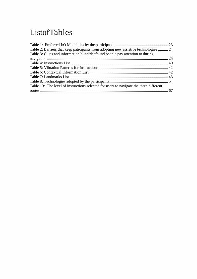
very detailed and high quality narrative maps. A narrative map is “a verbal or text-based description that provides the way finding instructions required following and maintaining orientation along a walking route” [37]. ClickAndGo service provides detailed navigation directions for indoor and outdoor routes. These instructions are prepared by specialists and they are done manually. According to the founder of the ClickAndGo service, he/she would go around each route in person, video tape it and record routing directions for it. The instructions couldthen be downloaded from the website in text format. This format can be used in devices that support Text-To-Speech and Text-To-Braille. The instructions could also be downloaded as mp3 files that are compatible with portable audio devices. There is also a voice service where the user can have a free call to ask for routing directions from one location to another. Preparing all of these routes manually takes a lot of time and effort, and makes it hard to scale it to many places or buildings. However, the ClickAndGo advantage over other service or technologies is the quality of the instructions it provides. Based on testimonials provided in the ClickAndGo website, users find the instructions outstanding and provide very good cues about the environment. So, I used ClickAndGo as one of the important sources to prepare my route instructions and landmarks list. I reviewed twenty indoor narrative maps’ instructions in the ClickAndGo service. Figure 2shows the list of destinations that was used in these twenty examples. The starting point was the same.
Figure 2: The twenty indoor narrative maps that I examined in the Needs Assessment The NavPal system tries to improve over this through the translation component. This component will partially automate the work done in the ClickAndGo service and still get a close quality of the narrative maps provided by this service. Some manual work will have to be done by going around the building and tagging locations of landmarks and other cues. However, once this is tagged in the map, the instructions generation could be automated. This helps make the balance between high quality instructions, such as ClickAndGo, and automated instructions generation that does not take cues and landmarks into consideration throughout the route, such as BlindAid application. Chapter 1 presents a representation for the balance that NavPal is trying to maintain. The needs assessment steps listed in this chapter played the main role in defining the

end user’s needs, challenges, and expectations for a new indoor navigation technology, like NavPal. The following chapters will define the work that was done in the interface, the navigation instructions and the translator components. This work took many of user concerns into consideration. Further enhancements that need to be done to the current interface or instructions model, are presented in the final chapter, i.e. Future Enhancements.


Chapter5
Interface 5.1 Interface Features Based on needs assessment, this section defines a list of constraints that need to exist in any interface design for the same target group. The following list contains features that were added in the current implementation of the interface. Other features, that are not implemented yet, are listed in section 9, “Conclusion”. • The instructions and landmarks presented in the interface should consider
landmarks that the user could detect with his/her senses, like feeling of the floor and the walls texture.
• The interface should give audio feedback about the application views as they switch and always keep the user informed about which view or screen he/she is currently using. It also needs to give the user tactile or audio feedback confirmation on every action the user makes.
• In the O&M lessons, the users learn to hold the right side by default so the instructions provided should assume this, unless the user needs to be at the other side. The user would need to hold the left side if the destination is there or if the area only has a wall on the left side, for example.
• If the interface is to use vibration patterns to communicate different messages to the user, the patterns need to be grouped and organized in a way to remove confusion and make it easier for the user to remember.
• As the blogs and interviews indicated, blind users like to know information about the surrounding environment. They like to know what is around them and like to get information about space. The interface needs to give the user some context about the environment, during navigation, to help the user build a mental map of the place. In the ClickAndGo service this was available in different examples like specifying the size of the hallway the user is going to navigate or giving information about the length of the carpet in feet from left to right and ahead of the user.
• Different vibration patterns for the Nexus One phone buttons: The Android Nexus One phone has four keys that are flat, as shown in Figure 3. Clicking any of the four buttons, by default, generates a single mild vibration. This makes them not distinguishable for someone who is blind. To help the user know which one of the four buttons he/she clicked, the interface uses four different vibration patterns for the four buttons. The interface functionality would require the user to click the menu button (second button) to access the map menu, and the back button (first button) to go back to the previous view from any current view. The other two are the home button, which puts the application in the background and takes the user to the home view, and the search button.

Figure 3: The four phone buttons in the Nexus One Android phone
• To add flexibility, the interface supports three levels of routing instructions’
details (high, intermediate, and low): The significance of this option is to avoid giving too many details to someone who is quite familiar with the place. Since the translator is in charge of producing the instructions, it should take the user’s preference into consideration. The high level is similar to the level given in the BlindAid application. The route points of interest are start, hallways’ intersections, and goal. The user is guided at the hallways intersections level until he/she gets to the final hallway, at which point a count of doors along the way to the destination is given. The intermediate level, however, adds step-by-step directions and adds to these points of interest a count of doors along the whole route. The low level adds, to the route description, additional landmarks and contextual information about the environment.
• Vibration Algorithm: The interface supports communicating instructions with tactile feedback. The interface communicates the instructions also using different vibration patterns. The patterns differ in the number of vibrations in them and the length of these vibrations. These vibration patterns are designed based on a vibration algorithm that limits the number of patterns the user should know. More information about this algorithm are presented in section 6.3.2 Vibration Algorithm
5.2 Components
• Welcome Screen
Figure 4 shows the first view in the application, which is the welcome screen. It lasts for two seconds.
Figure 4: Welcome Screen for the NavPal application

• Map View
The next view is the map view that shows the map, the current location of the user, the start and destination, and the planned path. The current location should be retrieved from the localization component. Since this view is dependent on the map representation and the path planner, little attention was given to it in this thesis work. As presented in Figure 5, the current implementation supports a grid map view for a single floor. The red triangle is to reflect the user’s location and the angle he/she is facing. The circle annotations reflect the planned path between two locations.
Figure 5: Image for the current map view
• Navigation Menu
When the user hits the menu button, the “Navigation Menu” view starts. This menu has different navigation tasks that the user can do. As Figure 6shows, this list includes: specifying the Goal, Getting route directions, adding a landmark, adding an obstacle, trying vibration patterns and exiting the application.
Figure 6: Navigation Menu Options

• Load Building Map This option is to load the building map in the map view. Ideally, this option should be modified to allow the user to select one of several maps to work with in the application. The application then needs to adjust accordingly. This is in terms of the destinations list that the user needs to select from, the kind of landmarks the user could come across, etc. • Specify a Destination
This option allows the user to select a destination. The view that starts, Figure 7, has a list of initial destinations that could exist in a school setting. The current initial list includes Dining, Lockers, Toilet, Lab, Library, Gym, and Drama. The initial list could be modified for different settings such as airports, hospitals, hotels, etc. This view should be connected to the map representation and the localization component. Once the user selects a destination, the current location of the user is retrieved from the localization component. At this point, the current location is hard coded. The destination’s location is determined based on the user’s selection for the goal. This current location and destination are then passed to the path planner to plan the route accordingly. When the user selects one of the public places, such as toilet or dining, the path planner needs to forward the user to the closest location. For example if the user selects toilet, then the closest toilet from the user’s current location is to be retrieved by the map representation component. This location is then passed to the path planner to direct the user accordingly.
Figure 7: The Destinations Menu
As Figure 8shows, the user could add to this list by first selecting the “Add a Destination” choice. Then, the user is forwarded to an audio recorder view. The user needs to click anywhere on the screen to start recording and click again to stop recording. The application then plays the recording to the user and forwards him back

to the destinations menu, with the new destination added. Currently the filename path gets saved on the list. When the user scrolls over it, the audio file gets retrieved based on the file name and gets played.
Figure 8: Adding a new Destination with Voice recording
• Get Directions This option gets the path planner output and allows the user to first choose a level for the instructions’ details. When the user selects “Route” option from the menu, he/she is forwarded to the instructions’ levels view. The user has to choose one of the three options (high, intermediate and low);Figure 9. The translator’s component converts the planned route into a set of instructions that correspond to the selected level of details. After the selection, the user is then taken to the next view which is the gestures view. The user has to draw one of five gestures, presented in Figure 9 , on the screen to switch over the navigation instructions of the planned route. The initial list of gestures was modified twice during the testing phase to finally be this current list. The gesture “_”, i.e. left to right horizontal line, gives the user the next instruction in the list of instructions that gets him to his/her goal. The gesture “_”, i.e. right to left horizontal line, takes the user back to the previous instruction. The “S”-shape gesture repeats the current instruction that the user is at. The semi-circle gesture gives the user the whole route instructions. This could be useful if the user wants to know ahead of time the steps he/she is going to go through. The final gesture is “^”, which takes the user back to the navigation menu. It acts like the back button on the phone.

Figure 9: Getting instructions (a) instructions levels menu (b) gesture drawing screen (c) defined gestures • Add a Landmark The Landmark option allows the user to add landmarks at his/her current location as he/she comes across them during navigation. When the user chooses this option, he/she is taken to a menu of an initial set of landmarks, Figure 10. The current initial list has Elevator, Escalator, Ramp, Railing on Wall, Water Fountain sound, Drinking Water Fountain, Steps, Floor Texture, Wall Texture, Column, Door and Smell. The initial list could be modified for different buildings. The current listhas a set of landmarks that could exist more in of a school setting. The final option in the list is “Add a Landmark” where the user is able to add to the list using voice recording. Like in the adding destination process, the file gets played when the user scrolls over it. When the user selects a landmark, the current location of the user should be retrieved from the localization component and the map should tag the selected landmark in the current location of the user. The map should also tag the direction of the landmark relative to the user’s current angle. As Figure 11 shows, the user is forwarded to directions Menu where he/she has to choose one of four options (front, back, right, and left). The significance of this option is that if the user hears a sound, for example, but to his/her right or left, it is good to tag this and inform the user about it when he/she comes back to the same location later.

Figure 10: Landmarks initial menu and adding a landmark
Figure 11: directions menu to which user gets forwarded after selecting a landmark
• Add an Obstacle
This option allows the user to add obstacles if they happen to exist in his/her route. Modifications could happen inside buildings where objects, for example, get placed in a corridor. They might be blocking the user’s route, in which case the path planner needs to adjust. The user could participate in modifying the map representation to reflect the change. This option allows the user to specify the objects location, its direction relative to the user’s locations, its width and height in feet unit. The user is forwarded to views to give this information in the order they are listed. For the obstacle location the user could choose one of three options, presented in Figure 12: o Right here: Choosing this option makes the interface retrieve the user’s location
form the localization component. The user then gets forwarded to the direction’s menu to specify the object’s direction relative to the user’s position. Then, the user gets to specify the width and height of the object.
o A number of feet away: This option could be useful if the user happens to hit the
object from faraway with the white cane and could give estimation to how far the

object is. Like in the previous option, the user then gets forwarded to specify direction, width, and height of the object.
o Give x, y location: This is an additional option in case a developer or a user is able
to know the x,y location in a floor. Like the previous two options, the user gets to specify direction, width, and height after that.
Figure 12: Adding an Obstacle option
For numerical inputs in the Obstacle option, such as width/height, number of feet, and x-y location, the interface uses a modified version of an android application called “Talking Dialer”. The Talking Dialer is an Android free application that has a virtual number pad. Wherever the user puts his/her finger on the screen, number 5 appears and the rest of the numbers are spread relative to number 5. The user feels vibration buzz as he/she transitions between the numbers. When he/she gets to the intended number, he/she has to lift his/her fingers of the screen. This action selects the number and speaks it out loud, and then prints it on the top part of the screen, as Figure 13shows. Reference [45] has video that shows the process. Shaking the phone deletes the last number in the list of selected numbers that appear in the top part of the phone. To confirm input, the user needs to click the trackball twice. The first click speaks out loud what the user entered to double check with the user that this is correct. Then the second click means “That is true and Go on”. The Talking Dialer was modified in different ways to suit the NavPal application. First, the actual dialing ability was disabled. Second, for every of the three purposes of use, when the Dialer starts, it gives instructions on what values the user needs to enter and in what format, i.e. inserting “#”s between the values. Third, in the confirmation process, the application tells the user what he/she entered for each value. For example, it says “You entered width equals … and Height equals …”. Fourth, some of the printouts at the bottom of the screen, which correspond to dialing or phonebook, were deleted.

Figure 13: the Talking Dialer
• Vibration Patterns
This menu option allows the user to try all the different vibration patterns defined. As Figure 14 shows, the patterns are listed in a menu. Each item is a keyword that corresponds to a vibration pattern. When the user scrolls over an item, the item title is spoken and its vibration pattern is played. Even though this menu was made for the testing phase to let the users try all the patterns provided, this menu could still be used as a tutorial. The user could use this menu to practice the different patterns and get used to them before they are presented to him in the actual instructions.
Figure 14: The list of vibration patterns
• EXIT
The Exit option just quits the application.
This chapter presented the interface features and components. The interface is mainly audio-based. It uses different input/output modalities, like haptic feedback, gestures, voice recording and menu selection. It provides flexibility in adding landmarks or obstacles to the map as the user comes across them. It provides flexibility to the user in terms of allowing the user to select different levels of verbosity for getting the instructions. The following chapter lists the navigation instructions defined and used

in the interface. It also lists landmarks and contextual information that are used with the instructions to give the user better clues and description of the surrounding environment.
Chapter6
Navigation Instructions
Based on needs assessment, I finalized a list of instructions that I use in the interface. Some of the instructions could be worded in different ways. The wording to be chosen might be dependent on the user’s preference. Further testing, also, could clarify the preference of one over the rest.
6.1 Assumptions The instructions build on the assumption that the routes are in well-structured hallways design and they do not go through wide open areas. In these areas, the user could easily get off-track and it is hard to keep moving in a straight line.
6.2 Terminology This section lists some of the terms that are used in the instructions and what they mean. Some of the terms could be replaced by their synonyms depending on the dialect of the user.
• The instructions use “Hallway”instead of “Corridor”. They are synonyms so choosing one over the other depends on the user’s dialect.
• The instructions use “Opening” instead of “Doorway” to refer toan opening that does not have a door.
• The term “Door” in the instructions refer to the rooms’ doors that are on the sides of the hallway.
• A “Hallway Door” is usedfor doors that are in the middle of the Hallway that the user comes across
• A “Ramp” is used for a ramp slope
6.3 Instructions List
6.3.1 Directions
Table 4 lists all the instructions used in the application interface that are necessary to guide a blind person in an indoor environment. The list shows the full phrase for the instruction and its vibration pattern ID. Table 5 presents the current defined list of vibration patterns for instructions and the IDs for these patterns.

ID Instruction Phrase I1 Turn {Right/Left} at this {Opening/ Hallway Corner} I2 Walk to the end of this Hallway I3 Make 90 degrees {Right/ Left} in place I4 Turn around I5 Walk to next {Right/ Left} side Opening I6 Walk to next Hallway Corner I7 Walk to next {Right side/ Left side/ Hallway} door I8 Walk to next {Up/ Down} Ramp {on your Right/ on your Left/ directly Ahead} I9 Hold {Right/ Left} side of this Hallway I10 Enter through this door I11 Enter through double doors I12 Take {Elevator/ Escalator/ Steps} {Up/ Down} to floor # I13 This is (Destination) I14 You are at (Start) I15 Destination is # feet { ahead to your Right/ ahead to your Left/ directly ahead} I16 Walk to next Perpendicular Wall I17 Go {Up/ Down} this ramp I18 Count # {Right/ Left} side doors I19 In # feet, you will notice (landmark full description) I20 In few feet, you will notice (landmark full description) Table 4: Instructions List
6.3.2 Vibration Algorithm The interface supports communicating instructions with tactile feedback. The interface communicates the instructions also using different vibration patterns. The patterns differ in the number of vibrations in them and the length of these vibrations. These vibration patterns are designed based on a vibration algorithm that limits the number of patterns the user should know. The vibration patterns are associated with keywords that are common in different instructions. If the instruction has more than one of these keywords, a long pause is inserted between every two patterns. The keywords are grouped into four different groups. Each group has a different number of vibrations in its pattern. The first group contains keywords that have to do with directions such as Right, Left, 90 Degrees in Place, Around, Up, Down, and Opposite-of-You. The vibration pattern for this group has one vibration but the length of this vibration differs for the different keywords. The length of the vibrations lies in the range of fifty to three-hundred-fifty milliseconds. The second group contains keywords that have to do with motion commands, such as Hold, Turn, Walk/Trail-Wall, Exit door(s), and End-of-Hallway. This group’s vibration pattern has two vibrations with varying lengths. The length of the vibrations lies in the range of fifty to three hundred milliseconds. The third group contains keywords about the environment, such as Hallway, Opening, Door, and Connector. The term ‘Connector’ refers to anything that connects two floors such as elevators, steps, escalators, and ramps. Using one vibration pattern for them all, helps reduce the number of patterns that the user has to recognize. The third group’s pattern has three vibrations with

varying length. The length exists in the range of hundred to three hundred. The fourth group has special cases, such as Landmark, Contextual Information, Destination, and Warning. The Landmark, Contextual Information and Destination have a pattern with one long vibration (550, 700, and 800 milliseconds). The Warning’s pattern is ten short consecutive vibrations with fifty millisecond’s length. Here is an example to clarify the algorithm. If the instruction is “Take Escalator Up” then the instruction’s vibration pattern becomes in order: pattern of ‘Connector’, four hundred milliseconds pause, and pattern of ‘Up’. This long pause between the keywords helps the user recognize the transition from one pattern to another.
Instruction First Pattern Second Pattern Third Pattern
Turn {Right/Left} at this {Opening/ Hallway Corner}
Turn {Right/Left}
Make 90 degrees {Right/Left} in place 90 degrees in place
{Right/Left}
Turn Around in place Around
Walk or Trail this wall to next {Opening/ Hallway Corner}
Walk or Trail this wall to next
{Opening/ Hallway Corner}
Hold {Right/Left} side of the Corridor Hold {Right/Left}
Walk to the end of this Hallway End of Hallway
Destination is {# feet} ahead {on your Right/Left} or {opposite of you}
Destination {Right/ Left/ opposite of you}
In #feet, you will notice {...landmark ...} Walk or Trail this wall to next
Landmark
In few feet, you will notice {... landmark...}
Walk or Trail this wall to next
Landmark
Walk to next {... Connector...}
Walk or Trail this wall to next
Connector
Enter through {door / double door} Enter through doors
Walk to next Door {Right/Left/ OppositeOfYou}
Walk or Trail this wall to next
Door
Walk to next Hallway Door Walk or Trail this wall to next
Door OppositeOfYou
Take {Elevator/Steps/Escalators} {Up/Down} to floor {x}
Connector {Up/Down} floor

This is {destination} Destination
.. {Contextual Information} .. Contextual Information
Table 5: Vibration Patterns for Instructions
6.3.3 Contextual Information Phrases
The following phrases are used in the navigation instructions to give the user more context about the surrounding environment. Any map representation should tag this information to make it feasible for the translator to generate these commands or phrases.
ID Contextual Information Phrase Comments C1 this is a # feet wide Hallway C2 this is a {right/ left} turning hallway C3 This is a {glass/ metal/ wooden} door C4 This is a {sliding/ push} door C5 There are two side-by-side double door
entrances
C6 You will Exit {CONNECTOR} into {ADJECTIVE} {foyer/ hallway/ Alcove}
CONNECTOR is to be replaced with another word {door, escalator, elevator, steps, etc.} ADJECTIVE is to be replaced with a description {long/short/wide/narrow/carpeted...}
C7 This Hallway Leads into Perpendicular wall
C8 There are # doors, and each door is # feet apart
C9 The carpet extends # feet ahead, and # feet left to right
C10 This a {3/4}-way Hallway intersection Table 6: Contextual Information List
6.3.4 Landmarks List This list of phrases states a number of landmarks and clues that are used in the navigation instructions to help the user identify where he/she is and verify that he/she is on the right track. Any map representation should tag this information to make it feasible for the instructions translator component to generate these commands or phrases. More and different options could be added for a different building type, such as a hospital or a hotel.

ID Full Description L1 a # feet {narrow/ wide} {Up/Down} Ramp L2 a {smooth tile/ carpeted} floor L3 a {tile/wooden/stone/} wall texture L4 a drinking water fountain L5 a low railing on the wall L6 an {ascending/ descending} escalator L7 elevators door L8 a {small/ big/ smooth/ fabric covered/ wooden} poster
board L9 a {glass/ metal/ wooden} door to your {Right/ Left} L10 a {glass/ metal/ wooden} Hallway door L11 A round column L12 {up down} steps L13 {coffee/…} smell L14 the sound of {Escalators/ a water Fountain} Table 7: Landmarks List
This chapter listed the navigation instructions used in the application. The chapter listed the instructions used to guide the user on how to move. The chapter also listed contextual information phrases that give the user more context about the surrounding environment. Landmarks list was also presented. This list has landmarks that help the user uniquely identify certain places in the building. The chapter also included the vibration algorithm that is used to communicate instructions to the user in a haptic feedback. The following chapter explains the translator component which is responsible to convert the path planner output into the instructions listed in this chapter.


Chapter7
Translator
7.1 Pseudo Code The translator component is built on assuming that the map representation can tag certain information in the nodes and able to respond to some queries. The translator component expects a list of Nodes as an input, where each has the information presented in Figure 15. Some of these features are static and can be recorded during the map representation, such as the (x, y) location, the floor number, the name, the type, etc. The rest are dependent on the route and can be filled in during or after the route is planned. The nodes that are returned by the path planner are expected to be the High level nodes. This means Start, Goal, Hallway Intersections, End of Hallway, Openings, and doors only at the final Hallway where the goal exists.
Figure 15: Features of route nodes on which the Translator depends The main translation function, “TranslateRoute”, is presented in Figure 16. The functions underlined with blue are supporting functions that are presented in the following figures. The ones underlined in orange are queries to the map representation component. The “Instructions” variable which is used in all functions is a global variable that stores the list of translated instructions. The pseudo code represents adding to this list by using the instruction ID, e.g. “Instructions.add(I4)” for adding“Turn Around” .The algorithm starts by announcing the start point, fixing the user’s direction or angle, and then setting the user on the proper Hallway side; lines 6-8. The algorithm then calls “TakeActionAtCurrentNode” function, which is presented in Figure 19. This function tells the user what to do if the user is at a certain node where he/she has to take an action, such as turn or exit door. Before giving instructions to transition to the next node, n2, the algorithm looks for nodes between n1 and n2 if the selected level is intermediate or low. If it is an intermediate level, the algorithm retrieves doors to go in a door-by-door level. If it is a Low level, the algorithm retrieves doors and landmarks as they appear in order between n1 and n2. Also, contextual information is added for this level as the user takes action or transitions between nodes. In line 35, the algorithm calls “TransitionToNextNode” to direct the user to move from a certain node or state to the next state. This function is

presented in Figure 20. If n2 is a Goal node then the algorithm adds ‘I13’ which announces to the user that he/she has reached destination. ‘n1’ is then assigned value of ‘n2’ and the algorithm repeats until the route has no more nodes to consider.
Figure 16: Psuedo Code for "Translate Route" function
Figure 17: The Psuedo Code for FixDirection function

Figure 18: The Psuedo Code for OrientUserOnPropperSide function
Figure 19: The Pseudo Code for TakeActionAtCurrNode function

Figure 20: The Psuedo code for TransitionToNextNode function
7.2 Example The following section presents an example of the Translator’s output to describe three different routes with three different levels of details. The routes are in Carnegie Mellon University, Newell Simon Hall, Floor A. Figure 21 shows the three routes and the points of interest along the route, such as start, goal, hallway corners, openings, and landmarks. The images show the translators output for the three routes at the three different levels. The Low level guides the user through landmarks and gives contextual information about the environment. The intermediate level, by default, applies to the low level as well. This level does not go into landmarks and contextual information but still gives step-by-step instructions. The High Level instructions guide the user at the hallways level. The openings are also considered at this level to avoid confusing the user. As in Route 1 below, an opening might feel like a hallway corner to the user. Since the interface depends on audio feedback, the list for each of the routes shows what the user hears in order. For this example, the path planner output and the functions that are queries to the map representation were hard-coded since the current map representation was not sufficient to fill the needed information out. It does not cover multiple floors and does not yet tag the aforementioned contextual information

Figure 21: Three navigation routes in CMU- NSH-FloorA
• Route 1:
Figure 22: The Translators output for Route1-High Level
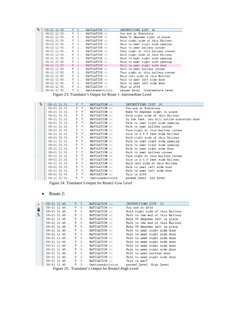
Figure 23: Translator’s Output for Route 1- Intermediate Level
Figure 24: Translator’s output for Route1-Low Level
• Route 2:
Figure 25: Translator’s Output for Route2-High Level

Figure 26: Translator's output for Route 2- Intermediate Level
Figure 27: Translator's output for Route 2- Low Level
• Route 3:
Figure 28: Translator’s Output for Route3-High Level

Figure 29: Translator's output for Route3-Intermediate Level
Figure 30: Translator's Output for Route3-Low Level
This chapter talked about the translator component. This component is responsible to convert the path planner output into meaningful routing instructions. The first section presented the pseudo code for the algorithm. The second section provided an example of the algorithm output. The next chapter provides information about the testing process and results.


Chapter8 Testing
8.1 Procedure There were eight blind users (P6, P7, P8, P10, P13, P14, P20, and P21) who participated in this testing process. P13 is totally blind in the left eye, and legally blind in his/her right eye. He/she used to have sight in his/her right eye but lost vision over time. He/she uses the white cane in unfamiliar places. P14 has been blind since his/her 20s. He/she used to be a telephone operator and depends on a seeing-eye-dog for navigation. P21 has been blind since birth. P20 has limited vision while navigating. He/she can detect things such as signs, but particularly needs his/her cane for curbs and other obstacles in the way. He/she has a very limited tunnel of vision. P10 is a 77-year old who is very accustomed to using a cane to navigate, and expressed many reservations about the utility of a technology-based navigation aid. Some of the users, such as P8 and P14, are technology oriented. Others, such as P10, P13 and P20, didn’t seem to be very technology oriented. P10 thinks switching to a technology like the Android phone would be an enormous change. P13 does not currently use voice input options on his/her cellphone. P20 never used a touch screen, smart phone, or something like the Talking Dialer. Even though the project involves all of these technologies, the user is very enthusiastic and optimistic about the project and interested in participating in future user testing. Table 8 lists the technologies that the participants use. Technology iPohne N-95 with
“Talks” Regular phone
1-800-TELL-ME for GPS navigation
Verizon Haven
Participant P8 P14 P10, P13, P20
P13 P20
Table 8: Technologies adopted by the participants The testing was conducted by a number of people in the NavPal team. The testers or observers were handed a testing guide that involves information about the testing goals, the testing process, the tools needed, things to explain to the user about the application, the observations that need to be noted during testing and questions that should be directed to the user. The main goals of the testing process were to test the interface usability and the quality of the instructions provided. For the first testing session, the user was asked to try out all the interface components. The observer took notes and asked the user questions about the components. The interface was modified according to feedback given by users throughout the testing process. Table 9 presents the modifications made to the interface in the gestures and other aspects of it. For the second testing session, i.e. to test the quality of instructions, the user was asked to follow three routes using directions provided by the interface. The users used different levels of
instruction details for the different routes. The observer took notes on what mistakes happened by the user or the interface, what confused the user, and what worked well. The observer also directed questions to the user about the instructions and what needs to be improved.
Version #
Gestures Defined Other Modifications Users who tested this interface
Other comments
1 - next: “>” - previous: “<” - repeat: semi-circle - all: “—“ - back: “^”
- Gestures view was displaying instruction in text format as well on the upper part of the screen. - flat buttons with vibration feedback only
P6, P8, P10, P21
The text was taking space from the gestures drawing space.
2 Switched repeat and all
- removed text from Gestures view - added audio feedback to flat buttons - gave more audio feedback as views switch
P7
3 - next: “—“ - previous: “—“ - repeat: “S” - all: semi-circle - back: “^”
-
P20, P13, P14 Next: left to right “—“ Previous: right to left “—“
Table 9: Code Versions Updated throughout testing phase
The testing took place at Newell Simon Hall (NSH), Carnegie Mellon. The routes were hardcoded since the system is not integrated yet with the appropriate map representation, path planner or localization components. Figure 21 presents the three routes used in the actual testing, which are in Floor A of NSH. The user was asked to follow a trial route, inFigure 31, prior to these three routes to get familiar with the interface usability to switch over instructions and to get familiar with the audio and tactile feedback. The trial route took the user from Floor 3 and down the elevator to Floor A to start the actual testing.

Figure 31: Trial Route in Floor 3 of NSH
For the first session, which is about the interface usability, the following observations were recorded by the tester:
• Use of virtual buttons: How many times did user confuse and press wrong one?Did the vibration pattern help the user recognize the mistake?
• Which vibration patterns were easily identifiable by the user and which patterns were difficult to distinguish?
• How many times the user draw a gesture, but the interface did confuse it with another gesture?
• How many times did the application crash? • How many times wasn’t the user able to recognize which view he/she is at
currently (i.e. after the views switch)?
In the first session as well, the following questions were directed to the user about the different components of the interface:
• What items in the Main Menu were not clearly worded? • Is there any other navigation task that would be helpful to add to the Map
Menu? • What other destinations in a school setting did the user expect to find but did
not? • What challenges did you find with the voice recording to add a new
destination? • Do you have any suggestions for a different accessible way to allow the user
to add a new destination? • Do you think this input modality (voice recording) would be preferred by
many blind users?Will they be comfortable recording when there are other people around?
• Are the patterns with the same number of vibrations distinguishable from one another (i.e. if they are not presented to the user together where it is easier to feel the difference)?

• We have defined around 18 vibration patterns now for the instructions. Do you think 18 is a lot for someone to distinguish and remember?Could you suggest a logical limit for the number of different patterns?
• Do you have other suggestions for Gestures? (Could be either changing one of the existing gestures, or defining a new one to do another operation with instructions other than get next, get previous, repeated, entire route)
• What Other Landmarks do you recommend adding to the default list of landmarks?
• Is the directions menu sufficient for the user to specify where the landmark is relative to the user’s position?
• Is there anything, other than direction, that would be useful for the user to specify about the landmark?
• What challenges did you face using the Talking Dialer [adding a number, adding a symbol, deleting a number, confirming input]
• What challenges do you think the user could face when trying to estimate the distance to an obstacle?
• What other suggestions do you have for a feasible way to estimating the obstacle’s location?
• What challenges do you think the user could face to figure out/estimate the width and height of obstacle?
• What other suggestions do you have for a feasible way to estimating the obstacle’s width and height?
• What challenges did you face using the modified Talking Dialer to enter numerical input? [adding a number, deleting a number, confirming input, finding the # symbol, etc]
• Which automatic views switching the user thinks do not make sense or are not expected?
• How many times did the user find difficulty switching between the different views (for example tried to get from one view to another but couldn’t)? Which Views?
• Which Output Modality is the user most comfortable with (audio, tactile) • Which Input Modality is the user most comfortable with? • Audio Feedback Clarity (i.e. voice clarity) • In what parts of the interface did the user expect feedback or announcement of
some sort but did not get it? • What were the primary challenges in using the device? • What did the user like most about the device’s interface? • What are the user’s main suggestions for improvement?
For the second testing session, which tests the quality of the instructions, the following observations were recorded for every route separately:
• Got to Goal? • Travel time (minutes/seconds) • Number of times got off-track (i.e. wrong turn) • Number of times did not find landmarks/contextual information described • Number of times miscounted doorways, hallways, etc. • Number of times repeated the same instruction more than once.
• Number of times the instructions did not match the current situation for the person while the user is still on the correct route track (for example, the instructions mentioned a landmark or a doorway that did not even exist)
• Number of times the instructions did not orient the user in the right angle/direction throughout the route
And the following follow-up questions were directed to the user:
• What other landmarks did the user come across and was not mentioned by the interface and are necessary to add?
• Did holding the phone in hand while navigating keep the user from using his/her hand to get tactile feedback about the environment?
• Do you think the low level instructions give too many details? • Did you get confused between additional landmarks and contextual
information that is additional, and the main navigation instructions? • Do you think the High Level instructions had too little details that make it
challenging for someone in a new environment? • If you were to define three levels of details for instructions, how would you
define the details at each level?
8.2 Results
8.2.1 Interface Usability
The results information is presented based on the component of the interface it relates to. Suggestions for enhancements or fixes in the interface are presented in the following chapter.
•
Different users had issues with the virtual phone buttons. The main complaint was that the users would hit the phone buttons by mistake, while drawing gestures or while using the trackball. Hitting the buttons altered an undesired behavior. P6 often pressed the search button by mistake and P20 often hit the home button and required assistance from the observer to get back to the application view. P20 often confused the main menu and home buttons. P21’s fingers often rested on the screen and hit extra buttons and often dragged second finger and hit extra buttons. Also, when trying to find the trackball, the user triggered other buttons.
Using Phone Virtual Buttons and Trackball
Different users expressed their desire about having the buttons tactile. P6 thinks that he/she prefers having the buttons raised, not flat. He/she says that he/she is a very tactile-oriented person and the advantage of tactile buttons is that they are not touch-sensitive. As presented in Figure 32, a tape was put on the phone buttons to make them easier to locate. This was present for all participants except P6 and P8. Based on participants’ feedback, the tape was useful to overcome the discomfort P6 and P8 felt with the flat buttons.
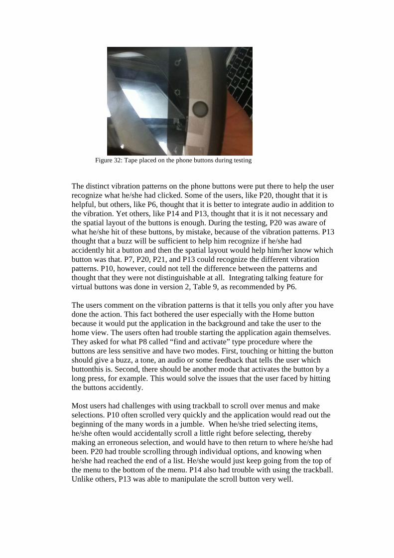
Figure 32: Tape placed on the phone buttons during testing
The distinct vibration patterns on the phone buttons were put there to help the user recognize what he/she had clicked. Some of the users, like P20, thought that it is helpful, but others, like P6, thought that it is better to integrate audio in addition to the vibration. Yet others, like P14 and P13, thought that it is it not necessary and the spatial layout of the buttons is enough. During the testing, P20 was aware of what he/she hit of these buttons, by mistake, because of the vibration patterns. P13 thought that a buzz will be sufficient to help him recognize if he/she had accidently hit a button and then the spatial layout would help him/her know which button was that. P7, P20, P21, and P13 could recognize the different vibration patterns. P10, however, could not tell the difference between the patterns and thought that they were not distinguishable at all. Integrating talking feature for virtual buttons was done in version 2, Table 9, as recommended by P6.
The users comment on the vibration patterns is that it tells you only after you have done the action. This fact bothered the user especially with the Home button because it would put the application in the background and take the user to the home view. The users often had trouble starting the application again themselves. They asked for what P8 called “find and activate” type procedure where the buttons are less sensitive and have two modes. First, touching or hitting the button should give a buzz, a tone, an audio or some feedback that tells the user which buttonthis is. Second, there should be another mode that activates the button by a long press, for example. This would solve the issues that the user faced by hitting the buttons accidently. Most users had challenges with using trackball to scroll over menus and make selections. P10 often scrolled very quickly and the application would read out the beginning of the many words in a jumble. When he/she tried selecting items, he/she often would accidentally scroll a little right before selecting, thereby making an erroneous selection, and would have to then return to where he/she had been. P20 had trouble scrolling through individual options, and knowing when he/she had reached the end of a list. He/she would just keep going from the top of the menu to the bottom of the menu. P14 also had trouble with using the trackball. Unlike others, P13 was able to manipulate the scroll button very well.
•
All users thought the navigation menu had all tasks that they think they will need to do during navigation. However, some users thought some items were not clearly worded. “Load Building Map” was not clear to P21, P20, and P7. For P21, “lockers”, “hold”, “up”, “railing”, and “Add an Obstacle” all were not clear.P8 and P10, however, thought that all items were clearly worded. P6 likes that “Add an Obstacle” and “Add a Landmark” were two separate menu options. Some of the users thought it was not clear because of the Text-To-Speech (TTS) pronunciation. For P14, “Add a Landmark” sounded like “Angle Landmark” and “Steps” sounded like “Skanks”. Also, P7 and P13 commented that the word “Add” sounded like “At”.
Navigation Main Menu
•
Specifying Destination
The participants suggested some modifications to the menu items. P6, P8, and P13 suggested changing the word “Toilet” to “Bathroom” or “Restroom”. P6 commented that it needs to be two items “Men’s Bathroom” and “Women’s Bathroom”. P8 suggested changing the word “Other”, which was used in version 1, to “Add a Destination”. This change was done in version 3, Table 9.
Participants also suggested adding other destinations that usually exist in a school setting. P10 suggested adding Cafeteria, and other classrooms. P13 suggested adding Vending Area, Food Area, and Water Fountains. P14 suggested adding Bookstore, Exit, Elevators, Stairwells, a “quiet room”, Break Room, Supply/Copy Room. P7 suggested adding Gymnasium, Stairs, Lounge Area, Water Fountain, Dormitories, and Elevators. P21 suggested adding names of specific buildings, dorms or locations. P8 suggested adding Elevators, Exits, and Entrances. He/she mentioned that it is good to add labeled exits. They could be labeled with the side of the street they are at, for example.
Most users thought that using voice recording is the most effective input method for adding a destination or a landmark. P6, P21, P14 thought that it is better than typing. P7 thought the “process was simple” and P14 thought that is was “pretty smooth”. P20, P13 and P7 thought that this method is used and familiar and will be preferred by most users. Unlike all others, P10 thought that he/she would not feel comfortable recording when there are others around. He/she also commented that voice recording might be an issue outdoors or in an environment where there is a lot of ambient noise where the device “could go bonkers”. He/she suggested using a direct microphone for these situations. The volume of the recorded audio file was an issue to some users. This issue is actually more of an android platform issue than an application issue. P20, P14 and P21 thought it was too quiet. P21 suggested having the instructions for voice recording ask the user to speak loudly. There are two other issues that some participants faced with voice recording process. P20 and P21 hit the register button twice by mistake before starting to record. The first click started and the second stopped the recording immediately.

This may come back to the sensitivity of the touch screen versus the tactile buttons that the users are used to. P10 suggested having a way, like a gesture, to ask the device to repeat the instructions again. This is for the instructions that are voiced for every view when it starts on what the view is about and what the user needs to do with it. Some participants suggested other accessible ways to give text input. P13 suggested using an accessible virtual keyboard. P7 suggested using Braille and commented that it is a common input method but is expensive. This is to make the device accessible to deafblind as well. •
Getting Directions
As Table 9 shows, the gestures went through two changes based on users’ feedback. Initially having the “_” gesture for “all” command annoyed participants because it is an easy-to-produce gesture. Once the user accidently produces it, he/she does not have a way to stop it. In the second version and based on P6 suggestion, “all” was switched with “repeat” because the semi-circle was harder to produce than the straight line. P8 and P14 suggested adding a way to interrupt or stop the “all” option and tell the phone to “Shut up”. The initial next “>” and previous “<” gestures introduced issues for participants. P8 usually drew more curved shapes “(” or “c” than the sharped shapes, but the application was still able to recognize it. P21 also had lots of trouble making carets, “<” and “>”. P7 thought these two gestures were hard to draw and suggested line swipes, left, right, up and down, instead. P8 suggested simpler line swipes that can be produced in a singular method. P6 also thought that straight lines would be better. For the third version, the “<” and “>” gestures were changed for simpler gestures because these gestures are used the most during navigation. Straight horizontal line, left to right, corresponds to “next” and right to left corresponds to “previous”.
Some participants still mentioned issues with the current, third, version of gestures. P20 could not get the “S” shape to register correctly and had some trouble with the circle and the caret. He/she mentioned that the “S”, caret and circle gestures could cause particular problems for those who had been blind since birth. They may have decreased ability to draw letters and characters because they had never seen them or had them described. Spatial concepts can vary for these users. The caret functionality could be substituted with the back button and this is what users did when they had trouble drawing it. P13, however, learned the gestures very quickly, and had no trouble getting the phone to recognize all five gestures. P13 and P7 mentioned that the whole circle is easy to draw. The main issue participants had with the gestures is that they need to use both hands, which makes them stop every time they need to draw a gesture. They are holding the phone in one hand and the other hand is for using the cane and sensing the environment. Gestures, like next command, which are used a lot during navigation need to have a one-hand technique or thumbing gesture for easier use with the cane. For this, the users gave different suggestions for one hand operations. P8 suggested shaking and orientation gestures. P13 suggested just a

press rather than a swipe. P21 said it should be a one touch stroke. P7 suggested touching left or right side of the screen for previous and next respectively. P6 mentioned that the interface could simulate a simple button input with the touchscreen. He/she said 90% of time you will be requesting the next direction, so maybe even just having your finger on the screen could be the default, and then if you want to return to previous steps, that’s where the gestures can come into play. Some Participants had issue with where they were drawing the gestures. In the first version, the view had text displayed in the upper part of the screen which took some of the space needed for drawing gestures. If the person draws part of the gesture over the text, the application could not recognize it. This text was removed in the second version to have the entire space available for gesture drawing. Also since the phone is all flat, P21 was going too high on the screen or sometimes would extend the drawing down and hit the phone buttons accidently. He/she thought having a phone case would be useful for guidance to indicate edges of the screen and to guide the fingers. He/she also suggested allowing the user to draw gestures at designated place on the screen. P10 had a similar issue and suggested having marks on the side of the screen to let you know if drawing goes too high.
Participants suggested further modification to the last version of gestures. P14 suggested new shapes for gestures, like a clockwise and counter clock wise gestures. P14 needs a “where am I now” gesture and a way to tell the phone “shut up”. P6 is interested in being able to customize gestures according to his/her preferences.
• Participants recommended some modifications to the list of landmarks. P6 recommended saying “Escalator” instead of “Escalator Sound”, “Carpet” versus “Tile” on the floor, and open doors and open areas versus narrow areas. P8 suggested adding “Carpet”, “Protruding Sign”, and “Ramps”. He/she thinks also the word “Column” is unclear and “Pillar” needs to be used instead. P13 likes adding vending machines/ice machines as landmarks. P14 recommended adding a three- or four- way- intersections, open stairwell versus encased open areas, like a lobby, and ice makers, like in hotels. P7 would add Stairs, Elevators, and Carpet. P21 would add wide/small openings. Most users thought the four directions menu was sufficient to describe the landmarks location relative to the user’s location. P6 suggested considering additional directions, like “angled to the left/right”. P10 suggested referencing a landmark in terms of other landmarks, like “top of steps” for example. P14 recommended specifying if the landmark ramps up/down.
Adding a Landmark
Participants gave different ideas for other information to store about landmarks. P14 suggested adding information about the sound a landmark may make. P21 recommended recording obstacles or long sloped hallways. P6 had an idea about recording annotations about landmarks, like “carpeted hallway”. P8 and P13 suggested organizing landmarks into submenus. P8 suggested, for example, having a submenu for floor texture. P13 mentioned smells as an example,

especially for deafblind users who would want to record different several specific smells (Christmas trees, coffee, flowers, etc.). According to P13, adding submenus could be true for all categories. Users had different additional comments about the landmarks list. P13 liked that the list included floor and wall textures, smell, and elevators, and gets the difference between the fountain sound and drinking fountain. P10 mentioned that the designers should blindfold themselves and then test it. Because in actuality, or on a practical level, some of these things, like floor textures, are not going to be useful information coming from a device. He/she also commented that something like “railing on the wall” would really only be in hospitals.
Some users experienced issues with understanding the TTS pronunciation. “Water fountain sound” was hard to understand for P8. P8 and P10 thought audio for and “Steps” was unclear. P13 thought audio for “Column” was unclear.
•
For specifying distance to an obstacle, participants had different opinions. P10 did not know why, or in what situation, would someone enter an obstacle that is four feet away, for example. He/she thinks that you run into an obstacle, so realistically, it should always be “right here”. He/she didn’t think the “Number of feet away” option made logical sense. P7 suggested using the number of steps/paces as a distance measurement tool. This is something he/she currently does on occasion.
Participants had few comments about difficulties they could face while trying to estimate width and height of obstacles. P6 commented that an object might not be square or rectangular or it might be a Christmas tree or a coat rack, which would be hard to evaluate its dimensions. P8 said that with regards to the “protruding sign” landmark, many objects are not simple width-by-height regular objects and the problem is that the protruding area might not be detectable with a cane at ground level. It has a smaller base than the rest of the object. P10 had pointed out that many blind people have very poor concepts of estimating sizes. He/she is concerned that estimations would be very inaccurate, and would vary by individual judgment. He/she pointed out that if these obstacles are going to be shared with other people, then there could be a lot of problems. P20 thinks that specifying dimensions would have to do with the user’s amount of vision. P20, who has limited vision, would scan left to right, but said that if someone were totally blind, he/she would have no idea. This was complemented by P7 who indicated a poor personal ability to estimate size/distance and that he/she is not good at judging feet and inches for distance. P13, however, did not think specifying dimensions would be an issue. P8 suggested adding dimensions in “Chest Height” or other qualifiers as opposed to specific dimensions. P7 also thought “Head Height” and “Chest Height” might be good qualifiers. P14 thought “Overhangs” could be used for estimating dimensions.
Adding an Obstacle
There is additional information that participants suggested recording about obstacles. P6 recommended recording whether the obstacle is wider at the top or base. P8 wants to be able to mark an obstacle as “Blocking” or “Non-Blocking”
the current path of the user, i.e. “Navigable” or “Non-Navigable”. P13 would like to be able to record a description of an obstacle, which might be ultimately more useful than the numerical designations. For example, for outdoor navigation, if there is construction on a route, he/she would just want a recorded description. P13 also would like to add “Above” to the four directions menu.
Most participants experienced challenges with using the Talking Dialer especially ones who are not very technology oriented. Participants had a number of dislikes about the Dialer. Even though P6 thought the dialer was pretty standard, he/she still thought that it was very sensitive. P8 commented that the dialer was not locked to a portrait orientation which made it difficult to use when it switched layouts. He/she also thought that the fact that a random tap automatically means that the user must input a number (and then delete it) was somewhat annoying. P14 did not think using the dialer was fast enough. P21 kept going off the sides of the screen while trying to select numbers. He/she wanted to have the phone and get comfortable with the dialer before having numbers actually register. P6 and P10 sometimes accidently chose the wrong number or hit phone buttons because of the Dialer’s sensitivity. P10 often had several fingers hovering close by and would thus accidentally select the wrong number. He/she got overloaded and frustrated while using the Dialer and was unable to master it during the testing session. P13 however was able to pick it up after a little bit of difficulty and did pretty good. P8 also liked the shake to delete numbers and P6 thought the dialer was pretty standard. Due to these challenges, participants suggested having a fixed orientation dialer. P8 has an iPhone and preferred the numbers to be in the same place each time. He/she indicated that this allows for much faster and easier input as it is relatively easy to remember the positions of the numbers with time. P7 also preferred a fixed dialer. P21 did not like the fact that the finger must start in the middle.
•
Participants agreed on a logical limit of 10 vibration patterns. P21, however, commented that the current menu is good considering the amount of information that need to be used. Participants agreed on that it is just a matter of familiarity and with time would be able to recognize the different patterns. P7 said it might take him several hours to gain more familiarity with the patterns. P6 said that he/she wouldn’t be able to memorize them, at least not in a short amount of time. P10 and P13 agreed on that this number of vibrations would be hard to distinguish, especially if the user is walking in traffic or if he/she is lost and anxiety kicks in. Participants had some challenges in distinguishing some patterns from each other. P8 thought the patterns were too close to each other. P13 found the different patterns quite hard to distinguish. Discerning the differences between “Door”, “Connector”, and “Opening” was very difficult. P14 thought there was a very little difference between “Left” and “Right”. P7 couldn’t easily distinguish between all of one type, but could easily tell short/long as well as one/two/three vibrations.
Vibration Patterns
Participants also suggested ways for making the patterns more intuitive. P6 gave an example of using intense and soft contrast. For example, algorithm could use intense and soft for a long hall, or little then strong for a turn right, and conversely, strong and little for turn left. It could also use a long pulse for “hold right,” a soft then strong signal for “turn right”, and conversely, a strong then soft signal for “turn left”. P13 prefers a directional buzz. If you needed to turn left, maybe it could buzz on the left side or mimic a left arrow by buzzing on right side and then top. This is kind of drawing upon the idea of embossed maps, which many blind people use. He/she also suggested for an open door, maybe it could click or have something sharper or more “knock-like” than just a buzz. He/she also said that the device should “go crazy” for obstacles-- something more like the vibration pattern for “Warning.” Also P14, P7, and P10 all thought the “Warning” pattern was distinct and obvious. Participants also had further comments on the patterns. P6 would be interested in customizing his/her own patterns. P8 mentioned that it is good to have the tactile feedback in addition to audio feedback for those who prefer tactile. P20 pointed out that this would be useful for deafbline people. P20 and P21 would not personally use the patterns and cannot navigate on the vibrations alone. P6 suggested incorporating tactile elements as well, similar to Opticon which uses pulsating fiber.
•
Participants had similar preferences for output modalities but their opinions varied more about the input modalities. Seven out of the eight participants listed audio as their most preferred output modality. P7 listed tactile or Braille as the preferred output modality, especially in a noisy environment. P20, P21 and P8 listed voice recording as their preferred input modality. P7 preferred button input but also liked voice recording. P6 liked voice recording and gestures. He/she thinks gestures would be more suitable in a noisy environment. P10 and P14 prefer gestures as well. According to P10, gestures were doable and said that he/she felt pretty comfortable using them and that they were “very easy to do”. P21 commented that gestures are like asking sighted users to draw braille figures. For the audio feedback provided by the device, as mentioned before, users thought some words were not pronounced clearly. Five participants evaluated the audio quality as “Good”. P10 listed it as “Fair”, P13 as “Pretty Good” and P20 as “Very Good”. P8 would like a different TTS voice. P13 also prefers a male voice even though, as he/she said many males tend to prefer a female voice. Voice selection could be made customizable by letting the user choose a voice from a menu during a set-up phase. It could be a matter of getting familiar with the voice. P20 pointed out that, even within testing session, he/she became more familiar with the tone and timber, and became more responsive to cues. P6 and P13 liked the fact that the volume could be customized. P6 mentioned that he/she would be open to headphones or maybe a built-in microphone to help with voice recognition, but regardless, he/she still needs to be able to hear, so at least one ear has to be open.
Input/ Output Modalities

•
As mentioned in the previous sections, the main challenges that the users faced were with the gestures, Talking Dialer, scroll ball, and sensitivity of the phone. The main issue with gestures was that the users needed to have one hand free for using cane and sensing the environment. The sensitivity of phone buttons and the screen was an issue for users,especially the ones used to tactile buttons. P20 and P21 mentioned that real buttons are preferred by most users, and they would be more comfortable ifthey were able to locate their point of orientation through tactile landmarks.P6 mentioned that this could be just a matter of getting used to the phone. P20 as well mentioned that this could be because he/she has never used a smartphone, a touchscreen or anything similar to the Talking Dialer.
One of the issues that P6 faced, but was fixed in the second version of the application, was missing audio feedback at view switching and confirmations on user’s actions. P6 was confused if whatever functionality he/she had just tried to perform had gone through. During later tests, participants pointed out that they did not have any issues with view switching. P7 pointed out that the views had logical transitions. P10 was happy with the audio feedback. P8 indicated confirmation vibration was very clear for voice recording button clicks.
Other General Dislikes
•
The participants commented about different things they liked about the interface. P6 and P7 like the idea of vibrations for noisy environments but would have to get used to them. P7 liked vibrations in addition to audio feedback for the phone buttons. Participants P6, P8, P13, and P7 liked the menus and thought they were very logical and well laid out. P8 thought they were very easy to understand and follow. P6 liked the adding options in the menus. P13 also liked the list of landmarks. P6 liked having the different input modalities currently in the device. Participants P10, P13, and P14 liked the gestures. P13 thought the gestures themselves were very easy and they had a “0” learning curve. P10 said that gestures were do-able, could be helpful, and was relatively comfortable using them. The user was able to adjust to using just his/her thumb to draw the gestures during the route testing, allowing for more seamless travel in that he/she held his/her cane in one hand and phone in the other. Some participants also commented on the simplicity of the interface. P20 found the interface overall very simple to use, especially the straight lines for the gestures. He/she liked the simplicity of its operations, and how he/she didn’t have to deal with tons of buttons or a complex keyboard. P13 thought that navigating with the device was easy. P20 was overall very positive and optimistic and found a lot to like and that he/she would definitely like to buy something like this. P21 also commented that he/she would find app useful in unfamiliar areas or after hours, i.e. when strangers are not around to help.
Other General Likes

8.2.2 Navigation Instructions During this testing phase users were assigned different levels of instructions for the different routes to avoid bias in judging how the level of instructions affected the navigation experience for the user. Table 10 shows the level of details or verbosity assigned to the users at every route. The outcome of this random assignment puts participants into four different groups based on the level of details used in each route. P6 and P7 are in one group, P8 and P21 are in another group, P13 is by his/her-self, and the rest are in a separate group. All users went through the routes in the same order, Route1, Route2, and then Route 3. So the testing phase had a total of twenty four navigation tasks, eight at each level category.
User Route 1 Route 2 Route 3 P6 H I L P8 L H I P10 I L H P21 L H I P7 H I L P14 I L H P13 I H L P20 I L H
Table 10: The level of instructions selected for users to navigate the three different routes •
Confusing Features in the Routes
There are some features in the selected routes, especially Route1 and Route2, which introduced confusion to users during navigation. First, Route1 had an issue with inlets, as P10 mentioned. It has a number of openings, as depicted in Figure 21. For blind users, like P21, an opening could be confused with a hallway corner and both could be confused with an open door. This makes the users miscount sometimes. Also, the second opening which is at R001, which is a kitchen area, and the next one, which is a stairwell inlet, are close to each other. The wall separating the two is much shorter than how it shows in the map. This introduced confusion, as P8 and P7 noted. As was the case with P10, if the instructions ask the user to hold right side of the hallway and there happens to be an inlet, then the user could go all the way inside and get off-track. Second, Route 2 has a different issue. The end of the first hallway, that the user is at, has a lab door. This door is sometimes open and sometimes closed. If it is closed then asking the user to navigate to the end of the hallway, given that he/she holds the right side of the hallway, is easy. However, if the door is open then the user, as was the case with P21, would keep going into the lab and miss the hallway turn. Third, the final hallway in Route 2 has seven doors that the user needs to count to get to the destination. Fourth, Route2 had a hallway door that is sometimes open and sometimes closed. For P6, the door was open during navigation and when the instructions said “Exit Door”, he/she was confused. For P10, however, when he/she came to the glass hallway doors, which were closed, at first he/she was a bit confused. He/she thought he/she had reached the end of the hall but the next

instruction, which said it was a glass door, did help, and he/she was able to proceed through. As mentioned before, open doors could cause the user to miscount considering it an opening or a hallway. The third route did not have much of an issue for users.
•
Reaching Goal
Figure 33: The number of participants who made it to the goal in each Route
Figure 34: the percentage of success in getting to Goal using the application
Some participants had difficulty getting to goal. There are four cases where participants totally failed to get to goal. As Figure 33 shows, three of the cases were on Route1 and one was on Route2. For the three cases in Route1, one was with high level instructions, one was with intermediate level, and one was with low level. The one case in Route 2 was using low level instructions. Two of the cases were with P10 who, as the notes below, had issues switching over the instructions which put him off-track and the instructions did not match the current situation he/she was at. P10 kept navigating without using the next button, and he/she missed turns this way. He/she also misused the previous option, where he/she would choose and start follow instructions from a previous state that did not match his/her current status in the route. One final thing the observer noted is that the participant P10 was not really counting doors as he/she went along. All of these issues introduced confusion and made it hard to get to goal.
0
5
10
Route 1 Route 2 Route 3
Participants who reached Goal
SUM

83% of the navigation tasks went successfully but there are two things to note about this. For Route2 and Route3, P6 got to goal with some assistance of the tester. This takes off 8% of the 24 navigation tasks. There are also two cases, out of the 75% pure successes, in Figure 34 where the participants required a do-over due to some confusion. P8 got confused with a Hallway door.
Figure 35: Travel Time (minutes) for the 24 navigation tasks with the different instructions levels
Figure 36: The average travel time for the three routes
Route 1 Route 2 Route 3
Average 5.875 7.25 3.625
012345678
Tim
e in
Min
utes
Average Travel Time

Figure 37: The number of Navigation instructions for all routes at the three levels
The number of instructions that the user has to follow seems to have the main influence on the travel time. Figure 35 shows the travel time for the twenty four navigation tasks. The highest travel time was for P7 in Route2, but as we noted before that this was due to a do-over. P8 also had high travel time in Route 2, which again was due to repeating. Figure 37 shows the number of instructions in each route. It is clear that the average travel times, in Figure 36, correspond to the number of instructions in each Route. So Route2 in general has the most number of instructions. The same order follows for the average travel time of the three routes. There are two cases in Figure 10 where Route1 took longer time than Route2, but in these two cases again the number of instructions in Route1 was higher. The first case was Route1 with Low level compared to Route2 High level. The second case was Route1 with Intermediate Level compared to Route2 with High level. The Table, presented in Figure 37, shows that in both of these cases, Route2 had less number of instructions.
• The participants had different opinions about whether the High level had fewer details than needed to guide someone in a new environment. This level only considers Hallways’ intersections and openings throughout the route, except at the final hallway where the destination is. It gives door by door instructions. For this reason, P7 and P21 thought that this level looked similar to the low level in that it considered door by door. For P21, it was Route2 that had the Low level instructions. This route has seven doors in the final hallway. That is why it felt like so to the user. For P7, it was Route1 which has three openings, two hallway intersections, and three doors. Due to how the High level is defined, only one of the doors was skipped at this Level. This again made the participant feel this level is similar to the Low level. P6 Preferred the High level out of the three levels. P13, P20 and P10 agreed that this level of details is fine. P10 thought that this level was at least not any more difficult for the user than the intermediate and low level routes.
Regarding The Three Levels
For whether the Low level was very detailed, participants had different opinions. P6, P8, P14, and P10 answered “Yes”. P10 also noted that especially at this level of details, he/she got confused between statements that were instructions and those
Route1 Route2 Route3
High 15 12 13
Intermediate 17 20 13
Low 19 26 16
05
1015202530
The Number of Navigation Instructions

that were just pointing out a landmark. One thing P6 noted is that, at this level, the instructions should be combined because it becomes confusing to the user. For example, instead of having an instruction for every door, the instructions could say “walk to the nth
•
door”. P8, however, could see why these details are useful and noted that this is good to have for familiarization with new environments. P13, P21, and P20 all thought this level is fine. P13 actually liked the Low level instructions the best. P20 answered “No; not if this is what someone needed”. The users gave suggestions for how they would define the instruction levels if they had the choice to do so. P6 thinks the Low level currently has too many details. He/she would like the instructions to give the approximate number of steps to take before arriving at the next landmark. P21 suggested that High level should specify hallway length and width, and number of closed offices and open halls. P13 suggested defining only two levels, High and Low, and in both levels, he/she still wanted to be reminded about doors and steps. That is what he/she liked about the Low level, i.e. its details. He/she added that he/she would prefer the High level once he/she has gone through a route few times. However, after a few days when he/she is really used to the environment, he/she wouldn’t even need the High level instructions or the cane. P8 also agreed with P13 about when he/she would use the two levels. P8 also thought that having all the levels were necessary and good to have to meet various user needs. P21,P13 and P7 recommended switching the terms for High and Low. They think High indicates many details and Low indicates few ones. P10 said that, having used all three of the levels once, he/she just felt confused. He/she said that all three have so many issues that using those as a starting point, he/she wouldn’t really know how to define the three levels.
Participants were asked about landmarks that they came across but were not noted by the interface. P6 mentioned that the kitchen area was not noted in Route 1. Also P10 mentioned the kitchen and added to it inlets and stairwells. The instructions referred to these as an “opening” which confused the user. A way to fix this is to identify what the openings are for and inform the users. So for the kitchen area and the stairway openings, the instructions could be more specific. P21 mentioned that the instructions have to be more specific between doorways and openings. A user would confuse open doors with openings. P14 mentioned that he/she would like to know distance to landmarks in feet or meters.
Landmarks recommend adding
• Final Notes
There are some issues that the user had during using the interface for navigation. First, P10 kept navigating without using the next button, and he/she would thus miss turns, especially with the Low level, where the user went much faster than the instructions. Having a “look ahead” feature could help in this issue, where the user could detect how long they should navigate for before prompting the next instruction. P10 also had issue with the “previous” feature. He/she would choose previous instruction, but then follow that instruction from the step he/she was already at. I think it was difficult for the user to discern if he/she had gone too far,
or not far enough, so he/she didn’t know if the issue was that he/she was several steps behind the actual instructions, or several steps ahead. P7 wanted to operate the system faster than the voice allowed for. P14 thought that the level of instruction is not high enough for users with seeing-eye-dogs. For P6, the term “Turn Around” was not clear. He/she did not know if this meant “Turn 90 degrees” or “Turn 180 degrees”. The users had different requests for improving on the instructions. First, P6, P10, P14, P20, and P8 all noted the desire of having a “look ahead” feature. P6 would like to know how many steps to go forward, or else the low level instructions are going to be hard for him. While following Route3, P6 and P14 played several steps, one after another, before proceeding forward. In Route2, P14 listened almost to the whole route before proceeding, and completed route after listening to all instructions. P20, P10 and P6 all hit the “next” button several times in a row before proceeding, especially in the Low level, and it did seem to help in reaching the final destination. Second, P6 also really liked that the instructions said the one hallway was four-feet wide but he/she would still like to know how many feet or steps there are between different landmarks. Third, like P6, P8 wanted instructions to be combined, i.e. “Three right doors” instead of three “next right door” commands. Fourth, not giving names to doors or openings caused confusion to users. So maybe as a general note, if doors lead to more recognizable locations, such as bathrooms, or auditoriums, etc., it would probably be better to note (or annotate) as such rather than just “door,” even if it is only being passed by along the route. The participants had different opinions about whether holding the phone in hand was a barrier. P8 and P10 answered “No”. However P8 had to stop and move the cane in order to clear both hands to input the gestures into the app and get the next instruction. P10, on the other hand, was able to hold the phone and make gestures with his/her thumb. P21 and P20 had a Yes and No. For P21, once he/she began using thumb for gestures it was a No, but before it was a Yes. P20 did not express any complaints on this matter. However, the observer noted that each time P20 wanted to get next instruction he/she would stop, put his/her cane under his/her arm, and then use his both hands, one to hold phone and one to draw the gesture. So the user was still able to get tactile feedback from the environment, but the use of the phone did make travel stilted. P6 and P13 said “Yes”. P7 actually stopped using the cane and just used his/her hand to avoid the switch back and forth when using the application. Like issue with others, having to draw gestures, caused a lot of “start and stop”. The gestures that are used often, like ‘next’, have to be a one-hand gesture to keep the other hand free for the cane and sensing the environment. This chapter presented the testing procedure and results. The testing was conducted with eight blind users and was divided into two main parts. The testing involved first examining the interface components and was examining the quality of navigation instructions. The users generally liked the interface simplicity and the input modalities like voice recording and gestures. The users had challenges mainly with the sensitivity of the touch screen and having to use their other hand sometimes when drawing gestures. The chapter listed more specific details about the users’ feedback on the interface components, the instructions and the

navigation experience with the phone. The final chapter lists the future enhancements based on the users’ suggestions and feedback during the testing.


Chapter9 Conclusion This thesis work presented a mobile phone based navigation application for blind. The focus of the thesis work was on the interface part as well as translating the planned route into meaningful instructions to guide blind users. The interface tried to improve over previous work by providing higher quality instructions, without a lot of manual work, and allowing more flexibility for the user. This includes flexibility in selecting the level of details for the instructions, flexibility in tagging destinations, landmarks and obstacles as the user comes across them. The interface was tested with eight blind users who were assigned three navigation tasks each. Seventy five percent of all navigation tasks went successfully, where the users depended only on the device. The users gave feedback on the usability of the interface as well as the navigation experience and the clarity of instructions. The main challenge most users had was sensitivity of touch screen phone and lack to tactile buttons. The users gave suggestions for how to decrease sensitivity of the device to meet needs of the target group. The users also gave suggestions for improving different aspects of the interface and the navigation instructions.


Chapter 10
Future Enhancements There are additional enhancements or features that are good to add to this work but were not added due to time limitation or due to not having the full system components available to be integrated in the work. There are enhancements that need to be done for the instructions side and for the interface side. In addition the two lists below,there are further suggestions for enhancements presented in chapter 8 which need to be taken into account.
10.1 Interface
• Shortcuts: Blind users like shortcuts. The interface could add shortcuts or ways to get the user back to where he/she was quicker, if the user accidently it the wrong button.
• Help option: When users interact with an application through a screen, it is common for them to consult its help section. To save them from having to navigate from a particular view of the interface to this section, participant 2 suggested placing a help button in all views. This button would allow to directly access the related help. This option should also have troubleshooting instructions to guide the user in situations like when the application is non-responsive or crashes.
• Braille: The interface could be modified to support external Braille Display or Braille Keyboard. This is for users who prefer tactile input/output modality, as is the case with P7.
• Map view: The map view should be modified based on the map representation component to reflect different floors in a building and include different annotations that show the user’s location, destination and route. The interface could be enhanced to allow the user to select one of several maps in the set-up phase.
• Customizations:Add a way to customize TTS voice, vibrations and gestures based on the user’s preference. This could be achieved with additional menus that query the user about his/her preferences in the set-up phase.
• “Find & activate”: Provide some way to lock or make it more difficult (require a double click) to accidentally activate the virtual buttons at the bottom of the screen during navigation. It could be something like the “find & activate” method explained before.
• Obstacles: Adding obstacles could be modified to allow the user to select if the object is blocking or non-blocking. This information could be enough to help the path planner plan a navigable route. This information could also replace the width/height input options that could introduce challenges to the user or waste his/her time. The interface could also allow the user to record description of an obstacle.
• Menus: Like P13 suggested, the interface should sort all menus alphabetically in case the user wants to know if he/she is at the top or the bottom of the list.

Another suggestion by the users was to organize landmarks in submenus, in case the user wants to be more specific about a landmark.
• Input: The interface could use voice recognition to maybe filter out menu options or get input from the user. If there is an accessible virtual keyboard for blind, it could be integrated in the application to add one more useful input method.
• Gestures: The gestures need to be modified according to the users’ suggestions to make the navigation easier to handle with one hand.
• Vibration patterns: Take users suggestions into account to make vibration patterns more intuitive.
10.2 Instructions
• One of the instructions that was used in the ClickAndGo narrative maps is helpful to indicate to the user if has gone too far beyond where he/she is supposed to be. It is good to include a phrase like “If you {see/feel/find/..}…. it means you have gone a few steps too far”
• One of the things that could be of interest to include as contextual information would be informing the user about the location of the Braille tag or plate that has the name of the room.
• The instructions and landmarks presented in the interface could consider landmarks that the user could detect with his/her senses like smelling scents, hearing sound shadows, and feeling displacements of air.
• The instructions could include more information about doors. For example, the location of the push button, the place to scan the access card, the location of the call button where the user could get assistance.
• To remove confusions introduced by openings, the instructions should be more specific about and identify the openings, if they are a kitchen area or a stairwell opening, for example.
• User felt that the hallways were actually more than 4 feet wide. If users’ spatial perceptions are going to vary greatly, it might be better just to designate a hallway in more vague terms, like “wide” or “narrow.”


References [1]. Braille Institute of America. http://www.brailleinstitute.org/ [2]. Andreas Hub, Joachim Diepstraten, Thomas Ertl. Design and development of an indoor
navigation and object identification system for the blind. ASSEST’04. [3]. JoAnn Gardner. Seeing with Other Senses: Gardens for the Blind. The Herb Companion,
February 3, 2007. http://www.perkins.org/news-events/press/seeing-with-other-senses.html, last visit November, 2010.
[4]. R. D. Jacobson. Navigation for the visually impaired: Going beyond tactile cartography. Swansea Geographer, Vol. 31, pages 53-59, 1994.
[5]. Hideo Makino, Ikuo Ishii, Makoto Nakashizuka. Development of Navigation System for theBlind Using GPS and Mobile Phone Combination. 18th Annual International Conference of the IEEE Engineering in Medicine and Biology Society, 1996.
[6]. Jack M. Loomis, Reginald G. Golledge, Roberta L. Klatzky. Navigation System for the Blind: Auditory Display Modes and Guidance. PRESENCE Vol. 7, No. 2, Pages 193-203, 1998.
[7]. P. Blenkhorn and D. G. Evans. A system for Enabling Blind People to Identify Landmarks: The Sound Buoy. IEEE Transactions on Rehabilitation Engineering, Vol. 5, No. 3, September 1997.
[8]. Sandra Mau, Nik A. Melchior, Maxim Makatchev and Aaron Steinfeld. BlindAid: An ElectronicTravel Aid for the Blind. Robotics Institute Report, CMU-RI-TR-07-39, 2008.
[9]. Lisa Ran, SumiHelal and Steve Moore. Drishti: An Integrated Indoor/Outdoor Blind Navigation System and Service. PERCOM’04.
[10]. SegviErtan, Clare Lee, Abigail Willets, Hong Tan and Alex Pentland. A Wearable Haptic Navigation Guidance System. Second International Symposium on Wearable Computers, 1998.
[11]. Ruşen ¨Oktem and ElifAydin. An RFID based indoor tracking method for navigating visually impaired people. Turk J ElecEng& Comp Sci. Vol. 18. (2010): 185-196.
[12]. Vladimir Kulyukin, ChaitanyaGharpure, John Nicholson, SachinPavithran. RFID in Robot-Assisted Indoor Navigation for the Visually Impaired. IROS’04
[13]. Andreas Hub. Precise Indoor and Outdoor Navigation for the Blind and Visually Impaired Using Augmented Maps and the TANIA System. Proceedings of the 9th International Conference on Low Vision, 2008.
[14]. IliasApostolopoulos, NavidFallah, EelkeFolmer, and Kostas E. Bekris. Feasibility of Interactive Localization and Navigation of People with Visual Impairments. 11th IEEE Intelligent Autonomous Systems (IAS’10), 2010.
[15]. http://portal.acm.org/citation.cfm?id=1783789.1783813&coll=GUIDE&dl=GUID [16]. Freundschuh, S. M. and M. J. Egenhofer. Human Conceptions of Spaces:
Implications for Geographic Information Systems. Transactions in GIS, Vol. 2, No. 4, pages 361-375, 1997
[17]. http://www.opteksystems.com.au/mobilespeak.htm [18]. P. Bahl, V. N. Padmanabhan. RADAR: an in-building RF-based user location and
tracking system. INFOCOMM’00. [19]. K. Wendlandt, M. Berhig, P. Robertson. Indoor localization with probability
density functionsbased on Bluetooth. PIMRC’05. [20].
[21].
http://www.evengrounds.com/blog/electronic-mobility-devices-for-persons-who-are-blind-orvisually-impaired
http://www.google.com/phone/detail/nexus-one [22]. http://www.deafblindresources.org/whatisdeafblindness.html [23]. http://www.sense.org.uk/what_is_deafblindness/types_deafblindness/usher_syndro
me [24]. http://www.sense.org.uk/what_is_deafblindness/types_deafblindness

[25]. http://www.hknc.org/ [26]. M. H. Choudhury, D. Aguerrevere, Armando Barreto. A Pocket-PC Based
Navigational Aid for Blind Individuals. VECIMS’04. [27]. http://www.wpsd.org/ [28]. http://www.wpsbc.org/wpsbc/site/default.asp [29]. http://dotbug3.blogspot.com/2009/05/transporation-againg.html [30]. http://dotbug3.blogspot.com/2009/02/nose-saves-day.html [31]. http://dotbug3.blogspot.com/2010/05/battle-zone.html [32]. http://dotbug3.blogspot.com/2010/05/sensory-appreciation.html [33]. http://dotbug3.blogspot.com/2010/05/google-accessibility.html [34]. http://dotbug3.blogspot.com/2010/03/one-of-those-days.html [35]. http://dotbug3.blogspot.com/2010/02/information-disability-guest-discussion.html [36]. [37].
http://www.clickandgomaps.com/ http://www.clickandgomaps.com/narrative-maps
[38]. http://en.wikipedia.org/wiki/Tunnel_vision [39]. Tissot, N. (2009). Indoor Navigation and Localization for visually impaired people
the navigation layer. Institute for Pervasive Computing Report, ETH Zuric, 2003. http://www.mics.ch/SumIntU03/NTissot.pdf, last visited November, 2010.
[40]. R. L., Klatzky , J. R. Marston, N. A. Giudice, R. G. Golledge and J. M. Loomis. Cognitive load of navigating without vision when guided by virtual sound versus spatial language. Journal of Experimental Psycology: Applied, Vol. 12, No. 4, pages 223-32, December 2006.
[41]. Jaime Sánchez. Mobile Audio Navigation Interfaces for the Blind. Universal Access in HCI, Part II, HCII 2009, LNCS 5616, pp. 236-245, 2009.
[42]. [43]. Blind & Vision Rehabilitation Services of Pittsburgh. http://www.pghvis.org/, last
visited November, 2010
http://www.deafblind.com/dbequipm.html
[44]. http://www.techbridgeworld.org/ [45]. http://www.youtube.com/[46].
watch?v=zsv6yfswugc http://en.wikipedia.org/wiki/GPS_for_the_visually_impa
[47]. ired
http://www.rnib.org.uk/livingwithsightloss/travelandshopping/audioentertainment/Pages/mp3players.aspx
[48]. http://en.wikipedia.org/wiki/Mobile_S[49].
peak http://www.abledata.com/abledata.cfm?pageid=19327&ksectionid=19327&top=15
253 [50]. http://www.independentliving.com/prodinfo.asp?number=75[51].
6610 http://sales.freedomscientific.com/category.aspx?categoryID=
[52]. 13
http://www.afb.org/Section.asp?SectionID=4&TopicID=31&DocumentID=[53].
1283 http://www.americanthermoform.com/
[54].
http://www.abilityhub.com/vision/index.htm


![[reports-archive.adm.cs.cmu.edu] - Carnegie Mellon …reports-archive.adm.cs.cmu.edu/anon/anon/usr0/ftp/2004/CMU-CS-04... · Seeing-Is-Believing: Using Camera Phones for Human-Verifiable](https://static.fdocuments.us/doc/165x107/5b3626e67f8b9abc218e2b14/reports-carnegie-mellon-reports-seeing-is-believing-using-camera-phones.jpg)