Designing a Visual Dashboard to Make Public Health Data ...
16
Designing a Visual Dashboard to Make Public Health Data Accessible for Health Departments APHA 2017 Annual Meeting November 2017 Atlanta, GA Betty Bekemeier, PhD, MPH, RN, FAAN Principle Investigator, PHAST University of Washington Funded by RWJF #73270
Transcript of Designing a Visual Dashboard to Make Public Health Data ...

Designing a Visual Dashboard to Make Public Health Data Accessible for
Health Departments
APHA 2017 Annual Meeting
November 2017
Atlanta, GA
Betty Bekemeier, PhD, MPH, RN, FAANPrinciple Investigator, PHAST University of Washington
Funded by RWJF #73270
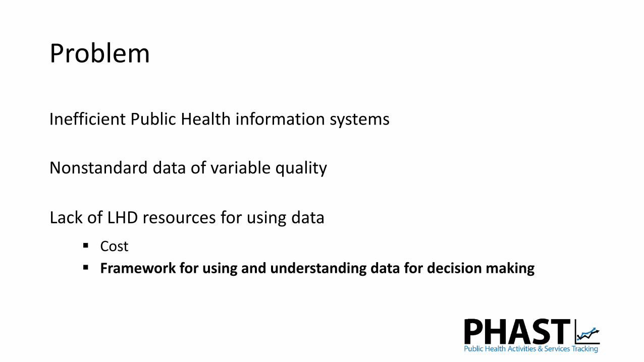
Problem
Inefficient Public Health information systems
Nonstandard data of variable quality
Lack of LHD resources for using data
Cost
Framework for using and understanding data for decision making

Problem

Part of the Solution
A dashboard that supports access to and understanding of data that can be compared across jurisdictions

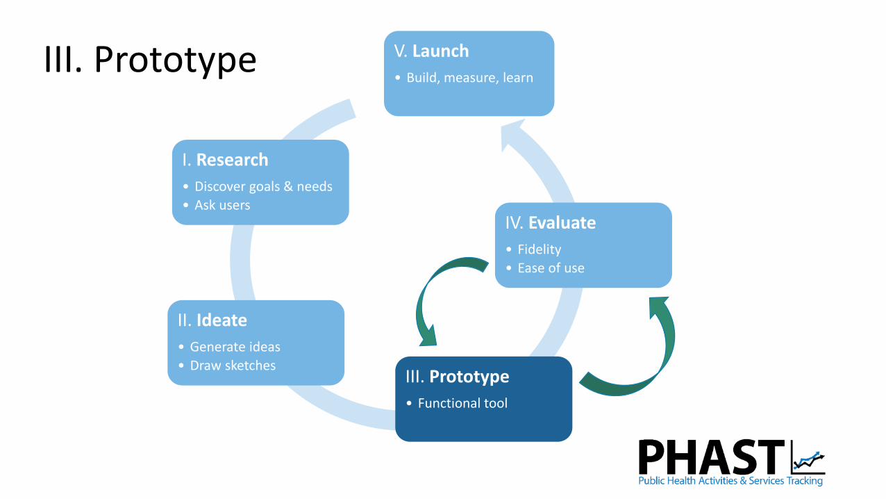
I. Research
• Discover goals & needs
• Ask users
II. Ideate
• Generate ideas
• Draw sketchesIII. Prototype
• Functional tool
IV. Evaluate
• Fidelity
• Ease of use
V. Launch
• Build, measure, learn
Method
User-Centered Design
source: http://lukaseiermann.com/rex.html#Process

I. ResearchDiscover Goals and Needs: Ask Users
45 minute phone interview with 14 public health practitioners
Qualitative analysis
Preferences specific to visualization features Simple
Easily understandable for non-technical audience
Comparison/trends over time
Ability to “drill down” into details
Mapping
Infographic: short summary of information
Moving into adapting more interactive visualizations

Purpose of Visualization
Understanding Understanding community health needs given limited resources
Produce reports, use screenshots
Program planning, evaluation, quality improvement
Communication Quickly create compelling argument for stakeholder/decision-makers
Justifying funding
I. ResearchDiscover Goals and Needs: Ask Users

PHAST Measures: Core Activities and Services
Communicable Disease Control
Chronic Disease Prevention
Environmental Health
Protection
Communicable Disease Control

PHAST Measures: Drill Down
Communicable Disease Control
Immunization
Enteric Disease
STIs
Tuberculosis
Childhood immunization completeness (community)
Childhood immunizations administered by agency (agency)
Confirmed vaccine-preventable disease cases (community)

II. Ideate
I. Research
• Discover goals & needs
• Ask users
II. Ideate
• Generate ideas
• Draw sketchesIII. Prototype
• Functional tool
IV. Evaluate
• Fidelity
• Ease of use
V. Launch
• Build, measure, learnIII. Prototype

III. Immunization Dashboard Prototype
Overview
Compare median levels of childhood immunization rates across states for all counties

III. Immunization Dashboard Prototype
Details
Learn more about a single state’s counties over time

III. Immunization Dashboard Prototype
Compare
Compare immunization rates for counties within and across states
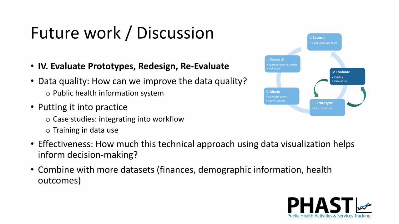
Future work / Discussion
• IV. Evaluate Prototypes, Redesign, Re-Evaluate
• Data quality: How can we improve the data quality? o Public health information system
• Putting it into practiceo Case studies: integrating into workflow
o Training in data use
• Effectiveness: How much this technical approach using data visualization helps inform decision-making?
• Combine with more datasets (finances, demographic information, health outcomes)

Thank you!
For more information visit www.phastdata.org
or contact us via email at [email protected]