"How to pick the right font and other considerations about (web) typography." por @voskoboinikova
Upload
truongnguyetCategory
view
219download
0
Typography in Publication Design
Designing a Devanāgarī text font for newspaper use Yashodeep Gholap, Independent Font Designer & Calligrapher, [email protected]
Abstract: In this paper, we describe a methodology used to design a new Devanāgarī typeface for
newspaper use. The main aim of this exercise was to find a balance between aesthetic and
functional requirements of newspaper text typefaces. It was designed intentionally for Hindi,
Marathi and basic Sanskrit. This typeface has been made functional keeping in mind today’s
requirement of economic printing and online usage of newspaper. Our design mainly focuses on
issues such as advantages and disadvantages of using modulated verses mono-linear typefaces for
text in newspapers, structure of Devanāgarī script, functional requirements of newspaper body-text
typefaces, aesthetic parameters of developed Devanāgarī type design, work process for developed
design, comparative analysis of developed design in terms of the economy of printing, legibility and
readability of characters, users’ aesthetic preference in letter designs, impersonal behavior of
characters and effective functionality for online usage i.e. e-papers.
Key words: comparative study of newspaper fonts, Devanāgarī typefaces, type design
legibility, economy.
1. Introduction
A newspaper is a scheduled publication containing news of current events, informative
articles, diverse features and advertising. It communicates authentic, unbiased and
transparent information. Type used for newspaper sets the tone and mood for its
communication with the readers and so this ‘voice’ of newspaper needs to be carefully
considered and crafted. Type plays a memorable role in newspaper design.
In Devanāgarī, fonts are differentiated in Modulated stroke fonts and Mono-linear fonts.
Currently, Devanāgarī newspapers are set in fonts like ITR Mitra, CDAC Surekh, Shree Lipi
701 for text and display sizes. Text fonts such as Surekh are derived from the Modulated
stroke approach of calligraphic writing.
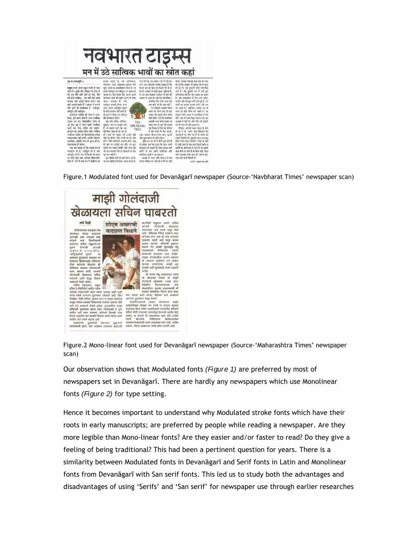
Figure.1 Modulated font used for Devanāgarī newspaper (Source-‘Navbharat Times’ newspaper scan)
Figure.2 Mono-linear font used for Devanāgarī newspaper (Source-‘Maharashtra Times’ newspaper scan)
Our observation shows that Modulated fonts (Figure 1) are preferred by most of
newspapers set in Devanāgarī. There are hardly any newspapers which use Monolinear
fonts (Figure 2) for type setting.
Hence it becomes important to understand why Modulated stroke fonts which have their
roots in early manuscripts; are preferred by people while reading a newspaper. Are they
more legible than Mono-linear fonts? Are they easier and/or faster to read? Do they give a
feeling of being traditional? This had been a pertinent question for years. There is a
similarity between Modulated fonts in Devanāgarī and Serif fonts in Latin and Monolinear
fonts from Devanāgarī with San serif fonts. This led us to study both the advantages and
disadvantages of using ‘Serifs’ and ‘San serif’ for newspaper use through earlier researches

in Latin, and hence decide on whether Modulated stroke font or Mono-linear font should be
designed for Devanāgarī newspaper.
2. Serif vs. San serif
Earlier research in Latin presents certain arguments in favour of Serif typefaces, and gives
reason as to why probably people prefer Serifs over San serifs:
1. Serifs are used to guide the horizontal “flow” of the eyes; the lack of serifs is said to
contribute to a vertical stress in sans serifs, which is supposed to compete with the
horizontal flow of reading. [De Lange, R. W., Esterhuizen, H. L., Beatty, D. (1993)]
2. Serifs are used to increase spacing between letters and words to aid legibility.
[Rubinstein, R. (1988); Sassoon, R. (1993]
3. Serifs are used to increase contrast (and irregularity) between different letters to
improve identification. [Reynolds, L. (1979)]
4. Serifs are used to bind characters into cohesive 'word wholes'. [Poulton, E.C. (1965)]
5. Readers prefer the traditionalism of body text set in serif typefaces, so they must be
more legible. [Lund, O. (1999)]
There are also some arguments in favour of Sans serif typefaces, these include:
1. Sans serifs are robust in nature and better at small sizes. Sans serif fonts are better
suited to survive reproduction and smearing because of their simple forms. [Morris, R.
A., Aquilante, K., et al. (2001)]
2. Sans serif is better on the web hence it can be better adopted for the online PDF’s of
newspapers (e-paper). [Poulton, E.C. (1972); Reynolds, L. (1979); Bernard, M., Mills,
M., Peterson, M., Storrer, K. (2001)]
These important arguments lead us to choose Modulated stroke approach for a font for
Devanāgarī newspaper. We also observed that reader’s preference and likeness in terms of
reading choice always differ. Readers like Mono-linear fonts as they look simple in terms of
forms and are readable. But when it comes to reading a Devanāgarī newspaper body text;
readers prefer Modulated stroke fonts.
This led us to following conclusions:
1. Devanāgarī newspaper should follow modulated text type approach:
Modulated text type face reflects the discipline, convention, tradition, something that to
be taken seriously. The root of this approach lies in our early manuscripts which are
calligraphed with the help of various tools like cut nib pen, brushes, stylus etc. Some
manuscripts didn’t have word spacing associated with them. Instead, various types of

punctuation and cantillation marks were used to show pauses and tones in reading. The
sentences were closed with ‘Danda’ mark. The use of thick and thin strokes in letters
enriches the beauty of complex Devanāgarī character forms. It is an old practice and
should be cherished in terms of type development.
Figure.3 Example of Sanskrit Manuscript (Source: ‘Arvachya Prachin Vibhag’ library, Thane)
2. A text face is not supposed to be noticed:
We read the article and the typeface disappears into the background. It’s not supposed to
draw our attention. A headline typeface on the other hand is meant to grab attention and
keep it. Headline typeface can be loud and expressive. But body text is where letters
comes in cluster hence irregularity in letters is necessary to improve identification. Here,
characters play a silent role.
3. Impression behind type or the subconscious impression it leaves with the reader:
All typefaces give the reader a certain feeling or impression. Most readers won't
consciously notice that the font is conveying anything more than the words on the page.
The robust and neutral typeface can also make a subconscious aesthetic impression. The
text in well designed typeface transmits complex intellectual and emotional messages in a
very concise and precise way.
3. Functional requirements for newspaper body-text
Font should be absolutely legible and readable- “Legibility is a rate by which a type
character can be identified” while “Readability is the ease of reading printed page or
message. It refers to arrangement of type. Readability involves design of total visual
entity, the complex interrelations among type, symbols, photos and illustrations”.
[Berryman, 1984, p.28]

Economy of the typeface in newspaper should be considered- Due to rapid growth in
technology and easy acquaintance with digital media; readers are exposed to various
sources to get the single information or news. Newspaper reading on internet or on
digital media like tablets or phones is much cost and time saving. This has affected the
economy of print media. The cost of a newspaper, number of pages, content,
designing, amount of advertising through newspaper, etc. are the factors which affect
the economy of newspaper. Hence it becomes important to test the efficiency of text
type to accommodate maximum content in lesser space.
Significant difference in reading pace of the reader- Consideration of reading pace in
type testing really matters in today’s fast life, where people really get any time for
newspaper reading or they hardly take some effort to go through a complete news.
Font should play the silent role and should not draw reader’s attention to the design- It
should give importance to the content rather than its form itself. Hence neutrality of
the font is very necessary.
Online usage of the font for e-paper should also be taken into consideration while
designing it- Due to rapid growth in digital and electronic media, an increasing amount
of text is being read directly from CRTs, LCDs and TVs. Corporate people, businessmen,
travelers always prefer to read news on their mobile screen, tablets or laptops rather
than investing an extra time with printed newspaper. Hence this rapidly growing era of
digitalization demands a newspaper typeface to be functional for its digital usage also.
4. Structure of Devanāgarī script in Modulated fonts
Calligraphic study of manuscripts helped us to understand the structural characteristics of
letters, flesh construction around the structure, axis for letters, contrast within the
character, loops, nodes, grey value or weight of characters, turns etc.
Figure.4 Character formations from their respective distinct linear structures
Study of basic handwriting and formal calligraphy led us to learn differences in structural
widths of different letters like र (Ra), क (Ka), छ (Cha), ळ (Lla) etc. In ‘Conceptual Model of
Devanāgarī Typefaces’ by Dr. Girish Dalvi, structure of letters are differentiated into Root
Letters and Derived letters, where it shows, ten letters अ, इ. ए, ख, त, भ, द, ध, थ, ष can
almost capture all the properties of remaining Devanāgarī letters. This character form
grouping has helped us in our font design process to develop characters sharing similar
structural properties in right manner.

Figure.5 Root letters and Derived letters classification and Visual example of Root letter इ.
(Source- ‘Conceptual Model of Devanāgarī Typefaces’-Dalvi 2010) The height and guidelines of Devanāgarī fonts are not completely defined by above and
below base matrā proportions. Several key letters, glyphs, conjuncts, diacritical,
vocalization and cantillation marks are required to set the vertical proportions. The
nomenclature used in the below image is defined by (Gokhale 1983).

Figure.6 Vertical proportions
5. Aesthetic parameters of our Devanāgarī type design
After studying the construction of Devanāgarī letters it further led us to fix on certain type
design parameters which would help us imbibe the above qualities and parameters for
Devanāgarī font design, which include, structural guidelines, letter nomenclature and
formal variations which were consolidated from (Gokhale, 1983) (Saynekar, 1996) and
(Dalvi, 2010). Based on our earlier study of forms and guidelines we fixed the design
parameters as follows: (1) Large kana-height (Base character height).
(2) Large inner counters.
(3) Setting the letter, word and line spacing by measuring widths of news-paper column
and frequency of number of words in one line of column so as to achieve a right
balance between base character height, length of the line and distance between
two lines.
(4) Moderate modulation in stem widths of the letter (considering the on screen use of
the font contrast within characters is kept lesser).
(5) Slightly condensed structure of characters to allow more text efficiency.
(6) Converting maximum frequently used conjuncts into Akhanda conjunct ligatures, so
that the right balance of counter spaces can be achieved in conjuncts also.
(7) Consideration of Hindi, Marathi and basic Sanskrit language while developing a
glyph set.
(8) Provision of design alternatives for peculiar forms.

(9) Development of font into 8 weights from Light to Black.
6. Font design process
We started our development with study of handwriting structure. This was a stepping stone
in the development. It helped us to analyze stroke variations in characters, their starting
and end points, joineries, balance in inner and outer counter space, achieving right
amount of grey value though character, word and line spacing, etc.
Figure.7 Handwritten paragraph in linear structure
We took the inspiration from Sanskrit manuscripts, calligraphic artworks, etc. and tried to
emulate such sample in Devanāgarī calligraphy by adding weight in structure of initial
paragraph with the help of cub nib tool. It gave us the right judgment of proportions of
stroke width to character height, optical balance in positive and negative space, etc.
Figure.8 Same paragraph in Devanāgarī calligraphy
During design process, the aim was to design a structure which has a modulated stroke but
experimenting with a newer formal feature which is unlike existing Modular stroke fonts.
The design which we arrived at was a hybrid between Modulated strokes and Monolinear
strokes; which looked Modulated but had lesser stroke contrast, had slightly inclined axis
with a condensed horizontal width. In order to achieve this, we required to have higher
base height to stroke width ratio. This was done to make it more functional for print as

well as screen. Below slide shows how linear structure of character and various interim
options in desired direction is worked out.
Figure.9 Character development and form progression As a part of a process, we studied the influence of calligraphy on font development of
modulated fonts like Natraj, Surekh and monolinear fonts like Yogesh and Firang. Also their
inter comparison to understand dependency of structures within character with character
widths, character heights, stroke widths to character height proportion, difference in
stroke widths within a character, character axis, balance of inner and outer character
space, etc. helped us substantiate our font structure.
Figure.10 Structural comparison with Modular and Monolinear existing fonts in Devanāgarī

‘Vertical proportions’ (figure 11) for our font are set considering base character height,
Vertical conjuncts, above base and below base matrā and cantillation marks. The x-height
and below base height is almost set same in proportion considering the vertical conjuncts
with below base matrā.
Figure.11 Vertical proportion of our font (Artha)
7. Comparison of font features
The below comparisons are some of the important features which define the
characteristics of a font. The terminologies for font features are defined by (Dalvi, 2010).
The ‘neck joinery’ can be identified in letters such as ट, ठ, द, ढ. It’s a junction where
neck and character stroke meets. Joinery can be angular or horizontal. In Yogesh, all ट,
ठ, द, ढ can be seen horizontal. In our font Artha, ट, ठ has angular joinery while द, ढ has
horizontal one (figure 12). This structural influence is taken from handwriting. It is an
authentic way to show such turns at joineries. Also angular joinery of ट, ठ helps to
make these characters more legible.

Figure.12 Comparison in Neck joineries
The ‘counter’ is the negative space seen in the letters such as क, व, ब. The Marathi and
Hindi nomenclature for counter is िववर (first recommended by Gokhale, 2004). Counters
could be of two types i.e. Close counters and Open counters. It is a said that open
counters increase the readability of the characters. But it could be just a matter of
choice. The closed counter character can still be readable depending upon how it is
designed. We have designed closed counter as it is authentic way of writing a character
(figure 13).
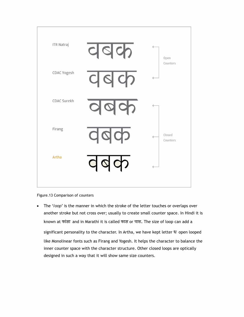
Figure.13 Comparison of counters
The ‘loop’ is the manner in which the stroke of the letter touches or overlaps over
another stroke but not cross over; usually to create small counter space. In Hindi it is
known at फांसा and in Marathi it is called फास or पाश. The size of loop can add a
significant personality to the character. In Artha, we have kept letter ध open looped
like Monolinear fonts such as Firang and Yogesh. It helps the character to balance the
inner counter space with the character structure. Other closed loops are optically
designed in such a way that it will show same size counters.

Figure.14 Comparison in Loop sizes and their formations
A ‘knot’ is the nature in which one stroke overlaps over another and transverses ahead
in letters such as म, इ, द. In our font, the size of knots is kept lesser (figure 15). This
design call was taken considering when font is used below 10pt, the knots should not
shout and should create an even grey. Comparison between Modular stroke ITR Natraj,
Monolinear Firang and Artha shows that moderately designed knots in Artha does not
shout at lower point size.

Figure.15 Comparison in knot sizes
As we can see in Figure 16, the ‘axis’ of each weight changes from less inclined to
more inclined on left side, from Light to Black weight. It helps to balance the inner and
outer counter space of each character with each weight without any expansion in
linear structure of characters. Also to retain the beauty of the typeface at bold sizes,
modulation between thick and thin stroke widths of the character increase with
increase in each weight. Hence Black weight shows maximum modulation while Light
weight show extremely moderate modulation in stroke widths. This show how just shift
in axis and modulation in stroke widths can create harmonious weights without

disturbing structure of the character. This also prevents an expansion of font while
working with bold weight.
Figure.16 Change in character axis with each weight 8. Font features of Artha
Important form feature of Artha is that, the joineries where circular strokes meet
vertical strokes are comparatively thinner. The outer curves flow inside towards
vertical terminals. In the below image, forms in dotted circles show details of these
curves. In all weights, thin strokes comparatively remain same while thick strokes show
significant width difference. Angular stress increases from Light to Black. The joineries
where two strokes create less than 30° angle has ink traps. Letters like अ, झ has ink

traps. In this font, all vertical, horizontal and angular terminals of characters have
smooth round curves. We have tried to retain as much of convention as possible while
introducing these experimental elements. This unusual approach in newspaper type
design let us think how far we can push typographic limits.
Figure.17 Letterform feature
Form and size wise difference between Nuktā, Bīndu and Purnavīram helps in improving
legibility. In our font Bīndu and Nuktā is diamond shaped while Purnavīram is in square
shape.
Figure.18 Difference between Nuktā, Bīndu and Purnavīram
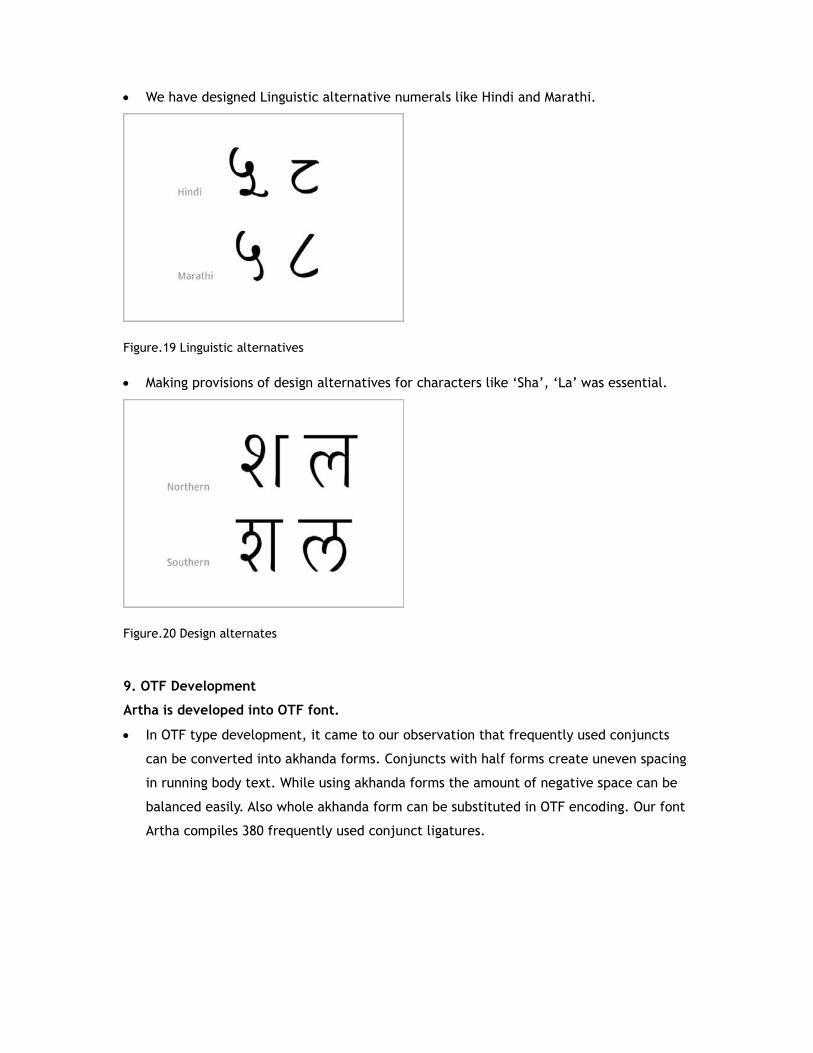
We have designed Linguistic alternative numerals like Hindi and Marathi.
Figure.19 Linguistic alternatives
Making provisions of design alternatives for characters like ‘Sha’, ‘La’ was essential.
Figure.20 Design alternates
9. OTF Development
Artha is developed into OTF font.
In OTF type development, it came to our observation that frequently used conjuncts
can be converted into akhanda forms. Conjuncts with half forms create uneven spacing
in running body text. While using akhanda forms the amount of negative space can be
balanced easily. Also whole akhanda form can be substituted in OTF encoding. Our font
Artha compiles 380 frequently used conjunct ligatures.
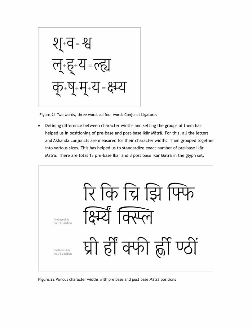
Figure.21 Two words, three words ad four words Conjunct Ligatures
Defining difference between character widths and setting the groups of them has
helped us in positioning of pre-base and post-base Ikār Mātrā. For this, all the letters
and Akhanda conjuncts are measured for their character widths. Then grouped together
into various sizes. This has helped us to standardize exact number of pre-base Ikār
Mātrā. There are total 13 pre-base Ikār and 3 post base Ikār Mātrā in the glyph set.
Figure.22 Various character widths with pre base and post base Mātrā positions

Artha is developed considering functional requirement of typing Hindi, Marathi and
Basic Sanskrit. The current Artha glyph set consist of around 700 glyphs which includes
independent Vowels, Consonant full forms, Consonant half forms, Nuktā full forms,
Nuktā half forms, Vowel alternatives, Consonant alternatives, Numbers, Rakār forms,
independent matrā, Akhanda conjuncts (Sanyuktākshar) and Punctuation marks.
Figure.23 Artha glyph set

Artha is generated into total eight weights from Light to Black. Light, Book, Regular
and Medium weights are designed for body text. While Demibold, Bold, Extrabold and
Black weights are for Display purpose.
Figure.24 Representation of Artha font weights
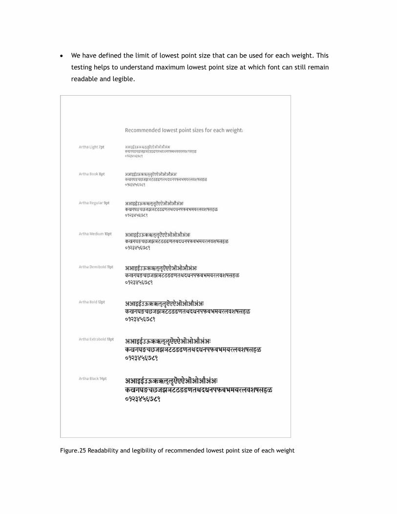
We have defined the limit of lowest point size that can be used for each weight. This
testing helps to understand maximum lowest point size at which font can still remain
readable and legible.
Figure.25 Readability and legibility of recommended lowest point size of each weight

10. Font Usage
We tried to set a page of Hindi financial newspaper in Artha to get a feel of font with
newspaper design. The below composition has use of all weights of Artha for display size as
well as body text.
Figure.26 Use of Artha for newspaper design
Newspaper use
For Newspaper body text content occupancy, Artha has been tested with currently used
two Modulated newspaper fonts named CDAC Surekh and Shreelipi 701. It is also tested
along with two Monolinear fonts named CDAC Yogesh and Firang by setting the text with
the same content. In testing sample, fonts are compared by matching their character
heights and not the point size. The below testing sample proves that Artha occupies lesser
space in column size compared to both Monolinear and Modulated font samples because of
its slightly condensed structure and larger stroke width to character base height ratio.

Figure.27 Content space comparison of Monolinear and Modulated fonts with Artha 3

Use for a book -‘Handbook of Devanāgarī Glyphs’
The beauty of Devanāgarī is that; for single conjunct can be written in two or more ways.
The book, ‘Handbook of Devanāgarī Glyphs’ lists down the number conjuncts, their ways to
be written and number of glyphs required to construct the conjunct while designing a
Devanāgarī font. The book was type set in Monolinear (Firang) and Modulated (Artha).
Their inter comparison shows the advantages that a Modulated font has over Monolinear
font while designing text conjuncts. Here are two conjunct cases from ‘Handbook of
Devanāgarī Glyphs’ by Dr. Girish Dalvi. It efficiently portrays the possible character
variation of single conjunct. It also talks about the visual difference that can be observed
while designing vertical conjuncts in Modular as well as Monolinear font with their
comparisons.
(Artha)
(Firang) Figure.28 Pages from ‘Handbook of Devanāgarī Glyphs’ by Dr. Girish Dalvi

Above example shows for conjunct like क्त्र there could be 5 different interpretations or for
conjunct like क्क्व there could be 10 different writing interpretations possible. It would be
a really complex to make all the interpretations possible on single keyboard. The
comparison of these conjuncts in Firang and Artha can also show how modulated font can
balance space with complex conjunct character structures also than Monolinear font.
Online usage
Since we also considered the online usage, font has been in the process of being hinted
and the preliminary results are promising. The font gives very good legibility across
mediums such as LCDs, CRTs and TVs.
11. Conclusion
(1) We feel, using Artha font text will occupy lesser space in news columns and hence more
content could be incorporated in smaller space of columns. To certain extent, this
might help to improve the economy of newspaper by saving the space required for
content. This saved space can be effectively used for more content and hence
indirectly improves effectiveness of newspaper.
(2) Due to its semi-handwritten structure, larger stroke width to base height ratio,
moderate modulation of strokes and large counter spaces; Artha is perhaps more
legible and readable at smaller sizes.
(3) Developed type design has balance in simple structure of characters, tracking and
leading in the font. We feel it will help in improving reader’s reading pace.
(4) Although the font has been carefully designed in terms of its forms and curves; it does
not draw reader’s attention to its design. Perhaps it gives importance to the content,
news or information in newspaper.
(5) The design takes inspiration from traditional reed-pen dimensionality and hence it
could give reader a ‘feel’ of traditional Devanāgarī while retaining a look of
contemporary Devanāgarī typeface.
(6) The lesser modulation in stroke widths, large character base height and larger counters
has helped Artha in promising legibility required for onscreen reading across different
types of digital screen displays. Hinting has further helped in finished rendering at
different sizes on screen. Hence Artha could also be used for online usage of
newspaper.
Acknowledgements
I humbly express my gratitude towards both of my teachers Prof. Santosh Kshirsagar and
Prof. Vinay Saynekar. They both inspired and motivated me to work in typography. Santosh
sir’s assignment on formal calligraphic writing had been a sole inspiration for me to build
this first own text typeface in Devanāgarī. In this process, I met one of my mentors Dr.
Girish Dalvi who has developed a deeper understanding of typeface design in me through
his discussions and periodical evaluation of my work. He is an honest critic who politely
always showed me where I was lacking in. I’m obliged to him for always being there for
me. Special thanks to our teacher Mr. Mukund Gokhale who graciously shared his
experiences, type design knowledge and guided me in this font development process. I’m
also obliged towards my one more mentor Mr. Sarang Kulkarni, who had been back bone in
my career. He not only directed and cultivated my interest in Calligraphy and Type design,
but introduced me to ‘Aksharaya’ which is a first Indian typographic forum of letter
conscious people.
References De Lange, R. W., Esterhuizen, H. L., Beatty, D. - Performance differences between Times and Helvetica in a reading task. Electronic Publishing, 6(3), 241-248, 1993. Rubinstein, R. - Digital Typography. Addison Wesley Longman, 1988. Sassoon, R. - Computers and Typography. Oxford: Intellect Books, 1993. Reynolds, L. - Legibility studies: Their relevance to present-day documentation methods. Journal of Documentation, 35(4), 307-340; 1979. Poulton, E.C. - Letter differentiation and rate of comprehension in reading. Journal of Applied Psychology, 49(5), 358-362; 1965. Lund, O. - Knowledge Construction in Typography: The case of legibility research and the legibility of sans serif typefaces. Thesis submitted for the degree of Doctor of Philosophy. Reading: The University of Reading, Department of Typography & Graphic Communication, 1999. Morris, R. A., Aquilante, K., et al. - Serifs slow RSVP reading at very small sizes, but don’t matter at larger sizes, 2001. Poulton, E.C. - Size, style, and vertical spacing in the legibility of small typefaces. Journal of Applied Psychology, 56(2), 156-161; 1972. Reynolds, L. - Legibility studies: Their relevance to present-day documentation methods. Journal of Documentation, 35(4), 307-340; 1979. Bernard, M., Mills, M., Peterson, M., Storrer, K. - A Comparison of Popular Online Fonts: Which is best and when? Usability News 3.2 Online, 2001.

Dr. Dalvi, Girish - ‘Conceptual Model for Devanāgarī Typefaces’ (Industrial Design Centre, IIT, Mumbai), 2010. Gokhale, Mukund Vasudeo – ‘Design Parameters of Devanāgarī, Caltis, pp 66-67, 1983. Gokhale, Mukund Vasudeo – ‘Composition and Construction of Devanāgarī Script’, Caltis, pp 60-62, 1984. Gokhale, Mukund Vasudeo – ‘An Experiment on Devanāgarī Type Design System’. Pune: Script Research Institute, 2004.
Saynekar, Vinay – ‘Akshar Saundarya’ (अक्षर स दयर्) Mumbai: Phulrani Prakashan, 1996.
Naik, Bapurao S. – ‘Typography of Devanāgarī, Volume II. Mumbai: Directorate of Languages, 1971.