Design Rationale
5
Design Rationale Site Title: After playing with several different options for a logo, right now I have decided to just have a very distinctive looking font for the title of my site. I downloaded it from www.dafont.com and it is called Caesar. I feel that a more distracting logo with an image may take away attention from the images, which are the main focus on this site. Fonts: All other text on the site will be in Garamond. I have chosen Garamond because visually I think it complements the Caesar font better than Times New Roman. I feel that it flows better and is easier on the eye when having to read lots of text. Garamond is also based on a Roman styled font and is in the serif font family. Color Palette: Background color Hex values are 282828. Supporting colors are 139139139 which is used for text and 221221221 which is used as an accent color. This last value is a very light gray because I felt that full white was too harsh and a little distracting. The light gray is complementary and easier on the eyes. I have chosen these colors because I think they make the images “pop” on the screen without being so harsh as black and white. I think they are complementary to the images and yet subdued. The colors are just supporting players to the images themselves.
-
Upload
caitlyn-kinnerk -
Category
Documents
-
view
47 -
download
1
description
Design Rationale. - PowerPoint PPT Presentation
Transcript of Design Rationale
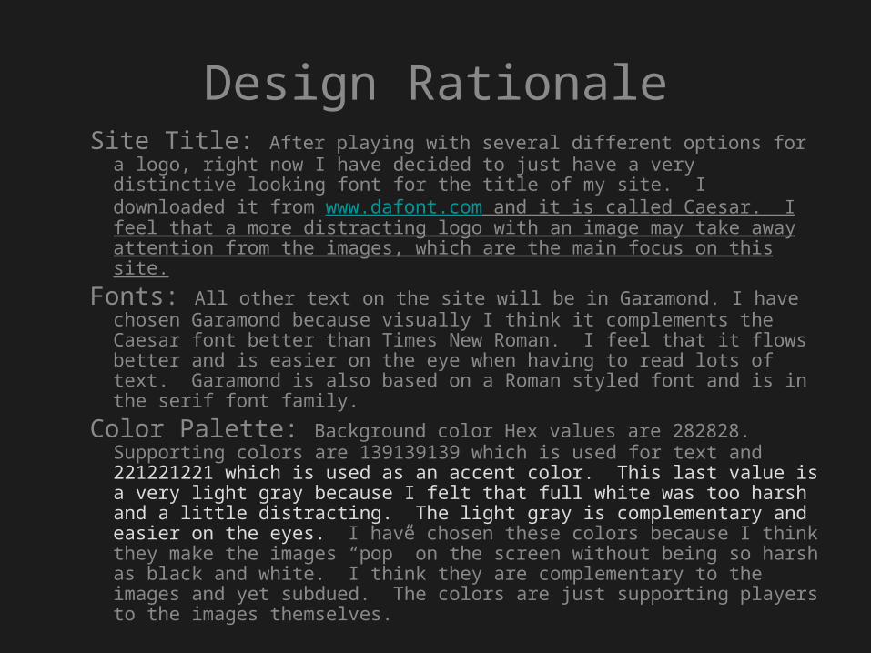
Design RationaleSite Title: After playing with several different options for a logo,
right now I have decided to just have a very distinctive looking font for the title of my site. I downloaded it from www.dafont.com and it is called Caesar. I feel that a more distracting logo with an image may take away attention from the images, which are the main focus on this site.
Fonts: All other text on the site will be in Garamond. I have chosen Garamond because visually I think it complements the Caesar font better than Times New Roman. I feel that it flows better and is easier on the eye when having to read lots of text. Garamond is also based on a Roman styled font and is in the serif font family.
Color Palette: Background color Hex values are 282828. Supporting colors are 139139139 which is used for text and 221221221 which is used as an accent color. This last value is a very light gray because I felt that full white was too harsh and a little distracting. The light gray is complementary and easier on the eyes. I have chosen these colors because I think they make the images “pop” on the screen without being so harsh as black and white. I think they are complementary to the images and yet subdued. The colors are just supporting players to the images themselves.
Classical Architecture as History, 1790-1943
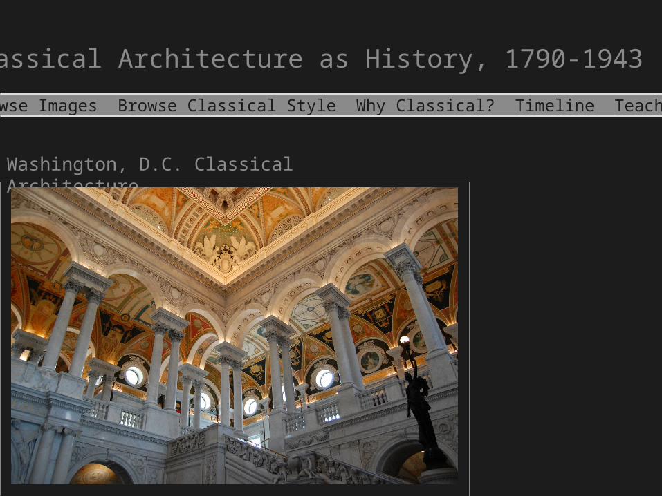
Washington, D.C. Classical Architecture
Browse Images Browse Classical Style Why Classical? Timeline Teachers
Library of Congress Lobby
View All Images
Home Browse Images Browse Classical Styles Why Classical? Timeline Teachers
Proudly Powered By Omeka
Search
Advanced Search
Why Classical?
Classical Architecture as History, 1790-1943
Browse Images Browse Classical Style Why Classical? Timeline Teachers
Washington D.C. is one of the largest examples in America that illustrates how each generation looks to the past in an effort to interpret the present. From the Federal City’s earliest plans, the classical influence was the dominant style chosen to convey the republican form of government the new nation hoped to follow. Examining the classical influence on Washington D.C. architecture raises questions concerning what Americans were attempting to accomplish in bringing the ancient past to American soil. Classical architecture in Washington D.C. is a visual and tangible example present generations may observe in its pursuit for knowledge in how the past viewed its own present.
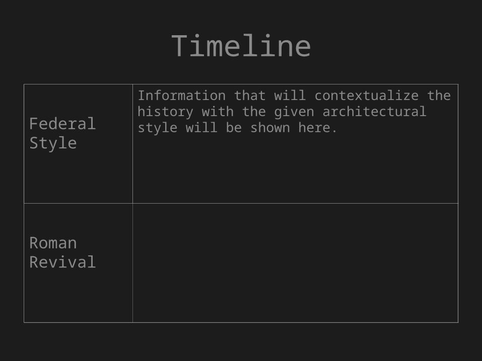
Timeline
Federal Style
Information that will contextualize the history with the given architectural style will be shown here.
Roman Revival