Design Guidelines - TransportationDesign Guidelines Sign Dimension Letter Style Size of Lettering...
15
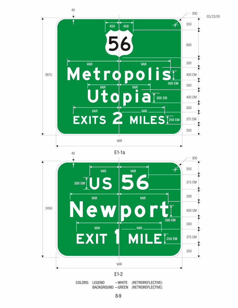
Design Guidelines Sign Dimension Letter Style Size of Lettering Amount of Legend There are general guidelines to follow in the design of highway signs in order to conform to basic stan- dards. Many of these guidelines are mentioned in various sections of the Manual on Uniform Traffic Control Devices (MUTCD), while others are derived from accepted practice in sign design and layout. Highway signs with standardized designs conform- ing to the general guidelines (like most regulatory, warning, emergency management, school, railroad- highway grade crossing, and bicycle signs), are contained in this book and are shown with differ- ent standard sizes depending on the type of high- way or facility where the sign is intended to be used. Although some guide signs also have been stan- dardized and are included in this book, most guide signs need to be designed separately because of the variability in message or legend. For most guide signs, there can be no rigid standardized sizes. Message variability controls overall sign dimen- sions. Whenever practicable, the overall dimen- sions of the sign plates should be in multiples of 150 mm (6 inches). The use of a small than “nominal” size for the various four types of roadway sign may sometimes be justified. For instance, a sign mounted over a particular roadway lane to which it applies may have to be limited in width to the lane width. In some cases, vertical clearances may limit the verti- cal dimension of the sign. On the other hand, a larger than “ ” sign may be desirable where greater legibility or emphases is needed. When a variation in the “standard” size is necessary, a re- duced or enlarged (as the case may be) letter height, interline, and edge spacing may be used but should be as nearly comparable to standards as possible. Type of letters used shall be those shown in the Standard Alphabets for Highway Signs book. As a guide to choice of alphabets, tests have show that, for any given legend, better legibility can be obtained by using a relatively wide spacing be- tween letters than by using wider and taller letters with a cramped space. Sign lettering is normally uppercase letters except that destination names may be in lowercase letter- ing, with initial uppercase. The initial uppercase letters used in conjunction with lowercase letters will be Series E(M) and shall be approximately 1½ times the “loop” height of the lowercase letters. Use of the Series B alphabet are for street name signs, parking signs, and other similar signs where limited breadth and stroke widths are required for design purposes. For guide signs on expressways and freeways, the prescribed numeral and letter sizes, according to interchange classification and component of sign legend, appear in Tables 2E-1 through 2E-4 of the MUTCD. The minimum sizes specified should be exceeded where conditions indicate a need for greater legibility. For conventional roads in rural districts on major routes, the principal legend on guide signs shall be in letters at least 150 mm (6 inches) in height. On low–volume roads and on urban streets with speeds of 40 km/h (25 mph), the principal legend shall be in letters at least 100 mm (4 inches) high. Lettering on street name signs should be at least 150 mm (6 inches) high (MUTCD, Section 2D.38). Supplementary lettering to indicate type of street or section of city may be in smaller lettering but at least 75 mm (3 inches) high. An accepted “rule-of-thumb” to follow for legibility for signs other than Interstate is to have 25 mm (1 inch) of letter height for every 12 m (40 feet) of desired legibility. The MUTCD states that regardless of letter size, the legend on a guide sign must be kept to a minimum to be instantly legible. For example, on expressways, the legend on a guide sign should only have two destinations and the directional copy. Directional copy, not exceeding three lines, er nominal 8-1
Transcript of Design Guidelines - TransportationDesign Guidelines Sign Dimension Letter Style Size of Lettering...

Design Guidelines
Sign Dimension
Letter Style
Size of Lettering
Amount of Legend
There are general guidelines to follow in the designof highway signs in order to conform to basic stan-dards. Many of these guidelines are mentioned invarious sections of the Manual on Uniform TrafficControl Devices (MUTCD), while others are derivedfrom accepted practice in sign design and layout.Highway signs with standardized designs conform-ing to the general guidelines (like most regulatory,warning, emergency management, school, railroad-highway grade crossing, and bicycle signs), arecontained in this book and are shown with differ-ent standard sizes depending on the type of high-way or facility where the sign is intended to beused.
Although some guide signs also have been stan-dardized and are included in this book, most guidesigns need to be designed separately because ofthe variability in message or legend. For mostguide signs, there can be no rigid standardizedsizes.
Message variability controls overall sign dimen-sions. Whenever practicable, the overall dimen-sions of the sign plates should be in multiples of150 mm (6 inches).
The use of a small than “nominal” size for thevarious four types of roadway sign may sometimesbe justified. For instance, a sign mounted over aparticular roadway lane to which it applies mayhave to be limited in width to the lane width. Insome cases, vertical clearances may limit the verti-cal dimension of the sign. On the other hand, alarger than “ ” sign may be desirable wheregreater legibility or emphases is needed. When avariation in the “standard” size is necessary, a re-duced or enlarged (as the case may be) letterheight, interline, and edge spacing may be used butshould be as nearly comparable to standards aspossible.
Type of letters used shall be those shown in theStandard Alphabets for Highway Signs book. As aguide to choice of alphabets, tests have show that,for any given legend, better legibility can be
obtained by using a relatively wide spacing be-tween letters than by using wider and taller letterswith a cramped space.
Sign lettering is normally uppercase letters exceptthat destination names may be in lowercase letter-ing, with initial uppercase. The initial uppercaseletters used in conjunction with lowercase letterswill be Series E(M) and shall be approximately 1½times the “loop” height of the lowercase letters.
Use of the Series B alphabet are for street namesigns, parking signs, and other similar signs wherelimited breadth and stroke widths are required fordesign purposes.
For guide signs on expressways and freeways, theprescribed numeral and letter sizes, according tointerchange classification and component of signlegend, appear in Tables 2E-1 through 2E-4 of theMUTCD. The minimum sizes specified should beexceeded where conditions indicate a need forgreater legibility.
For conventional roads in rural districts on majorroutes, the principal legend on guide signs shall bein letters at least 150 mm (6 inches) in height. Onlow–volume roads and on urban streets withspeeds of 40 km/h (25 mph), the principal legendshall be in letters at least 100 mm (4 inches) high.
Lettering on street name signs should be at least150 mm (6 inches) high (MUTCD, Section 2D.38).Supplementary lettering to indicate type of streetor section of city may be in smaller lettering but atleast 75 mm (3 inches) high.
An accepted “rule-of-thumb” to follow for legibilityfor signs other than Interstate is to have 25 mm (1inch) of letter height for every 12 m (40 feet) ofdesired legibility.
The MUTCD states that regardless of letter size, thelegend on a guide sign must be kept to a minimumto be instantly legible. For example, onexpressways, the legend on a guide sign shouldonly have two destinations and the directionalcopy. Directional copy, not exceeding three lines,
er
nominal
8-1

may include symbols, route numbers, arrows, car-dinal directions, interchange number(s), and otherexit instructions. Conventional road guide signsshould be limited to three lines of principal legendwhich includes only place names, route numbers,and street names.
In the Appendix, two sets of arrows are illustratedfor use in highway signs. With few exceptions,which include guide signs, the “standard arrow” isfor all types of signs. The “Up” and “Down” arrowsare to be used for guide signs and recommendedapplications are stated in Sections 2D.8 and 2E.18of the MUTCD.
With few exceptions, the MUTCD requires allsigns to have a border of the same color as the leg-end. A dark border should be set in from the edge,while a white border should extend to the edge ofthe panel.
A suitable border for 750mm (30-inch) signs witha light background should be from 13 to 19 mm(one-half to three-quarters of an inch) in width, 13mm (one-half inch) from the edge. For similarsigns with a white border, a width of 25 mm (oneinch) is appropriate. For other signs, the borderwidths should be of similar proportions but shouldnot exceed the stroke width of the major letteringof the sign. For guide signs, smaller than 1,800 x3,000 mm (6 feet by 10 feet), a width of approxi-mately 19 mm (1¼ inch) may be used; for thoseexceeding 1800 mm x 3000 mm (6 feet by 10 feet),the border should be 50 mm (2 inches) wide; andfor unusually large signs, a border of 75 mm (3inches) wide is appropriate.
The corners of all sign borders shall be roundedand, where practicable, the corners of the signpanels should also be rounded to fit the borderexcept for STOP signs. On guide signs, corner radiiof sign borders should be approximately one-eightof the lesser side dimension except that the radiishould not exceed 300 mm (12 inches) on anysign. The area outside the corner radius on largeguide signs may need to be trimmed.
Interline spacing should be approximately three-fourths the average of capital or uppercase letterheights in adjacent lines of letters.
The spacing to the top and bottom borders shouldbe approximately equal to the average of the letterheight of the adjacent line of letters. The lateralspacing to the vertical borders should be essen-tially the same as the height of the largest letter.
Spacing between words, words and arrow, a letterand arrow, or a word and number in a line copyshould be approximately 1 to 1 times the upper-case letter height used in that line of copy.
An example in the design of a guide sign using theabove guidelines is shown on the following pages.
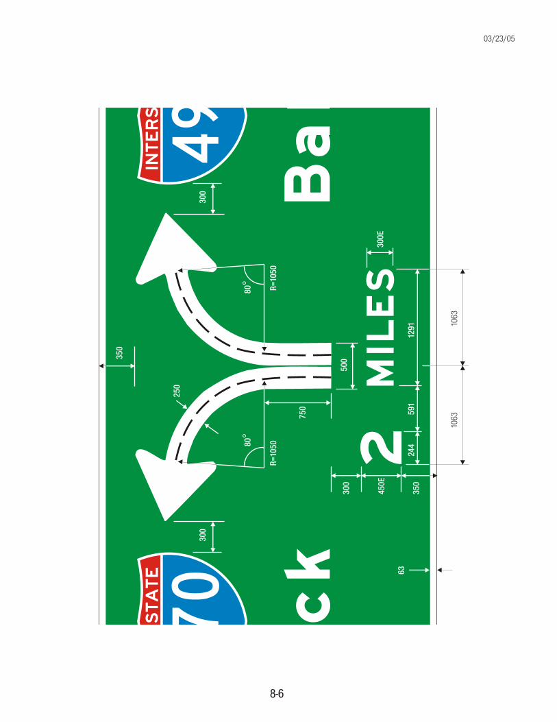
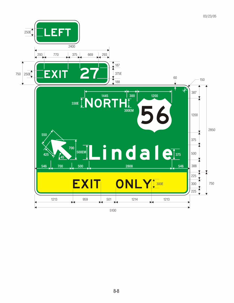
Design of diagrammatic signs follow the same prin-ciples and guidelines previously covered plus addi-tional guidelines necessary for the details relatedto the graphic components. Diagrammatic signsshall be designed in accordance with the followingcriteria:
1. The graphic legend shall be of a plan view show-ing a simplified off-ramp arrangement.
2. Only one destination may be shown for eacharrowhead, with a maximum of two destinationsper sign.
3. The graphic should not depict decelerationlanes. A black on yellow “EXIT ONLY” panelshould be used to supplement a lane drop graphic.
4. The shaft for the exit ramp movement shouldbe shorter than, but not separated from, thethrough movement graphic.
5. Arrow shafts should contain lane lines whereappropriate and route shields shall not be used asa substitute for arrowheads.
6. Route shields, cardinal directions, and destina-tions should be clearly related to the arrowhead,and the arrowhead should point toward the routeshield for the off movement.
Arrows
Borders
Spacing
Diagrammatic Signs
,
½
8-2
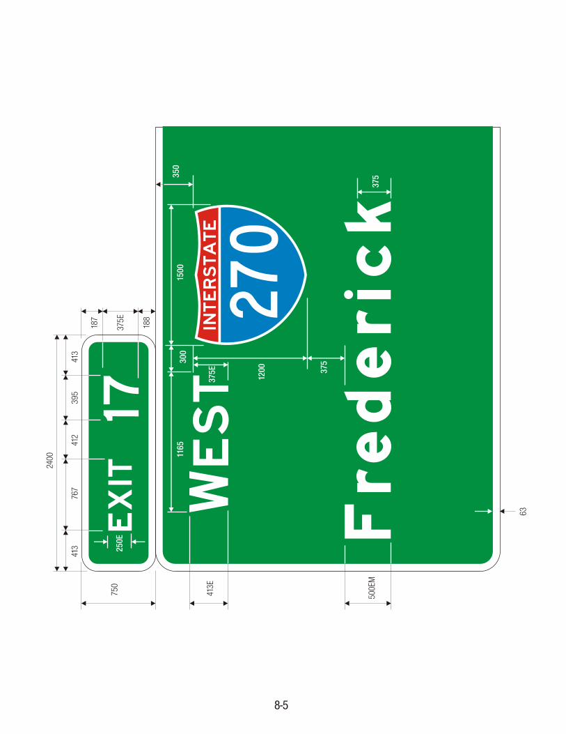
7. The cardinal direction should generally beplaced adjacent to the route shield and the destina-tion should be placed below and justified with theroute shield.
8. Exit number panels should be located towardthe top left edge of the sign for a left exit and to-ward the top right edge for right exits.
The above guidelines were based upon the resultsof a research project conducted by the Federal High-way Administration. This research generated idealsfor the various diagrammatic design features.
These ideal features have been modified so thatmore economical designs could not be obtained.
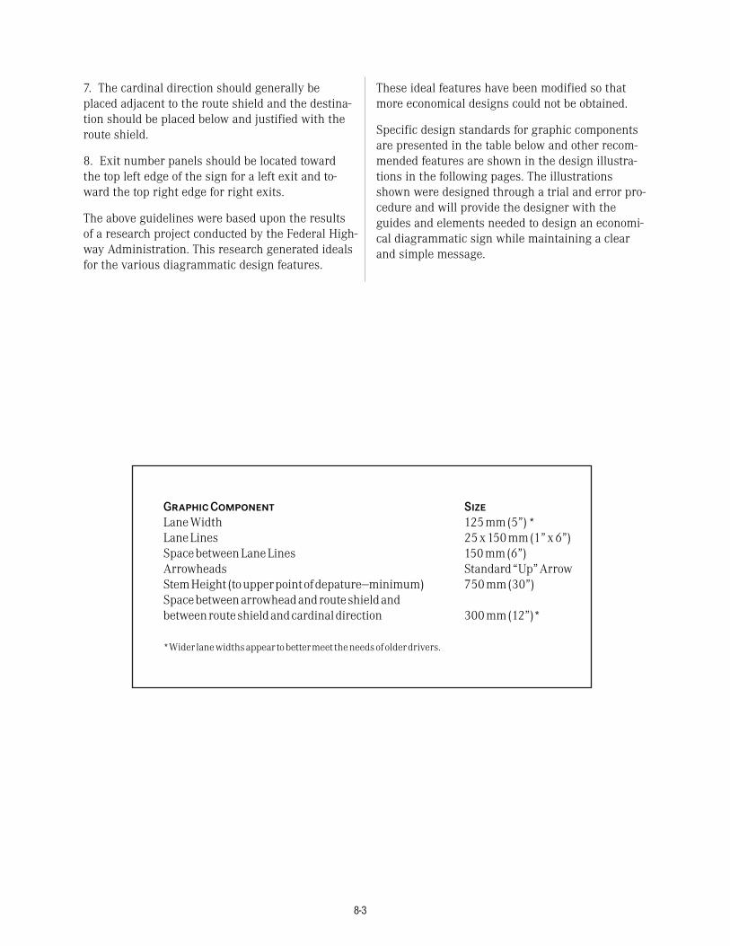
Specific design standards for graphic componentsare presented in the table below and other recom-mended features are shown in the design illustra-tions in the following pages. The illustrationsshown were designed through a trial and error pro-cedure and will provide the designer with theguides and elements needed to design an economi-cal diagrammatic sign while maintaining a clearand simple message.
GraphicComponent Size
LaneWidth 125mm(5”)*LaneLines 25x150mm(1”x6”)SpacebetweenLaneLines 150mm(6”)Arrowheads Standard“Up”ArrowStemHeight (toupperpointofdepature—minimum) 750mm(30”)Spacebetweenarrowheadandrouteshieldandbetweenrouteshieldandcardinaldirection 300mm(12”)*
*Wider lanewidthsappear tobettermeet theneedsofolderdrivers.
8-3

EXIT
17
EXIT
17LE
FT EST
Fre
der
ick
AST
Balt
imor
e2
MIL
ES
INTE
RSTA
TE
495
INTE
RSTA
TE
270
8-4
E1-3
Optio
nal
WE
EXIT
17LE
FT
EXIT
17
EST
Fre
der
ick
INTE
RSTA
TE
270
413E
500E
M
750
250E
1500
300
1200 37
5
375
1165
187
375E
188
413
767
412
395
413
2400
350
63
8-5
W37
5E
WEST
Fre
der
ick
EA
ST
Balt
imor
e2
MIL
ES
INTE
RSTA
TE
495
INTE
RSTA
TE
270
350
250
300
300
500
300
450E
350
300E
750
R=10
50R=
1050
80°
80°
63
1063
1063
244
591
1291
8-6
03/23/05
AST
Balt
imor
e
INTE
RSTA
TE
495
350
1500
300
375E
500E
375
1200
375
1389
3600
8-7
E41
3E
EXIT 27
ORTH
Lindale
56
EXIT ONLY
2400
750 250E 375E
187
188
770 669375293 293
5100
959 12145011213 1213
300E
2850
750
1200
375
500
300
225
225
388
3871445 300 1200
375
2808500700546 546
500EM700
550
42545
8-8
330E N300EM
LEFT250E
60 150
03/23/05
56
300
350
900
300
400 EM
300
400 EM
300
375 EM
350
300 EM
300 EM
250 EM
450 450
3675
VAR
40
VAR VAR
VAR VAR
VAR VAR
E1-1a40300
350
375 EM
300
400 EM
300
375 EM
350
300 EM
250 EM
300 EM
VAR
2450
VAR VAR
VAR VAR
VAR VAR
E1-2
COLORS: LEGEND —WHITE (RETROREFLECTIVE)BACKGROUND —GREEN (RETROREFLECTIVE)
8-9
03/23/05

225
300 EM
225
200
200
225
300 EM
225
300 EM
225
750
VAR
40
40
1250
VAR
VAR VAR
VAR VAR
VAR VAR
E2-1a
COLORS: LEGEND —WHITE (RETROREFLECTIVE)BACKGROUND —GREEN (RETROREFLECTIVE)
8-10
E2-1
200
187.5
375 EM*
187.5
40
750
VAR
VAR VAR
E1-5
250E
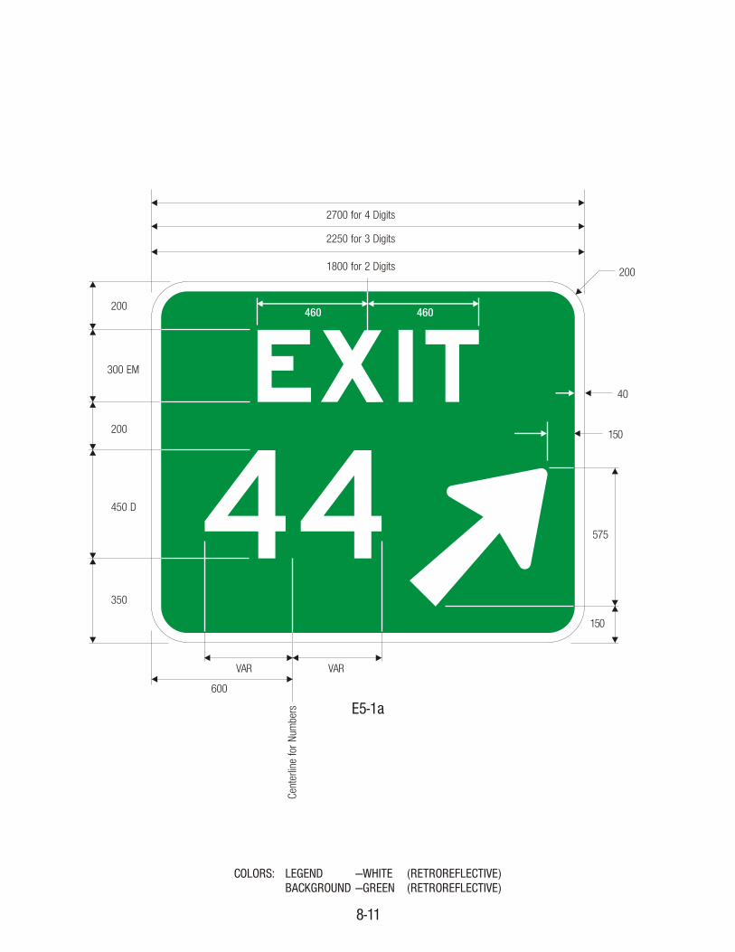
44EXIT
1800 for 2 Digits
2250 for 3 Digits
2700 for 4 Digits
200
300 EM
200
450 D
350
40
150
575
150
VAR VAR
600
460 460
Cent
erlin
e fo
r Num
bers E5-1a
200
COLORS: LEGEND —WHITE (RETROREFLECTIVE)BACKGROUND —GREEN (RETROREFLECTIVE)
8-11

56
200
285
300 D
250
900
250
330 EM
285
40
2600
2600
418.5 418.5
450 450
250 D
VAR VAR
20040
837238 300
1150
220
330 EM
300
VAR VAR
250 EM
300 D 250 D
250
2300
2600
COLORS: LEGEND —WHITE (RETROREFLECTIVE)BACKGROUND —GREEN (RETROREFLECTIVE)
8-12
E6-2
E6-2a
250 EM
03/23/05
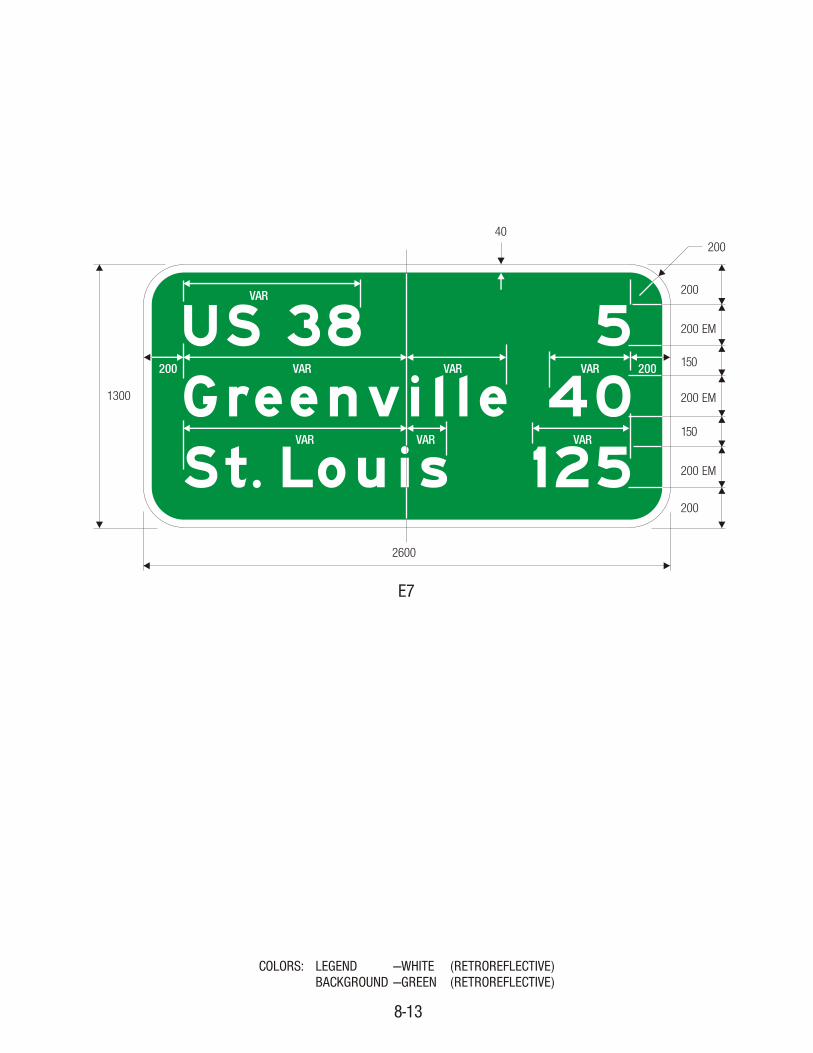
Greenville 40St. Louis
US 38 5
1251300
200
200
200 EM
150
200 EM
150
200 EM
200
2600
40
VAR
VAR VAR
VAR VAR VAR
VAR200 200
E7
COLORS: LEGEND —WHITE (RETROREFLECTIVE)BACKGROUND —GREEN (RETROREFLECTIVE)
8-13
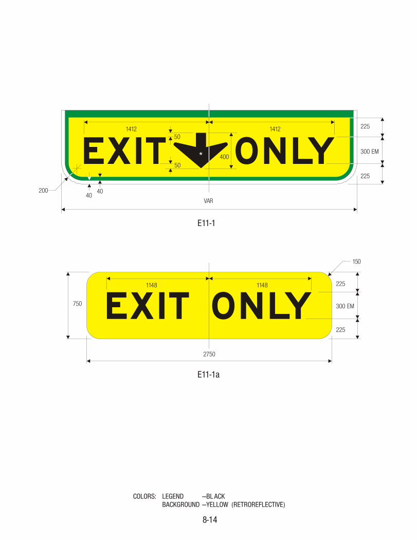
EXIT ONLY225
300 EM
225
50
50400
VAR
20040
40
1412 1412
*
EXIT ONLY1148 1148 225
300 EM
225
750
2750
150
E11-1
E11-1a
COLORS: LEGEND —BL ACKBACKGROUND —YELLOW (RETROREFLECTIVE)
8-14

EXIT ONLY150
100
300 EM
100
500
1129 1167
2500
E11-1c
EXIT500
150
100
300 EM
100
13001125
449 471 548 567
E11-1b
COLORS: LEGEND —BL ACKBACKGROUND —YELLOW (RETROREFLECTIVE)
8-15