Design brief - Architecture
43
Design Brief JAYVIN SUDRA HAVE WE LOST THE DESIGN EDGE?
-
Upload
jayvin-sudra -
Category
Documents
-
view
229 -
download
0
description
Artist, Initial, Developed, Final, Indesign
Transcript of Design brief - Architecture

Design Brief JAYVIN SUDRA
HAVE WE LOST THE DESIGN EDGE?

PLANNING

PLAN
Location The location of the photographs that I will be taking will be in a place that is central to unique buildings that are visually pleasing. This may include places like Canary Wharf, Stratford and areas around the Thames and London Bridge. Props I can use many props that I may find around the area like statue and sculptures, signs and the iconic red bus. Models I could use the natural people on the streets in my images to capture a natural image. I can also use models to project the images onto. Lighting I can use the natural light from the sun and the moon so that pictures seem natural with no sharp shadows. Time of day The time of day can that I will take my pictures will be when the sun is shining brightest to capture an image with a clear sky. If I do decide to take pictures in the night then I will have to use a tripod which could be an annoyance. Equipment I will be using my DSLR and possibly my tripod for dark scenes and also where I want to create an over exposed image.

MIND MAP
Architecture
Settings?
ISOExposure
Manual Mode
Shutter SpeedRAW
JPEGTime of Day?
Dusk
Night Time
Day Time
Sunset
Location?
Same Buildings
Canary Wharf
Signs
Statues
Train Station
New or Old Buildings
Road NamesStratford
Equipment
Tripod
Memory Card
Camera
Editing
Photoshop
Black and White
Colour
Central LondonLondon Bridge
Buildings

ARTIST WORK
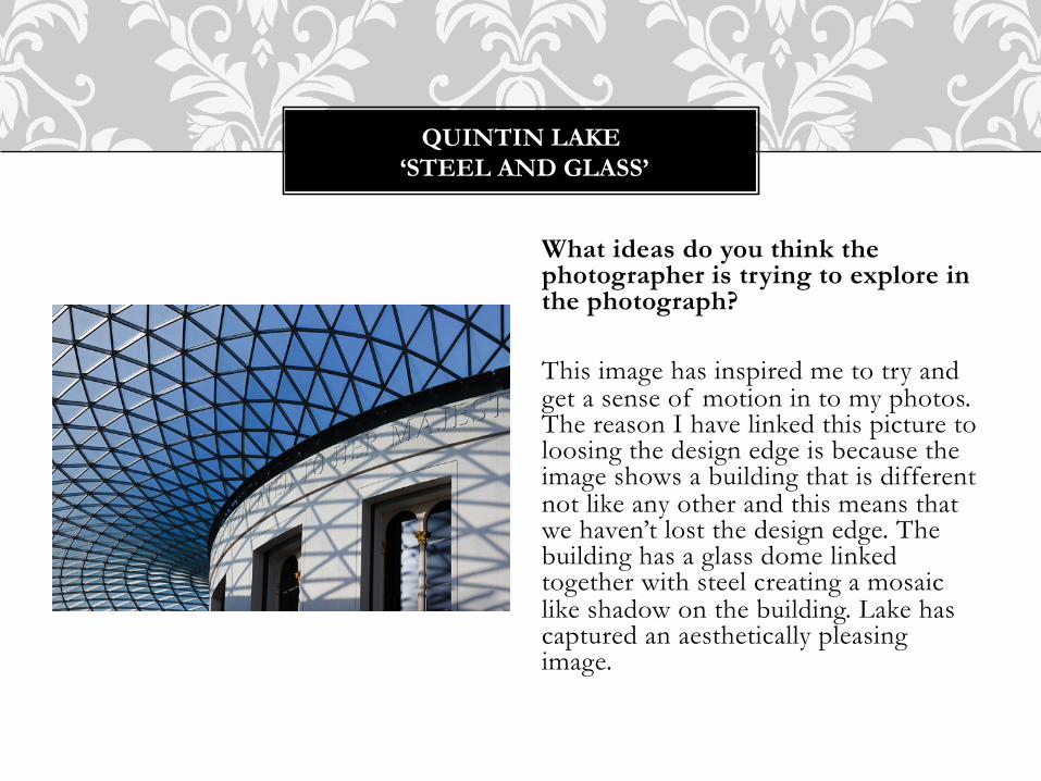
What ideas do you think the photographer is trying to explore in the photograph? This image has inspired me to try and get a sense of motion in to my photos. The reason I have linked this picture to loosing the design edge is because the image shows a building that is different not like any other and this means that we haven’t lost the design edge. The building has a glass dome linked together with steel creating a mosaic like shadow on the building. Lake has captured an aesthetically pleasing image.
QUINTIN LAKE ‘STEEL AND GLASS’

Where do the lines lead the building?
The lines on the building represent a road into the future. They start from the ground and end in the sky. This building suffered a fatal disaster were hundreds of people died. The lines lead the building to the tip (the end), the end of its life. I believe that Bidwell was captured a perfect square image that incorporates the building in to a central position.
CHARLIE BIDWELL ‘WORLD TRADE CENTRE’

What is Adamski trying to achieve?
This picture has really inspired me to create a dynamic sky in my images. The sky in this picture really gives the picture a real edge, the sleek black design of the building rises up into the sky where it is indulged by the sharp lining edges of the clouds. The use of black and whit in this image really makes in elegant and crisp.
JOSH ADAMSKI ‘2’

What did the artist want the viewer to feel about this image?
For me this image makes myself ask many questions. Why is the building situated in such a neglected place? The use of the black and white sky make the picture look like the building is lonely. And the way that Adamski makes the sky over and also under exposed is appealing to the eye.
JOSH ADAMSKI ‘5’

What is different about this image?
The building in this image is different to others, the way that the building has slanted sides creates a dynamic edge. The sky has been given a mysterious feel to enthuse the buildings integrity.
JOSH ADAMSKI ’15’
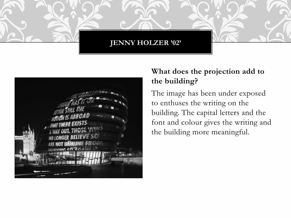
What does the projection add to the building?
The image has been under exposed to enthuses the writing on the building. The capital letters and the font and colour gives the writing and the building more meaningful.
JENNY HOLZER ’02’

How does the time of day affect this picture? This image has been taken just before sunset which has caused the sky to be dark blue. This creates a corresponding look with the colour of the writing and consequently the building. After looking at this image I believe that the time that I take a picture really influences a good picture. Also the whether on the specific day also matters. Clear skies always look good.
JENNY HOLZER ’05’

ARTIST ANALYSIS
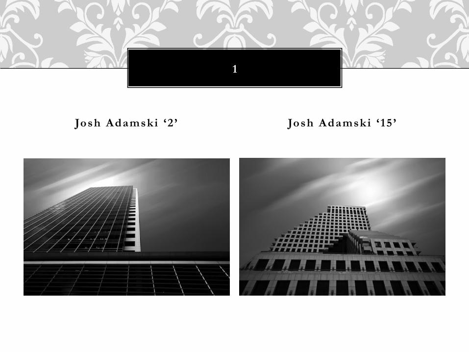
Josh Adamski ‘2 ’ Josh Adamski ‘ 15 ’
1

These two images are similar in that they are both aesthetically pleasing. They are both in black and white and I like the way that they have muted setting and background but have a strong appearance in the main building. Both of the images are similar in a lot of ways both have an edited sky which I believe enthuses the images, the sky develops the image so that it is more aesthetically pleasing. But even though the two images have been produced by the same person they are also different, the two buildings themselves give the image a different appearance. The first giving a strong, dark appearance and the second a more meaningful, bright. The reason why I have linked these two images with the question, ‘have we lost the design edge?’ is because I believe that these two images prove that in fact we have. The photographer has captured two similar images of buildings that will never be the same, one is more modern and made out of glass and the other is old fashioned and made out of cement but they both have the same purpose.

Char l ie Bidwel l ‘Wor ld Trade Centre ’ Quint in Lake ‘S tee l And Glass ’
2

These two images are very different in comparison with each other one is more modern and in colour and the other is old and in black and white. I believe that both of these images define the use of colour brilliantly. The first image by Bidwell is of the world trade center which was center to a fatal disaster I believe that the saturated colour of the image is perfect as it expresses old and the image by Quintin Lake of Steel and Glass is quiet the opposite it represents a new contemporary design which has been enthused by the richness of colour left by Lake. The reason that I have used these images to answer the question ‘have we lost the design edge?’ is because I feel that these two images say that we have not lost the design edge. They are both very different buildings which are both made of the same materials.

Jenny Holzer ‘02 ’ Jenny Holzer ‘05 ’
3

These images by Jenny Holzer have the same art based development idea. They both have words projected on them that make them more visually appealing. The way that the two buildings are very different, one is modern day building and the other very old fashioned but the projection gives them both a feeling of modern day buildings because of the modern edge that the projection gives. And also the way that Holzer saturates the colour of the new building and keeps the old in colour compensates for the difference in design of old and new in the image. The reason why I have chosen to use these two images is because I will try to create my own version of the projections. I will project my own images on to all different kinds of books, boxes and photo frames.

INITIAL PHOTO’S


EVALUATION
My intentions for taking these photographs was to get across the idea of ‘have we lost the design edge’. I kept this in mind when I was taking each photograph so that they all meet the brief. I initial found it hard to come up with ideas that would best present the brief but then I designed a mind map and did a plan of what I would be taking pictures of and looked at similar artist work that others had done. I decided that I would go to Canary Wharf in London where there are many tall, large and a whole different variety of buildings. I choose to go there in the middle of the day when the sun was at the highest point which meant that light would be shining on the buildings for a clear photograph with an attractive sky. Overall I am very happy with my initial photographs because they where mostly in black and white and it really made the shading stand out and be conspicuous.
DEVELOPED PHOTO’S


EVALUATION
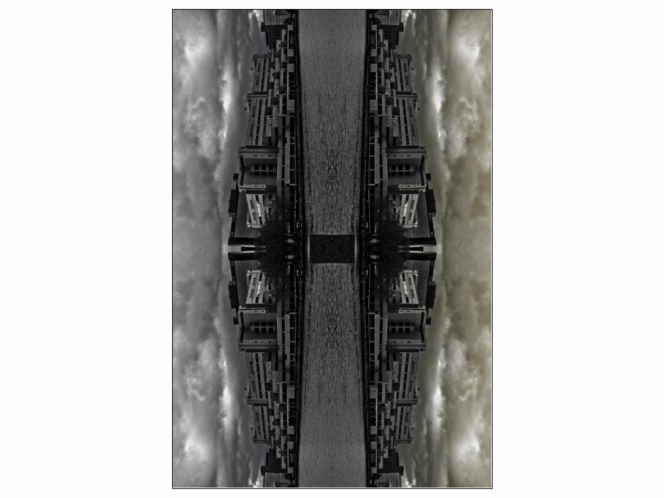
In this section I have split my photographs into two sections. The first are my projection images and the last are my Photoshop edits. With my projections I decided that I would project my images onto props that would infuse the images and make them more aesthetically pleasing. For these particular images I used a sphere polystyrene ball, an empty frame and canvas. For my Photoshop edits I wanted to create a theme where the images repeated so I flipped the images and joint them to make reflections so they would be relevant to the brief ‘have we lost the design edge?’. Overall I am very happy with my developed images I believe that all of the photos go well together and and look aesthetically pleasing. This may be because they all have hints of colour here and there but all they all have a dark, black appearance.

FINAL PHOTO’S


EVALUATION
Overall I am pleased with my final images. I tried to link them as much as I could to the brief and I believe that the images express the message of the brief very well and show that in fact we haven’t lost the design edge because over time the design of the buildings that are being made have and are slowly changing. I like the way that all of the images go well together and use different types of art to be accomplished. The brief ‘have we lost the design edge?’ made me think about old and new buildings so I instantly thought of black and white images and how now we have colour images. With my final images I linked some of my initial and developed photos and created a drastic and direct image which really expresses the brief question. I really tired to link my images to the brief and I believe that I have done this successfully.

INDESIGN