Describing the data graphically: Frequency distributions...
40
Copyright ©2014 Pearson Education, Inc. 2-1 Lecture 2 Describing the data graphically: Frequency distributions, histograms, and other types of graphs.
Transcript of Describing the data graphically: Frequency distributions...
Copyright ©2014 Pearson Education, Inc. 2-1
Lecture 2
Describing the data graphically:
Frequency distributions, histograms, and
other types of graphs.
Copyright ©2014 Pearson Education, Inc. 2-2
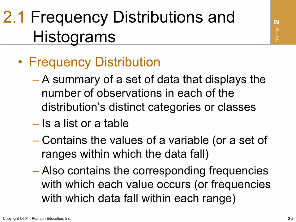
2.1 Frequency Distributions and Histograms
• Frequency Distribution – A summary of a set of data that displays the
number of observations in each of the distribution’s distinct categories or classes
– Is a list or a table – Contains the values of a variable (or a set of
ranges within which the data fall) – Also contains the corresponding frequencies
with which each value occurs (or frequencies with which data fall within each range)
Copyright ©2014 Pearson Education, Inc. 2-3
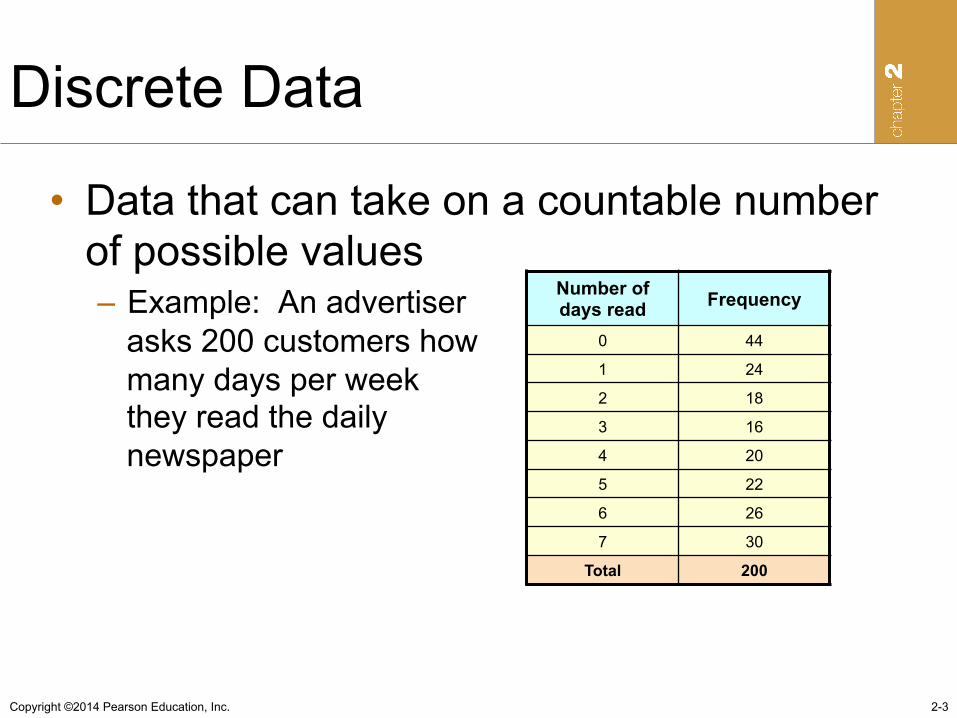
Discrete Data
• Data that can take on a countable number of possible values – Example: An advertiser
asks 200 customers how many days per week they read the daily newspaper
Number of days read Frequency
0 44
1 24
2 18
3 16
4 20
5 22
6 26
7 30
Total 200
Copyright ©2014 Pearson Education, Inc.
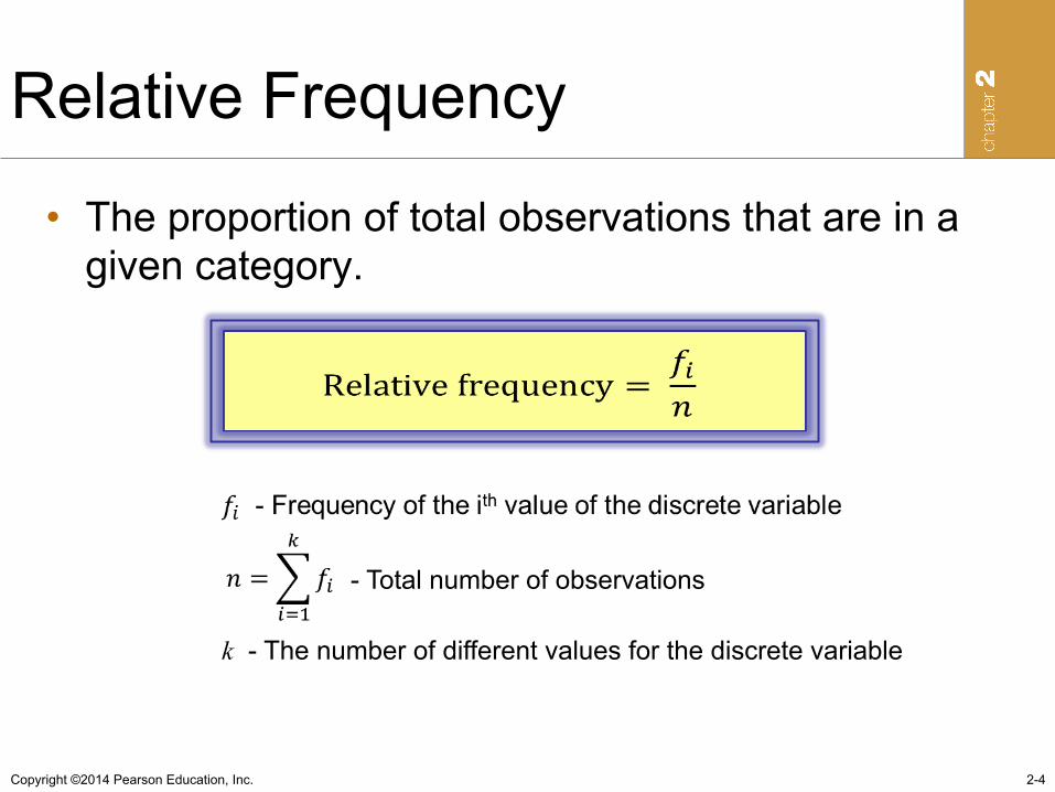
Relative Frequency
• The proportion of total observations that are in a given category.
2-4
- Total number of observations
k - The number of different values for the discrete variable
Copyright ©2014 Pearson Education, Inc. 2-5
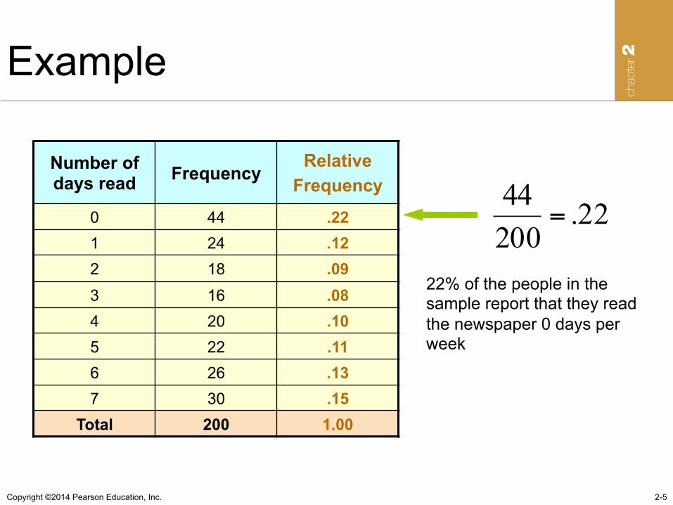
Example
Number of days read Frequency
Relative Frequency
0 44 .22 1 24 .12 2 18 .09 3 16 .08 4 20 .10 5 22 .11 6 26 .13 7 30 .15
Total 200 1.00
22% of the people in the sample report that they read the newspaper 0 days per week
.2220044
=
Copyright ©2014 Pearson Education, Inc.
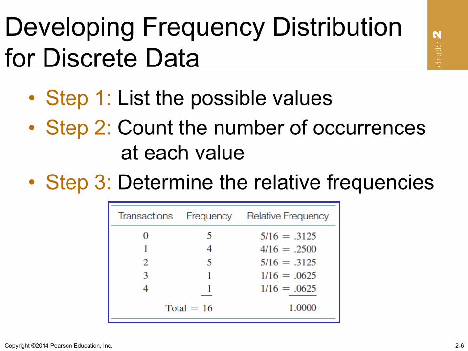
Developing Frequency Distribution for Discrete Data
• Step 1: List the possible values • Step 2: Count the number of occurrences
at each value • Step 3: Determine the relative frequencies
2-6
Copyright ©2014 Pearson Education, Inc.
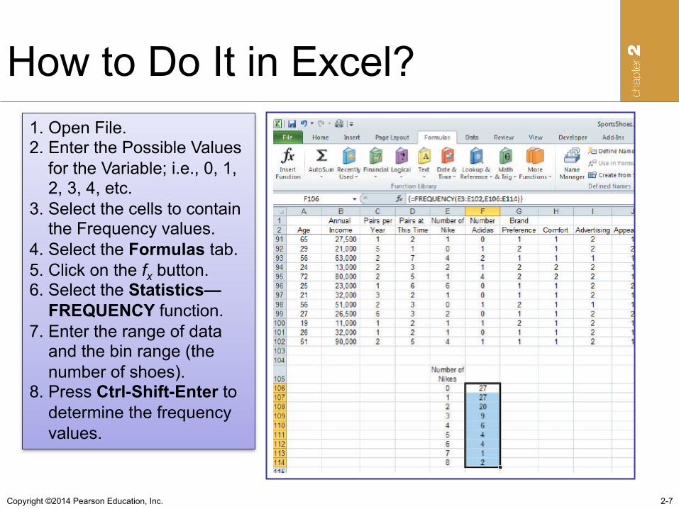
How to Do It in Excel?
2-7
1. Open File. 2. Enter the Possible Values for the Variable; i.e., 0, 1, 2, 3, 4, etc. 3. Select the cells to contain the Frequency values. 4. Select the Formulas tab. 5. Click on the fx button. 6. Select the Statistics— FREQUENCY function. 7. Enter the range of data and the bin range (the number of shoes). 8. Press Ctrl-Shift-Enter to determine the frequency values.
Copyright ©2014 Pearson Education, Inc.
Grouped Data
• Continuous data – data whose possible values are uncountable
and that may assume any value in an interval (weight, length, time)
• Discrete data with many possible outcomes (age, income, stock price)
• Summarized in a grouped data frequency distribution
• Data are organized in classes 2-8
Copyright ©2014 Pearson Education, Inc.
Criteria for Building Classes
• Classes must be mutually exclusive – classes do not overlap
• Classes must be all-inclusive – a set of classes contains all possible data values
• Classes should be of equal width, if possible – the distance between the lowest and the highest
possible values in each class is equal for all classes.
• Empty classes should be avoided
2-9
Copyright ©2014 Pearson Education, Inc.
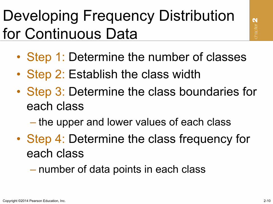
Developing Frequency Distribution for Continuous Data
• Step 1: Determine the number of classes • Step 2: Establish the class width • Step 3: Determine the class boundaries for
each class – the upper and lower values of each class
• Step 4: Determine the class frequency for each class – number of data points in each class
2-10
Copyright ©2014 Pearson Education, Inc.
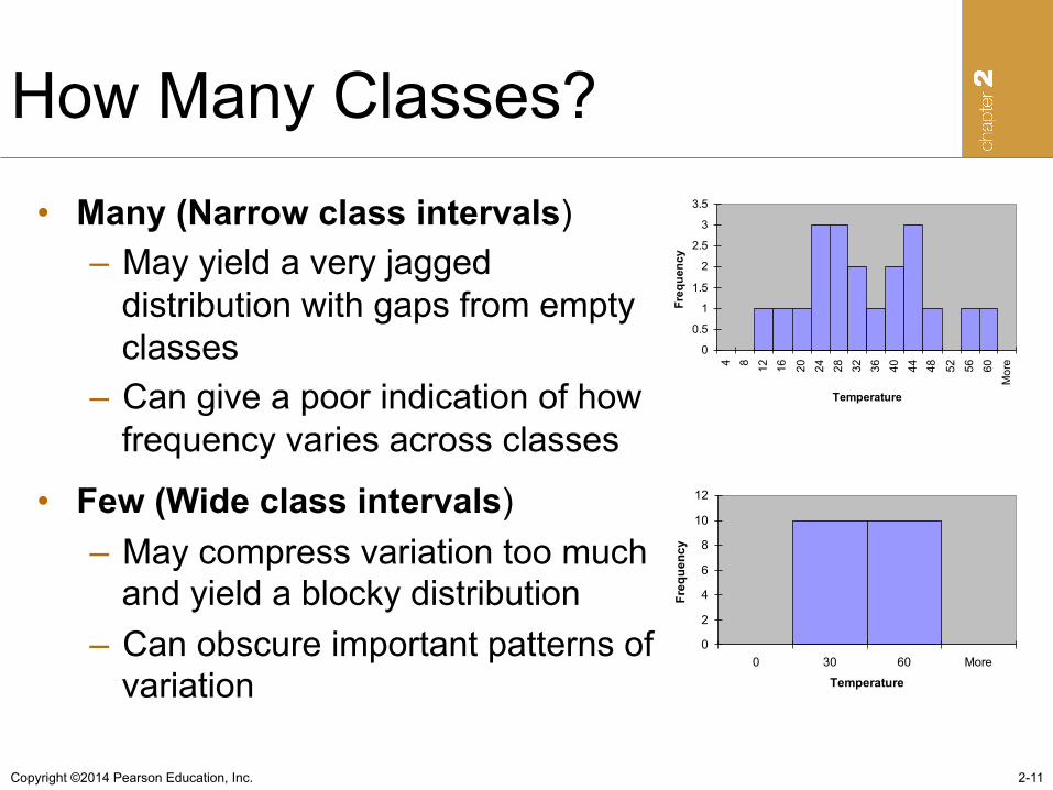
How Many Classes?
2-11
• Many (Narrow class intervals) – May yield a very jagged
distribution with gaps from empty classes
– Can give a poor indication of how frequency varies across classes
• Few (Wide class intervals) – May compress variation too much
and yield a blocky distribution – Can obscure important patterns of
variation
0
0.5
1
1.5
2
2.5
3
3.5
4 8 12 16 20 24 28 32 36 40 44 48 52 56 60More
Temperature
Frequency
0
2
4
6
8
10
12
0 30 60 More
TemperatureFrequency
Copyright ©2014 Pearson Education, Inc.
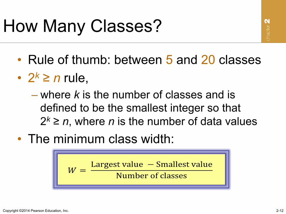
How Many Classes?
• Rule of thumb: between 5 and 20 classes • 2k ≥ n rule,
– where k is the number of classes and is defined to be the smallest integer so that 2k ≥ n, where n is the number of data values
• The minimum class width:
2-12
Copyright ©2014 Pearson Education, Inc.
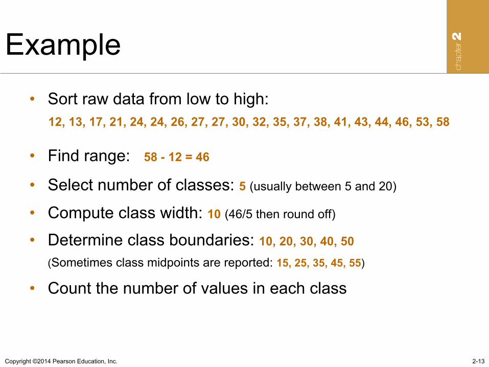
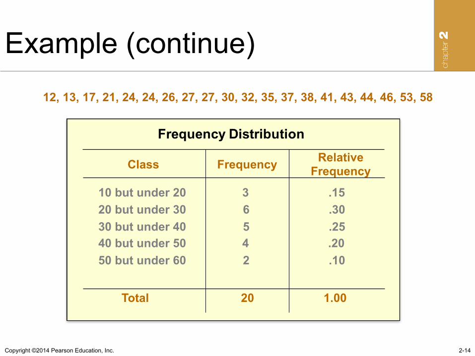
Example • Sort raw data from low to high: 12, 13, 17, 21, 24, 24, 26, 27, 27, 30, 32, 35, 37, 38, 41, 43, 44, 46, 53, 58
• Find range: 58 - 12 = 46
• Select number of classes: 5 (usually between 5 and 20)
• Compute class width: 10 (46/5 then round off)
• Determine class boundaries: 10, 20, 30, 40, 50 (Sometimes class midpoints are reported: 15, 25, 35, 45, 55)
• Count the number of values in each class
2-13
Copyright ©2014 Pearson Education, Inc.
Example (continue)
2-14
12, 13, 17, 21, 24, 24, 26, 27, 27, 30, 32, 35, 37, 38, 41, 43, 44, 46, 53, 58
Class Frequency Relative Frequency
10 but under 20 3 .15 20 but under 30 6 .30 30 but under 40 5 .25 40 but under 50 4 .20 50 but under 60 2 .10 Total 20 1.00
Copyright ©2014 Pearson Education, Inc.
More on Frequency Distributions
• Cumulative Frequency Distribution – a summary of a set of data that displays the
number of observations with values less than or equal to the upper limit of each of its classes
• Cumulative Relative Frequency Distribution – A summary of a set of data that displays the
proportion of observations with values less than or equal to the upper limit of each of its classes
2-15
Copyright ©2014 Pearson Education, Inc.
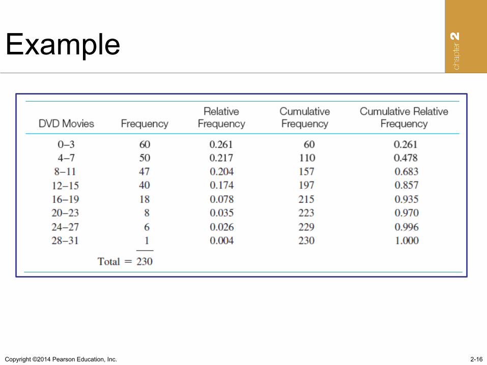
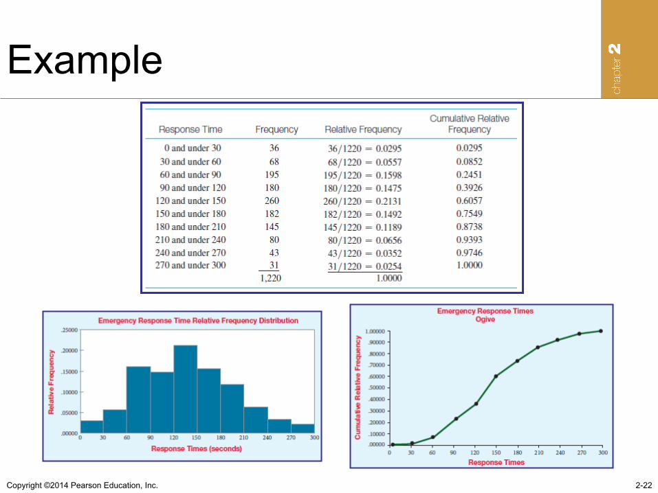
Example
2-16
Copyright ©2014 Pearson Education, Inc.
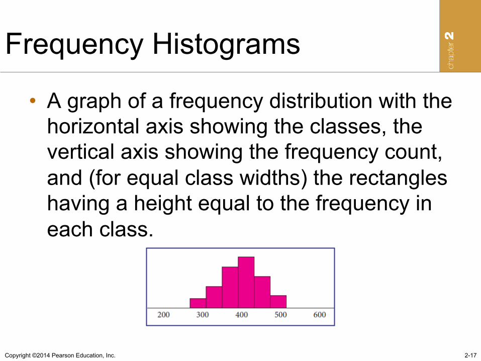
Frequency Histograms
• A graph of a frequency distribution with the horizontal axis showing the classes, the vertical axis showing the frequency count, and (for equal class widths) the rectangles having a height equal to the frequency in each class.
2-17
Copyright ©2014 Pearson Education, Inc.
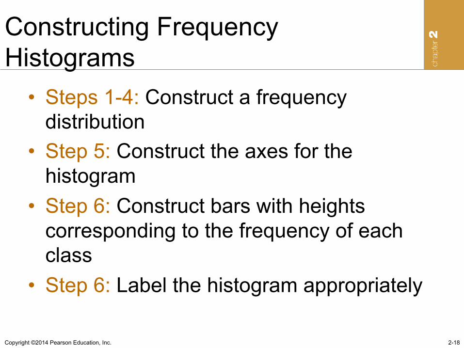
Constructing Frequency Histograms
• Steps 1-4: Construct a frequency distribution
• Step 5: Construct the axes for the histogram
• Step 6: Construct bars with heights corresponding to the frequency of each class
• Step 6: Label the histogram appropriately
2-18
Copyright ©2014 Pearson Education, Inc.
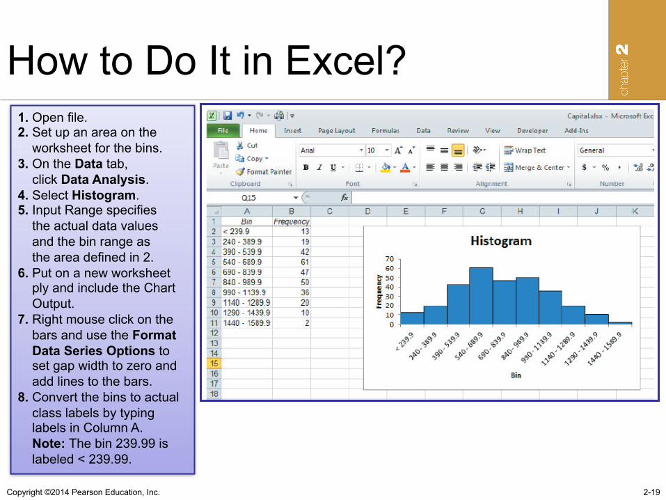
How to Do It in Excel?
2-19
1. Open file. 2. Set up an area on the worksheet for the bins. 3. On the Data tab, click Data Analysis. 4. Select Histogram. 5. Input Range specifies the actual data values and the bin range as the area defined in 2. 6. Put on a new worksheet ply and include the Chart Output. 7. Right mouse click on the bars and use the Format Data Series Options to set gap width to zero and add lines to the bars. 8. Convert the bins to actual class labels by typing labels in Column A. Note: The bin 239.99 is labeled < 239.99.
Copyright ©2014 Pearson Education, Inc.
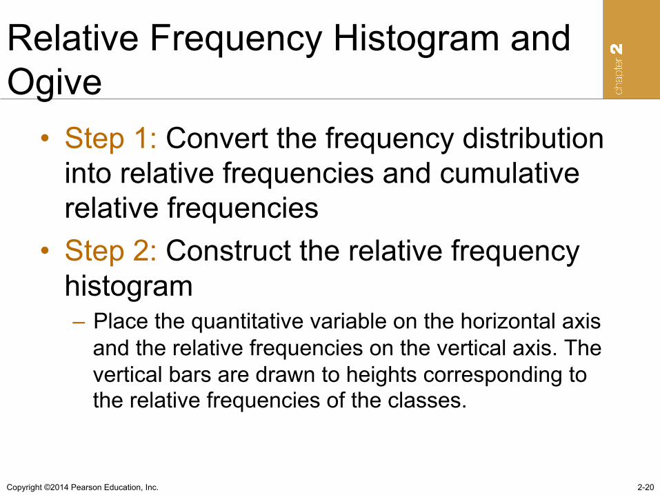
Relative Frequency Histogram and Ogive
• Step 1: Convert the frequency distribution into relative frequencies and cumulative relative frequencies
• Step 2: Construct the relative frequency histogram – Place the quantitative variable on the horizontal axis
and the relative frequencies on the vertical axis. The vertical bars are drawn to heights corresponding to the relative frequencies of the classes.
2-20
Copyright ©2014 Pearson Education, Inc.
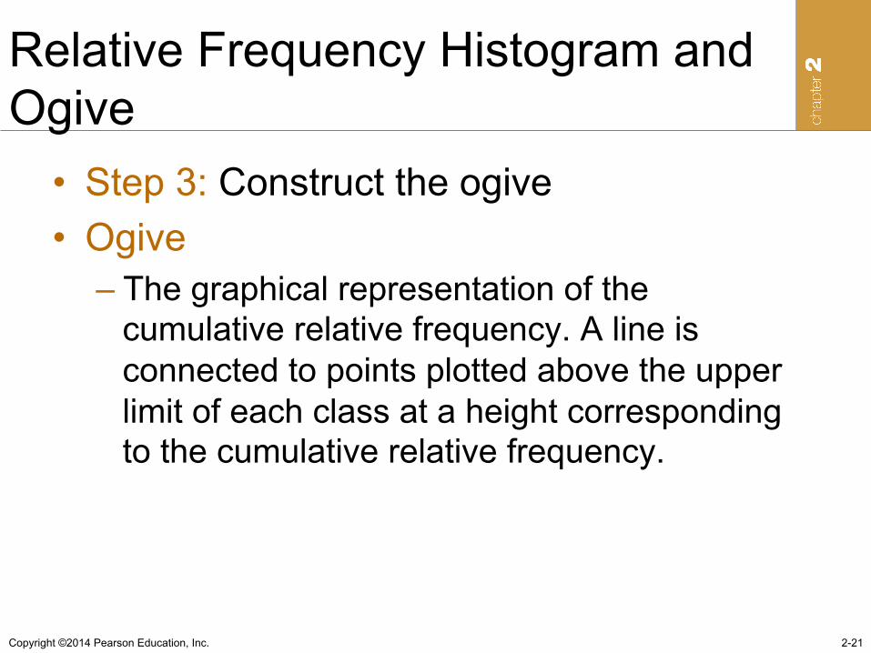
Relative Frequency Histogram and Ogive
• Step 3: Construct the ogive • Ogive
– The graphical representation of the cumulative relative frequency. A line is connected to points plotted above the upper limit of each class at a height corresponding to the cumulative relative frequency.
2-21
Copyright ©2014 Pearson Education, Inc.
Example
2-22
Copyright ©2014 Pearson Education, Inc.
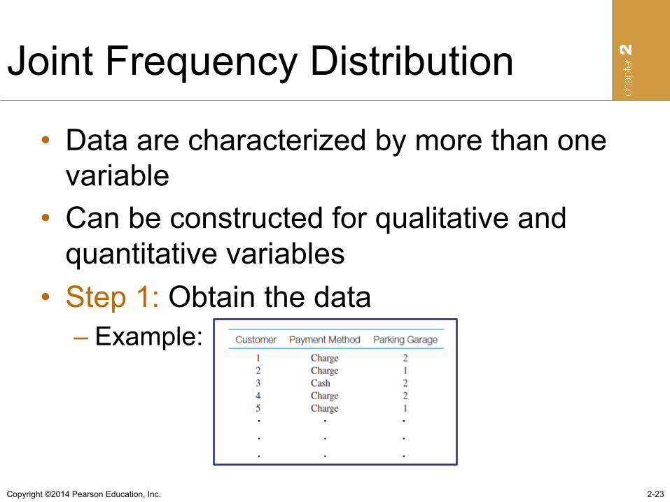
Joint Frequency Distribution
• Data are characterized by more than one variable
• Can be constructed for qualitative and quantitative variables
• Step 1: Obtain the data – Example:
2-23
. . .
. . .
. . .
Copyright ©2014 Pearson Education, Inc.
Joint Frequency Distribution
• Step 2: Construct the rows and columns of the joint frequency table
• Step 3: Count the number of joint occurrences at each row level and each column level for all combinations of row and column values and place these frequencies in the appropriate cells
• Step 4: Calculate the row and column totals
2-24
Copyright ©2014 Pearson Education, Inc.
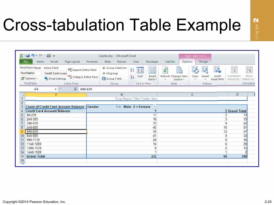
Cross-tabulation Table Example
2-25
Copyright ©2014 Pearson Education, Inc. 2-26
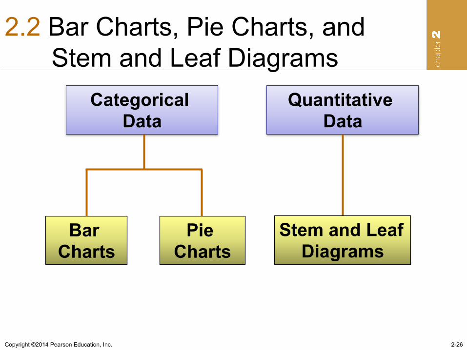
2.2 Bar Charts, Pie Charts, and Stem and Leaf Diagrams
Categorical Data
Bar Charts
Pie Charts
Quantitative Data
Stem and Leaf Diagrams
Copyright ©2014 Pearson Education, Inc.
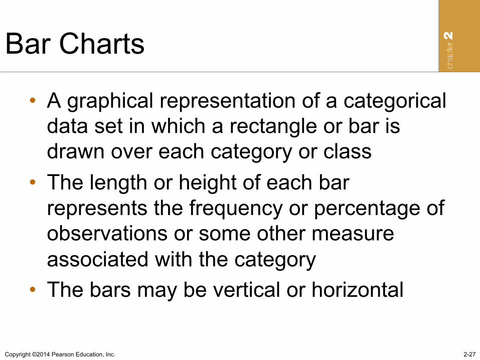
Bar Charts
• A graphical representation of a categorical data set in which a rectangle or bar is drawn over each category or class
• The length or height of each bar represents the frequency or percentage of observations or some other measure associated with the category
• The bars may be vertical or horizontal
2-27
Copyright ©2014 Pearson Education, Inc.
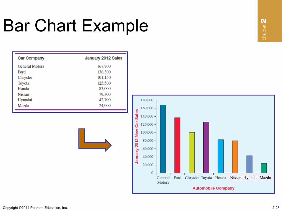
Bar Chart Example
2-28
Nissan Hyundai Mazda
Copyright ©2014 Pearson Education, Inc.
Constructing Bar Chart • Step 1: Define the categories for the variable of
interest • Step 2: For each category, determine the
appropriate measure or value • Step 3: For a column bar chart, locate the categories
on the horizontal axis. For a horizontal bar chart, place the categories on the vertical axis. Then construct bars, either vertical or horizontal, for each category such that the length or height corresponds to the value for the category.
• Step 4: Interpret the results
2-29
Copyright ©2014 Pearson Education, Inc.
Pie Charts
• A graph in the shape of a circle. • The circle is divided into “slices”
corresponding to the categories or classes to be displayed.
• The size of each slice is proportional to the magnitude of the displayed variable associated with each category or class.
2-30
Copyright ©2014 Pearson Education, Inc.
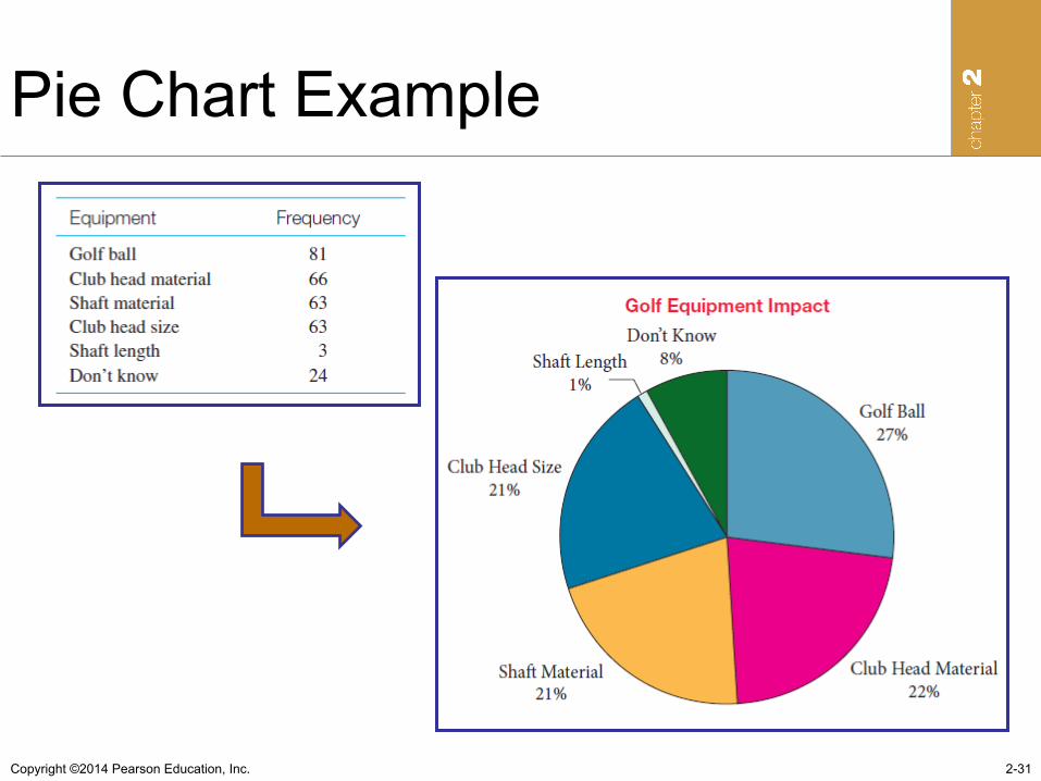
Pie Chart Example
2-31
Copyright ©2014 Pearson Education, Inc.
Constructing Pie Chart
• Step 1: Define the categories for the variable of interest.
• Step 2: For each category, determine the appropriate measure or value. The value assigned to each category is the proportion the category is to the total for all categories.
• Step 3: Construct the pie chart by displaying one slice for each category that is proportional in size to the proportion the category value is to the total of all categories.
2-32
Copyright ©2014 Pearson Education, Inc.
Constructing Stem and Leaf Diagram
• Step 1: Sort the data from low to high. • Step 2: Analyze the data for the variable of
interest to determine how you wish to split the values into a stem and a leaf.
• Step 3: List all possible stems in a single column between the lowest and highest values in the data.
• Step 4: For each stem, list all leaves associated with the stem.
2-33
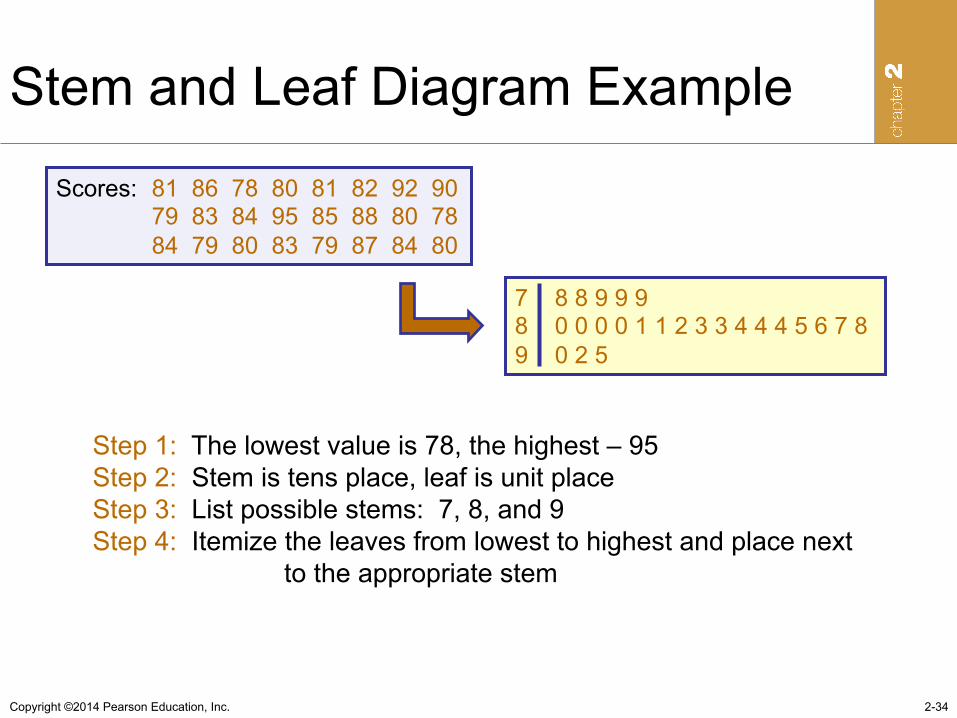
Copyright ©2014 Pearson Education, Inc.
Stem and Leaf Diagram Example
2-34
Scores: 81 86 78 80 81 82 92 90 79 83 84 95 85 88 80 78 84 79 80 83 79 87 84 80
7 8 8 9 9 9 8 0 0 0 0 1 1 2 3 3 4 4 4 5 6 7 8 9 0 2 5
Step 1: The lowest value is 78, the highest – 95 Step 2: Stem is tens place, leaf is unit place Step 3: List possible stems: 7, 8, and 9 Step 4: Itemize the leaves from lowest to highest and place next to the appropriate stem
Copyright ©2014 Pearson Education, Inc. 2-35
2.3 Line Charts and Scatter Diagrams
• Line Chart – A two-dimensional chart showing time on the
horizontal axis and the variable of interest on the vertical axis
• Scatter Diagram – A two-dimensional graph of plotted points in
which the vertical axis represents values of one quantitative variable and the horizontal axis represents values of the other quantitative variable
Copyright ©2014 Pearson Education, Inc.
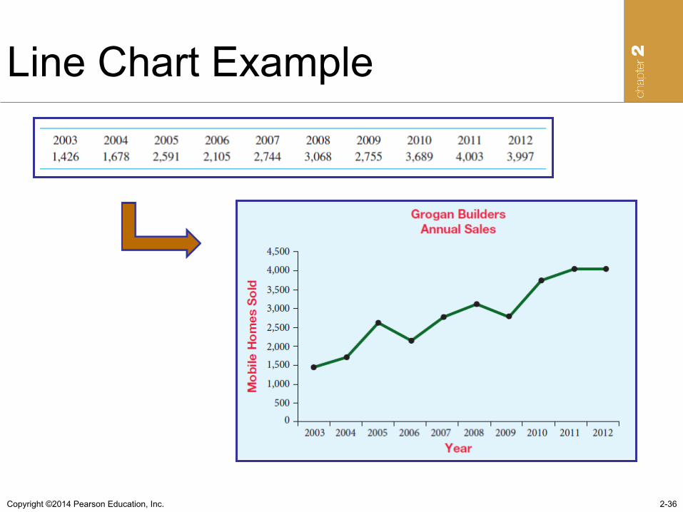
Line Chart Example
2-36
Copyright ©2014 Pearson Education, Inc.
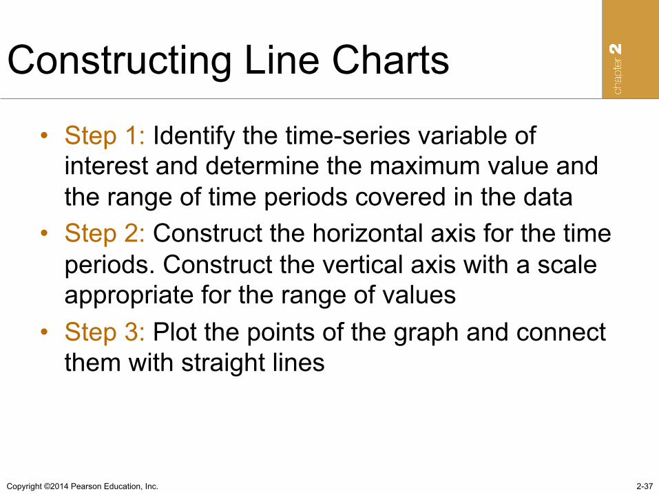
Constructing Line Charts
• Step 1: Identify the time-series variable of interest and determine the maximum value and the range of time periods covered in the data
• Step 2: Construct the horizontal axis for the time periods. Construct the vertical axis with a scale appropriate for the range of values
• Step 3: Plot the points of the graph and connect them with straight lines
2-37
Copyright ©2014 Pearson Education, Inc.
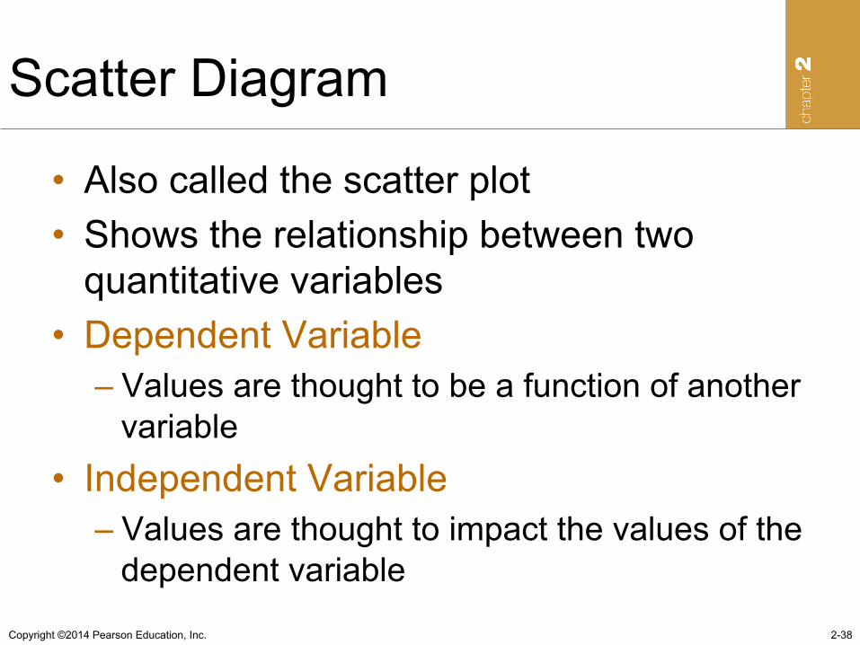
Scatter Diagram
• Also called the scatter plot • Shows the relationship between two
quantitative variables • Dependent Variable
– Values are thought to be a function of another variable
• Independent Variable – Values are thought to impact the values of the
dependent variable
2-38
Copyright ©2014 Pearson Education, Inc.
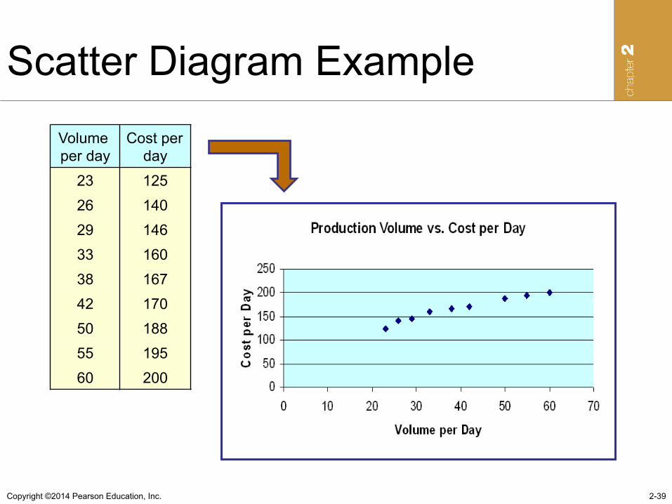
Scatter Diagram Example
2-39
Volume per day
Cost per day
23 125 26 140 29 146 33 160 38 167 42 170 50 188 55 195 60 200
Copyright ©2014 Pearson Education, Inc.
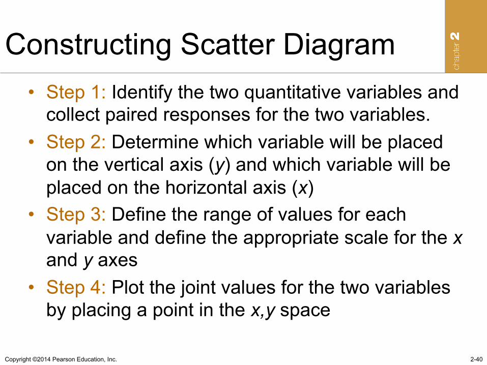
Constructing Scatter Diagram • Step 1: Identify the two quantitative variables and
collect paired responses for the two variables. • Step 2: Determine which variable will be placed
on the vertical axis (y) and which variable will be placed on the horizontal axis (x)
• Step 3: Define the range of values for each variable and define the appropriate scale for the x and y axes
• Step 4: Plot the joint values for the two variables by placing a point in the x,y space
2-40