Describing Data with Tables and Graphs. A frequency distribution is a collection of observations...
36
Chapter 2 Describing Data with Tables and Graphs
-
Upload
frederick-sutton -
Category
Documents
-
view
229 -
download
2
Transcript of Describing Data with Tables and Graphs. A frequency distribution is a collection of observations...

Chapter 2Describing Data with Tables and Graphs

A frequency distribution is a collection of observations produced by sorting observations into classes and showing their frequency (f) of occurrence in each class.
Frequency Distribution
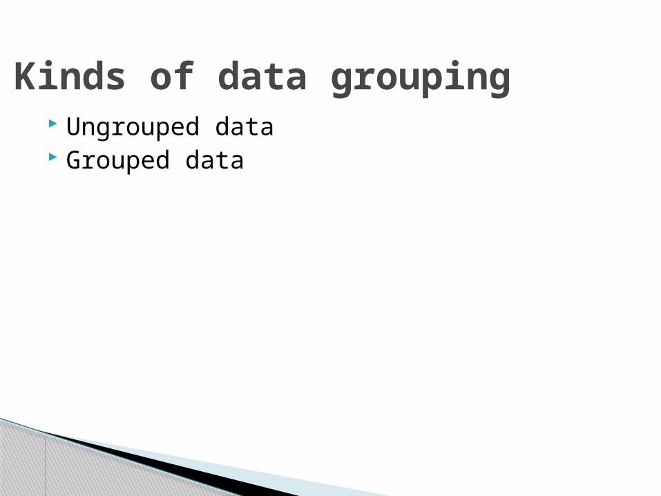
Ungrouped data Grouped data
Kinds of data grouping

◦ Group data◦ Lose detail◦ Gain simplified picture of the data
You win some and lose some.
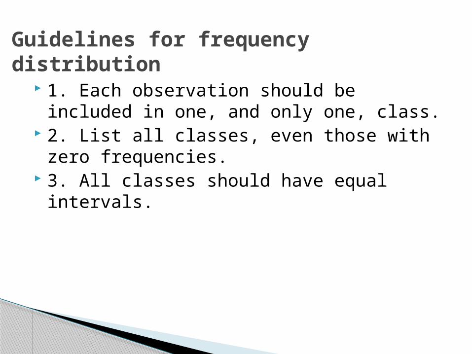
1. Each observation should be included in one, and only one, class.
2. List all classes, even those with zero frequencies.
3. All classes should have equal intervals.
Guidelines for frequency distribution
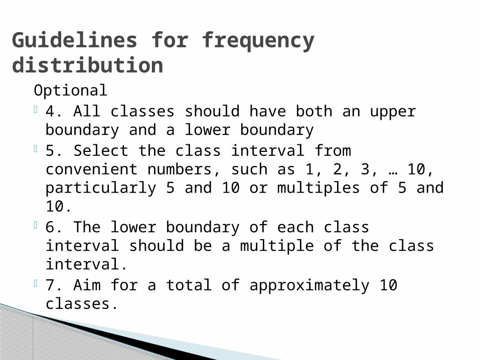
Optional 4. All classes should have both an upper
boundary and a lower boundary 5. Select the class interval from convenient
numbers, such as 1, 2, 3, … 10, particularly 5 and 10 or multiples of 5 and 10.
6. The lower boundary of each class interval should be a multiple of the class interval.
7. Aim for a total of approximately 10 classes.
Guidelines for frequency distribution
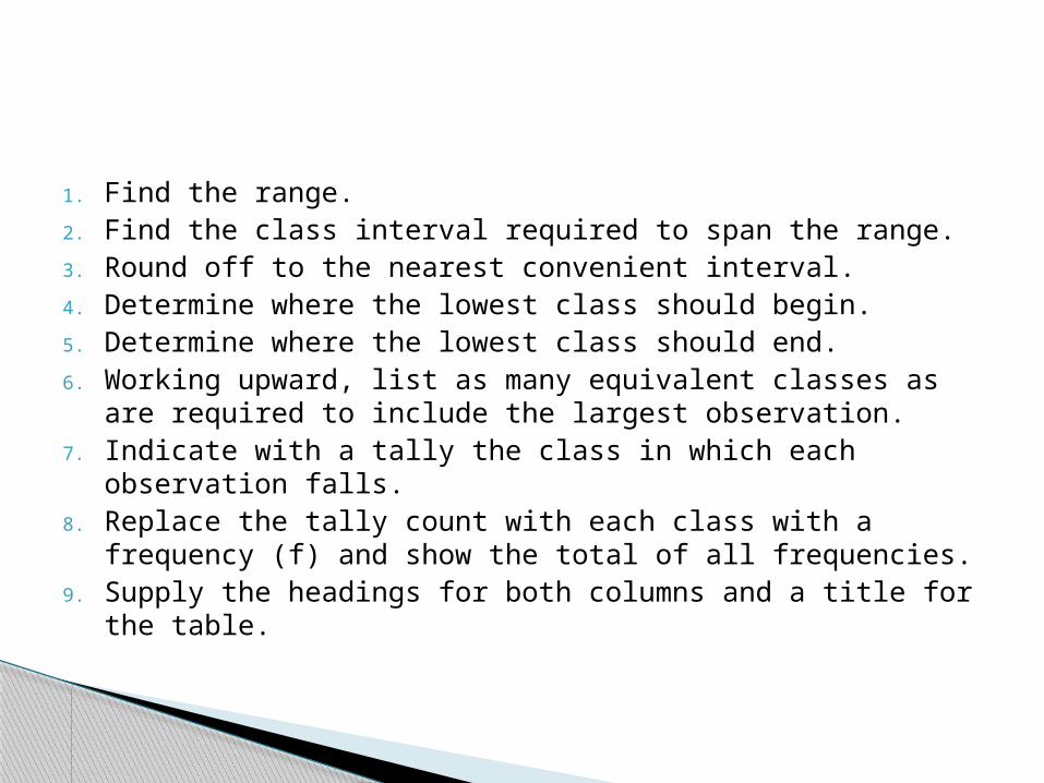
1. Find the range.2. Find the class interval required to span the range.3. Round off to the nearest convenient interval.4. Determine where the lowest class should begin.5. Determine where the lowest class should end.6. Working upward, list as many equivalent classes as are
required to include the largest observation.7. Indicate with a tally the class in which each observation
falls.8. Replace the tally count with each class with a frequency
(f) and show the total of all frequencies.9. Supply the headings for both columns and a title for the
table.
Highest – Lowest data value.
Range
Range/desired number of classes
Class interval to span the range

Keep the intervals equal
Round to a convenient interval
The lowest score should be a multiple of the class interval.
Where to begin

Add the interval value to the lowest value and subtract 1
Size of interval

Working upward, list as many equivalent classes as are required to include the largest observation
Show the intervals
Indicate with a tally the class in which each observation falls
Tallying occurrances
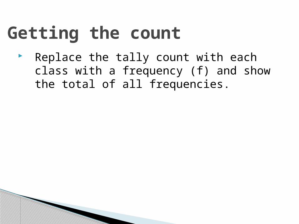
Replace the tally count with each class with a frequency (f) and show the total of all frequencies.
Getting the count

Supply the headings for both columns and a title for the table
Finishing up
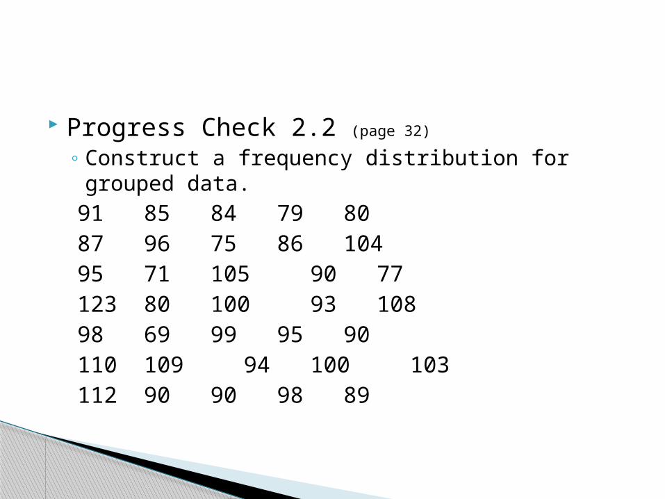
Progress Check 2.2 (page 32)
◦ Construct a frequency distribution for grouped data.91 85 84 79 8087 96 75 8610495 71 105 90 77123 80 100 93 10898 69 99 95 90110 109 94 100 103112 90 90 98 89
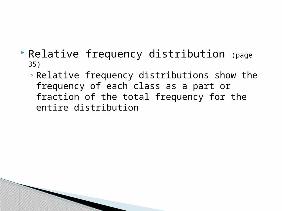
Relative frequency distribution (page 35)
◦ Relative frequency distributions show the frequency of each class as a part or fraction of the total frequency for the entire distribution
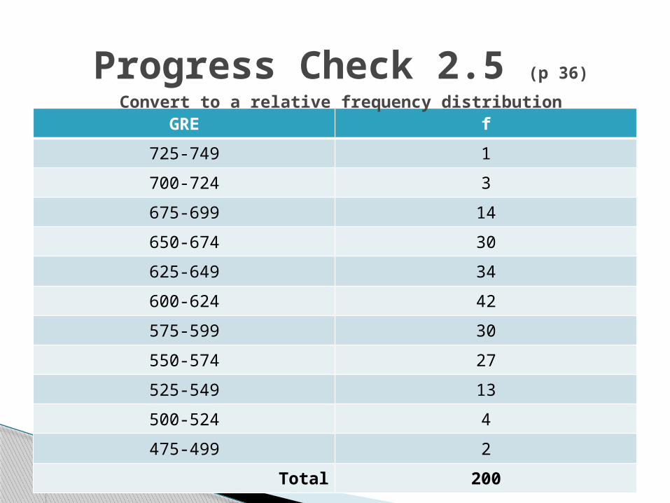
GRE f
725-749 1
700-724 3
675-699 14
650-674 30
625-649 34
600-624 42
575-599 30
550-574 27
525-549 13
500-524 4
475-499 2
Total 200
Progress Check 2.5 (p 36)
Convert to a relative frequency distribution
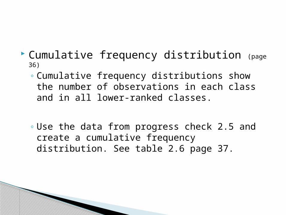
Cumulative frequency distribution (page 36)
◦ Cumulative frequency distributions show the number of observations in each class and in all lower-ranked classes.
◦ Use the data from progress check 2.5 and create a cumulative frequency distribution. See table 2.6 page 37.
Percentile ranks (page 38)
◦ Percentile rank of a score indicates the percentage of scores in the entire distribution with similar or smaller values than that score.

Examples of Frequency distributions for qualitative data (p 38)
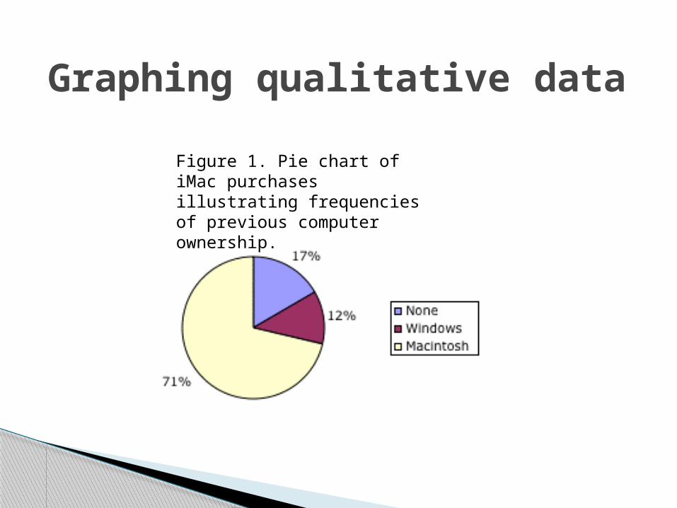
Graphing qualitative data
Figure 1. Pie chart of iMac purchases illustrating frequencies of previous computer ownership.
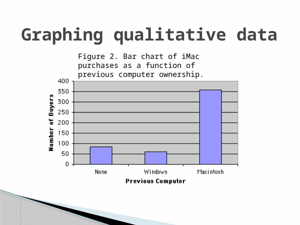
Graphing qualitative dataFigure 2. Bar chart of iMac purchases as a function of previous computer ownership.
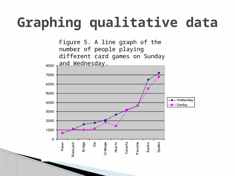
Graphing qualitative dataFigure 5. A line graph of the number of people playing different card games on Sunday and Wednesday.
◦ A line graph for quantitative data which also emphasizes the continuity of continuous variables.
Frequency Polygons

Histograms (page 41)
◦ Equal units along the horizontal axis (X)◦ Equal units along the vertical axis (Y)◦ Intersection of axes define the origin (0)◦ Numerical scales increase from left to right,
bottom to top.◦ Body reflects frequency for the classes reflected
by height of bars.
Stem and leaf display◦ A device for sorting quantitative data on the basis
of leading and trailing digits.
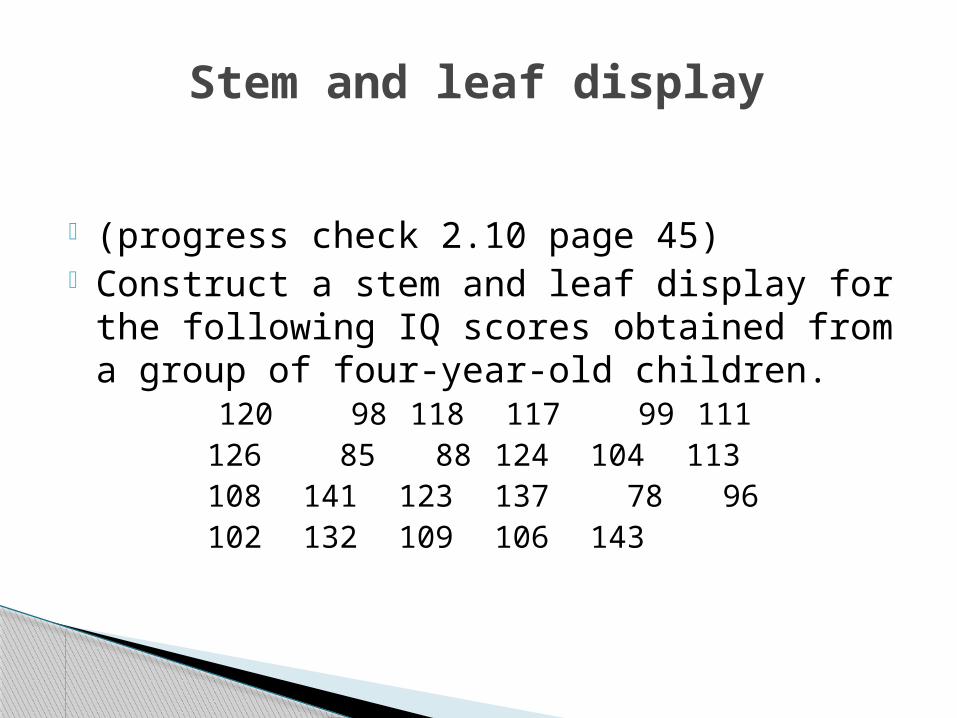
(progress check 2.10 page 45) Construct a stem and leaf display for the
following IQ scores obtained from a group of four-year-old children.
120 98 118 117 99 111126 85 88 124 104 113108 141 123 137 78 96102 132 109 106 143
Stem and leaf display

Frequency polygons◦ Common shapes
Normal Bimodal Positively skewed Negatively skewed

Skewness
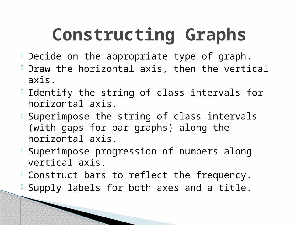
Decide on the appropriate type of graph. Draw the horizontal axis, then the vertical
axis. Identify the string of class intervals for
horizontal axis. Superimpose the string of class intervals (with
gaps for bar graphs) along the horizontal axis. Superimpose progression of numbers along
vertical axis. Construct bars to reflect the frequency. Supply labels for both axes and a title.
Constructing Graphs
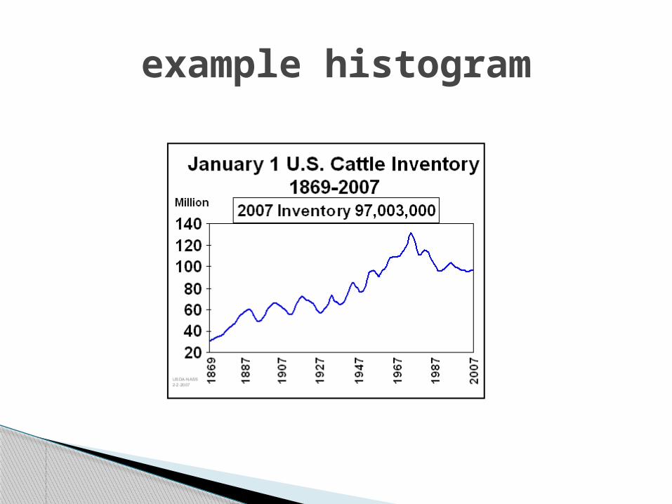
example histogram
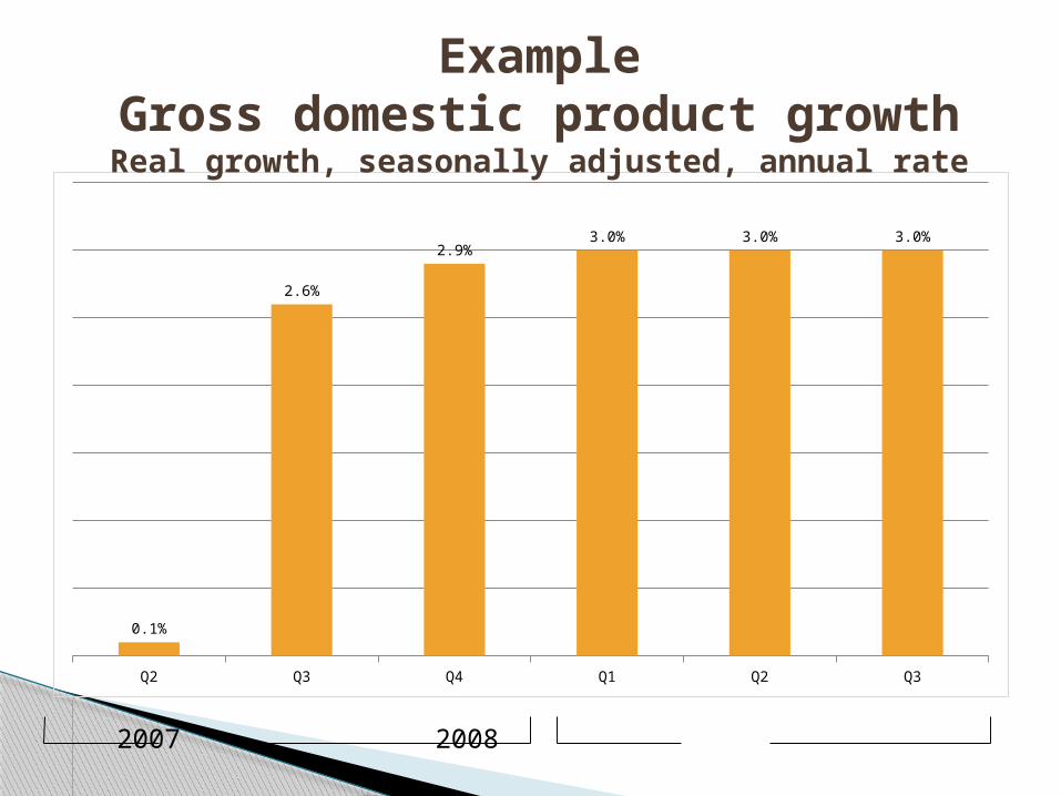
Q2 Q3 Q4 Q1 Q2 Q3
0.1%
2.6%
2.9%3.0% 3.0% 3.0%
ExampleGross domestic product growthReal growth, seasonally adjusted, annual rate
2007 2008
This link to a histogram applet shows the duration, in minutes, for geyser eruptions of Old Faithful in Yellowstone National Park. To see how varying bin (bar) widths affect the
shape of the data, change the width by using your mouse to drag the arrow
underneath the bin width scale at the bottom of the histogram.
Histogram demonstration
Progress Check 2.13 (p49)
Class Activity