Data_Visualization_Best_Practices
48
What’s Your Message? Illustrating Data: Raising the Bars Ed Bartholomew September 24, 2014
-
Upload
ed-bartholomew -
Category
Documents
-
view
212 -
download
0
Transcript of Data_Visualization_Best_Practices

What’s Your Message?
Illustrating Data: Raising the BarsEd BartholomewSeptember 24, 2014

DATA VISUALIZATION
Why is it needed?Visual perceptionMisrepresenting dataClarifying the dataMemory

Your Attention, Please!
• Velocity of information delivery is important– The average adult attention span has plummeted from 12
minutes a decade ago to just 5 minutes

What if Only the Mean is Reported?

Charts may reveal data that statistics do not
Y = 0.5x + 3


The Message
Get Their Attention
Tell the Story Trigger a Memory

GETTING THEIR ATTENTION

• Psychology, Psychophysics and Perception
• Structure and attributes of an image–Bertin’s Visual Attributes and Levels of
Organization–Mackinlay’s Perceptual Properties
Human Factors


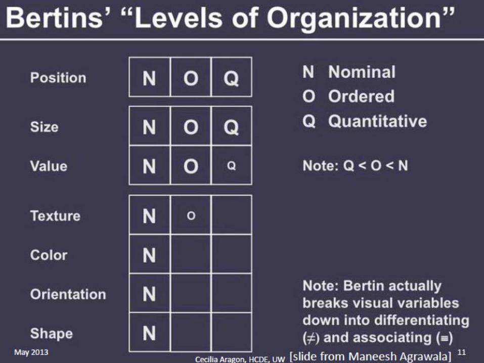

Mackinlay, 1986:

AreaVolume
Color

LengthPosition
Color for Grouping

Perception: Color is Context Sensitive


-- Contrasting color and shape

Perception: Pre-Attentive Processing
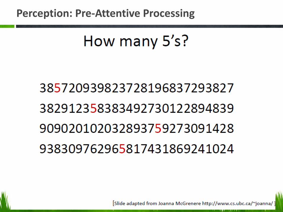
Perception: Pre-Attentive Processing

Tell the Story

Chart Types in the Word Cloud

Types of Charts - Comments
• Bar – Horizontal Bar makes labels easier to read• Pie – Be sure the segments total 100%• 3D – Need to label the objects with values• Line – Trends/Observations over time• Area – Quantitative and additive
– How many infections(ratio)? Not the change in rate (interval)-Use a line chart
• Tukey Box – Benchmarks, quartiles• Scatterplot – Correlation between two variables• Dual Axis – Correlated variables and time, Cost and
Earnings, Intervention and Infection Rate.

Less is More
Mackinlay’s Expressiveness criteria – “A set of facts is expressible in a visual language if the sentences (the visualizations) … express all the facts in the set of data and only the facts in the data.”

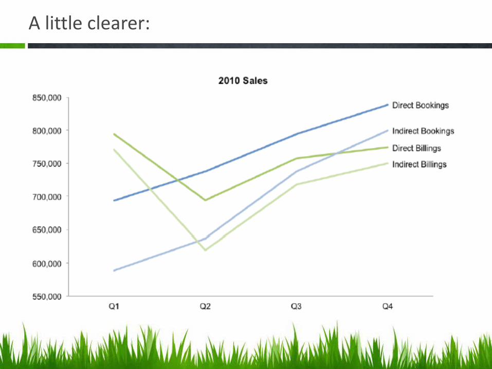
A little clearer:

Source: New Yorker, 2015

Establish Credibility and Trust
• Misleading graphs distort the story• Common ways this happens
– Failing to start an axis at 0– Inconsistent scale in either axis– Failing to label the axes


Retail Sales from November 1998 to April 2000
$0.00$50.00
$100.00$150.00$200.00$250.00$300.00
Nov-98
Dec-98
Jan-99
Feb-99
Mar-99
Apr-99
May-99
Jun-99
Jul-99
Aug-99
Sep-99
Oct-99
Nov-99
Dec-99
Jan-00
Feb-00
Mar-00
Apr-00
Month
Bil
lio
ns

Retail Sales Rise
$0.00$50.00
$100.00$150.00$200.00$250.00$300.00
Novembe
r
Decembe
r
Janu
ary
Februa
ryMarc
hApri
l
Month
Bill
ions
First YearSecond Year

Tukey’s Box Chart: Benchmarking
http://chartsgraphs.wordpress.com/2008/11/18/boxplots-r-does-them-right/

Dual Y Axis Chart: Time Series and Interaction
160
165
170
175
180
185
190
195
200
205
0
10
20
30
40
50
60
70
80
90
100
1 2 3 4 5 6 7 8 9 10 11 12 13 14 15 16 17 18 19 20 21 22 23 24 25 26
Weight(Lbs)Exercise(Min/Week)
Day
Relationship Between Exercise and Weight Loss
Linear regression, p<.05

Trigger a Memory

Edward Tufte
Sparklines create context Tabular data and Trends

Time Magazine – Nigel Holmes
“Consider this unsavory exhibit at right–chockablock with cliché and stereotype, coarse humor, and a content-empty third dimension. It is the product of a visual sensitivity in which a thigh-graph with a fishnet-stocking grid counts as a Creative Concept. Everything counts, but nothing matters.”-Edward Tufte

ET; Subtlety?

Useful Junk?
“Useful Junk? The Effects of Visual Embellishment on Comprehension and Memorability of Charts” Scott Bateman, Regan L. Mandryk, Carl Gutwin, Aaron Genest, David McDine, and Christopher Brooks of the University of Saskatchewan

Findings
“We found that people’s accuracy in describing the embellished charts was no worse than for plain charts, and that their recall after a two-to-three-week gap was significantly better. Although we are cautious about recommending that all charts be produced in this style, our results question some of the premises of the minimalist approach to chart design.”

Source: New Yorker, 2015

Source: New Yorker, 2015


Qualities of Good Graphics
• Simple• Communicates information without needing text• Easily reproduced• Clearly labeled• Illustrates patterns that can be easily
distinguished• Culturally appropriate• Correctly placed in the text• Consistently numbered and titled• Provides correct references (sources)

References and Resources
Data Visualization
1. Area chart: http://blog.visual.ly/line-vs-area-charts/ (population example/ temp vs rainfall) 2. Stephen Few and Bill Gates’ Favorite: http://www.perceptualedge.com/blog/?p=1829 3. Stephen Few: Chartjunk Debate
http://www.perceptualedge.com/articles/visual_business_intelligence/the_chartjunk_debate.pdf
4. Edward Tufte: http://www.edwardtufte.com/tufte/ 5. Cecilia Aragon, Department of Human Centered Design and Engineering, University of
Washington. http://www.hcde.washington.edu/ 6. http://www.storytellingwithdata.com/ 7. Bad examples S. Few: http://www.perceptualedge.com/examples.php 8. http://www.b-eye-network.com/channels/5628/view/17090 9. http://www.slideshare.net/idigdata/data-visualization-best-practices-2013 10. Andy Kirk: T:\Externally Funded Projects\CAUTI-AHRQ-
80399\Communications\Infographics\Andy Kirk Data Visualization Training 11. Information is beautiful awards: http://www.informationisbeautifulawards.com/news/20-
nicholas-felton-s-2013-annual-report 12. http://www.informationisbeautifulawards.com/showcase 13. http://www.aaronkoblin.com/work.html 14. http://www.datavizchallenge.org/about-challenge 15. http://www.fastcocreate.com/3022248/see-the-25-most-beautiful-data-visualizations-of-
2013#19 16. Charts that misrepresent data: Kevin Kenward – Data Visualization power point presentations. 17. http://scienceblogs.com/cognitivedaily/2009/01/28/reading-graphs-how-we-do-it-an/ 18. https://github.com/mbostock/d3/wiki/Gallery