DATAKIND - THE POWER OF DATA
18
DataKind Dublin Science Gallery, 17 April 2015 @DataKindDUB #data4good
-
Upload
conor-duke -
Category
Data & Analytics
-
view
256 -
download
0
Transcript of DATAKIND - THE POWER OF DATA
DataKind DublinScience Gallery, 17 April 2015
@DataKindDUB#data4good
Welcome!
Today we are aiming to:
• Tell you a little bit about using Data for Social Good
• Show you interesting work of data used for social causes
• Help you explore some interesting visualizations3pm to 5pm
meetup.com/DataKind-DUB/[email protected]
@DataKindDUB
Great to have you here!

Welcome!
Website: sciencegallery20150417.pen.io
3pm to 5pmmeetup.com/DataKind-DUB/
[email protected]@DataKindDUB
Great to have you here!
The power of Data
• HEALTH• EDUCATION• POLITICS• DEVELOPMENT
...• DAILY LIFE!

Good Data Science
First principles...
• Correlation doesn’t imply Causation• Occam’s Razor
Communicating your results...• Know your Audience• Let the data tell the story• ‘Intelligent Grandmother test’
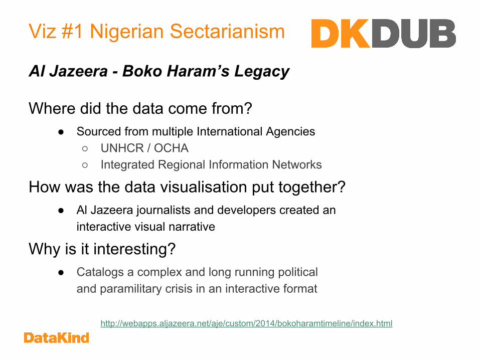
Viz #1 Nigerian Sectarianism
Where did the data come from?● Sourced from multiple International Agencies
○ UNHCR / OCHA○ Integrated Regional Information Networks
How was the data visualisation put together?● Al Jazeera journalists and developers created an
interactive visual narrative
Why is it interesting?● Catalogs a complex and long running political
and paramilitary crisis in an interactive format
http://webapps.aljazeera.net/aje/custom/2014/bokoharamtimeline/index.html
Al Jazeera - Boko Haram’s Legacy

Viz #1 Nigerian Sectarianism
● What happened on August 26th 2011?
● When was the first case of internal displacement in Southern Nigeria?
● On the 50th anniversary of Nigerian Independence, there were attacks in Abuja. Where in the capital did these take place?
For the eager ones!
● When is the first case of External Displacement and what caused it?
http://webapps.aljazeera.net/aje/custom/2014/bokoharamtimeline/index.html
Things to find...

Viz #2 - Selfie Analytics
Where did the data come from?● Publicly Available Instagram Selfies
How was the Data Visualisation put together?● Human Image Processing of Instagram Selfies● Used Crowdsourcing to Classify Images - Amazon's Mechanical Turk
Why is it interesting?● Study into passive LifeLogging by Instagram users
http://selfiecity.net/selfiexploratory
Beauty is in the Eye of the App-Holder
Viz #2 - Selfie Analytics
● Find all the girls in Sao Paulo with their Mouths Closed
● Find all the men in Bangkok who are looking up with their Eyes Open
● Find all the people who are Calm and Happy, then try Crop & Rotate
For the eager ones!
● Correlate people’s Mood with whether their Eyes are Open or Closed
http://selfiecity.net/selfiexploratory
Things to find...

Viz #3 - Prevalence of Diabetes
Where did the data come from?● International Diabetes Federation’s Global Atlas (public data portal)
How was the Data Visualisation put together?● IDF compiles data from
○ Peer-reviewed Journals○ National Health Statistics Reports○ International Agencies (CDC, WHO, …)
Why is it interesting?● Independent analysis of Global Diabetes Data● Find out potential new answers to pressing questions
https://public.tableau.com/s/gallery/prevalence-diabetes-world
Diabetes Mellitus - The Silent Epidemic
Viz #3 - Prevalence of Diabetes
● What is the prevalence of diabetes in your country? How does it compare to the surrounding region and the world overall?
● Which countries have the highest diabetes prevalence? Can you find any connection between them?
● Pick a region (Europe, Asia etc) of your interest and find out what are the countries with the highest and lowest levels of diabetes.
For the eager ones!
● Explore the relationship between diabetes and IGT (impaired glucose tolerance). Do you think they are related?
https://public.tableau.com/s/gallery/prevalence-diabetes-world
Things to find...
Viz #4 - Educating Girls
Where did the data come from?● World Bank (public data portal)
How was the Data Visualisation put together?● World Bank collates indicators from multiple sources
○ UNESCO, UNICEF, WHO, UNDESA, UNDP● Author used freeware to create the viz
Why is it interesting?● Targeted use of Global Data to highlight a specific cause / policy● In this case, the effect of Primary Education on Income Levels
https://public.tableau.com/s/gallery/educating-girls
If you educate a Woman, you educate a Family

Viz #4 - Educating Girls
● For the year you were born, what country had the lowest rate of girls finishing primary education?
● What was the average of this rate in High Income countries? What is the year with the best completion rate?
● Where do you see the best improvement in the ratio of primary education completion and reduced mortality?
For the eager ones!
● Which country has the highest ratio of completion to mortality over any year?
https://public.tableau.com/s/gallery/educating-girls
Things to find...
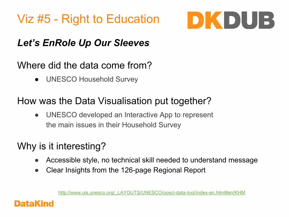
Viz #5 - Right to Education
Where did the data come from?● UNESCO Household Survey
How was the Data Visualisation put together?● UNESCO developed an Interactive App to represent
the main issues in their Household Survey
Why is it interesting?● Accessible style, no technical skill needed to understand message● Clear Insights from the 126-page Regional Report
http://www.uis.unesco.org/_LAYOUTS/UNESCO/oosci-data-tool/index-en.html#en/KHM
Let’s EnRole Up Our Sleeves

Viz #5 - Right to Education
● What are the difference between children in India? Compare○ Poorest vs Richest○ In School vs Out of School
• What is the difference in school experience between Girls and Boys in Pakistan?
• In Ethiopia what is the split between School vs Out of School comparing rural and urban areas
For the eager ones! • Of the Primary School Age Population in Nigeria, how many of the
poorest children are out of school?http://www.uis.unesco.org/_LAYOUTS/UNESCO/oosci-data-tool/index-en.html#en/KHM
http://www.uis.unesco.org/_LAYOUTS/UNESCO/oosci-data-tool/index-en.html#en/KHM
Things to find out ...
Hope you enjoyed our Workshop
DataDive16/17 May 2015Bank of Ireland,Grand Canal Square
[email protected]@DataKindDUB#data4good
meetup.com/DataKind-DUB/
Thank you !Join us: datakind.org/getinvolved