QBM117 Business Statistics Descriptive Statistics Numerical Descriptive Measures.
Data presentation and descriptive statistics
Paola Grosso SNE research group
Today with Jeroen van der Ham as “special guest”
Sep.06 2010 - Slide 2
Instructions for use
• I do talk fast: – Ask me to repeat if something is not clear; – I made an effort to keep it ‘interesting’,
but you are the ‘guinea pigs’…feedback is welcome!
• You will not get a grade: – But you will have to do some ‘work’;
• 3 for the price of 2 – We will start slow and accelerate; – We will (ambitiously?) cover lots of material; – We will also use more than the standard two hours.

Introduction
Sep.06 2010 - Slide 4
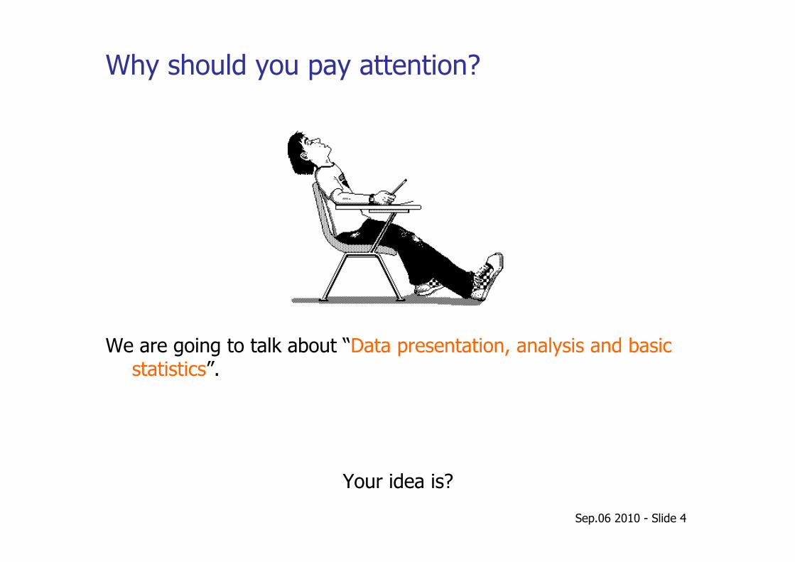
Why should you pay attention?
We are going to talk about “Data presentation, analysis and basic statistics”.
Your idea is?
Sep.06 2010 - Slide 5
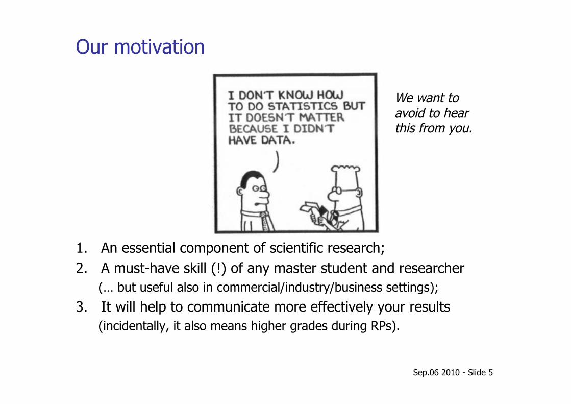
Our motivation
1. An essential component of scientific research; 2. A must-have skill (!) of any master student and researcher
(… but useful also in commercial/industry/business settings);
3. It will help to communicate more effectively your results (incidentally, it also means higher grades during RPs).
We want to avoid to hear this from you.
Sep.06 2010 - Slide 6
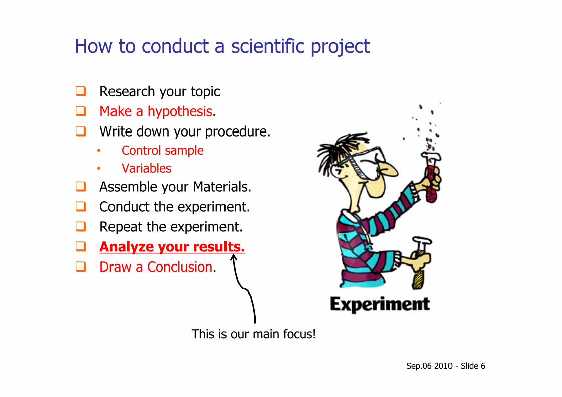
How to conduct a scientific project
Research your topic Make a hypothesis. Write down your procedure.
• Control sample • Variables
Assemble your Materials. Conduct the experiment. Repeat the experiment. Analyze your results. Draw a Conclusion.
This is our main focus!
Sep.06 2010 - Slide 7
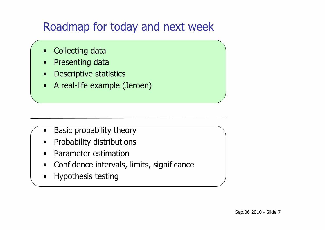
Roadmap for today and next week
• Collecting data • Presenting data • Descriptive statistics • A real-life example (Jeroen)
• Basic probability theory • Probability distributions • Parameter estimation • Confidence intervals, limits, significance • Hypothesis testing
Collecting data
Terminology Sampling Data types
Sep.06 2010 - Slide 9
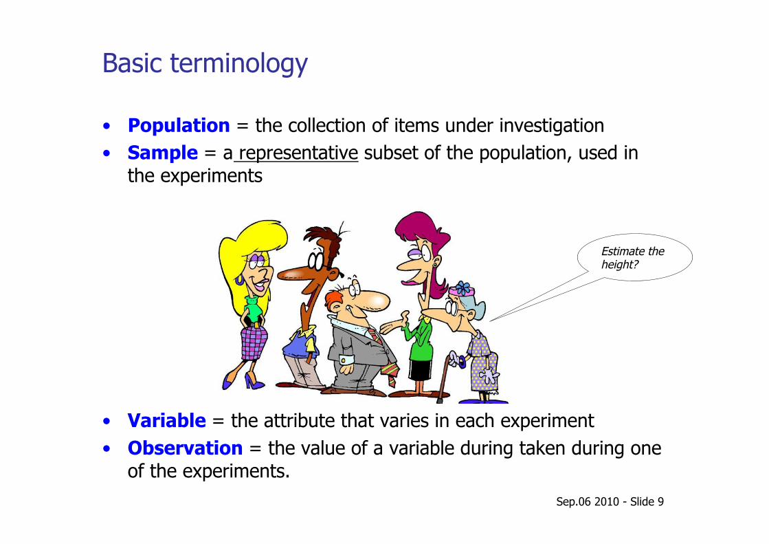
Basic terminology
• Population = the collection of items under investigation • Sample = a representative subset of the population, used in
the experiments
• Variable = the attribute that varies in each experiment • Observation = the value of a variable during taken during one
of the experiments.
Estimate the height?
Sep.06 2010 - Slide 10
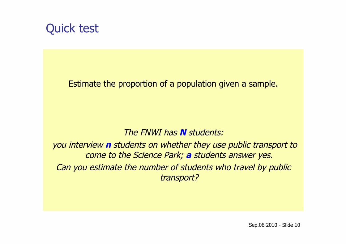
Quick test
Estimate the proportion of a population given a sample.
The FNWI has N students: you interview n students on whether they use public transport to
come to the Science Park; a students answer yes. Can you estimate the number of students who travel by public
transport?
Sep.06 2010 - Slide 11
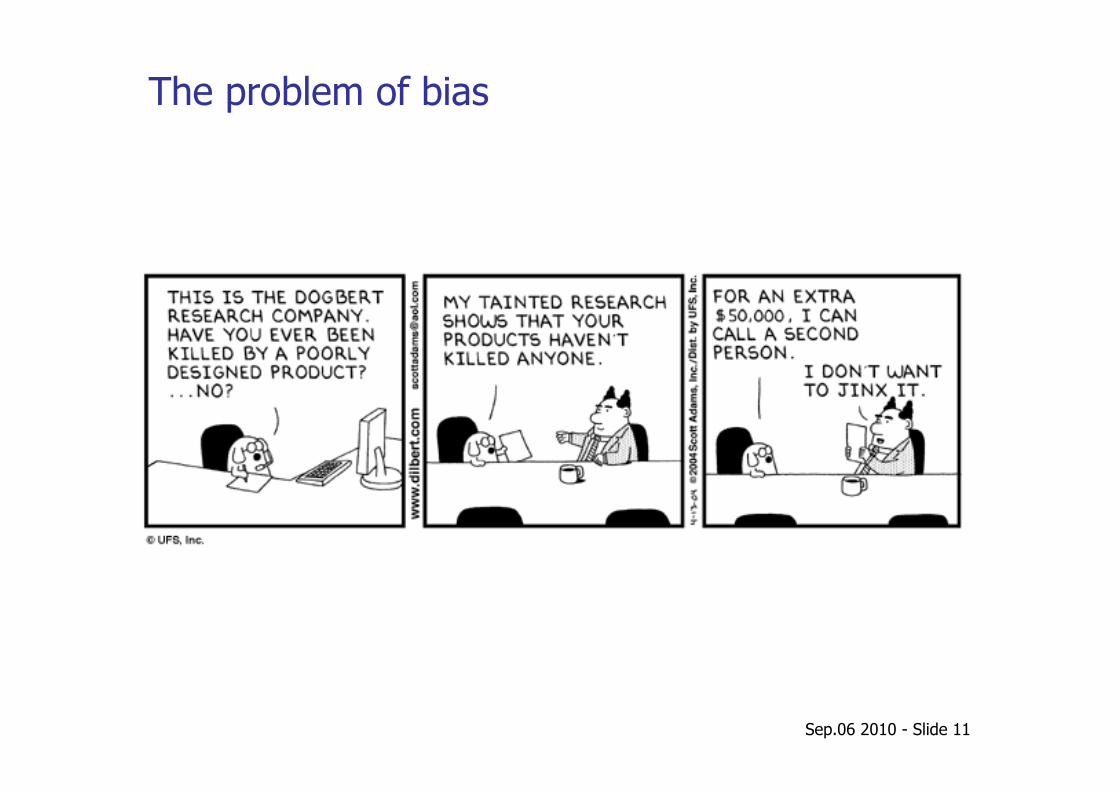
The problem of bias
Sep.06 2010 - Slide 12
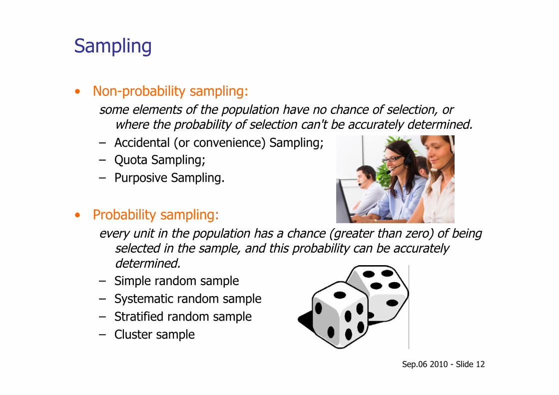
Sampling
• Non-probability sampling: some elements of the population have no chance of selection, or
where the probability of selection can't be accurately determined. – Accidental (or convenience) Sampling; – Quota Sampling; – Purposive Sampling.
• Probability sampling: every unit in the population has a chance (greater than zero) of being
selected in the sample, and this probability can be accurately determined.
– Simple random sample – Systematic random sample – Stratified random sample – Cluster sample
Sep.06 2010 - Slide 13
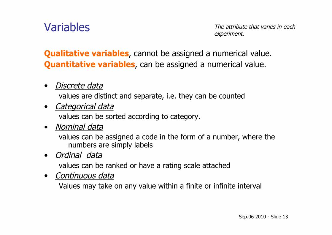
Variables
Qualitative variables, cannot be assigned a numerical value. Quantitative variables, can be assigned a numerical value.
• Discrete data values are distinct and separate, i.e. they can be counted
• Categorical data values can be sorted according to category.
• Nominal data values can be assigned a code in the form of a number, where the
numbers are simply labels • Ordinal data
values can be ranked or have a rating scale attached • Continuous data
Values may take on any value within a finite or infinite interval
The attribute that varies in each experiment.
Sep.06 2010 - Slide 14
Quick test
Discrete or continuous?
– The number of suitcases lost by an airline. – The height of apple trees. – The number of apples produced. – The number of green M&M's in a bag. – The time it takes for a hard disk to fail. – The production of cauliflower by weight.
Presenting the data
Tables Charts Graphs
Sep.06 2010 - Slide 16
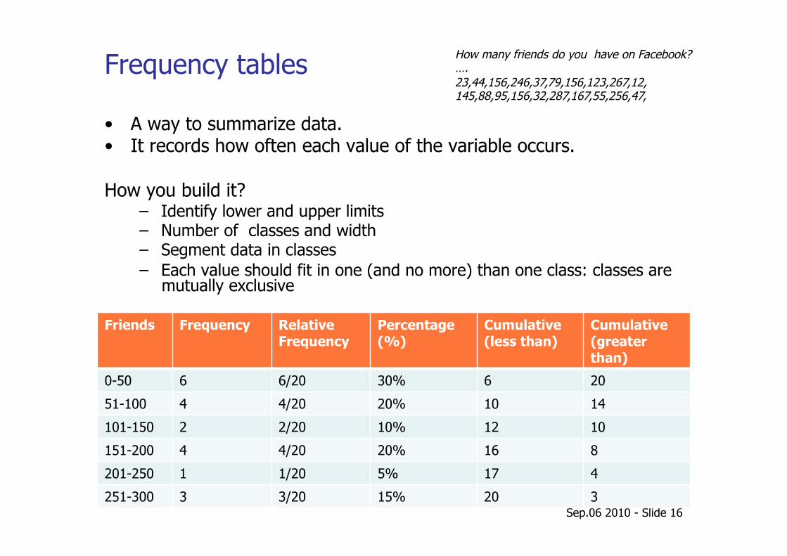
Frequency tables
Friends Frequency Relative Frequency
Percentage (%)
Cumulative (less than)
Cumulative (greater than)
0-50 6 6/20 30% 6 20
51-100 4 4/20 20% 10 14
101-150 2 2/20 10% 12 10
151-200 4 4/20 20% 16 8
201-250 1 1/20 5% 17 4
251-300 3 3/20 15% 20 3
How many friends do you have on Facebook? …. 23,44,156,246,37,79,156,123,267,12, 145,88,95,156,32,287,167,55,256,47,
• A way to summarize data. • It records how often each value of the variable occurs.
How you build it? – Identify lower and upper limits – Number of classes and width – Segment data in classes – Each value should fit in one (and no more) than one class: classes are
mutually exclusive
Sep.06 2010 - Slide 17
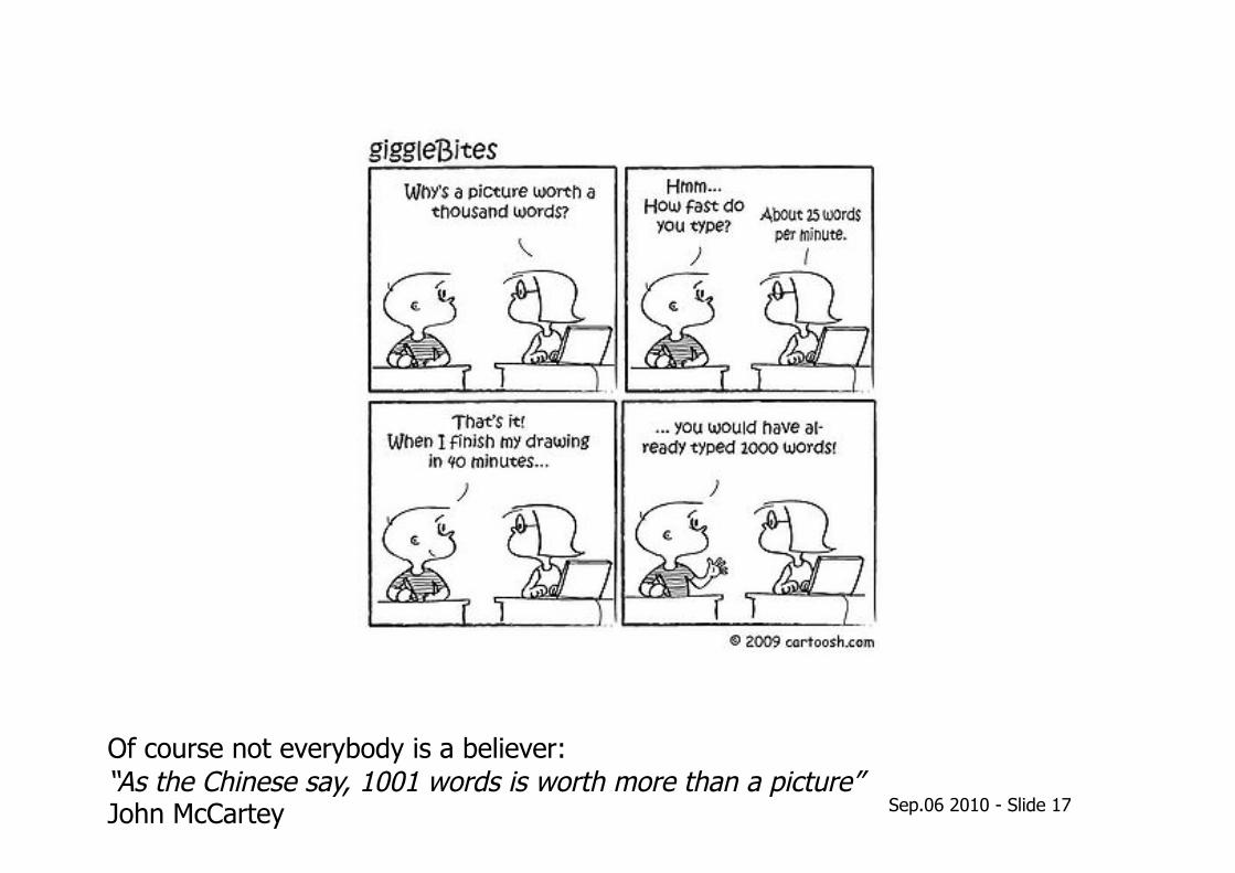
Of course not everybody is a believer: “As the Chinese say, 1001 words is worth more than a picture” John McCartey
Sep.06 2010 - Slide 18
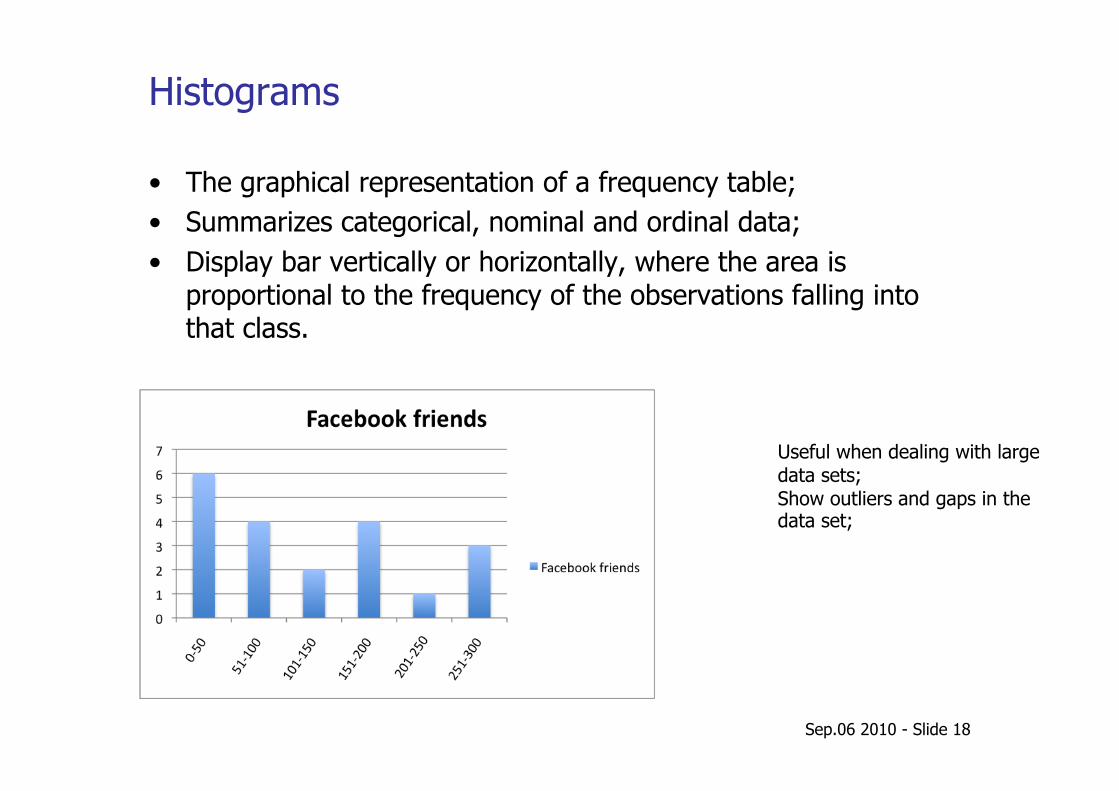
Histograms
• The graphical representation of a frequency table; • Summarizes categorical, nominal and ordinal data; • Display bar vertically or horizontally, where the area is
proportional to the frequency of the observations falling into that class.
Useful when dealing with large data sets; Show outliers and gaps in the data set;
Sep.06 2010 - Slide 19
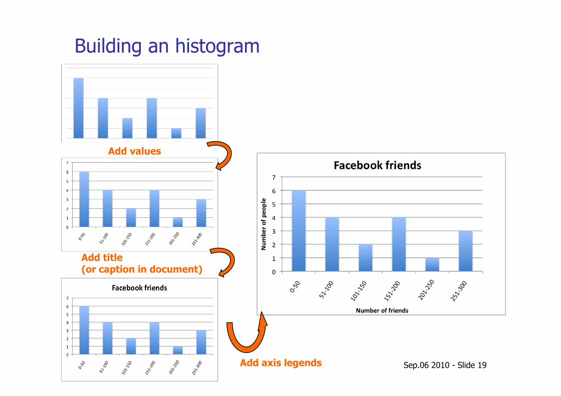
Building an histogram
Add values
Add title (or caption in document)
Add axis legends
Sep.06 2010 - Slide 20
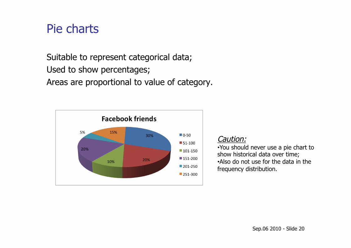
Pie charts
Suitable to represent categorical data; Used to show percentages; Areas are proportional to value of category.
Caution: • You should never use a pie chart to show historical data over time; • Also do not use for the data in the frequency distribution.
Sep.06 2010 - Slide 21
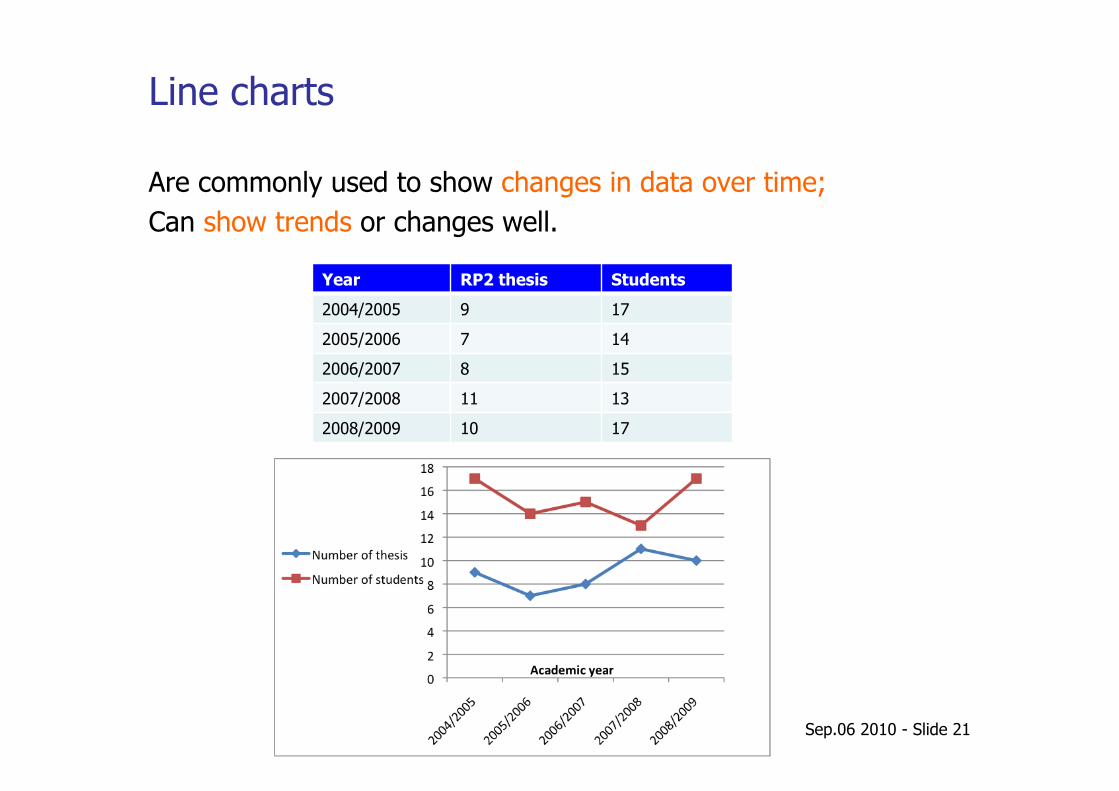
Line charts
Are commonly used to show changes in data over time; Can show trends or changes well.
Year RP2 thesis Students
2004/2005 9 17
2005/2006 7 14
2006/2007 8 15
2007/2008 11 13
2008/2009 10 17
Sep.06 2010 - Slide 22
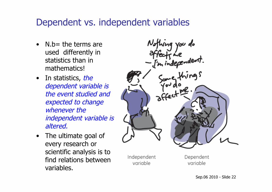
Dependent vs. independent variables
• N.b= the terms are used differently in statistics than in mathematics!
• In statistics, the dependent variable is the event studied and expected to change whenever the independent variable is altered.
• The ultimate goal of every research or scientific analysis is to find relations between variables.
Sep.06 2010 - Slide 23
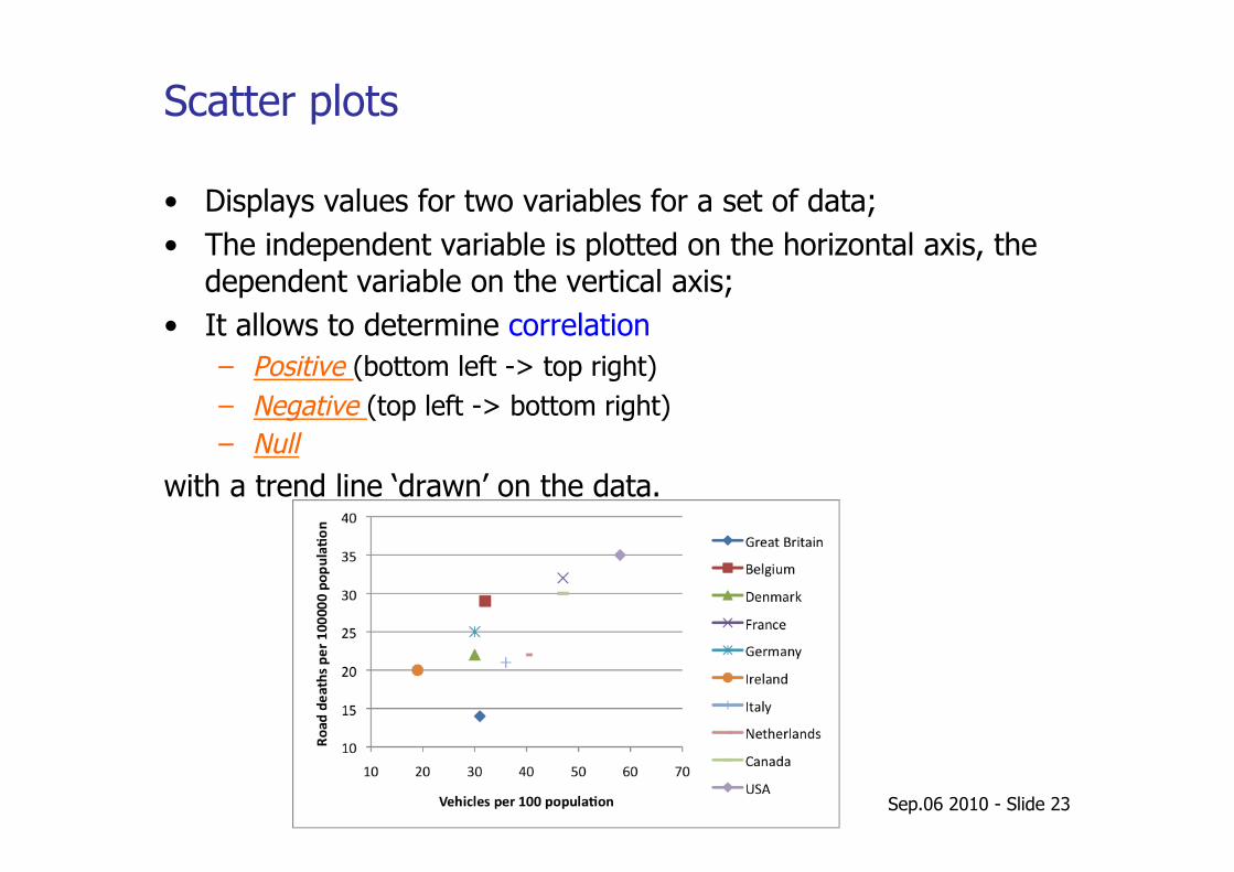
Scatter plots
• Displays values for two variables for a set of data; • The independent variable is plotted on the horizontal axis, the
dependent variable on the vertical axis; • It allows to determine correlation
– Positive (bottom left -> top right) – Negative (top left -> bottom right) – Null
with a trend line ‘drawn’ on the data.
Sep.06 2010 - Slide 24
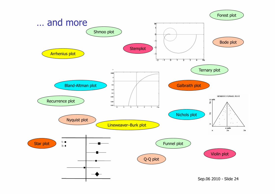
… and more
Arrhenius plot
Bland-Altman plot
Bode plot
Lineweaver–Burk plot
Forest plot
Funnel plot
Nyquist plot Nichols plot
Galbraith plot
Recurrence plot
Q-Q plot
Star plot
Shmoo plot
Stemplot
Violin plot
Ternary plot
Statistics packages followed by some hands on work
Sep.06 2010 - Slide 26
Graphics and statistics tools
Plenty of tools to use to plot and do statistical analysis. Just some you could use:
• gnuplot • ROOT • Excel
We will use the open-source statistical computer program R. Make installation yourself;
$> apt-get install r-base-core
Run R as: $> R
You find the documentation at: http://www.r-project.org/
Sep.06 2010 - Slide 27
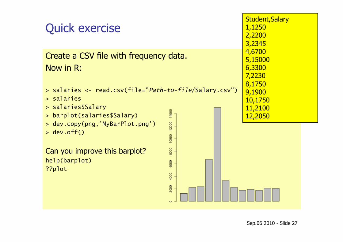
Quick exercise
Create a CSV file with frequency data. Now in R:
> salaries <- read.csv(file=”Path-to-file/Salary.csv")
> salaries
> salaries$Salary
> barplot(salaries$Salary)
> dev.copy(png,’MyBarPlot.png’)
> dev.off()
Can you improve this barplot? help(barplot)
??plot
Student,Salary 1,1250 2,2200 3,2345 4,6700 5,15000 6,3300 7,2230 8,1750 9,1900 10,1750 11,2100 12,2050
Descriptive statistics
• Median, mean and mode • Variance and standard deviation • Basic concepts of distribution • Correlation • Linear regression
Sep.06 2010 - Slide 29
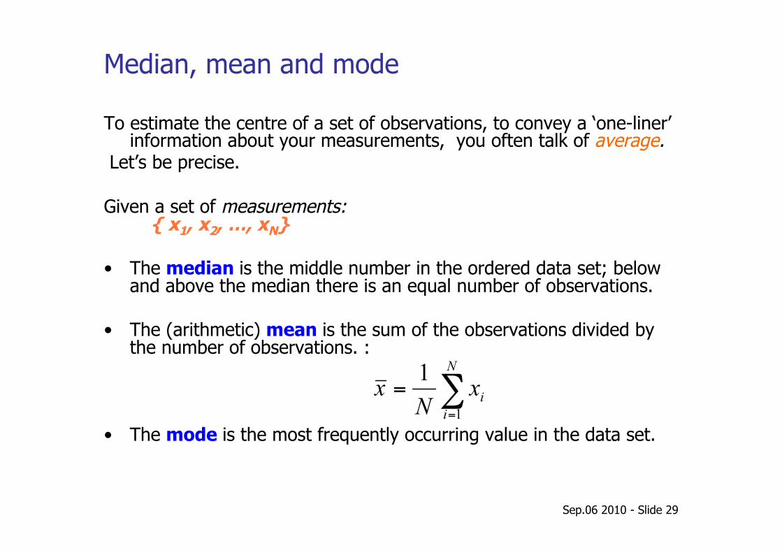
Median, mean and mode
To estimate the centre of a set of observations, to convey a ‘one-liner’ information about your measurements, you often talk of average.
Let’s be precise.
Given a set of measurements: { x1, x2, …, xN}
• The median is the middle number in the ordered data set; below and above the median there is an equal number of observations.
• The (arithmetic) mean is the sum of the observations divided by the number of observations. :
• The mode is the most frequently occurring value in the data set.
Sep.06 2010 - Slide 30
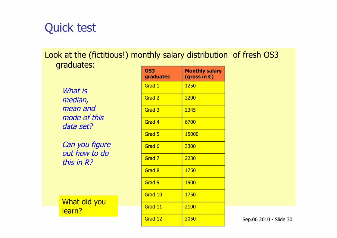
Quick test
Look at the (fictitious!) monthly salary distribution of fresh OS3 graduates:
OS3 graduates
Monthly salary (gross in €)
Grad 1 1250
Grad 2 2200
Grad 3 2345
Grad 4 6700
Grad 5 15000
Grad 6 3300
Grad 7 2230
Grad 8 1750
Grad 9 1900
Grad 10 1750
Grad 11 2100
Grad 12 2050
What is median, mean and mode of this data set?
Can you figure out how to do this in R?
What did you learn?
Sep.06 2010 - Slide 31
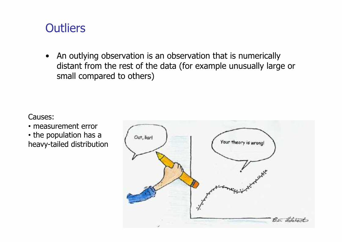
Outliers
• An outlying observation is an observation that is numerically distant from the rest of the data (for example unusually large or small compared to others)
Causes: • measurement error • the population has a heavy-tailed distribution
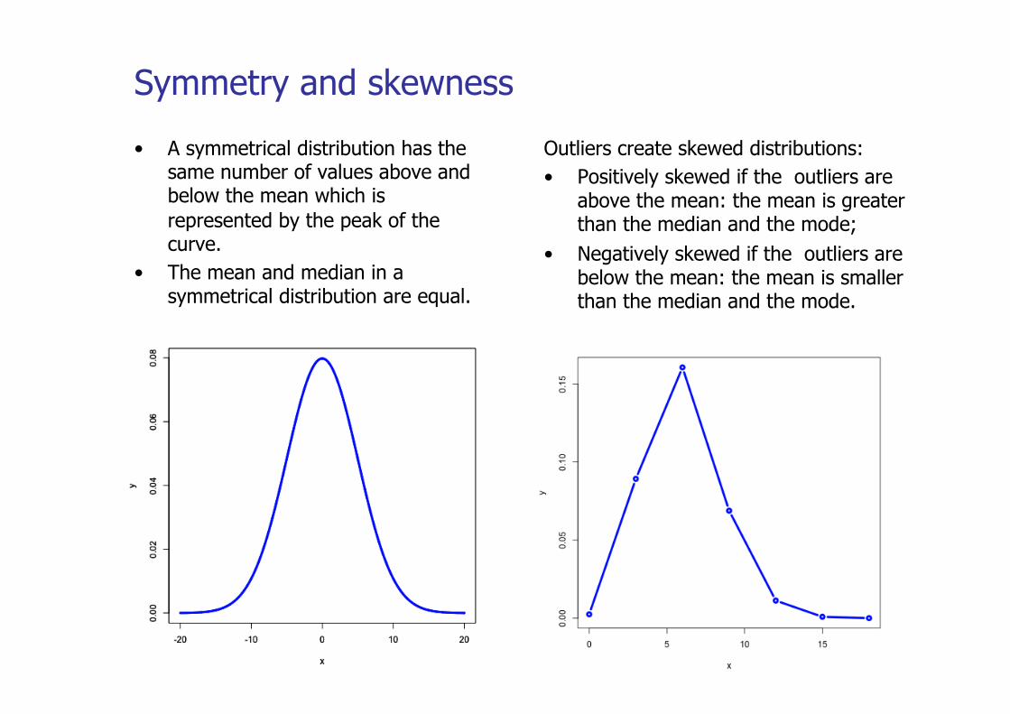
Symmetry and skewness
• A symmetrical distribution has the same number of values above and below the mean which is represented by the peak of the curve.
• The mean and median in a symmetrical distribution are equal.
Outliers create skewed distributions: • Positively skewed if the outliers are
above the mean: the mean is greater than the median and the mode;
• Negatively skewed if the outliers are below the mean: the mean is smaller than the median and the mode.
Sep.06 2010 - Slide 33
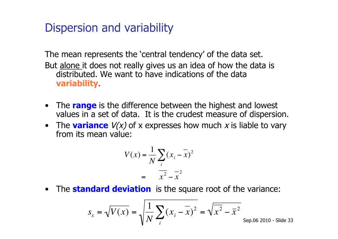
Dispersion and variability
The mean represents the ‘central tendency’ of the data set. But alone it does not really gives us an idea of how the data is
distributed. We want to have indications of the data variability.
• The range is the difference between the highest and lowest values in a set of data. It is the crudest measure of dispersion.
• The variance V(x) of x expresses how much x is liable to vary from its mean value:
• The standard deviation is the square root of the variance:
€
V (x) =1N
(xii∑ − x)2
= x 2 − x2
€
sx = V (x) =1N
(xi − x)2i∑ = x 2 − x 2
Sep.06 2010 - Slide 34
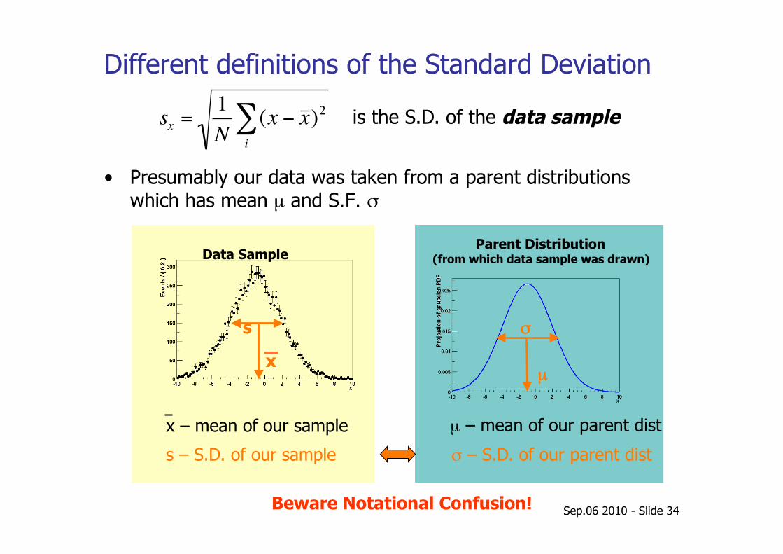
Different definitions of the Standard Deviation
• Presumably our data was taken from a parent distributions which has mean µ and S.F. σ
€
sx =1N
(x − x )2i∑ is the S.D. of the data sample
x – mean of our sample µ – mean of our parent dist
σ – S.D. of our parent dist s – S.D. of our sample
Beware Notational Confusion!
x
s σ
µ
Data Sample Parent Distribution
(from which data sample was drawn)
Different definitions of the Standard Deviation
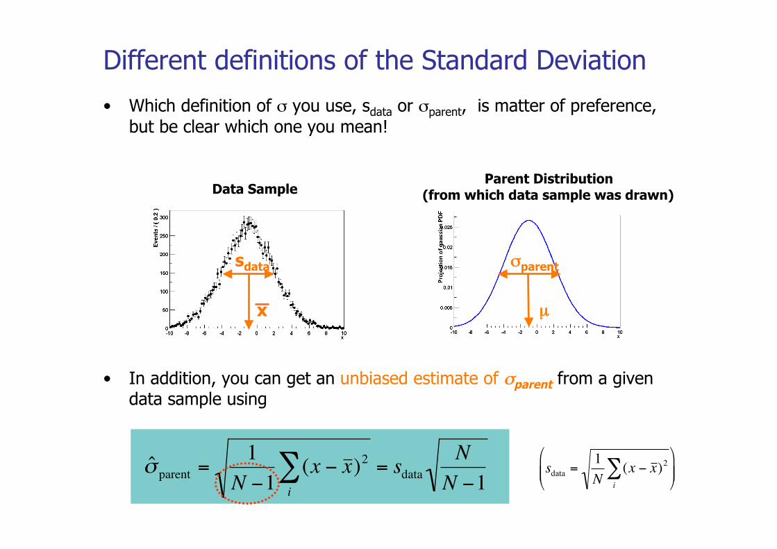
• Which definition of σ you use, sdata or σparent, is matter of preference, but be clear which one you mean!
• In addition, you can get an unbiased estimate of σparent from a given data sample using
€
ˆ σ parent =1
N −1(x − x )2
i∑ = sdata
NN −1
x
sdata σparent
µ
Data Sample Parent Distribution
(from which data sample was drawn)
€
sdata =1N
(x − x )2i∑
Sep.06 2010 - Slide 36
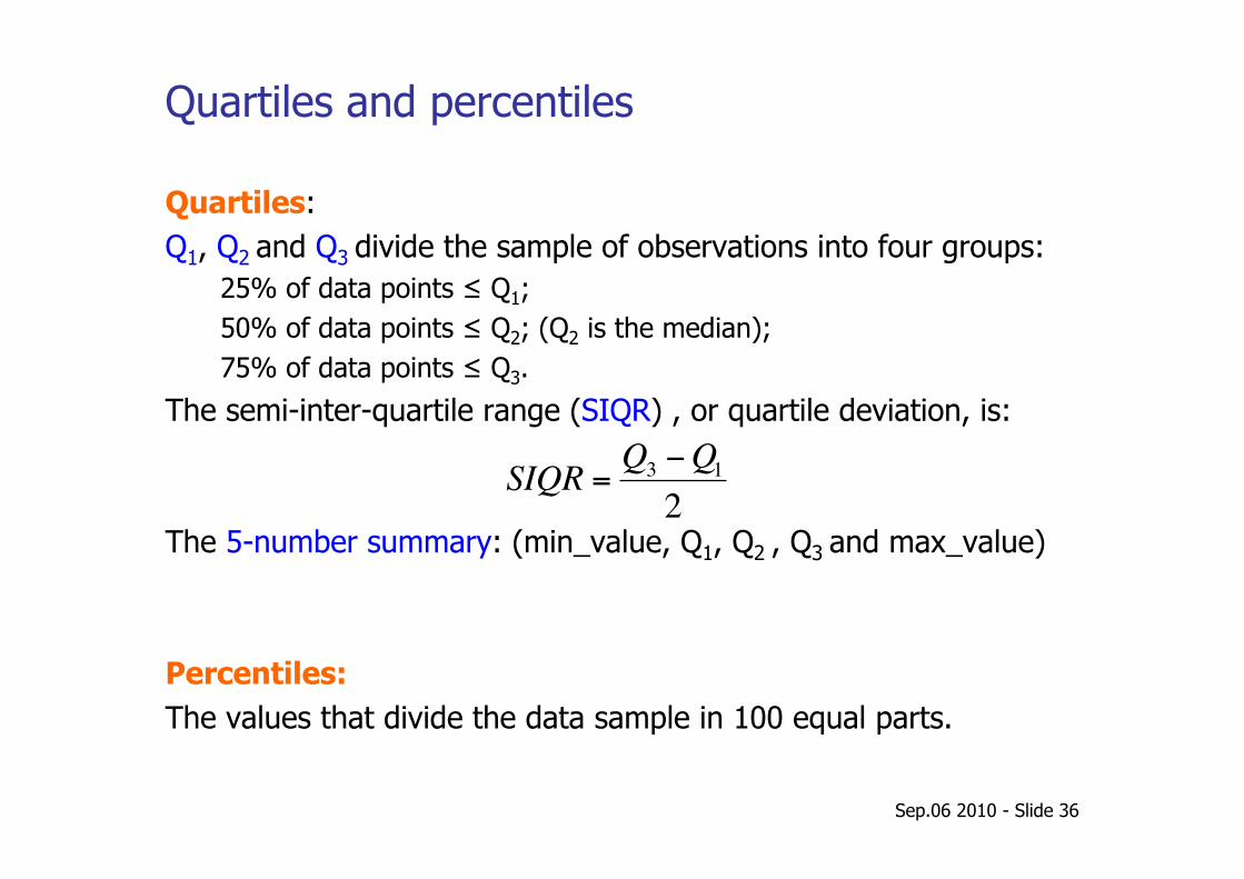
Quartiles and percentiles
Quartiles: Q1, Q2 and Q3 divide the sample of observations into four groups:
25% of data points ≤ Q1; 50% of data points ≤ Q2; (Q2 is the median); 75% of data points ≤ Q3.
The semi-inter-quartile range (SIQR) , or quartile deviation, is:
The 5-number summary: (min_value, Q1, Q2 , Q3 and max_value)
Percentiles: The values that divide the data sample in 100 equal parts.
€
SIQR =Q3 −Q12
Sep.06 2010 - Slide 37
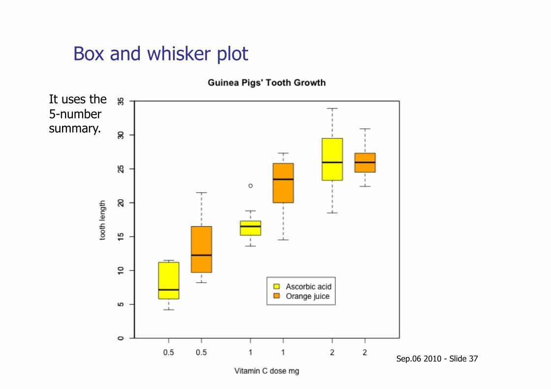
Box and whisker plot
It uses the 5-number summary.
Correlation and regression
Sep.06 2010 - Slide 39
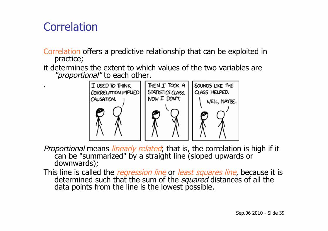
Correlation
Correlation offers a predictive relationship that can be exploited in practice;
it determines the extent to which values of the two variables are "proportional" to each other.
.
Proportional means linearly related; that is, the correlation is high if it can be "summarized" by a straight line (sloped upwards or downwards);
This line is called the regression line or least squares line, because it is determined such that the sum of the squared distances of all the data points from the line is the lowest possible.
Sep.06 2010 - Slide 40
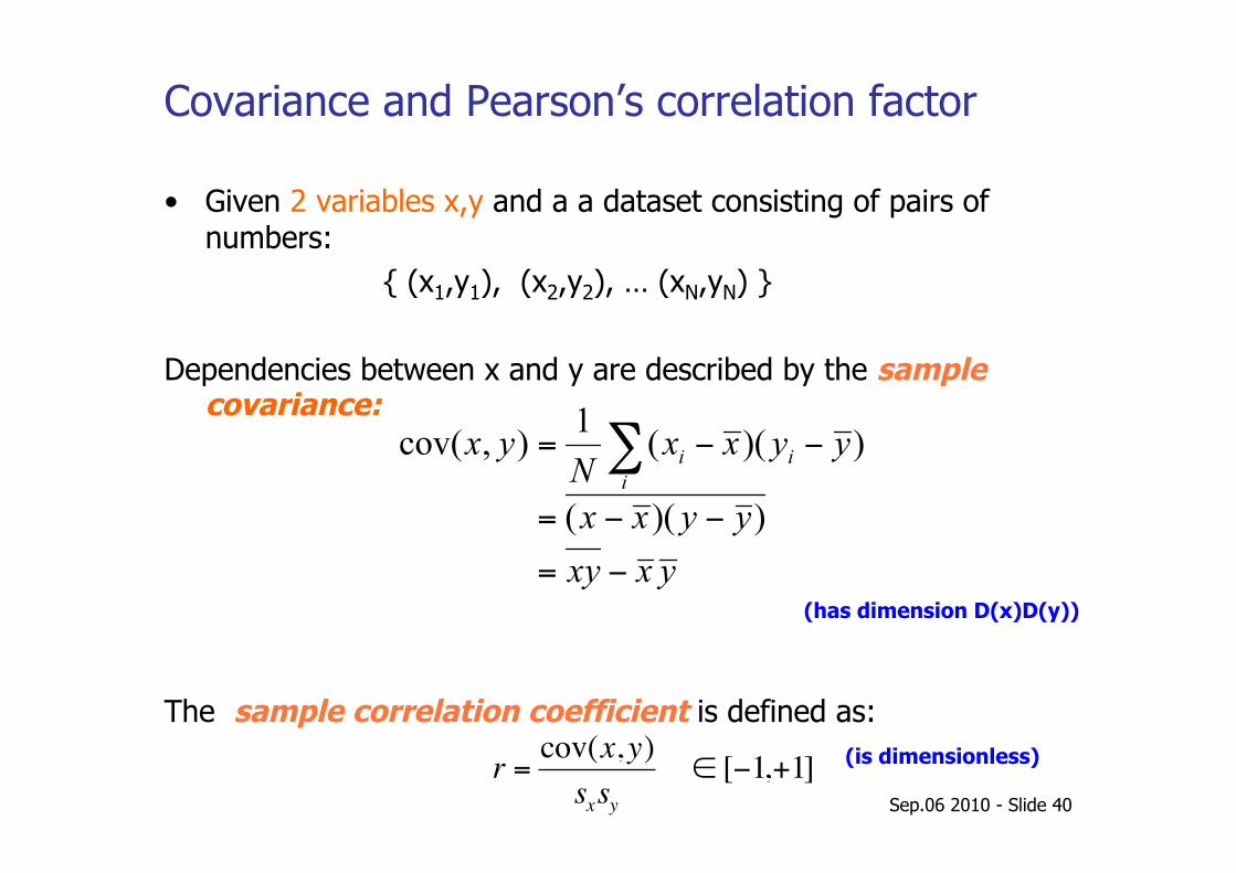
Covariance and Pearson’s correlation factor
• Given 2 variables x,y and a a dataset consisting of pairs of numbers: { (x1,y1), (x2,y2), … (xN,yN) }
Dependencies between x and y are described by the sample covariance:
The sample correlation coefficient is defined as:
(has dimension D(x)D(y))
€
r =cov(x,y)sxsy
∈ [−1,+1] (is dimensionless)
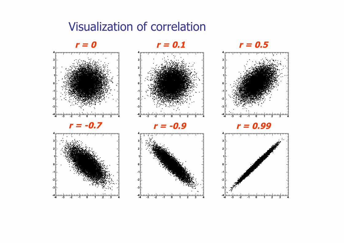
Visualization of correlation r = 0 r = 0.1 r = 0.5
r = -0.7 r = -0.9 r = 0.99
Sep.06 2010 - Slide 42
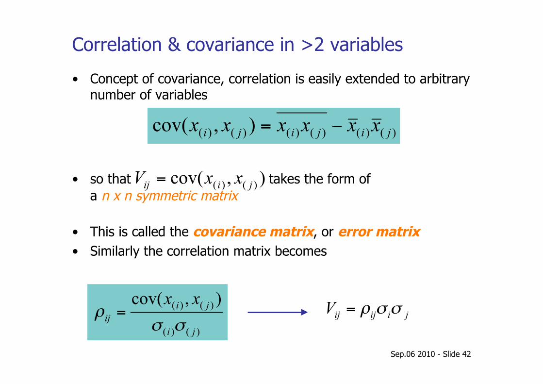
Correlation & covariance in >2 variables
• Concept of covariance, correlation is easily extended to arbitrary number of variables
• so that takes the form of a n x n symmetric matrix
• This is called the covariance matrix, or error matrix • Similarly the correlation matrix becomes
Sep.06 2010 - Slide 43
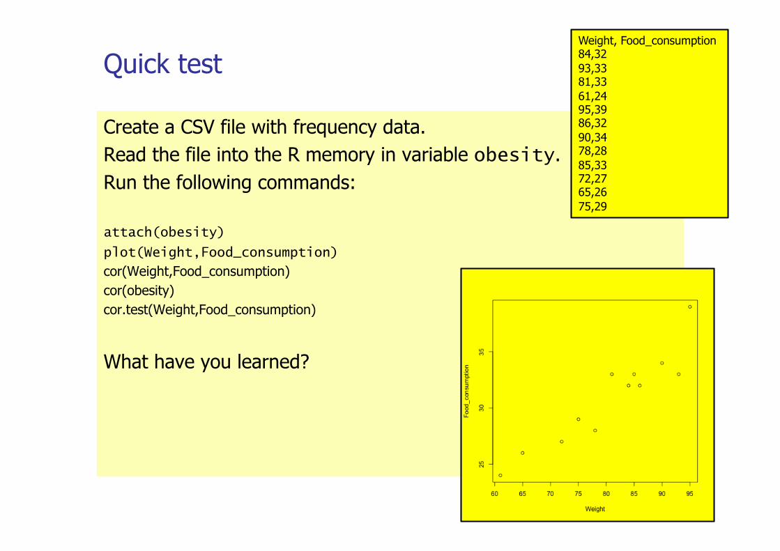
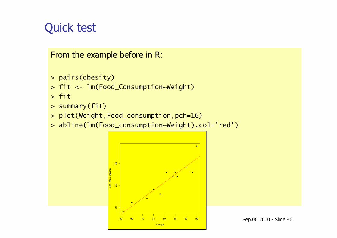
Quick test
Create a CSV file with frequency data. Read the file into the R memory in variable obesity. Run the following commands:
attach(obesity)
plot(Weight,Food_consumption)
cor(Weight,Food_consumption) cor(obesity) cor.test(Weight,Food_consumption)
What have you learned?
Weight, Food_consumption 84,32 93,33 81,33 61,24 95,39 86,32 90,34 78,28 85,33 72,27 65,26 75,29
Sep.06 2010 - Slide 44
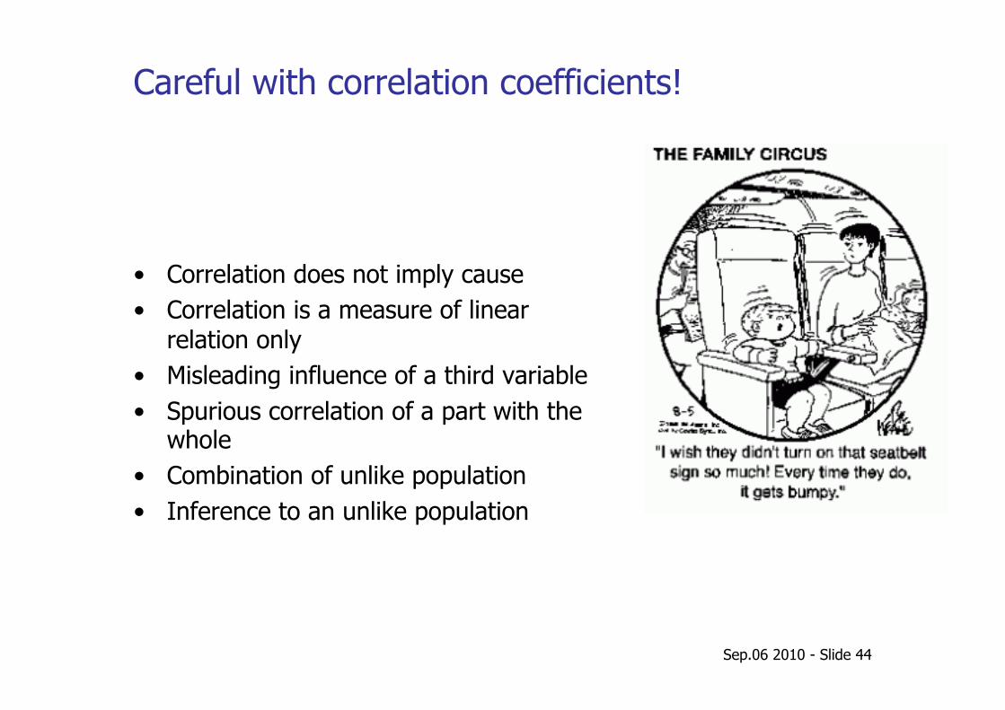
Careful with correlation coefficients!
• Correlation does not imply cause • Correlation is a measure of linear
relation only • Misleading influence of a third variable • Spurious correlation of a part with the
whole • Combination of unlike population • Inference to an unlike population
Sep.06 2010 - Slide 45
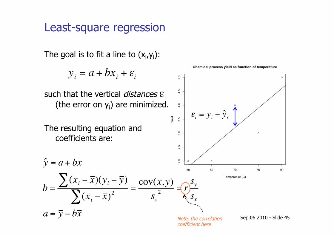
Least-square regression
€
yi = a + bxi + εi
The goal is to fit a line to (xi,yi):
such that the vertical distances εi (the error on yi) are minimized.
The resulting equation and coefficients are:
€
ˆ y = a + bx
b =(xi − x )∑ (yi − y )
(xi − x )2∑=
cov(x, y)sx
2 = rsy
sx
a = y − bx
€
εi = yi − ˆ y i
Note, the correlation coefficient here
Sep.06 2010 - Slide 46
Quick test
From the example before in R:
> pairs(obesity)
> fit <- lm(Food_Consumption~Weight)
> fit
> summary(fit)
> plot(Weight,Food_consumption,pch=16)
> abline(lm(Food_consumption~Weight),col='red')
Jeroen van der Ham: An end-to-end statistical analysis

See you next week…