Data Mining - Massey University Exploratory Data Analysis and Data Visualization Chapter 2 credits:...
48
Data Mining - Massey University Exploratory Data Analysis and Data Visualization Chapter 2 credits: Hand, Mannila and Smyth Cook and Swayne ggobi Lecture Notes: www.ggobi.org/book Padhraic Smyth’s UCI lecture notes R Graphics book
-
Upload
aubrey-spires -
Category
Documents
-
view
215 -
download
0
Transcript of Data Mining - Massey University Exploratory Data Analysis and Data Visualization Chapter 2 credits:...

Data Mining - Massey University
Exploratory Data Analysis and Data
Visualization
Chapter 2credits:
Hand, Mannila and SmythCook and Swayne
ggobi Lecture Notes: www.ggobi.org/bookPadhraic Smyth’s UCI lecture notes
R Graphics book
Data Mining - Massey University
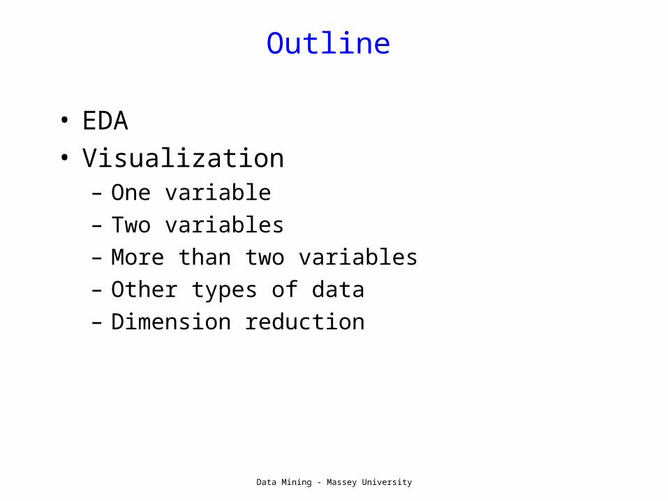
Outline
• EDA• Visualization
– One variable– Two variables– More than two variables– Other types of data– Dimension reduction

Data Mining - Massey University
EDA and Visualization
• Exploratory Data Analysis (EDA) and Visualization are important (necessary?) steps in any analysis task.
• can be thought of as hypothesis generation• get to know your data!
– distributions (symmetric, normal, skewed)– data quality problems– outliers– correlations and inter-relationships– subsets of interest– suggest functional relationships
• Sometimes EDA or viz might be the goal!– but be careful of multiple comparisons
Data Mining - Massey University

Data Mining - Massey University
EDA
• Good data analysis practice– You should always look at every variable - you will
learn something!• Deveaux example histogram?
– Look at descriptive statistics• Use means, medians, quantiles, boxplots• R functions: summary(), hist(), table()
– Visualization as part of EDA
• Humans are the best pattern recognition software• Limitations : many dimensions, large data sets

Data Mining - Massey University
Exploratory Data Analysis (EDA)
• get a general sense of the data • interactive and visual
– (cleverly/creatively) exploit human visual power to see patterns
• 1 to 5 dimensions (e.g. spatial, color, time, sound)– e.g. plot raw data/statistics, reduce dimensions as needed
• data-driven (model-free)• especially useful in early stages of data mining
– detect outliers (e.g. assess data quality)– test assumptions (e.g. normal distributions or skewed?)– identify useful raw data & transforms (e.g. log(x))
• http://www.itl.nist.gov/div898/handbook/eda/eda.htm
• Bottom line: it is always well worth looking at your data!
Data Mining - Massey University
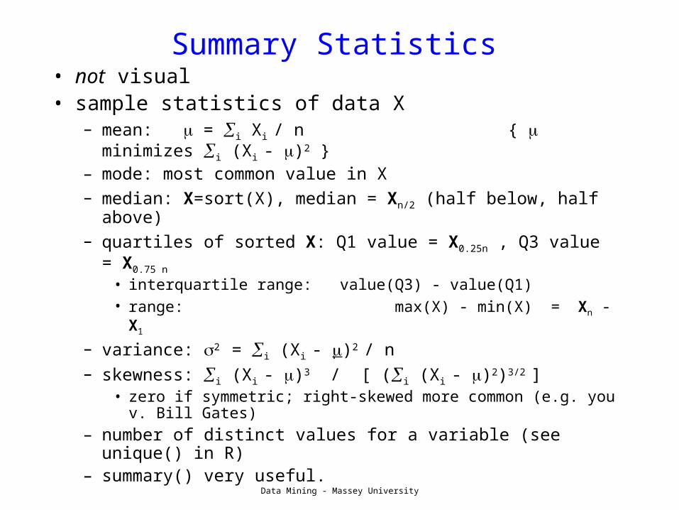
Summary Statistics• not visual• sample statistics of data X
– mean: = i Xi / n { minimizes i (Xi - )2 }
– mode: most common value in X– median: X=sort(X), median = Xn/2 (half below, half
above)– quartiles of sorted X: Q1 value = X0.25n , Q3 value =
X0.75 n • interquartile range: value(Q3) - value(Q1)• range: max(X) - min(X) = Xn - X1
– variance: 2 = i (Xi - )2 / n – skewness: i (Xi - )3 / [ (i (Xi - )2)3/2 ]
• zero if symmetric; right-skewed more common (e.g. you v. Bill Gates)
– number of distinct values for a variable (see unique() in R)
– summary() very useful.

Data Mining - Massey University
Single Variable Visualization• Histogram:
– Shows center, variability, skewness, modality, – outliers, or strange patterns.– Bins matter, use nclass option of hist– Beware of real zeros
QuickTime™ and aTIFF (Uncompressed) decompressor
are needed to see this picture.
QuickTime™ and aTIFF (Uncompressed) decompressor
are needed to see this picture.
QuickTime™ and aTIFF (Uncompressed) decompressor
are needed to see this picture.
hist(DiastolicBP,col='orange',nclass=20)

Data Mining - Massey University
Histograms
number of weeks a credit card was used in a given year

Data Mining - Massey University
Histograms
• small change to the “anchor point” can make a big difference:

Data Mining - Massey University
Issues with Histograms
• For small data sets, histograms can be misleading. Small changes in the data or to the bucket boundaries can result in very different histograms.
• For large data sets, histograms can be quite effective at illustrating general properties of the distribution.
• Histograms effectively only work with 1 variable at a time– Difficult to extend to 2 dimensions, not possible for >2– So histograms tell us nothing about the relationships among
variables

Data Mining - Massey University
Smoothed Histograms - Density Estimates
• Kernel estimates smooth out the contribution of each datapoint over a local neighborhood of that point.
∑=
−=
n
inh h
ixxKxf
1
1 ))(
()(ˆ
h is the kernel width
• Gaussian kernel is common:2
)(
2
1⎟⎠⎞
⎜⎝⎛ −
−h
ixx
Ce
• Formal procedures for optimal bandwidth choice
• R includes many options (?density)

Data Mining - Massey University
QuickTime™ and aTIFF (Uncompressed) decompressor
are needed to see this picture.

Data Mining - Massey University
Boxplots
QuickTime™ and aTIFF (Uncompressed) decompressor
are needed to see this picture.
• Shows a lot of information about a variable in one plot– Median– IQR– Outliers– Range– Skewness
• Negatives– Overplotting – Hard to tell
distributional shape– no standard
implementation in software (many options)
Data Mining - Massey University
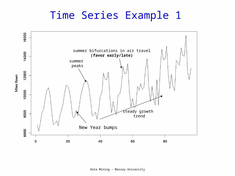
Time Series Example 1
steady growth trend
New Year bumps
summer peaks
summer bifurcations in air travel (favor early/late)

Data Mining - Massey University
Time-Series Example 2
Scotland experiment on effects of milk on better health
Unexpected “step effect” ???
mean weight vs mean agefor 10k control group

Data Mining - Massey University
Time Series Example 3
• spatio-temporal data
– growth of Wal-Mart in US
– http://projects.flowingdata.com/walmart/

Data Mining - Massey University
Displaying Two Variables
• For two numeric variables, the scatterplot is the obvious choice
QuickTime™ and aTIFF (Uncompressed) decompressor
are needed to see this picture.interesting?
interesting?

Data Mining - Massey University
2D Scatterplots
• standard tool to display relation between 2 variables– e.g. y-axis = response,
x-axis = suspected indicator
• useful to answer:– x,y related?
• no• linearly• nonlinearly
– variance(y) depend on x?
– outliers present?• R:
– plot(x,y,’.’);
QuickTime™ and aTIFF (Uncompressed) decompressor
are needed to see this picture.

Data Mining - Massey University
Scatter Plot: No apparent relationship

Data Mining - Massey University
Scatter Plot: Linear relationship

Data Mining - Massey University
Scatter Plot: Quadratic relationship
Data Mining - Massey University
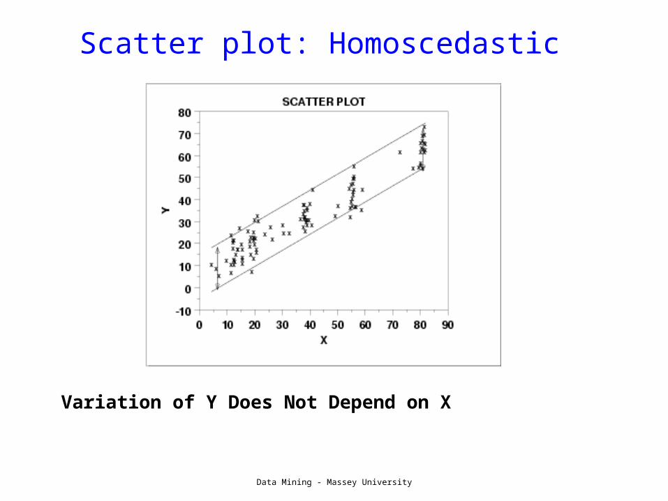
Scatter plot: Homoscedastic
Variation of Y Does Not Depend on X

Data Mining - Massey University
Scatter plot: Heteroscedastic
variation in Y differs depending on the value of Xe.g., Y = annual tax paid, X = income
Data Mining - Massey University
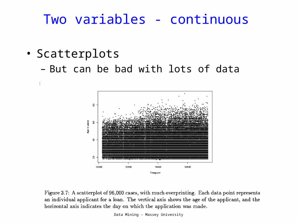
Two variables - continuous
• Scatterplots – But can be bad with lots of data

Data Mining - Massey University
Transparent plotting
• plot( rnorm(1000), rnorm(1000), col="#0000ff22", pch=16,cex=3)

Data Mining - Massey University
Alpha blending
• courtesy Simon Urbanek

Data Mining - Massey University
Jittering
• Jittering points helps too• plot(age, TimesPregnant)• plot(jitter(age),jitter(TimesPregnant)
QuickTime™ and aTIFF (Uncompressed) decompressor
are needed to see this picture.
QuickTime™ and aTIFF (Uncompressed) decompressor
are needed to see this picture.

Data Mining - Massey University
• What to do for large data sets– Contour plots
Two variables - continuous

Data Mining - Massey University
Displaying Two Variables
• If one variable is categorical, use variations on single dimensional methods
Library(‘trellis’)histogram(~DiastolicBP | TimesPregnant==0)
QuickTime™ and aTIFF (Uncompressed) decompressor
are needed to see this picture.
Data Mining - Massey University
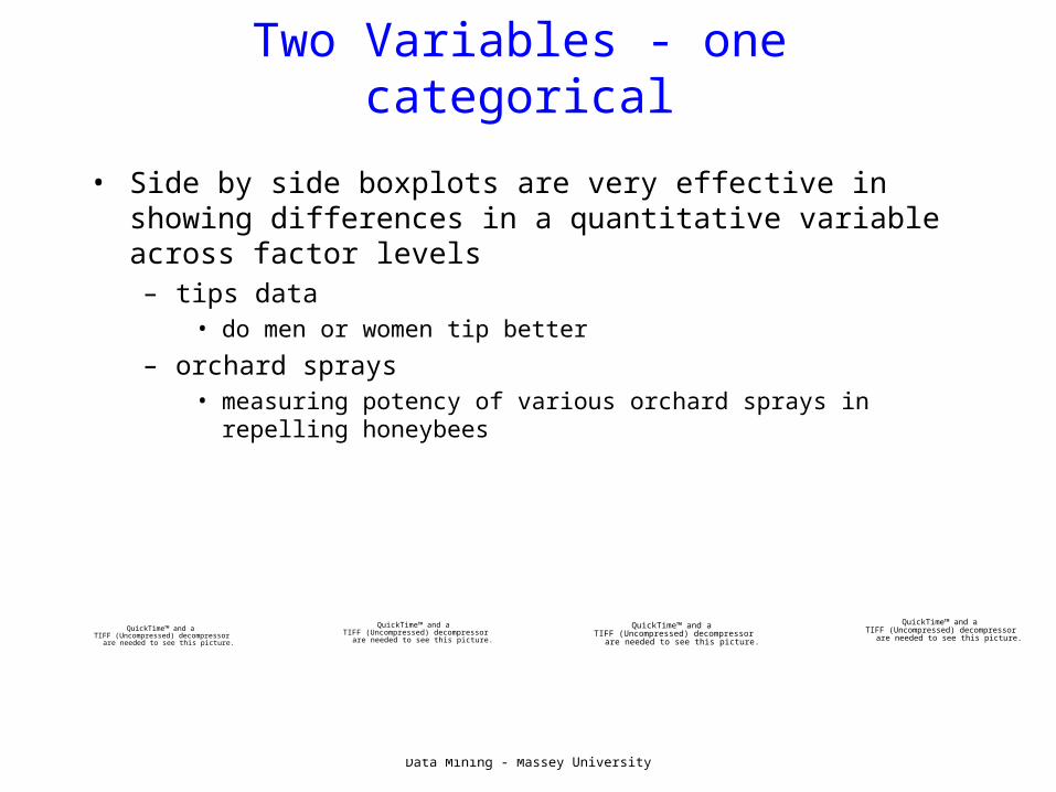
Two Variables - one categorical
• Side by side boxplots are very effective in showing differences in a quantitative variable across factor levels– tips data
• do men or women tip better
– orchard sprays• measuring potency of various orchard sprays in repelling
honeybees
QuickTime™ and aTIFF (Uncompressed) decompressor
are needed to see this picture.
QuickTime™ and aTIFF (Uncompressed) decompressor
are needed to see this picture.
QuickTime™ and aTIFF (Uncompressed) decompressor
are needed to see this picture.
QuickTime™ and aTIFF (Uncompressed) decompressor
are needed to see this picture.

Data Mining - Massey University
Barcharts and Spineplots
QuickTime™ and aTIFF (Uncompressed) decompressor
are needed to see this picture.
QuickTime™ and aTIFF (Uncompressed) decompressor
are needed to see this picture.
QuickTime™ and aTIFF (Uncompressed) decompressor
are needed to see this picture.
QuickTime™ and aTIFF (Uncompressed) decompressor
are needed to see this picture.
stacked barcharts or histograms are useful but should be used with caution
spineplots are nice, but can be hard to interpret
Data Mining - Massey University
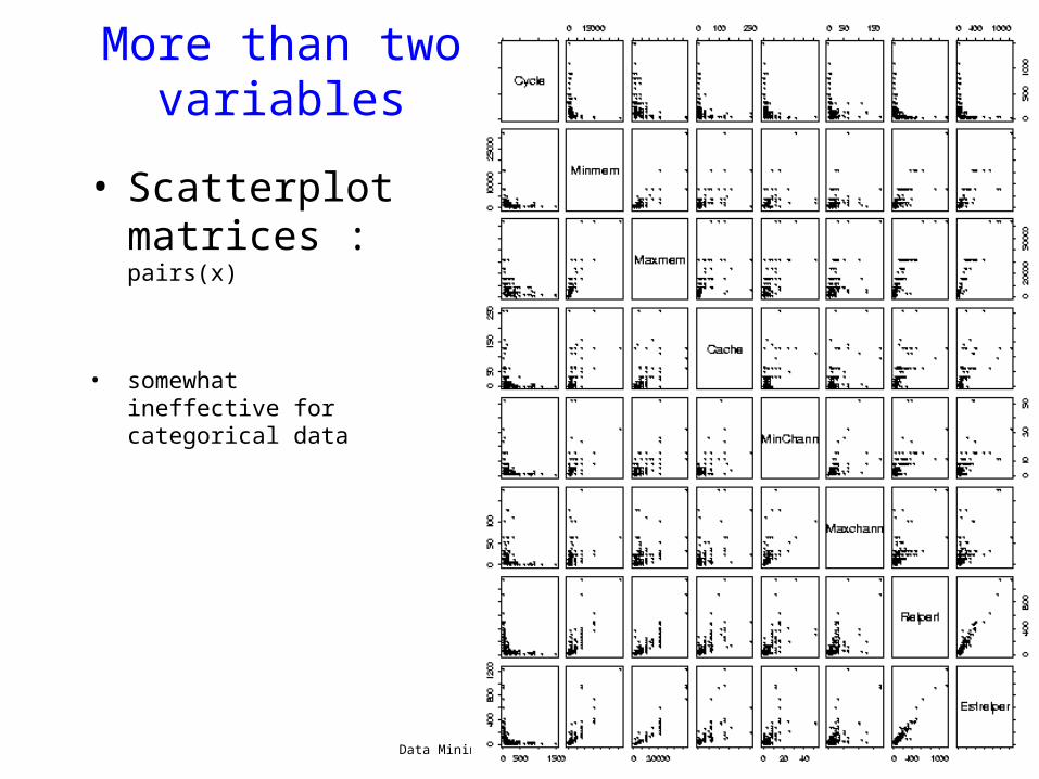
More than two variables
• Scatterplot matrices : pairs(x)
• somewhat ineffective for categorical data

Data Mining - Massey University
QuickTime™ and aTIFF (Uncompressed) decompressor
are needed to see this picture.
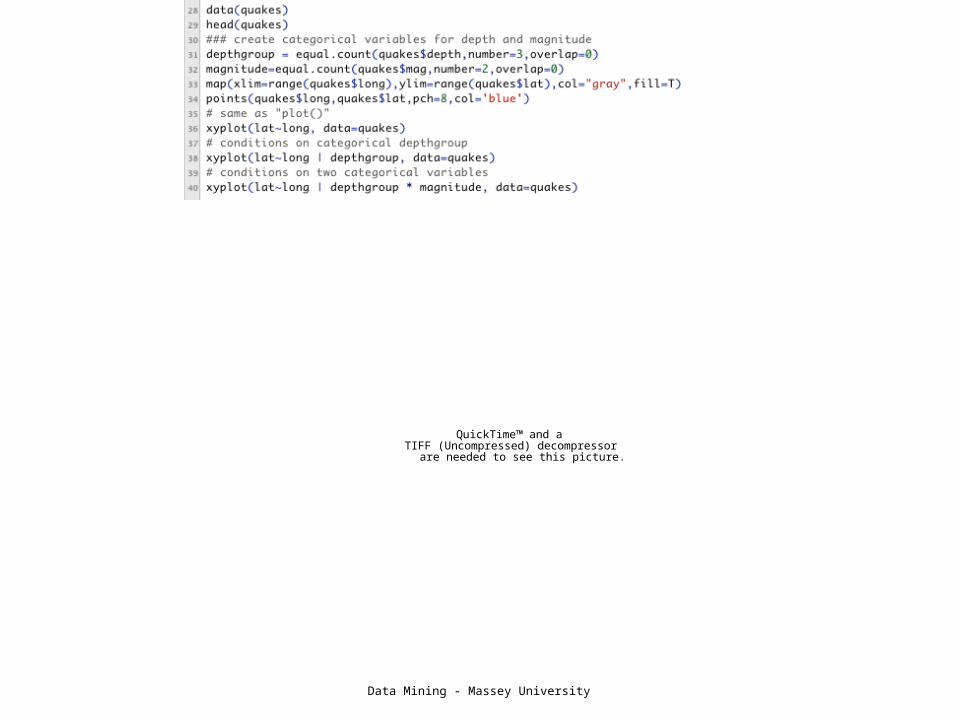
More than two variables• Get creative!• Conditioning on variables
– trellis or lattice plots– Cleveland models on human perception,
all based on conditioning– all use the R formula model– a lot of control over the output– alternate versions of standard R plot
functions• plot => xyplot• barplot => barchart• boxplot =>bwplot
• Earthquake data:– locations of 1000 seismic events of MB > 4.0.
The events occurred in a cube near Fiji since 1964
Data Mining - Massey University
QuickTime™ and aTIFF (Uncompressed) decompressor
are needed to see this picture.

Data Mining - Massey University
QuickTime™ and aTIFF (Uncompressed) decompressor
are needed to see this picture.

Data Mining - Massey University
Starplots

Data Mining - Massey University
Using Icons to Encode Information, e.g., Star Plots
• Each star represents a single observation. Star plots are used to examine the relative values for a single data point
• The star plot consists of a sequence of equi-angular spokes, called radii, with each spoke representing one of the variables.
• Useful for small data sets with up to 10 or so variables
• Limitations?– Small data sets, small dimensions– Ordering of variables may affect
perception
1 Price 2 Mileage (MPG) 3 1978 Repair Record (1 = Worst, 5 =
Best) 4 1977 Repair Record (1 = Worst, 5 =
Best)
5 Headroom 6 Rear Seat Room 7 Trunk Space 8 Weight
9 Length

Data Mining - Massey University
Chernoff’s Faces
• described by ten facial characteristic parameters: head eccentricity, eye eccentricity, pupil size, eyebrow slant, nose size, mouth shape, eye spacing, eye size, mouth length and degree of mouth opening
• Chernoff faces applet http://people.cs.uchicago.edu/~wiseman/chernoff/
• more icon plots http://www.statsoft.com/textbook/glosi.html

Data Mining - Massey University
Chernoff faces
Data Mining - Massey University
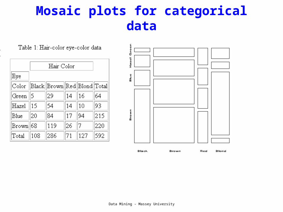
Mosaic plots for categorical data

Data Mining - Massey University
Mosaic Plots
QuickTime™ and aTIFF (Uncompressed) decompressor
are needed to see this picture.
• Good for plotting many categorical variables• sensitive to the order which they are applied
Data Mining - Massey University
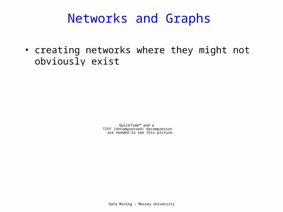
Networks and Graphs
• creating networks where they might not obviously exist
QuickTime™ and aTIFF (Uncompressed) decompressor
are needed to see this picture.
Data Mining - Massey University
Interactive Visualization
• Multi-dimensional viz is easiest using a tool that allows for variable selction– ggobi is such a tool.
• Brushing and linking of different plots• demo
– http://www.ggobi.org/book/chap-toolbox/toolbox-brushing-categorical.mov
QuickTime™ and aTIFF (Uncompressed) decompressor
are needed to see this picture.

Data Mining - Massey University
What’s missing?
• pie charts– very popular– good for showing simple relations of proportions– hard to get a real sense of what is going on– barplots, histograms usually better (but less pretty)
• 3D– nice to be able to show three dimensions– hard to do well– often done poorly– 3d best shown through “spinning” in 2D
• uses various types of projecting into 2D• see video • http://www.ggobi.org/book/chap-toolbox/toolbox-PP2D.mov

Data Mining - Massey University

Data Mining - Massey University
Dimension Reduction
• One way to visualize high dimensional data is to reduce it to 2 or 3 dimensions– Variable selection
• e.g. stepwise
– Principle Components• find linear projection onto p-space with maximal
variance
– Multi-dimensional scaling• takes a matrix of (dis)similarities and embeds the
points in p-dimensional space to retain those similarities

Data Mining - Massey University
Lab #2
• Explore graphics with demo(graphics)• Download Di Cook’s music data set and
create some simple graphics• Use the USArrests data to plot
scatterplots and do rudimentary interactive viz with identify().