Data Mining: Data and Exploring...
53
Data Mining: Data and Exploring Data Data Warehousing and Mining Lecture 3 by Hossen Asiful Mustafa
Transcript of Data Mining: Data and Exploring...

Data Mining: Data and Exploring Data
Data Warehousing and Mining
Lecture 3
by
Hossen Asiful Mustafa
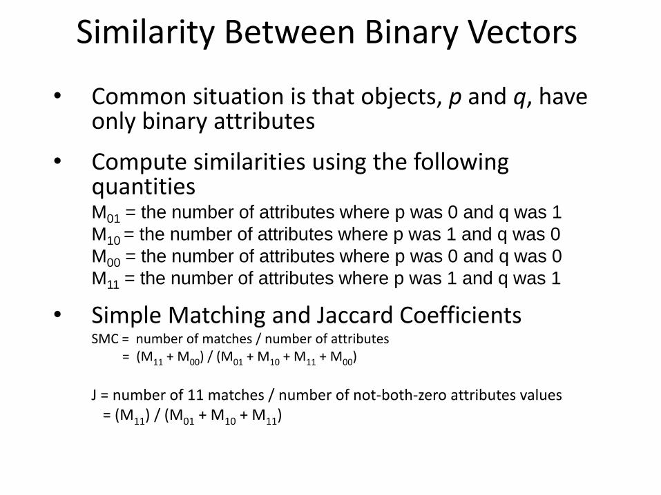
Similarity Between Binary Vectors
• Common situation is that objects, p and q, have only binary attributes
• Compute similarities using the following quantities
M01 = the number of attributes where p was 0 and q was 1
M10 = the number of attributes where p was 1 and q was 0
M00 = the number of attributes where p was 0 and q was 0
M11 = the number of attributes where p was 1 and q was 1
• Simple Matching and Jaccard Coefficients SMC = number of matches / number of attributes = (M11 + M00) / (M01 + M10 + M11 + M00)
J = number of 11 matches / number of not-both-zero attributes values = (M11) / (M01 + M10 + M11)

SMC versus Jaccard: Example
p = 1 0 0 0 0 0 0 0 0 0
q = 0 0 0 0 0 0 1 0 0 1
M01 = 2 (the number of attributes where p was 0 and q was 1)
M10 = 1 (the number of attributes where p was 1 and q was 0)
M00 = 7 (the number of attributes where p was 0 and q was 0)
M11 = 0 (the number of attributes where p was 1 and q was 1)
SMC = (M11 + M00)/(M01 + M10 + M11 + M00) = (0+7) / (2+1+0+7) = 0.7
J = (M11) / (M01 + M10 + M11) = 0 / (2 + 1 + 0) = 0

Cosine Similarity
• If d1 and d2 are two document vectors, then
cos( d1, d2 ) = (d1 d2) / ||d1|| ||d2|| ,
where indicates vector dot product and || d || is the length of vector d.
• Example:
d1 = 3 2 0 5 0 0 0 2 0 0
d2 = 1 0 0 0 0 0 0 1 0 2
d1 d2= 3*1 + 2*0 + 0*0 + 5*0 + 0*0 + 0*0 + 0*0 + 2*1 + 0*0 + 0*2 = 5
||d1|| = (3*3+2*2+0*0+5*5+0*0+0*0+0*0+2*2+0*0+0*0)0.5 = (42) 0.5 = 6.481
||d2|| = (1*1+0*0+0*0+0*0+0*0+0*0+0*0+1*1+0*0+2*2) 0.5 = (6) 0.5 = 2.245
cos( d1, d2 ) = .3150

Extended Jaccard Coefficient (Tanimoto)
• Variation of Jaccard for continuous or count attributes
– Reduces to Jaccard for binary attributes

Correlation • Correlation measures the linear relationship between
objects
• To compute correlation, we standardize data objects, p and q, and then take their dot product
)(/))(( pstdpmeanpp kk
)(/))(( qstdqmeanqq kk
qpqpncorrelatio ),(

Visually Evaluating Correlation
Scatter plots showing the similarity from –1 to 1.

General Approach for Combining Similarities
• Sometimes attributes are of many different types, but an overall similarity is needed.

Using Weights to Combine Similarities
• May not want to treat all attributes the same.
– Use weights wk which are between 0 and 1 and sum to 1.
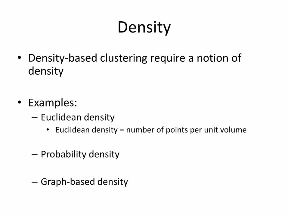
Density
• Density-based clustering require a notion of density
• Examples: – Euclidean density
• Euclidean density = number of points per unit volume
– Probability density
– Graph-based density

Euclidean Density – Cell-based • Simplest approach is to divide region into a
number of rectangular cells of equal volume and define density as # of points the cell contains
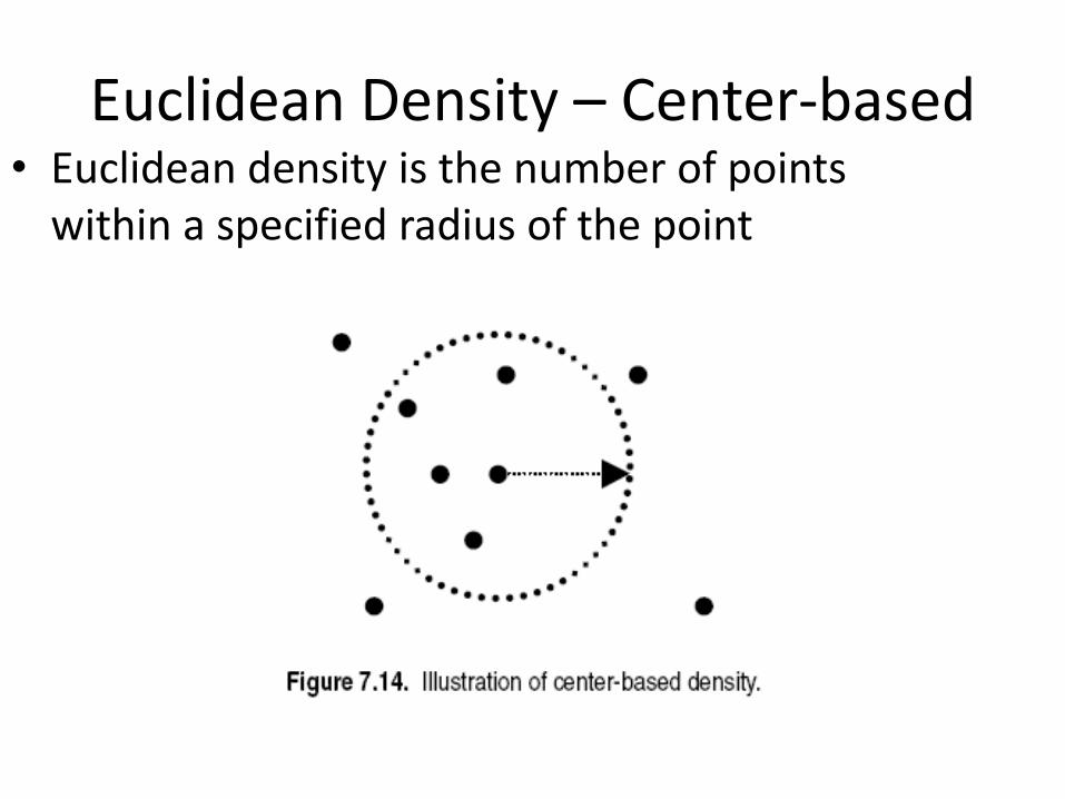
Euclidean Density – Center-based • Euclidean density is the number of points
within a specified radius of the point

DATA EXPLORATION

What is data exploration?
• Key motivations of data exploration include – Helping to select the right tool for preprocessing or analysis
– Making use of humans’ abilities to recognize patterns
• People can recognize patterns not captured by data analysis tools
• Related to the area of Exploratory Data Analysis (EDA) – Created by statistician John Tukey
– Seminal book is Exploratory Data Analysis by Tukey
– A nice online introduction can be found in Chapter 1 of the NIST Engineering Statistics Handbook
http://www.itl.nist.gov/div898/handbook/index.htm
A preliminary exploration of the data to better understand its characteristics.

Techniques Used In Data Exploration
• In EDA, as originally defined by Tukey – The focus was on visualization
– Clustering and anomaly detection were viewed as exploratory techniques
– In data mining, clustering and anomaly detection are major areas of interest, and not thought of as just exploratory
• In our discussion of data exploration, we focus on – Summary statistics
– Visualization
– Online Analytical Processing (OLAP)

Iris Sample Data Set
• Many of the exploratory data techniques are illustrated with the Iris Plant data set. – Can be obtained from the UCI Machine
Learning Repository http://www.ics.uci.edu/~mlearn/MLRepository.html
– From the statistician Douglas Fisher
– Three flower types (classes): • Setosa
• Virginica
• Versicolour
– Four (non-class) attributes • Sepal width and length
• Petal width and length
Virginica. Robert H. Mohlenbrock. USDA
NRCS. 1995. Northeast wetland flora: Field
office guide to plant species. Northeast National
Technical Center, Chester, PA. Courtesy of
USDA NRCS Wetland Science Institute.
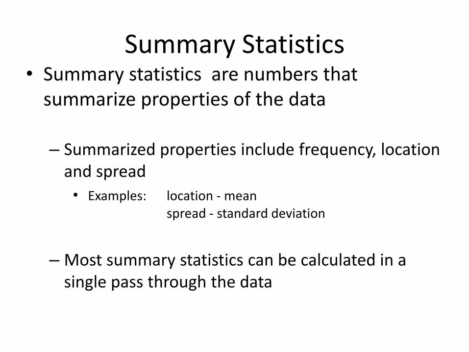
Summary Statistics • Summary statistics are numbers that
summarize properties of the data
– Summarized properties include frequency, location and spread
• Examples: location - mean spread - standard deviation
– Most summary statistics can be calculated in a single pass through the data

Frequency and Mode • The frequency of an attribute value is the
percentage of time the value occurs in the data set
– For example, given the attribute ‘gender’ and a representative population of people, the gender ‘female’ occurs about 50% of the time.
• The mode of a an attribute is the most frequent attribute value
• The notions of frequency and mode are typically used with categorical data
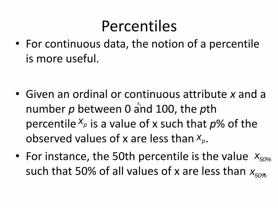
Percentiles • For continuous data, the notion of a percentile
is more useful.
• Given an ordinal or continuous attribute x and a number p between 0 and 100, the pth percentile is a value of x such that p% of the observed values of x are less than .
• For instance, the 50th percentile is the value such that 50% of all values of x are less than .
xp
xp
xp
x50%
x50%

Measures of Location: Mean and Median
• The mean is the most common measure of the location of a set of points.
• However, the mean is very sensitive to outliers.
• Thus, the median or a trimmed mean is also commonly used.

Measures of Spread: Range and Variance
• Range is the difference between the max and min
• The variance or standard deviation is the most common measure of the spread of a set of points.
• However, this is also
sensitive to outliers, so
that other measures
are often used.

Visualization Visualization is the conversion of data into a visual
or tabular format so that the characteristics of the data and the relationships among data items or attributes can be analyzed or reported.
• Visualization of data is one of the most powerful and appealing techniques for data exploration. – Humans have a well developed ability to analyze large
amounts of information that is presented visually
– Can detect general patterns and trends
– Can detect outliers and unusual patterns

Example: Sea Surface Temperature • The following shows the Sea Surface
Temperature (SST) for July 1982
– Tens of thousands of data points are summarized in a single figure

Representation • Is the mapping of information to a visual format • Data objects, their attributes, and the
relationships among data objects are translated into graphical elements such as points, lines, shapes, and colors.
• Example: – Objects are often represented as points – Their attribute values can be represented as the
position of the points or the characteristics of the points, e.g., color, size, and shape
– If position is used, then the relationships of points, i.e., whether they form groups or a point is an outlier, is easily perceived.

Arrangement • Is the placement of visual elements within a
display
• Can make a large difference in how easy it is to understand the data
• Example:
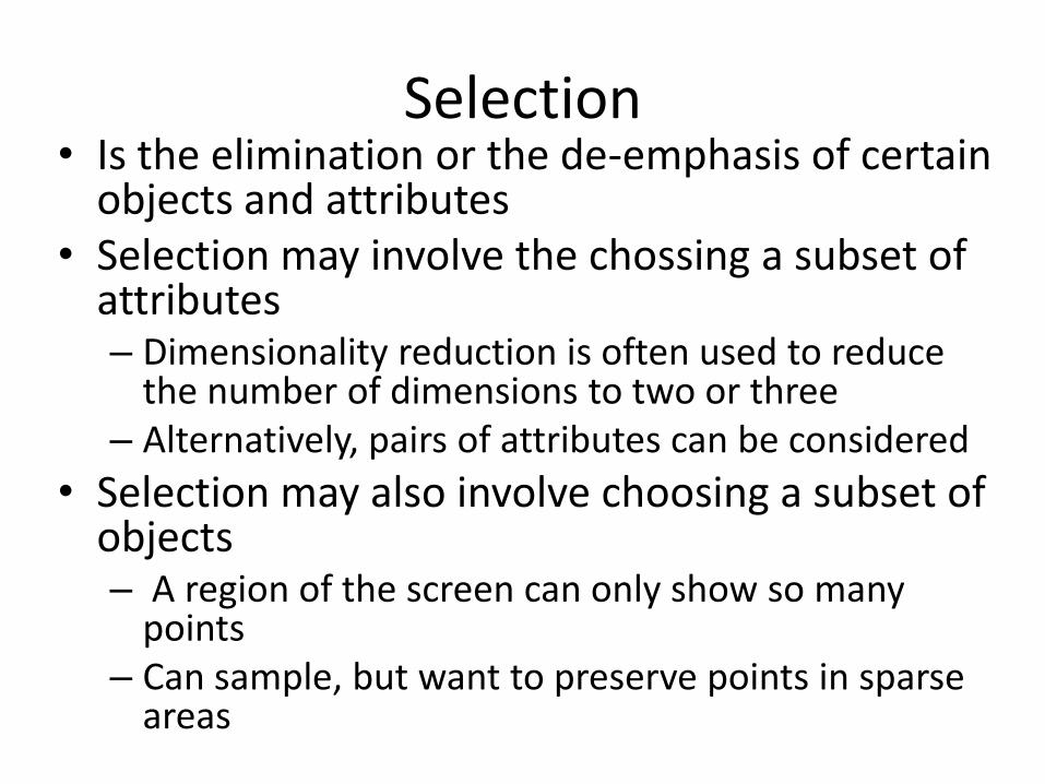
Selection • Is the elimination or the de-emphasis of certain
objects and attributes • Selection may involve the chossing a subset of
attributes – Dimensionality reduction is often used to reduce
the number of dimensions to two or three – Alternatively, pairs of attributes can be considered
• Selection may also involve choosing a subset of objects – A region of the screen can only show so many
points – Can sample, but want to preserve points in sparse
areas

Visualization Techniques: Histograms • Histogram
– Usually shows the distribution of values of a single variable
– Divide the values into bins and show a bar plot of the number of objects in each bin.
– The height of each bar indicates the number of objects
– Shape of histogram depends on the number of bins
• Example: Petal Width (10 and 20 bins, respectively)
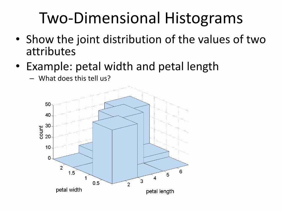
Two-Dimensional Histograms • Show the joint distribution of the values of two
attributes • Example: petal width and petal length
– What does this tell us?
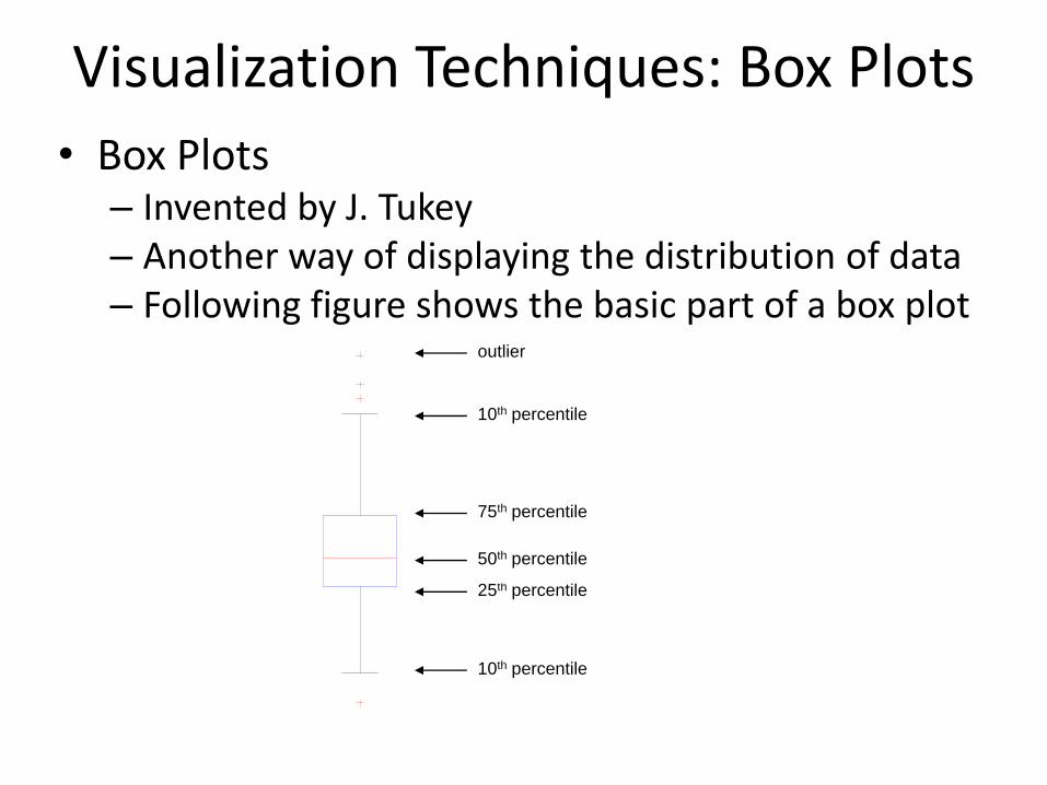
Visualization Techniques: Box Plots
• Box Plots – Invented by J. Tukey – Another way of displaying the distribution of data – Following figure shows the basic part of a box plot
outlier
10th percentile
25th percentile
75th percentile
50th percentile
10th percentile
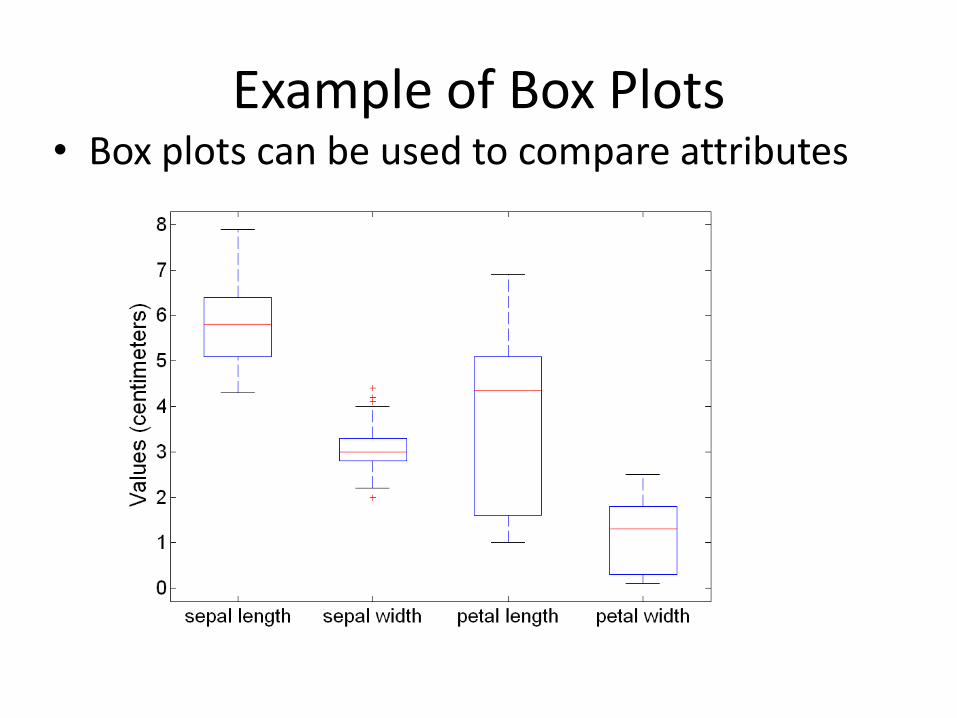
Example of Box Plots • Box plots can be used to compare attributes

Visualization Techniques: Scatter Plots
• Scatter plots – Attributes values determine the position
– Two-dimensional scatter plots most common, but can have three-dimensional scatter plots
– Often additional attributes can be displayed by using the size, shape, and color of the markers that represent the objects
– It is useful to have arrays of scatter plots can compactly summarize the relationships of several pairs of attributes

Scatter Plot Array of Iris Attributes
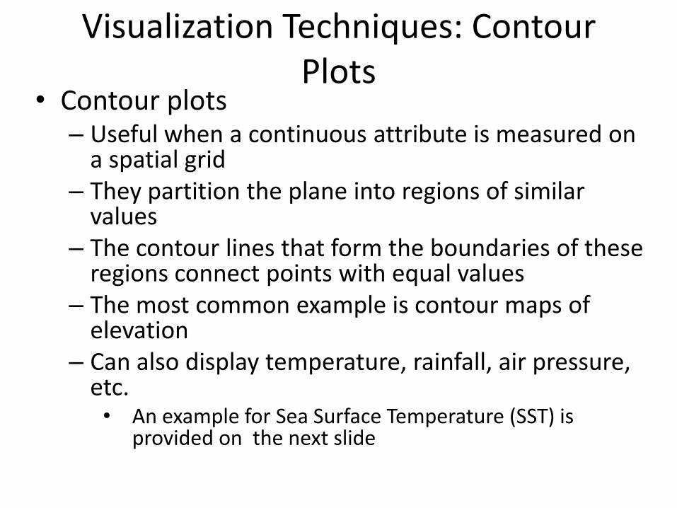
Visualization Techniques: Contour Plots
• Contour plots – Useful when a continuous attribute is measured on
a spatial grid – They partition the plane into regions of similar
values – The contour lines that form the boundaries of these
regions connect points with equal values – The most common example is contour maps of
elevation – Can also display temperature, rainfall, air pressure,
etc. • An example for Sea Surface Temperature (SST) is
provided on the next slide

Contour Plot Example: SST Dec, 1998
Celsius
Visualization Techniques: Matrix Plots
• Matrix plots
– Can plot the data matrix
– This can be useful when objects are sorted according to class
– Typically, the attributes are normalized to prevent one attribute from dominating the plot
– Plots of similarity or distance matrices can also be useful for visualizing the relationships between objects
– Examples of matrix plots are presented on the next two slides

Visualization of the Iris Data Matrix
standard
deviation

Visualization of the Iris Correlation Matrix

Visualization Techniques: Parallel Coordinates
• Parallel Coordinates – Used to plot the attribute values of high-
dimensional data – Instead of using perpendicular axes, use a set of
parallel axes – The attribute values of each object are plotted as a
point on each corresponding coordinate axis and the points are connected by a line
– Thus, each object is represented as a line – Often, the lines representing a distinct class of
objects group together, at least for some attributes – Ordering of attributes is important in seeing such
groupings

Parallel Coordinates Plots for Iris Data

Other Visualization Techniques • Star Plots
– Similar approach to parallel coordinates, but axes radiate from a central point
– The line connecting the values of an object is a polygon
• Chernoff Faces – Approach created by Herman Chernoff
– This approach associates each attribute with a characteristic of a face
– The values of each attribute determine the appearance of the corresponding facial characteristic
– Each object becomes a separate face
– Relies on human’s ability to distinguish faces
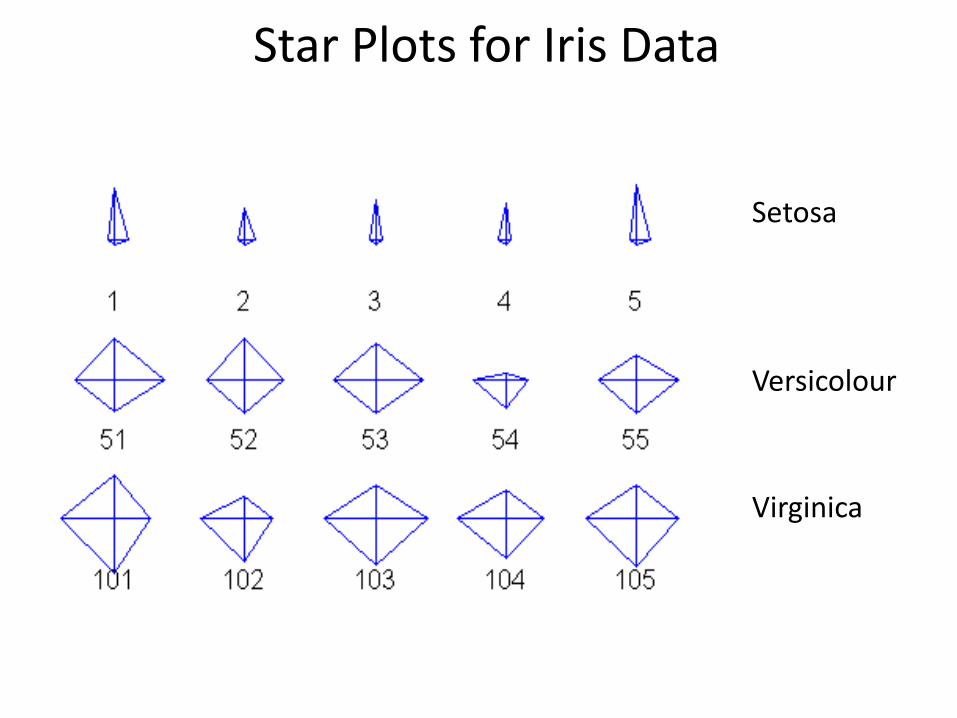
Star Plots for Iris Data
Setosa
Versicolour
Virginica

Chernoff Faces for Iris Data
Setosa
Versicolour
Virginica

OLAP • On-Line Analytical Processing (OLAP) was
proposed by E. F. Codd, the father of the relational database.
• Relational databases put data into tables, while OLAP uses a multidimensional array representation. – Such representations of data previously existed in
statistics and other fields
• There are a number of data analysis and data exploration operations that are easier with such a data representation.

Creating a Multidimensional Array
• Two key steps in converting tabular data into a multidimensional array. – First, identify which attributes are to be the dimensions
and which attribute is to be the target attribute whose values appear as entries in the multidimensional array. • The attributes used as dimensions must have discrete values • The target value is typically a count or continuous value, e.g.,
the cost of an item • Can have no target variable at all except the count of objects
that have the same set of attribute values
– Second, find the value of each entry in the multidimensional array by summing the values (of the target attribute) or count of all objects that have the attribute values corresponding to that entry.
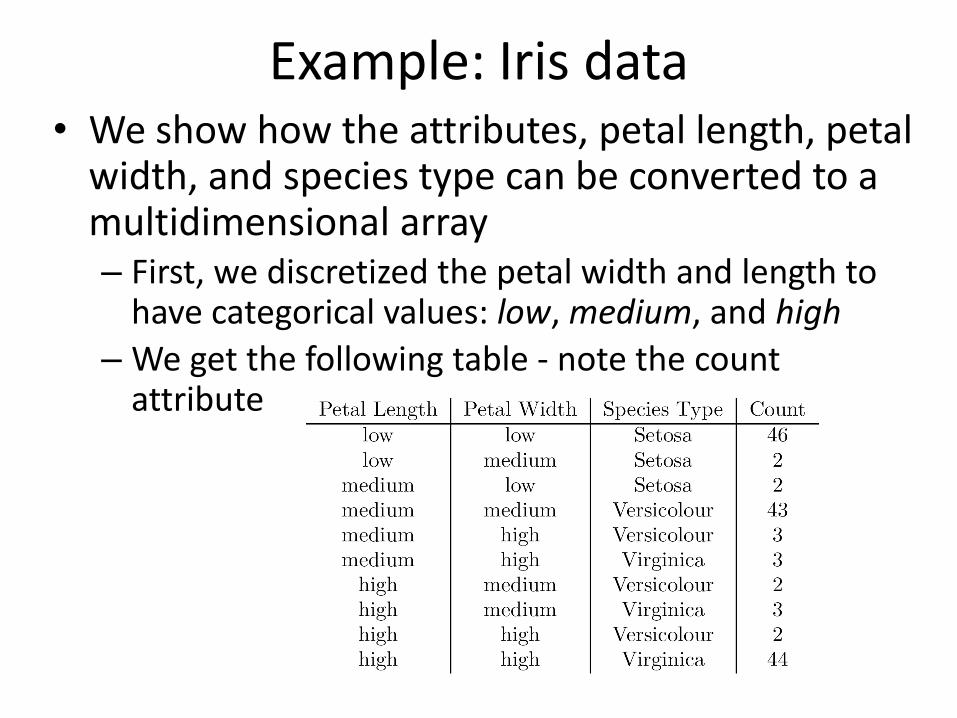
Example: Iris data • We show how the attributes, petal length, petal
width, and species type can be converted to a multidimensional array – First, we discretized the petal width and length to
have categorical values: low, medium, and high
– We get the following table - note the count attribute

Example: Iris data (continued)
• Each unique tuple of petal width, petal length, and species type identifies one element of the array.
• This element is assigned the corresponding count value.
• The figure illustrates the result.
• All non-specified tuples are 0.
Example: Iris data (continued)
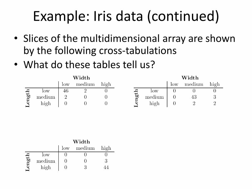
• Slices of the multidimensional array are shown by the following cross-tabulations
• What do these tables tell us?

OLAP Operations: Data Cube • The key operation of a OLAP is the formation of a
data cube • A data cube is a multidimensional representation
of data, together with all possible aggregates. • By all possible aggregates, we mean the aggregates
that result by selecting a proper subset of the dimensions and summing over all remaining dimensions.
• For example, if we choose the species type dimension of the Iris data and sum over all other dimensions, the result will be a one-dimensional entry with three entries, each of which gives the number of flowers of each type.

Data Cube Example • Consider a data set that records the sales of
products at a number of company stores at various dates.
• This data can be represented as a 3 dimensional array
• There are 3 two-dimensional aggregates (3 choose 2 ), 3 one-dimensional aggregates, and 1 zero-dimensional aggregate (the overall total)
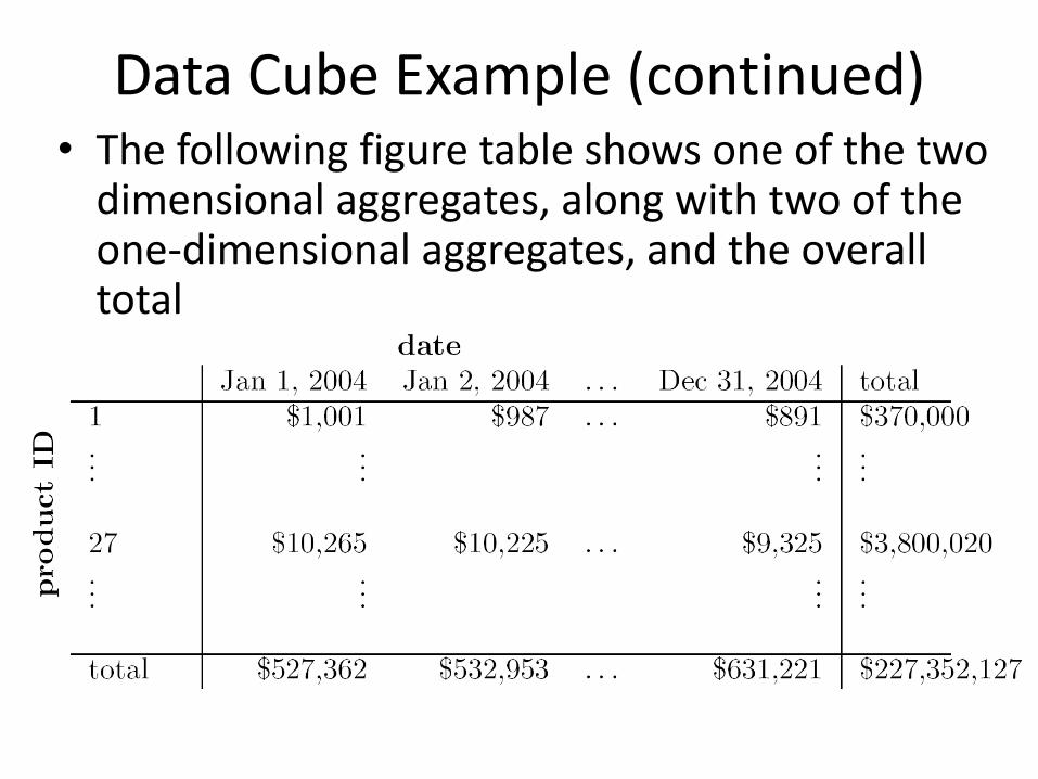
Data Cube Example (continued) • The following figure table shows one of the two
dimensional aggregates, along with two of the one-dimensional aggregates, and the overall total
OLAP Operations: Slicing and Dicing
• Slicing is selecting a group of cells from the entire multidimensional array by specifying a specific value for one or more dimensions.
• Dicing involves selecting a subset of cells by specifying a range of attribute values.
– This is equivalent to defining a subarray from the complete array.
• In practice, both operations can also be accompanied by aggregation over some dimensions.

OLAP Operations: Roll-up and Drill-down
• Attribute values often have a hierarchical structure. – Each date is associated with a year, month, and week.
– A location is associated with a continent, country, state (province, etc.), and city.
– Products can be divided into various categories, such as clothing, electronics, and furniture.
• Note that these categories often nest and form a tree or lattice – A year contains months which contains day
– A country contains a state which contains a city

OLAP Operations: Roll-up and Drill-down
• This hierarchical structure gives rise to the roll-up and drill-down operations.
– For sales data, we can aggregate (roll up) the sales across all the dates in a month.
– Conversely, given a view of the data where the time dimension is broken into months, we could split the monthly sales totals (drill down) into daily sales totals.
– Likewise, we can drill down or roll up on the location or product ID attributes.