Data Journalism - Storytelling with Data
60
DATA JOURNALISM Dr. Bahareh Heravi @Bahareh360 Week 5 Storytelling with Data
-
Upload
bahareh-heravi -
Category
Education
-
view
636 -
download
3
Transcript of Data Journalism - Storytelling with Data

DATA JOURNALISM
Dr. Bahareh Heravi @Bahareh360
Week 5Storytelling with Data

Finding the data
Cleaning/fixing the data Analysing the data Visualising the data
+ Wri6ng the accompanying story


DATA VISUALISATION

The New York City metropolitan area is home to the largest Jewish community outside Israel. It is also home to nearly a quarter of the nation's Indian Americans and 15% of all Korean Americans and the largest Asian Indian population in the Western Hemisphere; the largest African American community of any city in the country; and including 6 Chinatowns in the city proper, comprised as of 2008 a population of 659,596 overseas Chinese, the largest outside of Asia. New York City alone, according to the 2010 Census, has now become home to more than one million Asian Americans, greater than the combined totals of San Francisco and Los Angeles. New York contains the highest total Asian population of any U.S. city proper. 6.0% of New York City is of Chinese ethnicity, with about forty percent of them living in the borough of Queens alone. Koreans make up 1.2% of the city's population, and Japanese at 0.3%. Filipinos are the largest southeast Asian ethnic group at 0.8%, followed by Vietnamese who make up only 0.2% of New York City's population. Indians are the largest South Asian group, comprising 2.4% of the city's population, and Bangladeshis and Pakistanis at 0.7% and 0.5%, respectively. / Demographics of New York, Wikipedia

700 000
Source: infogram training

John Snow, 1854
John Snow Cholera Map

Florence Nigh@ngale Coxcomb

Charles Minard, 1812
Napoleaon’s March on Moscow
Six types of data: (1) the number of Napoleon's troops; (2) distance; (3) temperature; (4) the la6tude and longitude; (5) direc6on of travel; (6) loca6on rela6ve to specific dates.

TYPE OF DATA ANALYSIS
TEMPORAL GEOSPATIAL TOPICAL NETWORK

TEMPORAL
When?
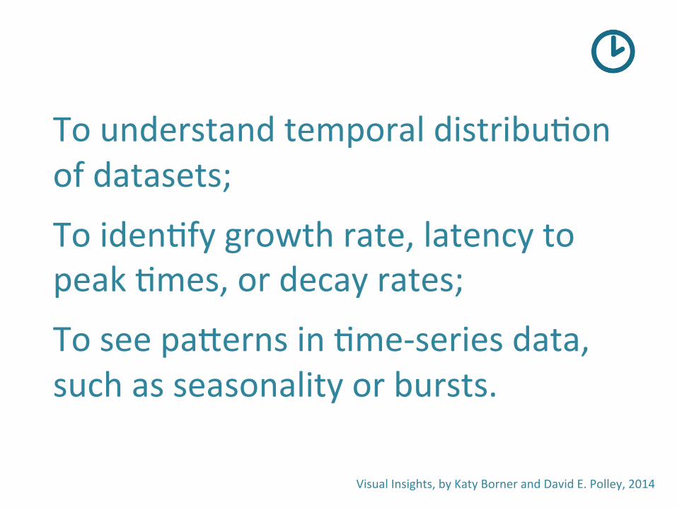
To understand temporal distribu6on of datasets;
To iden6fy growth rate, latency to peak 6mes, or decay rates;
To see paTerns in 6me-‐series data, such as seasonality or bursts.
Visual Insights, by Katy Borner and David E. Polley, 2014
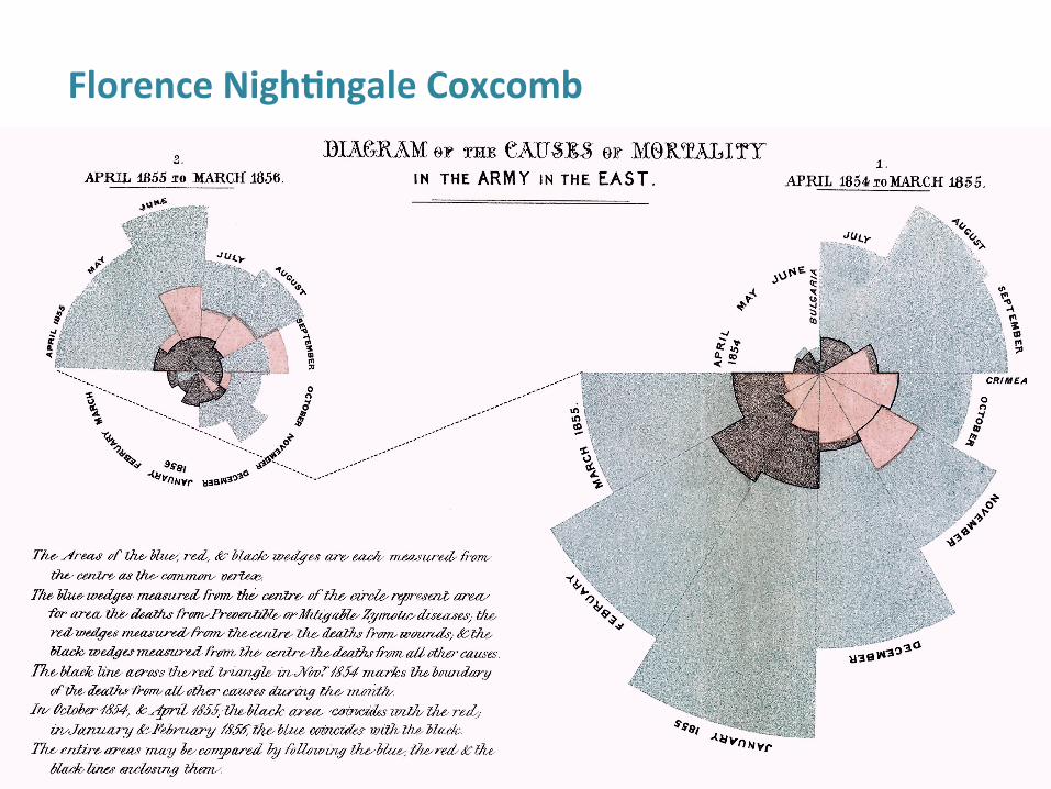
Florence Nigh@ngale Coxcomb

Napoleaon’s March on Moscow
Six types of data: (1) the number of Napoleon's troops; (2) distance; (3) temperature; (4) the la6tude and longitude; (5) direc6on of travel; (6) loca6on rela6ve to specific dates.
Charles Minard, 1812

Visual Insights, by Katy Borner and David E. Polley, 2014 hTp://scimaps.org/maps/map/history_flow_visuali_56/detail

The Guardian

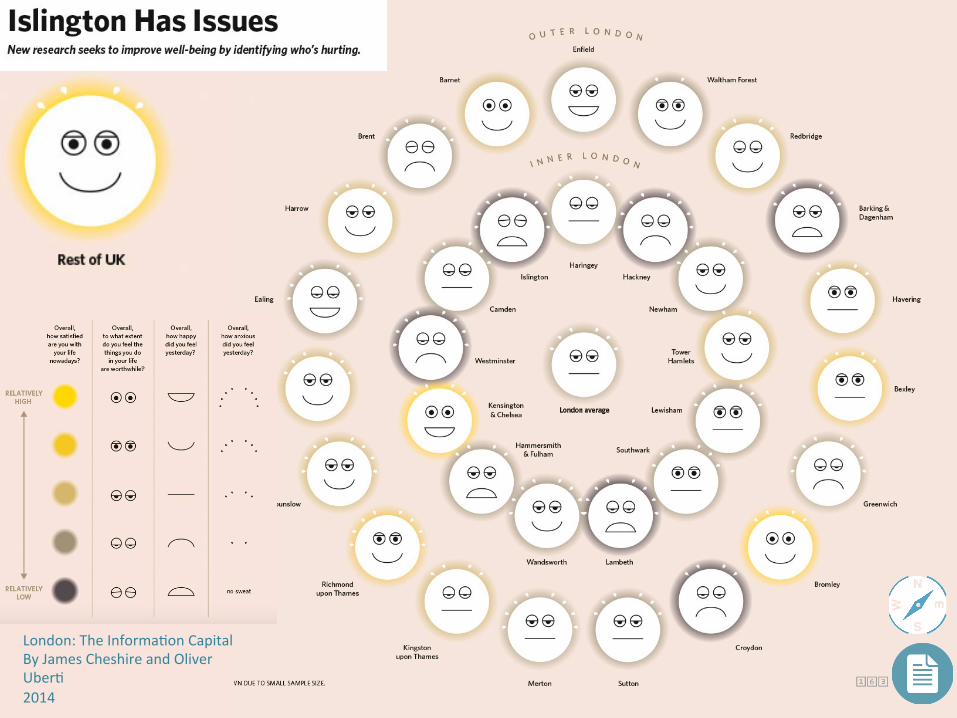
London: The Informa6on Capital By James Cheshire and Oliver
Uber6 2014

Marriage referendum in Ireland
Bahareh Heravi, Insight News Lab, 2015


GEOSPATIAL
Where?

Uses loca6on informa6on to iden6fy posi6ons, movements, [trends or paTerns] over geographical space.
Visual Insights, by Katy Borner and David E. Polley, 2014

hTp://www.theguardian.com/news/datablog/interac6ve/2011/aug/10/poverty-‐riots-‐mapped
Mapping London Riots with poverty

Language of Communi6es on TwiTer (Europe), David Fischer (2012)

Map of science collabora6ons 2005 -‐ 2009 Olivier H. Beauchesne (2012)

London: The Informa6on Capital By James Cheshire and Oliver Uber6 2014

By Bahareh Heravi Irish Times Data

hTp://www.carbonmap.org/


TOPICAL
What?

Uses text to iden6fy major topics, their interrela6ons, and their evolu6on over 6me, [and space].
Visual Insights, by Katy Borner and David E. Polley, 2014

Map of Science hTp://cns.iu.edu/images/teaching/ivmoocbook14/4.12.pdf

London: The Informa6on Capital By James Cheshire and Oliver
Uber6 2014

London: The Informa6on Capital By James Cheshire and Oliver
Uber6 2014

Facts are Sacred Simon Rogers
2013
London: The Informa6on Capital By James Cheshire and Oliver Uber6 2014

NETWORK
With whom?

To iden6fy (highly) connected en66es and the rela6onship between them;
Network proper6es, such as size and density;
Structure such as clusters and backbones.
Visual Insights, by Katy Borner and David E. Polley, 2014

Map of science collabora6ons 2008 -‐ 2012 Olivier H. Beauchesne (2014)

Bahareh Heravi, Insight News Lab, 2015

The Guardian

Source: Guardian Data

VISUALISING THE DATA

Why do we visualise? To tell a story and communicate
Visualise to analyse

Bar Line Area Map
More
Some chart types
Pie
ScatterPlot
Bubble Heat map
BoxPlot
Source: infogram training and Tableau

Most common way to visualise data. Good to show differences in values & categories that don’t add up to 100%.
Percent of spending by department, website traffic by origination site.
Poor choice for showing time- series data, as the line charts have a smoother representation.
Bar Comparing data
across categories
Source: infogram training and Tableau

Good for showing contrast when two or three components of something differ greatly in size.
Percentage of budget spent on different departments, response categories from a survey.
Poor choice if you have too many variables or if their values are similar in size.
Pie Compare proportions
out of 100%
Source: infogram training and Tableau

Line
Get some lengthy !data like oil prices?
Best choice for time-series data and highlighting trends, with not more than three sets per chart.
Stock price change over a five- year period, website page views during a month, revenue growth by quarter.
May be visually misleading when attempting to show data that is not based on time-series.
Line View trends inData over time
Source: infogram training and Tableau

A great choice to show regional differences in certain variables, when there is a clear correlation.
Driving penalties by county, product export destinations by country, car accidents by postcode.
Not optimal when the differences are small in size or when time- series data has to be displayed.
Map To show a
Geographical comparison
Source: infogram training

An effective way to get a sense of trends, concentrations, correlations and outliers.
Relationship between weight of a vehicle and its max speed, speeding ticket and death rate.
Not so easy to read by every day users.
Scatter Plot
Investigate relationshipvetween two variables
Source: Tableau

Suitable for understanding your data at a glance, seeing how data is skewed towards one end, identifying outliers in your data.
Not so easy to read by every day users.
Box Plot To show distribution
of a set of data
Source: Tableau

To give weight to cencentration of data on scatter plots or maps.
Not so easy to understand by every day users, particularly when comparing data on two axis.
Bubble To show cencentration
of data
Source: Tableau

Works well with 2-3 groups of people, objects or categories are compared, and when differences are significant.
A line chart is a better option with more than three groups and when differences are small.
Picto Another way of comparing
categories
Source: infogram training

Check out datavizcatalogue.com/

TOOLS

Fusion Tables


Hands-onVisualise number of death per county and rate of death per county in Ireland.
Start with Excel���Then Google Spreadsheets���Then move on to Datawrapper
Data:���RSA 2013 road death statisticsAny other?

Resources: Visual Insights: A Prac6cal Guide to Making Sense of Data, by Katy Borner and David E. Polley, 2014 Facts are Sacred, by Simon Rogers, 2013 London: The Informa6on Capital, by James Cheshire and Oliver Uber6, 2014 Which chart or graph is right for you?, Maila Hardin, Daniel Hom, Ross Perez, & Lori Williams, Tableau whitepaper

Ques@ons?
Bahareh R. Heravi
@Bahareh360