Dashboards - Driving Change or Driving Us Insane
34
Dashboards Driving Change or Driving Us Insane?
-
Upload
martha-horler -
Category
Data & Analytics
-
view
97 -
download
0
Transcript of Dashboards - Driving Change or Driving Us Insane

Dashboards Driving Change or Driving Us Insane?

Introduction
Martha Horler – Senior Data Management Officer
Jim McCarten – Head of Data and Information Services
Registry Services at Manchester Metropolitan University

What will we cover?
What is a Dashboard?
Common mistakes in designing a dashboard
Designing your own dashboard
Using dashboards to make decisions
Options for the technical side of creating a dashboard
Further reading
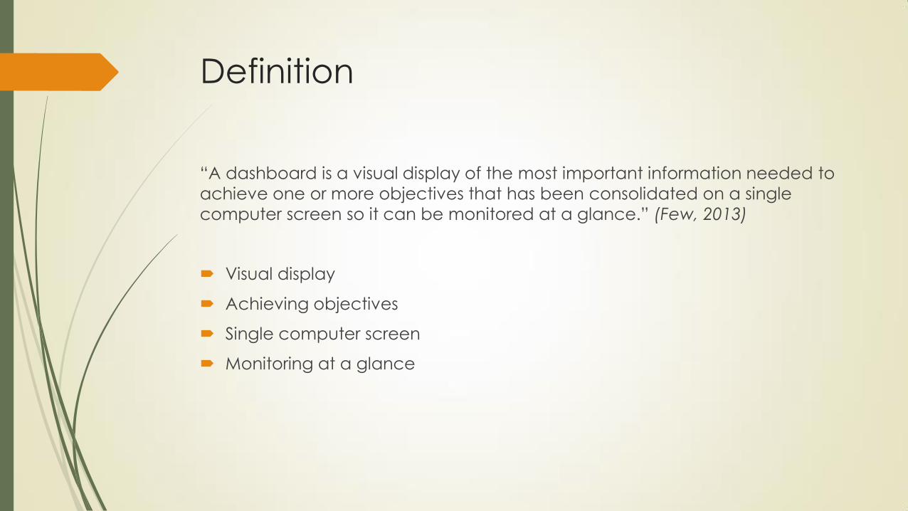
Definition
“A dashboard is a visual display of the most important information needed to
achieve one or more objectives that has been consolidated on a single
computer screen so it can be monitored at a glance.” (Few, 2013)
Visual display
Achieving objectives
Single computer screen
Monitoring at a glance


Additional Attributes
Small
Concise
Direct
Clear
Customisable

DISCUSSION
What areas of your work could have information presented in a
dashboard?
Discuss with a partner
Make a note of an example for later

Thirteen Common Mistakes in
Dashboard Design
From Stephen Few’s book
Examples to examine design that doesn’t work and learn why

1. Exceeding the boundaries of a single
screen
We can only hold so much
information in the mind at one time
Avoid scrolling in either direction
Avoid putting related data on
different ‘screens'
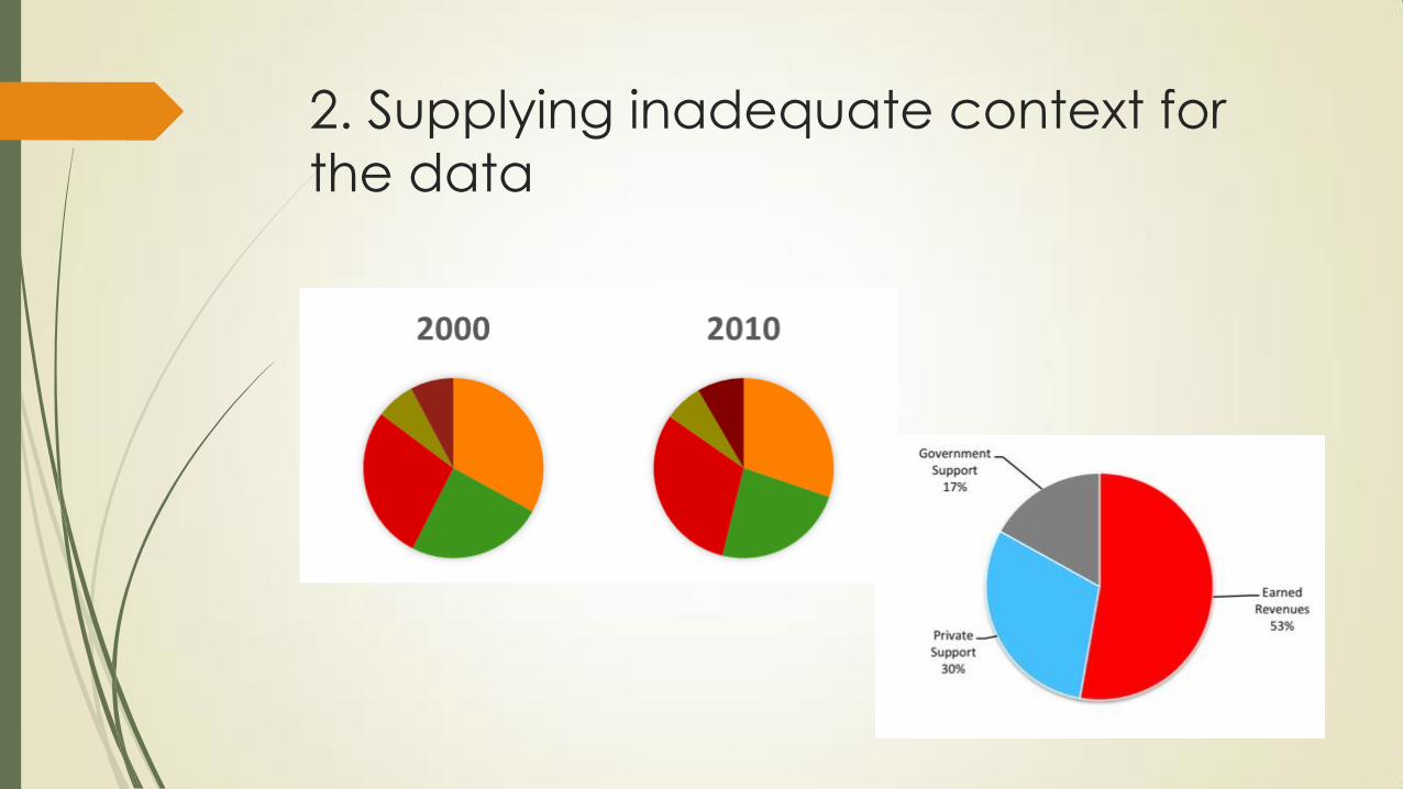
2. Supplying inadequate context for
the data

3. Displaying excessive detail or
precision
Should be a quick overview
Takes longer to process information when too precise
Check number of decimal places
Will rounding numbers suffice?

4. Expressing measures indirectly
What does the viewer need to know?
Don’t make them do calculations
0
10
20
30
40
50
60
70
1 2 3 4 5 6 7 8 9 10 11 -15
-10
-5
0
5
10
15
20
1 2 3 4 5 6 7 8 9 10 11

5. Choosing inappropriate display
media

Quiz

Answers
1. A
2. C
3. B
4. A
5. C
6. C
7. D

6. Introducing meaningless variety
Why use different chart types for everything if you don’t need to?
Annoying to look at
Hard work to decipher

7. Using poorly designed display media

8. Encoding quantitative data
inaccurately
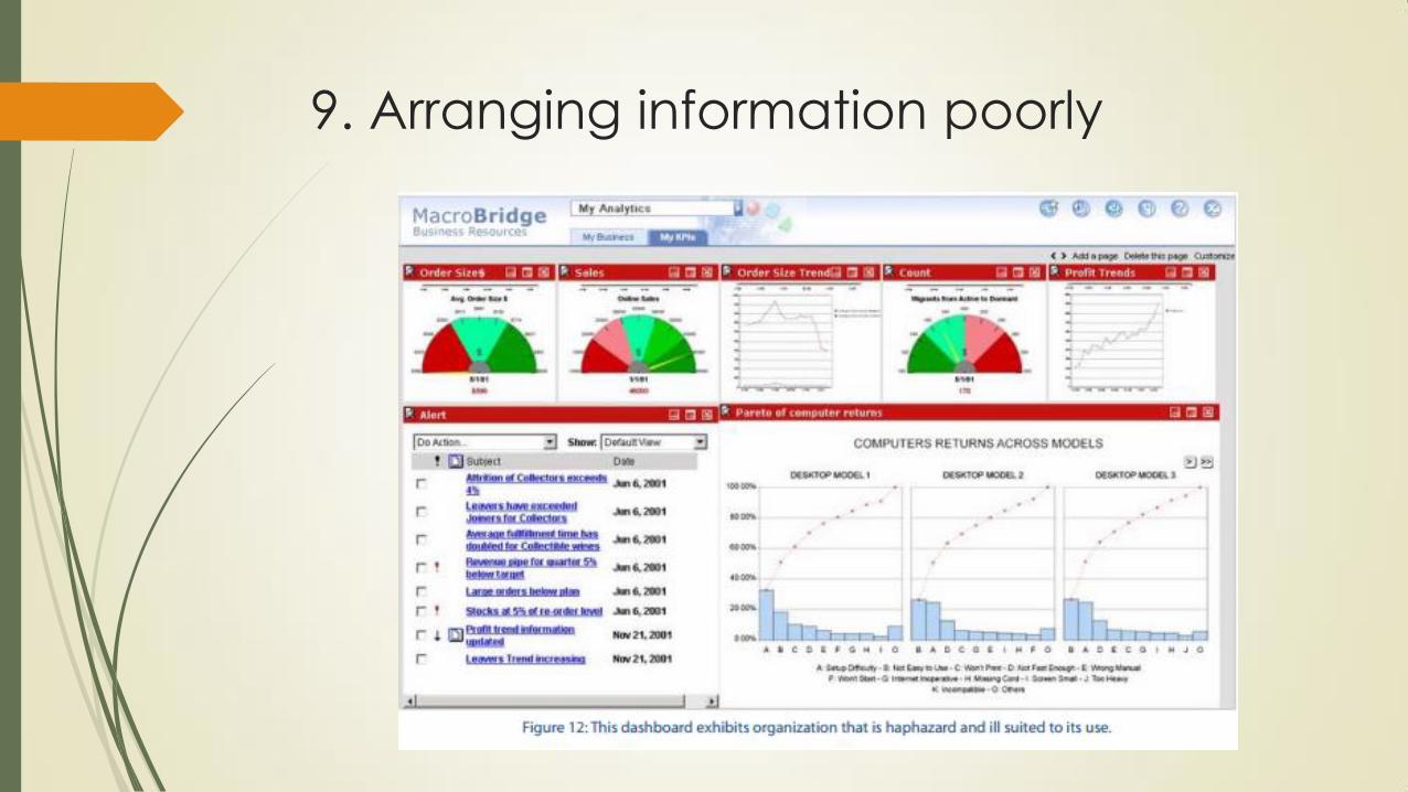
9. Arranging information poorly

10. Highlighting important information
ineffectively or not at all

11. Cluttering the display with visual
effects

12. Misusing or overusing colour

13. Designing an unattractive visual
display

Activity
Use post-it notes and paper to
create dashboard design
Use the area of work thought
of earlier
Discuss your design with the
person next to you

Using dashboards to make decisions
Dashboards need a purpose
What decision will be made from looking at the data?
What action will the data prompt?
Start with the end in mind
What decisions currently being made would benefit from more data?


How to build a data dashboard
Microsoft Excel
Quick, easy to use, connects to a range of data sources, good for prototyping
Software solutions
Tableau (free/public & paid)
Microsoft Power BI (free/public)
Jedox/SAS/Cognos/Oracle/QlikView
Programming solutions
Webpage: HTML, JS, CSS, PHP
Flash & ActionScript
R
Python

Example Excel Dashboard

Example Tableau Dashboard

Example R Dashboard

References
Information Dashboard Design (2013) Stephen Few, Analytics Press
978-1-938377-00-6
Visualize This (2011) Nathan Yau, Wiley Press
978-0-470-94488-2

Summary
Explained what a data dashboard is
Shown examples of bad dashboard design
Worked on an example dashboard for your organisation
Learnt about some tools to help you create your own

Thank you!
Any questions?