
CSS3 practico-diseño y desarrollo
350
Practical CSS3 DEVELOP AND DESIGN
-
Upload
santos-corrales -
Category
Documents
-
view
203 -
download
1
Transcript of CSS3 practico-diseño y desarrollo
ptg8274462
PracticalCSS3
DEVELOPAND DESIGN
ptg8274462
Practical CSS3DEVELOP AND DESIGN

ptg8274462
IV PRACTICAL CSS3
Online Resources . . . . . . . . . . . . . . . . . . . . . . . . . . . . . . . . . . . . . . . . . . . . . . . . . . . . . vii
Welcome to CSS3 . . . . . . . . . . . . . . . . . . . . . . . . . . . . . . . . . . . . . . . . . . . . . . . . . . . . viii
CHAPTER 1 INTRODUCTION TO CSS3 AND MODERN WEB DESIGN . . . . . . . . 2
Why CSS3? . . . . . . . . . . . . . . . . . . . . . . . . . . . . . . . . . . . . . . . . . . . . . . . . . . . . . . . . . . . . 4
Modern Web Design Philosophy . . . . . . . . . . . . . . . . . . . . . . . . . . . . . . . . . . . . . . 6
Thought Process for Content . . . . . . . . . . . . . . . . . . . . . . . . . . . . . . . . . . . . . . . . 10
CSS3 Modules in This Book . . . . . . . . . . . . . . . . . . . . . . . . . . . . . . . . . . . . . . . . . . 12
General CSS3 Features . . . . . . . . . . . . . . . . . . . . . . . . . . . . . . . . . . . . . . . . . . . . . . . 14
Wrapping Up . . . . . . . . . . . . . . . . . . . . . . . . . . . . . . . . . . . . . . . . . . . . . . . . . . . . . . . . . 35
CHAPTER 2 BUILDING A SOLID CROSS-BROWSER TEMPLATE
WITH HTML5 AND JAVASCRIPT . . . . . . . . . . . . . . . . . . . . . . . . . . . . . . . 36
Starting with Semantic HTML5 . . . . . . . . . . . . . . . . . . . . . . . . . . . . . . . . . . . . . . 38
Building a Template . . . . . . . . . . . . . . . . . . . . . . . . . . . . . . . . . . . . . . . . . . . . . . . . . . 41
Validating HTML5 . . . . . . . . . . . . . . . . . . . . . . . . . . . . . . . . . . . . . . . . . . . . . . . . . . . . 47
Exploring HTML5 Elements . . . . . . . . . . . . . . . . . . . . . . . . . . . . . . . . . . . . . . . . . 48
CSS Resets and normalize.css . . . . . . . . . . . . . . . . . . . . . . . . . . . . . . . . . . . . . . . 64
JavaScript Library Roundup . . . . . . . . . . . . . . . . . . . . . . . . . . . . . . . . . . . . . . . . . . 65
IE Conditional Comments . . . . . . . . . . . . . . . . . . . . . . . . . . . . . . . . . . . . . . . . . . . 68
Wrapping Up . . . . . . . . . . . . . . . . . . . . . . . . . . . . . . . . . . . . . . . . . . . . . . . . . . . . . . . . . 69
CHAPTER 3 SPICING UP YOUR FONTS AND TEXT . . . . . . . . . . . . . . . . . . . . . . . . . 70
Up the Pythons! . . . . . . . . . . . . . . . . . . . . . . . . . . . . . . . . . . . . . . . . . . . . . . . . . . . . . . 72
Using Web Fonts . . . . . . . . . . . . . . . . . . . . . . . . . . . . . . . . . . . . . . . . . . . . . . . . . . . . . 73
CSS3 Text Wrangling . . . . . . . . . . . . . . . . . . . . . . . . . . . . . . . . . . . . . . . . . . . . . . . . . 87
CSS3 Typography . . . . . . . . . . . . . . . . . . . . . . . . . . . . . . . . . . . . . . . . . . . . . . . . . . . . 94
Wrapping Up . . . . . . . . . . . . . . . . . . . . . . . . . . . . . . . . . . . . . . . . . . . . . . . . . . . . . . . . 105
CONTENTS

ptg8274462
CONTENTS V
CHAPTER 4 ENHANCING BOXES WITH CSS3 BLING . . . . . . . . . . . . . . . . . . . . . . 106
A Bright Future with CSS3 Bling . . . . . . . . . . . . . . . . . . . . . . . . . . . . . . . . . . . . 108
border-radius: God Bless Those Rounded Corners . . . . . . . . . . . . . . . . . 110
Adding Depth with box-shadow . . . . . . . . . . . . . . . . . . . . . . . . . . . . . . . . . . . . 114
Bring the Bling with CSS Gradients . . . . . . . . . . . . . . . . . . . . . . . . . . . . . . . . . 118
Multiple Backgrounds . . . . . . . . . . . . . . . . . . . . . . . . . . . . . . . . . . . . . . . . . . . . . . . 132
Box Clever: border-image . . . . . . . . . . . . . . . . . . . . . . . . . . . . . . . . . . . . . . . . . . . 136
box-decoration-break . . . . . . . . . . . . . . . . . . . . . . . . . . . . . . . . . . . . . . . . . . . . . . . 141
Adding Bling to a Banner Ad . . . . . . . . . . . . . . . . . . . . . . . . . . . . . . . . . . . . . . . . 142
Wrapping Up . . . . . . . . . . . . . . . . . . . . . . . . . . . . . . . . . . . . . . . . . . . . . . . . . . . . . . . . 147
CHAPTER 5 ANIMATED EFFECTS USING CSS3 . . . . . . . . . . . . . . . . . . . . . . . . . . . . 148
Bringing Animation to CSS . . . . . . . . . . . . . . . . . . . . . . . . . . . . . . . . . . . . . . . . . 150
Transforms . . . . . . . . . . . . . . . . . . . . . . . . . . . . . . . . . . . . . . . . . . . . . . . . . . . . . . . . . . 151
Transitions . . . . . . . . . . . . . . . . . . . . . . . . . . . . . . . . . . . . . . . . . . . . . . . . . . . . . . . . . . 179
Animations . . . . . . . . . . . . . . . . . . . . . . . . . . . . . . . . . . . . . . . . . . . . . . . . . . . . . . . . . . 189
Enhancing a Banner Ad with Animations . . . . . . . . . . . . . . . . . . . . . . . . . . 199
Providing Alternatives with Modernizr . . . . . . . . . . . . . . . . . . . . . . . . . . . . 204
Wrapping Up . . . . . . . . . . . . . . . . . . . . . . . . . . . . . . . . . . . . . . . . . . . . . . . . . . . . . . . . 217
CHAPTER 6 USING CSS TO IMPLEMENT ICONS . . . . . . . . . . . . . . . . . . . . . . . . . . 218
Icons Rock! . . . . . . . . . . . . . . . . . . . . . . . . . . . . . . . . . . . . . . . . . . . . . . . . . . . . . . . . . . 220
Using Icons on Websites . . . . . . . . . . . . . . . . . . . . . . . . . . . . . . . . . . . . . . . . . . . . 221
When to Use Icons . . . . . . . . . . . . . . . . . . . . . . . . . . . . . . . . . . . . . . . . . . . . . . . . . . 222
The Basics of Icon Implementation . . . . . . . . . . . . . . . . . . . . . . . . . . . . . . . . 224
Web Fonts as Icons . . . . . . . . . . . . . . . . . . . . . . . . . . . . . . . . . . . . . . . . . . . . . . . . . . 231
Pure CSS Icons: Peculiar? . . . . . . . . . . . . . . . . . . . . . . . . . . . . . . . . . . . . . . . . . . . 235
Wrapping Up . . . . . . . . . . . . . . . . . . . . . . . . . . . . . . . . . . . . . . . . . . . . . . . . . . . . . . . . 239

ptg8274462
VI PRACTICAL CSS3
CHAPTER 7 CSS3 LAYOUT CHOPS . . . . . . . . . . . . . . . . . . . . . . . . . . . . . . . . . . . . . . . . 240
CSS3 Layout Modules in Brief . . . . . . . . . . . . . . . . . . . . . . . . . . . . . . . . . . . . . . 242
Multi-col Layouts . . . . . . . . . . . . . . . . . . . . . . . . . . . . . . . . . . . . . . . . . . . . . . . . . . . 244
Using Flexbox . . . . . . . . . . . . . . . . . . . . . . . . . . . . . . . . . . . . . . . . . . . . . . . . . . . . . . . 255
Exploring Grids . . . . . . . . . . . . . . . . . . . . . . . . . . . . . . . . . . . . . . . . . . . . . . . . . . . . . 269
Other Layout Modules Worthy of Mention . . . . . . . . . . . . . . . . . . . . . . . . . 275
Wrapping Up . . . . . . . . . . . . . . . . . . . . . . . . . . . . . . . . . . . . . . . . . . . . . . . . . . . . . . . . 281
CHAPTER 8 RESPONSIVE AND ADAPTIVE DESIGN . . . . . . . . . . . . . . . . . . . . . . . 282
A Brief History of Web Browsers . . . . . . . . . . . . . . . . . . . . . . . . . . . . . . . . . . . 284
Responsive Design Strategies . . . . . . . . . . . . . . . . . . . . . . . . . . . . . . . . . . . . . . . 286
Flexible Layout Techniques . . . . . . . . . . . . . . . . . . . . . . . . . . . . . . . . . . . . . . . . . 292
Media Queries . . . . . . . . . . . . . . . . . . . . . . . . . . . . . . . . . . . . . . . . . . . . . . . . . . . . . . . 297
Media Query Polyfills . . . . . . . . . . . . . . . . . . . . . . . . . . . . . . . . . . . . . . . . . . . . . . . 307
Serving Images Responsively . . . . . . . . . . . . . . . . . . . . . . . . . . . . . . . . . . . . . . . 308
Mobile Browsers Lie! . . . . . . . . . . . . . . . . . . . . . . . . . . . . . . . . . . . . . . . . . . . . . . . . . 311
High-fidelity Devices . . . . . . . . . . . . . . . . . . . . . . . . . . . . . . . . . . . . . . . . . . . . . . . 316
A Responsive Heavy Metal Banner Ad! . . . . . . . . . . . . . . . . . . . . . . . . . . . . . 318
Wrapping Up . . . . . . . . . . . . . . . . . . . . . . . . . . . . . . . . . . . . . . . . . . . . . . . . . . . . . . . . 320
Index . . . . . . . . . . . . . . . . . . . . . . . . . . . . . . . . . . . . . . . . . . . . . . . . . . . . . . . . . . . . . . . . 321
BONUS CHAPTER
CHAPTER 9 STYLING HTML5 MEDIA AND FORMS . . . . . . . . . . . . . . . . . . . . . . . . A-2
Customizing <video> and <audio> . . . . . . . . . . . . . . . . . . . . . . . . . . . . . . . . . A-4
Form Improvements . . . . . . . . . . . . . . . . . . . . . . . . . . . . . . . . . . . . . . . . . . . . . . . A-12
Wrapping Up . . . . . . . . . . . . . . . . . . . . . . . . . . . . . . . . . . . . . . . . . . . . . . . . . . . . . . . A-15
ptg8274462
ONLINE RESOURCES VII
Throughout this book I use several third-party, online resources that include scripts and stylesheets, and I present and reference many examples that I wrote to illustrate the concepts in this book. The third-party resources are referenced where appro-priate, so you’ll be able to find them when needed. To find my examples is even easier: You can download them all at http://peachpit.com/practicalcss3.
But that’s not all! Also available at http://peachpit.com/practicalcss3 are the following:
� A bonus chapter. In Chapter 9, “Styling HTML5 Media and Forms,” I discuss building custom-styled controls for your HTML5 <video> and <audio> ele-ments, and styling form elements using the form-related pseudo-classes in CSS3.
� A cheat sheet. This reference document details the syntax of all the new CSS3 features I use in this book and how they are supported in browsers. Print it out and hang it on your wall as an at-a-glance guide! I’ll update this reference as the data changes.
Both are courtesy of your very generous author.
ONLINE RESOURCES
ptg8274462
VIII PRACTICAL CSS3
WELCOME TO CSS3
CSS3 provides you with exciting new tools for your web development toolbox, allowing
you to accomplish many styling tasks in a much easier, more flexible, and less hackish
manner than you’ve been used to when working with CSS2. The following chapters will
introduce you to the most useful, new CSS3 features and show you how to use them in real
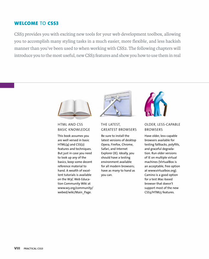
HTML AND CSS
BASIC KNOWLEDGE
This book assumes you
are well versed in basic
HTML(4) and CSS(2)
features and techniques.
But just in case you need
to look up any of the
basics, keep some decent
reference material to
hand. A wealth of excel-
lent tutorials is available
on the W3C Web Educa-
tion Community Wiki at
www.w3.org/community/
webed/wiki/Main_Page.
THE LATEST,
GREATEST BROWSERS
Be sure to install the
latest versions of desktop
Opera, Firefox, Chrome,
Safari, and Internet
Explorer (IE). Ideally, you
should have a testing
environment available
for all modern browsers;
have as many to hand as
you can.
OLDER, LESS-CAPABLE
BROWSERS
Have older, less-capable
browsers available for
testing fallbacks, polyfills,
and graceful degrada-
tion. Run older versions
of IE on multiple virtual
machines (VirtualBox is
an acceptable, free option
at www.virtualbox.org).
Camino is a good option
for a test Mac-based
browser that doesn’t
support most of the new
CSS3/HTML5 features.
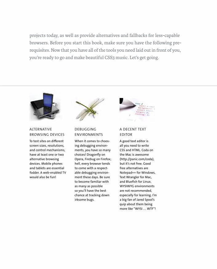
ptg8274462ALTERNATIVE
BROWSING DEVICES
To test sites on different
screen sizes, resolutions,
and control mechanisms,
have at least one or two
alternative browsing
devices. Mobile phones
and tablets are essential
fodder. A web-enabled TV
would also be fun!
DEBUGGING
ENVIRONMENTS
When it comes to choos-
ing debugging environ-
ments, you have so many
choices! Dragonfly on
Opera, Firebug on Firefox;
hell, every browser tends
to come with a respect-
able debugging environ-
ment these days. Be sure
to become familiar with
as many as possible
so you’ll have the best
chance at tracking down
irksome bugs.
A DECENT TEXT
EDITOR
A good text editor is
all you need to write
CSS and HTML. Coda on
the Mac is awesome
(http://panic.com/coda),
but it’s not free. Good
free alternatives are
Notepad++ for Windows,
Text Wrangler for Mac,
and Bluefish for Linux.
WYSIWYG environments
are not recommended,
especially for learning. I’m
a big fan of Jared Spool’s
quip about them being
more like “WYSI . . . WTF”!
projects today, as well as provide alternatives and fallbacks for less-capable
browsers. Before you start this book, make sure you have the following pre-
requisites. Now that you have all of the tools you need laid out in front of you,
you’re ready to go and make beautiful CSS3 music. Let’s get going.
ptg8274462
1
INTRODUCTION TOCSS3 AND MODERN WEB DESIGN

ptg8274462
3
CSS3, the new, modular version of
the CSS3 spec, contains many awe-
some new features that will make your web design work
easier, more flexible, and more interesting. What’s not
to love? Browser support is not complete yet, but many of the
features have enough support to be useful in a production envi-
ronment, and you can work around nonsupporting browsers.
In this chapter I’ll provide the rationale behind why the new
version came about and gently preach a manifesto of modern
web design to you. Then I’ll provide a brief roundup of the CSS3
modules before examining some of the general new features of
CSS3 that are useful to explore as background knowledge before
you go any further.

ptg8274462
4 CHAPTER 1 INTRODUCTION TO CSS3 AND MODERN WEB DESIGN
WHY CSS3?
CSS3 has been around for longer than you might think. In fact, work had started on the earliest parts of CSS3 at about the same time as the CSS2 spec was being finished in the late 1990s. CSS2 has many very powerful features, and you can do a lot with it, but it was clear all those years ago that despite this a number of features were missing from the spec. This was evidenced by the fact that web designers tried to do many tasks using weird and interesting hacks or unusual techniques, often involving lots of nested <div>s or other semantic backstabbery, images, or even proprietary technologies like Flash. Some examples that spring to mind include:
� Font embedding. Downloading custom fonts for use on websites has been available in Internet Explorer (IE) since version 4 but wasn’t standardized until years later with CSS3 web fonts. Before web fonts gained popular-ity and cross-browser support, web developers used to rely on all kinds of weird replacement techniques, such as image replacement and siFR (Scalable Inman Flash Replacement—see http://en.wikipedia.org/wiki/Scalable_Inman_Flash_Replacement) if they wanted custom fonts in headings.
� Bulletproof CSS. Back in the late 1990s and early 2000s a lot of pioneering techniques started to spring up for creating CSS UI features that wouldn’t break if the text was resized. The text wouldn’t spill messily out of its containers; instead, the design would expand along with it. These tech-niques were referred to as “Bulletproof CSS,” and they worked well if done properly. But often they required a number of nested <div>s, each with a single background image hung off it. Bulletproof rounded corners on a container required four nested <div>s! Such designs were inflexible as well. If you wanted to then change the color of the background, you’d have to go back into your preferred graphics editor and update all the background images each time. This is exactly the kind of problem that properties like border-radius were created to fix.

ptg8274462
WHY CSS3? 5
� Multiple column layouts. It is very common to use CSS floats to create mul-tiple column layouts; this everyone knows. But this is somewhat of a hack. Floats were never originally intended for this purpose. They were intended for simple magazine layout image floats.
� Dynamic UIs. Many “dynamic UI features,” such as layouts that automati-cally adapt to different screen widths and smooth animations and transi-tions for user feedback, have been traditionally done using JavaScript. There was no way to achieve them using CSS alone until recently; hence, the rise of DHTML in the late 1990s (yuck!) and more recently, the overwhelming popularity of JavaScript libraries, such as jQuery and Dojo.
And the list goes on. CSS3 was created not to give users a completely new set of amazing features to play with and create “spangly web innovations” (a great design agency name if ever there was one), but more to provide users with standardized, more flexible ways of solving existing problems.
There are now more than 40 modules in CSS3 at various stages of completion and browser support. The modular system is beneficial in many ways. It makes CSS3 easier to write by the spec teams and implement by the browser vendors: It is always easier to tackle small chunks than a single giant monolith. It also makes it easier for web designers and developers to get their heads around, and in my opinion, it makes it easier to “sell” to clients who may have issues about using
“unfinished” technologies in their sites (yes, CSS 2.1 was technically only finished in 2011, but hey).
ptg8274462
6 CHAPTER 1 INTRODUCTION TO CSS3 AND MODERN WEB DESIGN
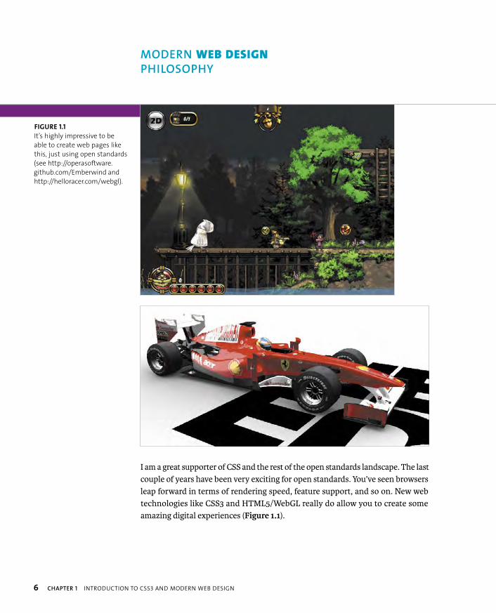
I am a great supporter of CSS and the rest of the open standards landscape. The last couple of years have been very exciting for open standards. You’ve seen browsers leap forward in terms of rendering speed, feature support, and so on. New web technologies like CSS3 and HTML5/WebGL really do allow you to create some amazing digital experiences (Figure 1.1).
FIGURE 1.1
It’s highly impressive to be
able to create web pages like
this, just using open standards
(see http://operasoftware.
github.com/Emberwind and
http://helloracer.com/webgl).
MODERN WEB DESIGN
PHILOSOPHY

ptg8274462
MODERN WEB DESIGN PHILOSOPHY 7
But everyone needs to take a step back when considering such innovations and not lose sight of the original qualities and best practices that made the web great, such as accessibility, usability, and graceful degradation.
ACCESSIBILITY COMES FIRST
In terms of my perspective on web design, I am really a “web 1.0” kinda guy. Inno-vative technologies are exciting, and you can fully appreciate their importance in the evolution of the web. But what is more exciting is the universal nature of the web. It’s the fact that you can take the same content, style it in a million different ways, and still have it remain accessible to all web users the world over regardless of how they use the web—be it on a mobile phone, using only keyboard controls, or via a screen reader.
It is something designers and developers shouldn’t lose sight of, but often we do. Whenever an exciting new web technology comes to the forefront, too many sites tend to pop up that go wild with the shiny and forget about the basic tenets. Recently, you’ve seen a sad reemergence of “This site is best viewed in…” messages, which should have been eliminated after the original browser wars ended a decade or so ago. And what about important text content rendered in <canvas>, which is therefore inaccessible? And how about CSS3 features that could work across mul-tiple browsers but don’t because the designer has only used the -webkit- prefixed version of the property? That designer might say, “Oooh, but it’s an app; therefore, it’s important to lock out anyone who isn’t using a device of the correct level of shininess” (Figure 1.2).
FIGURE 1.2 “Best viewed in Google Chrome” sounds
like a step back to the days of “Best viewed in IE4.”
Now, I’m not saying that all content should be acces-
sible to all people: It is not always that simple. But you
should make such allowances whenever possible.

ptg8274462
8 CHAPTER 1 INTRODUCTION TO CSS3 AND MODERN WEB DESIGN
USABILITY NEXT!
Once your users have managed to access your content and services, can they make sense of it and glean the information they wanted from it? This is a simple, perhaps obvious point to make, but I’ve lost count of the times I’ve gone to a company website and scratched my head in vain while trying to find contact details, opening times, or an address. Instead, I find nothing useful amidst the sea of marketing BS, cheesy videos, and other propaganda being presented.
Why do people not think more about what information is most useful to people viewing their websites and how to present that information in an easily digestible way? A simple, well-written, and clearly available bit of copy is nearly always more effective than reams of flashy, whizzy, technical stuff.
My mantra for usability (and many other people’s, too) is “don’t make me think.” Don’t make your users think about how to get what they want. If you’ve not already read it, Steve Krug’s book Don’t Make Me Think: A Common Sense Approach To Web Usability, 2nd Edition is essential reading.
GRACEFUL DEGRADATION AND PROGRESSIVE ENHANCEMENT
Graceful degradation and progressive enhancement were two terms that first became popular (or at least noteworthy) about a decade ago. Both were used when talking about what happens to content when the browser viewing it doesn’t sup-port all the features used to create it.
Graceful degradation means that the content falls back to something simpler but still perfectly accessible and usable. So, for example, if a content box is built and then styled using lots of CSS3 glitz, older browsers should still be able to display the text in a readable form, even if it doesn’t look as nice.
Progressive enhancement means that the base content is accessible by all, but then usability and stylistic enhancements are built on top of that base for those browsers that support those enhancements.
ptg8274462
MODERN WEB DESIGN PHILOSOPHY 9
These are design philosophies that I have always held dear. They have not always been easy to uphold, because you often meet clients who are “obsessed with pixel perfection across all browsers” or some similar weird fetish. But they are certainly becoming cool again, especially with all the CSS3 features to make use of and lots of mobiles and other alternative browsing devices to make your content work across. Oh, and IE6, 7, and 8 still have significant market share and often need to be supported.
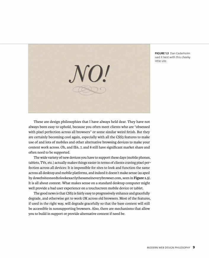
The wide variety of new devices you have to support these days (mobile phones, tablets, TVs, etc.) actually makes things easier in terms of clients craving pixel per-fection across all devices: It is impossible for sites to look and function the same across all desktop and mobile platforms, and indeed it doesn’t make sense (as aped by dowebsitesneedtolookexactlythesameineverybrowser.com, seen in Figure 1.3). It is all about context. What makes sense on a standard desktop computer might well provide a bad user experience on a touchscreen mobile device or tablet.
The good news is that CSS3 is fairly easy to progressively enhance and gracefully degrade, and otherwise get to work OK across old browsers. Most of the features, if used in the right way, will degrade gracefully so that the base content will still be accessible in nonsupporting browsers. Also, there are mechanisms that allow you to build in support or provide alternative content if need be.
FIGURE 1.3 Dan Cederholm
said it best with this cheeky
little site.
ptg8274462
10 CHAPTER 1 INTRODUCTION TO CSS3 AND MODERN WEB DESIGN
A good thought process to go through when implementing shiny features on a website interface is as follows:
1. Create a base of accessible HTML content. The styling and behavior you build on top of this content should, wherever possible, be usability and stylistic enhancements, and not essential for accessing the content.
2. Consider whether you need to use all the cool, cutting-edge technologies or whether you just want to because you’re a cool kid who wants to be in with the in crowd.
3. Check whether your proposed implementation will gracefully degrade while leaving the base content accessible.
4. Test whether the content is accessible and OK looking across varying devices (e.g., different screen sizes, control mechanisms).
5. In cases where the content is not accessible without the CSS3, WebGL, or whatever, or not accessible to certain users, do your best to build in alternative mechanisms that will provide access to that content.
THOUGHT PROCESS FOR CONTENT
ptg8274462
THOUGHT PROCESS FOR CONTENT 11
You should constantly look at making content work for as many users as pos-sible by:
1. Keeping graceful degradation/progressive enhancement in mind.
2. Providing alternatives for inaccessible content using built-in features (e.g., alt text, transcripts for video).
3. Building in your own alternatives when no built-in mechanisms exist (e.g., feature detection and provision of alternative styles using Modernizr).
4. Using polyfills to provide support for features where none exists.
The rule I used for deciding what to cover in this book was to include a CSS3 feature only if it has support across at least two major browsers and if you can make designs employing it work in older browsers that don’t support it via polyfills, alternative content, graceful degradation, and so on. I’ve broken this rule a few times, but only when I thought a feature was very significant and likely to have more implementations soon, and when nonsupport didn’t completely break sites.
TIP: A great site to consult for quick summaries of which CSS3
and HTML5 features are ready to use on production sites, and
whether fallbacks and the like should be provided is http://html5please.us
by Divya Manian, Paul Irish, et al.
ptg8274462
12 CHAPTER 1 INTRODUCTION TO CSS3 AND MODERN WEB DESIGN
Let’s look at a brief roundup of the major CSS3 modules you’ll be utilising and their main features. You can find more details on the latest status of each module at the W3C CSS Current Work page at www.w3.org/Style/CSS/current-work.en.html. As you’ll see, many of the modules are not yet finished, but this shouldn’t stop you from using some of those features. Many such features are already supported in brows-ers, albeit with vendor prefixes (see the section ”Vendor Prefixes” for more details).
The major CSS3 modules featured in this book include:
� CSS Color (www.w3.org/TR/css3-color). CSS Color defines the many ways to specify color in CSS3, including RGB (red, green, blue), HSL (hue, satu-ration, lightness), RGBA and HSLA (same as before but includes an alpha channel to specify transparency), and a separate opacity property to apply transparency to a whole selection of elements.
� CSS Fonts Level 3 (www.w3.org/TR/css3-fonts). As well as containing the definitions for downloadable web fonts (previously in a separate module known as, you guessed it, CSS web fonts), this module also contains defini-tions for other font-affecting properties, such as font-feature-settings.I won’t talk about many of these beyond web fonts, because many do not have much browser support yet. You’ll mostly meet these in Chapter 3.
� CSS Text Level 3 (www.w3.org/TR/css3-text). This goes hand in hand with CSS Fonts Level 3 to give you more power over your words! As well as hous-ing familiar items from CSS2, such as letter-spacing and text-transform,CSS Text introduces new friends, such as hyphenation and text shadow.
� Selectors Level 3 (www.w3.org/TR/css3-selectors). Selectors Level 3 defines a much more powerful, robust set of mechanisms for selecting the elements you want to apply styles to than was available in CSS2. Pretty much all of these selectors have good support across modern browsers. These are dis-cussed later in the “CSS3 Selectors” section of this chapter.
� Media Queries (www.w3.org/TR/css3-mediaqueries). The primary means by which you can now serve optimized different layouts of the same content to widely differing browsing devices—for example, wide screen and narrow screen. You’ll mostly meet these in Chapter 8.
CSS3 MODULES IN THIS BOOK
ptg8274462
CSS3 MODULES IN THIS BOOK 13
� Backgrounds and Borders Level 3 (www.w3.org/TR/css3-background). Back-grounds and Borders defines anything to do with background and borders, including rounded corners (border-radius), drop shadows (box-shadow), and fancy border effects (border-image).
� CSS Multi-column layout (www.w3.org/TR/css3-multicol). CSS Multi-column layout defines an easy way to break up content into multi-column layouts that reflow nicely rather than having to hack it with imprecise floats. You’ll meet these in Chapter 7.
� CSS transforms (www.w3.org/TR/css3-2d-transforms and www.w3.org/TR/css3-3d-transforms). These two specifications define mechanisms for transforming the size, position, and shape of elements in two and three dimensions. I’ll mainly talk about these in Chapter 5.
� CSS transitions (www.w3.org/TR/css3-transitions). CSS transitions give you a way to smoothly animate changes in state, such as a change in link color or an increase in banner size on hover. You’ll mainly see these in Chapter 5.
� CSS animations (www.w3.org/TR/css3-animations). CSS animations allow you to implement Flash-style declarative animations using keyframes detail-ing different property values, which the browser then “tweens” between. These are also covered in Chapter 5.
� CSS Flexible box layout (www.w3.org/TR/css3-flexbox). Mainly intended for equally distributing the height or width of rows or columns, this module defines new values for the display property to allow more powerful layout techniques. This is supported to varying degrees across modern browsers, but it is definitely worth mentioning.
� CSS Image Values and Replaced Content Level 3 (www.w3.org/TR/css3-images). This module contains some useful features for controlling back-ground images and replaced content, some of which is starting to be sup-ported across browsers. I’ll cover linear and radial gradients among other features.
ptg8274462
14 CHAPTER 1 INTRODUCTION TO CSS3 AND MODERN WEB DESIGN
To whet your appetite, let’s now look at some general CSS3 features. These fea-tures are grouped together because they are general features that you’ll meet time and time again throughout different chapters: They are useful in many different circumstances.
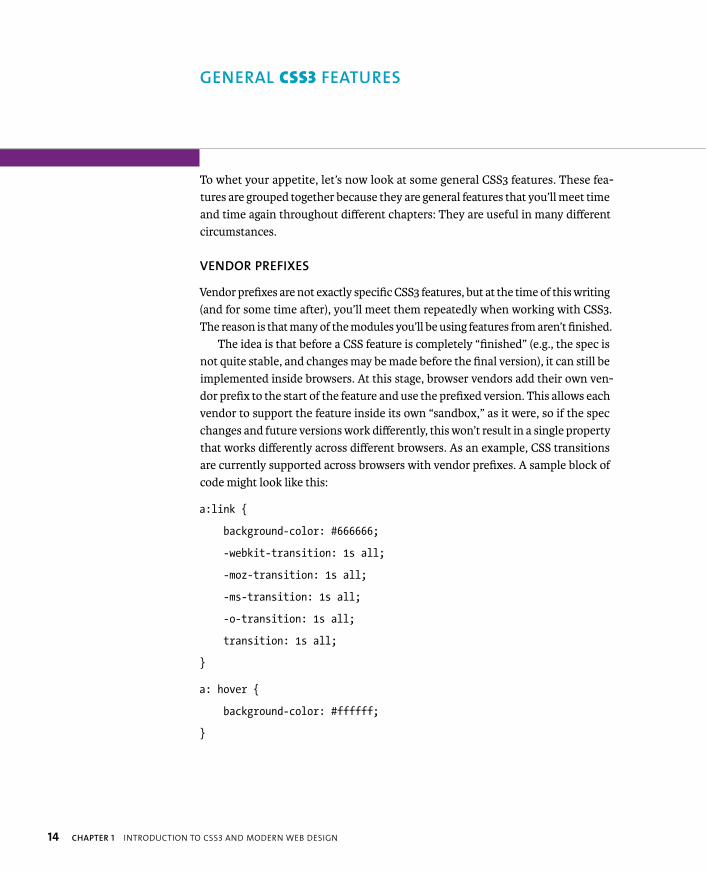
VENDOR PREFIXES
Vendor prefixes are not exactly specific CSS3 features, but at the time of this writing (and for some time after), you’ll meet them repeatedly when working with CSS3. The reason is that many of the modules you’ll be using features from aren’t finished.
The idea is that before a CSS feature is completely “finished” (e.g., the spec is not quite stable, and changes may be made before the final version), it can still be implemented inside browsers. At this stage, browser vendors add their own ven-dor prefix to the start of the feature and use the prefixed version. This allows each vendor to support the feature inside its own “sandbox,” as it were, so if the spec changes and future versions work differently, this won’t result in a single property that works differently across different browsers. As an example, CSS transitions are currently supported across browsers with vendor prefixes. A sample block of code might look like this:
a:link {
background-color: #666666;
-webkit-transition: 1s all;
-moz-transition: 1s all;
-ms-transition: 1s all;
-o-transition: 1s all;
transition: 1s all;
}
a: hover {
background-color: #ffffff;
}
GENERAL CSS3 FEATURES
ptg8274462
GENERAL CSS3 FEATURES 15
A PREFIXED NIGHTMARE?
I’ve put the prefixed properties in my example in the order they are in for two reasons. First, it looks
aesthetically pleasing to have the widest prefix first and the narrowest last.
Second, at the time of this writing, a number of non-WebKit browser makers were discussing adding
support for -webkit- prefixed versions of some properties, as well as their own prefixed versions. By putting
-webkit- first, you can make sure that if this happens, such browsers will end up using their own prefixed
version if it is present, not -webkit-, because the others all appear afterwards in the cascade.
Using the correct prefixed property will always be better and more accurate than relying on faked -webkit-
support, especially considering that in some cases you might feed the different browsers different property
values because of varying support. For example, at the time of this writing Opera does not yet support 3D
transforms, so you could provide Opera with this 2D transform that would work:
-webkit-transform: rotate3D(1,0,0,10deg) translateX(300px);
-o-transform: translateX(300px);
Why are other browsers considering adding -webkit- support? Because so many developers have been har-
boring an ill-conceived idea that WebKit is the only browser engine worth supporting. So they were using
lots of CSS3 features only with the -webkit- prefix, thereby making those features arbitrarily fail in other
browsers that support them. As far as users are concerned, it is the browsers that are at fault. The aver-
age site visitors don’t know any better, and neither should they be expected to. Messy as it is, non-WebKit
browsers adding -webkit- support is a somewhat desperate potential measure to try to fix this browser
support mess to some degree.
To sum up, it may sound nightmarish having to include five different versions of the same property in such
situations. Quite a few people think that you shouldn’t use vendor prefixes at all in production projects,
and that they are only for testing purposes (this is the W3C’s official stance too). But don’t let that stop you.
As you’ll discover throughout this book, it is easy in most cases to retain an acceptable user experience in
browsers that don’t support those properties, as long as you give it a bit of forethought!
If you want to use prefixed CSS3 features, please do so responsibly and use all the different prefixes for all
supporting browsers. And don’t make your sites dependent on a particular feature that doesn’t have cross-
browser support!
This transition shorthand property tells the browser to smoothly transition every property that changes when the link’s state changes over a duration of 1 sec-ond (see Chapter 5 for more details). In this case it is just the background color that changes. The aspect to focus on in this code is the fact that there are five copies of the transition property. The first four include vendor prefixes. At the time of
ptg8274462
16 CHAPTER 1 INTRODUCTION TO CSS3 AND MODERN WEB DESIGN
this writing, you need to include these so the effect will work in Chrome and other WebKit-based browsers (-webkit-), Firefox and other Gecko-based browsers (-moz-), IE (-ms-), and Opera (-o-). I’ve also included the fifth—prefixless—property so that when browsers start to support the prefixless version instead of their own specific prefixed property, the code will still work for them, and you won’t have to update it unless the spec has changed since then.
There is no single correct way to order the vendor prefixes in your code, and different people have different opinions about how it should be done. I’m just presenting my opinion of what I think works best.
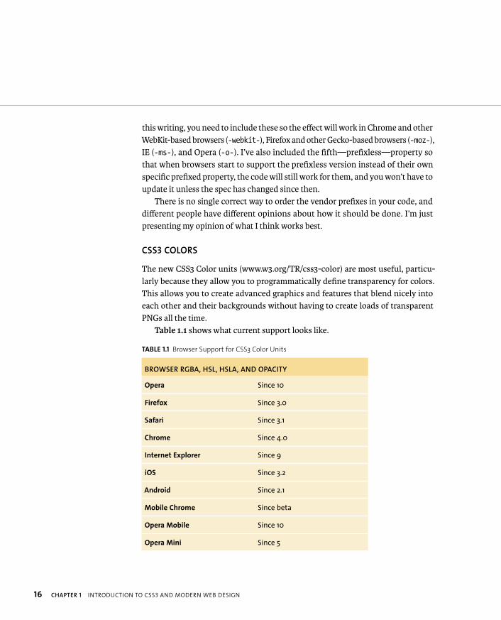
CSS3 COLORS
The new CSS3 Color units (www.w3.org/TR/css3-color) are most useful, particu-larly because they allow you to programmatically define transparency for colors. This allows you to create advanced graphics and features that blend nicely into each other and their backgrounds without having to create loads of transparent PNGs all the time.
Table 1.1 shows what current support looks like.
TABLE 1.1 Browser Support for CSS3 Color Units
BROWSER RGBA, HSL, HSLA, AND OPACITY
Opera Since 10
Firefox Since 3.0
Safari Since 3.1
Chrome Since 4.0
Internet Explorer Since 9
iOS Since 3.2
Android Since 2.1
Mobile Chrome Since beta
Opera Mobile Since 10
Opera Mini Since 5

ptg8274462
GENERAL CSS3 FEATURES 17
RGB AND RGBA
RGB (actually available since CSS2) works in a similar way to hex values. You define red, green, and blue channels, but you do it using numbers between 0 and 255, not pairs of hexadecimal numbers:
� rgb(255,0,0). Equivalent to #ff0000 or red
� rgb(255,255,255). Equivalent to #ffffff or white
RGBA takes this a step further, adding a fourth value that specifies the alpha channel, or the opacity of the color. This value is between 0 and 1; 0 is completely transparent, and 1 is completely opaque:
� rgba(255,0,0,1). Full red with full opacity
� rgba(255,0,0,0.5). Full red but 50 percent transparent
� rgba(255,0,0,0.2). Full red but 80 percent transparent
HSL AND HSLA
HSL—hue, saturation, and lightness—is a different way of defining a color, which makes a lot of sense to many people, especially designers who are used to using graphics editors. The syntax looks like this:
� hsl(0,100%,50%). Equivalent to #ff0000 or red
� hsl(0,0%,100%). Equivalent to #ffffff or white
The first value—hue—takes a value between 0 and 360. It’s basically a point around a standard color wheel circle.
The second value—saturation—takes a value of 0–100% and refers to how bright the color is; 100% is full color, and 0% is greyscale.
The third value—lightness—takes a value of 0–100% and refers to how light the color is; 100% is completely light/white, and 0% is completely dark/black.
ptg8274462
18 CHAPTER 1 INTRODUCTION TO CSS3 AND MODERN WEB DESIGN
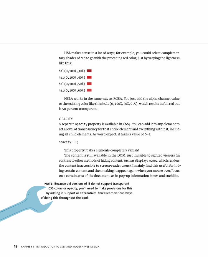
HSL makes sense in a lot of ways; for example, you could select complemen-tary shades of red to go with the preceding red color, just by varying the lightness, like this:
hsl(0,100%,30%)
hsl(0,100%,40%)
hsl(0,100%,50%)
hsl(0,100%,60%)
HSLA works in the same way as RGBA. You just add the alpha channel value to the existing color like this: hsla(0,100%,50%,0.5), which results in full red but is 50 percent transparent.
OPACITY
A separate opacity property is available in CSS3. You can add it to any element to set a level of transparency for that entire element and everything within it, includ-ing all child elements. As you’d expect, it takes a value of 0–1:
opacity: 0;
This property makes elements completely vanish!The content is still available in the DOM, just invisible to sighted viewers (in
contrast to other methods of hiding content, such as display:none;, which renders the content inaccessible to screen-reader users). I mainly find this useful for hid-ing certain content and then making it appear again when you mouse over/focus on a certain area of the document, as in pop-up information boxes and suchlike.
NOTE: Because old versions of IE do not support transparent
CSS colors or opacity, you’ll need to make provisions for this
by adding in support or alternatives. You’ll learn various ways
of doing this throughout the book.
ptg8274462
GENERAL CSS3 FEATURES 19
SIZING TEXT USING REMS
CSS3 introduces a few new size units (see www.w3.org/TR/css3-values); one in par-ticular that seems stable and is getting good browser support is the rem, or root em. This makes text styling a lot easier because all sizes defined in rems are relative to the text size of the root element—<html>. Rems get rid of the complications caused by ems and percentages: They work relative to the sizing of their parent elements. So, for nested elements, you’ll often have to do all kinds of weird calculations to work out what values to use to get the font size you want. Consider the following example (see rem_example.html in the chapter1 code download folder):
<h1>Example <em>rem</em> exploration</h1>
<p>This example is written to show why the new CSS3 rem unit p is useful. It allows you to much more easily size text and p boxes, as rem sizing is always relative to the size of the p <code><html></code> element.</p>
Here you can start off by sizing your text like so:
html {
font-size: 62.5%;
}
h1 {
font-size: 3em;
}
p {
font-size: 1.4em;
}
This is simple CSS. You start with the tried and tested 62.5% font setting to take the base font size for the whole document down to 10px (62.5% of 16px, the standard default body text font size in all browsers). Then you set the <h1> size

ptg8274462
20 CHAPTER 1 INTRODUCTION TO CSS3 AND MODERN WEB DESIGN
to three times that, which results in a computed size of 30px. The <p> is set to 1.4 times the size of the base font, or 14px.
The trouble starts when you try to resize children of those elements. If you wanted to, say, size your <code> element at 11px, how would you do that with ems? Well, 1.1em wouldn’t work, because it would be 1.1em of 14px (the size of its parent element). The actual value you need is 11/14 = 0.786em. Extrapolate this to more complicated and precise designs, and you’re looking at a whole load of complicated math and hair pulling.
Rems make text sizing a lot easier. If you instead used rems for these text sizes, everything would be relative to the font-size on the <html>. So getting 11px code font would be a matter of using the following:
code {
font-size: 1.1rem;
}
Table 1.2 shows the current state of browser support for rem units.
TABLE 1.2 Browser Support Matrix for Rem Units
BROWSER REM UNITS
Opera Since 11.6
Firefox Since 3.6
Safari Since 5.0
Chrome Since 6.0
Internet Explorer Since 9
iOS Since 4.0
Android Since 2.1
Mobile Chrome Since beta
Opera Mobile 12
Opera Mini No
ptg8274462
GENERAL CSS3 FEATURES 21
IE only supports rems since version 9, so support for older versions needs some attention. The best way to handle this is to provide fallbacks in pixel sizes so older IE versions at least get the same sizing, albeit with a lesser degree of flex-ibility. For example:
code {
font-size: 11px;
font-size: 1.1rem;
}
CSS3 SELECTORS
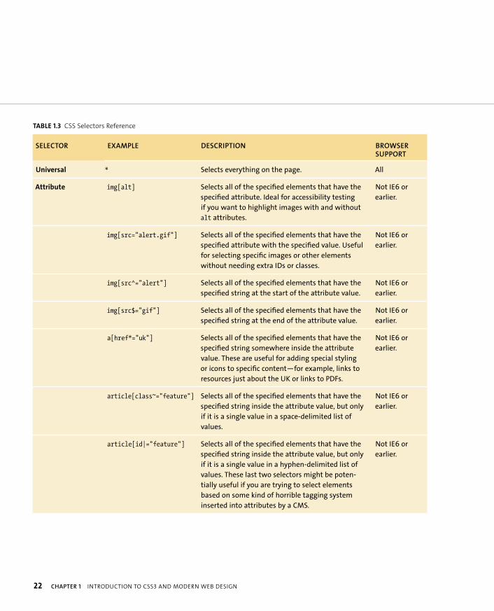
CSS3 features an entire toolbox of new selectors that allow you to select more spe-cific elements for styling while nullifying the need for a lot of those arbitrary IDs and classes you tend to often include to select “the last item in the list,” or “the first paragraph in the post that always contains the introduction,” or even “the twelfth div across on the 17th shelf because I want it to be the prettiest.”
I won’t discuss every selector exhaustively. If you want a detailed reference for each one, consult a resource such as www.w3.org/community/webed/wiki/Advanced_CSS_selectors. Instead, I’ll provide a quick reference in Table 1.3 for all the selectors, and then showcase some of the most powerful and interesting ones (as well as some seldom-explored selectors first included in CSS2) to give you a good flavor of what selectors are now capable of.
TIP: IE6 and IE7 don’t resize text set in pixels, so for accessibility’s
sake, if you are planning on using rems for text sizing, you might
want to consider bumping up the text size just for these browsers using
an IE conditional stylesheet (see Chapter 2.)
ptg8274462
22 CHAPTER 1 INTRODUCTION TO CSS3 AND MODERN WEB DESIGN
TABLE 1.3 CSS Selectors Reference
SELECTOR EXAMPLE DESCRIPTION BROWSER SUPPORT
Universal * Selects everything on the page. All
Attribute img[alt] Selects all of the specified elements that have the
specified attribute. Ideal for accessibility testing
if you want to highlight images with and without
alt attributes.
Not IE6 or
earlier.
img[src="alert.gif”] Selects all of the specified elements that have the
specified attribute with the specified value. Useful
for selecting specific images or other elements
without needing extra IDs or classes.
Not IE6 or
earlier.
img[src^="alert"] Selects all of the specified elements that have the
specified string at the start of the attribute value.
Not IE6 or
earlier.
img[src$="gif"] Selects all of the specified elements that have the
specified string at the end of the attribute value.
Not IE6 or
earlier.
a[href*="uk"] Selects all of the specified elements that have the
specified string somewhere inside the attribute
value. These are useful for adding special styling
or icons to specific content—for example, links to
resources just about the UK or links to PDFs.
Not IE6 or
earlier.
article[class~="feature"] Selects all of the specified elements that have the
specified string inside the attribute value, but only
if it is a single value in a space-delimited list of
values.
Not IE6 or
earlier.
article[id|="feature"] Selects all of the specified elements that have the
specified string inside the attribute value, but only
if it is a single value in a hyphen-delimited list of
values. These last two selectors might be poten-
tially useful if you are trying to select elements
based on some kind of horrible tagging system
inserted into attributes by a CMS.
Not IE6 or
earlier.

ptg8274462
GENERAL CSS3 FEATURES 23
TABLE 1.3 CSS Selectors Reference (continued)
SELECTOR EXAMPLE DESCRIPTION BROWSER SUPPORT
Descendant nav a Selects the element on the right only if it is nested
somewhere inside the element(s) to the left. You
can chain more than two together—for example,
nav li a.
All.
Child body>header Selects the element on the right only if it is a
direct child of the element(s) to the left. You can
chain more than two together—for example,
body>header>p.
Not IE6 or
earlier.
Adjacent sibling h1 + p Selects the element on the right only if it comes
immediately after the element on the left in the
source order, and they are siblings at the same
nesting level. It’s perfect if, for example, you set
paragraphs to have an indent on the first line but
want to remove that indent for the first line after
each heading.
Not IE6 or
earlier.
General sibling h1 ~ img Selects the element on the right only if it is a sib-
ling (at the same nesting level) as the element on
the left. It’s great for setting that indent mentioned
previously on each paragraph after a heading or
giving a special styling only to images inside an
article at the same level as a heading.
Not IE6 or
earlier.
UI element
pseudo-classes
a:link Styles the default state of a link. All.
a:visited Styles links when they’ve already been visited. All.
img:hover Styles elements when they’re hovered over. All.
input:focus Styles elements when they’re given focus (e.g., with
the keyboard).
All.
a:active Styles links while they are being activated (e.g., by
being clicked on).
All.
continues on next page
ptg8274462
24 CHAPTER 1 INTRODUCTION TO CSS3 AND MODERN WEB DESIGN
TABLE 1.3 CSS Selectors Reference (continued)
SELECTOR EXAMPLE DESCRIPTION BROWSER SUPPORT
UI element
pseudo-classes
(continued)
input:valid Styles form inputs that contain valid data. These
types of selectors are very useful for giving users
hints about whether their form data is valid or not.
Not supported
in IE.
input:invalid Styles form inputs that contain invalid data. Not supported
in IE.
input:enabled Styles enabled form inputs. All.
input:disabled Styles disabled form inputs. All.
input:in-range Styles form inputs that contain data that is inside
the valid range.
Not supported
in IE.
input:out-of-range Styles form inputs that contain data that is outside
the valid range.
Not supported
in IE.
Negation selector input:not([type="submit"]) Styles the specified element if it isn’t selected by
the simple selector(s) inside the parentheses. This is
useful in cases where you have several similar ele-
ments and want to select them all except for one
of two. For example, when laying out a form you’ll
want to give most of the inputs an equal width
but not the submit or file inputs. You can include
multiple selectors to negate inside the paren-
theses in a comma-delimited list—for example,
input:not([type="submit"], [type="file"]).
Not IE8 or
earlier.
Language selector p:lang(en-US) Styles the specified element only if it has the
language inside the parentheses set on it via the
lang attribute.
Not IE6 or
earlier.
Target selector article:target Styles the element only if it is the target of a link.
It’s incredibly cool for making content appear at
the click of a button, such as overlays, information
boxes, or different tabs in a tabbed interface, with-
out needing JavaScript. The main problem is that
each new state will be at a different URL, so it can
break the expected Back button functionality.
Not IE8 or
earlier.
ptg8274462
GENERAL CSS3 FEATURES 25
TABLE 1.3 CSS Selectors Reference (continued)
SELECTOR EXAMPLE DESCRIPTION BROWSER SUPPORT
Structural
pseudo-classes
:root Styles the root element of the document, which is
pretty much always <html>!
Not IE8 or
earlier.
li:nth-child(2n+1) In a series of child elements, styles the elements
specified by the formula in the parentheses. So,
for example, this formula would select all odd-
numbered list items (1, 3, 5, etc.). It’s great for zebra
striping to enhance readability.
Not IE8 or
earlier.
li:nth-last-child(2n+1) Works the same as nth-child but starts at the last
element and works backwards.
Not IE8 or
earlier.
p:nth-of-type(3) Works the same as nth-child but ignores elements
not of the type specified. I usually use this just to
select a single child element or a certain type.
Not IE8 or
earlier.
:nth-last-of-type(1) Works the same as nth-of-type, except that it
counts backwards from the last child element.
Not IE8 or
earlier.
p:first-child Selects the first child in a series of child elements, if
it is of the type specified.
Not IE8 or
earlier.
p:last-child Selects the last child in a series of child elements, if
it is of the type specified.
Not IE8 or
earlier.
p:first-of-type Selects the first child of that type in a series of child
elements.
Not IE8 or
earlier.
p:last-of-type Selects the last child of that type in a series of child
elements.
Not IE8 or
earlier.
li:only-child Selects the only child of an element if it is of the
type specified. This is useful if, for example, you
want to give list items a special styling only if there
is one list item present. You might want to omit the
bullet point because it is pointless and looks silly if
there is only one bullet!
Not IE8 or
earlier.
continues on next page
ptg8274462
26 CHAPTER 1 INTRODUCTION TO CSS3 AND MODERN WEB DESIGN
TABLE 1.3 CSS Selectors Reference (continued)
SELECTOR EXAMPLE DESCRIPTION BROWSER SUPPORT
Structural
pseudo-classes
(continued)
section p:only-of-type Selects the specified element if it is the only one of
its type inside its parent.
Not IE8 or
earlier.
:empty Selects an element only if it has no children. Not IE8 or
earlier.
Pseudo-elements p:first-letter Selects the first letter inside an element. It’s perfect
for making drop caps!
Not IE6 or
earlier.
p:first-line Selects the first line of text inside an element.
This is good for giving an intro paragraph an inter-
esting look—for example, putting the first line in
small caps.
Not IE6 or
earlier.
a:before Allows you to generate content before the specified
element—for example, adding icons before certain
content.
Not IE7 or
earlier.
a:after Allows you to generate content after the specified
content—for example, placing a copyright symbol
after certain pieces of content.
Not IE7 or
earlier.
Let’s move forward and look at a few cases in point to illustrate why CSS3 selectors are useful.
NOTES: The word All in Table 1.3 means all the browsers you’ll likely need
to support in most projects.
Some interesting new selector developments are in the CSS4 Selectors
module, so keep checking www.w3.org/TR/selectors4 for the latest.
ptg8274462
GENERAL CSS3 FEATURES 27
CSS3 ATTRIBUTE SELECTORS
CSS3 extends the basic attribute selector functionality by allowing you to select elements based on strings within attribute values. For example, you could select and style <img src=”alert.gif”> using the following:
img[src^=”alert”] {
border: 1px solid #000000;
}
The ^ character dictates that this selector should select <img> elements only if they have the string ‘alert’ at the start of the src attribute value.
<img src=”alert.gif”> could also be styled like this:
img[src$=”gif”] {
border: 1px solid #000000;
}
The $ character dictates that this selector should select <img> elements only if they have the string ‘gif’ at the end of the src attribute value. This is really useful for styling links that point to specific types of resources: You could perhaps add specific icons to different links depending on whether they link to PDFs, Word documents, and so forth.
You could also style <img src=”alert.gif”> like this:
img[src*=”ert”] {
border: 1px solid #000000;
}
The * character dictates that <img> elements with the string ‘ert’ anywhere within the src attribute will be selected.

ptg8274462
28 CHAPTER 1 INTRODUCTION TO CSS3 AND MODERN WEB DESIGN
THE NEGATION (NOT) PSEUDO-CLASS
The negation pseudo-class can be used to explicitly apply styles to elements that are not selected by a simple selector. Let’s say you wanted to apply a specific width to a number of form elements but not the submit. You could do this:
input[type=”text”], input[type=”url”], input[type=”email”], p select, textarea, etc, etc {
width: 15em;
}
But this code is a total messy pain. The :not selector allows you to do this:
input:not([type=”submit”]) {
width: 15em;
}
You can put multiple simple selectors inside the parentheses separated by commas, like so:
input:not([type=”submit”], [type=”file”])
CSS3 PSEUDO-CLASSES
Pseudo-classes don’t just select elements; they select elements in certain states—for example, a {} to select links, but then a:hover {} to select links only when they are being hovered over by the mouse.
CSS3 introduces some new pseudo-classes for you to sink your teeth into. My favorite, :target, allows you to select elements that are the target of the current page URL. This is very useful and allows for some cool effects, because it effectively lets you set styles to be applied when links are clicked. For example:
<a href=”#target”>Click me</a>
<div id=”target”>Woot!</div>
ptg8274462
GENERAL CSS3 FEATURES 29
The page URL targets the <div> when the link is clicked. To style it in this state, you could use this:
div:target {
...
}
Note that you can see a real working example of CSS-only tabs using :targetinside the target-demo folder in the chapter1 code download folder.
New pseudo-classes are also available for styling form inputs when the data is valid and invalid (see Chapter 2 for more about HTML5 forms). Funnily enough, they are:
input:valid { color: green; }
and
input:invalid { color: red; }
:nth-child allows you to select a repeating pattern of elements inside a con-tinuous series—for example, several list items or several paragraphs or articles next to one another. Let’s look at an example:
<ul>
<li>First</li>
<li>Second</li>
<li>Third</li>
<li>Fourth</li>
<li>Fifth</li>
<li>Sixth</li>
<li>Seventh</li>
<li>Eighth</li>
<li>Ninth</li>
<li>Tenth</li>
</ul>

ptg8274462
30 CHAPTER 1 INTRODUCTION TO CSS3 AND MODERN WEB DESIGN
To select list items, you’d do this, where n is a formula, number, or keyword:
li:nth-child(n)
To select just the odd or even list items, you’d do this (a very easy way to create the infamous zebra-striped table effect):
li:nth-child(odd)
li:nth-child(even)
Or, you could use this:
li:nth-child(2n+1)
li:nth-child(2n)
To create the same zebra stripes, let’s look at some other formula examples:
� li:nth-child(5). Selects the fifth adjacent list item.
� li:nth-child(4n+1). Selects every fourth list item, and then adds 1 to each result. So numbers 5 and 9.
� li:nth-child(3n-2). Selects every third list item, and then subtracts 2 from each result. So numbers 1, 4, and 7.
nth-last-child does the same thing as nth-child, but it counts backward from the last element in the sequence.
nth-of-type and nth-last-of-type are very similar but have one important difference: of-type ignores any rogue elements interspersed within the repeated sequence of elements because the selection is done by type of element, not child number. For example:
<div>
1. <article class=”abstract”> ... </article>
2. <article class=”abstract”> ... </article>
3. <article class=”abstract”> ... </article>

ptg8274462
GENERAL CSS3 FEATURES 31
4. <article class=”abstract”> ... </article>
5. <article class=”abstract”> ... </article>
6. <blockquote><p> ... </p></blockquote>
7. <article class=”abstract”> ... </article>
8. <article class=”abstract”> ... </article>
9. <article class=”abstract”> ... </article>
</div>
The<blockquote> is child number 6 out of 9. If you used article:nth-child(2n)as your selector to select all the even-numbered children of the <div>, you’d select the <article>s in positions 2, 4, and 8. The <blockquote> (position number six) wouldn’t be selected because it is not an <article>.
If you used article:nth-of-type(2n) as your selector, you would select the <article>s in positions 2, 4, 7, and 9. The reason is that this selects by the type of element, not the child position. Therefore, in this case the <blockquote> is com-pletely ignored and the even-numbered <article>s are selected. Yes, two of them are odd numbered according to my original numbering scheme, because in reality the <blockquote> exists and offsets their position. But article:nth-of-type(2n)ignores the <blockquote>, effectively counting positions 7 and 9 as 6 and 8.
Here are a few other pseudo-classes to quickly consider:
� only-child. Selects an element only if it is the only child of its parent—for example, article:only-child wouldn’t select anything in the preceding example because there is more than one <article> child.
� only-of-type. Selects an element only if it is the only sibling of its type inside the parent element. For example, blockquote:only-of-type would select the <blockquote> in the preceding example because it is the only one of its type present.
� empty. Selects an element only if it has no children whatsoever (including text nodes). For example, div:empty would select <div></div> but not <div>1</div> or <div><p>Hi!</p></div> .
ptg8274462
32 CHAPTER 1 INTRODUCTION TO CSS3 AND MODERN WEB DESIGN
PSEUDO-ELEMENTS
Pseudo-elements differ from pseudo-classes in that they don’t select states of elements; they select parts of an element:
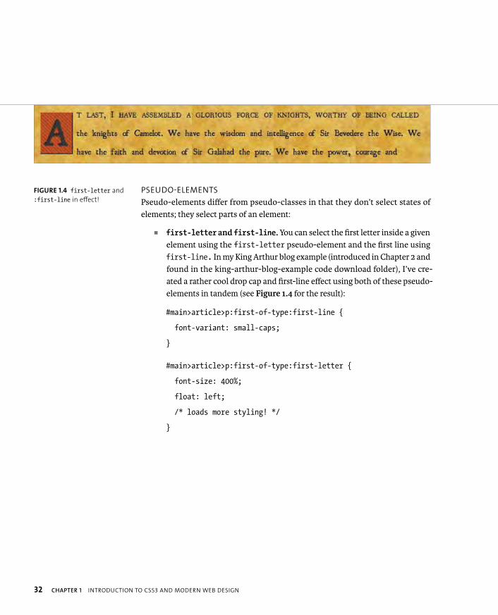
� first-letter and first-line. You can select the first letter inside a given element using the first-letter pseudo-element and the first line using first-line. In my King Arthur blog example (introduced in Chapter 2 and found in the king-arthur-blog-example code download folder), I’ve cre-ated a rather cool drop cap and first-line effect using both of these pseudo-elements in tandem (see Figure 1.4 for the result):
#main>article>p:first-of-type:first-line {
font-variant: small-caps;
}
#main>article>p:first-of-type:first-letter {
font-size: 400%;
float: left;
/* loads more styling! */
}
FIGURE 1.4 first-letter and
:first-line in effect!
ptg8274462
GENERAL CSS3 FEATURES 33
� Generated content using :before and :after. You can use the :before and :after pseudo-elements to specify that content should be inserted before and after the element you are selecting. You then specify what content you want to insert or generate. As a simple example, you can use the following rule to insert a decorative image after every link on the page:
a:after {
content: “ “ url(flower.gif);
}
You can also use the attr() function to insert the values of attributes of the elements after the element. For example, you could insert the target of every link in your document in brackets after each one using the following:
a:after {
content: “ ” “(“ attr(href) “)”;
}
This is a great technique to use in a print stylesheet where you want to just show the URLs in the document rather than having them hidden inside links (useless on a printed page).
CSS3 PSEUDO-ELEMENT DOUBLE-COLON SYNTAX
Note that the new CSS3 way of writing pseudo-elements is to use a double colon—for example, a::after { ... }, to set them apart from pseudo-classes. CSS3, how-ever, also still allows for single colon pseudo-elements for the sake of backward compatibility. This is what I’ll be using throughout the book, although you might want to use double-colon syntax for better future proofing; it is really up to you.
ptg8274462
34 CHAPTER 1 INTRODUCTION TO CSS3 AND MODERN WEB DESIGN
GETTING THE NEW BREED OF SELECTORS TO
WORK ACROSS OLDER BROWSERS
As you’ll have gathered, many of the new selectors available don’t work in those irksome older versions of IE that are still hanging around (like someone’s rhythmi-cally challenged dad on the dance floor at a wedding reception). So what hope do you have of using these selectors in the real world?
As luck would have it, for situations in which you really need old IE support, JavaScript can come to the rescue in the shape of Keith Clark’s Selectivizr (http://selectivizr.com). It sits on top of an existing JavaScript library and adds support to IE 6–8 for many of the new selectors.
To add it in, download Selectivizr and apply it to your site. Then make sure you also have one of the compatible libraries detailed on the Selectivizr site applied to your page (I’m using NWMatcher in my example). The code will look some-thing like this (again, check out my king arthur blog example in the chapter2 code download folder):
<script src=”http://s3.amazonaws.com/nwapi/nwmatcher/ p nwmatcher-1.2.5-min.js”></script>
<!--[if (gte IE 6)&(lte IE 8)]>
<script type=”text/javascript” src=”script/ p selectivizr-min.js”></script>
<![endif]-->
And there you go! This CSS3 selector support for IE 6–8 works like a charm!
NOTE: Selectivizr works only on CSS contained in
external stylesheets, not inline or internal CSS.

ptg8274462
WRAPPING UP 35
By now I’m sure you’ve conceded that CSS3 is awesome, and that you should start to embrace it as soon as possible. You’ve read about the philosophy and general approach you’ll be adopting for this book, reviewed the main CSS3 modules you’ll be dipping into along the way, and learned about some general CSS features to whet your appetites. With all this information under your belt, you’re ready for the next chapter, which focuses mainly on markup—riveting material.
WRAPPING UP

ptg8274462
2
BUILDING A SOLID CROSS-BROWSERTEMPLATE WITHHTML5 AND JAVASCRIPT

ptg8274462
37
Before starting any creative work with
CSS3, you should build up a rock-solid
markup template to structure your data in and provide
mechanisms to allow your content and layout to work in
older browsers to an acceptable degree. Recall the discussion of
progressive enhancement in the previous chapter.
Your resulting toolset will be akin to a cockroach—the sort of
creature that could survive an ice age or a nuclear war.
In the interests of adopting efficient modern markup and future
proofing your work, HTML5 should be your markup language of
choice. In this chapter you’ll explore the main features of HTML5
to ensure that you are up to speed. You’ll also learn about the
different mechanisms you’ll use for enabling HTML5 and CSS3
support across older browsers.

ptg8274462
38 CHAPTER 2 BUILDING A SOLID CROSS-BROWSER TEMPLATE WITH HTML5 AND JAVASCRIPT
STARTING WITHSEMANTIC HTML5
The first part of your toolset for working with CSS3 will be clean, semantic HTML, also referred to as POSH (plain old semantic HTML). Not only is it advantageous in many ways (e.g., better for search engine optimization, more accessible, easier coding and maintenance), but it is essential for success when you start applying advanced CSS techniques to your content. Trying to work out a system for using advanced selectors to style copy or using multiple animations in a sane fashion is more difficult if all you have to play with is horrible, old-fashioned spaghetti code (to see an example of horrible spaghetti code, look at the source of pretty much any CMS or Wiki page).
And because one of this book’s goals is to provide a forward-facing approach to web design, you’ll use HTML5 for all the markup in this book.
WHY USE HTML5?
Before jumping into HTML5, let’s consider HTML 4 for a minute. You’ll probably agree that it does a pretty good job of marking up static documents that you can link between. This was the job it was originally written for. However, technology never stands still, and many developers quickly decided that they weren’t happy just creating static documents. They wanted to start creating more dynamic sites that behaved like applications, and for such tasks, HTML 4 was missing a lot of native functionality. To implement video, animated graphics, and complicated form controls, developers turned to proprietary technologies like Flash, or complicated, inefficient kludges of HTML, CSS, and JavaScript if they wanted to create such functionality with open standards.

ptg8274462
STARTING WITH SEMANTIC HTML5 39
Originally termed “DHTML” (dynamic HTML), such kludges have more recently been handled in better ways using JavaScript libraries and the like. But the fact still remains that they are kludges for the following reasons:
� No better semantic elements are available to use for implementing features like video and complex form controls. The markup for such things tends to consist of loads of unsemantic nested <div>s and so forth. There is therefore no way for screen readers, search engines, or other automated user agents to work out what these constructs are supposed to be (although WAI-ARIA can help mitigate such problems), which is a problem for SEO and accessibility.
� Such implementations tend to add a significant amount of weight to the page.
� These kludges are used to create very common use cases: It seems ridiculous for you to have to resort to hacks and overcomplicated custom implementa-tions to implement them.
HTML5 comes to the rescue in these regards while maintaining backward compatibility. It includes all of the features already available in HTML 4, plus it defines previously missing details and adds several new features into the mix for creating applications, such as:
� New semantic elements for defining common page regions, such as headers, footers, primary navigation, distinct articles of content, figures, and so on.
� <canvas> and its associated API for creating complex scripted graphics, like animations.
� <audio>, <video>, and associated APIs for working with AV content.
� Mechanisms for allowing applications to work offline.
� Error handling to define what should happen when badly formed markup is used (missing closing tags, etc.)
ptg8274462
40 CHAPTER 2 BUILDING A SOLID CROSS-BROWSER TEMPLATE WITH HTML5 AND JAVASCRIPT
HTML5 ERROR HANDLING
Prior to HTML5, error handling was never defined in the specs, leaving
browser vendors to decide how to handle markup errors. This has led to
inconsistent error-handling implementations and different page rendering
across browsers when errors are present. Now that more browsers are start-
ing to get HTML5 parsers with consistent error handling as defined in the
spec, a lot of cross-browser compatibility issues should go away.
It is really cool to be able to implement functionality like embedded video with native HTML rather than having to resort to Flash for a number of reasons:
� HTML plays nicely with other open standards, so you can style your video or other features with CSS or directly enhance their functionality with JavaScript. With Flash, you’d have to access and open the .fla file and update the code directly, because it doesn’t communicate well with open standards. A Flash movie is just a black box as far as the browser is concerned: It doesn’t understand the individual components inside the movie.
� An open standards solution is more accessible, generally speaking, and better for SEO. Text inside Flash can’t be read using many screen read-ers and search engine robots. Flash video players aren’t readily keyboard accessible, whereas keyboard accessibility is available out of the box with HTML5 <video>, at least in Opera, Firefox with JavaScript enabled, and IE (Safari and Chrome have some catching up to do here).
� Having to download a Flash plug-in before you can start using content is no big deal for tech-savvy geeks, but it can present a user-experience hurdle for someone like my grandma.
In addition, most of the important HTML5 features have good support across modern browsers, and you can provide alternatives and fallbacks for nonsupporting browsers in many cases. Therefore, much of HTML5 is usable now in real-world projects. What’s good enough for youtube.com is good enough for you, right?
You’ll look at HTML5 features in more detail later in the chapter.
ptg8274462
BUILDING A TEMPLATE 41
At this point, let’s start building a simple template that you can use to build your CSS3 examples in. Start by creating a blank HTML file (you can see the finished template in the example file template.html in the chapter2 code download folder).
HTML5 DOCTYPE
The first line you need to add, as always, is the DOCTYPE. The HTML5 DOCTYPE is a rather shorter proposition than you’ll traditionally be used to in HTML 4.01 and earlier. Get ready for it, wait, go!
<!DOCTYPE html>
Well, that was easy, wasn’t it? As you know, traditionally DOCTYPEs have been long shambling strings containing URLs, Klingon words, and other such unmemo-rables. For example, look at the HTML 4 Strict DOCTYPE:
<!DOCTYPE HTML PUBLIC “-//W3C//DTD HTML 4.01//EN” p “http://www.w3.org/TR/html4/strict.dtd”>
Why was it like this? Well, as far as I know the W3C had various interesting ideas about what DOCTYPEs might empower you and the browser to do. But in the end all DOCTYPEs really did was to put browsers in standards mode when rendering a page of markup. The writers of HTML5 recognized this and decided to whittle down the DOCTYPE to the shortest valid string of characters that would put browsers in standards mode.
LANGUAGE AND BASIC DOCUMENT OUTLINE
Next, you’ll add the basic document outline below the DOCTYPE:
<html lang=”en-gb”>
<head>
<title>HTML5 template</title>
</head>
<body>
...
</body>
</html>
BUILDING A TEMPLATE
ptg8274462
42 CHAPTER 2 BUILDING A SOLID CROSS-BROWSER TEMPLATE WITH HTML5 AND JAVASCRIPT
This should look familiar, although I want to draw your attention to the langattribute on the <html> element. It is good practice to set an overall language for the entire document like this for accessibility purposes: Screen readers will handle various languages differently. For example, “six” is pronounced “six” in English but “seees” in French.
You can also set the language of individual parts of the document by putting the lang attribute on any element that it makes sense to do so. For example:
<p>As the French say, <span lang=”fr”>c’est la vie</span>.</p>
Notice the two parts to the first language example you saw: en-gb. The first part is called the primary language code, which unsurprisingly sets the overall language. You can find a full list of over 8000 of these codes at the IANA Language Subtag Registry at www.iana.org/assignments/language-subtag-registry. The optional second part sets a dialect of the primary language. So, for example:
� en-gb is British English
� en-us is American English
� en-ca is Canadian English
You can set your own experimental languages using the x experimental primary code:
<html lang=”x-millsian-nonsense”></html>
DEFINING YOUR DOCUMENT’S CHARACTER SET
You should also set a character set for your document, which specifies the range of text characters that can be used in your document: This has become much sim-pler in HTML5. Previously, the line you needed to use looked something like this:
<meta http-equiv=”content-type” content=”text/html; charset=UTF-8” />
In HTML5 this line has been reduced to the following, which older browsers will also understand: Add it just below the opening <head> tag:
<meta charset=”utf-8”>

ptg8274462
BUILDING A TEMPLATE 43
All you are interested in is the character set; hence, the HTML5 spec has been written to allow this version. You don’t need to specify that this is a content-type, and you don’t need to specify the mime-type if you are working with HTML5.
Here you’ve specified UTF-8, a universal character set that allows all characters from all languages, or just about. It is best to stick to this character set unless you have a very good reason not to.
XHTML5 AND CODING STYLES
In the HTML5 era there are no longer separate XHTML and HTML DOCTYPEs. You just use the same DOCTYPE, and then you really can stick to whatever coding style suits you, be it strict XML style or loose HTML style. It is possible to still use XHTML-style syntax in HTML5 (called XHTML5), as long as you use the correct mime-type, file extension, and so on. However this creates compatibility problems with older versions of Internet Explorer (IE), so I wouldn’t recommend using it.
In terms of coding style for the book, I’ll use a style first crystallised in my mind by fellow web education advocate and awesome Swede, Lars Gunther. He recommends the following guidelines:
� You’ll be using HTML but sticking to some XHTML syntax rules. You’ll be closing all open elements using lowercase for all elements and attributes, and including quotes around most attribute values.
� You don’t need to write out attribute values in full for attributes whose val-ues are the same as the attribute name—for example <input type=”text”required>, not <input type=”text” required=”required”>.
� You don’t need to include trailing slashes to close empty elements, so you’ll use the format <meta charset=”utf-8”>, not <meta charset=”utf-8” />.
NOTE: Mime-types specify what type of content a file contains
for the benefit of browsers trying to understand what content it
is they are dealing with: in this case, text/html for HTML.

ptg8274462
44 CHAPTER 2 BUILDING A SOLID CROSS-BROWSER TEMPLATE WITH HTML5 AND JAVASCRIPT
ADDING CROSS-BROWSER SUPPORT FORHTML5 SEMANTIC ELEMENTS
Now you need to add some little helpers to be able to style unknown elements. Why? Because older browsers do not support the HTML5 semantic elements discussed later in the “Exploring HTML5 Elements” section.
This problem will diminish as time goes on, but for now you can add in sup-port without too much trouble. To do this, you need to think about how browsers handle unknown elements.
By default, an unknown element is treated as an anonymous inline element. This includes all HTML5 elements that a browser doesn’t recognize—for example, <section> and <footer>. You could even stick <banana> and <porcupine> elements in your page if you had a reason to do so.
The trouble is that the new HTML5 elements you’ll be using are block-level elements. They are mostly more semantic containers to replace the slew of <div>syou’ve traditionally used to contain different parts of your pages. Therefore, you need to force nonsupporting browsers to treat them how you want. To do so, add the following inside your <head> element:
<style>
article, aside, audio, canvas, datalist, details, figcaption, p figure, footer, header, hgroup, menu, nav, section, video {
display: block;
}
</style>
NOTE: Because the HTML5 spec is still not complete, it may change
to include or remove various elements; therefore, the HTML5
element fix may well need to be updated to remove elements or
include additional ones in the future.

ptg8274462
BUILDING A TEMPLATE 45
This ensures that all browsers should basically do what you want with your CSS—well, except for IE. IE versions 6–8 need more help, because they won’t style unknown elements at all! For IE versions 6–8 to recognize unknown elements, you need to create an instance of each unknown element in the DOM. Something like this will do:
<script>
document.createElement(‘abbr’);
document.createElement(‘article’);
document.createElement(‘aside’);
document.createElement(‘audio’);
document.createElement(‘mark’);
// add more elements as required
</script>
Notice that here you’re not only dealing with block-level HTML5 elements, but are also dealing with inline HTML5 elements like <mark> and HTML 4 elements that simply aren’t supported in older versions of IE, such as <abbr>.
If you need to add a lot of these elements, there is a better way to deal with your script. Replace the preceding script block with the following:
<!--[if lt IE 9]>
<script src=”http://html5shiv.googlecode.com/svn/trunk/html5.js”>
</script>
<![endif]-->
This applies the “HTML5 shiv” to your code, which is a script written by the diminutively statured but huge-hearted Remy Sharp and hosted at Google Code. It does the work of all the JavaScript described earlier, and more. Because it is hosted at Google Code, you just have to link to it: You don’t need to understand the contents or worry about hosting it yourself and upgrading to the latest version when it is updated.

ptg8274462
46 CHAPTER 2 BUILDING A SOLID CROSS-BROWSER TEMPLATE WITH HTML5 AND JAVASCRIPT
To make the code even better, you’ve also put the <script> element inside an IE conditional comment, so that only IE8 and earlier versions will download the script (I’ll talk a bit more about conditional comments later in the chapter). IE9 and 10 have much better HTML5 support; other browsers are unlikely to need it. So for all those browsers, you can skip downloading the script and avoid an unnec-essary HTTP request.
NOTE: Remy’s HTML5 shiv now also includes Jonathan Neal’s IE Print
Protector—a script that fixes IE’s problems with printing HTML5 content.
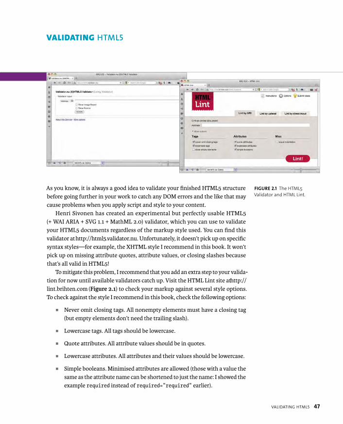
ptg8274462
VALIDATING HTML5 47
As you know, it is always a good idea to validate your finished HTML5 structure before going further in your work to catch any DOM errors and the like that may cause problems when you apply script and style to your content.
Henri Sivonen has created an experimental but perfectly usable HTML5 (+ WAI ARIA + SVG 1.1 + MathML 2.0) validator, which you can use to validate your HTML5 documents regardless of the markup style used. You can find this validator at http://html5.validator.nu. Unfortunately, it doesn’t pick up on specific syntax styles—for example, the XHTML style I recommend in this book. It won’t pick up on missing attribute quotes, attribute values, or closing slashes because that’s all valid in HTML5!
To mitigate this problem, I recommend that you add an extra step to your valida-tion for now until available validators catch up. Visit the HTML Lint site at http://lint.brihten.com (Figure 2.1) to check your markup against several style options. To check against the style I recommend in this book, check the following options:
� Never omit closing tags. All nonempty elements must have a closing tag (but empty elements don’t need the trailing slash).
� Lowercase tags. All tags should be lowercase.
� Quote attributes. All attribute values should be in quotes.
� Lowercase attributes. All attributes and their values should be lowercase.
� Simple booleans. Minimised attributes are allowed (those with a value the same as the attribute name can be shortened to just the name: I showed the example required instead of required=”required” earlier).
VALIDATING HTML5
FIGURE 2.1 The HTML5
Validator and HTML Lint.

ptg8274462
48 CHAPTER 2 BUILDING A SOLID CROSS-BROWSER TEMPLATE WITH HTML5 AND JAVASCRIPT
Let’s look at the HTML5 elements you’ll be using in this book, plus a few more for good measure. An exhaustive treatment of HTML5 features is beyond the scope of this book because you’ll be working with CSS3 styling, so most of the HTML5 APIs are pretty much irrelevant in this context. Yes, you could build a fully functional UI inside an HTML5 <canvas> element, but you won’t be able to style it with CSS, and you’d be committing most of the same accessibility, usability, and SEO crimes that Flash developers used to when building full Flash websites and the like. So, don’t even think about it!
In addition, most of the new elements you’ll look at are pretty self-explanatory, and I know you are a clever bunch. All of the elements described in this section are supported across all modern browsers with the exception of the Form elements, which have been a bit slower to catch on.
<AUDIO> AND <VIDEO>
Two of the most important new elements in HTML5 are <audio> and <video>.These respectively allow you to add audio and video content to your sites as easily as you’d add images using <img>. Both elements are pretty self-explanatory. Here is a <video> example (Figure 2.2):
FIGURE 2.2 A simple
HTML5 video example
(see simple-video.html in
the chapter2 folder).
NOTE: If you want a deeper treatment of HTML5, look no further than
Bruce Lawson and Remy Sharp’s excellent book, Introducing HTML5, 2nd
Edition (New Riders, 2011). For free tutorials, check out the Opera developer
community at http://dev.opera.com or the fantastic http://html5doctor.com.
EXPLORING HTML5 ELEMENTS
ptg8274462
EXPLORING HTML5 ELEMENTS 49
<video controls poster=”ship-icon.png” width=”640” height=”360”>
<source src=”video/boatride.mp4” type=”video/mp4”>
<source src=”video/boatride.webm” type=”video/webm”>
<!-- fallback content here -->
</video>
The <video> element includes:
� A controls attribute, which tells the browser to include the default controls for the video. If you don’t include this attribute, you can create your own controls instead using the media elements API.
� A poster attribute, which specifies the location of an image to use as a poster to display before the video starts to play. If not included, this defaults to the first frame of the video.
� width and height attributes to specify the width and height of the video. These work similarly to those for <img> except that if you specify different values to the video’s intrinsic values, the video doesn’t resize; instead, it letterboxes.
The <source> attributes point to the video files you want to play. You can instead put a single src attribute on the <video> element to just point to one video file to play, but this is currently a bad idea, because different browsers support different video formats (for reasons too boring to get into here.) IE and Safari prefer MP4, whereas Opera, Firefox, and Chrome prefer WebM. Therefore, you use two <source>elements to point to both formats, and the browser loads the one it recognizes. You don’t have to include the type attributes, but it is a good idea to do so, because these tell the browser what type of video each element points to, and it can select the one it wants instantly. If you don’t include the type attributes, the browser has to download a few bytes of each file to identify one it recognizes, which is a waste of time and effort.
NOTE: To easily convert between video formats, a good (and free)
choice is Miro Video Converter (www.mirovideoconverter.com).

ptg8274462
50 CHAPTER 2 BUILDING A SOLID CROSS-BROWSER TEMPLATE WITH HTML5 AND JAVASCRIPT
<video> and <audio> both work in a similar way, however note that <audio>doesn’t include the attributes not relevant to it, like poster, width, and height.
Here is an <audio> example:
<audio controls>
<source src=”audio/heavymetal.mp3” type=”audio/mp3”>
<source src=”audio/heavymetal.ogg” type=”audio/ogg”>
<!-- fallback content here -->
</audio>
The audio example produces a display like the one shown in Figure 2.3.The fallback content implied by the HTML comments in the preceding examples
can be anything you like, whether it is a message telling users their browser doesn’t support HTML5 video/audio with a direct link to download the media, or better, a Flash video/audio player fallback that can play the MP4/MP3 versions of your media.
Many other parts of HTML5 allow you to build in fallback content in this man-ner or will at least gracefully degrade to simpler content that people with older browsers will still be able to use.
HTML5 <video> and <audio> represent a very exciting area that has many new features to keep an eye out for (coming soon in a browser near you!); for example, elements such as <track> for adding text tracks like subtitles, APIs for accessing web cams and microphones (getUserMedia), APIs for generating and manipulating sound (Web Audio API), and more.
FIGURE 2.3 A simple
HTML5 audio example
(see simple-audio.html
in the chapter2 folder).
NOTE: Check out “Simple HTML5 video player with Flash fallback and custom controls”
by Bruce Lawson and Vadim Makeev (http://dev.opera.com/articles/view/simple-html5-
video-flash-fallback-custom-controls) to see the Flash fallback technique in action.
Or, check out “Everything you need to know about HTML5 video and audio” by
Simon Pieters (http://dev.opera.com/articles/view/everything-you-need-to-know-
about-html5-video-and-audio) for more details on <video> in general.
ptg8274462
EXPLORING HTML5 ELEMENTS 51
<ARTICLE> AND <SECTION>
Now let’s look at HTML5’s improved semantics. First up, HTML5 provides two elements—<article> and <section>—for separating your main content into distinct pieces on your sites. They are often misunderstood, so let’s tread carefully. Let’s consider a blog site, which has a main content column containing blog-post summaries and a secondary content column containing the author’s latest Tweets (see blog-site.html in the chapter2 folder for the full code).
You would traditionally mark this up using something like the following:
<div id=”main”>
<div class=”post-summary”>
<!-- post summary -->
</div>
<div class=”post-summary”>
<!-- post summary -->
</div>
<!-- etc. -->
</div>
<div id=”tweets”>
<div class=”tweet”> ... </div>
<div class=”tweet”> ... </div>
<div class=”tweet”> ... </div>
</div>
ptg8274462
52 CHAPTER 2 BUILDING A SOLID CROSS-BROWSER TEMPLATE WITH HTML5 AND JAVASCRIPT
This is all well and good, but all these <div>s are semantically anonymous; the browser doesn’t see them as a main content column, different Tweets, and so on. It just sees them as “divs inside divs.” You could upgrade this to HTML5, like so:
<section id=”main”>
<article>
<!-- post summary -->
</article>
<article>
<!-- post summary -->
</article>
<!-- etc. -->
</section>
<section id=”tweets”>
<article> ... </article>
<article> ... </article>
<article> ... </article>
</section>
Here, a supporting browser immediately knows that this contains two distinct sections of content. Both contain distinct articles, which could quite sensibly be syndicated separately, for example, in an RSS feed. This gives you a hint as to the difference between <section> and <article>. Both elements are for containing content, but
� <section> is for containing conceptually different areas of content within the page—for example, stories about animals versus animal photos or stories about animals versus stories about underpants.
� <article> is for containing distinct pieces of content within a page or a <section>, whether they are new items, videos, Tweets, or whatever. Each group of <article>s will have similar, related functionality or purpose but will be self-contained entities. If you could happily take a piece of content
ptg8274462
EXPLORING HTML5 ELEMENTS 53
and sensibly syndicate it as a separate entry in an RSS feed, it is probably a good candidate for an <article>. You shouldn’t think of <article>s as being “news articles,” because they can contain other items of content besides; think of them as being more like “articles of clothing on a clothing rail” and you’ll have a better idea.
One thing to note is that it is perfectly reasonable to use multiple <section>snested inside a single <article>. After all, you may have pages on your site in which the whole content of the page is an article, inside of which you might want to define separate sections of content, such as the introduction, summary, or dif-ferent parts, perhaps (see full-post.html inside the chapter2 code download folder):
<article>
<section id=”introduction”>
...
</section>
<section id=”part1”>
...
</section>
<section id=”part2”>
...
</section>
...
<section id=”summary”>
...
</section>
</article>
For more details and examples covering these elements and other HTML5 semantics, read “New structural elements in HTML5” by Bruce Lawson and my bad self at http://dev.opera.com/articles/view/new-structural-elements-in-html5.
ptg8274462
54 CHAPTER 2 BUILDING A SOLID CROSS-BROWSER TEMPLATE WITH HTML5 AND JAVASCRIPT
<HEADER> AND <FOOTER>
So, what about site headers and footers? You would traditionally mark these up using something like this:
<div id=”header”></div>
<div id=”footer”></div>
Pretty much every website or app has these. The header (or masthead) con-tains the site logo, title, and so on, and the footer contains site-wide content like copyright, accessibility statement, and so forth. The HTML5 creators recognized this and introduced the following unambiguous semantic elements to do the job:
<header></header>
<footer></footer>
If you refer back to my sample blog pages, you’ll see some examples of <header>and <footer> usage. Note that there are some inside <article>s and <section>s.This is perfectly allowed: You can do this to specify headers and footers just for subsections of your content rather than the whole site. You can therefore have multiple <header>s and <footer>s in a single document.
<ASIDE>
The <aside> element is really a special kind of <section>, specifically tasked with containing secondary information related to the main content of the site that doesn’t fit within the main flow. Good examples include a biography of the author of that page, a mini interview with the author, or a bibliography/references and further reading. It can, however, also be secondary content on the site, like a typical sidebar, a blogroll, or a list of other blog posts on the site you might be interested in (even if they are not posts related to the main content). The list of Tweets in my previous example is suitable as an <aside>.

ptg8274462
EXPLORING HTML5 ELEMENTS 55
You can also quite happily use an <aside> element inside an <article> too, as long as it contains content tangentially related to just that article. A biography of the author of just that article or further reading to go on to after you’ve finished that article would be suitable. The element simply looks like this:
<aside></aside>
<NAV>
The <nav> element was created to house the document’s primary navigation, whether that is a standard “list-o-links” nav bar, a drop-down menu, or even a search box. It shouldn’t be used for secondary navigation bars, related reading links, and so on. You can put it anywhere you like in your markup that makes sense. In my main blog site example, it’s inside the <header>:
<header>
<nav>
...
</nav>
</header>
There are many advantages to having the document’s primary navigation inside an unambiguous semantic element. For example, when browsers and screen read-ers start to recognize this element, it will make accessibility hacks like “skip to navigation” links a thing of the past.

ptg8274462
56 CHAPTER 2 BUILDING A SOLID CROSS-BROWSER TEMPLATE WITH HTML5 AND JAVASCRIPT
<HGROUP>
<hgroup> has been created with one specific purpose—to allow you to put two (or more) headings right next to one another and have them count as only one heading for the purposes of the document structure/hierarchy (the group will be counted as a single heading of the same rank as the highest-ranked heading in the group). This is especially useful in a situation in which you want to mark up a heading with a subtitle or strapline above or below it, because you can now do so without breaking the document structure:
<hgroup>
<h1>Cats and dogs</h1>
<h2>Your local store for pets and pet supplies</h2>
</hgroup>
<FIGURE> AND <FIGCAPTION>
Another type of content you’ve previously had no decent, consistent way of mark-ing up is figures with related captions. Prior to HTML5, you’d tend to do something similar to this:
<div id=”figure”>
<p><img src=”figure.png” alt=”This is a picture containing p important content”></p>
<p id=”caption”>This is a very important picture.</p>
</div>
NOTE: Heading levels in HTML5 are determined not by the number after the h (<h1>, <h2>,
etc.) but by their level of nesting inside so-called sectioning elements, worked out by the
HTML5 outline algorithm. For more information about HTML5 sectioning and out-
lines, read Mozilla’s excellent article “Sections and Outlines of an HTML5 Document”
(https://developer.mozilla.org/en/Sections_and_Outlines_of_an_HTML5_document).

ptg8274462
EXPLORING HTML5 ELEMENTS 57
But this feels a bit dirty, a bit grubby, and a bit amoral. It is almost completely semantically devoid, with nothing to let a browser or screen reader know this is a figure and caption, and certainly nothing to associate the caption with the figure! HTML5 offers a much better solution:
<figure>
<p><img src=”figure.png” alt=”This is a picture containing p important content”></p>
<figcaption>This is a very important picture.</figcaption>
</figure>
This code provides a consistent, semantic way of defining a figure and asso-ciating a caption with it. Note that the figure—the image in this case—can be anything you want. It could be a few images, videos, a <canvas>, or a combination of content types.
<TIME>
<time> quite simply provides you with a decent semantic way of marking up a date and time. Here’s a simple example:
<time datetime=”1978-06-27”>27th June 1978</time>
The datetime attribute contains an ISO-standard date and time, which is unam-biguous and machine-readable. The text inside the tags, on the other hand, can be any representation of the time and date you want and thus can be customized to suit the style of your site. You could also write:
<time datetime=”1978-06-27”>June 27 1978</time>
<time datetime=”1978-06-27”>My birthday</time>
<time datetime=”1978-06-27”>Nineteen seventy-eight, June the p twenty-seventh</time>

ptg8274462
58 CHAPTER 2 BUILDING A SOLID CROSS-BROWSER TEMPLATE WITH HTML5 AND JAVASCRIPT
You can also add a time, as follows:
<time datetime=”1978-06-27T23:58”>Two minutes to midnight, on my p birthday</time>
In addition, you can add a time zone adjustment. To make the previous example Central European Time (CET), you’d do this:
<time datetime=”1978-06-27T23:58Z+01:00”>Two minutes to midnight, p on my birthday, CET</time>
There is one last bit of <time> syntax to discuss, which is particularly useful to the blog example: If you want to specify that a declared time is the publication date of the content it resides within, you can use the pubdate attribute, like so (although the removal of this attribute from the spec is being debated at the time of this writing, so it might disappear):
<time datetime=”1978-06-27” pubdate>27th June 1978</time>
A number of people complained in the past that they were not able to mark up imprecise times using <time>, like you would in documents like museum cata-logues. This has been updated to mitigate this problem somewhat: Now you can do things like this:
� <time datetime=”1983”>The year 1983</time>
� <time datetime=”1983-12”>December 1983</time>
� <time datetime=”12-25”>25 November (any year)</time>
� <time datetime=”1983-W23”>Week 23 in 1983</time>
� <time datetime=”P 20 D”>A period of 20 days</time>
ptg8274462
EXPLORING HTML5 ELEMENTS 59
<MARK>
The <mark> element is designed to highlight words inside a section of content that don’t require emphasis in their meaning; for example, they aren’t important key-words that need <strong> or technical terms that would typically be pronounced in an alternate voice. But they do require highlighting to indicate their significance in another context. A very good example is highlighting search terms in a list of search results, or tags on a site, or particularly useful parts of a set of quotes contained within some research documents. For example, if you were using a music search application, you might want to mark up a results page like this (see mark-example.html in the chapter2 code download folder):
<h1>Results for search term <mark>love</mark>:</h1>
<ul>
<li><a href=”/songs/allyouneedislove/”>All you need is p <mark>love</mark></a> by The Beatles</li>
<li><a href=”/songs/lovewilltearusapart/”><mark>Love</mark> will p tear us apart</a> by Joy Division</li>
<li><a href=”/songs/lovehatelove/”><mark>Love</mark>, hate, p <mark>love</mark></a> by Alice in Chains</li>
</ul>
For more information about <mark>, read Mike Robinson’s article “Draw atten-tion with mark” (http://html5doctor.com/draw-attention-with-mark).

ptg8274462
60 CHAPTER 2 BUILDING A SOLID CROSS-BROWSER TEMPLATE WITH HTML5 AND JAVASCRIPT
HTML5 FORM ELEMENTS
Let’s now briefly look at the new form elements available in HTML5. Most of these were created to give you easier, semantically richer ways of implementing form controls that you already implement using kludges, because native mechanisms were not available in HTML 4. See simple-form.html in the chapter2 folder for a testable example.
You can see examples in Figures 2.4 through 2.6.
<input type=”range”>
<input type=”date”>
<input type=”color”>
HTML5 also adds a few specialized text inputs, which expect more specific types of data:
<input type=”url”>
<input type=”email”>
<input type=”tel”>
NOTE: HTML5 forms are not supported as well across browsers as some of the other fea-
tures discussed earlier. To determine which HTML5 form features your current browser
supports, send it to Mike Taylor’s “HTML5 inputs and attribute support” page at
www.miketaylr.com/code/input-type-attr.html.I’ve referred you to this page rather
than just listing the supported features, because they seem to change rapidly.
FIGURE 2.4 The range slider
input type.
FIGURE 2.5 The date picker
input type.
FIGURE 2.6 The color picker
input type.
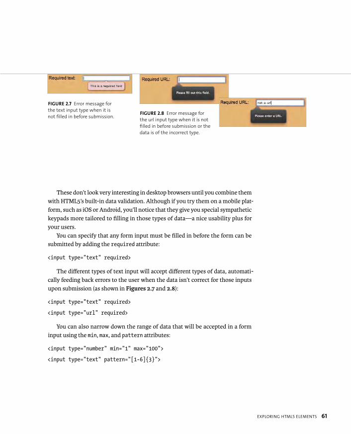
ptg8274462
EXPLORING HTML5 ELEMENTS 61
These don’t look very interesting in desktop browsers until you combine them with HTML5’s built-in data validation. Although if you try them on a mobile plat-form, such as iOS or Android, you’ll notice that they give you special sympathetic keypads more tailored to filling in those types of data—a nice usability plus for your users.
You can specify that any form input must be filled in before the form can be submitted by adding the required attribute:
<input type=”text” required>
The different types of text input will accept different types of data, automati-cally feeding back errors to the user when the data isn’t correct for those inputs upon submission (as shown in Figures 2.7 and 2.8):
<input type=”text” required>
<input type=”url” required>
You can also narrow down the range of data that will be accepted in a form input using the min, max, and pattern attributes:
<input type=”number” min=”1” max=”100”>
<input type=”text” pattern=”[1-6]{3}”>
FIGURE 2.7 Error message for
the text input type when it is
not filled in before submission.FIGURE 2.8 Error message for
the url input type when it is not
filled in before submission or the
data is of the incorrect type.
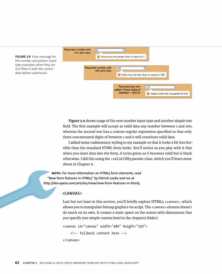
ptg8274462
62 CHAPTER 2 BUILDING A SOLID CROSS-BROWSER TEMPLATE WITH HTML5 AND JAVASCRIPT
Figure 2.9 shows usage of the new number input type and another simple text field. The first example will accept as valid data any number between 1 and 100, whereas the second one has a custom regular expression specified so that only three concatenated digits of between 1 and 6 will constitute valid data.
I added some rudimentary styling to my example so that it looks a bit less hor-rible than the standard HTML form looks. You’ll notice as you play with it that when you enter data into the form, it turns green as it becomes valid but is black otherwise. I did this using the :valid CSS3 pseudo-class, which you’ll learn more about in Chapter 9.
<CANVAS>
Last but not least in this section, you’ll briefly explore HTML5 <canvas>, which allows you to manipulate bitmap graphics via script. The <canvas> element doesn’t do much on its own. It creates a static space on the screen with dimensions that you specify (see simple-canvas.html in the chapter2 folder):
<canvas id=”canvas” width=”480” height=”320”>
<!-- fallback content here -->
</canvas>
FIGURE 2.9 Error message for
the number and pattern input
type examples when they are
not filled in with the correct
data before submission.
NOTE: For more information on HTML5 form elements, read
“New form features in HTML5” by Patrick Lauke and me at
http://dev.opera.com/articles/view/new-form-features-in-html5.
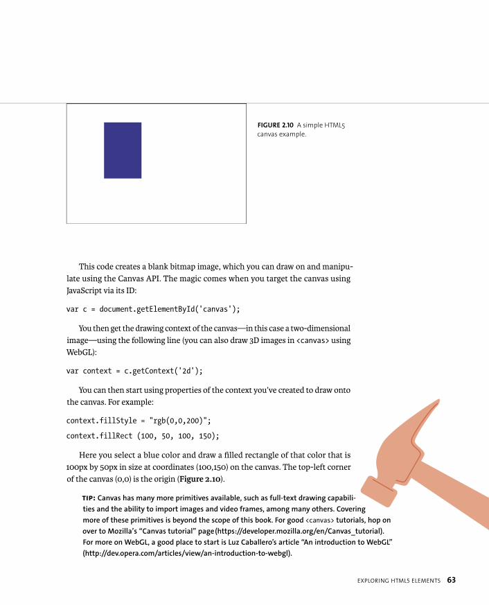
ptg8274462
EXPLORING HTML5 ELEMENTS 63
This code creates a blank bitmap image, which you can draw on and manipu-late using the Canvas API. The magic comes when you target the canvas using JavaScript via its ID:
var c = document.getElementById(‘canvas’);
You then get the drawing context of the canvas—in this case a two-dimensional image—using the following line (you can also draw 3D images in <canvas> using WebGL):
var context = c.getContext(‘2d’);
You can then start using properties of the context you’ve created to draw onto the canvas. For example:
context.fillStyle = “rgb(0,0,200)”;
context.fillRect (100, 50, 100, 150);
Here you select a blue color and draw a filled rectangle of that color that is 100px by 50px in size at coordinates (100,150) on the canvas. The top-left corner of the canvas (0,0) is the origin (Figure 2.10).
FIGURE 2.10 A simple HTML5
canvas example.
TIP: Canvas has many more primitives available, such as full-text drawing capabili-
ties and the ability to import images and video frames, among many others. Covering
more of these primitives is beyond the scope of this book. For good <canvas> tutorials, hop on
over to Mozilla’s “Canvas tutorial” page (https://developer.mozilla.org/en/Canvas_tutorial).
For more on WebGL, a good place to start is Luz Caballero’s article “An introduction to WebGL”
(http://dev.opera.com/articles/view/an-introduction-to-webgl).

ptg8274462
64 CHAPTER 2 BUILDING A SOLID CROSS-BROWSER TEMPLATE WITH HTML5 AND JAVASCRIPT
Many people favor the use of CSS resets in their work to get rid of the annoying differences between browser default styles. Such pieces of style are usually only tiny but still annoying when trying to get CSS layouts to work consistently. And some are not so tiny; for example, the differences between default form styling across browsers or margins and padding on the <html> and <body> elements, which you inevitably need to remove to get rid of unsightly spacing on the outside of your page.
CSS resets have traditionally been the answer to these style issues. CSS resets remove most or all default CSS styling, leaving you to add your own styles and be confident that you are much less likely to get weird behavior between browsers.
However, they are not perfect. CSS resets tend to be overzealous, removing every default style and leaving you with more work to add a lot of necessary styles back in. In addition, they inevitably clutter your styles: You can hide them in an external stylesheet, but you’ll still see loads of crazy declarations when it comes to debugging your CSS using a debugging tool.
A much better option is to use normalize.css, which was written by Nicolas Gallagher (http://nicolasgallagher.com/about-normalize-css). Instead of removing everything, normalize.css makes default styles more consistent across browsers, fixes bugs, and makes subtle improvements.
You simply download the file from https://github.com/necolas/normalize.css, attach it to your page, and voilà! For those interested in learning more, the About page referenced previously and the CSS file contain extensive comments and examples.
I’ve included this file in the template, and it is used in most of the examples in this book.
CSS RESETS AND NORMALIZE.CSS
ptg8274462
JAVASCRIPT LIBRARY ROUNDUP 65
You’ve done a lot so far in the chapter in terms of building up a template you can use to write HTML5 and CSS3 into with confidence, and going on a quick tour of the new HTML5 elements available to you. Let’s now return to further building up your toolkit for the coming events that shall unfold as you journey through the book. In this section you’ll look at the different JavaScript libraries you’ll be using to build in support for various CSS3 features that lack support in older browsers, most notably older IE versions. These libraries are often referred to as Polyfills.
CSS3-MEDIAQUERIES-JS
css3-mediaqueries-js is a nifty little library written by Wouter van der Graaf, which transparently adds support for Media Queries to browsers that don’t have them natively. The transition is a bit clunky when you trigger a media query by resizing a browser window; but don’t worry, users are very unlikely to ever do this or in fact know what a browser is (or care). For information about css3-mediaqueries-js, check out these sites:
� Home. http://code.google.com/p/css3-mediaqueries-js
� Download. http://code.google.com/p/css3-mediaqueries-js/downloads/list
Respond.js, written by Scott Jehl, is another library for adding in Media Query support to nonsupporting browsers. It specifically adds support for min-widthand max-width Media Queries. Find out more about it at its Github page: https://github.com/scottjehl/Respond.
NOTE: I suggest that you consult the websites of these different projects,
download the libraries so they are ready for you to start experimenting with
(many of them have online copies available that can be linked to, but it
is also useful to have them available for offline experimentation), and
check out the available documentation. I won’t include all of these in my
default template, because you won’t need all of them in each project.
JAVASCRIPT LIBRARY ROUNDUP

ptg8274462
66 CHAPTER 2 BUILDING A SOLID CROSS-BROWSER TEMPLATE WITH HTML5 AND JAVASCRIPT
CSS3PIE
CSS3PIE adds support for CSS3 “bling” features to older versions of IE that don’t support them. It is part of Sencha Labs and was originally developed by Jason Johnston. The current feature support list includes:
� border-radius
� box-shadow
� border-image
� multiple background images
� linear-gradient as background image
Note that CSS3PIE includes a JavaScript version (read more at http://css3pie.com/documentation/pie-js), but the basic version that you will most likely use (at first, at least) is an .htc file (HTML component—an IE-specific script used to create custom display behaviors that can be applied to a page via CSS). Bizarrely, you need to reference the .htc file with a path relative to the HTML file, not the CSS file, even if you are including references to it in CSS that is contained in an external stylesheet!
For example, consider the directory structure shown in Figure 2.11.To apply the CSS styling to the HTML file, you obviously need to reference it
using the path css/style.css:
<link rel=”stylesheet” type=”text/css” href=”css/style.css”>
The .htc file works by being applied to the CSS properties you want to affect in the form of a behavior property. You’d think that you’d need to do this by going up a level and then down a level again to get from .css to .htc:
behavior: url(../script/PIE.htc);
But you don’t. The .htc file is referenced from the CSS but actually acts on the HTML file after the CSS has been applied to it, so you need to reference it as if it were being referenced from the HTML file, like so:
behavior: url(script/PIE.htc);
This confused me at first.
FIGURE 2.11 A typical, simple
website directory structure.

ptg8274462
JAVASCRIPT LIBRARY ROUNDUP 67
For information about CSS3PIE, check out these sites:
� Home and download. http://css3pie.com
� About and support list. http://css3pie.com/about
� Documentation. http://css3pie.com/documentation
MODERNIZR
Modernizr is the daddy of all feature-detection libraries. It allows you to detect support for desired HTML5 and CSS3 features, and then serve up alternative styles and scripts to optimize the user experience in nonsupporting browsers. Created by Faruk Ateş, Paul Irish, and Alex Sexton, it has extensive documentation available, and Modernizr 2.0 and later allow you to download a customized version that only contains the feature tests you need for your particular project.
For information about Modernizr, check out these sites:
� Home. http://modernizr.com
� Documentation. http://modernizr.com/docs
� Download/customize. http://www.modernizr.com/download
SELECTIVIZR
Written by Keith Clark, and mentioned in the previous chapter, Selectivizr is a small utility that sits on top of an existing JavaScript library, such as jQuery or MooTools, and adds support for CSS3 selectors/pseudo-classes to nonsupporting versions of IE (6–8). The Home/Download page is at http://selectivizr.com.
ptg8274462
68 CHAPTER 2 BUILDING A SOLID CROSS-BROWSER TEMPLATE WITH HTML5 AND JAVASCRIPT
Many people saw IE conditional comments as bad, because they are a propri-etary feature invented by Microsoft to allow developers to target HTML, CSS, and JavaScript just at specific versions of IE. These conditional comments could be used for all kinds of evil and represent the sort of “feature” that was probably originally invented by He-Man’s arch nemesis, Skeletor (he also invented IE behaviors, the IE6 rendering engine, and soap operas).
But they are also very useful for modern web development practices if you need to target some CSS specifically at older versions of IE to fix rendering bugs and want to prevent browsers that don’t need those fixes from wasting bandwidth or HTTP requests. Here is a reminder of what they look like. In my template I’ve included this code:
<!--[if lt IE 9]>
<script src=”http://html5shiv.googlecode.com/svn/trunk/html5.js”>
</script>
<![endif]-->
The entire structure is wrapped in a standard HTML comment, so any browsers that aren’t IE will conveniently ignore the whole block. IE will treat it like an ifstatement, running the code if the browser matches the condition contained in the first line of the comment. In this example, the conditional logic is if lt IE 9,which means “if less than IE9”—so the script will be passed to any version of IE earlier than IE9. The [endif] part then marks where the conditional content ends.
Note that you can have as many of these IE conditional comments as you like inside your HTML. The most common ones you’ll use are:
� if IE. Gives the content to all versions of IE.
� if IE 6. Gives the content to the specified version of IE only.
� if lt IE 9. Gives the content to all versions of IE earlier than the specified version of IE.
� if lte IE 8. Gives the content to the specified version of IE and all earlier versions.
IE CONDITIONAL COMMENTS
ptg8274462
WRAPPING UP 69
You can also use gt and gte (“greater than” and “greater than or equal to”) in the same way, but you will be much less likely to use these. Most likely, you’ll use IE conditional comments to:
� Serve scripting only to specific IE versions, either to provide alternative mechanisms that will work in IE or to build in support for HTML and CSS features that don’t have native support.
� Serve CSS to fix IE-specific CSS bugs that threaten to make your lovingly crafted layouts crumble. The most obvious fixes that spring to mind are serving older IE versions different width and height values to compensate from the broken box model and giving various layout features hasLayoutto make those features behave properly in IE.
� Display abusive messages only to users of older IE versions while bullying them into upgrading their browser.
Bruce Lawson has written a great article that expands this topic further called “Supporting IE with conditional comments” (http://dev.opera.com/articles/view/supporting-ie-with-conditional-comments). There is also an article on MSDN called “About Conditional Comments” (http://msdn.microsoft.com/en-us/library/ms537512.aspx) that contains some pretty dreadful outdated web development ideas but provides a good reference for all of the IE conditional syntax available.
WRAPPING UP
After reading this chapter, you are up to speed on your markup structures and have built a toolkit you can rely on. Now you can stretch and relax a bit.
When you’re ready to continue your work and start looking into CSS3 enhance-ments for text and fonts, turn the page when you hear the tone. (If you’ve not bought the interactive version of the book, invent your own tone and hum it to yourself.)
NOTE: IE10 completely ignores conditional comments, so you can’t
use them to direct code only to IE10. This isn’t as bad as it sounds:
IE10 has really good standards support, worthy of a modern browser,
so chances are you wouldn’t need conditional comments anyway.
ptg8274462
3
SPICING UP YOURFONTS AND TEXT
ptg8274462
71
Fonts and text have been pretty stable
across browsers for a fairly long time
in terms of CSS2 support, although the feature set has
traditionally been a bit limited. But this is all changing, as
you’ll see as you travel through this chapter. CSS3 provides more
powerful features for bending type to your will.
In this chapter you’ll learn how to apply custom fonts to your web
documents in a variety of ways, from hosting free fonts on your
own server to using professional paid services. You’ll also learn
how to use some of the new CSS3 text features, such as control-
ling hyphenation and OpenType font features.
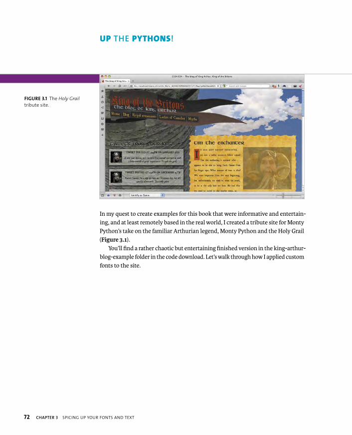
ptg8274462
72 CHAPTER 3 SPICING UP YOUR FONTS AND TEXT
UP THE PYTHONS!
In my quest to create examples for this book that were informative and entertain-ing, and at least remotely based in the real world, I created a tribute site for Monty Python’s take on the familiar Arthurian legend, Monty Python and the Holy Grail (Figure 3.1).
You’ll find a rather chaotic but entertaining finished version in the king-arthur-blog-example folder in the code download. Let’s walk through how I applied custom fonts to the site.
FIGURE 3.1 The Holy Grail
tribute site.
ptg8274462
USING WEB FONTS 73
For years, the lack of “web-safe fonts” available for web designers to use on their sites was a complete nightmare. Fonts like Times New Roman, Arial, Courier New, and Georgia can go quite a long way, but for custom headings or logos, you had to resort to tricky techniques like image replacement or even siFR or Cufon (which replaced text using Flash movies or SVG containing custom fonts).
Like a ray of sunshine, CSS2.1 introduced Web Fonts. Then it was dropped due to lack of agreement from browser vendors. Then it was reintroduced in the Web Fonts module, which was later subsumed into the Fonts module (www.w3.org/TR/css3-fonts), and lo, there was much rejoicing. This module contains functionality that allows you to specify custom font files to download along with your website, and then use them in the same way as any other font. You first need to specify the font to download using a @font-face block, like so:
@font-face {
font-family: myfont;
src: local(“myfont”),url(myfont.ttf),url(myfont.woff);
font-weight: bold;
font-style: italic;
}
Inside the curly braces, you can include:
� A font-family declaration to specify the name of your font, which is how you will refer to it in your CSS. You can pretty much use any term you like here, as long as you use it consistently throughout your CSS. Use font-family: ‘monkey butt’; if you really think your boss or client will be cool with it.
� A src declaration to point to the actual font(s) you want to use. This can point to a single font file or a comma-delimited list of as many different fonts as you want. The browser will go through the list until it can find a format it recognizes. The fonts can be local, such as local(“foo”), or external downloadable fonts, such as url(http://example.com/path/to/foo.ttf).
� A font-weight declaration to specify usage of a bold version of the font if it’s available. If the font file you are pointing to contains a bold version, it
USING WEB FONTS
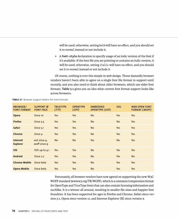
ptg8274462
74 CHAPTER 3 SPICING UP YOUR FONTS AND TEXT
will be used; otherwise, setting bold will have no effect, and you should set it to normal instead or not include it.
� A font-style declaration to specify usage of an italic version of the font if it’s available. If the font file you are pointing to contains an italic version, it will be used; otherwise, setting italic will have no effect, and you should set it to normal instead or not include it.
Of course, nothing is ever this simple in web design. Those dastardly browser vendors haven’t been able to agree on a single font file format to support until recently, and you also need to think about older browsers, which use older font formats. Table 3.1 gives you an idea what current font format support looks like across browsers.
TABLE 3.1 Browser Support Matrix for Font Formats
BROWSER/FONT FORMAT
SUPPORT @FONT-FACE
TRUETYPE(.TTF)
OPENTYPE(.OTF)
EMBEDDED OPENTYPE (.EOT)
SVG WEB OPEN FONT FORMAT (.WOFF)
Opera Since 10 Yes Yes No Yes Yes
Firefox Since 3.5 Yes Yes No No Yes
Safari Since 3.1 Yes Yes No Yes Yes
Chrome Since 4 Yes Yes No Yes Yes
Internet
Explorer
.eot since 4,
.woff since 9
No No Yes No Yes
iOS SVG up to 4.1 Yes Yes No Yes Yes
Android Since 2.2 Yes Yes No Yes No
Chrome Mobile Since beta Yes Yes No Yes Yes
Opera Mobile Since beta Yes Yes No Yes Yes
Fortunately, all browser vendors have now agreed on supporting the new W3C WOFF standard (www.w3.org/TR/WOFF), which is a container/compression format for OpenType and TrueType fonts that can also contain licensing information and suchlike. It is a winner all around, resulting in smaller file sizes and happier font foundries. It has been supported for ages in Firefox and Chrome, Safari since ver-sion 5.1, Opera since version 11, and Internet Explorer (IE) since version 9.

ptg8274462
USING WEB FONTS 75
Older versions of most browsers don’t matter as much anymore because they tend to be updated regularly. However, older versions of IE still need to be sup-ported; many IE installs won’t be updated anytime soon (49 percent of the world’s computers still run Windows XP, which can only run IE version 8 and earlier).
The good news is that IE has supported Microsoft’s proprietary Embedded OpenType format since version 4, meaning that old versions of IE can work with custom fonts quite well.
ADDING WEB FONTS TO THE EXAMPLE
To chronicle the adventures of Arthur and the Knights of Camelot—and their fights against such denizens as the Knights who say Ni and The Temptresses of Castle Anthrax—I decided to try to find some old-world fonts to communicate the right sort of look for a blog written by a medieval king. To find what I wanted, I looked at a few free font sites:
� dafont.com
� myfonts.com
� fontsquirrel.com
I eventually settled on three from Font Squirrel that would work out for this demo:
� (www.fontsquirrel.com/fonts/UglyQua)
� (www.fontsquirrel.com/fonts/Kells-SD)
� (www.fontsquirrel.com/fonts/Genzsch-Et-Heyse)
You might think that creating syntax and different font formats to provide cross-browser support would be a nightmare, given what I said earlier. But Font Squirrel provides two great features that will help you out here. The first one is the ready-made @font-face kits page (www.fontsquirrel.com/fontface), which contains all the font files and code you’ll need to get fonts working cross-browser.
But what if you want to customize one of Font Squirrel’s fonts or make one of your own fonts work cross-browser? The second feature—the @font-facegenerator—will come to your rescue. Just follow these steps to create what you need.
ptg8274462
76 CHAPTER 3 SPICING UP YOUR FONTS AND TEXT
1. Download some fonts you want to use. Generally, they will be in .otf or .ttf format, but either will do.
2. Go to the @font-face generator at www.fontsquirrel.com/fontface/generator.
3. Click the Add Fonts button, and select one of your font files. Repeat this step until you’ve added all the fonts you need to the list.
4. Select the “Yes, the fonts I’m uploading are legally eligible for web embed-ding” check box. The fonts I chose from Font Squirrel are free for commercial web use, but you’ll find many that are not, so be careful here.
5. Click the Download Your Kit button, and save the resulting ZIP download to a location you’ll remember.
At this point you’ll have a ZIP file full of different format fonts, HTML, CSS, and other shizzle. For each font you want to use, copy the font files (.eot, .svg, .ttf, and
.woff) to a fonts subdirectory in your working directory. Then open stylesheet.cssand copy all the CSS from there to the top of your CSS. It needs to be at the top so the fonts will be available when you apply them later on. At the top of main-style.css in my King Arthur example, you’ll find one of these structures for each font:
@font-face {
font-family: ‘GenzschEtHeyseRegular’;
src: url(‘genzschetheyse-webfont.eot’);
src: url(‘genzschetheyse-webfont.eot?#iefix’) p format(‘embedded-opentype’),
url(‘genzschetheyse-webfont.woff’) format(‘woff’),
url(‘genzschetheyse-webfont.ttf’) format(‘truetype’),
url(‘genzschetheyse-webfont.svg#GenzschEtHeyseRegular’) p format(‘svg’);
font-weight: normal;
font-style: normal;
}
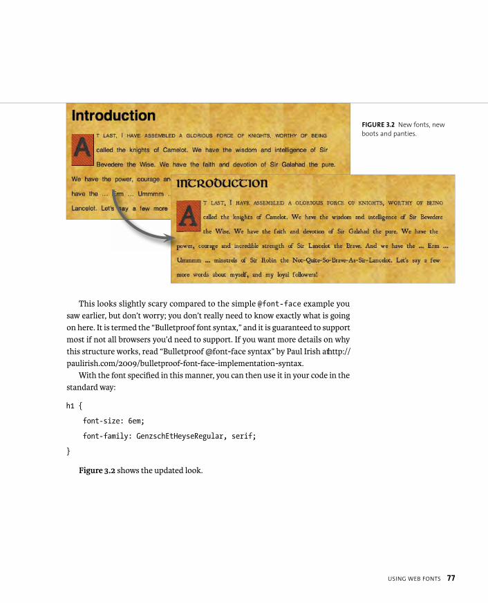
ptg8274462
USING WEB FONTS 77
This looks slightly scary compared to the simple @font-face example you saw earlier, but don’t worry; you don’t really need to know exactly what is going on here. It is termed the “Bulletproof font syntax,” and it is guaranteed to support most if not all browsers you’d need to support. If you want more details on why this structure works, read “Bulletproof @font-face syntax” by Paul Irish at http://paulirish.com/2009/bulletproof-font-face-implementation-syntax.
With the font specified in this manner, you can then use it in your code in the standard way:
h1 {
font-size: 6em;
font-family: GenzschEtHeyseRegular, serif;
}
Figure 3.2 shows the updated look.
FIGURE 3.2 New fonts, new
boots and panties.
ptg8274462
78 CHAPTER 3 SPICING UP YOUR FONTS AND TEXT
WEB-FONT PROBLEMS
Unfortunately, web fonts are not without their problems. If you really want a pro-fessional look to your site’s text, you need to consider your font choices carefully and test them thoroughly. The following problems need considerable thought.
FLASH OF UNSTYLED TEXT (FOUT)
FOUT refers to the way some browsers behave (namely Opera, Firefox earlier than version 4, and IE earlier than version 10) when they encounter a web font; that is, they first render the text without the font applied. Then they download the font file and apply it to the text. This can create a rather jarring and unsightly effect, which you’ve probably witnessed at some point.
There are a couple of solutions to this problem. One solution is the webfont loader from Google (http://code.google.com/apis/webfonts/docs/webfont_loader.html), which is a JavaScript API with quite a few features available. You can include it in your page using the following script:
<script src=”//ajax.googleapis.com/ajax/libs/webfont/1/p webfont.js”></script>
You then need to point to the fonts in question by putting scripts like the fol-lowing in your document’s <head>; the scripts need to be included before your style declarations:
<script>
WebFont.load({
custom: {
families: [‘MEgalopolisExtraRegular’, p ‘SansationRegular’],
}
});
</script>
ptg8274462
USING WEB FONTS 79
The JavaScript targets the fonts and the stylesheets that refer to them. It adds classes to the document’s <html> tag to indicate different stages of web-font loading. Before a web font has loaded, the class wf-loading is included. During this stage, you could hide the text using a descendant selector:
.wf-loading h1, .wf-loading p {
visibility: hidden;
}
When the font has finished loading and is ready to be used, the wf-loadingclass is removed, and a series of -active classes are included instead. Now you can include the fonts as desired, like so:
.wf-megalopolisextraregular-n4-active h1 {
visibility: visible;
font-family: MEgalopolisExtraRegular, arial, sans-serif;
}
.wf-sansationregular-n4-active p {
visibility: visible;
font-family: SansationRegular, arial, sans-serif;
}
If the font fails to load for some reason, a class of wf-inactive is included instead, and you can point to a fallback font:
.wf-inactive body {
visibility: visible;
font-family: sans-serif;
}
NOTE: Google also has a free Fonts service at www.google.com/
webfonts, which is worth checking out if you are looking for
some decent quality free fonts and want an easy-to-use service.
The fonts are also hosted by Google, so you’ll save some bandwidth.

ptg8274462
80 CHAPTER 3 SPICING UP YOUR FONTS AND TEXT
ADDED BANDWIDTH
Web fonts have many advantages over image replacement in terms of flexibility and the power you have to control your designs. They can also result in a smaller file size, depending on your situation. But you really need to think carefully about using them if, for example, you are only using a single font for a single heading at the top of your site.
In King Arthur’s blog I only used the Genzsch Et Heyse font for the <h1> on each page. The EOT and TTF versions are 66 kb; the WOFF version is 41 kb; and the SVG version is a whopping 209 kb (although this is only needed by users of old versions of iOS). Some single font files can range in size from 300 to 400 kb. And this is made worse by the fact that some browsers erroneously download more fonts than they need (see the “Browser bugs” section later in this chapter).
This problem will be mitigated as time goes on—as old IE versions die out and all browsers support WOFF. But it won’t go away completely. Some font files will just be very big, especially when you consider CJK (Chinese, Japanese, Korean) languages, which can feature literally thousands of characters; such fonts can weigh in at several megabytes.
So determine whether you really need a web font or if you’d be better off with image replacement, or even a web-safe font, such as Times New Roman. Just because you can use web fonts doesn’t mean you have to!
NOTE: If font file size is a problem in your situation, you could create a font
file containing just the characters you need using a program called Fontforge
(http://fontforge.sourceforge.net). In addition, a property in the spec called
unicode-range allows you to specify which characters you want to load from
the font file, making the bandwidth problem even easier to solve. But at
the time of this writing, unicode-range was only supported in WebKit, so I
decided not to talk about it in detail.
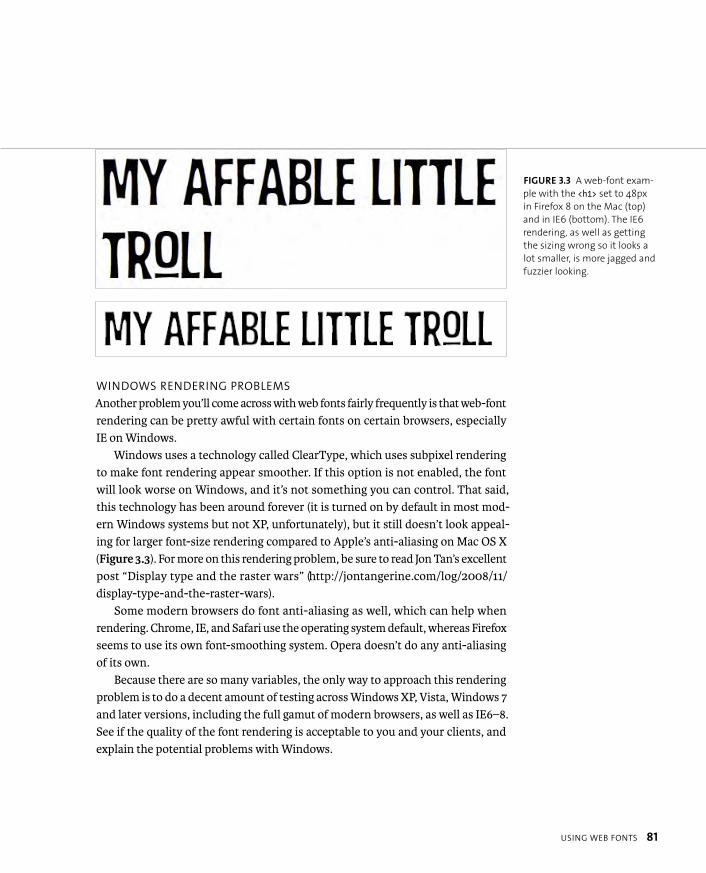
ptg8274462
USING WEB FONTS 81
WINDOWS RENDERING PROBLEMS
Another problem you’ll come across with web fonts fairly frequently is that web-font rendering can be pretty awful with certain fonts on certain browsers, especially IE on Windows.
Windows uses a technology called ClearType, which uses subpixel rendering to make font rendering appear smoother. If this option is not enabled, the font will look worse on Windows, and it’s not something you can control. That said, this technology has been around forever (it is turned on by default in most mod-ern Windows systems but not XP, unfortunately), but it still doesn’t look appeal-ing for larger font-size rendering compared to Apple’s anti-aliasing on Mac OS X (Figure 3.3). For more on this rendering problem, be sure to read Jon Tan’s excellent post “Display type and the raster wars” (http://jontangerine.com/log/2008/11/display-type-and-the-raster-wars).
Some modern browsers do font anti-aliasing as well, which can help when rendering. Chrome, IE, and Safari use the operating system default, whereas Firefox seems to use its own font-smoothing system. Opera doesn’t do any anti-aliasing of its own.
Because there are so many variables, the only way to approach this rendering problem is to do a decent amount of testing across Windows XP, Vista, Windows 7 and later versions, including the full gamut of modern browsers, as well as IE6–8. See if the quality of the font rendering is acceptable to you and your clients, and explain the potential problems with Windows.
FIGURE 3.3 A web-font exam-
ple with the <h1> set to 48px
in Firefox 8 on the Mac (top)
and in IE6 (bottom). The IE6
rendering, as well as getting
the sizing wrong so it looks a
lot smaller, is more jagged and
fuzzier looking.
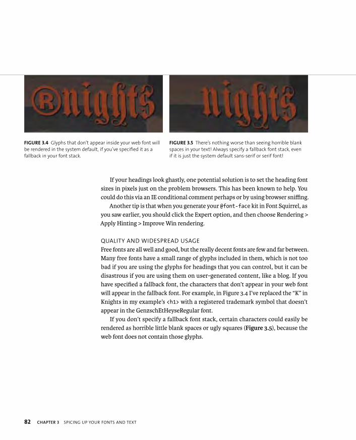
ptg8274462
82 CHAPTER 3 SPICING UP YOUR FONTS AND TEXT
If your headings look ghastly, one potential solution is to set the heading font sizes in pixels just on the problem browsers. This has been known to help. You could do this via an IE conditional comment perhaps or by using browser sniffing.
Another tip is that when you generate your @font-face kit in Font Squirrel, as you saw earlier, you should click the Expert option, and then choose Rendering > Apply Hinting > Improve Win rendering.
QUALITY AND WIDESPREAD USAGE
Free fonts are all well and good, but the really decent fonts are few and far between. Many free fonts have a small range of glyphs included in them, which is not too bad if you are using the glyphs for headings that you can control, but it can be disastrous if you are using them on user-generated content, like a blog. If you have specified a fallback font, the characters that don’t appear in your web font will appear in the fallback font. For example, in Figure 3.4 I’ve replaced the “K” in Knights in my example’s <h1> with a registered trademark symbol that doesn’t appear in the GenzschEtHeyseRegular font.
If you don’t specify a fallback font stack, certain characters could easily be rendered as horrible little blank spaces or ugly squares (Figure 3.5), because the web font does not contain those glyphs.
FIGURE 3.4 Glyphs that don’t appear inside your web font will
be rendered in the system default, if you’ve specified it as a
fallback in your font stack.
FIGURE 3.5 There’s nothing worse than seeing horrible blank
spaces in your text! Always specify a fallback font stack, even
if it is just the system default sans-serif or serif font!
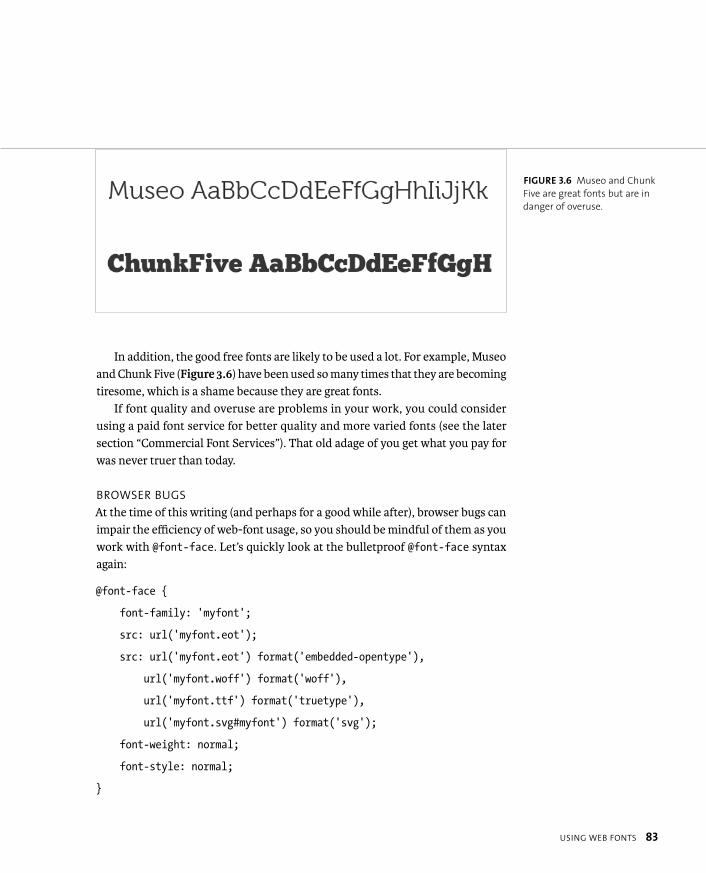
ptg8274462
USING WEB FONTS 83
In addition, the good free fonts are likely to be used a lot. For example, Museo and Chunk Five (Figure 3.6) have been used so many times that they are becoming tiresome, which is a shame because they are great fonts.
If font quality and overuse are problems in your work, you could consider using a paid font service for better quality and more varied fonts (see the later section “Commercial Font Services”). That old adage of you get what you pay for was never truer than today.
BROWSER BUGS
At the time of this writing (and perhaps for a good while after), browser bugs can impair the efficiency of web-font usage, so you should be mindful of them as you work with @font-face. Let’s quickly look at the bulletproof @font-face syntax again:
@font-face {
font-family: ‘myfont’;
src: url(‘myfont.eot’);
src: url(‘myfont.eot’) format(‘embedded-opentype’),
url(‘myfont.woff’) format(‘woff’),
url(‘myfont.ttf’) format(‘truetype’),
url(‘myfont.svg#myfont’) format(‘svg’);
font-weight: normal;
font-style: normal;
}
FIGURE 3.6 Museo and Chunk
Five are great fonts but are in
danger of overuse.
ptg8274462
84 CHAPTER 3 SPICING UP YOUR FONTS AND TEXT
If you are experiencing strange blips in font performance or rendering quality, it could be due to one of the following:
� IE9 and later support the WOFF format, but they also support EOT. If you are using syntax like that in the preceding code, IE9 and later will down-load the EOT file and use it (browsers go through the list and use the first font they recognize). You can find a more detailed reference for fixing IE9 font problems at www.fontspring.com/blog/fixing-ie9-font-face-problems.
� If your web fonts are failing in Firefox or IE and you are serving your fonts from a different domain, it might be because they have a stricter same-origin policy than most. A workaround is to serve the fonts using the Access-Control-Allow-Origin HTTP header defined in CORS (see http://dev.opera.com/articles/view/dom-access-control-using-cross-origin-resource-sharing for more details).
� If you are using WOFF and your fonts are being served from IIS, you’ll need to add a MIME type: WOFF doesn’t have a MIME type, but font/x-woffwill work.
� Never declare @font-face rules for fonts you don’t end up using: IE 6–8 will download them all anyway.
� Opera 11.5 and earlier on the Mac, unfortunately, download the EOT font as well as the WOFF font that it actually uses, wasting some bandwidth. Let’s hope this will be fixed soon.
COMMERCIAL FONT SERVICES
Commercial font services tend to give you better quality fonts on average, although there are some great free fonts available. You have two options for commercial font services:
� Buying fonts outright
� Using a hosted font service

ptg8274462
USING WEB FONTS 85
If you want to buy fonts outright and host them yourself, there are a number of different shops to visit, but the ones I’d recommend are:
� Myfonts.com
� Fontspring.com
� Fontshop.com
The three best options for commercial-hosted font services at the time of this writing are
� Typekit (https://typekit.com). Started off as an independent company by some very clever folks in the United States and recently acquired by Adobe.
� Fontdeck (http://fontdeck.com). Created by designers in the UK.
� WebType (www.webtype.com). Another quality font service set up in col-laboration between a number of type experts.
All the hosted font services work in roughly the same way: You sign up for the service, specify which domain(s) you want the fonts used on, paste some custom JavaScript and/or CSS into the <head> of the pages you want the fonts used on, and then choose the fonts you want to use on the web interface of the service.
You’ll then be given all the CSS you need; they are very easy to use. Another useful feature of all three is that you are free to test them to a certain degree. Font-deck gives you full access to all font services free of charge, but only the first 20 IP addresses that access your sites will see your fonts. Typekit allows you to use a limited set of its fonts on one website with limited page views. WebType gives you a 30-day free trial with each font.
When you start using these services, the benefits become very clear: You have access to high-quality fonts with full glyph sets and multiple weights and variants. For example, you can make proper use of the following and more:
font-weight: 200;
font-weight: 300;
font-weight: light;
font-weight: black;

ptg8274462
86 CHAPTER 3 SPICING UP YOUR FONTS AND TEXT
You can achieve a lot using different weights of just one typeface, as evidenced by excellent sites, such as Simon Collison’s personal site, colly.com (Figure 3.7).
All the fonts have agreed licenses for using them on the web. The font files are optimized as much as they can be to reduce file size, and although your users will still have to download them to use them, you can place the server burden on the font service, which reduces your bandwidth burden.
Each service has advantages and disadvantages: I prefer Fontdeck because it is slightly more intuitive to use than the others. Also, the restrictions are not as limited for testing purposes; you pay per font, and it doesn’t require JavaScript like Typekit does. It might work out to be slightly more expensive, but the costs are pretty minor either way.
FIGURE 3.7 Colly.com is
entirely typeset in Times New
Roman. Would you believe it?
NOTE: You can see some examples of Typekit and Fontdeck in action at http://
people.opera.com/cmills/css3book/typekit_example.html and http://people.
opera.com/cmills/css3book/fontdeck_example.html. I’ve also included these
examples in the chapter3 code download folder, but you’ll only see the
font examples working on the preceding URLs, because my Fontdeck and
Typekit examples were tied to that domain at the time.
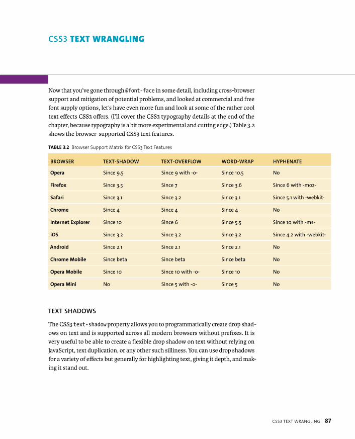
ptg8274462
CSS3 TEXT WRANGLING 87
CSS3 TEXT WRANGLING
Now that you’ve gone through @font-face in some detail, including cross-browser support and mitigation of potential problems, and looked at commercial and free font supply options, let’s have even more fun and look at some of the rather cool text effects CSS3 offers. (I’ll cover the CSS3 typography details at the end of the chapter, because typography is a bit more experimental and cutting edge.) Table 3.2 shows the browser-supported CSS3 text features.
TABLE 3.2 Browser Support Matrix for CSS3 Text Features
BROWSER TEXT-SHADOW TEXT-OVERFLOW WORD-WRAP HYPHENATE
Opera Since 9.5 Since 9 with -o- Since 10.5 No
Firefox Since 3.5 Since 7 Since 3.6 Since 6 with -moz-
Safari Since 3.1 Since 3.2 Since 3.1 Since 5.1 with -webkit-
Chrome Since 4 Since 4 Since 4 No
Internet Explorer Since 10 Since 6 Since 5.5 Since 10 with -ms-
iOS Since 3.2 Since 3.2 Since 3.2 Since 4.2 with -webkit-
Android Since 2.1 Since 2.1 Since 2.1 No
Chrome Mobile Since beta Since beta Since beta No
Opera Mobile Since 10 Since 10 with -o- Since 10 No
Opera Mini No Since 5 with -o- Since 5 No
TEXT SHADOWS
The CSS3 text-shadow property allows you to programmatically create drop shad-ows on text and is supported across all modern browsers without prefixes. It is very useful to be able to create a flexible drop shadow on text without relying on JavaScript, text duplication, or any other such silliness. You can use drop shadows for a variety of effects but generally for highlighting text, giving it depth, and mak-ing it stand out.
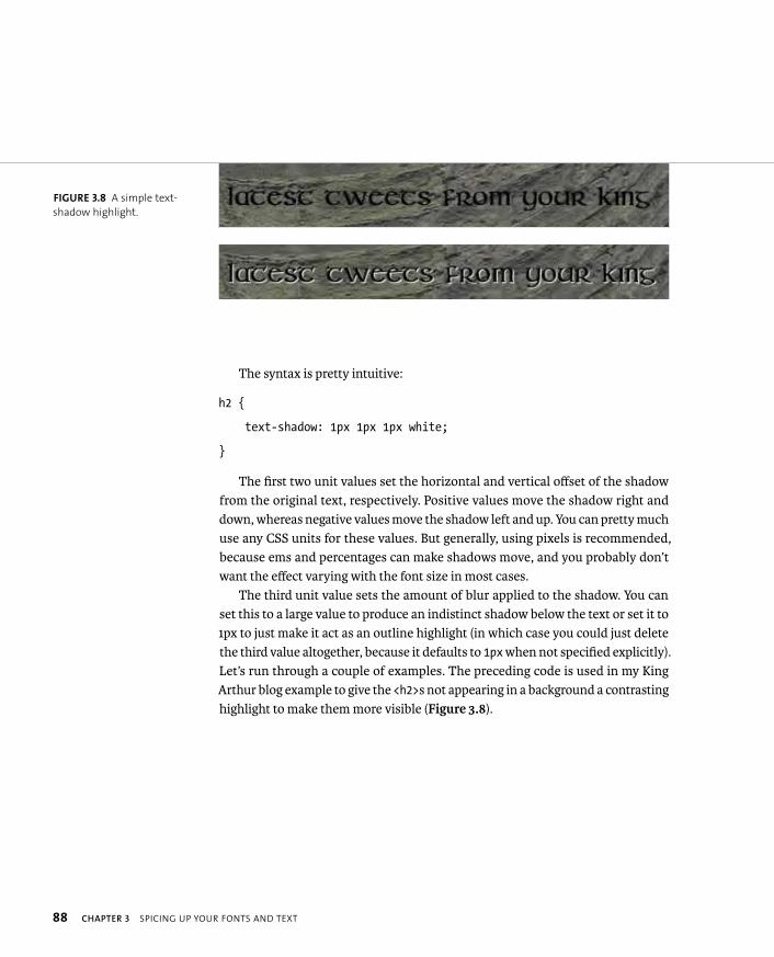
ptg8274462
88 CHAPTER 3 SPICING UP YOUR FONTS AND TEXT
The syntax is pretty intuitive:
h2 {
text-shadow: 1px 1px 1px white;
}
The first two unit values set the horizontal and vertical offset of the shadow from the original text, respectively. Positive values move the shadow right and down, whereas negative values move the shadow left and up. You can pretty much use any CSS units for these values. But generally, using pixels is recommended, because ems and percentages can make shadows move, and you probably don’t want the effect varying with the font size in most cases.
The third unit value sets the amount of blur applied to the shadow. You can set this to a large value to produce an indistinct shadow below the text or set it to 1px to just make it act as an outline highlight (in which case you could just delete the third value altogether, because it defaults to 1px when not specified explicitly). Let’s run through a couple of examples. The preceding code is used in my King Arthur blog example to give the <h2>s not appearing in a background a contrasting highlight to make them more visible (Figure 3.8).
FIGURE 3.8 A simple text-
shadow highlight.
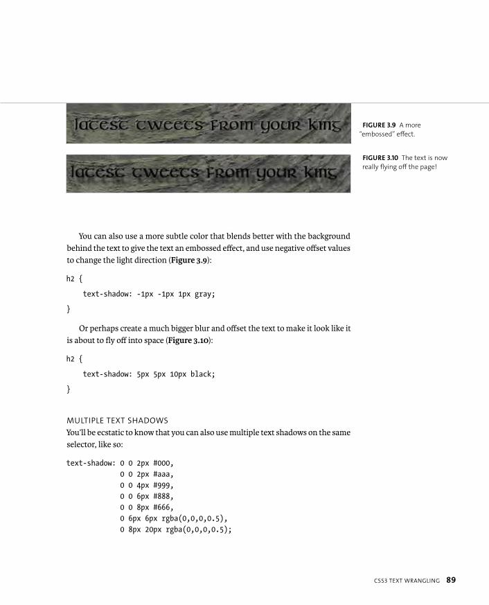
ptg8274462
CSS3 TEXT WRANGLING 89
You can also use a more subtle color that blends better with the background behind the text to give the text an embossed effect, and use negative offset values to change the light direction (Figure 3.9):
h2 {
text-shadow: -1px -1px 1px gray;
}
Or perhaps create a much bigger blur and offset the text to make it look like it is about to fly off into space (Figure 3.10):
h2 {
text-shadow: 5px 5px 10px black;
}
MULTIPLE TEXT SHADOWS
You’ll be ecstatic to know that you can also use multiple text shadows on the same selector, like so:
text-shadow: 0 0 2px #000, 0 0 2px #aaa, 0 0 4px #999, 0 0 6px #888, 0 0 8px #666, 0 6px 6px rgba(0,0,0,0.5), 0 8px 20px rgba(0,0,0,0.5);
FIGURE 3.9 A more
“embossed” effect.
FIGURE 3.10 The text is now
really flying off the page!
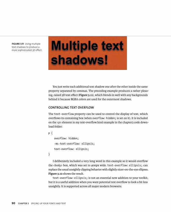
ptg8274462
90 CHAPTER 3 SPICING UP YOUR FONTS AND TEXT
You just write each additional text shadow one after the other inside the same property separated by commas. The preceding example produces a rather pleas-ing, raised 3D text effect (Figure 3.11), which blends in well with any backgrounds behind it because RGBA colors are used for the outermost shadows.
CONTROLLING TEXT OVERFLOW
The text-overflow property can be used to control the display of text, which overflows its containing box (when overflow: hidden; is set on it). It is included on the <p> element in my text-overflow.html example in the chapter3 code down-load folder:
p {
overflow: hidden;
-ms-text-overflow: ellipsis;
text-overflow: ellipsis;
}
I deliberately included a very long word in this example so it would overflow the <body> box, which was set to 400px wide. text-overflow: ellipsis; can replace the usual unsightly clipping behavior with slightly nicer-on-the-eye ellipses. Figure 3.12 shows the result.
text-overflow: ellipsis; is not an essential new addition to your toolkit, but it is a useful addition when you want potential text overflow to look a bit less unsightly. It is supported across all major modern browsers.
FIGURE 3.11 Using multiple
text shadows to produce a
more sophisticated 3D effect.
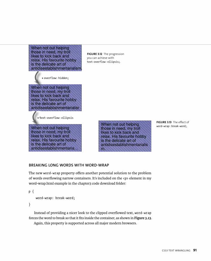
ptg8274462
CSS3 TEXT WRANGLING 91
BREAKING LONG WORDS WITH WORD-WRAP
The new word-wrap property offers another potential solution to the problem of words overflowing narrow containers. It’s included on the <p> element in my word-wrap.html example in the chapter3 code download folder:
p {
word-wrap: break-word;
}
Instead of providing a nicer look to the clipped overflowed text, word-wrapforces the word to break so that it fits inside the container, as shown in Figure 3.13.
Again, this property is supported across all major modern browsers.
FIGURE 3.12 The progression
you can achieve with
text-overflow: ellipsis;.
FIGURE 3.13 The effect of
word-wrap: break-word;.
+ overflow: hidden;
+ text-overflow: ellipsis

ptg8274462
92 CHAPTER 3 SPICING UP YOUR FONTS AND TEXT
CONTROLLING HYPHENATION
Hyphenation has long been a sore point on the web. If you want a body of text to sit neatly in a containing box, the obvious solution in print would be to justify the text and hyphenate words as required to make the column work without too many long gaps. This is standard fayre, especially in newspapers and magazines.
But on the web, this treatment is difficult to achieve: You can’t just hyphenate words and add line breaks as needed unless you can control the exact copy, font-size, font, containing box, and so forth. And this will almost never be the case; it just isn’t how the web works! Instead, you have to settle for left, right, or centred text; text-align: justify usually looks terrible, especially if you have lots of big words in your copy. Figure 3.14 illustrates this perfectly.
CSS3 comes to the rescue with the hyphens property. The three possible values include:
� none. No hyphenation occurs. This could be used to turn off inherited hyphenation set on a parent element.
� manual. Words are hyphenated onto separate lines, only there are line-breaking characters present within them (like a hyphen character or a soft hyphen—for example, ­).
� auto. Words are automatically broken at appropriate hyphenation points. To work successfully, browsers need to recognize the language to be hyphen-ated. Therefore, hyphens only works on markup with a correct language declared on a parent element via the lang attribute.
FIGURE 3.14
text-align: justifyusually results in lots of
nasty big gaps in your text.
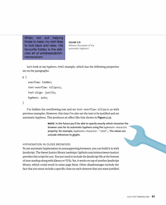
ptg8274462
CSS3 TEXT WRANGLING 93
Let’s look at my hyphens.html example, which has the following properties set on the paragraphs:
p {
overflow: hidden;
text-overflow: ellipsis;
text-align: justify;
hyphens: auto;
}
I’ve hidden the overflowing text and set text-overflow: ellipsis as with previous examples. However, this time I’ve also set the text to be justified and set automatic hyphens. This produces an effect like that shown in Figure 3.15.
HYPHENATION IN OLDER BROWSERS
To use automatic hyphenation in nonsupporting browsers, you can build it in with JavaScript. The Sweet Justice library (see https://github.com/aristus/sweet-justice) provides this script for you. You just need to include the JavaScript file at the bottom of your markup along with jQuery or YUI3. Yes, it works on top of another JavaScript library, which could result in some page bloat. Other disadvantages include the fact that you must include a specific class on each element that you want justified.
FIGURE 3.15
Witness the power of my
automatic hyphens!
NOTE: In the future you’ll be able to specify exactly which character the
browser uses for its automatic hyphens using the hyphenate-character
property; for example, hyphenate-character: “\2010”;. The values are
unicode references to glyphs.
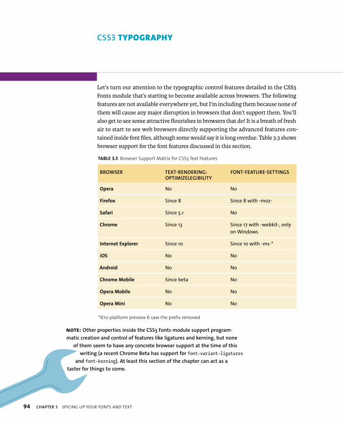
ptg8274462
94 CHAPTER 3 SPICING UP YOUR FONTS AND TEXT
Let’s turn our attention to the typographic control features detailed in the CSS3 Fonts module that’s starting to become available across browsers. The following features are not available everywhere yet, but I’m including them because none of them will cause any major disruption in browsers that don’t support them. You’ll also get to see some attractive flourishes in browsers that do! It is a breath of fresh air to start to see web browsers directly supporting the advanced features con-tained inside font files, although some would say it is long overdue. Table 3.3 shows browser support for the font features discussed in this section.
TABLE 3.3 Browser Support Matrix for CSS3 Text Features
BROWSER TEXT-RENDERING:OPTIMIZELEGIBILITY
FONT-FEATURE-SETTINGS
Opera No No
Firefox Since 8 Since 8 with -moz-
Safari Since 5.1 No
Chrome Since 13 Since 17 with -webkit-, only
on Windows
Internet Explorer Since 10 Since 10 with -ms-*
iOS No No
Android No No
Chrome Mobile Since beta No
Opera Mobile No No
Opera Mini No No
*IE10 platform preview 6 saw the prefix removed
NOTE: Other properties inside the CSS3 Fonts module support program-
matic creation and control of features like ligatures and kerning, but none
of them seem to have any concrete browser support at the time of this
writing (a recent Chrome Beta has support for font-variant-ligatures
and font-kerning). At least this section of the chapter can act as a
taster for things to come.
CSS3 TYPOGRAPHY

ptg8274462
CSS3 TYPOGRAPHY 95
LIGATURES AND OPTIMIZING TEXT RENDERING ON THE WEB
It is common in typography to join the strokes of certain sequences of characters to make them more legible and pleasing to the eye. Figure 3.16 shows some examples.
These are called ligatures, and decent font files will contain separate glyphs to handle them. When a specific sequence of characters is found, such as “ffl,” the separate glyphs of the letters are replaced with the special glyphs containing the ligatures. In CSS this can be controlled using the text-rendering property (which was actually first defined in SVG—see www.w3.org/TR/SVG11/painting.html#TextRenderingProperty):
text-rendering: optimizeLegibility
This turns on ligatures, which are very attractive but require a bit of extra processing power to render. Keep this in mind if you are desperate to tweak per-formance as much as possible.
In terms of browser support, you’ll be able to see the ligatures in Safari 5.1+, Firefox 4.0+ (uses ligatures automatically anyway, regardless of this property), IE10+, and Chrome 13+.
FIGURE 3.16 Compare the
words on the left to those on
the right.

ptg8274462
96 CHAPTER 3 SPICING UP YOUR FONTS AND TEXT
Figure 3.17 shows further examples. You can also see them at http://people.opera.com/cmills/css3book/fontdeck_example.html.
One detail to note is that the point of the text-rendering property is not just to control ligatures, but to dictate how special font features are rendered in the interests of legibility versus speed and geometric precision. The intended values for text-rendering include:
� optimizeLegibility. Legibility is favored over speed and geometric preci-sion. Generally, ligatures and other font hints will be turned on.
� optimizeSpeed. Speed is favored most. Generally, ligatures and other font hints will be turned off. This has no effect in Firefox due to it using ligatures automatically.
� geometricPrecision. Geometric precision will be favored most. Ligatures and other font hints will be turned on, depending on what produces the best shape forms.
� auto. The browser makes the rendering decision, depending on the current rendering context (e.g., What device am I on? What processing power do I have available?).
FIGURE 3.17 Words rendered
without ligatures (left) and
with (right).
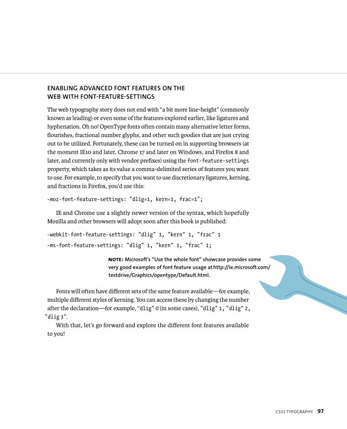
ptg8274462
CSS3 TYPOGRAPHY 97
ENABLING ADVANCED FONT FEATURES ON THE WEB WITH FONT-FEATURE-SETTINGS
The web typography story does not end with “a bit more line-height” (commonly known as leading) or even some of the features explored earlier, like ligatures and hyphenation. Oh no! OpenType fonts often contain many alternative letter forms, flourishes, fractional number glyphs, and other such goodies that are just crying out to be utilized. Fortunately, these can be turned on in supporting browsers (at the moment IE10 and later, Chrome 17 and later on Windows, and Firefox 8 and later, and currently only with vendor prefixes) using the font-feature-settingsproperty, which takes as its value a comma-delimited series of features you want to use. For example, to specify that you want to use discretionary ligatures, kerning, and fractions in Firefox, you’d use this:
-moz-font-feature-settings: “dlig=1, kern=1, frac=1”;
IE and Chrome use a slightly newer version of the syntax, which hopefully Mozilla and other browsers will adopt soon after this book is published:
-webkit-font-feature-settings: “dlig” 1, “kern” 1, “frac” 1
-ms-font-feature-settings: “dlig” 1, “kern” 1, “frac” 1;
Fonts will often have different sets of the same feature available—for example, multiple different styles of kerning. You can access these by changing the number after the declaration—for example, “dlig” 0 (in some cases), “dlig” 1, “dlig” 2,“dlig 3”.
With that, let’s go forward and explore the different font features available to you!
NOTE: Microsoft’s “Use the whole font” showcase provides some
very good examples of font feature usage at http://ie.microsoft.com/
testdrive/Graphics/opentype/Default.html.
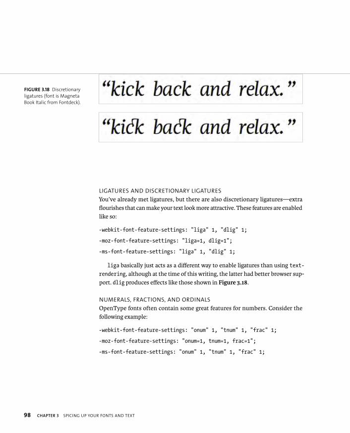
ptg8274462
98 CHAPTER 3 SPICING UP YOUR FONTS AND TEXT
LIGATURES AND DISCRETIONARY LIGATURES
You’ve already met ligatures, but there are also discretionary ligatures—extra flourishes that can make your text look more attractive. These features are enabled like so:
-webkit-font-feature-settings: “liga” 1, “dlig” 1;
-moz-font-feature-settings: “liga=1, dlig=1”;
-ms-font-feature-settings: “liga” 1, “dlig” 1;
liga basically just acts as a different way to enable ligatures than using text-rendering, although at the time of this writing, the latter had better browser sup-port. dlig produces effects like those shown in Figure 3.18.
NUMERALS, FRACTIONS, AND ORDINALS
OpenType fonts often contain some great features for numbers. Consider the following example:
-webkit-font-feature-settings: “onum” 1, “tnum” 1, “frac” 1;
-moz-font-feature-settings: “onum=1, tnum=1, frac=1”;
-ms-font-feature-settings: “onum” 1, “tnum” 1, “frac” 1;
FIGURE 3.18 Discretionary
ligatures (font is Magneta
Book Italic from Fontdeck).
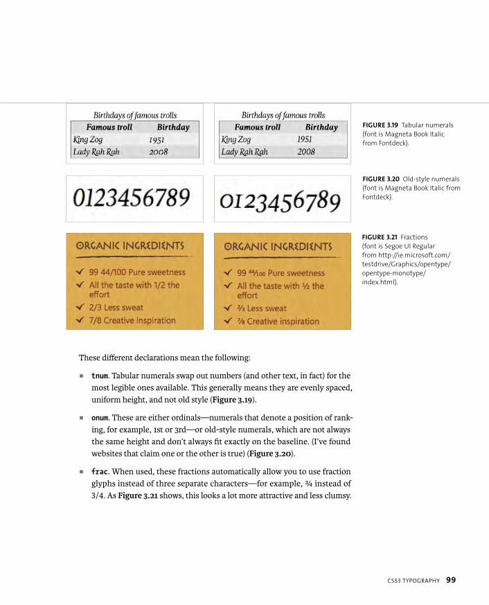
ptg8274462
CSS3 TYPOGRAPHY 99
These different declarations mean the following:
� tnum. Tabular numerals swap out numbers (and other text, in fact) for the most legible ones available. This generally means they are evenly spaced, uniform height, and not old style (Figure 3.19).
� onum. These are either ordinals—numerals that denote a position of rank-ing, for example, 1st or 3rd—or old-style numerals, which are not always the same height and don’t always fit exactly on the baseline. (I’ve found websites that claim one or the other is true) (Figure 3.20).
� frac. When used, these fractions automatically allow you to use fraction glyphs instead of three separate characters—for example, ¾ instead of 3/4. As Figure 3.21 shows, this looks a lot more attractive and less clumsy.
FIGURE 3.21 Fractions
(font is Segoe UI Regular
from http://ie.microsoft.com/
testdrive/Graphics/opentype/
opentype-monotype/
index.html).
FIGURE 3.20 Old-style numerals
(font is Magneta Book Italic from
Fontdeck).
FIGURE 3.19 Tabular numerals
(font is Magneta Book Italic
from Fontdeck).
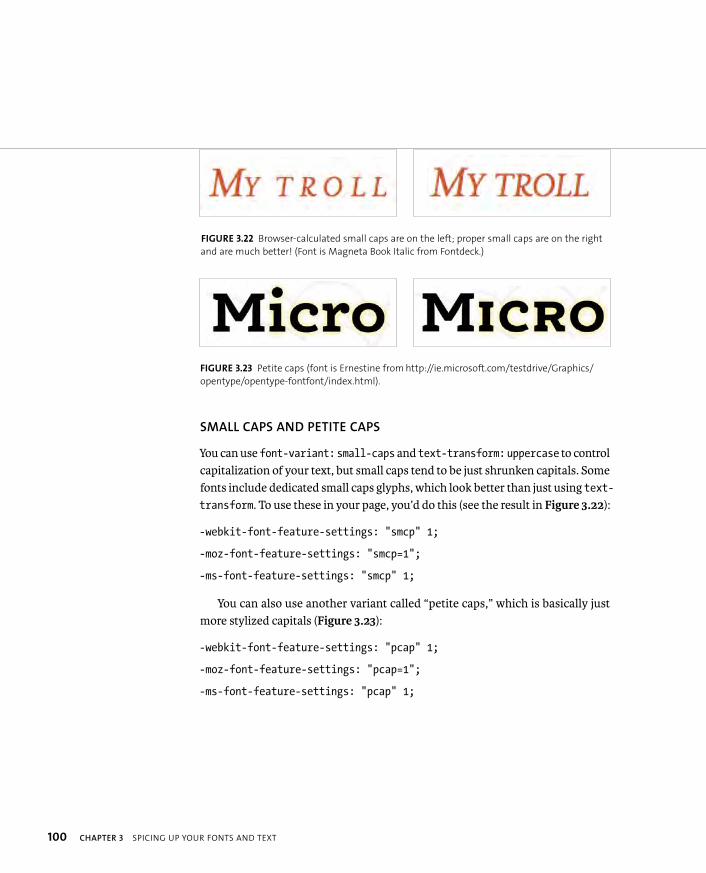
ptg8274462
100 CHAPTER 3 SPICING UP YOUR FONTS AND TEXT
SMALL CAPS AND PETITE CAPS
You can use font-variant: small-caps and text-transform: uppercase to control capitalization of your text, but small caps tend to be just shrunken capitals. Some fonts include dedicated small caps glyphs, which look better than just using text-transform. To use these in your page, you’d do this (see the result in Figure 3.22):
-webkit-font-feature-settings: “smcp” 1;
-moz-font-feature-settings: “smcp=1”;
-ms-font-feature-settings: “smcp” 1;
You can also use another variant called “petite caps,” which is basically just more stylized capitals (Figure 3.23):
-webkit-font-feature-settings: “pcap” 1;
-moz-font-feature-settings: “pcap=1”;
-ms-font-feature-settings: “pcap” 1;
FIGURE 3.22 Browser-calculated small caps are on the left; proper small caps are on the right
and are much better! (Font is Magneta Book Italic from Fontdeck.)
FIGURE 3.23 Petite caps (font is Ernestine from http://ie.microsoft.com/testdrive/Graphics/
opentype/opentype-fontfont/index.html).
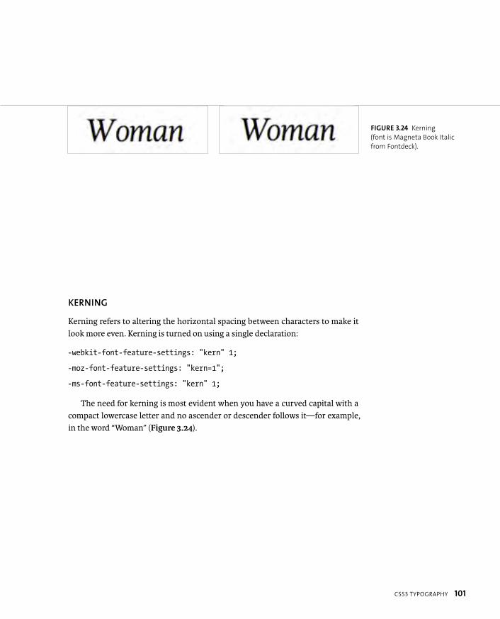
ptg8274462
CSS3 TYPOGRAPHY 101
KERNING
Kerning refers to altering the horizontal spacing between characters to make it look more even. Kerning is turned on using a single declaration:
-webkit-font-feature-settings: “kern” 1;
-moz-font-feature-settings: “kern=1”;
-ms-font-feature-settings: “kern” 1;
The need for kerning is most evident when you have a curved capital with a compact lowercase letter and no ascender or descender follows it—for example, in the word “Woman” (Figure 3.24).
FIGURE 3.24 Kerning
(font is Magneta Book Italic
from Fontdeck).

ptg8274462
102 CHAPTER 3 SPICING UP YOUR FONTS AND TEXT
STYLISTIC SETS AND OTHER ASSORTED EFFECTS
Here are a few stylistic sets and other text effects that I’ve lumped into one final section. Consider the following examples:
-webkit-font-feature-settings: “ss01” 1, “swsh” 1, “cswh” 1, “calt” 1;
-moz-font-feature-settings: “ss01=1, swsh=1, cswh=1, calt=1”;
-ms-font-feature-settings: “ss01” 1, “swsh” 1, “cswh” 1, “calt” 1;
Explanations of the different declarations used here are as follows:
� ss01. Stylistic sets specify the usage of an alternative set of glyph styles for the standard glyphs (Figure 3.25).
� swsh. Stylistic swashes specify the use of stylistic swashes where available, which are often similar to stylistic sets, although the latter tend to be more wide-ranging in terms of the kinds of changes they include (Figure 3.26).
FIGURE 3.25 Stylistic set examples (font is Majestic Mishmash Regular from Fontdeck—standard, ss01, and ss02).
FIGURE 3.26 Stylistic swashes (font is Trilogy Fatface Regular from Fontdeck).
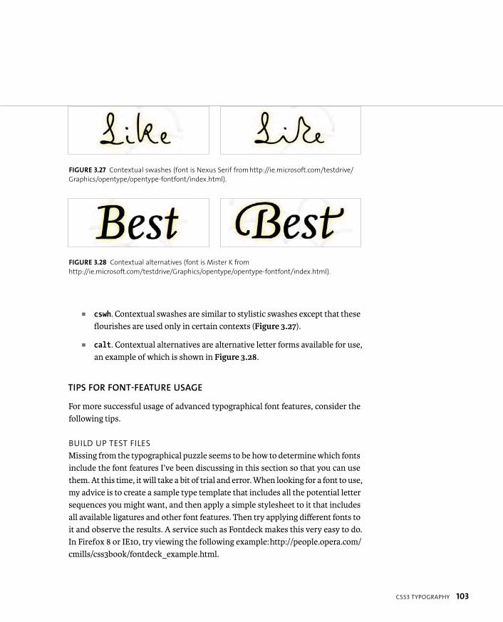
ptg8274462
CSS3 TYPOGRAPHY 103
� cswh. Contextual swashes are similar to stylistic swashes except that these flourishes are used only in certain contexts (Figure 3.27).
� calt. Contextual alternatives are alternative letter forms available for use, an example of which is shown in Figure 3.28.
TIPS FOR FONT-FEATURE USAGE
For more successful usage of advanced typographical font features, consider the following tips.
BUILD UP TEST FILES
Missing from the typographical puzzle seems to be how to determine which fonts include the font features I’ve been discussing in this section so that you can use them. At this time, it will take a bit of trial and error. When looking for a font to use, my advice is to create a sample type template that includes all the potential letter sequences you might want, and then apply a simple stylesheet to it that includes all available ligatures and other font features. Then try applying different fonts to it and observe the results. A service such as Fontdeck makes this very easy to do. In Firefox 8 or IE10, try viewing the following example: http://people.opera.com/cmills/css3book/fontdeck_example.html.
FIGURE 3.27 Contextual swashes (font is Nexus Serif from http://ie.microsoft.com/testdrive/
Graphics/opentype/opentype-fontfont/index.html).
FIGURE 3.28 Contextual alternatives (font is Mister K from
http://ie.microsoft.com/testdrive/Graphics/opentype/opentype-fontfont/index.html).
ptg8274462
104 CHAPTER 3 SPICING UP YOUR FONTS AND TEXT
USE DIFFERENT SELECTORS AND FONT SUBSETS
FOR APPLYING FONT FEATURES
You’ll probably not want to use advanced font features on all of your type. It would just be overkill! Most likely, you’ll just apply such features to headings, single characters, or small strings of characters near the start or end of your lines of text.
In addition, you could consider using a subset of your fonts that just contains the font features you want to style your headings and other text elements. This will reduce bandwidth as well:
h1, .flourish {
font-family: ‘my posh font subset’, fallback, fallback;
-webkit-font-feature-settings: “dlig” 1, “swsh” 1;
-moz-font-feature-settings: “ dlig=1, swsh=1”;
-ms-font-feature-settings: “dlig” 1, “swsh” 1;
}
ptg8274462
WRAPPING UP 105
In this chapter you investigated the new text and font features available in CSS3 and learned about usage and common problems you’ll encounter. You also looked at free and commercial font solutions. By now, you should be comfortable making good choices for fonts and text styling on your site.
For more in-depth information on fonts and to keep up with the latest on web fonts and text, be sure to read the blogs of such talented typography fanat-ics as Rich Rutter (clagnut.com), Jon Tan (jontangerine.com), and Mark Boulton (markboulton.co.uk).
WRAPPING UP

ptg8274462
4
ENHANCING BOXESWITH CSS3 BLING
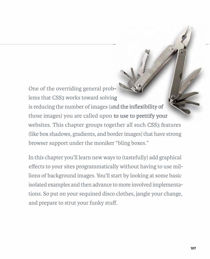
ptg8274462
107
One of the overriding general prob-
lems that CSS3 works toward solving
is reducing the number of images (and the inflexibility of
those images) you are called upon to use to prettify your
websites. This chapter groups together all such CSS3 features
(like box shadows, gradients, and border images) that have strong
browser support under the moniker “bling boxes.”
In this chapter you’ll learn new ways to (tastefully) add graphical
effects to your sites programmatically without having to use mil-
lions of background images. You’ll start by looking at some basic
isolated examples and then advance to more involved implementa-
tions. So put on your sequined disco clothes, jangle your change,
and prepare to strut your funky stuff.
ptg8274462
108 CHAPTER 4 ENHANCING BOXES WITH CSS3 BLING
A BRIGHT FUTURE
WITH CSS3 BLING
Most of you will have a good idea of the kinds of CSS3 features I’m referring to by bling boxes: Drop shadows, rounded corners, linear and radial gradients, and alpha transparency are exemplary examples. Also, a number of properties still require the use of images but allow you to use them in a more flexible way!
The advantages of such features should be obvious, but just in case, let’s briefly review them before moving on:
� Less downloading. Programmatically creating bling effects allows you to decrease the number of images you need for your designs and therefore the number of HTTP requests and download sizes involved.
� Easier maintenance of graphical effects. You can now vary colors, dimen-sions, and so on by just changing some CSS syntax rather than having to open Photoshop and manually alter image files.
� Less spaghetti code. Back in the day, so-called “bulletproof CSS” solutions typically involved multiple images and multiple nested <div>s—a double disappointment of extra complexity of design time and unsemantic cruft code. If you wanted to create bulletproof rounded corners on a content box to allow it to flex horizontally and vertically, you’d need three extra nested <div>s for holding all the necessary images. If you had only one container available, you’d have to settle for an inflexible, one-size box, which was usually rendered useless when content changed. CSS3 features, such as rounded corners and multiple background images, change all this.
� Fewer Photoshop ninja skills required. Creating such bling effects in code is a lot easier and more intuitive for non-Photoshop experts.
Of course, the main disadvantages at this time are that some of these CSS3 fea-tures are not supported in older browsers (usually meaning Internet Explorer 6–8), and they are often used with vendor prefixes. Table 4.1 gives you an at-a-glance reference of browser support for the properties covered in this chapter.
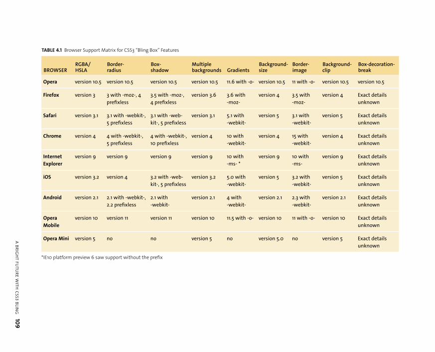
ptg8274462
A B
RIG
HT
FU
TU
RE
WIT
HC
SS
3 B
LING
109
TABLE 4.1 Browser Support Matrix for CSS3 “Bling Box” Features
BROWSERRGBA/HSLA
Border-radius
Box-shadow
Multiplebackgrounds Gradients
Background-size
Border-image
Background-clip
Box-decoration-break
Opera version 10.5 version 10.5 version 10.5 version 10.5 11.6 with -o- version 10.5 11 with -o- version 10.5 version 10.5
Firefox version 3 3 with -moz-, 4
prefixless
3.5 with -moz-,
4 prefixless
version 3.6 3.6 with
-moz-
version 4 3.5 with
-moz-
version 4 Exact details
unknown
Safari version 3.1 3.1 with -webkit-,
5 prefixless
3.1 with -web-
kit-, 5 prefixless
version 3.1 5.1 with
-webkit-
version 5 3.1 with
-webkit-
version 5 Exact details
unknown
Chrome version 4 4 with -webkit-,
5 prefixless
4 with -webkit-,
10 prefixless
version 4 10 with
-webkit-
version 4 15 with
-webkit-
version 4 Exact details
unknown
Internet
Explorer
version 9 version 9 version 9 version 9 10 with
-ms- *
version 9 10 with
-ms-
version 9 Exact details
unknown
iOS version 3.2 version 4 3.2 with -web-
kit-, 5 prefixless
version 3.2 5.0 with
-webkit-
version 5 3.2 with
-webkit-
version 5 Exact details
unknown
Android version 2.1 2.1 with -webkit-,
2.2 prefixless
2.1 with
-webkit-
version 2.1 4 with
-webkit-
version 2.1 2.3 with
-webkit-
version 2.1 Exact details
unknown
Opera
Mobile
version 10 version 11 version 11 version 10 11.5 with -o- version 10 11 with -o- version 10 Exact details
unknown
Opera Mini version 5 no no version 5 no version 5.0 no version 5 Exact details
unknown
*IE10 platform preview 6 saw support without the prefix
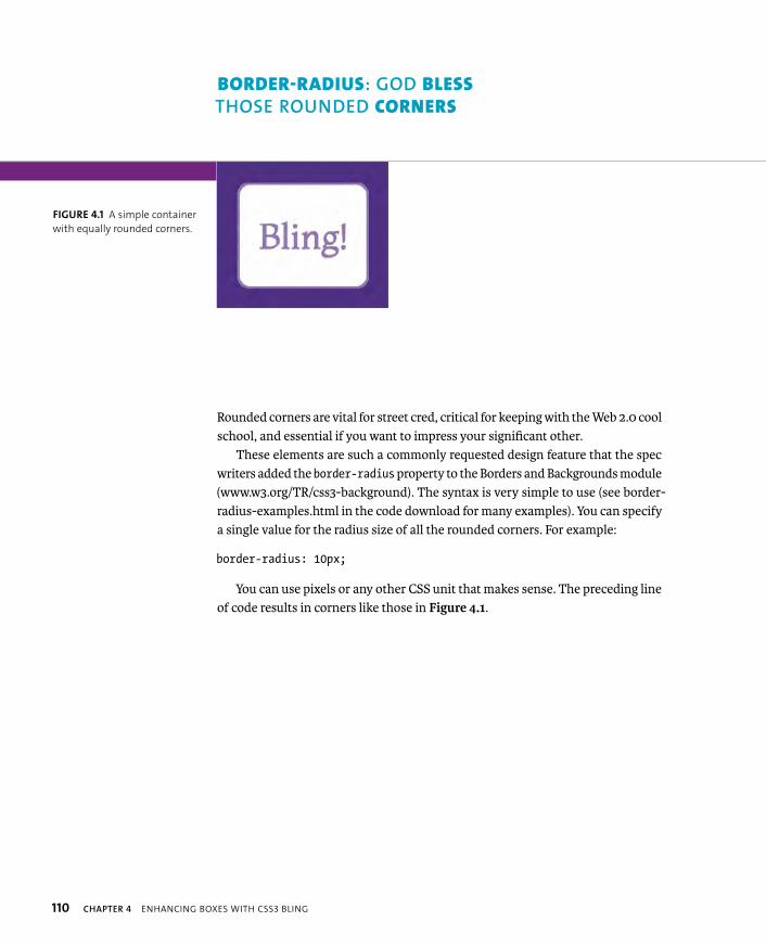
ptg8274462
110 CHAPTER 4 ENHANCING BOXES WITH CSS3 BLING
Rounded corners are vital for street cred, critical for keeping with the Web 2.0 cool school, and essential if you want to impress your significant other.
These elements are such a commonly requested design feature that the spec writers added the border-radius property to the Borders and Backgrounds module (www.w3.org/TR/css3-background). The syntax is very simple to use (see border-radius-examples.html in the code download for many examples). You can specify a single value for the radius size of all the rounded corners. For example:
border-radius: 10px;
You can use pixels or any other CSS unit that makes sense. The preceding line of code results in corners like those in Figure 4.1.
FIGURE 4.1 A simple container
with equally rounded corners.
BORDER-RADIUS: GOD BLESS
THOSE ROUNDED CORNERS
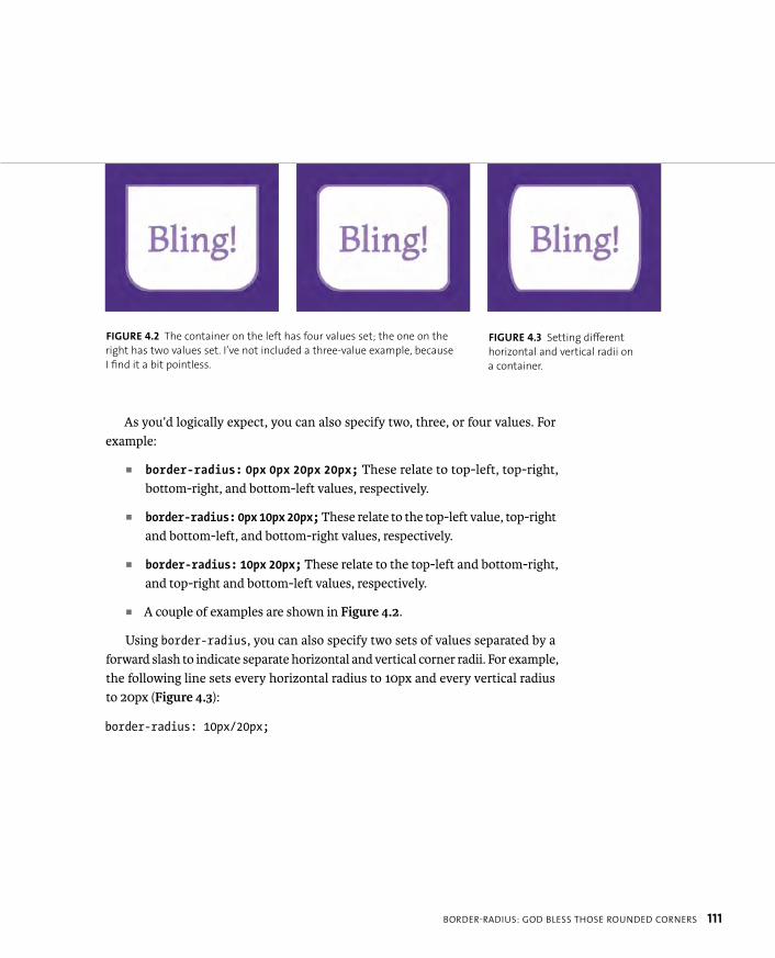
ptg8274462
BORDER-RADIUS: GOD BLESS THOSE ROUNDED CORNERS 111
As you’d logically expect, you can also specify two, three, or four values. For example:
� border-radius: 0px 0px 20px 20px; These relate to top-left, top-right, bottom-right, and bottom-left values, respectively.
� border-radius: 0px 10px 20px; These relate to the top-left value, top-right and bottom-left, and bottom-right values, respectively.
� border-radius: 10px 20px; These relate to the top-left and bottom-right, and top-right and bottom-left values, respectively.
� A couple of examples are shown in Figure 4.2.
Using border-radius, you can also specify two sets of values separated by a forward slash to indicate separate horizontal and vertical corner radii. For example, the following line sets every horizontal radius to 10px and every vertical radius to 20px (Figure 4.3):
border-radius: 10px/20px;
FIGURE 4.2 The container on the left has four values set; the one on the
right has two values set. I’ve not included a three-value example, because
I find it a bit pointless.
FIGURE 4.3 Setting different
horizontal and vertical radii on
a container.
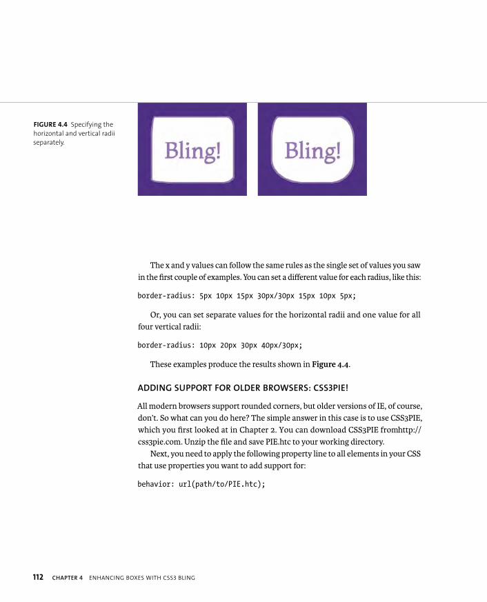
ptg8274462
112 CHAPTER 4 ENHANCING BOXES WITH CSS3 BLING
The x and y values can follow the same rules as the single set of values you saw in the first couple of examples. You can set a different value for each radius, like this:
border-radius: 5px 10px 15px 30px/30px 15px 10px 5px;
Or, you can set separate values for the horizontal radii and one value for all four vertical radii:
border-radius: 10px 20px 30px 40px/30px;
These examples produce the results shown in Figure 4.4.
ADDING SUPPORT FOR OLDER BROWSERS: CSS3PIE!
All modern browsers support rounded corners, but older versions of IE, of course, don’t. So what can you do here? The simple answer in this case is to use CSS3PIE, which you first looked at in Chapter 2. You can download CSS3PIE from http://css3pie.com. Unzip the file and save PIE.htc to your working directory.
Next, you need to apply the following property line to all elements in your CSS that use properties you want to add support for:
behavior: url(path/to/PIE.htc);
FIGURE 4.4 Specifying the
horizontal and vertical radii
separately.
ptg8274462
BORDER-RADIUS: GOD BLESS THOSE ROUNDED CORNERS 113
The easiest way to do this for the border-radius-examples.html file was to just apply this line to all <div>s, which works well even though the actual border-radius properties are applied via different classes on the different <div>s:
div {
...
behavior: url(PIE.htc);
}
The path you specify to the PIE.htc file must be relative to the HTML file the CSS is applied to, not the CSS, if you are using an external CSS file. This sounds very odd, but it is due to the way HTC file works: It alters the behavior of the CSS after it is applied to the HTML!
The other major part of using the CSS3PIE technique comes when you use it to add support for gradients. To do so, you need to add a special -pie- prefixed version of the property. For example:
-pie-background: linear-gradient(rgba(0,0,0,0), rgba(0,0,0,0.2));
You’ll notice that when using the -pie- prefix on a gradient, the prefix is put on background, not linear-gradient, which is where the vendor prefixes would go.
There is an added complication: the limitation of CSS3PIE’s RGBA support. You see, CSS3PIE will add support, but it won’t render the alpha bit. Instead, it will drop the alpha channel and render the equivalent RGB color. This is certainly better than nothing and is probably not disastrous in many situations, but it could also cause content to be rendered unreadable or just look shocking, especially if you’re relying on a color with a low alpha value to just add a faint shadow or tint to a container on your page. To remedy this problem, it is a good idea to change the -pie- prefixed version of the property to a sensible fallback color or even remove
it in some situations:
-pie-background: linear-gradient(#ff0000,#A60000);
NOTE: I tried applying the PIE behavior property to all elements on a
complex site using * { behavior: url(PIE.htc); }, but it resulted
in some very weird behavior, so it’s best not to try this strategy.
The * selector is expensive to render anyway, at the best of times.
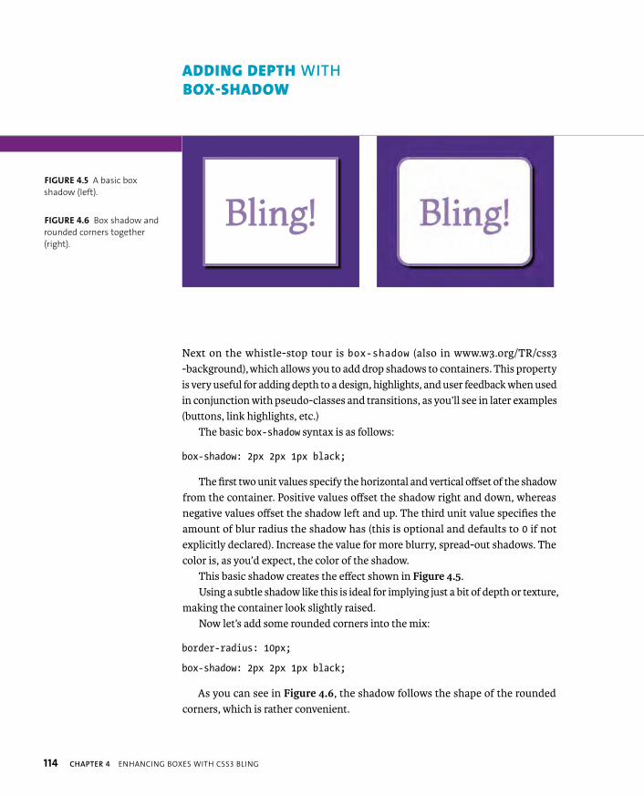
ptg8274462
114 CHAPTER 4 ENHANCING BOXES WITH CSS3 BLING
Next on the whistle-stop tour is box-shadow (also in www.w3.org/TR/css3-background), which allows you to add drop shadows to containers. This property is very useful for adding depth to a design, highlights, and user feedback when used in conjunction with pseudo-classes and transitions, as you’ll see in later examples (buttons, link highlights, etc.)
The basic box-shadow syntax is as follows:
box-shadow: 2px 2px 1px black;
The first two unit values specify the horizontal and vertical offset of the shadow from the container. Positive values offset the shadow right and down, whereas negative values offset the shadow left and up. The third unit value specifies the amount of blur radius the shadow has (this is optional and defaults to 0 if not explicitly declared). Increase the value for more blurry, spread-out shadows. The color is, as you’d expect, the color of the shadow.
This basic shadow creates the effect shown in Figure 4.5.Using a subtle shadow like this is ideal for implying just a bit of depth or texture,
making the container look slightly raised.Now let’s add some rounded corners into the mix:
border-radius: 10px;
box-shadow: 2px 2px 1px black;
As you can see in Figure 4.6, the shadow follows the shape of the rounded corners, which is rather convenient.
ADDING DEPTH WITH BOX-SHADOW
FIGURE 4.5 A basic box
shadow (left).
FIGURE 4.6 Box shadow and
rounded corners together
(right).
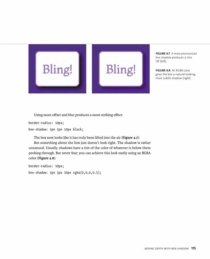
ptg8274462
ADDING DEPTH WITH BOX-SHADOW 115
Using more offset and blur produces a more striking effect:
border-radius: 10px;
box-shadow: 5px 5px 10px black;
The box now looks like it has truly been lifted into the air (Figure 4.7):But something about the box just doesn’t look right. The shadow is rather
unnatural. Usually, shadows have a tint of the color of whatever is below them peeking through. But never fear; you can achieve this look easily using an RGBA color (Figure 4.8):
border-radius: 10px;
box-shadow: 5px 5px 10px rgba(0,0,0,0.5);
FIGURE 4.7 A more pronounced
box shadow produces a nice
lift (left).
FIGURE 4.8 An RGBA color
gives the box a natural-looking,
more subtle shadow (right).
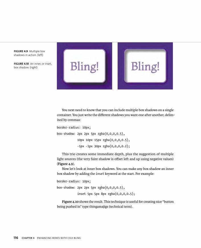
ptg8274462
116 CHAPTER 4 ENHANCING BOXES WITH CSS3 BLING
You next need to know that you can include multiple box shadows on a single container. You just write the different shadows you want one after another, delim-ited by commas:
border-radius: 10px;
box-shadow: 2px 2px 5px rgba(0,0,0,0.5),
10px 10px 15px rgba(0,0,0,0.5),
-1px -1px 30px rgba(0,0,0,0.2);
This trio creates some immediate depth, plus the suggestion of multiple light sources (the very faint shadow is offset left and up using negative values) (Figure 4.9).
Now let’s look at inner box shadows. You can make any box shadow an inner box shadow by adding the inset keyword at the start. For example:
border-radius: 10px;
box-shadow: 2px 2px 5px rgba(0,0,0,0.5),
inset 5px 5px 8px rgba(0,0,0,0.5);
Figure 4.10 shows the result. This technique is useful for creating nice “button being pushed in” type thingamajigs (technical term).
FIGURE 4.9 Multiple box
shadows in action. (left)
FIGURE 4.10 An inner, or inset,
box shadow. (right)

ptg8274462
ADDING DEPTH WITH BOX-SHADOW 117
Finally, let’s look at one more possible unit value you could include: spread. I’m not talking about middle-aged spread or marmalade but the fact that you can add a fourth unit value to specify an amount that the shadow size will increase by in all directions. It’s like “padding” for shadows. For example:
border-radius: 10px;
box-shadow: 5px 5px 10px 10px rgba(0,0,0,0.5);
See the effect in Figure 4.11. I’ve never found a use for adding a spread value, but you probably will.
ADDING BOX SHADOW SUPPORT TO OL’ IE
Adding CSS3PIE into the mix, as you did earlier, also adds box-shadow support for older versions of IE. But remember CSS3PIE’s limited support for RGBA: It is often better to provide an alternative style with a nontransparent color that might be more effective. You could provide this in a conditional-commented stylesheet.
NOTE: Use box shadows responsibly! Used subtly they can produce a great effect
and lift a design. However, if you use them a lot on the same site and on large
containers, they can make the site look cluttered and horrible. They can also
cause a significant performance impact, especially if you combine them with
animations. They are expensive to render in terms of processing power required.
FIGURE 4.11 A box shadow
with a spread value.

ptg8274462
118 CHAPTER 4 ENHANCING BOXES WITH CSS3 BLING
Gradients are one of the most hotly anticipated features to become native to CSS. Gradients are vital for design in general to reproduce the effects of light falling on curved/shiny surfaces and create interesting patterns. The number of developers who use them in web design is staggering, if not unsurprising. What is a surprise is that until CSS3 came along, web developers never had the ability to create gra-dients programmatically in any sane way that would work across browsers. SVG had gradients for a long time before that, but IE never supported SVG until IE9.
All this time you’ve been stuck with either faking SVG in IE using a Polyfill solution like SVGWeb or using repeated background images for those gradients or repeating patterns you desired. This last technique works OK-ish but is an inflex-ible pain and can become cumbersome very quickly, especially if your boss keeps changing his mind about the gradient colors (more playing with Photoshop; oh goody) or if you are trying to create any kind of complicated layered effect.
Again, CSS3 comes to the rescue with linear and radial gradients, which are defined in the CSS Image Values and Replaced Content module (http://dev.w3.org/csswg/css3-images). To see how flexible CSS gradients are, just have a good play with the examples in this section.
Let’s review the two different gradient types separately.
LINEAR GRADIENTS
Linear gradients are the simpler of the two types; these are smooth color progres-sions that start at one side or corner of an area and cycle smoothly between two or more color stops, ending at the other side or corner.
In CSS they work the same. CSS gradients are basically a special kind of back-ground image. You can set them in place of an image in most places that it would make sense to do so; for example, background-image and border-image (see the
“Box Clever: border-image” section later in this chapter for more on border images).
BRING THE BLING WITH CSS GRADIENTS
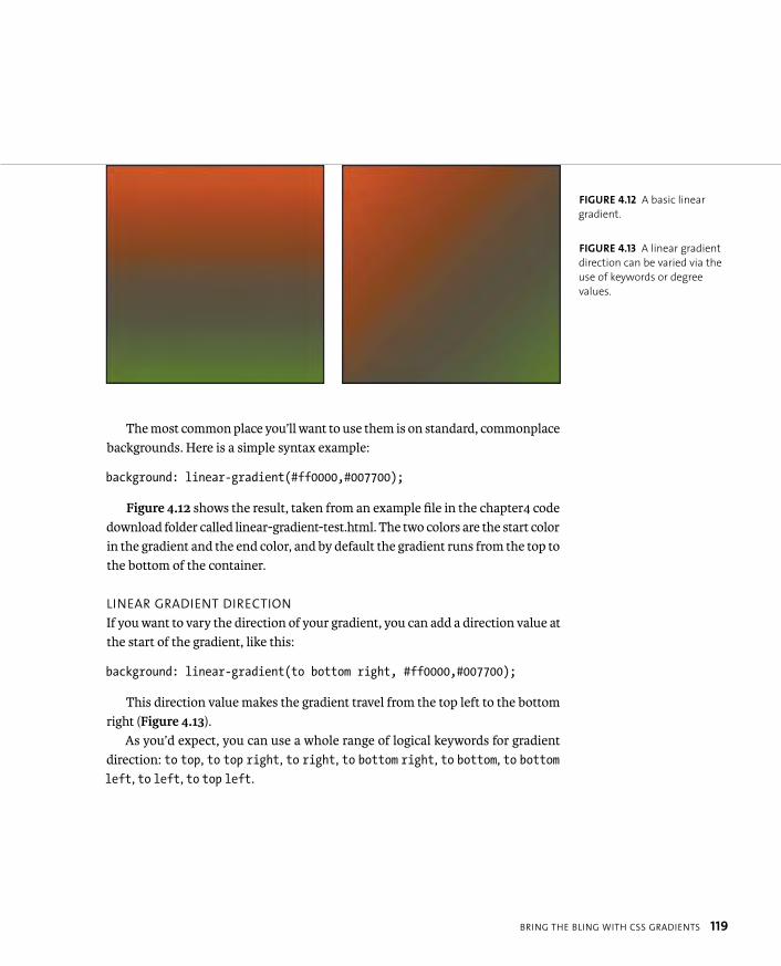
ptg8274462
BRING THE BLING WITH CSS GRADIENTS 119
The most common place you’ll want to use them is on standard, commonplace backgrounds. Here is a simple syntax example:
background: linear-gradient(#ff0000,#007700);
Figure 4.12 shows the result, taken from an example file in the chapter4 code download folder called linear-gradient-test.html. The two colors are the start color in the gradient and the end color, and by default the gradient runs from the top to the bottom of the container.
LINEAR GRADIENT DIRECTION
If you want to vary the direction of your gradient, you can add a direction value at the start of the gradient, like this:
background: linear-gradient(to bottom right, #ff0000,#007700);
This direction value makes the gradient travel from the top left to the bottom right (Figure 4.13).
As you’d expect, you can use a whole range of logical keywords for gradient direction: to top, to top right, to right, to bottom right, to bottom, to bottomleft, to left, to top left.
FIGURE 4.12 A basic linear
gradient.
FIGURE 4.13 A linear gradient
direction can be varied via the
use of keywords or degree
values.
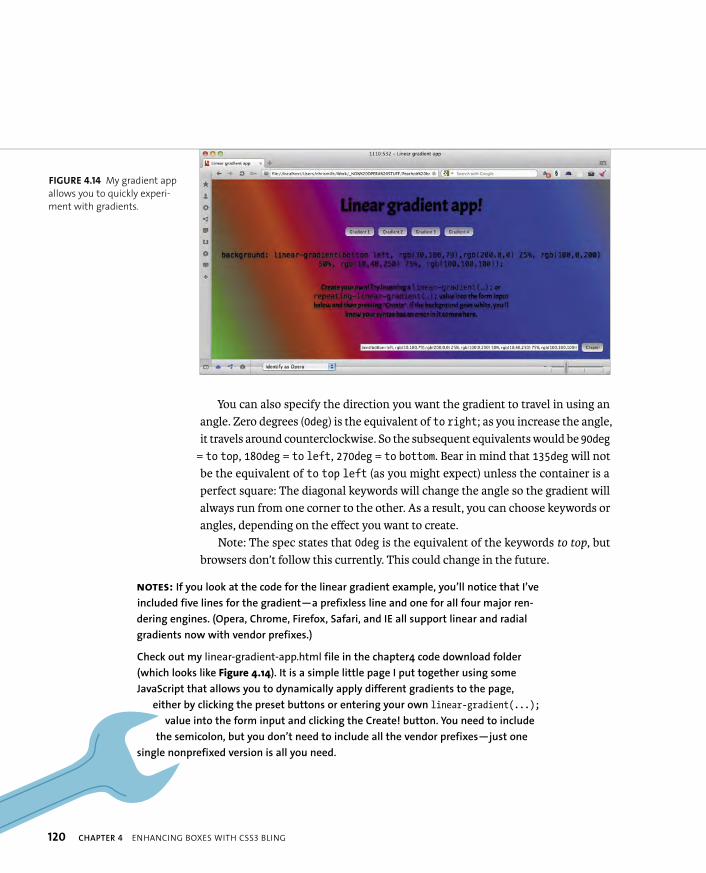
ptg8274462
120 CHAPTER 4 ENHANCING BOXES WITH CSS3 BLING
You can also specify the direction you want the gradient to travel in using an angle. Zero degrees (0deg) is the equivalent of to right; as you increase the angle, it travels around counterclockwise. So the subsequent equivalents would be 90deg
= to top, 180deg = to left, 270deg = to bottom. Bear in mind that 135deg will not be the equivalent of to top left (as you might expect) unless the container is a perfect square: The diagonal keywords will change the angle so the gradient will always run from one corner to the other. As a result, you can choose keywords or angles, depending on the effect you want to create.
Note: The spec states that 0deg is the equivalent of the keywords to top, but browsers don’t follow this currently. This could change in the future.
FIGURE 4.14 My gradient app
allows you to quickly experi-
ment with gradients.
NOTES: If you look at the code for the linear gradient example, you’ll notice that I’ve
included five lines for the gradient—a prefixless line and one for all four major ren-
dering engines. (Opera, Chrome, Firefox, Safari, and IE all support linear and radial
gradients now with vendor prefixes.)
Check out my linear-gradient-app.html file in the chapter4 code download folder
(which looks like Figure 4.14). It is a simple little page I put together using some
JavaScript that allows you to dynamically apply different gradients to the page,
either by clicking the preset buttons or entering your own linear-gradient(...);
value into the form input and clicking the Create! button. You need to include
the semicolon, but you don’t need to include all the vendor prefixes—just one
single nonprefixed version is all you need.
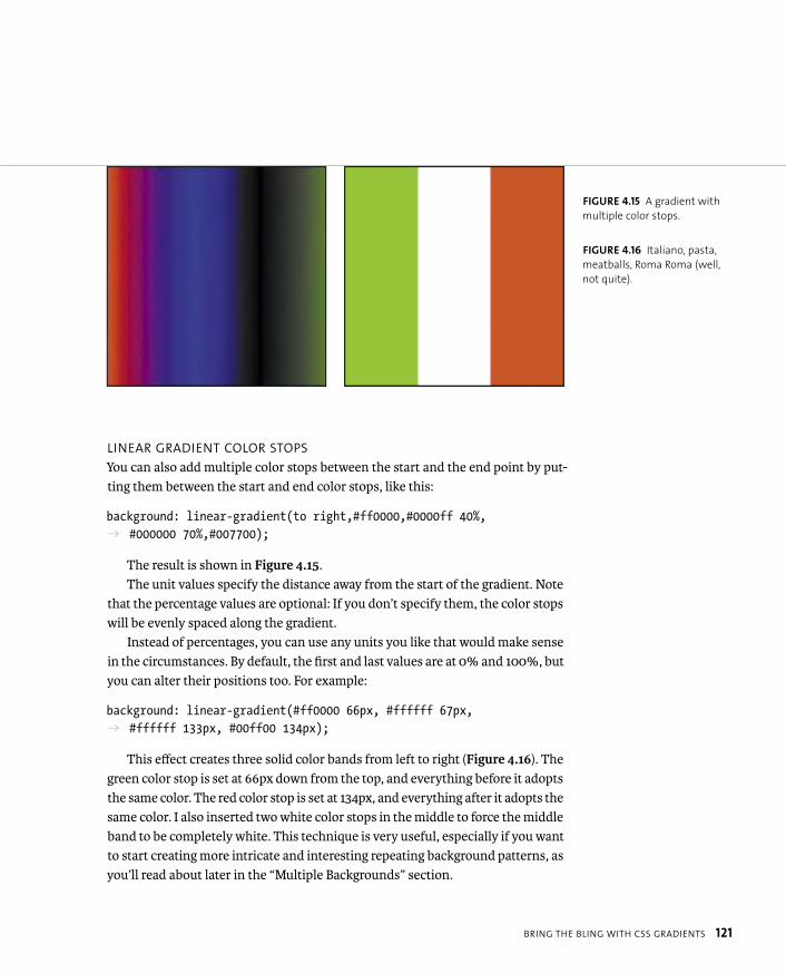
ptg8274462
BRING THE BLING WITH CSS GRADIENTS 121
LINEAR GRADIENT COLOR STOPS
You can also add multiple color stops between the start and the end point by put-ting them between the start and end color stops, like this:
background: linear-gradient(to right,#ff0000,#0000ff 40%,p #000000 70%,#007700);
The result is shown in Figure 4.15.The unit values specify the distance away from the start of the gradient. Note
that the percentage values are optional: If you don’t specify them, the color stops will be evenly spaced along the gradient.
Instead of percentages, you can use any units you like that would make sense in the circumstances. By default, the first and last values are at 0% and 100%, but you can alter their positions too. For example:
background: linear-gradient(#ff0000 66px, #ffffff 67px, p #ffffff 133px, #00ff00 134px);
This effect creates three solid color bands from left to right (Figure 4.16). The green color stop is set at 66px down from the top, and everything before it adopts the same color. The red color stop is set at 134px, and everything after it adopts the same color. I also inserted two white color stops in the middle to force the middle band to be completely white. This technique is very useful, especially if you want to start creating more intricate and interesting repeating background patterns, as you’ll read about later in the “Multiple Backgrounds” section.
FIGURE 4.15 A gradient with
multiple color stops.
FIGURE 4.16 Italiano, pasta,
meatballs, Roma Roma (well,
not quite).

ptg8274462
122 CHAPTER 4 ENHANCING BOXES WITH CSS3 BLING
You can even use negative unit values if for some reason you want the linear gradient to start or end outside the container. (You might want to change the gradi-ent on hover. Unfortunately, you can’t smoothly animate a gradient, at least not at the time of this writing. Believe me, I’ve tried.)
Again, I’ll extol the awesomeness of transparent colors by providing a very simple gradient with a vital difference (Figure 4.17):
background: linear-gradient(to top right, p rgba(0,0,0,0.6),rgba(0,0,0,0));
background-color: #ff0000;
Here the gradient is a transparency gradient overlaid onto a solid background color to create the different gradient colors. This is a very powerful technique because it means you can control the look of an entire site section just by varying the background color. It’s perfect if you want to vary the look of different pages on a site with minimum effort. Try it!
FIGURE 4.17 RGBA colors
provide great control over
gradients while blending them
into their surroundings.
TIP: It’s a good idea to always include a suitable background color in
a separate property alongside your gradient, even if the gradient is not
transparent. It acts as a good fallback mechanism for a browser that doesn’t
support CSS gradients, ensuring that content is still readable.
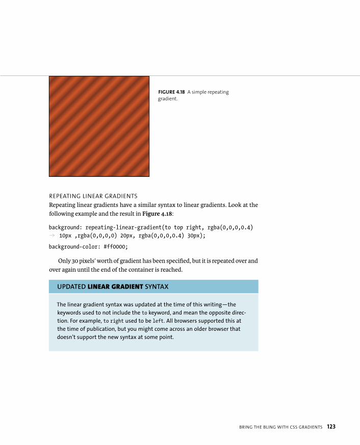
ptg8274462
BRING THE BLING WITH CSS GRADIENTS 123
REPEATING LINEAR GRADIENTS
Repeating linear gradients have a similar syntax to linear gradients. Look at the following example and the result in Figure 4.18:
background: repeating-linear-gradient(to top right, rgba(0,0,0,0.4) p 10px ,rgba(0,0,0,0) 20px, rgba(0,0,0,0.4) 30px);
background-color: #ff0000;
Only 30 pixels’ worth of gradient has been specified, but it is repeated over and over again until the end of the container is reached.
UPDATED LINEAR GRADIENT SYNTAX
The linear gradient syntax was updated at the time of this writing—the
keywords used to not include the to keyword, and mean the opposite direc-
tion. For example, to right used to be left. All browsers supported this at
the time of publication, but you might come across an older browser that
doesn’t support the new syntax at some point.
FIGURE 4.18 A simple repeating
gradient.
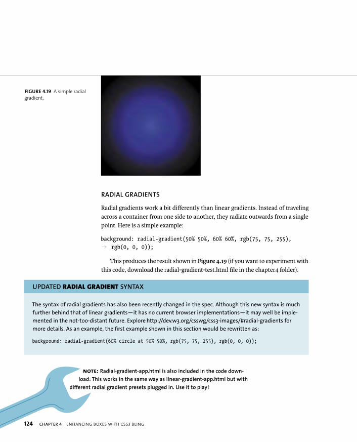
ptg8274462
124 CHAPTER 4 ENHANCING BOXES WITH CSS3 BLING
RADIAL GRADIENTS
Radial gradients work a bit differently than linear gradients. Instead of traveling across a container from one side to another, they radiate outwards from a single point. Here is a simple example:
background: radial-gradient(50% 50%, 60% 60%, rgb(75, 75, 255), p rgb(0, 0, 0));
This produces the result shown in Figure 4.19 (if you want to experiment with this code, download the radial-gradient-test.html file in the chapter4 folder).
UPDATED RADIAL GRADIENT SYNTAX
The syntax of radial gradients has also been recently changed in the spec. Although this new syntax is much
further behind that of linear gradients—it has no current browser implementations—it may well be imple-
mented in the not-too-distant future. Explore http://dev.w3.org/csswg/css3-images/#radial-gradients for
more details. As an example, the first example shown in this section would be rewritten as:
background: radial-gradient(60% circle at 50% 50%, rgb(75, 75, 255), rgb(0, 0, 0));
FIGURE 4.19 A simple radial
gradient.
NOTE: Radial-gradient-app.html is also included in the code down-
load: This works in the same way as linear-gradient-app.html but with
different radial gradient presets plugged in. Use it to play!
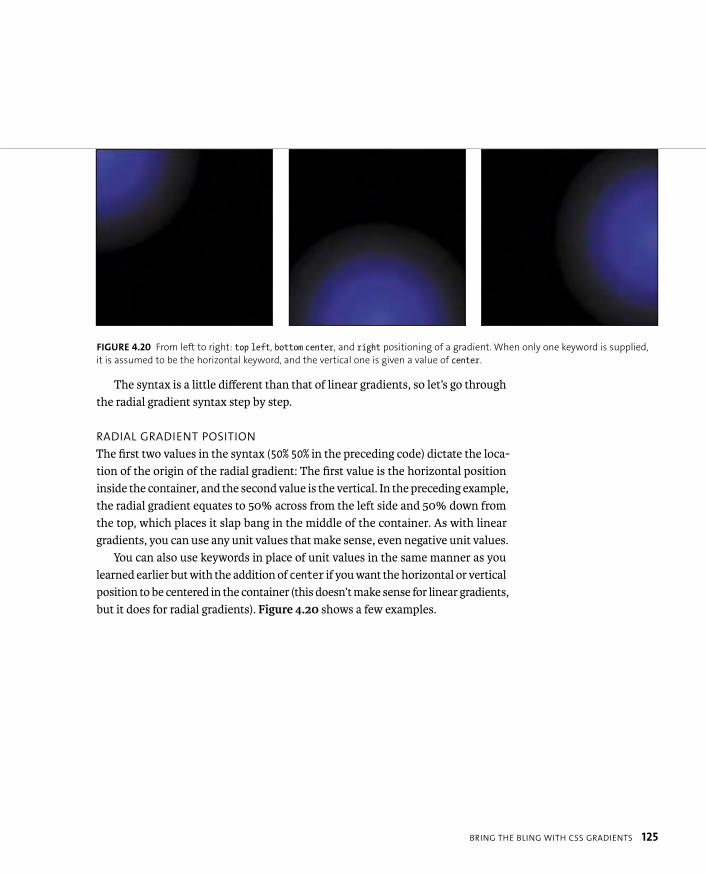
ptg8274462
BRING THE BLING WITH CSS GRADIENTS 125
The syntax is a little different than that of linear gradients, so let’s go through the radial gradient syntax step by step.
RADIAL GRADIENT POSITION
The first two values in the syntax (50% 50% in the preceding code) dictate the loca-tion of the origin of the radial gradient: The first value is the horizontal position inside the container, and the second value is the vertical. In the preceding example, the radial gradient equates to 50% across from the left side and 50% down from the top, which places it slap bang in the middle of the container. As with linear gradients, you can use any unit values that make sense, even negative unit values.
You can also use keywords in place of unit values in the same manner as you learned earlier but with the addition of center if you want the horizontal or vertical position to be centered in the container (this doesn’t make sense for linear gradients, but it does for radial gradients). Figure 4.20 shows a few examples.
FIGURE 4.20 From left to right: top left, bottom center, and right positioning of a gradient. When only one keyword is supplied,
it is assumed to be the horizontal keyword, and the vertical one is given a value of center.
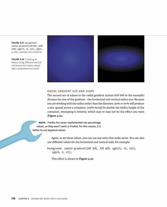
ptg8274462
126 CHAPTER 4 ENHANCING BOXES WITH CSS3 BLING
RADIAL GRADIENT SIZE AND SHAPE
The second set of values in the radial gradient syntax (60% 60% in the example) dictates the size of the gradient—the horizontal and vertical radius size. Because you are working with the radius rather than the diameter, 50% or 60% will produce a nice spread across a container. 100% would be double the width/height of the container, swamping it entirely, which may or may not be the effect you want (Figure 4.21).
Again, to set these values, you can use any units that make sense. You can also use different values for the horizontal and vertical radii, for example:
background: radial-gradient(50% 50%, 70% 40%, rgb(75, 75, 255), p rgb(0, 0, 0));
This effect is shown in Figure 4.22.
FIGURE 4.21 background:radial-gradient(50% 50%, 100%100%, rgb(75, 75, 255), rgb(0,0, 0)); swamps the container.
FIGURE 4.22 Creating an
ellipse using different vertical
and horizontal radius values.
Neo’s amphetamine lunch?
NOTE: Firefox has never implemented size percentage
values, so they won’t work in Firefox. For this reason, it is
better to use keyword values.
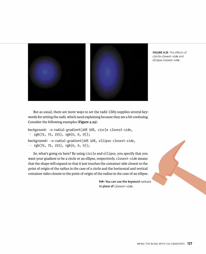
ptg8274462
BRING THE BLING WITH CSS GRADIENTS 127
But as usual, there are more ways to set the radii: CSS3 supplies several key-words for setting the radii, which need explaining because they are a bit confusing. Consider the following examples (Figure 4.23):
background: -o-radial-gradient(30% 50%, circle closest-side, p rgb(75, 75, 255), rgb(0, 0, 0));
background: -o-radial-gradient(30% 50%, ellipse closest-side, p rgb(75, 75, 255), rgb(0, 0, 0));
So, what’s going on here? By using circle and ellipse, you specify that you want your gradient to be a circle or an ellipse, respectively. closest-side means that the shape will expand so that it just touches the container side closest to the point of origin of the radius in the case of a circle and the horizontal and vertical container sides closest to the point of origin of the radius in the case of an ellipse.
FIGURE 4.23 The effects of
circle closest-side and
ellipse closest-side.
TIP: You can use the keyword contain
in place of closest-side.

ptg8274462
128 CHAPTER 4 ENHANCING BOXES WITH CSS3 BLING
Other keyword combinations available to you include:
� closest-corner positions the gradient so that its edge just touches the corner of the element closest to the origin (Figure 4.24).
� farthest-side positions the gradient so that its edge touches the side of the element farthest from its centre in the case of a circle or the farthest horizontal and vertical sides in the case of an ellipse (Figure 4.25).
� farthest-corner positions the gradient so that its edge just touches the corner of the element farthest from the origin. You can use the keyword cover in place of farthest-corner (Figure 4.26).
FIGURE 4.24 The effects of
circle closest-corner and
ellipse closest-corner.
FIGURE 4.25 The effects of
circle farthest-side and
ellipse farthest-side.

ptg8274462
BRING THE BLING WITH CSS GRADIENTS 129
I’ve not used these implicit shape values very much, preferring instead to control the shape using explicit unit values. But this doesn’t mean you won’t.
RADIAL GRADIENT COLOR STOPS
Color stops work in the same way as the color stops in linear gradients except that the units you specify denote distance from the center of the gradient, not distance from the starting corner/edge.
I encourage you to experiment with different color values with the examples I’ve provided and otherwise. Try creating a sun’s rays or a shadow or flashlight moving across the top of your site. Again, use RGBA colors for the win! You’ll see more exciting examples throughout the book.
FIGURE 4.26 The effects of
circle farthest-corner and
ellipse farthest-corner.
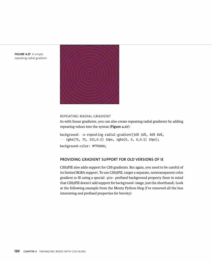
ptg8274462
130 CHAPTER 4 ENHANCING BOXES WITH CSS3 BLING
REPEATING-RADIAL-GRADIENT
As with linear gradients, you can also create repeating radial gradients by adding repeating values into the syntax (Figure 4.27):
background: -o-repeating-radial-gradient(50% 50%, 60% 60%, p rgba(75, 75, 255,0.5) 10px, rgba(0, 0, 0,0.5) 20px);
background-color: #ff0000;
PROVIDING GRADIENT SUPPORT FOR OLD VERSIONS OF IE
CSS3PIE also adds support for CSS gradients. But again, you need to be careful of its limited RGBA support. To use CSS3PIE, target a separate, nontransparent color gradient to IE using a special -pie- prefixed background property (bear in mind that CSS3PIE doesn’t add support for background-image, just the shorthand). Look at the following example from the Monty Python blog (I’ve removed all the less interesting and prefixed properties for brevity):
FIGURE 4.27 A simple
repeating radial gradient.
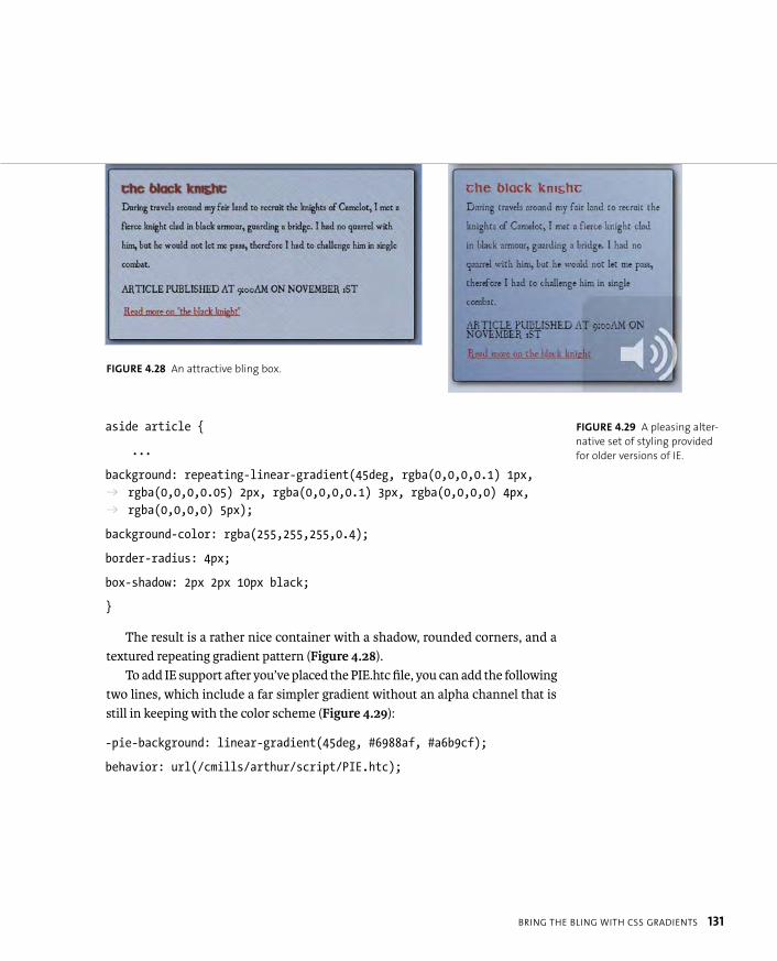
ptg8274462
BRING THE BLING WITH CSS GRADIENTS 131
aside article {
...
background: repeating-linear-gradient(45deg, rgba(0,0,0,0.1) 1px, p rgba(0,0,0,0.05) 2px, rgba(0,0,0,0.1) 3px, rgba(0,0,0,0) 4px, p rgba(0,0,0,0) 5px);
background-color: rgba(255,255,255,0.4);
border-radius: 4px;
box-shadow: 2px 2px 10px black;
}
The result is a rather nice container with a shadow, rounded corners, and a textured repeating gradient pattern (Figure 4.28).
To add IE support after you’ve placed the PIE.htc file, you can add the following two lines, which include a far simpler gradient without an alpha channel that is still in keeping with the color scheme (Figure 4.29):
-pie-background: linear-gradient(45deg, #6988af, #a6b9cf);
behavior: url(/cmills/arthur/script/PIE.htc);
FIGURE 4.29 A pleasing alter-
native set of styling provided
for older versions of IE.
FIGURE 4.28 An attractive bling box.
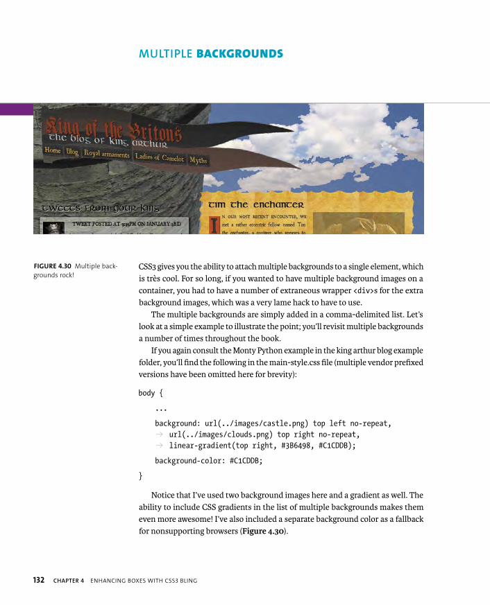
ptg8274462
132 CHAPTER 4 ENHANCING BOXES WITH CSS3 BLING
CSS3 gives you the ability to attach multiple backgrounds to a single element, which is très cool. For so long, if you wanted to have multiple background images on a container, you had to have a number of extraneous wrapper <div>s for the extra background images, which was a very lame hack to have to use.
The multiple backgrounds are simply added in a comma-delimited list. Let’s look at a simple example to illustrate the point; you’ll revisit multiple backgrounds a number of times throughout the book.
If you again consult the Monty Python example in the king arthur blog example folder, you’ll find the following in the main-style.css file (multiple vendor prefixed versions have been omitted here for brevity):
body {
...
background: url(../images/castle.png) top left no-repeat, p url(../images/clouds.png) top right no-repeat, p linear-gradient(top right, #3B6498, #C1CDDB);
background-color: #C1CDDB;
}
Notice that I’ve used two background images here and a gradient as well. The ability to include CSS gradients in the list of multiple backgrounds makes them even more awesome! I’ve also included a separate background color as a fallback for nonsupporting browsers (Figure 4.30).
FIGURE 4.30 Multiple back-
grounds rock!
MULTIPLE BACKGROUNDS
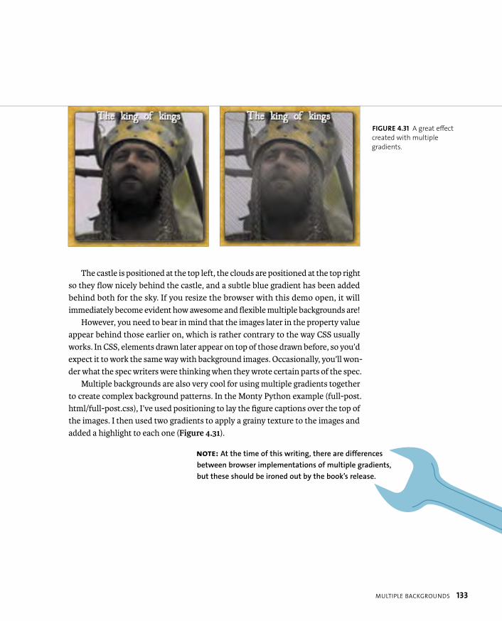
ptg8274462
MULTIPLE BACKGROUNDS 133
The castle is positioned at the top left, the clouds are positioned at the top right so they flow nicely behind the castle, and a subtle blue gradient has been added behind both for the sky. If you resize the browser with this demo open, it will immediately become evident how awesome and flexible multiple backgrounds are!
However, you need to bear in mind that the images later in the property value appear behind those earlier on, which is rather contrary to the way CSS usually works. In CSS, elements drawn later appear on top of those drawn before, so you’d expect it to work the same way with background images. Occasionally, you’ll won-der what the spec writers were thinking when they wrote certain parts of the spec.
Multiple backgrounds are also very cool for using multiple gradients together to create complex background patterns. In the Monty Python example (full-post.html/full-post.css), I’ve used positioning to lay the figure captions over the top of the images. I then used two gradients to apply a grainy texture to the images and added a highlight to each one (Figure 4.31).
NOTE: At the time of this writing, there are differences
between browser implementations of multiple gradients,
but these should be ironed out by the book’s release.
FIGURE 4.31 A great effect
created with multiple
gradients.

ptg8274462
134 CHAPTER 4 ENHANCING BOXES WITH CSS3 BLING
Another interesting effect to explore is combining a gradient effect with background-size to force it to repeat as a single, small, square unit (rather than along the gradient, as is the case with normal repeating gradients). You’ll see this in action again later on in the book, too. Consider this example:
background: radial-gradient(transparent 10px, #A60000 11px, p #A60000 12px),
repeating-linear-gradient(transparent, transparent 20px, p rgba(255,0,0,1) 21px, rgba(255,0,0,1) 21px) 0 -10px,
repeating-linear-gradient(left, transparent, rgba(255,0,0,1) 19px, p transparent 21px) 12px 0;
background-size: 21px 21px, 100%;
The effect is shown in Figure 4.32. This example is in the file gradient-background-size.html.
FIGURE 4.32 A rather
interesting pattern created
with multiple gradients and
background-size.
ptg8274462
MULTIPLE BACKGROUNDS 135
The radial gradient creates a simple, small, transparent circle with red on the outside. The background-size property was used to force this circle into a 22-pixel square, which then repeats. A couple of simple line patterns are then placed over the top and spaced so they perfectly bisect the circles, horizontally and vertically. This is a rather complex bit of code to write for a simple repeating pattern, but it does show what is possible. You can find more aesthetically pleasing examples at Lea Verou’s fantastic CSS3 patterns gallery at http://lea.verou.me/css3patterns.
MULTIPLE BACKGROUNDS IN IE?
Unfortunately, CSS3PIE’s supremacy collapses when you consider multiple back-ground support in past versions of IE. There isn’t a decent way to add support for multiple backgrounds to older IE versions without resorting to those nasty old nested <div>s. And you don’t want to go down that road!
So, the only way around this limitation is to provide alternative styling, either via a conditional comment or via Modernizr, which you’ll explore in Chapter 5.
TIP: Providing multiple background image fallbacks is difficult
if you need the flexibility the multiple backgrounds provide in a
liquid layout, as in the Monty Python example. To make IE fallback styling
easier to work out, it’s best to make the layout fixed in IE by serving a style
in your IE-targeted CSS, such as: body { width: 1024px; }.
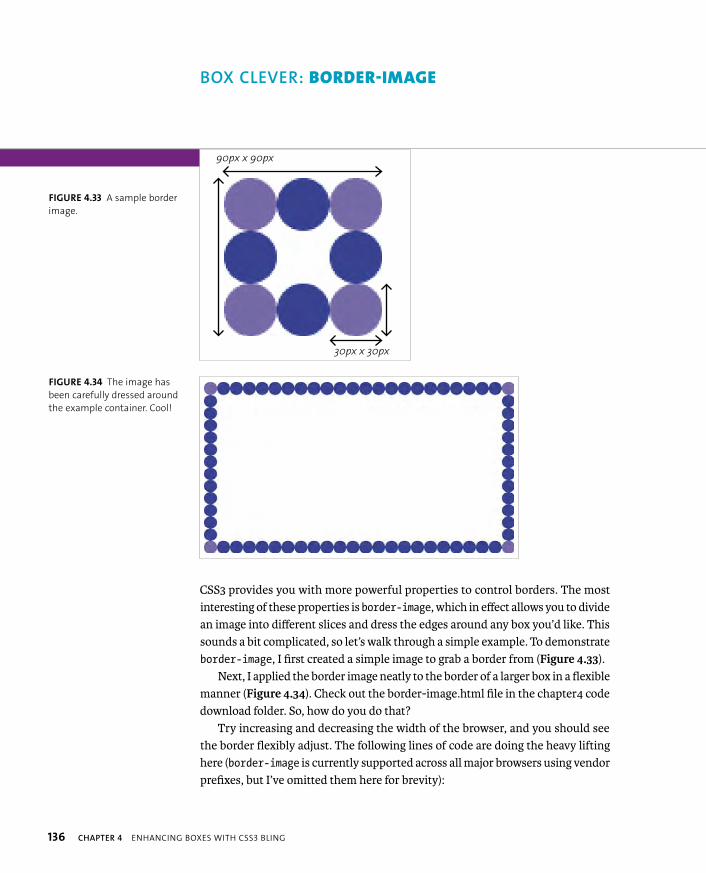
ptg8274462
136 CHAPTER 4 ENHANCING BOXES WITH CSS3 BLING
CSS3 provides you with more powerful properties to control borders. The most interesting of these properties is border-image, which in effect allows you to divide an image into different slices and dress the edges around any box you’d like. This sounds a bit complicated, so let’s walk through a simple example. To demonstrate border-image, I first created a simple image to grab a border from (Figure 4.33).
Next, I applied the border image neatly to the border of a larger box in a flexible manner (Figure 4.34). Check out the border-image.html file in the chapter4 code download folder. So, how do you do that?
Try increasing and decreasing the width of the browser, and you should see the border flexibly adjust. The following lines of code are doing the heavy lifting here (border-image is currently supported across all major browsers using vendor prefixes, but I’ve omitted them here for brevity):
BOX CLEVER: BORDER-IMAGE
90px x 90px
30px x 30px
FIGURE 4.33 A sample border
image.
FIGURE 4.34 The image has
been carefully dressed around
the example container. Cool!
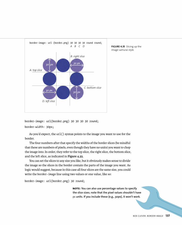
ptg8274462
BOX CLEVER: BORDER-IMAGE 137
border-image: url(border.png) 30 30 30 30 round;
border-width: 30px;
As you’d expect, the url() syntax points to the image you want to use for the border.
The four numbers after that specify the widths of the border slices (be mindful that these are numbers of pixels, even though they have no units) you want to chop the image into. In order, they refer to the top slice, the right slice, the bottom slice, and the left slice, as indicated in Figure 4.35.
You can set the slices to any size you like, but it obviously makes sense to divide the image so the slices in the border contain the parts of the image you want. As logic would suggest, because in this case all four slices are the same size, you could write the border-image line using two values or one value, like so:
border-image: url(border.png) 30 round;
NOTE: You can also use percentage values to specify
the slice sizes; note that the pixel values shouldn’t have
px units. If you include these (e.g., 30px), it won’t work.
FIGURE 4.35 Slicing up the
image samurai style.
border-image: url (border.png) 30 30 30 30 round round;
30 px
30 px
30 px
30 px
A B C D
A: top slice
B: right slice
C: bottom slice
D: left slice

ptg8274462
138 CHAPTER 4 ENHANCING BOXES WITH CSS3 BLING
After slicing the image, it is applied to the borders of your container: The four corners remain the same. The four sides all tile in one dimension to fill up the borders, however long they are (although see the end of this section for browser differences). The center of the image tiles in both directions to fill up the remain-ing background space.
How do you control the manner in which the tiling of the sides is handled? You use the round keyword. round specifies that the browser should always show a whole number of repeated border segments and no incomplete fragments, adjust-ing the size of each segment to maintain the desired result. If you try increasing or decreasing the browser window width in Opera, Firefox, and IE, you’ll see that the size of the balls adjust slightly. Unfortunately, WebKit-based browsers treat roundthe same as repeat, another value that just tiles the side slices until they fill up each side without rounding. You are therefore left with fragments at each end of the sides, which don’t look great (Figure 4.36).
Fragments might look OK as long as you plan the shape of your slices carefully and make sure they don’t differ much in height along their course. Another value to be aware of is stretch, which is the default. If you swap round for stretch in this example or omit it altogether, you’ll get the result shown in Figure 4.37.
Again, note that I’ve specified one value here for the repeating behavior of all four sides. If you want to specify different behavior for different sides, you could use two or four sides as logic would suggest; for example, round stretch or roundstretch round stretch.
FIGURE 4.36 border-imagefragments look shoddy.
FIGURE 4.37 stretch is OK for
very small variations in con-
tainer size but looks terrible if
your containers greatly differ
in size from the original image.

ptg8274462
BOX CLEVER: BORDER-IMAGE 139
And there’s one more detail you should know about the basic syntax. To actually provide space for your border image, you need to specify a border width, which is why border-width: 30px; was included in the code example. If you don’t do this, you won’t see anything. The border-width property offers additional interesting possibilities: If you make the border width bigger or smaller than the slices within the border-image property, the slice size will scale up or down to suit. So, if you make the border half as big, like so:
border-width: 15px;
the border image slices will be displayed in half dimensions, as shown in Figure 4.38!
BORDER-IMAGE PROBLEMS
Using border-image is not all plain sailing, of course, as with most things in web design. Aside from the fact that WebKit-based browsers currently don’t use the round value properly, there are a couple of other issues to keep in mind.
First, you need to determine if you want your central slice to be discarded or not. You might want the central slice to act as the background for your con-tainer content, or you might just want to put the border image only in the border. Unfortunately, the default behavior according to the spec is to discard it, but most browsers do the opposite, except for Chrome (try comparing border-image-2.html in Chrome and Opera). You are supposed to be able to control this behavior with border-image-slice, but this property is currently not supported in any browser,
FIGURE 4.38 Border images at
half the size—very funkalistic.
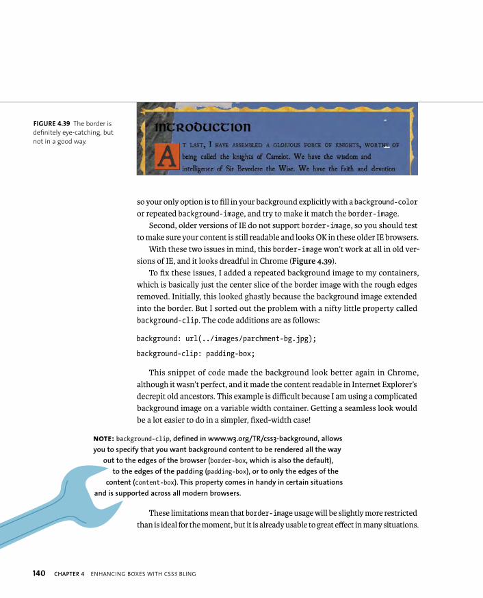
ptg8274462
140 CHAPTER 4 ENHANCING BOXES WITH CSS3 BLING
so your only option is to fill in your background explicitly with a background-coloror repeated background-image, and try to make it match the border-image.
Second, older versions of IE do not support border-image, so you should test to make sure your content is still readable and looks OK in these older IE browsers.
With these two issues in mind, this border-image won’t work at all in old ver-sions of IE, and it looks dreadful in Chrome (Figure 4.39).
To fix these issues, I added a repeated background image to my containers, which is basically just the center slice of the border image with the rough edges removed. Initially, this looked ghastly because the background image extended into the border. But I sorted out the problem with a nifty little property called background-clip. The code additions are as follows:
background: url(../images/parchment-bg.jpg);
background-clip: padding-box;
This snippet of code made the background look better again in Chrome, although it wasn’t perfect, and it made the content readable in Internet Explorer’s decrepit old ancestors. This example is difficult because I am using a complicated background image on a variable width container. Getting a seamless look would be a lot easier to do in a simpler, fixed-width case!
These limitations mean that border-image usage will be slightly more restricted than is ideal for the moment, but it is already usable to great effect in many situations.
NOTE: background-clip, defined in www.w3.org/TR/css3-background, allows
you to specify that you want background content to be rendered all the way
out to the edges of the browser (border-box, which is also the default),
to the edges of the padding (padding-box), or to only the edges of the
content (content-box). This property comes in handy in certain situations
and is supported across all modern browsers.
FIGURE 4.39 The border is
definitely eye-catching, but
not in a good way.
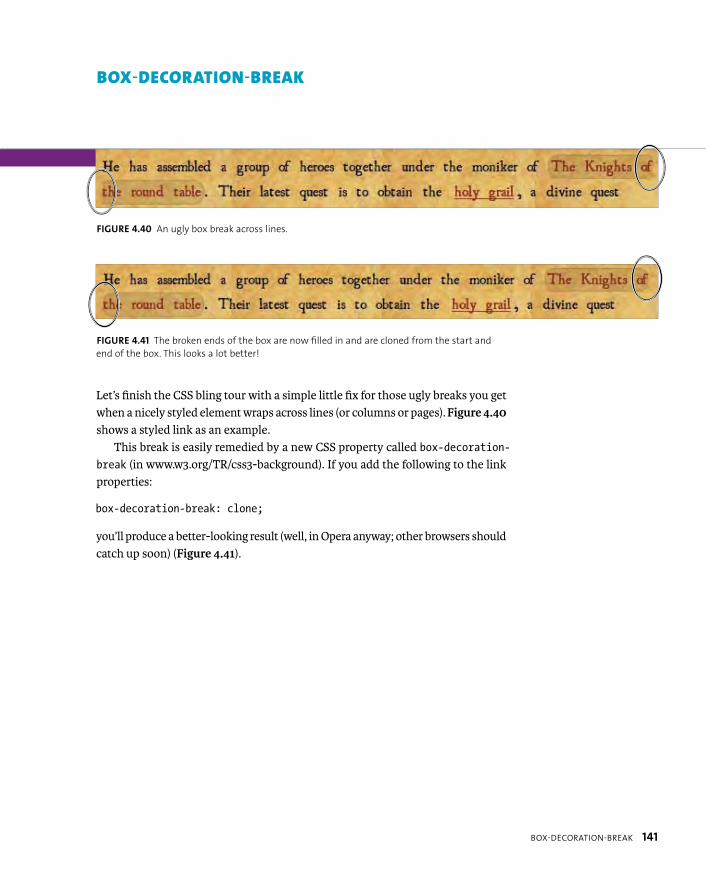
ptg8274462
BOX-DECORATION-BREAK 141
Let’s finish the CSS bling tour with a simple little fix for those ugly breaks you get when a nicely styled element wraps across lines (or columns or pages). Figure 4.40shows a styled link as an example.
This break is easily remedied by a new CSS property called box-decoration-break (in www.w3.org/TR/css3-background). If you add the following to the link properties:
box-decoration-break: clone;
you’ll produce a better-looking result (well, in Opera anyway; other browsers should catch up soon) (Figure 4.41).
BOX-DECORATION-BREAK
FIGURE 4.40 An ugly box break across lines.
FIGURE 4.41 The broken ends of the box are now filled in and are cloned from the start and
end of the box. This looks a lot better!

ptg8274462
142 CHAPTER 4 ENHANCING BOXES WITH CSS3 BLING
To round off the chapter, let’s build an ad example using some of the cool proper-ties you learned about earlier. You’ll make it look good, albeit different across older browsers, and make it sing with a minimum of images (and a video). Later in the book you’ll explore how to make the ad responsive and add some cool animated effects.
The ad will be for a fictional metal band called Dead Hamster. The band is making a comeback, and its management wants to move forward with an online advertising campaign that is going get the band noticed! And what better way to get people to notice than by using thrills, spills, moving pictures, and raw exciting content? OK, so they don’t have Bieber or Jedward, but they would only serve to draw the wrong kind of attention.
To make a big splash, the ad will work on mobile devices, so the poster needs to work at different sizes and on different devices. And the band also has a huge following in developing countries due to their freedom anthems. Therefore, the ad needs to work across less-capable browsers.
Let’s rock!
BASIC SETUP
The basic idea is to create a set ad size: the Internet Advertising Bureau (IAB) has semistandardized sizes for web ads, as you’ll see at http://en.wikipedia.org/wiki/Web_banner. Let’s start off this example by creating a 730 x 300 pixel “pop-under ad.”
But let’s take it even further and make an eye-catching ad to show that many of the tasks you used to do with Flash are now possible using only CSS3. In this chapter you’ll just build up the basic ad. (Animation will come in Chapter 5, and responsiveness in Chapter 8.) You’ll also learn how to provide a reasonable alter-native in older browsers and what improvements you can and should make if you were to do something similar in a production environment.
NOTE: I got the idea for creating a responsive advertising example
from Mark Boulton’s rather interesting “Responsive advertising” article
at www.markboulton.co.uk/journal/comments/responsive-advertising.
ADDING BLING TO A BANNER AD

ptg8274462
ADDING BLING TO A BANNER AD 143
The background of the entire advertisement is a short looping video clip that shows off the energy of the band. Over the top of this the most important informa-tion is displayed, and on hover/focus another pane of information is shown contain-ing more info. The final product as it stands at this point is shown in Figure 4.42.
The basic markup structure is as follows:
<section id=”ad”>
<video></video>
<div id=”video-frame”></div>
<div id=”frame1”></div>
<div id=”frame2”></div>
</section>
One section contains the entire ad and includes a <video> element to render the rocking Dead Hamster footage, a <div> to apply an effect over the top of the video (more on this shortly), and then a couple more <div>s to contain the two panes of information.
FIGURE 4.42 The rocking
heavy metal ad.
NOTE: JavaScript has been used to mute video: I fire the JavaScript on the
onloadedmetadata event to make sure mute is fired before the content starts
playing; otherwise, a clip of sound might be heard before the mute kicks in.
ptg8274462
144 CHAPTER 4 ENHANCING BOXES WITH CSS3 BLING
Most of the content is absolutely positioned so the layers stack on top of one another, and most of the containers are set to 720 x 300 px, the same dimensions as the outer container, to keep everything inside the ad working well. Most of the code should be pretty simple to understand for anyone with previous CSS experi-ence, so I’ll just explain the CSS3 code. You can find my code in the poster folder in the code download.
ADDING THE CSS3 SPARKLE
Let’s walk through the different layers of this example in turn so it’ll make more sense. You first have the video, and the video-frame div is positioned on top of it. This “superfluous” div is annoying to have to include, but it is necessary at the moment because currently border-image doesn’t work correctly across all brows-ers. Recall that in all browsers except Chrome the middle slice is wrongly included, and you can’t get rid of it. If you could, then you could add the ripped edges using border-image,but at present you can’t. So instead you’ll add the ripped edges on this div using multiple background images:
#video-frame {
width: 720px;
height: 300px;
background: url(left-edge.png) top left repeat-y, p url(right-edge.png) top right repeat-y;
}
This is a rather useful technique in many ways: Imagine if you had lots of ele-ments, such as headers or articles, and you wanted them to have a background image at either end and have a flexible width and height. This code is all you’d need.
Next, you’ll set a uniform black text shadow on all text, apart from the interest-ing flaming effect I’ve put on the word “hell”: This is suitable for increasing the latent cheese factor to be appropriate for the average heavy metal band. This can be done like so—add this now to your text:
ptg8274462
ADDING BLING TO A BANNER AD 145
#ad #hell {
font-size: 150%;
text-shadow: 0 0 4px white,
0 -5px 4px #FFFF33,
2px -10px 6px #FFDD33,
-2px -15px 11px #FF8800,
2px -25px 18px #FF2200;
}
Also, you’ll include a repeating radial gradient using various transparent blacks for a bit of background texture, plus a background color to provide a faint blue tint:
#ad #frame1 {
background-image: repeating-radial-gradient(top left,
rgba(0,0,0,0) 9px,
rgba(0,0,0,0.05) 10px,
rgba(0,0,0,0.05) 15px,
rgba(0,0,0,0.1) 16px,
rgba(0,0,0,0.1) 20px);
background-color: rgba(16,8,115,0.2);
}
And finally, you’ll use cool, very metal web fonts! These all result in a great set of components that blend well into one another.
SUPPORTING OLDER BROWSERS
To support older browsers, instead of using clever Polyfilling of content, you’ll include a simple image fallback for non-<video> supporting browsers:
<img src=”poster.jpg” alt=””>

ptg8274462
146 CHAPTER 4 ENHANCING BOXES WITH CSS3 BLING
You’ll do this because Flash content tends to dominate the area of the page it is put on, so rollovers on top of the video content won’t work on a Flash fallback.
In the end, let’s opt for the coward’s option of not displaying the hover effect in the second frame because IE6, 7, and 8 tend to prove troublesome when you are trying to get hover effects to work on positioned content. You’ll use text-indentto push the text far off the screen, so it will still be available to screen readers.
In addition, you’ll include some quick box model and positioning fixes for IE6 and 7. The box shadows, text shadows, gradients, and RGBA colors all degrade well.
ADDING AD IMPROVEMENTS
I think you’ve created a fairly effective basic ad in this example. The ad is all con-tained within a single container, so it is fairly easy to transplant in whichever page you want it in, and then position it where you want it.
But why not just create the ad in Flash? It would potentially be simpler to deal with, but the point is that you are trying to create components with open standards, which includes all the advantages they bring to the project, plus the text would not be accessible if you put it in a Flash video. The advantages open standards have over Flash in this context will be even more obvious when you start to add animated effects in Chapter 5.
Of course, before you really use this ad, you might want to make a few improvements:
� Optimize video files. The video files as they stand are a fairly heavy addition to a page, so you should optimize them.
� Pare down fonts. The fonts are also quite heavy. In a real production envi-ronment, you could use Fontforge (as mentioned in Chapter 3) to reduce the size of the font files and just include the glyphs you need.
� Add a link. You should also wrap the final version in a link (HTML5 allows block-level linking) to click through to wherever you want the ad to lead to.
ptg8274462
WRAPPING UP 147
Hopefully, you’ve come away from this chapter with an understanding of the great new tools CSS3 offers for making your visuals less image-dependent and therefore more flexible and lightweight. Although having the ability to programmatically cre-ate web graphics does make web design a lot easier for non-Photoshop ninjas (like me), I hope you’re committed to using those features in a responsible way rather than just spamming all the relevant properties onto every container on your site!
And, you also now know how to get these CSS3 features working in a reasonable manner across older, less-capable browsers.
WRAPPING UP

ptg8274462
5
ANIMATED EFFECTS USING CSS3

ptg8274462
149
Traditionally, the web was a very static
place. Achieving animations was not
possible in any sane way until JavaScript, animated GIFs,
and Flash came along, at which point everyone rejoiced and
applauded the ensuing slew of skip intros and horrible obtrusive
animations that crashed onto the web.
Using these newer technologies was all well and good, but there
was still no way for nondevelopers to create animations using open
standards—until now! With CSS3, you can animate elements of
your web documents. As a result, standards-based web design has
become even more fun!
In this chapter you’ll learn how to create useful animated effects
for your web pages using CSS3 Animations, Transforms, and
Transitions.
ptg8274462
150 CHAPTER 5 ANIMATED EFFECTS USING CSS3
BRINGING ANIMATION TO CSS
Combined, the following four specs provide you with several possibilities for creat-ing more responsive interfaces, animated effects, and presentational enhancements, which previously were only available through JavaScript:
� CSS Transforms (www.w3.org/TR/css3-2d-transforms and www.w3.org/TR/css3-3d-transforms). These two specifications define mechanisms for transforming the size, position, and shape of elements in two and three dimensions, and are in the process of being superseded by a single updated spec; see http://dev.w3.org/csswg/css3-transforms.
� CSS Transitions (www.w3.org/TR/css3-transitions). Transitions give you a way to smoothly animate changes in state, such as a change in link color. Transitioning changes in Transform properties is also very effective in many circumstances.
� CSS Animations (www.w3.org/TR/css3-animations). CSS Animations are similar to Transitions but don’t rely on state changes. Instead, you define dif-ferent property values inside @keyframes blocks that relate to different stages of an animation (e.g., color: red at the start of the animation; color: blueat the end of it). You then apply these animations to any element you want; the browser then applies the starting property values to the element and smoothly cycles them through to the end property values (so color: red at the beginning smoothly animates to color: blue at the end).
Support for all four specs is good across modern browsers. In any case, for non-supporting browsers it is simple to provide alternative styling using the Modernizr library, which you’ll learn about in detail later in the “Providing Alternatives with Modernizr” section.
So let’s explore these interesting new features. You should experiment and have fun with these features but also use them responsibly. You don’t want every new website to turn into a crazy animated nightmare!
NOTE: The appearance of animations/transitions inside CSS has led a number of web developers
to complain about CSS-based animations breaking the “separation of structure, presenta-
tion, and behavior layers” best practice. And they are technically right. However, you can
spout all the religious arguments you want about animation belonging in the behavior layer
rather than the presentation layer, but animation definitely falls in the realm of design.
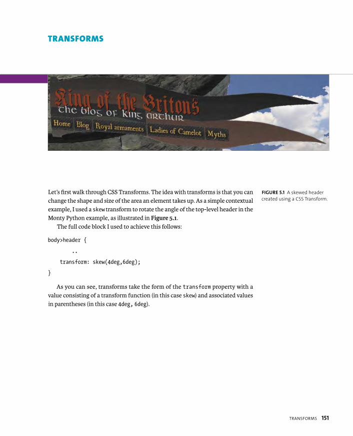
ptg8274462
TRANSFORMS 151
Let’s first walk through CSS Transforms. The idea with transforms is that you can change the shape and size of the area an element takes up. As a simple contextual example, I used a skew transform to rotate the angle of the top-level header in the Monty Python example, as illustrated in Figure 5.1.
The full code block I used to achieve this follows:
body>header {
..
transform: skew(4deg,6deg);
}
As you can see, transforms take the form of the transform property with a value consisting of a transform function (in this case skew) and associated values in parentheses (in this case 4deg, 6deg).
FIGURE 5.1 A skewed header
created using a CSS Transform.
TRANSFORMS

ptg8274462
152 CHAPTER 5 ANIMATED EFFECTS USING CSS3
The two specs define two- and three-dimensional transforms. I’ll cover the features they offer in two separate sections and will be brief, because transforms are a lot more interesting when combined with animations and other effects. Browser support for transforms is summarized in Table 5.1. I’ve not broken them down into detailed references because generally this data works for all properties associated with the 2D and 3D varieties of transforms.
TABLE 5.1 Browser Support for Transforms
BROWSER 2D TRANSFORMS 3D TRANSFORMS
Opera 10.6 with -o- No
Firefox 3.5 with -moz- 10 with -moz-
Safari 3.1 with -webkit- 4 with -webkit-
Chrome 4 with -webkit- 12 with -webkit-
Internet Explorer 9 with -ms- 10 with -ms-
iOS 3.2 with -webkit- 3.2 with -webkit-
Android 2.1 with -webkit- 3 with -webkit-
Mobile Chrome Since beta with -webkit- Since beta with -webkit-
Opera Mobile 11 with -o- No
Opera Mini No No
Note that in IE10 platform preview 6, support for non-prefixed transform properties has
been added.
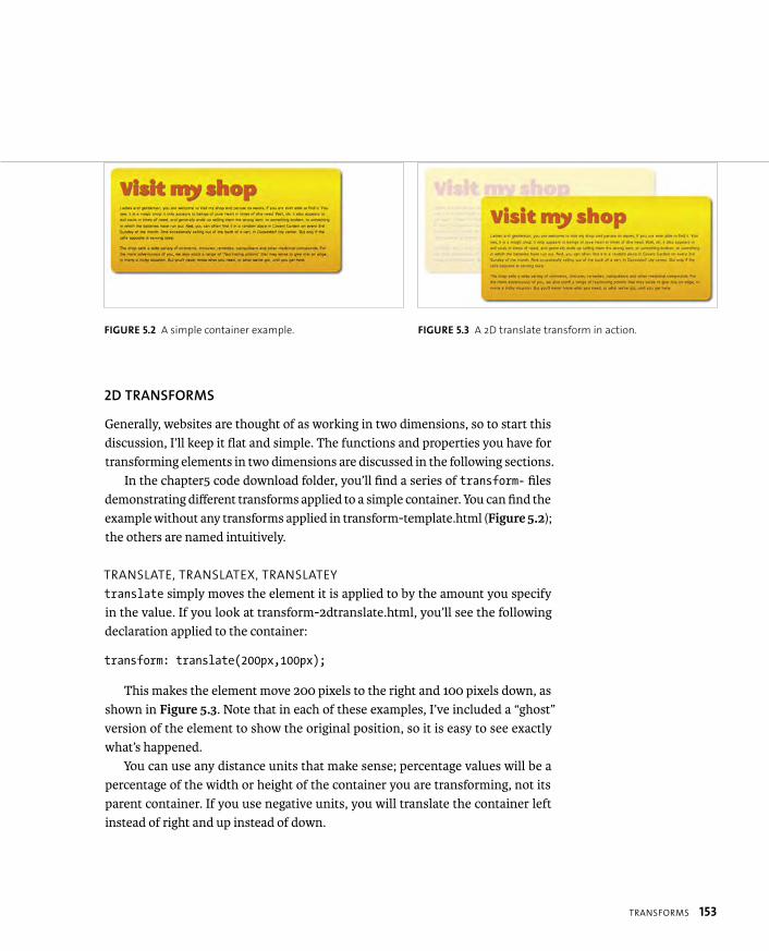
ptg8274462
TRANSFORMS 153
2D TRANSFORMS
Generally, websites are thought of as working in two dimensions, so to start this discussion, I’ll keep it flat and simple. The functions and properties you have for transforming elements in two dimensions are discussed in the following sections.
In the chapter5 code download folder, you’ll find a series of transform- files demonstrating different transforms applied to a simple container. You can find the example without any transforms applied in transform-template.html (Figure 5.2); the others are named intuitively.
TRANSLATE, TRANSLATEX, TRANSLATEY
translate simply moves the element it is applied to by the amount you specify in the value. If you look at transform-2dtranslate.html, you’ll see the following declaration applied to the container:
transform: translate(200px,100px);
This makes the element move 200 pixels to the right and 100 pixels down, as shown in Figure 5.3. Note that in each of these examples, I’ve included a “ghost” version of the element to show the original position, so it is easy to see exactly what’s happened.
You can use any distance units that make sense; percentage values will be a percentage of the width or height of the container you are transforming, not its parent container. If you use negative units, you will translate the container left instead of right and up instead of down.
FIGURE 5.2 A simple container example. FIGURE 5.3 A 2D translate transform in action.

ptg8274462
154 CHAPTER 5 ANIMATED EFFECTS USING CSS3
If you want to move the container in only one direction, you could set the other value to 0, for example; use the following line if you want to just move the container 200 pixels to the right:
transform: translate(200px,0);
or simply omit it altogether:
transform: translate(200px);
Be warned, however: If you specify only one value inside a translate trans-form, the browser will assume that it is an X transform and assume Y and Z are 0. It is therefore better to be more explicit about the direction you want to translate in, and use this:
transformX: translate(200px);
or this:
transformY: translate(200px);
if you want to move it along the vertical axis.
X, Y, AND Z AXES
X, Y, and Z are talked about a lot in this chapter. They refer to the X, Y, and Z
axes of the web page, which transforms, transitions, and animations move
elements along. X is the horizontal axis, moving from left to the right on the
page (so a negative X value would mean movement from right to left). Y is
the vertical axis, moving from top to bottom (a negative Y value would mean
movement from bottom to top). The Z axis moves out of the screen “toward
the viewer,” so from farther away to closer in distance; negative Z would do
the opposite.

ptg8274462
TRANSFORMS 155
ROTATE
As you might expect, the rotate transform allows you to rotate an element. In the transform-2drotate.html file you’ll find the following line:
transform: rotate(15deg);
which produces the effect shown in Figure 5.4.As you can see from this example, a positive deg (degree) value rotates the ele-
ment clockwise. You can use a negative degree value for counterclockwise rotations. For the mathematically minded, you can use radians instead of degrees (e.g., 1rad), although this is of limited use, because there is no way to accurately represent PI in CSS values, which working with radians heavily relies on.
Try altering the values to see what you get!
FIGURE 5.4 Rotating the
example container.

ptg8274462
156 CHAPTER 5 ANIMATED EFFECTS USING CSS3
A NOTE ABOUT TRANSFORM-ORIGIN
In the “rotate” section, notice that the rotation happens around the center
of the element, which may or may not be what you want. The good news is
that you can alter the position of the point the transform happens around
using the transform-origin property. Return to the transform-2drotate.html
file and uncomment the following property (+ prefixed versions) to see what
effect it has on the result:
transform-origin: top left;
You’ll find transform-origin’s possible values easy to understand if you are
already experienced in CSS2. They work the same as background-position
values. Therefore, you can set values using:
� Any standard CSS distance units, such as px, em, rem, cm, and so on
� Percentages
� Keywords, such as center, top left, bottom right.
You can mix and match different values for the horizontal and vertical if you
like, for example, top 35%. If you set only one value, it is assumed to be the
horizontal value with a vertical value of 50%.
Finally, you can set negative values to set the rotation point somewhere out-
side the element you are transforming.
Note that transform-origin can also affect other types of transforms, such
as scale, and the effect is more noticeable when you start combining trans-
forms with transitions. Do you want your element to grow from the top-left
down and to the right, or do you want it to grow from the center outwards?

ptg8274462
TRANSFORMS 157
SCALE, SCALEX, SCALEY
scale allows you to grow your elements horizontally and vertically, in a similar manner to width and height, except that it treats the element and its child content as one static entity; text won’t be reflowed and so on. In the transform-2dscale.html file in the chapter5 code download folder, you’ll find the following line:
transform: scale(1.25,1.1);
which produces the effect shown in Figure 5.5.This line scales the example by 25% horizontally and 10% vertically. scale
takes unitless values called scale factors, which indicate the amount to grow or shrink by. So, 1.1 means “grow by 10%,” 1.25 means “grow by 25%,” 2 means “grow by 100%,” and so on.
You can also use values less than 1 to shrink the affected element: 0.9 means “shrink by 10%,” 0.4 means “shrink by 60%,” and so on. You can even use negative values with scale , which invert the elements they are applied to; all the points on the element will go down past 0 and take a position on the opposite side from where they started.
In the previous example, two values are provided for scaling along the X and Y axes. If you specify only one value, it will be applied to both dimensions, for example:
transform: scale(1.25);
would scale the element by a factor of 1.25 horizontally and vertically.
FIGURE 5.5 Scaling the
example container—the
smaller version over the top is
the original; the larger version
behind is the scaled version.
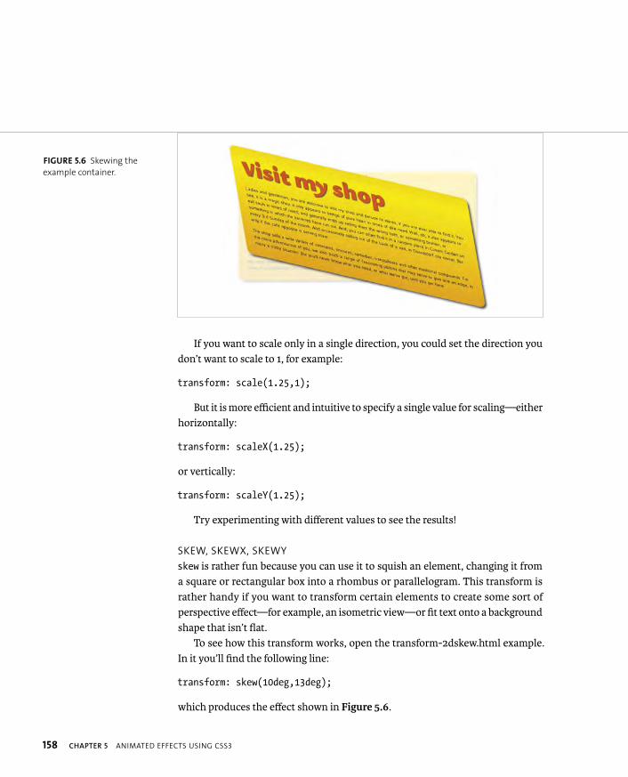
ptg8274462
158 CHAPTER 5 ANIMATED EFFECTS USING CSS3
If you want to scale only in a single direction, you could set the direction you don’t want to scale to 1, for example:
transform: scale(1.25,1);
But it is more efficient and intuitive to specify a single value for scaling—either horizontally:
transform: scaleX(1.25);
or vertically:
transform: scaleY(1.25);
Try experimenting with different values to see the results!
SKEW, SKEWX, SKEWY
skew is rather fun because you can use it to squish an element, changing it from a square or rectangular box into a rhombus or parallelogram. This transform is rather handy if you want to transform certain elements to create some sort of perspective effect—for example, an isometric view—or fit text onto a background shape that isn’t flat.
To see how this transform works, open the transform-2dskew.html example. In it you’ll find the following line:
transform: skew(10deg,13deg);
which produces the effect shown in Figure 5.6.
FIGURE 5.6 Skewing the
example container.

ptg8274462
TRANSFORMS 159
skew accepts the same unit values as rotate, but it works in a different way. Instead of the whole element being rotated but looking the same, it is deformed by three degrees horizontally and ten degrees vertically. In real terms, this might seem a bit illogical, because the three degrees x value is applied to the vertical sides (they are slanted three degrees off vertical) and the ten degrees y value is applied to the horizontal sides (they are slanted ten degrees off horizontal). Just think of it this way: The x and y values refer to the axes the shape is distorted along.
If you want to skew an element in only one direction, use skewX or skewY. For example:
transform: skewX(3deg);
transform: skewY(10deg);
MULTIPLE TRANSFORMS
You can apply multiple transforms in the same rule by including them all in the same property separated by spaces.
In the example file multiple_2dtransform.html, you’ll find the following trans-form line:
transform: skew(-3deg,-10deg) translateX(-200px) scale(0.7) p rotate(10deg);
The effect is shown in Figure 5.7.
FIGURE 5.7 Applying multiple
transforms to the example.
TIP: As you’d expect, you can use negative values to skew
the element in the other direction, vertically/horizontally.
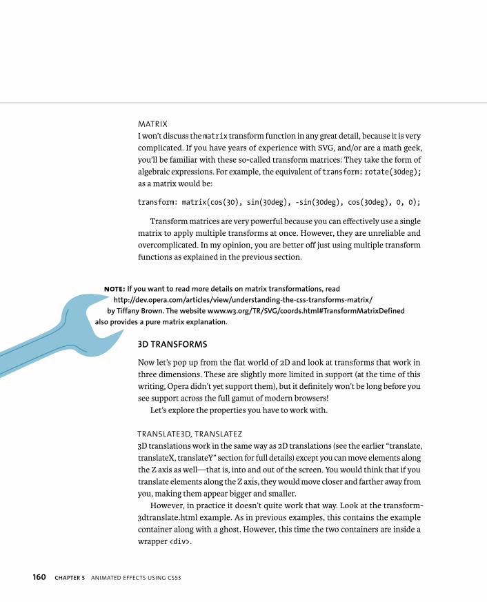
ptg8274462
160 CHAPTER 5 ANIMATED EFFECTS USING CSS3
MATRIX
I won’t discuss the matrix transform function in any great detail, because it is very complicated. If you have years of experience with SVG, and/or are a math geek, you’ll be familiar with these so-called transform matrices: They take the form of algebraic expressions. For example, the equivalent of transform: rotate(30deg);as a matrix would be:
transform: matrix(cos(30), sin(30deg), -sin(30deg), cos(30deg), 0, 0);
Transform matrices are very powerful because you can effectively use a single matrix to apply multiple transforms at once. However, they are unreliable and overcomplicated. In my opinion, you are better off just using multiple transform functions as explained in the previous section.
3D TRANSFORMS
Now let’s pop up from the flat world of 2D and look at transforms that work in three dimensions. These are slightly more limited in support (at the time of this writing, Opera didn’t yet support them), but it definitely won’t be long before you see support across the full gamut of modern browsers!
Let’s explore the properties you have to work with.
TRANSLATE3D, TRANSLATEZ
3D translations work in the same way as 2D translations (see the earlier “translate, translateX, translateY” section for full details) except you can move elements along the Z axis as well—that is, into and out of the screen. You would think that if you translate elements along the Z axis, they would move closer and farther away from you, making them appear bigger and smaller.
However, in practice it doesn’t quite work that way. Look at the transform-3dtranslate.html example. As in previous examples, this contains the example container along with a ghost. However, this time the two containers are inside a wrapper <div>.
NOTE: If you want to read more details on matrix transformations, read
http://dev.opera.com/articles/view/understanding-the-css-transforms-matrix/
by Tiffany Brown. The website www.w3.org/TR/SVG/coords.html#TransformMatrixDefined
also provides a pure matrix explanation.
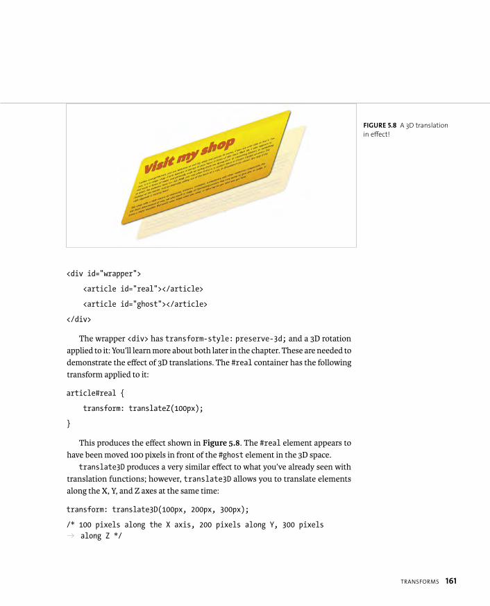
ptg8274462
TRANSFORMS 161
<div id=”wrapper”>
<article id=”real”></article>
<article id=”ghost”></article>
</div>
The wrapper <div> has transform-style: preserve-3d; and a 3D rotation applied to it: You’ll learn more about both later in the chapter. These are needed to demonstrate the effect of 3D translations. The #real container has the following transform applied to it:
article#real {
transform: translateZ(100px);
}
This produces the effect shown in Figure 5.8. The #real element appears to have been moved 100 pixels in front of the #ghost element in the 3D space.
translate3D produces a very similar effect to what you’ve already seen with translation functions; however, translate3D allows you to translate elements along the X, Y, and Z axes at the same time:
transform: translate3D(100px, 200px, 300px);
/* 100 pixels along the X axis, 200 pixels along Y, 300 pixels p along Z */
FIGURE 5.8 A 3D translation
in effect!
ptg8274462
162 CHAPTER 5 ANIMATED EFFECTS USING CSS3
ROTATEX, ROTATEY, ROTATEZ
Moving on to 3D rotations, the rotateX, rotateY, and rotateZ properties are a bit confusing at first, because they produce quite different results than what you might expect. rotateX and rotateY rotate the element they are applied to around the X and Y axes, respectively, which actually transforms them in the Z axis direction! rotateZ rotates the element around the Z axis, which produces a similar effect to the 2D rotation you saw in the earlier “rotate” section!
Let’s look at an example to smooth out this confusion: Open the transform-3drotate-x-y-z.html file in the chapter5 code download folder. In this file you’ll see three copies of an example with a 180 degree rotateX, rotateY, and rotateZapplied to them, respectively. I’ve also applied a basic transition to each one; as you hover over the example’s #wrapper <div>, each <article> will animate, so you can easily visualize the effects of these transforms. The rotation along the X axis looks like this:
transform: rotateX(180deg);
The Y axis rotation looks like this:
transform: rotateY(180deg);
And the Z axis rotation looks like this:
transform: rotateZ(180deg);
I’ve not included images here, because it is much easier to see the full effects of these examples by viewing the code example in your browser.
ptg8274462
TRANSFORMS 163
FIREFOX BAD HOVER?
In the transform-3drotate-x-y-z.html example file I’ve applied the :hover and
:focus effects to the parent #wrapper <div> but not the actual <article>s,
because some browsers (e.g., Firefox) will only continue to register the hover
event when the mouse is over the actual element being transitioned, not the
space it originally occupied.
Therefore, if you set the :hover effect on the actual <article>s, it will stop
as soon as the space taken up by the elements shrinks so that they move off
the mouse pointer, producing a clumsy jarring effect. This is not a problem in
most browsers. But in Firefox, you should still put the :hover/:focus on the
parent element wherever possible.
This issue is explained better in an example, so try loading the file transform-
3drotate-bad-hover.html in Firefox, and you’ll see what I mean. Of course,
this problem may be eliminated in the future. If you no longer see the prob-
lem, you know it’s been fixed!
ROTATE3D
I’ve included rotate3D in a separate section because it works in a different manner than the other 3D rotate functions. In the transform-3drotate-rotate3D.html file, you’ll see three copies of an example with the same rotations applied to them as in the previous example! The difference is that this time I used rotate3D in each case, not rotateX, rotateY, and rotateZ. Let’s look at equivalents:
� transform: rotateX(180deg); is equivalent to rotate3D(1,0,0,180deg);
� transform: rotateY(180deg); is equivalent to rotate3D(0,1,0,180deg);
� transform: rotateZ(180deg); is equivalent to rotate3D(0,0,1,180deg);
So how do these work? Notice that the rotate3D function takes four arguments. The fourth one is the number of degrees (or radians) you want the element to rotate through. The first three unitless values specify a direction vector for the element to rotate around. So 1,0,0 is one rotation along the X axis, and none in the Y or Z directions. So, in the first example, the element rotates around the X axis.

ptg8274462
164 CHAPTER 5 ANIMATED EFFECTS USING CSS3
Now it’s your turn: Try adjusting the vector values in this example to make the elements rotate in all sorts of weird and wonderful directions! For example, using a vector of 1,1,1 would cause the element to rotate around a line that travels downward at 45 degrees between the X, Y, and Z axes. A vector of 9,3,0 would cause the element to rotate around a line traveling down and right 30 degrees from the X axis and 60 degrees from the Y axis but not traveling at all in the Z direction. You can see visualizations of these values in Figure 5.9.
Note that the individual numbers in the vector values don’t matter; it is the proportions that matter. So, for example, 78,78,78 will result in the same direction vector as 1,1,1. You can also use negative vector values to make your direction vector travel in the opposite direction. For example, -1,-1,0 makes the element rotate around a line that is 45 degrees between the X and Y axes but runs left and up, not right and down, as positive values would produce.
NOTE: Be clear on the way the axes travel! As I’ve said before,
positive X is right; negative X is left. Positive Y is down; negative Y
is up. Positive Z is out of the screen; negative Z is into the screen.
X-axis
Y-axis
Z-axis
9 in X direction
3 in Y direction
Overall direction vector (9,3,0)
FIGURE 5.9 Visualizing direc-
tion vectors.
X-axis
Y-axis
Z-axis
1 in X direction
1 in Y direction
1 in Z direction
Overall direction vector (1,1,1)

ptg8274462
TRANSFORMS 165
SCALE3D, SCALEZ
The scale3D and scaleZ transform functions don’t do much in real terms; they imply the ability to grow elements along the Z axis, for example, increasing their height. But HTML elements intrinsically don’t have any thickness in this direc-tion—they are wafer thin. In actual fact, scaleZ will act as a multiplier for the translateZ function; transform: translateZ(10px) scaleZ(20); would have the same effect as transform: translateZ(200px). But you’d be better off just using translateZ or translate3D instead, as discussed earlier. If you want to give the impression of an element increasing in size and/or getting closer to the user, setting a simple 2D scale is often best.
MATRIX3D
As discussed earlier in the “matrix” section, matrix transforms are very powerful but very complicated and pretty much not within the realms of understanding for designers and other nontechies! And 3D matrices are even more complicated: They have 16 values for each function, as opposed to six for 2D matrices! Therefore, I won’t discuss them here (refer to the “matrix” section for links to more information).
PERSPECTIVE, TRANSFORM: PERSPECTIVE, AND PERSPECTIVE-ORIGIN
The transforms you’ve learned about so far can be used in a 3D space, but the ele-ments exist on a flat plane, as if they are all right in front of your eyes. In real life, this is not the case. You see objects in different positions around you in different perspectives. To simulate this a bit more accurately on the web, you can use the transform: perspective(); function, the perspective property, and the related perspective-origin property to make your elements look more three dimensional, even if they don’t have other transforms applied.
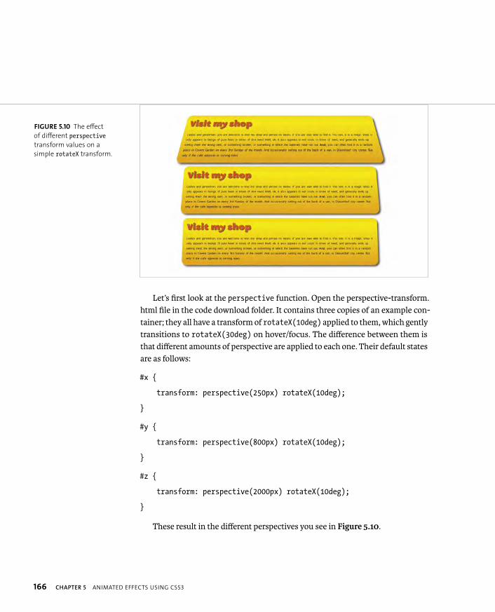
ptg8274462
166 CHAPTER 5 ANIMATED EFFECTS USING CSS3
Let’s first look at the perspective function. Open the perspective-transform.html file in the code download folder. It contains three copies of an example con-tainer; they all have a transform of rotateX(10deg) applied to them, which gently transitions to rotateX(30deg) on hover/focus. The difference between them is that different amounts of perspective are applied to each one. Their default states are as follows:
#x {
transform: perspective(250px) rotateX(10deg);
}
#y {
transform: perspective(800px) rotateX(10deg);
}
#z {
transform: perspective(2000px) rotateX(10deg);
}
These result in the different perspectives you see in Figure 5.10.
FIGURE 5.10 The effect
of different perspectivetransform values on a
simple rotateX transform.
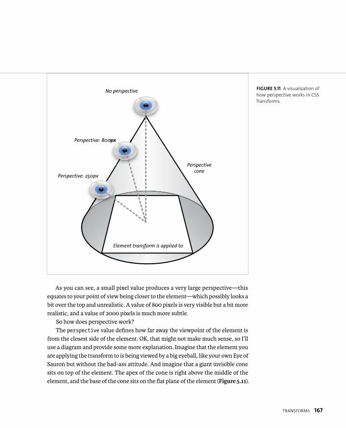
ptg8274462
TRANSFORMS 167
As you can see, a small pixel value produces a very large perspective—this equates to your point of view being closer to the element—which possibly looks a bit over the top and unrealistic. A value of 800 pixels is very visible but a bit more realistic, and a value of 2000 pixels is much more subtle.
So how does perspective work?The perspective value defines how far away the viewpoint of the element is
from the closest side of the element. OK, that might not make much sense, so I’ll use a diagram and provide some more explanation. Imagine that the element you are applying the transform to is being viewed by a big eyeball, like your own Eye of Sauron but without the bad-ass attitude. And imagine that a giant invisible cone sits on top of the element. The apex of the cone is right above the middle of the element, and the base of the cone sits on the flat plane of the element (Figure 5.11).
No perspective
Perspective: 800px
Perspective: 250px
Perspective cone
Element transform is applied to
FIGURE 5.11 A visualization of
how perspective works in CSS
Transforms.
ptg8274462
168 CHAPTER 5 ANIMATED EFFECTS USING CSS3
With no perspective applied, the Eye of Sauron will be right at the apex of the cone looking directly toward the element, which will therefore be seen straight on and totally flat. If you apply perspective values, the Eye of Sauron still looks directly at the element, but its position is shifted down the side of the cone. The perspective value is the distance the Eye of Sauron is from that edge; therefore, smaller values produce more dramatic distortions in the viewing of the element, whereas bigger values produce more subtle effects.
You can use pretty much any distance units that make sense for defining the amount of perspective, although pixels provide the most exact control and are probably the best to use. If you don’t include any units, the units default to pixels.
Now let’s turn to the separate perspective property: Look at the perspective-property.html file. In this example I’ve added an extra wrapper <div> around the three <article> elements identified with an ID of perspective-wrap and applied perspective to the whole lot using the following:
#perspective-wrap {
perspective: 800;
}
#x, #y, #z {
transform: rotateX(30deg);
}
Looking at the example you’ll see that the rotation transforms are applied to the <article> elements, but the perspective is applied to all the children of the <div>, as if they are all in the same 3D space. Because of the perspective, even though all the child elements have the same amount of rotation applied, they appear differently (Figure 5.12).
TIP: You need to put the perspective transform
before other transforms you want it applied to. If
you use rotateX(10deg) perspective(800px), for example,
the perspective would have no effect.

ptg8274462
TRANSFORMS 169
Finally, let’s look at perspective-origin. The perspective-origin property allows you to change the position of the perspective viewpoint. Returning to the awesome Eye of Sauron and cone metaphor, changing to perspective-origineffectively changes the positioning of the cone apex.
The default value of perspective-origin is center, and you can use the same values for it as you can for transform-origin (units, keywords, percentages; see the earlier sidebar “A Note About transform-origin” for more details). To get an idea of the effect this property has, look at the perspective-origin.html file. This file is similar to the perspective-property.html file, but it has some extra proper-ties/rules added:
#perspective-wrap {
perspective-origin: 0% center;
perspective: 800px;
transition: 3s all;
}
#perspective-wrap:hover {
perspective-origin: 100% center;
}
FIGURE 5.12 The perspectiveproperty in effect.
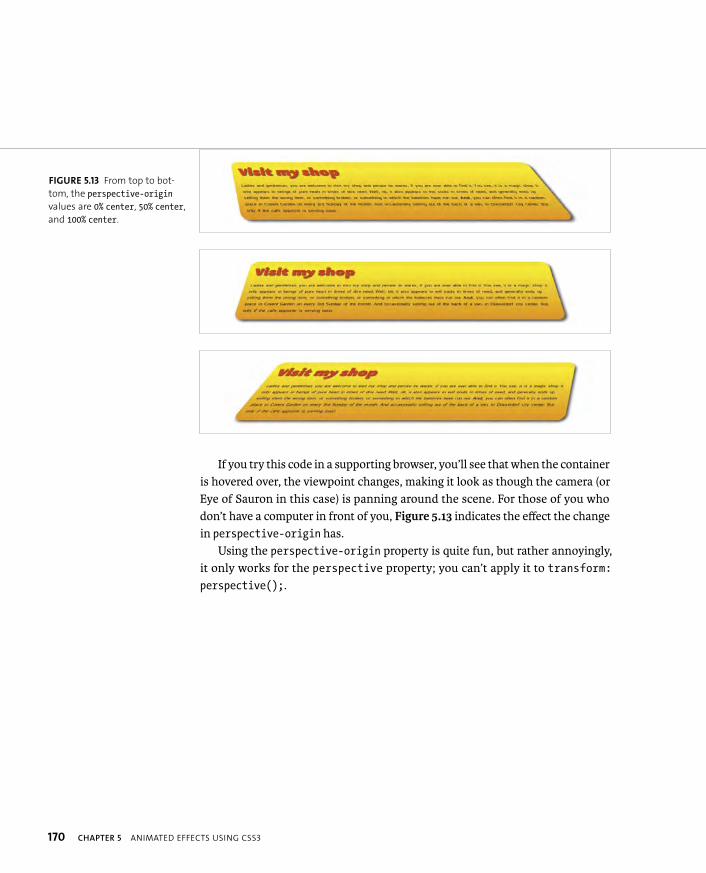
ptg8274462
170 CHAPTER 5 ANIMATED EFFECTS USING CSS3
If you try this code in a supporting browser, you’ll see that when the container is hovered over, the viewpoint changes, making it look as though the camera (or Eye of Sauron in this case) is panning around the scene. For those of you who don’t have a computer in front of you, Figure 5.13 indicates the effect the change in perspective-origin has.
Using the perspective-origin property is quite fun, but rather annoyingly, it only works for the perspective property; you can’t apply it to transform:perspective();.
FIGURE 5.13 From top to bot-
tom, the perspective-originvalues are 0% center, 50% center,
and 100% center.
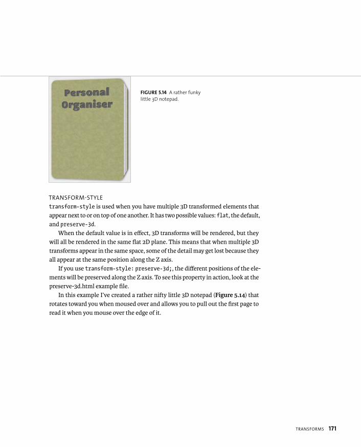
ptg8274462
TRANSFORMS 171
TRANSFORM-STYLE
transform-style is used when you have multiple 3D transformed elements that appear next to or on top of one another. It has two possible values: flat, the default, and preserve-3d.
When the default value is in effect, 3D transforms will be rendered, but they will all be rendered in the same flat 2D plane. This means that when multiple 3D transforms appear in the same space, some of the detail may get lost because they all appear at the same position along the Z axis.
If you use transform-style: preserve-3d;, the different positions of the ele-ments will be preserved along the Z axis. To see this property in action, look at the preserve-3d.html example file.
In this example I’ve created a rather nifty little 3D notepad (Figure 5.14) that rotates toward you when moused over and allows you to pull out the first page to read it when you mouse over the edge of it.
FIGURE 5.14 A rather funky
little 3D notepad.
ptg8274462
172 CHAPTER 5 ANIMATED EFFECTS USING CSS3
So how does this example work? Well, the only image used is the repeating image tile for the front and back covers of the notepad; the rest of the graphics were created using box-shadow, text-shadow, gradients, and web fonts. You learned about these in previous chapters, so I won’t explain them here. I’ll also not discuss the animated elements I’ve created using transitions, because you’ll look at those in detail later in this chapter. Here I’ll just concentrate on the transforms. To start, the markup is just some <article>s wrapped by a wrapper <div>:
<div id=”wrapper”>
<article id=”front”></div>
<article id=”p1”></div>
<article id=”p2”></div>
<article id=”back”></div>
</div>
To create the basic book, all of the pages are absolutely positioned on top of one another. The book is then rotated in three dimensions using the following:
#wrapper
transform: perspective(1200px) rotateY(-9deg);
transform-style: preserve-3d;
}
The pages are then moved into different positions in 3D space using the following:
#front {
transform: translateZ(5rem);
}
#p1 {
transform: translateZ(0rem); /* Explicitly setting this is p needed; Firefox does weird things with this example if p you don’t.*/
}
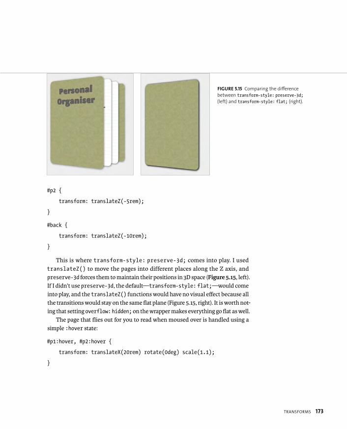
ptg8274462
TRANSFORMS 173
#p2 {
transform: translateZ(-5rem);
}
#back {
transform: translateZ(-10rem);
}
This is where transform-style: preserve-3d; comes into play. I used translateZ() to move the pages into different places along the Z axis, and preserve-3d forces them to maintain their positions in 3D space (Figure 5.15, left). If I didn’t use preserve-3d, the default—transform-style: flat;—would come into play, and the translateZ() functions would have no visual effect because all the transitions would stay on the same flat plane (Figure 5.15, right). It is worth not-ing that setting overflow: hidden; on the wrapper makes everything go flat as well.
The page that flies out for you to read when moused over is handled using a simple :hover state:
#p1:hover, #p2:hover {
transform: translateX(20rem) rotate(0deg) scale(1.1);
}
FIGURE 5.15 Comparing the difference
between transform-style: preserve-3d;(left) and transform-style: flat; (right).
ptg8274462
174 CHAPTER 5 ANIMATED EFFECTS USING CSS3
This example isn’t perfect. It would be better handled by a series of CSS Ani-mations triggered by links using JavaScript, because it would mean you could handle multiple pages flying out and it would be easier to make it keyboard acces-sible. (You’ll look at triggering animations with JavaScript later in the “Animations” section.)
Also, it doesn’t work in Opera and older browsers because they don’t support 3D transforms, so you’ll need to provide an alternative representation of the data for those browsers. You’ll find out how to do that later in the “Providing Alterna-tives with Modernizr” section.
BACKFACE-VISIBILITY
backface-visibility serves a single function: to specify whether an element’s backface (i.e., the reverse view of its content) is visible when the element is rotated in 3D so that its front is facing away from the viewer. To demonstrate using this prop-erty, let’s look at how to create a business card that flips over with a 3D transform (with realistic dimensions sized in millimeters!). You can find a finished example in the file two-faced-cheek.html.
Again, I’ll ignore the details that aren’t directly relevant to the example. The markup is again pretty simple:
<div id=”wrapper” tabindex=”0”>
<div id=”inner-wrapper”>
<div id=”front”>
</div>
<div id=”back”>
</div>
</div>
</div>
TIP: Adding the tabindex=”0” attribute is an old trick to make
any element appear in the page’s tabbing order and therefore be
keyboard focusable.
ptg8274462
TRANSFORMS 175
Here, the inner wrapper is used for the sizing and positioning, and the design work is applied to the two front and back <div>s for the front and back of the card. The outer wrapper <div> is there to add hover and other state change effects to, so that you don’t get that unwanted behavior in some browsers that was discussed earlier (see the “Firefox Bad Hover?” sidebar). The <div> contents are unimportant for the purposes of this example, although for a real business card you’d prob-ably want to mark up the contact details in a more useful way by using an hCard microformat, for example.
You’ll first set a transition on the inner wrapper and then tell it to preserve the 3D space:
#inner-wrapper {
...
transition: 1.5s all;
transform-style: preserve-3d;
}
Next, set backface-visibility: hidden; on both the front and back <div>:
#front, #back {
...
backface-visibility: hidden;
}
Then set up the default state of the business card:
#front {
transform: rotateX(0deg);
z-index: 2;
}
#back {
transform: rotateX(180deg);
}
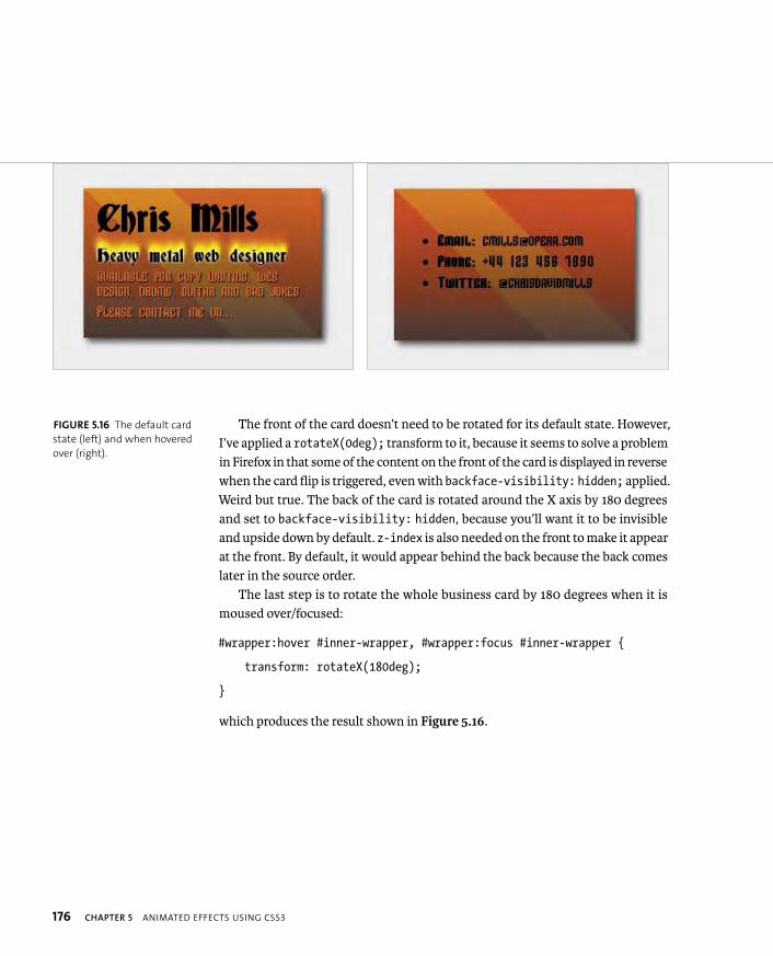
ptg8274462
176 CHAPTER 5 ANIMATED EFFECTS USING CSS3
The front of the card doesn’t need to be rotated for its default state. However, I’ve applied a rotateX(0deg); transform to it, because it seems to solve a problem in Firefox in that some of the content on the front of the card is displayed in reverse when the card flip is triggered, even with backface-visibility: hidden; applied. Weird but true. The back of the card is rotated around the X axis by 180 degrees and set to backface-visibility: hidden, because you’ll want it to be invisible and upside down by default. z-index is also needed on the front to make it appear at the front. By default, it would appear behind the back because the back comes later in the source order.
The last step is to rotate the whole business card by 180 degrees when it is moused over/focused:
#wrapper:hover #inner-wrapper, #wrapper:focus #inner-wrapper {
transform: rotateX(180deg);
}
which produces the result shown in Figure 5.16.
FIGURE 5.16 The default card
state (left) and when hovered
over (right).
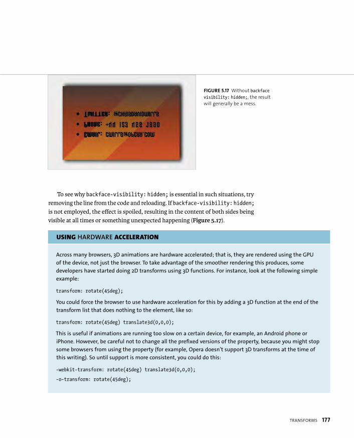
ptg8274462
TRANSFORMS 177
To see why backface-visibility: hidden; is essential in such situations, try removing the line from the code and reloading. If backface-visibility: hidden;is not employed, the effect is spoiled, resulting in the content of both sides being visible at all times or something unexpected happening (Figure 5.17).
USING HARDWARE ACCELERATION
Across many browsers, 3D animations are hardware accelerated; that is, they are rendered using the GPU
of the device, not just the browser. To take advantage of the smoother rendering this produces, some
developers have started doing 2D transforms using 3D functions. For instance, look at the following simple
example:
transform: rotate(45deg);
You could force the browser to use hardware acceleration for this by adding a 3D function at the end of the
transform list that does nothing to the element, like so:
transform: rotate(45deg) translate3d(0,0,0);
This is useful if animations are running too slow on a certain device, for example, an Android phone or
iPhone. However, be careful not to change all the prefixed versions of the property, because you might stop
some browsers from using the property (for example, Opera doesn’t support 3D transforms at the time of
this writing). So until support is more consistent, you could do this:
-webkit-transform: rotate(45deg) translate3d(0,0,0);
-o-transform: rotate(45deg);
FIGURE 5.17 Without backfacevisibility: hidden;, the result
will generally be a mess.
ptg8274462
178 CHAPTER 5 ANIMATED EFFECTS USING CSS3
THE TROUBLE WITH 3D CSS AND HTML
All in all, the 3D transforms are great fun and provide you with some inter-
esting possibilities for more dynamic, responsive user interfaces. But they are
not perfect by any means and need to be used sparingly and subtly.
The kinds of effects involving transforms, animations, and transitions that
I present in this chapter will not change the entire web paradigm, but
these kinds of effects are what work while still remaining inside the realms
of accessibility, usability, and good taste. Many of the more flashy 3D CSS
demos I’ve seen are fun demos but would probably not fly in the real world.
The trouble is that HTML and CSS form an inherently flat, 2D delivery mecha-
nism. You can imply some depth and perspective, sure, but there is no way
you can build an immersive, real, 3D world with such technologies. In addi-
tion, HTML elements have no inherent depth; the transforms and transitions
required would be very processor-intensive, and HTML really isn’t the right
technology to choose.
For a proper 3D environment, you would be much better served with HTML5
<canvas>/WebGL, which is beyond the scope of this book. And of course, such
technologies have issues of their own. Text inside <canvas> is just drawn
onto an image, so is inaccessible.
A combination of all these technologies is needed for more ambitious 3D
work, methinks.

ptg8274462
TRANSITIONS 179
With a run-through of CSS3 Transforms complete, let’s now turn to pastures new, namely transitions. As you’ve seen in some of the transform examples, transitions allow you to smoothly animate properties that change upon a state change (for example, when a link is hovered over) rather than the usual on/off rollover that would occur otherwise.
Table 5.2 summarizes the browser support for transitions.
TABLE 5.2 Browser Support for Transitions
BROWSER TRANSITIONS
Opera 10.5 with -o-
Firefox 4 with -moz-
Safari 3.1 with -webkit-
Chrome 4 with -webkit-
Internet Explorer 10 with -ms-
iOS 3.2 with -webkit-
Android 2.1 with -webkit-
Mobile Chrome Since beta with -webkit-
Opera Mobile 10 with -o-
Opera Mini No
Note that in IE10 platform preview 6, support for non-prefixed
transition properties has been added.
NOTE: It makes very little sense to try to demonstrate a transition
using static images, so I’ll not include many in this section. I’d
advise that you have the code download files close at hand while
reading this section.
TRANSITIONS

ptg8274462
180 CHAPTER 5 ANIMATED EFFECTS USING CSS3
SELECTING WHAT TO TRANSITION
To demonstrate transition basics, let’s walk through building up a very simple button example (see transition-button.html in the chapter5 folder). The button is simply a link styled to produce depth and shadowing using a combination of box shadow, linear gradients, text shadow, and more (Figure 5.18). There is nothing remarkable here except perhaps to say that I’ve used an inset box shadow to give the gradient a bit more shape.
When the link is moused over or focused via the keyboard, the background color changes (as dictated by the :hover/:focus states), and when the link is clicked/activated, another stronger, inset box shadow is applied to give the button the look of being pressed in. This is standard fare on the web, but I’m sure you’d agree that the experience could be better if the state changes were a bit smoother.
You can do this very easily by setting a transition on the link, as follows:
a {
...
transition-property: background-color;
}
You must set the transition on the element you want the transition to occur on. transition-property takes as its value the property you want to transition upon state change.
FIGURE 5.18 A simple, well-
styled button.
NOTES: Notice from the code examples in this section that the transition properties
currently need prefixes.
Not all CSS properties are animatable via CSS Transitions and Animations, but
most of the ones you’d conceivably want to animate are. A list of animatable
properties is available in the CSS Transitions spec in the Animatable Properties
section at www.w3.org/TR/css3-transitions/#animatable-properties.
ptg8274462
TRANSITIONS 181
SELECTING TRANSITION LENGTH
So far so good, but you need one addition to get the basic example working: You need to set a duration over which the transition will occur. This is done using the transition-duration property:
a {
...
transition-property: background-color;
transition-duration: 0.5s;
}
This property can take values with any CSS time units, but you’ll pretty much always use seconds.
DELAYING TRANSITIONS
If you want to set up a delay between the state changing on the element to be transitioned and the transition occurring, you can use the transition-delayproperty, like so:
transition-delay: 2s;
This property is useful if you want to fire multiple transitions but want them to happen one after the other in a staggered fashion.
ALTERING THE RATE OF TRANSITIONS
By default, transitions occur at the same rate throughout their duration. This is OK for many uses, but in some cases you’ll want to vary the transition rate to emulate concepts such as acceleration, friction, or gravity. To apply such variations to your transitions, you can use the transition-timing-function property.
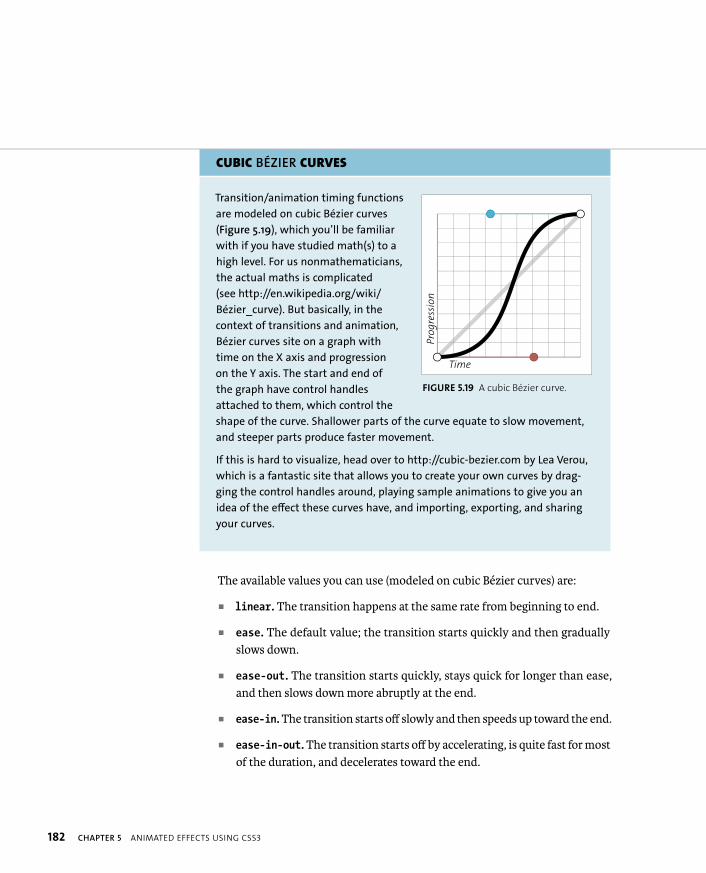
ptg8274462
182 CHAPTER 5 ANIMATED EFFECTS USING CSS3
CUBIC BÉZIER CURVES
Transition/animation timing functions
are modeled on cubic Bézier curves
(Figure 5.19), which you’ll be familiar
with if you have studied math(s) to a
high level. For us nonmathematicians,
the actual maths is complicated
(see http://en.wikipedia.org/wiki/
Bézier_curve). But basically, in the
context of transitions and animation,
Bézier curves site on a graph with
time on the X axis and progression
on the Y axis. The start and end of
the graph have control handles
attached to them, which control the
shape of the curve. Shallower parts of the curve equate to slow movement,
and steeper parts produce faster movement.
If this is hard to visualize, head over to http://cubic-bezier.com by Lea Verou,
which is a fantastic site that allows you to create your own curves by drag-
ging the control handles around, playing sample animations to give you an
idea of the effect these curves have, and importing, exporting, and sharing
your curves.
Time
Pro
gre
ssio
n
FIGURE 5.19 A cubic Bézier curve.
The available values you can use (modeled on cubic Bézier curves) are:
� linear. The transition happens at the same rate from beginning to end.
� ease. The default value; the transition starts quickly and then gradually slows down.
� ease-out. The transition starts quickly, stays quick for longer than ease, and then slows down more abruptly at the end.
� ease-in. The transition starts off slowly and then speeds up toward the end.
� ease-in-out. The transition starts off by accelerating, is quite fast for most of the duration, and decelerates toward the end.
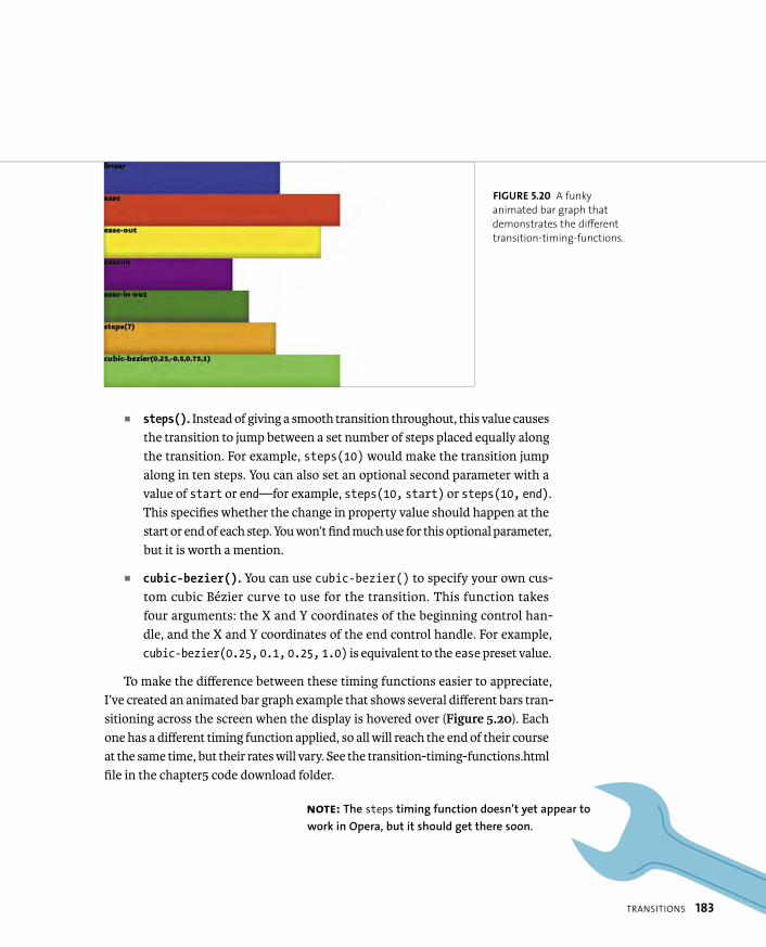
ptg8274462
TRANSITIONS 183
� steps(). Instead of giving a smooth transition throughout, this value causes the transition to jump between a set number of steps placed equally along the transition. For example, steps(10) would make the transition jump along in ten steps. You can also set an optional second parameter with a value of start or end—for example, steps(10, start) or steps(10, end).This specifies whether the change in property value should happen at the start or end of each step. You won’t find much use for this optional parameter, but it is worth a mention.
� cubic-bezier(). You can use cubic-bezier() to specify your own cus-tom cubic Bézier curve to use for the transition. This function takes four arguments: the X and Y coordinates of the beginning control han-dle, and the X and Y coordinates of the end control handle. For example, cubic-bezier(0.25, 0.1, 0.25, 1.0) is equivalent to the ease preset value.
To make the difference between these timing functions easier to appreciate, I’ve created an animated bar graph example that shows several different bars tran-sitioning across the screen when the display is hovered over (Figure 5.20). Each one has a different timing function applied, so all will reach the end of their course at the same time, but their rates will vary. See the transition-timing-functions.html file in the chapter5 code download folder.
FIGURE 5.20 A funky
animated bar graph that
demonstrates the different
transition-timing-functions.
NOTE: The steps timing function doesn’t yet appear to
work in Opera, but it should get there soon.

ptg8274462
184 CHAPTER 5 ANIMATED EFFECTS USING CSS3
I’ve styled the bars nicely and added a nifty little bit of JavaScript that resizes the height of the bars and their container to perfectly fill the screen when the page loads and when the screen is resized, making for an ideal adaptive example. (There’s also a small media query to change the font size when the height gets small; Chapter 8 covers Media Queries in more detail.)
How did I do this? The markup is again very simple (I’ve removed some of the <div>s for brevity; there are seven in all):
<div id=”wrapper” tabindex=”0”>
<div id=”timing1”><p>linear</p></div>
<div id=”timing2”><p>ease</p></div>
...
</div>
Now on to the CSS. I first selected the nested <div>s:
div div {
height: 100px;
width: 25%;
background: linear-gradient(top,rgba(0,0,0,0),rgba(0,0,0,0.4) p 70%);
box-shadow: inset 0 -10px 25px rgba(0,0,0,0.4);
transition-property: width;
transition-duration: 3s;
}
ptg8274462
TRANSITIONS 185
I set a default height on the <div>s for the benefit of browsers that don’t sup-port the JavaScript I’ve used (they probably won’t support the transitions anyway, but hey), a default width of 25%, some shadowing to make the bars look good, and most important, I declared a transition of the width property over 3 seconds.
Next, I set the nested <div> widths to 90%, only when their wrapper <div> is hovered over. Note that it is very powerful to use pseudo-classes in descendant/child selector chains like this:
#wrapper:hover div, #wrapper:focus div {
width: 100%;
}
Finally, I set each separate nested <div> to have a different background-colorand transition-timing-function, for example:
#timing1 {
background-color: blue;
transition-timing-function: linear;
}
#timing2 {
background-color: red;
transition-timing-function: ease;
}
TIP: Notice that I’ve used a negative number for the Y-position of the first
control handle in the cubic Bezier example: cubic-bezier(0.25,-0.5,0.75,1). This
causes a “bounce effect” where the transition goes below its beginning value and then
comes back up again and on to the final value. This technique can be very useful for some
effects, such as a toy boat bobbing up and down in the water after being dropped.
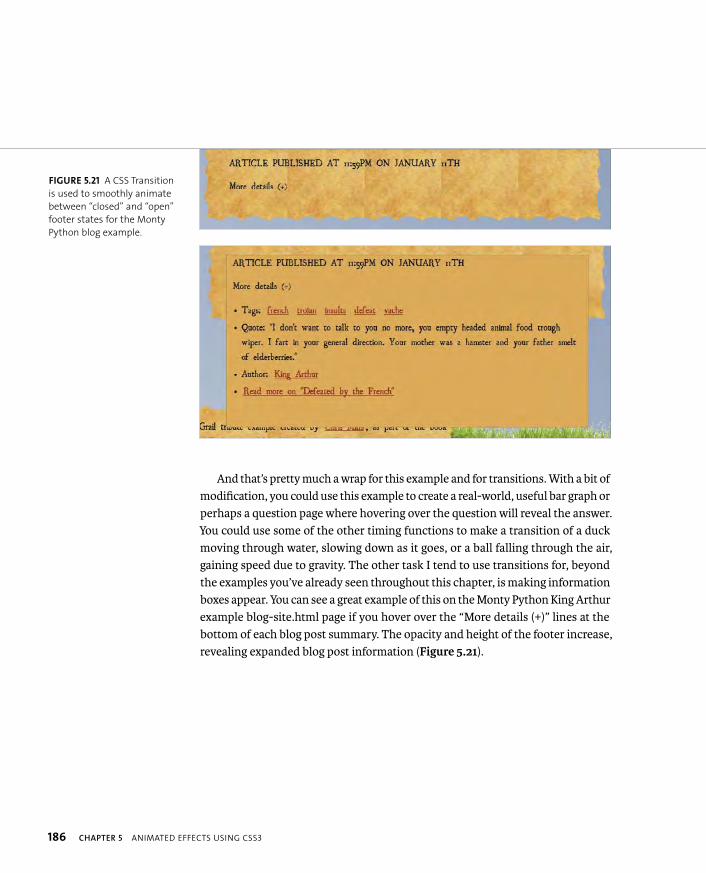
ptg8274462
186 CHAPTER 5 ANIMATED EFFECTS USING CSS3
And that’s pretty much a wrap for this example and for transitions. With a bit of modification, you could use this example to create a real-world, useful bar graph or perhaps a question page where hovering over the question will reveal the answer. You could use some of the other timing functions to make a transition of a duck moving through water, slowing down as it goes, or a ball falling through the air, gaining speed due to gravity. The other task I tend to use transitions for, beyond the examples you’ve already seen throughout this chapter, is making information boxes appear. You can see a great example of this on the Monty Python King Arthur example blog-site.html page if you hover over the “More details (+)” lines at the bottom of each blog post summary. The opacity and height of the footer increase, revealing expanded blog post information (Figure 5.21).
FIGURE 5.21 A CSS Transition
is used to smoothly animate
between “closed” and “open”
footer states for the Monty
Python blog example.
ptg8274462
TRANSITIONS 187
TRANSITION SHORTHAND AND MULTIPLE TRANSITIONS
Before moving on, you need to know about a couple more small but useful tech-niques. You can use the transition shorthand property to take the place of the other shorthand values, which can save you a lot of lines of code, especially when you have to write five different copies to include all the necessary browser prefixes:
transition-property: opacity;
transition-duration: 3s;
transition-timing-function: ease-in;
transition-delay: 1s;
These four properties can be represented by the following single shorthand property:
transition: opacity 3s ease-in 1s;
In addition, if you want to specify multiple different transitions on the same ruleset, you can list them all on the same property separated by commas. This works for shorthand and longhand:
transition: opacity 3s ease-in 1s, height 4s linear;
transition-property: opacity, height;
You must specify at least transition properties and durations for anything to animate; the other values are optional. If you don’t specify a delay, the default is 0s, and if you don’t specify a transition timing function, the default is ease.
If you specify multiple longhand properties, those different properties are looped through to make sure all transitions are assigned a value for each property. Let’s look at another example:
transition-property: opacity, height, width, background-color;
transition-duration: 3s;
transition-timing-function: ease-in, ease, linear;
ptg8274462
188 CHAPTER 5 ANIMATED EFFECTS USING CSS3
In this case, all four of the transition properties will be transitioned over a duration of 3 seconds, because that is the only value specified in the transition-duration property. Then for transition-timing-function, the first property is given ease-in, the second is given ease, and the third is given linear. But there is one more property. To give this a timing function, you cycle back to the start of the transition-timing-function list: the fourth property is therefore given the ease-in timing function.
You can specify that you want all properties that change upon state change to transition by just writing transition-property: all;
NOTE: To be honest, I very rarely have to write such complicated
transitions. I usually just write something like transition: 1s all;
(the duration often varies).
ptg8274462
ANIMATIONS 189
The next stop on this journey is CSS Animations. As discussed previously, ani-mations differ from transitions in that transitions are triggered by state changes, whereas animations happen independently. I would argue that animations therefore have a wider scope and are more useful than transitions. For example, you could use JavaScript to apply a CSS Animation to an element anytime you want, perhaps by attaching an animation to an ID selector and appending that ID to the element when a specific event occurs. This makes it easier, for example, to allow users to click links to fire animations.
You can also use CSS Animations with no JavaScript to create intro sequences of elements sliding into place or constant ambient background animations. Browser support for CSS Animations is shown in Table 5.3.
TABLE 5.3 Browser Support for Animations
BROWSER ANIMATIONS
Opera 12 with -o-
Firefox 5 with -moz-
Safari 4 with -webkit-
Chrome 4 with -webkit-
Internet Explorer 10 with -ms-
iOS 3.2 with -webkit-
Android 4 with -webkit-
Mobile Chrome Since Beta with -webkit-
Opera Mobile No
Opera Mini No
Note that in IE10 platform preview 6, support for non-prefixed
animation properties has been added.
You’ll explore various animation uses throughout this section.
ANIMATIONS
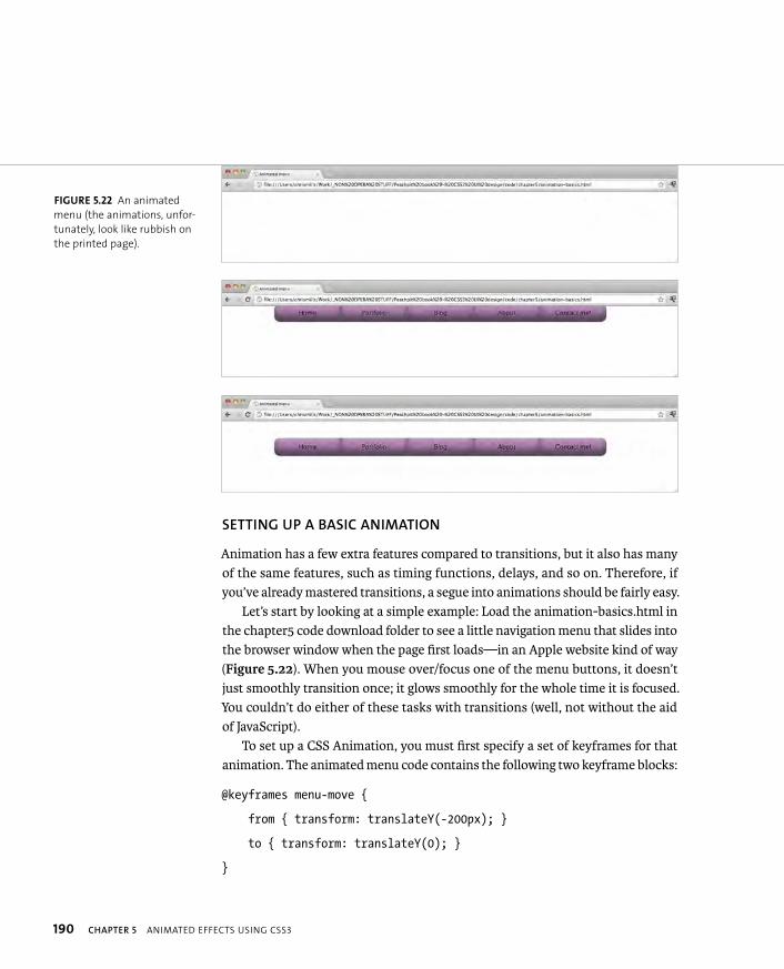
ptg8274462
190 CHAPTER 5 ANIMATED EFFECTS USING CSS3
SETTING UP A BASIC ANIMATION
Animation has a few extra features compared to transitions, but it also has many of the same features, such as timing functions, delays, and so on. Therefore, if you’ve already mastered transitions, a segue into animations should be fairly easy.
Let’s start by looking at a simple example: Load the animation-basics.html in the chapter5 code download folder to see a little navigation menu that slides into the browser window when the page first loads—in an Apple website kind of way (Figure 5.22). When you mouse over/focus one of the menu buttons, it doesn’t just smoothly transition once; it glows smoothly for the whole time it is focused. You couldn’t do either of these tasks with transitions (well, not without the aid of JavaScript).
To set up a CSS Animation, you must first specify a set of keyframes for that animation. The animated menu code contains the following two keyframe blocks:
@keyframes menu-move {
from { transform: translateY(-200px); }
to { transform: translateY(0); }
}
FIGURE 5.22 An animated
menu (the animations, unfor-
tunately, look like rubbish on
the printed page).
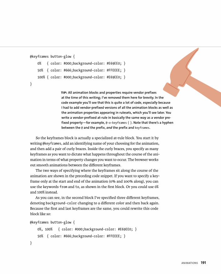
ptg8274462
ANIMATIONS 191
@keyframes button-glow {
0% { color: #000;background-color: #E69EE0; }
50% { color: #666;background-color: #FFEEEE; }
100% { color: #000;background-color: #E69EE0; }
}
So the keyframes block is actually a specialized at-rule block. You start it by writing @keyframes, add an identifying name of your choosing for the animation, and then add a pair of curly braces. Inside the curly braces, you specify as many keyframes as you want to dictate what happens throughout the course of the ani-mation in terms of what property changes you want to occur. The browser works out smooth animations between the different keyframes.
The two ways of specifying where the keyframes sit along the course of the animation are shown in the preceding code snippet. If you want to specify a key-frame only at the start and end of the animation (0% and 100% along), you can use the keywords from and to, as shown in the first block. Or you could use 0%and 100% instead.
As you can see, in the second block I’ve specified three different keyframes, denoting background-color changing to a different color and then back again. Because the first and last keyframes are the same, you could rewrite this code block like so:
@keyframes button-glow {
0%, 100% { color: #000;background-color: #E69EE0; }
50% { color: #666;background-color: #FFEEEE; }
}
TIP: All animation blocks and properties require vendor prefixes
at the time of this writing; I’ve removed them here for brevity. In the
code example you’ll see that this is quite a lot of code, especially because
I had to add vendor-prefixed versions of all the animation blocks as well as
the animation properties appearing in rulesets, which you’ll see later. You
write a vendor-prefixed at-rule in basically the same way as a vendor pre-
fixed property—for example, @-o-keyframes { }. Note that there’s a hyphen
between the @ and the prefix, and the prefix and keyframes.

ptg8274462
192 CHAPTER 5 ANIMATED EFFECTS USING CSS3
But I wouldn’t recommend this rewrite, especially not for complicated anima-tions: It is much easier to visualize the animation progression when the keyframes are written out in the order in which they occur.
You can have as many keyframes as you want and as many properties specified inside each keyframe as you want, meaning that complex animations are possible. You can start your keyframes at a value greater than 0%—for example, 50%, 60%,100%. But nothing will happen for the portion of the keyframes where nothing is specified.
APPLYING AN ANIMATION TO AN ELEMENT
So you’ve learned how to declare an animation block, but how on earth do you actually apply that animation to something on your page? That’s simple; you apply the element to any ruleset you like using the animation-name property with the animation’s identifying name as the property value:
ul {
...
animation-name: menu-move;
}
This is very useful because it means you only have to define an animation once, and then you can apply it to as many different rulesets as you want. You could have a whole bank of animation classes set up, and then add them where you need them.
ptg8274462
ANIMATIONS 193
SETTING ANIMATION DURATION
Your animation won’t do anything yet: In a similar manner to transitions, you have to tell it how long to last using animation-duration:
ul {
...
animation-name: menu-move;
animation-duration: 2s;
}
This property can take a value with any CSS time units, although you’ll most likely use seconds.
SPECIFYING THE NUMBER OF TIMES TO RUN THE ANIMATION
The menu-move animation will actually work as required already. It will slide into view once, and only once, because by default animations will play only once. If you want them to play more than once, you need to specify how many times using animation-iteration-count. This property accepts a positive number value or the keyword infinite if you want your animation to go to infinity and beyond (I tried typing that with a straight face and failed).
The menu-move animation is required only once, so you needn’t explicitly set it. For the button-glow animation, on the other hand, once is not enough. You want the animation to carry on until your site visitors stop hovering/focusing the buttons. Therefore, you should use infinite:
a:hover, a:focus {
...
animation-name: button-glow;
animation-duration: 1.5s;
animation-iteration-count: infinite;
}NOTE: Setting decimal values for animation-iteration-count (e.g. 0.5)
will make the animation play only part of the way through.
ptg8274462
194 CHAPTER 5 ANIMATED EFFECTS USING CSS3
ALTERING THE ANIMATION RATE
Again, similar to transitions, you can set different timing functions on animations to make the rate the animation occurs at vary from start to end. Only the property name is different: animation-timing-function. The timing functions are all the same. Here again is a list of the different timing functions:
� linear. The animation happens at the same rate from beginning to end.
� ease. The default value; the animation starts quickly and then gradually slows down.
� ease-out. The animation starts quickly, stays quick for longer than ease,and then slows down more abruptly at the end.
� ease-in. The animation starts off slowly and then speeds up toward the end.
� ease-in-out. The animation starts off by accelerating, is quite fast for most of the duration, and decelerates toward the end.
� steps(). Instead of giving a smooth transition throughout, this value causes the transition to jump between a set number of steps placed equally along the transition. For example, steps(10) would make the transition jump along in ten steps. You can also set an optional second parameter with a value of start or end—for example, steps(10, start) or steps(10, end).This specifies whether the change in property value should happen at the start or end of each step. You won’t find much use for this optional parameter, but it is worth a mention.
� cubic-bezier(). You can use cubic-bezier() to specify your own cus-tom cubic Bézier curve to use for the animation. This function takes four arguments: the X and Y coordinates of the beginning control handle, and the X and Y coordinates of the end control handle. For example, cubic-bezier(0.25, 0.1, 0.25, 1.0) is equivalent to the ease preset value. For more on cubic Bézier curves, see the “Cubic Bézier Curves” sidebar earlier in the chapter.

ptg8274462
ANIMATIONS 195
In this example, the glowing effect for the buttons was a bit too jerky using the default ease timing function, so I changed it to linear for a smoother feel:
a:hover, a:focus {
...
animation-name: button-glow;
animation-duration: 1.5s;
animation-iteration-count: infinite;
animation-timing-function: linear;
}
ADDING A DELAY
Yup, you guessed it; it is also possible to add a delay before an animation starts by adding an animation-delay value. This property is a lot more useful with anima-tion than it is with transitions. For instance, you could have an animated sequence occur on page load or after a button is activated with multiple animations occurring at different times. This type of result is not practical to achieve with transitions.
TIP: You can also give animation-delay a negative value to make the animation start
partway through the specified animation-duration.
ANIMATION-DIRECTION: BACK AND FORTH, SIR?
By default, animations occur from the start and go to the end on each iteration. However, it is possible to change this behavior so that the animation will instead take an alternative direction: The first iteration will go forward from 0% to 100%, the second iteration will travel smoothly back from 100% to 0%, the third iteration will go forward, the fourth will go back, and so on. This can be done by including the following line on the element to be animated:
animation-direction: alternate;
ptg8274462
196 CHAPTER 5 ANIMATED EFFECTS USING CSS3
For example, because I wanted the button glow to run seamlessly, I specified the button-glow animation like this:
@-keyframes button-glow {
0% { color: #000;background-color: #E69EE0; }
50% { color: #666;background-color: #FFEEEE; }
100% { color: #000;background-color: #E69EE0; }
}
If I specified animation-direction: alternate; on the a:hover,a:focus { }ruleset, I could rewrite my keyframes as this:
@-keyframes button-glow {
0% { color: #000;background-color: #E69EE0; }
100% { color: #666;background-color: #FFEEEE; }
}
I can now halve the animation-duration value, because each iteration would now be half the button glow pulse. This is a more efficient way to write this example and any others where you want the animation to do something and then return to its original state. But not all animations will be like this.
I’ve included this updated version for you in the chapter5 download folder as animation-basics2.html.
ANIMATION-FILL-MODE
The animation-fill-mode property allows you to specify how the animated ele-ment is displayed after an animation ends or during an animation-delay that occurs before the animation starts (i.e., no effect on negative animation delays). The possible values of animation-fill-mode are as follows:
� none. This is the default value. When an animation ends, the element it is applied to will go back to using its intrinsic styling. In addition, no styling from the animation keyframes will be applied to the element during an animation delay.
ptg8274462
ANIMATIONS 197
� forwards. This value makes an element with an animation applied to it retain the styles defined by the properties in the final keyframe, after the animation ends. The final keyframe will usually be 100% or to. This value is rather useful if you want the animations to finish in their final, not begin-ning, states—for example, when putting the building blocks of a layout into place upon page load.
� backwards. This property value causes styles defined in the first keyframe (usually 0% or from) to be applied to the element the animation is applied to during an animation-delay rather than the default element styles.
� both. This value applies the combined effects of forwards and backwardsto an element undergoing an animation.
I won’t provide isolated examples for you to see now; instead, I’ll present some examples later in the chapter that use these values.
SHORTHAND AND MULTIPLE ANIMATIONS
You need to write a lot of code for CSS Animations due to having to write keyframe blocks as well as include multiple properties to control how the animations are applied to elements. Fortunately, you can use a shorthand animation property to significantly reduce the amount of code needed.
The following properties:
animation-name: whoosh;
animation-duration: 10s;
animation-timing-function: ease-in;
animation-delay: 3s;
animation-iteration-count: 25;
animation-direction: alternate;
animation-fill-mode: backwards;
can be whittled down to this one line:
animation: whoosh 10s ease-in 3s 25 alternate backwards;
ptg8274462
198 CHAPTER 5 ANIMATED EFFECTS USING CSS3
The spec is not very precise in defining the exact order the property values should be included in the shorthand, but it’s best to stick with the preceding order to avoid potential browser bugs. Various sources indicate that this order fulfills the idiosyncrasies different browsers currently have.
You need to explicitly include animation-name and animation-duration for the animation to do anything. If you don’t explicitly specify the other values, their default values will come into play, which are:
animation-timing-function: ease;
animation-delay: 0s;
animation-iteration-count: 1;
animation-direction: normal;
animation-fill-mode: none;
You can also apply multiple animations in a single ruleset by including them in the same property separated by commas. This works for both longhand and shorthand values, for example:
animation: whoosh 10s, zap 5s;
animation-name: whoosh, zap;
animation-duration: 10s, 5s;
If you’re using longhand properties with different numbers of values, you need to specify all the animation names to be applied. If any subsequent properties have fewer values than the number of animations specified, the values will be alternated to fill the gaps. For example, look at the following properties:
animation-name: whoosh, zap, bang;
animation-duration: 10s, 5s;
animation-delay: 2s;
The whoosh animation will have a duration of 10 seconds, and the zap animation will have a delay of 5 seconds. The bang animation will have a delay of 10 seconds, because the duration values have run out, so they cycle around to the beginning again. All of the animations will have a delay of 2 seconds.
ptg8274462
ENHANCING A BANNER AD WITH ANIMATIONS 199
In Chapter 4, I introduced you to the Dead Hamster banner ad—a fair stab at creat-ing a banner advertisement with open standards as opposed to Flash, which looks cool and draws people in. Now you’ll enhance the banner using CSS Animations, Transitions, and Transforms.
To refresh your memory on the state in which you left the last version, open the example in the poster code download folder. You can also use this file as a starting point from which to add animations. Here you’ll look at some new code additions to add exciting swooshy bits to the banner!
Look at the first frame (<div id=”frame1”> in the HTML). This would look deliciously cool (and not at all like a middle manager’s PowerPoint presentation) if you had the different items of text whooshing into the ad, no?
To do this, you first need to set up the animations you need. For the four dif-ferent pieces of text, try these on for size:
@keyframes horizontal-left-150 {
from {transform: translateX(150px);}
to {transform: translateX(0px);}
}
@keyframes horizontal-right-400 {
from {transform: translateX(-400px);}
to {transform: translateX(0px);}
}
@keyframes horizontal-right-500 {
from {transform: translateX(-500px);}
to {transform: translateX(0px);}
}
NOTE: The finished code example from this section can be found in
the poster-animations-transforms-transitions code download folder.
ENHANCING A BANNER AD
WITH ANIMATIONS
ptg8274462
200 CHAPTER 5 ANIMATED EFFECTS USING CSS3
@keyframes horizontal-left-600 {
from {transform: translateX(600px);}
to {transform: translateX(0px);}
}
To apply these animations to the different pieces of text, you’ll use rules like this:
#ad h2 {
animation: horizontal-left-150 1s 1 1s backwards;
}
#ad #band-name {
animation: horizontal-right-400 2s 1 2.5s backwards;
}
#ad #album-name {
animation: horizontal-right-500 2s 1 3.5s backwards;
}
#ad #frame1 ul {
animation: horizontal-left-600 2s 1 4.5s backwards;
}
NOTE: You might think that having presentational animation names
goes against the semantic best practices we hold dear, but think
about it. Animations are entirely presentational, and you can
apply them to multiple elements, so the semantics will change.
Presentational is best in this case!
ptg8274462
ENHANCING A BANNER AD WITH ANIMATIONS 201
I used shorthand here, so let’s run through each value to make sure all is clear and you know what’s going on. In each case:
1. Start with animation-name. Each animation is applied to its appropriate ruleset by name.
2. Add animation-duration. Each animation must have a duration set on it to work.
3. Add animation-iteration-count. Each animation occurs only once, so you don’t need to add this in, but I included it to make the code completely obvious.
4. Add animation-delay. An animation delay is set for each rule so the pieces of text whoosh in at different times, not all together.
5. Add animation-fill-mode. This is set to backwards for all animations, which means that the animated elements take on the styling defined in their fromkeyframes during the animation delay in each case, and then the animation starts. If you didn’t include this, the animation would sit in its default posi-tion in each case before being animated from the from position and ending up back in the to position, which is the same as the default. This would look terrible. Try removing the backwards keywords and refreshing the example if you want to see the difference.
TIP: When creating animated effects where you are animating
elements from outside their container onto it, you’ll usually want
to set overflow: hidden; on the containing element, so the moving
elements slide into view when they move into it.

ptg8274462
202 CHAPTER 5 ANIMATED EFFECTS USING CSS3
For a bit of fun, I also decided to try animating the flaming text shadow by varying the text shadow values across different keyframes. They ended up look-ing like this:
@keyframes flamey-flamey {
0% {text-shadow: 0 0 4px white, 0 -5px 4px #FFFF33, p 2px -10px 6px #FFDD33, -2px -15px 11px #FF8800, p 2px -25px 18px #FF2200;}
19% {text-shadow: 0 0 4px white, 0 -5px 4px #FFFF33, p 2px -10px 6px #FFDD33, -2px -15px 11px #FF8800, p 2px -25px 18px #FF2200;}
20% {text-shadow: 0 0 4px white, 0 -4px 3px #FFFF44, p 3px -9px 7px #FFDF33, -3px -14px 12px #FF9900, p 3px -24px 19px #FF3300;}
39% {text-shadow: 0 0 4px white, 0 -4px 3px #FFFF44, p 3px -9px 7px #FFDF33, -3px -14px 12px #FF9900, p 3px -24px 19px #FF3300;}
40% {text-shadow: 0 0 4px white, 0 -5px 4px #FFFF33, p 3px -8px 8px #FFFD44, -3px -12px 11px #FF8800, p 2px -25px 20px #FF2200;}
59% {text-shadow: 0 0 4px white, 0 -5px 4px #FFFF33, p 3px -8px 8px #FFFD44, -3px -12px 11px #FF8800, p 2px -25px 20px #FF2200;}
60% {text-shadow: 0 0 5px white, 0 -6px 5px #FFFF55, p 2px -7px 7px #FFDD33, -5px -13px 15px #FF7700, p 4px -24px 19px #FF4411;}
79% {text-shadow: 0 0 5px white, 0 -6px 5px #FFFF55, p 2px -7px 7px #FFDD33, -5px -13px 15px #FF7700, p 4px -24px 19px #FF4411;}
80% {text-shadow: 0 0 4px white, 0 -5px 4px #FFFF33, p 5px -8px 6px #FFEE33, -4px -12px 13px #FF8822, p 2px -26px 18px #FF2200;}
100% {text-shadow: 0 0 4px white, 0 -5px 4px #FFFF33, p 5px -8px 6px #FFEE33, -4px -12px 13px #FF8822, p 2px -26px 18px #FF2200;}
}

ptg8274462
ENHANCING A BANNER AD WITH ANIMATIONS 203
In this case I didn’t want a smooth transition between each frame: I wanted five clear frames that would repeat; hence, I used duplicate values to make the text shadow stay the same across each different portion of the animation, for example 0–19%.
You can then apply this animation using the following code:
#ad #hell {
animation: flamey-flamey 0.2s infinite;
}
This time you’re not setting a delay or an animation-fill-mode, and the flames will keep flaming infinitely.
The last change in the example was the way #frame2 appears on hover and focus. This time I used a simple transform and transition:
#ad #frame2 p {
...
transform: scale(0);
transition: 1s all;
}
#ad:hover #frame2 p, #ad:focus #frame2 p {
transform: scale(1);
}

ptg8274462
204 CHAPTER 5 ANIMATED EFFECTS USING CSS3
Using the Modernizr feature detection library, let’s look at an intelligent way to pro-vide alternative styling for browsers that don’t support cutting-edge CSS3 features.
The tour of CSS Animations, Transitions, and Transforms you’ve just read about was deliberately kept simple, because there is lots of information to take in. But hopefully you’ve started to form some killer ideas about the cool effects you can achieve using these features. For more involved examples, I recommend doing a Google search. My favorite examples are still CSS3-man (www.optimum7.com/css3-man) and Pure CSS3 AT-AT (anthonycalzadilla.com/css3-ATAT/index.html), both by Anthony Calzadilla.
The trouble is that many of the demos you’ll see don’t give too much consider-ation to working in nonsupporting browsers. Perhaps it doesn’t matter in the case of throwaway demos, and many examples will degrade gracefully. For instance, look at the preceding animation-basics.html example, which works perfectly well when the animations are not supported; you just don’t get to see the fun animations. But what about interfaces in which you rely on animations for viewable content?
A good way to deal with such eventualities is to use feature detection; that is, you can use JavaScript to detect whether the browser accessing the content supports the CSS features you are using, and then serve different styles depending on the result.
The easiest way to do this for noncode ninjas is to use a feature detection library; the best available is Modernizr (www.modernizr.com), created by Faruk Ates, Paul Irish, Alex Sexton, and others. This uses JavaScript to feature detect pretty much every CSS3 and HTML5 feature, and then lets you selectively apply scripting and styles to suit. As of version 2, you can even build and download your own custom version that just includes the tests you want, reducing bandwidth (see www.modernizr.com/download). While you are experimenting at this point, you should just stick to using the full, uncompressed version of Modernizr (click the DEVELOPMENT download button on www.modernizr.com).
Let’s run through adding some CSS support detection magic to an example! To keep it simple and easy to follow, you’ll revisit the business card 3D flip example. Open the two-faced-cheek-modernizr.html file in the chapter5 code download folder for the finished example, or open the two-faced-cheek.html file for a start-ing point.
PROVIDING ALTERNATIVES
WITH MODERNIZR

ptg8274462
PROVIDING ALTERNATIVES WITH MODERNIZR 205
ADDING MODERNIZR TO YOUR PAGE
To apply Modernizr to your page, you first need to perform two steps:
1. Add a <script> element inside the <head> of your page to include the Mod-ernizr script, for example:
<script src=”modernizr-2.5.3.js”></script>
2. Add a class of no-js to your <html> tag:
<html lang=”en-gb” class=”no-js”>
Now when you run your page and then look at the code as it is rendered (for example, in a debugging tool like Opera Dragonfly), you’ll see that Modernizr has replaced your no-js class with a huge string of classes that look something like those shown in Figure 5.23.
This string allows you to specify different styles on a page based on whether different features are supported, using descendant selectors. If JavaScript isn’t supported or turned off, you’ll just be left with the default no-js class, and you can provide some kind of safe minimal styles that will probably work everywhere in the absence of more granular support information:
.no-js p {
color: black;
}
When JavaScript is supported and Modernizr is able to give you that granular support information, you can start applying fallback styles based on very specific support criteria. Let’s look at what the card 3D flip example required for wider-ranging browser support.
FIGURE 5.23 Modernizr adds
classes to your <html> element
to indicate which features your
browser supports.

ptg8274462
206 CHAPTER 5 ANIMATED EFFECTS USING CSS3
PROVIDING ALTERNATIVE STYLES
By default, the card flip example relies on a 3D transform for sighted viewers to be able to see both sides of the card. But this is no good for browsers that don’t support 3D transforms, like Opera (at the time of this writing). Nonsupporting browsers will get a class of no-csstransforms3d appended to their <head> classes, so you can provide alternative styling like so:
.no-csstransforms3d #wrapper:hover #front, .no-csstransforms3d p #wrapper:focus #front {
transform: rotate(-30deg) translate(-50%,-100%);
transition: 0.8s all ease-in;
}
The descendant selector applies a 2D transform to the front face of the card only when it is a descendant of .no-csstransforms3d. 3D rotation supporting browsers will ignore this styling. In Opera this styling gives you access to the back of the card, as shown in Figure 5.24.
FIGURE 5.24 A decent set of
alternative styles for brows-
ers that don’t support 3D
transforms but do support 2D
transforms.

ptg8274462
PROVIDING ALTERNATIVES WITH MODERNIZR 207
But what about browsers that don’t support 2D transforms? Older browsers like IE8 or Camino won’t support rem units, gradients, transforms, or text shadow, so what about them?
Modernizr won’t help with rem units. The best way to deal with them is to provide a pixel-size fallback next to the rem unit version of your property, as dis-cussed in Chapter 1:
margin-top: 5px;
margin-top: 0.5rem;
Older browsers will just read the first one, whereas newer browsers that support rem units will read both, but the latter line will override the former one.
For other CSS features, you’ll need to include at least the following CSS:
.no-csstransforms #wrapper:hover #front,.no-csstransforms p #wrapper:focus #front {
margin-left: -350px;
}
.no-cssgradients #front, .no-cssgradients #back {
background: #FF3500;
}
.no-cssgradients #front p, .no-cssgradients #back p {
/* ideally should be .no-textshadow, but modernizr doesn’t seem p to provide this */
color: #000000;
}
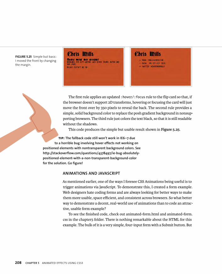
ptg8274462
208 CHAPTER 5 ANIMATED EFFECTS USING CSS3
The first rule applies an updated :hover/:focus rule to the flip card so that, if the browser doesn’t support 2D transforms, hovering or focusing the card will just move the front over by 350 pixels to reveal the back. The second rule provides a simple, solid background color to replace the posh gradient background in nonsup-porting browsers. The third rule just colors the text black, so that it is still readable without the shadows.
This code produces the simple but usable result shown in Figure 5.25.
ANIMATIONS AND JAVASCRIPT
As mentioned earlier, one of the ways I foresee CSS Animations being useful is to trigger animations via JavaScript. To demonstrate this, I created a form example. Web designers hate coding forms and are always looking for better ways to make them more usable, space efficient, and consistent across browsers. So what better way to demonstrate a decent, real-world use of animations than to code an attrac-tive, usable form example?
To see the finished code, check out animated-form.html and animated-form.css in the chapter5 folder. There is nothing remarkable about the HTML for this example. The bulk of it is a very simple, four-input form with a Submit button. But
FIGURE 5.25 Simple but basic:
I moved the front by changing
the margin.
TIP: The fallback code still won’t work in IE6–7 due
to a horrible bug involving hover effects not working on
positioned elements with nontransparent background colors. See
http://stackoverflow.com/questions/4378497/ie-bug-absolutely-
positioned-element-with-a-non-transparent-background-color
for the solution. Go figure!
ptg8274462
PROVIDING ALTERNATIVES WITH MODERNIZR 209
notice that I’m using the same setup as I did in the HTML card flip example (see two-faced-cheek.html). The front face has the form elements in it, whereas the back face has a “Thank you for your feedback!” message in it:
<form id=”feedback-form” action=”#” class=””>
<div id=”front”>
<h1>Give us your feedback!</h1>
<div>
<label for=”name” tabindex=”0”>Name<span class= p ”extended-info”> - Enter your first and last name p so we can identify you more easily.</span></label>
<input type=”text” name=”name” id=”name”>
<!-- Other form elements follow -->
</div>
</div>
<div id=”back”>
<h2>Thank you for your feedback!</h2>
</div>
</form>
TIP: Modernizr is also applied to the form
page to provide some fallbacks later on.
ptg8274462
210 CHAPTER 5 ANIMATED EFFECTS USING CSS3
Yes I’ve used the same card flip behavior as before, but instead of animating it via a transition and triggering it on hover/focus via pseudo-classes, I’ve put the animation in a CSS animation, like this:
@keyframes form-rotate {
from {
transform: rotateX(0deg);
}
to {
transform: rotateX(180deg);
}
}
.form-rotate {
animation: form-rotate 1s forwards;
}
The animation keyframes rotate whatever the animation is applied to around the X axis by 180 degrees, and the animation is applied to any element that is given a class of form-rotate. This will be the <input type=”submit”>.
The other noteworthy part of this example is the <h1>, and the fact that the form slides into the screen and out again when the <h1> is clicked (in browsers that support animations). To move the <h1> to where it is initially, I used a transform:
h1 {
position: absolute;
transform: rotate(90deg) translate(9.5rem,-23rem);
}
ptg8274462
PROVIDING ALTERNATIVES WITH MODERNIZR 211
To make the whole form slide in and slide out, two animations have been set up:
@keyframes form-out {
from {
transform: translateX(0rem);
}
to {
transform: translateX(38rem);
}
}
.form-out {
animation: form-out 1s forwards;
}
@keyframes form-in {
from {
transform: translateX(38rem);
}
to {
transform: translateX(0rem);
}
}
.form-in {
animation: form-in 1s forwards;
}
ptg8274462
212 CHAPTER 5 ANIMATED EFFECTS USING CSS3
But I haven’t applied the three classes shown earlier to anything yet, so what gives? I’ll do this via some simple JavaScript when the Submit button and <h1> are clicked. The JavaScript looks like this:
var submit = document.getElementById(“submit”);
var form = document.querySelector(“form”);
var back = document.getElementById(“back”);
var h1 = document.querySelector(“h1”);
Here, references to elements are stored on the page in the following variables:
� submit. The <input id=”submit”>
� form. The <form> element
� back. The back face of the form; the <div> with the #back attribute
� h1. The <h1> element
Next, I set up two event listeners:
submit.addEventListener(“click”, rotateForm, false);
h1.addEventListener(“click”, formOut, false);
� First line. Adds an event listener to the submit variable reference, which executes the rotateForm function when the Submit button is clicked.
� Second line. Adds an event listener to the h1 variable reference, which executes the formOut function when the <h1> element is clicked.
TIP: querySelector and addEventListener are not sup-
ported by IE versions earlier than version 9. Therefore, for
IE 6–8 support, you’ll need to consider using different code.
ptg8274462
PROVIDING ALTERNATIVES WITH MODERNIZR 213
Here is the first function:
function formOut() {
if(form.className===”” || form.className===”form-in”) {
if(Modernizr.cssanimations) {
form.setAttribute(“class”,”form-out”);
} else {
form.setAttribute(“class”,”form-fallback”);
form.style.left = “0rem”;
}
h1.innerHTML = “Hide feedback form!”;
} else {
if(Modernizr.cssanimations) {
form.setAttribute(“class”,”form-in”);
} else {
form.setAttribute(“class”,””);
form.style.left = “-38rem”;
}
h1.innerHTML = “Give us your feedback!”;
}
}
I’ve used an if ... else statement to see whether the form is offscreen and I want to move it on or whether it is onscreen and I want to move it off.
form.className===”” || form.className===”form-in” basically specifies “if the form’s class is empty OR it is set to form-in, then it will be offscreen; therefore, run the first Modernizr test.” modernizr.cssanimations tests whether CSS Anima-tions are supported by the current browser. If they are, then set the form’s class value to form-out to trigger the animation that brings it onscreen.
ptg8274462
214 CHAPTER 5 ANIMATED EFFECTS USING CSS3
If the Modernizr test returns false, the animation won’t work; instead you set the left property of the form to 0rem to make the form appear on the screen in one go, and set the form class to form-fallback so that the second part of the function will run when the user tries to hide the form again (if you don’t do this, the second part of the function will never run because the form class will always be blank). It’s not as nice-looking, but at least it works.
The last part of this section of the code (the h1.innerHTML part) changes the text inside the <h1> element to a message telling users they can hide it again if they want to.
If the outer if test returns false, then the form must be onscreen, and the code inside the else block is executed, which runs another modernizr.cssanimationstest. If this returns true, the code changes the class value to form-in to animate it offscreen again. If it returns false, the left property is returned to its original value—to move it offscreen again in a less glamorous manner—and the form classis set to blank again to return it to its original state.
The last part of the else block changes the <h1> text back to what it was originally.
Now on to the second function, rotateForm():
function rotateForm() {
if(Modernizr.cssanimations && Modernizr.csstransforms3d) {
form.setAttribute(“class”,”form-rotate”);
form.style.left = “0rem”;
} else {
back.style.zIndex = “5”;
}
}
Here, if Modernizr.cssanimations AND Modernizr.csstransforms3d are true, I’ve used setAttribute to set the <form>’s class attribute to form-rotate. This applies the rotate animation to the form, making it rotate to reveal the “Thank You” message. But setting the <form>’s class to form-rotate will override the class of form-out set earlier, which would cause the form to move offscreen again;
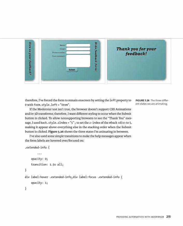
ptg8274462
PROVIDING ALTERNATIVES WITH MODERNIZR 215
therefore, I’ve forced the form to remain onscreen by setting the left property to 0 with form.style.left = “0rem”.
If the Modernizr test isn’t true, the browser doesn’t support CSS Animations and/or 3D transforms; therefore, I want different styling to occur when the Submit button is clicked. To allow nonsupporting browsers to see the “Thank You” mes-sage, I used back.style.zIndex = “5”; to set the z-index of the #back <div> to 5,making it appear above everything else in the stacking order when the Submit button is clicked. Figure 5.26 shows the three states I’m animating in between.
I’ve also used some simple transitions to make the help messages appear when the form labels are hovered over/focused on:
.extended-info {
...
opacity: 0;
transition: 1.5s all;
}
div label:hover .extended-info,div label:focus .extended-info {
opacity: 1;
}
FIGURE 5.26 The three differ-
ent states we are animating.
ptg8274462
216 CHAPTER 5 ANIMATED EFFECTS USING CSS3
Finally, some Modernizr fallbacks are added to allow older browsers to make some use of the form:
.no-cssgradients #front,.no-cssgradients #back {
background-color: #009999;
}
.no-cssanimations form {
left: 0;
}
.no-csstransforms h1 {
position: static;
}
.no-csstransforms .extended-info {
display: none;
}
I’m certainly not expecting you to know JavaScript just to use CSS. If you don’t understand this code, pass it to your friendly JavaScript developer and collabo-rate on it. He or she can probably do a much better job of this than I have. In any case, it’s worth exploring such techniques because it’s cool to be able to handle the animation with CSS rather than having to write it all in JavaScript. Even if you use jQuery or a similar library, it is still a lot of weight to add to the page just for a couple of simple animations.

ptg8274462
WRAPPING UP 217
You should now be clued into how to use CSS Transitions, Transforms, and Ani-mations to achieve some very cool, fresh effects on your web creations. Also, you now know how to use feature detection mechanisms like Modernizr to provide more carefully thought-out alternative experiences to nonsupporting browsers rather than just “IE or not IE” as discussed earlier in the book, for example, with CSS3PIE in Chapter 4.
WRAPPING UP
ptg8274462
6
USING CSS TOIMPLEMENT ICONS

ptg8274462
219
Icons are an essential part of creating
web interfaces as familiar signposts,
badges of honor, or notifications. They can draw attention
to important parts of the page quickly, use less space than
words, and can transcend languages. CSS3 offers some useful new
tricks to the icon arena; hence, this chapter on icons. After the
comparatively heavy learning curve presented by CSS Animations
in Chapter 5, you can relax a bit here.
In this chapter you’ll learn some slick ways to implement icons on
a web page employing cutting-edge CSS and HTML features, such
as multiple background images, web fonts, and data- attributes.
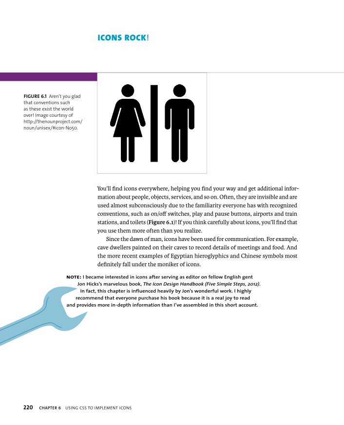
ptg8274462
220 CHAPTER 6 USING CSS TO IMPLEMENT ICONS
ICONS ROCK!
You’ll find icons everywhere, helping you find your way and get additional infor-mation about people, objects, services, and so on. Often, they are invisible and are used almost subconsciously due to the familiarity everyone has with recognized conventions, such as on/off switches, play and pause buttons, airports and train stations, and toilets (Figure 6.1)! If you think carefully about icons, you’ll find that you use them more often than you realize.
Since the dawn of man, icons have been used for communication. For example, cave dwellers painted on their caves to record details of meetings and food. And the more recent examples of Egyptian hieroglyphics and Chinese symbols most definitely fall under the moniker of icons.
NOTE: I became interested in icons after serving as editor on fellow English gent
Jon Hicks’s marvelous book, The Icon Design Handbook (Five Simple Steps, 2012).
In fact, this chapter is influenced heavily by Jon’s wonderful work. I highly
recommend that everyone purchase his book because it is a real joy to read
and provides more in-depth information than I’ve assembled in this short account.
FIGURE 6.1 Aren’t you glad
that conventions such
as these exist the world
over! Image courtesy of
http://thenounproject.com/
noun/unisex/#icon-No50.
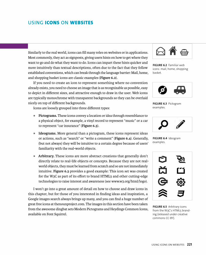
ptg8274462
USING ICONS ON WEBSITES 221
Similarly to the real world, icons can fill many roles on websites or in applications. Most commonly, they act as signposts, giving users hints on how to get where they want to go and do what they want to do. Icons can impart these hints quicker and more intuitively than textual descriptions, often due to the fact that they follow established conventions, which can break through the language barrier: Mail, home, and shopping basket icons are classic examples (Figure 6.2).
If you need to create an icon to represent something where no convention already exists, you need to choose an image that is as recognizable as possible, easy to depict in different sizes, and attractive enough to draw in the user. Web icons are typically monochrome with transparent backgrounds so they can be overlaid nicely on top of different backgrounds.
Icons are loosely grouped into three different types:
� Pictograms. These icons convey a location or idea through resemblance to a physical object, for example, a vinyl record to represent “music” or a car to represent “car insurance” (Figure 6.3).
� Ideograms. More general than a pictogram, these icons represent ideas or actions, such as “search” or “write a comment” (Figure 6.4). Generally, (but not always) they will be intuitive to a certain degree because of users’ familiarity with the real-world objects.
� Arbitrary. These icons are more abstract creations that generally don’t directly relate to real-life objects or concepts. Because they are not real-world objects, they must be learned from scratch and so are not immediately intuitive. Figure 6.5 provides a good example: This icon set was created for the W3C as part of its effort to brand HTML5 and other cutting-edge technologies to raise interest and awareness (see www.w3.org/html/logo).
I won’t go into a great amount of detail on how to choose and draw icons in this chapter, but for those of you interested in finding ideas and inspiration, a Google images search always brings up many, and you can find a huge number of great free icons at thenounproject.com. The images in this section have been taken from the awesome dingbat sets Modern Pictograms and Heydings Common Icons, available on Font Squirrel.
USING ICONS ON WEBSITES
FIGURE 6.2 Familiar web
icons: mail, home, shopping
basket.
FIGURE 6.3 Pictogram
examples.
FIGURE 6.4 Ideogram
examples.
FIGURE 6.5 Arbitrary icons
from the W3C’s HTML5 brand-
ing (released under creative
commons CC-BY).
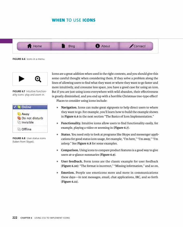
ptg8274462
222 CHAPTER 6 USING CSS TO IMPLEMENT ICONS
Icons are a great addition when used in the right contexts, and you should give this some careful thought when considering them. If they solve a problem along the lines of allowing users to find what they want or where they want to go faster and more intuitively, and consume less space, you have a good case for using an icon. But if you are just using icons everywhere with wild abandon, their effectiveness is greatly diminished, and you end up with a horrible Christmas tree-type effect!
Places to consider using icons include:
� Navigation. Icons can make great signposts to help direct users to where they want to go. For example, you’ll learn how to build the example shown in Figure 6.6 in the next section “The Basics of Icon Implementation.”
� Functionality. Intuitive icons allow users to find functionality easily, for example, playing a video or zooming in (Figure 6.7).
� Status. You need only to look at programs like Skype and messenger appli-cations for good status icon usage, for example, “I’m here,” “I’m away,” “I’m asleep.” See Figure 6.8 for some examples.
� Comparison. Using icons to compare product features is a good way to give users at-a-glance summaries (Figure 6.9).
� User feedback. Form icons are the classic example for user feedback (Figure 6.10): “The format is incorrect,” “Missing information,” and so on.
� Emotion. People use emoticons more and more in communications these days—in text messages, email, chat applications, IRC, and so forth (Figure 6.11).
WHEN TO USE ICONS
FIGURE 6.6 Icons in a menu.
FIGURE 6.7 Intuitive function-
ality icons: play and zoom in.
FIGURE 6.8 User status icons
(taken from Skype).
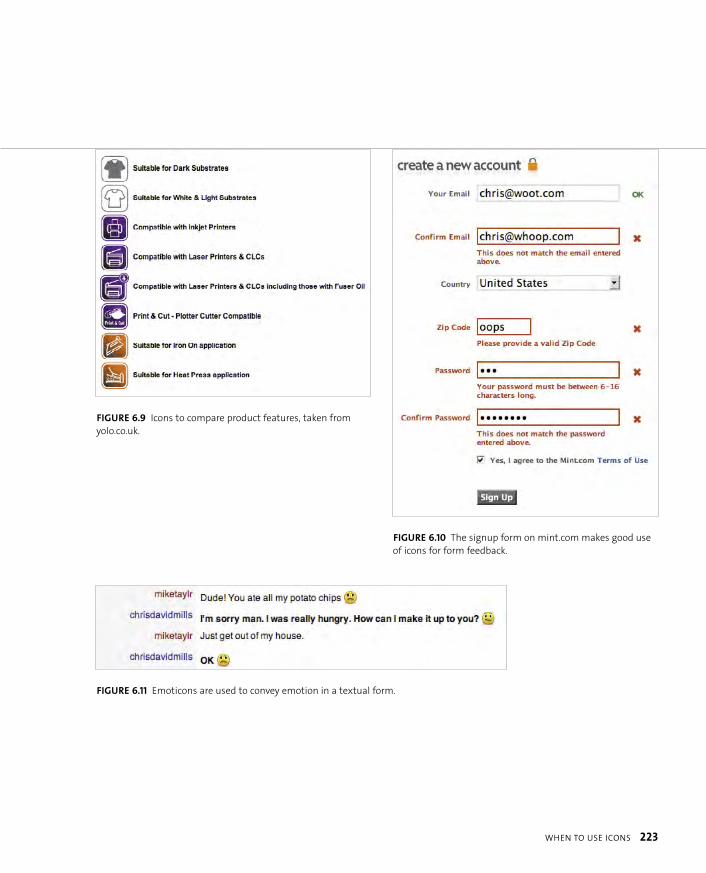
ptg8274462
WHEN TO USE ICONS 223
FIGURE 6.9 Icons to compare product features, taken from
yolo.co.uk.
FIGURE 6.11 Emoticons are used to convey emotion in a textual form.
FIGURE 6.10 The signup form on mint.com makes good use
of icons for form feedback.
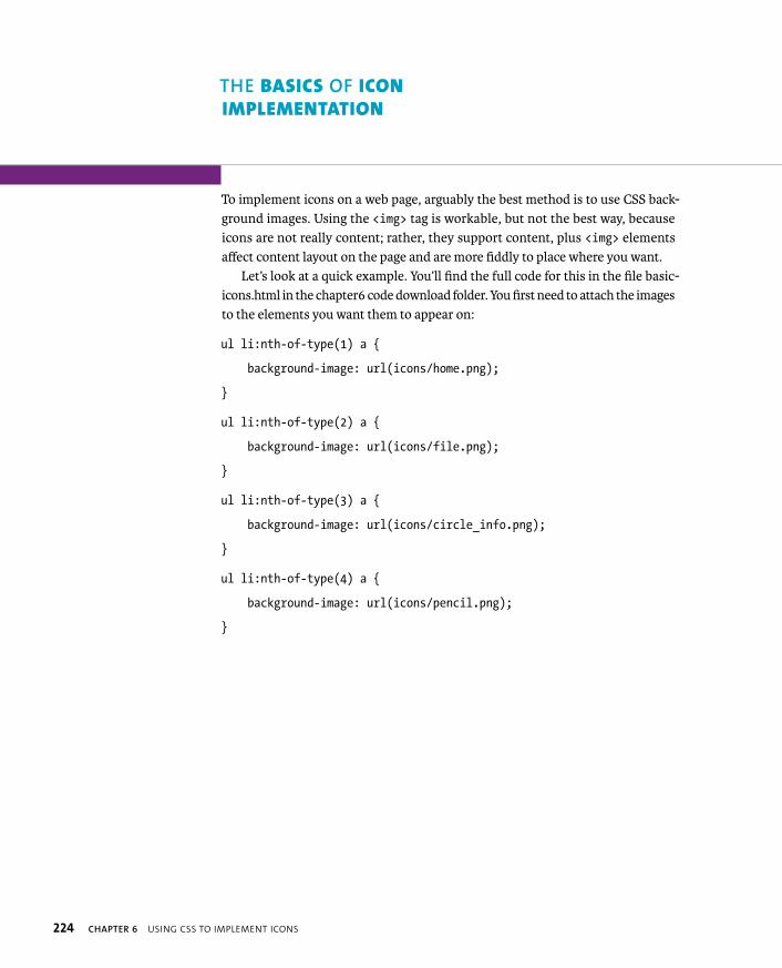
ptg8274462
224 CHAPTER 6 USING CSS TO IMPLEMENT ICONS
To implement icons on a web page, arguably the best method is to use CSS back-ground images. Using the <img> tag is workable, but not the best way, because icons are not really content; rather, they support content, plus <img> elements affect content layout on the page and are more fiddly to place where you want.
Let’s look at a quick example. You’ll find the full code for this in the file basic-icons.html in the chapter6 code download folder. You first need to attach the images to the elements you want them to appear on:
ul li:nth-of-type(1) a {
background-image: url(icons/home.png);
}
ul li:nth-of-type(2) a {
background-image: url(icons/file.png);
}
ul li:nth-of-type(3) a {
background-image: url(icons/circle_info.png);
}
ul li:nth-of-type(4) a {
background-image: url(icons/pencil.png);
}
THE BASICS OF ICON
IMPLEMENTATION
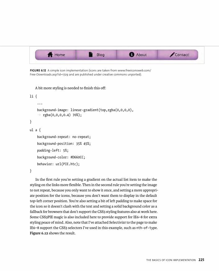
ptg8274462
THE BASICS OF ICON IMPLEMENTATION 225
A bit more styling is needed to finish this off:
li {
...
background-image: linear-gradient(top,rgba(0,0,0,0), p rgba(0,0,0,0.4) 70%);
}
ul a {
background-repeat: no-repeat;
background-position: 35% 45%;
padding-left: 5%;
background-color: #D660CC;
behavior: url(PIE.htc);
}
In the first rule you’re setting a gradient on the actual list item to make the styling on the links more flexible. Then in the second rule you’re setting the image to not repeat, because you only want to show it once, and setting a more appropri-ate position for the icons, because you don’t want them to display in the default top-left corner position. You’re also setting a bit of left padding to make space for the icon so it doesn’t clash with the text and setting a solid background color as a fallback for browsers that don’t support the CSS3 styling features also at work here. Some CSS3PIE magic is also included here to provide support for IE6–8 for extra styling peace of mind. Also, note that I’ve attached Selectivizr to the page to make IE6–8 support the CSS3 selectors I’ve used in this example, such as nth-of-type.Figure 6.12 shows the result.
FIGURE 6.12 A simple icon implementation (icons are taken from www.freeiconsweb.com/
Free-Downloads.asp?id=1729 and are published under creative commons unported).

ptg8274462
226 CHAPTER 6 USING CSS TO IMPLEMENT ICONS
GENERATED CONTENT FOR ICONS
You could also implement your icons using generated content, like so (see basic-icons-generated-content.html in the chapter6 code download folder):
ul li:nth-of-type(1) a:before {
content: url(icons/home.png);
}
/* Other three icons included in the same way as the first one, but p ommitted here for brevity */
ul a:before {
position: relative;
right: 4%;
top: 5px;
}
ul a {
padding-left: 1%;
background-image: linear-gradient(top,rgba(0,0,0,0),p rgba(0,0,0,0.4) 70%);
background-color: #D660CC;
behavior: url(PIE.htc);
}
This method is also a viable option, although generated content is not supported as widely across browsers (it won’t work in IE6–7). You’ll explore using generated content more in the “Web Fonts as Icons” section.

ptg8274462
THE BASICS OF ICON IMPLEMENTATION 227
CSS SPRITES
The preceding examples work well, but what about implementing multiple icons? Having to pull in a separate image file for each icon introduces a whole lot of HTTP requests: To make your code more efficient, you can use CSS sprites. The idea is that you combine all of your images into a single file, and then show the different icons by varying the background-position property. Your code will look like this (see basic-icons-css-sprites.html):
ul li:nth-of-type(1) a {
background-image: url(icons/sprite-set.png);
background-position: 35% 10px;
}
ul li:nth-of-type(2) a {
background-image: url(icons/sprite-set.png);
background-position: 35% -40px;
}
ul li:nth-of-type(3) a {
background-image: url(icons/sprite-set.png);
background-position: 35% -90px;
}
ul li:nth-of-type(4) a {
background-image: url(icons/sprite-set.png);
background-position: 35% -140px;
}
In each rule the background-position has the same horizontal value but increasing vertical values; each increase pushes the image farther and farther upwards, so that you only have to load a single file but can display different icons

ptg8274462
228 CHAPTER 6 USING CSS TO IMPLEMENT ICONS
as you are displaying a different part of the image in each case. The result is shown in Figure 6.13.
MAKING YOUR ICONS MORE BULLETPROOF
In the examples you’ve seen so far, you have a solid implementation that works well. The only trouble at this point is that if you are using percentages for your container widths; the icon can start to look misplaced or become too big for the containers when the screen gets narrower. To remedy this, you can adopt a few different approaches, either separately or in combination:
� Use min-width to limit the shrinking of the containers to an acceptable amount.
� Use Media Queries to serve up some different styling at smaller screen widths, for example, a smaller version of the image used for the icon. You’ll learn more about media queries in Chapter 8.
� Use background-size to constrain the icon to a particular size, proportional to the container.
The solution I considered for my icon set (see basic-icons-background-size.html) incorporates a combination of min-width and background-size. Let’s go through it now: You’ll first set a min-width on the list:
ul {
...
min-width: 750px;
}
FIGURE 6.13 CSS sprites in action.
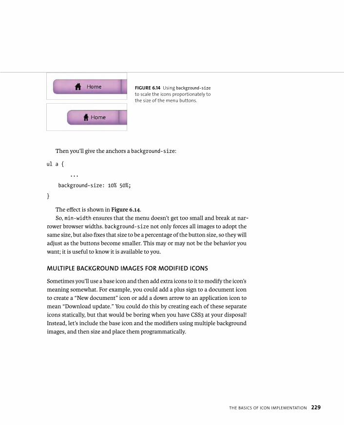
ptg8274462
THE BASICS OF ICON IMPLEMENTATION 229
Then you’ll give the anchors a background-size:
ul a {
...
background-size: 10% 50%;
}
The effect is shown in Figure 6.14.So, min-width ensures that the menu doesn’t get too small and break at nar-
rower browser widths. background-size not only forces all images to adopt the same size, but also fixes that size to be a percentage of the button size, so they will adjust as the buttons become smaller. This may or may not be the behavior you want; it is useful to know it is available to you.
MULTIPLE BACKGROUND IMAGES FOR MODIFIED ICONS
Sometimes you’ll use a base icon and then add extra icons to it to modify the icon’s meaning somewhat. For example, you could add a plus sign to a document icon to create a “New document” icon or add a down arrow to an application icon to mean “Download update.” You could do this by creating each of these separate icons statically, but that would be boring when you have CSS3 at your disposal! Instead, let’s include the base icon and the modifiers using multiple background images, and then size and place them programmatically.
FIGURE 6.14 Using background-sizeto scale the icons proportionately to
the size of the menu buttons.
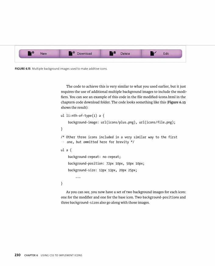
ptg8274462
230 CHAPTER 6 USING CSS TO IMPLEMENT ICONS
The code to achieve this is very similar to what you used earlier, but it just requires the use of additional multiple background images to include the modi-fiers. You can see an example of this code in the file modified-icons.html in the chapter6 code download folder. The code looks something like this (Figure 6.15shows the result):
ul li:nth-of-type(1) a {
background-image: url(icons/plus.png), url(icons/file.png);
}
/* Other three icons included in a very similar way to the first p one, but ommitted here for brevity */
ul a {
background-repeat: no-repeat;
background-position: 72px 10px, 50px 10px;
background-size: 13px 13px, 20px 25px;
...
}
As you can see, you now have a set of two background images for each icon: one for the modifier and one for the base icon. Two background-positions and three background-sizes also go along with those images.
FIGURE 6.15 Multiple background images used to make additive icons.
ptg8274462
WEB FONTS AS ICONS 231
Another option available to you is using web fonts as icons. Using a single character for the icons and applying a web font to them can give you the look you want. This is a good technique in many ways. The text character will be infinitely scalable when zooming in, and there are a wide variety of Dingbats-style fonts to use to create suitable icons. The downsides are that browsers must support @font-facefor them to work, font files can be big, and actually adding the character(s) into your HTML will pollute your content and possibly cause accessibility issues for those using screen readers.
Let’s review these problems one by one. I’ve assembled an example for you to dissect in the file web-font-icons.html in the chapter6 folder. To start, you’ll find your fonts using any of the resources detailed in Chapter 3. I found my fonts at www.fontsquirrel.com/fonts/list/style/Dingbat.
Next, you’ll create the different font formats you need using the Font Squirrel @Font-Face Generator (www.fontsquirrel.com/fontface/generator).
Then you’ll import the fonts in your CSS in the usual way using the bulletproof font syntax:
@font-face {
font-family: ‘Heydings’;
src: url(‘fonts/heydings_icons.eot’);
src: url(‘fonts/heydings_icons.eot?#iefix’) p format(‘embedded-opentype’),
url(‘fonts/heydings_icons.woff’) format(‘woff’),
url(‘fonts/heydings_icons.ttf’) format(‘truetype’),
url(‘fonts/heydings_icons.svg#SansationRegular’) p format(‘svg’);
font-weight: normal;
font-style: normal;
}
WEB FONTS AS ICONS
ptg8274462
232 CHAPTER 6 USING CSS TO IMPLEMENT ICONS
Rather than using images or hardcoding your text characters into your HTML, you’ll create them on the fly using generated content:
ul li:nth-of-type(1) a:before {
content: “H”;
}
ul li:nth-of-type(2) a:before {
content: “D”;
}
ul li:nth-of-type(3) a:before {
content: “i”;
}
ul li:nth-of-type(4) a:before {
content: “w”;
}
This avoids the problem of polluting your markup with surplus characters. However, it can be a bit fiddly trying to work out which text character corresponds to which icon you want to use. You could install the font on your system and then open a word processor and just type out characters until you find them, or open the font in an app like Character Map or Font Book and pick them out of there.
It seems that they are mapped to intuitive characters in this case—“H” for home, “i” for the information symbol, and so on—so hopefully other icon font authors will follow suit and start to adhere to some kind of ad hoc conventions.

ptg8274462
WEB FONTS AS ICONS 233
All that remains to do now is apply the font to your generated content and position it appropriately:
ul a:before {
font-family: Heydings;
position: relative;
right: 4%;
top: 6px;
}
Because you are using fonts, the icons are very easy to size, color, and even add drop shadow effects to. This is awesome!
ul a:before {
font-family: Heydings;
position: relative;
right: 4%;
top: 4px;
font-size: 1.6em;
color: #333;
text-shadow: 1px 1px 1px rgba(255,255,255,0.4);
}
Figure 6.16 shows the effect achieved.
TIP: To mitigate the issue of large font file sizes add-
ing significantly to page load, you could reduce the font
file using FontForge to include only the characters you need.
FIGURE 6.16 Icons made with web fonts.
ptg8274462
234 CHAPTER 6 USING CSS TO IMPLEMENT ICONS
HTML data- ATTRIBUTES FOR MORE EFFICIENT ICON CSS
When using the web font icon solution, you’ll need to include a separate
ruleset for each icon. A way to get around this and lessen the amount of
code is to use the new HTML5 data- attribute to store your text characters,
like this:
<li><a href=”#” data-icon=”H”>Home</a></li>
You can put anything you like after the data- part, and store whatever data
you like in these custom attributes. Then you’ll have your text characters
stored in your data-icon attributes; you can put them all on the page using
only a single CSS ruleset and eliminate the other four that were present
before:
ul a:before {
content: attr(data-icon);
...
}
You can see my implementation in web-font-icons-data-attributes.html.
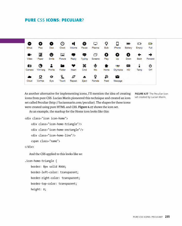
ptg8274462
PURE CSS ICONS: PECULIAR? 235
As another alternative for implementing icons, I’ll mention the idea of creating icons from pure CSS. Lucian Marin pioneered this technique and created an icon set called Peculiar (http://lucianmarin.com/peculiar). The shapes for these icons were created using pure HTML and CSS. Figure 6.17 shows the icon set.
As an example, the markup for the Home icon looks like this:
<div class=”icon icon-home”>
<div class=”icon-home-triangle”/>
<div class=”icon-home-rectangle”/>
<div class=”icon-home-line”/>
<span class=”name”>
</div>
And the CSS applied to this looks like so:
.icon-home-triangle {
border: 8px solid #000;
border-left-color: transparent;
border-right-color: transparent;
border-top-color: transparent;
height: 0;
PURE CSS ICONS: PECULIAR?
FIGURE 6.17 The Peculiar icon
set created by Lucian Marin.
ptg8274462
236 CHAPTER 6 USING CSS TO IMPLEMENT ICONS
width: 0;
position: absolute;
bottom: 7px;
left: 0;
}
.icon-home-rectangle {
background-color: #000;
width: 10px;
height: 8px;
border-bottom-left-radius: 1px;
border-bottom-right-radius: 1px;
position: absolute;
bottom: 1px;
left: 3px;
}
.icon-home-line {
background-color: #000;
width: 2px;
height: 5px;
border-radius: 1px;
position: absolute;
top: 2px;
left: 3px;
}
ptg8274462
PURE CSS ICONS: PECULIAR? 237
You can find an example implementation of these icons in the file peculiar-icons.html in the chapter6 folder. To implement the icons here, you need to download the Peculiar icon CSS and HTML from the URL provided earlier, and then copy all the HTML and CSS to your own files. For example, this where I put the Home icon:
<li>
<a href=”#”>Home
<div class=”icon icon-home”>
<div class=”icon-home-triangle”></div>
<div class=”icon-home-rectangle”></div>
<div class=”icon-home-line”></div>
</div>
</a>
</li>
You need to make sure the icon HTML is placed inside the container you want it to appear in (in this case the anchor) and that the container will display as a block-level element. In the case of your menu this works fine, because the anchors are already set to display: inline-block; to make the sizing work. Once all the Peculiar CSS is in place, you need to modify it a bit. For starters, the general icon class needs some work:
.icon {
position: absolute;
top: 16px;
left: 48px;
width:16px;
height:16px;
transform: scale(1.5);
}
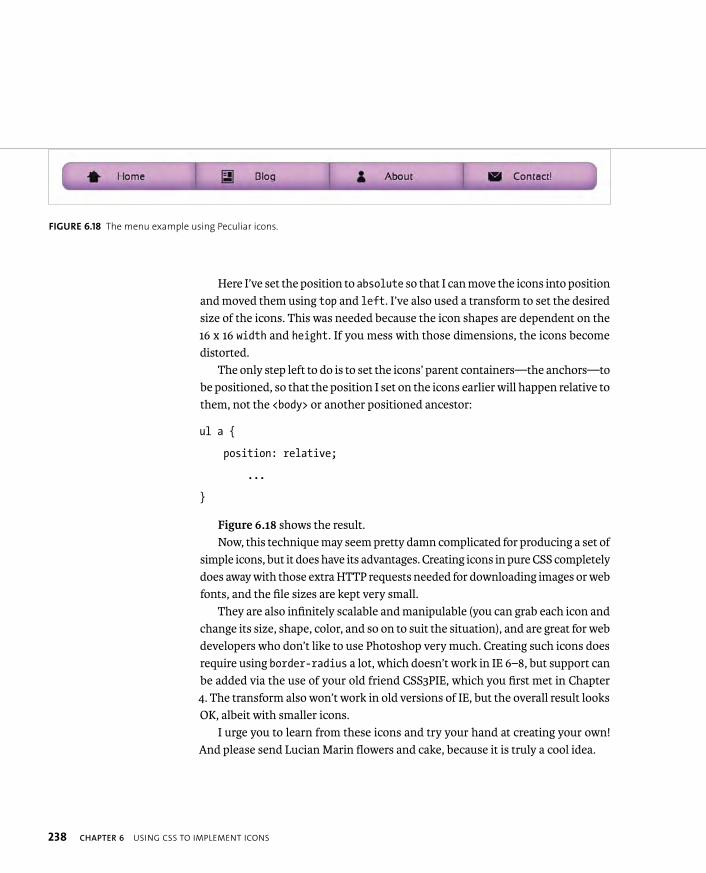
ptg8274462
238 CHAPTER 6 USING CSS TO IMPLEMENT ICONS
Here I’ve set the position to absolute so that I can move the icons into position and moved them using top and left. I’ve also used a transform to set the desired size of the icons. This was needed because the icon shapes are dependent on the 16 x 16 width and height. If you mess with those dimensions, the icons become distorted.
The only step left to do is to set the icons’ parent containers—the anchors—to be positioned, so that the position I set on the icons earlier will happen relative to them, not the <body> or another positioned ancestor:
ul a {
position: relative;
...
}
Figure 6.18 shows the result.Now, this technique may seem pretty damn complicated for producing a set of
simple icons, but it does have its advantages. Creating icons in pure CSS completely does away with those extra HTTP requests needed for downloading images or web fonts, and the file sizes are kept very small.
They are also infinitely scalable and manipulable (you can grab each icon and change its size, shape, color, and so on to suit the situation), and are great for web developers who don’t like to use Photoshop very much. Creating such icons does require using border-radius a lot, which doesn’t work in IE 6–8, but support can be added via the use of your old friend CSS3PIE, which you first met in Chapter 4. The transform also won’t work in old versions of IE, but the overall result looks OK, albeit with smaller icons.
I urge you to learn from these icons and try your hand at creating your own! And please send Lucian Marin flowers and cake, because it is truly a cool idea.
FIGURE 6.18 The menu example using Peculiar icons.

ptg8274462
WRAPPING UP 239
And so wraps up the exploration of CSS icons. I hope you’ve found it useful, and you’ll go forward and use icons effectively and responsibly! The examples all work acceptably in IE 6–8, to a greater or lesser degree. Which one works best for you really depends on your particular situation and the browser support needs of your project.
WRAPPING UP
ptg8274462
7
CSS3 LAYOUT CHOPS

ptg8274462
241
Now comes the time to turn to the
subject of using CSS to create layouts.
Traditionally, users of CSS have been poorly served in
this area, because the tools available to produce layouts
have been limited. However, CSS3 provides a number of modules
aimed at bridging that gap.
In CSS2, all you really have for designing web page layouts in a
serious way are floats and positioning. In many situations you
must still rely on JavaScript to fix CSS layout limitations.
CSS3 gives your layout abilities a real booster shot in the arm
by offering many modules designed to fulfill specific needs. In
this chapter you’ll explore those modules and learn how you can
successfully use them now. Let’s get this carnival of content con-
tortion started with a brief look at these new features.

ptg8274462
242 CHAPTER 7 CSS3 LAYOUT CHOPS
CSS3 LAYOUT MODULES IN BRIEF
Although CSS3 has a number of layout-oriented modules, I’ll mainly focus on discussing the following modules because of reasonable current support, future importance, and limited page count:
� CSS Multi-column layout (www.w3.org/TR/css3-multicol). Multi-col allows you to split a body of content into a number of different columns with column rules, column breaks, and more.
� CSS Flexible box layout (www.w3.org/TR/css3-flexbox). This module defines new values for the display property to allow for more powerful layout techniques that control the ordering and spacing of the children of a container, which were previously very difficult to achieve without JavaScript. Vertically spacing multiple elements equally inside a parent container is a good case in point. This module has recently had an overhaul, and most browsers don’t support the new syntax at the time of this writing. However, implementation of this module should come quickly, because browser vendors are very interested in it.
� CSS Grids (www.w3.org/TR/css3-grid). Grid systems are very popular for creating neat, consistent, balanced web layouts, but traditionally you’ve had to build your own or use a third-party grid system of some kind. The CSS Grids module provides a standardized, native way to create grids. Again, current browser support is patchy, but more should follow soon.
I’ll also cover the following modules briefly at the end of the chapter. These do not have solid browser support as of yet, but they are damn cool and will be important in the future:
� Regions (http://dev.w3.org/csswg/css3-regions). This module is intended to allow you to define a series of content regions in a document and an order in which content is placed into those regions as it fills them up.
� CSS3 Exclusions and Shapes Module Level 3 (http://dev.w3.org/csswg/css3-exclusions). Shapes allow you to define geometric shapes for content to flow around or inside, whereas exclusions allow you to flow content around those shapes. This module should allow for complicated magazine-style layouts.
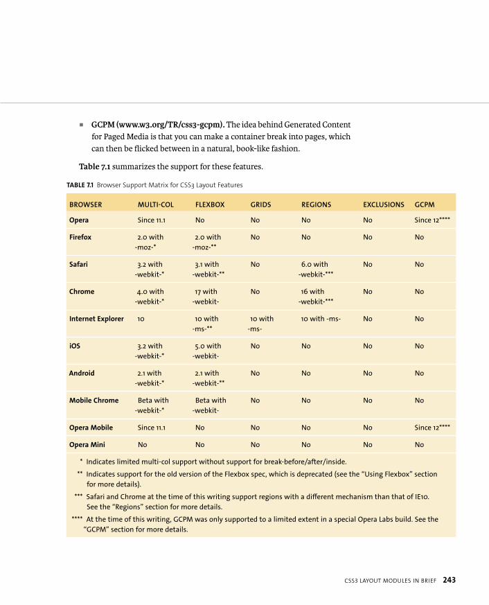
ptg8274462
CSS3 LAYOUT MODULES IN BRIEF 243
� GCPM (www.w3.org/TR/css3-gcpm). The idea behind Generated Content for Paged Media is that you can make a container break into pages, which can then be flicked between in a natural, book-like fashion.
Table 7.1 summarizes the support for these features.
TABLE 7.1 Browser Support Matrix for CSS3 Layout Features
BROWSER MULTI-COL FLEXBOX GRIDS REGIONS EXCLUSIONS GCPM
Opera Since 11.1 No No No No Since 12****
Firefox 2.0 with
-moz-*
2.0 with
-moz-**
No No No No
Safari 3.2 with
-webkit-*
3.1 with
-webkit-**
No 6.0 with
-webkit-***
No No
Chrome 4.0 with
-webkit-*
17 with
-webkit-
No 16 with
-webkit-***
No No
Internet Explorer 10 10 with
-ms-**
10 with
-ms-
10 with -ms- No No
iOS 3.2 with
-webkit-*
5.0 with
-webkit-
No No No No
Android 2.1 with
-webkit-*
2.1 with
-webkit-**
No No No No
Mobile Chrome Beta with
-webkit-*
Beta with
-webkit-
No No No No
Opera Mobile Since 11.1 No No No No Since 12****
Opera Mini No No No No No No
* Indicates limited multi-col support without support for break-before/after/inside.
** Indicates support for the old version of the Flexbox spec, which is deprecated (see the “Using Flexbox” section
for more details).
*** Safari and Chrome at the time of this writing support regions with a different mechanism than that of IE10.
See the “Regions” section for more details.
**** At the time of this writing, GCPM was only supported to a limited extent in a special Opera Labs build. See the
“GCPM” section for more details.
ptg8274462
244 CHAPTER 7 CSS3 LAYOUT CHOPS
The CSS Multi-column layout spec provides you with a small, focused set of tools for breaking a body of content into multiple columns. This isn’t just limited to text: You can create multi-col layouts with it if you like, and do smart tasks like have images or other elements span more than one column. But it isn’t great for full multi-col layouts. For example, you can’t specify different widths for individual columns.
So without further ado, let’s look at a simple example. You can find my finished example in the file simple-multi-col1.html in the chapter7 code download folder. In the file, note that the multi-col-related properties have been specified with prefixes for Firefox, and the WebKit browsers but not for IE and Opera, which sup-ports them without prefixes. Also note that most of the properties are applied to the parent container of the actual content you want to split into columns, in this case the <section> element that contains the main dummy content.
MULTI-COL LAYOUTS

ptg8274462
MULTI-COL LAYOUTS 245
SETTING THE NUMBER OF COLUMNS
To start, you use the column-count property to specify the number of columns you want:
section {
column-count: 3;
}
Specifying a number of columns equally divides your content into that number of columns across the horizontal space available. This produces the effect shown in Figure 7.1.
You can immediately see why this is useful: It is so flexible and easy. Prior to the introduction of this property, you had to break the content into multiple child containers and then float those; if content or layout requirements changed, you had to modify your markup.
FIGURE 7.1 Multiple columns
were never this easy before!
NOTE: In my code you’ll see that to give the columns some space
around the edges and line up at the top, I had to apply some padding to
the whole <section> and remove the top padding from the first main
content <h2>. You need to think carefully about this kind of styling
when trying to get multi-col layouts to look right. You’ll learn more
about this in a more complicated example later in this chapter.

ptg8274462
246 CHAPTER 7 CSS3 LAYOUT CHOPS
COLUMN WIDTH, NOT COUNT?
Another option available to you for indicating the number of columns you want is to specify a column-width property with a unit distance, like so:
section {
column-width: 25rem;
}
The effect this has is to make the columns adopt a best-fit approach. If three lots of the specified distance can fit into the available container width or thereabouts, you’ll produce three columns. If the width becomes narrower or wider, you may end up with two or four, and so on. The actual column width does vary, because the browser tries to fit the columns as neatly as possible. Figure 7.2 shows a com-parison of different container widths.
FIGURE 7.2 Varying numbers
of columns as the container
width is increased.

ptg8274462
MULTI-COL LAYOUTS 247
SPECIFYING COLUMN GUTTERS
Next, you’ll add a couple of properties to specify how to divide vertical rules and space between the columns:
section {
column-width: 25rem;
column-rule: 3px solid #8B2101;
column-gap: 2rem;
}
This produces the result shown in Figure 7.3.Note that the value given to the column-gap property is divided equally on either
side of the column-rule. So in the preceding example, in between each column you’ll get a gap of 1 rem, followed by the 3-pixel rule, and then another gap of 1 rem.
Note that the column-rule property is shorthand and works in the same way with the same values as the standard border property. You can even specify the different components in longhand if you like:
column-rule-width: 3px;
column-rule-style: solid;
column-rule-color: #8B2101;
FIGURE 7.3 A much neater
effect. You’ve created dividing
rules and column gaps to
improve legibility.

ptg8274462
248 CHAPTER 7 CSS3 LAYOUT CHOPS
SPECIFYING HOW THE COLUMNS ARE FILLED WITH CONTENT
Another property you can specify, column-fill, can take two different properties, auto and balance. auto is the default, which just makes the columns fill up left to right and down to a certain length. This can cause an uneven result, as shown on the left in Figure 7.4. The better option is often balance, which fills in the content as equally as possible across the columns, leaving less unsightly gaps, as shown on the right in Figure 7.4.
section {
column-width: 20rem;
column rule: 3px solid #8B2101;
column-gap: 2rem;
height: 85rem;
column-fill: balance;
}
FIGURE 7.4 Demonstrating
the difference between auto
column fill (left) and column-
balanced column fill (right).

ptg8274462
MULTI-COL LAYOUTS 249
The problem with column-fill is that it only has an effect when you set a fixed height on the container that you are applying multi-col effects to, as you did in this example. From my experience, you’ll almost never want to do this because you can rarely control the exact amount of content you’ll want to show across multiple pages using the same template. So column-fill is of limited use in my opinion. I’ve left the code in the example for you to look at but commented it out.
SPAN CONTENT ACROSS MULTIPLE COLUMNS
Usually, you won’t want all your content to just sit in one column. The example could definitely do with some sorting out of those top-level headings, and the image is cut off. What can you do, aside from going down to the pub (or better still, logging on to Twitter) and complaining about the web not being print? You can remedy these problems somewhat with the column-span property. Look at the file simple-multi-col2.html. It is the same as the previous example, except that it has an image added into the main content body. Let’s make the main headings and the image span all the columns, like so:
section h2 {
column-span: all;
}
section h2 + p, section img + p {
margin-top: 0;
}
section img {
column-span: all;
margin: 1rem auto;
}
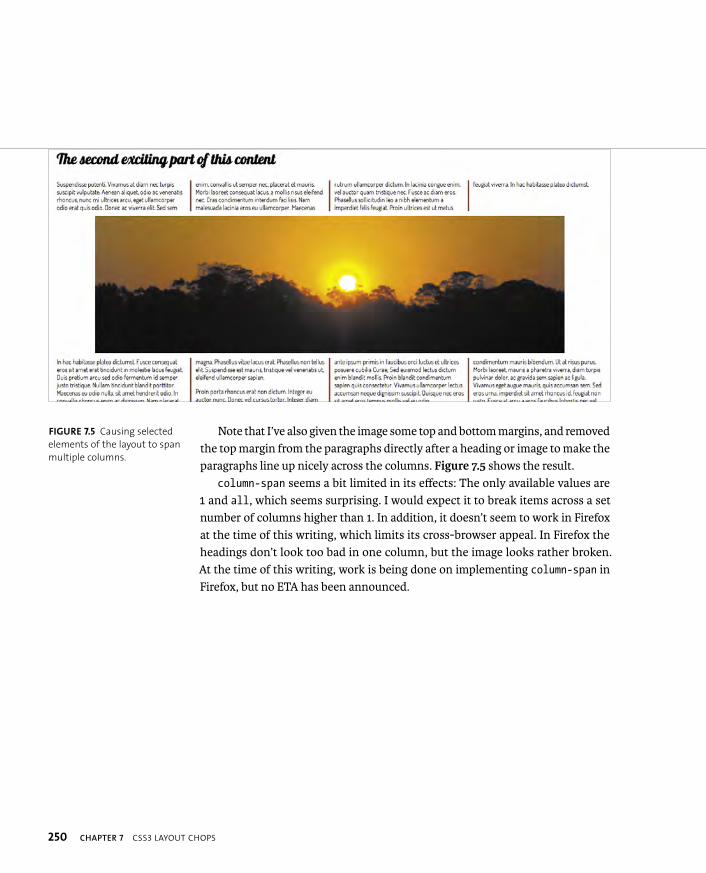
ptg8274462
250 CHAPTER 7 CSS3 LAYOUT CHOPS
Note that I’ve also given the image some top and bottom margins, and removed the top margin from the paragraphs directly after a heading or image to make the paragraphs line up nicely across the columns. Figure 7.5 shows the result.
column-span seems a bit limited in its effects: The only available values are 1 and all, which seems surprising. I would expect it to break items across a set number of columns higher than 1. In addition, it doesn’t seem to work in Firefox at the time of this writing, which limits its cross-browser appeal. In Firefox the headings don’t look too bad in one column, but the image looks rather broken. At the time of this writing, work is being done on implementing column-span in Firefox, but no ETA has been announced.
FIGURE 7.5 Causing selected
elements of the layout to span
multiple columns.
ptg8274462
MULTI-COL LAYOUTS 251
CONTROLLING WHERE THE COLUMNS BREAK
A number of properties defined in multi-col are intended to allow you to set where columns will break. To illustrate this, let’s look at the file our-friends-multi-col.html. It is the same as the previous version of this example you saw, but I’ve added some <h3> elements into the mix and an unordered list to experiment with. As is, the situation isn’t great; you’ll tend to get unsightly column breaks in places, such as just after the <h3>s.
To remedy this problem, you need to tell the browser where to break your columns! The available break properties and their values are as follows:
� break-before. Controls breaking before the element(s) being selected. Pos-sible values are auto, always, avoid, column, and avoid-column.
� break-after. Controls breaking after the element(s) being selected. Possible values are auto, always, avoid, column, and avoid-column.
� break-inside. Controls breaking inside the element(s) being selected. Pos-sible values are auto, avoid, and avoid-column.
To stop the columns from breaking after headings, you could use the follow-ing ruleset:
h3 {
break-after: avoid-column;
}
It is also best to always break columns before the <h3>s so they appear at the top of the columns. This can be done like so:
h3 {
break-before: column;
}
NOTE: There are other break property values besides those listed, but they
only apply to paged media: avoid-page, left, page, and right.

ptg8274462
252 CHAPTER 7 CSS3 LAYOUT CHOPS
A REAL MULTI-COLUMN LAYOUT
Let’s finish off this section with a slightly more complicated example—a more traditional multi-col layout with different elements in each column rather than just a single body of text split into columns. Check out the file our-friends-multi-col.html, the first version of my parody Disney movie. It contains more complicated content: six character bios. Each bio consists of a heading, image, and paragraph:
<article>
<h2>...</h2>
<img src=” “ alt=” “>
<p>...</p>
</article>
The only multi-col property this uses is column-width, which allows the number of columns to change at different widths without modifying the content.
section {
...
column-width: 36rem;
}
To get the columns to sit well, I set a fixed height on the articles:
article {
...
height: 45rem;
...
}
You are now in possession of a useful little responsive multi-column layout (Figure 7.6). This layout is actually very quick to implement and is flexible, com-pared to using floats.
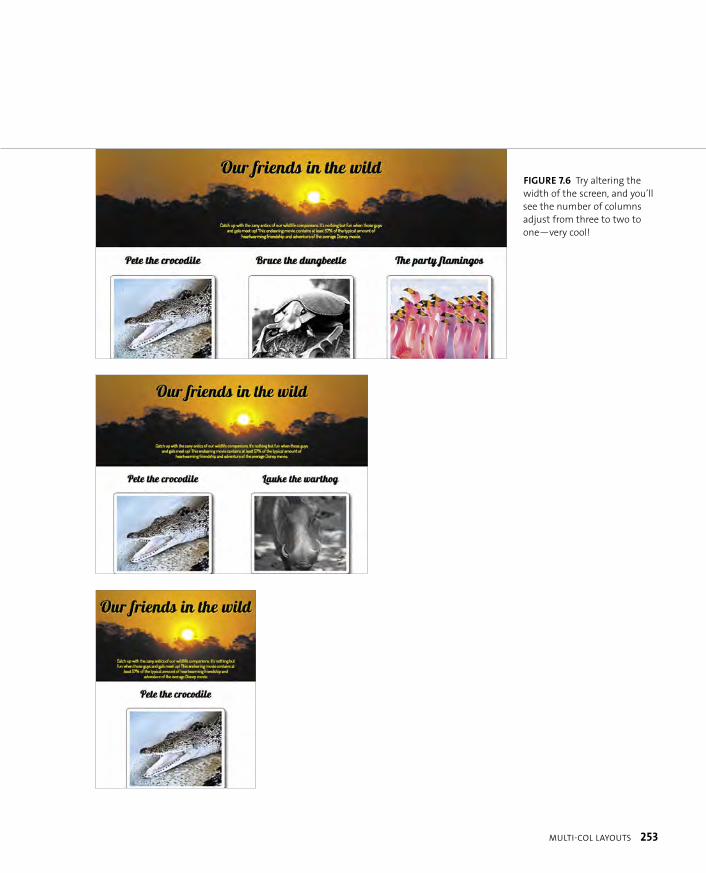
ptg8274462
MULTI-COL LAYOUTS 253
FIGURE 7.6 Try altering the
width of the screen, and you’ll
see the number of columns
adjust from three to two to
one—very cool!
ptg8274462
254 CHAPTER 7 CSS3 LAYOUT CHOPS
MULTI-COL PROBLEMS
Apart from some of the support issues documented earlier, the CSS Multi-column layout module has other problems associated with it. First, it obviously won’t work in older browsers like IE6–9. To remedy this, you could use Modernizr to detect support for multi-col (see Chapter 5 for more information on Modernizr) and pro-vide alternative styling for nonsupporting browsers, perhaps using some kind of slightly more limited floated layouts. Modernizr refers to multi-col as csscolumns.This is what you are testing for.
Second, multi-col has a fairly limited scope in terms of how it can be used: It was created to be used in specific circumstances where you want to put content into multiple columns and the content isn’t too complicated. You can’t create full magazine-style layouts or full multiple-column sites with multi-col, because you can’t specify widths of individual columns, column breaking seems unreliable, and the spec in general is limited in scope. For such tasks, you need a combination of different layout tools.
ptg8274462
USING FLEXBOX 255
Flexbox (www.w3.org/TR/css3-flexbox) is designed to facilitate some complicated layout techniques involving the spacing and ordering of child containers of a box. It is actually a new type of box model. To lay out some elements using Flexbox, you must set their parent container to use the new box model by using a new value of the display property:
section {
display: flex;
}
Or if you want your container to be inline, you’d use this:
section {
display: inline-flex;
}
Now let’s get cooking with some examples.
FLEXBOX SYNTAX CHANGES
At the time of this writing, only Chrome Canary supported the new Flexbox syntax shown throughout this
section. And it may well be different again by the time you read it; the spec has undergone a lot of changes
in the time I’ve been writing this. In fact, I had to rewrite my Flexbox examples four times during the course
of writing this book—such is the folly of trying to work with nascent specs! In any case, the chapter should
still nicely demonstrate the concepts of Flexbox.
Other modern browsers currently support Flexbox but with an older version of the syntax from 2009. You
can see how the new and old versions of the syntax map at
http://wiki.csswg.org/spec/flexbox-2009-2011-spec-propertymapping.
To solve the problem of different browsers supporting different versions of Flexbox, if you are considering
using Flexbox in a project, for now I’d recommend that you feed browsers the newest syntax by default, and
then feed alternative styles to those that don’t support the new syntax using Modernizr.
USING FLEXBOX
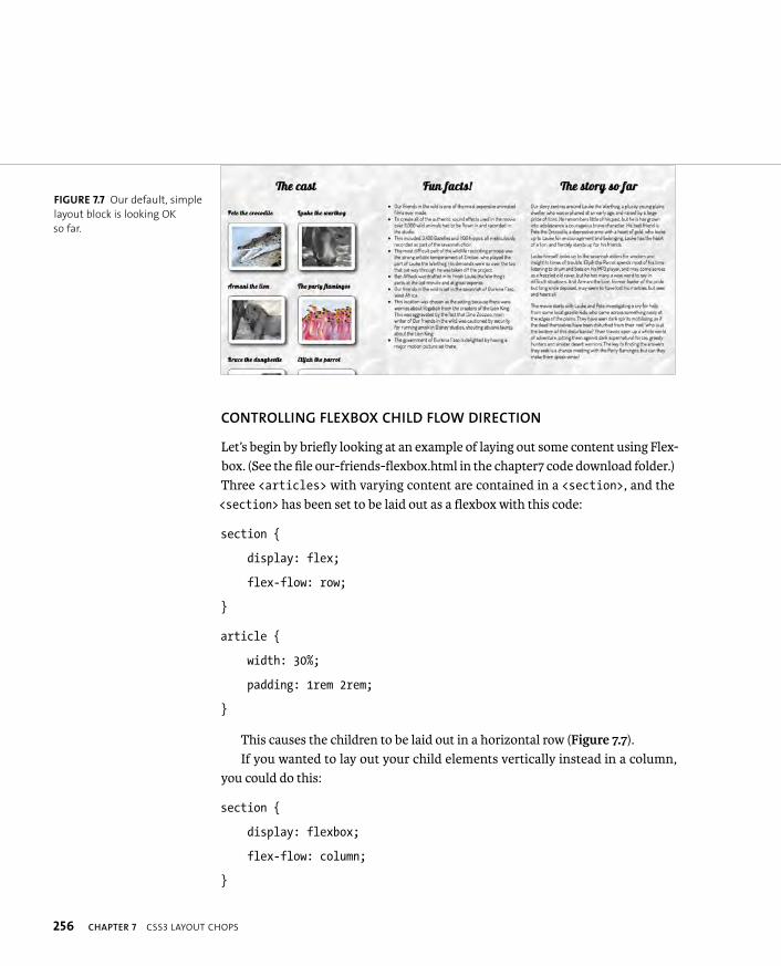
ptg8274462
256 CHAPTER 7 CSS3 LAYOUT CHOPS
CONTROLLING FLEXBOX CHILD FLOW DIRECTION
Let’s begin by briefly looking at an example of laying out some content using Flex-box. (See the file our-friends-flexbox.html in the chapter7 code download folder.) Three <articles> with varying content are contained in a <section>, and the <section> has been set to be laid out as a flexbox with this code:
section {
display: flex;
flex-flow: row;
}
article {
width: 30%;
padding: 1rem 2rem;
}
This causes the children to be laid out in a horizontal row (Figure 7.7).If you wanted to lay out your child elements vertically instead in a column,
you could do this:
section {
display: flexbox;
flex-flow: column;
}
FIGURE 7.7 Our default, simple
layout block is looking OK
so far.

ptg8274462
USING FLEXBOX 257
And the great thing is that you can also reverse the direction the child elements are displayed in, either horizontally or vertically, by using row-reverse and column-reverse. Try these options to see what happens!
WRAPPING ELEMENTS ONTO NEW LINES
If there are enough child elements to overflow the parent element, you can make them wrap onto multiple lines by adding an extra keyword to the flex-flow prop-erty, as shown in the example file our-friends-flexbox-wrap.html:
section {
display: flexbox;
flex-flow: row wrap;
}
This is similar to the previous example but contains six <article>s of equal width, not three. This produces the result shown in Figure 7.8. Note how, when you reduce the width of the browser window, the layout will go from three to two to one column—a cool responsive effect.
Note: flex-flow is actually a shorthand property for setting the flex-directionand flex-wrap properties on one line. Their possible values are as follows:
� flex-wrap. nowrap, wrap, wrap-reverse
� flex-direction. row, row-reverse, column, column-reverse
FIGURE 7.8 Using row wrap
to make child elements wrap
neatly across different rows
down the container is very
useful in some circumstances.
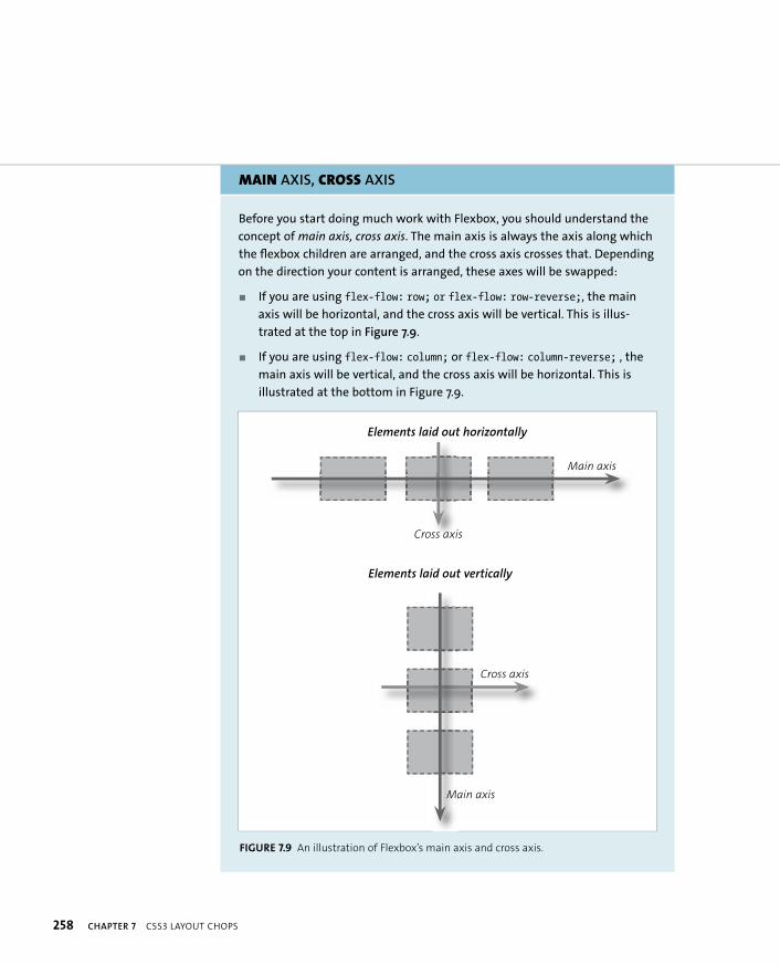
ptg8274462
258 CHAPTER 7 CSS3 LAYOUT CHOPS
MAIN AXIS, CROSS AXIS
Before you start doing much work with Flexbox, you should understand the
concept of main axis, cross axis. The main axis is always the axis along which
the flexbox children are arranged, and the cross axis crosses that. Depending
on the direction your content is arranged, these axes will be swapped:
� If you are using flex-flow: row; or flex-flow: row-reverse;, the main
axis will be horizontal, and the cross axis will be vertical. This is illus-
trated at the top in Figure 7.9.
� If you are using flex-flow: column; or flex-flow: column-reverse; , the
main axis will be vertical, and the cross axis will be horizontal. This is
illustrated at the bottom in Figure 7.9.
Elements laid out horizontally
Main axis
Cross axis
Elements laid out vertically
Cross axis
Main axis
FIGURE 7.9 An illustration of Flexbox’s main axis and cross axis.
ptg8274462
USING FLEXBOX 259
CUSTOMIZING DISPLAY ORDER OF CHILD ELEMENTS
Another rather killer feature of Flexbox is that it gives you the ability to change the ordering of your child elements. This is done using the order property. For example, going back to the our-friends-flexbox.html example, if you want to grab the first <article> (“Fun facts!”) and display it last, you could do this:
article:nth-of-type(2) {
order: 1;
}
This initially looks illogical. Surely this code should cause it to appear first, not last. With flex-order, you put your child elements inside ordinal groups: The elements from each ordinal group appear from lowest ordinal group number to highest ordinal group number, starting from 0. If multiple elements appear in the same ordinal group, they will then be ordered inside the group according to their position in the original source order.
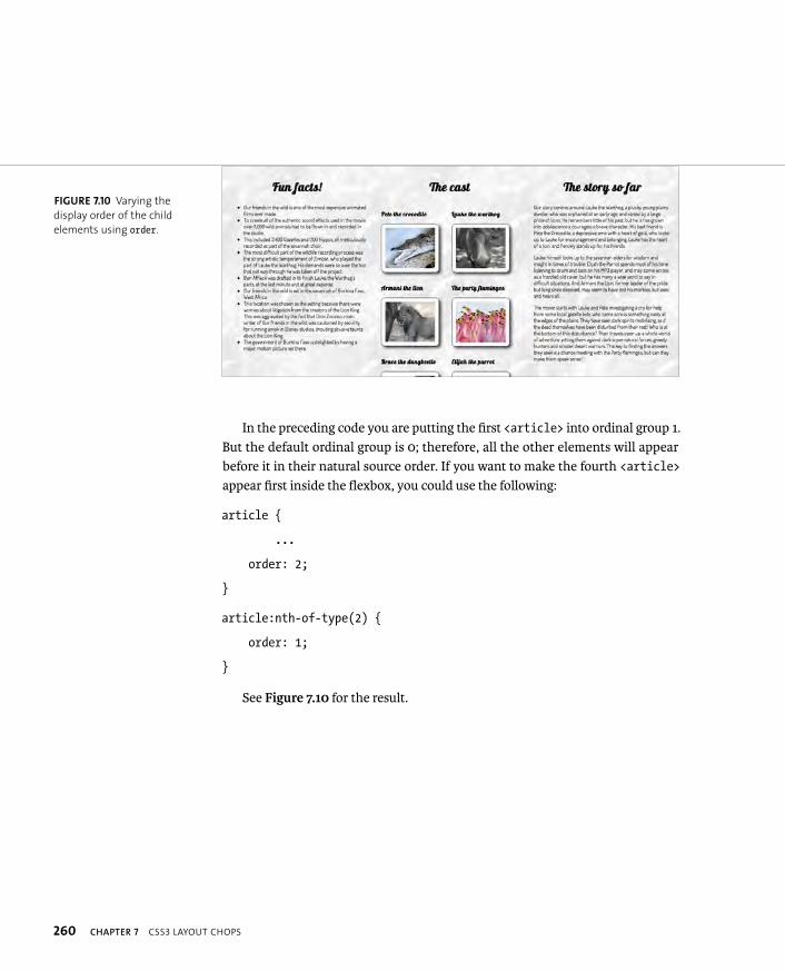
ptg8274462
260 CHAPTER 7 CSS3 LAYOUT CHOPS
In the preceding code you are putting the first <article> into ordinal group 1. But the default ordinal group is 0; therefore, all the other elements will appear before it in their natural source order. If you want to make the fourth <article>appear first inside the flexbox, you could use the following:
article {
...
order: 2;
}
article:nth-of-type(2) {
order: 1;
}
See Figure 7.10 for the result.
FIGURE 7.10 Varying the
display order of the child
elements using order.
ptg8274462
USING FLEXBOX 261
ALIGNING FLEXBOX CHILDREN
Flexbox also rocks big time when you want to align your flexbox children at the start, middle, or end of a column of content, for example. You can use the justify-content property to align your children along the main axis in whichever direc-tion you’ve set that to be. The possible values are flex-start, flex-end, center,space-between, and space-around.
I’ve used this to lay out the <header> content of my example. I wanted the content all centered, horizontally and vertically. This kind of layout is usually quite difficult to do, especially vertically (because you can’t rely on the old margin: autotrick for centering), and you usually end up messing around with positioning and inaccurate measurements.
To start with, you should set your <header> to be laid out like a flexbox in a vertical column:
header {
display: flex;
flex-flow: column;
}
By default this will lay out your elements in a column aligned to the left hori-zontally and sort of near the top vertically. Let’s first align them in a better position vertically:
header {
display: flexbox;
flex-flow: column;
justify-content: center;
}
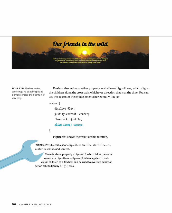
ptg8274462
262 CHAPTER 7 CSS3 LAYOUT CHOPS
Flexbox also makes another property available—align-items, which aligns the children along the cross axis, whichever direction that is at the time. You can use this to center the child elements horizontally, like so:
header {
display: flex;
justify-content: center;
flex-pack: justify;
align-items: center;
}
Figure 7.11 shows the result of this addition.
FIGURE 7.11 Flexbox makes
centering and equally spacing
elements inside their container
very easy.
NOTES: Possible values for align-items are flex-start, flex-end,
center, baseline, and stretch.
There is also a property, align-self, which takes the same
values as align-items. align-self, when applied to indi-
vidual children of a flexbox, can be used to override behavior
set on all children by align-items.
ptg8274462
USING FLEXBOX 263
THE FLEXIBILITY OF FLEXBOX
The last Flexbox feature you’ll look at is the ability to make child elements and their surrounding whitespace flexible. The property you need to do this is flex,as shown here:
section {
display: flexbox;
flex-flow: row;
}
article {
flex: 1 1 200px;
}
So what do the three arguments inside the function do?The third value is the preferred size of the child elements. If specified, the size
value will be applied to all the children before the other arguments come into effect. So if you set this as 200 pixels, each child element will have a width of 200 pixels (or height, if flex-flow is set to column rather than row) .
The first value is the positive flex, a proportion that dictates what share of remaining space available in the parent the children will have. So, for example, if the parent element of the three <article>s was 750 pixels and each one had a positive flex value of 1, as in the preceding code, the extra 150 pixels would be split equally between the children; each one would end up as 250 pixels wide.
If one of the children had a positive flex of 2, it would receive twice as much of the remaining space as the other two, so would end up as (150/4 x 2) + 200 = 275 pixels. The other two would be 150/4 + 200 = 237.5 pixels. The positive flex is the only mandatory argument.
The second value is the negative flex and is also a proportion, except that it works in the opposite direction to the positive flex value. This dictates what happens when the children of the flexbox overflow their parent. In the preceding example, if the parent element was 750 pixels wide and the children had a preferred size of 300 pixels for a total width of 900 pixels, they would overflow the parent by 150 pixels. A negative flex value of 1 given to all of them would cause each one to be reduced by 50 pixels to stop them overflowing their parent; each would end up as 250 pixels wide.

ptg8274462
264 CHAPTER 7 CSS3 LAYOUT CHOPS
If one of the children had a negative flex of 2, it would be reduced in width by twice as much as the other two, so would end up as 300 - (150/4 x 2) = 225 pixels. The other two would be 300 - 150/4 = 262.5 pixels. So in the case of negative flex, a lower number means less of a reduction and therefore a wider element!
Note: If no explicit negative flex value is set, the default value comes into play, which is 1.
This is complex, so let’s go over the workflow here. If you specify all three arguments, the workflow looks like this:
1. The preferred size is applied to all the flexbox children.
2. The remaining space is divided between the flexbox children according to the positive flex value set.
3. If the combined width (or height) of the children causes them to overflow the parent container, the negative flex values, if set, will shrink them down until they fit in. The ratio of these will dictate how much each child is shrunk by.
Note that flex is actually a shorthand property. You can see the three values it holds individually using flex-grow, flex-shrink, and flex-basis.
Time for an example! Look at the our-friends-flexbox-flexible.html file in the chapter7 code download folder. This is the same as our-friends-flexbox.html but with some experimental flex values applied to the <article>s. Be prepared to follow along and change them if you want to experience the different effects.
Let’s start by setting the following values on the child <articles>:
#cast {
flex: 1;
}
#facts {
flex: 1;
}
#plot {
flex: 1;
}
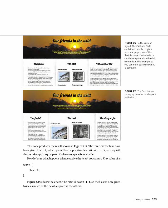
ptg8274462
USING FLEXBOX 265
This code produces the result shown in Figure 7.12. The three <articles> have been given flex: 1, which gives them a positive flex ratio of 1 : 1 : 1, so they will always take up an equal part of whatever space is available.
Now let’s see what happens when you give the #cast container a flex value of 2:
#cast {
flex: 2;
}
Figure 7.13 shows the effect. The ratio is now 2 : 1 : 1, so the Cast is now given twice as much of the flexible space as the others.
FIGURE 7.12 In the current
layout, The Cast and Facts
containers have been given
an equal proportion of the
flexible space. I’ve included a
subtle background on the child
elements in this example so
you can more easily see what
is going on.
FIGURE 7.13 The Cast is now
taking up twice as much space
as the Facts.

ptg8274462
266 CHAPTER 7 CSS3 LAYOUT CHOPS
Let’s briefly explore the other two arguments and their effects. Try setting these values on your properties:
#cast {
flex: 1 400px;
}
#facts {
flex: 1 250px;
}
#plot {
flex: 1 250px;
}
In this case, you are setting widths of 400, 250, and 250 pixels on the flexible containers; the remaining width is then divided equally between them, because the positive flex is set to 1 for all of them.
Now try these values:
#cast {
flex: 1 400px;
}
#facts {
flex: 1 400px;
}
#plot {
flex: 1 500px;
}

ptg8274462
USING FLEXBOX 267
Here, the combined widths would cause the containers to overflow their par-ent, which would look horrible. Fortunately, a default negative flex value of 1 is set on all of the children, which causes them all to shrink by an equal amount of the overflow, meaning that all is well. If you wanted one of the children to be reduced by a larger amount than the others, you could set an explicit negative flex value on it, for example:
#plot {
flex: 1 3 500px;
}
Now the flexible boxes are shrunk in size until they no longer overflow their container. Because the negative flex ratio #cast to #facts is 1 : 3, #cast will have ¼ of the total width reduction applied to it, and #facts will have ¾ of the total width reduction applied to it.
This would cause the Plot to be shrunk by ths of the overflow amount, and the other two to be shrunk by only th—the shrinking ratio is 1 : 1 : 3.
CROSS-BROWSER FLEXBOX WITH MODERNIZR
As you’ve seen, Flexbox is very useful for solving some specific types of layout problems. The main problem with it right now is the lack of browser support. The new syntax you’ve seen so far in this section is only supported in Chrome Canary at the time of this writing.
To make it work across a wider range of browsers at the moment, you’ll need to feed other browsers the now deprecated 2009 Flexbox syntax that was imple-mented by Firefox, WebKit browsers, and IE.
NOTE: The site http://wiki.csswg.org/spec/flexbox-2009-2011-spec-property-
mapping provides a fairly useful table showing the mapping between the
old and new syntaxes, although this is now somewhat out of date. Peter
Gasston, tech reviewer for this book, has written a useful guide to the old
syntax at www.netmagazine.com/tutorials/css3-flexible-box-model-explained.
ptg8274462
268 CHAPTER 7 CSS3 LAYOUT CHOPS
You can put your cross-browser flexbox into action using your old friend Mod-ernizr. Modernizr detects support for the new Flexbox syntax (flexbox/no-flexbox)and the old version (flexbox-legacy/no-flexbox-legacy).
Look at the code download file our-friends-flexbox-modernizr.html. This is the same as the previous example you looked at except that Modernizr is included on the page, and a whole raft of legacy Flexbox properties are applied to browsers that only support the old syntax using Modernizr’s descendant selector system. I won’t list all of the fallback code here, but you can find it under the “Modernizr fallback rules” flag in the our-friends-flexbox-modernizr.html file.
These properties work fairly well and are fairly self-explanatory, although I found that box-flex (the old syntax of flex) seemed to work slightly oddly and unreliably. Hopefully, browsers will support the new syntax soon so that this kind of craziness will become a thing of the past!
TIP: To provide browsers that don’t even support the old Flexbox
syntax with alternative layout rules, use .no-flexbox-legacy xxx { ... }.

ptg8274462
EXPLORING GRIDS 269
The CSS Grid Positioning Module Level 3 (www.w3.org/TR/css3-grid) is designed to allow web designers to lay out web pages neatly in a stable grid. You most likely already do this, but usually you create your own grid system or use a third-party framework, such as 960 (http://960.gs) or Blueprint CSS (http://blueprintcss.org). CSS3 grids offer a simple native way of creating your own grid system, which has to be a good thing.
At the time of this writing, CSS3 grids are only supported by IE10 and nightly builds of the WebKit browsers (with -ms- and -webkit- prefixes, respectively), so I won’t cover them in depth. However, I’ll provide you with a solid example of how to use them, because they are bound to be important in the future.
In this example you’ll put together a simple grid layout using these nu-schule-kool-toolz (technical term.)
DEFINING THE GRID STRUCTURE
In a similar fashion to Flexbox, CSS3 grids work by using a custom value of the display property, grid, to designate a container as an area of the page that will be laid out using CSS3 grids (look at the file simple-grid.html in the chapter7 code download folder to follow along with this first example):
body {
display: grid;
}
EXPLORING GRIDS

ptg8274462
270 CHAPTER 7 CSS3 LAYOUT CHOPS
You then divide this container into columns and rows using the grid-columnsand grid-rows properties, like so:
body {
display: grid;
grid-columns: 30rem 40rem 30rem;
grid-rows: 1fr 1fr 1fr 1fr;
}
The grid-columns property specifies three columns in the grid, and they are 30 rems wide, 40 rems wide, and 30 rems wide, respectively. In this case, the grid-rows property is using a new CSS unit called fr (fraction), which means I will be this many parts of the total big. So in this case you have four rows that are all 1frbig for a total of 4fr. Therefore, each row spans 1/4 of the total height of the body.
You could also use percentages, other CSS length units, or auto to specify col-umns, for example:
body {
display: grid;
grid-columns: 30% 40% 30%;
grid-rows: 1fr 1fr 1fr 1fr;
}
In this alternative version, I’ve changed grid-columns so that the columns are percentages (you can see this alternative example in simple-grid2.html). Percent-ages work the way you’d expect them to, although you need to be careful about using weird combinations of percentages and absolute unit values: If they end up as less than 100% in one or both dimensions, you’ll waste space and produce unexpected results. If they end up as more than 100%, your content may be cut off.

ptg8274462
EXPLORING GRIDS 271
FITTING YOUR CONTENT ONTO THE GRID
Next, you need to start fitting your content onto the grid. This is done by applying some special properties to the child elements of the container that is set to display as a grid. In this simple example, the children look like this:
<header>
<h1>Header</h1>
</header>
<div id=”block1”>Block 1</div>
<div id=”block2”>Block 2</div>
<div id=”block3”>Block 3</div>
<div id=”block4”>Block 4</div>
<footer>
<h2>Footer</h2>
</footer>
You can fit these elements to the grid you defined earlier using the following properties:
� grid-column specifies the column the child element will be placed in, or start in, in the case of children that span multiple columns.
� grid-column-span specifies the number of columns that the child element will span (optional).
� grid-row specifies the row the child element will be placed in, or start in, in the case of children that span multiple rows.
� grid-row-span specifies the number of rows that the child element will span (optional).

ptg8274462
272 CHAPTER 7 CSS3 LAYOUT CHOPS
So, for example, you could lay out your content like this:
header {
grid-column: 1;
grid-column-span: 3;
grid-row: 1;
}
footer {
grid-column: 1;
grid-column-span: 3;
grid-row: 4;
}
#block1 {
background-color: blue;
grid-column: 1;
grid-row: 2;
grid-row-span: 2;
}
/* And so on - look at the code file for the rest of it */
This simple grid layout is shown in Figure 7.14.
FIGURE 7.14 A simple grid
layout in action.

ptg8274462
EXPLORING GRIDS 273
You can use nested grids if you like to create all kinds of complicated layouts, although if you consider doing this, your information architecture might need revisiting! I’m sure this simple example gives you a good idea of how powerful these grids can be, especially considering that you can create liquid grids as well as fixed grids, and you can place elements wherever you like on the grid regardless of source order and structure.
A REAL GRID EXAMPLE
Now let’s look at a more complex example. Here you’ll go back and re-lay out the “our-friends” in the wild example again using CSS grids. As you follow along, you can look at the file our-friends-css-grids.html in the code download to find the right code if you go wrong at some point.
As grids become more complex, it’s best to start drawing them out on paper (or some other medium) and then refer to the sketch as you start placing your content. The grid you’ll use looks something like the one shown in Figure 7.15.
<header>
<article>
<article>
<article>
<article>
<article>
<article>d
ivider
divid
er
divid
er
<footer>
1
4%
7
4%
4
12%
2
20%
1 300px
2 450px
3 450px
4 450px
1 300px
3
20%
5
20%
6
20%
grid-columns
gri
d-r
ow
s
FIGURE 7.15 A schematic of
the example grid.
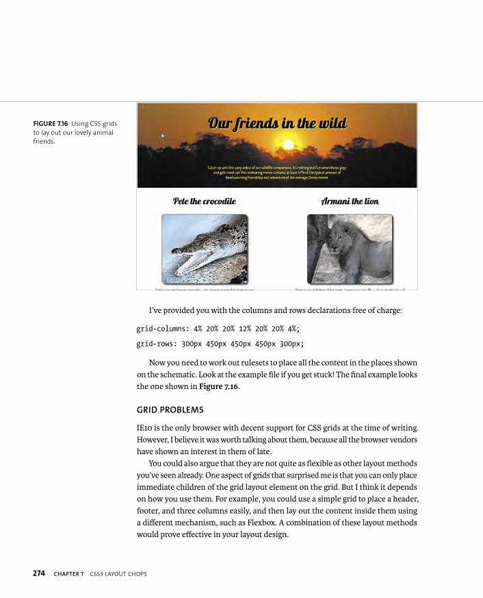
ptg8274462
274 CHAPTER 7 CSS3 LAYOUT CHOPS
I’ve provided you with the columns and rows declarations free of charge:
grid-columns: 4% 20% 20% 12% 20% 20% 4%;
grid-rows: 300px 450px 450px 450px 300px;
Now you need to work out rulesets to place all the content in the places shown on the schematic. Look at the example file if you get stuck! The final example looks the one shown in Figure 7.16.
GRID PROBLEMS
IE10 is the only browser with decent support for CSS grids at the time of writing. However, I believe it was worth talking about them, because all the browser vendors have shown an interest in them of late.
You could also argue that they are not quite as flexible as other layout methods you’ve seen already. One aspect of grids that surprised me is that you can only place immediate children of the grid layout element on the grid. But I think it depends on how you use them. For example, you could use a simple grid to place a header, footer, and three columns easily, and then lay out the content inside them using a different mechanism, such as Flexbox. A combination of these layout methods would prove effective in your layout design.
FIGURE 7.16 Using CSS grids
to lay out our lovely animal
friends.

ptg8274462
OTHER LAYOUT MODULES WORTHY OF MENTION 275
A few other CSS3 layout modules are also worth mentioning, although I’ll just talk about them briefly, because their browser support and finished status is even more nonexistent than those you’ve learned about already.
REGIONS
The CSS Regions Module Level 3 spec (http://dev.w3.org/csswg/css3-regions) defines a set of functionality for specifying different elements to flow content into. This was supported in IE10 and Chrome/Safari nightlies at the time of this writing. But at the time, the spec looked to be very much in flux and likely to change—hence my unwillingness to cover it in much detail.
However, for completeness I’ll walk you through it. See the file simple-regions-ms.html in the chapter7 code download folder for an example that will work in IE10. Here you have a set of <div>s for laying out content into:
<section id=”layout”>
<div id=”region1” class=”region”></div>
<div id=”region2”><img src=”images/sunset.jpg” p alt=”sunset image”></div>
<div id=”region3” class=”region”></div>
<div id=”region4” class=”region”></div>
<div id=”region5” class=”region”></div>
</section>
The actual content is stored in a separate file—region-content.html—and included at the bottom of the main example page using an iFrame:
<iframe id=”region-content” src=”region-content.html”>
The region’s magic works as follows: You identify the source of the content (in this case, the iFrame) by its ID and give it a keyword of your choosing:
#region-content {
-ms-flow-into: my-regions;
}
OTHER LAYOUT MODULES
WORTHY OF MENTION
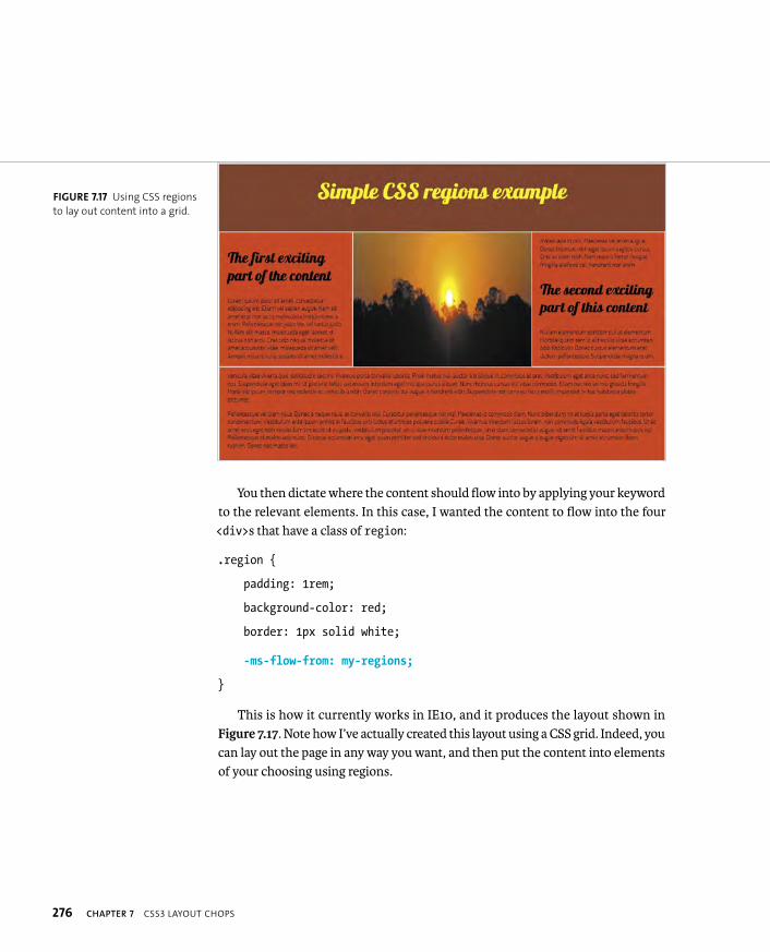
ptg8274462
276 CHAPTER 7 CSS3 LAYOUT CHOPS
You then dictate where the content should flow into by applying your keyword to the relevant elements. In this case, I wanted the content to flow into the four <div>s that have a class of region:
.region {
padding: 1rem;
background-color: red;
border: 1px solid white;
-ms-flow-from: my-regions;
}
This is how it currently works in IE10, and it produces the layout shown in Figure 7.17. Note how I’ve actually created this layout using a CSS grid. Indeed, you can lay out the page in any way you want, and then put the content into elements of your choosing using regions.
FIGURE 7.17 Using CSS regions
to lay out content into a grid.
ptg8274462
OTHER LAYOUT MODULES WORTHY OF MENTION 277
Try resizing the browser window and note how the content keeps reflowing inside the regions: The reason is that I’ve set the width of the grid rows using per-centages. The content starts to flow into the first region in the source order and then continues to the second region when the first is filled, and so on.
WebKit-based browsers currently support regions but with a different syntax that isn’t limited to using an iFrame to contain the content:
#region-content {
content: -webkit-from-flow(“flow_name”);
}
.region {
-webkit-flow: “flow_name”;
}
An example of this that will work in Chrome Canary only (at the time of this writing) can be seen in simple-regions-webkit.html. Be warned though: To enable CSS regions in this browser, you currently need to type about:flags into the Chrome Canary URL bar, enable CSS Regions in the settings, and relaunch.
EXCLUSIONS
The idea behind the CSS Exclusions and Shapes Module Level 3 (http://dev.w3.org/csswg/css3-exclusions) is that you can define a shape or specify an element and then flow content around that shape/element, thereby creating complicated lay-outs. You might see these types of layouts in a magazine with text flowing around an image of a mountain or a floated image halfway between two columns of text. You can think of exclusions as a way to create more powerful floats. Indeed, CSS3 did have a feature called positioned floats, which was invented by Microsoft, but this seems to have been merged with the Exclusions spec now.
TIP: In the same manner as multi-col, you can use break properties to
specify where content should and shouldn’t break when it is nearing the
edge of your regions. See http://dev.w3.org/csswg/css3-regions/#region-flow-break
for more details.

ptg8274462
278 CHAPTER 7 CSS3 LAYOUT CHOPS
Exclusions aren’t supported anywhere at the time of this writing, but I’ll at least give you an idea of how they are supposed to work. To make a more interesting float, you could have a simple section with a figure inside it, like this:
<section>
...
<figure> ... </figure>
...
</section>
You should be able to absolutely position the figure inside the section, and then turn it into an exclusion using the wrap-flow property:
figure {
position: absolute;
color: #fff;
top: 30%;
left: 40%;
wrap-flow: both;
}
You can then give it padding and a margin, like so:
figure {
position: absolute;
color: #fff;
top: 30%;
left: 40%;
wrap-flow: both;
wrap-padding: 10px;
wrap-margin: 10px;
}
ptg8274462
OTHER LAYOUT MODULES WORTHY OF MENTION 279
wrap-flow specifies what side of the exclusion element, in this case the figure, you want the text to flow around. You can specify auto, start, end, both, maximum,or clear:
� auto is the default: If you set this value, the surrounding text will not wrap around the exclusion; it will just sit underneath the exclusion element as if it doesn’t exist.
� start means that content will wrap around the start of the exclusion, but the space after the end of it will be left empty of content.
� end means that content will wrap around the end of the exclusion, but the space before the start of it will be left empty of content.
� both means that the content will wrap around the start and end of the exclusion.
� maximum will cause content to wrap around the side of the exclusion that has the largest amount of space next to it.
� clear means that content will only wrap around the top and bottom of the exclusion; the space to the left and right (start and end) of it will be left empty.
wrap-margin specifies how much margin you want left between the exclusion element and the rest of the content.
wrap-padding specifies how much padding you want left between the exclusion element and the rest of the content.
If you have multiple exclusions interacting inside the same space, they should wrap around one another in reverse order of how they are placed in the document. See http://dev.w3.org/csswg/css3-exclusions/#exclusions-order for more details.
If you want your content to flow around a more complicated shape, you can define what the shape of the exclusion will be using the shapes part of the Exclu-sions spec: See http://dev.w3.org/csswg/css3-exclusions/#shapes. You’ll be able to create circles, ellipses, and so on to shape your exclusions or even base those shapes on images.

ptg8274462
280 CHAPTER 7 CSS3 LAYOUT CHOPS
GCPM
Finally, let’s look at the CSS Generated Content for Paged Media (GCPM) mod-ule (www.w3.org/TR/css3-gcpm). This module is currently supported only by the experimental “Opera Reader” technology, but it is lots of fun to play with. You can set your whole web page (or a small part of it) to be paginated using rulesets defined in a special paged at-rule:
@media -o-paged {
...
}
To set the whole page content, you can do this:
@media -o-paged {
html {
height: 100%;
overflow: -o-paged-x;
}
}
When you load this page in a supporting browser, the whole page content will be paginated, and you can flick through the pages by swiping left and right on a touch device, and by using arrow keys on a non touch device.
Opera Reader/GCPM has many more features besides. See Håkon Wium Lie’s website at http://people.opera.com/howcome/2011/reader for experimental builds and a more complete treatment.

ptg8274462
WRAPPING UP 281
In this chapter you explored some of the new layout features contained among the CSS3 modules, including multi-col, flexbox, exclusions, and generated content for paged media.
A significant number of these features are currently not supported across brows-ers, and unfortunately, some of them don’t degrade gracefully, causing layouts to completely break in those browsers that don’t support them. However, browser vendors are working hard on adding support for them. In the meantime, you can provide alternative styling to nonsupporting browsers through tools like Modernizr, and you should be prepared for the revolution when it comes.
WRAPPING UP
ptg8274462
8
RESPONSIVE AND ADAPTIVE DESIGN
ptg8274462
283
One of the biggest challenges faced by
web developers and designers today is
optimizing websites so they look and perform well across
a wide range of devices that differ significantly in screen
size, processing power, and so on. You no longer just have to think
about different browsers on a desktop or laptop. You now have to
consider mobile phones (both modern smartphones and older
feature phones), tablets, web-enabled TVs, and other devices.
This may sound like a nightmare, and with more web-enabled
devices no doubt appearing every year, you might think it’ll get
worse. How on earth do you provide a good web experience across
all these devices?
In this chapter I’ll discuss high-level strategies and implementa-
tion options available for combatting such problems.

ptg8274462
284 CHAPTER 8 RESPONSIVE AND ADAPTIVE DESIGN
A BRIEF HISTORY OFWEB BROWSERS
When the web was first introduced in the early to mid-90s, it was basically view-able using web browser software installed on personal computers (first desktops, and slightly later, laptops). These computers had monitors with resolutions of 640 x 480 pixels, 800 x 600 pixels, and later on, 1024 x 768 pixels. This didn’t really change much until the middle of the 2000s when mobile phones became power-ful enough to run real web browsers (OK, before that was a lame standard called WAP, but I won’t bother discussing it here; you can look it up if you are interested).
Fast forward a few more years and a huge variety of devices are now capable of browsing the web:
� Modern smart phones do a great job of rendering websites, for example, iPhones, Android-based devices, and BlackBerry and Nokia phones running Opera Mobile, Mobile Chrome, Fennec, and other browsers.
� Several varieties of tablets are available too, mainly iPads and a slew of Android-based devices, again running similar browsers to those described previously but with larger screens.
� TVs are increasingly becoming web-enabled: You can view the web on TVs (from companies like Sony, Samsung, and Ikea) with built-in browsers and on games consoles run through TVs (like the Nintendo Wii and the PlayStation 3).
� Portable game consoles like the Nintendo 3DS and Sony Vita all have web browsers as well.
� Many people in the world still browse the web using feature phones that don’t have very good web browsers installed or use a proxy browser, such as Opera Mini to gain access to web content (see the “Opera Mini” sidebar).
ptg8274462
A BRIEF HISTORY OF WEB BROWSERS 285
OPERA MINI
Opera Mini is a proxy-based browser that doesn’t work like a normal web browser. Usually, you install
a browser on your device that has full rendering capabilities. When a web page is browsed to, the code,
images, and other assets that make up that web page are downloaded to your device and interpreted
and assembled into a web page by the browser for you to interact with. But Opera Mini does not have full
rendering capabilities; it is merely a thin client that can display a static format similar to PDF called OBML
(Opera Binary Markup Language). The web-page code and assets, when requested, are actually downloaded
to a server farm to be assembled into the web page and are then compressed into this OBML format.
The OBML page is then sent to the device to be displayed. This system has some big advantages: First, OBML
is a static, compressed format. The size of the pages you are viewing can be reduced by up to 90 percent
using this system, meaning much smaller downloads, which is great for those on slow networks and those
still paying for web access by the kilobyte. Second, because rendering is done on the server, the Mini client
is very small and simple; therefore, it can run on low-powered phones—pretty much anything with a JVM
(Java Virtual Machine).
Opera Mini does have its disadvantages too. Rendering will not look as nice, because many styling features,
such as box shadows and web fonts, are turned off to save on bandwidth and processing power require-
ments. In addition, OBML just provides a static snapshot of the page you are viewing at the time it was ren-
dered; therefore, animated content (CSS animations, JavaScript-based animations, Flash, or even animated
GIFs) won’t work, and background script operations, such as Ajax page updates, won’t work either. This
means that web applications that rely on heavy scripting may not perform very well, depending on whether
the developer responsible tested in Opera Mini and used progressive enhancement to still provide a work-
able experience without JavaScript.
But most websites work well on Opera Mini. The point is not to provide a perfect browsing experience,
but to provide a fast, usable browsing experience that works on nearly any device. It is worth installing
Opera Mini on a high-powered device, such as an iPhone. If you are stuck on a slow, mobile phone network
and desperately need to use the web, Opera Mini can be very useful.

ptg8274462
286 CHAPTER 8 RESPONSIVE AND ADAPTIVE DESIGN
Broadly speaking, there are three main strategies for optimizing web content across different devices. Let’s look at each one in detail.
DO NOTHING SPECIAL
Do nothing special sounds great, huh? The truth is that as long as you create web content using open standards and best practices, as detailed in this book and other decent learning resources, your content will probably be accessible across most devices. The web is responsive by default. The <body> element will cover 100 per-cent of the browser window width unless you tell it not to. And if you use floats to arrange repeated content blocks in rows and size containers in percentages rather than absolute measurements, your layout will have some degree of flexibility as browser windows become narrower.
In addition, many HTML5 and CSS3 features will degrade gracefully in nonsup-porting browsers. As you can see in my CSS bling example in Opera 12 (Figure 8.1,left) and in Opera Mini 6 (Figure 8.1, right), many of the bling effects don’t work in Opera Mini, but the content is still readable.
NOTE: The Opera Mini screen shot shown in Figure 8.1
is actually taken from the Opera Mini simulator, which is
available at www.opera.com/developer/tools/mini.
RESPONSIVE DESIGN STRATEGIES
FIGURE 8.1 Graceful degradation of CSS3 bling in Opera 12 desktop (left)
and in Opera Mini 6 (right).
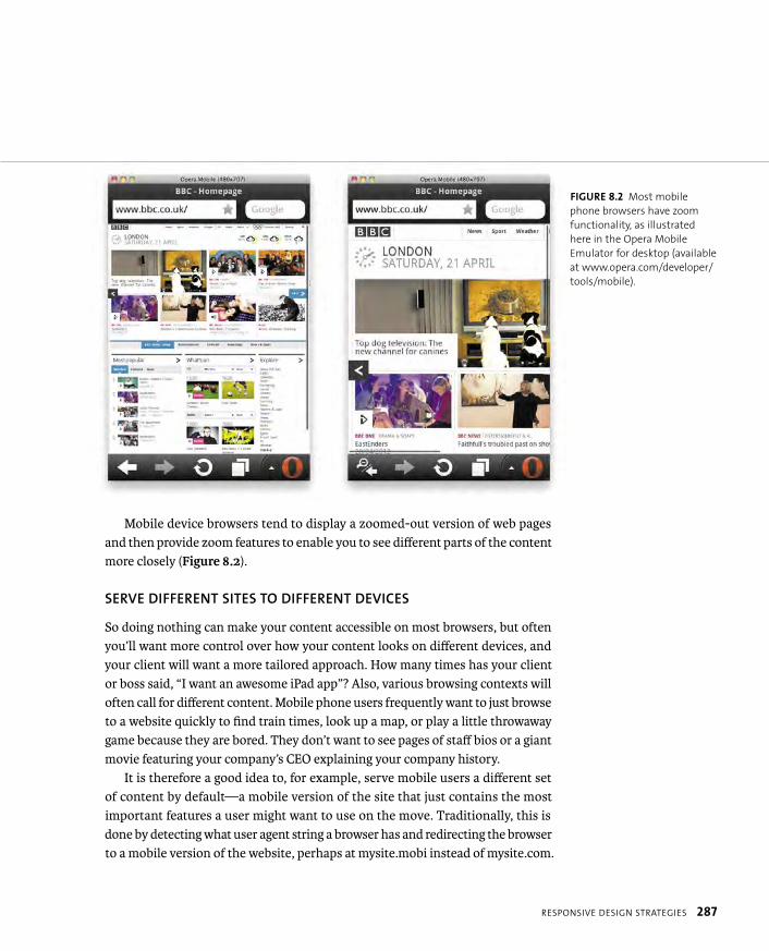
ptg8274462
RESPONSIVE DESIGN STRATEGIES 287
Mobile device browsers tend to display a zoomed-out version of web pages and then provide zoom features to enable you to see different parts of the content more closely (Figure 8.2).
SERVE DIFFERENT SITES TO DIFFERENT DEVICES
So doing nothing can make your content accessible on most browsers, but often you’ll want more control over how your content looks on different devices, and your client will want a more tailored approach. How many times has your client or boss said, “I want an awesome iPad app”? Also, various browsing contexts will often call for different content. Mobile phone users frequently want to just browse to a website quickly to find train times, look up a map, or play a little throwaway game because they are bored. They don’t want to see pages of staff bios or a giant movie featuring your company’s CEO explaining your company history.
It is therefore a good idea to, for example, serve mobile users a different set of content by default—a mobile version of the site that just contains the most important features a user might want to use on the move. Traditionally, this is done by detecting what user agent string a browser has and redirecting the browser to a mobile version of the website, perhaps at mysite.mobi instead of mysite.com.
FIGURE 8.2 Most mobile
phone browsers have zoom
functionality, as illustrated
here in the Opera Mobile
Emulator for desktop (available
at www.opera.com/developer/
tools/mobile).
ptg8274462
288 CHAPTER 8 RESPONSIVE AND ADAPTIVE DESIGN
Although this might seem like a good idea, it is fraught with problems and you must be careful. First, you’ll have to publish and maintain two or more versions of your site (desktop version, mobile version, iPad app, TV app, etc.), which adds more time and cost to the project.
Second, doing browser sniffing is error prone and shortsighted. If you are just detecting the iPad, for example, because you have a specific iPad app, it might not be so bad. But it usually makes more sense to develop sites to work across all devices, not just one. Also, user agent strings are deliberately ambiguous, because back in the early days of the web, developers started using user agent sniffing to arbitrarily target browsers they wanted to support, leaving other browsers locked out, even if they could render those sites perfectly well. To get access to these sites, browsers started aping other vendors’ user agent strings, so you’d end up with user agent strings like this:
Mozilla/5.0 (Windows; U; Windows NT 5.1; en-US) AppleWebKit/525.13 p (KHTML, like Gecko) Chrome/0.2.149.27 Safari/525.13
And even if your code is serving the right content to the right browsers now, it may not in the future when new browsers come out that have different user agent strings. You’ll have to keep updating your code to take these new browsers into account! As an example, when Opera hit version 10, the user agent string was changed to include a version number of 9.81, because so many developers were using browser sniffing code that returned Opera 10+ as Opera 1, thereby blocking browsers from accessing sites that would render them fine. Hilarity ensued. Really.
It is much more effective and less error prone to test whether browsers support the features your sites need, as you’ve been doing with Modernizr, rather than testing whether the browser is one of the ones you think will support your code.
TIP: You should always provide a link to switch between site
versions too, in case a mobile user wants to use the desktop
version of the site instead. Users hate having their choices taken away!
ptg8274462
RESPONSIVE DESIGN STRATEGIES 289
TERMINOLOGY CONFUSION!
You were probably wowed when you first read the delicious buzzword-laden title of this chapter. I included
both “responsive design” and “adaptive design” because you’ll probably hear these two terms and vari-
ous other word combinations to describe the techniques this chapter covers in your travels around the
interwebs.
In fact, I was confused about when to use which term. So, after doing a bit of research on the subject, the
best distinction between “adaptive” and “responsive” that I came up with is as follows:
� Responsive design refers to the use of technologies like media queries and flexible units to create flex-
ible web page/app layouts that are optimized to suit different-sized viewports.
� Adaptive design is pretty much another term for “progressive enhancement,” which of course was
defined in Chapter 1, and examples have been shown throughout the book. Adaptive design refers to
any design that allows a website to adapt and provide an acceptable experience in browsers of different
abilities. You could think of responsive design as a subset of adaptive design.
You’ll also hear the term “mobile web” quite a lot, especially from manager types; it’s used to describe the
web created for mobile devices, or some such thing. I recommend that you stay away from this term as
much as possible.
Designer and all-round “good bloke” Stephen Hay summed it up nicely when he said: “There is no mobile
web. There is only the web, which we view in different ways. There is also no desktop web. Or tablet web.
Thank you.”
Creating different sites for different devices is not really the right way to think about accessing web content;
you should strive to optimize the same content for different devices.
A better way to think about “mobile” is a state of being rather than a device. When users are mobile, they
are more likely to be using various devices to browse the web, have less bandwidth available, and be inter-
ested in different information and functionality. This leads to a separate set of requirements for people who
are stationary and those who are on the move. Therefore, different versions of your site will require differ-
ent UX work.

ptg8274462
290 CHAPTER 8 RESPONSIVE AND ADAPTIVE DESIGN
OPTIMIZE ONE SITE FOR DIFFERENT BROWSERS/DEVICES
The third method for optimizing web content across devices generally involves using responsive/adaptive design techniques to create a single set of content that will automatically change depending on features of the browser accessing it, such as screen width and height, resolution, and more.
Usually these techniques involve:
� Feature detection to see if a feature will work in a browser and serving fallback content if it doesn’t (e.g., using Modernizr).
� Using flexible layout techniques, such as CSS multi-col and percentages for container widths, so that layouts will breathe and still look good on smaller screens and browser windows.
� Serving smaller images, videos, and other media to smaller screen devices that don’t need the bigger versions and could really benefit from being saved some bandwidth.
� Using smart layout optimization technologies, such as CSS media queries and viewport, to change how content is displayed depending on screen width, resolution, orientation, and other features of the browsing device.
Support for the nu-school features discussed in this chapter is summarized in Table 8.1.
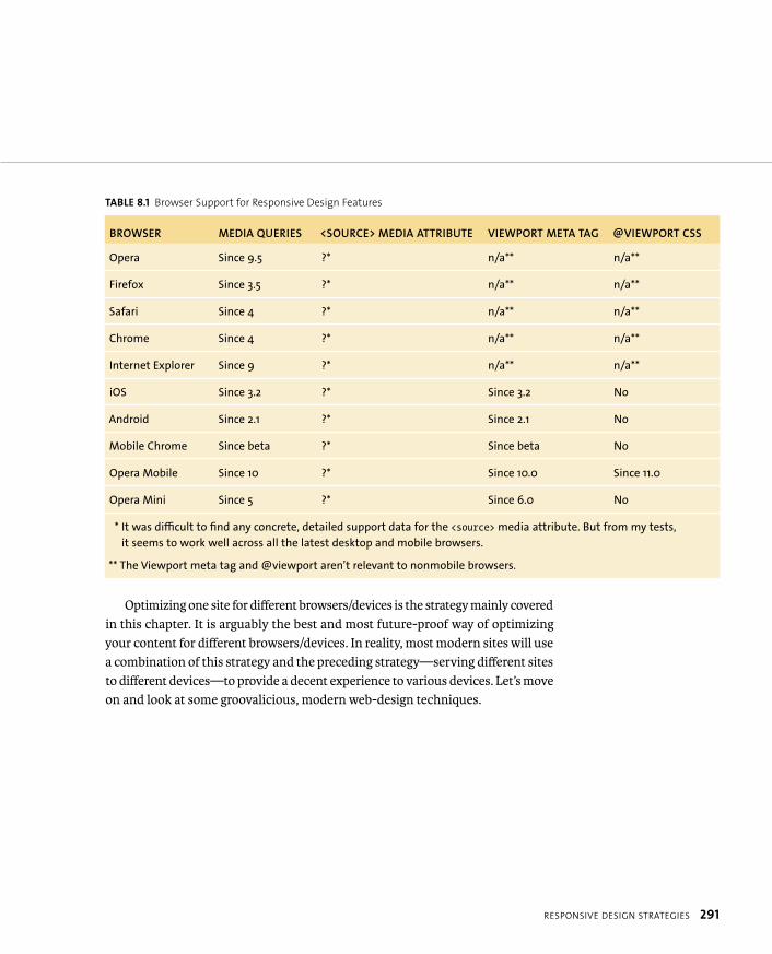
ptg8274462
RESPONSIVE DESIGN STRATEGIES 291
TABLE 8.1 Browser Support for Responsive Design Features
BROWSER MEDIA QUERIES <SOURCE> MEDIA ATTRIBUTE VIEWPORT META TAG @VIEWPORT CSS
Opera Since 9.5 ?* n/a** n/a**
Firefox Since 3.5 ?* n/a** n/a**
Safari Since 4 ?* n/a** n/a**
Chrome Since 4 ?* n/a** n/a**
Internet Explorer Since 9 ?* n/a** n/a**
iOS Since 3.2 ?* Since 3.2 No
Android Since 2.1 ?* Since 2.1 No
Mobile Chrome Since beta ?* Since beta No
Opera Mobile Since 10 ?* Since 10.0 Since 11.0
Opera Mini Since 5 ?* Since 6.0 No
* It was difficult to find any concrete, detailed support data for the <source> media attribute. But from my tests,
it seems to work well across all the latest desktop and mobile browsers.
** The Viewport meta tag and @viewport aren’t relevant to nonmobile browsers.
Optimizing one site for different browsers/devices is the strategy mainly covered in this chapter. It is arguably the best and most future-proof way of optimizing your content for different browsers/devices. In reality, most modern sites will use a combination of this strategy and the preceding strategy—serving different sites to different devices—to provide a decent experience to various devices. Let’s move on and look at some groovalicious, modern web-design techniques.
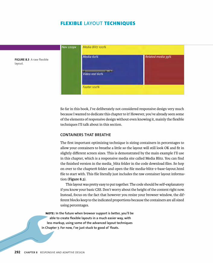
ptg8274462
292 CHAPTER 8 RESPONSIVE AND ADAPTIVE DESIGN
So far in this book, I’ve deliberately not considered responsive design very much because I wanted to dedicate this chapter to it! However, you’ve already seen some of the elements of responsive design without even knowing it, mainly the flexible techniques I’ll talk about in this section.
CONTAINERS THAT BREATHE
The first important optimizing technique is sizing containers in percentages to allow your containers to breathe a little so the layout will still look OK and fit in slightly different screen sizes. This is demonstrated by the main example I’ll use in this chapter, which is a responsive media site called Media Blitz. You can find the finished version in the media_blitz folder in the code download files. So hop on over to the chapter8 folder and open the file media-blitz-1-base-layout.html file to start with. This file literally just includes the raw container layout informa-tion (Figure 8.3).
This layout was pretty easy to put together. The code should be self-explanatory if you know your basic CSS. Don’t worry about the height of the content right now. Instead, focus on the fact that however you resize your browser window, the dif-ferent blocks keep to the indicated proportions because the containers are all sized using percentages.
NOTE: In the future when browser support is better, you’ll be
able to create flexible layouts in a much easier way, with
less markup, using some of the advanced layout techniques
in Chapter 7. For now, I’ve just stuck to good ol’ floats.
FLEXIBLE LAYOUT TECHNIQUES
Nav 220px Media Blitz 100%
Footer 100%
Media 60% Related media 39%
Video reel 60%
FIGURE 8.3 A raw flexible
layout.
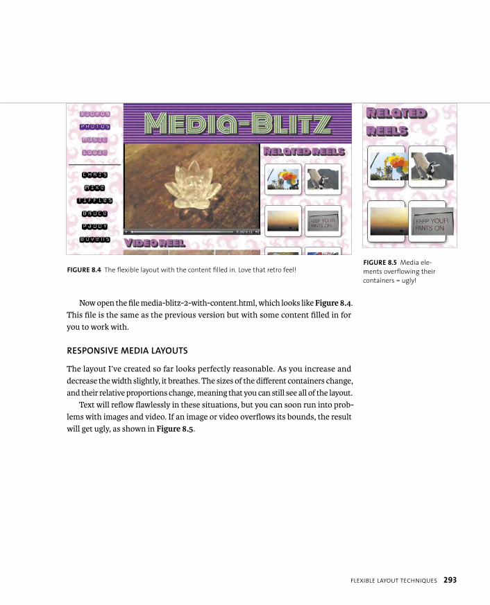
ptg8274462
FLEXIBLE LAYOUT TECHNIQUES 293
Now open the file media-blitz-2-with-content.html, which looks like Figure 8.4.This file is the same as the previous version but with some content filled in for you to work with.
RESPONSIVE MEDIA LAYOUTS
The layout I’ve created so far looks perfectly reasonable. As you increase and decrease the width slightly, it breathes. The sizes of the different containers change, and their relative proportions change, meaning that you can still see all of the layout.
Text will reflow flawlessly in these situations, but you can soon run into prob-lems with images and video. If an image or video overflows its bounds, the result will get ugly, as shown in Figure 8.5.
FIGURE 8.5 Media ele-
ments overflowing their
containers = ugly!
FIGURE 8.4 The flexible layout with the content filled in. Love that retro feel!

ptg8274462
294 CHAPTER 8 RESPONSIVE AND ADAPTIVE DESIGN
A good way to get the media elements to also breathe inside their containers is to set max-width: 100%; on those elements. So even when the images and videos are larger than their containers, they will be constrained inside. And as the containers shrink or grow, the media elements will shrink and grow with them (Figure 8.6).
FIGURE 8.6 Using max-width:100% to make media flexible.

ptg8274462
FLEXIBLE LAYOUT TECHNIQUES 295
To give you some examples, I’ve used this trick on the main playing video, the related reels, and the other “videos” in the reel:
video {
max-width: 100%;
}
#related article {
...
width: 35%;
margin: 2rem 2%;
padding: 2rem 3%;
}
#related img {
display: block;
margin: 0 auto;
max-width: 100%;
}
#video-reel article {
width: 33%;
display: inline-block;
opacity: 0.7;
}
#video-reel img {
max-width: 100%;
}

ptg8274462
296 CHAPTER 8 RESPONSIVE AND ADAPTIVE DESIGN
Another good way to use max-width when creating responsive layouts is to set an upper bound on your layout width. When your layout starts to look ghastly in very wide viewports (and let’s face it, big “cinema-screen” monitors are increas-ingly common these days), you can control the result using something like this:
body {
max-width: 1300px;
margin: 0 auto;
}
When the upper bound is reached, the layout will no longer grow but instead be centered inside whatever space is available, as shown in Figure 8.7.
TIP: max-width is not supported in IE7 and earlier; therefore, I’ve
set width: 100% as a fallback in the iefixes.css file included in one
of my conditional comments (along with pixel fallbacks for all the units
set in rems, which aren’t supported in IE8 and earlier). But you must be
careful with this: width is way less flexible than max-width. If the container
is smaller than the image, the image will maintain its set width and over-
flow the container.
FIGURE 8.7 Setting an upper
bound on the layout width
using max-width.
ptg8274462
MEDIA QUERIES 297
The Media Blitz example is looking good now, but it is still not great. When you resize the screen less than 1024px in width, the <h1> wraps onto two lines, and the media elements start to look tiny and insignificant. This is unacceptable given that they are supposed to be the main content of the site!
Wouldn’t it be great if you had a mechanism to dynamically alter the layout of your site based on features such as width and height?
Well, here’s the good news: The Media Queries spec (www.w3.org/TR/css3-mediaqueries) allows you to do just that! In a nutshell, it extends the func-tionality of CSS3 media types, which allow you to apply styles to markup based on whether it is onscreen, being printed, and so on:
@media print {
/* print styles go here */
}
<link rel=”stylesheet” media=”print” href=”print.css”>
Media queries go even further, allowing you to apply styles based on media types plus the result of tests on the condition of media features, such as browser viewport width, screen orientation, resolution, and more. Here is a simple example:
@media screen and (max-width: 800px) {
/* put your styles here */
}
This code block specifies the following: For the screen media type only, if the width of the browser window is 800 pixels or less, apply the styles within the block. If these conditions aren’t true, completely ignore the rules within the block. You can immediately see how powerful this feature is. It means that you can start applying different styles to your site depending on features like screen width, so you can provide one layout for a wide viewport, one for a narrow viewport, and as many more as you like!
MEDIA QUERIES
ptg8274462
298 CHAPTER 8 RESPONSIVE AND ADAPTIVE DESIGN
If you want to apply your custom styles to any media type, you can use the keyword all, or just omit the media type. The following are equivalent:
@media all and (max-width: 800px)
@media (max-width: 800px)
You can use the not keyword to indicate that you want to apply your styles in any case other than the one evaluated as true by the media query. For example:
@media not screen and (max-width: 800px) {
/* put your styles here */
}
You can chain further conditions onto the ends of your media queries to enforce stricter conditions, for example:
@media screen and (max-width: 800px) and (orientation: landscape) {
/* put your styles here */
}
If you want to apply the same set of conditional styles when multiple conditions are true, you can put the different sets of conditions on the same line, separated by commas, like so:
@media screen and (max-width: 800px), print and (max-width: 29.7cm) {
/* put your styles here */
}
The most common media features you’ll want to test are as follows:
� min/max-width and min/max-height. Apply styles depending on the width or height of your browser window’s viewport: the part of the window that the web page is actually displayed in.
� min/max-device-width and min/max-device-height. Apply styles depend-ing on the physical width or height of the device rather than the viewport. The importance of this distinction will become apparent later in the chapter.

ptg8274462
MEDIA QUERIES 299
� aspect-ratio/device-aspect-ratio. Apply styles based on aspect ratio or device aspect ratio. The former is defined as the ratio of width over height,and the latter is defined as the ratio of device-width over device-height.
� orientation. Apply styles based on whether the target device is in portrait or landscape mode. This feature is useful for targeting different layouts on devices like iPads, Android phones, and other tablets and smartphones that change between portrait and landscape when you change the way you hold them.
� min/max-resolution. Apply styles based on minimum and maximum device resolutions. This is useful if you want to, for example, serve larger icons and increase text size on devices with high resolutions, like iPhones with retina displays.
� min/max-device-pixel-ratio. A proprietary Apple media feature that is similar to min- and max-resolution but seems better supported currently.
You can find a full list of media features at www.w3.org/TR/css3-mediaqueries/#media1.
APPLYING SOME MEDIA QUERIES TO THE EXAMPLE
Let’s return to the Media Blitz example and improve it at different screen widths using media queries. You can see the final result of these additions in media-blitz-3-with-media-queries.html and media-blitz3.css. At the bottom of this new CSS file, you’ll find a series of @media blocks that kick in when the screen width decreases below certain thresholds. I won’t cover every ruleset inside these blocks in excruciating detail, because each is pretty obvious, but let’s just look at the whole of the first one to help you get the idea:
@media all and (max-width: 1024px) {
nav {
float: none;
width: 100%;
margin-left: 0;
}
ptg8274462
300 CHAPTER 8 RESPONSIVE AND ADAPTIVE DESIGN
#main-panel {
margin-left: 0px;
}
nav ul {
width: 100%;
}
nav li {
display: inline-block;
}
nav li a {
display: block;
margin-right: 3rem;
}
nav hr {
width: 90%;
}
body {
display: table;
width: 100%;
}
nav {
display: table-caption;
table-layout: fixed;
caption-side: bottom;
}
}

ptg8274462
MEDIA QUERIES 301
You force these rules to kick in when the browser window is less than 1024 pixels in width. When they kick in, you remove the float from the <nav>, change its width to 100%, and get rid of the left margin from both the <nav> and the #main-panel so that the location of the navigation menus changes from the side of the layout to the top of it. You then set the list items to display: inline-blockso they sit alongside one another rather than on top of one another, do a couple of other minor adjustments there, and then use some CSS tables magic to relocate the navigation to the bottom of the site instead of the top. Figure 8.8 shows the result.
FIGURE 8.8 The result of the
first media query kicking in.
The navigation menu moves
from the side of the site down
to the bottom, and the rest
of the content expands to
span the entire width of the
browser.
ptg8274462
302 CHAPTER 8 RESPONSIVE AND ADAPTIVE DESIGN
WHICH MEDIA QUERIES SHOULD YOU USE?
It is often a challenge to work out exactly which media queries to use. You
need to determine how many different layouts your site needs and at what
width you should change layouts. Also, consider whether you need any other
types of media query. The solution depends on what target audience/devices
you are designing for. If you are creating an app that is designed only for iPad
and iPod, you’ll probably get away with having a layout for the iPad screen
size and one for the iPhone size, which breathes a bit for portrait/landscape
orientation:
@media screen and (max-width: 480px) { ... }
@media screen and (max-width: 1024px) { ... }
You might go further and optimize the layout for portrait/landscape:
@media screen and (orientation: landscape) { ... }
@media screen and (orientation: portrait) { ... }
If you need to target more devices, you might well expand your list of
queries to suit other screen sizes. Targeting devices like this is referred to
as setting device breakpoints.
My personal preference is to use content breakpoints instead: I usually
ignore target devices completely and just add in media queries to fix the
layout when it breaks. This methodology is more flexible and therefore
better overall for supporting a wide range of devices. But it is often a bit
more complicated than just creating a couple of well-thought-out layouts
for specific screen sizes. The choice is yours.
Width- and orientation-based media queries are certainly the most common
media queries you’ll use, although with so many high-resolution devices
now available on the market, you might also want to provide different
images or layout features depending on resolution: see the “High-fidelity
Devices” section later in the chapter.
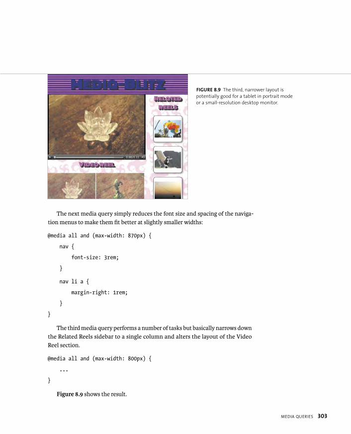
ptg8274462
MEDIA QUERIES 303
The next media query simply reduces the font size and spacing of the naviga-tion menus to make them fit better at slightly smaller widths:
@media all and (max-width: 870px) {
nav {
font-size: 3rem;
}
nav li a {
margin-right: 1rem;
}
}
The third media query performs a number of tasks but basically narrows down the Related Reels sidebar to a single column and alters the layout of the Video Reel section.
@media all and (max-width: 800px) {
...
}
Figure 8.9 shows the result.
FIGURE 8.9 The third, narrower layout is
potentially good for a tablet in portrait mode
or a small-resolution desktop monitor.
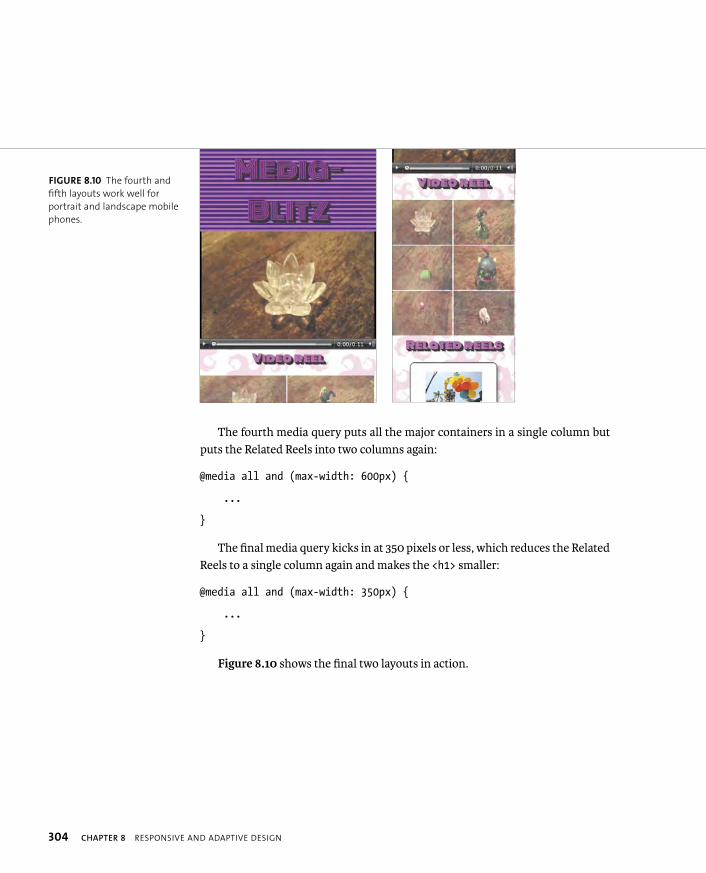
ptg8274462
304 CHAPTER 8 RESPONSIVE AND ADAPTIVE DESIGN
The fourth media query puts all the major containers in a single column but puts the Related Reels into two columns again:
@media all and (max-width: 600px) {
...
}
The final media query kicks in at 350 pixels or less, which reduces the Related Reels to a single column again and makes the <h1> smaller:
@media all and (max-width: 350px) {
...
}
Figure 8.10 shows the final two layouts in action.
FIGURE 8.10 The fourth and
fifth layouts work well for
portrait and landscape mobile
phones.
ptg8274462
MEDIA QUERIES 305
CSS TABLES MAGIC
In media-blitz-3-with-media-queries.html, when the first media query kicks in, the navigation menu moves
to the bottom of the screen. This is the result of the following two rulesets:
body {
display: table;
table-layout: fixed;
width: 100%;
}
nav {
display: table-caption;
caption-side: bottom;
}
The table-related properties are part of CSS2. They were created to allow web developers to lay out groups
of elements with a tabular structure without abusing table markup. An obvious application of CSS tables
is to lay out forms in an easier fashion (see the file form_csstables.html in the chapter8 code download
folder). This is basically achieved using markup like this:
<ul>
<li><label><input></li>
...
</ul>
and CSS like this:
li {
display:table-row;
}
label {
display:table-cell;
}
The technique I’ve used in my media query example is the only known way to move the position of a child
element from side to top to bottom reliably without changing the source order. It is a useful technique to
keep in mind, although bear in mind that these properties don’t work in IE7 and earlier.
ptg8274462
306 CHAPTER 8 RESPONSIVE AND ADAPTIVE DESIGN
MOBILE FIRST
Let’s now turn the media query example on its head by looking at the Mobile First technique invented by Luke Wroblewski. This technique reverses what you did in the preceding section. You create the mobile layout first as the default layout, and then apply wider layouts as the browser width increases.
The Media Blitz example is recreated using Mobile First in the file media-blitz-4-mobile-first.html. I won’t show all of the code here, but be sure to dig through the file so you can appreciate the differences between media-blitz-3 and media-blitz-4. The former starts with the wide-screen layout and layers on styles suitable for narrower screens. The latter starts with the narrow-screen layout and layers on styles suitable for wider screens. As a brief example, the <h1> is initially set to its smallest size:
h1 {
font-family: ‘Monoton’, cursive;
}
and then is increased in size by subsequent media queries:
@media all and (min-width: 350px) {
h1 {
font-size: 6rem;
}
}
This reverse method has many advantages: One of which is that it is often easier to start by designing a simple, narrow (mobile) layout and then add on complexity to work up to a richer wide-screen (desktop) layout than it is to design a complex, all-singing wide-screen layout and then try to factor that down to an effective (uncluttered) narrow layout.
ptg8274462
MEDIA QUERY POLYFILLS 307
One problem with Mobile First is that browsers that don’t support media que-ries will get a mobile layout rather than a desktop layout. To fix this, you could include a JavaScript polyfill in your page. The two worth checking out are css3-mediaqueries.js (http://code.google.com/p/css3-mediaqueries-js) and respond.js (https://github.com/scottjehl/Respond). Both work in the same sort of way. You just include the JavaScript in your page after the CSS declarations. All my responsive examples from number 4 (media-blitz-4-mobile-first.html) on include the following:
<script src=”respond.min.js”></script>
In terms of which one to use, css3-mediaqueries.js is larger in size but more robust, whereas respond.js works only on width/height media queries.
FLASH: RESPONSIVE SHORTCOMINGS
Although the media query polyfills work well, one glaring problem is that
the video fallback that comes into play when the Media Blitz example is
loaded in IE6–8 is, well, Flash. When Flash is loaded into a browser, the
browser allocates some space for it and then hands control of that space
over to the Flash Player; the resulting content doesn’t play nicely with web
standards.
The Flash movie therefore can’t be reduced in size or otherwise manipulated
using CSS (width, max-width, etc.), so the Flash video will stay the same size
regardless of how the size of the rest of the page around it changes. In a
responsive design, when the screen width gets too narrow, the layout will
start to look horrible as the Flash movie stomps all over it.
Therefore, I’ve set my Flash Player fallback to a bit smaller than the HTML5
<video> equivalent and set the <body> element to a fixed width of 1024px
inside one of my IE conditional comments so that the design is now fixed,
eliminating the problem. It’s not perfect, but think of it this way: Users of IE
won’t be using a narrow-screen device anyway, and at least they get a layout
they can use.
MEDIA QUERY POLYFILLS
ptg8274462
308 CHAPTER 8 RESPONSIVE AND ADAPTIVE DESIGN
Another advantage of Mobile First is that you can easily serve smaller background images to smaller devices, and then swap them out for bigger images using rules in wider media queries. For example, in simple-responsive-header-image1.html, a background image spans the whole <header>, which runs across 100 percent of the screen width. I’ve included it like this:
header {
...
background: url(images/sunset.jpg) center;
}
Setting it to display in the center ensures that the nice sun in the center of the image will always display in the center of the header. But there’s more you can do here.
Take a look at simple-responsive-header-image2.html. The original 1024px wide image is 41 KB, which doesn’t make much difference to a user with a fast con-nection but could slow down response time somewhat for a mobile user on a slow mobile network. To mitigate this, I’ve included a 480px version in the default CSS:
header {
...
background: url(images/sunset-480.jpg) center;
}
SERVING IMAGES RESPONSIVELY
ptg8274462
SERVING IMAGES RESPONSIVELY 309
Therefore, narrow-screen browsers get a much smaller image. The full-size image is then served up in a media query like so:
@media all and (min-width: 481px) {
header {
background: url(images/sunset.jpg) center;
}
}
Devices that have a browser window width of 480px or less will only load the small image, and devices with a browser window width of over 480px will load the larger image.
Of course, the preceding technique doesn’t work for images put on the page using <img>. Often, you’ll want to serve smaller content images to smaller devices too. This is a much harder problem to solve. Fortunately, intelligent people have been thinking about this problem. For a robust solution that relies on some server-side magic, check out Matt Wilcox’s excellent Adaptive Images technique. All you’ll need is at http://24ways.org/2011/adaptive-images-for-responsive-designs.
ptg8274462
310 CHAPTER 8 RESPONSIVE AND ADAPTIVE DESIGN
RESPONSIVE VIDEO
For video, the solution to making it responsive is a bit different. HTML5 <video> has a rather nifty responsive mechanism included—a media attribute on the <source>element in which you can insert a media query test. If the test is passed, that video source is the one loaded into the <video> element, unless of course another <source> element later on in the source order overrides it.
In media-blitz-5-responsive-video.html, you can see this in action:
<video controls>
<source src=”videos/320/crystal320.mp4” type=”video/mp4” p media=”all and (max-width: 480px)”>
<source src=”videos/320/crystal320.webm” type=”video/webm” p media=”all and (max-width: 480px)”>
<source src=”videos/720/crystal720.mp4” type=”video/mp4” p media=”all and (min-width: 481px)”>
<source src=”videos/720/crystal720.webm” type=”video/webm” p media=”all and (min-width: 481px)”>
...
</video>
When the screen width is 480px or less, the 320 video is loaded; when the screen width is more than 480px, the 720 video is loaded.
NOTE: I cheated slightly in media-blitz5.css. I set the <video> element to
width: 100%, not, max-width: 100%, so that the video will always span the
full width of the screen, even when the 320 video is displayed across the
full-screen width at 321–480px. This is not a great idea, especially when
the width gets much bigger, because the video will start to look very
grainy. You need to be especially mindful of this on very high-resolution
devices like the iPhone 4.
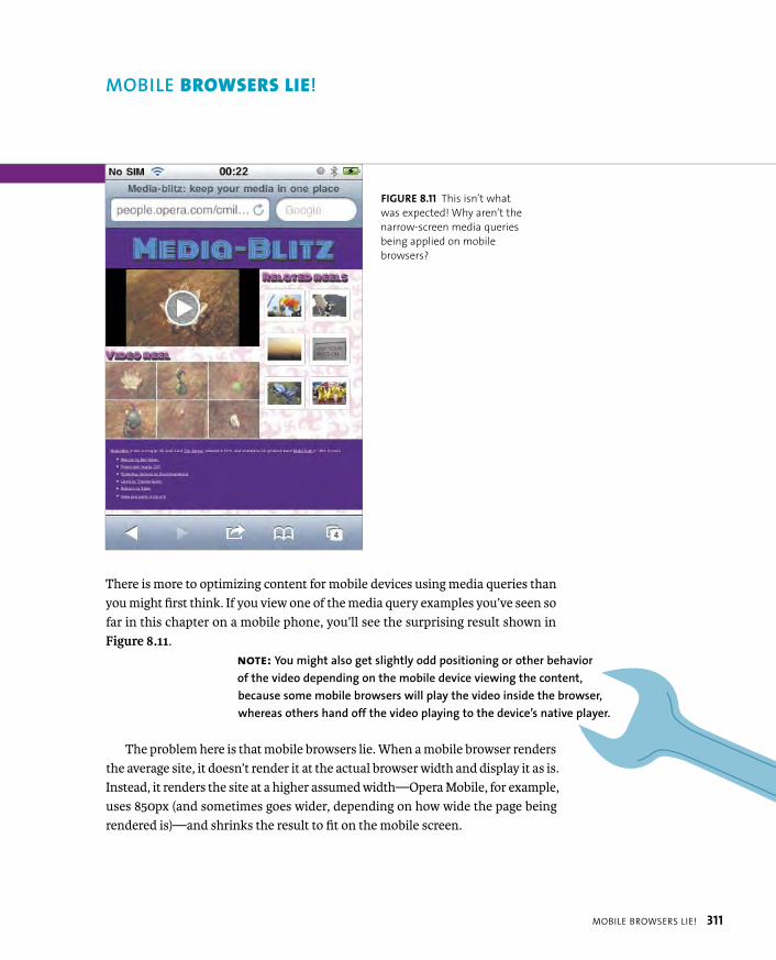
ptg8274462
MOBILE BROWSERS LIE! 311
There is more to optimizing content for mobile devices using media queries than you might first think. If you view one of the media query examples you’ve seen so far in this chapter on a mobile phone, you’ll see the surprising result shown in Figure 8.11.
The problem here is that mobile browsers lie. When a mobile browser renders the average site, it doesn’t render it at the actual browser width and display it as is. Instead, it renders the site at a higher assumed width—Opera Mobile, for example, uses 850px (and sometimes goes wider, depending on how wide the page being rendered is)—and shrinks the result to fit on the mobile screen.
NOTE: You might also get slightly odd positioning or other behavior
of the video depending on the mobile device viewing the content,
because some mobile browsers will play the video inside the browser,
whereas others hand off the video playing to the device’s native player.
MOBILE BROWSERS LIE!
FIGURE 8.11 This isn’t what
was expected! Why aren’t the
narrow-screen media queries
being applied on mobile
browsers?
ptg8274462
312 CHAPTER 8 RESPONSIVE AND ADAPTIVE DESIGN
You can understand why browser creators would do this. Historically, most sites are not created with responsive techniques in mind; therefore, they would look crappy if rendered at widths of 480px, 320px, or less. But in this responsive world, you should override this behavior so that your media queries behave like you want them to.
You could do this by changing your width/height media queries to always test for the equivalent device-width/device-height as well. For example:
@media all and (max-width: 800px), @media all and p (max-device-width: 800px) {
...
}
But having to do this for every @media block means a lot of extra typing and hassle, so let’s look at a better solution: viewport.
<META NAME="VIEWPORT">
A better, less messy way to make media queries behave themselves is to use the viewport meta tag. Invented by Apple to make web apps display more reliably on iDevices, it was adopted by other browser manufacturers because it is a jolly good idea.
To get your media queries to behave (Figure 8.12), you can add the following line into your HTML <head> (see media-blitz-6-with-viewport.html in the code download folder):
<meta name=”viewport” content=”width=device-width”>
This makes the browser render the site at its true width, triggering media que-ries as appropriate.

ptg8274462
MOBILE BROWSERS LIE! 313
The viewport meta tag is not just limited to forcing browsers to tell the truth about the site’s width or height. You can also do the following:
� Set a specific width or height to render at. This is done using a number for the width or height value. For example,
<meta name=”viewport” content=”width=320”>
� Set an initial zoom factor for your content. This is done using initial-scale and a zoom factor:
<meta name=”viewport” content=”initial-scale=1.5”>
Such values work just like CSS scale transforms: 1.5 means “zoom in by 50%,” 0.75 means “zoom out to 75% of initial size,” and so on.
� Set the target pixel density. As you’ll see later in the “High-fidelity Devices” section, devices with high resolutions will often have multiple physical
FIGURE 8.12 Viewport helps
you to better display content
on a mobile device.
ptg8274462
314 CHAPTER 8 RESPONSIVE AND ADAPTIVE DESIGN
device pixels for each pixel on your page (sometimes called CSS pixels). To alter how many or just set a CSS pixel to equal 1 device pixel, you can use target-densitydpi=device-dpi. For example:
target-densitydpi=device-dpi or
target-densitydpi=160.
<meta name=”viewport” content=”target-densitydpi=device-dpi”>
� Set a maximum and/or minimum allowed zoom factor for your content.If you want to limit how far your users can zoom in or out, you can use maximum-scale and minimum-scale, like so:
<meta name=”viewport” content=”maximum-scale=2, minimum-scale=0.5”>
� Turn off the ability to zoom. This is done using user-scalable=no:
<meta name=”viewport” content=”user-scalable=no”>.
TIP: Zooming is a very important accessibility feature for many
users. You should really think carefully before you limit it or turn
it off completely. A viable use case would be a game UI where you want it
to remain full screen and don’t want it to be zoomed (in which case, you
might want to provide an in-game zoom mechanism). Or, you might want
to just limit zooming to acceptable levels that don’t make your app look
too terrible at either end of the spectrum but still retain acceptable levels
of zooming for low-vision users.
ptg8274462
MOBILE BROWSERS LIE! 315
@VIEWPORT
You might be thinking that this viewport thing smells like presentation
rather than content so should probably be handled using some kind of
CSS construct rather than an HTML meta tag. Some clever folks at Opera
agree and have produced the @viewport rule spec (http://dev.w3.org/csswg/
css-device-adapt/#the-viewport-rule), which defines the same functionality
as Viewport meta tag but as a CSS construct. The different options avail-
able in Viewport meta tag all have their equivalents in @viewport, except
target-densitydpi (hopefully, this will be added later):
@-o-viewport {
width: device-width;
width: 320px;
zoom: 1.5;
max-zoom: 2;
min-zoom: 0.5;
user-zoom: fixed;
}
Note that @viewport currently works only in Opera Mobile 11 and later, but
in my opinion it is a better implementation than Viewport meta tag, and
should catch on in the future.

ptg8274462
316 CHAPTER 8 RESPONSIVE AND ADAPTIVE DESIGN
As if the techniques you’ve looked at so far weren’t complicated enough, many devices from Apple, HTC, LG, Nokia, and more are now coming out with high-resolution screens. For that reason, text and images are in danger of becoming illegibly small.
To compensate for this potential problem, mobile browsers on high-resolution devices lie to you twice. Not only do they render sites at a broader width than the physical device width, but they also apply a default zoom to the content. So a CSS pixel can actually equal multiple device pixels (yes, folks, bizarrely enough, pixels in CSS are actually a relative unit). For example, in Opera Mobile running on an HTC Desire S, the zoom factor is 1.5, and in the default browser on iOS 4, the zoom factor is 2.
How do you deal with this extra level of complexity? Generally, it’s not that much of an ordeal, because most of the features on your web page will still look crisp when scaled. It’s mainly just images and video you need to worry about. If you are concerned about your images not looking as crisp as they could, you could reference a slightly larger image than required in your <img> element and then constrain the size, so when it is scaled up in high-resolution browsers, it stays crisp:
<img src=”images/tribal-sun-640px.jpg” width=”480”>
Or in the case of CSS background images, you could check for a certain pixel ratio via a media query and use additional rules inside the media query to “fix” the issue in browsers that pass the test.
For example, you could use background-size to cancel out the effects of the device zoom in the case of a background slice:
#wrap {
background: url(images/wood.jpg);
}
@media screen and (min-device-pixel-ratio: 3/2) {
#wrap {
background-size: 255px;
/* Original image is 1.5 times this size - 383px */
}
}
HIGH-FIDELITY DEVICES
ptg8274462
HIGH-FIDELITY DEVICES 317
Or when dealing with icons, you could serve a larger background image to devices with a higher pixel density, for example:
ul li:nth-of-type(1) a {
background-image: url(icons/home-32.png);
border-radius: 20px 0 0 0;
background-position: 25px 50%;
}
@media screen and (-o-min-device-pixel-ratio: 3/2) {
ul li:nth-of-type(1) a {
background-image: url(icons/home-48.png);
}
}
You can see working examples of these techniques in the file high-resolution-example.html. Note that at the moment min-device-pixel-ratio is supported dif-ferently across browsers: Opera Mobile uses ratio values, for example, 3/2, whereas WebKit-based mobile browsers support it with decimals, such as 1.5. In the example file you’ll see multiple versions of the media query with different vendor prefixes used to serve the different browsers values they recognize.
If you want to stop mobile browsers from applying their default zoom, you could use the target-densitydpi viewport feature to tell the browser, I really do want to make 1 pixel equal 1 pixel; tell the whole truth, damn you! like this:
<meta name=”viewport” content=”width=device-width, p target-densitydpi=device-dpi”>
ptg8274462
318 CHAPTER 8 RESPONSIVE AND ADAPTIVE DESIGN
As promised earlier in the book, I’ll round off this chapter by returning to the heavy metal banner ad and making it responsive. I’ll make it pair down to the smaller
“large rectangle” ad size of 336 x 280 in devices with screens narrower than 800px and change it to a narrow banner that spans 100 percent of the screen width in very narrow devices (less than 480px in width). I’ll also use the media attribute in my video <source>s to stop the video being served to narrow-screen devices and include a background image instead in such cases. See the poster-responsive folder in the root of the code download for the finished new version.
FIRST ALTERNATIVE: 800PX OR LESS
The middle-sized ad is achieved via the following media query:
@media all and (max-width: 800px) {
...
}
A fair amount of work was required here to adjust all the styles and get the ad looking good at this narrower size. I won’t discuss all the CSS changes in the media query, because there is nothing new here. To see all the new styles, search for the preceding media query in the code and check them out.
Note that I didn’t tweak the animations: When I tested the narrow size in ani-mation-supporting browsers, all the animations seemed to still look fine.
SECOND ALTERNATIVE: 480PX OR LESS
For all of the new styling in this section to work correctly, I used viewport to make mobile browsers render at the real device width:
<meta name=”viewport” content=”width=device-width”>
Here is how I set up the alternative styling for narrow-screen browsers. Note that I’ve completely hidden the <video> to save on processing in small-screen devices:
@media all and (max-width: 480px) {
video {
display: none;
}
A RESPONSIVE HEAVY
METAL BANNER AD!

ptg8274462
A RESPONSIVE HEAVY METAL BANNER AD! 319
#ad {
width: 100%;
height: 90px;
background-image: url(bg-alternative.jpg);
font-size: 13px;
}
#ad, #ad div {
width: 100%;
height: 90px;
}
#ad #band-name {
top: -10px;
left: 20px;
}
#ad #album-name {
top: 50px;
right: 40px;
}
#ad #frame1 ul, #ad #frame2 p {
visibility: hidden;
}
#ad h2, #ad #band-name, #ad #album-name, #ad #frame1 ul {
animation: none;
}
}

ptg8274462
320 CHAPTER 8 RESPONSIVE AND ADAPTIVE DESIGN
Here I implemented some simple styling to alter the ad’s dimensions. I also hid the video player and some of the text, and turned off all the animations (except the awesome flames), because I felt the ad would be too cluttered at a smaller size. Smaller, less-powerful devices also appreciate less load on their processors.
And that’s it! Figure 8.13 shows the three different sizes of the ad.
WRAPPING UP
This chapter has given you valuable insights into optimizing your web creations so they’ll look better and perform better on different types of devices, from tiny mobile devices to wide-screen monitors. Along the way you looked at media queries, viewport, adaptive image and video techniques, and more. I think you’ll agree that this chapter was a lot of fun, so go forth and play!
FIGURE 8.13 Et voilà,
responsive advertising!
ptg8274462
INDEX 321
NUMBERS2D transforms
applying, 159matrix, 160rotate, 155–156scale, scaleX, scaleY, 157–158skew, skewX, skewY, 158–159translate, translateX, translateY,
153–154X, Y, and Z axes, 154
3D animations, hardware acceleration, 177. See also CSS Animations
3D transforms. See also CSS Transforms
backface-visibility, 174–177matrix3D, 165perspective, 165–170rotate3D, 163–164rotateX, rotateY, rotateZ, 162scale3D and scaleZ, 165transform-style, 171–174translate3D, translateZ, 160–161trouble with, 178
SYMBOL:: (double-colon) syntax, 33
Aaccessibility, prioritizing, 7–8adaptive design, versus responsive
design, 289Adaptive Images technique, 309adjacent sibling CSS3 selector, 23Android
animations, 189bling boxes, 109CSS3 Color Units, 16font formats, 74layout features, 243rem units, 20responsive design features, 291text features, 87, 94transforms, 152transitions, 179
animating flaming text, 202–203animation rate, altering, 194–195
animation-direction property, using, 195–196
animation-duration property, using, 193, 198
animation-fill-mode property, 196–197animation-name property, using,
192, 198animations. See also 3D animations;
CSS Animationsadding delays, 195applying to elements, 192button-glow, 196card flip behavior, 208, 210enhancing banner ad with, 199–203:hover/:focus rule, 208menu-move, 193moving <h1>, 210–212multiple, 197–198overflow: hidden, 201running number of times, 193shorthand, 197–198sliding form, 211triggering via JavaScript, 208–216whoosh, 198
animation-timing-function, 194–195anti-aliasing, 81<article> element, 51–53<aside> element, 54–55Ates, Faruk, 67, 204attr() function, using, 33attribute CSS3 selector, 22, 27<audio> element, 48, 50
control buttons, A-4–A-5media styling, A-10–A-11resources, A-11SVG and <canvas>, A-10–A-11wiring buttons with JavaScript,
A-5–A-9
Bbackface-visibility 3D transform,
174–177background content, rendering, 140background images
serving to small devices, 308using in banner ads, 144
background-clip property, using, 140background:radial-gradient, 126
backgroundsattaching to elements, 132gradients, 133in IE versions, 135using linear gradients on, 119
background-size, using gradients with, 134–135
banner ad. See also bling boxesadding bling to, 142–146animating flaming text, 202–203background images, 144enhancing with animations,
199–203heavy metal example, 318–320improving, 146recommended size, 142repeating radial gradient, 145support for older browsers, 145–146
Bézier curves, cubic, 182bling boxes. See also banner ad; CSS3
featuresadding depth, 114–117adding to banner ad, 142–146advantages, 108border-image property, 136–140box-decoration break property, 141box-shadow property, 114–117browser support for, 109disadvantages, 108examples, 108
border-image propertyapplying, 136–138central slice, 139fragments, 138problems, 139–140providing space, 139tiling sides, 138url() syntax, 137
border-radius property, 110–113Boulton, Mark, 142box-decoration break property,
using, 141boxes. See bling boxesbox-shadow property, 114–117browser support. See also mobile
browsers; Modernizranimations, 189“bling box” features, 109color units, 16CSS selectors, 22–26
INDEX
ptg8274462
322 INDEX
browser support (continued)font formats, 74indicating, 205layout features, 243rem units, 20, 206responsive design features, 291text features, 87, 94transforms, 152transitions, 179
browsers, history of, 284Bulletproof CSS, 4, 77, 231button, styling, 180button-glow animation, specifying, 196
CCaballero, Luz, 63Calzadilla, Anthony, 204<canvas> element, 62–63capitalization, controlling, 100captions, creating, 56–57Cederholm, Dan, 9character set, defining, 42–43child CSS3 selector, 23, 25Chrome
animations, 189bling boxes, 109CSS3 Color Units, 16font formats, 74layout features, 243rem units, 20responsive design features, 291text features, 87, 94transforms, 152transitions, 179
Chrome Mobilefont formats, 74text features, 87, 94
Clark, Keith, 34, 67ClearType, use by Windows, 81Collison, Simon, 86column layouts, 5. See also CSS Multi-
column layout modulecontent
generating, 26thought process for, 10–11
corners, rounded, 110–113CSS, Bulletproof, 4CSS Animations. See also 3D
animations; animationsat-rule block, 191
background-color, 191browser support for, 189keyframe blocks, 190–192setting up, 190–192website, 150
CSS Exclusions and Shapes layout module, 242, 277–279
CSS Flexible box layout module, 242CSS Grids
layout module, 242problems with, 274
CSS Multi-column layout module, 242. See also column layouts; layout modules
adjusting columns, 253column breaks, 251column gutters, 247column-count property, 245column-fill property, 248–249column-gap property, 247column-rule property, 247column-span property, 249–250column-width property, 246, 252features, 244lack of browser support, 254limited scope, 254parody Disney movie, 252–253problems, 254setting number of columns, 245
CSS Regions Module, 242, 275–277CSS resets, using, 64CSS sprites, using with icons, 227–228CSS tables, applying, 305CSS Transforms. See also 3D
transforms2D, 153–160browser support for, 152:focus effect, 163:hover effect, 163skew, 151two- and three-dimensional, 152website, 150
CSS Transitions. See also transitionsspec, 180website, 150
CSS3column layouts, 5creation of, 4–5dynamic UIs, 5font embedding, 4modules in, 4–5
CSS3 Color units, browser support for, 16–18
CSS3 features. See also bling boxesCSS3 Color units, 16–18sizing text using rems, 19–21vendor prefixes, 14–16
CSS3 modules, 12–13CSS3 selectors
adjacent sibling, 23attribute, 22, 27child, 23descendant, 23general sibling, 23language, 24negation, 24negation pseudo-class, 28pseudo-classes, 28–31pseudo-elements, 26, 32–33resource, 21structural pseudo-classes, 25–26target, 24UI element pseudo-classes, 23–24universal, 22using with older browsers, 34
CSS3-man website, 204css3-mediaqueries-js library, 65CSS3PIE, 66–67
downloading, 112–113gradients, 113.htc file, 66RGBA support, 113support for IE versions, 130using with box shadows, 117
CSS4 selectors module, 26cubic Bézier curves, 182, 185
Ddate and time, marking up, 57–58datetime attribute, using, 57–58Dead Hamster banner ad,
142–146, 199descendant CSS3 selector, 23design philosophies. See web design
philosophyDevlin, Ian, A-11DHTML (dynamic HTML), 39DOCTYPE, using, 41, 43double-colon (::) syntax, 33dynamic UIs, 5

ptg8274462
INDEX 323
Eelements. See also HTML5 elements
repeating patterns of, 29selecting, 23, 26, 28styling, 23–25
ellipsis;, using with text-overflowproperty, 90–91, 93
embedded video, implementing with HTML, 40
error messages, examples of, 61–62Eye of Sauron, 167–168
Ffeature detection library. See
Modernizr<figcaption> element, 56–57<figure> element, 56–57Firefox
animations, 189bling boxes, 109CSS3 Color Units, 16font formats, 74rem units, 20responsive design features, 291text features, 87, 94transforms, 152transitions, 179
Flexbox. See also layout modulesaligning children, 261–262align-items property, 262align-self property, 262<articles> and <section>, 256box-flex property, 268browser support, 255Cast container, 265child <articles>, 264–265child flow direction, 256–257cross axis, 258cross-browser with Modernizr,
267–268display order of child elements,
259–260display property, 255Facts container, 265flex property, 263–264flex-flow property, 257–258flexibility of, 263–267flex-order property, 259<header> content, 261
main axis, 258syntax changes, 255wrapping elements, 257
:focus effect, using with transforms, 163
font embedding, 4font files
creating, 80reducing, 233
font formats, browser support for, 74font services, 85–86font size, considering, 80Font Squirrel
customizing fonts, 75–76downloading fonts from, 75@font-face generator, 75–76@font-face kit, 82
Fontdeck service, 85–86@font-face block, 73, 83–84font-family declaration, including, 73font-feature usage, 103–104font-feature-settings property, 97–99Fontforge, downloading, 80fonts. See also text; typography;
web fontsadding to Holy Grail tribute site,
75–77anti-aliasing, 81browser bugs, 83–84bulletproof syntax, 77downloading, 73glyphs in, 82heading sizes, 82OpenType, 74overuse of, 82–83quality of, 82–83troubleshooting, 84TrueType, 74websites, 75
Fonts module, 73Fonts service website, 79font-style declaration, including, 74font-weight declaration, including,
73–74<footer> element, 54form improvements. See also HTML5
form elementsconsistency, A-12pseudo-classes, A-12selectors, A-12–A-15
form inputs, styling, 24
FOUT (flash of unstyled text), 78–84fractions, declaring, 99
GGallagher, Nicolas, 64Gasston, Peter, 267GCPM (Generate Content for Paged
Media), 243, 280general sibling CSS3 selector, 23Google
Fonts service, 79webfont loader, 78
Google Code, HTML5 shiv, 45–46graceful degradation, 8–9gradients
features, 118linear, 118–123radial, 124–130using with backgrounds, 133
grid layout examples, 272–274grid structure. See also layout modules
defining, 269–270grid-columns property, 270grid-rows property, 270
gridselements, 271fitting content onto, 271–273
Gunther, Lars, 43
H<header> element, 54headings
determining levels of, 56grouping, 56
heavy metal banner ad, 318–320<hgroup> element, 56Hicks, Jon, 216high-fidelity devices, 316–317highlighting words, 59Holy Grail tribute site, 72, 75–77Home icon
CSS applied to, 235–236markup for, 235
:hover effect, using with transforms, 163
HSL, browser support for CSS 3 Color Units, 16–18
HSLA, browser support for CSS 3 Color Units, 16–18

ptg8274462
324 INDEX
HTML, trouble with 3D CSS, 178HTML content, creating base of, 10HTML Lint website, 47HTML5. See also semantic HTML5;
templatebenefits, 39browser support for, 40DOCTYPE, 41embedded video, 40error handling, 40features, 39outlines, 56sectioning, 56shiv, 45–46validating, 47
HTML5 elements. See also elements<article>, 51–53<aside>, 54–55<audio>, 48–50<canvas>, 62–63<figcaption>, 56–57<figure>, 56–57<footer>, 54<header>, 54<hgroup>, 56<mark>, 59<nav>, 55<section>, 51–53<time>, 57–58<video>, 48–50
HTML5 form elements, 60–62. See alsoform improvements
hyphenation, controlling, 92–93
IIAB (Internet Advertising Bureau), 142icons
arbitrary, 221background images, 229–230background-position property, 227background-size property, 228–229comparison, 222–223CSS sprites, 227–228emotion, 222–223functionality, 222generated content for, 226guidelines for use of, 222–223ideograms, 221implementing, 224–230, 235–238
making bulletproof, 228–229Media Queries, 228–229min-width property, 228–229navigation, 222Peculiar set, 235–238pictograms, 221setting gradient on list item, 225status, 222user feedback, 222–223web fonts as, 231–234
IE conditional comments, 68–69IE Print Protector script, 46IE versions
backgrounds in, 135CSS3PIE, 130gradient support for, 130–131
images, serving responsively, 308–310Internet Explorer
animations, 189bling boxes, 109CSS3 Color Units, 16font formats, 74layout features, 243rem units, 20–21responsive design features, 291text features, 87, 94transforms, 152transitions, 179
iOSanimations, 189bling boxes, 109CSS3 Color Units, 16font formats, 74layout features, 243rem units, 20responsive design features, 291text features, 87, 94transforms, 152transitions, 179
Irish, Paul, 11, 204“Bulletproof @font-face syntax,” 77Modernizr library, 67
JJavaScript, triggering animations with,
208–216JavaScript libraries
css3-mediaqueries-js, 65CSS3PIE, 66–67
Modernizr, 67respond.js, 65Selectivizr, 67
Jehl, Scott, 65
Kkerning text, 101King Arthur example, adding fonts to,
75–77Krug, Steve, 8
Llanguage CSS3 selector, 24Lauke, Patrick, 62Lawson, Bruce
HTML5 semantics, 53HTML5 video player, 50IE conditional comments, 69
layout modules. See also CSS Multi-column layout module; Flexbox; grid structure
CSS Exclusions and Shapes, 242, 277–279
CSS Flexible box, 242CSS GCPM (Generate Content for
Paged Media), 280CSS Grids, 242CSS Multi-column, 242CSS Regions Level 3, 275–277GCPM, 243Regions, 242
layout techniquescontainers, 292–293max-width, 295–296responsive media layouts,
293–296layout width, setting upper bound
on, 296letters in elements, selecting, 26ligatures
dealing with, 95–96discretionary, 98
linear gradientscolor stops, 121–122negative unit values, 122repeating, 123RGBA colors, 122syntax, 123
ptg8274462
INDEX 325
transparent colors, 122using on backgrounds, 119varying direction of, 118–120
links, styling, 23list items, selecting, 30
MMakeev, Vadim, 50Manian, Divya, 11Marin, Lucian, 235<mark> element, 59matrix 2D transform, 160matrix3D transform, 165Media Blitz site, 292, 297, 299, 306–307media layouts, responsive, 293–296media queries
applying, 299–301, 303–304applying styles, 297–298content breakpoints, 302device breakpoints, 302Mobile First technique, 306not keyword, 298orientation-based, 302polyfills, 307spec, 297table-related properties, 305testing features, 298–299using, 302viewport meta tag, 312–315width-based, 302
menu-move animation, running, 193<meta name=“viewport”>, 312–315mime-types, described, 43Miro Video Converter, 49mobile browsers. See also browser
supportbrowser width, 311<meta name=“viewport”>, 312–315optimizing content for, 311–312rendering sites, 311–312width/height media queries, 312
Mobile Chromeanimations, 189CSS3 Color Units, 16layout features, 243rem units, 20responsive design features, 291transforms, 152transitions, 179
Mobile First techniqueadvantage of, 308using with media queries, 306
“mobile web,” explained, 289Modernizr, 67. See also browser
supportanimating states, 215animations and JavaScript, 208applying to pages, 205descendant selector, 206downloading, 204event listeners, 212fallbacks, 216if test, 214providing alternative styles,
206–207test, 213–214transitions, 215
Monty Python example, 72, 186muting video, 142
N<nav> element, 55Neal, Jonathan, 46negation CSS3 selector, 24negation pseudo-class, 28normalize.css, using, 63numerals
fractions, 99ordinal, 99tabular, 99
Oopacity, browser support for CSS3
Color Units, 16, 18open standards, 6OpenType fonts
numbers, 98–99support for, 74
Operaanimations, 189bling boxes, 109CSS3 Color Units, 16font formats, 74layout features, 243rem units, 20text features, 87, 94transforms, 152
transitions, 179Opera Mini
animations, 189bling boxes, 109CSS3 Color Units, 16disadvantages, 285features, 285layout features, 243OBML (Opera Binary Markup
Language) page, 285rem units, 20responsive design features, 291simulator, 286text features, 87, 94transforms, 152transitions, 179
Opera Mobileanimations, 189bling boxes, 109CSS3 Color Units, 16Emulator, 287font formats, 74layout features, 243rem units, 20responsive design features, 291text features, 87, 94transforms, 152transitions, 179
ordinal numerals, declaring, 99
PPeculiar icon set, using, 235–238perspective 3D transforms, 165–170petite caps, using, 100philosophy of web design, 6–9polyfills, using with media
queries, 307prefixed properties, 15progressive enhancement, 8–9pseudo-classes, 28–31pseudo-elements, 26, 32–33Python, Monty, 72
Rradial gradients
circle closest-corner, 128circle closest-side, 127circle farthest-corner, 129
ptg8274462
326 INDEX
radial gradients (continued)circle farthest-side, 128closest-corner, 128color stops, 129contain keyword, 127ellipse closest-corner, 128ellipse closest-side, 127ellipse farthest-corner, 129ellipse farthest-side, 128farthest-corner, 128farthest-side, 128keyword combinations, 128keywords versus unit values, 125position, 125repeating, 130, 145setting radii, 127size and shape, 126–129syntax, 124–125using, 135
Regions Module, 242, 275–277rems
dealing with, 206using to size text, 19–21
rendering text, 95–96respond.js library, 65responsive design, 286–291responsive media layouts, 293–296RGBA, browser support for CSS 3 Color
Units, 16–17Robinson, Mike, 59rotate
2D transform, 155–1563D transforms, 162
rotate3D transform, 163–164rounded corners, 110–114
SSafari
animations, 189bling boxes, 109CSS3 Color Units, 16font formats, 74layout features, 243rem units, 20responsive design features, 291text features, 87, 94transforms, 152transitions, 179
scale 2D transforms, 157–158
scale3D and scaleZ transforms, 165<section> element, 51–55Selectivizr library, 34, 67selectors. See CSS3 selectorsSelectors Level 3 CSS3 module, 12semantic HTML5. See also HTML5
cross-browser support, 44–46versus HTML4, 38
Sexton, Alex, 67, 204shadows, adding depth with, 114–117Sharp, Remy, 45–46, 48sites. See websitesSivonen, Henri, 47size units, 19skew 2D transforms, 158–159skew transform, example of, 151small caps, using, 100sprites, using with icons, 227structural pseudo-classes CSS3
selector, 25–26stylistic sets, 102–103
Ttables, applying, 305tabular numerals, declaring, 99Tan, Jon, 81target CSS3 selector, 24:target pseudo-class, 28–29template. See also HTML5
browser support for, 44–46building, 41–46character set, 42–43document outline, 41–42HTML5 DOCTYPE, 41language, 41–42mime-types, 43XHTML5 and coding styles, 43
text. See also fonts; typographyaligning, 92capitalizing, 100controlling hyphenation, 92–93justifying, 92ligatures, 95–96sizing using rems, 19–21using word-wrap with, 91
text effects, browser support for, 87text overflow, controlling, 90–91text rendering, optimizing, 95–96text-shadow property, 88–90
<time> element, 57–58transform-origin property, 156transforms. See 3D transforms; CSS
Transformstransform-style property, using,
171–173transition shorthand property,
15–16transition-property: all, 188transitions. See also CSS Transitions
altering rate of, 181–186“bounce effect,” 185browser support for, 179cubic Bézier curves, 182, 185cubic-bezier() value, 183delaying, 181ease values, 182linear value, 182multiple, 187–188nested <div>s, 184–185selecting items for, 180selecting length of, 181shorthand property, 187–188steps() value, 183
transition-timing-function property, 181–183
translate 2D transforms, 153–154translate3D transform, 160–161TrueType fonts, support for, 74Typekit font service, 85typography. See also fonts; text; web
fontsfont-feature usage, 103–104font-feature-settings property,
97–99kerning, 101ligatures, 95–96petite caps, 100small caps, 100stylistic sets, 102–103text rendering, 95–96
UUI element pseudo-classes CSS3
selector, 23–24universal CSS3 selector, 22usability, prioritizing, 8

ptg8274462
INDEX 327
Vvalidating HTML5, 47vendor prefixes, 14–16video
muting, 142responsive, 310
video formats, converting between, 49<video> element, 48–50
control buttons, A-4–A-5controls attribute, 49height attribute, 49media styling, A-10–A-11poster attribute, 49resources, A-11<source> attributes, 49SVG and <canvas>, A-10–A-11using in banner ad, 142width attribute, 49wiring buttons with JavaScript,
A-5–A-9@viewport rule spec, accessing, 314
WW3C
Current Work page, 12WOFF standard, 74
web browsers. See browser supportweb design philosophy, 6–9web fonts. See also fonts; text;
typographyadded bandwidth, 80creating text characters, 232FOUT (flash of unstyled text), 78–84HTML5 data- attribute, 233as icons, 231–234problems, 78–84storing text characters, 233using, 73Windows rendering problems,
81–82webfont loader, 78–79
WebGL, article about, 63-webkit- prefixes properties, 15websites
Adaptive Images technique, 309Backgrounds and Borders Level 3
module, 13<canvas> tutorials, 63CSS Animations, 13, 150CSS Color module, 12CSS Exclusions and Shapes layout
module, 242, 277CSS Flexible box layout module,
13, 242CSS Fonts Level 3 module, 12CSS Grids layout module, 242CSS Image Values and Replaced
Content Level 3 module, 13CSS Multi-column layout module,
13, 242CSS Regions Level 3 module, 275CSS Text Level 3 module, 12CSS Transitions, 13, 150CSS3 and HTML5 features, 11CSS3 Color units, 16–18CSS3 modules, 12CSS3-man, 204css3-mediaqueries-js library, 65CSS3PIE, 112–113CSS4 selectors module, 26“Display type and the raster
wars,” 81font services, 85Font Squirrel, 75Fontdeck, 85Fontforge, 80fonts, 75Fonts module, 73Fonts service, 79GCPM (Generate Content for Paged
Media), 280GCPM layout module, 243Google Fonts service, 79HTML Lint, 47
HTML5 and CSS3 features, 11HTML5 elements, 48HTML5 form elements, 62HTML5 sectioning and outlines, 56IAB (Internet Advertising
Bureau), 142IE conditional comments, 69<mark> element, 59Media Queries module, 12, 297Miro Video Converter, 49Modernizr library, 67normalize.css, 64Regions layout module, 242respond.js library, 65Selectivizr, 34Selectors Level 3 module, 12size units, 19Typekit, 85“Use the whole font” showcase, 97video players, A-11@viewport rule spec, 314W3C Current Work page, 12W3C WOFF standard, 74webfont loader from Google, 78WebGL, 63WebType font service, 85
whoosh animation, duration of, 198Wilcox, Matt, 309Windows ClearType, 81words, highlighting, 59word-wrap, using, 91Wroblewski, Luke, 306
XX, Y, and Z axes, 154XHTML5 and coding styles, 43
Zzebra stripes, creating, 25, 30zooming feature, including, 314

ptg8274462
This page intentionally left blank

ptg8274462
Unlimited online access to all Peachpit, Adobe Press, Apple Training and New Riders videos and books, as well as content from other leading publishers including: O’Reilly Media, Focal Press, Sams, Que, Total Training, John Wiley & Sons, Course Technology PTR, Class on Demand, VTC and more.
No time commitment or contract required! Sign up for one month or a year. All for $19.99 a month
SIGN UP TODAYpeachpit.com/creativeedge
ptg8274462
9
STYLING HTML5 MEDIA AND FORMS
ptg8274462
A-3
Some HTML5 features not only pro-
vide new capabilities to allow you to
create richer, better functionality more easily and natively,
but they also bring with them new visual controls for your
users to interact with. These include <video> and <audio>, as
well as some new HTML5 form features. However, they present a
host of styling problems: As with many older, less-nascent HTML
features, the specs don’t dictate how they should be styled, so
browsers have different default styling for such elements.
It’s a pain to style such elements across browsers consistently,
especially if you also need to consider styling fallbacks that might
be written in Flash. The information in this chapter will ease your
pain by providing you with techniques for cross-browser styling
consistency.

ptg8274462
A-4 CHAPTER 9 STYLING HTML5 MEDIA AND FORMS
CUSTOMIZING <VIDEO>AND <AUDIO>
The HTML5 <video> and <audio> elements provide a great way to embed media onto your page without having to use plug-in content like Flash; although, for older browser support you’ll want to consider providing a Flash movie fallback.
One of the main pain points of the HTML5 media elements is that they look different across browsers, as illustrated in Figure 9.1.
To remedy this, you can remove the native controls provided by the controlsattribute, create your own simple buttons using HTML and CSS, and then use the HTMLMediaElement JavaScript API to wire those buttons to the right functions. You’ll learn how to do this in the next few sections.
CREATING SIMPLE CONTROL BUTTONS
Let’s start by creating some nicer-looking video controls using your old friends HTML and CSS. You can do this in any way you want, but here I’ve used styled HTML <button> elements to create Play/Pause, Stop, Fast Forward, and Rewind buttons, and a timer. The HTML looks like this:
<div id=”controls”>
<button id=”play” data-icon=”P”></button>
<button id=”stop” data-icon=”S”></button>
<div id=”timer”>00:00</div>
<button id=”rwd” data-icon=”B”></button>
<button id=”fwd” data-icon=”F”></button>
</div>
FIGURE 9.1 The visuals of
different browsers’ HTML
media implementations are
a real drag for designers.

ptg8274462
CUSTOMIZING <VIDEO> AND <AUDIO> A-5
STYLING YOUR CONTROL BUTTONS
Styling your control buttons using the preceding code is nothing special, and you’ve already seen this CSS earlier in the book, so I won’t spell it all out in detail. The main items to note are that I’ve used a web font to create the icons for the buttons (the glyphs are read from HTML5 data- attributes and are added to the page using generated content; you saw this in Chapter 6), and the different button depressing and depth effects have simply been made using various text shadows, box shadows, and gradients.
The styling results in the visual effect shown in Figure 9.2—a much better cross-browser look!
WIRING THE BUTTONS UP WITH JAVASCRIPT
Now it’s time to make your custom buttons actually do something. This is fairly simple, because HTML5 provides a convenient API you can use to give your con-trols real functionality. Let’s explore! You can find my finished JavaScript in the file custom-player.js in the chapter9 code download folder. You should first set up some variables so it is easy to reference the <video>/<audio> player, the buttons, and the timer:
var media = document.getElementById(‘custom-player’);
var play = document.getElementById(‘play’);
var stop = document.getElementById(‘stop’);
var timer = document.getElementById(‘timer’);
FIGURE 9.2 The custom controls styled.
Note that in this image I’ve removed the
video controls attribute so the default
browser controls are not rendered.
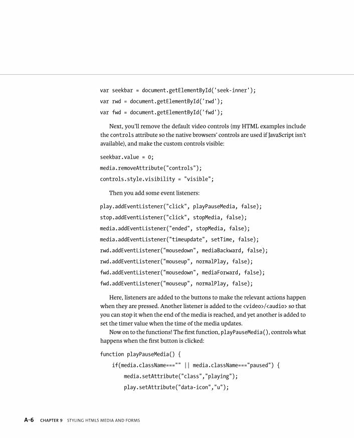
ptg8274462
A-6 CHAPTER 9 STYLING HTML5 MEDIA AND FORMS
var seekbar = document.getElementById(‘seek-inner’);
var rwd = document.getElementById(‘rwd’);
var fwd = document.getElementById(‘fwd’);
Next, you’ll remove the default video controls (my HTML examples include the controls attribute so the native browsers’ controls are used if JavaScript isn’t available), and make the custom controls visible:
seekbar.value = 0;
media.removeAttribute(“controls”);
controls.style.visibility = “visible”;
Then you add some event listeners:
play.addEventListener(“click”, playPauseMedia, false);
stop.addEventListener(“click”, stopMedia, false);
media.addEventListener(“ended”, stopMedia, false);
media.addEventListener(“timeupdate”, setTime, false);
rwd.addEventListener(“mousedown”, mediaBackward, false);
rwd.addEventListener(“mouseup”, normalPlay, false);
fwd.addEventListener(“mousedown”, mediaForward, false);
fwd.addEventListener(“mouseup”, normalPlay, false);
Here, listeners are added to the buttons to make the relevant actions happen when they are pressed. Another listener is added to the <video>/<audio> so that you can stop it when the end of the media is reached, and yet another is added to set the timer value when the time of the media updates.
Now on to the functions! The first function, playPauseMedia(), controls what happens when the first button is clicked:
function playPauseMedia() {
if(media.className===”” || media.className===”paused”) {
media.setAttribute(“class”,”playing”);
play.setAttribute(“data-icon”,”u”);
ptg8274462
CUSTOMIZING <VIDEO> AND <AUDIO> A-7
media.play();
} else {
media.setAttribute(“class”,”paused”);
play.setAttribute(“data-icon”,”P”);
media.pause();
}
}
Here I’ve used a simple if ... else statement to specify that if the class set on the media element is blank or paused, it is paused or stopped; otherwise, it is playing. If it is paused or stopped, you change the class on the media element to playing, change the data-icon attribute value on the Play button to “u” (a pause icon), and play the video using the play() method of the media API. If the media is playing, you change the media’s class attribute value back to paused, change the data-icon attribute value on the Play button to “P” (a play icon), and pause the video using the media API’s pause() method.
Next, you add the stopMedia() function, which controls what happens when the Stop button is pressed:
function stopMedia() {
media.pause();
media.currentTime = 0;
media.setAttribute(“class”,””);
play.setAttribute(“data-icon”,”P”);
}
This is much simpler, because it has only one state rather than two states that are toggled in between. There is no stop() method in the media API, so instead you use the pause() method to pause the media and put it back to the start using currentTime = 0. You also make sure that the Play/Pause button is reset by put-ting those class and data-icon attributes you were playing with earlier back to their default states.
ptg8274462
A-8 CHAPTER 9 STYLING HTML5 MEDIA AND FORMS
Next, you add the setTime() function, which updates the time counter:
function setTime() {
var minutes = Math.floor(media.currentTime / 60);
var seconds = Math.floor(media.currentTime - minutes * 60);
var minuteValue;
var secondValue;
if (minutes<10) {
minuteValue = “0” + minutes;
} else {
minuteValue = minutes;
}
if (seconds<10) {
secondValue = “0” + seconds;
} else {
secondValue = seconds;
}
mediaTime = minuteValue + “:” + secondValue;
timer.innerHTML = mediaTime;
}
This code isn’t as bad as it looks. The first part uses a bit of math to work out what the minute and second values are from the raw seconds returned by the currentTime method of the API. The second part checks whether the minute and second values are less than 10 or not. If so, a 0 is appended to the value, for example, 09. If not, the 0 is not appended, so the values will appear as, for example, 10, not 010.
ptg8274462
CUSTOMIZING <VIDEO> AND <AUDIO> A-9
The final two lines build the minute and second value into a timer readout, for example, 09:43, and then that value is squirted into the timer <div> using innerHTML.
The last set of functions is for the rewind/fast forward functionality:
function mediaBackward() {
media.pause();
interval = setInterval(‘media.currentTime = p media.currentTime - 3’, 200);
}
function mediaForward() {
media.pause();
interval = setInterval(‘media.currentTime = p media.currentTime + 3’, 200);
}
function normalPlay() {
clearInterval(interval);
media.play();
}
The first two functions use setInterval() to add or subtract three to/from the current time every fifth of a second while the mouse button is held down. I also pause the video while this is happening so that it doesn’t mess up the process. There is a setPlaybackRate() method, but I had to fake it like this as that method doesn’t work in Opera yet.
When the mouse button is not longer pressed, the normalPlay() removes the interval, and just starts the video playing as normal.

ptg8274462
A-10 CHAPTER 9 STYLING HTML5 MEDIA AND FORMS
OTHER MEDIA STYLING TIPS
Native video is really rather nice because you can style it in any way you want using CSS, and even create cool effects with media using SVG and <canvas>. For example, a simple effect I’ve used in this example is to hide the controls using opacity when you’re not hovering over the media:
#controls {
opacity: 0.5;
transition: 1s all;
}
and then only reveal them in their full glory when you do hover over the media:
#player:hover #controls, player:focus #controls {
opacity: 1;
}
You could get a lot crazier with transforms and transitions if you wanted to, but I’d advise against it. Animating video is so processor intensive that it’s best to avoid it.
Another tip concerns styling Flash fallbacks. You pretty much can’t. And even if you want to do something simple like making sure a <video> is centered in its parent column, you need to include a wrapper <div> around the video, and then center that. For example:
#wrapper {
margin: 0 auto;
}
ptg8274462
CUSTOMIZING <VIDEO> AND <AUDIO> A-11
Another big bugbear is getting consistent styling on the HTML5 media and the Flash fallback. You need to think about the styling of the HTML and the Flash movie separately.
OTHER RESOURCES
As you might have guessed, there is a lot more I could say about HTML5 media; in fact, there’s enough to fill an entire book. And indeed one of this book’s sister books fills this role. For much more about HTML5 media, check out HTML5 Multimedia: Develop and Design (Peachpit, 2011) by Ian Devlin.
There are also numerous other good resources available on the Internet. Here are just a few:
� dev.opera articles about HTML5 media. http://dev.opera.com/articles/tags/video and http://dev.opera.com/articles/tags/audio
� Using HTML5 audio and video on MDN. https://developer.mozilla.org/en/Using_HTML5_audio_and_video
NOTE: If you really don’t fancy tackling all the JavaScript and styling
manually, you could use one of the many third-party video players
available. Many of them are written to take a lot of the browsers’
inconsistencies and HTML5/Flash standoffs out of your hands. I rec-
ommend checking out http://videojs.com and http://sublimevideo.net.
ptg8274462
A-12 CHAPTER 9 STYLING HTML5 MEDIA AND FORMS
CSS3 and associated, modern web design goodies offer specific features for making HTML form styling easier. Simply put, HTML forms are a total pain to get looking good, and looking the same across browsers. The reason is that they are rendered so differently by default across browsers—and that is before you even start using the new HTML5 form controls, which as mentioned in Chapter 2 are not supported that well across browsers yet.
IMPROVING CONSISTENCY
A great way to instantly level the playing field and improve consistency across browsers is to apply that rather useful normalize.css to your forms (you’ve seen this used throughout this book). Normalize renders many elements more consistently across browsers, including form controls. If you want to see the effect it has, look at the demo page at http://necolas.github.com/normalize.css/demo.html. Scroll down to the “Forms” section. This may not be exactly what you want straight away, but it is a great base to build upon.
CSS3 FORM SELECTORS
CSS3 provides a number of form-related pseudo-classes to help you style form fields that contain valid and invalid data. They should be used along with the new HTML5 required attribute:
<input type=”text” id=”name” name=”name” required>
Keep in mind that form elements need to have a name attribute to be submit-ted as part of a form and to be validated. The pseudo-classes available to use with CSS are as follows:
� :required and :optional. These pseudo-classes let you style controls based on whether or not they have a required attribute.
� :valid and :invalid. These pseudo-classes apply styles to form controls based on whether the data contained inside them is valid or invalid.
� :in-range and :out-of-range. These pseudo-classes work with controls that feature a min and/or max attribute, styling data based on whether it is inside or outside the allowed data range.
FORM IMPROVEMENTS
ptg8274462
FORM IMPROVEMENTS A-13
Let’s look at a quick example to illustrate these pseudo-classes in action. See css3-form-selectors.html in the chapter9 code download folder. The parts of the demo that illustrate usage of the different features are fairly self-explanatory, but let’s have a look. Some styling is applied first to differentiate required and optional inputs:
#name:required {
border: 1px solid black;
box-shadow: inset 2px 2px 3px rgba(0,0,0,0.7);
background: linear-gradient(top,#fff,#ccc);
}
label[id=”required”]:before {
content: “*”;
}
#name:optional {
border: 1px grey dashed;
box-shadow: inset 2px 2px 3px rgba(0,0,0,0.4);
opacity: 0.9;
}
Here I’ve made the optional input look a bit fainter and less important than the required one, and also used generated content to add an asterisk to the required label.
Next, I’ve styled the valid and invalid input examples as follows:
@keyframes box-shake {
from { transform: translateX(2px); }
to { transform: translateX(-2px); }
}

ptg8274462
A-14 CHAPTER 9 STYLING HTML5 MEDIA AND FORMS
#email:invalid {
border: 2px solid rgb(255,100,100);
box-shadow: inset 2px 2px 3px rgba(0,0,0,0.7);
background: linear-gradient(top,#fff,#eee);
animation: box-shake 0.1s infinite;
}
#email:valid {
border: 1px solid black;
box-shadow: inset 2px 2px 3px rgba(0,0,0,0.7);
background: linear-gradient(top,#fff,#eee);
}
I’ve made invalid inputs look as deviant as possible with a big red border and a shaky animation! Try entering an email address into one of the email fields to see the instant change in style when the form data becomes valid. Then I’ve used a number input with min and max attributes set (allowing data in the range 1–100):
@keyframes box-pulse {
from { transform: scale(1.1); }
to { transform: scale(0.9); }
}
#number:out-of-range {
border: 2px solid rgb(255,100,100);
box-shadow: inset 2px 2px 3px rgba(0,0,0,0.7);
background: linear-gradient(top,#fff,#eee);
animation: box-pulse 0.8s infinite linear alternate;
transform-origin: center;
}

ptg8274462
WRAPPING UP A-15
#number:in-range {
border: 1px solid black;
box-shadow: inset 2px 2px 3px rgba(0,0,0,0.7);
background: linear-gradient(top,#fff,#eee);
}
Try focusing the input and entering a value of 101 or more to see what happens!
WRAPPING UP
In this chapter, you learned a range of styling tips and tricks to help you get the most out of some of the new HTML5 features—namely <audio> and <video>. You also learned some neat little HTML form goodies.
NOTE: The pseudo-selectors in the file css3-form-selectors.
html will work across all modern browsers with the exception
that in-range and out-of-range don’t work in Firefox.