
CSS3 for Web Designers - kfilko.schoolwires.net...CSS3 FOR WEB DESIGNERS Brief books for people who...
133
CSS3 FOR WEB DESIGNERS Brief books for people who make websites N o. 2 CSS3 FOR WEB DESIGNERS Dan Cederholm Foreword by Jeffrey Zeldman
Transcript of CSS3 for Web Designers - kfilko.schoolwires.net...CSS3 FOR WEB DESIGNERS Brief books for people who...
CSS3 FOR WEB DESIGNERS
Brief books for people who make websites No.
2
CSS3 FORWEB DESIGNERS
Dan Cederholm
Foreword by Jeffrey Zeldman
CSS3 FORWEB DESIGNERS
Dan Cederholm

Copyright © 2010 by Dan CederholmAll rights reserved
Publisher: Jeffrey ZeldmanDesigner: Jason Santa MariaEditor: Mandy BrownTechnical Editor: Ethan MarcotteCopyeditor: Krista Stevens
ISBN 978-0-9844425-2-2
A Book ApartNew York, New Yorkhttp://books.alistapart.com
10 9 8 7 6 5 4 3 2 1
TABLE OF CONTENTS
chapter 1
Using CSS3 Today1chapter 2
Understanding CSS Transitions1 5chapter 3
Hover-Crafting with CSS328chapter 4
Transforming the Message5 3chapter 5
Multiple Backgrounds82chapter 6
Enriching Forms
chapter 7
Conclusion
92116
Index1 2 2

FOREWORDWebsites are not the same as pictures of websites. When one person designs in Photoshop and another converts the design to markup and CSS, the coder must make guesses and assump-tions about what the designer intended. This interpretive process is never without friction—unless the coder is Dan Cederholm. When Dan codes other people’s designs, he gets everything right, including the parts the designer got wrong. For instance, Dan inevitably translates a designer’s fixed Photoshop dimensions into code that is flexible, accessible, and bulletproof. (Indeed, Dan coined the phrase “bulletproof web design” while teaching the rest of us how to do it.)
In Dan’s case, flexible never means sloppy. The details always matter. That’s because Dan is not only a brilliant front-end developer and user advocate, he is also a designer to his core. He dreams design, bleeds design, and even gave the world a new way to share design at dribbble.com. Dan is also a born teacher and funny guy whose deadpan delivery makes Steven Wright look giddy by comparison. Dan speaks all over, helping designers improve their craft, and he not only edu-cates, he kills.
And that, my friends, is why we’ve asked him to be our (and your) guide to CSS3. You couldn’t ask for a smarter, more experienced, more design-focused guide or a bigger web stan-dards geek than our man Dan. Enjoy the trip!
—Jeffrey Zeldman

1 USING CSS3 TODAY
Looking back upon the storied history of css, we see some important milestones that have shaped our direction as web designers. These watershed techniques, articles, and events helped us create flexible, accessible websites that we could be proud of both visually as well as under the hood.
You could argue that things began to get interesting back in 2001, when Jeffrey Zeldman wrote “To Hell With Bad Browsers” (http://bkaprt.com/css3/1/),1 signaling the dawn of the CSS Age. This manifesto encouraged designers to push forward and use CSS for more than just link colors and fonts, leaving behind older, incapable browsers that choked on CSS1. Yes, CSS1.
We spent the next several years discovering and sharing tech-niques for using CSS to achieve what we wanted for our cli-ents and bosses. It was an exciting time to be experimenting,
1. The long URL: http://www.alistapart.com/articles/tohell/
1 USING CSS3 TODAY
2 CSS3 FOR WEB DESIGNERS
pushing boundaries, and figuring out complex ways of han-dling cross-browser rendering issues—all in the name of in-creased flexibility, improved accessibility, and reduced code.
Somewhere around 2006 or so, the talk about CSS went quiet. Most of the problems we needed to solve had documented solutions. Common browser bugs had multiple workarounds. We created support groups for designers emotionally scarred by inexplicable Internet Explorer bugs. Our hair started to gray. (OK, I’m speaking for myself here.) Most importantly though, the contemporary crop of browsers was relatively stagnant. This period of status quo gave us time to craft reus-able approaches and establish best practices, but things got a little, dare I say, boring for the CSS aficionado yearning for better tools.
Thankfully things changed. Browsers began iterating and up-dating more rapidly (well, some of them anyway). Firefox and Safari not only started to gain market share, they also thrived on a quicker development cycle, adding solid standards sup-port alongside more experimental properties. In many cases, the technologies that these forward-thinking browsers chose to implement were then folded back into draft specifications. In other words, periodically it was the browser vendors that pushed the spec along.
BUT DON’T READ THE SPECAsk a roomful of web designers, “Who likes reading specs?” and you might get one person to raise their hand. (If you are that person, I commend you and the free time you apparently have). Although they serve as important references, I certainly don’t enjoy reading specifications in their entirety, nor do I recommend doing so in order to grasp CSS3 as a whole.
The good news is that CSS3 is actually a series of modules that are designed to be implemented separately and independently from each other. This is a very good thing. This segmented
3
approach has enabled portions of the spec to move faster (or slower) than others, and has encouraged browser vendors to implement the pieces that are further along before the entirety of CSS3 is considered finished.
The W3C explains the module approach:
Rather than attempting to shove dozens of updates into a single monolithic specification, it will be much easier and more efficient to be able to update individual pieces of the specification. Modules will enable CSS to be updated in a more timely and precise fash-ion, thus allowing for a more flexible and timely evolution of the specification as a whole.2
The benefit here for us web designers is that along with ex-perimentation and faster release cycle comes the ability to use many CSS3 properties before waiting until they become Candidate Recommendations, perhaps years from now.
Now, by all means, if you enjoy reading specifications, go for it! Naturally there’s a lot to be learned in there—but it’s far more practical to focus on what’s currently implemented and usable today, and those are the bits that we’ll be talking about in the rest of this chapter. Later, we’ll apply those bits in ex-amples throughout the rest of the book.
I’ve always learned more about web design by dissecting examples in the wild rather than reading white papers, and that’s what we’ll stress in the pages that follow.
CSS3 IS FOR EVERYONEI’ve been hearing this quite a bit from fellow web designers across the globe: “I can’t wait to use CSS3 … when it’s done.”
But the truth is everyone can begin using CSS3 right now. And
2. http://www.w3.org/TR/css3-roadmap/#whymods
USING CSS3 TODAY
4 CSS3 FOR WEB DESIGNERS
fortunately you don’t have to think differently or make drastic changes to the way you craft websites in order to do so. How can anyone use CSS3 on any project? Because we’re going to carefully choose the situations where we apply CSS3, focusing squarely on the experience layer.
Targeting the experience layer
If we’ve been doing things right over the past several years, we’ve been building upon a foundation of web standards (semantic HTML and CSS for layout, type, color, etc.), leav-ing much of the interaction effects—animation, feedback, and movement—to technologies like Flash and JavaScript. With CSS3 properties being slowly, but steadily introduced in forward-thinking browsers, we can start to shift some of that experience layer to our stylesheets.
As an interface designer who leans heavily toward the visual side of design rather than the programmatic side, the more I can do to make a compelling user experience using already-familiar tools like HTML and CSS, the more I do a happy little dance.
CSS3 is for web designers like you and I, and we can start using portions of it today, so long as we know when and how to fold it in.
When to apply CSS3
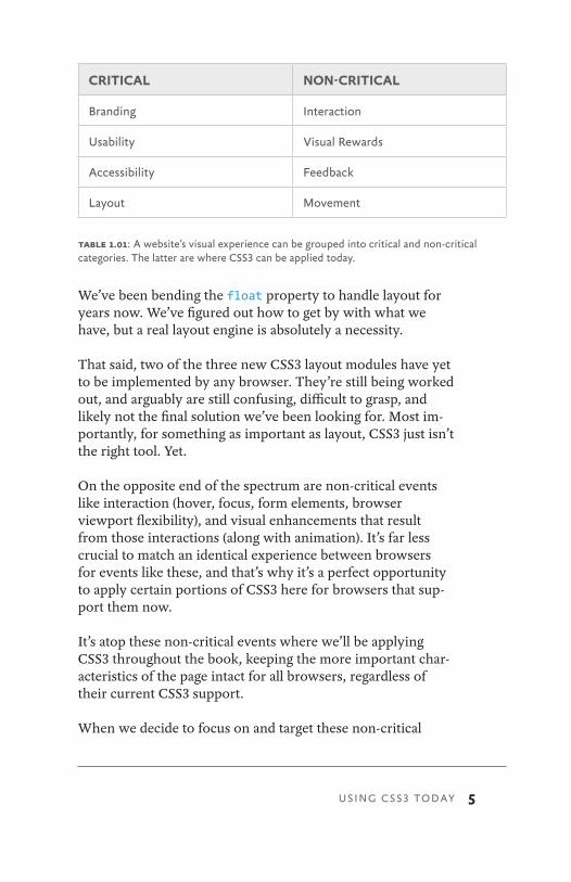
In terms of a website’s visual experience, we could group things into two categories: critical and non-critical (table 1.01).
Areas like branding, usability, and layout are crucial to any website’s success, and as such utilizing technology that’s not fully supported by all browsers would be a risky venture there.
For example, in the evolving CSS3 spec there are multiple drafts for controlling layout—something we drastically need.
5
We’ve been bending the float property to handle layout for years now. We’ve figured out how to get by with what we have, but a real layout engine is absolutely a necessity.
That said, two of the three new CSS3 layout modules have yet to be implemented by any browser. They’re still being worked out, and arguably are still confusing, difficult to grasp, and likely not the final solution we’ve been looking for. Most im-portantly, for something as important as layout, CSS3 just isn’t the right tool. Yet.
On the opposite end of the spectrum are non-critical events like interaction (hover, focus, form elements, browser viewport flexibility), and visual enhancements that result from those interactions (along with animation). It’s far less crucial to match an identical experience between browsers for events like these, and that’s why it’s a perfect opportunity to apply certain portions of CSS3 here for browsers that sup-port them now.
It’s atop these non-critical events where we’ll be applying CSS3 throughout the book, keeping the more important char-acteristics of the page intact for all browsers, regardless of their current CSS3 support.
When we decide to focus on and target these non-critical
CRITICAL NON-CRITICAL
Branding Interaction
Usability Visual Rewards
Accessibility Feedback
Layout Movement
table 1.01: A website’s visual experience can be grouped into critical and non-critical categories. The latter are where CSS3 can be applied today.
USING CSS3 TODAY
6 CSS3 FOR WEB DESIGNERS
areas of the visual experience, it becomes incredibly freeing to layer on CSS3 and enrich the interaction of a website without worrying that the core message, layout, and accessibility will be hindered.
CORE CSS3 PROPERTIES THAT ARE USABLE TODAYSo, while we’ve pinpointed the experience layer as a place we can safely apply CSS3 today, we’ll also want to pinpoint which CSS3 properties we can use. That is, which portions of the spec have a reached enough of a browser implementation tip-ping point to be practical and usable right now.
Large chunks of CSS3 have not yet been implemented in any browser. Things are still being worked out. We can be curious about those chunks that are in flux, but we’re better off focus-ing our attention on what actually works, and lucky for us there’s a fair amount now that does.
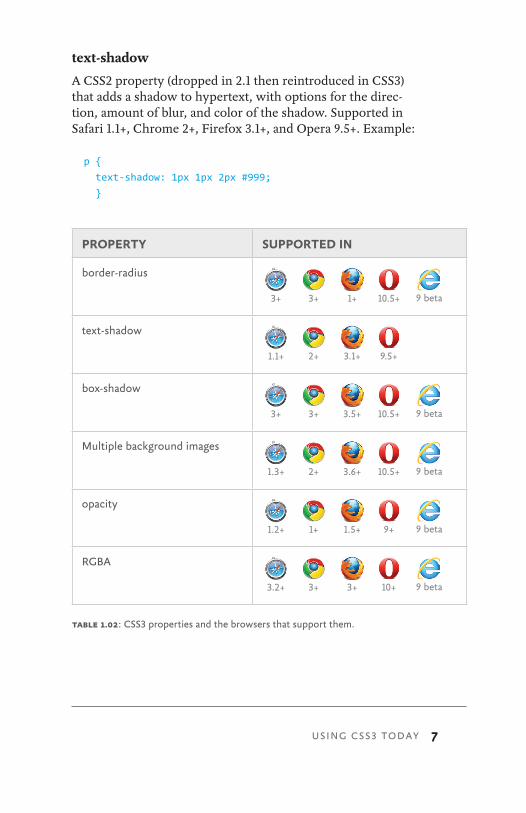
Let’s take a quick look at the relatively small set of core CSS3 properties that we’ll be using in the examples in the book (below, and table 1.02). I’m merely introducing them here, as we’ll be digging much deeper into advanced syntax and real-world usage later.
border-radius
Rounds the corners of an element with a specified radius value. Supported in Safari 3+, Chrome 3+, Firefox 1+, Opera 10.5+, and IE9 Beta. Example:
.foo {
border-radius: 10px;
}
7
text-shadow
A CSS2 property (dropped in 2.1 then reintroduced in CSS3) that adds a shadow to hypertext, with options for the direc-tion, amount of blur, and color of the shadow. Supported in Safari 1.1+, Chrome 2+, Firefox 3.1+, and Opera 9.5+. Example:
p {
text-shadow: 1px 1px 2px #999;
}
table 1.02: CSS3 properties and the browsers that support them.
USING CSS3 TODAY
PROPERTY SUPPORTED IN
border-radius
3+ 3+ 1+ 10.5+ 9 beta
text-shadow
1.1+ 2+ 3.1+ 9.5+
box-shadow
3+ 3+ 3.5+ 10.5+ 9 beta
Multiple background images
1.3+ 2+ 3.6+ 10.5+ 9 beta
opacity
1.2+ 1+ 1.5+ 9+ 9 beta
RGBA
3.2+ 3+ 3+ 10+ 9 beta
8 CSS3 FOR WEB DESIGNERS
box-shadow
Adds a shadow to an element. Identical syntax to text- shadow. Supported in Safari 3+, Chrome 3+, Firefox 3.5+, Opera 10.5+, and IE9 Beta. Example:
.foo {
box-shadow: 1px 1px 2px #999;
}
Multiple background images
CSS3 adds the ability to apply multiple background images on an element (separated with commas), as opposed to just one as defined in CSS2.1. Supported in Safari 1.3+, Chrome 2+, Firefox 3.6+, Opera 10.5+, and IE9 Beta. Example:
body {
background: url(image1.png) no-repeat top left,
url(image2.png) repeat-x bottom left,
url(image3.png) repeat-y top right;
}
opacity
Defines how opaque an element is. A value of 1 means com-pletely opaque, while a value of 0 means fully transparent. Supported in Safari 1.2+, Chrome 1+, Firefox 1.5+, Opera 9+, and IE9 Beta. Example:
.foo {
opacity: 0.5; /* .foo will be 50% transparent */
}
RGBA
Not a CSS property, but rather a new color model introduced in CSS3, adding the ability to specify a level of opacity along with an RGB color value. Supported in Safari 3.2+, Chrome 3+, Firefox 3+, Opera 10+, and IE9 Beta. Example:
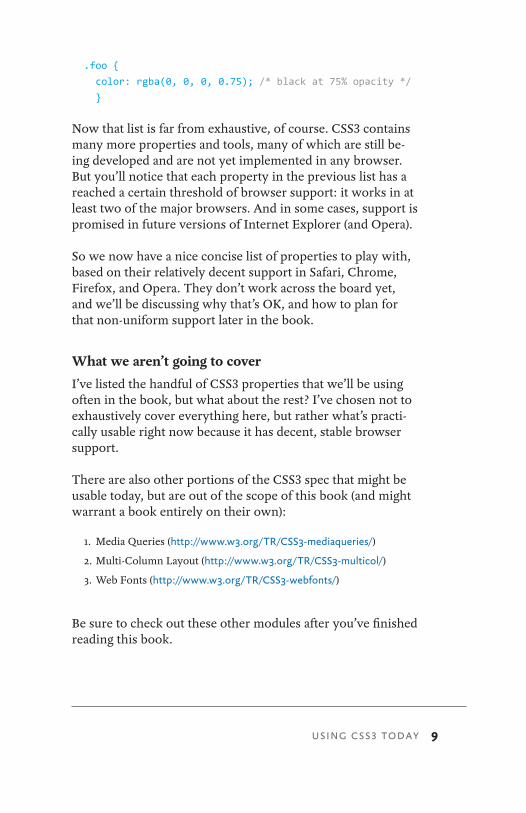
9
.foo {
color: rgba(0, 0, 0, 0.75); /* black at 75% opacity */
}
Now that list is far from exhaustive, of course. CSS3 contains many more properties and tools, many of which are still be-ing developed and are not yet implemented in any browser. But you’ll notice that each property in the previous list has a reached a certain threshold of browser support: it works in at least two of the major browsers. And in some cases, support is promised in future versions of Internet Explorer (and Opera).
So we now have a nice concise list of properties to play with, based on their relatively decent support in Safari, Chrome, Firefox, and Opera. They don’t work across the board yet, and we’ll be discussing why that’s OK, and how to plan for that non-uniform support later in the book.
What we aren’t going to cover
I’ve listed the handful of CSS3 properties that we’ll be using often in the book, but what about the rest? I’ve chosen not to exhaustively cover everything here, but rather what’s practi-cally usable right now because it has decent, stable browser support.
There are also other portions of the CSS3 spec that might be usable today, but are out of the scope of this book (and might warrant a book entirely on their own):
1. Media Queries (http://www.w3.org/TR/CSS3-mediaqueries/)
2. Multi-Column Layout (http://www.w3.org/TR/CSS3-multicol/)
3. Web Fonts (http://www.w3.org/TR/CSS3-webfonts/)
Be sure to check out these other modules after you’ve finished reading this book.
USING CSS3 TODAY
10 CSS3 FOR WEB DESIGNERS
VENDOR-SPECIFIC PREFIXESI mentioned earlier that the CSS3 specification is a series of modules that are being slowly rolled out by browser vendors. In some cases this rolling out involves experimental support. That is, while the spec is being written, debated, and hashed out at the W3C, a browser maker might choose to add sup-port for certain properties anyway, testing it in a real-world environment. It’s become a healthy part of the process, where feedback from experimental usage is often used to make ad-justments to the spec.
Alternatively, a browser vendor might want to introduce an experimental property that’s not part of any proposed stan-dard, but may become one at a later date.
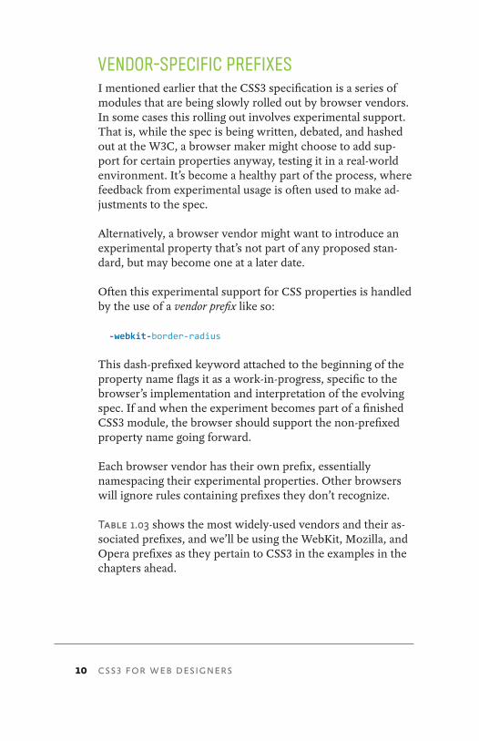
Often this experimental support for CSS properties is handled by the use of a vendor prefix like so:
-webkit-border-radius
This dash-prefixed keyword attached to the beginning of the property name flags it as a work-in-progress, specific to the browser’s implementation and interpretation of the evolving spec. If and when the experiment becomes part of a finished CSS3 module, the browser should support the non-prefixed property name going forward.
Each browser vendor has their own prefix, essentially namespacing their experimental properties. Other browsers will ignore rules containing prefixes they don’t recognize.
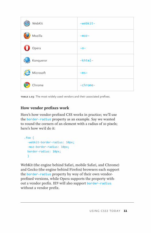
Table 1.03 shows the most widely-used vendors and their as-sociated prefixes, and we’ll be using the WebKit, Mozilla, and Opera prefixes as they pertain to CSS3 in the examples in the chapters ahead.
11
How vendor prefixes work
Here’s how vendor-prefixed CSS works in practice; we’ll use the border-radius property as an example. Say we wanted to round the corners of an element with a radius of 10 pixels; here’s how we’d do it:
.foo {
-webkit-border-radius: 10px;
-moz-border-radius: 10px;
border-radius: 10px;
}
WebKit (the engine behind Safari, mobile Safari, and Chrome) and Gecko (the engine behind Firefox) browsers each support the border-radius property by way of their own vendor- prefixed versions, while Opera supports the property with- out a vendor prefix. IE9 will also support border-radius without a vendor prefix.
WebKit
–webkit–
Mozilla –moz–
Opera –o–
Konqueror –khtml–
Microsoft –ms–
Chrome –chrome–
table 1.03: The most widely-used vendors and their associated prefixes.
USING CSS3 TODAY

12 CSS3 FOR WEB DESIGNERS
Optimal ordering
When using vendor prefixes, it’s important to keep in mind the order in which you list rules in your declarations. You’ll notice in the above example that we listed the vendor-prefixed property first, followed by the non-prefixed CSS3 property.
Why put the actual CSS3 property last? Because your styles will likely work in more browsers in the future, progressively enhancing your designs going forward. And when a browser finally implements support for the property as defined in the specification, that real property will trump the experimental version since it comes last in the list. Should the implementa-tion for the vendor-specific version differ from the real prop-erty, you’re ensuring that the final standard reigns supreme.
Don’t be afraid of vendor prefixes!
Your initial reaction might be one of, “Blech, this is messy, proprietary stuff!” But I assure you, not only is it a way for-ward, it’s much less messy than the code bloat and inflex-ibility that often come along with non-CSS3 solutions, and an important part of the evolution of the specification as well.
By using these properties now via vendor prefixes, we can test the waters, even giving valuable feedback to browser makers before the spec is final. Remember, too, that the prefixes are usually attached to proposed standards. That’s a big difference from other hackish CSS we’ve all periodically used to solve cross-browser issues.
Some might compare vendor prefixes to the syntax exploits many of us have used to target specific browser versions (for example, using w\idth: 200px or _width: 200px to target specific versions of IE). But rather, vendor prefixes are an im-portant part of the standards process, allowing the evolution of a property in a real-world implementation.

13
As CSS expert Eric Meyer explains in “Prefix or Posthack” on A List Apart (http://bkaprt.com/css3/2/):3
Prefixes give us control of our hacking destiny. In the past, we had to invent a bunch of parser exploits just to get inconsistent implementations to act the same once we found out they were inconsistent. It was a wholly reactive approach. Prefixes are a proactive approach.
He goes on to suggest that vendor prefixing is not only posi-tive, but should be made more central to the standards pro-cess, and would:
… force the vendors and the Working Group to work together to devise the tests necessary to determine interoperability. Those tests can then guide those who follow, helping them to achieve interoperable status much faster. They could literally ship the prefixed implementation in one public beta and drop the prefix in the next.
So, don’t fret over vendor prefixes. Use them knowing you’re a part of a process that allows you to get work done today, and paves the way toward a future when prefixes can be dropped.
What about all that repetition?
You might think it’s silly to have to repeat what seems like the same property three or four times for each vendor, and I might agree with you.
But the reality is that non-CSS3 solutions would likely re-quire inflexible and more complex code, albeit perhaps non-repetitive.
3. http://www.alistapart.com/articles/prefix-or-posthack/
USING CSS3 TODAY

14 CSS3 FOR WEB DESIGNERS
We won’t need to repeat ourselves forever. For now, it’s a nec-essary but temporary step to keep potentially varying imple-mentations between browsers separate from the final spec implementation.
Before we start doing compelling things with the handful of usable CSS3 properties and their respective vendor prefixes, let’s get a basic grasp on CSS transitions. Understanding tran-sitions and how they operate will help us combine them with other properties to create wonderful experiences.
15
it was 1997 and I was sitting in a terribly run-down apart-ment in beautiful Allston, Massachusetts. A typical late night of viewing source and teaching myself HTML followed a day of packing CDs at a local record label for peanuts (hence the run-down apartment). I’m sure you can relate.
One triumphant night, I pumped my fist in sweet victory. I’d just successfully coded my first JavaScript image rollover. Remember those?
I still remember the amazement of seeing a crudely designed button graphic I’d cobbled together “swap” to a different one when hovered over by the mouse. I barely had a clue as to what I was doing at the time, but making something on the page successfully change, dynamically, was, well … magical.
We’ve come a long way over the past decade in regard to interaction and visual experience on the web. Historically, technologies like Flash and JavaScript have enabled animation,
2 UNDERSTANDING CSS TRANSITIONS
UNDERSTANDING CSS TRANSITIONS
16 CSS3 FOR WEB DESIGNERS
movement, and interaction effects. But recently, with brows-ers rolling out support for CSS transitions and transforms, some of that animation and experience enrichment can now be comfortably moved to our stylesheets.
My first JavaScript rollover back in 1997 took me several nights of head scratching, many lines of code that seemed alien to me at the time, and multiple images. CSS3 today en-ables far richer, more flexible interactions through simple lines of code that thankfully degrade gracefully in the brows-ers that don’t yet support it.
As I mentioned in Chapter 1, we can start to use some CSS3 properties right now as long as we carefully choose the situ-ations in which to use them. The same could be said for CSS transitions. They certainly won’t replace existing technolo-gies like Flash, JavaScript, or SVG (especially without broader browser support)—but in conjunction with the aforemen-tioned core CSS3 properties (and CSS transforms and anima-tions which we’ll cover later in the book), they can be used to push the experience layer a notch higher. And most impor-tantly, they’re relatively easy to implement for the web design-er already familiar with CSS. It only takes a few lines of code.
I’m introducing CSS transitions early here in Chapter 2, as we’ll be applying them to many of the examples later in the book. Having a basic understanding of the syntax of transi-tions and how they work will be beneficial before we dig deeper into a case study.
TAIL WAGGING THE DOGInitially developed solely by the WebKit team for Safari, CSS Transitions are now a Working Draft specification at the W3C. (CSS Transforms and CSS Animations share that same lineage, and we’ll be talking about them in Chapters 4 and 6, respectively.)
17
This is a nice example of browser innovation being folded back into a potential standard. I say potential since it’s merely a draft today. However, Opera has recently added CSS transi-tions support in version 10.5 and Firefox has pledged support for version 4.0. In other words, while it is a draft specification and evolving, it’s stable enough for Opera and Firefox to be taking it seriously and adding support for it. Most impor-tantly, CSS transitions are no longer proprietary Safari-only experiments.
Let’s take a look at how transitions work, shall we? Like the CSS3 properties discussed in Chapter 1, I’m only introducing them here along with their basic syntax so you’ll have a good handle on how they operate. Later, we’ll be doing all sorts of fun things with transitions, using them to polish the examples in the chapters ahead, and you’ll be up to speed on how tran-sitions properly fit into the mix.
WHAT ARE CSS TRANSITIONS?I like to think of CSS transitions like butter, smoothing out value changes in your stylesheets when triggered by interac-tions like hovering, clicking, and focusing. Unlike real butter, transitions aren’t fattening—they’re just a few simple rules in your stylesheet to enrich certain events in your designs.
The W3C explains CSS transitions quite simply (http:// bkaprt.com/css3/3/):1
CSS Transitions allow property changes in CSS values to occur smoothly over a specified duration.
This smoothing animates the changing of a CSS value when triggered by a mouse click, focus or active state, or any chang-es to the element (including even a change on the element’s class attribute).
1. The long URL: http://www.w3.org/TR/CSS3-transitions/
UNDERSTANDING CSS TRANSITIONS
18 CSS3 FOR WEB DESIGNERS
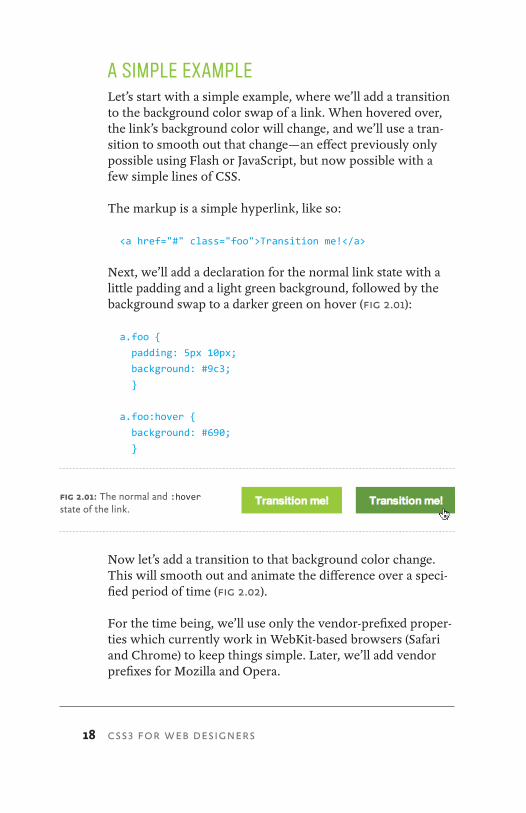
A SIMPLE EXAMPLELet’s start with a simple example, where we’ll add a transition to the background color swap of a link. When hovered over, the link’s background color will change, and we’ll use a tran-sition to smooth out that change—an effect previously only possible using Flash or JavaScript, but now possible with a few simple lines of CSS.
The markup is a simple hyperlink, like so:
<a href="#" class="foo">Transition me!</a>
Next, we’ll add a declaration for the normal link state with a little padding and a light green background, followed by the background swap to a darker green on hover (fig 2.01):
a.foo {
padding: 5px 10px;
background: #9c3;
}
a.foo:hover {
background: #690;
}
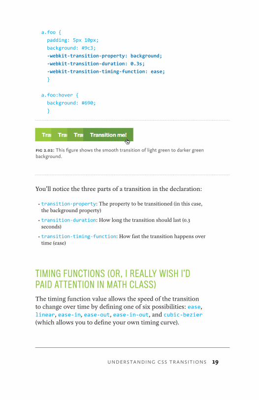
Now let’s add a transition to that background color change. This will smooth out and animate the difference over a speci-fied period of time (fig 2.02).
For the time being, we’ll use only the vendor-prefixed proper-ties which currently work in WebKit-based browsers (Safari and Chrome) to keep things simple. Later, we’ll add vendor prefixes for Mozilla and Opera.
fig 2.01: The normal and :hover state of the link.
19
a.foo {
padding: 5px 10px;
background: #9c3;
-webkit-transition-property: background;
-webkit-transition-duration: 0.3s;
-webkit-transition-timing-function: ease;
}
a.foo:hover {
background: #690;
}
You’ll notice the three parts of a transition in the declaration:
•transition-property: The property to be transitioned (in this case, the background property)
•transition-duration: How long the transition should last (0.3 seconds)
•transition-timing-function: How fast the transition happens over time (ease)
TIMING FUNCTIONS (OR, I REALLY WISH I’D PAID ATTENTION IN MATH CLASS)The timing function value allows the speed of the transition to change over time by defining one of six possibilities: ease, linear, ease-in, ease-out, ease-in-out, and cubic-bezier (which allows you to define your own timing curve).
fig 2.02: This figure shows the smooth transition of light green to darker green background.
UNDERSTANDING CSS TRANSITIONS

20 CSS3 FOR WEB DESIGNERS
If you slept through geometry in high school like I did, don’t worry. I recommend simply plugging in each of these timing function values to see how they differ.
For our simple example, the duration of the transition is so quick (just a mere 0.3 seconds) that it’d be difficult to tell the difference between the six options. For longer animations, the timing function you choose becomes more of an important piece of the puzzle, as there’s time to notice the speed changes over the length of the animation.
When in doubt, ease (which is also the default value) or linear should work just fine for short transitions.
DELAYING THE TRANSITION Going back to our example, transitions can be delayed from the moment the trigger happens on screen. For example, let’s say we wanted the background transition to happen half a second after the link is hovered over. We can do that using the transition-delay property.
a.foo {
padding: 5px 10px;
background: #9c3;
-webkit-transition-property: background;
-webkit-transition-duration: 0.3s;
-webkit-transition-timing-function: ease;
-webkit-transition-delay: 0.5s;
}
a.foo:hover {
background: #690;
}

21
SHORTHAND TRANSITIONSWe could simplify the (non-delayed) declaration significantly by using the transition shorthand property, which is the syn-tax we’ll be using in the examples later in the book.
a.foo {
padding: 5px 10px;
background: #9c3;
-webkit-transition: background 0.3s ease;
}
a.foo:hover {
background: #690;
}
Now we have a much more compact rule that accomplishes the same result.
Shorthand transition with a delay
If we wanted to add back in the half-second delay to the short-hand version of the transition, we can do that by placing the duration value at the end of the rule, like this:
a.foo {
padding: 5px 10px;
background: #9c3;
-webkit-transition: background 0.3s ease 0.5s;
}
a.foo:hover {
background: #690;
}
Now sure, all of this wonderful transitioning works just fine in WebKit browsers, but what about the others?
UNDERSTANDING CSS TRANSITIONS
22 CSS3 FOR WEB DESIGNERS
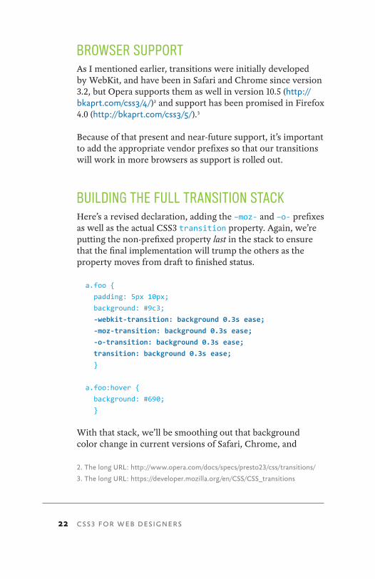
BROWSER SUPPORTAs I mentioned earlier, transitions were initially developed by WebKit, and have been in Safari and Chrome since version 3.2, but Opera supports them as well in version 10.5 (http://bkaprt.com/css3/4/)2 and support has been promised in Firefox 4.0 (http://bkaprt.com/css3/5/).3
Because of that present and near-future support, it’s important to add the appropriate vendor prefixes so that our transitions will work in more browsers as support is rolled out.
BUILDING THE FULL TRANSITION STACKHere’s a revised declaration, adding the –moz- and –o- prefixes as well as the actual CSS3 transition property. Again, we’re putting the non-prefixed property last in the stack to ensure that the final implementation will trump the others as the property moves from draft to finished status.
a.foo {
padding: 5px 10px;
background: #9c3;
-webkit-transition: background 0.3s ease;
-moz-transition: background 0.3s ease;
-o-transition: background 0.3s ease;
transition: background 0.3s ease;
}
a.foo:hover {
background: #690;
}
With that stack, we’ll be smoothing out that background color change in current versions of Safari, Chrome, and
2. The long URL: http://www.opera.com/docs/specs/presto23/css/transitions/
3. The long URL: https://developer.mozilla.org/en/CSS/CSS_transitions

23
Opera, as well as future versions of any browser that chooses to support it.
TRANSITIONING STATESI remember being slightly confused when I first started play-ing around with CSS Transitions. Wouldn’t it make more sense if the transition properties were placed in the :hover declaration, since that’s the trigger for the transition? The an-swer is that there are other possible states of an element be-sides :hover, and you’ll likely want that transition to happen on each of those without duplication.
For instance, you may want the transition to also happen on the :focus or :active pseudo-classes of the link as well. Instead of having to add the transition property stack to each of those declarations, the transition instructions are attached to the normal state and therefore declared only once.
The following example adds the same background switch to the :focus state. This enables triggering the transition from either hovering over or focusing the link (via the keyboard, for example).
a.foo {
padding: 5px 10px;
background: #9c3;
-webkit-transition: background 0.3s ease;
-moz-transition: background 0.3s ease;
-o-transition: background 0.3s ease;
transition: background 0.3s ease;
}
a.foo:hover,
a.foo:focus {
background: #690;
}
UNDERSTANDING CSS TRANSITIONS
24 CSS3 FOR WEB DESIGNERS
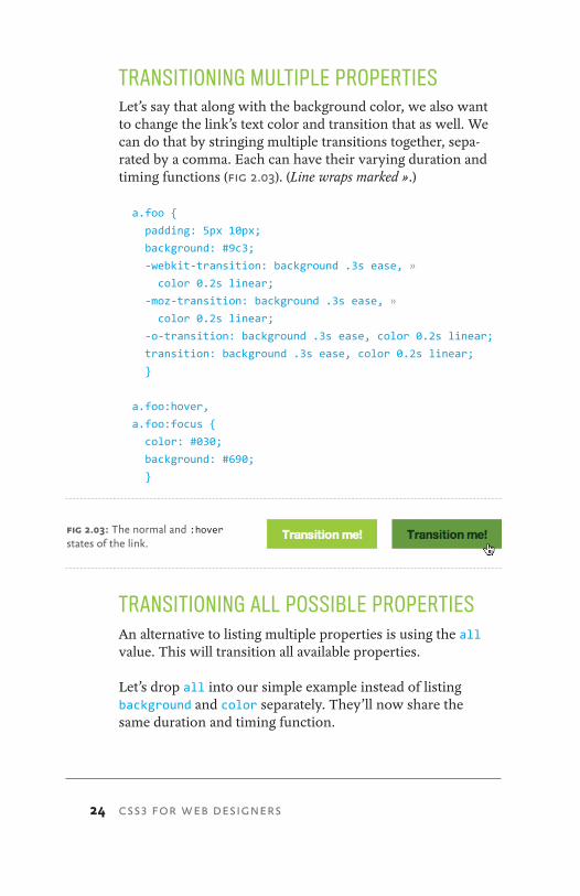
TRANSITIONING MULTIPLE PROPERTIESLet’s say that along with the background color, we also want to change the link’s text color and transition that as well. We can do that by stringing multiple transitions together, sepa-rated by a comma. Each can have their varying duration and timing functions (fig 2.03). (Line wraps marked ».)
a.foo {
padding: 5px 10px;
background: #9c3;
-webkit-transition: background .3s ease, »
color 0.2s linear;
-moz-transition: background .3s ease, »
color 0.2s linear;
-o-transition: background .3s ease, color 0.2s linear;
transition: background .3s ease, color 0.2s linear;
}
a.foo:hover,
a.foo:focus {
color: #030;
background: #690;
}
TRANSITIONING ALL POSSIBLE PROPERTIESAn alternative to listing multiple properties is using the all value. This will transition all available properties.
Let’s drop all into our simple example instead of listing background and color separately. They’ll now share the same duration and timing function.
fig 2.03: The normal and :hover states of the link.

25
a.foo {
padding: 5px 10px;
background: #9c3;
-webkit-transition: all 0.3s ease;
-moz-transition: all 0.3s ease;
-o-transition: all 0.3s ease;
transition: all 0.3s ease;
}
a.foo:hover,
a.foo:focus {
color: #030;
background: #690;
}
This is a convenient way of catching all the changes that hap-pen on :hover, :focus, or :active events without having to list each property you’d like to transition.
WHICH CSS PROPERTIES CAN BE TRANSITIONED?Now that we’ve successfully transitioned the background and color of a hyperlink, there are many other CSS properties that can be transitioned, including width, opacity, position, and font-size. A chart of all the possible properties (and their types) that can be transitioned is available from the W3C (http://bkaprt.com/css3/6/).4
The opportunities for wonderfully fluid experiences are clear. We’ll be using several of these properties in conjunction with transitions throughout our case study examples in the next chapter and onward.
4. The long URL: http://www.w3.org/TR/css3-transitions/#properties-from-css-
UNDERSTANDING CSS TRANSITIONS
26 CSS3 FOR WEB DESIGNERS
WHY NOT USE JAVASCRIPT INSTEAD?You might be wondering, with not all browsers supporting (or at least promising support for) CSS Transitions, why not use a JavaScript solution to handle the animation? Popular frame-works such as jQuery, Prototype, and script.aculo.us have enabled animations via JavaScript that work cross-browser for some time now.
It all depends on how crucial the transitions are to the experi-ence. I’m stressing here in this little book that you can em-brace the simplicity and flexibility of CSS3 if you choose the appropriate parts of the user experience to apply it: enriching the interactions that happen on the page. Quite often, the ani-mation of these interactions when handled by CSS Transitions aren’t integral to the brand, readability, or layout of the web-site. Therefore, a few simple lines of CSS to trigger a simple animation that’s native to the browsers that support it (rather than tapping into a JavaScript framework) seems like a smart choice. And one I’m glad we have at our disposal.
BE SMART, BE SUBTLELike all shiny new tools, it’s important to use transitions appropriately. One can easily go overboard adding transitions to everything on the page, resulting in some sort of annoying, pulsating monster. It’s key to decide where transitions right-fully enrich the user experience and when they are just extra-neous noise. Additionally, making sure the speed of the transi-tion doesn’t slow down an otherwise snappy action from the user is crucial. Use with care and caution.
For more thoughts on appropriate speeds for CSS transitions and animations, see Trent Walton’s post on the subject: http://bkaprt.com/css3/7/.5
5. http://trentwalton.com/2010/03/22/CSS3-in-transition/

27
Now that we have a solid base knowledge of how CSS transi-tions work at a technical level, we can use them to smooth out the experience layer in the examples that follow, beginning with the very next chapter. Let’s get to it.
UNDERSTANDING CSS TRANSITIONS
28 CSS3 FOR WEB DESIGNERS
we’ve spent the first two chapters in training, get-ting up to speed with what’s currently usable today in terms of CSS3. We also talked about how the experience layer is cur-rently the most appropriate place to apply that usable CSS3.
To recap the important bits we’ve covered so far, let’s keep in mind that:
1. There are core CSS3 properties that are usable today.
2. Everyone can use these core properties in their own projects, espe-cially when targeted at the experience layer.
3. Vendor prefixes allow us to push forward right now, helping test in-flux properties in real-world contexts.
4. CSS Transitions are no longer proprietary experiments, but draft specifications that other browsers are embracing. Let’s use ’em!
With all of this under our anti-gravity belts, it’s now time to have fun with all our new tools, and put them to work in the context of a full-page design.
3 HOVER-CRAFTING WITH CSS3
29
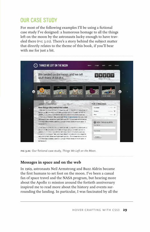
OUR CASE STUDYFor most of the following examples I’ll be using a fictional case study I’ve designed: a humorous homage to all the things left on the moon by the astronauts lucky enough to have trav-eled there (fig 3.01). There’s a story behind the subject matter that directly relates to the theme of this book, if you’ll bear with me for just a bit.
Messages in space and on the web
In 1969, astronauts Neil Armstrong and Buzz Aldrin became the first humans to set foot on the moon. I’ve been a casual fan of space travel and the NASA program, but hearing more about the Apollo 11 mission around the fortieth anniversary inspired me to read more about the history and events sur-rounding the landing. In particular, I was fascinated by all the
fig 3.01: Our fictional case study, Things We Left on the Moon.
HOVER-CRAFTING WITH CSS3
30 CSS3 FOR WEB DESIGNERS
stuff that was left on the moon and remains up there to this day.
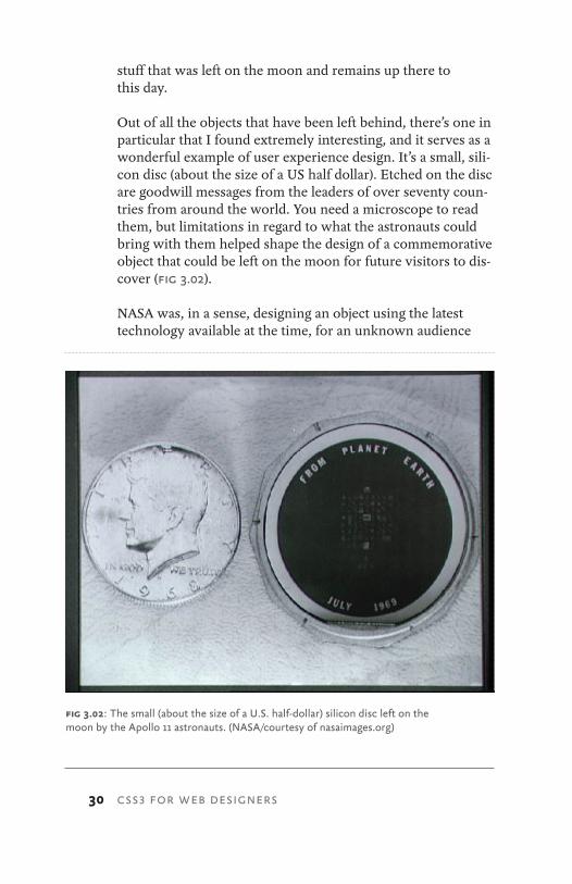
Out of all the objects that have been left behind, there’s one in particular that I found extremely interesting, and it serves as a wonderful example of user experience design. It’s a small, sili-con disc (about the size of a US half dollar). Etched on the disc are goodwill messages from the leaders of over seventy coun-tries from around the world. You need a microscope to read them, but limitations in regard to what the astronauts could bring with them helped shape the design of a commemorative object that could be left on the moon for future visitors to dis-cover (fig 3.02).
NASA was, in a sense, designing an object using the latest technology available at the time, for an unknown audience
fig 3.02: The small (about the size of a U.S. half-dollar) silicon disc left on the moon by the Apollo 11 astronauts. (NASA/courtesy of nasaimages.org)
31
sometime in the future. Sound familiar?
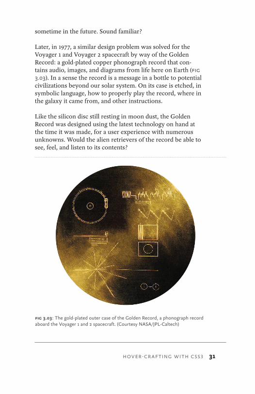
Later, in 1977, a similar design problem was solved for the Voyager 1 and Voyager 2 spacecraft by way of the Golden Record: a gold-plated copper phonograph record that con-tains audio, images, and diagrams from life here on Earth (fig 3.03). In a sense the record is a message in a bottle to potential civilizations beyond our solar system. On its case is etched, in symbolic language, how to properly play the record, where in the galaxy it came from, and other instructions.
Like the silicon disc still resting in moon dust, the Golden Record was designed using the latest technology on hand at the time it was made, for a user experience with numerous unknowns. Would the alien retrievers of the record be able to see, feel, and listen to its contents?
fig 3.03: The gold-plated outer case of the Golden Record, a phonograph record aboard the Voyager 1 and 2 spacecraft. (Courtesy NASA/JPL-Caltech)
HOVER-CRAFTING WITH CSS3
32 CSS3 FOR WEB DESIGNERS
We can learn a lot from the silicon disc left on the moon and the Golden Record hurtling into deep space—that utilizing the best technology possible can help support the message being sent to a largely unknown audience.
As web designers, we too are sending messages in a bottle when we create things for the web. We can make assumptions about who will be reading them, what they’re actually capable of understanding, etc.—but we’re never 100% informed. That shouldn’t prevent us from using the best technology available to deliver that message and the experience around it, letting the experience degrade gracefully in older or less capable devices.
Our job as designers is not to simply dress up the bottle and make it look pretty, but rather to find ways to enrich the story and enhance the message. CSS3 can help us do that today.
So now you know why our case study pays homage to those messages left on the moon or floating through space. It’s time to start dissecting the site, breaking it into bite-sized examples as they pertain to CSS3. I find it helpful to collect all the tech-niques we’ll be discussing in a single place. You’ll be able to reference this template and all the examples whenever you’d like in a living, breathing, one-page website.
You can download the case study’s example code at http://CSS3exp.com/code.
Each of the remaining chapters tackles a different set of exam-ples related to CSS3. Instead of attempting to be all inclusive, telling you everything there is to know about CSS3, I’m doing quite the opposite here: diving into very specific, targeted examples, while showing how they work in a simulated con-text—quick takeaways that you’ll be able to apply immediately and build upon after digesting these pages. Burp.
33
SURPRISE AND DELIGHTPart of what makes designing for the web so different and in-teresting as opposed to static media is interaction. Things can react, move, and even surprise when experienced in pixels rather than paper.
And it’s the interaction that’s so easily enhanced by CSS3 for browsers that support it, yet not missed by those that don’t.
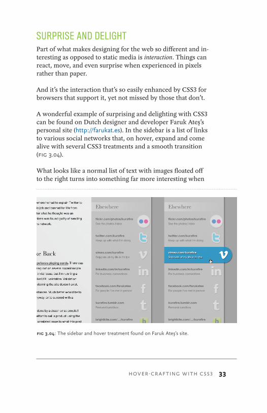
A wonderful example of surprising and delighting with CSS3 can be found on Dutch designer and developer Faruk Ateş’s personal site (http://farukat.es). In the sidebar is a list of links to various social networks that, on hover, expand and come alive with several CSS3 treatments and a smooth transition (fig 3.04).
What looks like a normal list of text with images floated off to the right turns into something far more interesting when
fig 3.04: The sidebar and hover treatment found on Faruk Ateş’s site.
HOVER-CRAFTING WITH CSS3
34 CSS3 FOR WEB DESIGNERS
you interact with it. This is a prime example of enriching the experience layer, and Faruk uses a variety of CSS3 properties in order to make that happen (in the browsers that support them).
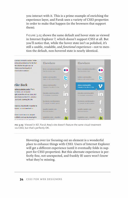
Figure 3.05 shows the same default and hover state as viewed in Internet Explorer 7, which doesn’t support CSS3 at all. But you’ll notice that, while the hover state isn’t as polished, it’s still a usable, readable, and functional experience—not to men-tion the default, non-hovered state is nearly identical.
Hovering over (or focusing on) an element is a wonderful place to enhance things with CSS3. Users of Internet Explorer will get a different experience (until it eventually folds in sup-port for CSS3 properties). But this alternate experience is per-fectly fine, not unexpected, and frankly IE users won’t know what they’re missing.
fig 3.05: Viewed in IE7, Faruk Ateş’s site doesn’t feature the same visual treatment via CSS3, but that’s perfectly OK.

35
That is, until they fire this up in their friend’s copy of Safari, Chrome, Firefox, or Opera (and feel a flush of jealousy).
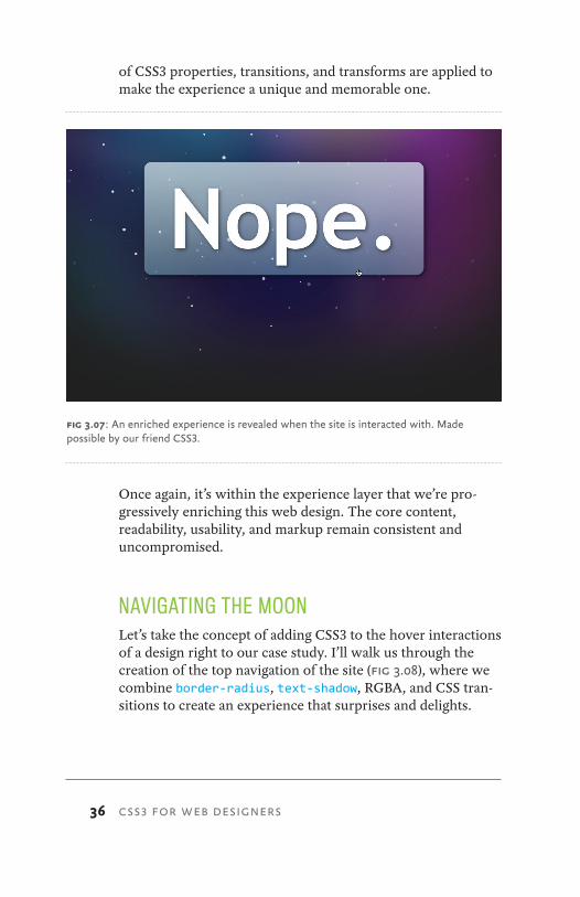
DO WEBSITES NEED TO BE EXPERIENCED EXACTLY THE SAME IN EVERY BROWSER?It’s an important question (and an appropriate one to ask at this point), and I attempt to answer it on this enormously long domain (fig 3.06): http://dowebsitesneedtobeexperienced exactlythesameineverybrowser.com.
Like Faruk’s example, it’s not until you start to interact with the site that things get interesting. On the surface, the site looks nearly identical in most browsers, but the moment you move the mouse across the screen and text (fig 3.07), a series
fig 3.06: The curiously named http://dowebsitesneedtobeexperiencedexactly thesameineverybrowser.com.
HOVER-CRAFTING WITH CSS3
36 CSS3 FOR WEB DESIGNERS
of CSS3 properties, transitions, and transforms are applied to make the experience a unique and memorable one.
Once again, it’s within the experience layer that we’re pro-gressively enriching this web design. The core content, readability, usability, and markup remain consistent and uncompromised.
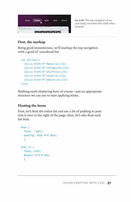
NAVIGATING THE MOONLet’s take the concept of adding CSS3 to the hover interactions of a design right to our case study. I’ll walk us through the creation of the top navigation of the site (fig 3.08), where we combine border-radius, text-shadow, RGBA, and CSS tran-sitions to create an experience that surprises and delights.
fig 3.07: An enriched experience is revealed when the site is interacted with. Made possible by our friend CSS3.
37
First, the markup
Being good semanticians, we’ll markup the top navigation with a good ol’ unordered list.
<ul id="nav">
<li><a href="#">News</a></li>
<li><a href="#">Things</a></li>
<li><a href="#">Stuff</a></li>
<li><a href="#">Junk</a></li>
<li><a href="#">About</a></li>
</ul>
Nothing earth-shattering here of course—just an appropriate structure we can use to start applying styles.
Floating the items
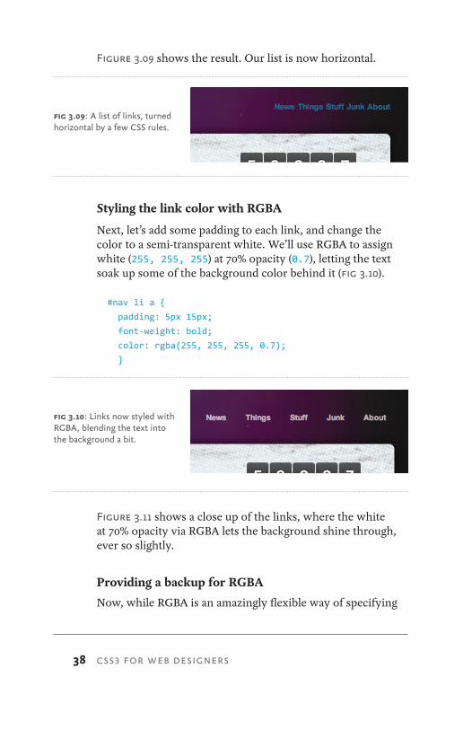
First, let’s float the entire list and use a bit of padding to posi-tion it over to the right of the page; then, let’s also float each list item.
#nav {
float: right;
padding: 42px 0 0 30px;
}
#nav li {
float: left;
margin: 0 0 0 5px;
}
fig 3.08: The top navigation of our case study, enriched with CSS3 when hovered.
HOVER-CRAFTING WITH CSS3
38 CSS3 FOR WEB DESIGNERS
Figure 3.09 shows the result. Our list is now horizontal.
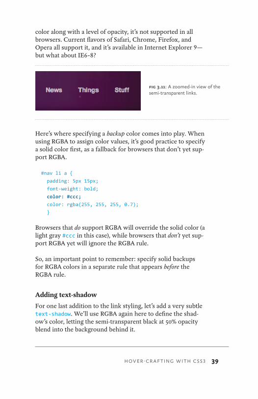
Styling the link color with RGBA
Next, let’s add some padding to each link, and change the color to a semi-transparent white. We’ll use RGBA to assign white (255, 255, 255) at 70% opacity (0.7), letting the text soak up some of the background color behind it (fig 3.10).
#nav li a {
padding: 5px 15px;
font-weight: bold;
color: rgba(255, 255, 255, 0.7);
}
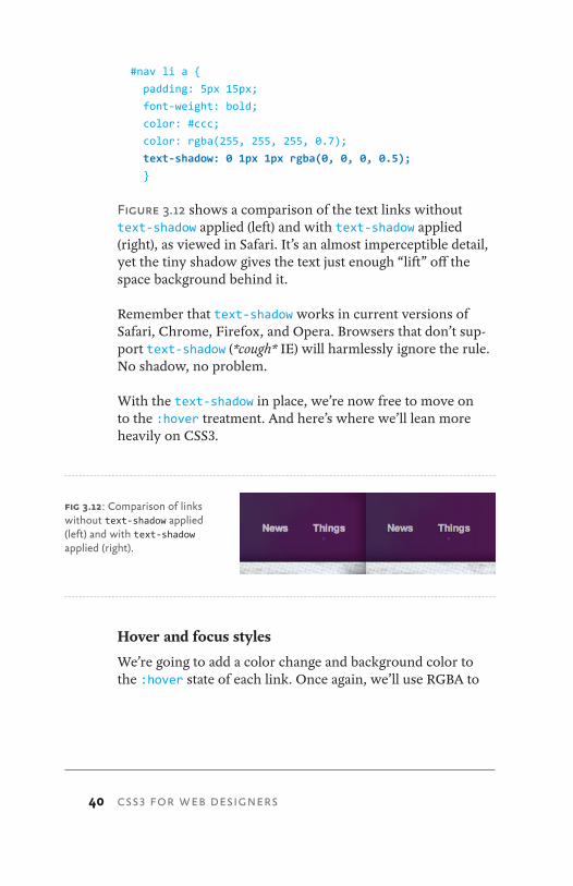
Figure 3.11 shows a close up of the links, where the white at 70% opacity via RGBA lets the background shine through, ever so slightly.
Providing a backup for RGBA
Now, while RGBA is an amazingly flexible way of specifying
fig 3.09: A list of links, turned horizontal by a few CSS rules.
fig 3.10: Links now styled with RGBA, blending the text into the background a bit.
39
color along with a level of opacity, it’s not supported in all browsers. Current flavors of Safari, Chrome, Firefox, and Opera all support it, and it’s available in Internet Explorer 9—but what about IE6–8?
Here’s where specifying a backup color comes into play. When using RGBA to assign color values, it’s good practice to specify a solid color first, as a fallback for browsers that don’t yet sup-port RGBA.
#nav li a {
padding: 5px 15px;
font-weight: bold;
color: #ccc;
color: rgba(255, 255, 255, 0.7);
}
Browsers that do support RGBA will override the solid color (a light gray #ccc in this case), while browsers that don’t yet sup-port RGBA yet will ignore the RGBA rule.
So, an important point to remember: specify solid backups for RGBA colors in a separate rule that appears before the RGBA rule.
Adding text-shadow
For one last addition to the link styling, let’s add a very subtle text-shadow. We’ll use RGBA again here to define the shad-ow’s color, letting the semi-transparent black at 50% opacity blend into the background behind it.
fig 3.11: A zoomed-in view of the semi-transparent links.
HOVER-CRAFTING WITH CSS3
40 CSS3 FOR WEB DESIGNERS
#nav li a {
padding: 5px 15px;
font-weight: bold;
color: #ccc;
color: rgba(255, 255, 255, 0.7);
text-shadow: 0 1px 1px rgba(0, 0, 0, 0.5);
}
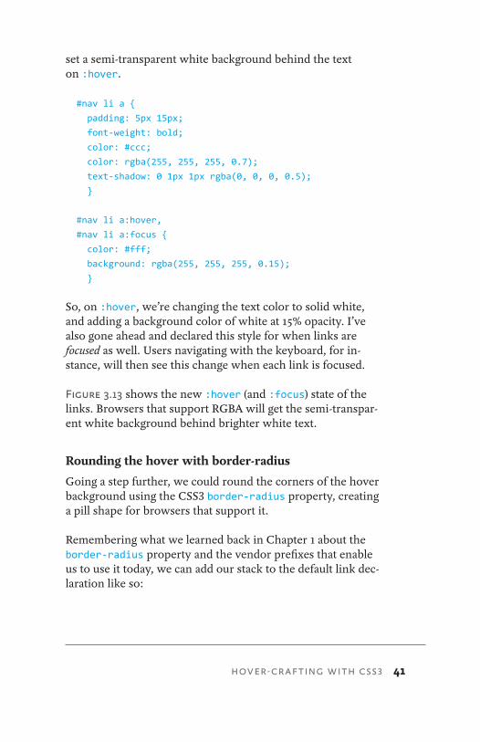
Figure 3.12 shows a comparison of the text links without text-shadow applied (left) and with text-shadow applied (right), as viewed in Safari. It’s an almost imperceptible detail, yet the tiny shadow gives the text just enough “lift” off the space background behind it.
Remember that text-shadow works in current versions of Safari, Chrome, Firefox, and Opera. Browsers that don’t sup-port text-shadow (*cough* IE) will harmlessly ignore the rule. No shadow, no problem.
With the text-shadow in place, we’re now free to move on to the :hover treatment. And here’s where we’ll lean more heavily on CSS3.
Hover and focus styles
We’re going to add a color change and background color to the :hover state of each link. Once again, we’ll use RGBA to
fig 3.12: Comparison of links without text-shadow applied (left) and with text-shadow applied (right).
41
set a semi-transparent white background behind the text on :hover.
#nav li a {
padding: 5px 15px;
font-weight: bold;
color: #ccc;
color: rgba(255, 255, 255, 0.7);
text-shadow: 0 1px 1px rgba(0, 0, 0, 0.5);
}
#nav li a:hover,
#nav li a:focus {
color: #fff;
background: rgba(255, 255, 255, 0.15);
}
So, on :hover, we’re changing the text color to solid white, and adding a background color of white at 15% opacity. I’ve also gone ahead and declared this style for when links are focused as well. Users navigating with the keyboard, for in-stance, will then see this change when each link is focused.
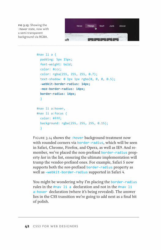
Figure 3.13 shows the new :hover (and :focus) state of the links. Browsers that support RGBA will get the semi-transpar-ent white background behind brighter white text.
Rounding the hover with border-radius
Going a step further, we could round the corners of the hover background using the CSS3 border-radius property, creating a pill shape for browsers that support it.
Remembering what we learned back in Chapter 1 about the border-radius property and the vendor prefixes that enable us to use it today, we can add our stack to the default link dec-laration like so:
HOVER-CRAFTING WITH CSS3
42 CSS3 FOR WEB DESIGNERS
#nav li a {
padding: 5px 15px;
font-weight: bold;
color: #ccc;
color: rgba(255, 255, 255, 0.7);
text-shadow: 0 1px 1px rgba(0, 0, 0, 0.5);
-webkit-border-radius: 14px;
-moz-border-radius: 14px;
border-radius: 14px;
}
#nav li a:hover,
#nav li a:focus {
color: #fff;
background: rgba(255, 255, 255, 0.15);
}
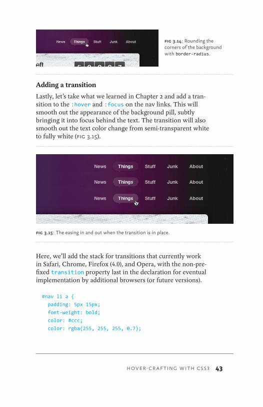
Figure 3.14 shows the :hover background treatment now with rounded corners via border-radius, which will be seen in Safari, Chrome, Firefox, and Opera, as well as IE9. And re-member, we’ve placed the non-prefixed border-radius prop-erty last in the list, ensuring the ultimate implementation will trump the vendor-prefixed ones. For example, Safari 5 now supports both the non-prefixed border-radius property as well as –webkit-border-radius supported in Safari 4.
You might be wondering why I’m placing the border-radius rules in the #nav li a declaration and not in the #nav li a:hover declaration (where it’s being revealed). The answer lies in the CSS transition we’re going to add next as a final bit of polish.
fig 3.13: Showing the :hover state, now with a semi-transparent background via RGBA.
43
Adding a transition
Lastly, let’s take what we learned in Chapter 2 and add a tran-sition to the :hover and :focus on the nav links. This will smooth out the appearance of the background pill, subtly bringing it into focus behind the text. The transition will also smooth out the text color change from semi-transparent white to fully white (fig 3.15).
Here, we’ll add the stack for transitions that currently work in Safari, Chrome, Firefox (4.0), and Opera, with the non-pre-fixed transition property last in the declaration for eventual implementation by additional browsers (or future versions).
#nav li a {
padding: 5px 15px;
font-weight: bold;
color: #ccc;
color: rgba(255, 255, 255, 0.7);
fig 3.14: Rounding the corners of the background with border-radius.
HOVER-CRAFTING WITH CSS3
fig 3.15: The easing in and out when the transition is in place.
44 CSS3 FOR WEB DESIGNERS
text-shadow: 0 1px 1px rgba(0, 0, 0, 0.5);
-webkit-border-radius: 14px;
-moz-border-radius: 14px;
border-radius: 14px;
-webkit-transition: all 0.3s ease-in-out;
-moz-transition: all 0.3s ease-in-out;
-o-transition: all 0.3s ease-in-out;
transition: all 0.3s ease-in-out;
}
#nav li a:hover,
#nav li a:focus {
color: #fff;
background: rgba(255, 255, 255, 0.15);
}
Remember that we add the transition properties to the normal state of the element to be transitioned. Transitions are de-signed this way in order for the transition to happen not only on :hover, but also on :focus or :active states as well.
I’m using the all value in our transition to catch all the properties that change on :hover and :focus—color and background in this case. Alternatively, we could’ve achieved the same transition by listing each of those properties explic-itly in a comma-delimited list like this:
-webkit-transition:
color 0.3s ease-in-out,
background 0.3s ease-in-out;
-moz-transition:
color 0.3s ease-in-out,
background 0.3s ease-in-out;
-o-transition:
color 0.3s ease-in-out,
background 0.3s ease-in-out;
transition:
color .3s ease-in-out,
background .3s ease-in-out;
45
You can quickly see how the all value is a bit more compact and efficient for transitioning multiple changes on an element.
Hover-crafting the experience
We’ve just walked through a rather simple example, adding various CSS3 properties to the experience layer. Browsers that are capable will ease in a semi-transparent, rounded back-ground color behind text-shadowed text links. Browsers that aren’t capable don’t get the enhanced hover experience, but that’s perfectly OK. What they do get is a semantically-struc-tured horizontal list of links—and that foundation is what’s most important here.
I think this little exercise also demonstrates how efficient it is to achieve something that previously would have required Flash and/or JavaScript to achieve. The CSS rules that we used are simple and straightforward, harmless for browsers that don’t yet support them.
We’ve also future-proofed our CSS3 by ensuring that the property from the spec is included last in our rules. Dup-licating these rules with the appropriate vendor-specific prefixes is a necessary effort—but one where the payoff is golden: getting to use CSS3 right now to enhance the experi-ence for many users.
SIMPLE AND FLEXIBLE HOVERING USING OPACITYWe’re constantly looking for solutions that save time and offer additional flexibility. This is precisely what CSS3 offers us in spades: the ability to achieve, in a few lines of code, what used to take more time and resources to create and maintain.
Yet another tool for the hover-crafting arsenal is the opacity property. As mentioned in Chapter 1, opacity is a CSS3 prop-erty that allows you to specify how opaque a given element
HOVER-CRAFTING WITH CSS3
46 CSS3 FOR WEB DESIGNERS
is. Coupled with the aforementioned RGBA, opacity offers another method to add transparency to the designs we create for the web.
One of the ways I like to use opacity is to create simple and flexible hover states for hyperlinked graphics, using the varia-tion in transparency to create multiple states from a single image. Add a CSS transition into the mix and you now have a wonderfully rich experience for linked graphics on the page that’s easy to maintain.
Let’s take a look at how the opacity property is used on the moon case study.
Opacity on clickable images
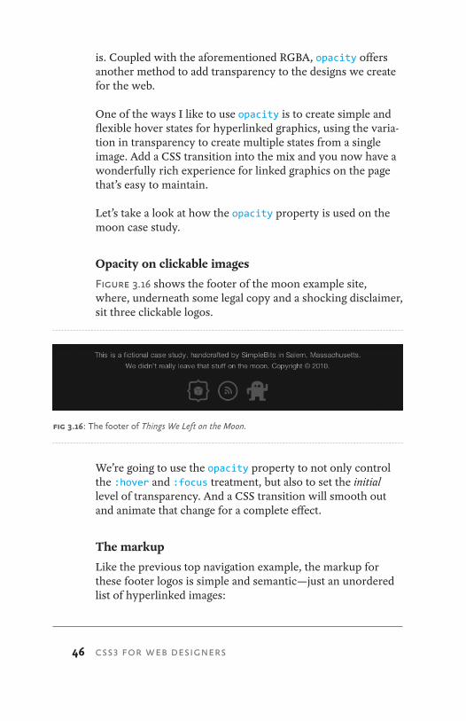
Figure 3.16 shows the footer of the moon example site, where, underneath some legal copy and a shocking disclaimer, sit three clickable logos.
We’re going to use the opacity property to not only control the :hover and :focus treatment, but also to set the initial level of transparency. And a CSS transition will smooth out and animate that change for a complete effect.
The markup
Like the previous top navigation example, the markup for these footer logos is simple and semantic—just an unordered list of hyperlinked images:
fig 3.16: The footer of Things We Left on the Moon.
47
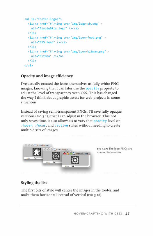
<ul id="footer-logos">
<li><a href="#"><img src="img/logo-sb.png" »
alt="SimpleBits logo" /></a>
</li>
<li><a href="#"><img src="img/icon-feed.png" »
alt="RSS feed" /></a>
</li>
<li><a href="#"><img src="img/icon-bitman.png" »
alt="BitMan" /></a>
</li>
</ul>
Opacity and image efficiency
I’ve actually created the icons themselves as fully-white PNG images, knowing that I can later use the opacity property to adjust the level of transparency with CSS. This has changed the way I think about graphic assets for web projects in some situations.
Instead of saving semi-transparent PNGs, I’ll save fully opaque versions (fig 3.17) that I can adjust in the browser. This not only saves time, it also allows us to vary that opacity level on :hover, :focus, and :active states without needing to create multiple sets of images.
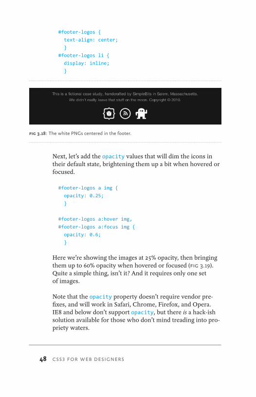
Styling the list
The first bits of style will center the images in the footer, and make them horizontal instead of vertical (fig 3.18).
HOVER-CRAFTING WITH CSS3
fig 3.17: The logo PNGs are created fully-white.
48 CSS3 FOR WEB DESIGNERS
#footer-logos {
text-align: center;
}
#footer-logos li {
display: inline;
}
Next, let’s add the opacity values that will dim the icons in their default state, brightening them up a bit when hovered or focused.
#footer-logos a img {
opacity: 0.25;
}
#footer-logos a:hover img,
#footer-logos a:focus img {
opacity: 0.6;
}
Here we’re showing the images at 25% opacity, then bringing them up to 60% opacity when hovered or focused (fig 3.19). Quite a simple thing, isn’t it? And it requires only one set of images.
Note that the opacity property doesn’t require vendor pre-fixes, and will work in Safari, Chrome, Firefox, and Opera. IE8 and below don’t support opacity, but there is a hack-ish solution available for those who don’t mind treading into pro-priety waters.
fig 3.18: The white PNGs centered in the footer.
49
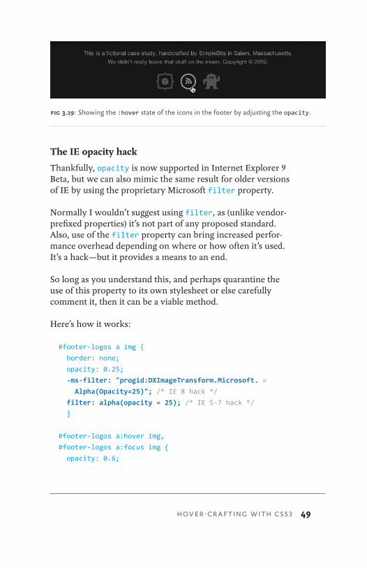
The IE opacity hack
Thankfully, opacity is now supported in Internet Explorer 9 Beta, but we can also mimic the same result for older versions of IE by using the proprietary Microsoft filter property.
Normally I wouldn’t suggest using filter, as (unlike vendor-prefixed properties) it’s not part of any proposed standard. Also, use of the filter property can bring increased perfor-mance overhead depending on where or how often it’s used. It’s a hack—but it provides a means to an end.
So long as you understand this, and perhaps quarantine the use of this property to its own stylesheet or else carefully comment it, then it can be a viable method.
Here’s how it works:
#footer-logos a img {
border: none;
opacity: 0.25;
-ms-filter: "progid:DXImageTransform.Microsoft. »
Alpha(Opacity=25)"; /* IE 8 hack */
filter: alpha(opacity = 25); /* IE 5-7 hack */
}
#footer-logos a:hover img,
#footer-logos a:focus img {
opacity: 0.6;
fig 3.19: Showing the :hover state of the icons in the footer by adjusting the opacity.
HOVER-CRAFTING WITH CSS3
50 CSS3 FOR WEB DESIGNERS
-ms-filter:"progid:DXImageTransform.Microsoft. »
Alpha(Opacity=60)"; /* IE 8 hack */
filter: alpha(opacity = 60); /* IE 5-7 hack */
}
The syntax is similar, with a value of opacity passed through IE’s alpha filter. Note that IE8 ignores the filter property and requires the vendor-prefixed –ms-filter with some ad-ditional (ugly) values.
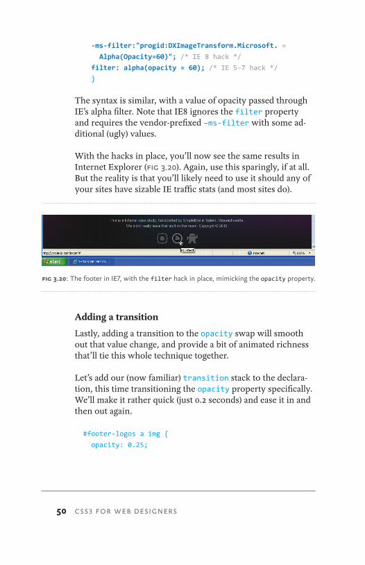
With the hacks in place, you’ll now see the same results in Internet Explorer (fig 3.20). Again, use this sparingly, if at all. But the reality is that you’ll likely need to use it should any of your sites have sizable IE traffic stats (and most sites do).
Adding a transition
Lastly, adding a transition to the opacity swap will smooth out that value change, and provide a bit of animated richness that’ll tie this whole technique together.
Let’s add our (now familiar) transition stack to the declara-tion, this time transitioning the opacity property specifically. We’ll make it rather quick (just 0.2 seconds) and ease it in and then out again.
#footer-logos a img {
opacity: 0.25;
fig 3.20: The footer in IE7, with the filter hack in place, mimicking the opacity property.
51
-ms-filter: "progid:DXImageTransform.Microsoft. »
Alpha(Opacity=25)"; /* IE 8 hack */
filter: alpha(opacity = 25); /* IE 5-7 hack */
-webkit-transition: opacity 0.2s ease-in-out;
-moz-transition: opacity 0.2s ease-in-out;
-o-transition: opacity 0.2s ease-in-out;
transition: opacity 0.2s ease-in-out;
}
#footer-logos a:hover img,
#footer-logos a:focus img {
opacity: 0.6;
-ms-filter: "progid:DXImageTransform.Microsoft. »
Alpha(Opacity=60)"; /* IE 8 hack */
filter: alpha(opacity = 60); /* IE 5-7 hack */
}
With the transition in place, we now have a simple technique for using opacity to craft a flexible hover experience using a single set of images.
GO FORTH AND HOVER-CRAFTAs I mentioned before, this solution has affected the way I think about creating the asset graphics for a design. We can use opacity to control how the graphic appears by default, blending it into the background—then applying a different value for :hover, :focus, and :active states, tying it together with a transition for browsers that support it.
Keep the opacity property in mind next time you’re creating hover treatments for hyperlinked images in your own designs. You’ll save time, bandwidth, and the unnecessary complexity that other solutions might require.
HOVER-CRAFTING WITH CSS3

52 CSS3 FOR WEB DESIGNERS
Hover-crafting with CSS3 is about quickly and efficiently add-ing simple styles that enrich the experience layer, surprising and delighting users with the browsers that support those properties now and into the future. If the browser doesn’t support the high-fidelity experience you’ve created, that’s per-fectly OK, as they won’t know what they’re missing.
53
Like css transitions, CSS transforms were also initially developed by the WebKit team, then folded back into two separate Working Drafts at the W3C:
1. CSS 2D Transforms (http://www.w3.org/TR/CSS3-2d-transforms/)
2. CSS 3D Transforms (http://www.w3.org/TR/CSS3-3d-transforms/)
We’re going to focus solely on 2D transforms in this book, as they’re the most practical to use right now. An entire book could be filled with information on 3D transforms alone, and they’re wonderfully magical. But 2D transforms have the most traction in regards to browser support, including Safari 3.2, Chrome 3.2, Firefox 4.0, and Opera 10.5 (just like transitions).
So just what are CSS Transforms? The W3C describes them as:
4 TRANSFORMINGTHE MESSAGE
TRANSFORMING THE MESSAGE
54 CSS3 FOR WEB DESIGNERS
CSS 2D Transforms allow elements rendered by CSS to be trans-formed in two-dimensional space.1
Well, that was helpful. The best way to understand transforms is to see them in action.
So let’s first walk through a simple example applying various 2D transforms on a small photo gallery. We’ll then use those same techniques in practice on the moon example site later in the chapter.
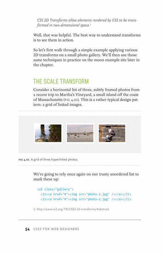
THE SCALE TRANSFORMConsider a horizontal list of three, subtly framed photos from a recent trip to Martha’s Vineyard, a small island off the coast of Massachusetts (fig 4.01). This is a rather typical design pat-tern: a grid of linked images.
We’re going to rely once again on our trusty unordered list to mark these up:
<ul class="gallery">
<li><a href="#"><img src="photo-1.jpg" /></a></li>
<li><a href="#"><img src="photo-2.jpg" /></a></li>
1. http://www.w3.org/TR/CSS3-2d-transforms/#abstract
fig 4.01: A grid of three hyperlinked photos.
55
<li><a href="#"><img src="photo-3.jpg" /></a></li>
</ul>
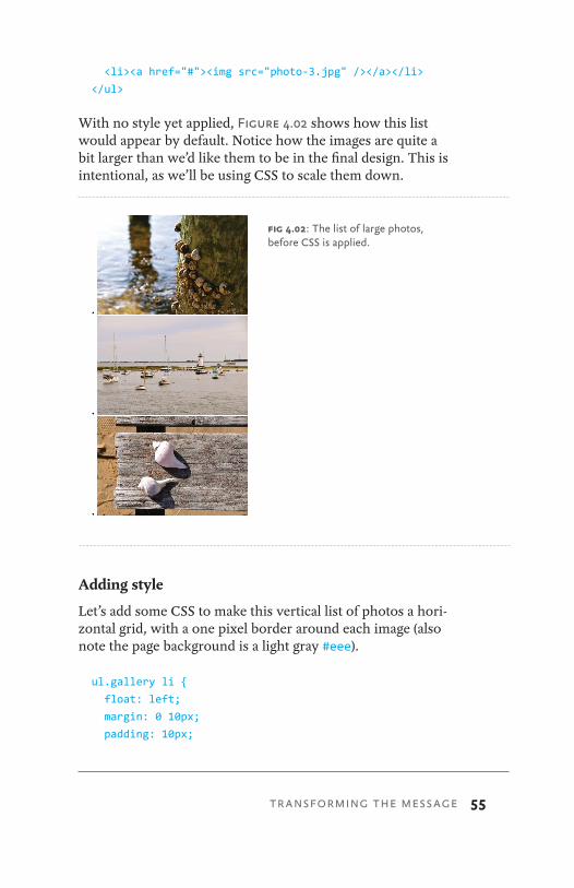
With no style yet applied, Figure 4.02 shows how this list would appear by default. Notice how the images are quite a bit larger than we’d like them to be in the final design. This is intentional, as we’ll be using CSS to scale them down.
Adding style
Let’s add some CSS to make this vertical list of photos a hori-zontal grid, with a one pixel border around each image (also note the page background is a light gray #eee).
ul.gallery li {
float: left;
margin: 0 10px;
padding: 10px;
fig 4.02: The list of large photos, before CSS is applied.
TRANSFORMING THE MESSAGE
56 CSS3 FOR WEB DESIGNERS
border: 1px solid #ddd;
list-style: none;
}
ul.gallery li a img {
float: left;
width: 200px;
}
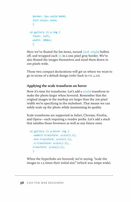
Here we’ve floated the list items, turned list-style bullets off, and wrapped each li in a one pixel gray border. We’ve also floated the images themselves and sized them down to 200 pixels wide.
Those two compact declarations will get us where we want to go in terms of a default design (refer back to fig 4.01).
Applying the scale transform on hover
Now it’s time for transforms. Let’s add a scale transform to make the photo larger when hovered. Remember that the original images in the markup are larger than the 200 pixel width we’re specifying in the stylesheet. That means we can safely scale up the photo while maintaining its quality.
Scale transforms are supported in Safari, Chrome, Firefox, and Opera—each requiring a vendor prefix. Let’s add a stack that satisfies those browsers as well as any future ones.
ul.gallery li a:hover img {
-webkit-transform: scale(1.5);
-moz-transform: scale(1.5);
-o-transform: scale(1.5);
transform: scale(1.5);
}
When the hyperlinks are hovered, we’re saying, “scale the images to 1.5 times their initial size” (which was 200px wide).
57
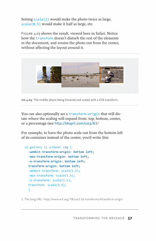
Setting scale(2) would make the photo twice as large, scale(0.5) would make it half as large, etc.
Figure 4.03 shows the result, viewed here in Safari. Notice how the transform doesn’t disturb the rest of the elements in the document, and zooms the photo out from the center, without affecting the layout around it.
You can also optionally set a transform-origin that will dic-tate where the scaling will expand from: top, bottom, center, or a percentage (see http://bkaprt.com/css3/8/).2
For example, to have the photo scale out from the bottom left of its container instead of the center, you’d write this:
ul.gallery li a:hover img {
-webkit-transform-origin: bottom left;
-moz-transform-origin: bottom left;
-o-transform-origin: bottom left;
transform-origin: bottom left;
-webkit-transform: scale(1.5);
-moz-transform: scale(1.5);
-o-transform: scale(1.5);
transform: scale(1.5);
}
2. The long URL: http://www.w3.org/TR/css3-2d-transforms/#transform-origin
fig 4.03: The middle photo being hovered and scaled with a CSS transform.
TRANSFORMING THE MESSAGE
58 CSS3 FOR WEB DESIGNERS
An appropriate drop shadow
We could go a step further with this example and add a drop shadow to the photo when hovered. This would be an appro-priate use of the CSS3 box-shadow property, as we’re making the enlarged photo appear as if it’s pulling up off the page.
Now, the drop shadow is a delicate beast, an often overused crutch by the trigger-happy designer. It’s easy to get carried away and overdo it. But in this case, we’re attempting to add dimension to the photo enlargement, so it should work out quite well.
The syntax for box-shadow is identical to the text-shadow property we used back in Chapter 3. However, unlike text-shadow, box-shadow requires vendor prefixes in order to work in Safari, Chrome, and Firefox. (Opera 10+ and IE9 Beta sup-port the non-prefixed box-shadow.) Let’s fold those rules in.
ul.gallery li a:hover img {
-webkit-transform: scale(1.5);
-moz-transform: scale(1.5);
-o-transform: scale(1.5);
transform: scale(1.5);
-webkit-box-shadow: 4px 4px 10px rgba(0, 0, 0, 0.5);
-moz-box-shadow: 4px 4px 10px rgba(0, 0, 0, 0.5);
box-shadow: 4px 4px 10px rgba(0, 0, 0, 0.5);
}
We’ve added a CSS3 stack for the box-shadow property for the WebKit and Mozilla browsers that support it, ending with the non-prefixed version as we have with other examples.
In terms of the syntax, here we’re applying a shadow on the hovered image that is 4px from the top, 4px from the left, has a 10px blur, and is black at 50% opacity (ensuring it’ll blend in to whatever background or element sits behind it).

59
Figure 4.04 shows the shadow now appearing in conjunction with the scale transform when a photo is hovered over. This combination gives the effect of having the enlarged photo pop out from the page.
Smoothing out the zoom with a transition
Lastly, adding a transition to the linked photos will smooth out the scaling, giving the :hover treatment an animated zoom-in-and-out—an effect previously only possible with Flash or JavaScript, but now possible in many browsers with just the few lines of CSS3.
Here’s the transition stack added to the complete CSS for our little photo gallery:
ul.gallery li {
float: left;
margin: 0 10px;
padding: 10px;
border: 1px solid #ddd;
list-style: none;
}
fig 4.04: The hovered photo, now scaled with box-shadow applied.
TRANSFORMING THE MESSAGE

60 CSS3 FOR WEB DESIGNERS
ul.gallery li a img {
float: left;
width: 200px;
-webkit-transition: -webkit-transform 0.2s ease-in-out;
-moz-transition: -moz-transform 0.2s ease-in-out;
transition: transform 0.2s ease-in-out;
}
ul.gallery li a:hover img {
-webkit-transform: scale(1.5);
-moz-transform: scale(1.5);
-o-transform: scale(1.5);
transform: scale(1.5);
-webkit-box-shadow: 4px 4px 10px rgba(0, 0, 0, 0.5);
-moz-box-shadow: 4px 4px 10px rgba(0, 0, 0, 0.5);
box-shadow: 4px 4px 10px rgba(0, 0, 0, 0.5);
}
Notice this time, the property we’re transitioning is the scale transform, hence the appropriate vendor prefixes are in place for both the transition and transform properties.
TRANSFORMING THE EXPERIENCEWith everything in place, the result is quite impressive for the minimal amount of CSS that’s required to make it hap-pen. We’re putting most of the burden of the effect back on the browsers that support it, rather than injecting Flash or JavaScript to make it happen.
Again, the place where we chose to fully embrace CSS3 in this particular example is in the experience layer: when the photo is hovered, we’re offering an enhanced view. It’s not critical for browsers that don’t support those properties.
Users of Internet Explorer, for example, will just see a gallery of clickable thumbnails, and that’s perfectly OK. If the hover
61
treatment was critical, then we’d need to rethink our use of CSS3 to achieve the visual experience.
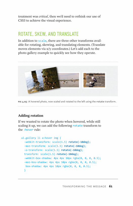
ROTATE, SKEW, AND TRANSLATEIn addition to scale, there are three other transforms avail-able for rotating, skewing, and translating elements. (Translate moves elements via x/y coordinates.) Let’s add each to the photo gallery example to quickly see how they operate.
Adding rotation
If we wanted to rotate the photo when hovered, while still scaling it up, we can add the following rotate transform to the :hover rule:
ul.gallery li a:hover img {
-webkit-transform: scale(1.5) rotate(-10deg);
-moz-transform: scale(1.5) rotate(-10deg);
-o-transform: scale(1.5) rotate(-10deg);
transform: scale(1.5) rotate(-10deg);
-webkit-box-shadow: 4px 4px 10px rgba(0, 0, 0, 0.5);
-moz-box-shadow: 4px 4px 10px rgba(0, 0, 0, 0.5);
box-shadow: 4px 4px 10px rgba(0, 0, 0, 0.5);
}
fig 4.05: A hovered photo, now scaled and rotated to the left using the rotate transform.
TRANSFORMING THE MESSAGE
62 CSS3 FOR WEB DESIGNERS
We’re still scaling up the photo on hover, but we’re also tip-ping the photo 10 degrees to the left using rotate (fig 4.05). This will work in Safari, Chrome, Firefox, and Opera. A nega-tive value from -1deg to -360deg rotates the element counter-clockwise, while a positive value from 1deg to 360deg rotates it clockwise.
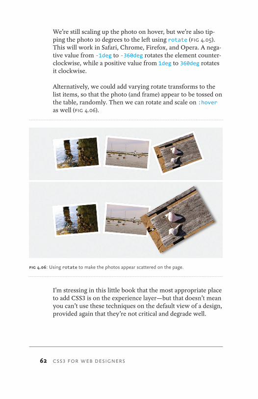
Alternatively, we could add varying rotate transforms to the list items, so that the photo (and frame) appear to be tossed on the table, randomly. Then we can rotate and scale on :hover as well (fig 4.06).
I’m stressing in this little book that the most appropriate place to add CSS3 is on the experience layer—but that doesn’t mean you can’t use these techniques on the default view of a design, provided again that they’re not critical and degrade well.
fig 4.06: Using rotate to make the photos appear scattered on the page.
63
For example, should the browser not support rotate trans-forms, and the photos appear perfectly straight, that’d would be fine. Nothing would appear broken.
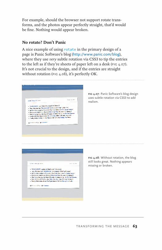
No rotate? Don’t Panic
A nice example of using rotate in the primary design of a page is Panic Software’s blog (http://www.panic.com/blog), where they use very subtle rotation via CSS3 to tip the entries to the left as if they’re sheets of paper left on a desk (fig 4.07). It’s not crucial to the design, and if the entries are straight without rotation (fig 4.08), it’s perfectly OK.
fig 4.07: Panic Software’s blog design uses subtle rotation via CSS3 to add realism.
fig 4.08: Without rotation, the blog still looks great. Nothing appears missing or broken.
TRANSFORMING THE MESSAGE
64 CSS3 FOR WEB DESIGNERS
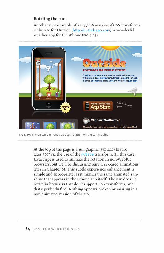
Rotating the sunAnother nice example of an appropriate use of CSS transforms is the site for Outside (http://outsideapp.com), a wonderful weather app for the iPhone (fig 4.09).
At the top of the page is a sun graphic (fig 4.10) that ro-tates 360° via the use of the rotate transform. (In this case, JavaScript is used to animate the rotation in non-WebKit browsers, but we’ll be discussing pure CSS-based animations later in Chapter 6). This subtle experience enhancement is simple and appropriate, as it mimics the same animated sun-shine that appears in the iPhone app itself. The sun doesn’t rotate in browsers that don’t support CSS transforms, and that’s perfectly fine. Nothing appears broken or missing in a non-animated version of the site.
fig 4.09: The Outside iPhone app uses rotation on the sun graphic.

65
Transforms coupled with transitions in CSS can help support the overall message in the designs we create for the web, and that’s a wonderfully enabling tool for us web designers.
The skew transform
The skew transform takes x and y coordinates and skews an element. If we were to skew the photos in our gallery on hover, for example, we’d use the following CSS (skewing neg-ative five degrees on the x coordinate, and 30 degrees on the y coordinate) (fig 4.11):
ul.gallery li a:hover img {
-webkit-transform: scale(1.5) skew(-5deg, 30deg);
-moz-transform: scale(1.5) skew(-5deg, 30deg);
-o-transform: scale(1.5) skew(-5deg, 30deg);
transform: scale(1.5) skew(-5deg, 30deg);
}
fig 4.10: Outside app’s sun graphic comes to life after positioning and rotating with CSS.
fig 4.11: Using the skew transform to distort the photo.
TRANSFORMING THE MESSAGE
66 CSS3 FOR WEB DESIGNERS
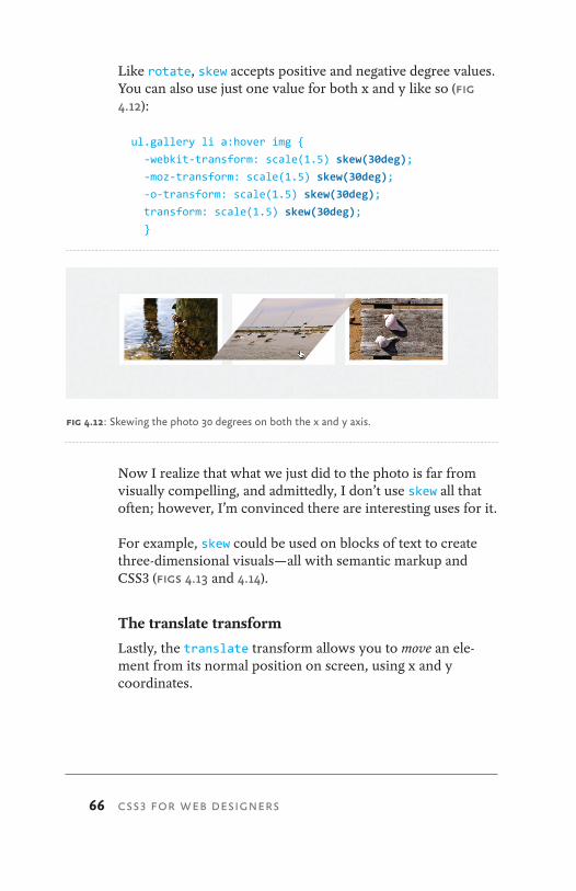
Like rotate, skew accepts positive and negative degree values. You can also use just one value for both x and y like so (fig 4.12):
ul.gallery li a:hover img {
-webkit-transform: scale(1.5) skew(30deg);
-moz-transform: scale(1.5) skew(30deg);
-o-transform: scale(1.5) skew(30deg);
transform: scale(1.5) skew(30deg);
}
Now I realize that what we just did to the photo is far from visually compelling, and admittedly, I don’t use skew all that often; however, I’m convinced there are interesting uses for it.
For example, skew could be used on blocks of text to create three-dimensional visuals—all with semantic markup and CSS3 (figs 4.13 and 4.14).
The translate transform
Lastly, the translate transform allows you to move an ele-ment from its normal position on screen, using x and y coordinates.
fig 4.12: Skewing the photo 30 degrees on both the x and y axis.
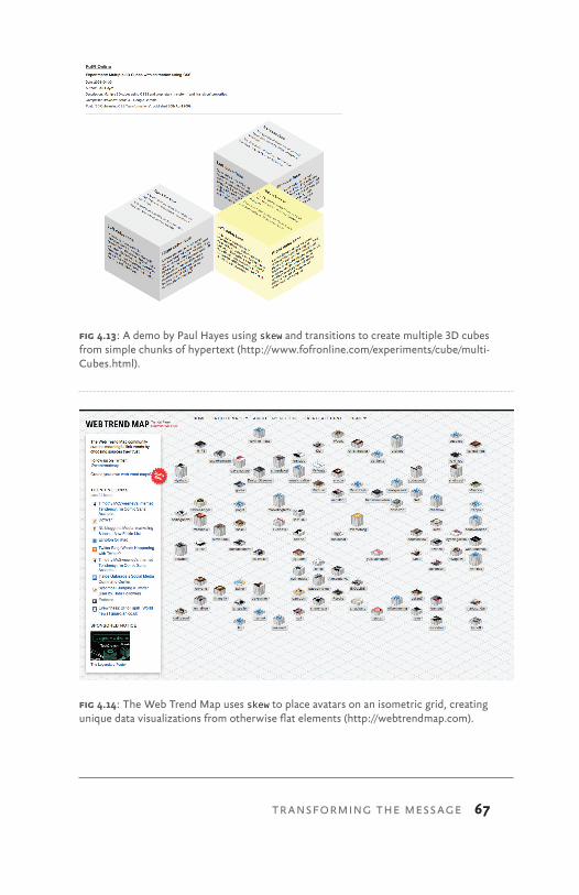
67
fig 4.13: A demo by Paul Hayes using skew and transitions to create multiple 3D cubes from simple chunks of hypertext (http://www.fofronline.com/experiments/cube/multi-Cubes.html).
fig 4.14: The Web Trend Map uses skew to place avatars on an isometric grid, creating unique data visualizations from otherwise flat elements (http://webtrendmap.com).
TRANSFORMING THE MESSAGE
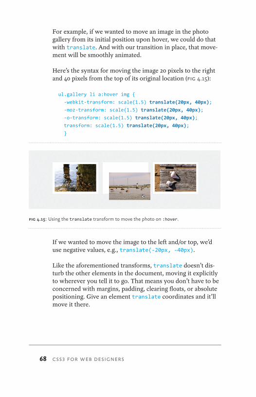
68 CSS3 FOR WEB DESIGNERS
For example, if we wanted to move an image in the photo gallery from its initial position upon hover, we could do that with translate. And with our transition in place, that move-ment will be smoothly animated.
Here’s the syntax for moving the image 20 pixels to the right and 40 pixels from the top of its original location (fig 4.15):
ul.gallery li a:hover img {
-webkit-transform: scale(1.5) translate(20px, 40px);
-moz-transform: scale(1.5) translate(20px, 40px);
-o-transform: scale(1.5) translate(20px, 40px);
transform: scale(1.5) translate(20px, 40px);
}
If we wanted to move the image to the left and/or top, we’d use negative values, e.g., translate(-20px, -40px).
Like the aforementioned transforms, translate doesn’t dis-turb the other elements in the document, moving it explicitly to wherever you tell it to go. That means you don’t have to be concerned with margins, padding, clearing floats, or absolute positioning. Give an element translate coordinates and it’ll move it there.
fig 4.15: Using the translate transform to move the photo on :hover.
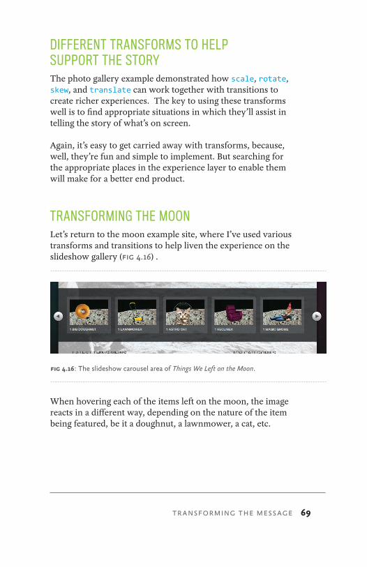
69
DIFFERENT TRANSFORMS TO HELP SUPPORT THE STORYThe photo gallery example demonstrated how scale, rotate, skew, and translate can work together with transitions to create richer experiences. The key to using these transforms well is to find appropriate situations in which they’ll assist in telling the story of what’s on screen.
Again, it’s easy to get carried away with transforms, because, well, they’re fun and simple to implement. But searching for the appropriate places in the experience layer to enable them will make for a better end product.
TRANSFORMING THE MOONLet’s return to the moon example site, where I’ve used various transforms and transitions to help liven the experience on the slideshow gallery (fig 4.16) .
When hovering each of the items left on the moon, the image reacts in a different way, depending on the nature of the item being featured, be it a doughnut, a lawnmower, a cat, etc.
fig 4.16: The slideshow carousel area of Things We Left on the Moon.
TRANSFORMING THE MESSAGE

70 CSS3 FOR WEB DESIGNERS
Adding an appropriate transform/transition to each of the items is not only fun and easy to implement, it’s also harmless for browsers that don’t yet support the bits of CSS3 that make the interaction possible.
Let’s go through each item one by one to see how scale, rotate, positioning, and opacity can be combined with tran-sitions to complete the experience.
Supporting the message
If we think about each of the linked items, and specifically about their meaning, we can then apply a transform and/or transition that supports the story of the object at hand.
How would a big doughnut or reclining chair react to interac-tion? We can choose to apply the appropriate CSS3 here to help enrich the experience (fig 4.17).
fig 4.17: The things we’ll be transforming.
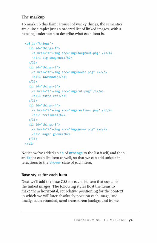
71
The markup
To mark up this faux carousel of wacky things, the semantics are quite simple: just an ordered list of linked images, with a heading underneath to describe what each item is.
<ol id="things">
<li id="things-1">
<a href="#"><img src="img/doughnut.png" /></a>
<h2>1 big doughnut</h2>
</li>
<li id="things-2">
<a href="#"><img src="img/mower.png" /></a>
<h2>1 lawnmower</h2>
</li>
<li id="things-3">
<a href="#"><img src="img/cat.png" /></a>
<h2>1 astro cat</h2>
</li>
<li id="things-4">
<a href="#"><img src="img/recliner.png" /></a>
<h2>1 recliner</h2>
</li>
<li id="things-5">
<a href="#"><img src="img/gnome.png" /></a>
<h2>1 magic gnome</h2>
</li>
</ol>
Notice we’ve added an id of #things to the list itself, and then an id for each list item as well, so that we can add unique in-teractions to the :hover state of each item.
Base styles for each item
Next we’ll add the base CSS for each list item that contains the linked images. The following styles float the items to make them horizontal, set relative positioning for the context in which we will later absolutely position each image, and finally, add a rounded, semi-transparent background frame.
TRANSFORMING THE MESSAGE
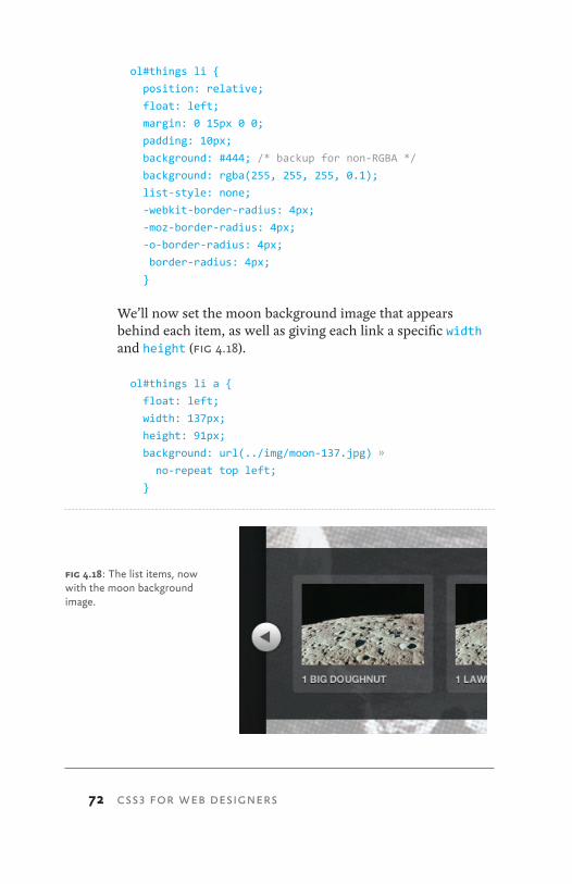
72 CSS3 FOR WEB DESIGNERS
ol#things li {
position: relative;
float: left;
margin: 0 15px 0 0;
padding: 10px;
background: #444; /* backup for non-RGBA */
background: rgba(255, 255, 255, 0.1);
list-style: none;
-webkit-border-radius: 4px;
-moz-border-radius: 4px;
-o-border-radius: 4px;
border-radius: 4px;
}
We’ll now set the moon background image that appears behind each item, as well as giving each link a specific width and height (fig 4.18).
ol#things li a {
float: left;
width: 137px;
height: 91px;
background: url(../img/moon-137.jpg) »
no-repeat top left;
}
fig 4.18: The list items, now with the moon background image.
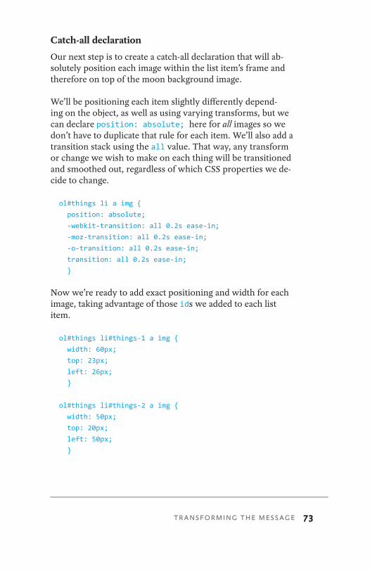
73
Catch-all declaration
Our next step is to create a catch-all declaration that will ab-solutely position each image within the list item’s frame and therefore on top of the moon background image.
We’ll be positioning each item slightly differently depend-ing on the object, as well as using varying transforms, but we can declare position: absolute; here for all images so we don’t have to duplicate that rule for each item. We’ll also add a transition stack using the all value. That way, any transform or change we wish to make on each thing will be transitioned and smoothed out, regardless of which CSS properties we de-cide to change.
ol#things li a img {
position: absolute;
-webkit-transition: all 0.2s ease-in;
-moz-transition: all 0.2s ease-in;
-o-transition: all 0.2s ease-in;
transition: all 0.2s ease-in;
}
Now we’re ready to add exact positioning and width for each image, taking advantage of those ids we added to each list item.
ol#things li#things-1 a img {
width: 60px;
top: 23px;
left: 26px;
}
ol#things li#things-2 a img {
width: 50px;
top: 20px;
left: 50px;
}
TRANSFORMING THE MESSAGE
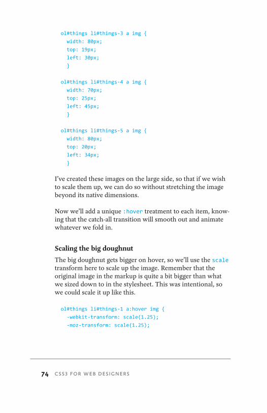
74 CSS3 FOR WEB DESIGNERS
ol#things li#things-3 a img {
width: 80px;
top: 19px;
left: 30px;
}
ol#things li#things-4 a img {
width: 70px;
top: 25px;
left: 45px;
}
ol#things li#things-5 a img {
width: 80px;
top: 20px;
left: 34px;
}
I’ve created these images on the large side, so that if we wish to scale them up, we can do so without stretching the image beyond its native dimensions.
Now we’ll add a unique :hover treatment to each item, know-ing that the catch-all transition will smooth out and animate whatever we fold in.
Scaling the big doughnut
The big doughnut gets bigger on hover, so we’ll use the scale transform here to scale up the image. Remember that the original image in the markup is quite a bit bigger than what we sized down to in the stylesheet. This was intentional, so we could scale it up like this.
ol#things li#things-1 a:hover img {
-webkit-transform: scale(1.25);
-moz-transform: scale(1.25);
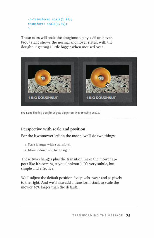
75
-o-transform: scale(1.25);
transform: scale(1.25);
}
These rules will scale the doughnut up by 25% on hover. Figure 4.19 shows the normal and hover states, with the doughnut getting a little bigger when moused over.
Perspective with scale and position
For the lawnmower left on the moon, we’ll do two things:
1. Scale it larger with a transform.
2. Move it down and to the right.
These two changes plus the transition make the mower ap-pear like it’s coming at you (lookout!). It’s very subtle, but simple and effective.
We’ll adjust the default position five pixels lower and 10 pixels to the right. And we’ll also add a transform stack to scale the mower 20% larger than the default.
fig 4.19: The big doughnut gets bigger on :hover using scale.
TRANSFORMING THE MESSAGE
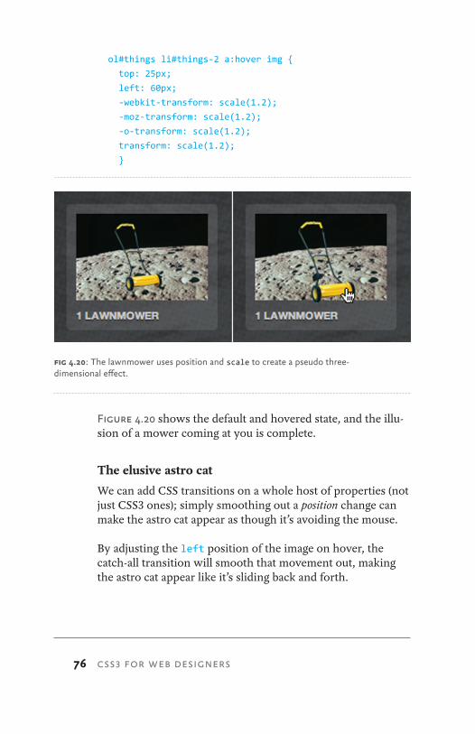
76 CSS3 FOR WEB DESIGNERS
ol#things li#things-2 a:hover img {
top: 25px;
left: 60px;
-webkit-transform: scale(1.2);
-moz-transform: scale(1.2);
-o-transform: scale(1.2);
transform: scale(1.2);
}
Figure 4.20 shows the default and hovered state, and the illu-sion of a mower coming at you is complete.
The elusive astro cat
We can add CSS transitions on a whole host of properties (not just CSS3 ones); simply smoothing out a position change can make the astro cat appear as though it’s avoiding the mouse.
By adjusting the left position of the image on hover, the catch-all transition will smooth that movement out, making the astro cat appear like it’s sliding back and forth.
fig 4.20: The lawnmower uses position and scale to create a pseudo three- dimensional effect.
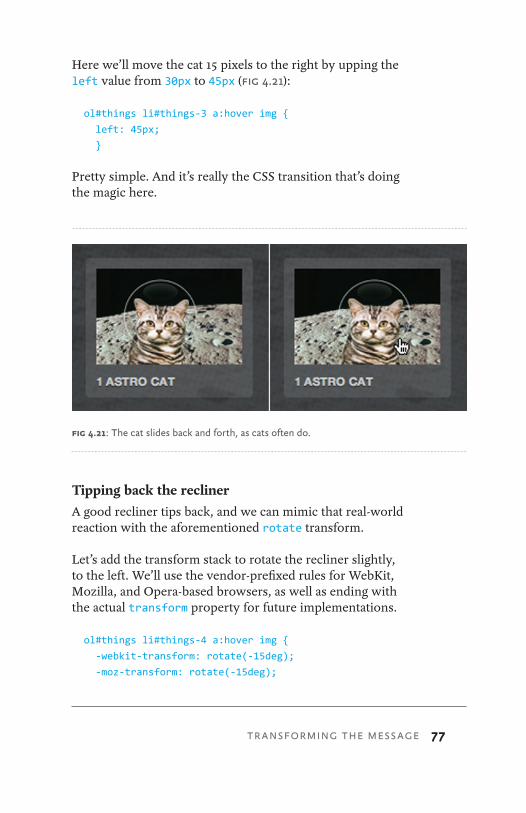
77
Here we’ll move the cat 15 pixels to the right by upping the left value from 30px to 45px (fig 4.21):
ol#things li#things-3 a:hover img {
left: 45px;
}
Pretty simple. And it’s really the CSS transition that’s doing the magic here.
Tipping back the reclinerA good recliner tips back, and we can mimic that real-world reaction with the aforementioned rotate transform.
Let’s add the transform stack to rotate the recliner slightly, to the left. We’ll use the vendor-prefixed rules for WebKit, Mozilla, and Opera-based browsers, as well as ending with the actual transform property for future implementations.
ol#things li#things-4 a:hover img {
-webkit-transform: rotate(-15deg);
-moz-transform: rotate(-15deg);
fig 4.21: The cat slides back and forth, as cats often do.
TRANSFORMING THE MESSAGE

78 CSS3 FOR WEB DESIGNERS
-o-transform: rotate(-15deg);
transform: rotate(-15deg);
}
We used a negative value to tip the image to the left (counter-clockwise), and once again the transition will smooth out that subtle rotation, completing the illusion of our comfy, plushy chair on the moon (fig 4.22).
The disappearing gnome
For the final item, we’ll take a lounging gnome and make him partially disappear. Somehow, that seems like a perfectly natu-ral thing for a gnome to do.
We’ll use the opacity property to simply and quickly create a hover style for the image, dimming it down considerably. Because of the transition already in place for all property changes on the image, the opacity swap will animate in browsers that support transitions, creating a smooth disap-pearance for our little friend.
The declaration is simply:
fig 4.22: The recliner tips back to the left using a negative value on the rotate transform.
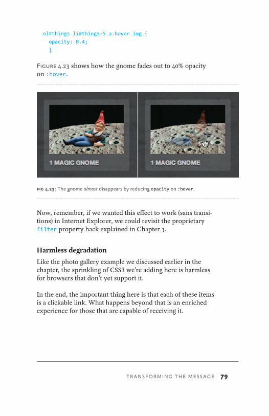
79
ol#things li#things-5 a:hover img {
opacity: 0.4;
}
Figure 4.23 shows how the gnome fades out to 40% opacity on :hover.
Now, remember, if we wanted this effect to work (sans transi-tions) in Internet Explorer, we could revisit the proprietary filter property hack explained in Chapter 3.
Harmless degradation
Like the photo gallery example we discussed earlier in the chapter, the sprinkling of CSS3 we’re adding here is harmless for browsers that don’t yet support it.
In the end, the important thing here is that each of these items is a clickable link. What happens beyond that is an enriched experience for those that are capable of receiving it.
fig 4.23: The gnome almost disappears by reducing opacity on :hover.
TRANSFORMING THE MESSAGE

80 CSS3 FOR WEB DESIGNERS
ONE MORE TIME NOW: BE SMART, BE SUBTLEBy taking a little time to think about the meaning behind the content we’re dealing with, we can choose to apply some of the CSS3 properties that work today along with transitions and transforms.
These experience enhancements can be the mark of a true web craftsperson: attention to details that not everyone will notice, care and feeding for non-critical visual events, and elevating the message a step beyond the norm. For browsers that support this stuff now, and those that will in the future, the small amount of code and thought is well worth it.
Try and be subtle when it comes to CSS transforms. It’s easy to get carried away, but when used appropriately, they can make all the difference in the way the reader experiences the message you’re delivering.
More “wow,” please
Speaking of getting carried away, the next time your client or boss says, “this design needs more ‘wow’” or “it’s miss-ing some pizzazz!” just add the following declaration to your stylesheet (and make sure they’re using Safari, Chrome, Firefox, or Opera, of course):
*:hover {
-webkit-transform: rotate(180deg);
-moz-transform: rotate(180deg);
-o-transform: rotate(180deg);
transform: rotate(180deg);
}
This little bit of CSS3 says, “hover over anything on the page, and rotate it 180 degrees.” Try it. It’s a sure-fire way to make a big impression (fig 4.24).
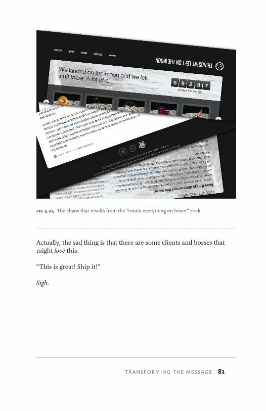
81
Actually, the sad thing is that there are some clients and bosses that might love this.
“This is great! Ship it!”
Sigh.
fig 4.24: The chaos that results from the “rotate everything on hover” trick.
TRANSFORMING THE MESSAGE
82 CSS3 FOR WEB DESIGNERS
if you asked me two years ago, “What’s the one thing you’re looking most forward to in CSS3?” I might’ve enthusi-astically replied, “Multiple background images!” At the time, the ability to layer more than one background image on a single element seemed as though it would cure a lot of the headaches we’d been suffering as web designers.
To create flexible, bulletproof solutions to design problems, we must figure out how we can get by using fewer graphics or without adding extraneous markup as hooks for extra back-ground images. We’ve done the best with what we’ve had, but the promise of being able to assign multiple background im-ages to an element had always seemed, to me, to be this won-derful promise of easier times with less code.
The reality, though, is that along the way, browsers have add-ed support for much of the Backgrounds and Borders Module
5 MULTIPLE BACKGROUNDS
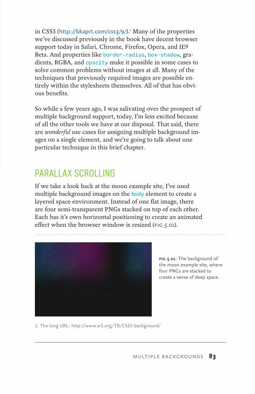
83
in CSS3 (http://bkaprt.com/css3/9/).1 Many of the properties we’ve discussed previously in the book have decent browser support today in Safari, Chrome, Firefox, Opera, and IE9 Beta. And properties like border-radius, box-shadow, gra-dients, RGBA, and opacity make it possible in some cases to solve common problems without images at all. Many of the techniques that previously required images are possible en-tirely within the stylesheets themselves. All of that has obvi-ous benefits.
So while a few years ago, I was salivating over the prospect of multiple background support, today, I’m less excited because of all the other tools we have at our disposal. That said, there are wonderful use cases for assigning multiple background im-ages on a single element, and we’re going to talk about one particular technique in this brief chapter.
PARALLAX SCROLLINGIf we take a look back at the moon example site, I’ve used multiple background images on the body element to create a layered space environment. Instead of one flat image, there are four semi-transparent PNGs stacked on top of each other. Each has it’s own horizontal positioning to create an animated effect when the browser window is resized (fig 5.01).
1. The long URL: http://www.w3.org/TR/CSS3-background/
fig 5.01: The background of the moon example site, where four PNGs are stacked to create a sense of deep space.
MULTIPLE BACKGROUNDS
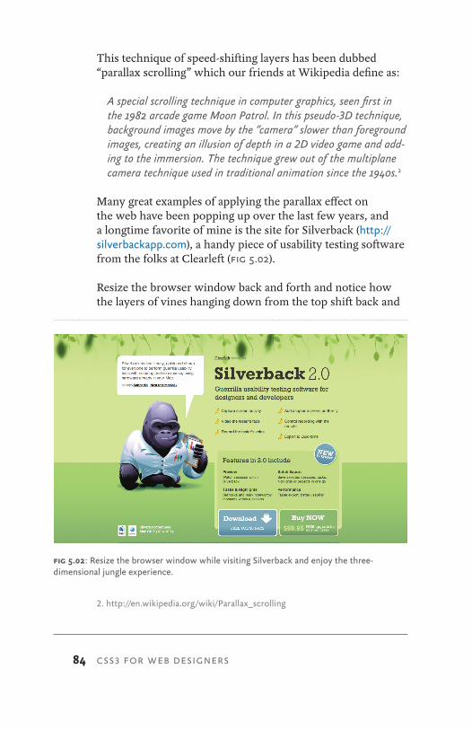
84 CSS3 FOR WEB DESIGNERS
This technique of speed-shifting layers has been dubbed “parallax scrolling” which our friends at Wikipedia define as:
A special scrolling technique in computer graphics, seen first in the 1982 arcade game Moon Patrol. In this pseudo-3D technique, background images move by the “camera” slower than foreground images, creating an illusion of depth in a 2D video game and add-ing to the immersion. The technique grew out of the multiplane camera technique used in traditional animation since the 1940s.2
Many great examples of applying the parallax effect on the web have been popping up over the last few years, and a longtime favorite of mine is the site for Silverback (http://silverbackapp.com), a handy piece of usability testing software from the folks at Clearleft (fig 5.02).
Resize the browser window back and forth and notice how the layers of vines hanging down from the top shift back and
2. http://en.wikipedia.org/wiki/Parallax_scrolling
fig 5.02: Resize the browser window while visiting Silverback and enjoy the three- dimensional jungle experience.
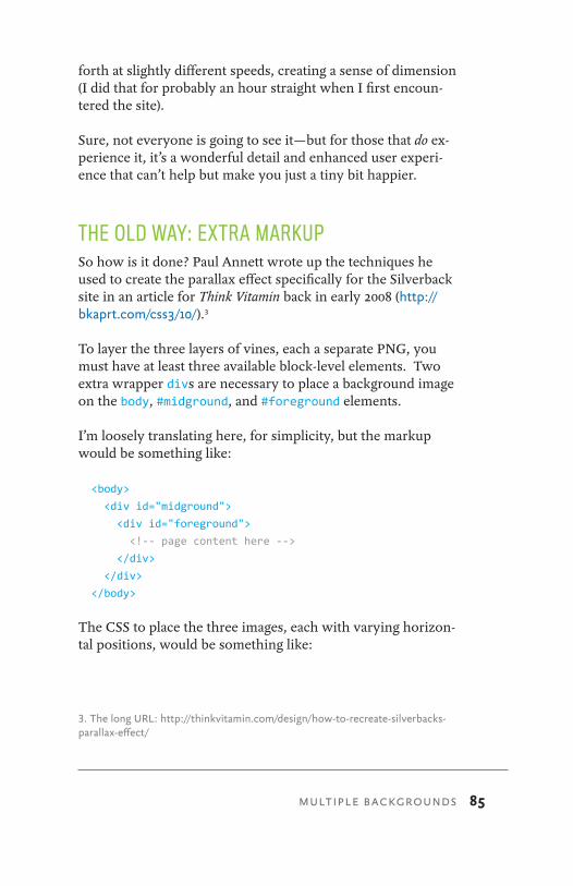
85
forth at slightly different speeds, creating a sense of dimension (I did that for probably an hour straight when I first encoun-tered the site).
Sure, not everyone is going to see it—but for those that do ex-perience it, it’s a wonderful detail and enhanced user experi-ence that can’t help but make you just a tiny bit happier.
THE OLD WAY: EXTRA MARKUPSo how is it done? Paul Annett wrote up the techniques he used to create the parallax effect specifically for the Silverback site in an article for Think Vitamin back in early 2008 (http://bkaprt.com/css3/10/).3
To layer the three layers of vines, each a separate PNG, you must have at least three available block-level elements. Two extra wrapper divs are necessary to place a background image on the body, #midground, and #foreground elements.
I’m loosely translating here, for simplicity, but the markup would be something like:
<body>
<div id="midground">
<div id="foreground">
<!-- page content here -->
</div>
</div>
</body>
The CSS to place the three images, each with varying horizon-tal positions, would be something like:
3. The long URL: http://thinkvitamin.com/design/how-to-recreate-silverbacks-parallax-effect/
MULTIPLE BACKGROUNDS
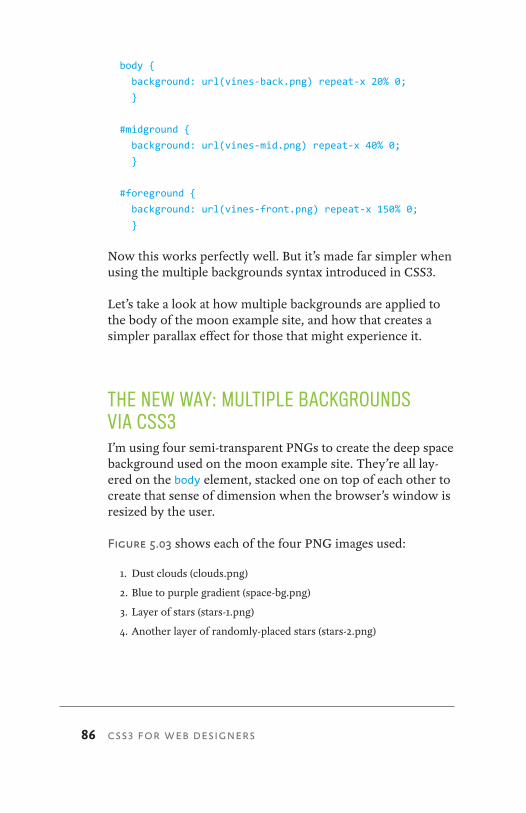
86 CSS3 FOR WEB DESIGNERS
body {
background: url(vines-back.png) repeat-x 20% 0;
}
#midground {
background: url(vines-mid.png) repeat-x 40% 0;
}
#foreground {
background: url(vines-front.png) repeat-x 150% 0;
}
Now this works perfectly well. But it’s made far simpler when using the multiple backgrounds syntax introduced in CSS3.
Let’s take a look at how multiple backgrounds are applied to the body of the moon example site, and how that creates a simpler parallax effect for those that might experience it.
THE NEW WAY: MULTIPLE BACKGROUNDS VIA CSS3I’m using four semi-transparent PNGs to create the deep space background used on the moon example site. They’re all lay-ered on the body element, stacked one on top of each other to create that sense of dimension when the browser’s window is resized by the user.
Figure 5.03 shows each of the four PNG images used:
1. Dust clouds (clouds.png)
2. Blue to purple gradient (space-bg.png)
3. Layer of stars (stars-1.png)
4. Another layer of randomly-placed stars (stars-2.png)
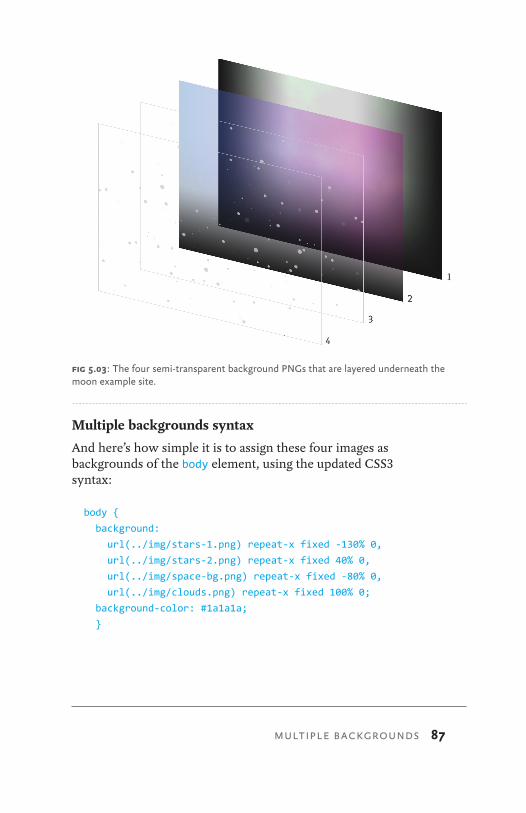
87
Multiple backgrounds syntax
And here’s how simple it is to assign these four images as backgrounds of the body element, using the updated CSS3 syntax:
body {
background:
url(../img/stars-1.png) repeat-x fixed -130% 0,
url(../img/stars-2.png) repeat-x fixed 40% 0,
url(../img/space-bg.png) repeat-x fixed -80% 0,
url(../img/clouds.png) repeat-x fixed 100% 0;
background-color: #1a1a1a;
}
fig 5.03: The four semi-transparent background PNGs that are layered underneath the moon example site.
MULTIPLE BACKGROUNDS
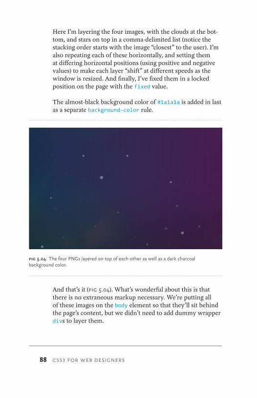
88 CSS3 FOR WEB DESIGNERS
Here I’m layering the four images, with the clouds at the bot-tom, and stars on top in a comma-delimited list (notice the stacking order starts with the image “closest” to the user). I’m also repeating each of these horizontally, and setting them at differing horizontal positions (using positive and negative values) to make each layer “shift” at different speeds as the window is resized. And finally, I’ve fixed them in a locked position on the page with the fixed value.
The almost-black background color of #1a1a1a is added in last as a separate background-color rule.
And that’s it (fig 5.04). What’s wonderful about this is that there is no extraneous markup necessary. We’re putting all of these images on the body element so that they’ll sit behind the page’s content, but we didn’t need to add dummy wrapper divs to layer them.
fig 5.04: The four PNGs layered on top of each other as well as a dark charcoal background color.
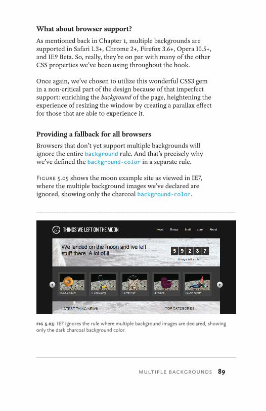
89
What about browser support?
As mentioned back in Chapter 1, multiple backgrounds are supported in Safari 1.3+, Chrome 2+, Firefox 3.6+, Opera 10.5+, and IE9 Beta. So, really, they’re on par with many of the other CSS properties we’ve been using throughout the book.
Once again, we’ve chosen to utilize this wonderful CSS3 gem in a non-critical part of the design because of that imperfect support: enriching the background of the page, heightening the experience of resizing the window by creating a parallax effect for those that are able to experience it.
Providing a fallback for all browsers
Browsers that don’t yet support multiple backgrounds will ignore the entire background rule. And that’s precisely why we’ve defined the background-color in a separate rule.
Figure 5.05 shows the moon example site as viewed in IE7, where the multiple background images we’ve declared are ignored, showing only the charcoal background-color.
fig 5.05: IE7 ignores the rule where multiple background images are declared, showing only the dark charcoal background color.
MULTIPLE BACKGROUNDS

90 CSS3 FOR WEB DESIGNERS
Now, nothing is broken here—but losing all the space-y-ness in the background is a shame. The solution is to specify a single fallback background image first in the declaration, for brows-ers (like IE7 and 8) that don’t support multiple images. Then we can override that rule with the multiple one (which will be ignored by IE).
body {
background: url(../img/space-bg.png) »
repeat-x fixed -80% 0;
background:
url(../img/stars-1.png) repeat-x fixed -130% 0,
url(../img/stars-2.png) repeat-x fixed 40% 0,
url(../img/space-bg.png) repeat-x fixed -80% 0,
url(../img/clouds.png) repeat-x fixed 100% 0;
background-color: #1a1a1a;
}
For the single image fallback, you could choose one of the im-ages used in the multiple declaration, or even go so far as to create a flattened version of the multiple layers.
For the moon site, I’ve chosen to simply use space-bg.png, which is the color gradient image (fig 5.06), therefore serv-ing a starless, cloudless version of the background to brows-ers that don’t yet support multiple background images. How appropriate.
USING MULTIPLE BACKGROUNDS TODAYIn keeping with the theme of the other examples in the book, here we’re using multiple background images today. We’re forging ahead with a CSS3 property that has healthy support in Safari, Chrome, Firefox, and Opera, as well as IE9 Beta. Instead of fearing that non-universal support and waiting it out, we’re choosing to apply the property on a non-critical visual event (a parallax-shifting background).
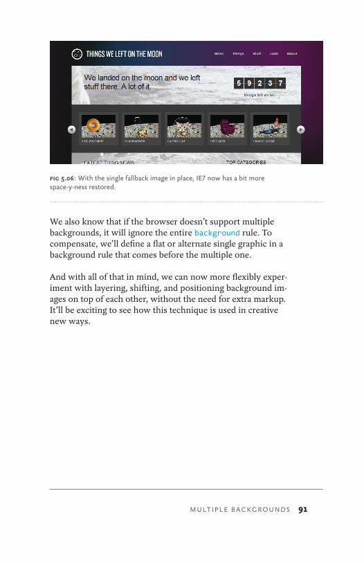
91
We also know that if the browser doesn’t support multiple backgrounds, it will ignore the entire background rule. To compensate, we’ll define a flat or alternate single graphic in a background rule that comes before the multiple one.
And with all of that in mind, we can now more flexibly exper-iment with layering, shifting, and positioning background im-ages on top of each other, without the need for extra markup. It’ll be exciting to see how this technique is used in creative new ways.
fig 5.06: With the single fallback image in place, IE7 now has a bit more space-y-ness restored.
MULTIPLE BACKGROUNDS

92 CSS3 FOR WEB DESIGNERS
forms are another aspect of a website that can involve interaction, and therefore they offer additional visual events that are ripe for enriching with CSS3.
By default, form elements themselves can differ drastically in appearance depending on the browser or operating system in which they’re viewed. Why not embrace that variation by choosing to apply the portions of CSS3 that work today to heighten the experience?
It’s important to strike a balance between subtle modification of form elements and maintaining the familiar to ensure us-ability for your forms. In other words, an input should still obviously appear as an input. Now that CSS is capable of deep styling of form elements (in most browsers), we have to be careful to not tamper with the most important part: the functionality.
6 ENRICHING FORMS
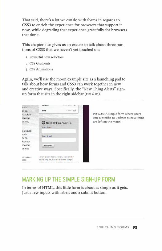
93
That said, there’s a lot we can do with forms in regards to CSS3 to enrich the experience for browsers that support it now, while degrading that experience gracefully for browsers that don’t.
This chapter also gives us an excuse to talk about three por-tions of CSS3 that we haven’t yet touched on:
1. Powerful new selectors
2. CSS Gradients
3. CSS Animations
Again, we’ll use the moon example site as a launching pad to talk about how forms and CSS3 can work together in new and creative ways. Specifically, the “New Thing Alerts” sign-up form that sits in the right sidebar (fig 6.01).
MARKING UP THE SIMPLE SIGN-UP FORMIn terms of HTML, this little form is about as simple as it gets. Just a few inputs with labels and a submit button.
fig 6.01: A simple form where users can subscribe to updates as new items are left on the moon.
ENRICHING FORMS
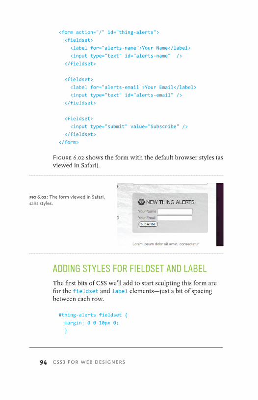
94 CSS3 FOR WEB DESIGNERS
<form action="/" id="thing-alerts">
<fieldset>
<label for="alerts-name">Your Name</label>
<input type="text" id="alerts-name" />
</fieldset>
<fieldset>
<label for="alerts-email">Your Email</label>
<input type="text" id="alerts-email" />
</fieldset>
<fieldset>
<input type="submit" value="Subscribe" />
</fieldset>
</form>
Figure 6.02 shows the form with the default browser styles (as viewed in Safari).
ADDING STYLES FOR FIELDSET AND LABELThe first bits of CSS we’ll add to start sculpting this form are for the fieldset and label elements—just a bit of spacing between each row.
#thing-alerts fieldset {
margin: 0 0 10px 0;
}
fig 6.02: The form viewed in Safari, sans styles.
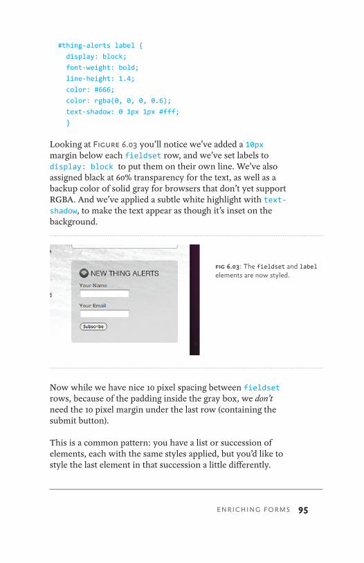
95
#thing-alerts label {
display: block;
font-weight: bold;
line-height: 1.4;
color: #666;
color: rgba(0, 0, 0, 0.6);
text-shadow: 0 1px 1px #fff;
}
Looking at Figure 6.03 you’ll notice we’ve added a 10px margin below each fieldset row, and we’ve set labels to display: block to put them on their own line. We’ve also assigned black at 60% transparency for the text, as well as a backup color of solid gray for browsers that don’t yet support RGBA. And we’ve applied a subtle white highlight with text-shadow, to make the text appear as though it’s inset on the background.
Now while we have nice 10 pixel spacing between fieldset rows, because of the padding inside the gray box, we don’t need the 10 pixel margin under the last row (containing the submit button).
This is a common pattern: you have a list or succession of elements, each with the same styles applied, but you’d like to style the last element in that succession a little differently.
fig 6.03: The fieldset and label elements are now styled.
ENRICHING FORMS

96 CSS3 FOR WEB DESIGNERS
Instead of adding class="last" to the final element, why not take advantage of the :last-child pseudo-class in CSS3 to remove the bottom margin without having to touch the markup:
#thing-alerts fieldset {
margin: 0 0 10px 0;
}
#thing-alerts fieldset label {
display: block;
font-weight: bold;
line-height: 1.4;
color: #666;
color: rgba(0, 0, 0, 0.6);
text-shadow: 0 1px 1px #fff;
}
#thing-alerts fieldset:last-child {
margin: 0;
}
Keep in mind that :last-child isn’t supported in IE8 and below, but for minor presentational adjustments like this one, it’s a great alternative to adding a class in the markup.
Figure 6.04 shows where we’re at currently, now with bottom margin on the last fieldset element removed by way of the :last-child pseudo-class.
More CSS3 selectors
While we’re making good use of :last-child, it’s a good time to point out that there are many more wonderfully conve-nient new selectors in CSS3.
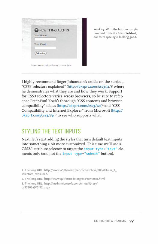
97
I highly recommend Roger Johansson’s article on the subject, “CSS3 selectors explained” (http://bkaprt.com/css3/11/)1 where he demonstrates what they are and how they work. Support for CSS3 selectors varies across browsers, so be sure to refer-ence Peter-Paul Koch’s thorough “CSS contents and browser compatibility” tables (http://bkaprt.com/css3/12/)2 and “CSS Compatibility and Internet Explorer” from Microsoft (http://bkaprt.com/css3/13/)3 to see who supports what.
STYLING THE TEXT INPUTSNext, let’s start adding the styles that turn default text inputs into something a bit more customized. This time we’ll use a CSS2.1 attribute selector to target the input type="text" ele-ments only (and not the input type="submit" button).
1. The long URL: http://www.456bereastreet.com/archive/200601/css_3_selectors_explained/
2. The long URL: http://www.quirksmode.org/css/contents.html
3. The long URL: http://msdn.microsoft.com/en-us/library/ cc351024(VS.85).aspx
fig 6.04: With the bottom margin removed from the final fieldset, our form spacing is looking good.
ENRICHING FORMS

98 CSS3 FOR WEB DESIGNERS
If we simply declared:
#thing-alerts input
we’d be styling all inputs in the form (text and buttons), but if we modify that to:
#thing-alerts input[type="text"]
we’ll target the text inputs only.
Again, using a powerful selector in the stylesheet avoids hav-ing to add extra classes in the markup to style the various form elements separately. This is beautiful.
Keep in mind that while attribute selectors are supported in IE7 and above, they aren’t supported in IE6, but that’s OK since we’re just modifying the non-critical appearance of these form elements. IE6 will ignore these rules, and that’s perfectly acceptable in this case.
The following declaration applies a specific width, padding, and font-size, turns off default borders, adds a background-color, and rounds the corners of the inputs using our trusty border-radius stack.
#thing-alerts fieldset input[type="text"] {
width: 215px;
padding: 5px 8px;
font-size: 1.2em;
color: #666;
border: none;
background-color: #fff;
-webkit-border-radius: 4px;
-moz-border-radius: 4px;
-o-border-radius: 4px;
border-radius: 4px;
}
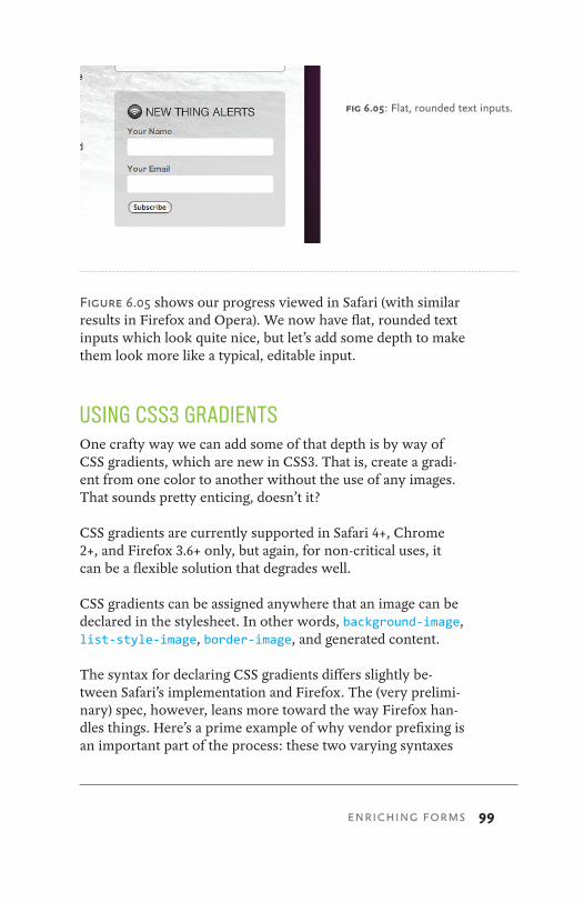
99
Figure 6.05 shows our progress viewed in Safari (with similar results in Firefox and Opera). We now have flat, rounded text inputs which look quite nice, but let’s add some depth to make them look more like a typical, editable input.
USING CSS3 GRADIENTSOne crafty way we can add some of that depth is by way of CSS gradients, which are new in CSS3. That is, create a gradi-ent from one color to another without the use of any images. That sounds pretty enticing, doesn’t it?
CSS gradients are currently supported in Safari 4+, Chrome 2+, and Firefox 3.6+ only, but again, for non-critical uses, it can be a flexible solution that degrades well.
CSS gradients can be assigned anywhere that an image can be declared in the stylesheet. In other words, background-image, list-style-image, border-image, and generated content.
The syntax for declaring CSS gradients differs slightly be-tween Safari’s implementation and Firefox. The (very prelimi-nary) spec, however, leans more toward the way Firefox han-dles things. Here’s a prime example of why vendor prefixing is an important part of the process: these two varying syntaxes
fig 6.05: Flat, rounded text inputs.
ENRICHING FORMS
100 CSS3 FOR WEB DESIGNERS
can be correctly declared for each browser, while the official spec is still being hashed out.
I’ll be honest in saying that the syntax for either can be a tad bit confusing. There’s an immense amount of control pos-sible in creating gradients, including the colors involved, color stops, direction of the gradient, etc.
For example, here is the syntax for creating a simple linear gradient for both WebKit and Mozilla-based browsers on the background of an element:
#foo {
background-image: -webkit-gradient(linear, »
0% 0%, 0% 100%, from(#fff), to(#999));
background-image: -moz-linear-gradient(0% 100% »
90deg, #fff, #999);
}
It’s not entirely intuitive, and it’s also difficult to remember the differences for each vendor.
The best way I’ve found to come up with the right code is to use John Allsopp’s wonderful WYSIWYG editor (fig 6.06, http://bkaprt.com/css3/14/).4
Use this tool to visually create the gradients you want, then grab the appropriate syntax for both Safari and Firefox. John’s tool does all the heavy lifting for you. And this is extremely helpful as I haven’t been able to memorize the code (and the differences between browsers) yet.
Jonathan Snook has a helpful post on working your way through gradient syntax that might prove helpful as well: http://bkaprt.com/css3/15/.5
4. The long URL: http://www.westciv.com/tools/gradients/index-moz.html
5. The long URL: http://snook.ca/archives/html_and_css/multiple-bg-css-gradients
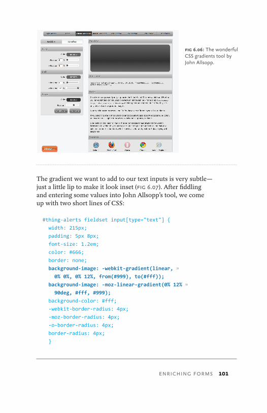
101
The gradient we want to add to our text inputs is very subtle—just a little lip to make it look inset (fig 6.07). After fiddling and entering some values into John Allsopp’s tool, we come up with two short lines of CSS:
#thing-alerts fieldset input[type="text"] {
width: 215px;
padding: 5px 8px;
font-size: 1.2em;
color: #666;
border: none;
background-image: -webkit-gradient(linear, »
0% 0%, 0% 12%, from(#999), to(#fff));
background-image: -moz-linear-gradient(0% 12% »
90deg, #fff, #999);
background-color: #fff;
-webkit-border-radius: 4px;
-moz-border-radius: 4px;
-o-border-radius: 4px;
border-radius: 4px;
}
fig 6.06: The wonderful CSS gradients tool by John Allsopp.
ENRICHING FORMS

102 CSS3 FOR WEB DESIGNERS
We’re applying a linear gradient here, but radial gradients are also possible with CSS.
And here you can see how the syntax differs between –webkit and –moz implementations. We’re essentially adding a small linear gradient that goes from light gray (#999) to white (#fff) for just 12% of the vertical height of the input. We’re apply-ing the vendor-prefixed background-image rules to make that happen in Safari and Firefox.
Figure 6.08 shows the results, where you can see our rounded inputs now sporting a little inner shadow using no images.
Browsers that don’t yet support CSS gradients will ignore those background-image rules and just be flat white. And that’s perfectly fine. But the adjustment, flexibility, and con-trol that comes along with CSS gradients is rather compelling.
fig 6.07: A zoomed view of the tiny gradient at the top of each text input that makes it look recessed.
fig 6.08: Text inputs with the CSS gradient in place.
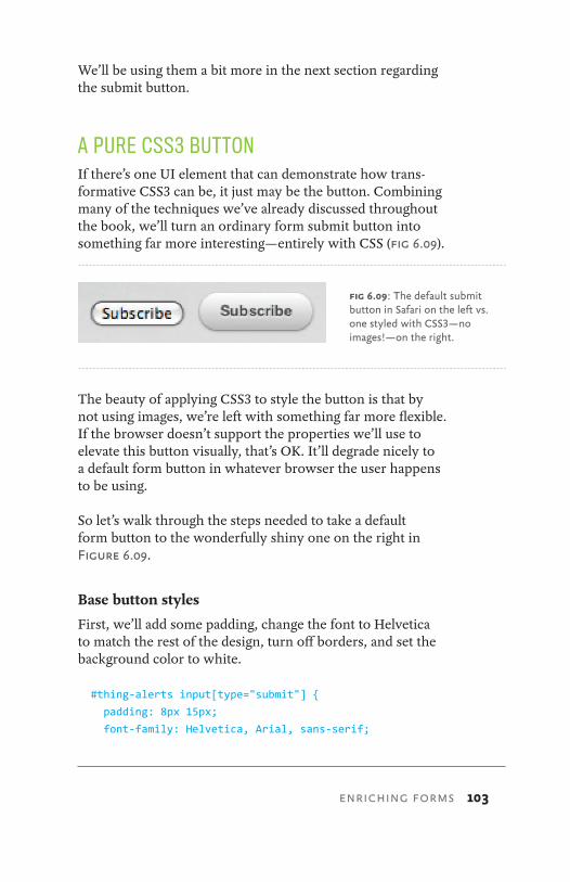
103
We’ll be using them a bit more in the next section regarding the submit button.
A PURE CSS3 BUTTONIf there’s one UI element that can demonstrate how trans-formative CSS3 can be, it just may be the button. Combining many of the techniques we’ve already discussed throughout the book, we’ll turn an ordinary form submit button into something far more interesting—entirely with CSS (fig 6.09).
The beauty of applying CSS3 to style the button is that by not using images, we’re left with something far more flexible. If the browser doesn’t support the properties we’ll use to elevate this button visually, that’s OK. It’ll degrade nicely to a default form button in whatever browser the user happens to be using.
So let’s walk through the steps needed to take a default form button to the wonderfully shiny one on the right in Figure 6.09.
Base button styles
First, we’ll add some padding, change the font to Helvetica to match the rest of the design, turn off borders, and set the background color to white.
#thing-alerts input[type="submit"] {
padding: 8px 15px;
font-family: Helvetica, Arial, sans-serif;
fig 6.09: The default submit button in Safari on the left vs. one styled with CSS3—no images!—on the right.
ENRICHING FORMS

104 CSS3 FOR WEB DESIGNERS
font-weight: bold;
line-height: 1;
color: #444;
border: none;
background-color: #fff;
}
Figure 6.10 shows how things are looking in Safari with those simple base styles applied. And we already have something that looks nothing like a default input button.
Rounding to a pill shape
Next, let’s add a border-radius stack to get the button round-ed down to a pill shape (fig 6.11).
#thing-alerts fieldset input[type="submit"] {
padding: 8px 15px;
font-family: Helvetica, Arial, sans-serif;
font-weight: bold;
line-height: 1;
color: #444;
border: none;
background-color: #fff;
-webkit-border-radius: 23px;
-moz-border-radius: 23px;
-o-border-radius: 23px;
border-radius: 23px;
}
fig 6.10: A submit button with default borders and backgrounds removed.
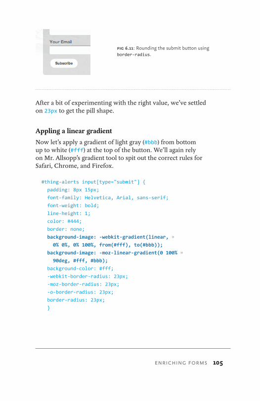
105
After a bit of experimenting with the right value, we’ve settled on 23px to get the pill shape.
Appling a linear gradient
Now let’s apply a gradient of light gray (#bbb) from bottom up to white (#fff) at the top of the button. We’ll again rely on Mr. Allsopp’s gradient tool to spit out the correct rules for Safari, Chrome, and Firefox.
#thing-alerts input[type="submit"] {
padding: 8px 15px;
font-family: Helvetica, Arial, sans-serif;
font-weight: bold;
line-height: 1;
color: #444;
border: none;
background-image: -webkit-gradient(linear, »
0% 0%, 0% 100%, from(#fff), to(#bbb));
background-image: -moz-linear-gradient(0 100% »
90deg, #fff, #bbb);
background-color: #fff;
-webkit-border-radius: 23px;
-moz-border-radius: 23px;
-o-border-radius: 23px;
border-radius: 23px;
}
fig 6.11: Rounding the submit button using border-radius.
ENRICHING FORMS
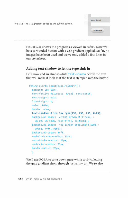
106 CSS3 FOR WEB DESIGNERS
Figure 6.12 shows the progress as viewed in Safari. Now we have a rounded button with a CSS gradient applied. So far, no images have been used and we’ve only added a few lines in our stylesheet.
Adding text-shadow to let the type sink in
Let’s now add an almost-white text-shadow below the text that will make it look as if the text is stamped into the button.
#thing-alerts input[type="submit"] {
padding: 8px 15px;
font-family: Helvetica, Arial, sans-serif;
font-weight: bold;
line-height: 1;
color: #444;
border: none;
text-shadow: 0 1px 1px rgba(255, 255, 255, 0.85);
background-image: -webkit-gradient(linear, »
0% 0%, 0% 100%, from(#fff), to(#bbb));
background-image: -moz-linear-gradient(0 100% »
90deg, #fff, #bbb);
background-color: #fff;
-webkit-border-radius: 23px;
-moz-border-radius: 23px;
-o-border-radius: 23px;
border-radius: 23px;
}
We’ll use RGBA to tone down pure white to 85%, letting the gray gradient show through just a tiny bit. We’re also
fig 6.12: The CSS gradient added to the submit button.
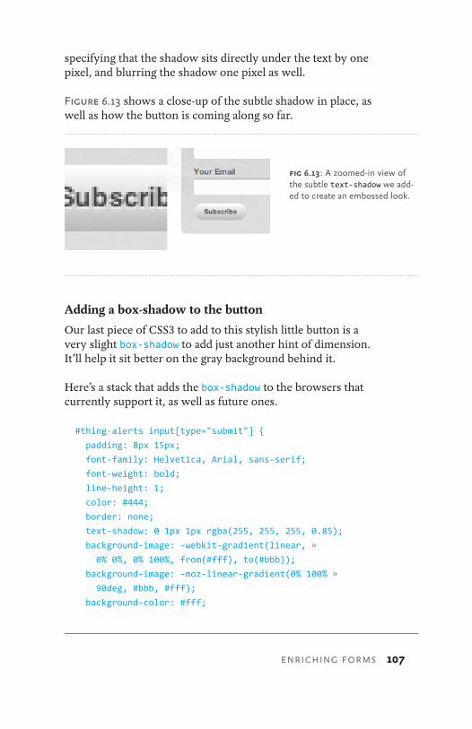
107
specifying that the shadow sits directly under the text by one pixel, and blurring the shadow one pixel as well.
Figure 6.13 shows a close-up of the subtle shadow in place, as well as how the button is coming along so far.
Adding a box-shadow to the button
Our last piece of CSS3 to add to this stylish little button is a very slight box-shadow to add just another hint of dimension. It’ll help it sit better on the gray background behind it.
Here’s a stack that adds the box-shadow to the browsers that currently support it, as well as future ones.
#thing-alerts input[type="submit"] {
padding: 8px 15px;
font-family: Helvetica, Arial, sans-serif;
font-weight: bold;
line-height: 1;
color: #444;
border: none;
text-shadow: 0 1px 1px rgba(255, 255, 255, 0.85);
background-image: -webkit-gradient(linear, »
0% 0%, 0% 100%, from(#fff), to(#bbb));
background-image: -moz-linear-gradient(0% 100% »
90deg, #bbb, #fff);
background-color: #fff;
fig 6.13: A zoomed-in view of the subtle text-shadow we add-ed to create an embossed look.
ENRICHING FORMS
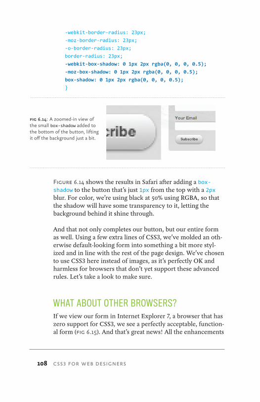
108 CSS3 FOR WEB DESIGNERS
-webkit-border-radius: 23px;
-moz-border-radius: 23px;
-o-border-radius: 23px;
border-radius: 23px;
-webkit-box-shadow: 0 1px 2px rgba(0, 0, 0, 0.5);
-moz-box-shadow: 0 1px 2px rgba(0, 0, 0, 0.5);
box-shadow: 0 1px 2px rgba(0, 0, 0, 0.5);
}
Figure 6.14 shows the results in Safari after adding a box-shadow to the button that’s just 1px from the top with a 2px blur. For color, we’re using black at 50% using RGBA, so that the shadow will have some transparency to it, letting the background behind it shine through.
And that not only completes our button, but our entire form as well. Using a few extra lines of CSS3, we’ve molded an oth-erwise default-looking form into something a bit more styl-ized and in line with the rest of the page design. We’ve chosen to use CSS3 here instead of images, as it’s perfectly OK and harmless for browsers that don’t yet support these advanced rules. Let’s take a look to make sure.
WHAT ABOUT OTHER BROWSERS?If we view our form in Internet Explorer 7, a browser that has zero support for CSS3, we see a perfectly acceptable, function-al form (fig 6.15). And that’s great news! All the enhancements
fig 6.14: A zoomed-in view of the small box-shadow added to the bottom of the button, lifting it off the background just a bit.

109
we added via a handful of CSS3 rules in the stylesheet have been safely ignored, leaving a bare-bones form that acts ex-actly as it should. Mission accomplished.
USING BOX-SHADOW TO CREATE FOCUS STATESWe could go a step further in our enrichment of this form’s interactions by using the box-shadow property on the inputs’ focus state. It’s quick, easy, and like the aforementioned CSS3, degrades beautifully.
It requires simply creating a new declaration and adding the :focus pseudo-class to the attribute selector for text inputs.
(By the way, the preceding paragraph is a sure-fire pickup line, should you be in need of one. Thank me later.)
#thing-alerts input[type="text"]:focus {
-webkit-box-shadow: 0 0 12px rgba(51, 204, 255, 0.5);
-moz-box-shadow: 0 0 12px rgba(51, 204, 255, 0.5);
box-shadow: 0 0 12px rgba(51, 204, 255, 0.5);
}
fig 6.15: In IE7, the form looks like a normal form. And functions like one, too. This is good.
ENRICHING FORMS
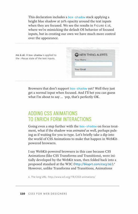
110 CSS3 FOR WEB DESIGNERS
This declaration includes a box-shadow stack applying a bright blue shadow at 50% opacity around the text inputs when they are focused. We see the results in Figure 6.16, where we’re mimicking the default OS behavior of focused inputs, but in creating our own we have much more control over the appearance.
Browsers that don’t support box-shadow yet? Well they just get a normal input when focused. And I’ll bet you can guess what I’m about to say … yep, that’s perfectly OK.
ADDING CSS ANIMATIONS TO ENRICH FORM INTERACTIONSGoing even a step further with the box-shadow on focus treat-ment, what if the shadow was animated as well, perhaps puls-ing as if waiting for you to type. Let’s briefly take a dip into the world of CSS Animations to make that happen in WebKit-powered browsers.
I say WebKit-powered browsers in this case because CSS Animations (like CSS Transforms and Transitions), were ini-tially developed by the WebKit team, then folded back into a proposed standard at the W3C (http://bkaprt.com/css3/16/).6 However, unlike Transforms and Transitions, Animations
6. The long URL: http://www.w3.org/TR/CSS3-animations/
fig 6.16: A box-shadow is applied to the :focus state of the text inputs.
111
have yet to be implemented by anyone else. They currently work in Safari and Chrome, but not Firefox or Opera, nor is there planned support in IE9. For that reason, I don’t place as much attention on Animations (at least for now). And while they are powerful and exciting, it remains to be seen whether their adoption will be as comprehensive and swift as Transforms and Transitions have been, which already have decent (and growing) support.
Nonetheless, the concept and syntax for creating CSS Animations is rather straightforward, and for non-critical en-hancements that only WebKit browsers will enjoy for now, it’s fun to inject them into appropriate places. Let’s add a simple animation to the focus state of the input to get a sense of how it all works.
Working with keyframes
The first part of building a CSS animation is to create a key-frames declaration. Those familiar with programming might relate this to building a function that can be called and refer-enced elsewhere in the stylesheet.
A keyframe is a specialized CSS at-rule. It’s similar to a normal CSS declaration, but allows you to name it with an identifier and specify CSS rules and changes over the duration with a list of percentage values (or the keywords “to” and “from”).
It’ll make more sense to just see one in practice, so let’s create a simple animation that will fade in and fade out the box-shadow we previously added to focused form inputs.
We’ll name it “pulse” and set three rules that differ slightly: one at the starting point (0%), one at the halfway point (50%), and one at the end (100%). Each percentage rule is just adjust-ing the level of opacity of the blue box-shadow, from 20% up to 90% and back down to 20%. This change, transitioned over time and looped, will create the appearance of the input puls-ing when focused in WebKit-powered browsers.
ENRICHING FORMS
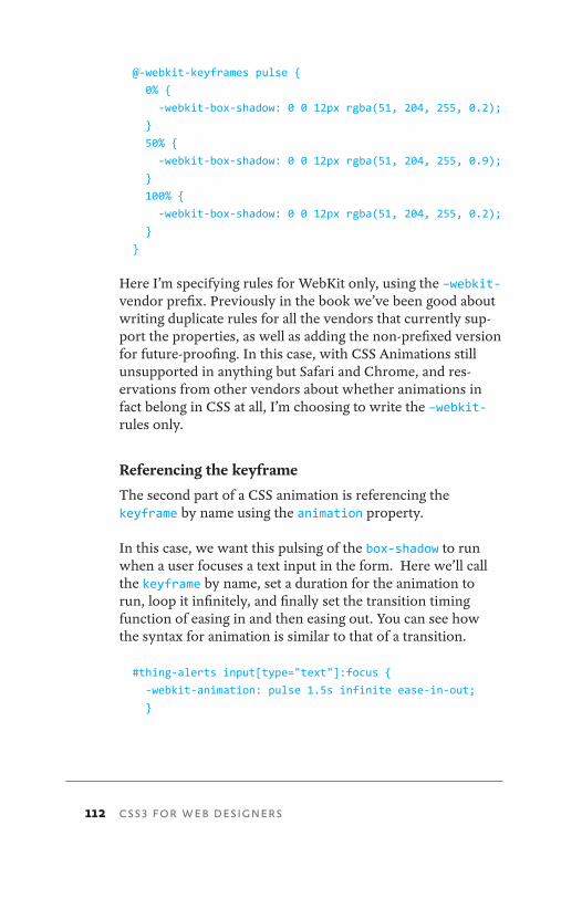
112 CSS3 FOR WEB DESIGNERS
@-webkit-keyframes pulse {
0% {
-webkit-box-shadow: 0 0 12px rgba(51, 204, 255, 0.2);
}
50% {
-webkit-box-shadow: 0 0 12px rgba(51, 204, 255, 0.9);
}
100% {
-webkit-box-shadow: 0 0 12px rgba(51, 204, 255, 0.2);
}
}
Here I’m specifying rules for WebKit only, using the –webkit- vendor prefix. Previously in the book we’ve been good about writing duplicate rules for all the vendors that currently sup-port the properties, as well as adding the non-prefixed version for future-proofing. In this case, with CSS Animations still unsupported in anything but Safari and Chrome, and res- ervations from other vendors about whether animations in fact belong in CSS at all, I’m choosing to write the –webkit- rules only.
Referencing the keyframe
The second part of a CSS animation is referencing the keyframe by name using the animation property.
In this case, we want this pulsing of the box-shadow to run when a user focuses a text input in the form. Here we’ll call the keyframe by name, set a duration for the animation to run, loop it infinitely, and finally set the transition timing function of easing in and then easing out. You can see how the syntax for animation is similar to that of a transition.
#thing-alerts input[type="text"]:focus {
-webkit-animation: pulse 1.5s infinite ease-in-out;
}
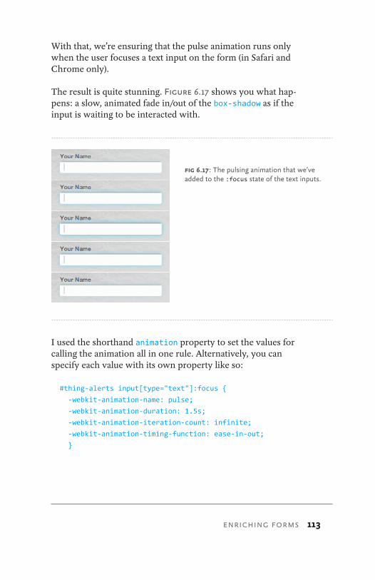
113
With that, we’re ensuring that the pulse animation runs only when the user focuses a text input on the form (in Safari and Chrome only).
The result is quite stunning. Figure 6.17 shows you what hap-pens: a slow, animated fade in/out of the box-shadow as if the input is waiting to be interacted with.
I used the shorthand animation property to set the values for calling the animation all in one rule. Alternatively, you can specify each value with its own property like so:
#thing-alerts input[type="text"]:focus {
-webkit-animation-name: pulse;
-webkit-animation-duration: 1.5s;
-webkit-animation-iteration-count: infinite;
-webkit-animation-timing-function: ease-in-out;
}
fig 6.17: The pulsing animation that we’ve added to the :focus state of the text inputs.
ENRICHING FORMS
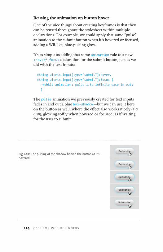
114 CSS3 FOR WEB DESIGNERS
Reusing the animation on button hover
One of the nice things about creating keyframes is that they can be reused throughout the stylesheet within multiple declarations. For example, we could apply that same “pulse” animation to the submit button when it’s hovered or focused, adding a Wii-like, blue-pulsing glow.
It’s as simple as adding that same animation rule to a new :hover/:focus declaration for the submit button, just as we did with the text inputs:
#thing-alerts input[type="submit"]:hover,
#thing-alerts input[type="submit"]:focus {
-webkit-animation: pulse 1.5s infinite ease-in-out;
}
The pulse animation we previously created for text inputs fades in and out a blue box-shadow—but we can use it here on the button as well, where the effect also works nicely (fig 6.18), glowing softly when hovered or focused, as if waiting for the user to submit.
Fig 6.18: The pulsing of the shadow behind the button as it’s hovered.

115
What about other browsers?
Adding CSS Animations is the first time in the book where we’ve really targeted just one browser vendor with our expe-rience enriching: WebKit. One of the primary reasons we’re seeing CSS3 being used more and more is because of it’s adop-tion by Firefox, Opera, and even IE9. You might be asking if it’s worth adding CSS Animations at this point in time. It’s certainly something to consider.
Either CSS Animations will remain a WebKit-only technol-ogy, or it will go the way of Transitions and Transforms and be adopted by the others. Either way, CSS Animations are simple, require little overhead, and are safely ignored by browsers that don’t support them. What I’ve demonstrated here with animations is rather rudimentary, barely scratch-ing the surface of what’s possible on screen with just markup and stylesheets. It’s exciting stuff, and for that reason alone it’s worth experimenting with.
FOCUS ON INTERACTIONIt’s rare when form elements are also crucial brand elements, and that’s precisely why forms are a fantastic opportunity to enhance with CSS3.
Form elements differ greatly in appearance depending on the user’s environment—but we can embrace those differences by choosing to enrich them with advanced CSS, knowing things will degrade to fully-functional, familiar, default form controls in browsers that don’t yet support CSS3.
ENRICHING FORMS
116 CSS3 FOR WEB DESIGNERS
okay, Let’s come back down to earth now and decompress.
We’ve covered a lot of wonderful (if I may say so) ways to use CSS3 right now in your daily work. My hope is that by demonstrating how these techniques can enhance the experi-ence layer in browsers that support them, while gracefully degrading in browsers that don’t, you’ll be inspired to use them every day, regardless of the project you’re working on.
The real promise of CSS3 is that it enables us to solve com-mon design problems more efficiently, with less code and more flexibility. So long as you (and your clients and bosses) can accept that websites may look and be experienced differ-ently in the browsers and devices that access them, then the sky’s the limit. Jump right in.
7 CONCLUSION
117
I mentioned back in Chapter 1 that I often hear, “I can’t wait to use CSS3—when it’s done.” My goal with this book was to prove that you don’t need to wait. Start experimenting with this stuff now. Begin using CSS3 for non-critical visual events in your designs. Now that you’re armed with what works, and—more importantly—how things degrade when they don’t, you can comfortably achieve what previously took more time and code, with only a few lines of CSS.
WHAT ABOUT CLIENTS AND BOSSES WHO DON’T GET IT?Another question I often get asked when talking about CSS3 is how to use it in client work. How do you educate clients on the benefits of using CSS3 over other solutions? It’s the education that’s most helpful: Show your clients how much less code and how many fewer images there are. Show them how the experience differs in browsers that don’t yet support CSS3. Explain the tradeoffs to them.
If that sounds like too much work, then just do it.
Start adding CSS3 to your daily work and let your clients and bosses happily discover it. The truth is, many of the examples I’ve demonstrated in this book are discoverable while expe-riencing the site: hovering, focusing, interacting, etc. That’s intentional of course.
Often, with my own client work, I’ll add this experience en-hancment into the project without saying a word about it, sur-prising and delighting the client when they stumble on it. And more importantly, surprising and delighting the client’s visitors when they stumble upon it.
Getting this to work in every browser imaginable? Well, that will cost extra. Ahem.
CONCLUSION
118 CSS3 FOR WEB DESIGNERS
LOOKING AHEADWhat about the future? The whole of CSS3 encompasses much, much more than can be covered in this small book. I wanted to focus very squarely on what’s practically usable today, avoiding what’s still being hashed out in other modules that perhaps don’t have such widespread implementation.
But the track is a positive one. New property support is be-ing added in almost every new iteration of WebKit, Mozilla, and Opera. This rapid adoption via vendor prefixing is what’s driving innovation. Keeping tabs on what’s new, and watching for a tipping point in implementation among these forward-thinking browsers is what can educate you on real world use.
We also have exciting times ahead by way of IE9 Beta. Yes, I really did say that. We’re seeing more and more CSS3 sup-port being added to Internet Explorer, and that means all good things.
Eventually, we’ll be able to rely on CSS3 not only for experi-ence enhancement, but for those critical visual concepts as well (layout being a primary example). It’s been a seemingly slow path to get there, but that’s necessary for things to unfold correctly. While on that slow path, don’t hesitate to grab hold and use what works in the present. You, your clients, and the web’s citizens will benefit.
119
FURTHER READING AND RESOURCESCSS3.info has long been rounding up news, examples, and developments: http://www.CSS3.info
Also see their preview section for demos of specific properties: http://www.CSS3.info/preview
Earlier, I told you not to read the specs, but for a relevant big picture view, to prepare for what’s ahead, and to see which modules are in what state (Working Draft, Candidate Recommendation, etc.), look here: http://www.w3.org/Style/CSS/current-work
Or, go here for more on the modules themselves, how they’re broken up, and what they contain: http://www.w3.org/TR/CSS3-roadmap
The development blogs for all the major browsers are a fantas-tic place to keep up on what’s being implemented and when. I highly recommend subscribing to keep abreast of what’s being adopted, rejected, and experimented with: http://webkit.org/blog http://blog.mozilla.com http://dev.opera.com/articles/css http://blogs.msdn.com/b/ie
Several sites have emerged to help understand browser compatibility and identify which versions support which properties: http://caniuse.com http://www.quirksmode.org/css/contents.html http://html5readiness.com Don’t let the URL fool you, as it contains CSS3 info as well.
CONCLUSION
120 CSS3 FOR WEB DESIGNERS
A number of browser-based tools provide a visual environ-ment for creating the currently supported syntax, and serve as great learning tools: http://CSS3generator.com http://CSS3please.com http://gradients.glrzad.com http://tools.westciv.com http://border-radius.com
And finally, JavaScript solutions can assist in broadening the support for CSS3 to many additional browsers. For critical vi-sual events that need to work everywhere using today’s CSS3, there are options: http://www.modernizr.com http://ecsstender.org http://selectivizr.com A pseudo-class selector emulation for IE5.5-8.
Thanks for reading! Now go build wonderful things. Dream big and implement small.


122 CSS3 FOR WEB DESIGNERS
-chrome 11*:hover 80-khtml 11-moz 11, 22–25, 42, 44, 51, 56–61, 65–68,
72–77, 80, 98, 100, 101, 104–109-ms 11, 49–51-o 11, 22–25, 44, 51, 56–61, 65, 66,
68, 72, 73, 75, 76, 78, 80, 98, 101, 104–106, 108
-webkit 10, 11, 19–25, 42, 44, 51, 56–58, 60, 61, 65, 66, 68, 72–74, 76, 77, 80, 98, 100, 101, 104–109, 112–114
Aactive 17, 23, 25, 44, 47, 51Aldrin, Buzz 29A List Apart 1, 13all 24–25, 44–45, 73Allsopp, John 100–101, 105animation 4, 5, 15–16, 20, 26, 64, 84,
93, 110–115Annett, Paul 85Apollo 11 29Armstrong, Neil 29Ateş, Faruk 33–35attribute selector 97–98, 109
BBackgrounds and Borders Module 82border-radius 6–7, 10–11, 36, 41–44, 72,
83, 98, 101, 104–106, 108, 120box-shadow 7–8, 58, 60–61, 83, 107–114browser viewport 5
CCandidate Recommendation 3, 119Chrome 6–9, 11, 18, 22, 35, 39, 40, 42,
43, 48, 53, 56, 58, 62, 80, 83, 89, 90, 99, 105, 111, 112, 113
Clearleft 84color model 8CSS3 specification 2–4, 6, 9, 10, 12, 14,
16–17, 45, 99–100, 119cubic-bezier 19
Eease 19–25ease-in 19, 73ease-in-out 19, 44, 51, 60, 112–114ease-out 19experience layer 4, 6, 16, 27–28, 34, 36,
45, 52, 60, 62, 69, 116
Ffilter 49–51, 79Firefox 2, 6–9, 11, 17, 22, 35, 39, 40,
42, 43, 48, 53, 56, 58, 62, 80, 83, 89, 90–92, 99, 100, 102, 105, 111, 115
Flash 4, 15, 16, 18, 45, 59, 60focus 5, 17, 23–25, 34, 40–52, 109–114,
117forms 92–115
GGecko 11Golden Record 31–32gradients 83, 93, 99–102, 105–107, 120
HHayes, Paul 67
Iinput[type="submit"] 97, 103–105input[type="text"] 97, 98, 109, 112–113Internet Explorer 2, 6–9, 11–12, 34, 39,
40, 42, 48–51, 58, 60, 79, 83, 89–90, 96–98, 108, 111, 115, 118, 120IE6 98IE7 34, 89, 91, 98, 108–109IE8 and below 39, 48–51, 90, 96IE9 Beta 6–9, 8, 11, 42, 49, 58, 89, 90,
111, 115, 118
JJavaScript 4, 15, 16, 18, 26, 45, 59, 60,
64, 120Johansson, Roger 97jQuery 26
INDEX
123
Kkeyframes 111–114Koch, Peter-Paul 97Konqueror 11
Llast-child 96layout 4–5, 9, 118linear 19–20, 24, 100, 102, 105–107
Mmedia queries 9Meyer, Eric 13Microsoft 11, 49–51, 97modules 2–3Moon Patrol 84Mozilla 10, 11, 18, 58, 77, 100, 118multi-column layout 9multiple background images 7–8,
82–91
NNASA 29–32, 126
Oopacity 7–8, 25, 45–51, 70, 78–79, 83Opera 6–9, 10, 11, 17, 18, 22, 23, 35, 39,
40, 42, 43, 48, 53, 56, 58, 62, 77, 80, 83, 89, 90, 99, 111, 115, 118
Outside 64–65
PPanic Software 63parallax scrolling 84–90PNG 47–48, 83, 85–88progressive enhancement 12Prototype 26pulse 111–114
RRGBA 7–9, 36, 38–44, 46, 58, 60, 61, 72,
83, 95, 96, 106–109, 112rotate 61–66, 69–70, 77–78, 80
SSafari 2, 6–9, 11, 16, 17, 18, 22, 35, 39,
40, 42, 43, 48, 53, 56, 57, 58, 62, 80, 83, 89, 90, 94, 99, 100, 102, 104, 105, 106, 108, 111, 112, 113
scale 54–62, 65–70, 74–76script.aculo.us 26silicon disc 30–31Silverback 84skew 61, 65–67, 69Snook, Jonathan 100SVG 16
Ttext-shadow 7, 36, 39–42, 44, 45, 58,
95–96, 106–107Think Vitamin 85timing function 19–20, 24, 112transform 16, 36, 53–81, 110–111, 115transform-origin 57transition 14, 15–27, 28, 36, 43–44,
46, 50–51, 53, 65, 69, 70, 76, 78–81, 110–111, 115
translate 61, 66, 68–69
Vvendor prefix 10–14, 18, 22, 28, 41, 48,
56, 58, 60, 99, 112, 118Voyager 1 and Voyager 2 31
WW3C 3, 10, 16, 17, 25, 53, 110Walton, Trent 26Web Fonts 9WebKit 10, 11, 16, 18, 21, 22, 53, 58, 64,
77, 100, 110, 111, 112, 115, 118Web Trend Map 67Wii 114Wikipedia 84Working Draft 119Working Group 13
ZZeldman, Jeffrey
INDEX

124 CSS3 FOR WEB DESIGNERS
ABOUT A BOOK APART
Web design is about multi-disciplinary mastery and laser focus, and that’s the thinking behind our brief books for people who make websites. We cover the emerging and essential topics in web design and development with style, clarity, and, above all, brevity—because working designer-developers can’t afford to waste time.
The goal of every title in our catalog is to shed clear light on a tricky subject, and do it fast, so you can get back to work. Thank you for supporting our mission to provide profession-als with the tools they need to move the web forward.
COLOPHONThe text is set in FF Yoga and its companion, FF Yoga Sans, both by Xavier Dupré. Headlines and cover are set in Titling Gothic by David Berlow, code excerpts in Consolas by Lucas de Groot.
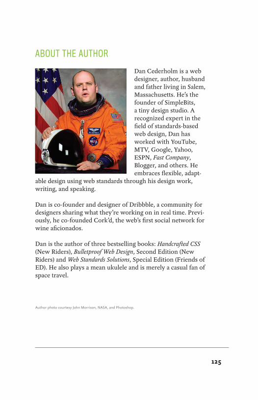
125
ABOUT THE AUTHOR
Dan Cederholm is a web designer, author, husband and father living in Salem, Massachusetts. He’s the founder of SimpleBits, a tiny design studio. A recognized expert in the field of standards-based web design, Dan has worked with YouTube, MTV, Google, Yahoo, ESPN, Fast Company, Blogger, and others. He embraces flexible, adapt-
able design using web standards through his design work, writing, and speaking.
Dan is co-founder and designer of Dribbble, a community for designers sharing what they’re working on in real time. Previ-ously, he co-founded Cork’d, the web’s first social network for wine aficionados.
Dan is the author of three bestselling books: Handcrafted CSS (New Riders), Bulletproof Web Design, Second Edition (New Riders) and Web Standards Solutions, Special Edition (Friends of ED). He also plays a mean ukulele and is merely a casual fan of space travel.
Author photo courtesy John Morrison, NASA, and Photoshop.