
CSS: Cascading Style Sheets - elite.polito.it · Summary •Introduction •CSS syntax •CSS...
144
CSS: Cascading Style Sheets BASICS, SELECTORS, BOX MODEL, PAGE LAYOUT Laura Farinetti - DAUIN
Transcript of CSS: Cascading Style Sheets - elite.polito.it · Summary •Introduction •CSS syntax •CSS...
CSS: Cascading
Style SheetsBASICS, SELECTORS, BOX MODEL,
PAGE LAYOUT
Laura Farinetti - DAUIN
Summary
• Introduction
• CSS syntax
• CSS selectors
• CSS cascading
• CSS box model
• CSS positioning schemes
• Page layout with CSS float
• CSS Flexbox
10/03/2019 Cascading Style Sheets 2
Cascading Style Sheets
• CSS: Cascading Style Sheet
• CSS 1: W3C recommendation (17 Dec 1996)
• CSS 2.1: W3C Recommendation (7 June 2011)
• CSS 3: different stages (REC, PR, CR, WD)– see http://www.w3.org/Style/CSS/current-work
• Resources:– CSS 2.1 standard, http://www.w3.org/TR/CSS21/
– W3C CSS Tutorial,http://www.w3.org/Style/Examples/011/firstcss
10/03/2019 Cascading Style Sheets 3
CSS level 3 (CSS3)
• Major change: introduction of modules
• Advantage of modules: they (supposedly) allow
the specification to be completed and approved
more quickly, because segments are completed
and approved in chunks
– This also allows browser and user-agent
manufacturers to support sections of the specification
but keep their code bloat to a minimum by only
supporting those modules that make sense
10/03/2019 Cascading Style Sheets 4
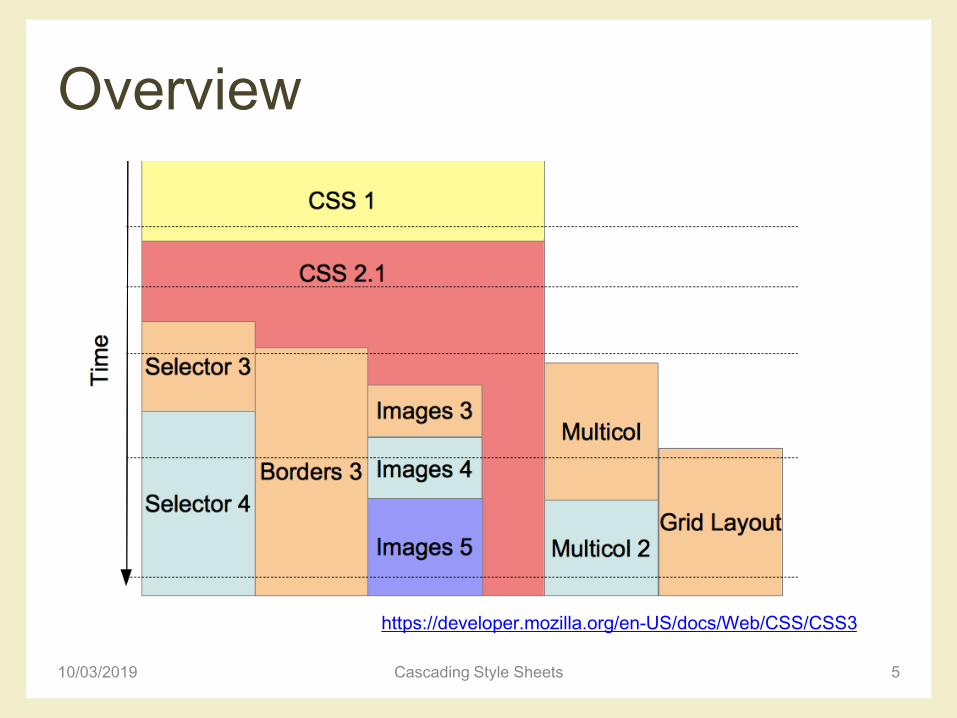
Overview
10/03/2019 Cascading Style Sheets 5
https://developer.mozilla.org/en-US/docs/Web/CSS/CSS3

CSS SYNTAX
10/03/2019 Cascading Style Sheets 6
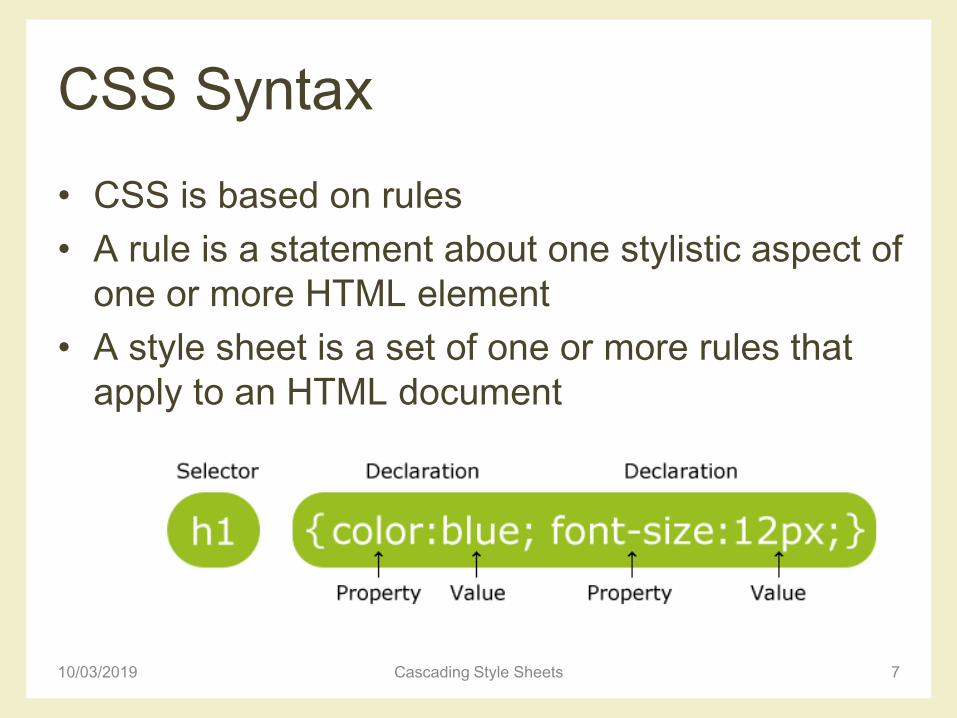
CSS Syntax
• CSS is based on rules
• A rule is a statement about one stylistic aspect of
one or more HTML element
• A style sheet is a set of one or more rules that
apply to an HTML document
710/03/2019 Cascading Style Sheets
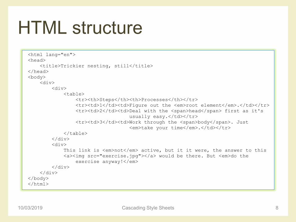
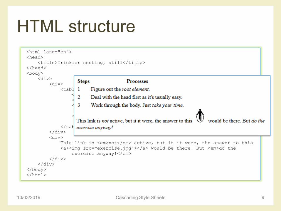
HTML structure
10/03/2019 Cascading Style Sheets 8
<html lang="en">
<head>
<title>Trickier nesting, still</title>
</head>
<body>
<div>
<div>
<table>
<tr><th>Steps</th><th>Processes</th></tr>
<tr><td>1</td><td>Figure out the <em>root element</em>.</td></tr>
<tr><td>2</td><td>Deal with the <span>head</span> first as it's
usually easy.</td></tr>
<tr><td>3</td><td>Work through the <span>body</span>. Just
<em>take your time</em>.</td></tr>
</table>
</div>
<div>
This link is <em>not</em> active, but it it were, the answer to this
<a><img src="exercise.jpg"></a> would be there. But <em>do the
exercise anyway!</em>
</div>
</div>
</body>
</html>
HTML structure
10/03/2019 Cascading Style Sheets 9
<html lang="en">
<head>
<title>Trickier nesting, still</title>
</head>
<body>
<div>
<div>
<table>
<tr><th>Steps</th><th>Processes</th></tr>
<tr><td>1</td><td>Figure out the <em>root element</em>.</td></tr>
<tr><td>2</td><td>Deal with the <span>head</span> first as it's
usually easy.</td></tr>
<tr><td>3</td><td>Work through the <span>body</span>. Just
<em>take your time</em>.</td></tr>
</table>
</div>
<div>
This link is <em>not</em> active, but it it were, the answer to this
<a><img src="exercise.jpg"></a> would be there. But <em>do the
exercise anyway!</em>
</div>
</div>
</body>
</html>

• HTML documents are trees
HTML structure
10/03/2019 Cascading Style Sheets 10
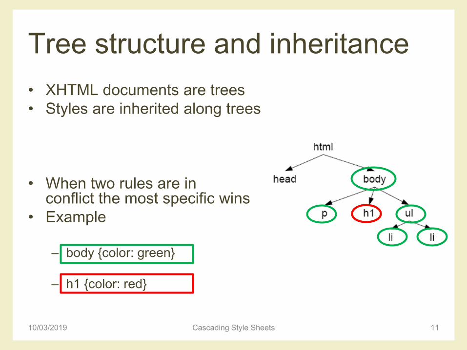
Tree structure and inheritance
• XHTML documents are trees
• Styles are inherited along trees
• When two rules are inconflict the most specific wins
• Example
– body {color: green}
– h1 {color: red}
10/03/2019 Cascading Style Sheets 11
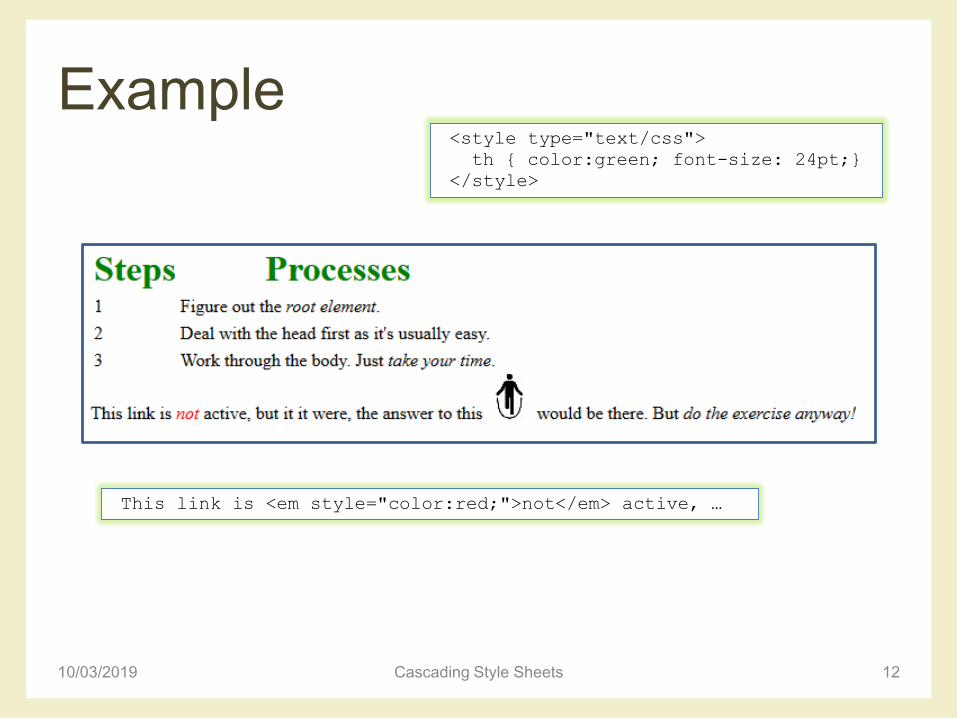
Example
10/03/2019 Cascading Style Sheets 12
This link is <em style="color:red;">not</em> active, …
<style type="text/css">
th { color:green; font-size: 24pt;}
</style>
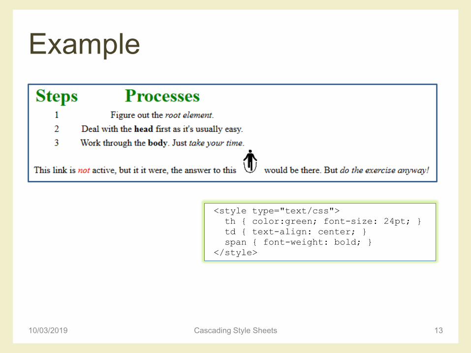
Example
10/03/2019 Cascading Style Sheets 13
<style type="text/css">
th { color:green; font-size: 24pt; }
td { text-align: center; }
span { font-weight: bold; }
</style>
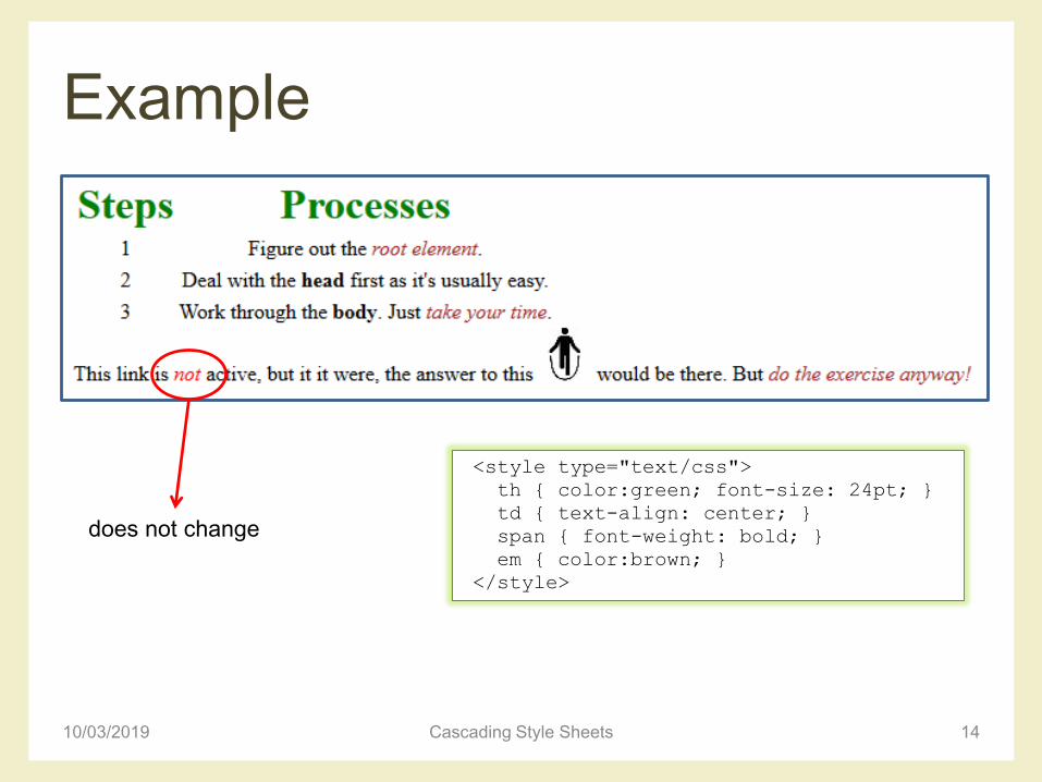
Example
10/03/2019 Cascading Style Sheets 14
<style type="text/css">
th { color:green; font-size: 24pt; }
td { text-align: center; }
span { font-weight: bold; }
em { color:brown; }
</style>
does not change
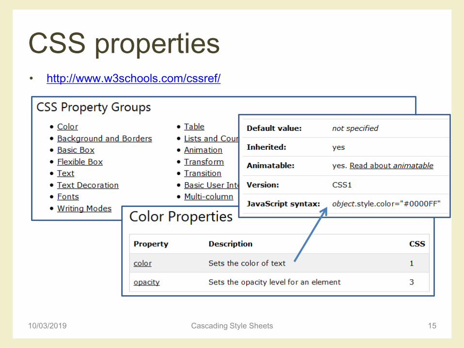
CSS properties• http://www.w3schools.com/cssref/
10/03/2019 Cascading Style Sheets 15

CSS SELECTORS
10/03/2019 Cascading Style Sheets 16
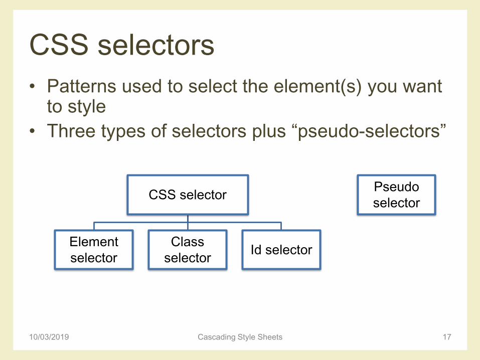
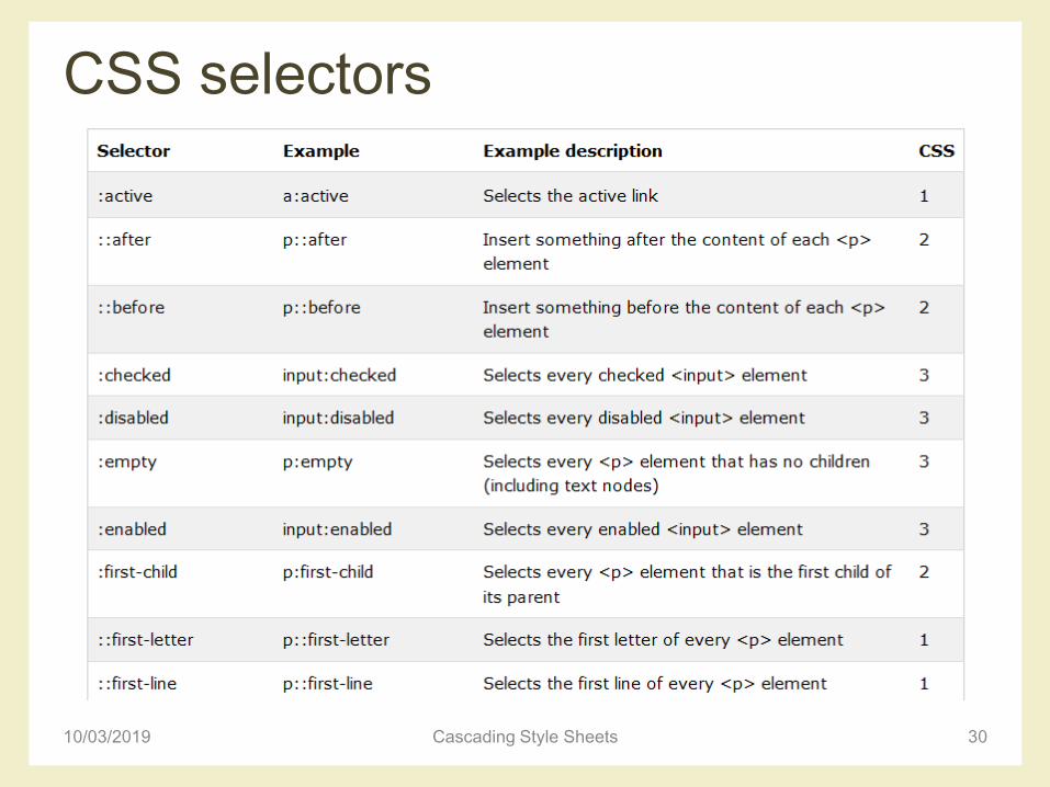
CSS selectors
• Patterns used to select the element(s) you want to style
• Three types of selectors plus “pseudo-selectors”
10/03/2019 Cascading Style Sheets 17
CSS selector
Element
selector
Class
selectorId selector
Pseudo
selector
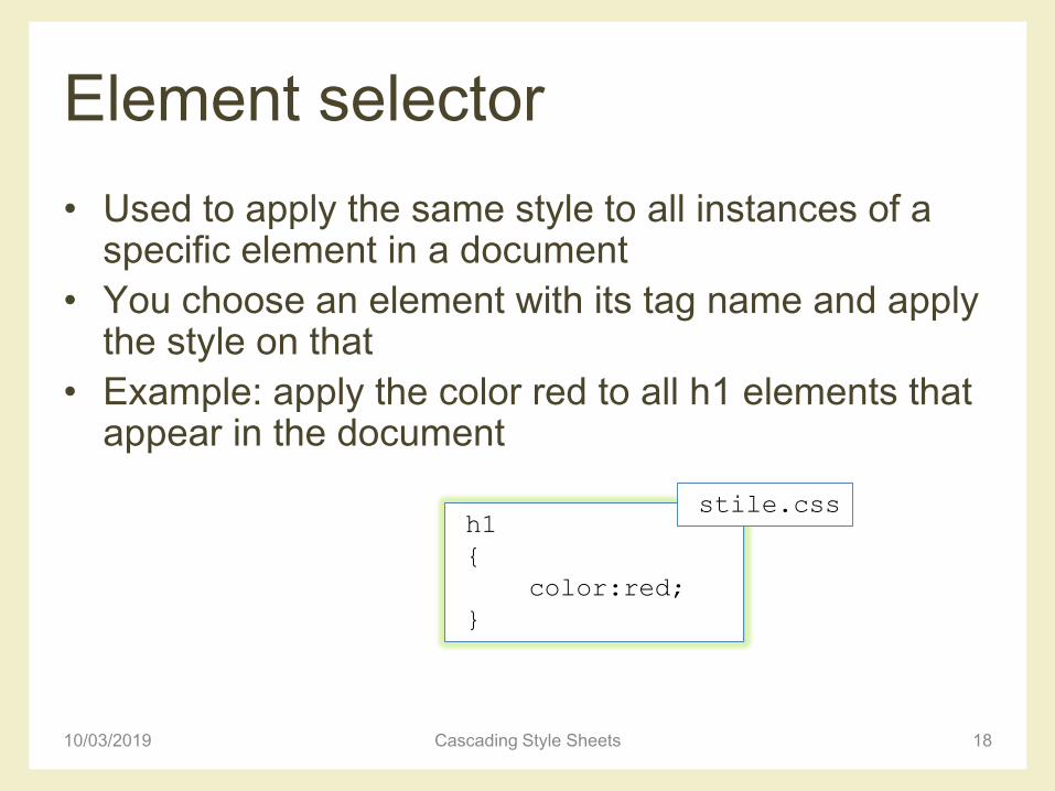
Element selector
• Used to apply the same style to all instances of a specific element in a document
• You choose an element with its tag name and apply the style on that
• Example: apply the color red to all h1 elements that appear in the document
10/03/2019 Cascading Style Sheets 18
h1
{
color:red;
}
stile.css
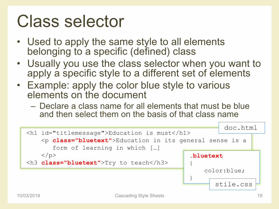
Class selector • Used to apply the same style to all elements
belonging to a specific (defined) class
• Usually you use the class selector when you want to apply a specific style to a different set of elements
• Example: apply the color blue style to various elements on the document– Declare a class name for all elements that must be blue
and then select them on the basis of that class name
10/03/2019 Cascading Style Sheets 19
<h1 id="titlemessage">Education is must</h1>
<p class="bluetext">Education in its general sense is a
form of learning in which […]
</p>
<h3 class="bluetext">Try to teach</h3>
.bluetext
{
color:blue;
}
stile.css
doc.html
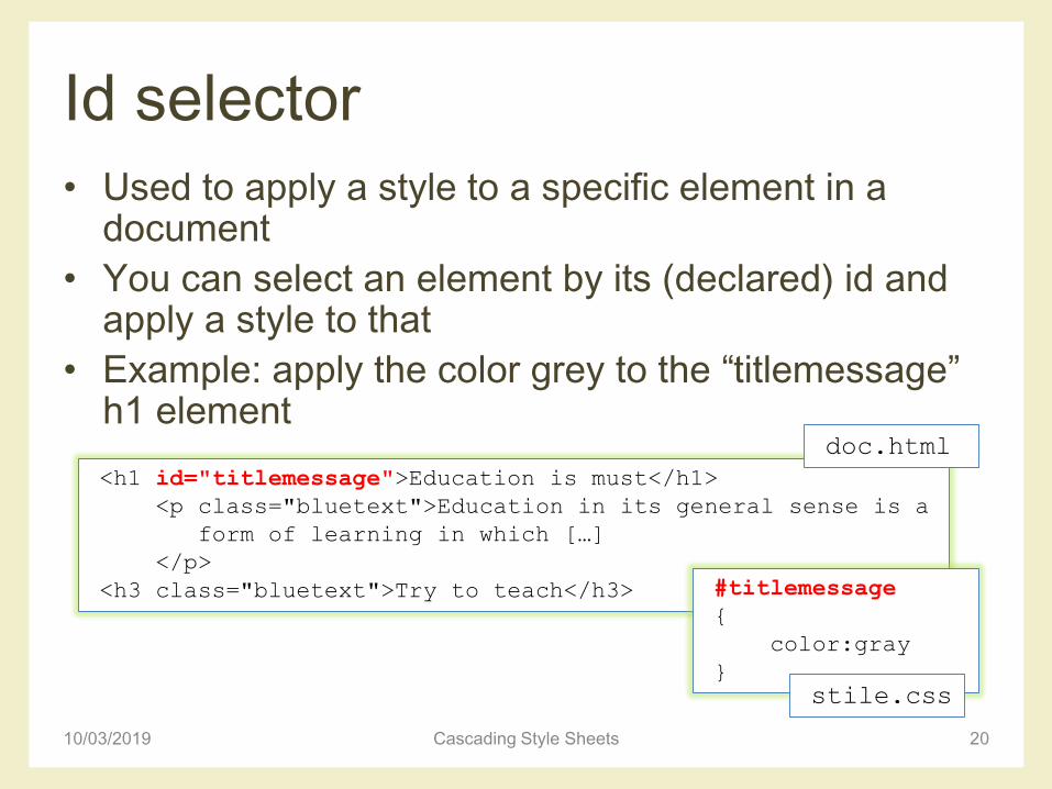
Id selector
• Used to apply a style to a specific element in a document
• You can select an element by its (declared) id and apply a style to that
• Example: apply the color grey to the “titlemessage” h1 element
10/03/2019 Cascading Style Sheets 20
<h1 id="titlemessage">Education is must</h1>
<p class="bluetext">Education in its general sense is a
form of learning in which […]
</p>
<h3 class="bluetext">Try to teach</h3> #titlemessage
{
color:gray
}
stile.css
doc.html
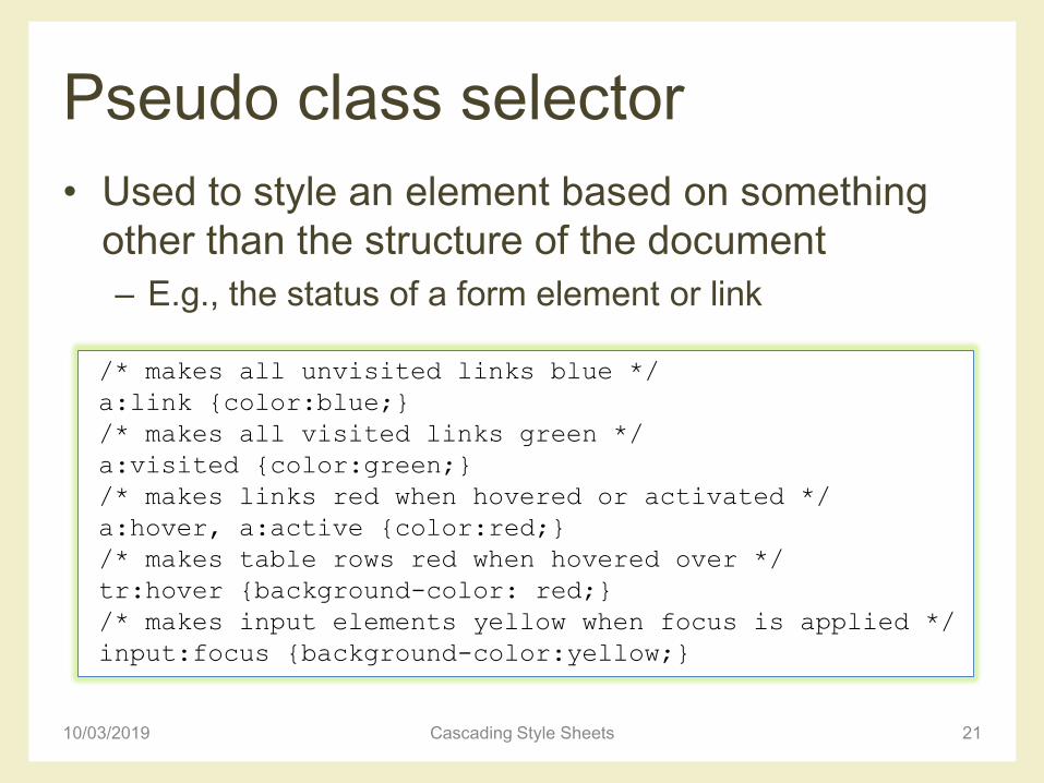
Pseudo class selector
• Used to style an element based on something
other than the structure of the document
– E.g., the status of a form element or link
10/03/2019 Cascading Style Sheets 21
/* makes all unvisited links blue */
a:link {color:blue;}
/* makes all visited links green */
a:visited {color:green;}
/* makes links red when hovered or activated */
a:hover, a:active {color:red;}
/* makes table rows red when hovered over */
tr:hover {background-color: red;}
/* makes input elements yellow when focus is applied */
input:focus {background-color:yellow;}
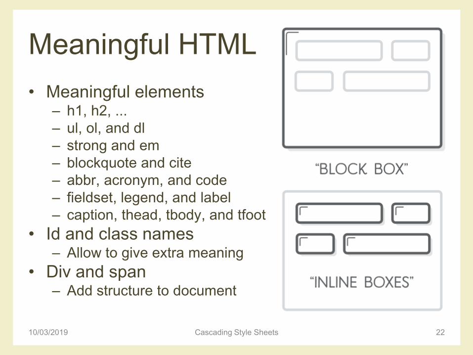
Meaningful HTML
• Meaningful elements– h1, h2, ...
– ul, ol, and dl
– strong and em
– blockquote and cite
– abbr, acronym, and code
– fieldset, legend, and label
– caption, thead, tbody, and tfoot
• Id and class names– Allow to give extra meaning
• Div and span– Add structure to document
10/03/2019 Cascading Style Sheets 22
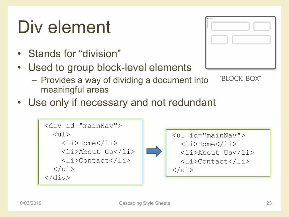
Div element
• Stands for “division”
• Used to group block-level elements– Provides a way of dividing a document into
meaningful areas
• Use only if necessary and not redundant
10/03/2019 Cascading Style Sheets 23
<div id="mainNav">
<ul>
<li>Home</li>
<li>About Us</li>
<li>Contact</li>
</ul>
</div>
<ul id="mainNav">
<li>Home</li>
<li>About Us</li>
<li>Contact</li>
</ul>
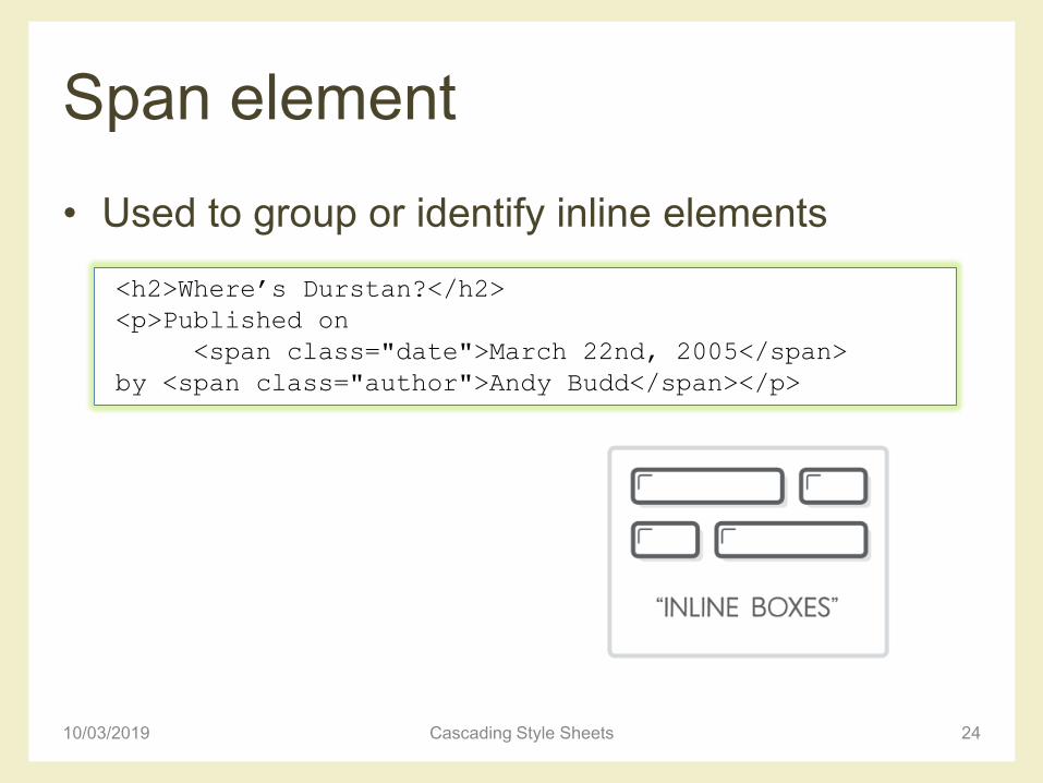
Span element
• Used to group or identify inline elements
10/03/2019 Cascading Style Sheets 24
<h2>Where’s Durstan?</h2>
<p>Published on
<span class="date">March 22nd, 2005</span>
by <span class="author">Andy Budd</span></p>
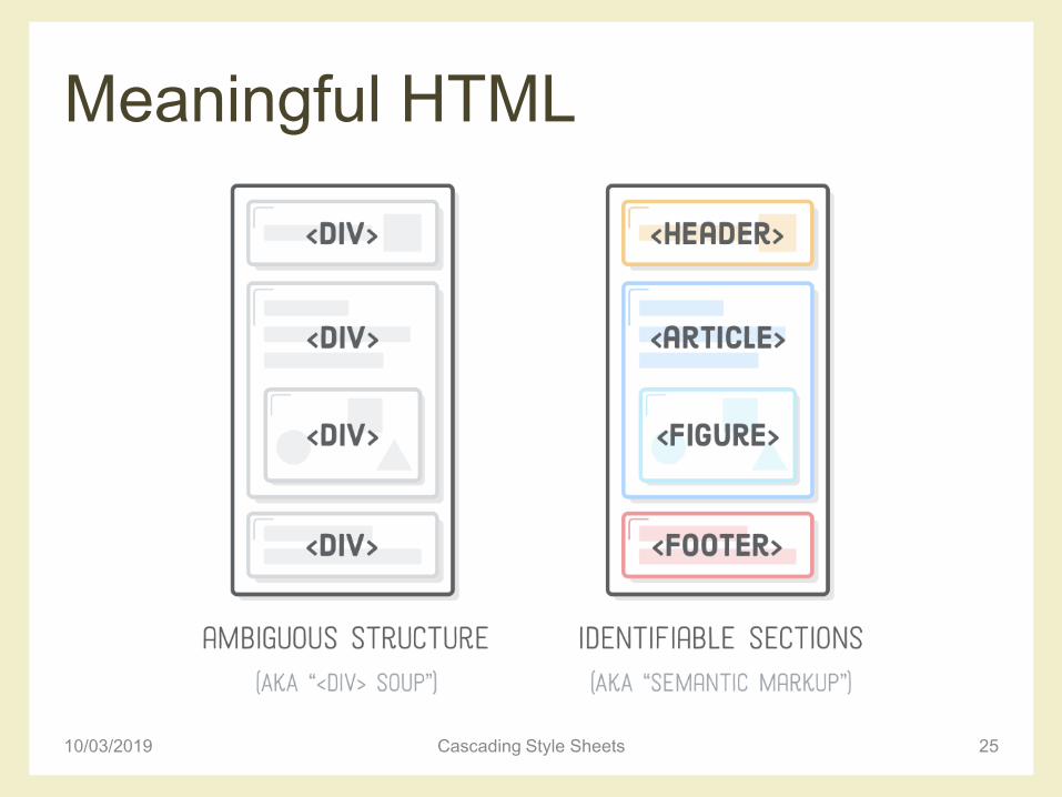
Meaningful HTML
10/03/2019 Cascading Style Sheets 25
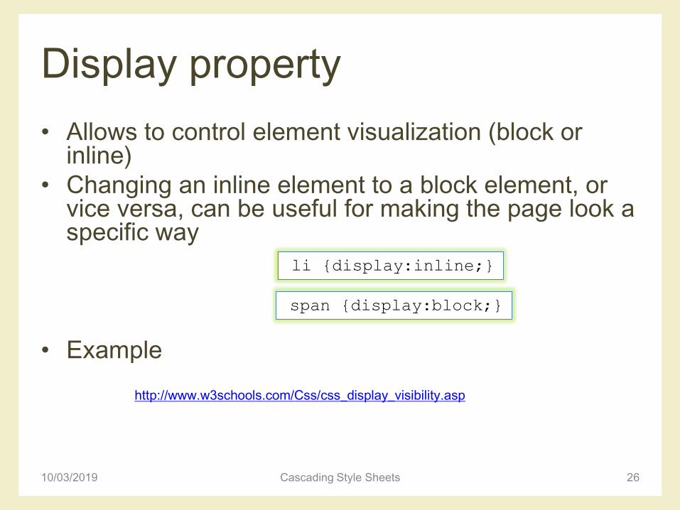
Display property
• Allows to control element visualization (block or inline)
• Changing an inline element to a block element, or vice versa, can be useful for making the page look a specific way
• Example
10/03/2019 Cascading Style Sheets 26
http://www.w3schools.com/Css/css_display_visibility.asp
li {display:inline;}
span {display:block;}
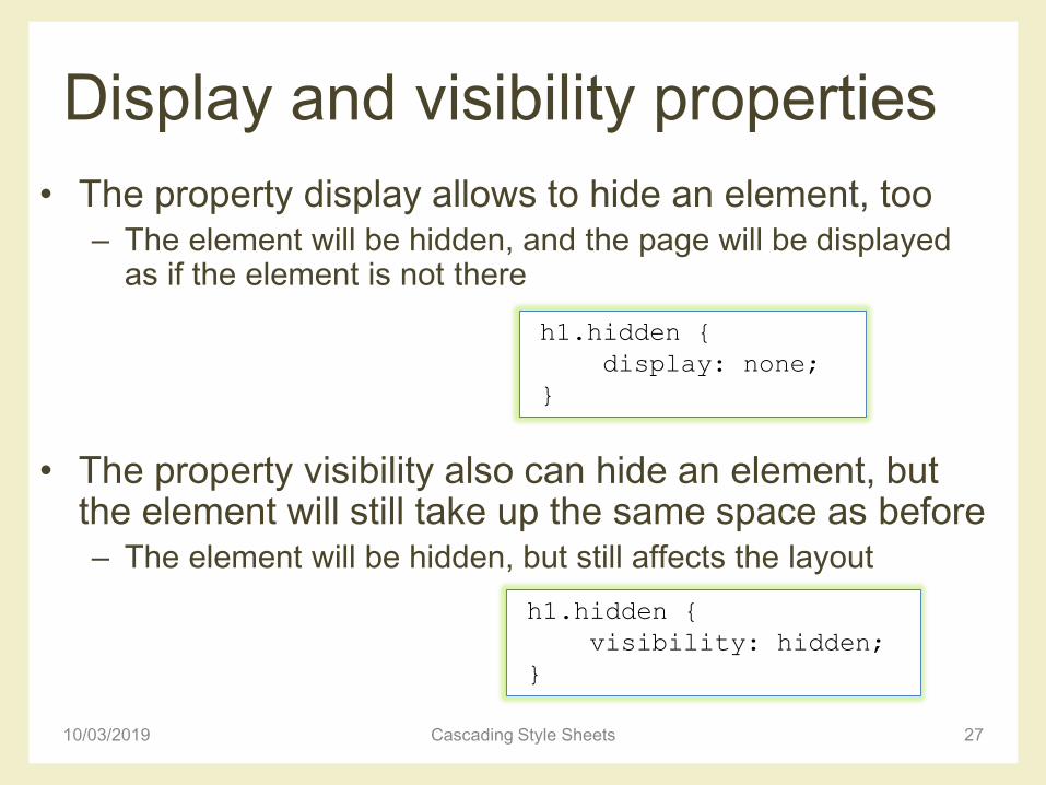
Display and visibility properties
• The property display allows to hide an element, too– The element will be hidden, and the page will be displayed
as if the element is not there
• The property visibility also can hide an element, but the element will still take up the same space as before– The element will be hidden, but still affects the layout
10/03/2019 Cascading Style Sheets 27
h1.hidden {
display: none;
}
h1.hidden {
visibility: hidden;
}

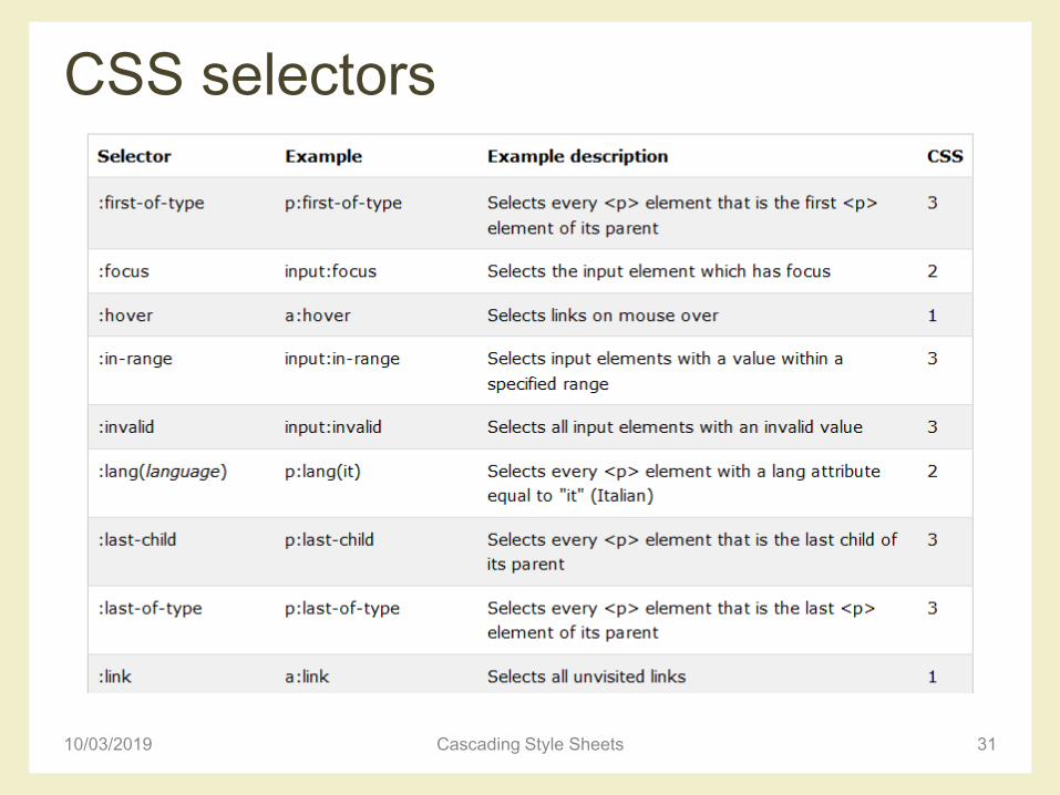
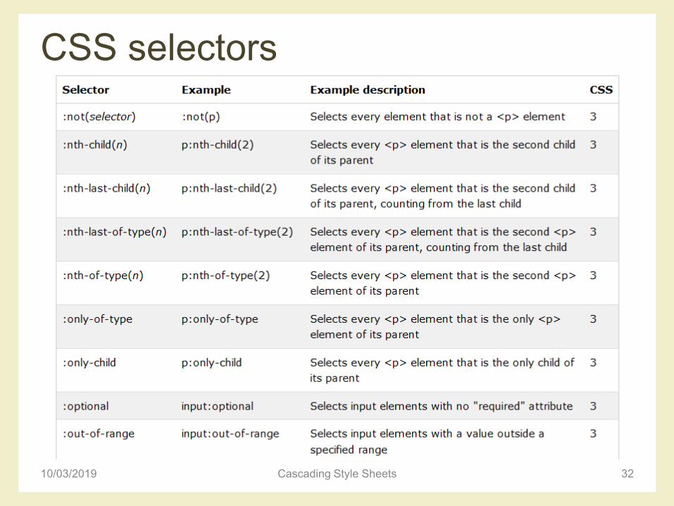
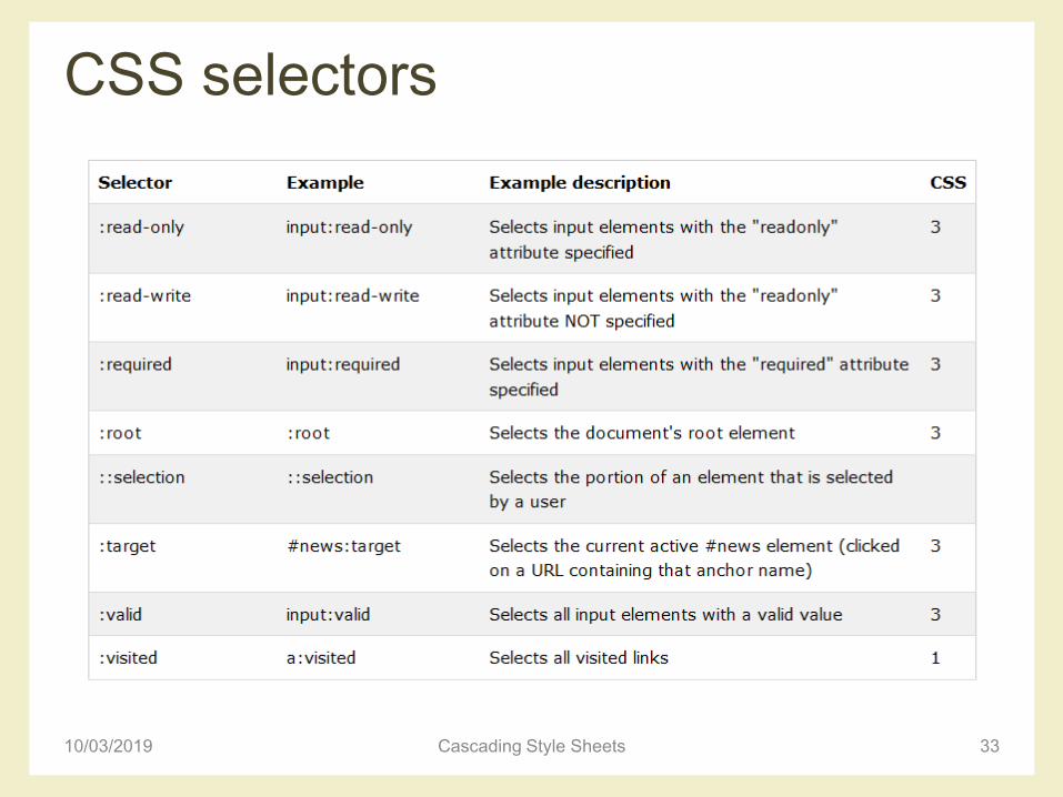
CSS selectors
10/03/2019 Cascading Style Sheets 28
http://www.w3schools.com/cssref/css_selectors.asp
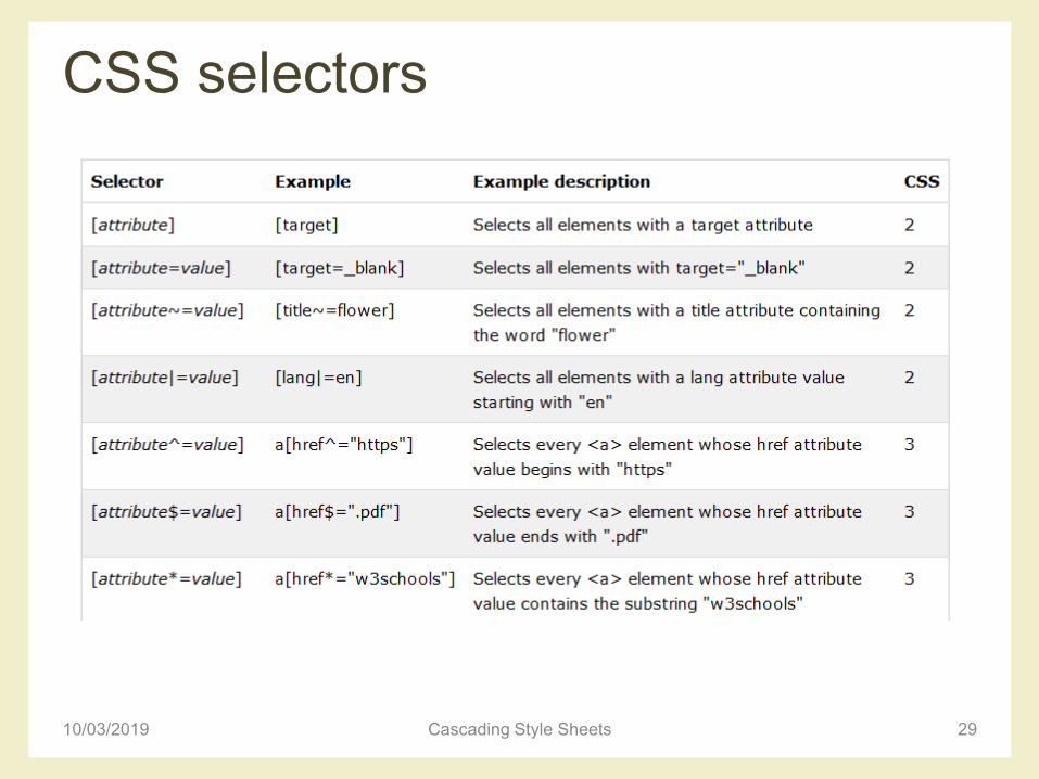
CSS selectors
10/03/2019 Cascading Style Sheets 29
CSS selectors
10/03/2019 Cascading Style Sheets 30
CSS selectors
10/03/2019 Cascading Style Sheets 31
CSS selectors
10/03/2019 Cascading Style Sheets 32
CSS selectors
10/03/2019 Cascading Style Sheets 33
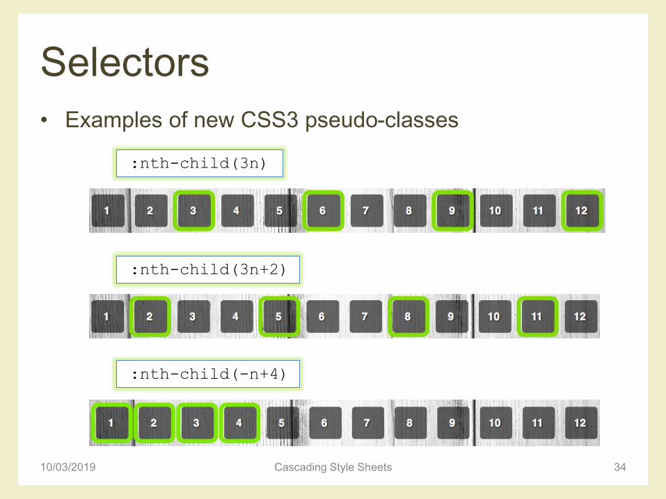
Selectors
• Examples of new CSS3 pseudo-classes
10/03/2019 Cascading Style Sheets 34
:nth-child(3n)
:nth-child(3n+2)
:nth-child(-n+4)
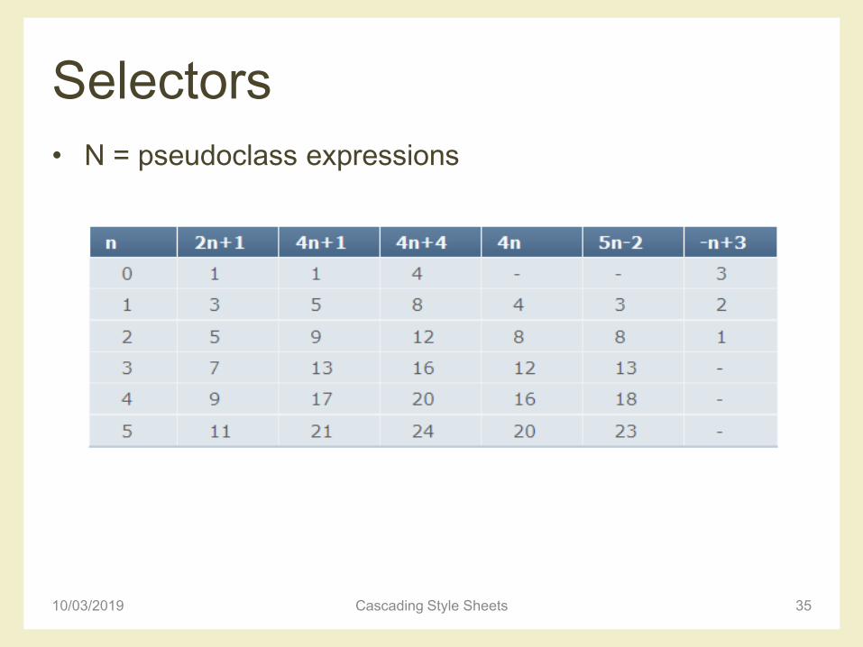
Selectors
• N = pseudoclass expressions
10/03/2019 Cascading Style Sheets 35
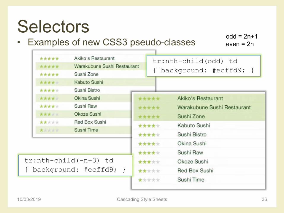
Selectors • Examples of new CSS3 pseudo-classes
10/03/2019 Cascading Style Sheets 36
tr:nth-child(odd) td
{ background: #ecffd9; }
odd = 2n+1
even = 2n
tr:nth-child(-n+3) td
{ background: #ecffd9; }
Selectors • Examples of new CSS3 pseudo-classes
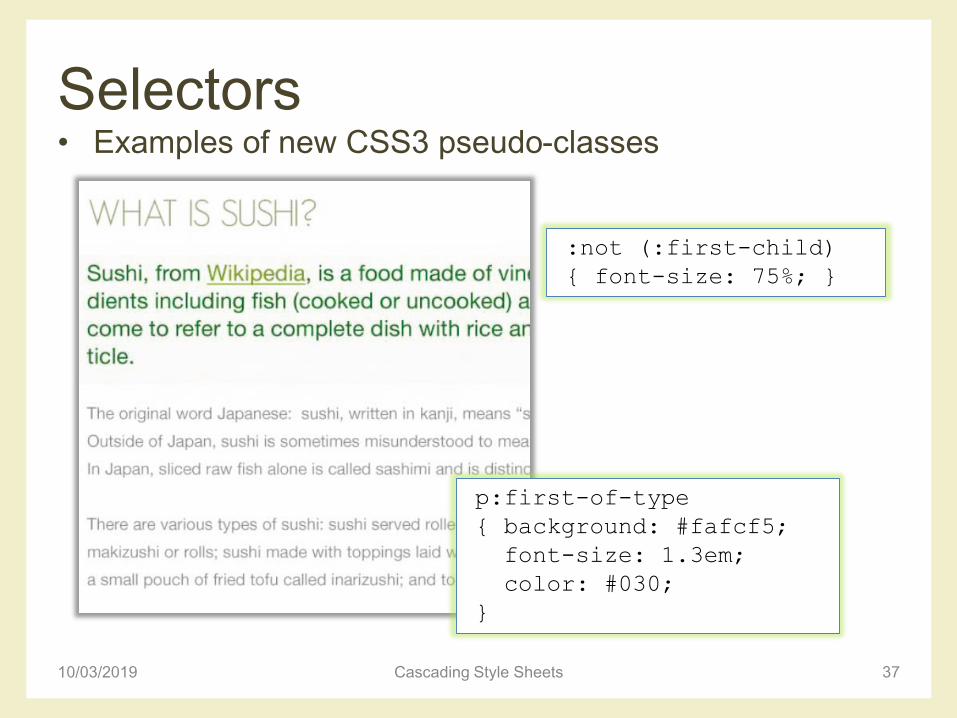
10/03/2019 Cascading Style Sheets 37
p:first-of-type
{ background: #fafcf5;
font-size: 1.3em;
color: #030;
}
:not (:first-child)
{ font-size: 75%; }
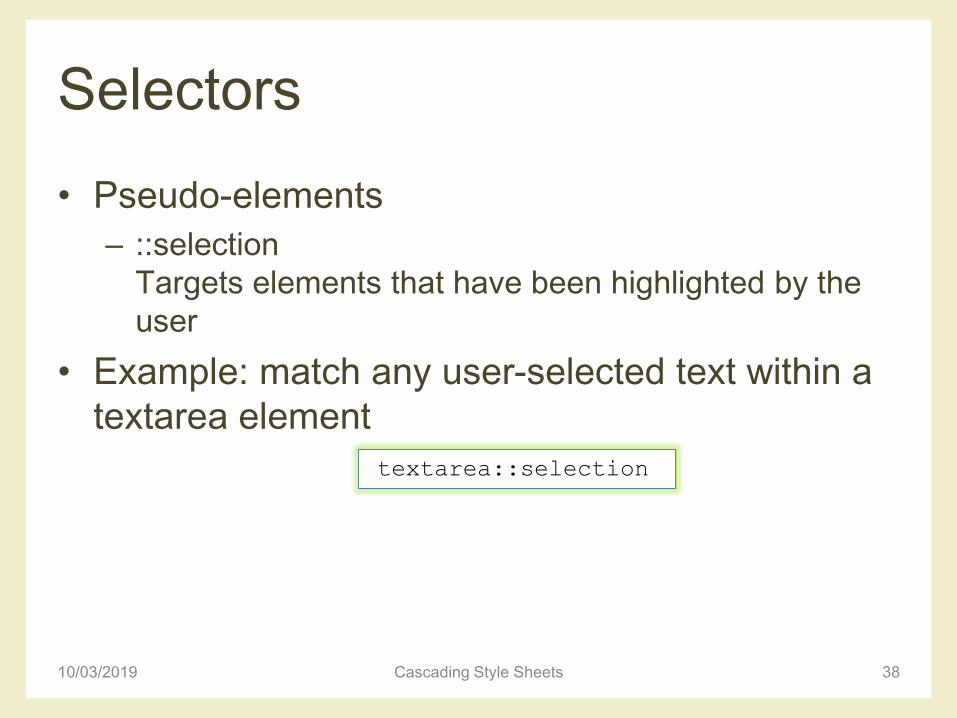
Selectors
• Pseudo-elements
– ::selection
Targets elements that have been highlighted by the
user
• Example: match any user-selected text within a
textarea element
10/03/2019 Cascading Style Sheets 38
textarea::selection
CSS CASCADING
10/03/2019 Cascading Style Sheets 39
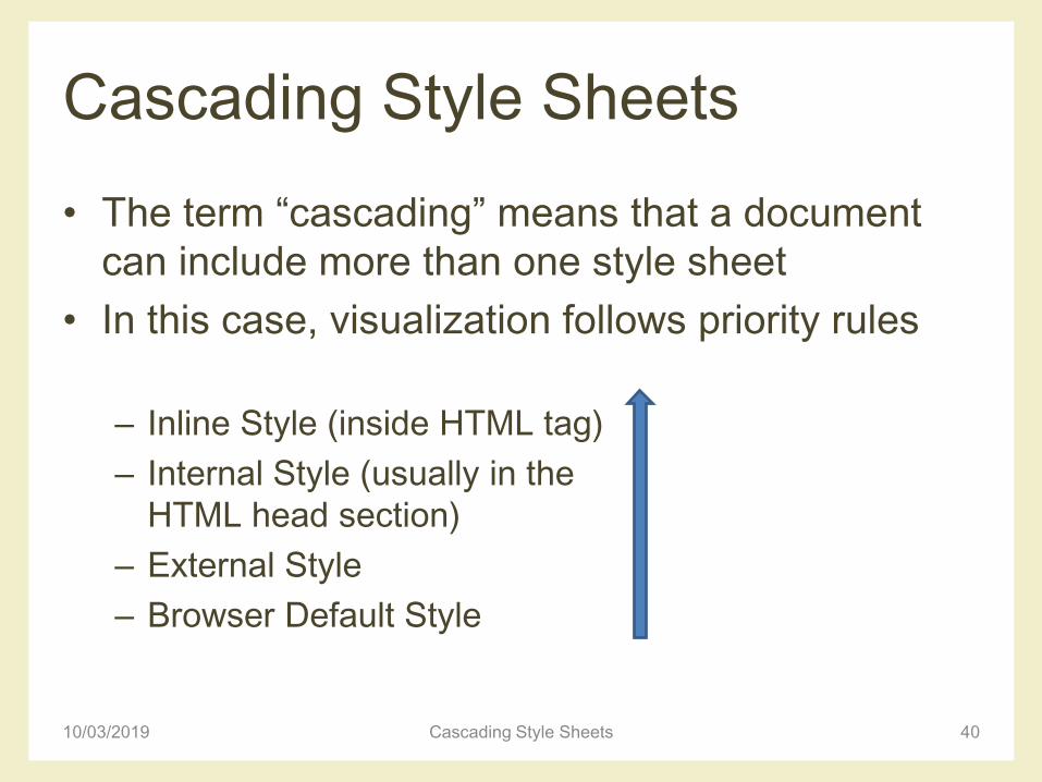
Cascading Style Sheets
• The term “cascading” means that a document
can include more than one style sheet
• In this case, visualization follows priority rules
– Inline Style (inside HTML tag)
– Internal Style (usually in the
HTML head section)
– External Style
– Browser Default Style
4010/03/2019 Cascading Style Sheets
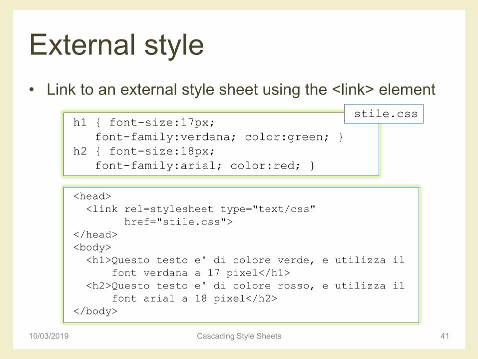
External style
• Link to an external style sheet using the <link> element
41
h1 { font-size:17px;
font-family:verdana; color:green; }
h2 { font-size:18px;
font-family:arial; color:red; }
stile.css
<head>
<link rel=stylesheet type="text/css"
href="stile.css">
</head>
<body>
<h1>Questo testo e' di colore verde, e utilizza il
font verdana a 17 pixel</h1>
<h2>Questo testo e' di colore rosso, e utilizza il
font arial a 18 pixel</h2>
</body>
10/03/2019 Cascading Style Sheets
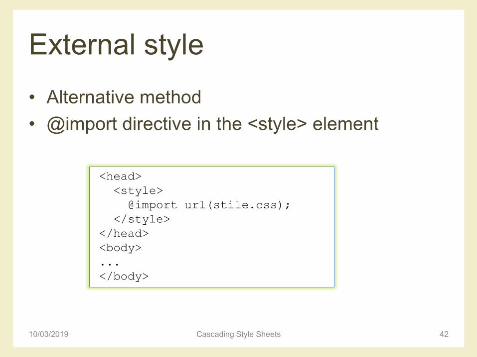
External style
• Alternative method
• @import directive in the <style> element
10/03/2019 Cascading Style Sheets 42
<head>
<style>
@import url(stile.css);
</style>
</head>
<body>
...
</body>
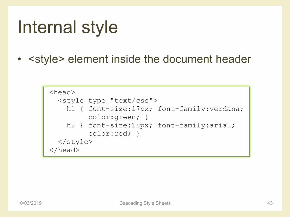
Internal style
• <style> element inside the document header
10/03/2019 Cascading Style Sheets 43
<head>
<style type="text/css">
h1 { font-size:17px; font-family:verdana;
color:green; }
h2 { font-size:18px; font-family:arial;
color:red; }
</style>
</head>
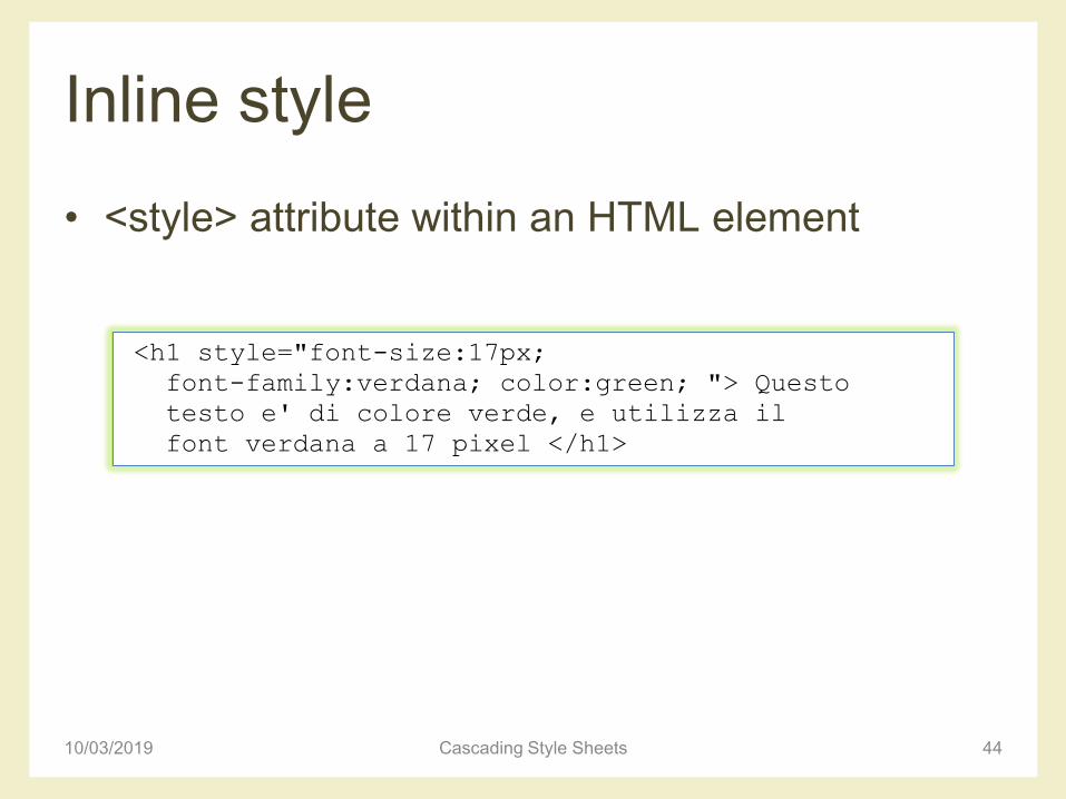
Inline style
• <style> attribute within an HTML element
10/03/2019 Cascading Style Sheets 44
<h1 style="font-size:17px;
font-family:verdana; color:green; "> Questo
testo e' di colore verde, e utilizza il
font verdana a 17 pixel </h1>
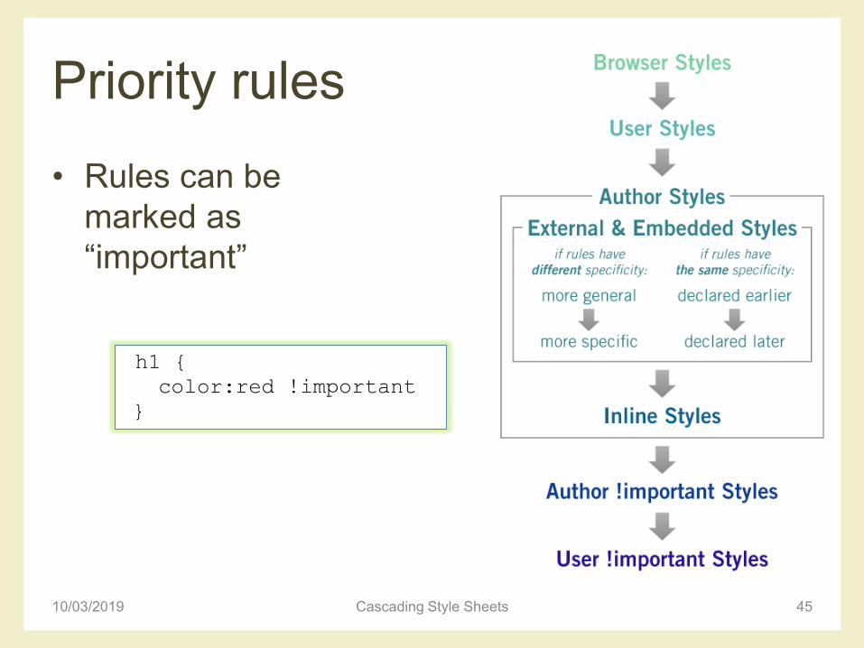
Priority rules
• Rules can be
marked as
“important”
10/03/2019 Cascading Style Sheets 45
h1 {
color:red !important
}
CSS specificity• Specificity determines which CSS rule is applied by the
browser– Specificity is usually the reason why your CSS-rules don’t apply
to some elements, although you think they should
• Every selector has its place in the specificity hierarchy
• There are four distinct categories which define the specificity level of a given selector– Inline styles (presence of style in document: attached directly to
the element to be styled, e.g. <h1 style="color: #fff;">
– IDs (# of ID selectors)
– Classes, attributes and pseudo-classes (# of class selectors) –this group includes .classes, [attributes] and pseudo-classes such as :hover, :focus, …
– Elements and pseudo-elements (# of Element (type) selectors), including for instance :before and :after
10/03/2019 Cascading Style Sheets 46
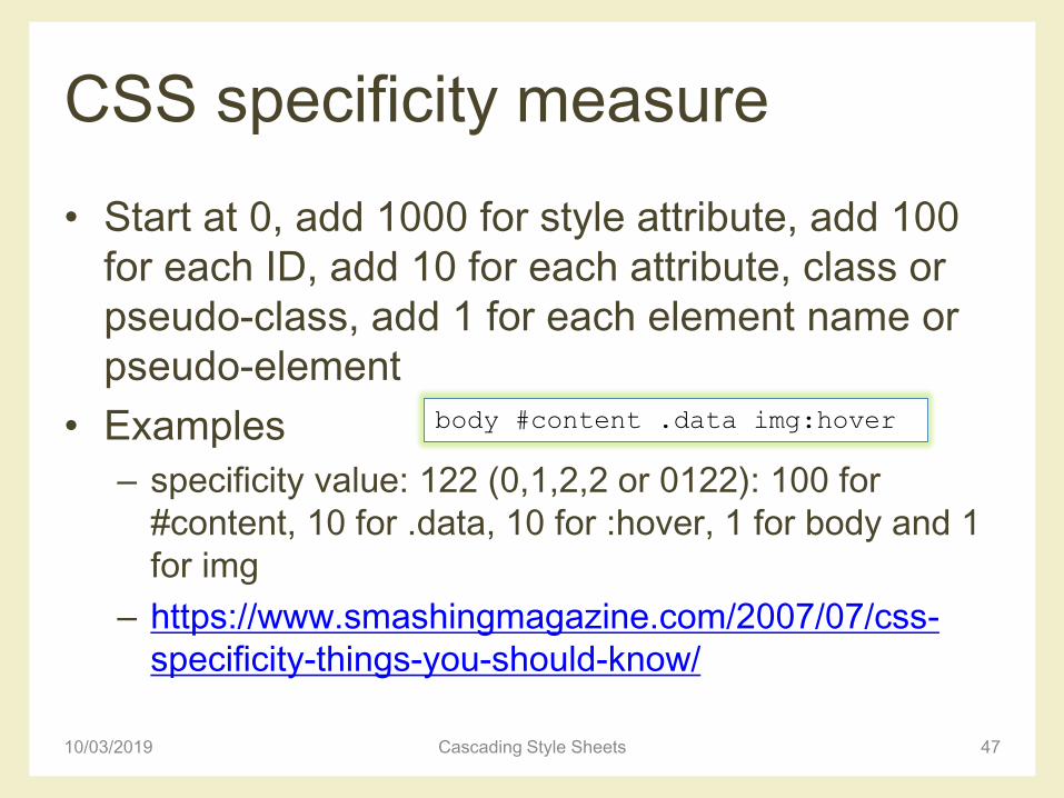
CSS specificity measure
• Start at 0, add 1000 for style attribute, add 100
for each ID, add 10 for each attribute, class or
pseudo-class, add 1 for each element name or
pseudo-element
• Examples
– specificity value: 122 (0,1,2,2 or 0122): 100 for
#content, 10 for .data, 10 for :hover, 1 for body and 1
for img
– https://www.smashingmagazine.com/2007/07/css-
specificity-things-you-should-know/
10/03/2019 Cascading Style Sheets 47
body #content .data img:hover
10/03/2019 Cascading Style Sheets 48
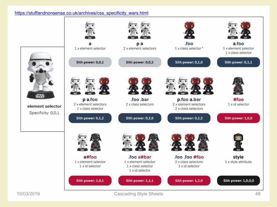
https://stuffandnonsense.co.uk/archives/css_specificity_wars.html

CSS specificity principles
• The embedded style sheet has a greater specificity than other rules
• ID selectors have a higher specificity than attribute selectors– You should always try to use IDs to increase the
specificity
• A class selector beats any number of element selectors
• The universal selector and inherited selectors have a specificity of 0, 0, 0, 0
10/03/2019 Cascading Style Sheets 49
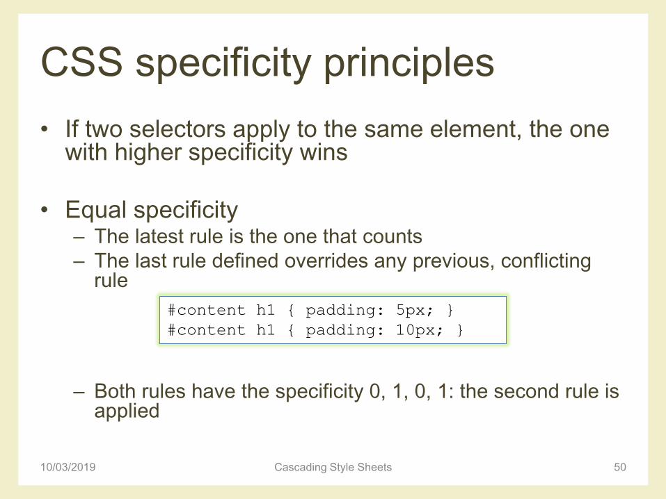
CSS specificity principles
• If two selectors apply to the same element, the one with higher specificity wins
• Equal specificity– The latest rule is the one that counts
– The last rule defined overrides any previous, conflicting rule
– Both rules have the specificity 0, 1, 0, 1: the second rule is applied
10/03/2019 Cascading Style Sheets 50
#content h1 { padding: 5px; }
#content h1 { padding: 10px; }
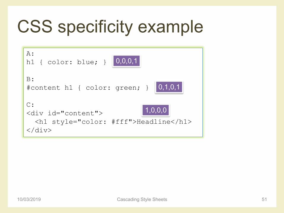
CSS specificity example
10/03/2019 Cascading Style Sheets 51
A:
h1 { color: blue; }
B:
#content h1 { color: green; }
C:
<div id="content">
<h1 style="color: #fff">Headline</h1>
</div>
0,0,0,1
0,1,0,1
1,0,0,0
References for CSS selectors
• Selectutorial
– http://css.maxdesign.com.au/selectutorial/index.htm
• CSS selectors
– https://www.sitepoint.com/css-selectors/
• CSS Specificity: Things You Should Know
– https://www.smashingmagazine.com/2007/07/css-
specificity-things-you-should-know/
10/03/2019 Cascading Style Sheets 52
CSS BOX MODEL
10/03/2019 Cascading Style Sheets 53
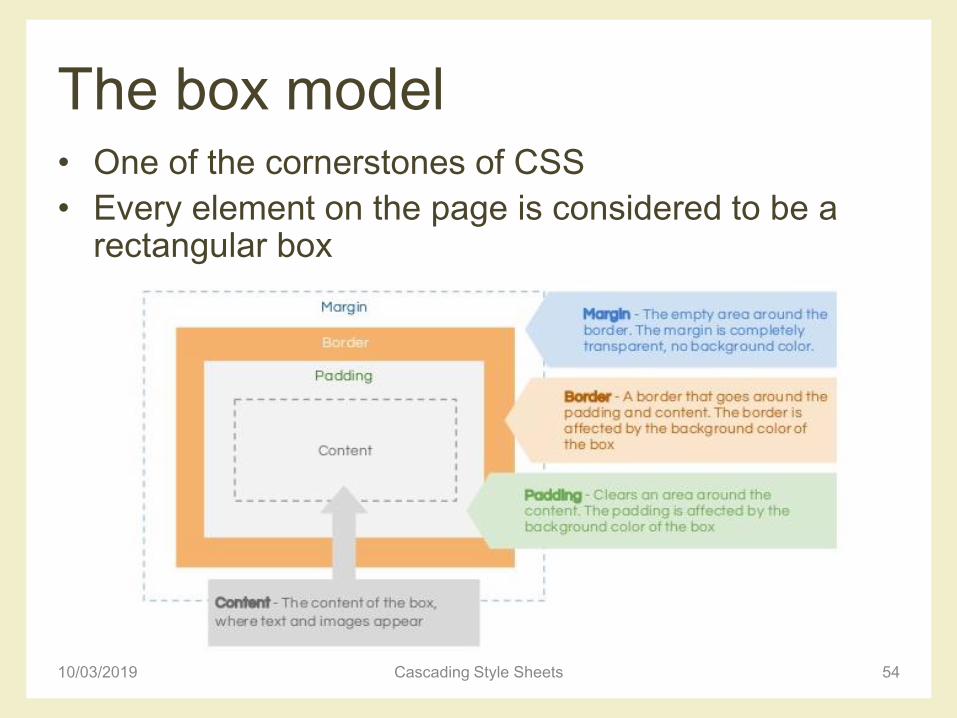
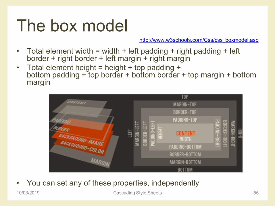
The box model• One of the cornerstones of CSS
• Every element on the page is considered to be a rectangular box
10/03/2019 Cascading Style Sheets 54
The box model
• Total element width = width + left padding + right padding + left border + right border + left margin + right margin
• Total element height = height + top padding + bottom padding + top border + bottom border + top margin + bottom margin
• You can set any of these properties, independently10/03/2019 Cascading Style Sheets 55
http://www.w3schools.com/Css/css_boxmodel.asp
Example
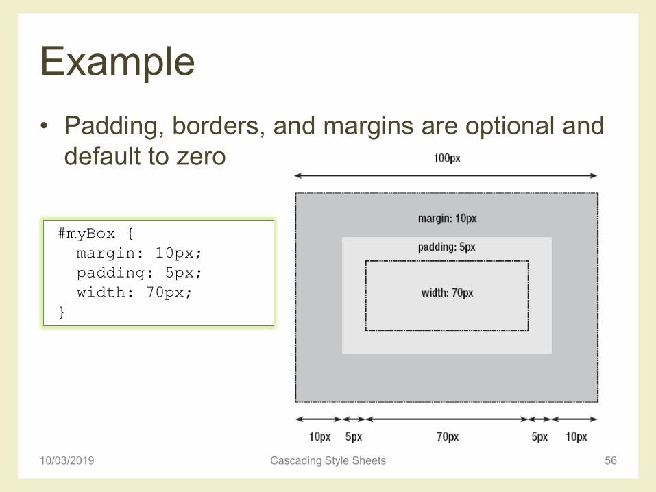
• Padding, borders, and margins are optional and
default to zero
10/03/2019 Cascading Style Sheets 56
#myBox {
margin: 10px;
padding: 5px;
width: 70px;
}
Box and borders
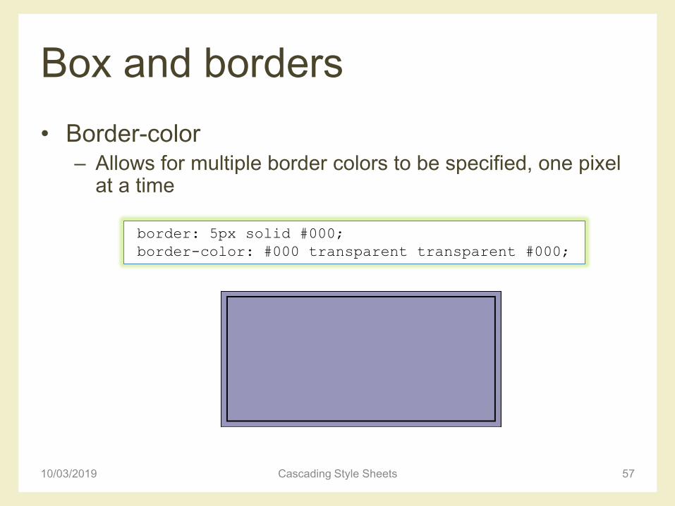
• Border-color– Allows for multiple border colors to be specified, one pixel
at a time
10/03/2019 Cascading Style Sheets 57
border: 5px solid #000;
border-color: #000 transparent transparent #000;
Box and borders
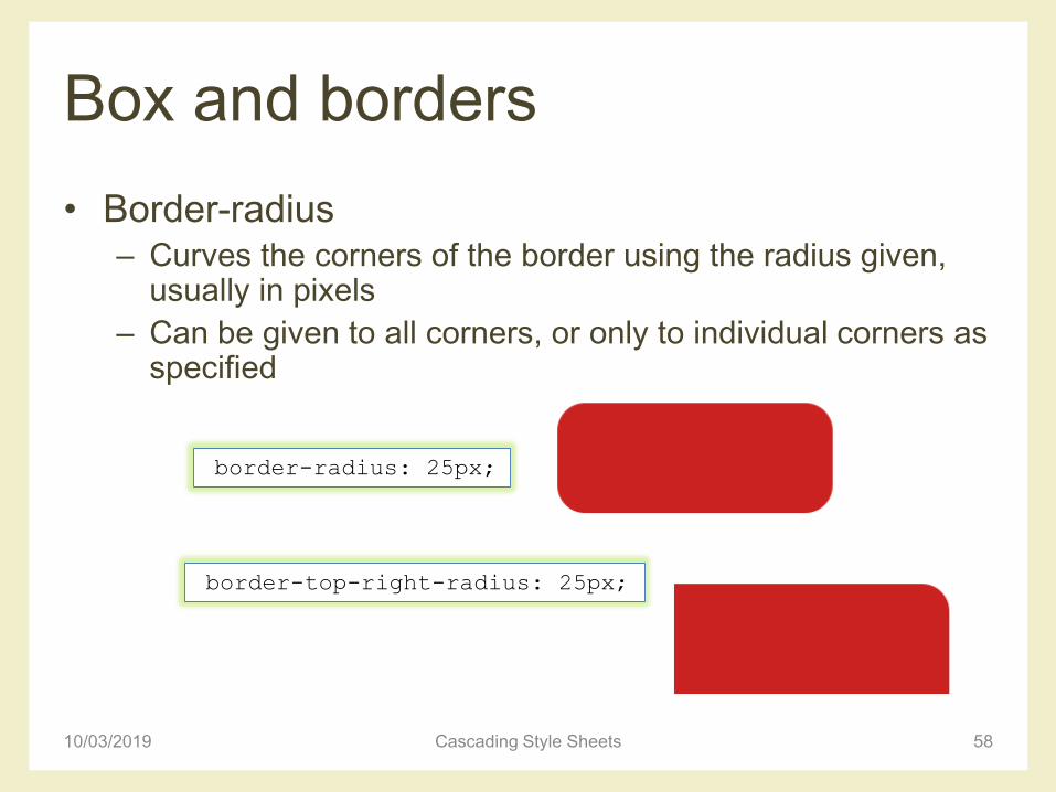
• Border-radius– Curves the corners of the border using the radius given,
usually in pixels
– Can be given to all corners, or only to individual corners as specified
10/03/2019 Cascading Style Sheets 58
border-radius: 25px;
border-top-right-radius: 25px;
Box and borders
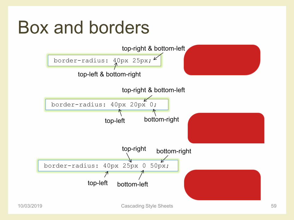
10/03/2019 Cascading Style Sheets 59
border-radius: 40px 25px;
border-radius: 40px 20px 0;
top-left & bottom-right
top-right & bottom-left
top-left
top-right & bottom-left
bottom-right
border-radius: 40px 25px 0 50px;
top-left bottom-left
bottom-righttop-right
Box and borders
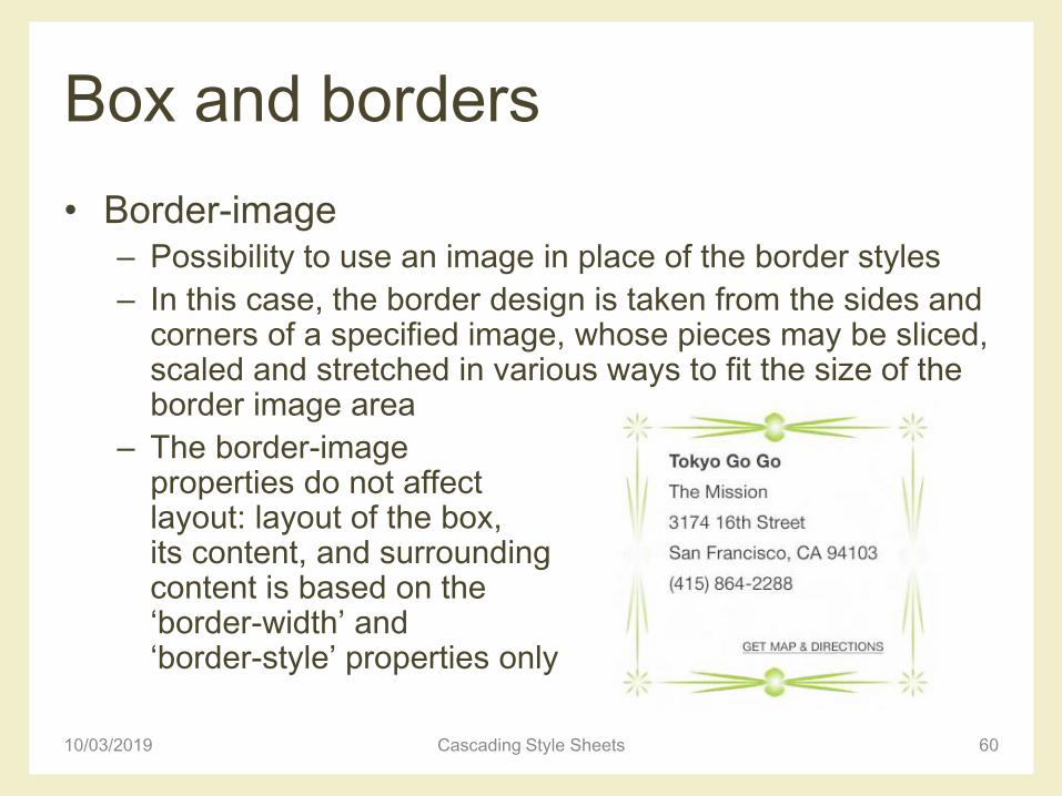
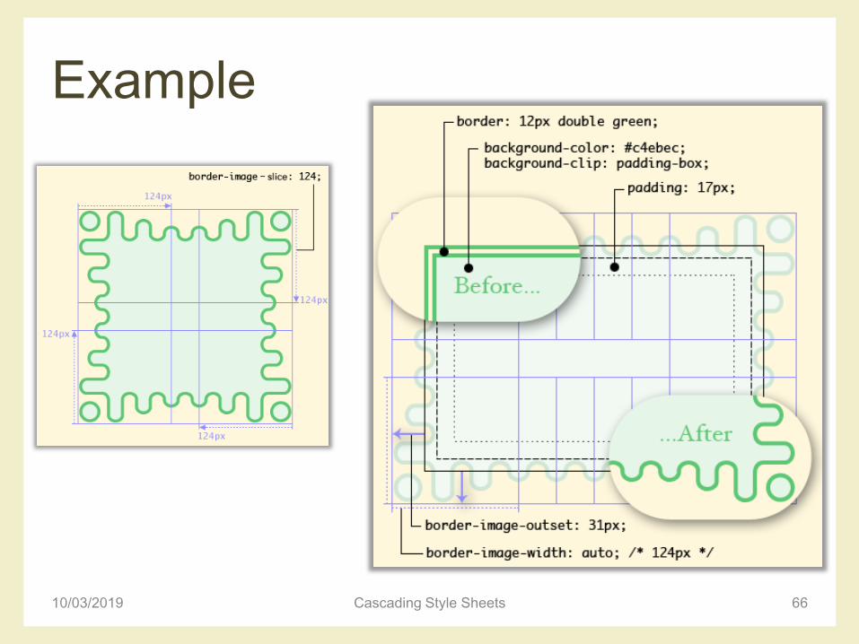
• Border-image– Possibility to use an image in place of the border styles
– In this case, the border design is taken from the sides and corners of a specified image, whose pieces may be sliced, scaled and stretched in various ways to fit the size of the border image area
– The border-image properties do not affect layout: layout of the box, its content, and surrounding content is based on the ‘border-width’ and ‘border-style’ properties only
10/03/2019 Cascading Style Sheets 60
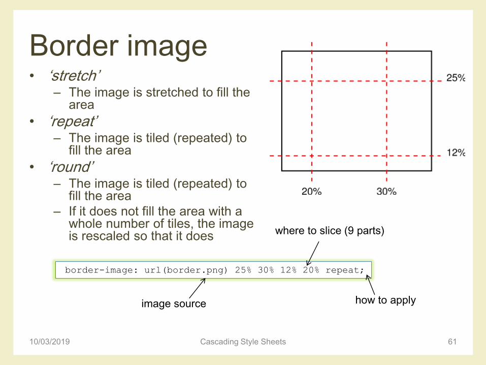
Border image• ‘stretch’
– The image is stretched to fill the area
• ‘repeat’– The image is tiled (repeated) to
fill the area
• ‘round’– The image is tiled (repeated) to
fill the area
– If it does not fill the area with a whole number of tiles, the image is rescaled so that it does
10/03/2019 Cascading Style Sheets 61
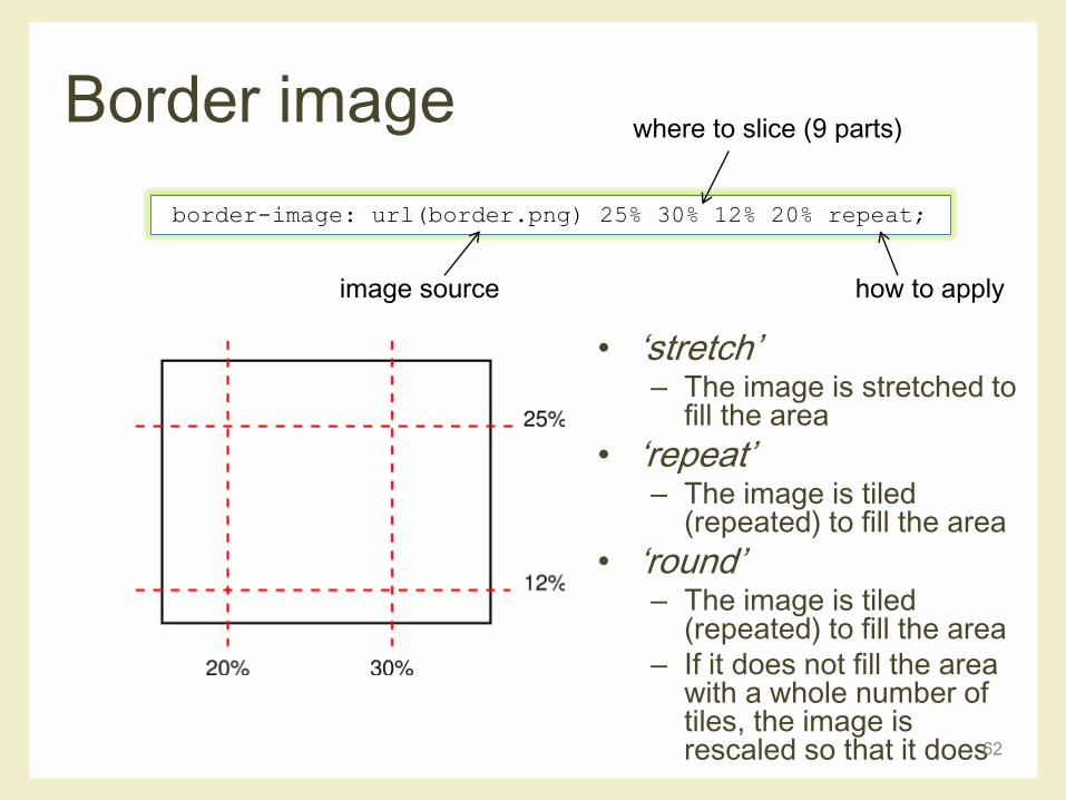
border-image: url(border.png) 25% 30% 12% 20% repeat;
image source
where to slice (9 parts)
how to apply
Border image
• ‘stretch’– The image is stretched to
fill the area
• ‘repeat’– The image is tiled
(repeated) to fill the area
• ‘round’– The image is tiled
(repeated) to fill the area
– If it does not fill the area with a whole number of tiles, the image is rescaled so that it does62
border-image: url(border.png) 25% 30% 12% 20% repeat;
image source
where to slice (9 parts)
how to apply
Example
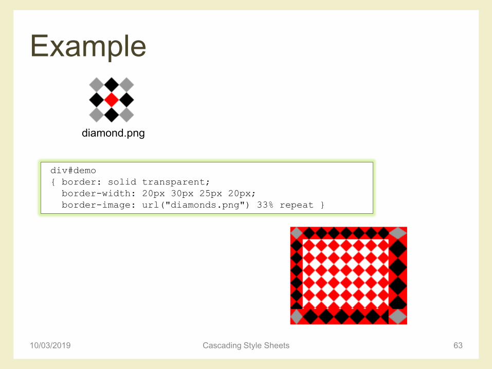
10/03/2019 Cascading Style Sheets 63
div#demo
{ border: solid transparent;
border-width: 20px 30px 25px 20px;
border-image: url("diamonds.png") 33% repeat }
diamond.png
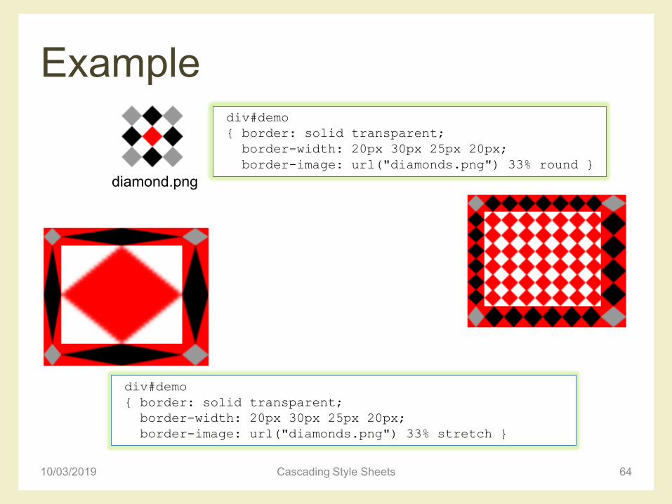
Example
10/03/2019 Cascading Style Sheets 64
div#demo
{ border: solid transparent;
border-width: 20px 30px 25px 20px;
border-image: url("diamonds.png") 33% round }
diamond.png
div#demo
{ border: solid transparent;
border-width: 20px 30px 25px 20px;
border-image: url("diamonds.png") 33% stretch }
Example
10/03/2019 Cascading Style Sheets 65
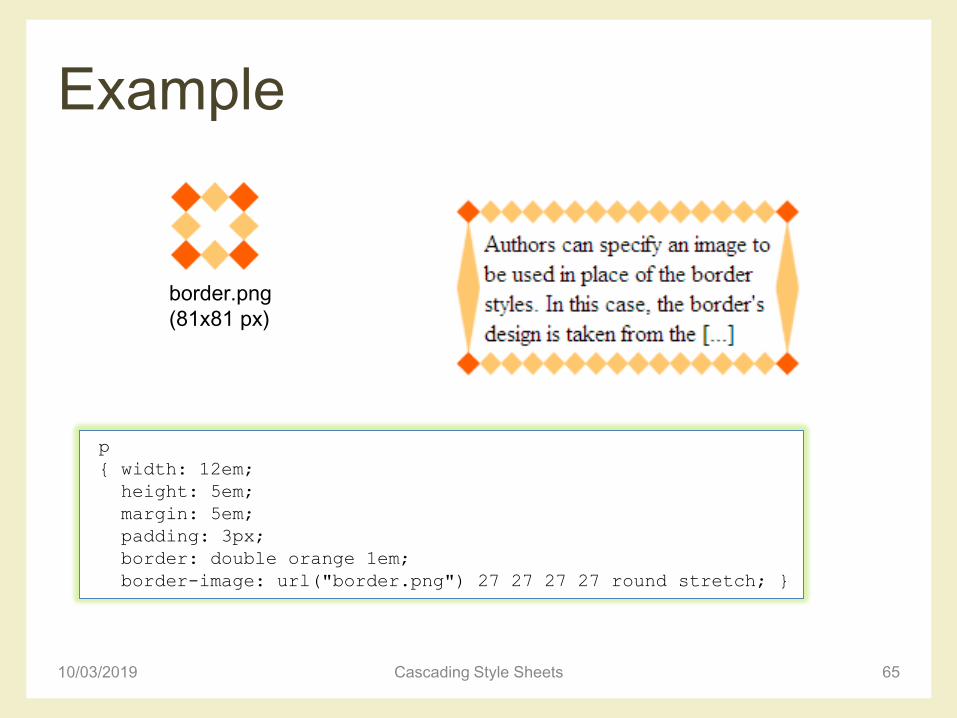
p
{ width: 12em;
height: 5em;
margin: 5em;
padding: 3px;
border: double orange 1em;
border-image: url("border.png") 27 27 27 27 round stretch; }
border.png
(81x81 px)
Example
10/03/2019 Cascading Style Sheets 66
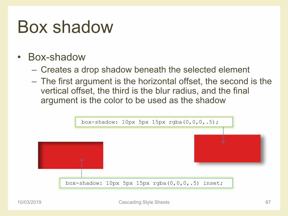
Box shadow
• Box-shadow– Creates a drop shadow beneath the selected element
– The first argument is the horizontal offset, the second is the vertical offset, the third is the blur radius, and the final argument is the color to be used as the shadow
10/03/2019 Cascading Style Sheets 67
box-shadow: 10px 5px 15px rgba(0,0,0,.5);
box-shadow: 10px 5px 15px rgba(0,0,0,.5) inset;

Box shadow
• Multiple shadows
10/03/2019 Cascading Style Sheets 68
#Example_M {
-moz-box-shadow: 0 0 5px black, 40px -30px lime,40px 30px
50px red, -40px 30px yellow, -40px -30px 50px blue;
-webkit-box-shadow: 0 0 5px black, 40px -30px lime, 40px
30px 50px red, -40px 30px yellow, -40px -30px 50px blue;
box-shadow: 0 0 5px black, 40px -30px lime, 40px 30px
50px red, -40px 30px yellow, -40px -30px 50px blue;
}
CSS POSITIONING SCHEMES
10/03/2019 Cascading Style Sheets 69
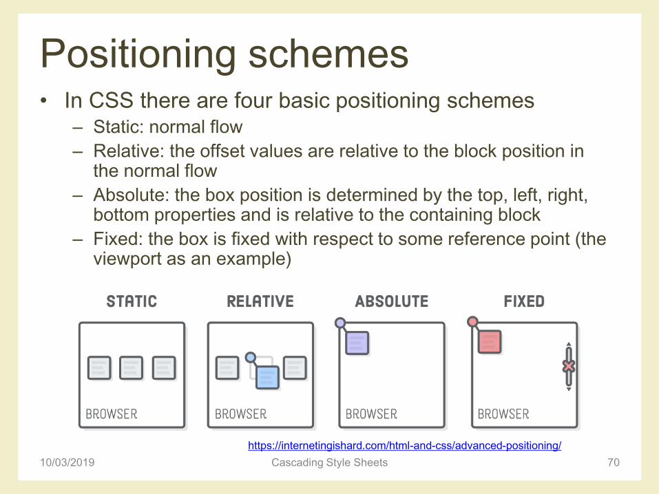
Positioning schemes• In CSS there are four basic positioning schemes
– Static: normal flow
– Relative: the offset values are relative to the block position in the normal flow
– Absolute: the box position is determined by the top, left, right, bottom properties and is relative to the containing block
– Fixed: the box is fixed with respect to some reference point (the viewport as an example)
10/03/2019 Cascading Style Sheets 70
https://internetingishard.com/html-and-css/advanced-positioning/
Normal flow
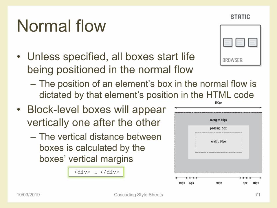
• Unless specified, all boxes start life
being positioned in the normal flow
– The position of an element’s box in the normal flow is
dictated by that element’s position in the HTML code
• Block-level boxes will appear
vertically one after the other
– The vertical distance between
boxes is calculated by the
boxes’ vertical margins
10/03/2019 Cascading Style Sheets 71
<div> … </div>
Normal flow
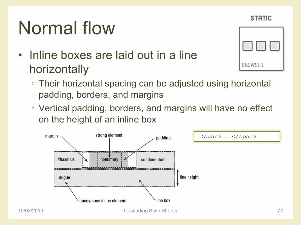
• Inline boxes are laid out in a line
horizontally◦ Their horizontal spacing can be adjusted using horizontal
padding, borders, and margins
◦ Vertical padding, borders, and margins will have no effect
on the height of an inline box
10/03/2019 Cascading Style Sheets 72
<span> … </span>
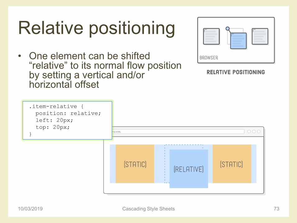
Relative positioning
• One element can be shifted “relative” to its normal flow position by setting a vertical and/or horizontal offset
10/03/2019 Cascading Style Sheets 73
.item-relative {
position: relative;
left: 20px;
top: 20px;
}
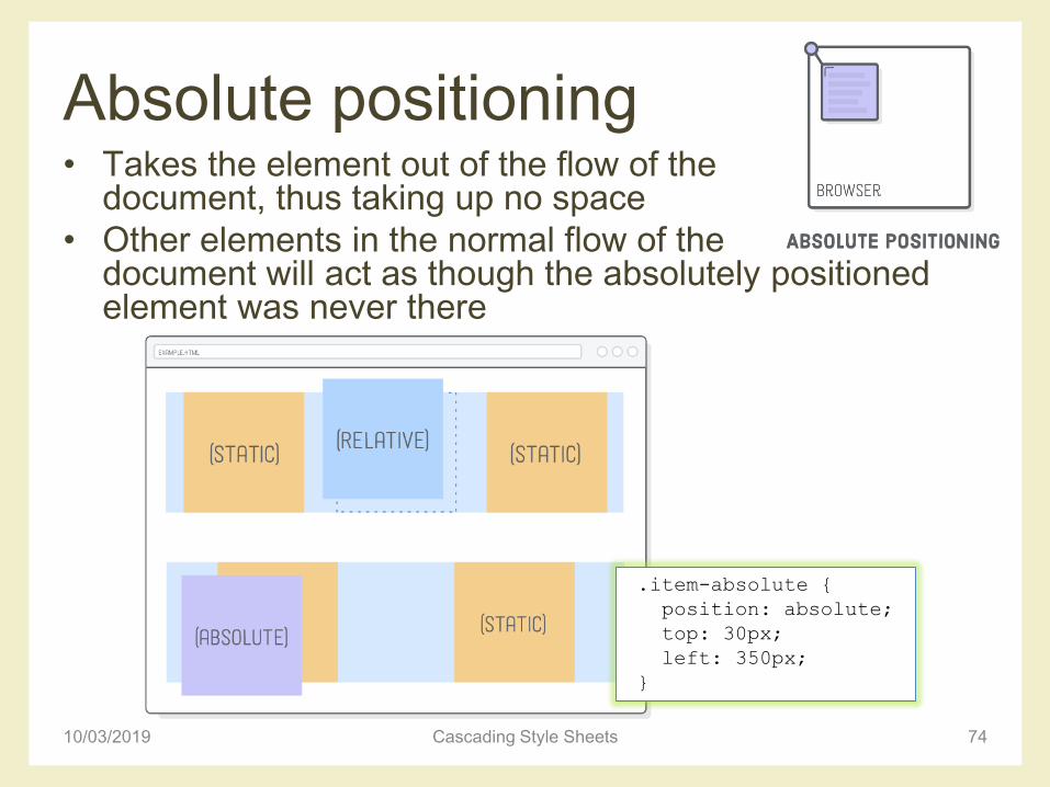
Absolute positioning• Takes the element out of the flow of the
document, thus taking up no space
• Other elements in the normal flow of the document will act as though the absolutely positioned element was never there
10/03/2019 Cascading Style Sheets 74
.item-absolute {
position: absolute;
top: 30px;
left: 350px;
}
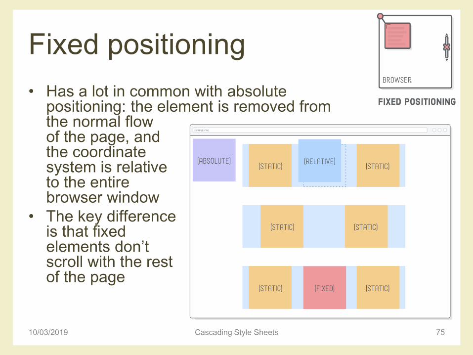
Fixed positioning
• Has a lot in common with absolute positioning: the element is removed from the normal flowof the page, and the coordinate system is relative to the entire browser window
• The key difference is that fixed elements don’t scroll with the rest of the page
10/03/2019 Cascading Style Sheets 75
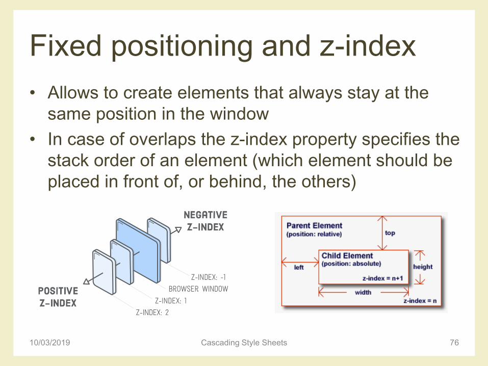
Fixed positioning and z-index
• Allows to create elements that always stay at the
same position in the window
• In case of overlaps the z-index property specifies the
stack order of an element (which element should be
placed in front of, or behind, the others)
10/03/2019 Cascading Style Sheets 76
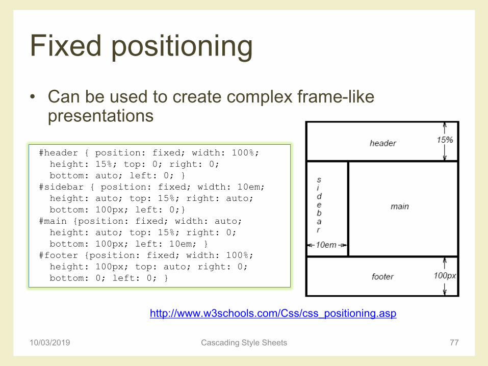
Fixed positioning
• Can be used to create complex frame-like presentations
10/03/2019 Cascading Style Sheets 77
#header { position: fixed; width: 100%;
height: 15%; top: 0; right: 0;
bottom: auto; left: 0; }
#sidebar { position: fixed; width: 10em;
height: auto; top: 15%; right: auto;
bottom: 100px; left: 0;}
#main {position: fixed; width: auto;
height: auto; top: 15%; right: 0;
bottom: 100px; left: 10em; }
#footer {position: fixed; width: 100%;
height: 100px; top: auto; right: 0;
bottom: 0; left: 0; }
http://www.w3schools.com/Css/css_positioning.asp
Floating
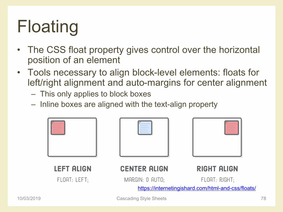
• The CSS float property gives control over the horizontal position of an element
• Tools necessary to align block-level elements: floats for left/right alignment and auto-margins for center alignment– This only applies to block boxes
– Inline boxes are aligned with the text-align property
10/03/2019 Cascading Style Sheets 78
https://internetingishard.com/html-and-css/floats/
Floating
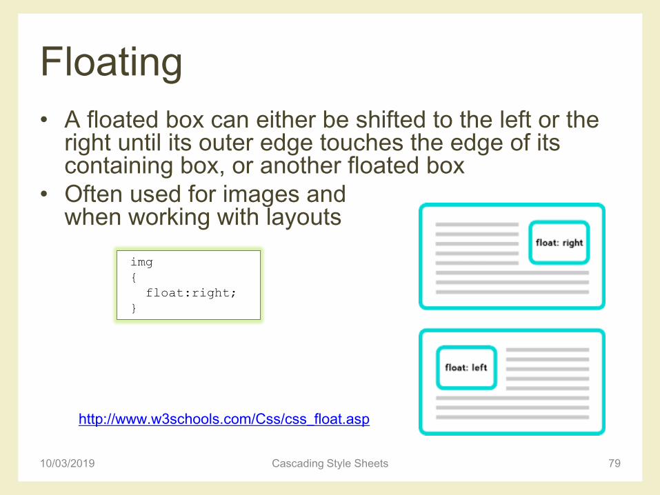
• A floated box can either be shifted to the left or the right until its outer edge touches the edge of its containing box, or another floated box
• Often used for images and when working with layouts
10/03/2019 Cascading Style Sheets 79
http://www.w3schools.com/Css/css_float.asp
img
{
float:right;
}
Floating
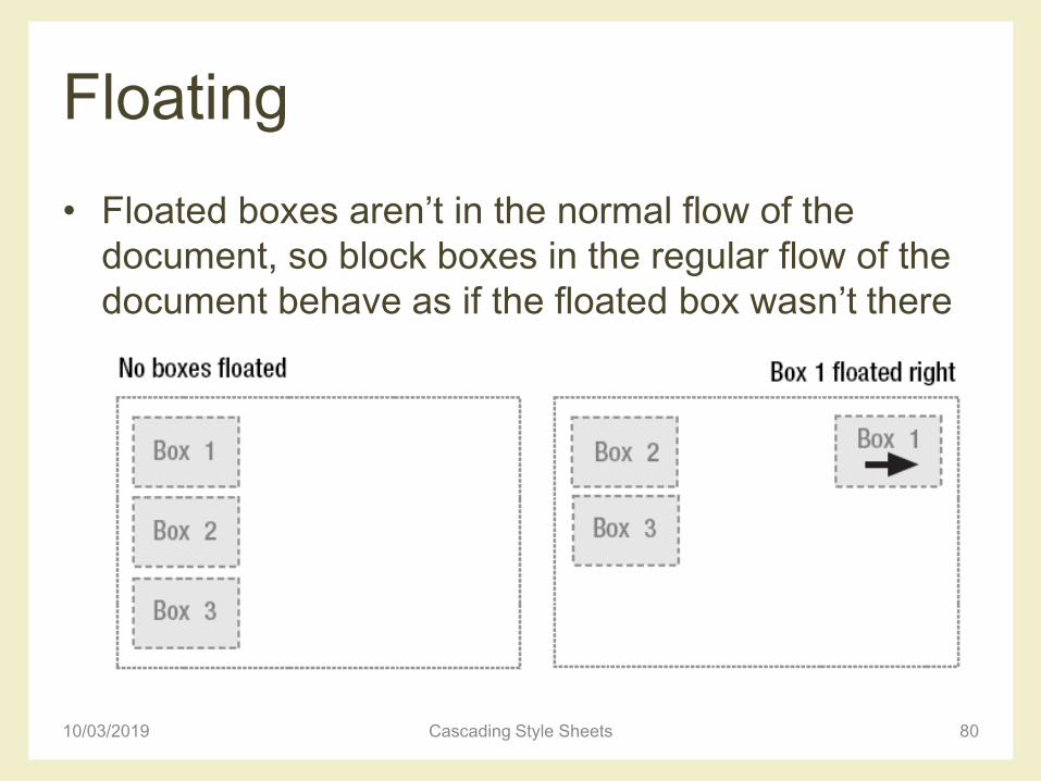
• Floated boxes aren’t in the normal flow of the
document, so block boxes in the regular flow of the
document behave as if the floated box wasn’t there
10/03/2019 Cascading Style Sheets 80
Floating
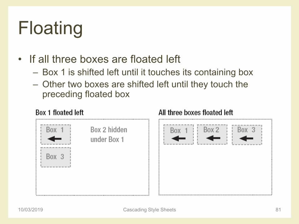
• If all three boxes are floated left– Box 1 is shifted left until it touches its containing box
– Other two boxes are shifted left until they touch the preceding floated box
10/03/2019 Cascading Style Sheets 81
Floating
10/03/2019 Cascading Style Sheets 82
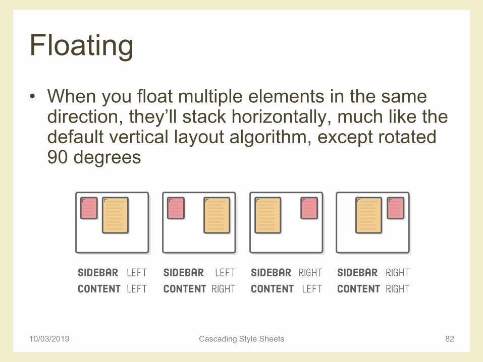
• When you float multiple elements in the same direction, they’ll stack horizontally, much like the default vertical layout algorithm, except rotated 90 degrees
Floating
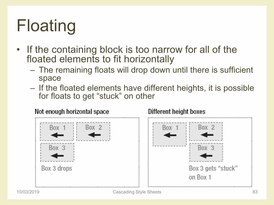
• If the containing block is too narrow for all of the floated elements to fit horizontally– The remaining floats will drop down until there is sufficient
space
– If the floated elements have different heights, it is possible for floats to get “stuck” on other
10/03/2019 Cascading Style Sheets 83
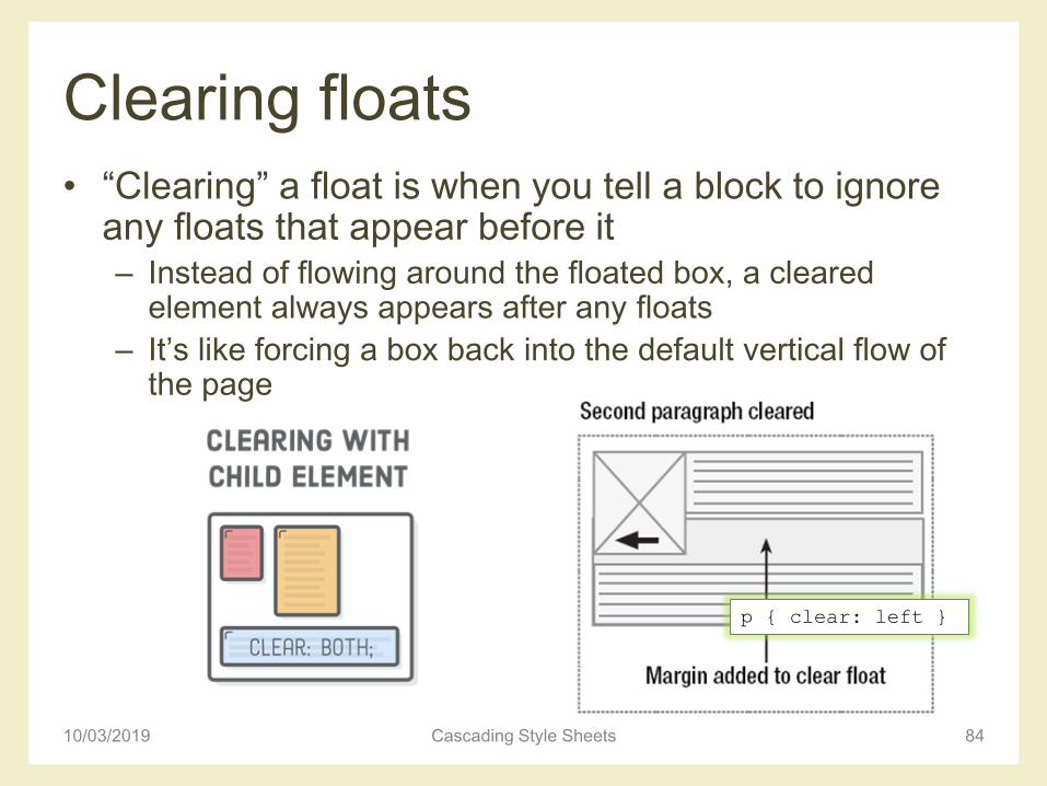
Clearing floats
• “Clearing” a float is when you tell a block to ignore any floats that appear before it– Instead of flowing around the floated box, a cleared
element always appears after any floats
– It’s like forcing a box back into the default vertical flow of the page
10/03/2019 Cascading Style Sheets 84
p { clear: left }
References for CSS box model and
positioning
• Learn CSS layout
– http://learnlayout.com/
• Floatutorial
– http://css.maxdesign.com.au/floatutorial/
• All about floats
– https://css-tricks.com/all-about-floats/
10/03/2019 Cascading Style Sheets 85
PAGE LAYOUT WITH CSS
FLOATS
10/03/2019 Cascading Style Sheets 86
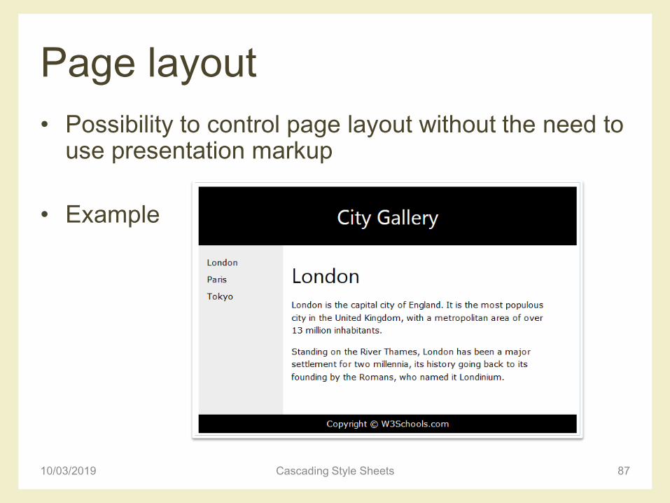
Page layout
• Possibility to control page layout without the need to use presentation markup
• Example
10/03/2019 Cascading Style Sheets 87
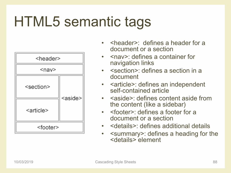
HTML5 semantic tags
• <header>: defines a header for a document or a section
• <nav>: defines a container for navigation links
• <section>: defines a section in a document
• <article>: defines an independent self-contained article
• <aside>: defines content aside from the content (like a sidebar)
• <footer>: defines a footer for a document or a section
• <details>: defines additional details
• <summary>: defines a heading for the <details> element
10/03/2019 Cascading Style Sheets 88
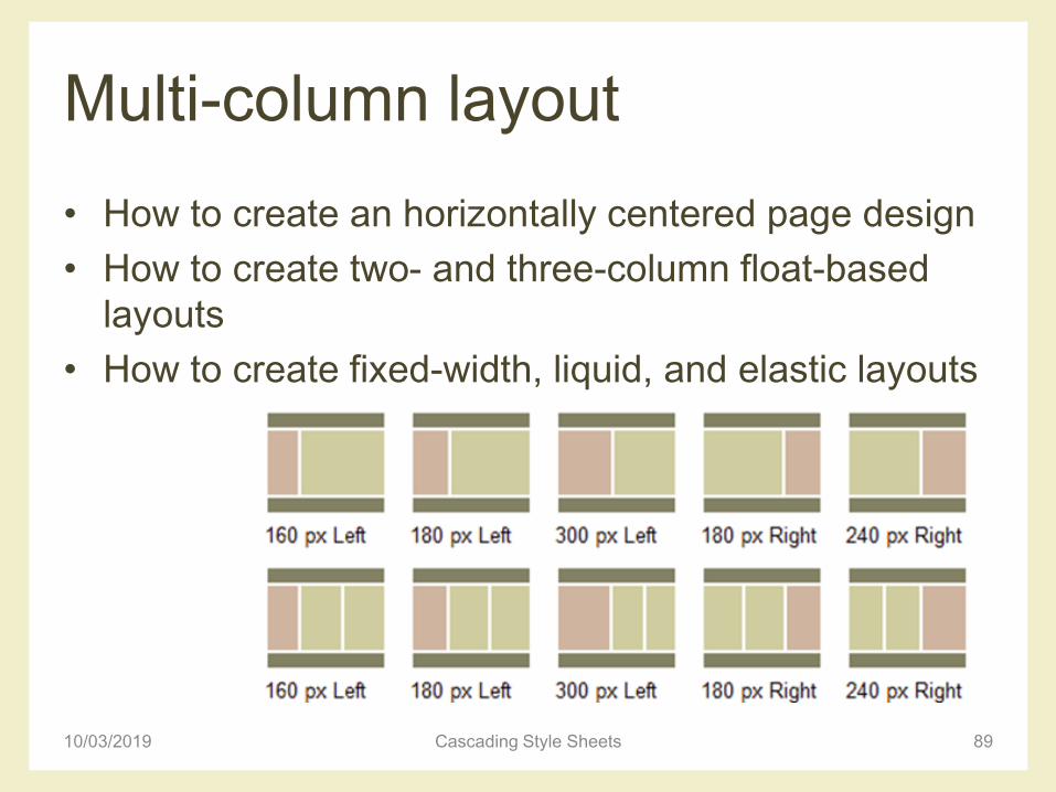
Multi-column layout
• How to create an horizontally centered page design
• How to create two- and three-column float-based
layouts
• How to create fixed-width, liquid, and elastic layouts
10/03/2019 Cascading Style Sheets 89
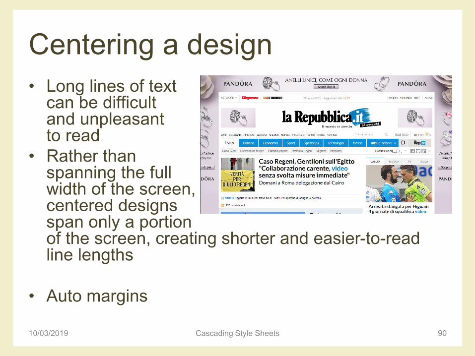
Centering a design
• Long lines of textcan be difficult and unpleasant to read
• Rather than spanning the full width of the screen, centered designs span only a portion of the screen, creating shorter and easier-to-read line lengths
• Auto margins
10/03/2019 Cascading Style Sheets 90
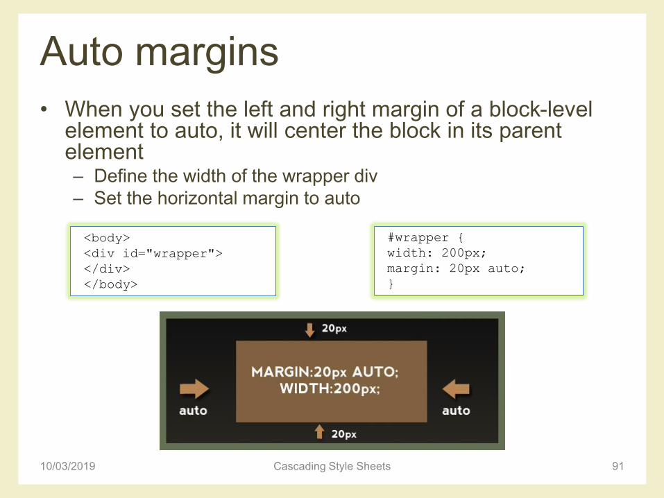
Auto margins
• When you set the left and right margin of a block-level element to auto, it will center the block in its parent element– Define the width of the wrapper div
– Set the horizontal margin to auto
10/03/2019 Cascading Style Sheets 91
<body>
<div id="wrapper">
</div>
</body>
#wrapper {
width: 200px;
margin: 20px auto;
}
Float-based layouts
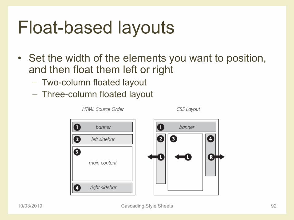
• Set the width of the elements you want to position, and then float them left or right– Two-column floated layout
– Three-column floated layout
10/03/2019 Cascading Style Sheets 92
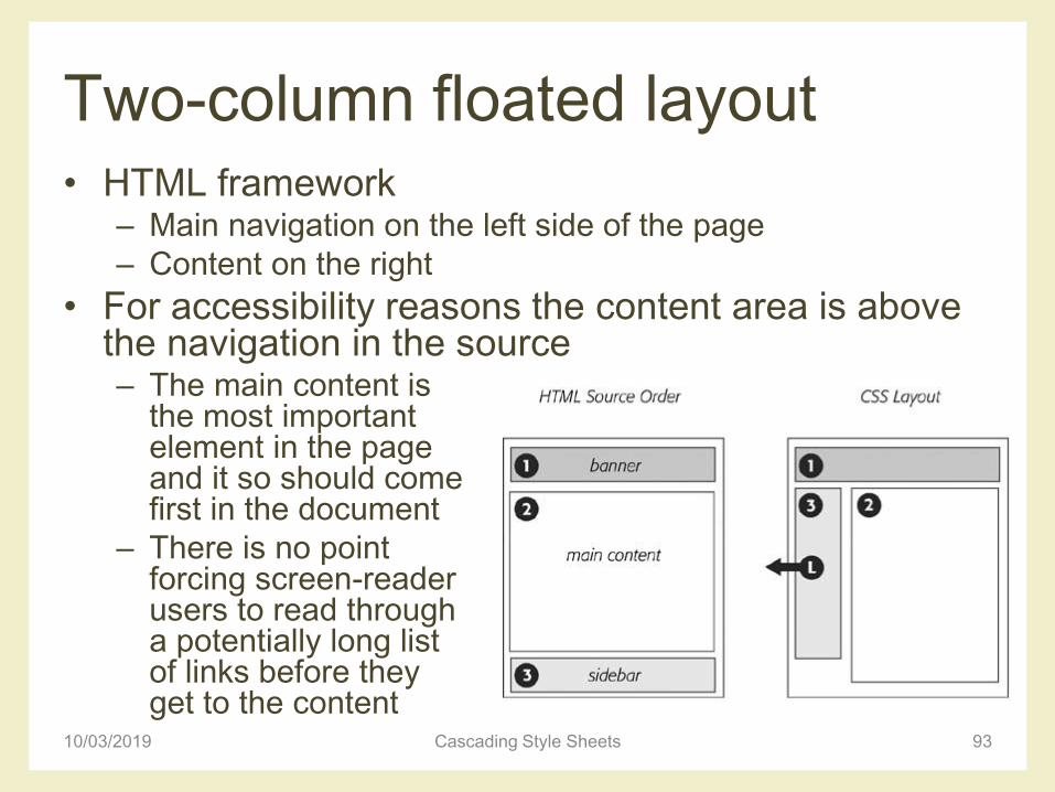
Two-column floated layout• HTML framework
– Main navigation on the left side of the page
– Content on the right
• For accessibility reasons the content area is above the navigation in the source– The main content is
the most important element in the pageand it so should come first in the document
– There is no point forcing screen-reader users to read through a potentially long list of links before they get to the content
10/03/2019 Cascading Style Sheets 93
Two-column floated layout
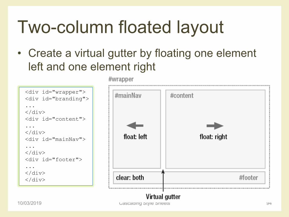
• Create a virtual gutter by floating one element
left and one element right
10/03/2019 Cascading Style Sheets 94
<div id="wrapper">
<div id="branding">
...
</div>
<div id="content">
...
</div>
<div id="mainNav">
...
</div>
<div id="footer">
...
</div>
</div>
Two-column floated layout
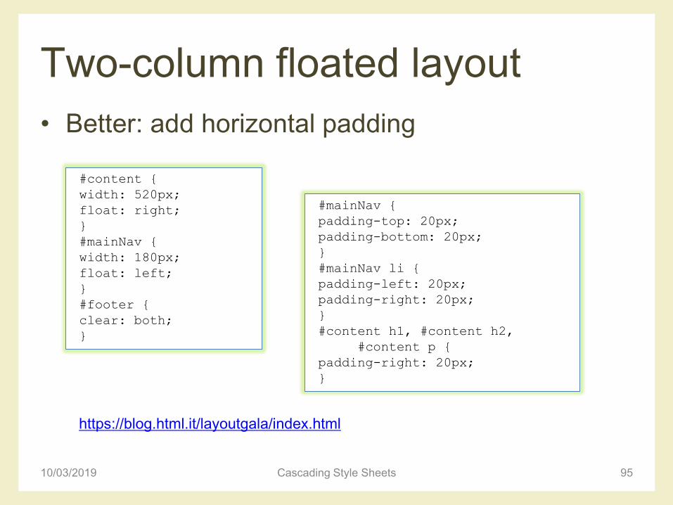
• Better: add horizontal padding
10/03/2019 Cascading Style Sheets 95
#content {
width: 520px;
float: right;
}
#mainNav {
width: 180px;
float: left;
}
#footer {
clear: both;
}
#mainNav {
padding-top: 20px;
padding-bottom: 20px;
}
#mainNav li {
padding-left: 20px;
padding-right: 20px;
}
#content h1, #content h2,
#content p {
padding-right: 20px;
}
https://blog.html.it/layoutgala/index.html

Three-column floated layout
• HTML framework– Two new divs inside the content div
• Float the main content left and the secondary content right, inside the already floated content div – Divides the second content column in two, creating a three-
column effect
10/03/2019 Cascading Style Sheets 96
<div id="content">
<div id="mainContent">
…
</div>
<div id="secondaryContent">
…
</div>
</div>
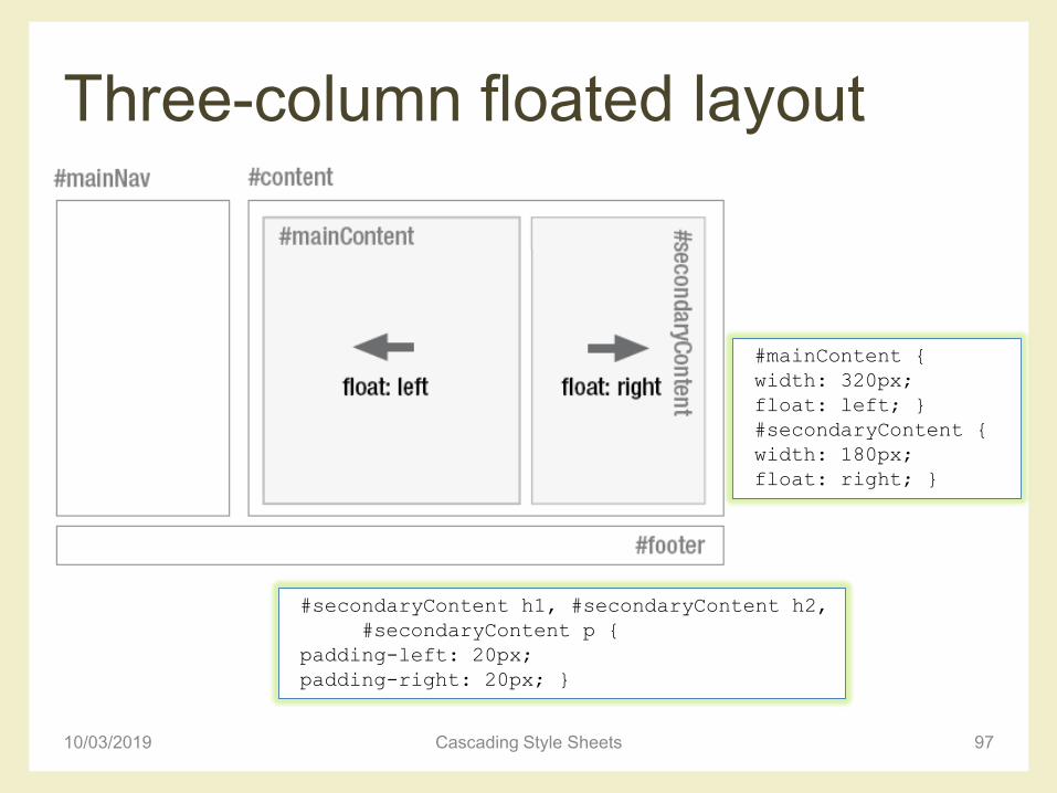
Three-column floated layout
10/03/2019 Cascading Style Sheets 97
#mainContent {
width: 320px;
float: left; }
#secondaryContent {
width: 180px;
float: right; }
#secondaryContent h1, #secondaryContent h2,
#secondaryContent p {
padding-left: 20px;
padding-right: 20px; }
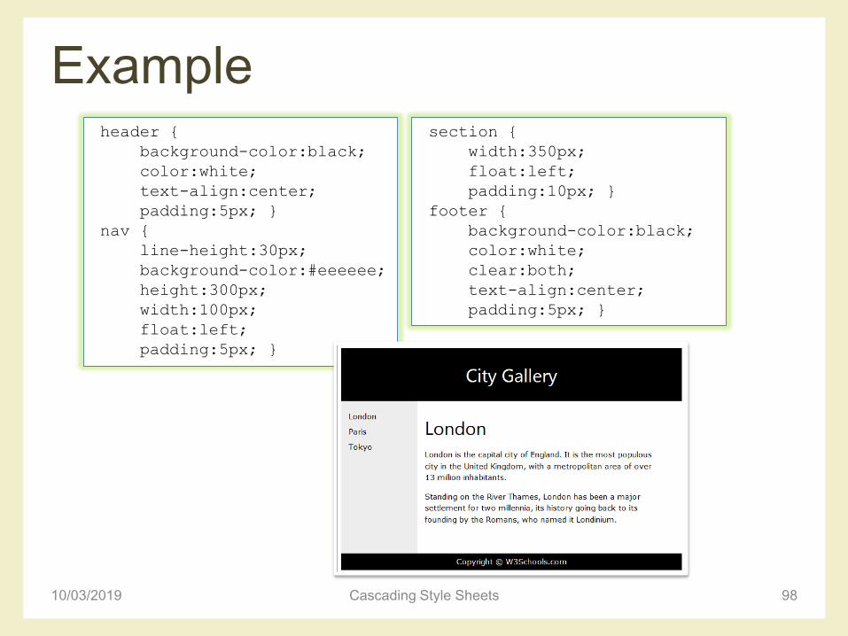
Example
10/03/2019 Cascading Style Sheets 98
header {
background-color:black;
color:white;
text-align:center;
padding:5px; }
nav {
line-height:30px;
background-color:#eeeeee;
height:300px;
width:100px;
float:left;
padding:5px; }
section {
width:350px;
float:left;
padding:10px; }
footer {
background-color:black;
color:white;
clear:both;
text-align:center;
padding:5px; }
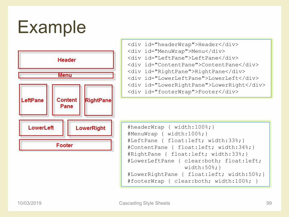
Example
10/03/2019 Cascading Style Sheets 99
<div id="headerWrap">Header</div>
<div id="MenuWrap">Menu</div>
<div id="LeftPane">LeftPane</div>
<div id="ContentPane">ContentPane</div>
<div id="RightPane">RightPane</div>
<div id="LowerLeftPane">LowerLeft</div>
<div id="LowerRightPane">LowerRight</div>
<div id="footerWrap">Footer</div>
#headerWrap { width:100%;}
#MenuWrap { width:100%;}
#LeftPane { float:left; width:33%;}
#ContentPane { float:left; width:34%;}
#RightPane { float:left; width:33%;}
#LowerLeftPane { clear:both; float:left;
width:50%;}
#LowerRightPane { float:left; width:50%;}
#footerWrap { clear:both; width:100%; }
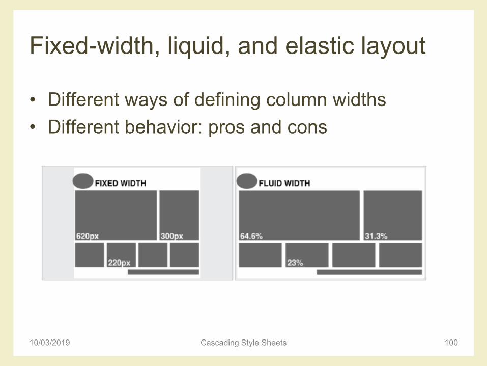
Fixed-width, liquid, and elastic layout
• Different ways of defining column widths
• Different behavior: pros and cons
10/03/2019 Cascading Style Sheets 100
Fixed-width layout
• Column widths defined in pixels
• Very common: they give the developer more control over layout and positioning
• Downsides– Do not make good use of the available space:
columns are always the same size no matter the window size
– Usually work well with the browser default text size, but if you increase the text size a couple of steps, sidebars start running out of space and the line lengths get too short to comfortably read
10/03/2019 Cascading Style Sheets 101
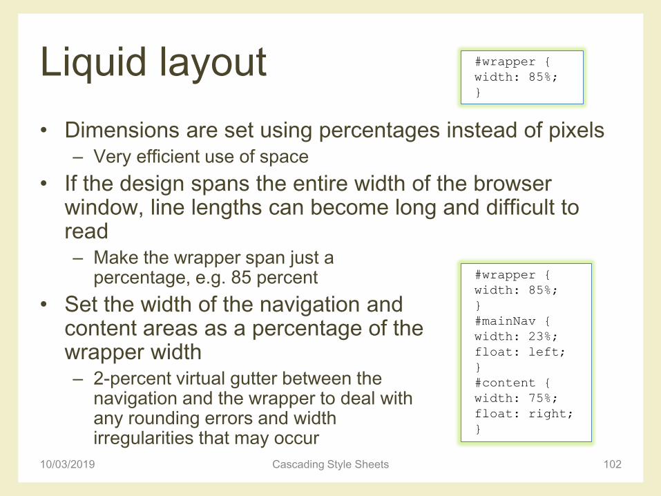
Liquid layout
• Dimensions are set using percentages instead of pixels– Very efficient use of space
• If the design spans the entire width of the browser window, line lengths can become long and difficult to read– Make the wrapper span just a
percentage, e.g. 85 percent
• Set the width of the navigation and content areas as a percentage of the wrapper width– 2-percent virtual gutter between the
navigation and the wrapper to deal with any rounding errors and width irregularities that may occur
10/03/2019 Cascading Style Sheets 102
#wrapper {
width: 85%;
}
#wrapper {
width: 85%;
}
#mainNav {
width: 23%;
float: left;
}
#content {
width: 75%;
float: right;
}
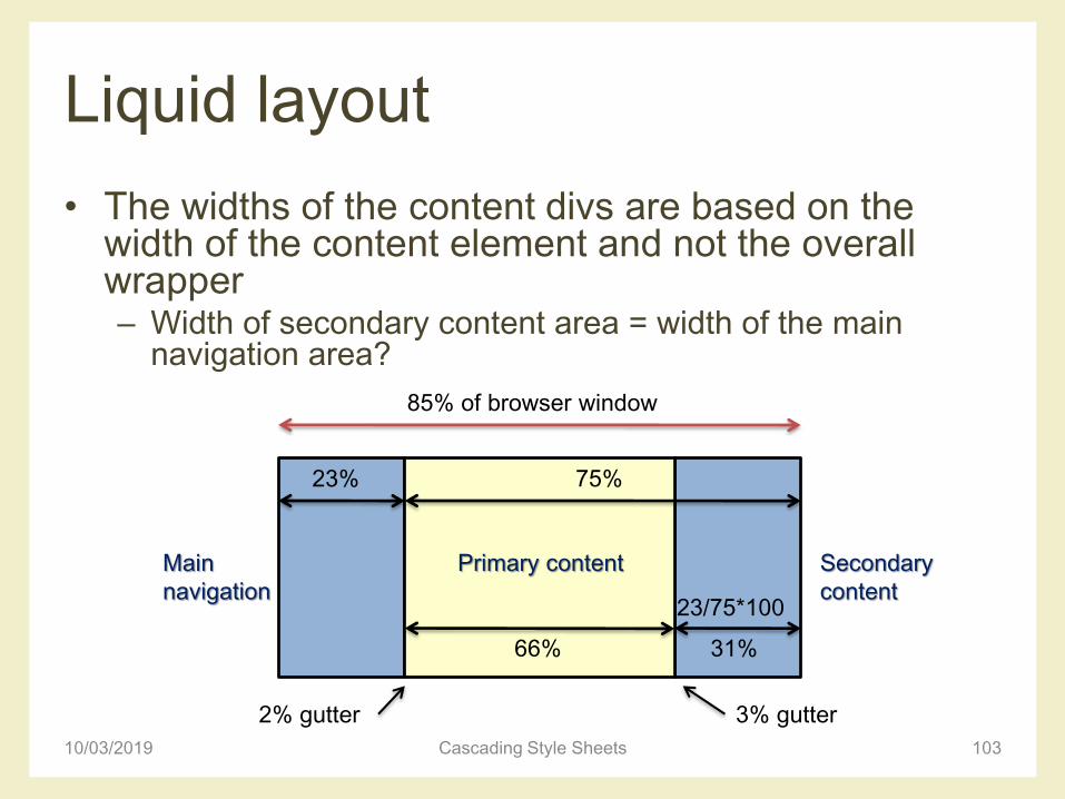
Liquid layout
• The widths of the content divs are based on the width of the content element and not the overall wrapper– Width of secondary content area = width of the main
navigation area?
10/03/2019 Cascading Style Sheets 103
Primary content Secondary
content
Main
navigation
85% of browser window
23% 75%
31%
23/75*100
66%
2% gutter 3% gutter

Liquid layout
• 3 columns liquid layout
10/03/2019 Cascading Style Sheets 104
#wrapper {
width: 85%;
}
#mainNav {
width: 23%;
float: left;
}
#content {
width: 75%;
float: right;
}
#mainContent {
width: 66%;
float: left;
}
#secondaryContent {
width: 31%;
float: right;
}
Primary content
23% 75%
31%
23/75*100
66%
Elastic layout
• With liquid layouts– Line lengths can get uncomfortably long on large resolution
monitors
– Lines can become very short and fragmented in narrow windows or when the text size is increased a couple of steps
• In elastic layouts the width of elements is relative to the font size (ems) instead of the browser width– When the font size is increased the whole layout scales
• Allows to keep line lengths to a readable size – Particularly useful for people with reduced vision
10/03/2019 Cascading Style Sheets 105
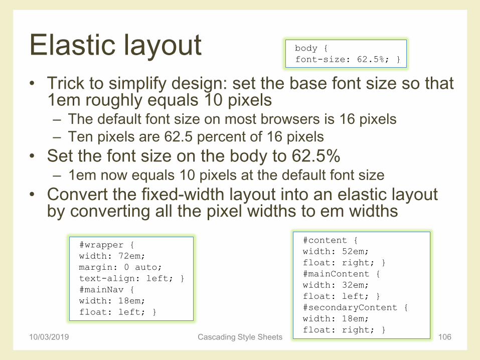
Elastic layout• Trick to simplify design: set the base font size so that
1em roughly equals 10 pixels– The default font size on most browsers is 16 pixels
– Ten pixels are 62.5 percent of 16 pixels
• Set the font size on the body to 62.5%– 1em now equals 10 pixels at the default font size
• Convert the fixed-width layout into an elastic layout by converting all the pixel widths to em widths
10/03/2019 Cascading Style Sheets 106
body {
font-size: 62.5%; }
#wrapper {
width: 72em;
margin: 0 auto;
text-align: left; }
#mainNav {
width: 18em;
float: left; }
#content {
width: 52em;
float: right; }
#mainContent {
width: 32em;
float: left; }
#secondaryContent {
width: 18em;
float: right; }
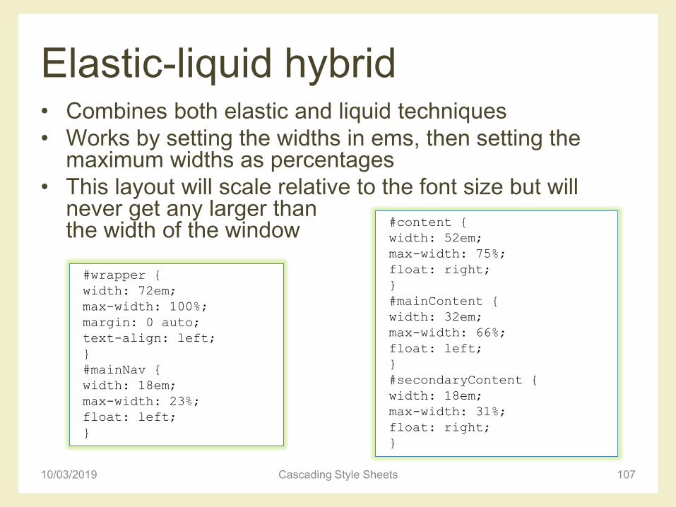
Elastic-liquid hybrid• Combines both elastic and liquid techniques
• Works by setting the widths in ems, then setting the maximum widths as percentages
• This layout will scale relative to the font size but will never get any larger than the width of the window
10/03/2019 Cascading Style Sheets 107
#wrapper {
width: 72em;
max-width: 100%;
margin: 0 auto;
text-align: left;
}
#mainNav {
width: 18em;
max-width: 23%;
float: left;
}
#content {
width: 52em;
max-width: 75%;
float: right;
}
#mainContent {
width: 32em;
max-width: 66%;
float: left;
}
#secondaryContent {
width: 18em;
max-width: 31%;
float: right;
}
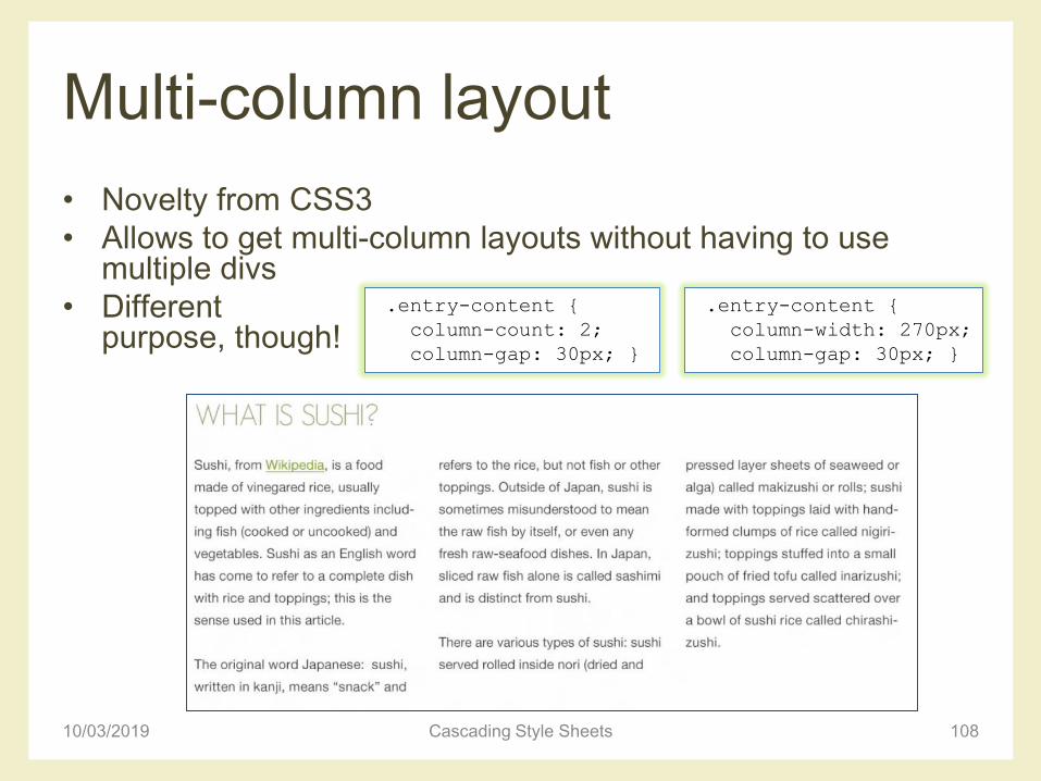
Multi-column layout
• Novelty from CSS3
• Allows to get multi-column layouts without having to use multiple divs
• Different purpose, though!
10/03/2019 Cascading Style Sheets 108
.entry-content {
column-count: 2;
column-gap: 30px; }
.entry-content {
column-width: 270px;
column-gap: 30px; }
Multi-column layout
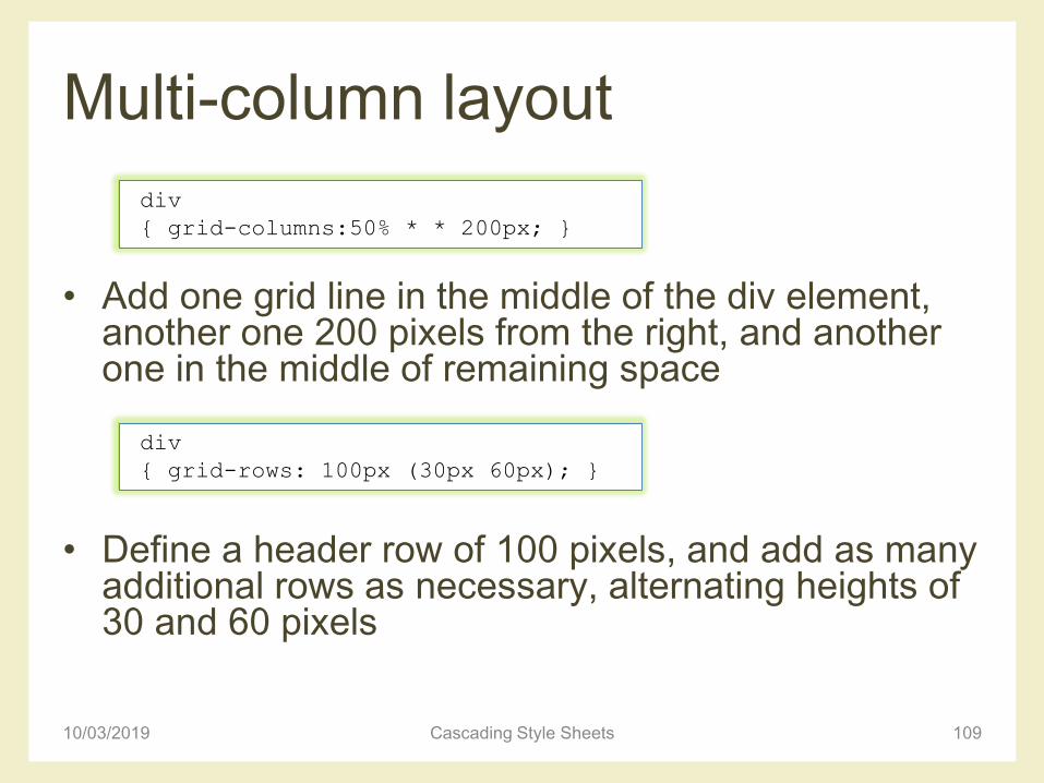
• Add one grid line in the middle of the div element, another one 200 pixels from the right, and another one in the middle of remaining space
• Define a header row of 100 pixels, and add as many additional rows as necessary, alternating heights of 30 and 60 pixels
10/03/2019 Cascading Style Sheets 109
div
{ grid-columns:50% * * 200px; }
div
{ grid-rows: 100px (30px 60px); }
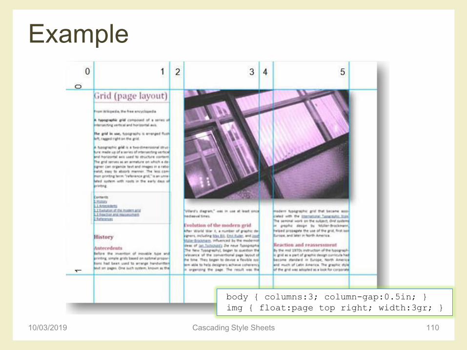
Example
10/03/2019 Cascading Style Sheets 110
body { columns:3; column-gap:0.5in; }
img { float:page top right; width:3gr; }
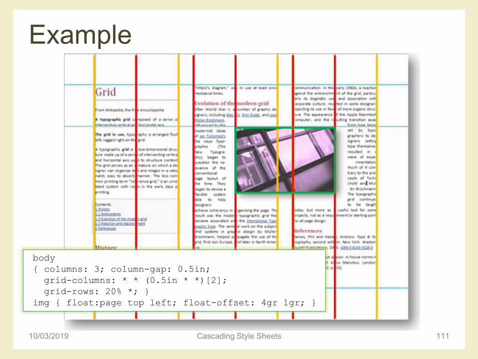
Example
10/03/2019 Cascading Style Sheets 111
body
{ columns: 3; column-gap: 0.5in;
grid-columns: * * (0.5in * *)[2];
grid-rows: 20% *; }
img { float:page top left; float-offset: 4gr 1gr; }
Advanced layout: grid
10/03/2019 Cascading Style Sheets 112
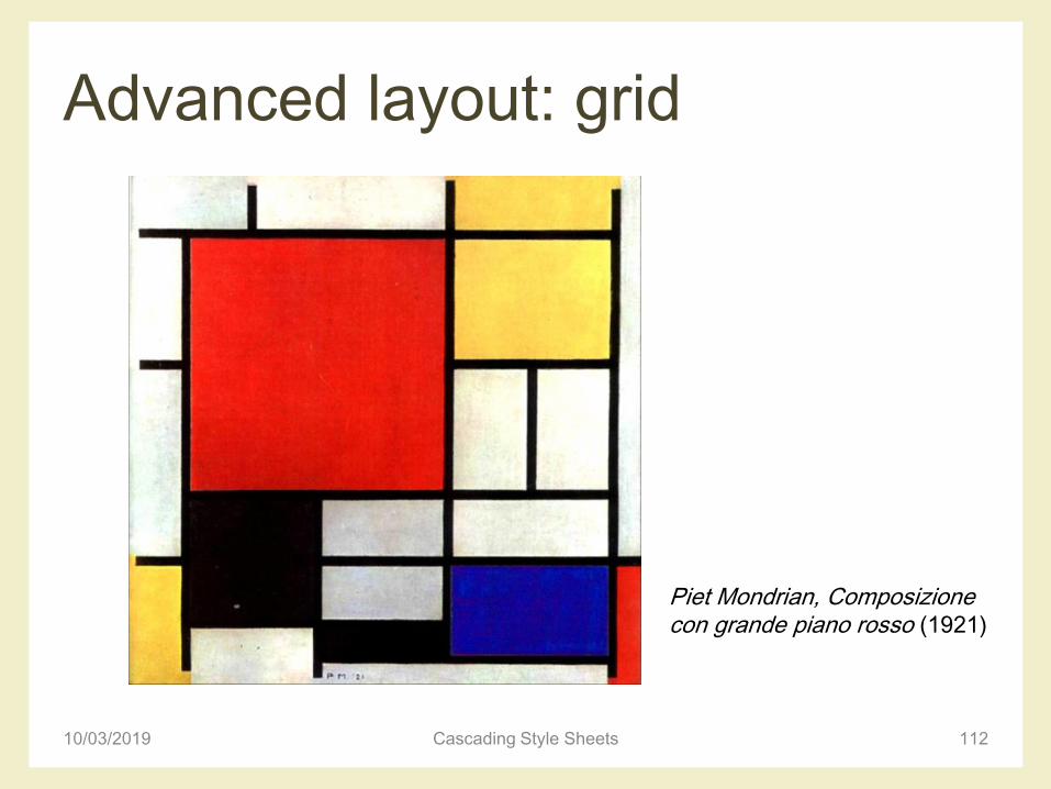
Piet Mondrian, Composizione con grande piano rosso (1921)
Advanced layout: grid
10/03/2019 Cascading Style Sheets 113
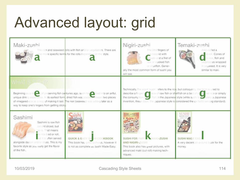
Advanced layout: grid
10/03/2019 Cascading Style Sheets 114
Advanced layout: grid
• It is possible to define a grid in which content can
flow or be placed, or that remain empty
• There are three ways to define a grid
– Explicit grid: defined with ‘grid-columns’ and ‘grid-rows’
properties
– Natural grid: automatically created by elements with a
natural grid structure (multi-column elements and tables)
– Default grid: all other block elements define a single-cell
grid
10/03/2019 Cascading Style Sheets 115
Example
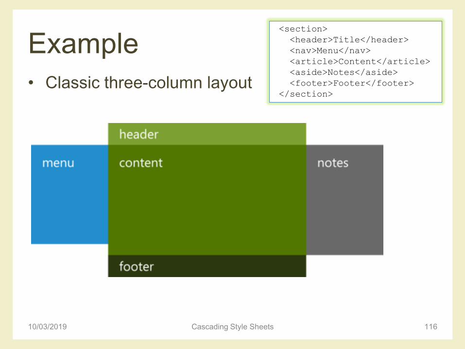
• Classic three-column layout
10/03/2019 Cascading Style Sheets 116
<section>
<header>Title</header>
<nav>Menu</nav>
<article>Content</article>
<aside>Notes</aside>
<footer>Footer</footer>
</section>
Virtual grid
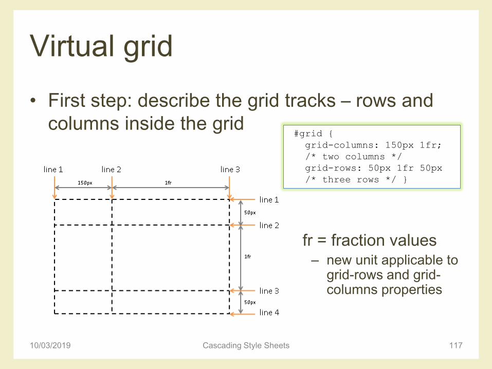
• First step: describe the grid tracks – rows and
columns inside the grid
10/03/2019 Cascading Style Sheets 117
#grid {
grid-columns: 150px 1fr;
/* two columns */
grid-rows: 50px 1fr 50px
/* three rows */ }
fr = fraction values– new unit applicable to
grid-rows and grid-columns properties
Virtual grid
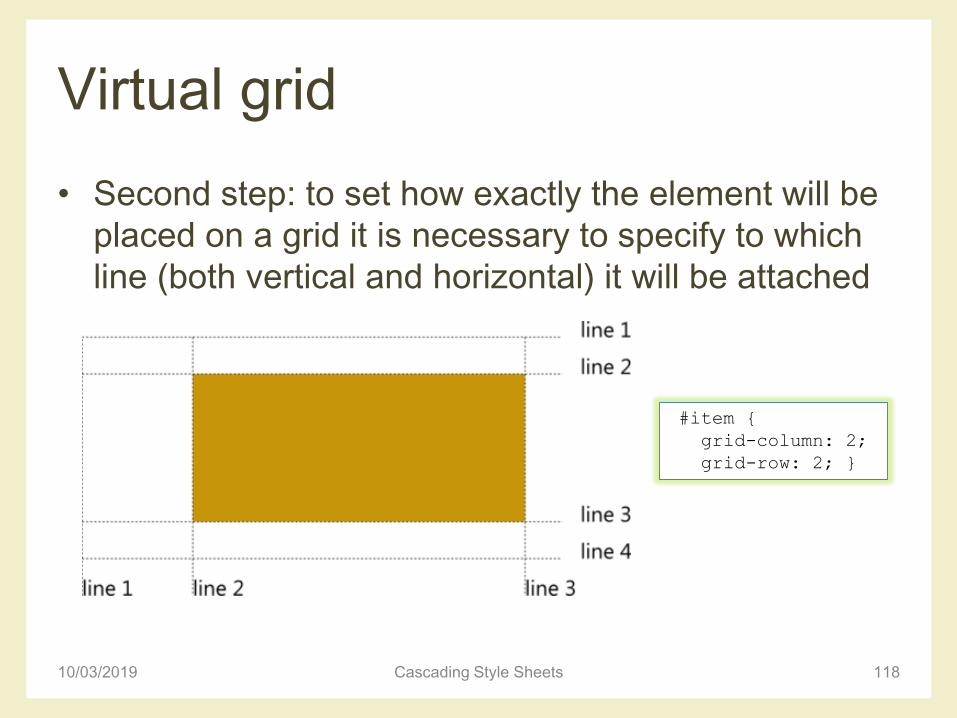
• Second step: to set how exactly the element will be
placed on a grid it is necessary to specify to which
line (both vertical and horizontal) it will be attached
10/03/2019 Cascading Style Sheets 118
#item {
grid-column: 2;
grid-row: 2; }
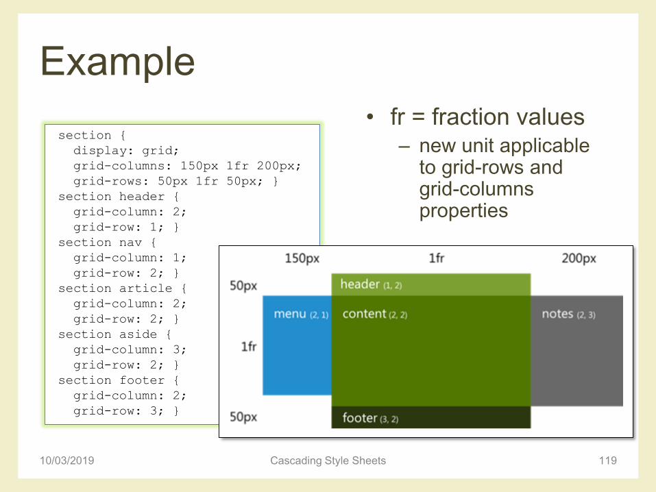
Example
• fr = fraction values– new unit applicable
to grid-rows and grid-columns properties
10/03/2019 Cascading Style Sheets 119
section {
display: grid;
grid-columns: 150px 1fr 200px;
grid-rows: 50px 1fr 50px; }
section header {
grid-column: 2;
grid-row: 1; }
section nav {
grid-column: 1;
grid-row: 2; }
section article {
grid-column: 2;
grid-row: 2; }
section aside {
grid-column: 3;
grid-row: 2; }
section footer {
grid-column: 2;
grid-row: 3; }
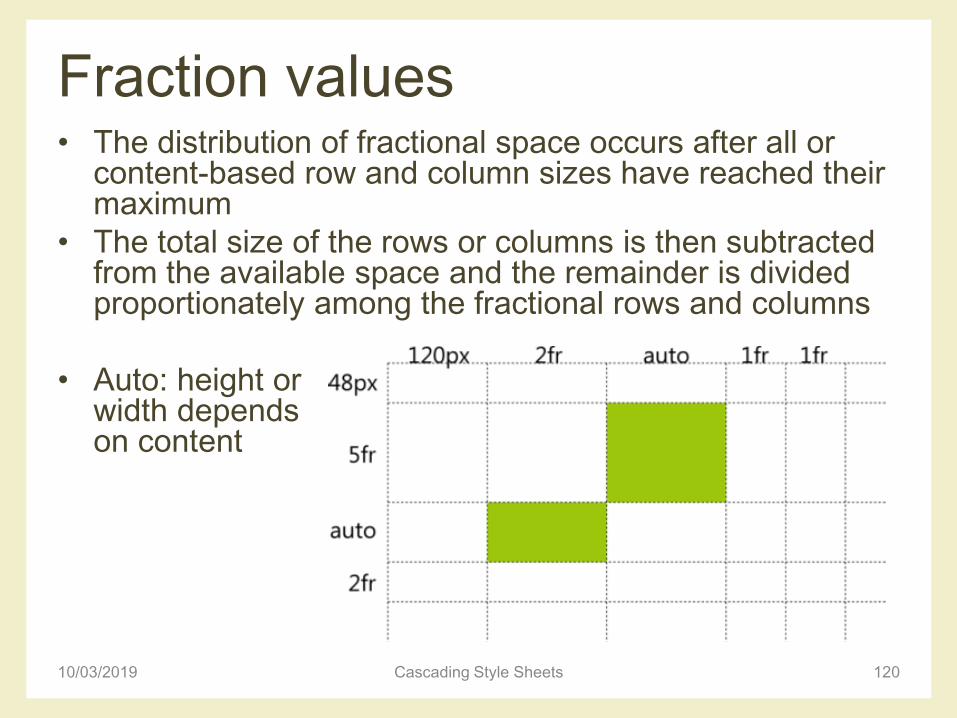
Fraction values• The distribution of fractional space occurs after all or
content-based row and column sizes have reached their maximum
• The total size of the rows or columns is then subtracted from the available space and the remainder is divided proportionately among the fractional rows and columns
• Auto: height or width depends on content
10/03/2019 Cascading Style Sheets 120
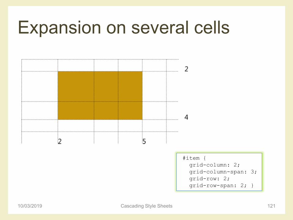
Expansion on several cells
10/03/2019 Cascading Style Sheets 121
#item {
grid-column: 2;
grid-column-span: 3;
grid-row: 2;
grid-row-span: 2; }
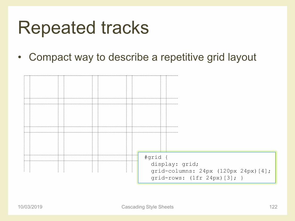
Repeated tracks
• Compact way to describe a repetitive grid layout
10/03/2019 Cascading Style Sheets 122
#grid {
display: grid;
grid-columns: 24px (120px 24px)[4];
grid-rows: (1fr 24px)[3]; }
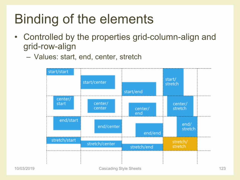
Binding of the elements
• Controlled by the properties grid-column-align and grid-row-align– Values: start, end, center, stretch
10/03/2019 Cascading Style Sheets 123
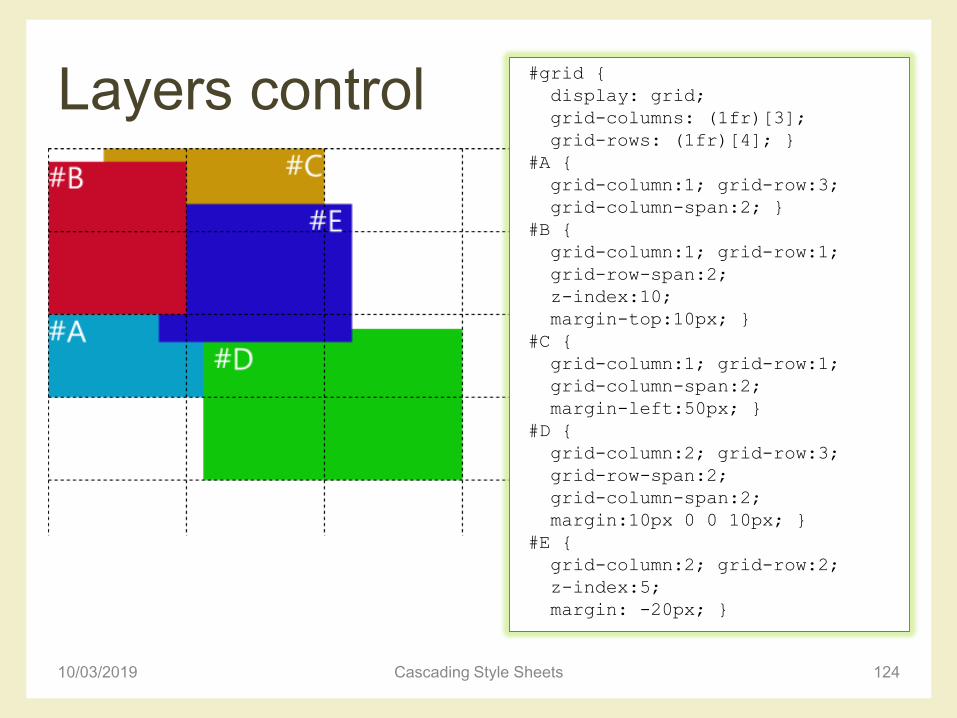
Layers control
10/03/2019 Cascading Style Sheets 124
#grid {
display: grid;
grid-columns: (1fr)[3];
grid-rows: (1fr)[4]; }
#A {
grid-column:1; grid-row:3;
grid-column-span:2; }
#B {
grid-column:1; grid-row:1;
grid-row-span:2;
z-index:10;
margin-top:10px; }
#C {
grid-column:1; grid-row:1;
grid-column-span:2;
margin-left:50px; }
#D {
grid-column:2; grid-row:3;
grid-row-span:2;
grid-column-span:2;
margin:10px 0 0 10px; }
#E {
grid-column:2; grid-row:2;
z-index:5;
margin: -20px; }
CSS FLEXBOX
10/03/2019 Cascading Style Sheets 125
Flexbox
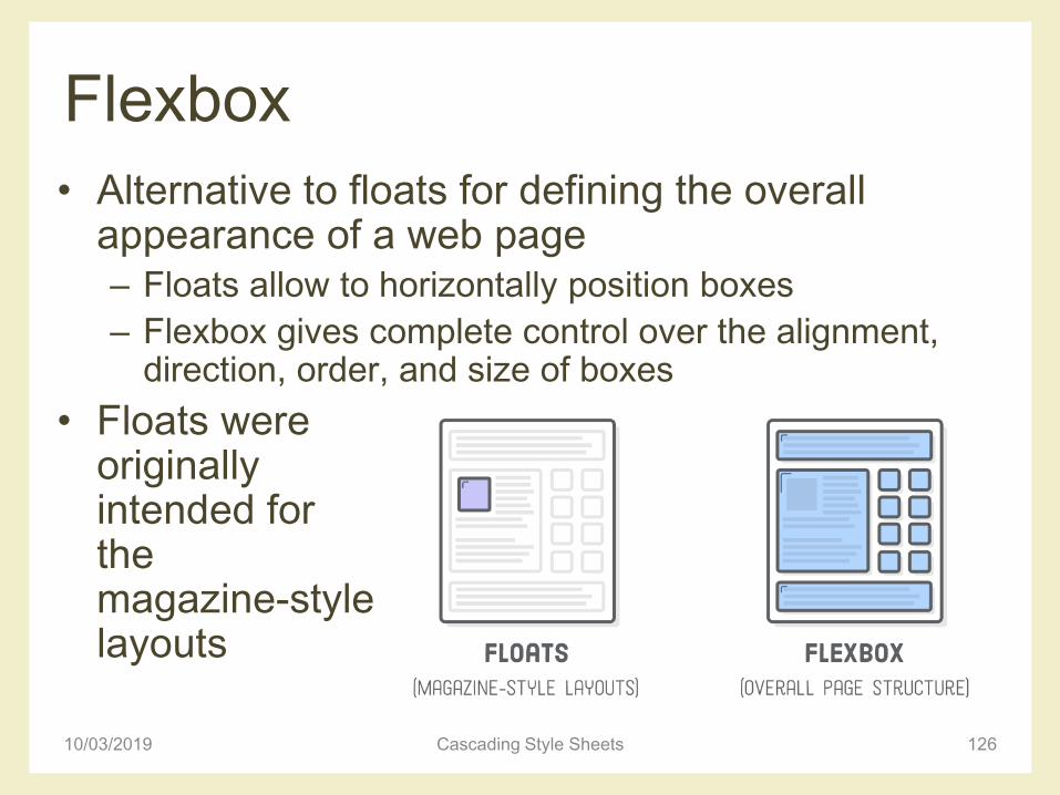
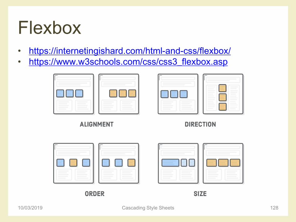
• Alternative to floats for defining the overall appearance of a web page– Floats allow to horizontally position boxes
– Flexbox gives complete control over the alignment, direction, order, and size of boxes
• Floats were originally intended for the magazine-stylelayouts
10/03/2019 Cascading Style Sheets 126
Flexbox vs floats
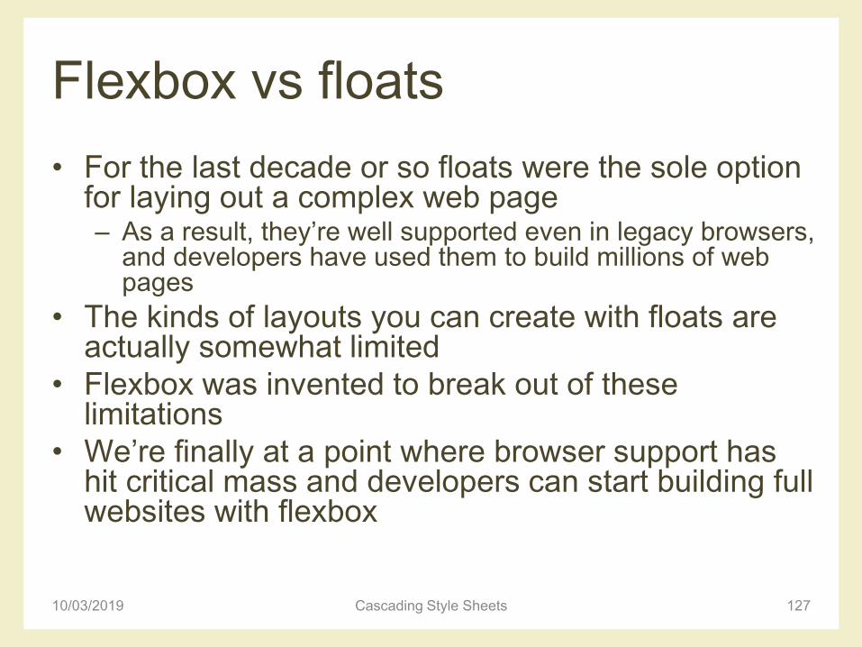
• For the last decade or so floats were the sole option for laying out a complex web page– As a result, they’re well supported even in legacy browsers,
and developers have used them to build millions of web pages
• The kinds of layouts you can create with floats are actually somewhat limited
• Flexbox was invented to break out of these limitations
• We’re finally at a point where browser support has hit critical mass and developers can start building full websites with flexbox
10/03/2019 Cascading Style Sheets 127
Flexbox • https://internetingishard.com/html-and-css/flexbox/
• https://www.w3schools.com/css/css3_flexbox.asp
10/03/2019 Cascading Style Sheets 128
Flexbox
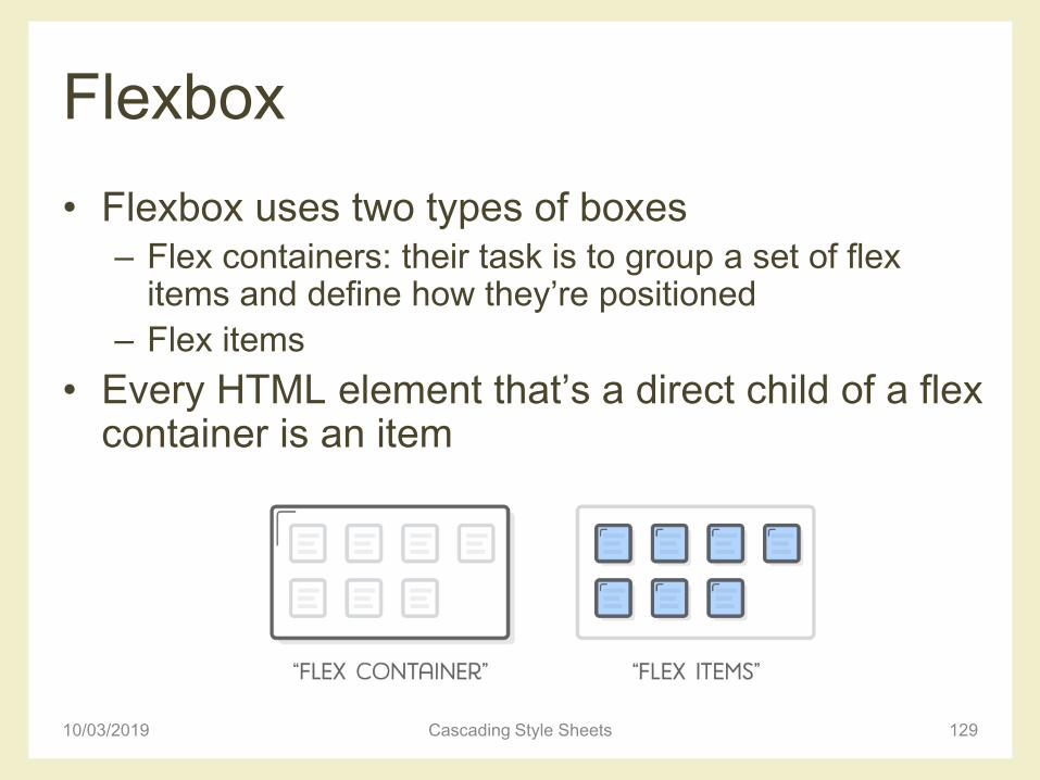
• Flexbox uses two types of boxes – Flex containers: their task is to group a set of flex
items and define how they’re positioned
– Flex items
• Every HTML element that’s a direct child of a flex container is an item
10/03/2019 Cascading Style Sheets 129
Horizontal alignment
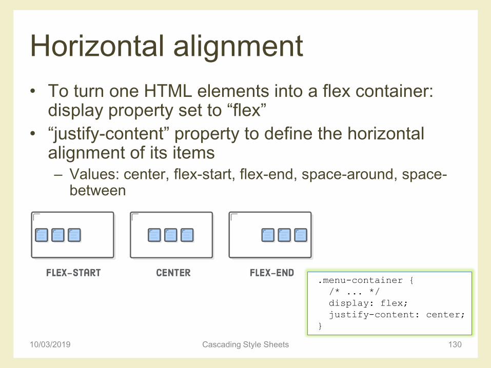
• To turn one HTML elements into a flex container: display property set to “flex”
• “justify-content” property to define the horizontal alignment of its items– Values: center, flex-start, flex-end, space-around, space-
between
10/03/2019 Cascading Style Sheets 130
.menu-container {
/* ... */
display: flex;
justify-content: center;
}
Distribution
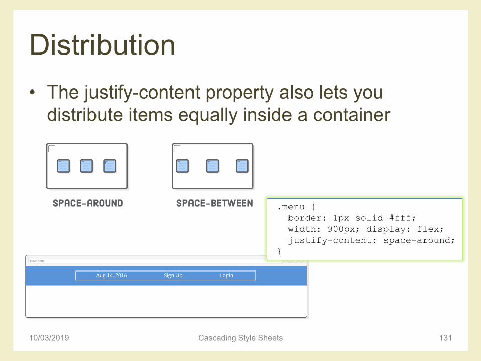
• The justify-content property also lets you
distribute items equally inside a container
10/03/2019 Cascading Style Sheets 131
.menu {
border: 1px solid #fff;
width: 900px; display: flex;
justify-content: space-around;
}
Grouping
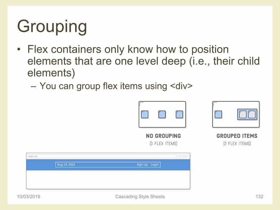
• Flex containers only know how to position elements that are one level deep (i.e., their child elements)– You can group flex items using <div>
10/03/2019 Cascading Style Sheets 132
Vertical alignment
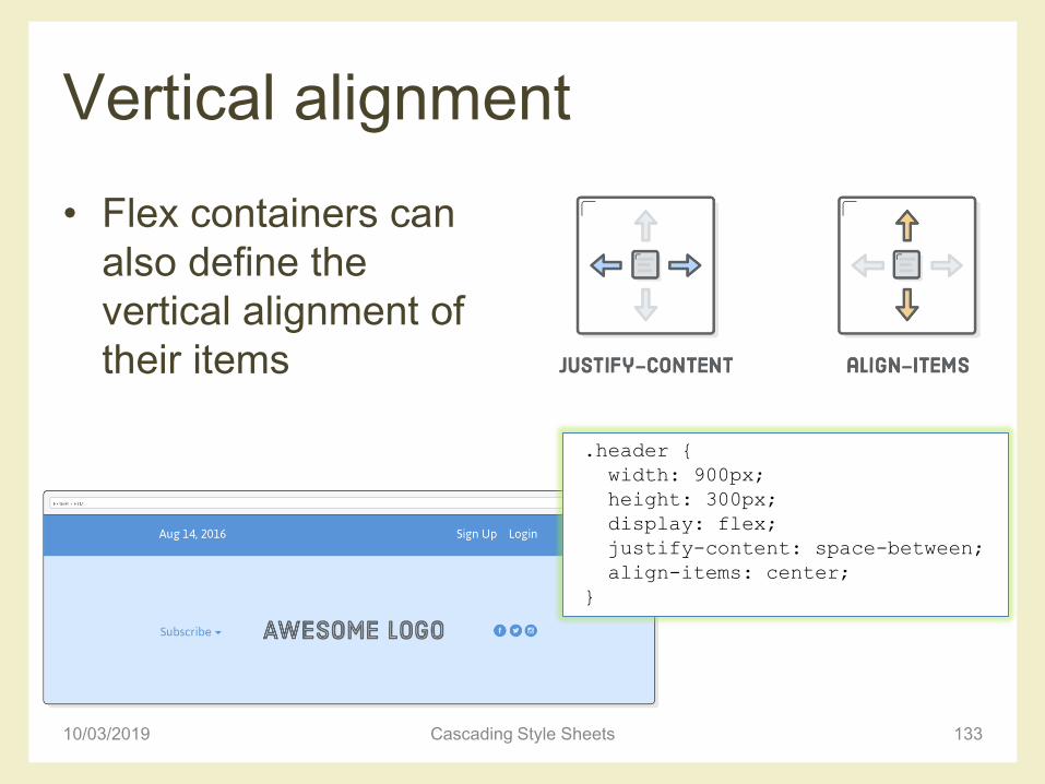
• Flex containers can
also define the
vertical alignment of
their items
10/03/2019 Cascading Style Sheets 133
.header {
width: 900px;
height: 300px;
display: flex;
justify-content: space-between;
align-items: center;
}
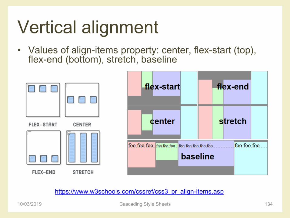
Vertical alignment• Values of align-items property: center, flex-start (top),
flex-end (bottom), stretch, baseline
10/03/2019 Cascading Style Sheets 134
https://www.w3schools.com/cssref/css3_pr_align-items.asp
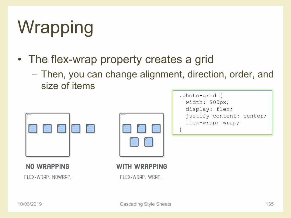
Wrapping
• The flex-wrap property creates a grid
– Then, you can change alignment, direction, order, and
size of items
10/03/2019 Cascading Style Sheets 135
.photo-grid {
width: 900px;
display: flex;
justify-content: center;
flex-wrap: wrap;
}
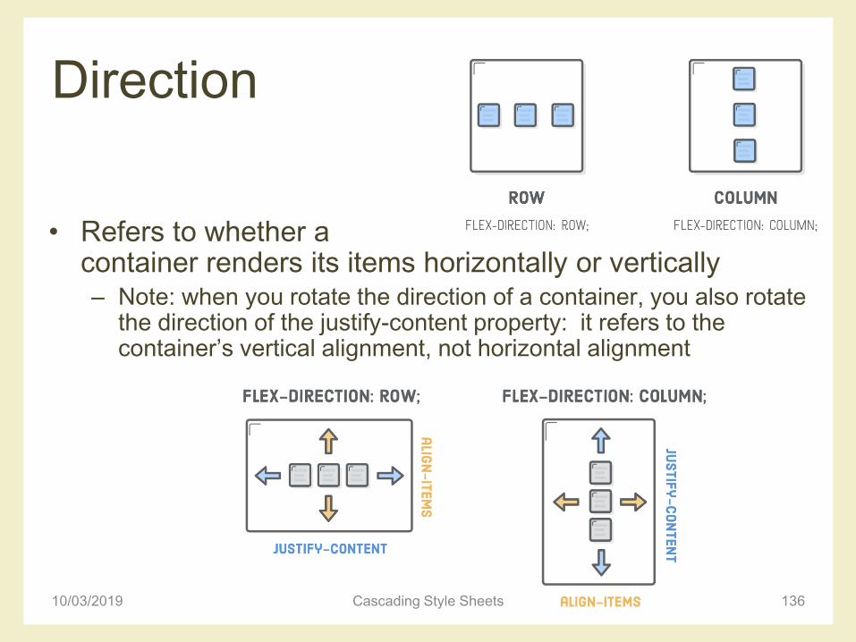
Direction
• Refers to whether a container renders its items horizontally or vertically– Note: when you rotate the direction of a container, you also rotate
the direction of the justify-content property: it refers to the container’s vertical alignment, not horizontal alignment
10/03/2019 Cascading Style Sheets 136

Order
• The flex-direction property can also control the order in which items appear– row-reverse and column-
reverse properties
• Can modify default HTML rendering
10/03/2019 Cascading Style Sheets 137
.photo-grid {
width: 900px;
display: flex;
justify-content: center;
flex-wrap: wrap;
flex-direction: row-reverse;
align-items: center;
}
Flex items order and alignment
• It’s also possible to manipulate individual items
• order property
– Default is 0, increasing or decreasing it moves the
item to the right or left, respectively
• align-self property
– Overrides the align-items value from its container
• Values: center, flex-start (top), flex-end (bottom),
stretch, baseline
10/03/2019 Cascading Style Sheets 138
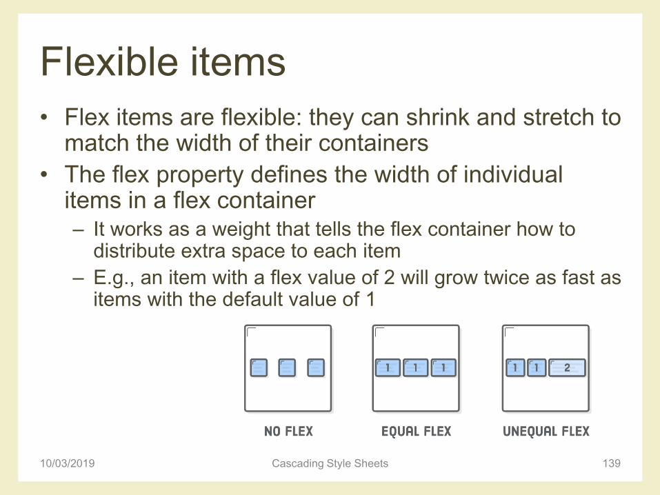
Flexible items
• Flex items are flexible: they can shrink and stretch to match the width of their containers
• The flex property defines the width of individual items in a flex container– It works as a weight that tells the flex container how to
distribute extra space to each item
– E.g., an item with a flex value of 2 will grow twice as fast as items with the default value of 1
10/03/2019 Cascading Style Sheets 139
Flexible items
10/03/2019 Cascading Style Sheets 140
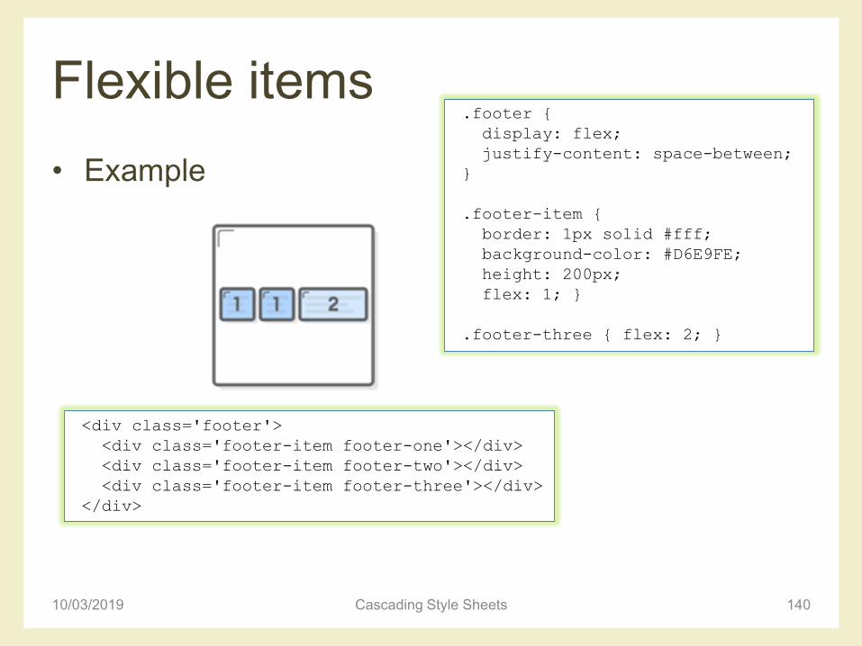
<div class='footer'>
<div class='footer-item footer-one'></div>
<div class='footer-item footer-two'></div>
<div class='footer-item footer-three'></div>
</div>
• Example
.footer {
display: flex;
justify-content: space-between;
}
.footer-item {
border: 1px solid #fff;
background-color: #D6E9FE;
height: 200px;
flex: 1; }
.footer-three { flex: 2; }
Summary of CSS flexbox
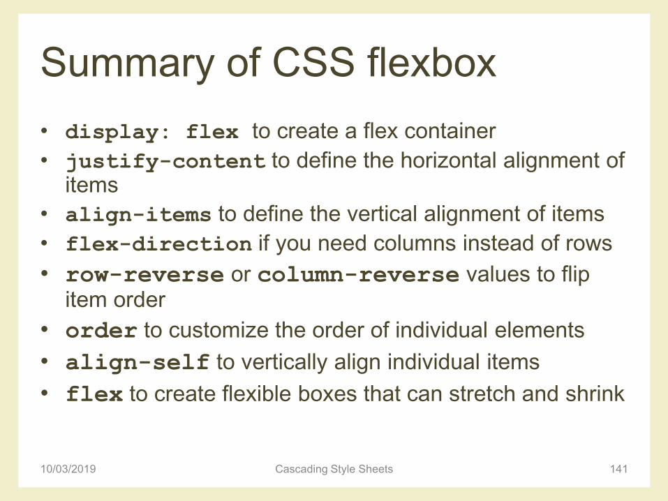
• display: flex to create a flex container
• justify-content to define the horizontal alignment of items
• align-items to define the vertical alignment of items
• flex-direction if you need columns instead of rows
• row-reverse or column-reverse values to flip item order
• order to customize the order of individual elements
• align-self to vertically align individual items
• flex to create flexible boxes that can stretch and shrink
10/03/2019 Cascading Style Sheets 141

Grid layout with flexbox
10/03/2019 Cascading Style Sheets 142
• Example– http://www.html.it/guide/esempi/flexbox/8.%20colonne-
wrap-flex.html
References for CSS flexbox
• Interneting is hard flexbox tutorial
– https://internetingishard.com/html-and-css/flexbox/
• A complete guide to flexbox
– https://css-tricks.com/snippets/css/a-guide-to-flexbox/
• W3schools
– https://www.w3schools.com/css/css3_flexbox.asp
• Flexbox, guida pratica
– http://www.html.it/guide/flexbox-guida-pratica/
10/03/2019 Cascading Style Sheets 143
License
• This work is licensed under the Creative Commons “Attribution-NonCommercial-ShareAlike Unported (CC BY-NC-SA 3,0)” License.
• You are free:– to Share - to copy, distribute and transmit the work
– to Remix - to adapt the work
• Under the following conditions:– Attribution - You must attribute the work in the manner specified by the
author or licensor (but not in any way that suggests that they endorse you or your use of the work).
– Noncommercial - You may not use this work for commercial purposes.
– Share Alike - If you alter, transform, or build upon this work, you may distribute the resulting work only under the same or similar license to this one.
• To view a copy of this license, visit http://creativecommons.org/license/by-nc-sa/3.0/
10/03/2019 Cascading Style Sheets 144