CSS: Cascading Style Sheets - polito.it · CSS: Cascading Style Sheets MORE PROPERTIES AND...
78
CSS: Cascading Style Sheets MORE PROPERTIES AND APPLICATION EXAMPLES Laura Farinetti - DAUIN
Transcript of CSS: Cascading Style Sheets - polito.it · CSS: Cascading Style Sheets MORE PROPERTIES AND...

CSS: Cascading
Style SheetsMORE PROPERTIES ANDAPPLICATION EXAMPLES
Laura Farinetti - DAUIN
Summary
• More CSS properties– Colors and backgrounds
– Text
– Borders
– Transformations
– Transitions
• Sample applications– Vertical navigation bars
– Horizontal navigation bars
– Image maps
– Form styles
07/03/2017 Cascading Style Sheets 2
MORE CSS PROPERTIES
07/03/2017 Cascading Style Sheets 3

RGBA color and opacity
• RGBA color – Like RGB color definitions, but allows a fourth field,
defining the alpha value of the color being applied
– Like opacity, the alpha value is between 0.0 (fully transparent) and 1.0 (fully opaque)
07/03/2017 Cascading Style Sheets 4
div { color: rgb(0,255,0); }
div { color: rgba(0,255,0,0.5); }

HSLA color and opacity
• HSLA color
– Like HSL color, but allows a fourth field, defining the
alpha value of the color being applied
07/03/2017 Cascading Style Sheets 5
div { color: hsl(240,50%,50%); }
div { color: hsla(240,50%,50%,0.5); }
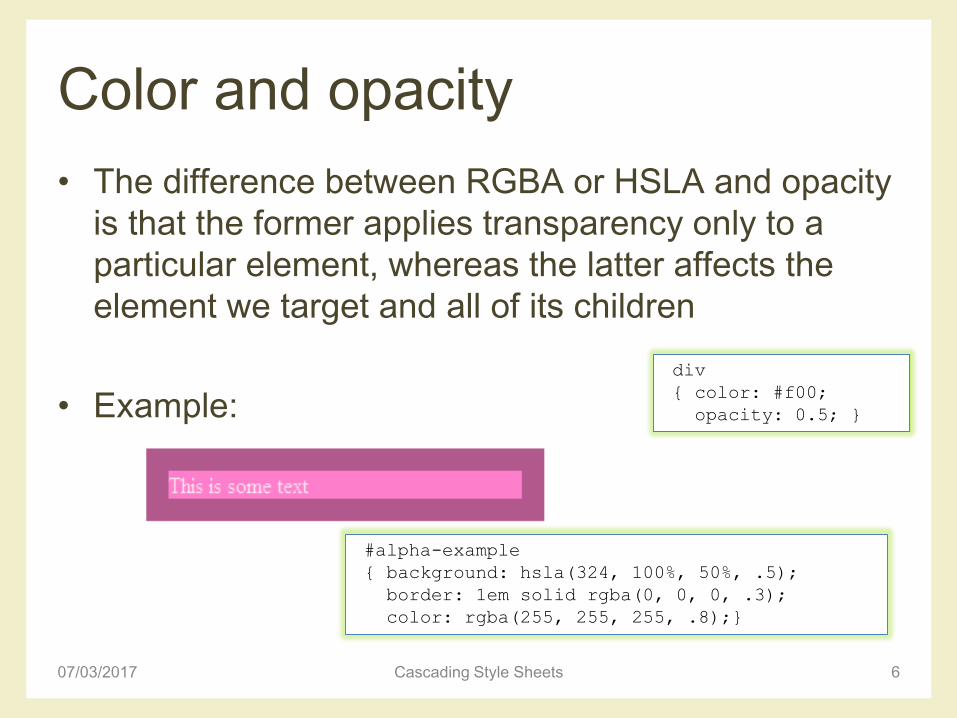
Color and opacity
• The difference between RGBA or HSLA and opacity
is that the former applies transparency only to a
particular element, whereas the latter affects the
element we target and all of its children
• Example:
07/03/2017 Cascading Style Sheets 6
div
{ color: #f00;
opacity: 0.5; }
#alpha-example
{ background: hsla(324, 100%, 50%, .5);
border: 1em solid rgba(0, 0, 0, .3);
color: rgba(255, 255, 255, .8);}
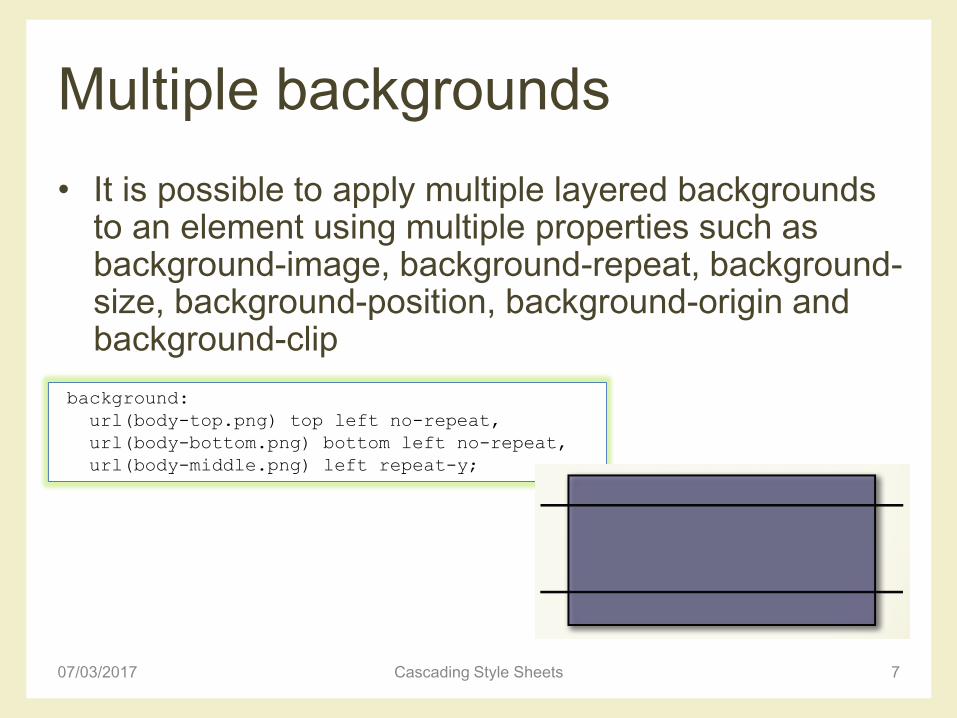
Multiple backgrounds
• It is possible to apply multiple layered backgrounds to an element using multiple properties such as background-image, background-repeat, background-size, background-position, background-origin and background-clip
07/03/2017 Cascading Style Sheets 7
background:
url(body-top.png) top left no-repeat,
url(body-bottom.png) bottom left no-repeat,
url(body-middle.png) left repeat-y;
Multiple backgrounds• Example
07/03/2017 Cascading Style Sheets 8
#multiple_background
{ width:400px;
height:150px;
border:2px solid #CCC;
background:
url(uccello.jpg) no-repeat 30px top,
url(lumaca.jpg) no-repeat right 105px,
url(logo.jpg) no-repeat 60px 55px,
url(fiore.jpg) no-repeat 5px 55px,
url(erba.jpg) repeat-x bottom,
url(cielo.jpg) repeat-x top;
}

Text shadows
• Arguments: horizontal offset, vertical offset, blur radius and color to be used as the shadow
• Multiple shadow definitions may be separated using commas
• Examples
07/03/2017 Cascading Style Sheets 9
text-shadow: 10px 10px 10px #333;
body
{ background: #ccc; }
p
{ margin: 0 0 1em;
font-size: 60px;
font-weight: bold;
color: #ccc;letter-spacing: 1px;
text-shadow: -1px -1px 0px #333, 1px 1px 1px #fff; }
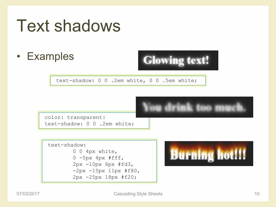
Text shadows
• Examples
07/03/2017 Cascading Style Sheets 10
text-shadow: 0 0 .2em white, 0 0 .5em white;
color: transparent:
text-shadow: 0 0 .2em white;
text-shadow:
0 0 4px white,
0 -5px 4px #fff,
2px -10px 6px #fd3,
-2px -15px 11px #f80,
2px -25px 18px #f20;

Word wrap
• Specifies whether the current rendered line should
break if the content exceeds the boundary of the
specified rendering box for an element
• Example
07/03/2017 Cascading Style Sheets 11
div
{ word-wrap: break-word }
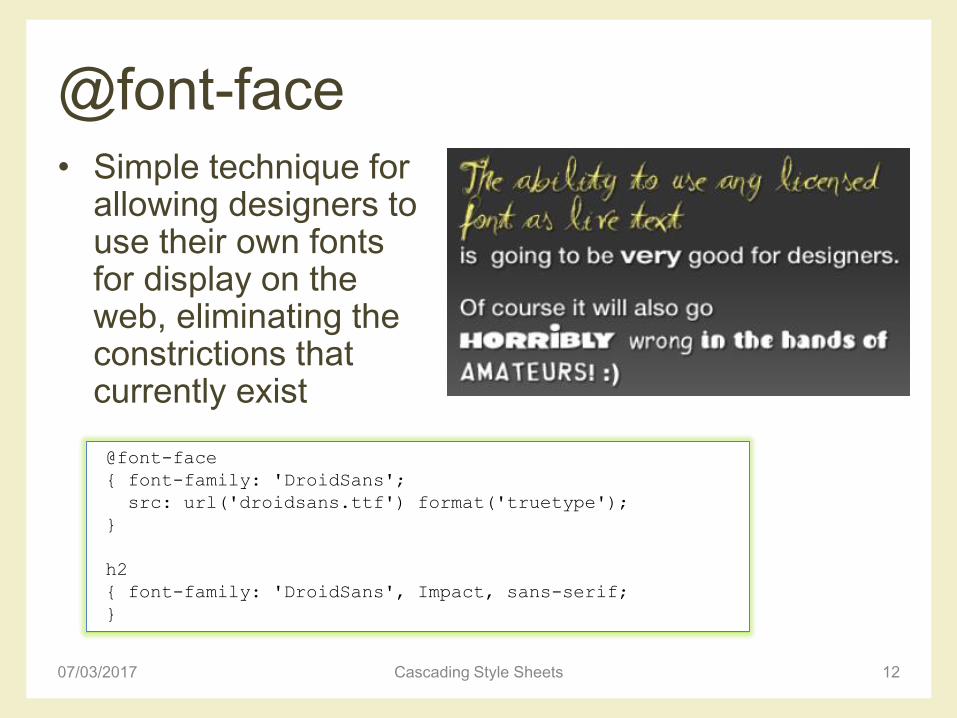
@font-face
• Simple technique for allowing designers to use their own fonts for display on the web, eliminating the constrictions that currently exist
07/03/2017 Cascading Style Sheets 12
@font-face
{ font-family: 'DroidSans';
src: url('droidsans.ttf') format('truetype');
}
h2
{ font-family: 'DroidSans', Impact, sans-serif;
}
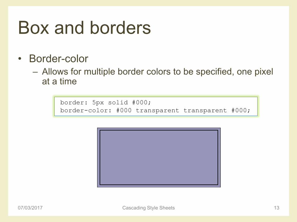
Box and borders
• Border-color– Allows for multiple border colors to be specified, one pixel
at a time
07/03/2017 Cascading Style Sheets 13
border: 5px solid #000;
border-color: #000 transparent transparent #000;

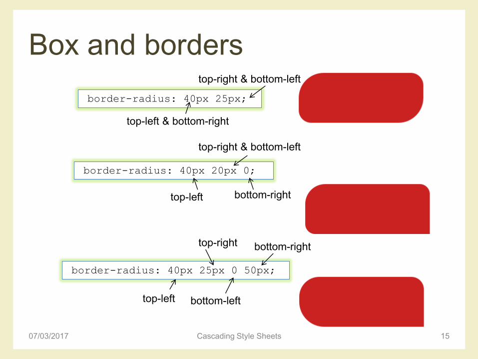
Box and borders
• Border-radius– Curves the corners of the border using the radius given,
usually in pixels
– Can be given to all corners, or only to individual corners as specified
07/03/2017 Cascading Style Sheets 14
border-radius: 25px;
border-top-right-radius: 25px;
Box and borders
07/03/2017 Cascading Style Sheets 15
border-radius: 40px 25px;
border-radius: 40px 20px 0;
top-left & bottom-right
top-right & bottom-left
top-left
top-right & bottom-left
bottom-right
border-radius: 40px 25px 0 50px;
top-left bottom-left
bottom-righttop-right
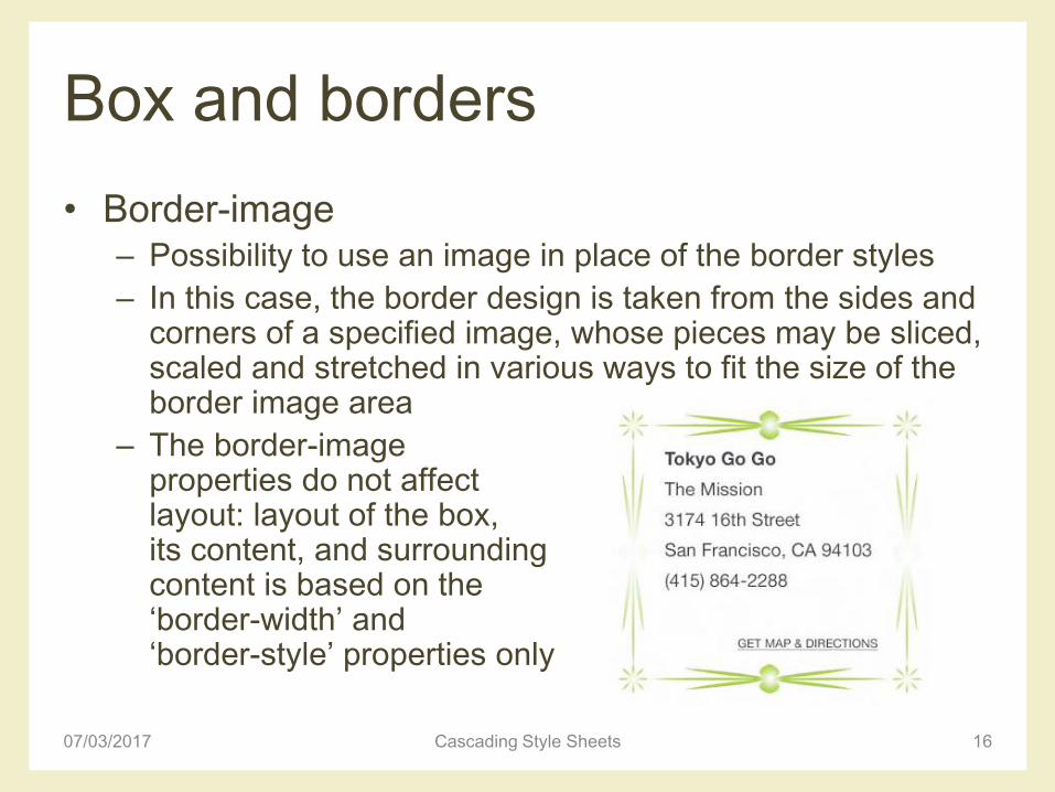
Box and borders
• Border-image– Possibility to use an image in place of the border styles
– In this case, the border design is taken from the sides and corners of a specified image, whose pieces may be sliced, scaled and stretched in various ways to fit the size of the border image area
– The border-image properties do not affect layout: layout of the box, its content, and surrounding content is based on the ‘border-width’ and ‘border-style’ properties only
07/03/2017 Cascading Style Sheets 16

Border image• ‘stretch’
– The image is stretched to fill the area
• ‘repeat’– The image is tiled (repeated) to
fill the area
• ‘round’– The image is tiled (repeated) to
fill the area
– If it does not fill the area with a whole number of tiles, the image is rescaled so that it does
07/03/2017 Cascading Style Sheets 17
border-image: url(border.png) 25% 30% 12% 20% repeat;
image source
where to slice (9 parts)
how to apply

Border image
• ‘stretch’– The image is stretched to
fill the area
• ‘repeat’– The image is tiled
(repeated) to fill the area
• ‘round’– The image is tiled
(repeated) to fill the area
– If it does not fill the area with a whole number of tiles, the image is rescaled so that it does18
border-image: url(border.png) 25% 30% 12% 20% repeat;
image source
where to slice (9 parts)
how to apply

Example
07/03/2017 Cascading Style Sheets 19
div#demo
{ border: solid transparent;
border-width: 20px 30px 25px 20px;
border-image: url("diamonds.png") 33% repeat }
diamond.png

Example
07/03/2017 Cascading Style Sheets 20
div#demo
{ border: solid transparent;
border-width: 20px 30px 25px 20px;
border-image: url("diamonds.png") 33% round }
diamond.png
div#demo
{ border: solid transparent;
border-width: 20px 30px 25px 20px;
border-image: url("diamonds.png") 33% stretch }

Example
07/03/2017 Cascading Style Sheets 21
p
{ width: 12em;
height: 5em;
margin: 5em;
padding: 3px;
border: double orange 1em;
border-image: url("border.png") 27 27 27 27 round stretch; }
border.png
(81x81 px)

Example
07/03/2017 Cascading Style Sheets 22

Box shadow
• Box-shadow– Creates a drop shadow beneath the selected element
– The first argument is the horizontal offset, the second is the vertical offset, the third is the blur radius, and the final argument is the color to be used as the shadow
07/03/2017 Cascading Style Sheets 23
box-shadow: 10px 5px 15px rgba(0,0,0,.5);
box-shadow: 10px 5px 15px rgba(0,0,0,.5) inset;
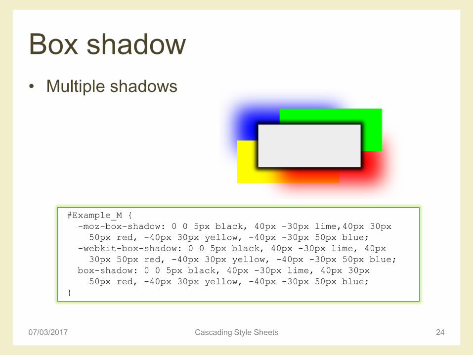
Box shadow
• Multiple shadows
07/03/2017 Cascading Style Sheets 24
#Example_M {
-moz-box-shadow: 0 0 5px black, 40px -30px lime,40px 30px
50px red, -40px 30px yellow, -40px -30px 50px blue;
-webkit-box-shadow: 0 0 5px black, 40px -30px lime, 40px
30px 50px red, -40px 30px yellow, -40px -30px 50px blue;
box-shadow: 0 0 5px black, 40px -30px lime, 40px 30px
50px red, -40px 30px yellow, -40px -30px 50px blue;
}

Transformations• Rotate
– Rotates the selected element at the defined angle, defined in degrees
– The rotation doesn’t affect layout, and elements that are transformed are treated similarly to position:relative
• Scale– Scales the element in question based on the specified unit-
less numbers given for the X and Y axes
– If only one number is given, it is applied to both axes
07/03/2017 Cascading Style Sheets 25
transform: rotate(30deg);
transform: scale(0.5,2.0);

Transformations
• Skew
– Skews the element around the X and Y axes by the
specified angles, in degrees
– If it’s only one number, the Y axis is assumed to be zero
• Translate
– Moves the object along each axis by the length specified
– The unit can be anything accepted as a length in CSS,
such as px, em, percentages, …
07/03/2017 Cascading Style Sheets 26
transform: skew(-30deg);
transform: translate(30px, 0);

Transformations
07/03/2017 Cascading Style Sheets 27
foto.htm
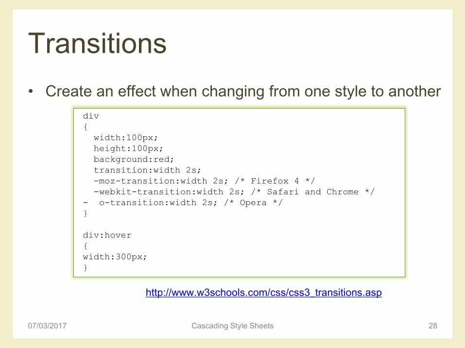
Transitions
• Create an effect when changing from one style to another
07/03/2017 Cascading Style Sheets 28
div
{
width:100px;
height:100px;
background:red;
transition:width 2s;
-moz-transition:width 2s; /* Firefox 4 */
-webkit-transition:width 2s; /* Safari and Chrome */
- o-transition:width 2s; /* Opera */
}
div:hover
{
width:300px;
}
http://www.w3schools.com/css/css3_transitions.asp

Transitions
07/03/2017 Cascading Style Sheets 29
• Funzione di timing – Il modo di calcolare i valori intermedi durante la transizione:
permette di cambiare la velocità della transizione durantela sua durata
– Valori: ease, ease-in, ease-out, ease-in-out, linear (equivalenti a specifiche curve di Bezier), cubic-bezier (P0, P1, P2, P3)
http://www.w3.org/TR/css3-
transitions/#transition-timing-function_tag

APPLICATION EXAMPLE
NAVIGATION BARS
07/03/2017 Cascading Style Sheets 30

Lists and navigation bars
• Simple list
• To add custom bullets – You could use the list-style-image property, but there is
little control over the position of the bullet image
– Turn list bullets off and add custom bullet as a background image on the list element
07/03/2017 Cascading Style Sheets 31
<ul>
<li>Read emails</li>
<li>Write book</li>
<li>Go shopping</li>
<li>Cook dinner</li>
<li>Watch Scrubs</li>
</ul>

Custom bullets
• Remove indentation by zeroing down the margin and padding on the list
• Remove the default bullet setting the list style type to none
• Adding padding to the left side of the list item creates the necessary space for the bullet
07/03/2017 Cascading Style Sheets 32
ul {
margin: 0;
padding: 0;
list-style-type: none;
}
li {
background: url(bullet.gif) no-repeat 0 50%;
padding-left: 30px;
}simple-list.htm

Vertical navigation bar
• HTML framework
07/03/2017 Cascading Style Sheets 33
<ul class="arrowblue">
<li><a href="home.htm« class="selected">Home</a></li>
<li><a href="about.htm">About</a></li>
<li><a href="services.htm">Our Services</a></li>
<li><a href="work.htm">Our Work</a></li>
<li><a href="news.htm">News</a></li>
<li><a href="contact.htm">Contact</a></li>
</ul>vertical-nav.htm

Vertical navigation bar
• Remove the default bullets and zero down the margin and padding
07/03/2017 Cascading Style Sheets 34
.arrowblue {
list-style-type: none;
margin: 0;
padding: 0;
width: 180px; /*width of menu*/
border-style: solid solid none solid;
border-color: #94AA74;
border-size: 1px;
border-width: 1px;
}

Vertical navigation bar
• Rather than style the list items, style the enclosed anchors– To create a button-like area, set the display property of the
anchors to block and specify the anchor’s dimensions
– The line height is set to 24 pixels to center the link text vertically
– The last rule removes the underline from the link text
07/03/2017 Cascading Style Sheets 35
.arrowblue li a{
font: bold 12px Verdana, Arial, Helvetica, sans-serif;
display: block;
background: transparent url(img/arrowblue.gif) 100% 0;
height: 24px; /* set height: bg image-padding (32px-4px-4px)*/
padding: 4px 0 4px 10px;
line-height: 24px; /*set line-height (32px - 4px - 4px)*/
text-decoration: none;
}
Vertical navigation bar
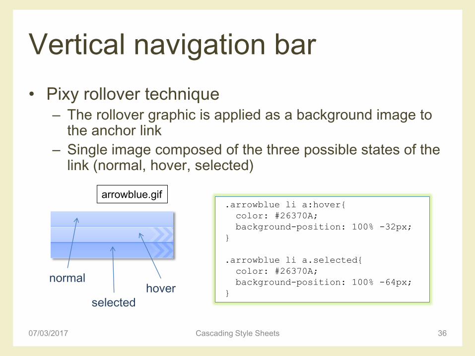
• Pixy rollover technique– The rollover graphic is applied as a background image to
the anchor link
– Single image composed of the three possible states of the link (normal, hover, selected)
07/03/2017 Cascading Style Sheets 36
.arrowblue li a:hover{
color: #26370A;
background-position: 100% -32px;
}
.arrowblue li a.selected{
color: #26370A;
background-position: 100% -64px;
}
arrowblue.gif
hover
selected
normal

Horizontal navigation bar
• HTML framework
07/03/2017 Cascading Style Sheets 37
<ul class="glossymenu">
<li class="current"><a href="#"><b>Home</b></a></li>
<li><a href="#"><b>About</b></a></li>
<li><a href="#"><b>News</b></a></li>
<li><a href="#"><b>Products</b></a></li>
<li><a href="#"><b>Services</b></a></li>
<li><a href="#"><b>Clients</b></a></li>
<li><a href="#"><b>Case Studies</b></a></li>
</ul>
horizontal-nav.htm

Horizontal navigation bar
• Default bullets removed
• Central horizontal navigation bar, with a repeating image as a background– Margin and padding dimensions set accordingly
07/03/2017 Cascading Style Sheets 38
.glossymenu{
position: relative;
padding: 0 0 0 34px;
margin: 0 auto 0 auto;
background: url(img/menur_bg.gif) repeat-x;
/*tab background image path*/
width: 60%;
height: 46px;
list-style: none;
}
menur_bg.gif

Horizontal navigation bar
• Lists are normally displayed vertically
• Two methods to make it display horizontally– Set the list items to display inline
– Float all list items left
• Here: floating method
07/03/2017 Cascading Style Sheets 39
ul li {
float: left;
}
ul li {
display: inline;
}
.glossymenu li {
float: left;
}

Horizontal navigation bar
• Effect for current and hover elements
07/03/2017 Cascading Style Sheets 40
.glossymenu li.current a, .glossymenu li a:hover {
color: #fff;
background: url(img/menur_hover_left.gif) no-repeat;
/*left tab image path*/
background-position: left;
}
.glossymenu li.current a b, .glossymenu li a:hover b {
color: #fff;
background: url(img/menur_hover_right.gif) no-repeat
right top; /*right tab image path*/
}
http://www.w3schools.com/Css/css_navbar.aspmenur_hover_left.gif
menur_hover_right.gif

APPLICATION EXAMPLE
CSS IMAGE MAPS
07/03/2017 Cascading Style Sheets 41
CSS image maps
• Allow to specify regions of an image to act as
hotspots
• Image maps are still valid in HTML
– But they mix presentation with content
• It is possible to create simple image maps with a
combination of lists, anchors, and some CSS code
07/03/2017 Cascading Style Sheets 42

Example
07/03/2017 Cascading Style Sheets 43
imagemap.htm

CSS image maps
• Add the image to the page inside a named div
• Add a list of links to each artist– Each list item needs to be given an id to identify the person
in that list item
– Give each link a title attribute containing the name of the artist: tooltip showing who the person is will be displayed on most browsers when the link is hovered
07/03/2017 Cascading Style Sheets 44
<div class="imagemap">
<img src="img/beatles_basic.jpg" alt="The Beatles" />
</div>

CSS image maps
07/03/2017 Cascading Style Sheets 45
<div class="imagemap">
<img src="img/beatles_basic.jpg" alt="The Beatles" />
<ul>
<li><a id="paul" href="" title="Paul McCartney">
<span>Paul McCartney - Bass Guitar and Vocals
<br /><br />Paul McCartney was born June 18, 1942,
in Liverpool, England. [...] </span></a></li>
<li><a id="ringo" href="" title="Ringo Starr">
<span>Ringo Starr - Drums<br /><br />Born
Richard [...]</span></a></li>
<li><a id="john" href="" title="John Lennon">
<span>John Lennon - Guitar and Vocals<br /><br />
John Lennon was born on [...]</span></a></li>
<li><a id="george" href="" title="George Harrison">
<span>George Harrison - Lead Guitar and Vocals
<br /><br />Pop star, songwriter, recording
artist and producer [...] </span></a></li>
</ul>
</div>

CSS image maps
• Set the width and height of the div so that it matches the dimensions of the image
• Set the position property of the div to relative– Important: it allows the enclosed links to be positioned absolutely,
in relation to the edges of the div, and hence the image
• Remove the list bullets and zero down the list’s margin and padding
07/03/2017 Cascading Style Sheets 46
.imagemap {
width:400px;
height:240px;
position: relative;
}
.imagemap ul {
margin: 0;
padding: 0;
list-style: none;
}

CSS image maps
• Style the links– Set widths and heights to create the desired hit area
– Links can then be positioned (in absolute coordinates) over the correct artist, forming the hotspots
• The link text should not be displayed unless the hotspot is hit
07/03/2017 Cascading Style Sheets 47
.imagemap a {
position: absolute;
display: block;
width: 60px;
height: 60px;
text-decoration: none;
}
.imagemap a span, .imagemap a:visited span {
display: none;
}
CSS image maps
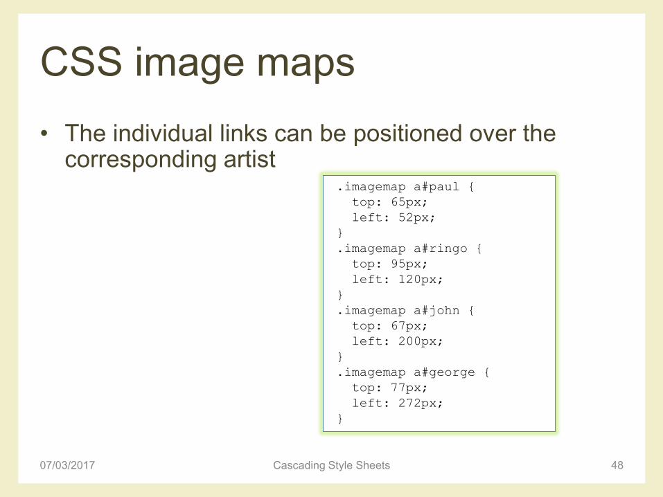
• The individual links can be positioned over the corresponding artist
07/03/2017 Cascading Style Sheets 48
.imagemap a#paul {
top: 65px;
left: 52px;
}
.imagemap a#ringo {
top: 95px;
left: 120px;
}
.imagemap a#john {
top: 67px;
left: 200px;
}
.imagemap a#george {
top: 77px;
left: 272px;
}
CSS image maps
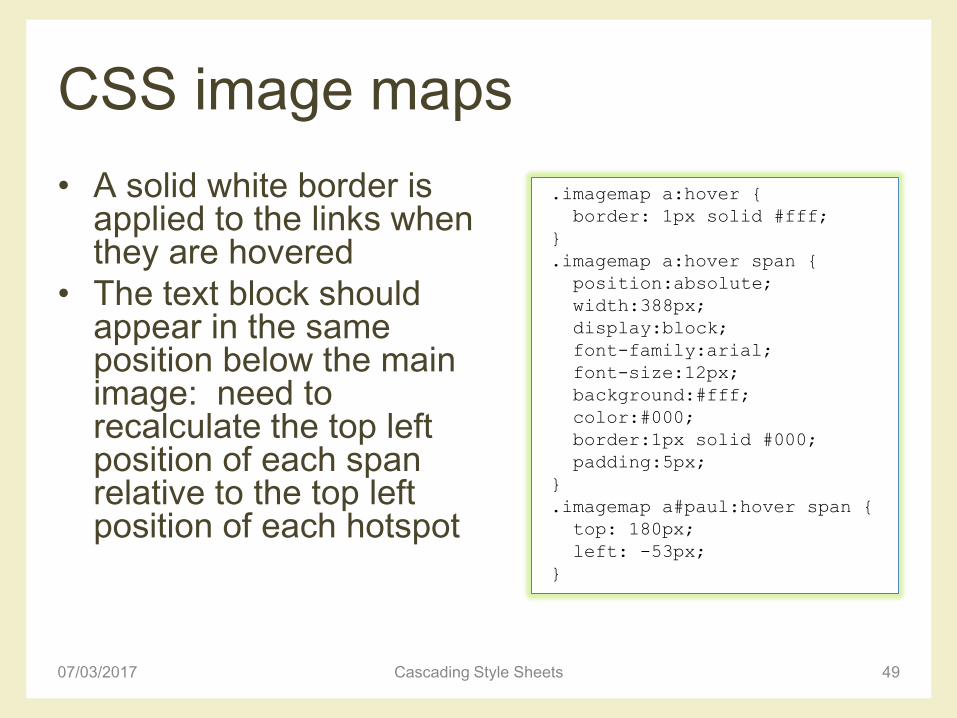
• A solid white border is applied to the links when they are hovered
• The text block should appear in the same position below the main image: need to recalculate the top left position of each span relative to the top left position of each hotspot
07/03/2017 Cascading Style Sheets 49
.imagemap a:hover {
border: 1px solid #fff;
}
.imagemap a:hover span {
position:absolute;
width:388px;
display:block;
font-family:arial;
font-size:12px;
background:#fff;
color:#000;
border:1px solid #000;
padding:5px;
}
.imagemap a#paul:hover span {
top: 180px;
left: -53px;
}

APPLICATION EXAMPLE
FORM LAYOUTS
07/03/2017 Cascading Style Sheets 50

Simple form layout
• Short and relatively
simple forms are
easiest to fill in
when the form
labels appear
vertically above
their associated
form elements
07/03/2017 Cascading Style Sheets 51
simple-form.htm

Useful HTML form elements
• Fieldset element: to group related blocks of information
07/03/2017 Cascading Style Sheets 52
fieldset {
border: solid 1px #ccc;
}

Useful HTML form elements
• Label element: to add a meaningful and descriptive label to each form element – Real benefit: to increase form usability for people using
assistive devices
• Two ways to associate a label with a form– Implicitly, by nesting the form element inside the label
element
– Explicitly, by setting the for attribute of the label equal to the id name of the associated form element
07/03/2017 Cascading Style Sheets 53
<label>email <input name="email" type="text"/></label>
<label for="email">email<label>
<input name="email" id="email" type="text"/>
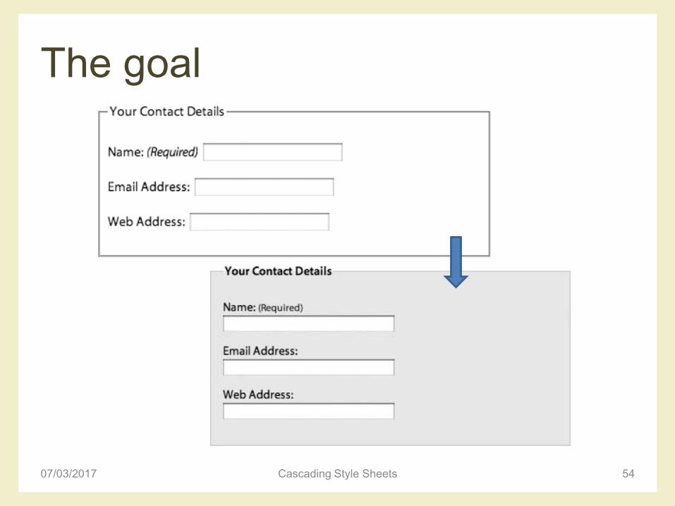
The goal
07/03/2017 Cascading Style Sheets 54

Simple form layout
• HTML code
07/03/2017 Cascading Style Sheets 55
<fieldset>
<legend>Your Contact Details</legend>
<p>
<label for="author">Name:</label>
<input name="author" id="author" type="text" />
</p>
<p>
<label for="email">Email Address:</label>
<input name="email" id="email" type="text" />
</p>
<p>
<label for="url">Web Address:</label>
<input name="url" id="url" type="text" />
</p>
</fieldset>

Simple form layout
• General styles for the fieldset and legend elements
– The fieldsets must be vertically separated using margins
– The contents can be given breathing space using padding
– Light background, with a slightly darker, 1-pixel border
07/03/2017 Cascading Style Sheets 56
fieldset {
margin: 1em 0;
padding: 1em;
border : 1px solid #ccc;
background: #f8f8f8;
}
legend {
font-weight: bold;
}
Simple form layout
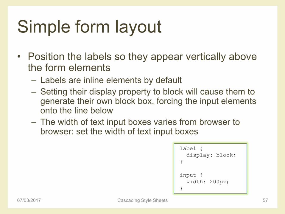
• Position the labels so they appear vertically above the form elements – Labels are inline elements by default
– Setting their display property to block will cause them to generate their own block box, forcing the input elements onto the line below
– The width of text input boxes varies from browser to browser: set the width of text input boxes
07/03/2017 Cascading Style Sheets 57
label {
display: block;
}
input {
width: 200px;
}

Simple form layout
• Unlike text areas and text inputs, radio buttons and check boxes need to be handled differently– Rather than having their labels above them, these
elements usually have their labels to the right of them
– When stacked vertically all the elements are left aligned, making them easier to select
07/03/2017 Cascading Style Sheets 58

Simple form layout• The width of the text boxes was defined by applying a
width to the input element– The input element covers other form widgets such as check
boxes, radio buttons, and submit buttons
• The best way to distinguish between input elements is to give them a class
07/03/2017 Cascading Style Sheets 59
<fieldset>
<legend>Remember Me</legend>
<p>
<input id="remember-yes" class="radio" name="remember"
type="radio" value="yes" />
<label for="remember-yes">Yes</label>
</p>
<p>
<input id="remember-no" class="radio" name="remember"
type="radio" value="no" checked="checked" />
<label for="remember-no">No</label>
</p>
</fieldset>
Simple form layout
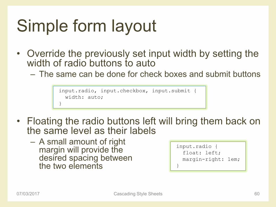
• Override the previously set input width by setting the width of radio buttons to auto– The same can be done for check boxes and submit buttons
• Floating the radio buttons left will bring them back on the same level as their labels– A small amount of right
margin will provide thedesired spacing betweenthe two elements
07/03/2017 Cascading Style Sheets 60
input.radio, input.checkbox, input.submit {
width: auto;
}
input.radio {
float: left;
margin-right: 1em;
}

Longer form layout
• For longer and more complex forms, vertical space becomes an issue– To improve scanning and reduce the amount of vertical
space used, it makes sense to position the labels and form elements horizontally
07/03/2017 Cascading Style Sheets 61
Longer form layout
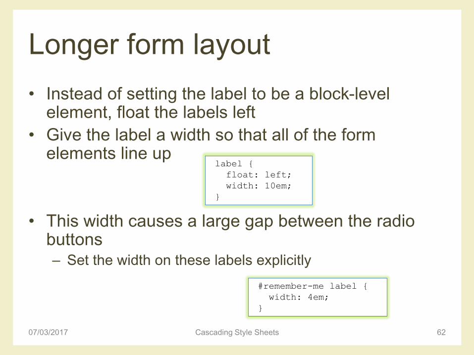
• Instead of setting the label to be a block-level element, float the labels left
• Give the label a width so that all of the form elements line up
• This width causes a large gap between the radio buttons– Set the width on these labels explicitly
07/03/2017 Cascading Style Sheets 62
label {
float: left;
width: 10em;
}
#remember-me label {
width: 4em;
}
Complex form layout
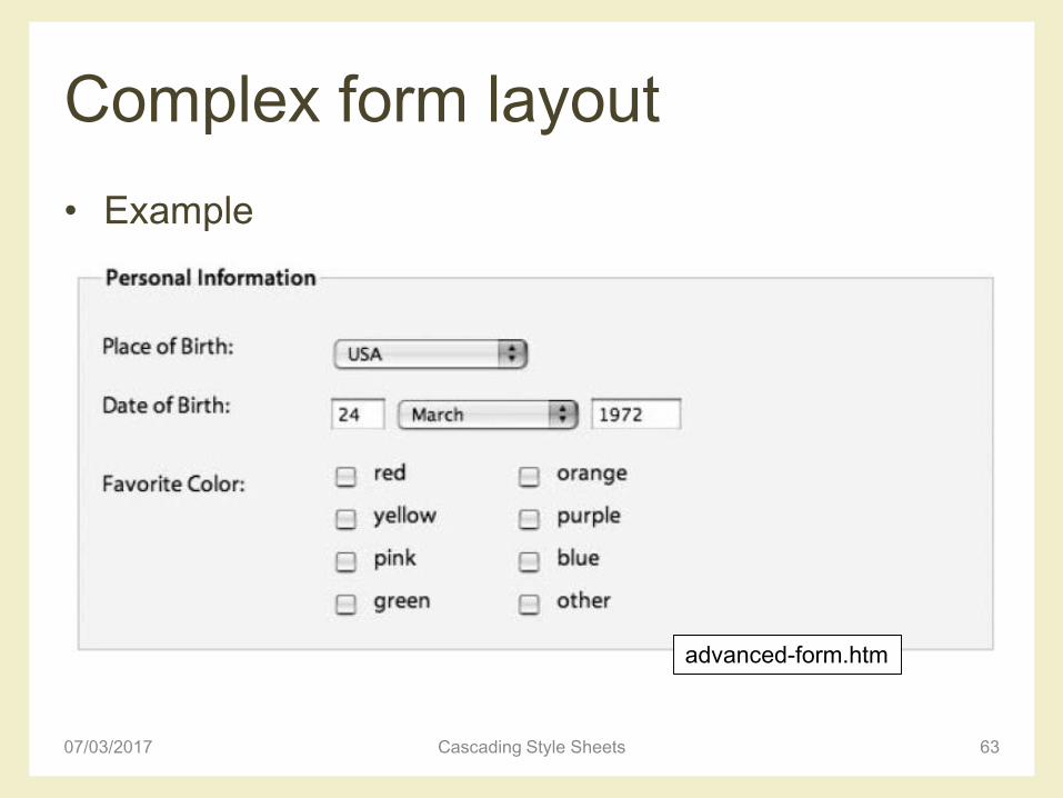
• Example
07/03/2017 Cascading Style Sheets 63
advanced-form.htm
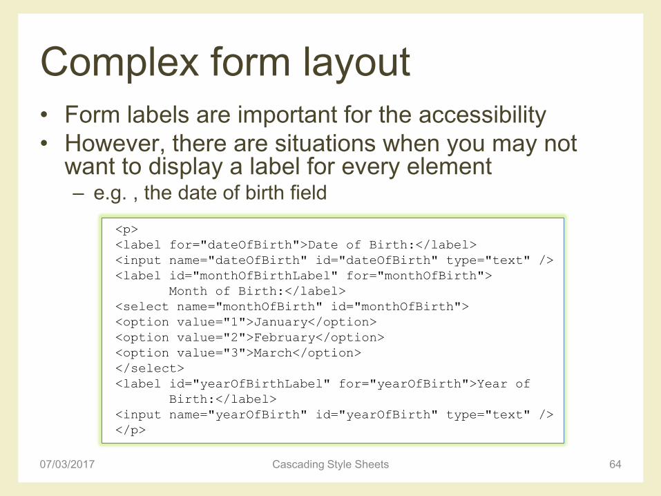
Complex form layout• Form labels are important for the accessibility
• However, there are situations when you may not want to display a label for every element– e.g. , the date of birth field
07/03/2017 Cascading Style Sheets 64
<p>
<label for="dateOfBirth">Date of Birth:</label>
<input name="dateOfBirth" id="dateOfBirth" type="text" />
<label id="monthOfBirthLabel" for="monthOfBirth">
Month of Birth:</label>
<select name="monthOfBirth" id="monthOfBirth">
<option value="1">January</option>
<option value="2">February</option>
<option value="3">March</option>
</select>
<label id="yearOfBirthLabel" for="yearOfBirth">Year of
Birth:</label>
<input name="yearOfBirth" id="yearOfBirth" type="text" />
</p>

Complex form layout
• Hide the “month of birth” and “year of birth” labels– Setting the labels’ display property to none would stop the
labels from displaying, but it would also prevent many screen readers from accessing them
• Solution: position the labels off screen using a large negative text indent
• To prevent the labels from affecting the layout, the width needs to be zeroed down
07/03/2017 Cascading Style Sheets 65
#monthOfBirthLabel, #yearOfBirthLabel {
text-indent: -1000em;
width: 0;
}

Complex form layout
• The various form controls can then be sized individually and given margins to control their horizontal spacing
07/03/2017 Cascading Style Sheets 66
input#dateOfBirth {
width: 3em;
margin-right: 0.5em;
}
select#monthOfBirth {
width: 10em;
margin-right: 0.5em;
}
input#yearOfBirth {
width: 5em;
}

Multicolumn check boxes
• Goal: create a two-column layout for large groups of check boxes or radio buttons
• Problem: labels only work for individual elements, not groups of elements
07/03/2017 Cascading Style Sheets 67
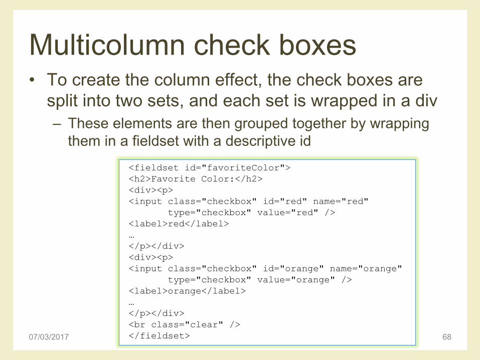
Multicolumn check boxes• To create the column effect, the check boxes are
split into two sets, and each set is wrapped in a div
– These elements are then grouped together by wrapping
them in a fieldset with a descriptive id
07/03/2017 Cascading Style Sheets 68
<fieldset id="favoriteColor">
<h2>Favorite Color:</h2>
<div><p>
<input class="checkbox" id="red" name="red"
type="checkbox" value="red" />
<label>red</label>
…
</p></div>
<div><p>
<input class="checkbox" id="orange" name="orange"
type="checkbox" value="orange" />
<label>orange</label>
…
</p></div>
<br class="clear" />
</fieldset>

Multicolumn check boxes
• A generic fieldset style has already been created– Override those styles, zeroing down the padding and
margin, removing the borders and setting the background color to be transparent
07/03/2017 Cascading Style Sheets 69
fieldset#favoriteColor {
margin: 0;
padding: 0;
border: none;
background: transparent;
}

Multicolumn check boxes
• The heading is going to act like a label so it needs to be floated left and given a width of 10ems like the other labels
• The headline also needs to look like a label, so the font weight needs to be set to normal and the font size needs to be reduced
• The two-column layout can then be created bygiving the divs a widthand floating them left
07/03/2017 Cascading Style Sheets 70
#favoriteColor h2 {
width: 10em;
float: left;
font-size: 1em;
font-weight: normal;
}
#favoriteColor div {
width: 8em;
float: left;
}
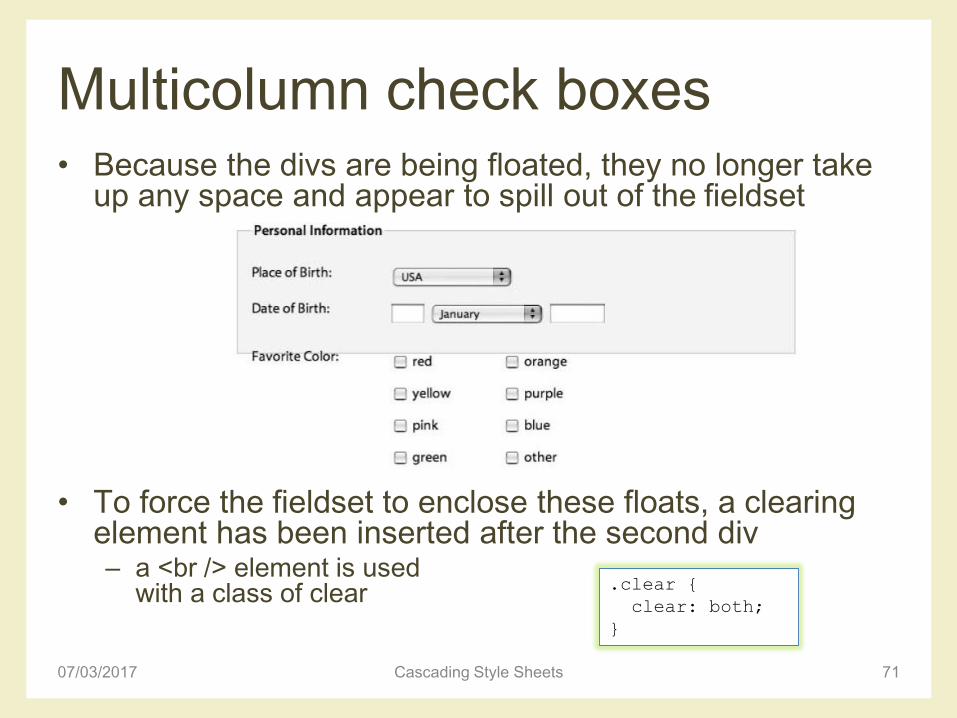
Multicolumn check boxes• Because the divs are being floated, they no longer take
up any space and appear to spill out of the fieldset
• To force the fieldset to enclose these floats, a clearing element has been inserted after the second div– a <br /> element is used
with a class of clear
07/03/2017 Cascading Style Sheets 71
.clear {
clear: both;
}

Multicolumn check boxes
• All the labels in this form have been floated left and set to be 10ems wide
• The labels for the check boxes do not need to be floated and require a much smaller width
• Unfloated labels as block-level elements– Explicitly set the display property to inline
07/03/2017 Cascading Style Sheets 72
label {
width: 3em;
float: none;
display: inline;
}

Form feedback
• Forms will usually require some type of feedback message to highlight fields that have been missed or incorrectly filled in– Usually done by adding an error message next to the
appropriate field
07/03/2017 Cascading Style Sheets 73

Form feedback
• The best approach is to include the error message text inside the form label, and then position it using CSS
07/03/2017 Cascading Style Sheets 74
<p>
<label for="email">Email Address:
<span class="feedback">Incorrect email address. Please try
again.</span>
</label>
<input name="email" id="email" type="text" />
</p>
Form feedback
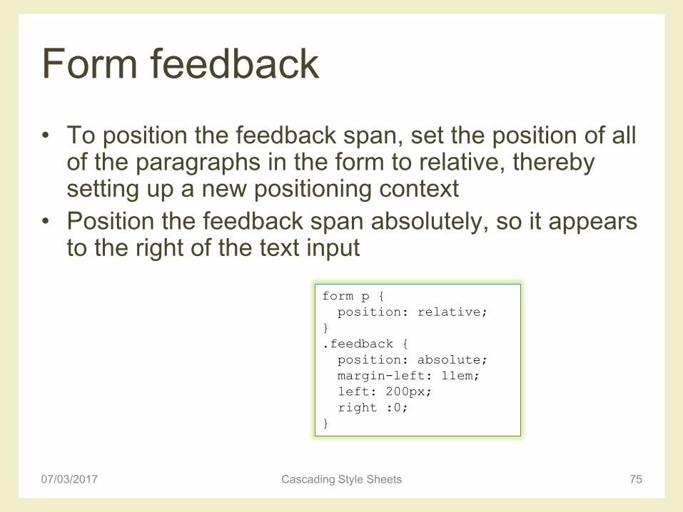
• To position the feedback span, set the position of all of the paragraphs in the form to relative, thereby setting up a new positioning context
• Position the feedback span absolutely, so it appears to the right of the text input
07/03/2017 Cascading Style Sheets 75
form p {
position: relative;
}
.feedback {
position: absolute;
margin-left: 11em;
left: 200px;
right :0;
}

Form feedback
• Apply the desired styling to the feedback message
– E.g. text bold red, plus a warning image to the left side of
the message
07/03/2017 Cascading Style Sheets 76
form p {
position: relative;
}
.feedback {
position: absolute;
margin-left: 11em;
left: 200px;
font-weight: bold;
color: #760000;
padding-left: 18px;
background: url(images/error.png) no-repeat left top;
}

References
• Andy Budd, Cameron Moll, Simon Collison,
“CSS Mastery, Advanced Web Standards
Solutions”– www.cssmastery.com/
• CSS reference– https://developer.mozilla.org/en-US/docs/Web/CSS/Reference
• Dynamic Drive CSS Library– http://www.dynamicdrive.com/style/
• CSSplay– http://www.cssplay.co.uk/articles/imagemap/
07/03/2017 Cascading Style Sheets 77

License
• This work is licensed under the Creative Commons “Attribution-NonCommercial-ShareAlike Unported (CC BY-NC-SA 3,0)” License.
• You are free:– to Share - to copy, distribute and transmit the work
– to Remix - to adapt the work
• Under the following conditions:– Attribution - You must attribute the work in the manner specified by the
author or licensor (but not in any way that suggests that they endorse you or your use of the work).
– Noncommercial - You may not use this work for commercial purposes.
– Share Alike - If you alter, transform, or build upon this work, you may distribute the resulting work only under the same or similar license to this one.
• To view a copy of this license, visit http://creativecommons.org/license/by-nc-sa/3.0/
07/03/2017 Cascading Style Sheets 78