CSS3: Using media queries to improve the web site experience
CS7026 – Media Queries
Different Screen Size Different Design…

Introduction
2
Historically web content was viewed only on traditional desktop systems, but the dramatic uptake of smartphones, tablets, and other devices with a wide range of dimensions has changed all this.
The challenge for web designers is to ensure that their websites look good not only on a big screen, but also on a tiny phone and everything in between.
Media queries are an excellent way to deliver different styles to different devices, providing the best experience for each type of user.
Introduction
3
Media queries are part of the CSS3 specification.
They expand the role of the media attribute that controls how your styles are applied.
E.g., it's been common practice for years to use a separate style sheet for printing web pages by specifying media=“print”.
Media queries take this idea to the next level by allowing designers to target styles based on a number of device properties, such as screen width, orientation, and so on.

Introduction
4
So CSS Media Queries are a feature in CSS3 which allows
you to specify when certain CSS rules should be applied.
This allows you to apply a special CSS for mobile, or
adjust a layout for print.
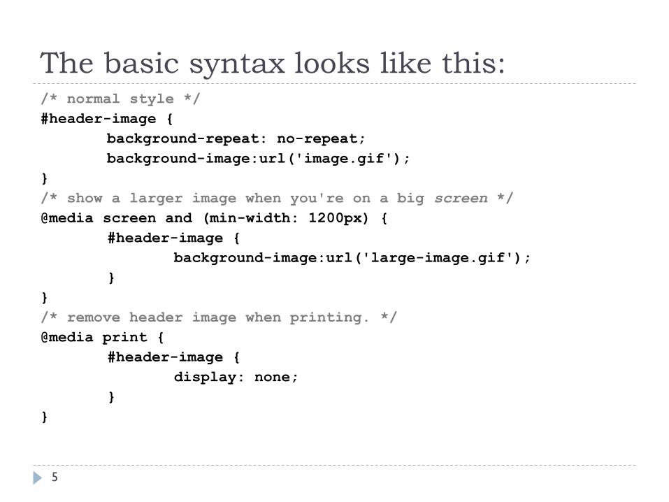
The basic syntax looks like this:
5
/* normal style */
#header-image {
background-repeat: no-repeat;
background-image:url('image.gif');
}
/* show a larger image when you're on a big screen */
@media screen and (min-width: 1200px) {
#header-image {
background-image:url('large-image.gif');
}
}
/* remove header image when printing. */
@media print {
#header-image {
display: none;
}
}

But can also be called like this:
6
<link rel='stylesheet' media='all' href='normal.css' />
<link rel='stylesheet' media='print' href='print.css' />
<link rel='stylesheet' media='screen and (min-width:
701px)' href='medium.css' />
The advantage of this method is that only the valid CSS is downloaded; so print.css is only downloaded when
printing (or using print preview).

Media Queries
7
Combining media queries can be done by combining them
with an comma.
The query below is to target devices with an device-ratio
of 1.5. The first element is for webkit, the second is for all
other browsers (1.5 * 96).
@media screen and (-webkit-device-pixel-ratio: 1.5),
screen and (resolution: 144dpi)

When a pixel is not a pixel… (an aside)
8
The device pixel ratio (also called CSS Pixel Ratio) is what
determines how a device's screen resolution is interpreted by
the CSS.
The reason it was created is because as phones screens get
higher resolutions, if every device still had a CSS pixel ratio of
1 then webpages would render too small to see.
A typical full screen desktop monitor is a 24" monitor at
1920x1080. Imagine if that monitor was shrunk down to < 5"
but had the same resolution. Viewing things on the screen
would be impossible because they would be so small.
When a pixel is not a pixel… (an aside)
9
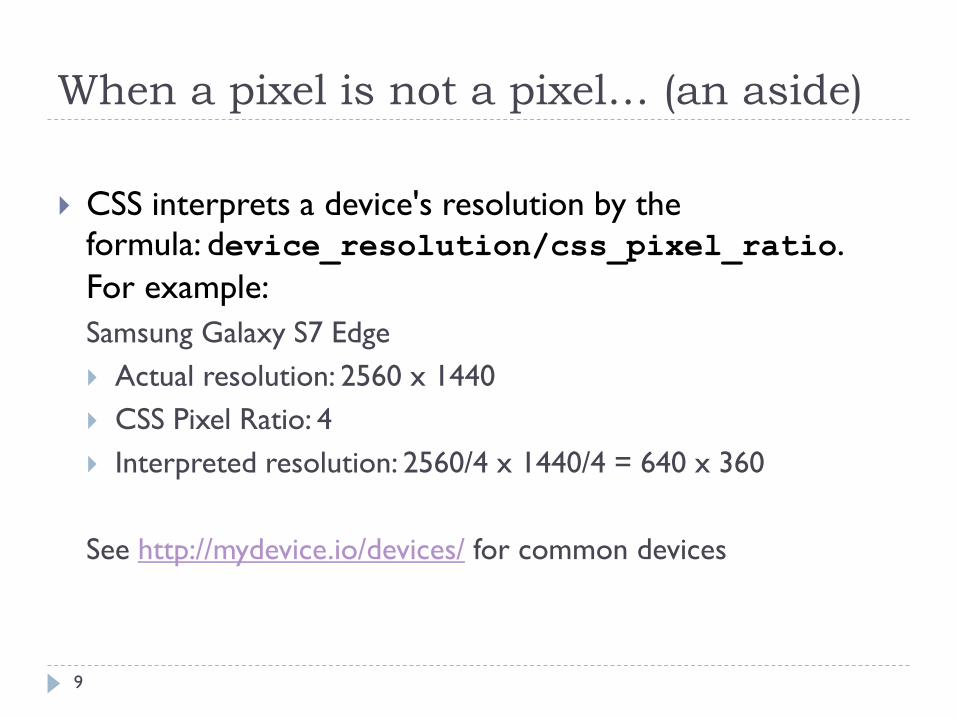
CSS interprets a device's resolution by the
formula: device_resolution/css_pixel_ratio.
For example:
Samsung Galaxy S7 Edge
Actual resolution: 2560 x 1440
CSS Pixel Ratio: 4
Interpreted resolution: 2560/4 x 1440/4 = 640 x 360
See http://mydevice.io/devices/ for common devices

When a pixel is not a pixel… (an aside)
10
When viewing a web page, the CSS will think the device
has a 360x640 resolution screen and Media Queries will
respond as if the screen is 360x640.
But the rendered elements on the screen will be four
times as sharp as an actual 360x640 screen.
So the number describes the ratio of how much "real"
pixels (physical pixels of the screen) are used to display
one "virtual" pixel (size set in CSS).
Back to Media Queries
11
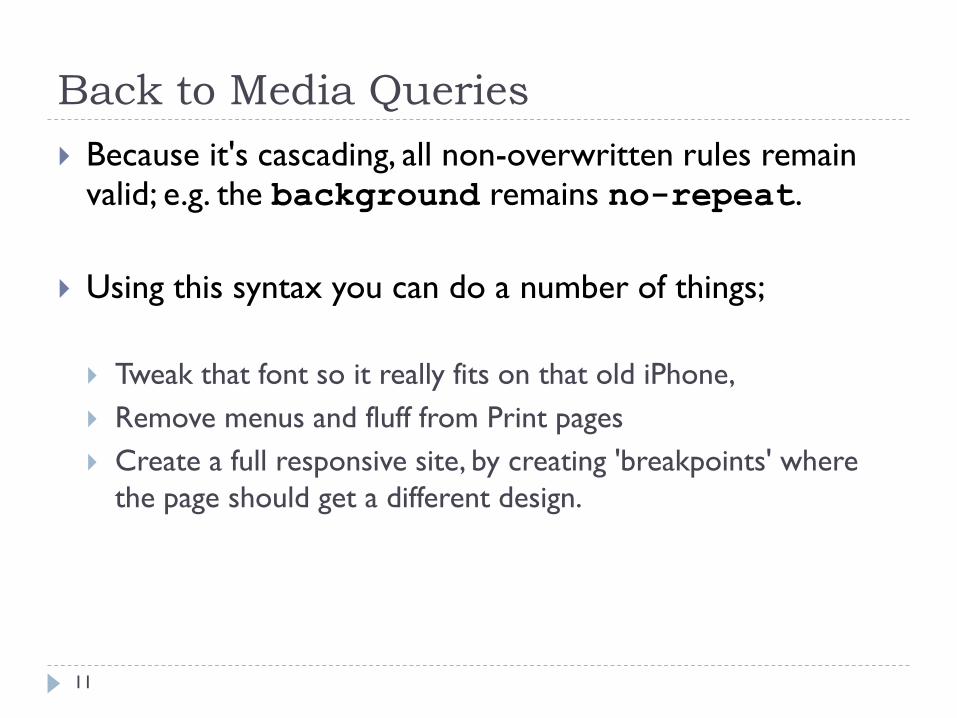
Because it's cascading, all non-overwritten rules remain valid; e.g. the background remains no-repeat.
Using this syntax you can do a number of things;
Tweak that font so it really fits on that old iPhone,
Remove menus and fluff from Print pages
Create a full responsive site, by creating 'breakpoints' where
the page should get a different design.

Media Queries
12
For example:#block1, #block2 {
float: left; width: 100%;
}
@media (min-width: 1000px) {
#block1, #block2 {
width: 50%;
}
}
This example shows the 2 blocks on big screens next to each other, while on small screens they will be displayed below each other.

Support
13
Media queries are supported in Internet Explorer (IE) 9+,
Firefox 3.5+, Safari 3+, Opera 7+, as well as on most
modern smartphones and other screen-based devices.
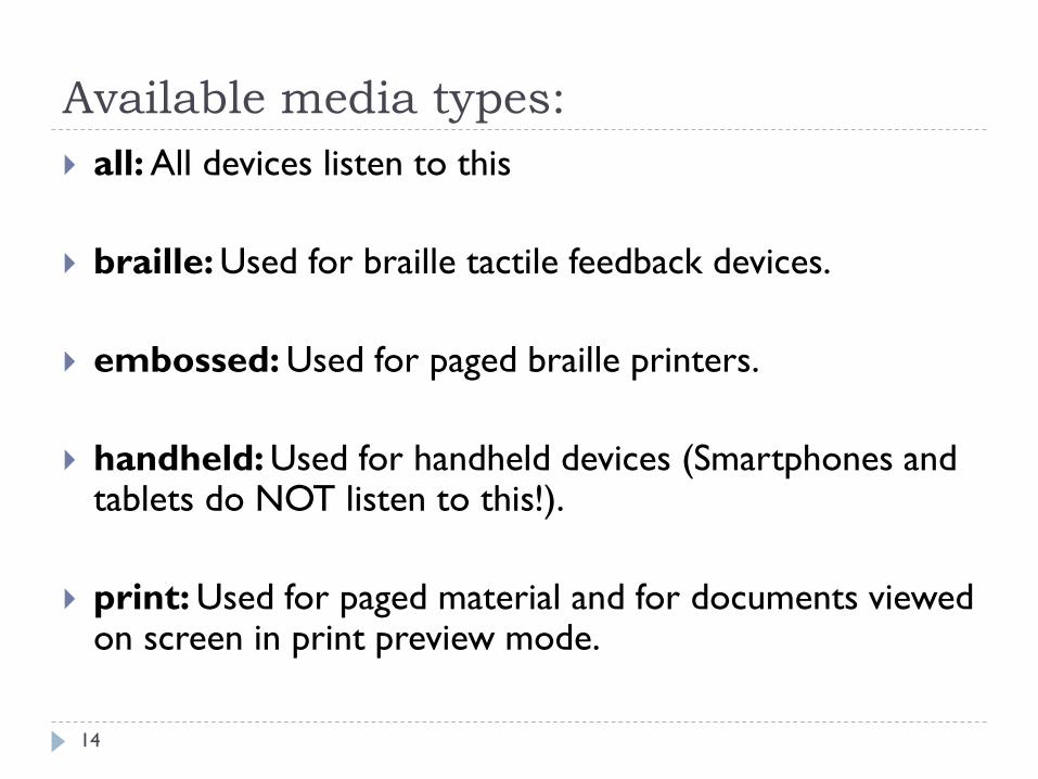
Available media types:
14
all: All devices listen to this
braille: Used for braille tactile feedback devices.
embossed: Used for paged braille printers.
handheld: Used for handheld devices (Smartphones and tablets do NOT listen to this!).
print: Used for paged material and for documents viewed on screen in print preview mode.
Available media types:
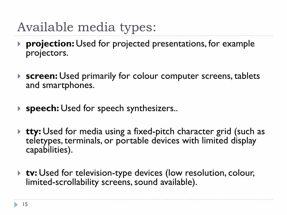
15
projection: Used for projected presentations, for example projectors.
screen: Used primarily for colour computer screens, tablets and smartphones.
speech: Used for speech synthesizers..
tty: Used for media using a fixed-pitch character grid (such as teletypes, terminals, or portable devices with limited display capabilities).
tv: Used for television-type devices (low resolution, colour, limited-scrollability screens, sound available).

Available media types:
16
Of course browsers don't behave the way we expect to
do.
Most important; the handheld media type is not used by
smartphones and tablets. Smartphones respond to screen.
So in effect, the handheld media type is quite useless.
The TV media type apparently works with the Wii
browser, powered by Opera. But that’s about it. All other
smart TVs seem to have gone for screen as well.
Media Features for setting conditions in
media queries
17
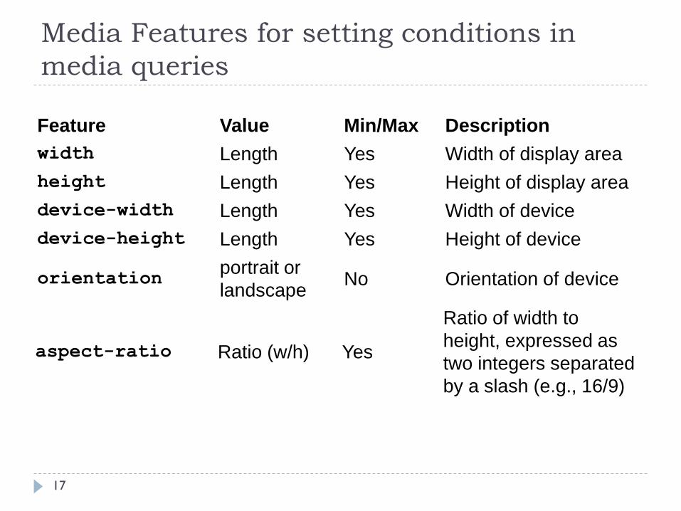
Feature Value Min/Max Description
width Length Yes Width of display area
height Length Yes Height of display area
device-width Length Yes Width of device
device-height Length Yes Height of device
orientationportrait or
landscapeNo Orientation of device
aspect-ratio Ratio (w/h) Yes
Ratio of width to
height, expressed as
two integers separated
by a slash (e.g., 16/9)

Media Features for setting conditions in
media queries
18
Feature Value Min/Max Description
device-
aspect-
ratio
Ratio (w/h) YesRatio of device-width to
device-height
color Integer Yes
Number of bits per colour
component (if not colour, the
value is 0)
color-
indexInteger Yes
Number of entries in the
output device's colour lookup
table
monochrome Integer Yes
Number of bits per pixel in
the monochrome frame
buffer (if not monochrome,
the value is 0)

Media Features for setting conditions in
media queries
19
Feature Value Min/Max Description
resolution Resolution Yes
Density of pixels of output
device, express as integer
followed by dpi (dots per inch)
or dpcm (dots per centimeter)
scanprogressive
or interlaceNo
Scanning process used by TV
devices
grid 0 or 1 No
If set to 1, the device is grid-
based, such as a teletype
terminal or phone display with
only one fixed font (all other
devices are 0)
Media Features
20
The first five features (width, height, device-
width, device-height, and orientation ) are
the most useful.
You can prefix most features with min- and max- to
indicate minimum and maximum values, such as min-
width and max-width.

width, device-width, and viewport
21
Perhaps one of the most confusing aspects of media queries is
the difference between width and height and the equivalent
values prefixed by device- .
In the case of desktop and laptop computers, the difference is
easy to understand: width and height refer to the size of the
browser viewport, whereas device-width and device-
height refer to the dimensions of the monitor.
Not everybody runs his or her browser full-screen,
so width and height are the measurements that you need to
use.

width, device-width, and viewport
22
Mobile browsers fill the available screen, so you might
expect width and device-width to be the same.
Unfortunately, that's not always the case.
Most smartphones, including Android, iPhone, and Windows Phone 7, set width to a nominal viewport
approximately 1,000 pixels wide (in an iPhone and iPod
touch, it's 980 pixels, Windows Phone 7 uses 1024 pixels).

width, device-width, and viewport
23
Even though the style sheet attached to the page may use
media queries to serve different styles depending on the
values of min-width and max-width , the iPod touch
ignores the styles and displays the desktop version
because the viewport is considered to be 980 pixels
wide.
To confuse matters even further, the iPhone, iPod touch,
and iPad don't take orientation into account when
calculating width, whereas other devices do.

width, device-width, and viewport
24
Thankfully, there's a simple solution to this confusion.
Apple devised a new <meta> tag, which has been widely
adopted by other mobile device manufacturers and has
been incorporated into the specification likely to be
approved by the W3C.
Add the following line to the <head> of each web page:
<meta name="viewport" content="width=device-width,
initial-scale=1">
width, device-width, and viewport
25
This tells mobile devices to treat the viewport as being
the same width as the physical width of the device.
What's more, it tells the iPhone, iPod touch, and iPad to
take orientation into account when calculating width.
As a result, you can use width in media queries safe in
the knowledge that it means what you think it does.

The futility of chasing devices…
26
There are hundreds of devices with different resolutions for portrait and landscape not to mention that you have no knowledge of what an iPhone 12 will look like whenever it arrives
The best course of action is to forget about all devices and orientation and simply base the design on min or max-width. This is very easy because by default an unstyled web page will adapt to all pages without doing anything to it (apart from adding the viewport meta tag). It's only when the designer starts styling it that it breaks down :-)

The futility of chasing devices…
27
All you need to do is design on the desktop and drag
your browser window smaller or wider.
If at any point you see a horizontal scrollbar on the
viewport or if the design doesn't work well at the width
you are looking at then throw in a media query at that
width and change the design to fit.
In a fluid site a few well placed media queries will cater
for hundreds of devices whether they be in landscape or
portrait mode. It really is that simple.

How to Write Media Queries – A Closer Look
28
To add a media query to the media attribute, you set one
or more conditions using the available media features.
You specify the value for a media feature after a colon in
the same way as for a CSS property.
Each condition is wrapped in parentheses and added to the media declaration using the keyword and .
media="screen and (min-width: 401px) and
(max-width: 600px)"
How to Write Media Queries
29
Media queries are Boolean: they will either be true or
false.
If the entire statement is true, the style sheet is applied. If
false, it will be ignored.
So when using the query, all parts must be true for the
style sheet to be applied. In other words, it will apply only
to screens between 401 and 600 pixels wide.
How to Write Media Queries
30
Some media features, such as color ,monochrome ,
and grid , can be used as conditions without specifying a
value.
For example, the following targets all colour visual
displays:
media="screen and (color)"
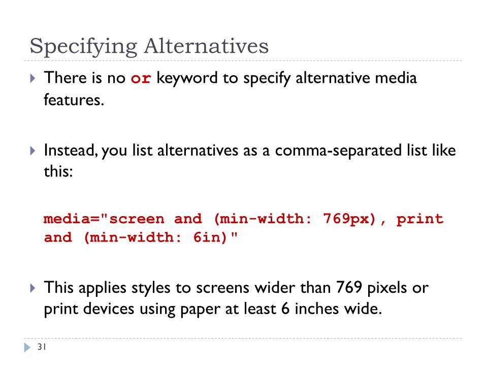
Specifying Alternatives
31
There is no or keyword to specify alternative media
features.
Instead, you list alternatives as a comma-separated list like
this:
media="screen and (min-width: 769px), print
and (min-width: 6in)"
This applies styles to screens wider than 769 pixels or
print devices using paper at least 6 inches wide.

Specifying Negative Conditions
32
To specify a negative condition, you can precede the media declaration with the keyword not like this:
media="not screen and (monochrome)”
You can't use not in front of an individual condition. The
keyword must come at the beginning of the declaration,
and it negates the whole declaration.
So, the preceding example applies to all devices except
monochrome screens.
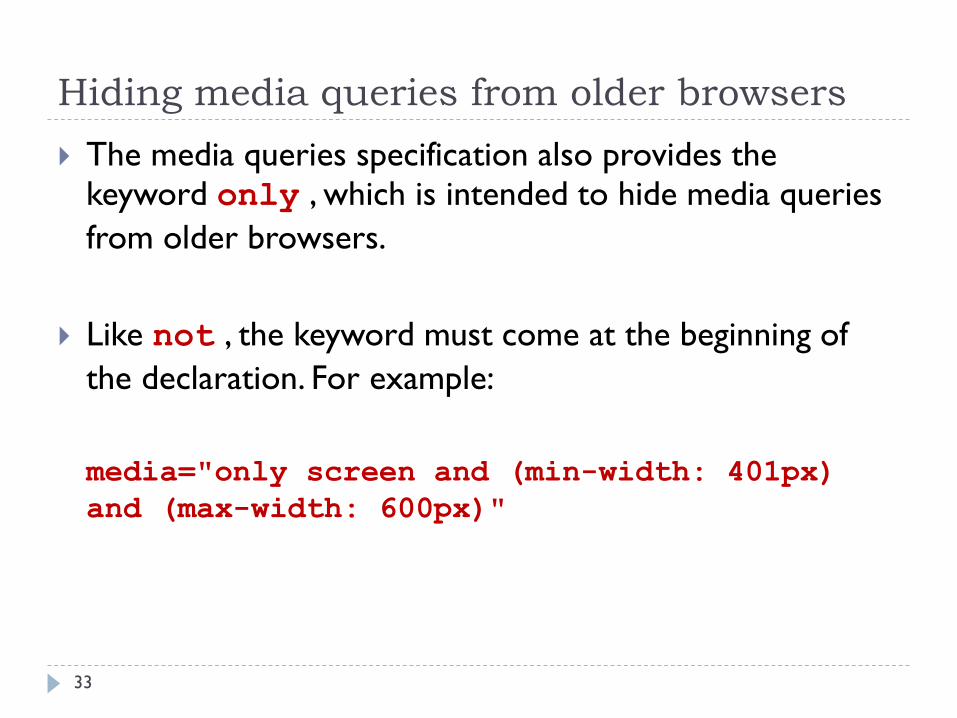
Hiding media queries from older browsers
33
The media queries specification also provides the keyword only , which is intended to hide media queries
from older browsers.
Like not , the keyword must come at the beginning of
the declaration. For example:
media="only screen and (min-width: 401px)
and (max-width: 600px)"

Hiding media queries from older browsers
34
Browsers that don't recognize media queries expect a comma-separated list of media types, and the specification says they should truncate each value immediately before the first non-alphanumeric character that isn't a hyphen.
So, an old browser should interpret the preceding example as this:
media="only"
Because there is no such media type as only , the style sheet is ignored.

Hiding media queries from older browsers
35
Similarly, an old browser should interpret the following
as media="screen" :
media="screen and (min-width: 401px) and
(max-width: 600px)"
In other words, it should apply the style rules
to all screen devices, even though it doesn't know what
the media queries mean.

Hiding media queries from older browsers
36
Unfortunately, IE 6–8 failed to implement the specification
correctly - instead of applying the styles to all screen
devices, it ignores the style sheet altogether.
In spite of this behaviour, it's still recommended to prefix media queries with only if you want to hide the styles
from other, less common browsers.

Dealing with older versions of Internet
Explorer
37
The lack of support for media queries in IE 6 through IE 8
is not a problem.
Simply create a basic set of styles that are served to all
browsers without using media queries, and use the media
queries to provide an enhanced experience for visitors
using more advanced browsers.

Dealing with older versions of Internet
Explorer
38
Alternatively, use an Internet Explorer conditional
comment to serve a special set of rules to older versions
of IE like this:
<!--[if lt IE 9 & !IEMobile]> <link
href="iestyles.css" rel="stylesheet"
type="text/css"> <![endif]-->

Using media queries with @import and
@media
39
In addition to using media queries in <link> tags when
attaching an external style sheet, you can use them with @import and @media .
The basic syntax is the same. E.g., the following imports a
style sheet and applies the styles to devices with a screen
that's no wider than 400 pixels:
@import url("phone.css") only screen and
(max-width:400px);

Using media queries with @import and
@media
40
Media queries can also be used within a style sheet like
this:
@media only screen and (max-width:400px) {
#navbar { float: none; width: 400px; } }

Sending Differently-Compressed
Videos to Handheld Devices
41
Video files tend to be large, and sending very high-quality
video can be wasteful if sent to handheld devices where
the small screen sizes make high quality unnecessary.
There’s no point in sending high-definition video meant
for a widescreen monitor to a handheld device screen.
Compressing a video down to a size appropriate for a
small screen can save a lot of bandwidth, making your
server and - most importantly - your mobile users happy.

Sending Differently-Compressed
Videos to Handheld Devices
42
HTML5 allows you to use the media attribute on the
source element, which queries the browser to find out
screen size (or number of colours, aspect ratio, and so
on) and send different files that are optimised for
different screen sizes.
This functionality and syntax is borrowed from the CSS
Media Queries specification dev.w3.org/csswg/css3-
mediaqueries/) but is part of the markup, as we’re
switching source files depending on device characteristics.

Sending Differently-Compressed
Videos to Handheld Devices
43
Here, the browser is “asked” if it has a min-device-width
of 800px - that is, does it have a wide screen. If it does, it receives hi-res.ogv; if not, it is sent lo-res.ogv:
<video controls>
<source src=hi-res.ogv... media=“(min-
device-width: 800px)”>
<source src=lo-res.ogv>
</video>
Note that you should still use the type attribute with codecs parameters and fallback content previously discussed.