cs171: final project final project varun bansal, cici cao, sofia hou Process Book april 20, 2012
33
cs171: final project varun bansal, cici cao, sofia hou Process Book april 20, 2012
Transcript of cs171: final project final project varun bansal, cici cao, sofia hou Process Book april 20, 2012

cs171: final projectvarun bansal, cici cao, sofia hou
Process Booka p r i l 2 0 , 2 0 1 2
cs171: final projectvarun bansal, cici cao, sofia hou
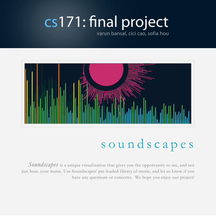
s o u n d s c a p e sSoundscapes is a unique visualization that gives you the opportunity to see, and not
just hear, your music. Use Soundscapes’ pre-loaded library of music, and let us know if you have any questions or concerns. We hope you enjoy our project!

Process BookI. Introduction
a. Data
b. Tasks
c. Users
d. Related work
II. Processa. Data collection
b. Real time player
c. Frequency analysis
d. Lyrics analysis
e. Beats analysis
f. Dashboard
III. Visual design
IV. Analysis
V. Logistics
VI. Conclusion
cs171: final projectvarun bansal, cici cao, sofia hou
tab
le o
f c
on
ten
ts
Initial Project Proposal
I. Summary
II. Problems
Updated Project Proposal
I. Change of direction
II. Libraries
III. Data representation
sketch

Our initial project aimed to convey data on economic development and environmental indi-cators, namely, deforestation, and urbanization, across the world. Based on a preliminary search for data, we had hoped that by combining data series from the United Nations Environment Programme and UNdata, we would be able to obtain a global coverage of this data. For the visualization itself, we envisioned a map of the world with overlayed data and informational boxes that appeared upon hovering over various geographic areas.
ProblemsUnfortunately, we ran into fairly significant problems in collecting data. The databases we were relying on proved to be sparsely populated, and reliable data was not available in any of the sources we turned to.
After much debate and collecting data for this initial proposal, we decided that the difficul-ties in locating data were large enough to merit a switch in the direction we were taking our project in.
Summary
initial project proposal

updated project proposal

After much debate and collecting data for our previous proposal, we decided that the difficul-ties in locating data were large enough to merit a switch in the direction we were taking our project in. Rather than visualizing international environmental data, we are now visualizing music data. Specifically, we plan on looking at metrics such as amplitude, frequency, and beat, and analyzing this data for things such as repeti-tive sequences. We will obtain the data by run-ning various Processing and Java libraries—such as Ess—on music inputted either from a file or from a mic.
We have been able to acquire the necessary data and have started the coding process.
LibrariesThe main library we are using to import sound and strip frequency is Minim. This is an better choice than ESS and Sonia because it takes in stereo input as opposed to only mono input. It has the capability of:
• Forward Fourier Transform (FFT) - fre-quency analysis
• Beat Detection
Change of Direction
updated project proposal
updated project proposal
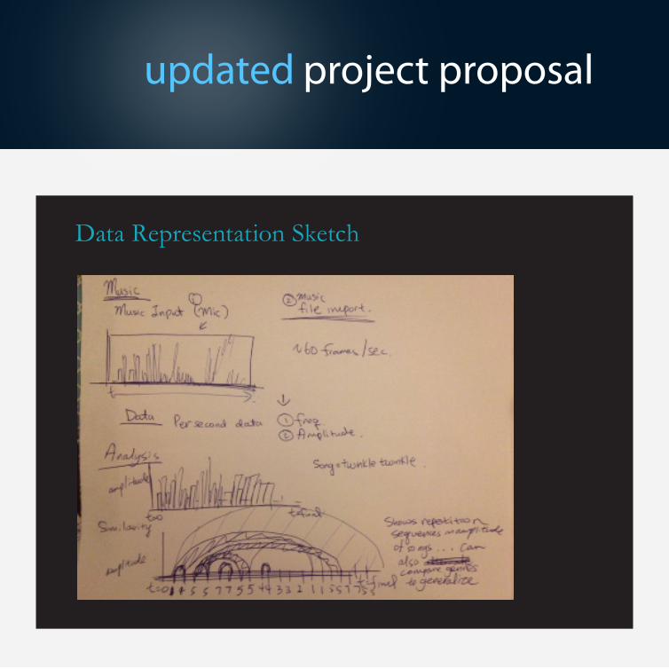
Data Representation Sketch

DataThe data is really a holistic breakdown of each song. From a song’s metadata, we have the song title (N), the Year Release (O), and the Artist (N). From the actual music itself, we collected the frequency spectrum (Q) and the beats (Q) - however, for the purposes of analysis we turned this beats data into categorical binary data. Finally we have the lyrics of the song for text analysis.
Note: N=Nominal Data, O=Ordinal Data, Q=Quantitative Data
TasksBefore we delve into the tasks, we should really preface them. With all the data that we have, we chose to break the analysis down into four main components: live play analysis, frequency analy-sis, beat analysis/comparison, and lyrics analysis.
Domain Tasks: With this visualization, we
Introduction
project process book
wanted the user to experience music not only aurally but also visually. While playing the music, the user can see how the frequency and beats change with time, hear and see a breakdown of the lyrics, as well as see the end result of the frequency and beat analysis. The user can there-fore see, compare, and contrast the variations in frequency, text, beat across 9 different genres of music.
Analysis Tasks: 1) Retrieve Value. This one is self-explanatory. Everywhere you click is full of data. 2) Filter. the ControlP5 checkboxes allow the user to filter by genre. 3) Find extremum, Range, and Outliers. The graphs of frequency and beats allows one to see the ranges of the data very easily as well as any outliers; as for the lyrics, the bigger the word is, the more often it appears.
4) Watching the visualization live. The user can hear and see the visualization at the same time!

project process book
UsersThe target audience is the general public, lovers of music, or simply those who want to learn about music. To appeal to the eclectic tastes of each individual, we have included nine main genres of music ranging from classical to country to Rap. This is not a visualization on the fundamentals of music theory so everyone has equal access to it - both for education and personal enjoyment!
Related WorkEveryone loves music, and with the physics of sound the data on music is limitless. Each indi-vidual piece of song can have a vast amount of frequency, amplitude, and beats data. However, we were inspired to analyze music after seeing a project named the Shape of a Song (http://bewitched.com/song.html )in which the author visualized, through arch diagrams, similar patterns within different types of songs. This
provided analysis on two levels: song and genre specific. On the song specific level, the arches showcased observations such as how the begin-ning of the song was similar to the end. On the genre specific level, comparing the arch diagrams of songs from different genres (i.e. modern techno or pop versus classical) shows characteris-tic patterns of each genre, with modern electronic and synthesized music displaying more repetition and similarity throughout the piece.
Chopin, Mazurka in F# MinorThe image illustrates the complex, nested struc-ture of the piece.

Thus, we decided to tackle the task of analysing music. Seeing the plethora of data that can be gathered from each song, our next task was to figure out how we will represent this wealth of information. What we ultimately decided to implement was a dashboard that will analyze beats via the arch diagram structure, frequency spectrums real time, and lyrics analysis for a comprehensive view of every type of song.
Data collectionChoosing the songs, song information: We selected nine genres (classical, country, elec-tronic, folk, rap, RnB, rock, jazz, and pop) and chose five popular songs from each genre. We then manually collected data on the songs, such as the artist. We assigned each song a unique id,
Process
project process book
and used this id to link the song name, informa-tion, the actual MP3 file of the song, the lyrics text file, and the generated word cloud of the lyrics.
Beats: The beats data was transformed into binary data form of 1s and 0s based on a specific threshold. Originally we had planned on mak-ing arc diagrams based on patterns of beats using suffix trees or another kind of algorithm. However, because our team had little back-ground in computer science algorithms, we had to switch into a simpler form of analysis as the prerequisites to constructing arc diagrams were very much beyond our scope of knowledge and comfort. We spent an extensive amount of time here researching algorithms before finally opting for the alternative solution.
Therefore, we manually ran through all 45 songs using the Minim library and collected thousands of beats per song. Then using Python, we cal-culated the beats ratio for each song. Combined
Philip Glass, Candyman 2
project process book
with frequency spectrum data, we then plotted them to see how they correlate for each song/data point.
Frequency: The frequency data was collected in a similar way to beats, using the Minimum library. Like beats, this was also done manually in the sense that we had to play through all 45 songs to get the frequency data for each indi-vidual song.
Lyrics: Though we originally planned to use a web scraper to download the lyrics data, we found that there were no single website that had the lyrics for many of the songs; the lyrics were found across many website. In addition, many website had inconsistent internal standards, mak-ing accurate scraping difficult. Therefore, we had to resort to manually extracting the lyrics from each website and exporting into a text file for each song.
Real time playerProblem Abstraction
Because sound is so integral to music, we knew that a real time music was crucial to the project. Thus, we used the minim library to source a player that will read in mp3 and replay it when the program was run. We at first considered different libraries such as ESS but minim was chosen for its comprehensiveness and the ease in reading mp3 over .wav files. However, because there was a screen that comes with the option, we wanted to visually show real time data of the music somehow. Thus, taking popular convention into consideration, we decided to showcase the buckets of frequencies at each time step. That, way the frequencies are shown real time with the player. Additionally, to increase user interactivity, code was dissected and integrated with ControlP5 objects for the user to play and pause the music at will and to drag the tab to different parts of the music.

project process book
Design evolution
Design wise, the major decision was regarding how to display the frequencies. Very simple bar graphs were created a first. However, due to the large number of bins in the frequency spectrum (512), the bar graphs looked like very thin lines that weren’t too stylized. Thus, we decided to aggregate consecutive bars to reduce the spec-trum to 256. The most intuitive representation was the horizontal display across an axis of the
frequencies. However, to make the graph more aesthetically pleasing as well as to highlight bars that show especially high magnitudes for the bin, ranges were specified and tied to colors (blue for low, red for high) as to make a multicolored and magnitude weighted color spectrum for the frequency spectrum.
However, that still didn’t populate the whole diagram since the highest frequency bins rarely spike in certain types of music. Thus, we decided
project process book
to add in a beat detector mechanism which was an expanding circle that expanded and was high-lighted whenever a beat was recognized during the music playback.
To make the player even more stylized and also to show a more distinct way of where frequency magnitudes were, we wrapped the horizontal axis of the original analysis into a circle. Thus, this not only added increased excitement in terms of representation but also condensed the spectrum into something more condensed for the user to recognize. However, coding the circled frequency lines was rather complicated due to the require-ment to specify all four coordinates of each rect-angle. Trig was used to calculate the necessary angles and weights to figure out the code. Lastly, because the frequencies were wrapped around the beat indicator circle, we decided to make its color scheme synonymous to the indicators, which meant that it was dim when there were no beats and highlighted gradually when there were. This way, the color and movement of this frequency representation didn’t clash with the horizontal axis. In fact, the circled representation was a
great way of looking at the whole of the frequency spectrum while the horizontal representation was a more detailed look at the first half of the spectrum.
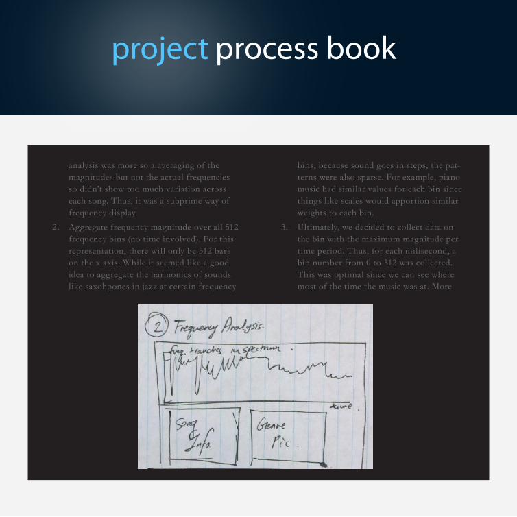
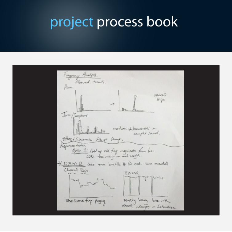
Frequency analysisProblem Abstraction
Since frequency is such an integral part of music analysis, this tab was definitely necessary. How-ever, there was much debate in terms of how to represent the frequencies. Due to the nature of the minim library, we had a wealth of data. For every milisecond, we had 512 data points for the mag-nitude of each frequency bin. Thus, a true repre-sentation of the frequency would be a 3D one but even that was way too big (imagine the number of miliseconds in the length of a song multiplied by 512). Thus, we had to think of a good method of representing a single number over time that will show some variations between the different songs and genres. Three mechanisms were considered:
1. Average frequency magnitude over all 512 frequency bins for each time period: This

project process book
project process book
analysis was more so a averaging of the magnitudes but not the actual frequencies so didn’t show too much variation across each song. Thus, it was a subprime way of frequency display.
2. Aggregate frequency magnitude over all 512 frequency bins (no time involved). For this representation, there will only be 512 bars on the x axis. While it seemed like a good idea to aggregate the harmonics of sounds like saxohpones in jazz at certain frequency
bins, because sound goes in steps, the pat-terns were also sparse. For example, piano music had similar values for each bin since things like scales would apportion similar weights to each bin.
3. Ultimately, we decided to collect data on the bin with the maximum magnitude per time period. Thus, for each milisecond, a bin number from 0 to 512 was collected.This was optimal since we can see where most of the time the music was at. More

project process book
will be disclosed in the discussion regarding design evolution.
Design Evolution
Ultimately, the objective was to visualize the bins to show some sort of pattern. It was decided that the most intuitive and simple method was just a line graph connecting the numbers of each bin size. From doing so, we can see that songs such like classical piano skirts over different frequen-cies rather steadily. There aren’t too many leaps in the frequency bins and the frequencies tended towards the middle ranges at times. However, music such as house and electronic mostly were in the lower bins with occasionally jumps to the other extreme of the spectrum. In terms of representing these trends distinctly, we realized that it’s not the frequency values that matter but the actual shape of the graph. Thus, there is only a horizontal axis that signal progression over time. The line graph is graphed on top. Because for some songs, most of the data tend to ag-gregate on the bottom frequency bins, it would be hard to see this phenomenon if these ranges
were obstructed by the horizontal axis. Thus, in this representation, the bin frequency number was inverted such that the lowest bin values were on top and the highest closer to the time axis.
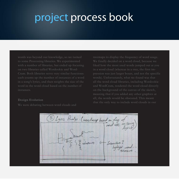
Lyrics analysisProblem Abstraction
From the start, we felt as if somehow visualizing the lyrics for each song would add a new dimen-sion beyond the analysis of the beats and frequen-cies. For the lyrics, we initially hoped to create original code to create a word cloud and have interactivity; for example, a user hovering over a word would bring a dialogue box displaying infor-mation on the word’s usage frequency within the song being played. However, what we found was that creating word clouds is actually significantly harder than we originally thought: it involves writ-ing algorithms that not only take the weight of a word into considerations, but also need to alter sizing, font, rotation, and display to fit the words within each other to create a visually appealing graphic. After some attempts, we quickly learned that creating a good algorithm to display the
project process book
project process book
words was beyond our knowledge, so we turned to some Processing libraries. We experimented with a number of libraries, but ended up focusing on two libraries called Wordookie and Word-Cram. Both libraries serve very similar functions: each counts up the number of instances of a word in a song’s lyrics, and then weights the size of the word in the word cloud based on the number of instances.
Design Evolution
We were debating between word clouds and
treemaps to display the frequency of word usage. We finally decided on a word cloud, because we liked how the most used words jumped out at you in a word cloud (whereas in a tree, the first im-pression was just larger boxes, and not the specific words). Unfortunately, what we found was that all the word cloud libraries, including Wordookie and WordCram, rendered the word cloud directly on the background of the canvas of the sketch, meaning that if you added any other graphics at all, the words would be obscured. This meant that the only way to include word clouds in our

project process book
visualization was as images. Therefore, we wrote a separate script that fed in the lyrics for each song, created the word cloud visualization, saved it, and moved on to the next song. We then pulled from these images to display in the Lyrics Analysis but-ton display whenever needed. Unfortunately, this meant that we had to leave behind the interactive element of this particular visualization, as the visualization is not being run in real time. This was unfortunate, as it was counter to our original goals, but given the constraints posed by the cre-ators of the library (and by our lack of knowledge of these placing algorithms) it was the best we could do.
Beat analysisProblem Abstraction
In the beginning, as mentioned in the data col-lection section, we really wanted to pattern match the beat sequence for each song. In particular, we wanted to use the concept of arc diagrams to achieve this. Unfortunately, despite significant efforts to draw these diagrams, we realized that none of us possessed the knowledge of the
algorithms needed to find and visualize the beat patterns within a particular song.
Design Evolution
The design choice of making it a scatterplot was simplicity of displaying quantitative data. It was easy to see where songs fit on the graph. Since beats data was mainly binary, it wouldn’t make for an interesting plot if we simply displayed it by itself. Instead it was more interesting to pair it up with frequency since most of our visualiza-tion was based on these two datasets. To see the relationship, you can filter by genre too since it would be interesting to know if there are patterns between groups as well as within groups.
DashboardProblem Abstraction
Originally we wanted to filter by time (decades), genre and song. However, after acquiring the data and realizing that most songs were from the current decade, we decided that it was better to simply filter by song and genre. This was the most intuitive course of action because when we gath-

project process book

project process book

project process book

project process book
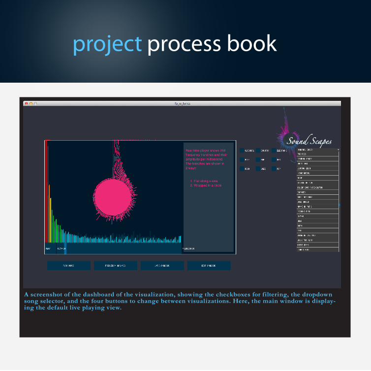
On the homescreen, there is one main viewer window where the visualizations themselves occur. To the right side are the filters. These are grouped into two categories:
• By genre: checkboxes that allow you to filter both the song list and the visualization by the 9 different genres
• By song: lyric and frequency analysis as well as the player function are song specific
Below the homescreen are the navigation but-tons. There are four navigation buttons, and clicking one changes the visualization in the main viewer window.
• Player: listen to each song and see the beats of the song as well as the frequency spectrum bars shoot-up as the song plays. The bars are also around the beat since it’s a better representation of the whole spec-trum. It wraps something really long into something that is compact and that doesn’t
Visual Design
project process book
ered the data, we specifically gathered five songs for each of the nine genres we had selected.
The filter interacts with every part of the visualiza-tion in that the genre filters the song list as well as the data in the beat analysis segment.
Design Evolution
We wanted to keep the design clean and simple using ControlP5. We wanted screens that changed depending on what button we need and the visu-alization to change depending on the filter and selected song.

distort the data. Therefore the user can have an easier time comparing the spectrum bars, especially for genres such as classical. The spectral nature of the bars allows the eyes to immediately see spikes in frequency since the music moves so fast.
• Frequency Analysis: For this view, a graph of frequencies in the song over time is dis-played, along with basic information about the song itself.
• Lyrics Analysis: See a word map of the most frequently used words in the current song. We were debating between word clouds and treemaps to display the frequency of word usage. We finally decided on a word cloud, because we liked how the most used words jumped out at you in a word cloud (whereas in a tree, the first impression was just larger boxes, and not the specific words).
• Beat Analysis: This is a pretty self-explanato-ry. Hovering over the individual data points gives you information about the point. Also filter mechanism work (i.e. checkboxes)! Here we debated about having 9 colors represent-
project process book
ing each of the 9 genres. We decided against it because 9 colors seemed like it would clut-ter. However, we were stumped as to other ways of better representing it.
For the user interface, the color palette was cho-sen using Adobe Kuhler with the already given palette of ControlP5. We wanted to match the visualization to controlP5’s palette to give the overall visualization more unity.
If we had more time, we would try and take the interactivity of this visualization even further than it already is. For instance, we would code our own algorithm for the word cloud for the lyrics. This would allow us to size it according to our wishes, and to place it in a location and layer as per our preferences. This, in turn, would allow interactivity.
Another aspect would be gathering more data. Our dataset is currently very small, and probably not significant since the sample size for each genre is merely five.
We would also have liked to figure out how the visualization could have the capability to take a user’s own MP3 file, audio recording, and mic

project process book
data stream in. Analyzing this audio data uses the same infrastructure we already have in place; all we would need to do would be to find a way to bring the audio in and be analyzed.
A screenshot showing the frequency display of the visualization. This display plots fre-quency vs. beats data in an interactive scat-terplot.
A screenshot showing the control-lers and filters located to the side of the visualization. The checkboxes allow filtering by genre, and the dropbox allows the selection of a specific song.

project process book
A screenshot showing the frequency graphs for a song in the main visualization window.
A screenshot showing the word cloud for the lyr-ics for a particular song.
project process book
A screenshot of the dashboard of the visualization, showing the checkboxes for filtering, the dropdown song selector, and the four buttons to change between visualizations. Here, the main window is display-ing the default live playing view.

project process book
Analysis
By looking at the data and visualizations, we see some very interesting results. For instance, to the right are screenshots of the results of looking for harmonies. Image (c) shows the harmonies from a piano, where we see relatively few harmonies. Next, we see (b), which is the output of a jazz piece. Here, we see more and richer harmonies. Finally, in (c), which is the output of a song focused on human vocals, we see a much richer harmonial structure, as indicated by the increased and stronger bars as well as the constant blue bars across the spectrum. We see more noise on the bottom level of voice. What we see here, basically, is that the jazz songs are richer than the piano, but the human voice is the rich-est harmonial instrument of all.
(a) (b)
(c)
project process book
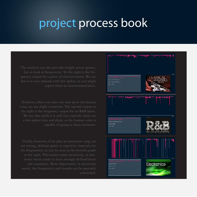
The analysis can also provide insight across genres. Let us look at frequencies. To the right is the fre-
quency output for a piece of classical music. We see that it is very smooth with few spikes, as you might
expect from an instrumental piece.
However, when you take one step up to the human voice, we see slight variations. The second output to
the right is the frequency output for an R&B piece. We see that while it is still very smooth, there are a few spikes here and there, as the human voice is
capable of going to these extremes.
Finally, however, if we play an electronic song, we see strong, defined spikes at repetitive intervals for the frequencies, as can be seen in the bottom graph
at the right. This makes sense intuitively, as elec-tronic music tends to have strongly defined beats
and sequences. More importantly, in electronic music, the frequencies and sounds can be precisely
controlled.

project process book
We can also glean some quick, though generally intuitive, insights from looking at the lyrics. First on the left we have the word cloud from a typical pop song. We see that it features high amounts of repetition, and so we see a relatively small sample of words repeated many times.
The second word cloud on the left is from a rap piece. As rap is a voice-based performance, as we might expect, the number and variety of words used is much larger than a typical pop song. So we see in the word cloud many words, with few very large words, indicating a lack of repetition.
Finally, the third word cloud on the left is from an electronic piece. We see that there are simply two words for the whole piece. This makes sense, as electronic pieces have few to no lyrics.

project process book
Unfortunately, while the other visualizations were quite successful, the beats one was not quite as good, as can be seen in the scatterplots generated, such as the one above. We were unable to produce a meaningful analysis from the beats. After some experimentation, we surmise that this is because the beats detector that was built into the minim library was inac-curate, causing inaccurate data collection and tracking for all the songs.

LogisticsThe work of this visualization was split very evenly among team members as the whole project was coded entirely together. We believed that this would be the most efficient way to code (agile programming) because there would be constant discussion whenever problems arose. It also meant that nobody would have to wait for the other to finish any one part.
ConclusionWe hope that you enjoyed this visualization as much as we had fun making it. This process of creating a complicated visualization was much difficult than we had anticipated, especially a visualization of multiple segments. There were many constraints and obstacles to be dealt with, particularly in terms of feasibly and design. When there were many interactive components, effi-ciency and design were trade-offs. It was the first time dealing with complex libraries, especially music ones. Nevertheless it was a great learning experience, as there is more and more data in the world, the role of visualization becomes that much prominent.