Narrative Perspective Point of View Author ’ s Point of View.

Creative Point of View■ BY K ATRIN EISMANN
Appreciating the light during the shortest days of the year is essential to make it through the winter, and using Photoshop to add color and light to your images can make the long winter nights pass more quickly.
Creative Color Blends
› ›
ph
ot
os
ho
p u
se
r ›
ja
nu
ar
y /
fe
br
ua
ry
20
08
058
Photoshop from the creative to the practical
Enhancing the image with color and contrast creates an
intriguing morning mood.
The pastel gradients mimic softer light.
MA
RK
BE
CK
ELM
AN
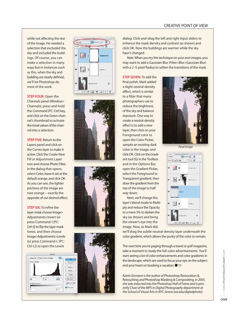
Adjustment Layer icon at the bottom of the Layers panel. Click OK to close the Curves dialog with no changes.
Next load the pastel gradients by selecting Edit>Preset Manager and choosing Gradients from the Preset Type menu. From the flyout menu (right-facing arrow), select Pastels, click Append to add them to the Gradient panel, and click Done.
STEP TWO: Now we’ll add a Gradient Fill layer. Click the Create New Fill or Adjustment Layer icon and select Gradi-ent. Once the Gradient Fill dialog appears, click the field next to Gradi-ent, choose the Linear Yellow, Pink, Purple pastel gradient, and click OK. As you can see here, it obliterates the entire image. Click OK to close the Gradient Fill dialog.
STEP THREE: Because this gradient is on its own layer, we can adjust it to enhance the colors of the image beautifully. Let’s change the blend mode to Multiply and lower the Opac-ity to 23%.
As is often the case, the creative process requires that you work flexibly and in this instance, Mark wanted to add density to the sky and warm the buildings to better reflect the new color of the light,
Enhancing photo-graphic color is emotionally similar to
painting, in which a painter applies a brush stroke and then reflects, reacts, and responds to the brush stroke by adding another one. In the process, the image grows, changes, and gains an identity of its own. In the case of sophisticated color blending, working with layers, masks, and blend modes allows you to experiment and grow with the image; admittedly, the final outcome often creates itself. It’s best to start off subtly and build the effect up to what you can create. In this before-and-after image, Mark Beckelman started with an early morning shot of the Chrysler Building in Manhattan and with a few appropriate layers, created the much richer final image. Here, we demonstrate his technique, with special thanks to Mark Beckelman—talented and inquisi-tive photographer and friend (visit www.beckelman.com for more information).
STEP ONE: Photographed against the light on a warm sum-mer morning, the air is thick with humidity, which reduced the image contrast. To enhance the morning light, we’ll first add a Curves adjustment layer by clicking on the Create New Fill or
CREATIVE POINT OF VIEW
› ›
ww
w.p
ho
to
sh
op
us
er
.co
m
059
Katrin Eismann is the author of Photoshop Restoration & Retouching and Photoshop Masking & Compositing. In 2005, she was inducted into the Photoshop Hall of Fame and is pres-ently Chair of the MPS in Digital Photography department at the School of Visual Arts in NYC (www.sva.edu/digitalphoto).
while not affecting the rest of the image. He needed a selection that excluded the sky and included the build-ings. Of course, you can make a selection in many ways but in instances such as this, when the sky and building are clearly defined, we’ll let Photoshop do most of the work.
STEP FOUR: Open the Channels panel (Window> Channels), press-and-hold the Command (PC: Ctrl) key, and click on the Green chan-nel’s thumbnail to activate the tonal values of the chan-nel into a selection.
STEP FIVE: Return to the Layers panel and click on the Curves layer to make it active. Click the Create New Fill or Adjustment Layer icon and choose Photo Filter. In the dialog that opens, select Color, leave it set at the default orange, and click OK. As you can see, the lighter portions of the image are now orange—exactly the opposite of our desired effect.
STEP SIX: To refine the layer mask choose Image> Adjustments>Invert (or press Command-I [PC: Ctrl-I]) to flip the layer mask tones, and then choose Image>Adjustments>Levels (or press Command-L [PC: Ctrl-L]) to open the Levels
dialog. Click-and-drag the left and right input sliders to enhance the mask density and contrast (as shown) and click OK. Now the buildings are warmer while the sky hasn’t changed.
Note: When you try this technique on your own images, you may want to add a Gaussian Blur (Filter>Blur>Gaussian Blur) with a 2–5-pixel Radius to soften the transitions of the mask.
STEP SEVEN: To add the final polish, Mark added a slight neutral-density effect, which is similar to a filter that many photographers use to reduce the brightness of the sky and balance exposure. One way to create a neutral-density effect is to add a new layer, then click on your Foreground color to open the Color Picker, sample an existing dark color in the image, and click OK. Click on the Gradi-ent tool (G) in the Toolbox and in the Options Bar, open the Gradient Picker, select the Foreground to Transparent gradient, then draw the gradient from the top of the image to half way down.
Next, we’ll change this layer’s blend mode to Multi-ply and reduce the Opacity to a mere 5% to darken the sky (as shown) and bring the viewer’s eye into the image. Now, as Mark did, we’ll drag the subtle neutral-density layer underneath the color gradient, which allows the purity of the color to remain.
The next time you’re paging through a travel or golf magazine, take a moment to study the full-color advertisements. You’ll start seeing a lot of color enhancements and color gradients in the landscape, which are used to focus your eye on the subject and your heart on booking a vacation. ■
Final image