Visual Semantic Planning Using Deep Successor Representations
Upload
qhrclinicalopsCategory
view
271download
2
1 Proprietary and Confidential
Moving Past Summary Statistics and into Charting as a Means to View Processes and Improvement Over Time
If you haven’t already viewed the introduction to summary statistics please see
the “Understanding and Using Summary Statistics” SlideShare http://www.slideshare.net/QHRClinicalOps/using-summary-statistics
This presentation will walk through creating a visual representation of time
period data
Metric Hospital LOSCount (N) 30Arithmetic Mean (Average; Mean)
3.1
Standard Deviation 0.67Minimum 1.95th Percentile 2.025th Percentile 2.6Median 3.175th Percentile 3.495th Percentile 4.2Maximum 4.3
012345
7/1/
2012
8/1/
2012
9/1/
2012
10/1
/201
2
11/1
/201
2
12/1
/201
2
1/1/
2013
2/1/
2013
3/1/
2013
4/1/
2013
5/1/
2013
6/1/
2013
7/1/
2013
8/1/
2013
9/1/
2013
10/1
/201
3
11/1
/201
3
12/1
/201
3
1/1/
2014
2/1/
2014
3/1/
2014
4/1/
2014
5/1/
2014
6/1/
2014
7/1/
2014
8/1/
2014
9/1/
2014
10/1
/201
4
11/1
/201
4
12/1
/201
4
LOS (Days) Over Time
Going From This: To This: To Ultimately This:
2 Proprietary and Confidential
What is a “Run Chart” and What Do I Need to Create a Run Chart?
A “Run Chart” is simply a graph that displays observed data in a time sequence
It allows the user to view the process over time and compare each observation with the median value
for the entire period
Run Charts provide a visual representation of whether the process is improving, find trends in the data,
and determine any outliers or periods that may need further investigation
Run charts require 3 pieces of information:
A Defined Time Period
Variable, tracked over the defined time period
MEDIAN of Variable Being Monitored over the entire time period
I have created an example to walk you through all of the steps and data needs to create such a chart
012345
7/1/
2012
8/1/
2012
9/1/
2012
10/1
/201
2
11/1
/201
2
12/1
/201
2
1/1/
2013
2/1/
2013
3/1/
2013
4/1/
2013
5/1/
2013
6/1/
2013
7/1/
2013
8/1/
2013
9/1/
2013
10/1
/201
3
11/1
/201
3
12/1
/201
3
1/1/
2014
2/1/
2014
3/1/
2014
4/1/
2014
5/1/
2014
6/1/
2014
7/1/
2014
8/1/
2014
9/1/
2014
10/1
/201
4
11/1
/201
4
12/1
/201
4
LOS (Days) Over Time

3 Proprietary and Confidential
Step 1: Tracking the Data and Getting it Ready for Charting
Each month, the hospital recorded each visit’s length
of stay and then found the monthly Average LOS by
summing the total length of stay for all visits and
dividing by the number of visits
They recorded this each month as that month’s
Average LOS
Next, the hospital calculated the median Length of
Stay using the Excel Formula: =MEDIAN(Array). The formula is as follows in this example:
=MEDIAN($B$3:$B$32); copied down for the entire time period
Alternatively, you can use the "Insert Function" option found
under the formulas menu or the "fx" option found next to the
formula bar to search for the MEDIAN() formula (Instructions
based on Excel 2010)
4 Proprietary and Confidential
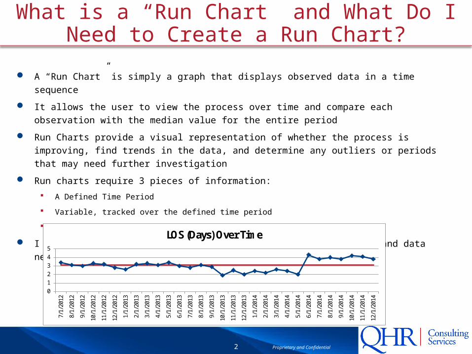
Step 2: Creating a Basic Run Chart – Part 1
Go to the "Insert" menu and select
the type of chart you want. In this case, we want to use a line
chart.
After you select the chart type
(assuming you have not
preselected the data), a blank
window will appear.
Right click on this new window to
see a list of options (or go to the
"Drawing Tools: Format" tab after
selecting the chart).
In this menu, you want to select
"Select Data Source" to access the
data series menu.

5 Proprietary and Confidential
Step 2: Creating a Basic Run Chart – Part 2
In the “Select Data Source” menu, you
will use the "Add" option under "Legend
Entries (Series)" to select your data
Enter the name of the series in the first
option, or link the name to a cell using
the icon to the right of the entry box
Select the range of the values you wish
to be displayed as “Series Values” by
using the icon on the right hand side of
the second bar
Each Series added must be done
individually, repeating the above 2 steps
You will be adding two series to the
chart.
Average LOS: in this case the series values
would be =$B$3:$B$32
Median LOS: in this case the series values
would be =$C$3:$C$32
6 Proprietary and Confidential
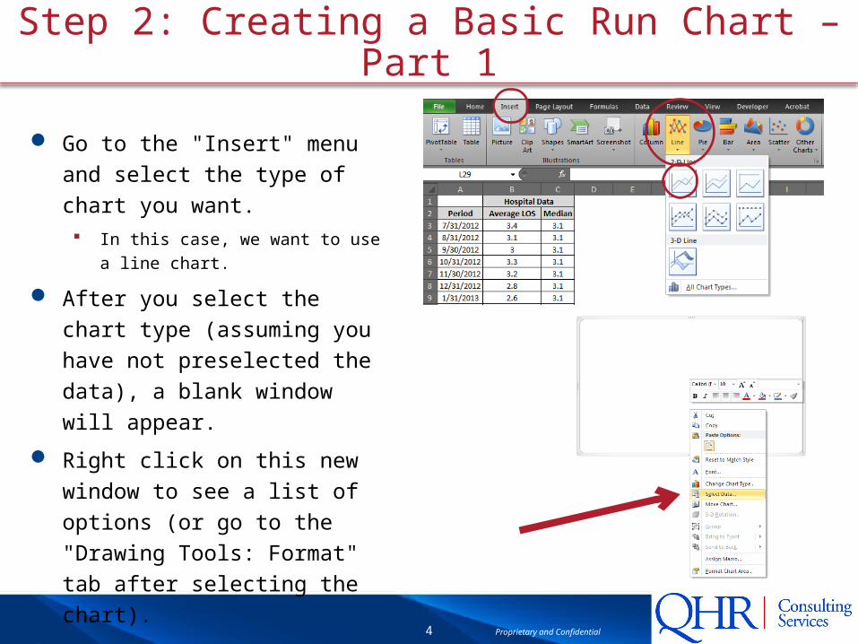
Step 2: Creating a Basic Run Chart – Part 3
The final Step of the chart is
ensuring that the "Horizontal
(Category) Axis Labels" match the
desired labels
If they do not by default, simply use
the "Edit" option for this section and
select the range of labels desired,
in this case we select the date
range
The final product should look like
the chart pasted to the left
Now that you have the data linked
to the chart, you can customize the
look and feel of the chart to better
fit your needs
00.5
11.5
22.5
33.5
44.5
5
7/1/
2012
9/1/
2012
11/1
/201
2
1/1/
2013
3/1/
2013
5/1/
2013
7/1/
2013
9/1/
2013
11/1
/201
3
1/1/
2014
3/1/
2014
5/1/
2014
7/1/
2014
9/1/
2014
11/1
/201
4
Average LOS
Median

7 Proprietary and Confidential
Step 3: Customizing a Chart to Fit Your Needs
Customization options are
available in Excel’s Ribbon,
visable after you click on the
chart, under the “Layout” Tab
Some common chart
customization includes: Adding a title
Adding Axis Titles
Moving or removing the legend
Removing the gridlines (not performed on
this chart)
Resizing the chart (done by grabbing the
corner of the chart and dragging until
desired shape/size)
The screenshots are of the
customization selections I made
with the end result shown below
0
1
2
3
4
5
7/1/
2012
8/1/
2012
9/1/
2012
10/1
/201
2
11/1
/201
2
12/1
/201
2
1/1/
2013
2/1/
2013
3/1/
2013
4/1/
2013
5/1/
2013
6/1/
2013
7/1/
2013
8/1/
2013
9/1/
2013
10/1
/201
3
11/1
/201
3
12/1
/201
3
1/1/
2014
2/1/
2014
3/1/
2014
4/1/
2014
5/1/
2014
6/1/
2014
7/1/
2014
8/1/
2014
9/1/
2014
10/1
/201
4
11/1
/201
4
12/1
/201
4
Aver
age
LOS
LOS (Days) Over TimeMedian LOS