Courtney Golightly - EGRD5003: Audiences & Contexts
28
AUDIENCES AND CONTEXTS EGRD5003 Courtney Golightly 1106941 EGRD5003 Audience and Context 12/13
-
Upload
james-pentland -
Category
Documents
-
view
222 -
download
3
description
Courtney Golightly - EGRD5003: Audiences & Contexts
Transcript of Courtney Golightly - EGRD5003: Audiences & Contexts

A U D I E N C E S A N D C O N T E X T S E G R D 5 0 0 3
Courtney Golightly1106941
EGRD5003Audience and Context 12/13

A U D I E N C E S A N D C O N T E X T S E G R D 5 0 0 3
CONTENTS:Signatures:
ProposalExperimentation
ResearchMore experimentation
OutcomeEvaluation
Animal Instincts:
ProposalResearch
ExperimentationOutcomeEvaluation
Bibliography

A U D I E N C E S A N D C O N T E X T S E G R D 5 0 0 3
SIGNATURES

A U D I E N C E S A N D C O N T E X T S E G R D 5 0 0 3
The brief I have chosen to do is ‘Signatures’: design a set of signs or symbols that represent both the collective and individual identities for a group of work colleagues. The group I have chosen to do are my classmates. To show the class individually I want to show them as an individual person, but collectively I would like to combine the individual properties of each person. To do this, I intend to firstly simplify the person individually to make certain facial features of that person stand out. I then want to use the most noticeable feature which defines that person ad combine it with other features of the classmates. This will create a whole new ‘identity’ or ‘person’. The final image I then intend to use as a symbol in a social experiment, where the community can see my work and I can gather feedback.
PROPOSAL

A U D I E N C E S A N D C O N T E X T S E G R D 5 0 0 3
I started off by painting my classmates using acrylic paint as silhouettes. The reason the faces do not have much detail such as shading is because I did not want the faces to instantly stand out as that person. I wanted the most noticeable parts of a certain persons face to stand out, so that it can be used to create the final ‘person’. I also filmed the process of the paintings, which shows how nicely the faces come together just by adding little details. Be it a mark to show where a mouth would sit, or a line to show an eyebrow, all together it shows that person.I filmed every painting, but unfortunately, the format that my camera put the files into was not compatible with my laptop, which meant that I need to use different software to edit my movies. However, the files were too large and the resolution and quality of them were bad. This meant that I was only able to edit one film clip.
DEVELOPMENT
To view video, click here

A U D I E N C E S A N D C O N T E X T S E G R D 5 0 0 3
This shows the stages of development for Steve. As you can see the photograph is painted (right), and then I edit the painting (below) to make it more crisp. This allowed me to Photoshop the images.
STEVE DEVELOPMENT

A U D I E N C E S A N D C O N T E X T S E G R D 5 0 0 3
These are only four of the twenty-seven portraits I created of my classmates. These show how certain aspects of the faces stand out to show that individual person. The reason that these are not done in colour is because it took away the simplicity of the features. I wanted to show that even if a facial feature of a person is all black, it can still be noticeably them.

A U D I E N C E S A N D C O N T E X T S E G R D 5 0 0 3
These are the final outcomes which show the individual facial features of my class mates combined to create a new ‘identity’. I intend to use this as the image on my card to symbolise a person.

A U D I E N C E S A N D C O N T E X T S E G R D 5 0 0 3
For my research I needed to look at how these certain types of flyers and cards are dispersed. The main way these are shown to the public are inside telephone boxes. The images are shown multicoloured and not stuck on very neatly. They look as though they are just quickly put there and not cared about.
S.D. (20/11/2012) Phone box prostitute calling cards
M@. (27/03/2008) 17 Boxes Of Smut
RESEARCH

A U D I E N C E S A N D C O N T E X T S E G R D 5 0 0 3
To the left you can see my own visual concept of a card of this nature. Due to the ‘person’ I have created, it does not look neither man or woman, so I had to advertise it as both. The typography that I used is similar to the ones in my research, but as they are all very different, I realised that the type used on these cards is not thought about a lot, and any type that catches someone’s attention will do.
S.D. (1996). Six Inch Killaz: Shoot to kill.
Jez Higgins. (09/01/2001). Prostitute Trading Trumps.
VISUAL CONCEPT

A U D I E N C E S A N D C O N T E X T S E G R D 5 0 0 3
I also referred to my research when developing the colour of the leaflets. The colours used are very bold, striking and used to catch someone’s attention over the others inside the telephone box. This is why I used such bright colours, as these are supposed to be noticed. As for the colour of the ‘person’, this was kept black as it became very confusing when put in colour. When used just in black, it also gives a sense of secrecy.
VISUAL CONCEPT II

A U D I E N C E S A N D C O N T E X T S E G R D 5 0 0 3
To get my cards in the public eye, and for them to be used by who I intended, I put them inside
telephone boxes around South Shields. I chose to distribute these around South Shields as in places
such as London there are so many to choose from and there is a possibility I would not get any
responses, whereas South Shields these are hardly seen and would catch a lot more attention. I was very uncertain about the E-mails I would receive, whether they be serious, funny, or if I would not get any replies and they just be taken down by
south Tyneside council.

A U D I E N C E S A N D C O N T E X T S E G R D 5 0 0 3
As well as sticking the cards inside telephone boxes, I also put them onto lights and on shop doors alongside other advertisements. Unfortunately, the ones on the shop doors were taken down instantly. This showed me exactly why they are only put inside of telephone boxes and showed me the feeling they were giving people. I am glad I tried this, as I was unsure if they looked more funny than serious.
REAL LIFE APPLICATION

A U D I E N C E S A N D C O N T E X T S E G R D 5 0 0 3
This is the outcome of the signs I placed around my town. It was pleasing that I did receive these emails as I was unsure if they would work. This shows that although I only received three emails, they are very different and show the different responses to the cards. One of them being very serious and upset by them, and the others not.
OUTCOME

A U D I E N C E S A N D C O N T E X T S E G R D 5 0 0 3
EVALUATIONFor this brief I chose to design a set of signs or symbols to represent my class mates both individually and collectively. To do this I first thought of how to represent my class mates individually, and decided to use their facial features. The reason for this being that every persons features shows them as an individual and features that stand out are noticeably that person. I used Acrylic paint to paint portraits of each separate person, so that I could make certain features stand out and also change them if it is not noticeably that person.I had to change some of the portraits because one of the problems I had when showing them to people was that it did not stand out straight away as to which person it was. To change this I painted the faces in different ways and see if it was more noticeable, I did this until the person was understandably them. I kept the colour of the paint as black, as colours made the portraits look confusing and did not make the features stand out at all; keeping it black and white silhouettes meant that visually you could look at certain aspects of the face and determine which person it is without an enormous amount of detail. While painting the portraits, I also filmed the process. All twenty films turned out very well and looked exactly how I intended them to look on the camera, but unfortunately I was unable to create as many movies as I intended. I wanted to create a montage of all of the films, but the files were too large and I did not have the software skills to create the movie. I got help from my class mate James Pentland, who helped me to salvage one of the smaller files and create a fastened up movie of my painting process using Final Cut pro. With the portraits painted, I then scanned them into the computer so that I could cut out the features of the individual person and merge them together in the form of a new face – a new identity. With this new image formed, I then began to research into how I could use this as a symbol and get it into the public eye. For this I was very interested in the cards inside of telephone boxes which advertise prostitutes and escorts. I created my own design of cards using the three different ‘identities’ created, making them bright and eye catching so that I could use this as a social experiment and see if I could get emails from the public relating to my cards. I looked closely at the typography used on the cards, and every card I looked at in my research used a different type, which showed me that the type is not the part of the card which is thought about the most, and as long as it stands out and catches a persons eye within a mixture of other advertising cards then it doesn’t matter. The area I used for these cards to be placed was South Shields, this meant that there was less competition and more chance of me getting a response from the public as these cards as not around that area as much as London. This went well and I did receive emails from the public. Not as many as I would have liked, which was down to me not placing enough and not spreading them widely around the area. The responses varied from funny to serious, which did not give me a direct idea of the reaction the cards cause. If I was to do this assignment again, I would make changes so that I could make my montage movie, and intend to do this in the future. I would also create a wider range of cards using the face, making them look more interesting which would get me more of a response from the public. I would then like to use my cards in London to get a response from people who would actually use these cards for reason they are intended.
A U D I E N C E S A N D C O N T E X T S E G R D 5 0 0 3
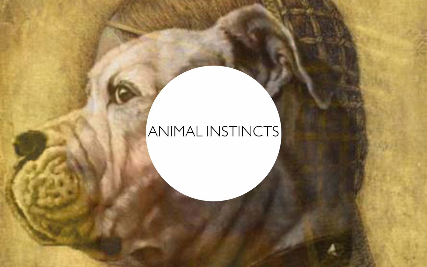
ANIMAL INSTINCTS

A U D I E N C E S A N D C O N T E X T S E G R D 5 0 0 3
The brief I have chosen to do is ‘Animal instincts’: – personify an animal or animals so as to illustrate basic human instincts or characteristics. I chose this assignment because it was one that interested me. For this I intend to show an animal in human form, to create images which visually stand out and put an animal in a human environment. The final images I intend to put onto Instagram for them to be seen by people around the world, this way I can see how many people ‘like’ my images, and get comments on my work.
PROPOSAL

A U D I E N C E S A N D C O N T E X T S E G R D 5 0 0 3
For part of my research I looked at an artist called Charlotte Caron. Her work is chunked into four series—Landscapes, Portraits, Vanities, and Anatomy—the unique treatment of the Portraits have particularly stood out. A beautifully imaginative hybrid of humans and animals, “this series of paintings, photographs, trying to respond to a form of duality—that assumes an animal part—by the medium of painting in addition, runs, mask, portrait,” according to the artist statement. “To ultimately create an osmosis between the two mediums, so between the animal and the portrait.”The reason this work interested me is because they combine the animal form with the human form to merge them into one.
Caron, (2011) Charlotte Caron’s painted portraits
C h a r l o t t e C a r o n
RESEARCH

A U D I E N C E S A N D C O N T E X T S E G R D 5 0 0 3
These show my response to my research of Charlotte Caron’s paintings. I wanted to create work similar by painting animal heads onto a human head. Although, these did not come out exactly how I intended, as although they look interesting they do not show an animal as a human. This meant that I had to change my concept and research more to get a better idea.

A U D I E N C E S A N D C O N T E X T S E G R D 5 0 0 3
This is the experimentation I did when trying to combine a human with an animal. As this is done widely around the internet, I used myself, and my cats to show it is my own work. This went one step closer to the work I want to create, but is not what I want. Again, this gave me a completely different route to go down, and further research was needed.
EXPERIMENTATION

A U D I E N C E S A N D C O N T E X T S E G R D 5 0 0 3
S.Hopper, B. Fletcher. (2013). Sound Influx’s Birthday Party
MisterEpicMann, (2013), http://www.youtube.com/watch?v=qnydFmqHuVo
RESEARCH
I did more research into how people put an animal into a human environment, or vise versa.

A U D I E N C E S A N D C O N T E X T S E G R D 5 0 0 3
Pope Saint Victor. (01/02/2010). Oreamnos americanus basketballicus
Upon looking at the work of ‘Pope Saint Victor’, I created my own style similar to his work (one up, and right). This started to give me the look I was going for, and I began to develop my work from here. Although I want my work to look similar, I want it to have my own look..

A U D I E N C E S A N D C O N T E X T S E G R D 5 0 0 3
After researching various artists, and experimenting in ways of my own, I then began to create pieces of work which are visually interesting and would be interesting to the public to look at. The images I began to create show animals in a
human working environment. Visually, the images look funny, interesting, and would draw in the
public’s attention. Because I intend these images to be on ‘Instagram’, they need to stand out
compared to other images.

A U D I E N C E S A N D C O N T E X T S E G R D 5 0 0 3
These are the images I created to show ‘animals at work’. I wanted to have the animal working a job which is suited to them, so a cow as a butcher and a dog as a postman etc.
GENERATION OF IDEAS

A U D I E N C E S A N D C O N T E X T S E G R D 5 0 0 3
GENERATION OF IDEAS II
I wanted to create a wide range of images for me to put onto Instagram. So I had to combine various types of animal with different styles of jobs. The images are intended to make people laugh and find visual interesting to look at.

A U D I E N C E S A N D C O N T E X T S E G R D 5 0 0 3
After creating my images, I then created an Instagram account for them to be shared around the world. The images were liked by over 40 people around the world within 5 minutes of me posting them onto the internet. Messages such as ‘Laugh out loud’ were commented on the images.
Golightly, C. (2013). Animal Jobs.

A U D I E N C E S A N D C O N T E X T S E G R D 5 0 0 3
EVALUATIONFor this brief I chose to personify and animal as to show basic human characteristics or instincts. For this I did a lot of research, and looked at various types of artist to see how they interoperate the same kind of brief. I then used this research and created my own pieces of work in this style to get a feel of what I wanted to create as a final piece that I could show to the public. I looked at paintings, and initially started to do more ‘hands on’ pieces of work, but this was a dead end for me as it was uninteresting and I realised if it did not appeal to me, then it would not be appealing to anyone else. This meant that my strategy had to change and I had to go down a different route. I hit a lot more dead ends when creating my work, as there was so many different ways to combine an animal with a human and give it human characteristics that I wanted my work to stand out among many other artists who have attempted the same brief. I looked at using myself as part of the work, and my own animals so that no one else would have the same work as me. This looked interesting and appealing but did not fit the brief very well. I wanted to look into work which is fascinating and quite humorous so that I would get a positive response from the public when showing them my work. I looked at trends going around the internet such as ‘how animals eat’ and seen that the public showed a positive reaction to humour. After researching more into the subject of animals and humans combines, the Flickr artist ‘Pope Saint Victor’ stood out to me the most, creating work which showed animal head on human bodies. I created images which were similar to his style, and developed it to create my very own style. My final work I put onto Instagram, which shows animal head on human bodies, but with a humorous twist. Putting a cows head on a butchers body received 18 likes from people around the world, some commenting on my work such as ‘laugh out loud’. This is exactly what I intended, and got the reaction I wanted.If I was to change anything and learn from in this assignment, I would like to be able to create a lot more pieces of work, and create a larger portfolio of work. In the future I intend to collaborate with James Pentland to create a book of work with the subject of animal heads on a human body. We both enjoyed each others’ work, and thought it a good idea to carry on with the subject and take it further.

A U D I E N C E S A N D C O N T E X T S E G R D 5 0 0 3
BIBLIOGRAPHY
C. Caron. (9th May 2012). CHARLOTTE CARON’S PAINTED PORTRAITS. Available: http://trendland.com/charlotte-carons-painted-portraits/. Last accessed 05/03/2013.Golightly, C. (2013). Animal Jobs. Available: http://instagram.com/animaljobs. Last accessed 15/04/2013.Jez Higgins. (09/01/2001). Prostitute Trading Trumps. Available: http://www.jezuk.co.uk/cgi-bin/view/prostituteTradingTrumps/starterPack?sheet=3. Last accessed 09/03/2013.J.Klima. (2013). How Animals Eat Their Food. Available: http://newmediarockstars.com/2013/04/1-5-million-viewers-tune-in-to-learn-how-animals-eat-their-food-video/. Last accessed 03/04/2013.M@. (27/03/2008). 17 Boxes Of Smut From The Euston Road. Available: http://londonist.com/2008/03/17_boxes_of_smu.php. Last accessed 12/04/2013.Pope Saint Victor. (01/02/2010). Oreamnos americanus basketballicus. Available: http://www.flickr.com/photos/popestvictor/4323508478/in/set-72157623329801420/. Last accessed 05/03/2013.S.D. (20/11/2012). Phone box prostitute calling cards. Available: http://commons.wikimedia.org/wiki/File:Phone_box_prostitute_calling_cards_1.jpg. Last accessed 04/03/2013.S.D. (1996). Six Inch Killaz: Shoot to kill. Available: http://www.thedragnet.org/blog/music/killaz/killaz_09.html. Last accessed 10/04/2013.
IMAGE SOURCES
http://www.buycostumes.com/p/31794/police-officer-plus-adult-costumehttp://www.flickr.com/photos/popestvictor/4323508478/in/set-72157623329801420/http://www.guardian.co.uk/lifeandstyle/2009/dec/05/pigs-trotters-oil-gluten-freehttp://raptorpolitics.org.uk/2012/07/16/the-eagle-owl-the-question-is-were-they-once-native-of-scotland/http://www.flickr.com/photos/stacy-lee/4883373450/