Corporate identity through graphic design - DiVA - Simple search
53
2002-09-12 Corporate identity through graphic design Anna Matsson Sofia Valtersson DEGREE PROJECT Graphic Arts Technology Nr: E 2529 GT
Transcript of Corporate identity through graphic design - DiVA - Simple search

2002-09-12
Corporate identity through graphic design
Anna MatssonSofia Valtersson
DEGREE PROJECT
Graphic Arts TechnologyNr: E 2529 GT

DEGREE PROJECTGraphic Arts Technology
ProgrammeGraphic Art Technology, 120p
Reg numberE2529GT
Year-Month-Day2002-09-12ExaminerGöran BryntseSupervisor at the Company/DepartmentGrant Johnston och Donal Fitzpatrick
Exents15 ECTS
NamesAnna MatssonSofia Valtersson
Company/DepartmentDe Pasquale and Queensland University of TechnologyTitle
Corporate identity through graphic design
Keywordscorporate identity, graphic profile, design, folder, advertisement, De Pasquale, Queensland University of Technology
Dalarna University781 88 BorlängeRöda vägen 3
Telphone: 023-77 80 00Faxnumber: 023-77 80 50URL: http://www.du.se/
SummaryThe degree project has been implemented abroad in Brisbane, Australia. A literature study has beenperformed parallel to the practical work within the subject »Corporate identity through graphicaldesign«. In this study deeper research has been made concerning the establishment and manifestationof a corporate identity and its program. The knowledge given from this study has been put into practi-ce through two larger projects.
The first project was carried out at De Pasquale, advertising agency in Brisbane, where a corporateidentity program was designed for a new company. The company is a fitness centre, called KnockoutFitness, which specializes in different types of boxing training sessions such as Boxing, Thai Bow andBoxercise but also Aqua aerobics. They needed a full corporate identity program including a logotype,business card, letter paper-paper and address labels.
The second project was carried out at Queensland University of Technology in Brisbane. A promotioncampaign was designed for the Department of Visual Arts, which included two information folders andone advertisement. The purpose of the campaign was to promote both the undergraduate and postgra-duate courses offered within the department.

Anna MatssonSofia ValterssonDegree project, 15 ECTS
Dalarna UniversityGraphic Arts Technology
Corporate identity through graphic design
3
Content
1 Introduction 71.1 Background 8
1.1.1 De Pasquale 8
1.1.2 Queensland University of Technology 8
1.2 Aim 91.3 Goal 91.4 Method 91.5 Delimitation 9
2 Corporate identity through graphic design 102.1 Identity - what is that? 10
2.1.1 Name and trademark 10
2.1.2 The significance of graphic design 10
2.1.2.1 Typography 11
2.1.2.2 Colours 11
2.2 The corporate identity program 112.2.1 The content of a corporate identity program 12
2.2.2 The corporate identity program’s main task 12
2.2.2.1 The goal of an identity program 12
2.2.3 The logotype 12
2.2.4 The manual 13
2.3 Corporate identity in communication materials 132.3.1 Design and identity 13
2.3.1.1 What is essential? 14
2.3.2 To design an advertisement 14
2.3.3 Other graphical communication materials 142.3.3.1 To choose the right font 15
2.3.3.2 Character size 15
2.3.3.3 Row-length 15
2.3.3.4 Line-spacing 15
2.3.3.5 To choose the right paper 15
2.3.3.5.1 Which gsm? 15
2.3.3.5.2 Coated or uncoated? 16
2.3.3.5.3 Opacity 16
2.3.3.5.4 Costs and quantity 16

3 Implementation 173.1 De Pasquale- corporate identity program 17
3.1.1 Knockout Fitness 17
3.1.2 Research 17
3.1.3 Sketches and ideas 17
3.1.4 Logotype 17
3.1.4.1 The symbol 18
3.1.4.2 Fonts 18
3.1.4.3 Colours 18
3.1.5 Business card 18
3.1.6 Letter paper 19
3.1.7 Address label 19
3.1.8 Paper 19
3.1.9 Equipment 19
3.1.9.1 Software 19
3.1.9.2 Hardware 19
3.1.10 Meeting with the client 19
3.1.11 Future use 20
3.2 Queensland University of Technology- folders 213.2.1 Target audience 21
3.2.2 Research 21
3.2.3 Sketches and ideas 21
3.2.4 Texts 21
3.2.5 Format 21
3.2.6 Layout 22
3.2.6.1 The covers 22
3.2.6.2 The insides 22
3.2.7 Fonts 22
3.2.8 Colours 23
3.2.8.1 Folder for undergraduate courses 23
3.2.8.2 Folder for honours and postgraduate courses 23
3.2.9 Images 23
3.2.9.1 Digital photos 24
3.2.9.2 Scanning 24
3.2.9.3 Image processing 24
3.2.9.3.1 Colour separation 24
3.2.9.3.2 Separation settings 24
3.2.10 Dummy 25
3.2.11 Equipment 25
3.2.11.1 Software 25
3.2.11.2 Hardware 25
Anna MatssonSofia ValterssonDegree project, 15 ECTS
Dalarna UniversityGraphic Arts Technology
Corporate identity through graphic design
4

3.2.1.2 Print house 25
3.2.12.1 CTP 26
3.2.12.1.1 DPX-system 26
3.2.12.2 Quotation request 26
3.2.12.3 Quotation 26
3.2.12.4 Quantity 26
3.2.13 Paper 26
3.2.14 Delivery 27
3.2.15 Future use 27
3.3 Queensland University of Technology- advertisement 283.3.1 Target audience 28
3.3.2 Ideas 28
3.3.3 Format 28
3.3.4 Texts 28
3.3.5 Fonts 28
3.3.6 Layout 28
3.3.7 Image processing 28
3.3.8 Equipment 28
4 Account of problems 294.1 De Pasquale 29
4.1.1 Software 29
4.1.2 Hardware 29
4.1.3 Material 29
4.2 Queensland University of Technology 294.2.1 Equipment 29
4.2.2 Material delivery 29
4.2.3 Permission to print 29
5 Conclusion 30
6 Discussion 31
7 References 32
Anna MatssonSofia ValterssonDegree project, 15 ECTS
Dalarna UniversityGraphic Arts Technology
Corporate identity through graphic design
5

Appendix A (1)Time plan
Appendix B (9)Corporate identity program
Appendix C (11)Folders and advertisement
Anna MatssonSofia ValterssonDegree project, 15 ECTS
Dalarna UniversityGraphic Arts Technology
Corporate identity through graphic design
6

1 IntroductionThe degree project within the course Graphic Arts Technology at DalarnaUniversity has been carried out at two different companies in BrisbaneAustralia; De Pasquale advertising agency and Queensland Universityof Technology.
De Pasquale needed a complete corporate identity program designedfor a soon to be started fitness centre, Knockout Fitness. The programincluded a logotype; symbol and business name, business card, letterpaper and address label.
Queensland University of Technology needed a promotion campaigndesigned for the department of Visual Arts, Creative Industries Faculty.This campaign included two information folders and one advertisement.
Books, magazines and Internet has been helpful materials in the des-igning process. Both projects have been implemented in Macintosh envi-ronment using software such as Photoshop and Illustrator.
Anna MatssonSofia ValterssonDegree project, 15 ECTS
Dalarna UniversityGraphic Arts Technology
Corporate identity through graphic design
7

1.1 BackgroundFor several years there has been an agreement between DalarnaUniversity and Queensland University of Technology (QUT) in Brisbane,Australia, in form of a student exchange program. This program is meantfor students who desire to place a part of their education abroad.
During the spring 2002 it was time for the third-year students ofGraphic Arts Technology to do their degree projects. Göran Bryntse, headof department, contacted Sharon Tickle, coordinator for international stu-dents at the Creative Industries Faculty at QUT and it was arranged fortwo students to go to Brisbane.
A few weeks, out of the total of ten weeks, the project would be carriedout at the advertising agency De Pasquale in Brisbane. The remainingweeks the students would perform their work at the University.
1.1.1 De PasqualeThe advertising agency De Pasquale in Brisbane had the opportunity toaccept two students for a few weeks to provide the students with somepractical experience. The agency needed help to design a corporate iden-tity program for a soon to be started fitness centre, Knockout Fitness.Knockout Fitness niche is to offer different forms of boxing exercise sessionssuch as traditional boxing, Boxersice and Thai Bow but also Aqua aerobics.
1.1.2 Queensland University of TechnologyQueensland University of Technology needed a promotion campaigndesigned for the department of Visual Arts, Creative Industries Facultywhich would serve as a second part of the degree project. The campaignincluded two information folders and one advertisement. One folder wasto promote the undergraduate courses within Visual Arts and one for thehonours and postgraduate courses which also would be promoted throughthe advertisement. The folders would contain information about the cour-ses, the university and the department.
The advertisement was to be published in two issues of the Australianand New Zeeland Journal of Art published by the Art Association ofAustralia and New Zeeland. Texts and image material would be suppliedfrom the department of Visual Arts. Supervisor for the project was DonalFitzpatrick, Head of Department of Visual Arts.
Anna MatssonSofia ValterssonDegree project, 15 ECTS
Dalarna UniversityGraphic Arts Technology
Corporate identity through graphic design
8

1.2 AimThe aim is to get an increased knowledge of different approaches in themarketing of a company in the matter of corporate identity programs andpromotion campaigns.
1.3 GoalThe goal is to design a suitable corporate identity program for KnockoutFitness, a boxing fitness centre in Brisbane. This program is supposed tobe used throughout all the graphical material when Knockout Fitnessstarts up their business.
The goal is also to design a promotion campaign in the shape of two fol-ders and one advertisement for Queensland University of Technology. Thecampaign will promote the courses within the Department of Visual Artsat the Creative Industries Faculty.
1.4 MethodThrough literature studies and collection of information from Internet,a deeper research will be performed. The knowledge given from this studywill then be applied on two practical projects. The work will be imple-mented in Macintosh environment using software such as Photoshopand Illustrator.
1.5 DelimitationA complete corporate identity program for the fitness centre KnockoutFitness and a promotion campaign for the Department of Visual Arts,Creative Industries Faculty, will be designed. The identity program willbe delimitated to include a logotype, business card, letter paper andaddress label. The promotion campaign will consist of two folders and oneadvertisement. The degree project will be carried out at the advertisingagency De Pasquale and Queensland University of Technology inBrisbane, Australia.
Anna MatssonSofia ValterssonDegree project, 15 ECTS
Dalarna UniversityGraphic Arts Technology
Corporate identity through graphic design
9

2 Corporate identity through graphic design
The graphic design plays a very important role for a company to be ableto express its identity visually. Everything the company does, everythingthat is manufactured or sold, everywhere it acts, everything that is writ-ten, spoken or exposed will confirm the company’s identity1.
Generally when a company expresses its identity through design it isoften used for commercial purposes to increase the company’s profit1.Many commercial organisations also use design to describe their rela-tionships with the clients or customers, deliberately or undeliberately1. Acompany that wants to be able to compete on the market must use all itsavailable competence, least of all visually2. High qualitative design has tobe a part of the plan as well as in every fulfilled stage3.
2.1 Identity – what is that?Identity is about the addition of the qualities someone chooses to exposeto emphasize his or hers existence. After the establishment of someone’sidentity you create an opinion, you evaluate the person concerned andcreate an image.4 A company’s image will never be effective though if it isnot followed up by an advanced and clear graphical idiom2. To make anorganisation effective it has to have a clear aim and a strong sense ofbelonging. Aim and belonging are two keystones in a company’s identity.1
2.1.1 Name and trademarkName and trademark are two of the most important pieces in a compa-ny’s identity and therefore put high demands on the graphic design. Witha strong graphic identity program, which are also correctly followed youachieve clarity and hopefully also endurance. The trademarks that nowimpress us have once been very insignificant when they started off anddid not differentiate appreciably from the competitive companies theyhave now left behind.
A well established trademark represents large investments and values.Rightly performed it awakens positive recognisable feelings within theeyes of the beholder and stands for a quality guarantee. Therefore it isimportant that the graphic design, not least the logotype, in the right wayreflects the company’s identity.4
The name is also of great importance. Very few names stand out direct-ly but you avoid as far as possible to be confused with others in the samebusiness. In account to this you also have the possibility to register andprotect the name.4
2.1.2 The significance of the graphic designDesign means to plan, sort, reconstruct, organize, calculate and shape2. Inhard competition a design of high quality is demanded to achieve maxi-mum success. High qualitative design is one of the company manage-
Anna MatssonSofia ValterssonDegree project, 15 ECTS
Dalarna UniversityGraphic Arts Technology
Corporate identity through graphic design
101. Olins Wally (1994) Corporate Identity (s25, 53, 56, 7)2. Eksell Olle, (1999) Formulerat (s10)3. Eksell, Olle (1999) Design=Ekonomi (s24)4. Hinn Lars, Rossling Göran (1994) Företagsidentitet (s13, 41)

ment’s most important functions in order to create their own face. Thisrole has been dominant, since it is visual and is being repeated in so manydifferent shapes and so many times.1
2.1.2.1 TypographyFor the company to have a high qualitative typography within its corpo-rate identity program is more important than one might think. The typo-graphy is everywhere within the company’s business. Above all the typo-graphy is important in the design of marketing material such asadvertisements, brochures, posters, signs and business cards but also inaction media such as TV. If the typography is not right the message thecompany wants to send out may not be interpreted in the right way by thebeholder and may not catch the right target audience. The typographymust harmonize with the company’s identity and in the same way alsoreflect the business.
2.1.2.2 ColoursColours speak directly to our feelings and therefore become an importantelement in the visual identity2. The graphic designer chooses, in consul-tation with the management, a special company colour. This colour willbe a part of the company’s total visual identity, from logotype on businesscards to the company sign high up on the roof.2
Through studies it has been appointed that the favourite colour aroundthe world is blue3. After blue, comes in the right order; red, green, violet,orange and yellow. Young people prefer strong colours to a greater extentthan elderly. Older people rather choose more restrained shades or thetraditional basic colours.3 The blue colour gives a feeling of coldness. Inthe same way many people perceive that the yellow and red colours arewarm2. The company should make sure that the trends that are popularat the moment among colours are reflected in for example printed mat-ters and are adjusted to suit the target audience. To choose the most effec-tive colour and the right colour combination plays an important part ofthe marketing strategy.3
2.2 The corporate identity programThe corporate identity program’s intent is to visually reflect the compa-ny’s identity. The identity is expressed through the company name, thesymbol, the logotype and the colours through which the company disting-uishes itself 4. Growing competition and rationalization have led to thatcompanies more often invest in qualitative design programs1. If a client orcustomer has to choose between two companies that offers the same ser-vice or product his or hers choice can totally depend on the company’sreputation. Most often the client or customer chooses the company withthe strongest identity.4
Anna MatssonSofia ValterssonDegree project, 15 ECTS
Dalarna UniversityGraphic Arts Technology
Corporate identity through graphic design
111. Eksell Olle, (1999) Design=Ekonomi (s24,38)2. Bergström Bo, (2001) Effektiv visuell kommunikation (s282, 272, 82)3. Hinn Lars, Rossling Göran (1994) Företagsidentitet (s82, 84)4. Olins Wally (1994) Corporate Identity (s8, 35)

2.2.1 The content of a corporate identity programA basic identity program includes logotype, symbol, colours, typography,business card, letter-paper and manual1. Depending on the company’sbusiness and size it can also include things like packaging, correspon-dence cards, signs, vehicles, working-clothes and office equipment etc.
2.2.2 The corporate identity program’s main taskThe corporate identity program’s task is to visualize the company’s quali-ties. Most important are the logotype, typography and colours. The cor-porate identity program is a very important carrier of the company’s iden-tity, but sometimes it is used and interpreted as a synonym of the identity,which is far more than it can live up to. High qualitative corporate iden-tity programs are more often find within successful and well-managedcompanies then within others.2
2.2.2.1 The goal of an identity programA corporate identity program should inspire the employees, help toemphasize the company’s performances and give satisfied customers. Acorporate identity program tells you who and what the company wants to be.
A corporate identity program should be addressed to clients and custo-mers, business partners, investors, journalists and PR. It should empha-size the company’s visual identity in a qualitative level to improve thecompany’s image.3
The corporate identity program should motivate its employees to makethem more effective and more motivated. The employees can also have anexternal effect, a good image starts at home. If the employees feel at homeand are comfortable at their working place their enthusiasm will have apositive effect on the clients or customers. If the employees do not approveof the company, they will on the other hand have a negative external effect.3
The economy can be improved with the means of a corporate identityprogram in three ways:- Improved internal and external identity affects the profit.- Internal identity improves the employees’ motivation and performancesand therefore also the cost-effectiveness.- Simplicity and standards through a clear communication by means of acorporate identity program also improve the cost-effectiveness.3
2.2.3 The logotypeLogo is a shortening for logotype and means word in Greek4. The logoty-pe is the company’s or the product’s name, or a part of it, expressed in aspecially chosen font. The name itself can be describing or arbitrary anddoes not need to have a natural connection with the business. Many com-panies choose to complement the logotype with a symbol, a symbol whichmost often consists of a simplified image.1
Anna MatssonSofia ValterssonDegree project, 15 ECTS
Dalarna UniversityGraphic Arts Technology
Corporate identity through graphic design
121. Bergström Bo, (2001) Effektiv visuell kommunikation (s269, 28, 269, 273)2. Hinn Lars, Rossling Göran (1994) Företagsidentitet (s44, 28)3. Mollerup Per (1999) Marks of Excellence (s55)4. White Jan V (1985) Grafisk formgivning (s28)

A symbol’s strength should not be underestimated. One of the most com-plex and ritual symbols is for example the cross within Christianity. Itappears in different places on Christian buildings, in paintings, in booksand in different stages within service as a part of the ritual. Priests andfollowers also make the sign of the cross with a simple hand movement.
The symbol has the same power as music on one’s feelings and memo-ries. Symbols can awaken terror as for example the Nazis’ swastika butalso pleasure and joy. If performed right a symbol can sum up the idea ofa whole company.1 But the whole arrangement of symbol and logotypetogether is of course important2.
2.2.4 The manualThe rules for a company’s visual identity are called a design program andare usually assembled in a graphic or visual manual, which serves as akind of reference book. The manual is set to be followed therefore it isimportant to educate people concerned in questions regarding the compa-ny’s identity.2 Designing the manual is the graphic designer’s most impor-tant task3.
In the very back of the manual there are templates and rules for howletter-papers and business cards etc should look. It is important that themanual does not set the rules too tight and strict but allows a certainroom for creativity.2 The manual is important but the application is themost important.
2.3 Corporate identity in communication materialsSimply put you could say that graphic design consists of three elements;the area, the dot and the line. The area is equal with the graphic desig-ner’s sphere of activity. A graphic element of the same size works diffe-rently in different areas. There are two solutions to an area problem.Either you need to adjust the area to suit the graphic element or the ele-ment has to be adjusted to suit the size of the area. Within graphic designthe problem is always to find a balance between such elements and anarea.3 When the size of the area is determined, the size of the elementthat should be placed within the area has to be decided and also where itshould be placed. This is the general basis of graphic design.3
The lines in graphic design are often composed of the typography. It hasto be decided how large or small, long or short the lines should be to getthe desired effect.3 When all this is done all graphic elements have to bearranged within the determined area. Problems of this kind often haveseveral possible solutions but only one that is perfect. This solution maynot be found but you can always get as close as possible.3
2.3.1 Design and identityA company’s communication materials have to be of uniform quality andreflect the company and its purposes1. Advertising is an instrument to selland develop the company’s image. It should also help to create good rela-tionships between the company and its interested parties.4
Anna MatssonSofia ValterssonDegree project, 15 ECTS
Dalarna UniversityGraphic Arts Technology
Corporate identity through graphic design
131. Olins Wally (1994) Corporate Identity (s73, 7)2. Bergström Bo, (2001) Effektiv visuell kommunikation (s28, 269, 273)3. Eksell Olle, (1999) Formulerat (s13, 21, 23, 31, 36)4. Hinn Lars, Rossling Göran (1994) Företagsidentitet (s44)

Material such as folders, brochures, posters and advertisements are the-refore important as they contribute to the company’s identity. All thesethings are evident, visible, they are designed and therefore design is anessential part of a company’s identity1.
2.3.1.1 What is essential?The key to successful marketing communication is to, in beforehand, deci-de what the company wants the customers to know, feel and think whenhe or she comes in contact with their business. You have to be specific andclear.2 If the company for example uses a slogan the slogan should alwaysbe located in the same position in all their advertising3.
The logotype should always be visible in printed matters because thelogo is something the company is proud of and it represents their busi-ness. Within, for example an advertisement the logotype should be largeenough to dominate everything else and have good blackness in order tocreate contrast between the logotype and the paper. It is the logotype, wit-hout competition, that is the most important element. Every other infor-mation should be arranged as discretely as possible next to or under it. Toaccomplish most possible visibility and effect it is wise to give the logoty-pe its own delimited area. This area could be marked off with for exam-ple a line of text, an empty space, a square or just an indication which thebeholder unconsciously reacts to.4
The logotype is not always the most significant element for the compa-ny’s identity though. In for example a product-based company it is theproduct which is the most significant element. The first thing you thinkabout when you hear the company’s name is not the logotype or the sym-bol but the product you recognize. Take for example Jaguar – the firstthing that comes in to your mind is the car, what it looks like, how muchit costs, how it feels to sit in, how it sounds, how it smells etc.4 In a caselike this it might be better to emphasize what the customer recognizesinstead of the logo.
2.3.2 To design an advertisementAll elements in an advertisement have to be coordinated to create a senseof harmony. The idea should give the printed matter an essential valueand the image should catch the attention of the eye and describe what itis all about. The text should inform by means of headline, subheading andtext, and has to be clear and stimulating. The typography has to considerthe readability and emphasize the message. The logotype should of cour-se also be included.3
2.3.3 Other graphical communication materialsFor other communication materials such as folders, brochures, and pos-ters consideration has to be taken to several other parts then just the dis-position and the layout. These are things like readability, image repro-duction, dimensions and quantity etc. The right paper could for examplebe the difference between total success and total failure.
Anna MatssonSofia ValterssonDegree project, 15 ECTS
Dalarna UniversityGraphic Arts Technology
Corporate identity through graphic design
141. Olins Wally (1994) Corporate Identity (s7)2. Hinn Lars, Rossling Göran (1994) Företagsidentitet (s48)3. Eksell Olle, (1999) Formulerat (s81, 95)4. White Jan V (1985) Grafisk formgivning (s29)

2.3.3.1 To choose the right fontThere are two main groups of fonts; roman types and sans serifs. Forlonger texts in journals and books a roman font is the most suitable. Withits serifs it closes the ranks on the baseline where the eye follows the row.The sans serif with its simpler letter-construction is most suitable forheadlines and shorter texts. There are often several variants of the samefont, so called carvings. The differences are small but sometimes it canmake the difference between good or bad.1
2.3.3.2 Character sizeLonger texts could for adults be set with 10, 11 or 12 points or half-pointsteps in between. Narrower columns are set with a smaller character size;7, 8 or 9 points or half-point steps in between. If we are within “the nor-mal interval” of 8-11 points it is usually no problem to read the charactersbecause of their size.1
2.3.3.3 Row-lengthThe ideal row-length has a maximum of 55-65 characters per row. A rowshould never be shorter than 35-45 characters. A shorter row-lengthshould be chosen for a text set with a smaller character size, as more let-ters are needed for one row. This is in order to avoid going beyond themaximum of 65 characters per row. If you on the other hand have a textset with a larger character size you will do the opposite to avoid gaps inthe typesetting.1
2.3.3.4 Line-spacingThe line-spacing are measured from baseline to baseline and is usuallyexpressed in points, as the characters. The spacing should normally be atleast in the same size as the character size. In headlines on the otherhand it is most often smaller since the counter otherwise would look too large.
The line-spacing has to be adjusted to the font as well as the charactersize and measure. There are no standard rules that are always right.Word spaces must never look larger than the spacing. That will give gapsin the typesetting, which causes the eye to lose its hold and choose theshortest way to the next row instead of the following word on the row.1
2.3.3.5 To chose the right paperThere are several factors that affect the choice of paper. It is important toconsider what the printed matter purpose is and how it will be used.
2.3.3.5.1 Which gsm?Before a decision can be made regarding the gsm (grammes per squaremetre) of the paper it is important to consider how large the insert or insi-de of the printed matter is going to be. A thinner printed matter like a fol-der requires a bulkier and more stiff paper than for example a book.
Anna MatssonSofia ValterssonDegree project, 15 ECTS
Dalarna UniversityGraphic Arts Technology
Corporate identity through graphic design
151. Hellmark, C (1998) Typografisk handbok (s26, 27, 31, 32)

Bulk and stiffness depend on if the paper is glossy, uncoated or coated andtherefore affects which gsm you should choose. A glossy and/or coatedpaper is for example less bulky than an uncoated paper as it is being com-pressed between the rolls in the paper machine.
2.3.3.5.2 Coated or matt?If it is important that the images show a lot of details and contrasts andhave the exact right colours a glossy coated paper is recommended. Thiskind of paper is not the best choice though if the readability is of highimportance and there is a lot of text. In this case a matt slightly yellowishpaper is most suitable. You often have to compromise between optimalimage representation and optimal readability.
2.3.3.5.3 OpacityThe print on one side of the paper could be visible through the paper andinterfere with the print on the other side. This could happen with a glos-sy coated paper with high whiteness and low gsm. Low opacity can becounteracted by choosing a higher gsm or a paper with lower whiteness.Opacity problems do not appear as often with matt papers since it oftenhas a higher bulk.
2.3.3.5.4 Costs and quantityWith higher quantity increases the percentage cost for the paper of theprinted matters total cost of production. A higher gsm also results in ahigher cost.
Anna MatssonSofia ValterssonDegree project, 15 ECTS
Dalarna UniversityGraphic Arts Technology
Corporate identity through graphic design
16

3 Implementation
3.1 De Pasquale -corporate identity programAt the commission of the advertising agency De Pasquale a corporateidentity program was designed for Knockout Fitness, a boxing fitness cen-tre that was about to open in Brisbane, Australia. To register the compa-ny they needed a complete corporate identity program including logotype,business card, letter paper and address label. Supervisor for the projectwas Grant Johnston, head of the design division at De Pasquale.
3.1.1 Knockout FitnessKnockout Fitness will be owned and managed by Slavko Zeljko, personalboxing trainer. The business concept is to offer fitness classes within tra-ditional boxing, Boxercise, Thai Bow and Aqua Aerobics. There will beboth group and individual sessions and it will be possible for customers,with the assistance of Slavko Zeljko, to design their own training pro-gram. The target audience are both males and females in all age groups.
3.1.2 ResearchResearch has been done primarily through the Internet. Internet hasbeen used to find background information about boxing, everything fromrules to clothing and Mike Tyson. This has been an aid to define whichkind of graphical “look” that would suit the client best. The client has alsoprovided basic information about the business.
3.1.3 Sketches and ideasGraphical books, magazines and journals have been used as inspirationalmaterials for both the logotype and the graphic design. Basic informationwas also provided from the client, which included the business conceptand the client’s intentions with the business.
Several sketches of different proposals for the logotype were made.Most ideas were based on a boxing-symbol such as a glove in some formor a boxer in a special pose. These sketches were shown to GrantJohnston and together with him the best proposal were picked out todevelop further. After yet another meeting with Grant Johnston a finallogotype was chosen from the developed ideas.
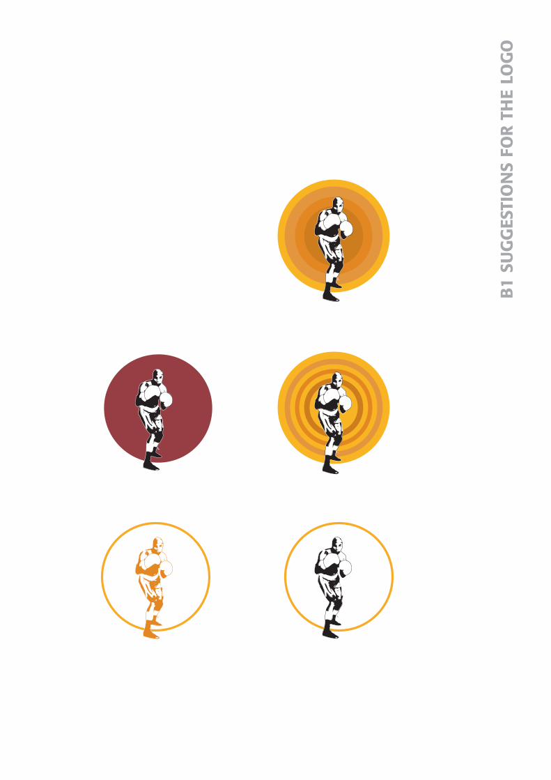
3.1.4 The logotypeThe symbol that was finally chosen for Knockout Fitness is presented inthe shape of a boxer with lifted guard. The illustration was made inIllustrator 8.0 to get a simplified silhouette of the figure and is presentedin black. A brown-purplish circle frames the boxer.
The business-name Knockout Fitness is written as one word but withtwo different weights of the font to separate the two words. The symboland the business-name will act as two different logos and are supposed tobe used separately. (see appendix B5)
Anna MatssonSofia ValterssonDegree project, 15 ECTS
Dalarna UniversityGraphic Arts Technology
Corporate identity through graphic design
17

3.1.4.1 The symbolThe figure was chosen to clearly show which area the fitness centre spe-cializes in. It clearly emphasizes that it is about some form of boxing wit-hout giving a violent appearance. If the symbol for example had consistedof two boxers in a boxing ring it had strongly signalised “fight” which is not itspurpose. It shall appeal to both men and women and symbolize all Boxercice.
The circle behind the figure gives the boxer a soft framing and alsogives colour to the logotype. It can also be seen as a spotlight, which lightsup the figure in the middle.
3.1.4.2 The fontThe font should emanate a feeling of sport and stability without, for thatmatter, giving a too male and macho impression. It was a balancing bet-ween finding a font that was neither to heavy nor to thin. Finally a sansserif named Formata was chosen since it has some weight but still softshapes. It looks sporty but without giving a too tough impression.
The business-name Knockout Fitness is written as one word. Instead ofthe word space two different weights of the font have been used. The wordKnockout is set with Formata Medium and Fitness with FormataRegular. Knockout is set with the heavier type of the font because it is theword that should be emphasized. This since it foretells the fitness centre’sniche. The word Fitness reveals which kind of business it is all about butit is the centre’s specialisation that is the most important message toreach out to the customers. The whole business name is written with capi-tal letters. (see appendix B2, B9)
3.1.4.3 ColoursBlack was the colour chosen for the boxer in the symbol. It gives a strongcontrast against the other colours in the corporate identity program. It isdistinct and gives a clean but tough and modern impression. The brown-purplish colour in the circle is a dull funky colour but yet modern andmatches the other colours in the identity program well. It has a good con-trasting effect against both the black figure and the grey-greenish colouron the business card.
The business name can be written with either the brown-purplishcolour or the grey-greenish colour depending on how and where it will beused. Both colours are Pantone Process colours, 11-7 and 103-2. (seeappendix B4)
3.1.5 The business cardThe business card has the standard measurements of 90*55 mm. Thelogotype is placed to the left, on the front of the card in a rather largescale to clearly emphasize which kind of business the card’s owner repre-sents. This since the cards primarily will be distributed to customers andpotential customers. For the background of the front a grey-greenishcolour was chosen to bring more life to the card. The colour harmoniseswell with the logotype and gives the card a fresh appearance.
Anna MatssonSofia ValterssonDegree project, 15 ECTS
Dalarna UniversityGraphic Arts Technology
Corporate identity through graphic design
18

On the back of the card the business name is found together with all theinformation. The business name appears in the shape of the logotype, setwith capital letters with the font Formata Medium and Regular. Addressinformation and telephone numbers are set with Formata Light in thesize of 7pt and the information about the different training sessions offe-red are set with Formata Regular also in 7pt.
3.1.6 Letter paperTo keep the design clean and simple there are only two elements on theletter paper, the logotype and the address information. The logotype isplaced in the upper right corner of the letterhead to be more easily spot-ted even if the paper is placed in a file. The address information andtelephone numbers are placed in the bottom right-hand corner. The textis set with Formata light 7pt in the same grey-green colour found on thebackground of the business card and the address label. The format of theletter paper is standard A4. (see appendix B7)
3.1.7 Address labelPrints on envelopes are expensive, therefore it was decided that addresslabels were a more suitable alternative for Knockout Fitness more restric-ted budget. These labels are placed in the bottom of the envelope in theleft-hand corner to not disturb the remaining information. The logotypeis placed in the top left-hand corner of the label, in the same way as onthe business card and has the same background colour. The address infor-mation and telephone numbers are placed under the logotype a bit to theleft. The text is set with Formata light 7pt. (see appendix B8)
3.1.8 PaperSince Knockout Fitness has not yet started up their business no paperwere chosen for neither the business card nor the letter paper. It washowever decided that the paper should be slightly yellowish to match theother colours.
3.1.9 EquipmentAll equipment needed to complete the corporate identity program wasprovided by De Pasquale. All the work was performed in Macintosh envi-ronment on a G4 computer, in the software Illustrator 8.0. Both black andwhite as well as colour printers were available at the company.
3.1.10 Meeting with the clientDuring the course of the project meetings were held with the client,Slavko Zeljko, during three different occasions. Propositions for a logoty-pe and three different suggestions of the business card were presentedand discussed to achieve a result as satisfying as possible for both parties.
Anna MatssonSofia ValterssonDegree project, 15 ECTS
Dalarna UniversityGraphic Arts Technology
Corporate identity through graphic design
19

3.1.11 Future useThe corporate identity program is supposed to be used for all occasions forexample when letter paper, signs and training programs are produced. Ithas been impossible to do a follow-up on how the profile has been appliedsince the company has not yet started up their business.
Anna MatssonSofia ValterssonDegree project, 15 ECTS
Dalarna UniversityGraphic Arts Technology
Corporate identity through graphic design
20

3.2 Queensland University of Technology -foldersAt the commission of Donal Fitzpatrick, Head of Department of VisualArts, two folders were designed for the department. The folders containinformation about undergraduate courses and honours and postgraduatecourses. Donal Fitzpatrick were also supervising this project.
3.2.1 Target audienceThe undergraduate folder’s purpose is to attract new students to theDepartment of Visual Arts. The honours and postgraduate folder willhopefully attract students already studying at the University to take amaster’s or Doctor of Philosophy degree. The target audience includesmostly young people, which has been taken into consideration in the des-igning of the folders.
3.2.2 ResearchInformational material about the courses within the Department ofVisual Arts and a CD with student-work were provided from DonalFitzpatrick. By studying this material you got an insight into the contentof the courses within the Department. The Visual Arts’ website were alsohelpful in finding a suitable layout for the folders.
3.2.3 Sketches and ideasBooks, magazines and Internet have been a great source of inspiration inthe production of the folders. After gathering information the work star-ted out by discussing different ideas and making sketches. These sketcheswere then tested in Macintosh environment. In the final folders thearrangement of the insides are similar but texts, colours and some ima-ges are different. The covers are made in two different colours to separa-te the two.
3.2.4 MaterialThe texts for the folders has been written by Donal Fitzpatrick. They con-tain information about the courses within the department together witha shorter general text about Brisbane and the University.
18 slides and a CD were also provided from Donal Fitzpatrick and fourformer students. They all portray final projects and performances.
3.2.5 FormatSince the budget for the folders was restricted they were first supposed tobe printed on an A4, folded two ways. This format did not allow the spa-cious layout desired. This common format also increases the risk for thefolders to disappear in the large amount of similar publications.
After discussions with the print house it appeared possible to print thetwo folders on a larger sheet without a major price difference. This sheethad the size of 520*370 mm, which allowed two folders to be printed onthe same sheet. The folders’ total size were changed into 360*230mm
Anna MatssonSofia ValterssonDegree project, 15 ECTS
Dalarna UniversityGraphic Arts Technology
Corporate identity through graphic design
21

which gave each page the size of 90*230 mm. To get a high, narrow andmore interesting format the folders would be tabernacle folded. This alsodifferentiates them from other publications. (see appendix C8-11)
3.2.6 LayoutThe two folders are based on the same design but are given two differentcolours to clearly separate them from each other. This was also to preventthem for being mistaken for the same folder. The design idea is to achie-ve a spacious layout with a lot of images instead of a lot of text. It wasimportant that the images selected for the folders demonstrated the bre-adth of the options for the studies offered by the Department of VisualArts. Therefore images from former students’ performances and finalworks has been used. These images are supposed to show what you canaccomplish within the courses offered and to arise interest and curiosity.(see appendix C1-4)
3.2.6.1 The CoversThe courses within the Department of Visual Arts include several areassuch as film, art, web, sound and video. The symbol of an eye has beenchosen to emphasize the visual theme within these areas. A slogan wasalso written and placed in the centre of the covers. It reads »for creativeminds« and refers to the creative units within these courses.
To avoid imperfect register when folded the background colour runsover all pages of the folders’ covers. A series of tickets are placed on thefirst spread and welcomes the audience to open and look inside the folder. (see appendix C1, C3)
3.2.6.2 The InsidesThe insides of the two folders share the same basic design but the coloursand some of the images differentiate from each other.
Four former students, from four different courses, gave us their per-mission to use their slides. One image from each student was chosen,together with a few images from a CD provided by Donal Fitzpatrick. Allimages are arranged to create a spacious layout.
The text is margin-justified and placed at the bottom of the page. Toemphasize the headlines and make them more visible, they are placedfive millimetres to the left of the main type and are in the same colour asthe background of the cover. (see appendix C2, C4)
3.2.7 FontsThree different fonts are used in the folders; Helvetica Neue Thin,Microscan and Meta Normal. Microscan is used for all the headlines inthe folders, except for Visual Arts on the cover, which are set withHelvetica Neue Thin. Microscan is a slab serif which means that its bargraph are right angled, this gives the font a digital look. This togetherwith Helvetica Neue Thin, which has an artistic look, manifest both thedigital and the creative units of the courses.
Anna MatssonSofia ValterssonDegree project, 15 ECTS
Dalarna UniversityGraphic Arts Technology
Corporate identity through graphic design
22

In shorter texts a sans serif is easier to reed than a roman. Therefore asans serif was used for the main type in the folders. The font chosen wasMeta Normal, which is a Swedish sans serif compatible with the designin the folders. The font size was set to 8pt and line-space to 11pt to givethe text enough space without decreasing the readability.(see appendix C6)
3.2.8 ColoursTwo different colours have been used for the covers of the folders to cle-arly separate them from one another. The colours were chosen to attractthe target audience and awaken their interest but also to give an attrac-tive graphical impression. They should look professional but yet playfuland not too strict and boring.
3.2.8.1 The Undergraduate folderThe colours chosen for the undergraduate folder were a purple shade anda light orange. Both these colours have a good contrasting effect, good sig-nal abilities and attract the eye. All these effects are important for thefolder’s design since its purpose is to recruit new students to theDepartment of Visual Arts and awaken interest for the courses provided. (see appendix C5)
3.2.8.2 The Postgraduate folderThe two colours chosen for this folder were a dark blue and the same lightorange used for the undergraduate folder. Blue is a classical and timelesscolour, which gives the folder a serious impression without being stiff andboring. It sends out a feeling of class and style and was therefore foundmore compatible with words like “doctor of philosophy” and “research”than purple.
This folder did not need the same attraction ability as the undergradu-ate folder since the target audience is students already studying at theUniversity. Therefore it was not necessary to use a colour with strong sig-nal ability. (see appendix C5)
3.2.9 ImagesDonal Fitzpatrick provided a CD with images from previous student-work. These images were all small in size and had a resolution of only72dpi (dots/inch). Several more and qualitatively better images were the-refore needed and four third year students gave permission to use someof their slides from performances and final projects. 18 slides were provi-ded and six of those images were finally chosen for the two folders. Sevenimages were taken from the CD. Four photos were also needed for thecovers and those were shot with a digital camera.
Anna MatssonSofia ValterssonDegree project, 15 ECTS
Dalarna UniversityGraphic Arts Technology
Corporate identity through graphic design
23

3.2.9.1 Digital photosA few photos were required for the covers of the folders. These photoswere shot with a digital camera to simplify the working process as thepictures can be transferred to a computer directly through a cable. Fourdigital photos were finally used for the two folders.
3.2.9.2 ScanningAll slides were first scanned with a low resolution and with a size of 100%on a Nikon Scan slide scanner. These images had a resolution of just72dpi and were only used during the working process of the layout. Theywere used to simulate how the different images matched each other andhow they appeared with the rest of the layout.
Six slides were finally chosen and rescanned in their right size i.e. thesize they should have in the final production. The slides were scannedwith a resolution of 350 ppi, which was the resolution the print houserequired, through a plug-in software in Photoshop 5.0 called Nikon PolaroidScan. No other settings were made in the scanning software.
3.2.9.3 Image processingEvery image was retouched in Photoshop 5.0. Darkness/brightness andcontrast were adjusted with a curve if necessary and dust and scratcheswere removed with the clone tool. All images were also sharpened withthe filter Unsharp mask as the dot gain will blur them a little in the prin-ting press. Finally the images were converted to CMYK (Cyan, Magenta,Yellow and Black)
3.2.9.3.1 Colour separationBefore an image can be printed it has to be converted from RGB (Red,Green and Blue) to CMYK. CMYK stands for Cyan, Magenta, Yellow andBlack, the four colours used in printing. An image saved as a CMYKimage technically consists of four separate greyscale images, one forCyan, one for Magenta, one for Yellow and one for Black. RGB stands forRed, Green and Blue which are the three channels with which a compu-ter monitor shows colours.
To convert an image to CMYK, ICC-profiles are often used. An ICC-pro-file is a standard to describe the colour properties of scanners, monitors,printers, before-trial prints and prints. They are used by most ColourManagement Systems and are created by means of a Photo spectrometer.1
2.2.9.3.2 Separation settingsThe print house where the two folders were to be printed did not use
ICC-profiles and did not give any recommendations for the separationsettings. To avoid the most common printing problems when it comes toimage reproduction the settings were set according to own experiences.
Dot gain, which is a measurement of the halftone dot’s change in sizefrom film to final print, was set to 20%, which is standard and normalwhen printing on a matt paper1. Separation method GCR (GrayComponent Replacement) was chosen, as it is the method normally used
Anna MatssonSofia ValterssonDegree project, 15 ECTS
Dalarna UniversityGraphic Arts Technology
Corporate identity through graphic design
241. Kaj Johansson mfl. (1998) Grafisk kokbok (s294, 288)

since it reduces the total ink quantity more than UCR (Under ColourRemoval). GCR stands for Gray Component Replacement, a separationmethod that reduces the ink saturation in the part of the image that con-tains all three colours CMY. This is done by totally or partly replace thejoined colour with black. UCR, Under Colour Removal on the other handis a separation method, which only affects the neutral parts of the image,which contains the same quantity of all three colours CMY and replacesit with black.
Total ink saturation was changed from 400% to 350% because of therisk of smearing during the printing process if printed with too much ink.Depending on paper and printing process the ink saturation is usually setto between 240-350%1.
3.2.10 DummyAfter a first draft of the layout was designed, two dummies were printedon a colour printer and presented for the client, Donal Fitzpatrick. Adummy is a specimen used as an aid during the planning process and theproduction of a printed matter, magazine or journal. The dummies werediscussed and evaluated and it was decided how the ideas would be car-ried out further. Several dummies were frequently presented to DonalFitzpatrick during the course of the project but with mostly minor changes.
3.2.11 EquipmentAll equipment used for this project was provided by the Department ofVisual Arts, Creative Industries Faculty at Queensland University ofTechnology. Access was given to computer laboratories at the University’scampus, and the necessary software was installed on two computers inone of the computer laboratories.
3.2.11.1 SoftwareThe software used during the production of the two folders are Photoshop 5.0and Illustrator 8.0. Photoshop was used for scanning, image processingand colour separation of the images. The layout and the illustrations forthe folders were designed in Illustrator 8.0. Since none of the folders con-tained a lot of texts it was also possible to arrange both text and imagesin Illustrator 8.0.
3.2.11.2 HardwareAll work was carried out in Macintosh environment on G3 computers.The scanner used was a Nikon Scan slide scanner. All colour printoutswere printed at the Student Copying and Printing Service at GardensPoint Campus.
3.2.12 The print houseThe print house, Bayfield Printing in Brisbane, was chosen to print thetwo folders by the client Donal Fitzpatrick . The print house is located notfar from the University and had had earlier contact with the Department
Anna MatssonSofia ValterssonDegree project, 15 ECTS
Dalarna UniversityGraphic Arts Technology
Corporate identity through graphic design
251. Kaj Johansson mfl. (1998) Grafisk kokbok (s79)2.. www.bayfieldprinting.com.au 020815

of Visual Arts. Contact person became Gary Livingstone, SalesConsultant at Bayfield Printing.
Bayfield Printing uses CTP (Computer To Plate) equipment and hasrecently installed a Fuji Shinaharo Automated 4 Colour Process printingpress. They also have a modern bindery and an off print processingdepartment.2
3.2.12.1 CTPTo produce high quality four-colour process with tight budgets has alwaysbeen difficult since film costs have often been higher than print costs.Computer to Plate has provided an alternative, producing high qualityprint without the expense of film. The traditional process of producing ametal plate involves sub processes such as stripping film, plate burningand plate processing. In each process the image quality will be slightlyreduced and the final plate quality is often far different from that ofthe origin.1
CTP eliminates the risk of human errors, and it guarantees perfectplate alignment and accurate exposure every time. CTP saves labourcosts as well as time since all prepress is done digitally, and produces dra-matic cost savings, as film costs are totally eliminated.1
3.2.12.1.1 DPX-systemBayfield Printing uses the latest DPX Computer To Plate unit. It canprint with up to 175 lpi (lines/inch) and with a maximum resolution of3600 dpi.1
3.2.12.2 Quotation requestMichelle Young, Administration Officer at the department of Visual Arts,sent a first quotation request to the print house. This request concerneda folder containing of an A4 folded two ways. After discussions withMichelle Young and Donal Fitzpatrick and the presentation of a dummyit was decided that the format would be changed to 90*230mm, that is asheet in the size of 360*230 mm tabernacle folded. A new quotationrequest was sent to Gary Livingstone of the new format including a fifthcolour, and later one request without the fifth colour. (see appendix C8)
3.2.12.3 QuotationFour quotations were received from Bayfield Printing during three diffe-rent occasions. (see appendix C9-11)
3.2.12.4 QuantityAt least 1000 copies of each folder were supposed to be printed.
3.2.13 PaperSeveral aspects had to be considered when a paper was to be chosen forthe folders. Image representation was important since the images showprevious student-work and should have a large power of attraction onpossible new students. They had to look professional and as original-like
Anna MatssonSofia ValterssonDegree project, 15 ECTS
Dalarna UniversityGraphic Arts Technology
Corporate identity through graphic design
261. www.bayfieldprinting.com.au 020815

as possible. Readability was not as important since all the para-graphs are rather short. Therefore some kind of glossy and/or coatedpaper was preferable.
As the folders did not include a large insert the paper had to have ahigh gsm to get a good bulk and stiffness and to not feel flabby in yourhand. A glossy and coated paper also requires a paper with higher gsmthan an uncoated.
Since the budget for the two folders were restricted the print house sug-gested a glossy paper called A2 Gloss Art with a weight of 130 gsm. A morestiff, 150 gsm, and also a less glossy paper was found more suitable so theprint house instead suggested Sovereign Gloss. This paper had a betterquality but was about the same price.
3.2.14 DeliveryA CD with the original documents, fonts and images was given to BayfieldPrinting. The CD also included PDF-files to show exactly how the folderswere supposed to look in case something would be rearranged when thedocuments were opened at the print house.
The finished, trimmed and folded folders were going to be sent, free ofcharge to Queensland University of Technology. Delivery time was set toapproximately five working days according to the quotation.
3.2.15 Future useThe folders purpose is to promote the courses offered within theDepartment of Visual Arts. The undergraduate folder will be used torecruit new students and awaken an interest for the undergraduate cour-ses. The honours and postgraduate folder will be used to entice students,who have finished their bachelor degree at the University, to further stu-dies by taking a master’s or even a Doctor of Philosophy degree.
Anna MatssonSofia ValterssonDegree project, 15 ECTS
Dalarna UniversityGraphic Arts Technology
Corporate identity through graphic design
27

3.3 Queensland University of Technology -advertisementAt the commission of Donal Fitzpatrick an advertisement was designedfor the honours and postgraduate courses within the Department of VisualArts. This advertisement will be published in the Australian and NewZealand Journal of Art. The journal is printed in black and white and publis-hed four times a year by the Art Association of Australia and New Zealand.
3.3.1 Target audienceThe advertisement’s purpose is to attract students already studying atthe University to further studies and take a master’s or Doctor ofPhilosophy degree.
3.3.2 IdeasBooks, journals and magazines have been a great source of inspiration inthe design of the advertisement. As the advertisement’s intent is to pro-mote the honours and postgraduate courses, the layout is based on thesame design as the honours and postgraduate folder. Therefore the sameimage used on the cover of the folder is used for the advertisement.
3.3.3 FormatThe advertisement has the format of 150*110mm and is set to occupy halfa page in the journal.
3.3.4 TextsThe text for the advertisement was written by Donal Fitzpatrick. It containsshort information about the courses offered by the Department of Visual Arts.
3.3.5 FontsThe same fonts used in the folders are used in the advertisement;Helvetica Neue Thin and Microscan in the headlines and Meta Normal inthe main type. The font size was set to 8pt.
3.3.6 LayoutTo get a homogeneous design the same image used on the cover of thehonours and postgraduate folder was used for the advertisement. Theimage was placed to the left since the motion of the image’s subject isdirected to the right and leads the reader in to the advertisement. Thedirection of motion draws attention to the text which is placed to the rightof the image. (see appendix C7)
3.3.7 Image processingSince the size of the image is the same as in the folder the image only nee-ded to be converted to greyscale. The resolution was also changed, to300dpi. This since the advertisement was to be printed on matt paper.
3.3.8 EquipmentThe same equipment used for the production of the folders was used forthe advertisement.
Anna MatssonSofia ValterssonDegree project, 15 ECTS
Dalarna UniversityGraphic Arts Technology
Corporate identity through graphic design
28

4 Account of problems
4.1 De PasqualeOnly one computer was intended for our use at the agency, which delay-ed the project considerabley. The colours on the display were unstable andfrequently changed in brightness. Therefore it was hard to previewcolours on the display since they looked completely different when theywere printed. Another minor problem was that the agency had an olderversion of Illustrator. Some functions were missing or worked differently.The most difficult part of the project was to keep the tight deadlines.
4.2 Queensland University of TechnologyThe time period during which this project has been carried out we havehad problems with both projects, equipment and material. This seemed tobe due to lack of planning for our arrival by the Creative IndustriesFaculty at Queensland University of Technology.
4.2.1 EquipmentNeither Illustrator 9.0 nor Quark Xpress 4.1, needed to design the two fol-ders, were installed in the specific computer laboratory that was suppo-sed to be our working area. Fortunately the Computer Support at KelvinGrove Campus had a copy of Illustrator 8.0 and PageMaker 6.0. It turnedout though that something was wrong with their version of PageMakerwhich prevented the software from previewing the fonts properly.
No printer was available in the computer laboratory. Therefore the onlyprint-outs obtainable were the colour prints printed at the StudentCopying and Printing Service at the University. This lead to unnecessarycosts for the client.
4.2.2 Material deliveryBecause of that the material was not delivered in time, the project wasdelayed several weeks. Two weeks elapsed before the slides of differentkinds of student-work were gathered. To get the text took an additionalfew weeks. When the material was finally collected there were only a fewweeks left to finish the campaign.
4.2.3 Permission to print The folders had to be approved by at least one higher instance. Thismeant that if the folders were not approved they would not be printed.
Anna MatssonSofia ValterssonDegree project, 15 ECTS
Dalarna UniversityGraphic Arts Technology
Corporate identity through graphic design
29

5 ConclusionThe degree project has been implemented at De Pasquale advertisingagency and Queensland University of Technology. This has given us aninsight in two different working procedures when it comes to graphic design.
At De Pasquale a corporate identity program has been designed for aboxing fitness centre. The final identity program consists of a logotype;symbol and business name, business card, letter paper and address label.Working with short deadlines and larger clients at the agency has taughtus the importance of believing in yourself in order to persuade the clientto buy your idea. You have to appear competent and professional in frontof the client, for him or her to trust you.
A promotion campaign for the Department of Visual Arts has beendesigned at Queensland University of Technology. This campaign inclu-ded two folders and one advertisement. For the moment only the adverti-sement will be published since the folders have not been approved by themarketing division at QUT. The work at the University was more indepen-dent and therefore not as developing as the work at the advertising agency.
Anna MatssonSofia ValterssonDegree project, 15 ECTS
Dalarna UniversityGraphic Arts Technology
Corporate identity through graphic design
30

6 DiscussionWhen we first came to Australia the project was delayed because of con-fusions regarding the emplacement of the degree project. Due to this itwas difficult to complete the project within the time of our stay inBrisbane, Australia. If future exchanges of this kind will take place bet-ween Dalarna university and Queensland University of Technology betterplanning and follow up is required.
It has been interesting to see the differences between Swedish andAustralian design. These differences were most obvious at De Pasqualeduring our work with the corporate identity program. The Swedish designis very clear and simple compared to the Australian more messy design.The design we applied in the corporate identity program was howeverappreciated and the client was very pleased with the result.
During our work with the promotion campaign for the Department ofVisual Arts the importance of a clear communication was reinforced. Itwas not until the two folders, included in the campaign, were to be prin-ted that it was revealed that they first had to be approved by the marke-ting division. If this information had been accessible to us from the begin-ning we would not have accepted the commission. At this moment thefolders have not been approved. The client Donal Fitzpatrick was howeververy pleased with the design of the whole promotion campaign.
Anna MatssonSofia ValterssonDegree project, 15 ECTS
Dalarna UniversityGraphic Arts Technology
Corporate identity through graphic design
31

7 References
LiteratureJohansson Kaj, Lundberg Peter, Ryberg Robert (1998) Grafisk kokbokBokförlaget Arena ISBN: 91-7843-128-X
Olins Wally (1994) Corporate Identity Thames and Hudson ISBN: 0-500-27808-3
Hinn Lars, Rossling Göran (1994) Företagsidentitet Liber-Hermods ISBN: 91-23-01469-5
Eksell Olle, (1999) Formulerat Bokförlaget Arena ISBN: 91-7843-139-5
White Jan V (1985) Grafisk formgivning: Forum ISBN: 91-37-08894-7
Hellmark, C (1998) Typografisk handbok: OrdfrontISBN: 91-7324-609-9
Bergström Bo (2001) Effektiv visuell kommunikation: CarlssonsISBN: 91-7203-426-2
Mollerup Per (1999) Marks of Excellence Phaidon Press LimitedISBN: 0-7148-3838-1
Eksell Olle (1999) Design=Ekonomi Bokförlaget ArenaISBN:91-7843-136-0
Internetwww.bayfieldprinting.com.au 020815
Personal communicationDonal Fitzpatrick, Head of Department of Visual Arts, Queensland University of Technology
Grant Johnston, Head of the design devision, De Pasquale
Proof-readersPatrik Ribjer, business school graduateMartin Zinner, studentThomas Norrgård, student
Anna MatssonSofia ValterssonDegree project, 15 ECTS
Dalarna UniversityGraphic Arts Technology
Corporate identity through graphic design
32

Appendix A
Time plan
De Pasquale
V 16 ResearchSketches and ideas for a logotype
V 17 Decide on colours and fontsLogotype finished
V 18 Business card, letter paper etc. finished
V 19 Reserve week
Queensland University of Technology
V 20 Preparations and researchSketches and ideas
V 21 Look at the image materialDecide on a formatBegin with the layout
V 22 Choose images, colours and fontsContact the print house
V 23 Photo shoot if necessaryFirst draft of the layoutBegin with the advertisement
V 24 Text editingPossible adjustments of the layoutFinal scanning
V 25 Folders finishedSend the material to the print houseAdvertisement finished
V 26 Reserve week
Parallel work with literature study
Anna MatssonSofia ValterssonDegree project, 15 ECTS
Dalarna UniversityGraphic Arts Technology
Corporate identity through graphic design
B1
SUG
GES
TIO
NS
FOR
TH
E LO
GO

Formata
KNOCKOUTFITNESS
Berthold Akzidenz Grotesk
KNOCKOUTFITNESS
Swiss 721
KNOCKOUTFITNESS
B2
SU
GG
ESTI
ON
S FO
R T
HE
FON
T

slavko zelikowickam Street 348
fortitude valley4006 queensland australia
home: 07 3395 6993mobile: 0405 468 311
boxing coachingbeginners to advancedpersonal sessions andgroup sessionsaqua aerobicsboxercisethai box
KN
OC
KO
UTF
ITN
ESS
KNOCKOUTFITNESS
boxing coachingbeginners to advancedpersonal sessions and
group sessionsaqua aerobics
boxercisethai box
slavko zelikowickam Street 348fortitude valley4006 queensland australiahome: 07 3395 6993mobile: 0405 468 311
KNOCKOUTFITNESS
boxing coachingbeginners to advancedpersonal sessions and
group sessionsaqua aerobics
boxercisethai box
slavko zelikowickam street 348fortitude valley4006 queensland australiahome: 07 3395 6993mobile: 0405 468 311
KNOCKOUTFITNESS
beginners to advancedpersonal sessions and
group sessionsboxing coaching
aqua aerobicsboxercise
thai box
slavko zelikowickam Street 348fortitude valley4006 queensland australiahome: 07 3395 6993mobile: 0405 468 311
KNOCKOUTFITNESS
beginners to advancedpersonal sessions and
group sessionsboxing coaching
aqua aerobicsboxercise
thai box slavko zelikowickam Street 348fortitude valley4006 queensland australiahome: 07 3395 6993mobile: 0405 468 311
KNOCKOUTFITNESS
beginners to advancedpersonal sessions andgroup sessionsboxing coachingaqua aerobicsboxercisethai box
slavko zelikowickam Street 348
fortitude valley4006 queensland australia
home: 07 3395 6993mobile: 0405 468 311
B3
SUG
GES
TIO
NS
OF
BU
SIN
ESS
CAR
D

Pantone process 103-2
Pantone process 11-7
B4
COLO
UR
S

KNOCKOUTFITNESS
KNOCKOUTFITNESS
KNOCKOUTFITNESS
KNOCKOUTFITNESS
B5
LOG
OTY
PE

KNOCKOUTFITNESS
beginners to advancedpersonal sessions and
group sessionsboxing coaching
aqua aerobicsboxercise
thai box slavko zelikowickam Street 348fortitude valley4006 queensland australiahome: 07 3395 6993mobile: 0405 468 311
B6
BU
SIN
ESS
CAR
D

knockout fitness, slavko zelikowickham street 348, fortitude valley
4006 queensland australiahome: 07 3395 6993 mobile: 0405 468 311
B7
LETT
ER P
AP
ER

knockout fitnessslavko zeliko
wickam Street 348,fortitude valley
4006 queensland australia
B8
AD
DR
ESS
LAB
ELS

FORMATA
Regular ABCDEFGHIJKLMNOPQRSTUVXYZÅÄÖabcdefghijklmnopqrstuvxyzåäö1234567890 +´!"#%&/()=?
Medium ABCDEFGHIJKLMNOPQRSTUVXYZÅÄÖabcdefghijklmnopqrstuvxyzåäö1234567890 +´!"#%&/()=?
Light ABCDEFGHIJKLMNOPQRSTUVXYZÅÄÖabcdefghijklmnopqrstuvxyzåäö1234567890 +´!"#%&/()=?
BEMBO
Regular ABCDEFGHIJKLMNOPQRSTUVXYZÅÄÖabcdefghijklmnopqrstuvxyzåäö1234567890 +´!"#%&/()=?
Italic ABCDEFGHIJKLMNOPQRSTUVXYZÅÄÖabcdefghijklmnopqrstuvxyzåäö1234567890 +´!"#%&/()=?
Bold ABCDEFGHIJKLMNOPQRSTUVXYZÅÄÖabcdefghijklmnopqrstuvxyzåäö1234567890 +´!"#%&/()=?0
B9
FON
TS

undergraduate
visu
al
a
rts
visual arts office
room 203 H block
QUT kelvin grove campus
victoria park road
kelvin grove qld 4059
phone: 61 7-3864 3394
fax: 61 7-3864 3974
email: [email protected]
web: creativeindustries.qut.com
layout & design: sofia valtersson & anna matssonCRICOS Code: 00213J © QUT 2002
where are we?
Brisb
ane
is a
vibr
ant
sub
trop
ical
ci
ty on
Au
stra
lia’s e
ast
coas
t ne
stle
d on
a r
iver
tha
t op
ens
out
to M
oret
on B
ay a
nd i
ts b
eaut
iful
isla
nds.
St
uden
ts ar
e ba
sed
in th
e th
ree
cent
ral
city
ca
mpus
es
of
the
Facu
lty
of
Crea
tive
Ind
ustrie
s, a
t Ke
lvin
Gro
ve, Gar
dens
Po
int
and
Sout
h Brisb
ane.
Our
stu
dent
s an
d th
eir
wor
k fo
rm a
vital
par
t of
the
exc
itin
g an
d cr
eative
life
of in
ner ci
ty B
risb
ane.
what are we?
In t
he d
epar
tmen
t of
Vis
ual Art w
e m
aint
ain
a cr
eative
co
mm
itm
ent
to in
terd
isci
plin
ary
expe
rim
enta
l pr
actice
. Fo
r th
e du
ration
of
thei
r St
udio
Stu
dies
eve
ry s
tude
nt rec
eive
s a
stud
io
spac
e from
w
hich
to
ex
plo
re
a pe
rson
al a
rea
of a
rt p
ract
ice.
For
som
e th
is
mea
ns a
con
tinu
ed e
xplo
ration
of
pain
ting
, dr
awin
g, i
nsta
llation
, ph
otom
edia
, gr
aphi
cs
and
prin
tmed
ia,
for
othe
rs a
n in
vest
igat
ion
of t
he p
ossi
bilit
ies
offe
red
by n
ew a
rt for
ms,
pe
rfor
man
ce, vi
deo
and
elec
tron
ic m
edia
. C1
CO
VE
R

C2
INS
IDE

visu
al
arts
honours and postgraduate study
phone:
61 7-3864 3394
fax:
61 7-3864 3974
email:
web:
creativeindustries.qut.com
address:
visual art office
room 203 H block
QUT kelvin grove campus
victoria park road
kelvin grove qld 4059
layout & design: anna matsson & sofia valtersson cricos code: 00213J © QUT 2002
where are we?
Brisb
ane
is a
vibr
ant
sub
trop
ical
ci
ty on
Au
stra
lia's
eas
t co
ast
nest
led
on a
riv
er t
hat
open
s ou
t to
Mor
eton
Bay
and
its
bea
utifu
l is
land
s. St
uden
ts ar
e ba
sed
in th
e th
ree
cent
ral
city
ca
mpus
es
of
the
Facu
lty
of
Crea
tive
Ind
ustrie
s, a
t Ke
lvin
Gro
ve, Gar
dens
Po
int
and
Sout
h Brisb
ane.
Our
stu
dent
s an
d th
eir
wor
k fo
rm a
vital
par
t of
the
exc
itin
g an
d cr
eative
life
of in
ner ci
ty B
risb
ane.
what do we offer?
The
oppo
rtun
itie
s fo
r gr
adua
te s
tudy
in
the
Visu
al A
rts
in t
he C
reat
ive
Indu
stries
Fac
ulty
at
Q
UT
are
very
ex
citing
. As
an
under
-gr
adua
te s
tude
nt y
ou m
ay c
hoos
e to
stu
dy
at H
onou
rs a
nd p
roce
ed a
long
a r
esea
rch
path
way
to
Mas
ters
and
Doc
tora
l st
udie
s, o
r as
a s
tudi
o pr
actition
er y
ou m
ay c
hoos
e to
st
udy
in t
he M
aste
r of
Fin
e Arts
cour
se a
nd
com
bine
you
r re
sear
ch p
roje
ct w
ith
cour
se
work
ele
ctiv
es o
f yo
ur c
hoosi
ng.
All
cour
ses
are
offe
red
in ful
l tim
e an
d pa
rt-
tim
e m
ode
and
are
des
igne
d
to
be
as
flexi
ble
as p
ossi
ble.
Withi
n th
e de
partm
ent
the
staf
f ha
ve
grea
t dep
th
in
term
s of
su
perv
isio
n co
vering
all
type
s of
med
ia fro
m
trad
itio
nal ar
eas
like
pain
ting
and
scu
lptu
re
thro
ugh
video
, in
stal
lation
an
d
per
form
-an
ce to
elec
tron
ic a
rts
and
mul
tim
edia
.
C3
CO
VE
R

facilities
Indiv
idua
l st
udio
sp
ace
and
24/7
ac
cess
to
com
puting
lab
s an
d ot
her
tech
nolo
gies
are
pro
vide
d. T
here
is
a ge
nero
us
scho
lars
hip
sche
me
for
whi
ch s
tude
nts
may
app
ly. Th
ere
are
also
dis
cret
iona
ry fun
ds s
et a
side
for
ea
ch s
tude
nt a
t ea
ch lev
el to
supp
ort
proj
ect
cost
s, c
onfe
renc
e at
tend
ance
an
d th
esis
pro
duct
ion
cost
s.
contact
Plea
se c
onta
ct M
iche
lle Y
oung
at
the
depa
rtm
ent
if yo
u ha
ve a
ny f
urth
er
enqu
irie
s on
: te
leph
one:
61
7-38
64 3
394
fa
x: 6
1 7-
3864
397
4 em
ail:
m2.
youn
g@qu
t.ed
u.au
bachelor of fine arts (honours)
Stud
ents
w
ho
have
su
cces
sful
ly
com
ple
ted
an
unde
rgra
duat
e de
gree
fro
m a
rec
ogni
sed
Uni
vers
ity
in A
ustral
ia o
r ov
erse
as a
nd h
ave
the
equi
vale
nt o
f a
grad
e po
int
aver
age
of fiv
e on
a
seve
n po
int
scal
e. A
lter
native
ly ca
ndid
ates
w
ill be
co
nsid
ered
w
ho de
mon
stra
te eq
uiva
lenc
e of
ot
her
rele
vant
qu
alifi
cation
s an
d/or
exp
erie
nce.
The
cour
se in
volv
es m
ajor
st
udio
w
ork
in co
n-su
ltat
ion
with
a pe
rson
al su
perv
isor
as
w
ell
as
grou
p cr
itiq
ues
and
sem
inar
s. T
he e
mph
asis
is
on
indiv
idua
l pro
ject
dev
elop
men
t an
d
cove
rs
the
broa
d sp
ectrum
of
vi
sual
ar
t from
pa
inting
an
d sc
ulptu
re
thro
ugh
video
an
d
per
form
ance
to
el
ectron
ic a
rts
and
mul
tim
edia
.
course duration: N
orm
ally
tw
o se
mes
ters
ful
l tim
e or
fou
r se
mes
ters
par
t tim
e.
master of arts (research)
Can
be
under
take
n ei
ther
as
re
sear
ch
thes
is,
min
imum
w
ord
coun
t of
30
,000
w
ords
, or
as
a
crea
tive
or
pro
duc
tion
bas
ed
pro
ject
w
ith
an
exeg
esis
, m
inim
um w
ord
coun
t of
10,
000
wor
ds.
course duration: W
ith
Hon
ours
, Re
sear
ch O
nly
Prog
ram
can
be
one
year
ful
l tim
e. W
ith
thre
e ye
ar
unde
rgra
duat
e, c
ours
e w
ork
plus
Res
earc
h Pr
ogra
m
two
year
s fu
ll tim
e. P
art
tim
e eq
uiva
lenc
e fo
r bo
th
option
s is
ava
ilabl
e.
master of fine arts
A ve
ry fle
xibl
e po
st gr
adua
te de
gree
al
low
ing
the
com
bina
tion
of
re
sear
ch pr
ojec
t an
d co
urse
w
ork.
Th
is
Mas
ters
deg
ree
is
rese
rved
fo
r ad
vanc
ed
prof
essi
onal
pr
actice
in
th
e st
udio
. Its
flexi
bilit
y al
low
s st
uden
ts t
o w
ork
sole
ly i
n th
e st
udio
or
to
com
bine
the
ir s
tudi
o w
ork
with
elec
tive
s se
lect
ed t
o en
hanc
e th
eir
stud
ies
from
acr
oss
the
Uni
vers
itie
s m
any
offe
ring
s.
course duration:
Thre
e se
mes
ters
ful
l tim
e. I
t is
poss
ible
to
st
udy
in
the
sum
mer
te
rm
and
com
plet
e th
e aw
ard
in tw
elve
m
onth
s. It
is al
so
poss
ible
to
take
the
sem
este
rs o
ut o
f no
rmal
ord
er
and
com
men
ce m
id y
ear.
doctor of philosophy
Can
be
under
take
n ei
ther
as
re
sear
ch
thes
is,
min
imum
wor
d co
unt
80,0
00 w
ords
, or
as
crea
tive
or
pro
duc
tion
bas
ed
pro
ject
w
ith
an
exeg
esis
, m
inim
um w
ord
coun
t of
20,
000
wor
ds.
course duration: Si
x se
mes
ters
of fu
ll tim
e st
udy.
You
may
stu
dy ful
l or
par
t tim
e as
eithe
r an
int
erna
l or
ext
erna
l ca
ndid
ate.
Ext
erna
l st
uden
ts m
ust in
clud
e an
on-
cam
pus
perio
d of
stu
dy e
ach
year
.
C4
INS
IDE

C: 73M: 82Y: 71 K: 87
C: 73M: 82Y: 71K: 87
C: 73M: 82Y: 71K: 87
C5
CO
LOU
RS

HELVETICA NEUE
Roman ABCDEFGHIJKLMNOPQRSTUVXYZÅÄÖabcdefghijklmnopqrstuvxyzåäö1234567890 +´!"#%&/()=?
Thin ABCDEFGHIJKLMNOPQRSTUVXYZÅÄÖabcdefghijklmnopqrstuvxyzåäö1234567890 +´!"#%&/()=?
Italic ABCDEFGHIJKLMNOPQRSTUVXYZÅÄÖabcdefghijklmnopqrstuvxyzåäö1234567890 +´!"#%&/()=?
Bold ABCDEFGHIJKLMNOPQRSTUVXYZÅÄÖabcdefghijklmnopqrstuvxyzåäö1234567890 +´!"#%&/()=?
META
Normal ABCDEFGHIJKLMNOPQRSTUVXYZÅÄÖabcdefghijklmnopqrstuvxyzåäö1234567890 +´!"#%&/()=?
Italic ABCDEFGHIJKLMNOPQRSTUVXYZÅÄÖabcdefghijklmnopqrstuvxyzåäö1234567890 +´!"#%&/()=?
Bold ABCDEFGHIJKLMNOPQRSTUVXYZÅÄÖabcdefghijklmnopqrstuvxyzåäö1234567890 +´!"#%&/()=?0
C6
FON
TS

visu
al a
rtsFor more information contact: Michelle Young
Phone: (07) 3864 3394E-mail: [email protected]
Web: creativeindustries.qut.com
postgraduate studies
In the Discipline of visual arts, in the creative industries faculty at QUT, we offer graduate study at honours, ma (Research) and phd.
The opportunity exists to complete graduate research by thesis or a com-bination of studio/curatorial project and thesis. We are particularly keen to build on our reputation for research in australian visual culture. All courses are offered in full time and part time mode and are designed to be as flexible as possible, a generous scholarship scheme exits and their are discretionary funds set aside for conference attendance and thesis production costs.
C7
AD
VE
RT
ISE
ME
NT

QUOTATION REQUEST
Subject: Folder, tabernacle folding
Colour: 4-process colours
Art size: 360*230mm
Quantity: 1000 + following 500
Material: Digital files on cd
C8
QU
OTA
TIO
N R
EQ
UE
ST

C9
QU
OTA
TIO
N 1

C10
QU
OTA
TIO
N 2

C11
QU
OTA
TIO
N 3