Regression Analysis of variables Describing Poultry Meat ...
Upload
meagan-harveyCategory
view
228download
6
Copyright © 2014 Pearson Education, Inc. All rights reserved
Chapter 4
Regression Analysis:
Exploring Associations
between Variables
4 - 2 Copyright © 2014 Pearson Education, Inc. All rights reserved
Learning Objectives
Be able to write a concise and accurate description of an association between two continuous variables based on a scatterplot.
Understand how to use a regression line to summarize a linear association between two continuous variables.
Interpret the intercept and slope of a regression line in context and know how to use the regression line to predict mean values of the response variable.
Critically evaluate a regression model.
Copyright © 2014 Pearson Education, Inc. All rights reserved
4.1
Visualizing Variability with a Scatterplot

4 - 4 Copyright © 2014 Pearson Education, Inc. All rights reserved
Scatterplots
Used to investigate a positive, negative, or no association between two numerical variables.
In states where women tend to marry at an older age, men also tend to marry at an older age.

4 - 5 Copyright © 2014 Pearson Education, Inc. All rights reserved
Positive Trend
Older cars tend to have more miles than newer cars.
Newer cars tend to have fewer miles than older cars.
There is a positive association between car age and miles the car has been driven.

4 - 6 Copyright © 2014 Pearson Education, Inc. All rights reserved
Negative Trend
Countries with higher literacy rates tend to have fewer births per woman.
Countries with lower literacy rates tend to have more births per woman.
There is a negative association between literacy rate and births per woman.
4 - 7 Copyright © 2014 Pearson Education, Inc. All rights reserved
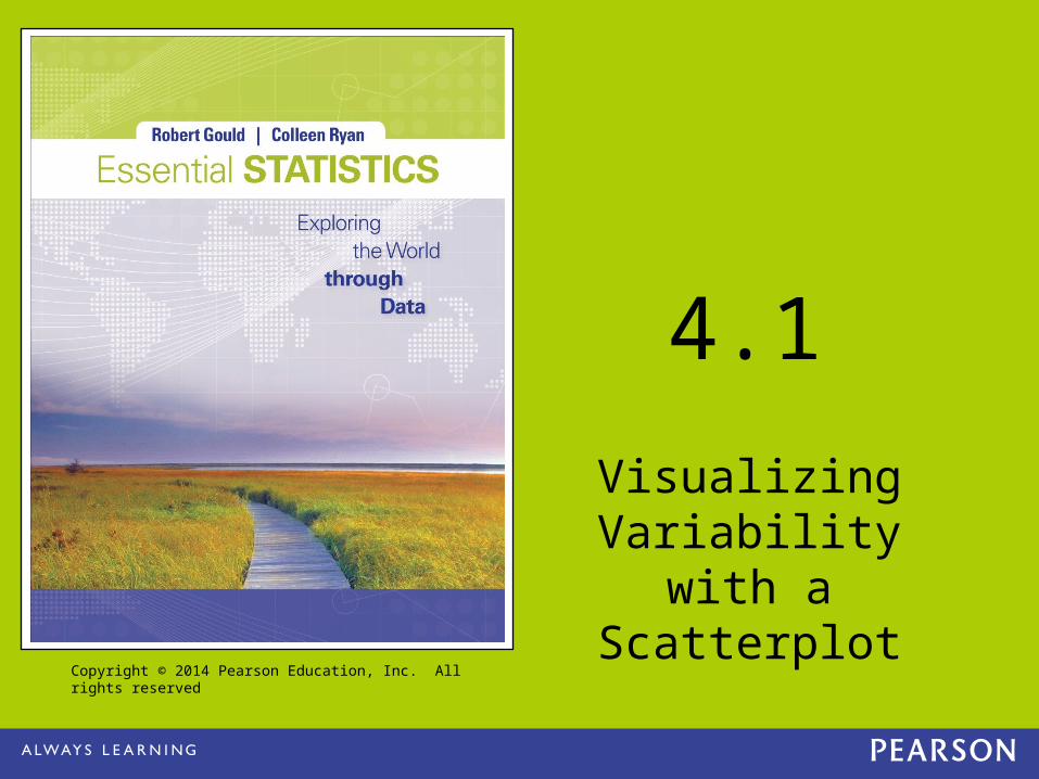
No Trend
There is no trend between the speed and age of a marathon runner.
Knowing the age of a marathon runner does not help predict the runner’s speed.
There is no association between a marathon runner’s age and speed.

4 - 8 Copyright © 2014 Pearson Education, Inc. All rights reserved
Strength of Association
If for each value of x, there is a small spread of y values, then there is a strong association between x and y.
If for each value of x, there is a large spread of y values, then there is a weak or no association between x and y.
If there is a strong (weak) association between x and y, then x is a good (bad) predictor of y.

4 - 9 Copyright © 2014 Pearson Education, Inc. All rights reserved
Strength of Association

4 - 10 Copyright © 2014 Pearson Education, Inc. All rights reserved
Linear Trends
A trend is linear if there is a line such that the points in general do not stray far from the line.
Linear trends are the easiest to work with. There is a positive linear association between number
of searches for “Vampire” and number for “Zombie”.

4 - 11 Copyright © 2014 Pearson Education, Inc. All rights reserved
Other Shapes
Nonlinear association can also occur, but this is covered in a more advanced statistics course.
Only use techniques from this chapter when there is a linear trend.

4 - 12 Copyright © 2014 Pearson Education, Inc. All rights reserved
Summary of Analysis of the Scatterplot
Look to see if there is a trend or association. Determine the strength of trend. Is the
association strong or weak? Look at the shape of the trend. Is it linear?
Is it nonlinear?

4 - 13 Copyright © 2014 Pearson Education, Inc. All rights reserved
Writing Clear Descriptions Based on Association
Good: People who have higher salaries tend to travel farther
on vacation. A person who has a high salary is predicted to travel
far on vacation.
Bad: Because they have higher salaries, they travel farther. A person with a high salary will travel farther on
vacation.
Copyright © 2014 Pearson Education, Inc. All rights reserved
4.2
Measuring Strength of Association with
Correlation

4 - 15 Copyright © 2014 Pearson Education, Inc. All rights reserved
The Correlation Coefficient r
The correlation coefficient is a number, r, that measures the strength of the linear association between two variables.
-1 ≤ r ≤ 1 If r is close to 1, then there is a strong positive linear
association. If r is close to -1, then there is a strong negative
linear association. If r is close to 0, then there is a weak or no
association.

4 - 16 Copyright © 2014 Pearson Education, Inc. All rights reserved
Positive Correlation

4 - 17 Copyright © 2014 Pearson Education, Inc. All rights reserved
Weak or No Correlation

4 - 18 Copyright © 2014 Pearson Education, Inc. All rights reserved
Negative Correlation

4 - 19 Copyright © 2014 Pearson Education, Inc. All rights reserved
Interpreting Correlation
The correlation between daily swim suits and ski jackets purchased in an apparel store is r = -0.96
There is a strong negative correlation between daily swim suits and ski jackets purchased.
On days with strong swim suit sales, one predicts that ski jacket sales would be weak.
This does not mean that people who buy swim suits are causing potential ski jacket buyers to not buy.
4 - 20 Copyright © 2014 Pearson Education, Inc. All rights reserved
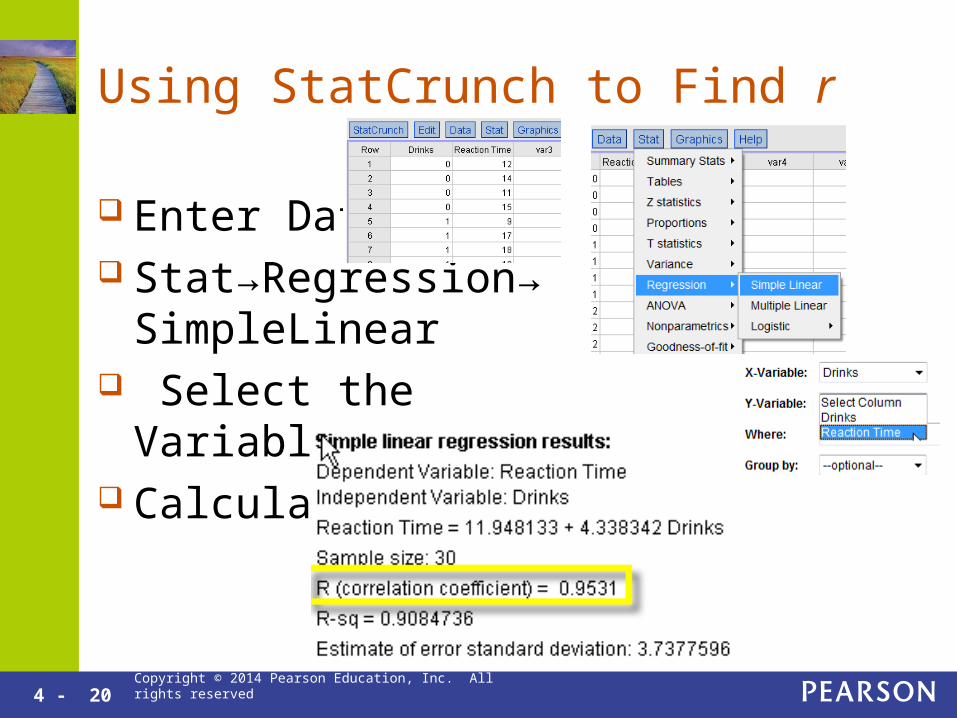
Using StatCrunch to Find r
Enter Data Stat→Regression→
SimpleLinear Select the Variables Calculate
4 - 21 Copyright © 2014 Pearson Education, Inc. All rights reserved
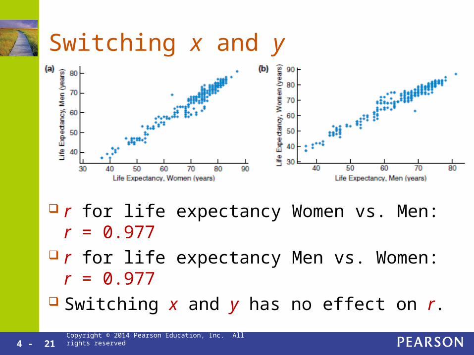
Switching x and y
r for life expectancy Women vs. Men: r = 0.977 r for life expectancy Men vs. Women: r = 0.977 Switching x and y has no effect on r.
4 - 22 Copyright © 2014 Pearson Education, Inc. All rights reserved
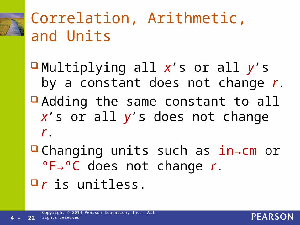
Correlation, Arithmetic, and Units
Multiplying all x’s or all y’s by a constant does not change r.
Adding the same constant to all x’s or all y’s does not change r.
Changing units such as in→cm or ºF→ºC does not change r.
r is unitless.
4 - 23 Copyright © 2014 Pearson Education, Inc. All rights reserved
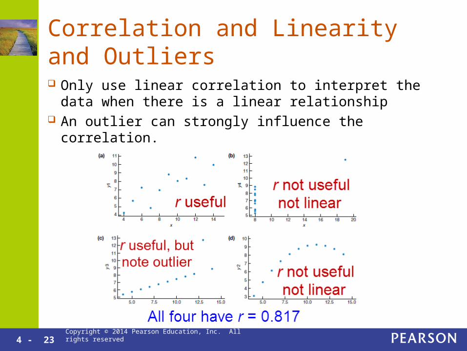
Correlation and Linearity and Outliers
Only use linear correlation to interpret the data when there is a linear relationship
An outlier can strongly influence the correlation.

Copyright © 2014 Pearson Education, Inc. All rights reserved
4.3
Modeling Linear Trends

4 - 25 Copyright © 2014 Pearson Education, Inc. All rights reserved
Least Squares Regression Line
The Regression Line is the “best fit” line for the data.
The line minimizes the average squared vertical distances.
It is only useful with data with a linear model.
4 - 26 Copyright © 2014 Pearson Education, Inc. All rights reserved
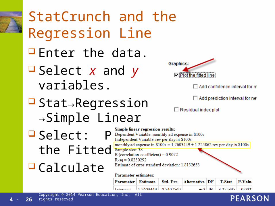
StatCrunch and the Regression Line
Enter the data. Select x and y variables. Stat→Regression
→Simple Linear Select: Plot the Fitted
Line Calculate
4 - 28 Copyright © 2014 Pearson Education, Inc. All rights reserved
Interpreting the Slope
The slope is the coefficient in front of x in the regression line equation.
Rise/Run means that if x is increased by 1, then y is predicted or increases by an average of the slope value.
The slope is only meaningful if the data follows a linear model.

4 - 29 Copyright © 2014 Pearson Education, Inc. All rights reserved
Interpreting the Slope
The slope is 1.2. If x is increased by 1, y has an average
increase of 1.2. For every $100 the company spends on ads,
it averages an additional $120 in revenue.
4 - 30 Copyright © 2014 Pearson Education, Inc. All rights reserved
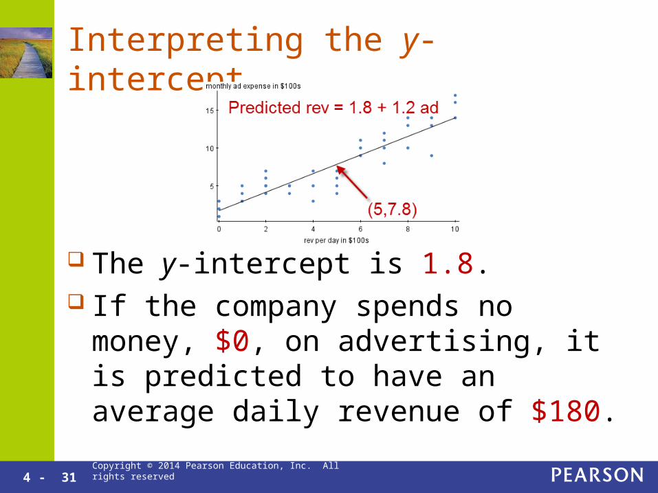
Interpreting the y-intercept
The y-intercept is the value of y when x is 0. Use the y-intercept to interpret the data only
when: It makes sense to have a value of 0 for x. The calculated y-intercept value is meaningful. The data include values equal to or close to 0.
4 - 31 Copyright © 2014 Pearson Education, Inc. All rights reserved
Interpreting the y-intercept
The y-intercept is 1.8. If the company spends no money, $0, on
advertising, it is predicted to have an average daily revenue of $180.

4 - 32 Copyright © 2014 Pearson Education, Inc. All rights reserved
Why Not to Use the y-intercept
A sample of high school freshmen and sophomores resulted in a regression equation that relates age to height in inches: predicted height = -9.2 + 4.9x
The y-intercept is -9.2. A height of -9.2 inches is meaningless. The sample only included teenagers. The age of 0 years
is too far from the ages in the sample. The slope is meaningful. High school freshmen and
sophomores grow an average of 4.9 inches per year.
4 - 33 Copyright © 2014 Pearson Education, Inc. All rights reserved
Correlation is Not Causation
A strong correlation is not evidence of a cause-and-effect relationship.
Do not use the words, “causes”, “makes”, “will”, “because”, etc. when making regression analysis based conclusions.
Do use the words, “predict”, “tends”, and“on average”.
4 - 34 Copyright © 2014 Pearson Education, Inc. All rights reserved
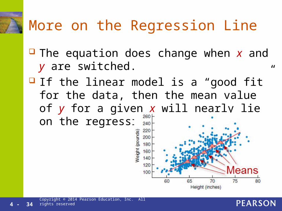
More on the Regression Line
The equation does change when x and y are switched.
If the linear model is a “good fit” for the data, then the mean value of y for a given x will nearly lie on the regression line.

Copyright © 2014 Pearson Education, Inc. All rights reserved
4.4
Evaluating the Linear Model

4 - 36 Copyright © 2014 Pearson Education, Inc. All rights reserved
Nonlinear Data
If you can’t imagine a line don’t try to find one.
If the association is not linear, don’t attempt to find or interpret r or the equation of the least squares regression line.

4 - 37 Copyright © 2014 Pearson Education, Inc. All rights reserved
Slope and Causation
Predicted Salary = 22,000 + 8,000 College Years Wrong: Each year in college results in an
additional salary increase of $8,000. Wrong: A person with one more year of
college education will earn an extra $8,000. Correct: On average, people with one more
year of college education tend to earn an extra $8,000.

4 - 38 Copyright © 2014 Pearson Education, Inc. All rights reserved
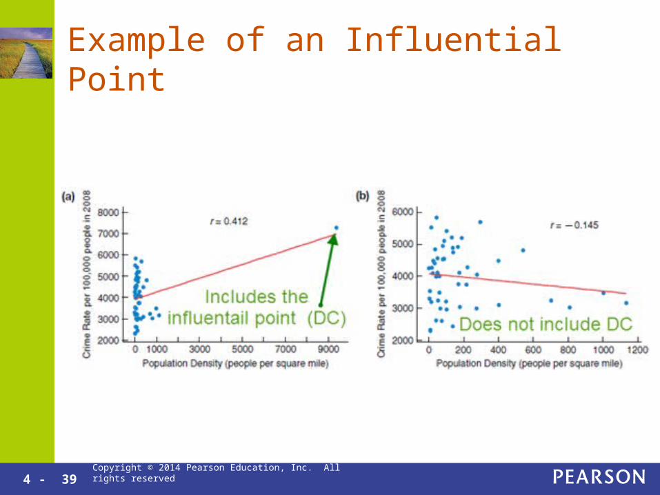
Beware of Outliers
Outliers have a strong effect on both the correlation and the equation of the regression line.
An outlier that strongly effects the regression line is called an influential point.
When there is an influential point present, perform regression analysis both with and without the influential point.
4 - 39 Copyright © 2014 Pearson Education, Inc. All rights reserved
Example of an Influential Point

4 - 40 Copyright © 2014 Pearson Education, Inc. All rights reserved
Regression of Aggregate Data
Using Aggregate Data for regression means that each point represents the mean of all the y-values with a given x-value.
When using aggregate data, be sure to include the word “mean” in all interpretations.
4 - 41 Copyright © 2014 Pearson Education, Inc. All rights reserved
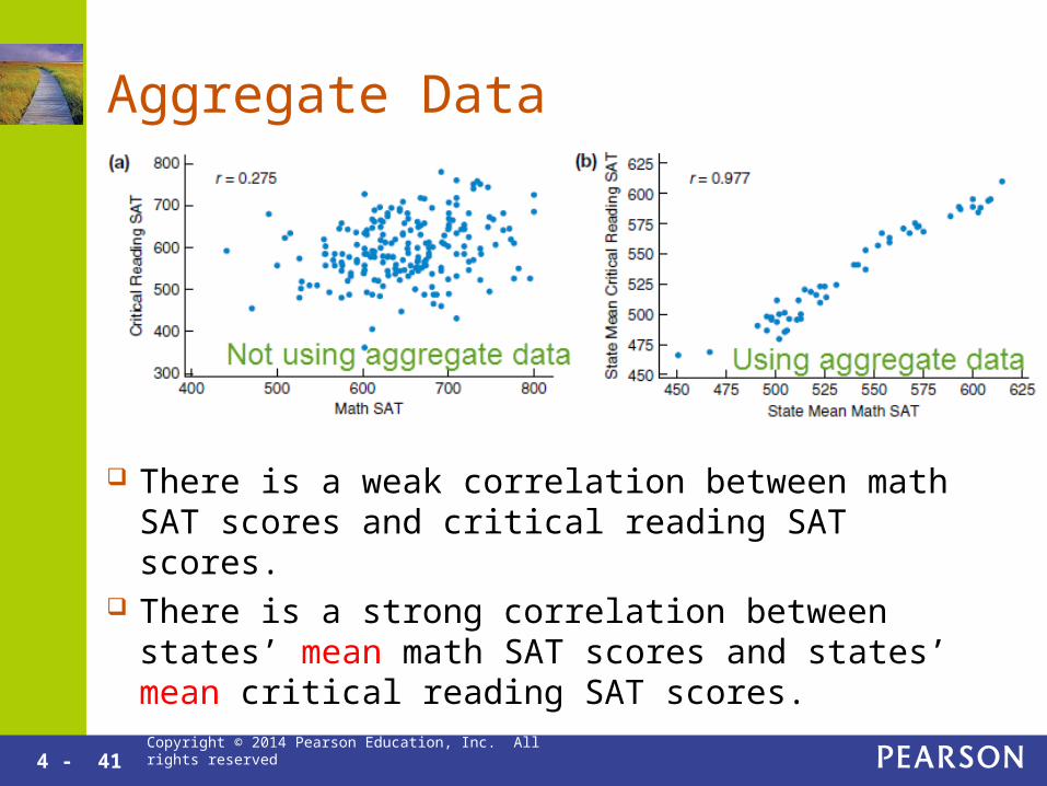
Aggregate Data
There is a weak correlation between math SAT scores and critical reading SAT scores.
There is a strong correlation between states’ mean math SAT scores and states’ mean critical reading SAT scores.
4 - 42 Copyright © 2014 Pearson Education, Inc. All rights reserved
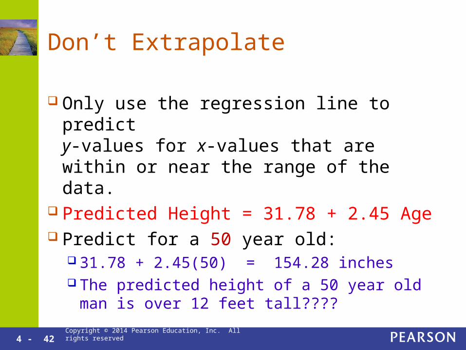
Don’t Extrapolate
Only use the regression line to predict y-values for x-values that are within or near the range of the data.
Predicted Height = 31.78 + 2.45 Age Predict for a 50 year old:
31.78 + 2.45(50) = 154.28 inches The predicted height of a 50 year old man is over
12 feet tall????

4 - 43 Copyright © 2014 Pearson Education, Inc. All rights reserved
Coefficient of Determination r2
r2 measures how much of the variation in the response variable, y, can be explained by the explanatory variable, x.
r2 is used to help determine which explanatory variable would be best for making predictions about the response variable.

4 - 44 Copyright © 2014 Pearson Education, Inc. All rights reserved
Coefficient of Determination Example
60.5% of the variation in the value of cars can be explained by the age of the car. The other 39.5% cannot be explained by the age of the car.
Copyright © 2014 Pearson Education, Inc. All rights reserved
Chapter 4
Case Study

4 - 46 Copyright © 2014 Pearson Education, Inc. All rights reserved
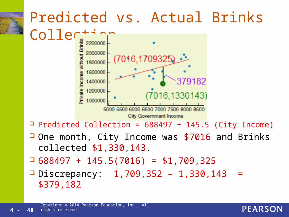
Scatterplot of City Government Income vs. Private Meter Income Without Brinks
Positive weak linear association Predicted Collection = 688497 + 145.5 (City Income)

4 - 47 Copyright © 2014 Pearson Education, Inc. All rights reserved
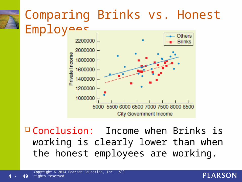
Are Brinks Employees Stealing from Parking Meters?
New York City contracted Brinks to collect parking meter money. The city suspects that employees are keeping some of it.
There is data on the monthly meter collection of honest (not Brinks) collectors vs. the city’s total income for that month.
4 - 48 Copyright © 2014 Pearson Education, Inc. All rights reserved
Predicted vs. Actual Brinks Collection
Predicted Collection = 688497 + 145.5 (City Income) One month, City Income was $7016 and Brinks
collected $1,330,143. 688497 + 145.5(7016) = $1,709,325 Discrepancy: 1,709,352 – 1,330,143 = $379,182
4 - 49 Copyright © 2014 Pearson Education, Inc. All rights reserved
Comparing Brinks vs. Honest Employees
Conclusion: Income when Brinks is working is clearly lower than when the honest employees are working.

Copyright © 2014 Pearson Education, Inc. All rights reserved
Chapter 4
Guided Exercise 1

4 - 51 Copyright © 2014 Pearson Education, Inc. All rights reserved
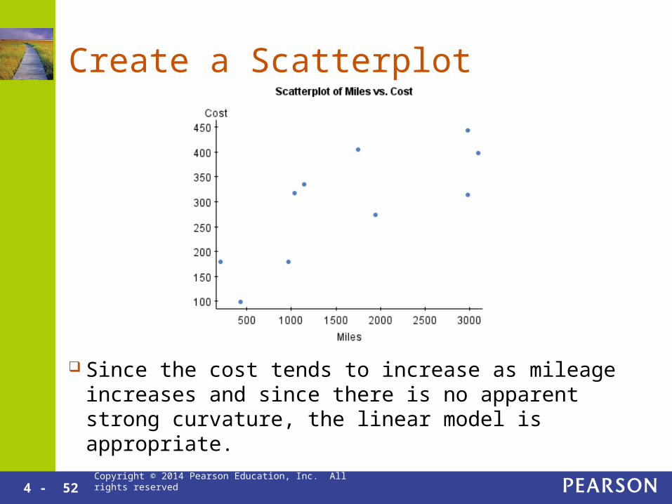
Does the Cost of a Flight Depend on the Distance? How much would it
cost to fly 500 miles? Use a complete
regression analysis.
4 - 52 Copyright © 2014 Pearson Education, Inc. All rights reserved
Create a Scatterplot
Since the cost tends to increase as mileage increases and since there is no apparent strong curvature, the linear model is appropriate.

4 - 53 Copyright © 2014 Pearson Education, Inc. All rights reserved
The Regression Line
Interpret the Slope: 0.08. For every additional mile, on average, the price
goes up by $0.08. Interpret the y-intercept: 163
This is the predicted price for a 0 mile flight. The y-intercept is meaningless here.
4 - 54 Copyright © 2014 Pearson Education, Inc. All rights reserved
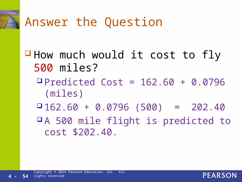
Answer the Question
How much would it cost to fly 500 miles? Predicted Cost = 162.60 + 0.0796 (miles) 162.60 + 0.0796 (500) = 202.40 A 500 mile flight is predicted to cost $202.40.
Copyright © 2014 Pearson Education, Inc. All rights reserved
Chapter 4
Guided Exercise 2
4 - 56 Copyright © 2014 Pearson Education, Inc. All rights reserved
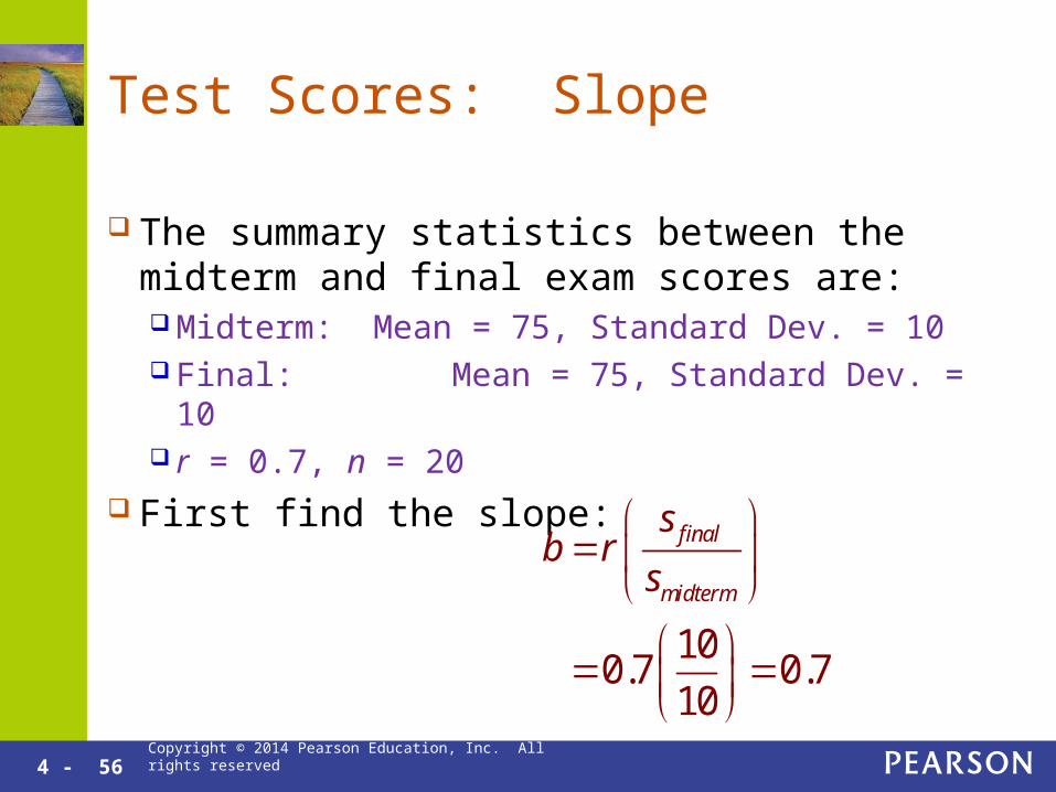
Test Scores: Slope
The summary statistics between the midterm and final exam scores are: Midterm: Mean = 75, Standard Dev. = 10 Final: Mean = 75, Standard Dev. = 10 r = 0.7, n = 20
First find the slope:
final
midterm
sb r
s
10
0.7 0.710
4 - 57 Copyright © 2014 Pearson Education, Inc. All rights reserved
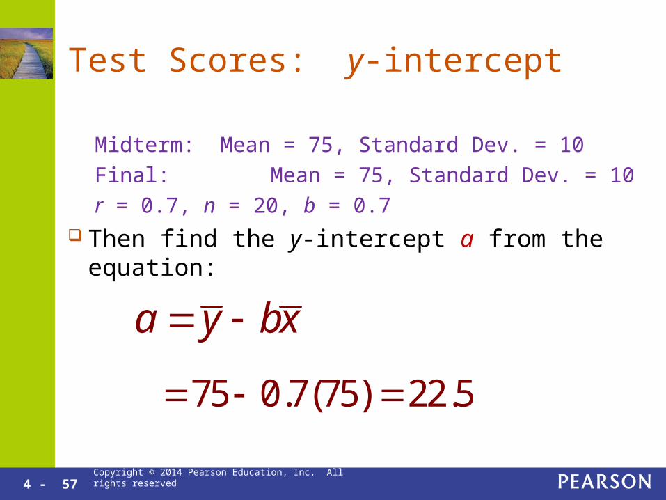
Test Scores: y-intercept
Midterm: Mean = 75, Standard Dev. = 10
Final: Mean = 75, Standard Dev. = 10
r = 0.7, n = 20, b = 0.7 Then find the y-intercept a from the equation:
a y bx
75 0.7(75) 22.5

4 - 58 Copyright © 2014 Pearson Education, Inc. All rights reserved
Test Scores: Regression Line
Midterm: Mean = 75, Standard Dev. = 10
Final: Mean = 75, Standard Dev. = 10
r = 0.7, n = 20, b = 0.7, a = 22.5 Write out the following equation:
Predicted = a + bx Predicted Final Score = 22.5 + 0.7(Midterm Score) Use the equation to predict the final score for a midterm score of 95%.
Predicted Final = 22.5 + 0.7(95) = 89 This is less than 95 since the slope is less than 1.