Conventions of a music magazine
4
Conventions of a music magazine It is clear that when producing a magazine there are certain ways media presents the content, when making my magazine I followed the usual conventions a music magazine would follow. I kept my magazine more of a masculine magazine, and in doing this I used a male artist on the front. However, the magazine I was potentially aspiring to follow used a woman on the front of their magazine, yet as you can see it’s quite a masculine pose. As you can see, the Name is not the main feature, and the artists name is in massive bold red writing, They have used a large dominant icon who people recognize who is giving eye contact, her outfit even fits in with the colour scheme of the magazine front cover, which follows, Red, white, grey and black. I followed this convention on my magazine, tying all the colours together to create a theme itself. My theme was British bands; because of this the colours I choose t fit in with the scheme was Blue black red and white. The main writing follows down the left hand side, I also decided to follow this technique to make it look like a believable magazine. There are 2 people featured on the front page of the magazine because, you have to show there are more people included, Names of other bands are also used to show the magazine entails more than the main character, because some of the audience may not be a Madonna
-
Upload
hannamsophie6088 -
Category
Education
-
view
480 -
download
0
Transcript of Conventions of a music magazine

Conventions of a music magazine
It is clear that when producing a magazine there are certain ways media presents the content, when making my magazine I followed the usual conventions a music magazine would follow. I kept my magazine more of a masculine magazine, and in doing this I used a male artist on the front. However, the magazine I was potentially aspiring to follow used a woman on the front of their magazine, yet as you can see it’s quite a
masculine pose. As you can see, the Name is not the main feature, and the artists name is in massive bold red writing, They have used a large dominant icon who people recognize who is giving eye contact, her outfit even fits in with the colour scheme of the magazine front cover, which follows, Red, white, grey and black.I followed this convention on my magazine, tying all the
colours together to create a theme itself. My theme was British bands; because of this the colours I choose t fit in with the scheme was Blue black red and white. The main writing follows down the left hand side, I also decided to follow this technique to make it look like a believable magazine. There are 2 people featured on the front page of the magazine because, you have to show there are more people included, Names of other bands are also used to show the magazine entails more than the main character, because some of the audience may not be a Madonna
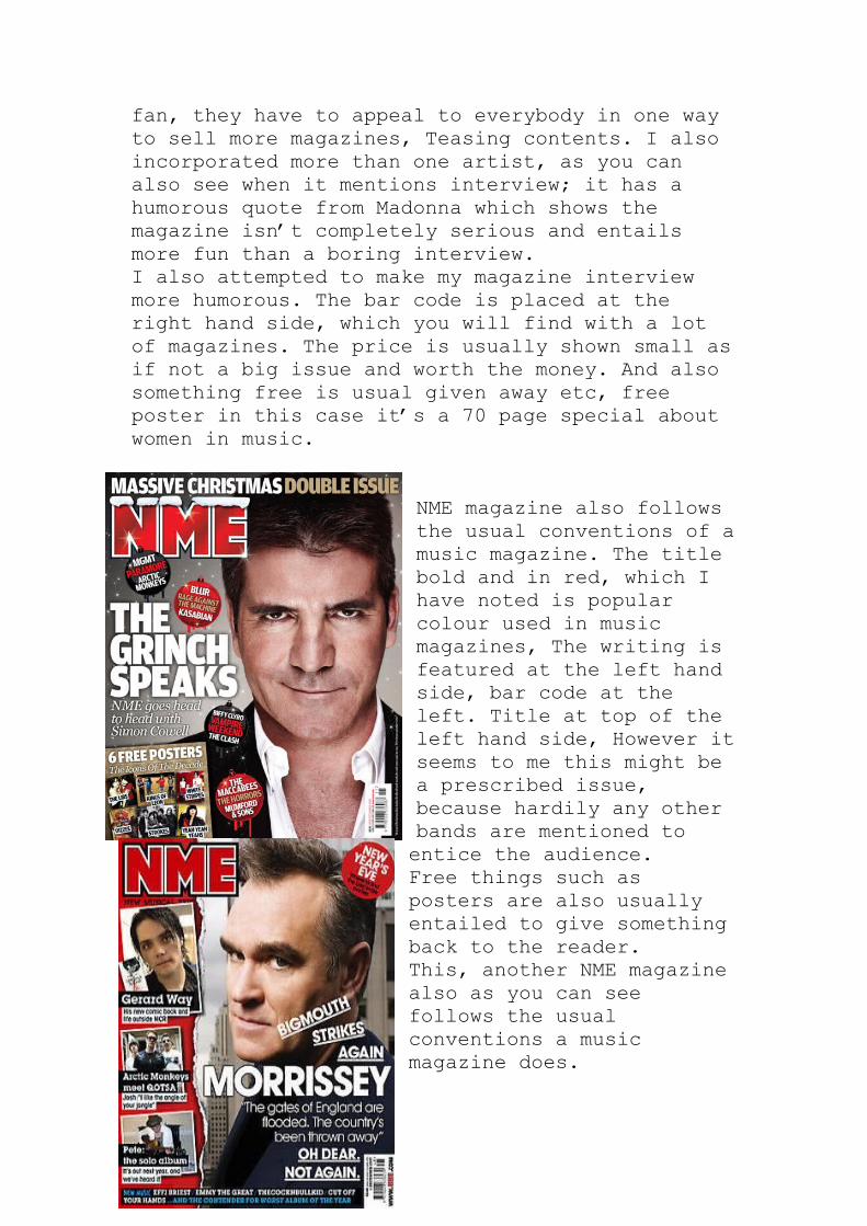
fan, they have to appeal to everybody in one way to sell more magazines, Teasing contents. I also incorporated more than one artist, as you can also see when it mentions interview; it has a humorous quote from Madonna which shows the magazine isn’t completely serious and entails more fun than a boring interview.I also attempted to make my magazine interview more humorous. The bar code is placed at the right hand side, which you will find with a lot of magazines. The price is usually shown small as if not a big issue and worth the money. And also something free is usual given away etc, free poster in this case it’s a 70 page special about women in music.
NME magazine also follows the usual conventions of a music magazine. The title bold and in red, which I have noted is popular colour used in music magazines, The writing is featured at the left hand side, bar code at the left. Title at top of the left hand side, However it seems to me this might be a prescribed issue, because hardily any other bands are mentioned to entice the audience.Free things such as posters are also usually entailed to give something back to the reader.This, another NME magazine also as you can see follows the usual conventions a music magazine does.
Double page analysis.
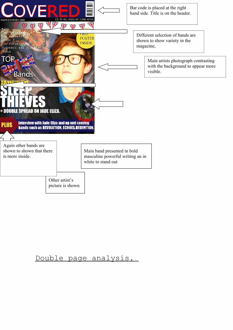
Main band presented in bold masculine powerful writing an in white to stand out
Other artist’s picture is shown
Bar code is placed at the right hand side. Title is on the header.
Different selection of bands are shown to show variety in the magazine,
Again other bands are shown to shown that there is more inside.
Main artists photograph contrasting with the background to appear more visible.

This double page spread is from Kerrang, you can clearly see the colour scheme,And the interview is set up into columns, the main title at the top. Many pictures surrounding the interview, this is a clear representation of a rock magazines double page spread, messy, packed with information, Pictures from gigs. The logo for kerrang in the top right corner.