
ComponentOne MediaPlayer for WPF · 6 Step 1 of 3: Creating an Application with a C1MediaPlayer...
31
ComponentOne MediaPlayer for WPF By GrapeCity, Inc.
Transcript of ComponentOne MediaPlayer for WPF · 6 Step 1 of 3: Creating an Application with a C1MediaPlayer...
ComponentOne
MediaPlayer for WPF
By GrapeCity, Inc.
Copyright 1987-2012 GrapeCity, Inc. All rights reserved.
Corporate Headquarters
ComponentOne, a division of GrapeCity
201 South Highland Avenue
3rd Floor
Pittsburgh, PA 15206 ∙ USA
Internet: [email protected]
Web site: http://www.componentone.com
Sales
E-mail: [email protected]
Telephone: 1.800.858.2739 or 1.412.681.4343 (Pittsburgh, PA USA Office)
Trademarks
The ComponentOne product name is a trademark and ComponentOne is a registered trademark of GrapeCity, Inc. All other
trademarks used herein are the properties of their respective owners.
Warranty
ComponentOne warrants that the original CD (or diskettes) are free from defects in material and workmanship, assuming normal use, for a period of 90 days from the date of purchase. If a defect occurs during this time, you may return the defective
CD (or disk) to ComponentOne, along with a dated proof of purchase, and ComponentOne will replace it at no charge. After 90 days, you can obtain a replacement for a defective CD (or disk) by sending it and a check for $25 (to cover postage and
handling) to ComponentOne.
Except for the express warranty of the original CD (or disks) set forth here, ComponentOne makes no other warranties, express
or implied. Every attempt has been made to ensure that the information contained in this manual is correct as of the time it was
written. We are not responsible for any errors or omissions. ComponentOne’s liability is limited to the amount you paid for the product. ComponentOne is not liable for any special, consequential, or other damages for any reason.
Copying and Distribution
While you are welcome to make backup copies of the software for your own use and protection, you are not permitted to make
copies for the use of anyone else. We put a lot of time and effort into creating this product, and we appreciate your support in seeing that it is used by licensed users only.
This manual was produced using ComponentOne Doc-To-Help™.

iii
Table of Contents
ComponentOne MediaPlayer for WPF .............................................................................................................. 5
Help with ComponentOne Studio for WPF ....................................................................................................... 5
Key Features ...................................................................................................................................................... 5
MediaPlayer for WPF Quick Start ...................................................................................................................... 5
Step 1 of 3: Creating an Application with a C1MediaPlayer Control .............................................................. 6
Step 2 of 3: Adding Content to the C1MediaPlayer Control ............................................................................ 6
Step 3 of 3: Running the Project .......................................................................................................................... 7
Using C1MediaPlayer ........................................................................................................................................ 9
C1MediaPlayer Elements ..................................................................................................................................... 9
Screen .................................................................................................................................................... 11
Item List ................................................................................................................................................ 12
Chapter List .......................................................................................................................................... 12
Adjust Volume ...................................................................................................................................... 13
Time Presenter ...................................................................................................................................... 14
Supported File Types .......................................................................................................................................... 14
MediaPlayer for WPF Layout and Appearance ................................................................................................ 15
ComponentOne ClearStyle Technology ........................................................................................................... 15
How ClearStyle Works ........................................................................................................................ 15
C1MediaPlayer ClearStyle Properties................................................................................................. 15
MediaPlayer Theming ........................................................................................................................................ 17
MediaPlayer for WPF Appearance Properties ................................................................................................. 22
Text Properties ...................................................................................................................................... 22
Color Properties .................................................................................................................................... 23
Border Properties .................................................................................................................................. 23
Size Properties ...................................................................................................................................... 23
Templates ............................................................................................................................................................ 24
MediaPlayer for WPF Samples ........................................................................................................................ 25
MediaPlayer for WPF Task-Based Help ........................................................................................................... 25
Adding Media Content ....................................................................................................................................... 25

iv
Creating Chapters ............................................................................................................................................... 27
Turning Off Autoplay ......................................................................................................................................... 28
Looping Media Files .......................................................................................................................................... 28
Setting the Initial Volume .................................................................................................................................. 29
Showing the Chapter List on Page Load .......................................................................................................... 29
Showing the Item List on Page Load ................................................................................................................ 30

5
ComponentOne MediaPlayer for WPF ComponentOne MediaPlayer™ for WPF provides a player that runs
all video and audio media formats supported by WPF. Implement
advanced capabilities with ease such as playlists, full-screen mode,
overlay support, and more.
For a list of the latest features added to ComponentOne Studio for
WPF, visit What's New in Studio for WPF.
Getting Started
- Using C1MediaPlayer
(page 9)
- Quick Start (page 5)
- Task-Based Help (page
25)
Help with ComponentOne Studio for WPF Getting Started
For information on installing ComponentOne Studio for WPF, licensing, technical support, namespaces and
creating a project with the control, please visit Getting Started with Studio for WPF.
What's New
For a list of the latest features added to ComponentOne Studio for WPF, visit What's New in Studio for WPF.
Key Features ComponentOne MediaPlayer for WPF allows you to create customized, rich applications. Make the most of
MediaPlayer for WPF by taking advantage of the following key features:
Create Playlists
Add your own playlist in line or in the code behind.
Full Screen Mode
Easily set the player to display in full screen mode.
Overlay Support
Add an overlay to your WPF media player; for example, you can overlay logos, banners, and
advertisements.
MediaPlayer for WPF Quick Start The following quick start guide is intended to get you up and running with MediaPlayer for WPF. In this quick
start, you'll start in Visual Studio to create a new project, add a C1MediaPlayer control to your application, and
add chaptered content to the C1MediaPlayer control.
6
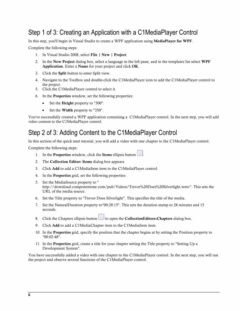
Step 1 of 3: Creating an Application with a C1MediaPlayer Control In this step, you'll begin in Visual Studio to create a WPF application using MediaPlayer for WPF.
Complete the following steps:
1. In Visual Studio 2008, select File | New | Project.
2. In the New Project dialog box, select a language in the left pane, and in the templates list select WPF
Application. Enter a Name for your project and click OK.
3. Click the Split button to enter Split view.
4. Navigate to the Toolbox and double-click the C1MediaPlayer icon to add the C1MediaPlayer control to
the project.
5. Click the C1MediaPlayer control to select it.
6. In the Properties window, set the following properties:
Set the Height property to "300".
Set the Width property to "350".
You've successfully created a WPF application containing a C1MediaPlayer control. In the next step, you will add
video content to the C1MediaPlayer control.
Step 2 of 3: Adding Content to the C1MediaPlayer Control In this section of the quick start tutorial, you will add a video with one chapter to the C1MediaPlayer control.
Complete the following steps:
1. In the Properties window, click the Items ellipsis button .
2. The Collection Editor: Items dialog box appears.
3. Click Add to add a C1MediaItem item to the C1MediaPlayer control.
4. In the Properties grid, set the following properties:
5. Set the MediaSource property to "
http://download.componentone.com/pub/Videos/Trevor%20Does%20Silverlight.wmv". This sets the
URL of the media source.
6. Set the Title property to "Trevor Does Silverlight". This specifies the title of the media.
7. Set the NaturalDuration property to"00:28:15". This sets the duration stamp to 28 minutes and 15
seconds.
8. Click the Chapters ellipsis button to open the CollectionEditors:Chapters dialog box.
9. Click Add to add a C1MediaChapter item to the C1MediaItem item.
10. In the Properties grid, specify the position that the chapter begins at by setting the Position property to
"00:02:48".
11. In the Properties grid, create a title for your chapter setting the Title property to "Setting Up a
Development System".
You have successfully added a video with one chapter to the C1MediaPlayer control. In the next step, you will run
the project and observe several functions of the C1MediaPlayer control.
7
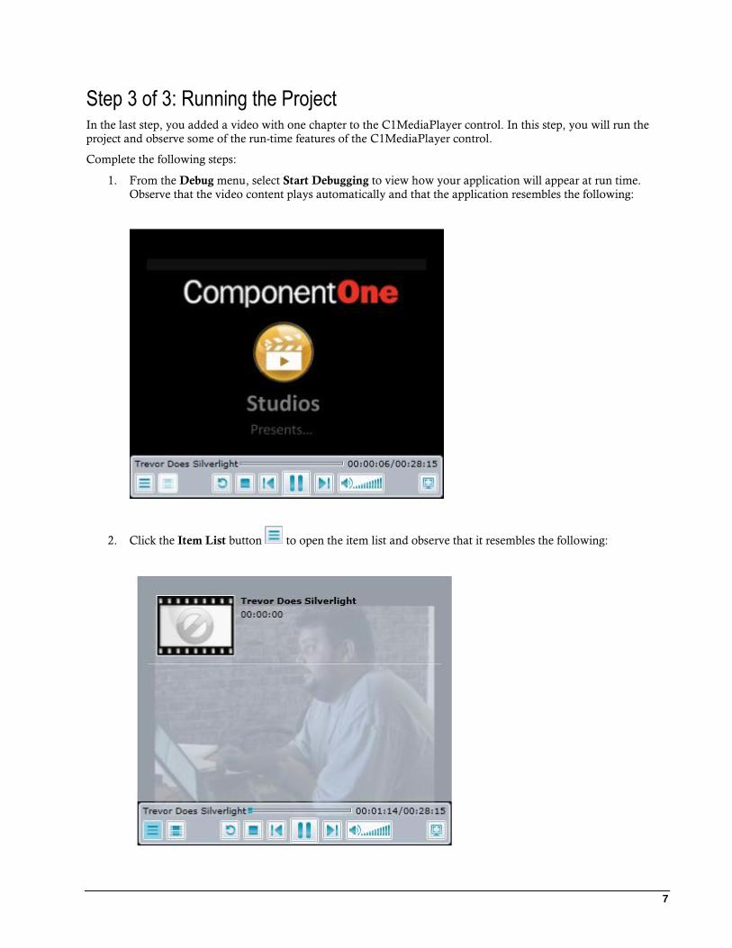
Step 3 of 3: Running the Project In the last step, you added a video with one chapter to the C1MediaPlayer control. In this step, you will run the
project and observe some of the run-time features of the C1MediaPlayer control.
Complete the following steps:
1. From the Debug menu, select Start Debugging to view how your application will appear at run time.
Observe that the video content plays automatically and that the application resembles the following:
2. Click the Item List button to open the item list and observe that it resembles the following:

8
You added the title and the duration time of the video in steps 2 and 3 of Step 2 of 3: Adding Content to
the C1MediaPlayer Control (page 6).
3. Click the Chapter List button to open the chapter list and observe that it resembles the following:
4. Click Setting up a Development System and observe that the video fast-forwards to that chapter. The
media player content will appear follows:

9
Congratulations! You have successfully completed the MediaPlayer for WPF quick start. In this quick start,
you've created a MediaPlayer for WPF application, added chaptered video content to the C1MediaPlayer control,
and viewed some of the run-time capabilities of the control.
Using C1MediaPlayer The C1MediaPlayer control is a media device used to deliver video and audio to your users. With the
C1MediaPlayer control, you can create content playlists and even separate large videos into manageable chapters.
The control is able to hold any media format supported by WPF.
After the C1MediaPlayer control is added to your project, you can begin customizing its appearance and
behaviors. You can apply themes and gradients, create video overlays, choose full screen view, add and remove
buttons, and much more.
You can add content to the C1MediaPlayer control by creating C1MediaItem item and then setting its
MediaSource property to the URL location of an image, video, or audio file.
To help get you started, the following topics will present you with an overview of some of the common elements
and features of the C1MediaPlayer control.
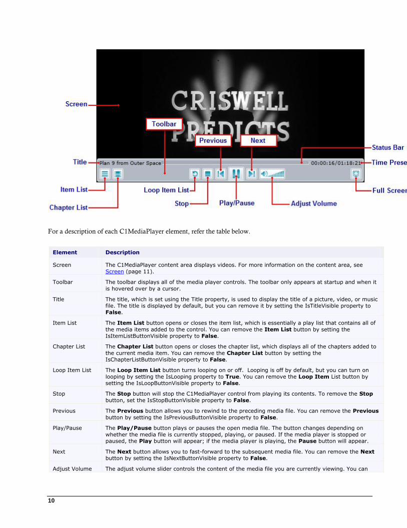
C1MediaPlayer Elements This section provides a visual and descriptive overview of the elements that comprise the C1MediaPlayer control.
The following image lists the default elements of the C1MediaPlayer control.
10
For a description of each C1MediaPlayer element, refer the table below.
Element Description
Screen The C1MediaPlayer content area displays videos. For more information on the content area, see
Screen (page 11).
Toolbar The toolbar displays all of the media player controls. The toolbar only appears at startup and when it
is hovered over by a cursor.
Title The title, which is set using the Title property, is used to display the title of a picture, video, or music file. The title is displayed by default, but you can remove it by setting the IsTitleVisible property to False.
Item List The Item List button opens or closes the item list, which is essentially a play list that contains all of
the media items added to the control. You can remove the Item List button by setting the IsItemListButtonVisible property to False.
Chapter List The Chapter List button opens or closes the chapter list, which displays all of the chapters added to
the current media item. You can remove the Chapter List button by setting the IsChapterListButtonVisible property to False.
Loop Item List The Loop Item List button turns looping on or off. Looping is off by default, but you can turn on
looping by setting the IsLooping property to True. You can remove the Loop Item List button by setting the IsLoopButtonVisible property to False.
Stop The Stop button will stop the C1MediaPlayer control from playing its contents. To remove the Stop
button, set the IsStopButtonVisible property to False.
Previous The Previous button allows you to rewind to the preceding media file. You can remove the Previous
button by setting the IsPreviousButtonVisible property to False.
Play/Pause The Play/Pause button plays or pauses the open media file. The button changes depending on
whether the media file is currently stopped, playing, or paused. If the media player is stopped or paused, the Play button will appear; if the media player is playing, the Pause button will appear.
Next The Next button allows you to fast-forward to the subsequent media file. You can remove the Next button by setting the IsNextButtonVisible property to False.
Adjust Volume The adjust volume slider controls the content of the media file you are currently viewing. You can
11
click the mute button to mute sound.
Full Screen The Full Screen button opens and closes the full screen view of the C1MediaPlayer control. When the
control is in full screen mode, you can return to its regular size by either clicking the Full Screen button again or by pressing ESC on your keyboard. To remove the Full Screen button, set the IsFullScreenButtonVisible property to False.
Time Presenter The time presenter displays both the time elapsed and the time remaining in the current media file.
You can remove the time presenter by setting the IsTimePresenterVisible property to False.
Status Bar The status bar indicates both the time elapsed and the time remaining in the currently media file. It's
also a slider bar that allows you to change your location in the current media file. To remove the status bar, set the IsPositionSliderVisible property to False.
Screen
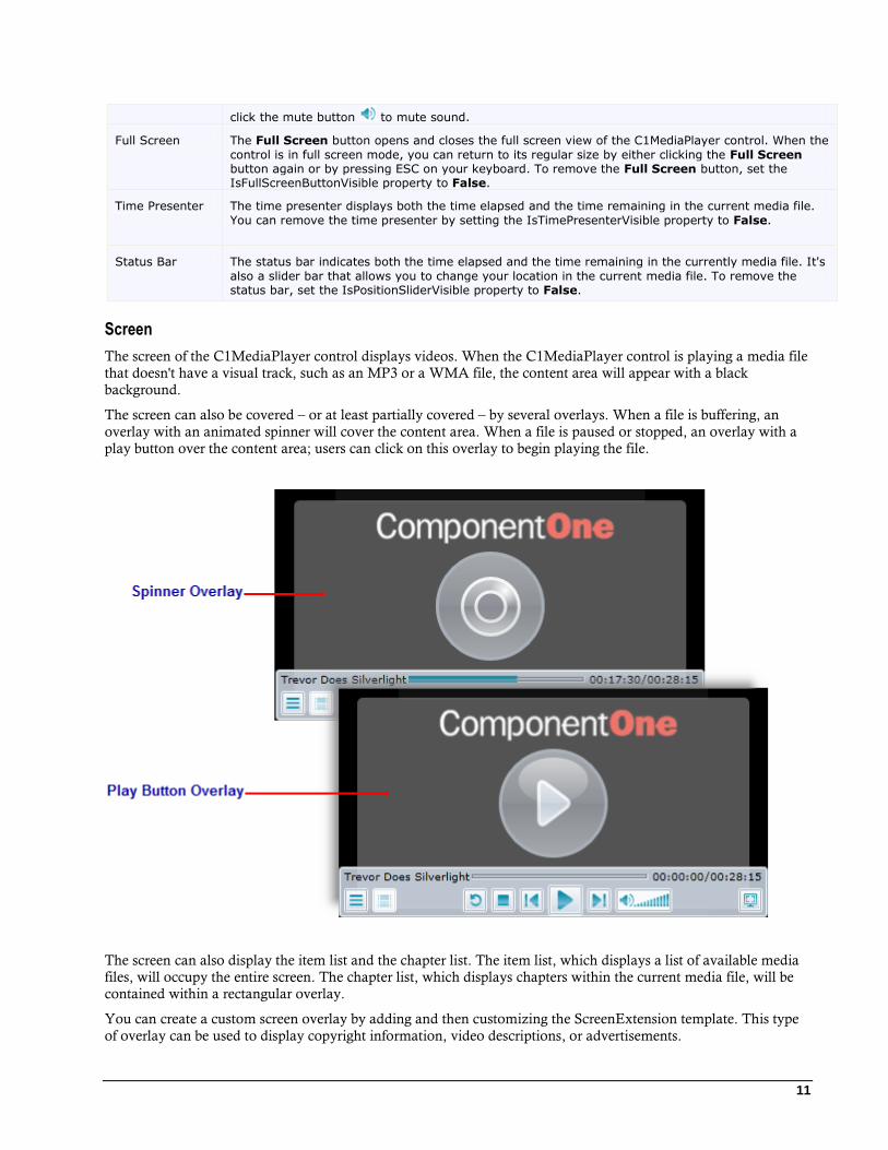
The screen of the C1MediaPlayer control displays videos. When the C1MediaPlayer control is playing a media file
that doesn't have a visual track, such as an MP3 or a WMA file, the content area will appear with a black
background.
The screen can also be covered – or at least partially covered – by several overlays. When a file is buffering, an
overlay with an animated spinner will cover the content area. When a file is paused or stopped, an overlay with a
play button over the content area; users can click on this overlay to begin playing the file.
The screen can also display the item list and the chapter list. The item list, which displays a list of available media
files, will occupy the entire screen. The chapter list, which displays chapters within the current media file, will be
contained within a rectangular overlay.
You can create a custom screen overlay by adding and then customizing the ScreenExtension template. This type
of overlay can be used to display copyright information, video descriptions, or advertisements.
12
Item List
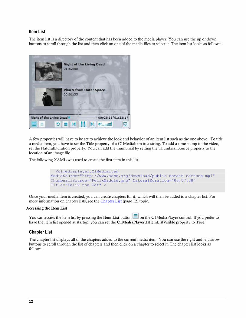
The item list is a directory of the content that has been added to the media player. You can use the up or down
buttons to scroll through the list and then click on one of the media files to select it. The item list looks as follows:
A few properties will have to be set to achieve the look and behavior of an item list such as the one above. To title
a media item, you have to set the Title property of a C1MediaItem to a string. To add a time stamp to the video,
set the NaturalDuration property. You can add the thumbnail by setting the ThumbnailSource property to the
location of an image file
The following XAML was used to create the first item in this list.
<c1mediaplayer:C1MediaItem
MediaSource="http://www.acme.org/download/public_domain_cartoon.mp4"
ThumbnailSource="FelixMiddle.png" NaturalDuration="00:07:58"
Title="Felix the Cat" >
Once your media item is created, you can create chapters for it, which will then be added to a chapter list. For
more information on chapter lists, see the Chapter List (page 12) topic.
Accessing the Item List
You can access the item list by pressing the Item List button on the C1MediaPlayer control. If you prefer to
have the item list opened at startup, you can set the C1MediaPlayer.IsItemListVisible property to True.
Chapter List
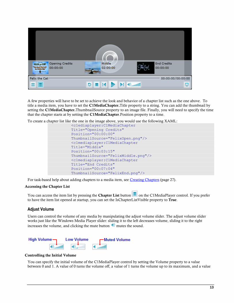
The chapter list displays all of the chapters added to the current media item. You can use the right and left arrow
buttons to scroll through the list of chapters and then click on a chapter to select it. The chapter list looks as
follows:
13
A few properties will have to be set to achieve the look and behavior of a chapter list such as the one above. To
title a media item, you have to set the C1MediaChapter.Title property to a string. You can add the thumbnail by
setting the C1MediaChapter.ThumbnailSource property to an image file. Finally, you will need to specify the time
that the chapter starts at by setting the C1MediaChapter.Position property to a time.
To create a chapter list like the one in the image above, you would use the following XAML: <c1ediaplayer:C1MediaChapter
Title="Opening Credits"
Position="00:00:00"
ThumbnailSource="FelixOpen.png"/>
<c1mediaplayer:C1MediaChapter
Title="Middle"
Position="00:03:15"
ThumbnailSource="FelixMiddle.png"/>
<c1mediaplayer:C1MediaChapter
Title="End Credits"
Position="00:07:04"
ThumbnailSource="FelixEnd.png"/>
For task-based help about adding chapters to a media item, see Creating Chapters (page 27).
Accessing the Chapter List
You can access the item list by pressing the Chapter List button on the C1MediaPlayer control. If you prefer
to have the item list opened at startup, you can set the IsChapterListVisible property to True.
Adjust Volume
Users can control the volume of any media by manipulating the adjust volume slider. The adjust volume slider
works just like the Windows Media Player slider: sliding it to the left decreases volume, sliding it to the right
increases the volume, and clicking the mute button mutes the sound.
Controlling the Initial Volume
You can specify the initial volume of the C1MediaPlayer control by setting the Volume property to a value
between 0 and 1. A value of 0 turns the volume off, a value of 1 turns the volume up to its maximum, and a value

14
of 0.5 places the volume in the middle of the scale. If you'd rather mute the control at run time, you can also set the
IsMuted property to True.
Time Presenter
The position element provides two time markers: time elapsed and total time. The time elapsed is on the left side of
the time presenter while the total time is on the right side of the time presenter.
By default, the time elapsed will start from zero. However, you can change the starting position of a media file by
setting the Position property to a time. When you run the project, the media file will begin from the point that you
specified, and the time elapsed portion of the time presenter will start counting time from that position of time.
Supported File Types The C1MediaPlayer control currently supports the following media types:
Video
The video formats supported are as follows:
Raw Video.
YV12 - YCrCb(4:2:0).
RGBA - 32 bit Alpha Red, Green, Blue.
WMV, MV2, and MV3 ( Windows Media Video 7, 8, and 9)
Supports Simple and Main Profiles.
Supports only progressive (non-interlaced) content.
WMVA: Windows Media Video Advanced Profile, non-VC-1.
WVC1: Windows Media Video Advanced Profile, VC-1.
Supports Advanced Profile.
Supports only progressive (non-interlaced) content.
H264 (ITU-T H.264 / ISO MPEG-4 AVC).
Audio
The audio formats supported are as follows:
“1” –WAV format.
"353" - Microsoft Windows Media Audio v7, v8 and v9.x Standard (WMA Standard).
"354" - Microsoft Windows Media Audio v9.x and v10 Professional (WMA Professional).
"85" - ISO MPEG-1 Layer III (MP3).
15
"255" - ISO Advanced Audio Coding (AAC).
MediaPlayer for WPF Layout and
Appearance The following topics detail how to customize the C1MediaPlayer control's layout and appearance. You can use
built-in layout options to lay your controls out in panels such as Grids or Canvases. Themes allow you to
customize the appearance of the grid and take advantage of WPF's XAML-based styling. You can also use
templates to format and layout the control and to customize the control's actions.
ComponentOne ClearStyle Technology ComponentOne ClearStyle™ technology is a new, quick and easy approach to providing Silverlight and WPF
control styling. ClearStyle allows you to create a custom style for a control without having to deal with the hassle
of XAML templates and style resources.
Currently, to add a theme to all standard WPF controls, you must create a style resource template. In Microsoft
Visual Studio, this process can be difficult; this is why Microsoft introduced Expression Blend to make the task a
bit easier. Having to jump between two environments can be a bit challenging to developers who are not familiar
with Blend or do not have the time to learn it. You could hire a designer, but that can complicate things when your
designer and your developers are sharing XAML files.
That's where ClearStyle comes in. With ClearStyle the styling capabilities are brought to you in Visual Studio in
the most intuitive manner possible. In most situations you just want to make simple styling changes to the controls
in your application so this process should be simple. For example, if you just want to change the row color of your
data grid this should be as simple as setting one property. You shouldn't have to create a full and complicated-
looking template just to simply change a few colors.
How ClearStyle Works
Each key piece of the control's style is surfaced as a simple color property. This leads to a unique set of style
properties for each control. For example, a Gauge has PointerFill and PointerStroke properties, whereas a
DataGrid has SelectedBrush and MouseOverBrush for rows.
Let's say you have a control on your form that does not support ClearStyle. You can take the XAML resource
created by ClearStyle and use it to help mold other controls on your form to match (such as grabbing exact colors).
Or let's say you'd like to override part of a style set with ClearStyle (such as your own custom scrollbar). This is
also possible because ClearStyle can be extended and you can override the style where desired.
ClearStyle is intended to be a solution to quick and easy style modification but you're still free to do it the old
fashioned way with ComponentOne's controls to get the exact style needed. ClearStyle does not interfere with
those less common situations where a full custom design is required.
C1MediaPlayer ClearStyle Properties
MediaPlayer for WPF supports ComponentOne's new ClearStyle technology that allows you to easily change
control colors without having to change control templates. By just setting a few color properties you can quickly
style the entire grid.
The following table outlines the brush properties of the C1MediaPlayer control:
Brush Description
Background Gets or sets the brush of the control’s background.

16
ButtonBackground Gets or sets thebrush of the buttons’ background color.
ButtonForeground Gets or sets the brush of the buttons’ foreground color (for example, the
symbols on the buttons).
MouseOverBrush Gets or sets the System.Windows.Media.Brush used to highlight the buttons
when the mouse is hovered over them.
PressedBrush Gets or sets the System.Windows.Media.Brush used to highlight the buttons
when they are clicked on.
You can completely change the appearance of the C1MediaPlayer control by setting a few properties, such as the
Background property, which sets the background color of the media player. For example, if you set the
Background property to "#FFE40005", the C1MediaPlayer control would appear similar to the following:
If you want the buttons to appear lime green for better contrast against the red, you can also set the
ButtonForeground and ButtonBackground properties. In the following example, the ButtonForeground property
is set to “#FF5500DE” and the ButtonBackground property is set to “#FF00F500”.

17
It’s that simple with ComponentOne’s ClearStyle technology. For more information on ClearStyle, see the
ComponentOne ClearStyle Technology (page 15) topic.
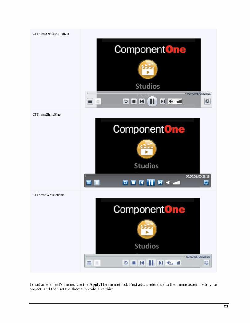
MediaPlayer Theming ComponentOne MediaPlayer for WPF incorporates several themes that allow you to customize the appearance of your
grid. When you first add a C1MediaPlayer control to the page, it appears similar to the following image:
This is the control's default appearance. You can change this appearance by using one of the built-in themes or by
creating your own custom theme. All of the built-in themes are based on WPF Toolkit themes. The built-in themes
are described and pictured below:
Full Theme Name Appearance

18
C1ThemeBureauBlack
C1Blue
C1ThemeExpressionDark

19
C1ThemeExpressionLight
C1ThemeOffice2007Black
C1ThemeOffice2007Blue

20
C1ThemeOffice2007Silver
C1ThemeOffice2010Black
C1ThemeOffice2010Blue
21
C1ThemeOffice2010Silver
C1ThemeShinyBlue
C1ThemeWhistlerBlue
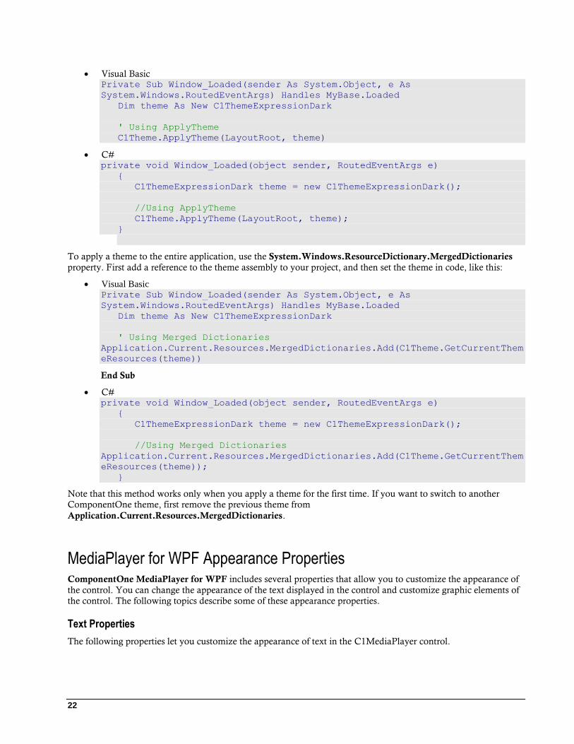
To set an element's theme, use the ApplyTheme method. First add a reference to the theme assembly to your
project, and then set the theme in code, like this:
22
Visual Basic Private Sub Window_Loaded(sender As System.Object, e As
System.Windows.RoutedEventArgs) Handles MyBase.Loaded
Dim theme As New C1ThemeExpressionDark
' Using ApplyTheme C1Theme.ApplyTheme(LayoutRoot, theme)
C# private void Window_Loaded(object sender, RoutedEventArgs e)
{
C1ThemeExpressionDark theme = new C1ThemeExpressionDark();
//Using ApplyTheme
C1Theme.ApplyTheme(LayoutRoot, theme);
}
To apply a theme to the entire application, use the System.Windows.ResourceDictionary.MergedDictionaries
property. First add a reference to the theme assembly to your project, and then set the theme in code, like this:
Visual Basic Private Sub Window_Loaded(sender As System.Object, e As
System.Windows.RoutedEventArgs) Handles MyBase.Loaded
Dim theme As New C1ThemeExpressionDark
' Using Merged Dictionaries
Application.Current.Resources.MergedDictionaries.Add(C1Theme.GetCurrentThem
eResources(theme))
End Sub
C# private void Window_Loaded(object sender, RoutedEventArgs e)
{
C1ThemeExpressionDark theme = new C1ThemeExpressionDark();
//Using Merged Dictionaries
Application.Current.Resources.MergedDictionaries.Add(C1Theme.GetCurrentThem
eResources(theme));
}
Note that this method works only when you apply a theme for the first time. If you want to switch to another
ComponentOne theme, first remove the previous theme from
Application.Current.Resources.MergedDictionaries.
MediaPlayer for WPF Appearance Properties ComponentOne MediaPlayer for WPF includes several properties that allow you to customize the appearance of
the control. You can change the appearance of the text displayed in the control and customize graphic elements of
the control. The following topics describe some of these appearance properties.
Text Properties
The following properties let you customize the appearance of text in the C1MediaPlayer control.

23
Property Description
FontFamily Gets or sets the font family of the control. This is a dependency property.
FontSize Gets or sets the font size. This is a dependency property.
FontStretch Gets or sets the degree to which a font is condensed or
expanded on the screen. This is a dependency property.
FontStyle Gets or sets the font style. This is a dependency property.
FontWeight Gets or sets the weight or thickness of the specified font.
This is a dependency property.
Color Properties
The following properties let you customize the colors used in the control itself.
Property Description
Background Gets or sets a brush that describes the background of a
control. This is a dependency property.
Foreground Gets or sets a brush that describes the foreground color.
This is a dependency property.
Border Properties
The following properties let you customize the control's border.
Property Description
BorderBrush Gets or sets a brush that describes the border background
of a control. This is a dependency property.
BorderThickness Gets or sets the border thickness of a control. This is a
dependency property.
Size Properties
The following properties let you customize the size of the C1MediaPlayer control.
Property Description
ActualHeight Gets or sets the horizontal alignment characteristics
applied to this element when it is composed within a
parent element, such as a panel or items control. This is a
dependency property.
ActualWidth Gets the rendered width of this element. This is a
dependency property.
Height Gets or sets the suggested height of the element. This is a
dependency property.
MaxHeight Gets or sets the maximum height constraint of the
element. This is a dependency property.
24
MaxWidth Gets or sets the maximum width constraint of the element.
This is a dependency property.
MinHeight Gets or sets the minimum height constraint of the
element. This is a dependency property.
MinWidth Gets or sets the minimum width constraint of the element.
This is a dependency property.
Width Gets or sets the width of the element. This is a
dependency property.
Templates One of the main advantages to using a WPF control is that controls are "lookless" with a fully customizable user
interface. Just as you design your own user interface (UI), or look and feel, for WPF applications, you can provide
your own UI for data managed by ComponentOne MediaPlayer for WPF. Extensible Application Markup
Language (XAML; pronounced "Zammel"), an XML-based declarative language, offers a simple approach to
designing your UI without having to write code.
Accessing Templates
You can access templates in Microsoft Expression Blend by selecting the C1MediaPlayer control and, in the menu,
selecting Edit Template. Select Edit a Copy to create an editable copy of the current template or Create Empty to
create a new blank template.
Note: If you create a new template through the menu, the template will automatically be linked to that template's property. If you manually create a template in XAML you will have to link the appropriate template property to the template you've created.
Note that you can use the Template property to customize the template.
Included Templates
Additional templates are also available for C1MediaPlayer elements. To access these templates, select the
C1MediaPlayer control and, in the menu, select Edit Additional Templates. Select Edit a Copy to create an
editable copy of the current template or select Create Empty to create a new blank template.
The additional templates described in the table below.
Template Description
BufferingTemplate Template for an overlay over the screen when the state of the content is buffering.
PausedTemplate Template for an overlay over the screen when the state of the content is paused.
ScreenExtension Template for an optional overlay of the video area.
25
ToolBarExtension Template for an optional extension of the ToolBar that contains the show/hide items/chapter
list.
UnstartedTemplate Template for an overlay over the screen when the state of the content is unstarted.
MediaPlayer for WPF Samples Please be advised that these ComponentOne software tools are accompanied by various sample projects and/or demos which may make use of other development tools included with the ComponentOne Studios.
Samples can be accessed from the ComponentOne Control Explorer. To view samples, on your desktop, click the Start button and then click ComponentOne | Studio for WPF | Samples | WPF ControlExplorer.
The following pages within the ControlExplorer detail the C1MediaPlayer control:
Sample Description
MediaPlayer Illustrates the functionality of the C1MediaPlayer control.
MediaPlayer for WPF Task-Based Help The task-based help assumes that you are familiar with programming in Visual Studio .NET and know how to use
the C1MediaPlayer control in general. If you are unfamiliar with the ComponentOne MediaPlayer for WPF
product, please see the MediaPlayer for WPF Quick Start first.
Each topic in this section provides a solution for specific tasks using the ComponentOne MediaPlayer for WPF
product.
Each task-based help topic also assumes that you have created a new WPF project.
Adding Media Content You can add media content by creating a C1MediaItem object and then setting its MediaSource property to the
location of your media file. In this topic, you will add a video file to the media player in the Properties window, in
XAML, and in code.
At Design Time
To add video content, complete the following steps:
1. Click the C1MediaPlayer control once to select it.
2. Find the Items property and click its ellipsis button .
The Collection Editor: Items dialog box opens.
3. Click Add to add a C1MediaItem object the C1MediaPlayer control.
4. In the Properties grid, set the following:
Set the MediaSource property to
"http://download.componentone.com/pub/Videos/Trevor%20Does%20Silverlight.wmv".
Set the Title property to "Trevor Does Silverlight".
5. Click the OK to close the Collection Editor: Items dialog box.
6. Run the program and observe that content is loaded into the control.
26
In XAML
To add video content using XAML, complete the following:
1. Place the following markup between the <c1mediaplayer:C1MediaPlayer> and
</c1mediaplayer:C1MediaPlayer> tags:
<c1mediaplayer:C1MediaItem
MediaSource="http://download.componentone.com/pub/Videos/Trevor%20Does%20
Silverlight.wmv" Title="Trevor Does Silverlight" Name="C1MediaPlayer1" />
2. Run the program and observe that content is loaded into the control.
In Code
To add video content using code, complete the following steps:
1. Open the Window1.xaml.cs page and import the following namespace:
Visual Basic
Imports C1.WPF.MediaPlayer
C#
using C1.WPF.MediaPlayer;
2. Place the following code beneath the InitializeComponent() method:
Visual Basic
'Create a C1MediaItem object
Dim C1MediaItem1 As New C1MediaItem()
'Create a Uri object that contains the media file's path
Dim Uri1 As New
Uri("http://download.componentone.com/pub/Videos/Trevor%20Does%20Silver
light.wmv")
'Set the C1MediaItems content source to the Uri object
C1MediaItem1.MediaSource = Uri1
'Name the media item
C1MediaItem1.Title = "Trevor Does Silverlight"
'Add the media item to the media player
C1MediaPlayer1.Items.Add(C1MediaItem1)
C#
//Create a C1MediaItem object
C1MediaItem C1MediaItem1 = new C1MediaItem();
//Create a Uri object that contains the media file's path
Uri Uri1 = new
Uri("http://download.componentone.com/pub/Videos/Trevor%20Does%20Silver
light.wmv");
//Set the C1MediaItems content source to the Uri object
C1MediaItem1.MediaSource = Uri1;

27
//Name the media item
C1MediaItem1.Title = "Trevor Does Silverlight";
//Add the media item to the media player
c1MediaPlayer1.Items.Add(C1MediaItem1);
3. Run the program and observe that content is loaded into the control.
Creating Chapters You can create chapters by creating a C1MediaChapter item and then settings its Position property. This topic
assumes that you have completed the Adding Media Content (page 25) task-based help topic.
At Design Time
To create a chapter, complete the following steps:
1. Click the C1MediaPlayer control once to select it.
2. In the Properties window, click the Items property's ellipsis button .
The Collection Editor: Items dialog box opens.
3. In the Items pane, select the C1MediaItem that you want to add the chapters to.
4. In the Properties pane, click the Chapters property's ellipsis button .
5. The Collection Editor: Chapters dialog box opens.
6. Create a chapter by completing the following steps:
a. Click Add to add a chapter.
A C1MediaChapter item is added to the Items pane.
b. Set the Position property to a time. For this example, set it to "00:01:25", which will create the chapter at 1
minute and 25 seconds into media file.
c. Set the Title property to a name. For this example, set it "Trevor Looks Confused".
7. Click OK to close the Collection Editor: Chapters dialog box.
8. Click OK to close the Collection Editor: Items dialog box.
9. Run the program and click the Chapter List button . Observe that one chapter, Trevor Looks
Confused, appears in the list. You can double-click it to skip ahead to that part of the media file.
In XAML
To create a chapter, complete the following steps:
1. Place the following markup between the <c1mediaplayer:C1MediaItem> and the
</c1mediaplayer:C1MediaItem> tags:
<c1mediaplayer:C1MediaChapter Name="C1MediaPlayer1"
Position="00:01:25" Title="Trevor Looks Confused"/>
2. Run the program and click the Chapter List button . Observe that one chapter, Trevor Looks
Confused, appears in the list. You can double-click it to skip ahead to that part of the media file.

28
Turning Off Autoplay By default, the C1MediaPlayer control will autoplay audio files; however, you can turn this feature off by setting
the AutoPlay property to False.
At Design Time
To turn off autoplay, complete the following steps:
1. Click the C1MediaPlayer control once to select it.
2. In the Properties window, locate the AutoPlay check box and deselect it.
In XAML
To turn off autoplay, add AutoPlay="False" to the <c1mediaplayer:C1MediaPlayer> tag so that the
markup resembles the following:
<c1mediaplayer:C1MediaPlayer Name="C1MediaPlayer1" AutoPlay="False">
In Code
To turn off autoplay, complete the following steps:
1. Open the Window1.xaml.cs page.
2. Place the following code beneath the InitializeComponent() method:
Visual Basic
C1MediaPlayer1.AutoPlay = False
C#
c1MediaPlayer1.AutoPlay = false;
3. Run the program.
Looping Media Files By default, the C1MediaPlayer control will automatically run through its item list only once. But if you'd prefer to
have the player continuously loop through its items, you can set the IsLooping property to True.
At Design Time
To turn on looping, complete the following steps:
1. Click the C1MediaPlayer control once to select it.
2. In the Properties window, locate the IsLooping check box and select it.
In XAML
To turn on looping, add IsLooping="True" to the <c1mediaplayer:C1MediaPlayer> tag so that the
markup resembles the following:
<c1mediaplayer:C1MediaPlayer Name="C1MediaPlayer1" IsLooping="True">
In Code
To turn on looping, complete the following steps:
1. Open the Window1.xaml.cs page.
2. Place the following code beneath the InitializeComponent() method:
Visual Basic
29
C1MediaPlayer1.IsLooping = True
C#
c1MediaPlayer1.IsLooping = true;
3. Run the program.
Setting the Initial Volume You can set the initial volume setting of the C1MediaPlayer control by setting the Volume property to a value
between 0 and 1. In this topic, you will set the volume so that it's at its midway point upon page load.
At Design Time
To set the volume, complete the following steps:
1. Click the C1MediaPlayer control once to select it.
2. In the Properties window, set the Volume property to "0.5".
3. Run the program and observe that the C1MediaPlayer control's volume is set halfway.
In XAML
Complete the following steps:
1. To set the volume, complete the following steps:
2. Add Volume="0.5" to the <c1mediaplayer:C1MediaPlayer> tag so that the markup resembles
the following:
3.
<c1mediaplayer:C1MediaPlayer Name="C1MediaPlayer1" Volume="0.5">
4. Run the program and observe that the C1MediaPlayer control's volume is set halfway.
In Code
To set the volume, complete the following steps:
1. Open the Window1.xaml.cs page.
2. Place the following code beneath the InitializeComponent() method:
Visual Basic
C1MediaPlayer1.Volume = 0.5
C#
c1MediaPlayer1.Volume = 0.5;
3. Run the program and observe that the C1MediaPlayer control's volume is set halfway.
Showing the Chapter List on Page Load By default, the C1MediaPlayer control doesn't show the chapter list when it's loaded; users will have to open the
list themselves by clicking the Chapter List button. However, you can make the chapter list show upon page load
by setting the IsChapterListVisible property to True.
At Design Time
To open the chapter list on page load, complete the following steps:
1. Click the C1MediaPlayer control once to select it.

30
2. In the Properties window, locate the IsChapterListVisible check box and then select it.
3. Run the program and observe that the chapter list opens at run time.
In XAML
To open the chapter list on page load, complete the following steps:
1. Add IsChapterListVisble="True" to the <c1mediaplayer:C1MediaPlayer> tag so that the
markup resembles the following:
<c1mediaplayer:C1MediaPlayer Name="C1MediaPlayer1"
IsChapterListVisible="True">
2. Run the program and observe that the chapter list opens at run time.
In Code
To open the chapter list on page load, complete the following steps:
1. Open the Window1.xaml.cs page.
2. Place the following code beneath the InitializeComponent() method:
Visual Basic
C1MediaPlayer1.IsChapterListVisible = True
C#
c1MediaPlayer1.IsChapterListVisible = true;
3. Run the program and observe that the chapter list opens at run time.
Showing the Item List on Page Load By default, the C1MediaPlayer control doesn't show the item list when it's loaded; users will have to open the list
themselves by clicking the Item List button. However, you can make the item list show upon page load by setting
the IsItemListVisible property to True.
At Design Time
To open the item list on page load, complete the following steps:
1. Click the C1MediaPlayer control once to select it.
2. In the Properties window, locate the IsItemListVisible check box and then select it.
3. Run the program and observe that the item list opens at run time.
In XAML
To open the item list on page load, complete the following steps:
1. Add IsItemListVisble="True" to the <c1mediaplayer:C1MediaPlayer> tag so that the
markup resembles the following:
<c1mediaplayer:C1MediaPlayer Name="C1MediaPlayer1"
IsItemListVisible="True">
2. Run the program and observe that the item list opens at run time.

31
In Code
To open the item list on page load, complete the following steps:
1. Open the Window1.xaml.cs page.
2. Place the following code beneath the InitializeComponent() method:
Visual Basic
C1MediaPlayer1.IsItemListVisible = True
C#
c1MediaPlayer1.IsItemListVisible = true;
3. Run the program and observe that the item list opens at run time.