
ComponentOne AutoComplete for ASP.NET Wijmo€¦ · Create auto-complete search boxes with this...
28
ComponentOne AutoComplete for ASP.NET Wijmo By GrapeCity, Inc.
-
Upload
nguyenhuong -
Category
Documents
-
view
235 -
download
0
Transcript of ComponentOne AutoComplete for ASP.NET Wijmo€¦ · Create auto-complete search boxes with this...

ComponentOne
AutoComplete for ASP.NET Wijmo
By GrapeCity, Inc.

Copyright 1987-2012 GrapeCity, Inc. All rights reserved.
Corporate Headquarters
ComponentOne, a division of GrapeCity
201 South Highland Avenue
3rd Floor
Pittsburgh, PA 15206 ∙ USA
Internet: [email protected]
Web site: http://www.componentone.com
Sales
E-mail: [email protected]
Telephone: 1.800.858.2739 or 1.412.681.4343 (Pittsburgh, PA USA Office)
Trademarks
The ComponentOne product name is a trademark and ComponentOne is a registered trademark of GrapeCity, Inc. All other
trademarks used herein are the properties of their respective owners.
Warranty
ComponentOne warrants that the original CD (or diskettes) are free from defects in material and workmanship, assuming normal use, for a period of 90 days from the date of purchase. If a defect occurs during this time, you may return the defective
CD (or disk) to ComponentOne, along with a dated proof of purchase, and ComponentOne will replace it at no charge. After 90 days, you can obtain a replacement for a defective CD (or disk) by sending it and a check for $25 (to cover postage and
handling) to ComponentOne.
Except for the express warranty of the original CD (or disks) set forth here, ComponentOne makes no other warranties, express
or implied. Every attempt has been made to ensure that the information contained in this manual is correct as of the time it was
written. We are not responsible for any errors or omissions. ComponentOne’s liability is limited to the amount you paid for the product. ComponentOne is not liable for any special, consequential, or other damages for any reason.
Copying and Distribution
While you are welcome to make backup copies of the software for your own use and protection, you are not permitted to make
copies for the use of anyone else. We put a lot of time and effort into creating this product, and we appreciate your support in seeing that it is used by licensed users only.
This manual was produced using ComponentOne Doc-To-Help™.

iii
Table of Contents
ComponentOne AutoComplete for ASP.NET Wijmo Overview ........................................................................ 5
Help with ComponentOne Studio for ASP.NET Wijmo .................................................................................. 5
AutoComplete for ASP.NET Wijmo Key Features ............................................................................................ 5
AutoComplete for ASP.NET Wijmo Quick Start ............................................................................................... 7
Step 1 of 3: Add C1AutoComplete to the Page .................................................................................................. 7
Step 2 of 3: Customize the AutoComplete Search Box ..................................................................................... 7
Step 3 of 3: Run your Application ....................................................................................................................... 8
Design-Time Support in AutoComplete for ASP.NET Wijmo ............................................................................ 9
C1AutoComplete Smart Tag ............................................................................................................................... 9
C1AutoComplete Context Menu ...................................................................................................................... 10
C1AutoComplete DesignerForm ...................................................................................................................... 11
Exploring the AutoComplete DesignerForm ..................................................................................... 11
How to Use the Designer ..................................................................................................................... 14
AutoComplete for ASP.NET Wijmo Elements................................................................................................. 15
AutoComplete for ASP.NET Wijmo Appearance ............................................................................................ 16
Themes ................................................................................................................................................................ 16
CSS Selectors ...................................................................................................................................................... 17
Working with the Client-Side ........................................................................................................................... 18
Client-Side Events ............................................................................................................................................... 18
AutoComplete for ASP.NET Wijmo Task-Based Help ..................................................................................... 21
Creating a C1AutoComplete Control in Code ................................................................................................. 21
Customizing the Width and Height of C1AutoComplete ............................................................................... 21
Using the AutoPostBack Property ..................................................................................................................... 22
Using DataBinding ............................................................................................................................................. 25
Using the LoadOnDemand Property ................................................................................................................ 25
Using Themes with C1AutoComplete .............................................................................................................. 26
Applying a Built-in Theme Using the Smart Tag ............................................................................... 26
Adding a Custom Theme ..................................................................................................................... 27

iv
Using jQuery ThemeRoller .................................................................................................................. 27

5
ComponentOne AutoComplete for
ASP.NET Wijmo Overview Create auto-complete search boxes with this Ajax-powered
AutoComplete Control. This search box supports DataBinding,
AutoPostBack for value retrieval, and Ajax loading of values.
Getting Started
Get started with the
following topics:
- Key Features (page 5)
- Quick Start (page 7)
- Control Elements (page
15)
Help with ComponentOne Studio for ASP.NET Wijmo Getting Started
For information on installing ComponentOne Studio for ASP.NET Wijmo, licensing, technical support,
namespaces and creating a project with the control, please visit Getting Started with ASP.NET Wijmo.
What's New
For a list of the latest features added to ComponentOne Studio for ASP.NET Wijmo, visit What's New in Studio
for ASP.NET Wijmo.
AutoComplete for ASP.NET Wijmo
Key Features The C1AutoComplete control is a special type of search box that can be created on the client-side or server-side to
complete search terms input by the user.
Feature Overview
C1AutoComplete provides several unique features including LoadOnDemand, DataBinding, AutoPostBack,
AutoComplete positioning, a MaxCount property, a MinLength property, and built-in themes.
LoadOnDemand
AutoComplete for ASP.NET Wijmo is Ajax-powered which allows you to load information
dynamically. Child items are loaded when you type in the search box.
DataBinding
C1AutoComplete allows you to bind the label, value, and category fields to a data source of your choice.
AutoPostBack
6
With the AutoPostBackproperty, you can indicate whether or not the control posts back to the server each
time a user interacts with the control.
Positioning
The AutoComplete control allows you to identify the position of the control in relation to the associated
input element.
MaxCount
C1AutoComplete allows you to control the maximum number of callback results. To use this property,
you must specify the data source and have the LoadOnDemand property set to "true".
MinLength
The MinLength property allows you to control the number of characters a user has to type before the
AutoComplete control activates.
Theming
With just a click of the SmartTag, change the AutoComplete's look by selecting one of the 5 premium
themes (Midnight, Aristo, Rocket, Cobalt, and Sterling). Optionally, use ThemeRoller from jQuery UI to
create a customized theme! For more information on this feature, see Themes (page 16).
CSS Support
Use a cascading style sheet (CSS) style to define custom skins. CSS support allows you to match the
search box to your organization's standards.

7
AutoComplete for ASP.NET Wijmo
Quick Start This quick start describes how to get started with AutoComplete for ASP.NET Wijmo. In the quick start you'll
create a project in Visual Studio, add a C1AutoComplete control to the page, change the appearance and behavior
of the control, add a list of DataItems, and observe the C1AutoComplete's run-time behavior.
Step 1 of 3: Add C1AutoComplete to the Page In this step you'll create a new project and add an AutoComplete for ASP.NET Wijmo search box to your
project. To begin the Quick Start, complete the following steps:
1. From the Visual Studio File menu select New │ Project. The New Project dialog box will appear.
2. In the New Project dialog box expand a language in the left-hand pane and select Web. In the right pane,
choose ASP.NET Empty Web Application, enter a Name for your application, and select OK. A new
application will be created.
3. In the Solution Explorer, right-click the project and choose Add Reference.
4. In the Add Reference dialog box, locate and select the C1.Web.Wijmo.Controls and
C1.Web.Wijmo.Controls.Design assemblies and click OK. The references will be added.
5. While in Design view, navigate to the Visual Studio Toolbox and double-click the C1AutoComplete icon
to add a C1AutoComplete control to the page.
You've completed creating a new project and adding a C1AutoComplete search box to your project. In the next
step you'll customize the search box's appearance and behavior.
Step 2 of 3: Customize the AutoComplete Search Box In this step you'll change the appearance and behavior of the search box you created in the last step. Complete the
following steps to customize your AutoComplete for ASP.NET Wijmo search box:
1. Select the C1AutoComplete smart tag to open the C1AutoComplete Tasks menu and set the following:
Enter 300px in the Width textbox
Enter 50px in the Height textbox
Select midnight in the Theme drop-down box to change the appearance of the AutoComplete control.
2. Click Add AutoCompleteItem to open the C1AutoComplete DesignerForm. Use the Add ChildItems
button to add 13 ChildItems to the C1AutoComplete control.
3. Click the first ChildItem in the list, C1AutoCompleteItem1, and locate the label and value properties.
Enter c++ for both properties. Enter the text from the following table in the label and value textboxes for
the remaining C1AutoCompleteItems:
C1AutoCompleteDataItem Label Value
C1AutoCompleteItem2 java java
C1AutoCompleteItem3 php php
C1AutoCompleteItem4 coldfusion coldfusion

8
C1AutoCompelteItem5 javascript javascript
C1AutoCompleteItem6 asp asp
C1AutoCompleteItem7 ruby ruby
C1AutoCompleteItem8 python python
C1AutoCompleteItem9 c c
C1AutoCompleteItem10 scala scala
C1AutoCompleteItem11 groovy groovy
C1AutoCompleteItem12 haskell haskell
C1AutoCompleteItem13 perl perl
Click OK when you have finished entering the above values. These C1AutoCompleteItems are the items
which will complete a user's search.
4. Click the C1AutoComplete control to view the properties in the Properties window. Locate the MinCount
property and change the value from 1 to 2.
You've completed step two of the AutoComplete for ASP.NET Wijmo quick start guide. In the next step
you'll run the project.
Step 3 of 3: Run your Application Now that you've customized your search box's apperance and behavior, the only thing left to do is to run your
application and observe some of the run-time functionality of the C1AutoComplete search box.
Complete the following steps:
1. Press F5 to run your application. The C1AutoComplete search box should appear as in the following
image:
2. Begin typing a search topic in your search box. Try typing "ja" in the search box. It should appear as
follows:
Congratulations, you've created and customized a C1AutoComplete search box control and completed
theAutoComplete for ASP.NET Wijmo Quick Start guide!
9
Design-Time Support in AutoComplete
for ASP.NET Wijmo AutoComplete for ASP.NET Wijmo includes customized context menus, smart tags, and design-time support
that simplify working with the object model.
The following sections describe how to use the AutoComplete for ASP.NET Wijmo design-time environment,
particularly the C1AutoComplete Tasks menu accessible from the C1AutoComplete Smart Tag and
C1AutoComplete Context Menu, to configure the C1AutoComplete control.
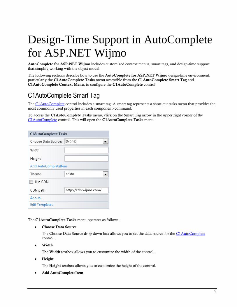
C1AutoComplete Smart Tag The C1AutoComplete control includes a smart tag. A smart tag represents a short-cut tasks menu that provides the
most commonly used properties in each component/command.
To access the C1AutoComplete Tasks menu, click on the Smart Tag arrow in the upper right corner of the
C1AutoComplete control. This will open the C1AutoComplete Tasks menu.
The C1AutoComplete Tasks menu operates as follows:
Choose Data Source
The Choose Data Source drop-down box allows you to set the data source for the C1AutoComplete
control.
Width
The Width textbox allows you to customize the width of the control.
Height
The Height textbox allows you to customize the height of the control.
Add AutoCompleteItem
10
Clicking Add AutoCompleteItem opens the AutoComplete DesignerForm and allows you to add items
to the C1AutoComplete control by clicking the Add Child Item button.
Theme
Clicking the Theme drop-down box allows you to select from various visual schemes. For more
information about available visual styles, see Themes (page 16).
Use CDN
Selecting the Use CDN check box will indicate that the control extender must load client resources from a
content delivery network. By default this box is not checked.
CDN Path
Indicates the path for the content delivery network. Enter a URL here to change the path.
About
Clicking on the About item displays the About dialog box, which is helpful in finding the version number
of Dialog for ASP.NET Wijmo and online resources.
Edit Templates
Clicking the Edit Templates item enters the C1AutoComplete Tasks Template Editing Mode.
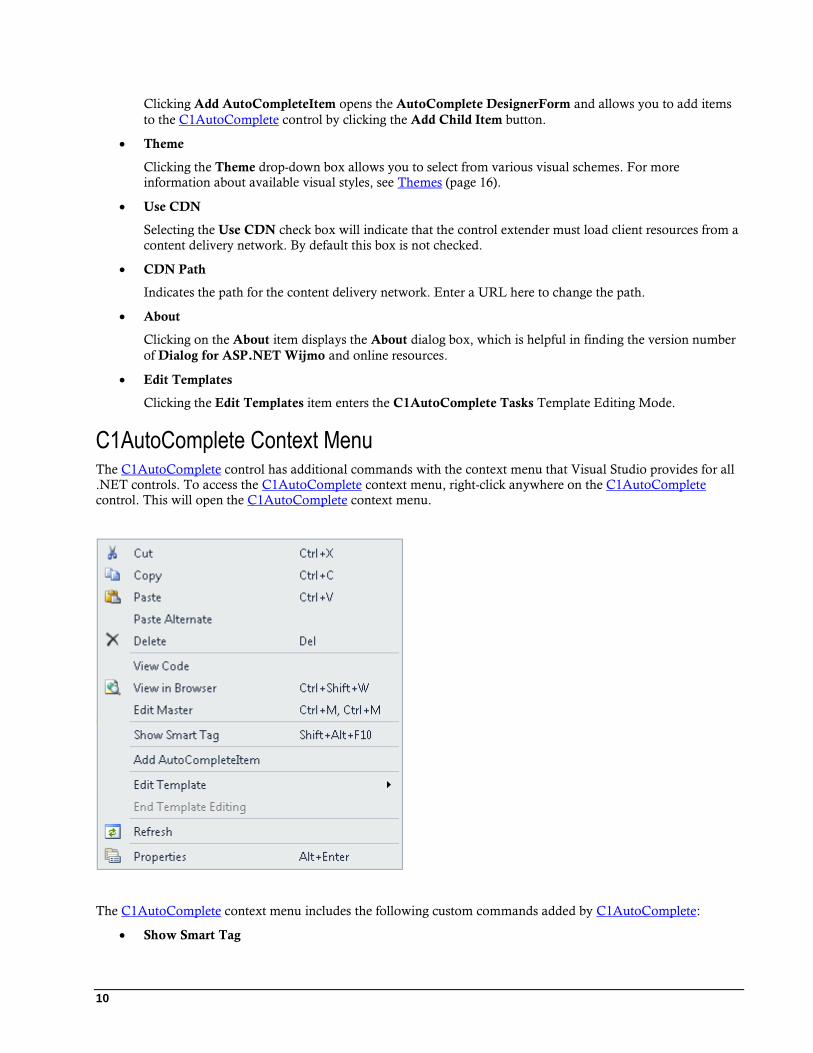
C1AutoComplete Context Menu The C1AutoComplete control has additional commands with the context menu that Visual Studio provides for all
.NET controls. To access the C1AutoComplete context menu, right-click anywhere on the C1AutoComplete
control. This will open the C1AutoComplete context menu.
The C1AutoComplete context menu includes the following custom commands added by C1AutoComplete:
Show Smart Tag

11
Shows the smart tag for the C1AutoComplete control. For more information on how to use the smart tag
and available features, see C1AutoComplete Smart Tag (page 9).
Add AutoCompleteItem
Clicking the Add AutoCompleteItem item opens the AutoComplete DesignerForm, allowing you to add
a child item to the C1AutoComplete control.
Edit Template
Clicking the Edit Templates item enters the C1AutoComplete Tasks Template Editing Mode, allowing
you to edit and apply a template to the C1AutoComplete control.
C1AutoComplete DesignerForm The AutoComplete Designer Form is C1AutoComplete's designer for editing its properties, as well as the
C1AutoCompleteDataItem properties. The AutoComplete Designer Form is similar to the Properties window as
it allows programmers to modify the control visually. However, it allows you to select a
C1AutoCompleteDataItem, set its properties, and then preview the appearance of the C1AutoComplete control,
all within the form.
In this topic you will become familiar with the AutoComplete Designer Form's design interface so you can use
the commands within it to edit C1AutoComplete with minimal effort and time.
To open the AutoComplete Designer Form , click the C1AutoComplete smart tag and select the Add
AutoCompleteItem link from the C1AutoComplete Tasks menu:
Exploring the AutoComplete DesignerForm
The AutoComplete DesignerForm contains a menu, a toolbar, an Edit tab, a Preview tab, and a properties pane.

12
The Edit Tab
Click the Edit tab and select the C1AutoComplete control or the C1AutoCompleteDataItem for which you would
like to set the properties.
The Preview Tab
Click the Preview tab for a preview of the C1AutoComplete control.
The Properties Pane
The AutoComplete DesignerForm properties pane is almost identical to the Visual Studio Properties window. Use
the properties pane to change the properties for the C1AutoComplete control or the C1AutoCompleteDataItems.

13
Command Buttons
There are two command buttons summarized in the following table:
Button Description
OK Clicking OK applies the new settings to the C1AutoComplete control.
Cancel Clicking Cancel closes the AutoComplete Designer Form, cancelling the new
settings and applying the default settings to the C1AutoComplete control.
AutoComplete DesignerForm Menu
The AutoComplete DesignerForm menu contains the following available menu items and submenus:
Menu Item Submenu Item Description
File Exit Closes the AutoComplete Designer Form.
Edit
Add Child Adds a new C1AutoCompleteDataItem as a child of the C1AutoComplete or of another C1AutoCompleteDataItem.
Delete Removes the selected C1AutoCompleteDataItem.
Rename Allows you to change the name of the
C1AutoCompleteDataItem.
AutoComplete DesignerForm Toolbar
The AutoComplete DesignerForm Toolbar has options available depending on whether you have selected the
C1AutoComplete control or one of the C1AutoCompleteDataItems.

14
Note: The Move Item Left, Move Item Right, Insert Item, Cut, Copy, and Paste buttons are not available.
The table below describes each available button on the toolbar and when they are available:
Button Name Description
Move Item Up Moves the selected C1AutoCompleteDataItem up in the list of DataItems.
This button is available when you select a C1AutoCompleteDataItem.
Move Item Down Moves the selected C1AutoCompleteDataItem down in the list of
DataItems. This button is available when you select a
C1AutoCompleteDataItem.
Add Child Item Adds a C1AutoCompleteDataItem to the C1AutoComplete control. This
button is available when you select the C1AutoComplete control.
Delete Deletes the selected C1AutoCompleteDataItem or the C1AutoComplete
control. This button is always available.
How to Use the Designer
The following topics illustrate how to use the AutoComplete Designer Form for several tasks.
Deleting a C1AutoCompleteDataItem
You can use one of the following three methods when deleting a C1AutoCompleteDataItem in the designer:
Deleting a child item through the shortcut menu
Right-click the C1AutoCompleteDataItem you wish to delete and select Delete.
Deleting a child item by pressing on the delete button
Select the item you wish to delete and click on the Delete.
Deleting a child item through the Edit menu.
Click the Edit menu and select Delete.
Renaming the AutoCompleteDataItem in the Designer
You can use one of the following three methods when renaming a C1AutoCompleteDataItem in the designer:
Pressing F2
a. Select the C1AutoCompleteDataItem you wish to rename.
b. Press the F2 key and type the new name.
Selecting rename from the shortcut menu
a. Right-click the C1AutoCompleteDataItem you wish to rename.
b. Select Rename from the context menu and type the new name.
Selecting rename from the Edit menu
a. Select the C1AutoCompleteDataItem you wish to rename.

15
b. Click the Edit menu, select Rename, and enter the new name.
Adding a Child Item
You can use one of the following three methods when adding a C1AutoCompleteDataItem in the designer:
Adding a child item through the shortcut menu
Right-click on the C1AutoComplete control and select Add Child | AutoComplete.
Adding a Data Item by pressing on the Add Child button
Select C1AutoComplete control, click on the Add Child button’s drop-down arrow, and select
AutoComplete.
Adding a child item through the Edit menu
Select the C1AutoComplete control, click on the Edit menu, and select Add Child | AutoComplete.
AutoComplete for ASP.NET Wijmo
Elements This section provides a visual and descriptive overview of the elements that comprise the C1AutoComplete
control.
The C1AutoComplete control is comprised of an input element and the AutoComplete element that contains
C1AutoCompleteDataItems:
See below for a description of each C1AutoComplete element:
Input Element
The input element allows users to enter the item for which they are searching and to display the item
selected from the AutoComplete element.
AutoComplete Element
The AutoComplete element contains C1AutoCompleteDataItems. They are either items which you have
created during design time or items which are populated from another data source.
C1AutoCompleteDataItems

16
C1AutoCompleteDataItems can either be created at design time or can be called from an outside data
source.
AutoComplete for ASP.NET Wijmo
Appearance C1AutoComplete is designed to make customization easy for you. The possibilities are endless when it comes to
changing your C1AutoComplete dialog window's appearance. C1AutoCompleteprovides several styles for its input
area and built-in themes, including those for Office 2007.
In addition to the property styles for each dialog window element, C1AutoComplete provides full support for CSS
styles so you can further customize each dialog window element through CSS styles.
Themes C1AutoComplete includes themes allowing you to easily change the control's appearance. The control includes
several built-in themes allowing you to customize the control's appearance to your application. You can easily
change themes from the C1AutoComplete Tasks menu, from the Properties window, and in code.
The following themes are included in AutoComplete for ASP.NET Wijmo:
Visual Styles Preview
Arctic
Aristo
Cobalt

17
Midnight
Rocket
Sterling
CSS Selectors You can style many C1AutoComplete elements using CSS to make their appearance unique. To make this
customization easier, ComponentOne includes CSS selectors with each of its six built-in themes.
You can apply general CSS properties such as border, background, text, font, margin, padding, list, outline, and
table to applicable CSS selectors.
For a list of common individual CSS selectors and grouped CSS selectors, select the C1AutoComplete control in
your project and view the drop-down list next to the CssClass property in the Visual Studio Properties window.
C1AutoControl CSS selectors begin with ui-autocomplete:

18
You can combine the individual CSS selectors as a group to make the CSS selector more specific and strong.
Working with the Client-Side The AutoComplete for ASP.NET Wijmo controls have a very rich client-side object model since most of their
members are identical to the members in the server-side control.
When a C1AutoComplete control is rendered, and instance of the client-side control will be created automatically.
This means that you can enjoy the convenience of accessing the properties and methods of the C1AutoComplete
controls without having to postback to the server.
Using client-side code, you can implement many features in your Web page without the need to send informaion
to the Web server, which takes time. Using the client-side object model increases the efficiency of your Web site.
Client-Side Events AutoComplete for ASP.NET Wijmo includes several client-side events that allow you to manipulate the
C1AutoComplete controls when an action such as searching in the search box occurs.
You can use the server-side properties, listed in the Client Side Event table, to specify the name of the JavaScript
function that will respond to a particular client-side event. For example, to assign a JavaScript function called
"Search" to respond when the AutoComplete window is searched, you would set the OnClientSearch property to
"search".
The following table lists the events that you can use in your client scripts. These properties are defined on the
server side, but the actual events of the name you declare for each JavaScript function are defined on the client
side.
Event Server-Side
Property Name
Event Name Description
OnClientChange change Occurs when the control is

19
changed.
OnClientClose close Occurs when the control is
closed.
OnClientCreate create Occurs when the control is
created.
OnClientFocus focus Occurs when the control gains
focus.
OnClientOpen open Occurs when the control is
opened.
OnClientSearch search Occurs when a search is performed.
OnClientSelect select Occurs when the control is
selected.


21
AutoComplete for ASP.NET Wijmo
Task-Based Help The task-based help section assumes that you are familiar with programming in the Visual Studio ASP.NET
environment and have a general understanding of the AutoComplete for ASP.NET Wijmo control.
Each topic provides a solution for specific tasks using C1AutoComplete. By following the steps outlined in each
topic, you will be able to create projects using a variety of C1AutoComplete features.
Each task-based help topic assumes that you have created a new ASP.NET project.
Creating a C1AutoComplete Control in Code Creating a C1AutoComplete control in code is an easy process. In this topic, you will add a PlaceHolder control to
the page, add an import statement, customize the C1AutoComplete control, and add the control to the
PlaceHolder.
Complete the following steps:
1. In Design View, navigate to the Visual Studio Toolbox and add a PlaceHolder control to the page.
2. Double-click the page to add a Page_Load event and switch to Code view.
3. Add the following statement to the top of the Code Editor to import the appropriate namespace.
Visual Basic
Imports C1.Web.Wijmo.Controls.C1AutoComplete
C# using C1.Web.Wijmo.Controls.C1AutoComplete;
4. Add the following code to the Page_Load event to create the control and add the control to the
PlaceHolder.
Visual Basic
'Create a new C1AutoComplete
Dim C1A As New C1AutoComplete()
'Add the control to the PlaceHolder
PlaceHolder1.Controls.Add(C1A)
C#
//Create a new C1AutoComplete
C1AutoComplete C1A = new C1AutoComplete();
//Add the C1AutoComplete to the PlaceHolder control
PlaceHolder1.Controls.Add(C1A);
Customizing the Width and Height of C1AutoComplete This topic will take you through customizing the width and height of C1AutoComplete. This can be done in
Design View, in Source View, or in code.
In Design View

22
Complete the following steps:
1. Select the C1AutoComplete control in your project and click the smart tag to open the
C1AutoComplete Tasks menu.
2. Set the Height property of the control to 150px.
3. Set the Width property of the control to 200px.
4. Press F5 to run the program and see the changes you made
In Source View
Complete the following steps:
1. Go to your project's Source View.
2. The Height and Width properties are both within the <wijmo:C1AutoComplete> tags:
<wijmo:C1Complete ID="C1AutoComplete1" runat="server" Height="200px"
Width="200px">
3. Set the Height and Width properties to 200px.
4. Press F5 to run your program.
In Code
Add the following code to the Page_Load event to set the Height and Width properties of the C1AutoComplete
control.
Visual Basic
Me.C1AutoComplete1.Height = 150
Me.AutoComplete1.Width = 200
C#
this.C1AutoComplete1.Height = 150;
this.C1AutoComplete1.Width = 200;
Using the AutoPostBack Property The AutoPostBack property indicates whether or not the control posts back to the server each time a user interacts
with the control. This topic will walk you through creating a C1AutoComplete control, setting the content, and
setting the AutoPostBack property.
Complete the following steps:
1. Add a C1AutoComplete control and a standard ListBox control to your application. Your Design view
should resemble the following image:

23
2. Select the C1AutoComplete control on your page and then navigate to the Visual Studio Properties
window. Locate the AutoPostBack property in the list and set it to True.
3. Click the Events button to view the C1AutoComplete Events. Locate the ItemSelected event and
enter C1AutoComplete1_ItemSelected.
4. Switch to Source view and locate the <wijmo:C1AutoComplete> </wijmo:C1AutoComplete>
tags. Insert the following markup between the tags to create your C1AutoCompleteDataItems:
<Items>
<wijmo:C1AutoCompleteDataItem Label="c++" Value="c++" />
<wijmo:C1AutoCompleteDataItem Label="java" Value="java" />
<wijmo:C1AutoCompleteDataItem Label="php" Value="php" />
<wijmo:C1AutoCompleteDataItem Label="coldfusion"
Value="coldfusion" />
<wijmo:C1AutoCompleteDataItem Label="javascript"
Value="javascript" />
<wijmo:C1AutoCompleteDataItem Label="asp" Value="asp" />
<wijmo:C1AutoCompleteDataItem Label="ruby" Value="ruby" />
<wijmo:C1AutoCompleteDataItem Label="python" Value="python"
/>
<wijmo:C1AutoCompleteDataItem Label="c" Value="c" />
<wijmo:C1AutoCompleteDataItem Label="scala" Value="scala"
/>
<wijmo:C1AutoCompleteDataItem Label="groovy" Value="groovy"
/>
24
<wijmo:C1AutoCompleteDataItem Label="haskell"
Value="haskell" />
<wijmo:C1AutoCompleteDataItem Label="perl" Value="perl" />
</Items>
5. Locate the <asp:ListBox> </asp:ListBox> tags and add the following markup to govern the
width and height of the ListBox control:
Width="300px" Height="300px"
6. Right-click the Source view and select View Code from the list. There should be code that resembles the
following that Visual Studio created to handle the ItemSelected event you set previously:
Visual Basic
Protected Sub C1AutoComplete1_ItemSelected(ByVal sender As Object,
ByVal args As
C1.Web.Wijmo.Controls.C1AutoComplete.C1AutoCompleteDataItemEventArgs)
End Sub
C#
protected void C1AutoComplete1_ItemSelected(object sender,
C1.Web.Wijmo.Controls.C1AutoComplete.C1AutoCompleteDataItemEventArgs
args)
7. Place the following code below the ItemSelected event handler. This code will handle adding a new item
to the ListBox control from the C1AutoComplete control:
Visual Basic
ListBox1.Items.Add(New ListItem(C1AutoComplete1.Text))
C#
ListBox1.Items.Add(new ListItem(C1AutoComplete1.Text));
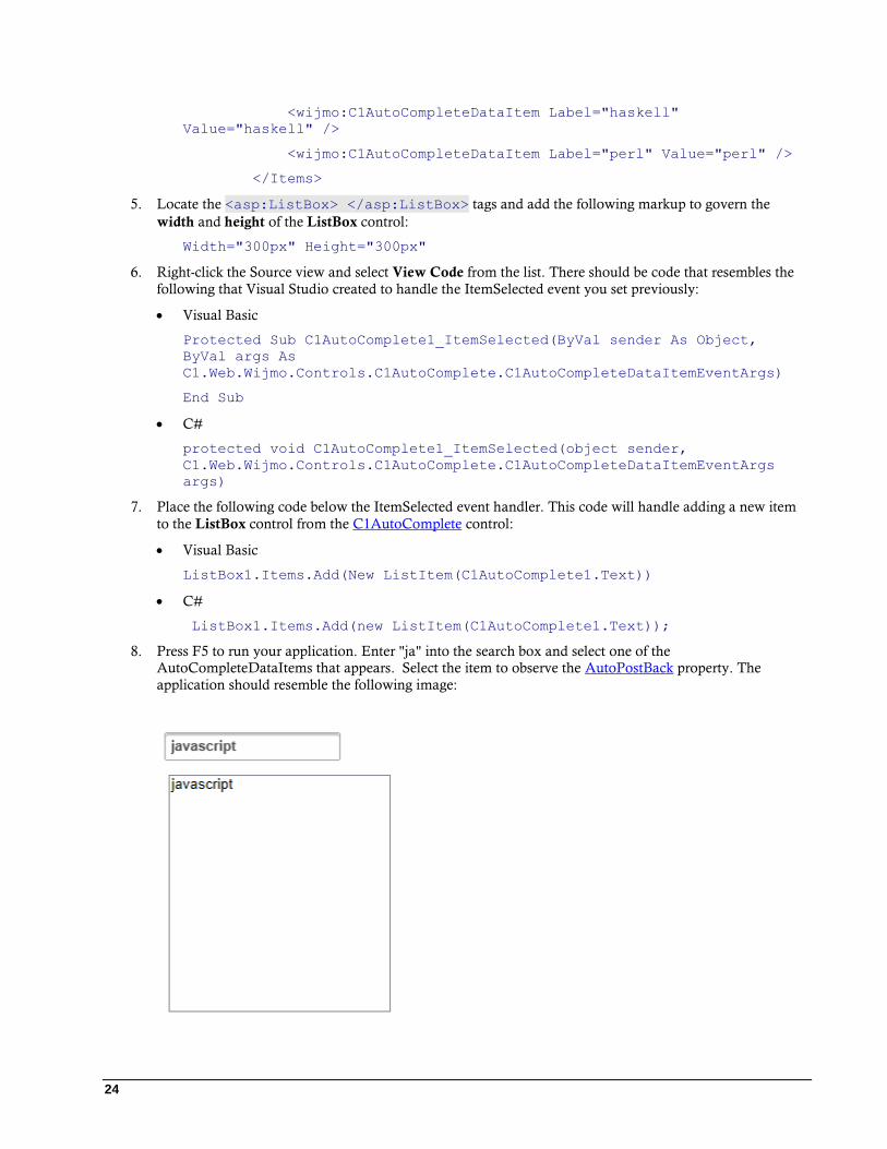
8. Press F5 to run your application. Enter "ja" into the search box and select one of the
AutoCompleteDataItems that appears. Select the item to observe the AutoPostBack property. The
application should resemble the following image:

25
Using DataBinding C1AutoComplete supports data binding which allows you to bind the label, value, and category fields to a data
source of your choice.
Complete the following steps:
1. Right-click on the App_Data folder in the Solution Explorer and select Add | Existing Item from the list.
2. Locate the C1Nwind.mdb database in your ComponentOne Samples folder and click Add.
3. Select the C1AutoComplete control in your project.
4. Click the smart tag button to open the C1AutoComplete Tasks menu.
5. Click the arrow on the Choose Data Source drop-down list and select New Data Source from the list.
This will open the Data Source Configuration Wizard.
6. Select SqlDatabase from the list and click OK. In the Choose Your Data Connection window, choose
ConnectionString as your data connection and click Next.
7. In the Configure Select Statement window, select Products from the drop-down list under Specify
columns from a table or view and click Next.
8. Click Test Query to make sure the database is properly queried and then click Finish.
9. Press F5 to run your application. Type a few letters into the search box to test the AutoComplete function.
Using the LoadOnDemand Property The LoadOnDemand property allows you to retrieve data dynamically. The child items are loaded when the user
begins typing in the search box.
Complete the following steps:
1. Right-click on the App_Data folder in the Solution Explorer and select Add | Existing Item from the list.
2. Locate the C1Nwind.mdb database in your ComponentOne Samples folder and click Add to add the
database to your project.
3. Select the C1AutoComplete control in your project.
4. Click the smart tag button to open the C1AutoComplete Tasks menu.
5. Click the arrow on the Choose Data Source drop-down list and select New Data Source from the list.
This will open the Data Source Configuration Wizard.
6. Select SqlDatabase from the list and click OK. In the Choose Your Data Connection window, use the
drop-down menu to choose C1Nwind.mdb as your data connection and click Next.
7. In the Configure Select Statement window, select Products from the drop-down list under Specify
columns from a table or view and click Next.
8. Click Test Query to make sure the database is properly queried and then click Finish.
9. Select the C1AutoComplete control in your project and then navigate to the Properties window.
10. Locate the LoadOnDemand property in the Properties window and set it to True.
11. Still in the Properties window, locate the MaxCount property and set it to 5. This property will limit the
number of search results in the AutoComplete and must be used with the LoadOn Demand property.
12. Press F5 to run your application and type "E" into the search box. The results should resemble the
following image:

26
Using Themes with C1AutoComplete C1AutoComplete provides six built-in CSS themes. You can also choose a different theme by using the CDN or by
rolling your own theme with jQuery ThemeRoller. This topic will walk you through applying a built-in theme,
choosing a custom theme using the CDN, or rolling your own theme using ThemeRoller.
Applying a Built-in Theme Using the Smart Tag
Applying one of the six built-in themes using the smart tag is an easy way to customize your AutoComplete search
box.
Complete the following steps:
1. Select the C1AutoComplete control in your project.
2. Click the smart tag button to open the C1AutoComplete Tasks menu.
3. Use the Theme drop-down box to choose a new theme.
4. Press F5 or start debugging to run the program. Your chosen theme will be applied to the
AutoComplete control.
27
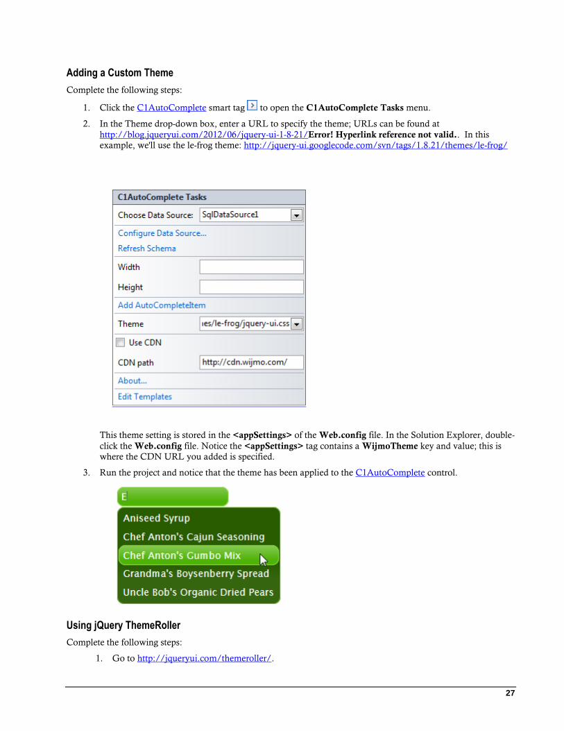
Adding a Custom Theme
Complete the following steps:
1. Click the C1AutoComplete smart tag to open the C1AutoComplete Tasks menu.
2. In the Theme drop-down box, enter a URL to specify the theme; URLs can be found at
http://blog.jqueryui.com/2012/06/jquery-ui-1-8-21/Error! Hyperlink reference not valid.. In this
example, we'll use the le-frog theme: http://jquery-ui.googlecode.com/svn/tags/1.8.21/themes/le-frog/
This theme setting is stored in the <appSettings> of the Web.config file. In the Solution Explorer, double-
click the Web.config file. Notice the <appSettings> tag contains a WijmoTheme key and value; this is
where the CDN URL you added is specified.
3. Run the project and notice that the theme has been applied to the C1AutoComplete control.
Using jQuery ThemeRoller
Complete the following steps:
1. Go to http://jqueryui.com/themeroller/.

28
2. Go to the Roll Your Own tab. Change the settings to create a custom theme; you can customize fonts,
backgrounds, colors, and more. Or you can click the Gallery tab to select an existing theme.
3. Click the Download button and then click Download again on the Build Your Download page.
4. Save and unzip the theme .zip file to a folder within your Visual Studio project folder. In this example,
we created a customtheme folder.
5. In the Solution Explorer, click Show All Files. Right-click customtheme and click Include In Project.
6. Click the C1AutoComplete smart tag to open the Tasks menu.
7. Enter the path to your custom theme .css in the Theme property, for example,
\customtheme\css\custom-theme\jquery-ui-1.8.21.custom.css.
8. Run your project and note that the new theme is applied to C1AutoComplete.