Community Ecology: Analytical Methods Using R and Excel
43
Community Ecology Analytical Methods Using R and Excel ® PUBLISHING PE L AGIC Mark Gardener DATA IN THE WILD Community Ecology - Sample Chapter
-
Upload
pelagic-publishing -
Category
Documents
-
view
3.149 -
download
3
description
by Mark GardenerInteractions between species are of fundamental importance to all living systems and the framework we have for studying these interactions is community ecology. This is important to our understanding of the planets biological diversity and how species interactions relate to the functioning of ecosystems at all scales. Species do not live in isolation and the study of community ecology is of practical application in a wide range of conservation issues.The study of ecological community data involves many methods of analysis. In this book you will learn many of the mainstays of community analysis including: diversity, similarity and cluster analysis, ordination and multivariate analyses. This book is for undergraduate and postgraduate students and researchers seeking a step-by-step methodology for analysing plant and animal communities using R and Excel.
Transcript of Community Ecology: Analytical Methods Using R and Excel

CommunityEcologyEcologyAnalytical Methods Using R and Excel®
PUBLISHINGPELAGIC Mark Gardener
DATA IN THE WILD
Comm
unity EcologyM
arkG
ardener
PUBLISHINGPELAGIC
PUBLISHINGPELAGIC
Interactions between species are of fundamental importance to all living systems and the framework we have for studying these interactions is community ecology. This is important to our understanding of the planets biological diversity and how species interactions relate to the functioning of ecosystems at all scales. Species do not live in isolation and the study of community ecology is of practical application in a wide range of conservation issues.
The study of ecological community data involves many methods of analysis. In this book you will learn many of the mainstays of community analysis including: diversity, similarity and cluster analysis, ordination and multivariate analyses. This book is for un-dergraduate and postgraduate students and researchers seeking a step-by-step meth-odology for analysing plant and animal communities using R and Excel.
Microsoft’s Excel spreadsheet is virtually ubiquitous and familiar to most computer us-ers. It is a robust program that makes an excellent storage and manipulation system for many kinds of data, including community data. The R program is a powerful and � exible analytical system able to conduct a huge variety of analytical methods, which means that the user only has to learn one program to address many research ques-tions. Its other advantage is that it is open source and therefore completely free. Novel analytical methods are being added constantly to the already comprehensive suite of tools available in R.
About the authorMark Gardener is both an ecologist and an analyst. He has worked in a range of ecosys-tems around the world and has been involved in research across a spectrum of com-munity types. His knowledge of R is largely self-taught and this gives him insight into the needs of students learning to use R for complicated analyses.
Data in the Wild SeriesData in the Wild is a series of practical books, sharing key tools and methods for the col-lection, analysis and interpretation of environmental data. They are published rapidly in print and digital formats.
Cover photograph: Over under water picture, showing Fairy Basslets (Pseudanthias tuka) amongst Cabbage Coral (Turbinaria reniformis) and tropical island in the background. Indo Pa-ci� c. © Copyright: David Fleetham - www.oceanwideImages.com
www.pelagicpublishing.com
PUBLISHINGPELAGIC
Community Ecology - Sample Chapter
Community Ecology
Analytical Methods Using
R and Excel®
Mark Gardener
DATA IN THE WILD SERIES
Pelagic Publishing | www.pelagicpublishing.com
Community Ecology - Sample Chapter

Published by Pelagic Publishingwww.pelagicpublishing.comPO Box 725, Exeter, EX1 9QU
Community EcologyAnalytical Methods Using R and Excel®
ISBN 978–1–907807–61–9 (Pbk)ISBN 978–1–907807–62–6 (Hbk)ISBN 978–1–907807–63–3 (ePub)ISBN 978–1–907807–65–7 (PDF)ISBN 978–1–907807–64–0 (Mobi)
Copyright © 2014 Mark Gardener
All rights reserved. No part of this document may be produced, stored in a retrieval system, or transmitted in any form or by any means, electronic, mechanical, photocopying, recording or otherwise without prior permission from the publisher.
While every effort has been made in the preparation of this book to ensure the accuracy of the information presented, the information contained in this book is sold without warranty, either express or implied. Neither the author, nor Pelagic Publishing, its agents and distributors will be held liable for any damage or loss caused or alleged to be caused directly or indirectly by this book.
Windows, Excel and Word and are trademarks of the Microsoft Corporation. For more information visit www. microsoft.com. OpenOffice.org is a trademark of Oracle. For more information visit www.openoffice.org. LibreOffice is a trademark of The Document Foundation. For more information visit www.libreoffice.org. Apple Macintosh is a trademark of Apple Inc. For more information visit www.apple.com.
British Library Cataloguing in Publication DataA catalogue record for this book is available from the British Library.
Cover image: Over under water picture, showing Fairy Basslets (Pseudanthias tuka) amongst Cabbage Coral (Turbinaria reniformis) and tropical island in the background. Indo Pacific. © David Fleetham/OceanwideImages.com
Community Ecology - Sample Chapter

About the author
Mark Gardener (www.gardenersown.co.uk) is an ecologist, lecturer and writer working in the UK. His primary area of research was in pollination ecology and he has worked in the UK and around the world (principally Australia and the United States). Since his doctor-ate he has worked in many areas of ecology, often as a teacher and supervisor. He believes that ecological data, especially community data, are the most complicated and ill-behaved and are consequently the most fun to work with. He was introduced to R by a like-minded pedant whilst working in Australia during his doctorate. Learning R was not only fun but opened up a new avenue, making the study of community ecology a whole lot easier. He is currently self-employed and runs courses in ecology, data analysis and R for a variety of organisations. Mark lives in rural Devon with his wife Christine, a biochemist who conse-quently has little need of statistics.
Acknowledgements
There are so many people to thank that it is hard to know where to begin. I am sure that I will leave some people out, so I apologise in advance. Thanks to Richard Rowe (James Cook University) for inspiring me to use R. Data were contributed from various sources, especially from MSc students doing Biological Recording; thanks especially to Robin Cure, Jessie MacKay, Mark Latham, John Handley and Hing Kin Lee for your hard-won data. The MSc programme helped me to see the potential of ‘proper’ biological records and I thank Sarah Whild for giving me the opportunity to undertake some teaching on the course. Thanks also to the Field Studies Council in general: many data examples have arisen from field courses I’ve been involved with.
Software used
Several versions of Microsoft’s Excel® spreadsheet were used in the preparation of this book. Most of the examples presented show version 2007 for Microsoft Windows® although other versions may also be illustrated.
The main version of the R program used was 2.12.1 for Macintosh: The R Foundation for Statistical Computing, Vienna, Austria, ISBN 3-900051-07-0, http://www.R-project.org/. Other versions were used in testing code.
Support material
Free support material is available on the Community Ecology companion website, which can be accessed via the book’s resources page: http://www.pelagicpublishing.com/com-munity-ecology-resources.html
Community Ecology - Sample Chapter

Reader feedback
We welcome feedback from readers – please email us at [email protected] and tell us what you thought about this book. Please include the book title in the subject line of your email.
Publish with Pelagic Publishing
We publish scientific books to the highest editorial standards in all life science disciplines, with a particular focus on ecology, conservation and environment. Pelagic Publishing pro-duces books that set new benchmarks, share advances in research methods and encourage and inform wildlife investigation for all.
If you are interested in publishing with Pelagic please contact [email protected] with a synopsis of your book, a brief history of your previous written work and a statement describing the impact you would like your book to have on readers.
Community Ecology - Sample Chapter

Contents
Introduction viii
1. Starting to look at communities 1
1.1 A scientific approach 1 1.2 The topics of community ecology 2 1.3 Getting data – using a spreadsheet 4 1.4 Aims and hypotheses 5 1.5 Summary 5 1.6 Exercises 7
2. Software tools for community ecology 8
2.1 Excel 8 2.2 Other spreadsheets 9 2.3 The R program 10 2.4 Summary 15 2.5 Exercises 15
3. Recording your data 16
3.1 Biological data 16 3.2 Arranging your data 18 3.3 Summary 19 3.4 Exercises 19
4. Beginning data exploration: using software tools 20
4.1 Beginning to use R 20 4.2 Manipulating data in a spreadsheet 28 4.3 Getting data from Excel into R 60 4.4 Summary 62 4.5 Exercises 63
5. Exploring data: choosing your analytical method 64
5.1 Categories of study 64 5.2 How ‘classic’ hypothesis testing can be used in community studies 66
Community Ecology - Sample Chapter

vi | Contents
5.3 Analytical methods for community studies 70 5.4 Summary 73 5.5 Exercises 74
6. Exploring data: getting insights 75
6.1 Error checking 75 6.2 Adding extra information 78 6.3 Getting an overview of your data 80 6.4 Summary 104 6.5 Exercises 105
7. Diversity: species richness 106
7.1 Comparing species richness 108 7.2 Correlating species richness over time or against an
environmental variable 119 7.3 Species richness and sampling effort 123 7.4 Summary 148 7.5 Exercises 149
8. Diversity: indices 151
8.1 Simpson’s index 151 8.2 Shannon index 160 8.3 Other diversity indices 168 8.4 Summary 194 8.5 Exercises 195
9. Diversity: comparing 196
9.1 Graphical comparison of diversity profiles 197 9.2 A test for differences in diversity based on the t-test 199 9.3 Graphical summary of the t-test for Shannon and Simpson indices 212 9.4 Bootstrap comparisons for unreplicated samples 227 9.5 Comparisons using replicated samples 252 9.6 Summary 269 9.7 Exercises 270
10. Diversity: sampling scale 272
10.1 Calculating beta diversity 272 10.2 Additive diversity partitioning 299 10.3 Hierarchical partitioning 303 10.4 Group dispersion 306 10.5 Permutation methods 309
10.6 Overlap and similarity 315 10.7 Beta diversity using alternative dissimilarity measures 325 10.8 Beta diversity compared to other variables 327 10.9 Summary 331 10.10 Exercises 333
Community Ecology - Sample Chapter

Contents | vii
11. Rank abundance or dominance models 334
11.1 Dominance models 334 11.2 Fisher’s log-series 358 11.3 Preston’s lognormal model 360 11.4 Summary 363 11.5 Exercises 365
12. Similarity and cluster analysis 366
12.1 Similarity and dissimilarity 366 12.2 Cluster analysis 382 12.3 Summary 416 12.4 Exercises 418
13. Association analysis: identifying communities 419
13.1 Area approach to identifying communities 420 13.2 Transect approach to identifying communities 428 13.3 Using alternative dissimilarity measures for identifying communities 431 13.4 Indicator species 436 13.5 Summary 444 13.6 Exercises 445
14. Ordination 446
14.1 Methods of ordination 447 14.2 Indirect gradient analysis 449 14.3 Direct gradient analysis 490 14.4 Using ordination results 505 14.5 Summary 520 14.6 Exercises 522
Appendices 524Bibliography 542Index 547
Community Ecology - Sample Chapter

Introduction
Interactions between species are of fundamental importance to all living systems and the framework we have for studying these interactions is community ecology. This is impor-tant to our understanding of the planet’s biological diversity and how species interactions relate to the functioning of ecosystems at all scales. Species do not live in isolation and the study of community ecology is of practical application in a wide range of conservation issues.
The study of ecological community data involves many methods of analysis. In this book you will learn many of the mainstays of community analysis including: diversity, similarity and cluster analysis, ordination and multivariate analyses. This book is for undergraduate and postgraduate students and researchers seeking a step-by-step meth-odology for analysing plant and animal communities using R and Excel.
Microsoft’s Excel spreadsheet is virtually ubiquitous and familiar to most computer users. It is a robust program that makes an excellent storage and manipulation system for many kinds of data, including community data. The R program is a powerful and flex-ible analytical system able to conduct a huge variety of analytical methods, which means that the user only has to learn one program to address many research questions. Its other advantage is that it is open source and therefore free. Novel analytical methods are being added constantly to the already comprehensive suite of tools available in R.
What you will learn in this book
This book is intended to give you some insights into some of the analytical methods employed by ecologists in the study of communities. The book is not intended to be a math-ematical or theoretical treatise but inevitably there is some maths! I’ve tried to keep this in the background and to focus on how to undertake the appropriate analysis at the right time. There are many published works concerning ecological theory; this book is intended to support them by providing a framework for learning how to analyse your data.
The book does not cover every aspect of community ecology. There are a few minor omissions – I hope to cover some of these in later works.
How this book is arranged
There are four main strands to scientific study: planning, recording, analysis and report-ing. The first few chapters deal with the planning and recording aspects of study. You will see how to use the main software tools, Excel and R, to help you arrange and begin
Community Ecology - Sample Chapter

to make sense of your data. Later chapters deal more explicitly with the grand themes of community ecology, which are:
• Diversity – the study of diversity is split into several chapters covering species richness, diversity indices, beta diversity and dominance–diversity models.
• Similarity and clustering – this is contained in one chapter covering similarity, hier-archical clustering and clustering by partitioning.
• Association analysis – this shows how you can identify which species belong to which community by studying the associations between species. The study of associations leads into the identification of indicator species.
• Ordination – there is a wide range of methods of ordination and they all have similar aims; to represent complicated species community data in a more simplified form.
The reporting element is not covered explicitly; however the presentation of results is shown throughout the book. A more dedicated coverage of statistical and scientific report-ing can be found in my previous work, Statistics for Ecologists Using R and Excel.
Throughout the book you will see example exercises that are intended for you to try out. In fact they are expressly aimed at helping you on a practical level – reading how to do something is fine but you need to do it for yourself to learn it properly. The Have a Go exercises are hard to miss.
Have a Go: Learn something by doing it
The Have a Go exercises are intended to give you practical experience at various analytical methods. Many will refer to supplementary data, which you can get from the companion website. Some data are intended to be used in Excel and others are for using with R.
Most of the Have a Go exercises utilise data that is available on the companion website. The material on the website includes various spreadsheets, some containing data and some allowing analytical processes. The CERE.RData file is the most helpful – this is an R file, which contains data and custom R commands. You can use the data for the exercises (and for practice) and the custom commands to help you carry out a variety of analytical proc-esses. The custom commands are mentioned throughout the book and the website con-tains a complete directory.
You will also see tips and notes, which will stand out from the main text. These are ‘use-ful’ items of detail pertaining to the text but which I felt were important to highlight.
Tips and Notes: Useful additional information
The companion website contains supplementary data, which you can use for the exercises. There are also spreadsheets and useful custom R commands that you can use for your own analyses.
At the end of each chapter there is a summary table to help give you an overview of the material in that chapter. There are also some self-assessment exercises for you to try out. The answers are in Appendix 1.
Introduction | ix
Community Ecology - Sample Chapter

Support files
The companion website (see resources page: http://www.pelagicpublishing.com/commu-nity-ecology-resources.html) contains support material that includes spreadsheet calcula-tions and data in Excel and CSV (comma separated values) format. There is also an R data file, which contains custom R commands and datasets. Instructions on how to load the R data into your copy of R are on the website. In brief you need to use the load() command, for Windows or Mac you can type the following:
load(file.choose())
This will open a browser window and you can select the CERE.RData file. On Linux machines you’ll need to replace the file.choose() part with the exact filename in quotes, see the website for more details.
I hope that you will find this book helpful, useful and interesting. Above all, I hope that it helps you to discover that analysis of community ecology is not the ‘boring maths’ at the end of your fieldwork but an enjoyable and enlightening experience.
Mark Gardener, Devon 2013
x | Introduction
Community Ecology - Sample Chapter

11. Rank abundance or dominance models
One way of looking at the diversity of a community is to arrange the species in order of abundance and then plot the result on a graph. If the community is very diverse then the plot will appear ‘flat’. You met this kind of approach in Chapter 8 when looking at even-ness and drew an evenness plot in Section 8.3.4 using a Tsallis entropy profile. In dominance plots the species abundance is generally represented as the log of the abundance.
Various models have been proposed to help explain the observed patterns of domi-nance plots. In this chapter you’ll see how to create these models and to visualise them using commands in the vegan command package. Later in the chapter you will see how to examine Fisher’s log-series (Section 11.2) and Preston’s lognormal model (Section 11.3) but first you will look at some dominance models.
11.1 Dominance models
Rank–abundance dominance (RAD) models, or dominance/diversity plots, show logarith-mic species abundances against species rank order. They are often used as a way to analyse types of community distribution, particularly in plant communities.
The vegan package contains several commands that allow you to create and visualise RAD models.
11.1.1 Types of RAD model
There are several models in common use; each takes the same input data (logarithmic abun-dance and rank of abundance) and uses various parameters to fit a model that describes the observed pattern.
There are five basic models available via the vegan package:
• Lognormal.• Preemption.• Broken stick.• Mandelbrot.• Zipf.
The radfit() command carries out the necessary computations to fit all the models to a community dataset. The result is a complicated object containing all the models applied
Community Ecology - Sample Chapter

11. Rank abundance or dominance models | 335
to each sample in your dataset. You can then determine the ‘best’ model for each sample that you have.
The vegan package also has separate commands that allow you to interrogate the mod-els and visualise them. You can also construct a specific model for a sample or entire data-set. The various models are:
• Lognormal – plants are affected by environment and each other. The model will tend to normal, growth tends to be logarithmic so Lognormal model is likely.
• Preemption (Motomura model or geometric series) – resource partitioning model. The most competitive species grabs resources, which leaves less for other species.
• Broken stick – assumes abundance reflects partitioning along a gradient. This is often used as a null model.
• Mandelbrot – cost of information. Abundance depends on previous species and physical conditions (the costs). Pioneers therefore have low costs.
• Zipf – cost of information. The forerunner of Mandelbrot (a subset of it with fewer parameters).
The models each have a variety of parameters, in each case the abundance of species at rank r (ar) is the calculated value.
Broken stick modelThe broken stick model has no actual parameters: the abundance of species at rank r is calculated like so:
ar = J/S Σ(1/x)
In this model J is the number of individuals and S is the number of species in the com-munity. This gives a null model where the individuals are randomly distributed among observed species, and there are no fitted parameters.
Preemption modelThe (niche) preemption model (also called Motomura model or geometric series) has a single fitted parameter. The abundance of species at rank r is calculated like so:
ar = Jα(1 – α)(r – 1)
In this model J is the number of individuals and the parameter α is a decay rate of abun-dance with rank. In a regular RAD plot (see Section 11.1.3) the model is a straight line.
Lognormal modelThe lognormal model has two fitted parameters, the abundance of species at rank r is cal-culated like so:
ar = exp(log(μ) + log(σ) × N)
This model assumes that the logarithmic abundances are distributed normally. In the model, N is a normal deviate and μ and Σ are the mean and standard deviation of the distribution.
Community Ecology - Sample Chapter

336 | Community Ecology: Analytical Methods using R and Excel
Zipf modelIn the Zipf model there are two fitted parameters, the abundance of species at rank r is calculated like so:
ar = J × P1 × rγ
In the Zipf model J is the number of individuals, P1 is the proportion of the most abundant species and γ is a decay coefficient.
Mandelbrot modelThe Mandelbrot model adds one parameter to the Zipf model, the abundance of species at rank r is calculated like so:
ar = Jc (r + β)γ
The addition of the β parameter leads to the P1 part of the Zipf model becoming a simple scaling constant c.
Summary of modelsMuch has been written about the ecological and evolutionary significance of the various models. If your data happen to fit a particular model it does not mean that the underlying ecological theory behind that model must exist for your community. Modelling is a way to try to understand the real world in a simpler and predictable fashion. The models fall into two basic camps:
• Models based on resource partitioning.• Models based on statistical theory.
The resource-partitioning models can be further split into two, operating over ecological time or evolutionary time.
The broken stick model is an ecological resource-partitioning model. It is often used as a null model because it assumes that there are environmental gradients, which species partition in a simple way.
The preemption model is an evolutionary resource-partitioning model. It assumes that the most competitive species will get a larger share of resources regardless of when it arrived in the community.
The lognormal model is a statistical model. The lognormal relationship appears often in communities. One theory is that species are affected by many factors, environmental and competitive – this leads to a normal distribution. Plant growth is logarithmic so the lognormal model ‘fits’. Note that the normal distribution refers to the abundance-class histogram.
The Zipf and Mandelbrot models are statistical models related to the cost of informa-tion. The presence of a species depends on previous conditions; environmental and pre-vious species presence – these are the costs. Pioneer species have low costs – they do not need the presence of other species or prior conditions. Competitor species and late-succes-sional species have higher costs, in terms of energy, time or ecosystem organisation.
You can think of the difference between lognormal and Zipf/Mandelbrot models as being how the factors that affect the species operates:
Community Ecology - Sample Chapter

11. Rank abundance or dominance models | 337
• Lognormal: factors apply simultaneously.• Zipf/Mandelbrot: factors apply sequentially.
Most of the models assume you have genuine counts of individuals. This is fine for animal communities but not so sensible for plants, which have more plastic growth. In an ideal situation you would use some kind of proxy for biomass to assess plant communities. Cover scales are not generally viewed as being altogether suitable but of course if these are all the data you’ve got, then you’ll probably go with them! In the next section you will see how to create the various models and examine their properties.
11.1.2 Creating RAD models
There are two main ways you could proceed when it comes to making RAD models:
• Make all RAD models and compare them.• Make a single RAD model.
In the first case you are most likely to prepare all the possible models so that you can see which is the ‘best’ for each sample. In the second case you are most likely to wish to com-pare a single model between samples.
The radfit() command in the vegan package will prepare all five RAD models for a com-munity dataset or single sample. You can also prepare a single RAD model using commands of the form rad.xxxx(), where xxxx is the name of the model you want (Table 11.1).
Table 11.1 RAD models and their corresponding R commands (from the vegan package).
RAD model Command
Lognormal rad.lognormal()Pre-emption rad.preempt()Broken stick rad.null()Mandelbrot rad.zipfbrot()Zipf rad.zipf()
You’ll see how to prepare individual models later but first you will see how to prepare all RAD models for a sample.
Preparing all RAD modelsThe radfit() command allows you to create all five common RAD models for a com-munity dataset containing multiple samples. You can also use it to obtain models for a single sample.
RAD model overviewTo make a model you simply use the radfit() command on a community dataset or sample. If you are looking at a dataset with several samples then the data must be in the form of a data.frame. If you have a single sample then the data can be a simple vector or a matrix.
Community Ecology - Sample Chapter
338 | Community Ecology: Analytical Methods using R and Excel
The result you see will depend on whether you used a multi-sample dataset or a single sample. For a dataset with several samples you see a row for each of the five models – split into columns for each sample:
> gb.rad = radfit(gbt)> gb.rad
Deviance for RAD models:
Edge Grass WoodNull 6410.633 1697.424 2527.32Preemption 571.854 422.638 155.43Lognormal 740.107 72.456 856.94Zipf 931.124 132.885 1427.66Mandelbrot 229.538 45.899 155.43
If you only used a single sample then the result shows a row for each model with columns showing various results:
> gb.rad.E1 <- radfit(gb.biol[1,])> gb.rad.E1
RAD models, family poisson No. of species 17, total abundance 715
par1 par2 par3 Deviance AIC BICNull 828.463 888.755 888.755 Preemption 0.5215 86.117 148.409 149.242Lognormal 1.5238 2.4142 96.605 160.897 162.563Zipf 0.63709 -2.0258 105.544 169.836 171.502Mandelbrot 3399.6 -5.3947 3.9929 39.999 106.291 108.791
In any event you end up with a result object that contains information about each of the RAD models. You can explore the result in more detail using a variety of ‘helper’ com-mands and by using the $ syntax to view the various result components.
RAD model componentsOnce you have your RAD model result you can examine the various components. The result of the radfit() command is a type of list, which contains several layers of com-ponents. The top ‘layer’ is a result for each sample:
> gbt.rad
Deviance for RAD models:
Edge Grass WoodNull 6410.633 1697.424 2527.32Preemption 571.854 422.638 155.43Lognormal 740.107 72.456 856.94Zipf 931.124 132.885 1427.66Mandelbrot 229.538 45.899 155.43
> names(gbt.rad)[1] "Edge" "Grass" "Wood"
Community Ecology - Sample Chapter

11. Rank abundance or dominance models | 339
For each named sample there are further layers:
> names(gbt.rad$Edge)[1] "y" "family" "models"
The $models layer contains the five RAD models:
> names(gbt.rad$Edge$models)[1] "Null" "Preemption" "Lognormal" "Zipf" "Mandelbrot"
Each of the models contains several components:
> names(gbt.rad$Edge$models$Mandelbrot) [1] "model" "family" "y" "coefficients" [5] "fitted.values" "aic" "rank" "df.residual" [9] "deviance" "residuals" "prior.weights"
So, by using the $ syntax you can drill down into the result and view the separate com-ponents. AIC values, for example, are used to determine the ‘best’ model from a range of options. The AIC values are an estimate of information ‘lost’ when a model is used to represent a situation. In the following exercise you can have a go at creating a series of RAD models for the 18-sample ground beetle community data. You can then examine the details and compare models.
Have a Go: Create multiple RAD models for a
community dataset
For this exercise you will need the ground beetle data in the CERE.RData file. You will also need the vegan package.
1. Start by preparing the vegan package:
> library(vegan)
2. Make a series of RAD models for the ground beetle data – you may get warnings, which relate to the fitting of some of the generalised linear models – do not worry overly about these:
> gb.rad <- radfit(gb.biol)
3. View the result by typing its name – you will see the deviance for each model/sam-ple combination:
> gb.rad Deviance for RAD models: E1 E2 E3 E4 E5 E6 G1 Null 828.4633 546.8046 532.3123 874.3219 893.7626 701.7052 331.3146 Preemption 86.1171 74.6780 49.5901 155.1716 101.2498 75.4722 131.4807 Lognormal 96.6051 144.1771 110.9866 138.4723 148.3373 137.1522 27.4805 Zipf 105.5441 184.9127 145.8725 162.6555 197.7341 186.7730 14.7817
Mandelbrot 39.9992 74.6780 49.5901 63.0773 106.0696 75.4718 14.5470 G2 G3 G4 G5 G6 W1 W2Null 155.8671 85.2082 132.7137 199.5453 135.7377 684.9151 272.1441Preemption 51.0619 23.3040 42.5072 62.1768 45.4607 99.0215 25.4618
Community Ecology - Sample Chapter

340 | Community Ecology: Analytical Methods using R and Excel
Lognormal 13.7845 9.7973 14.3199 15.8622 18.7468 286.6316 92.0102Zipf 11.6686 10.9600 23.3319 19.1257 25.5595 398.0188 179.2625Mandelbrot 4.2693 3.0943 4.7256 7.0041 8.9452 99.0212 25.4566 W3 W4 W5 W6Null 270.9451 296.5025 330.6709 204.388Preemption 20.5931 42.4143 47.5003 32.311Lognormal 75.1871 153.1896 174.7615 78.464Zipf 143.4578 238.3210 282.7760 168.513Mandelbrot 20.5906 42.4127 47.4973 32.299
4. Use the summary() command to give details about each sample and the model details – the list is quite extensive:
> summary(gb.rad)
*** E1 ***
RAD models, family poisson No. of species 17, total abundance 715
par1 par2 par3 Deviance AIC BICNull 828.463 888.755 888.755Preemption 0.5215 86.117 148.409 149.242Lognormal 1.5238 2.4142 96.605 160.897 162.563Zipf 0.63709 -2.0258 105.544 169.836 171.502Mandelbrot 3399.6 -5.3947 3.9929 39.999 106.291 108.791
5. Look at the samples available for inspection:
> names(gb.rad) [1] "E1" "E2" "E3" "E4" "E5" "E6" "G1" "G2" "G3" "G4" "G5" "G6" "W1" "W2"[15] "W3" "W4" "W5" "W6"
6. Use the $ syntax to view the RAD models for the W1 sample:
> gb.rad$W1
RAD models, family poisson No. of species 12, total abundance 1092
par1 par2 par3 Deviance AIC BICNull 684.915 737.908 737.908Preemption 0.47868 99.022 154.015 154.499Lognormal 3.2639 1.7828 286.632 343.625 344.594Zipf 0.53961 -1.6591 398.019 455.012 455.982Mandelbrot Inf -1.3041e+08 2.0021e+08 99.021 158.014 159.469
7. From step 6 you can see that the preemption model has the lowest AIC value. View the AIC values for all the models and samples:
> sapply(gb.rad, function(x) unlist(lapply(x$models, AIC))) E1 E2 E3 E4 E5 E6 G1Null 888.7550 604.7068 589.1388 965.4858 973.9772 771.2113 418.5341Preemption 148.4088 134.5803 108.4166 248.3355 183.4645 146.9783 220.7002Lognormal 160.8968 206.0793 171.8131 233.6363 232.5519 210.6583 118.7000Zipf 169.8358 246.8149 206.6991 257.8194 281.9487 260.2791 106.0012Mandelbrot 106.2909 138.5802 112.4166 160.2413 192.2843 150.9779 107.7665
Community Ecology - Sample Chapter

11. Rank abundance or dominance models | 341
The structure of the result for a single sample is the same as for the multi-sample data but you have one less level of data – you do not have the sample names.
By comparing the AIC values for the various models you can determine the ‘best’ model for each sample, as you saw in step 7 of the preceding exercise.
The radfit() command assumes that your data are genuine count data and therefore are integers. If you have values that are some other measure of abundance then you’ll have to modify the model fitting process by using a different distribution family, such as Gamma. This is easily carried out by using the family = Gamma instruction in the radfit() command. In the following exercise you can have a go at making RAD models for some non-integer data that require a Gamma fit.
G2 G3 G4 G5 G6 W1 W2Null 229.47852 144.66473 226.4738 286.5904 19.38683 737.9082 325.96427Preemption 126.67329 84.76055 138.2674 151.2219 131.10975 154.0146 81.28201Lognormal 91.39596 73.25383 112.0800 106.9072 106.39589 343.6247 149.83040Zipf 89.27999 74.41651 121.0921 110.1708 113.20861 455.0118 237.08266Mandelbrot 83.88072 68.55087 104.4857 100.0491 98.59426 158.0142 85.27674 W3 W4 W5 W6Null 323.27808 350.63206 385.2040 252.71046Preemption 74.92607 98.54388 104.0333 82.63346Lognormal 131.52006 211.31915 233.2946 130.78639Zipf 199.79075 296.45061 341.3091 220.83585Mandelbrot 78.92356 102.54224 108.0304 86.62174
8. Look at what models are available for the G1 sample:
> names(gb.rad$G1$models)[1] "Null" "Preemption" "Lognormal" "Zipf" "Mandelbrot"
9. View the lognormal model for the G1 sample:
> gb.rad$G1$models$Lognormal
RAD model: Log-Normal Family: poisson No. of species: 28 Total abundance: 365
log.mu log.sigma Deviance AIC BIC 0.8149253 2.0370676 27.4805074 118.6999799 121.3643889
The $ syntax allows you to explore the models in detail and, as you saw in step 7, you can also get a summary of the ‘important’ elements of the models.
Have a Go: Create RAD models for abundance
data using a Gamma distribution
You will need the vegan package for this exercise and the bf.biol data, which are found in the CERE.RData file.
1. Start by preparing the vegan package:
> library(vegan)
Community Ecology - Sample Chapter

342 | Community Ecology: Analytical Methods using R and Excel
It is useful to visualise the models that you make, and you’ll see how to do this shortly (Section 11.1.3) but before that you will see how to prepare single RAD models.
Preparing single RAD modelsRather than prepare all five RAD models you might prefer to examine a single model. You can use the $ syntax to get the single models from a radfit() result but this can be a bit tedious.
The vegan package contains several commands that allow you to create individual RAD models (Table 11.1). These commands are designed to operate on single samples rather than data frames containing multiple samples. However, with some coercion you can make results objects containing a single RAD model for several samples. An advantage of single models is that you can use various ‘helper’ commands to extract model components. In the following exercise you can have a go at making some single RAD model results.
2. The bf.biol data were prepared from the bf data. The xtabs() command was used and the result is a table object that has two classes – look at the data class:
> class(bf.biol)[1] "xtabs" "table"
3. You need to get these data into a data.frame format so that the radfit() com-mand can prepare a series of models for each sample:
> bfs =as.matrix(bf.biol)> class(bfs) = "matrix"> bfs = as.data.frame(bfs)
4. Now make a radfit() result using a Gamma distribution, since the data are not inte-gers. You will get warnings that the generalised linear model did not converge:
> bfs.rad = radfit(bfs, family = Gamma)
5. Look at the RAD models you prepared:
> bfs.rad
Deviance for RAD models:
1996 1997 1998 1999 2000 2001Null 6.75808 5.90335 9.76398 16.10717 14.07862 12.34689Preemption 0.82914 1.24224 1.16693 2.23559 2.61460 0.52066Lognormal 2.32981 1.95389 3.34543 3.85454 2.67501 1.27117Zipf 3.80899 5.85292 5.03517 2.57252 2.50295 4.76591Mandelbrot 0.65420 1.19315 1.13141 0.80418 1.08860 0.51195 2002 2003 2004 2005Null 18.68292 22.86051 18.99316 14.3380Preemption 1.84098 4.44566 2.68697 1.9573Lognormal 2.71852 3.41538 4.32521 3.0185Zipf 3.26510 3.39652 3.14484 2.2478Mandelbrot 0.95159 2.62833 1.11120 0.6803
The RAD models prepared using the Gamma distribution can be handled like the mod-els you made using the Poisson distribution (the default).
Community Ecology - Sample Chapter

11. Rank abundance or dominance models | 343
Have a Go: Create single RAD models for community data
For this exercise you will need the ground beetle data in the CERE.RData file. You will also need the vegan package.
1. Start by preparing the vegan package:
> library(vegan)
2. Make a preemption model for the W1 sample:
> gbW1.pe = rad.preempt(gb.biol["W1",])> gbW1.pe
RAD model: Preemption Family: poisson No. of species: 12 Total abundance: 1092
alpha Deviance AIC BIC 0.4786784 99.0215048 154.0145519 154.4994586
3. Get the fitted values from the model:
> fitted(gbW1.pe) [1] 522.7168308 272.5035660 142.0619905 74.0599819 38.6090670 [6] 20.1277400 10.4930253 5.4702405 2.8517545 1.4866812[11] 0.7750390 0.4040445
4. Now make a Mandelbrot model for the G1 sample:
> gbG1.zb = rad.zipfbrot(gb.biol["G1",])
5. Use some helper commands to extract the AIC and coefficients from the model:
> AIC(gbG1.zb)[1] 107.7665
> coef(gbG1.zb) c gamma beta 0.6001759 -1.6886844 0.1444777
6. Now make a lognormal model for the entire dataset – use the apply() command like so:
> gb.ln = apply(gb.biol, MARGIN = 1, rad.lognormal)
7. Use the names() command to see that the result contains a model for each sample:
> names(gb.ln) [1] "E1" "E2" "E3" "E4" "E5" "E6" "G1" "G2" "G3" "G4" "G5" "G6" "W1"[14] "W2" "W3" "W4" "W5" "W6"
> names(gb.ln$E1) [1] "model" "family" "y" "coefficients" [5] "fitted.values" "aic" "rank" "df.residual" [9] "deviance" "residuals" "prior.weights"
8. View the model for the E1 sample:
> gb.ln$E1
Community Ecology - Sample Chapter

344 | Community Ecology: Analytical Methods using R and Excel
Tip: The lapply() and sapply() commands
The lapply() command operates on list objects and allows you to use a function over the components of the list. The result is itself a list, with names the same as the original components. The sapply() command is very similar but the result is a matrix object, which may be more convenient.
In the preceding exercise you used the AIC(), coef() and fitted() commands to extract the AIC values, coefficients and the fitted values from the models. Other ‘helper’ commands are deviance() and resid(), which produce the deviance and residuals respectively.
Comparing different RAD modelsYou’ve already seen how to look at the different models and to compare them, by looking at AIC values for example. The sapply() command is particularly useful as it allows you to execute a command over the various elements of the result (which is a kind of list).
It would be useful to determine if different models were significantly different from one another. The model with the lowest AIC value is considered to be the ‘best’ and it is easy to see which this is by inspection:
> sapply(mod, function(x) unlist(lapply(x$models, AIC))) Edge Grass WoodNull 6535.1052 1850.7079 2604.8112Preemption 698.3265 577.9220 234.9224Lognormal 868.5789 229.7401 938.4294Zipf 1059.5962 290.1691 1509.1537Mandelbrot 360.0098 205.1833 238.9203
RAD model: Log-Normal Family: poisson No. of species: 17 Total abundance: 715
log.mu log.sigma Deviance AIC BIC 1.523787 2.414170 96.605129 160.896843 162.563270
9. Now view the coefficients for all the samples:
> sapply(gb.ln, FUN = coef) E1 E2 E3 E4 E5 E6log.mu 1.523787 2.461695 2.107499 1.686040 2.052081 2.371504log.sigma 2.414170 1.952583 2.056276 2.120549 2.092042 1.995912 G1 G2 G3 G4 G5 G6log.mu 0.8149253 1.249582 1.284923 1.369442 1.286567 1.500785log.sigma 2.0370676 1.761516 1.651098 1.588253 1.760267 1.605790 W1 W2 W3 W4 W5 W6log.mu 3.263932 3.470459 3.269124 3.178878 3.357883 3.525677log.sigma 1.782800 1.540651 1.605284 1.543145 1.526280 1.568422
The result you obtained in step 6 is a list object – so you used the sapply() command to get the coefficients in step 9.
Community Ecology - Sample Chapter

11. Rank abundance or dominance models | 345
It is a little more difficult to get a result that shows the ‘best’ model for each sample. In the following exercise you can have a go at making a result object that contains the lowest AIC value and the matching model name for every sample.
Have a Go: Create a result object that shows the lowest
AIC and matching model name for a radfit() result
For this exercise you will need the ground beetle data in the CERE.RData file. You will also need the vegan package.
1. Start by preparing the vegan package:
> library(vegan)
2. Make a RAD result using the radfit() command:
> gb.rad = radfit(gb.biol)
3. Typing the result name gives the deviance but you need the AIC values as a result object so use the sapply() command like so:
> gb.aic = sapply(gb.rad, function(x) unlist(lapply(x$models, AIC)))
4. View the result: you get five rows, one for each model, and a column for each sample:
> gb.aic[, 1:6] E1 E2 E3 E4 E5 E6Null 888.7550 604.7068 589.1388 965.4858 973.9772 771.2113Preemption 148.4088 134.5803 108.4166 248.3355 183.4645 146.9783Lognormal 160.8968 206.0793 171.8131 233.6363 232.5519 210.6583Zipf 169.8358 246.8149 206.6991 257.8194 281.9487 260.2791Mandelbrot 106.2909 138.5802 112.4166 160.2413 192.2843 150.9779
5. The result is a matrix so convert it to a data.frame:
> gb.aic = as.data.frame(gb.aic)
6. Now make an index that shows which AIC value is the lowest for every sample:
> index <- apply(gb.aic, MARGIN = 2, function(x) which(x == min(x)))> indexE1 E2 E3 E4 E5 E6 G1 G2 G3 G4 G5 G6 W1 W2 W3 W4 W5 W6 5 2 2 5 2 2 4 5 5 5 5 5 2 2 2 2 2 2
7. You want to make a new vector that contains the lowest AIC values. You need a simple loop:
> aicval <- numeric(0)> for(i in 1:ncol(gb.aic)) { aicval[i] <- gb.aic[which(gb.aic[,i] == min(gb.aic[,i])), i] }
8. In step 7 you set-up a ‘dummy’ vector to receive the results. Then the loop runs for as many columns as there are in the AIC results. Each time around the loop gets the mini-mum AIC value for that column and adds it to the dummy vector. View the result:
Community Ecology - Sample Chapter

346 | Community Ecology: Analytical Methods using R and Excel
Note: Minimum AIC values and RAD model
The steps in the exercise that created the data.frame containing the minimum AIC values and the corresponding RAD model name are packaged into a custom function rad_aic(), which is part of the CERE.RData file.
The minimum AIC values allow you to select the ‘best’ RAD model but how do you know if there is any significant difference between models? It may be that several models are equally ‘good’. There is no practical way of determining the statistical difference between RAD models because they are based on different data (the models use different param-
> aicval [1] 106.29094 134.58026 108.41663 160.24125 183.46446 146.97826 [7] 106.00117 83.88072 68.55087 104.48570 100.04912 98.59426[13] 154.01455 81.28201 74.92607 98.54388 104.03335 82.63346
9. Assign names to the minimum AIC values by using the original sample names:
> names(aicval) <- colnames(gb.aic)> aicval E1 E2 E3 E4 E5 E6 G1 106.29094 134.58026 108.41663 160.24125 183.46446 146.97826 106.00117 G2 G3 G4 G5 G6 W1 W2 83.88072 68.55087 104.48570 100.04912 98.59426 154.01455 81.28201 W3 W4 W5 W6 74.92607 98.54388 104.03335 82.63346
10. Now use the index value you made in step 6 to get the names of the RAD models that correspond to the lowest AIC values:
> monval <- rownames(gb.aic)[index]
11. Assign the sample names to the models so you can keep track of which model belongs to which sample:
> names(monval) <- colnames(gb.aic)> monval E1 E2 E3 E4 E5 "Mandelbrot" "Preemption" "Preemption" "Mandelbrot" "Preemption" E6 G1 G2 G3 G4 "Preemption" "Zipf" "Mandelbrot" "Mandelbrot" "Mandelbrot" G5 G6 W1 W2 W3 "Mandelbrot" "Mandelbrot" "Preemption" "Preemption" "Preemption" W4 W5 W6 "Preemption" "Preemption" "Preemption"
12. Now assemble the results into a new data.frame:
> gb.models <- data.frame(AIC = aicval, Model = monval)
Your final result has two columns, one containing the lowest AIC and a column con-taining the name of the corresponding RAD model. The row names of the data.frame contain the sample names so there is no need to make an additional column.
Community Ecology - Sample Chapter

11. Rank abundance or dominance models | 347
eters). This means you cannot use the anova() command for example, like you might with lm() or glm() models.
If you have replicate samples, however, you can use analysis of variance to explore differences between models. The process involves looking at the variability in the model deviance between replicates. In the following exercise you can have a go at exploring vari-ability in RAD models for a subset of the ground beetle data with six replicates.
Have a Go: Perform ANOVA on RAD model deviance
For this exercise you will need the ground beetle data in the CERE.RData file. You will also need the vegan package.
1. Start by preparing the vegan package:
> library(vegan)
2. Make a RAD model result from the first six rows of the ground beetle data (relating to the Edge habitat) using the radfit() command:
> Edge.rad = radfit(gb.biol[1:6, ])
3. Extract the deviance from the result:
> Edge.dev = sapply(Edge.rad, function(x) unlist(lapply(x$models, deviance)))> Edge.dev E1 E2 E3 E4 E5 E6Null 828.46326 546.80456 532.31232 874.32187 893.7626 701.70519Preemption 86.11705 74.67805 49.59012 155.17162 101.2498 75.47216Lognormal 96.60513 144.17705 110.98661 138.47233 148.3373 137.15216Zipf 105.54412 184.91272 145.87254 162.65549 197.7341 186.77304Mandelbrot 39.99923 74.67802 49.59008 63.07732 106.0696 75.47178
4. Now rotate the result so that the models form the columns and the replicates (sam-ples) are the rows:
> Edge.dev = t(Edge.dev)> Edge.dev Null Preemption Lognormal Zipf MandelbrotE1 828.4633 86.11705 96.60513 105.5441 39.99923E2 546.8046 74.67805 144.17705 184.9127 74.67802E3 532.3123 49.59012 110.98661 145.8725 49.59008E4 874.3219 155.17162 138.47233 162.6555 63.07732E5 893.7626 101.24981 148.33726 197.7341 106.06963E6 701.7052 75.47216 137.15216 186.7730 75.47178
5. You will need to use the stack() command to rearrange the data into two col-umns, one for the deviance and one for the model name. However, first you need to convert the result into a data.frame object:
> Edge.dev = as.data.frame(Edge.dev)> class(Edge.dev)[1] "data.frame"
6. Now you can use the stack() command and alter the column names:
Community Ecology - Sample Chapter

348 | Community Ecology: Analytical Methods using R and Excel
> Edge.dev = stack(Edge.dev)> names(Edge.dev) = c("deviance", "model")
7. You now have a data.frame that can be used for analysis. Before that though you should alter the names of the RAD models as they are quite long – make them shorter:
> levels(Edge.dev$model) = c("Log", "Mb", "BS", "Pre", "Zip")
8. Now carry out an ANOVA on the deviance to see if there are significant differences between the RAD models – use the logarithm of the deviance to help normalise the data:
> Edge.aov = aov(log(deviance) ~ model, data = Edge.dev)> summary(Edge.aov) Df Sum Sq Mean Sq F value Pr(>F)model 4 20.9193 5.2298 65.545 6.937e-13 ***Residuals 25 1.9948 0.0798 ---Signif. codes: 0 ‘***’ 0.001 ‘**’ 0.01 ‘*’ 0.05 ‘.’ 0.1 ‘ ’ 1
9. Use the TukeyHSD() command to explore differences between the individual models:
> TukeyHSD(Edge.aov, ordered = TRUE) Tukey multiple comparisons of means 95% family-wise confidence level factor levels have been ordered
Fit: aov(formula = log(deviance) ~ model, data = Edge.dev)
$model diff lwr upr p adjPre-Mb 0.2700865 -0.20887308 0.7490461 0.4776096Log-Mb 0.6773801 0.19842055 1.1563397 0.0028170Zip-Mb 0.9053575 0.42639796 1.3843171 0.0000820BS-Mb 2.3975406 1.91858106 2.8765002 0.0000000Log-Pre 0.4072936 -0.07166594 0.8862532 0.1233203Zip-Pre 0.6352710 0.15631147 1.1142306 0.0053397BS-Pre 2.1274541 1.64849457 2.6064137 0.0000000Zip-Log 0.2279774 -0.25098216 0.7069370 0.6345799BS-Log 1.7201605 1.24120094 2.1991201 0.0000000BS-Zip 1.4921831 1.01322353 1.9711427 0.0000000
10. Visualise the differences between the models by using a box-whisker plot. Your plot should resemble Figure 11.1:
> boxplot(log(deviance) ~ model, data = Edge.dev, las = 1)> title(xlab = "RAD model", ylab = "Log(model deviance)")
11. You can see from the results that there are differences between the RAD models. The Mandelbrot model has the lowest overall deviance but it is not significantly differ-ent from the preemption model. You can see this more clearly if you plot the Tukey result directly; the following command produces a plot that looks like Figure 11.2:
> plot(TukeyHSD(Edge.aov, ordered = TRUE), las = 1)
Community Ecology - Sample Chapter

11. Rank abundance or dominance models | 349
Log Mb BS Pre Zip
4.0
4.5
5.0
5.5
6.0
6.5
RAD model
Log(
mod
el d
evia
nce)
Figure 11.1 Model deviance (log deviance) for various RAD models. Log = lognormal, Mb = Mandelbrot, BS = broken stick, Pre = preemption, Zip = Zipf–Mandelbrot.
0.0 0.5 1.0 1.5 2.0 2.5 3.0
BS-Zip
BS-Log
Zip-Log
BS-Pre
Zip-Pre
Log-Pre
BS-Mb
Zip-Mb
Log-Mb
Pre-Mb
95% family-wise confidence level
Differences in mean levels of model
Figure 11.2 Tukey HSD result of pairwise differences in RAD model for ground beetle communities.
In this case the deviance of the original RAD models was log transformed to help with normalising the data – notice that you do not have to make a transformed variable in advance, you can do it from the aov() and boxplot() commands directly.
Community Ecology - Sample Chapter

350 | Community Ecology: Analytical Methods using R and Excel
Tip: Reordering variables
In many cases the factor variables that you use in analyses are unordered. R takes them alphabetically and this can be ‘inconvenient’ for some plots. Use the reorder() command to alter the order of the various factor levels. The command works like so:
reorder(factor, response, FUN = mean)
So, if you want to reorder the factor to show a boxplot in order of mean value you would use the command to make a new ‘version’ of the original factor, which you then use in your boxplot() command.
Note: ANOVA for RAD models
The commands required for conducting ANOVA on RAD models are bundled into a cus-tom command, rad_test(), which is part of the CERE.RData file. The command includes print(), summary() and plot() methods, the latter allowing you to produce a boxplot of the deviance or a plot of the post-hoc results.
11.1.3 Visualising RAD models using dominance/diversity plots
You need to be able to visualise the RAD models as dominance/diversity plots. The radfit() and rad.xxxx() commands have their own plot() routines, some of which use the lattice package. This package comes as part of the basic R installation but is not loaded until required.
Most often you will have the result of a radfit() command and will have a result that gives you all five RAD models for the samples in your community dataset. In the following exercise you can have a go at comparing the DD plots for all the samples in a community dataset.
Have a Go: Visualise RAD models from multiple samples
For this exercise you will need the ground beetle data in the CERE.RData file. You will also need the vegan package. The lattice package will be used but this should already be installed as part of the normal installation of R.
1. Start by preparing the vegan package:> library(vegan)
2. Make a RAD model from the ground beetle data using the radfit() command:> gb.rad = radfit(gb.biol)
3. Make a plot that shows all the samples and selects the best RAD model for each one. The plot() command will utilise the lattice package, which will be readied if necessary. The final graph should resemble Figure 11.3:
> plot(gb.rad)
Community Ecology - Sample Chapter

11. Rank abundance or dominance models | 351
4. Now make a plot that shows all samples but for a single RAD model (Preemption), your graph should resemble Figure 11.4:> plot(gb.rad, model = "Preemption")
Rank
Abundance
131030100300
E1E1
0 5 10 15 20 25
E2E2 E3E3
0 5 10 15 20 25
E4E4 E5E5
E6E6 G1G1 G2G2 G3G3
131030100300
G4G4
131030100300
G5G5 G6G6 W1W1 W2W2 W3W3
0 5 10 15 20 25
W4W4 W5W5
0 5 10 15 20 25
131030100300
W6W6
NullPreemption
LognormalZipf
Mandelbrot
Figure 11.3 RAD models for 18 samples of ground beetles. Each panel shows the RAD model with the lowest AIC.
Rank
Abundance
131030100300
E1E1
0 5 10 15 20 25
E2E2 E3E3
0 5 10 15 20 25
E4E4 E5E5
E6E6 G1G1 G2G2 G3G3
131030100300
G4G4
131030100300
G5G5 G6G6 W1W1 W2W2 W3W3
0 5 10 15 20 25
W4W4 W5W5
0 5 10 15 20 25
131030100300
W6W6
NullPreemption
LognormalZipf
Mandelbrot
Figure 11.4 Dominance/diversity for the preemption RAD model for 18 samples of ground beetles.
Community Ecology - Sample Chapter
352 | Community Ecology: Analytical Methods using R and Excel
If you have a single sample and a radfit() result, containing the five RAD models, you can use the plot() command to produce a slightly different looking plot. In this instance you get a single plot window with the ‘fit lines’ superimposed onto a single plot window. If you want a plot with separate panels you can use the radlattice() command to pro-duce one. In the following exercise you can have a go at visualising RAD models for a single sample.
Have a Go: Visualise RAD models for a single sample
For this exercise you will need the ground beetle data in the CERE.RData file. You will also need the vegan package. The lattice package will be used but this should already be installed as part of the normal installation of R.
1. Start by preparing the vegan package:
> library(vegan)
2. Make a RAD model from the ground beetle data using the radfit() command:
> gb.rad = radfit(gb.biol)
3. Now use the plot() command to view all the RAD models for the E1 sample; your plot should resemble Figure 11.5:
> plot(gb.rad$E1)
5 10 15
12
510
2050
100
200
Rank
Abundance
NullPreemptionLognormalZipfMandelbrot
Figure 11.5 Dominance/diversity for RAD models in a sample of ground beetles.
It is not easy to alter the colours on the plots – these are set by the plot() command internally.
Community Ecology - Sample Chapter

11. Rank abundance or dominance models | 353
Tip: Plot axes in log scale
To plot both axes in a log scale you can simply use the log = "xy" instruction as part of your plot() command. Note though that this only works for plots that operate in a single window and not the lattice type plots.
In the preceding exercise you used the default colours and line styles. It is not trivial to alter them because they are built-in to the commands and not ‘available’ as separate user-controlled instructions. However, you can produce a more customised graph by produc-
Rank
Abundance 2^0
2^2
2^4
2^6
2^8AIC = 888.75AIC = 888.75NullNull
5 10 15
AIC = 148.41AIC = 148.41PreemptionPreemption
AIC = 160.90AIC = 160.90LognormalLognormal
5 10 15
AIC = 169.84AIC = 169.84ZipfZipf
2^0
2^2
2^4
2^6
2^8AIC = 106.29AIC = 106.29
MandelbrotMandelbrot
Figure 11.6 Dominance/diversity for RAD models in a sample of ground beetles.
4. You can compare the five models in separate panels by using the radlattice() command; your graph should resemble Figure 11.6:
> radlattice(gb.rad$E1)
In this exercise you selected a single sample from a radfit() result that contained multiple samples. You can make a result for a single sample easily by simply specifying the appropriate sample in the radfit() command itself, e.g.
> radfit(gb.biol["E1", ]
However, it is easy enough to prepare a result for all samples and then you are able to select any one you wish.
Community Ecology - Sample Chapter

354 | Community Ecology: Analytical Methods using R and Excel
ing single RAD model results. These single-model results have plot(), lines() and points() methods, which allow you fine control over the graphs you produce.
Customising DD plotsThe regular plot() and radlattice() commands allow you to compare RAD models for one or more samples. However, you may wish to visualise particular model-sample combinations and produce a more ‘targeted’ plot. In the following exercise you can have a go at making a more selective plot.
Have a Go: Make a selective dominance/diversity plot
For this exercise you will need the ground beetle data in the CERE.RData file. You will also need the vegan package. The lattice package will be used but this should already be installed as part of the normal installation of R.
1. Start by preparing the vegan package:
> library(vegan)
2. Make a lognormal RAD model for the E1 sample of the ground beetle community data:
> m1 = rad.lognormal(gb.biol["E1",])
3. Make another lognormal model but for the E2 sample:
> m2 = rad.lognormal(gb.biol["E2",])
4. Now make a broken stick model for the E3 sample:
> m3 = rad.null(gb.biol["E3",])
5. Start the plot by looking at the m1 model you made in step 2:
> plot(m1, pch = 1, lty = 1, col = 1)
6. Add points from the m2 model (step 3) and then add a line for the RAD model fit. Use different colour, plotting symbols and line type from the plot in step 5:
> points(m2, pch = 2, col = 2)> lines(m2, lty = 2, col = 2)
7. Now add points and lines for the m3 model (step 4) and use different colours and so on:
> points(m3, pch = 3, col = 3)> lines(m3, lty = 3, col = 3)
8. Finally add a legend; make sure that you match up the colours, line types and plot-ting characters. Your final graph should resemble Figure 11.7:
> legend(x = "topright", legend = c("Lognormal E1", "Lognormal E2", "Broken Stick E3"), pch = 1:3, lty = 1:3, col = 1:3, bty = "n")
Community Ecology - Sample Chapter

11. Rank abundance or dominance models | 355
Identifying species on plotsYour basic dominance/diversity plot shows the log of the species abundances against the rank of that abundance. You see the points relating to each species but it might be helpful to be able to see which point relates to which species. The plot() commands that produce single-window plots (i.e. not ones that use the lattice package) of RAD models allow you to identify the points, so you can see which species are which. The identify() command allows you to use the mouse to essentially add labels to a plot. The plot needs to be of a spe-cific class, "ordiplot", which is produced when you make a plot of an RAD model. This class of plot is also produced when you plot the results of ordination (see Chapter 14).
In the following exercise you can have a go at making a plot of an RAD model and cus-tomising it by identifying the points with the species names.
5 10 15
12
510
2050
100
200
Rank
Abundance
Lognormal E1Lognormal E2Broken Stick E3
Figure 11.7 Dominance/diversity for different RAD models and samples of ground beetles.
The graph you made is perhaps not a very sensible one but it does illustrate how you can build a customised plot of your RAD models.
Have a Go: Identify the species from points
of a dominance/diversity plot
For this exercise you will need the ground beetle data in the CERE.RData file. You will also need the vegan package.
1. Start by preparing the vegan package:
> library(vegan)
2. Make a Zipf model of the E1 sample:
> gb.zipf = rad.zipf(gb.biol["E1",])
Community Ecology - Sample Chapter

356 | Community Ecology: Analytical Methods using R and Excel
3. Now make a plot of the RAD model but assign the result to a named object:> op = plot(gb.zipf)
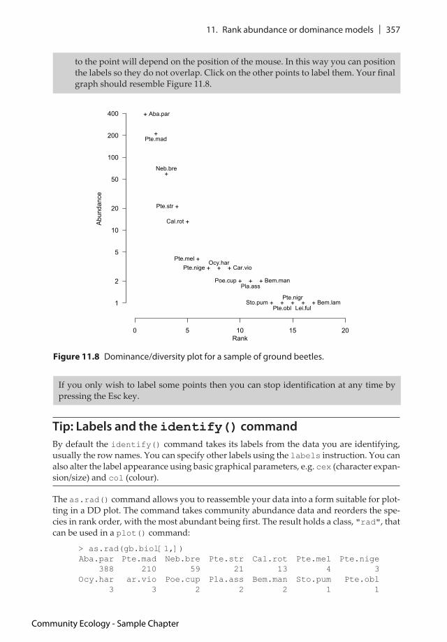
4. The plot shows basic points and a line for the fitted model. You will redraw the plot and customise it shortly but first look at the op object you just created:> op$species rnk poiAba.par 1 388Pte.mad 2 210Neb.bre 3 59Pte.str 4 21Cal.rot 5 13Pte.mel 6 4Pte.nige 7 3Ocy.har 8 3Car.vio 9 3Poe.cup 10 2Pla.ass 11 2Bem.man 12 2Sto.pum 13 1Pte.obl 14 1Pte.nigr 15 1Lei.ful 16 1Bem.lam 17 1
attr(,"class")[1] "ordiplot"
5. The op object contains all the data you need for a plot. The identify() command will use the row names as the default labels but first, redraw the plot and display the points only (the default is type = "b"). Also, suppress the axes and make a little more room to fit the labels into the plot region:> op = plot(gb.zipf, type = "p", pch = 43, xlim = c(0, 20), axes = FALSE)
6. You may get a warning message but the plot is created anyhow. The type = "p" part turned off the line to leave the points only (type = "l" would show the line only). Now add in the y-axis and set the axis tick positions explicitly:> axis(2, las = 1, at = c(1,2,5,10,20, 50, 100, 200, 400))
7. Now add in the x-axis but shift its position in the margin so it is one line outwards. You can also specify the axis tick positions using the pretty() command, which works out neat intervals:> axis(1, line = 1, at = pretty(0:20))
8. Finally you get to label the points. Start by typing the command:> identify(op, cex = 0.9)
9. Now the command will be waiting for you to click with the mouse in the plot region. Select the plot window by clicking in an outer margin or the header bar – this ‘acti-vates’ the plot. Position your mouse cursor just below the top-most point and click once. The label appears just below the point. Now move to the next point and click just to the right of it – the label appears to the right. The position of the label relative
Community Ecology - Sample Chapter
11. Rank abundance or dominance models | 357
Tip: Labels and the identify() command
By default the identify() command takes its labels from the data you are identifying, usually the row names. You can specify other labels using the labels instruction. You can also alter the label appearance using basic graphical parameters, e.g. cex (character expan-sion/size) and col (colour).
The as.rad() command allows you to reassemble your data into a form suitable for plot-ting in a DD plot. The command takes community abundance data and reorders the spe-cies in rank order, with the most abundant being first. The result holds a class, "rad", that can be used in a plot() command:
> as.rad(gb.biol[1,])Aba.par Pte.mad Neb.bre Pte.str Cal.rot Pte.mel Pte.nige 388 210 59 21 13 4 3 Ocy.har ar.vio Poe.cup Pla.ass Bem.man Sto.pum Pte.obl 3 3 2 2 2 1 1
to the point will depend on the position of the mouse. In this way you can position the labels so they do not overlap. Click on the other points to label them. Your final graph should resemble Figure 11.8.
Rank
Abundance
+
+
+
+
+
++ + +
+ + +
+ + + + +1
2
5
10
20
50
100
200
400
0 5 10 15 20
Aba.par
Pte.mad
Neb.bre
Pte.str
Cal.rot
Pte.melPte.nige
Ocy.harCar.vio
Poe.cupPla.ass
Bem.man
Sto.pumPte.obl
Pte.nigr
Lei.fulBem.lam
Figure 11.8 Dominance/diversity plot for a sample of ground beetles.
If you only wish to label some points then you can stop identification at any time by pressing the Esc key.
Community Ecology - Sample Chapter

358 | Community Ecology: Analytical Methods using R and Excel
Pte.nigr Lei.ful Bem.lam 1 1 1 attr(,"class")[1] "rad"
The resulting plot() would contain only the points, plotted as the log of the abundance against the rank.
One of the RAD models you’ve seen is the lognormal model. This was one of the first RAD models to be developed and in the following sections you will learn more about lognormal data series.
11.2 Fisher’s log-series
The lognormal model you’ve seen so far stems from the original work of Fisher – you met this earlier (in Section 8.3.2) in the context of an index of diversity. The vegan package uses non-linear modelling to calculate Fisher’s log-series (look back at Figures 8.6 and 8.7).
The fisherfit() command in the vegan package carries out the main model fitting processes. You looked at this in Section 8.3.2 but in the following exercise you can have a go at making Fisher’s log-series and exploring the results with a different emphasis.
Have a Go: Explore Fisher’s log-series
You will need the vegan and MASS packages for this exercise. The MASS package comes as part of the basic distribution of R but is not loaded by default. You will also use the ground beetle data in the CERE.RData file.
1. Start by preparing the vegan and MASS packages:
> library(vegan)> library(MASS)
2. Make a log-series result for all samples in the ground beetle community dataset:
> gb.fls <- apply(gb.biol, MARGIN = 1,fisherfit)
3. You made Fisher’s log-series models for all samples – see the names of the compo-nents of the result:
> names(gb.fls) [1] "E1" "E2" "E3" "E4" "E5" "E6" "G1" "G2" "G3" "G4" "G5" "G6"[13] "W1" "W2" "W3" "W4" "W5" "W6"
4. Look at the result for the G1 sample:
> gb.fls$G1
Fisher log series modelNo. of species: 28
Estimate Std. Erroralpha 7.0633 1.5389
5. Look at the components of the result for the G1 sample:
Community Ecology - Sample Chapter

11. Rank abundance or dominance models | 359
> names(gb.fls$G1)[1] "minimum" "estimate" "gradient" "hessian" [5] "code" "iterations" "df.residual" "nuisance" [9] "fisher"
6. Look at the $fisher component:
> gb.fls$G1$fisher 1 2 3 4 5 6 17 23 25 52 178 12 3 3 1 2 1 1 2 1 1 1
attr(,"class")[1] "fisher"
7. You can get the frequency and number of species components using the as.fisher() command:
> as.fisher(gb.biol["G1",]) 1 2 3 4 5 6 17 23 25 52 178 12 3 3 1 2 1 1 2 1 1 1 attr(,"class")[1] "fisher"
8. Visualise the log-series with a plot and also look at the profile to ascertain the nor-mality, split the plot window in two and produce a plot that resembles Figure 11.9:
> opt = par(mfrow = c(2,1))> plot(gb.fls$G1)> plot(profile(gb.fls$G1))> par(opt)
0 50 100 150
02
46
810
Frequency
Species
4 6 8 10 12
-3-2
-10
12
3
alpha
tau
Figure 11.9 Fisher’s log-series (top) and profile plot (bottom) for a sample of ground beetles.
Community Ecology - Sample Chapter

360 | Community Ecology: Analytical Methods using R and Excel
Fisher’s log-series can only be used for counts of individuals and not for other forms of abun-dance data. You must have integer values for the fisherfit() command to operate.
Tip: Convert abundance data to log-series data
The as.fisher() command in the vegan package allows you to ‘convert’ abundance data into Fisher’s log-series data.
Fisher’s model seems to imply infinite species richness and so ‘improvements’ have been made to the model. In the following section you’ll see how Preston’s lognormal model can be used.
11.3 Preston’s lognormal model
Preston’s lognormal model (Preston 1948) is a subtle variation on Fisher’s log-series. The frequency classes of the x-axis are collapsed and merged into wider bands, creating octaves of doubling size, 1, 2, 3–4, 5–8, 9–16 and so on. Furthermore, for each frequency half the species are transferred to the next highest octave. This makes the data appear more lognor-mal by reducing the lowest octaves (which are usually high).
In the vegan package the prestonfit() command carries out the model fitting process. By default the frequencies are split, with half the species being transferred to the next highest octave. However, you can turn this feature off by using the tiesplit = FALSE instruction.
The expected frequency f at an abundance octave o is determined by the formula shown in Figure 11.10.
9. Use the confint() command to get the confidence intervals of all the log-series – you can use the sapply() command to help:
> sapply(gb.ff, confint) E1 E2 E3 E4 E5 E62.5 % 1.778765 1.315205 1.501288 3.030514 2.287627 1.69592297.5 % 5.118265 4.196685 4.626269 7.266617 5.902574 4.852549 G1 G2 G3 G4 G5 G62.5 % 4.510002 3.333892 2.687344 4.628881 4.042329 3.65864897.5 % 10.618303 8.765033 7.892262 10.937909 9.806917 9.205348 W1 W2 W3 W4 W5 W62.5 % 0.9622919 0.8672381 0.8876847 1.029564 0.9991796 0.761400897.5 % 3.3316033 3.1847201 3.2699293 3.595222 3.4755296 2.9843201
The plot() command produces a kind of bar chart when used with the result of a fisherfit() command. You can alter various elements of the plot such as the axis labels. Try also the bar.col and line.col instructions, which alter the colours of the bars and fitted line.
f S0 explog2 o
2
2 2
Figure 11.10 Preston’s lognormal model. Expected frequency for octaves (o), where μ is the location of the mode, δ is the mode width (both in log2 scale) and S0 is expected number of species at mode.
Community Ecology - Sample Chapter
11. Rank abundance or dominance models | 361
The lognormal model is usually truncated at the lowest end, with the result that some rare species may not be recorded – this truncation is called the veil line.
The prestonfit() command fits the truncated lognormal model as a second degree log-polynomial to the octave pooled data using Poisson (when tiesplit = FALSE) or quasi-Poisson (when tiesplit = TRUE) error distribution.
The prestondistr() command uses an alternative method: fitting a left-truncated normal distribution to log2 transformed non-pooled observations with direct maximisa-tion of log-likelihood.
Both commands have plotting routines, which produce a bar chart and fitted line. You can also add extra lines to the plots. In the following exercise you can have a go at explor-ing Preston’s log-series.
Have a Go: Explore Preston’s lognormal models
You will need the vegan package for this exercise. You will also use the ground beetle data in the CERE.RData file.
1. Start by preparing the vegan package:
> library(vegan)
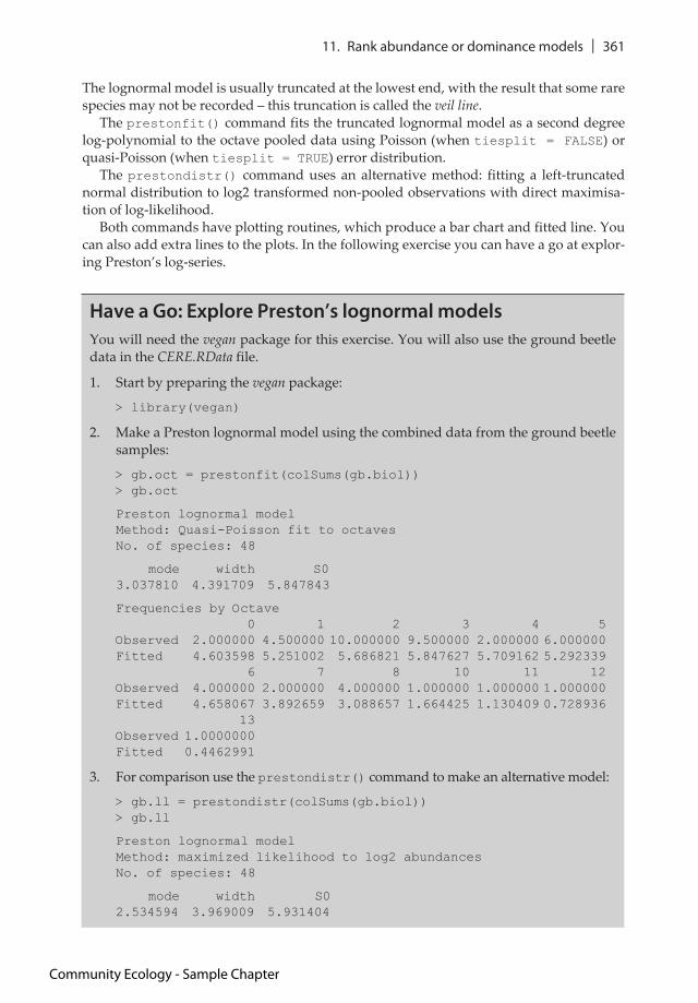
2. Make a Preston lognormal model using the combined data from the ground beetle samples:
> gb.oct = prestonfit(colSums(gb.biol))> gb.oct
Preston lognormal modelMethod: Quasi-Poisson fit to octaves No. of species: 48
mode width S0 3.037810 4.391709 5.847843
Frequencies by Octave 0 1 2 3 4 5Observed 2.000000 4.500000 10.000000 9.500000 2.000000 6.000000Fitted 4.603598 5.251002 5.686821 5.847627 5.709162 5.292339 6 7 8 10 11 12Observed 4.000000 2.000000 4.000000 1.000000 1.000000 1.000000Fitted 4.658067 3.892659 3.088657 1.664425 1.130409 0.728936 13Observed 1.0000000Fitted 0.4462991
3. For comparison use the prestondistr() command to make an alternative model:
> gb.ll = prestondistr(colSums(gb.biol))> gb.ll
Preston lognormal modelMethod: maximized likelihood to log2 abundances No. of species: 48
mode width S0 2.534594 3.969009 5.931404
Community Ecology - Sample Chapter

362 | Community Ecology: Analytical Methods using R and Excel
Frequencies by Octave 0 1 2 3 4 5Observed 2.000000 4.500000 10.000000 9.500000 2.000000 6.000000Fitted 4.837308 5.504215 5.877843 5.890765 5.540596 4.890714 6 7 8 10 11 12Observed 4.000000 2.000000 4.000000 1.000000 1.0000000 1.000000Fitted 4.051531 3.149902 2.298297 1.011387 0.6099853 0.345265 13Observed 1.0000000Fitted 0.1834074
4. Both versions of the model have the same components. Look at these using the names() command:> names(gb.oct)[1] "freq" "fitted" "coefficients" "method"
> names(gb.ll)[1] "freq" "fitted" "coefficients" "method"
5. View the Quasi-Poisson model in a plot – use the yaxs = "i" instruction to ‘ground’ the bars:> plot(gb.oct, bar.col = "gray90", yaxs = "i")
6. The plot shows a histogram of the frequencies of the species in the different octaves. The line shows the fitted distribution. The vertical line shows the mode and the horizontal line the standard deviation of the response. Add the details for the alter-native model using the lines() command:> lines(gb.ll, line.col = "blue", lty = 2)
7. Now examine the density distribution of the histogram and add the density line to the plot; your final graph should resemble Figure 11.11:> den = density(log2(colSums(gb.biol)))> lines(den$x, ncol(gb.biol)*den$y, lwd = 2, col = "darkgreen", lty = 3)
Frequency
Species
02
46
810
1 2 4 8 16 32 64 128 256 512 1024 2048 4096 8192
Figure 11.11 Preston’s log-series for ground beetle communities. Solid line = quasi-Poisson model, dashed line = log likelihood model, dotted line = density.
Community Ecology - Sample Chapter
11. Rank abundance or dominance models | 363
Tip: Axis extensions
By default R usually adds a bit of extra space to the ends of the x and y axes (about 4% is added to the ends). This is controlled by the xaxs and yaxs graphical parameters. The default is xaxs = "r" and the same for yaxs. You can ‘shrink’ the axes by setting the value to "i". for the axis you require.
You can convert species count data to Preston octave data by using the as.preston() command:
> as.preston(colSums(gb.biol)) 0 1 2 3 4 5 6 7 8 10 11 12 13 2.0 4.5 10.0 9.5 2.0 6.0 4.0 2.0 4.0 1.0 1.0 1.0 1.0 attr(,"class")[1] "preston"
This makes a result object that has a special class, "preston", which currently does not have any specific commands associated with it. However, you could potentially use such a result to make your own custom functions.
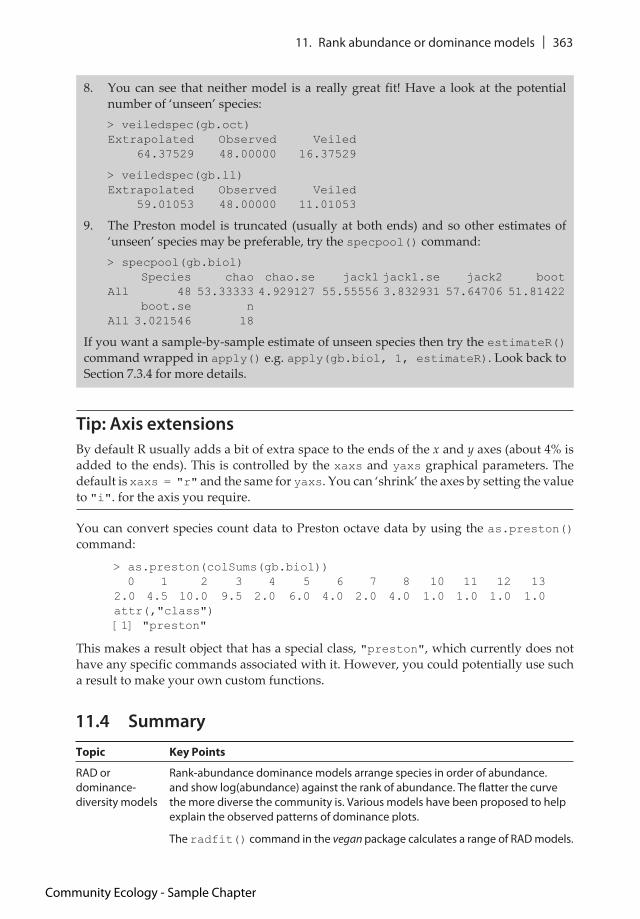
8. You can see that neither model is a really great fit! Have a look at the potential number of ‘unseen’ species:> veiledspec(gb.oct) Extrapolated Observed Veiled 64.37529 48.00000 16.37529
> veiledspec(gb.ll) Extrapolated Observed Veiled 59.01053 48.00000 11.01053
9. The Preston model is truncated (usually at both ends) and so other estimates of ‘unseen’ species may be preferable, try the specpool() command:> specpool(gb.biol) Species chao chao.se jack1 jack1.se jack2 bootAll 48 53.33333 4.929127 55.55556 3.832931 57.64706 51.81422 boot.se nAll 3.021546 18
If you want a sample-by-sample estimate of unseen species then try the estimateR() command wrapped in apply() e.g. apply(gb.biol, 1, estimateR). Look back to Section 7.3.4 for more details.
11.4 Summary
Topic Key Points
RAD or dominance-diversity models
Rank-abundance dominance models arrange species in order of abundance. and show log(abundance) against the rank of abundance. The flatter the curve the more diverse the community is. Various models have been proposed to help explain the observed patterns of dominance plots.
The radfit() command in the vegan package calculates a range of RAD models.
Community Ecology - Sample Chapter

364 | Community Ecology: Analytical Methods using R and Excel
Broken stick model
Broken stick: This gives a null model where the individuals are randomly distributed among observed species, and there are no fitted parameters. The model is seen as an ecological resource-partitioning model.
The rad.null() command calculates broken stick models.
Preemption model
The preemption model (also called Motomura model or geometric series) has a single fitted parameter. The model tends to produce a straight line. The model is seen as an evolutionary resource-partitioning model.
The rad.preempt() command calculates preemption models.
Lognormal model
The lognormal model has two fitted parameters. It assumes that the log of species abundance is normally distributed. The model implies that resources affect species simultaneously.
The rad.lognormal() command calculates lognormal models.
Zipf model In the Zipf model there are two fitted parameters. The model implies that resources affect species in a sequential manner.
The rad.zipf() command calculates Zipf models.
Mandelbrot model
The Mandelbrot model adds one parameter to the Zipf model. The model implies that resources affect species in a sequential manner.
The rad.zipfbrot() command calculates Mandelbrot models.
Comparing models
The result of the radfit() command contains information about deviance and AIC values for the models, allowing you to select the ‘best’. The AIC values and ‘best’ model are also displayed when you plot the result of radfit() that contains multiple samples.
If you have replicate samples you can compare deviance between models using ANOVA.
Visualise RAD models with DD plots
Once you have your RAD model(s), which can be calculated with the radfit() command, you can visualise them graphically. The result of radfit() has plot() routines, the lattice package is used to display some models, for example the lattice system will display the ‘best’ model for each sample if radfit() is used on a dataset with multiple samples.
Plotting a radfit() result for a single sample produces a single plot with the model fits overlaid for comparison. The radlattice() command will display the models in separate panels (using the lattice package) for a single sample.
Fisher’s log-series
Fisher’s log-series was an early attempt to model species abundances. One of the model parameters (alpha) can be used as an index of diversity, calculated via the fisher.alpha() command in the vegan package.
The fisherfit() command will compute Fisher’s log-series (using non-linear modelling).
Use the confint() command in the MASS package to calculate confidence intervals for Fisher’s log-series.
The as.fisher() command in the vegan package allows you to convert abundance data into Fisher’s log-series data.
Community Ecology - Sample Chapter

11. Rank abundance or dominance models | 365
11.5 Exercises
11.1 Rank abundance-dominance models derive from biological or statistical theo-ries. The (biological) resource-partitioning models can be thought of as operating in two broad ways – what are they?
11.2 The Mandelbrot RAD model is a derivative of the Zipf model, two additional parameters being added – TRUE or FALSE?
11.3 The DeVries data is a matrix containing two samples; counts of tropical butter-fly species in canopy or understorey habitat. Which is the ‘best’ model for each habitat?
11.4 The radfit() and rad.xxxx() commands assume that your data are count data. If you had cover data instead how might you modify the command(s)?
11.5 How many unseen (i.e. veiled) species are calculated to be in the DeVries data?
The answers to these exercises can be found in Appendix 1.
Preston’s lognormal
Preston’s lognormal model is an ‘improvement’ on Fisher’s log-series, which implied infinite species richness. The frequency classes of the x-axis are collapsed and merged into wider bands, creating octaves of doubling size, 1, 2, 3–4, 5–8, 9–16 and so on. Furthermore, for each frequency half the species are transferred to the next highest octave.
The prestonfit() and prestondistr() commands in the vegan package compute Preston’s log-series. The commands have plotting routines allowing you to visualise the models.
You can convert species count data to Preston octave data by using the as.preston() command.
Topic Key Points
Community Ecology - Sample Chapter


![PROJECT COMMUNICATION FORM - Alpha Analytical...Excel Spreadsheet HAZSITE Electronic Deliverables C] TO-15 Unit Conversion Table Other: Expected Sampling Date(s): Indicate expected](https://static.fdocuments.us/doc/165x107/60d4b9a7163fb461706cf3bf/project-communication-form-alpha-analytical-excel-spreadsheet-hazsite-electronic.jpg)