Color Research on Thai Wall Painting in the Ayutthaya and ...
11
77 J. Soc. Photogr. Imag. Japan. (2013) Vol. 76 No. 1 : 77–87 Original Paper Color Research on Thai Wall Painting in the Ayutthaya and Bangkok Dynasties アユタヤおよびバンコク王朝期のタイ壁画の色彩研究 Kanakarn RUXPAITOON * , Naokazu AOKI * and Hiroyuki KOBAYASHI * ラクパイトゥーン カナカーン * ・青木直和 * ・小林裕幸 * Abstract Most Thai wall paintings are related to the religion, manners and customs of the people, as well as the prosperity of the dynasty of the time. The Thai dynasties consist of the Ayutthaya dynasty (1351–1767) and the Bangkok dynasty (1782–Present). The culture and diplomatic relations were different in each dynasty. The number of usable pigments was different in each dynasty, too. Therefore, the characteristics of wall paintings should reflect the period background of each dynasty. Almost all historic Thai wall paintings have been produced at Buddhist temples, and have different characteristics of color usage than overseas wall paintings made even with the same fresco technique as that used in Thailand. In this study, colors used in Thai wall paintings of various dynasties were measured and plotted in the L * a * b * color space. Representative colors were obtained by using K-means clustering in combination with two-step clustering, and their characteristics were discussed by comparing with those of Egyptian, Pompeii, and the Renaissance fresco. In addition, impressions of the color arrangement of these paintings were obtained by a color image scale. 要 旨 タイの壁画の題材は宗教画,民衆の風俗,そしてそれらと並んでその時代の王朝の栄華を描いたものも多く,各王朝それ ぞれの時代背景を反映した特徴を有している.タイの王朝はアユタヤ王朝(1351–1767 年)とバンコク王朝(1782– 現在) から成る.文化や海外との外交関係は各王朝期で異なる.また,利用できる顔料の数も各王朝期で異なり,壁画の特徴は 各王朝期の時代を反映していると言える.ほとんどの壁画は仏教寺院で制作されており,色使いは同じフレスコ技法を用 いた西欧の壁画とはことなる特徴が観られる.本研究は,タイ各王朝期の壁画に使われている色を,スキャナを用いて画 集から取得し,L * a * b * 空間にプロットした.その分布から Two-step クラスタリング法と K 平均クラスタ法を用いて代表 色を求め,ポンペイやルネサンスのフレスコ画と比較して議論した.さらに,配色カラーイメージスケールを用い,各時 代の配色の印象を求めた. Key words: Thai dynasty periods, Wall paintings, Representative colors, Impression of color arrangement キーワード:タイ王朝期,壁画,代表色,配色の印象 1. Introduction Images can be divided into two types: “traditional images” be- fore the invention of photography, and “techno images” after the invention of photography 1) . Whereas the traditional images have a history of a few tens of thousands of years, the techno images have a history of only 200 years, at most. It is clear that knowing the characteristics of paintings and other traditional images, which have such a long history, is useful for the technology of techno images such as photographs. There are many opportunities to encounter Western paintings (in the Renaissance, Baroque, Impressionist and other styles) and East Asian paintings from Japan and China, and a great deal of research has been carried out on such paintings. Thai paintings, which are classified under Southeast Asia, are almost unknown, and there has been almost no academic research on their image characteristics, such as color usage. This research analyzes color usage in Thai paintings, and elucidates their features by comparing them with Western paintings. Printed material, such as books of paintings, are the most familiar media through which we come into contact with paintings, and it is no exaggeration to say that much of the infor- mation we know about paintings has been acquired through such media. In academic research on the color features and other characteristics of paintings it is difficult in almost all cases to obtain information from the original works, and in most cases research has been conducted based on information obtained from books of paintings and catalogs 2) . In this research too, data was obtained from books of paintings, and examined by using an anal- ysis method proposed in previous research 2) . Almost all Thai wall paintings have been produced in Buddhist temples, and they are art which visualizes the ideals of Buddhism. Materials with local characteristics have been used to produce these wall paint- ings, and they are a type of Buddhist art which expresses the originality of Thai art. The subjects of most Thai wall paintings Received 8th, December 2012, Accepted 7th, February 2013 平成 24 年 12 月 8 日受付 平成 25 年 2 月 7 日受理 *Graduate School of Advanced Integration Science, Chiba University, 1-33 Yayoicho, Inage-ku, Chiba 263-8522, Japan 千葉大学大学院融合科学研究科 〒 263-8522 千葉市稲毛区弥生町 1-33
Transcript of Color Research on Thai Wall Painting in the Ayutthaya and ...

77
J. Soc. Photogr. Imag. Japan. (2013) Vol. 76 No. 1 : 77–87
Original Paper
Color Research on Thai Wall Painting in the Ayutthaya and Bangkok Dynasties
アユタヤおよびバンコク王朝期のタイ壁画の色彩研究
Kanakarn RUXPAITOON*, Naokazu AOKI
* and Hiroyuki KOBAYASHI*
ラクパイトゥーン カナカーン *・青木直和 *・小林裕幸 *
Abstract Most Thai wall paintings are related to the religion, manners and customs of the people, as well as the prosperity of the dynasty
of the time. The Thai dynasties consist of the Ayutthaya dynasty (1351–1767) and the Bangkok dynasty (1782–Present). The
culture and diplomatic relations were different in each dynasty. The number of usable pigments was different in each dynasty,
too. Therefore, the characteristics of wall paintings should reflect the period background of each dynasty. Almost all historic Thai
wall paintings have been produced at Buddhist temples, and have different characteristics of color usage than overseas wall
paintings made even with the same fresco technique as that used in Thailand. In this study, colors used in Thai wall paintings of
various dynasties were measured and plotted in the L*a*b* color space. Representative colors were obtained by using K-means
clustering in combination with two-step clustering, and their characteristics were discussed by comparing with those of
Egyptian, Pompeii, and the Renaissance fresco. In addition, impressions of the color arrangement of these paintings were
obtained by a color image scale.
要 旨 タイの壁画の題材は宗教画,民衆の風俗,そしてそれらと並んでその時代の王朝の栄華を描いたものも多く,各王朝それ
ぞれの時代背景を反映した特徴を有している.タイの王朝はアユタヤ王朝(1351–1767年)とバンコク王朝(1782–現在)
から成る.文化や海外との外交関係は各王朝期で異なる.また,利用できる顔料の数も各王朝期で異なり,壁画の特徴は
各王朝期の時代を反映していると言える.ほとんどの壁画は仏教寺院で制作されており,色使いは同じフレスコ技法を用
いた西欧の壁画とはことなる特徴が観られる.本研究は,タイ各王朝期の壁画に使われている色を,スキャナを用いて画
集から取得し,L*a*b* 空間にプロットした.その分布から Two-step クラスタリング法と K 平均クラスタ法を用いて代表
色を求め,ポンペイやルネサンスのフレスコ画と比較して議論した.さらに,配色カラーイメージスケールを用い,各時
代の配色の印象を求めた.
Key words: Thai dynasty periods, Wall paintings, Representative colors, Impression of color arrangement
キーワード:タイ王朝期,壁画,代表色,配色の印象
1. Introduction
Images can be divided into two types: “traditional images” be-
fore the invention of photography, and “techno images” after the
invention of photography 1). Whereas the traditional images have
a history of a few tens of thousands of years, the techno images
have a history of only 200 years, at most. It is clear that knowing
the characteristics of paintings and other traditional images,
which have such a long history, is useful for the technology of
techno images such as photographs. There are many opportunities
to encounter Western paintings (in the Renaissance, Baroque,
Impressionist and other styles) and East Asian paintings from
Japan and China, and a great deal of research has been carried
out on such paintings. Thai paintings, which are classified under
Southeast Asia, are almost unknown, and there has been almost
no academic research on their image characteristics, such as
color usage. This research analyzes color usage in Thai paintings,
and elucidates their features by comparing them with Western
paintings. Printed material, such as books of paintings, are the
most familiar media through which we come into contact with
paintings, and it is no exaggeration to say that much of the infor-
mation we know about paintings has been acquired through such
media. In academic research on the color features and other
characteristics of paintings it is difficult in almost all cases to
obtain information from the original works, and in most cases
research has been conducted based on information obtained from
books of paintings and catalogs 2). In this research too, data was
obtained from books of paintings, and examined by using an anal-
ysis method proposed in previous research 2). Almost all Thai
wall paintings have been produced in Buddhist temples, and they
are art which visualizes the ideals of Buddhism. Materials with
local characteristics have been used to produce these wall paint-
ings, and they are a type of Buddhist art which expresses the
originality of Thai art. The subjects of most Thai wall paintings
Received 8th, December 2012, Accepted 7th, February 2013 平成 24年 12月 8日受付 平成 25年 2月 7日受理
*Graduate School of Advanced Integration Science, Chiba University, 1-33 Yayoicho, Inage-ku, Chiba 263-8522, Japan
千葉大学大学院融合科学研究科 〒 263-8522 千葉市稲毛区弥生町 1-33

J. Soc. Photogr. Imag. Japan. Vol. 76 No. 1 (2013)78
are religious scenes, manners of the common people, and the
glory of the dynasties in each era. The Thai dynasties consist of
the Ayutthaya Dynasty (1351–1767) and the Bangkok Dynasty
(1782–Present) 3).
The history of painting in Ayutthayan art is roughly divided
into three periods. The early period (from the mid 14th century
to the mid 15th century) shows a mixed influence of Lopburi
art*1 and Sri Lanka art*2. In the middle period (from the mid 15th
century to the early 17th century), the influence of Sukhotai art*3
grows stronger. This was also an era of war, and styles from
other countries flowed in. In the late period (from the mid 17th
century to the mid 18th century), Thai art was influenced by
Chinese art. As a result, it began to use a broader palette of
colors, and an elegant style of painting unique to Thailand was
perfected. Many different subjects were painted including imag-
es of the Buddha, and flowers and birds. As the method of pro-
duction, painters used a fresco technique in which a line drawing
is executed on a plastered wall, the surrounding area is embed-
ded with a vermillion color, and then color is applied in a planar
fashion 3). The lines are simple and drawn solidly, and the colors
are black (believed to be lamp black or bone), white (believed to
be lime or white earth) and red (believed to be cinnabar). Gold
foil is also used, particularly for important parts and ceilings.
Ayutthaya pigments are natural, and there are only a few types.
Due to climate problems and earthquakes, many wall paintings
have been destroyed, but there are still some extant paintings
produced in the early 15th century.
The Bangkok dynasty*4 is comprised of the reigns of nine
monarchs, Rama 1 to Rama 9 (in the following, their reigns will
be indicated as Rama 1, Rama 9 etc.), and the dynasty is divided
into three periods: the early period (Rama 1–3), middle period
(Rama 4–6), and the late period (Rama 7 to the present Rama 9).
Rama 1 in the early period (1782–1809) triumphed in a war with
Myanmar, and built many temples such as Wat Prakaew. Many
corridor wall paintings were produced at that time. The tech-
niques retained the features of Ayutthaya art, as is, and the
images are expressed with vivid colors and gold. The composi-
tion is distinguished by the “San Yuan” perspective technique of
oriental art in which space is expressed by drawing distant
views, intermediate views and near views with different view-
points in a single picture plane. Layers of ambiguous air, such as
clouds or mist, are painted at the connecting points of these
three views, and it is also said that these elements comprise the
blank time of human consciousness. That is, this “emptiness”
lies outside the intentions of the painter, and is a view of “uncon-
ditioned nature.” Another distinguishing feature is that story
scenes are drawn in the center of the picture plane, and artists
draw images of 18–19th century customs and manners, and
things like they like, above and below the central image. During
the reign of Rama 2 (1809–1824), there was lively cultural ex-
change with Portugal, and students were sent to India to learn
architecture and other technologies. In the reign of Rama 3
(1824–1851), Thai art was influenced by Chinese art. At that
time, almost all pigments were imported from China 3).
During the middle period, Thai art received a major influence
from Europe. In the reign of Rama 4 (1851–1868), there was a
shift in subject matter from Buddhist themes to fables. Styles
were also influenced by the start of cultural exchange with the
West, and a distinctive style was born which combines the real-
ism of Europe with the beautiful and elegant line drawings char-
acteristic of Thai wall paintings. The works of the painter Khrua
In Khong, who is representative of the reign of Rama 4, can be
regarded as similar to early Renaissance art in terms of
technique, use of color, and composition etc. The foreigners and
European style buildings which appear in the works of Khrua
In Khong were painted based on his image of foreign countries,
developed from watching the lives of foreigners living in Thai-
land. During the reign of Rama 5 (1868–1910), foreign exchange
students were sent to Europe with the aim to aiding the develop-
ment of Thailand. In the reign of Rama 6 (1910–1925), surnames
were given to all of the citizens of Thailand, and people began to
wear European style clothing 4). During the reign of Rama 7
(1925–1935) in the late period, a constitution was enacted, and
political, social and educational systems were put in place. Many
European style buildings were constructed. After the short reign
of Rama 8 (1935–1946), Rama 9 (1946–Present) ascended to the
throne, and worked to develop the country’s infrastructure, and
improve the living environment for the Thai people. The King is
well-versed in culture and art, and has made efforts to achieve
broader education and understanding in those fields. New styles
unique to Thailand have also been developed. By the order of
Rama 9, new wall paintings have been painted since 1993 depict-
ing dynastic chronicles and the history of Thailand. These wall
paintings are rendered so realistically that the people in the paint-
ings can be recognized, and vivid colors are used in all of these
works 5).
There is a strong link between Buddhism and the daily lives of
the Thai people. The wall paintings in temples are representa-
tive of Thai art, and can be regarded as cultural heritage. There-
fore, knowing the expressive techniques of these paintings is
extremely important for understanding Thai art. No previous
research has been done regarding color usage and expressive
techniques.
In this research, the authors investigate color usage in the
wall paintings of each dynasty, which make up the long history of
Thai painting described above, and elucidate the features of
these paintings by comparing between dynasties, and with
*1 Lopburi art 1): Lopburi art was established as the Khmer kingdom of
Cambodia expanded its territory to the west, and brought the area
from northeast to central Thailand under its control. In short, it is
Khmer art in Thailand. Its center is Lopburi, which was formerly
called “Lawou,” and thus it is called Lopburi art. Its golden age was in
the 12th and 13th centuries. (However, there are remains indicating an
influence from Khmer art starting around the 7th century.) To be pre-
cise, the Khmer-style “stalactite”-shaped towers called “Prasat,”
which rise above temples, correspond not to Buddhist stupas but to
shrines.*2 Sri Lanka art 1): An inverted bowl-shaped structure is created on a
pedestal, and on top of that are placed a square crown and finial, thus
providing the elements of a basic stupa. However, the bowl-shaped
part of the tower in Myanmar and Thailand is shaped like a bell rather
than a grave mound.*3 Sukhothai art 1): This was established under the Sukhothai Kingdom,
when the Tai peoples established a state in the south of northern
Thailand. The Sukhothai Kingdom expelled the Khmer forces, invited
Buddhist high priests from Sri Lanka, and embraced Theraveda
Buddhism. Therefore, this art unique to Thailand was created under
the influence of Sri Lanka art.*4 Bangkok dynasty: Another name for the Rattanakosin dynasty. The
capital city is Bangkok, so it is called the Bangkok dynasty. The royal
palace is located on Rattanakosin Island, surrounded by canals and
the Chao Phraya River, and thus another name is the Rattanakosin
dynasty.

K. RUXPAITOON et al. Color Research on Thai Wall Painting in the Ayutthaya and Bangkok Dynasties 79
Western painting. Wall painting data was acquired from books of
paintings, and representative colors were found from the distri-
bution of colors used in L*a*b space, by using a combination of
the two-step cluster method 6) and the K-means clustering
method 2). Impressions of the color combination in each era were
found by using a color image scale for color combinations 7).
The authors also examine the features of color usage by compar-
ing it with the European wall paintings from the Pompei and Re-
naissance Eras which are thought to have influenced Thai wall
paintings. Fig. 1 shows the Thai dynasties and reigns in compari-
son with other eras.
2. Experiment
2.1 Wall painting samples
Since there is a limit on the number of samples, their selection
is extremely important. Wall paintings of Wat Chongnonsee and
Wat Yai-Suwannaram (Fig. 2a) which are entirely intact were se-
lected as samples for the Ayutthaya Era. Wall paintings from the
temples most closely related to each monarch were selected as
samples for the Bangkok Era. The wall paintings of Wat Prakeaw
(Fig. 2b) were selected for Rama 1, the wall paintings of Wat
Borvornnivet (Fig. 2c) for Rama 3, the wall paintings of the paint-
er Khrua In Khong at Wat Borvonnivet (Fig. 2d) for Rama 4 (who
Fig. 1 Comparison of Thai dynasties with overseas periods
Fig. 2a Wall paintings at Wat Chongnonsee and Wat Yai-Suwannaram from the reign of King Prasarttong, Ayutthaya dynasty. Paintings of Buddhist scrip-
tures and stories 8)
Fig. 2b Wall paintings painted in the corridors of Wat Prakeaw during the reign of Rama 1. The subjects are Buddhist history 9)
Fig. 2c Wall paintings from Wat Borvonnivet during the reign of Rama 3. The paintings feature stories from the Romance of the Three Kingdoms 10)
J. Soc. Photogr. Imag. Japan. Vol. 76 No. 1 (2013)80
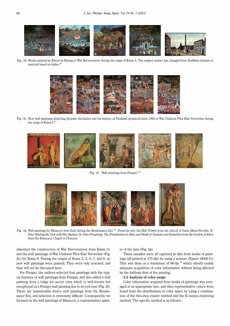
inherited the construction of Wat Borvornnivet from Rama 3),
and the wall paintings of Wat Chaloem Phra Kiat Vorravihar (Fig.
2e) for Rama 9. During the reigns of Rama 2, 5, 6, 7, and 8, no
new wall paintings were painted. They were only restored, and
thus will not be discussed here.
For Pompei, the authors selected four paintings with the typi-
cal features of wall paintings from Pompei, and also added a wall
painting from a lodge for secret rites which is well-known but
exceptional as a Pompei wall painting due to its red tone (Fig. 2f).
There are innumerable fresco wall paintings from the Renais-
sance Era, and selection is extremely difficult. Consequently, we
focused on the wall paintings of Masaccio, a representative paint-
er of the time (Fig. 2g).
These samples were all captured as data from books of paint-
ings (all printed at 175 dpi) by using a scanner (Epson 10000 G).
This was done at a resolution of 96 dpi 2) which should enable
adequate acquisition of color information without being affected
by the halftone dots of the printing.
2.2 Analysis of color usage
Color information acquired from books of paintings was aver-
aged at an appropriate size, and then representative colors were
found from the distributions in color space by using a combina-
tion of the two-step cluster method and the K-means clustering
method. The specific method is as follows.
Fig. 2d Works painted by Khrua In Khong at Wat Borvornnivet during the reign of Rama 4. The subject matter has changed from Buddhist themes to
material based on fables 4)
Fig. 2e New wall paintings depicting dynastic chronicles and the history of Thailand, produced since 1993 at Wat Chaloem Phra Kiat Vorravihar during
the reign of Rama 9 5)
Fig. 2f Wall paintings from Pompei 11)
Fig. 2g Wall paintings by Masaccio from Italy during the Renaissance Era 12). From the left: the Holy Trinity from the church of Santa Maria Novella, St.
Peter Healing the Sick with His Shadow, St. Peter Preaching, The Distribution of Alms and Death of Ananias and Expulsion from the Garden of Eden
from the Brancacci Chapel in Florence

K. RUXPAITOON et al. Color Research on Thai Wall Painting in the Ayutthaya and Bangkok Dynasties 81
(1) Acquire wall painting color information: See 2.1.
(2) Average data: Obtain color information as sRGB values by
using image measurement software. A 5×5 pixel window was
selected as the size for averaging the color information of each
pixel. It is probably valid to perform this step with a 2×2 pixel
(0.5×0.5 mm) window, which is the size of the visual MTF peak
at the distance of distinct vision, but even with paintings thought
to have the most detail among those analyzed here, there were
no differences in color distribution or representative colors due
to the difference between these two sizes. Therefore, a 5×5
pixel window was used because it requires less computation.
(3) Convert from monitor RGB values to L*a*b values: The
8-bit RGB data (0–255) input for a standard display is indicated
by R8bit, G8bit, and B8bit. First, these values are divided by 255 to
obtain normalized values in the range 0–1, R'sRGB, G'sRGB, and
B'sRGB 13).
(1)
Gamma correction is converted in reverse to find linear RGB for
each of the following cases 13).
If R'sRGB, G'sRGB, and B'sRGB ≤ 0.04045, then
RsRGB = R'sRGB/12.92
GsRGB = G'sRGB/12.92 (2)
BsRGB = B'sRGB/12.92
If R'sRGB, G'sRGB, and B'sRGB >0.04045, then
(3)
Next is conversion to (X, Y, Z). In actual sRGB, the maximum
value of Y is calculated by introducing 80 as the coefficient L0
because the display brightness level is assumed to be 80 cm/m2.
(4)
The L*, a* and b* values are calculated from the obtained tristim-
ulus values using the following equations.
(5)
Here, Xn, Yn, and Zn are the tristimulus values (reference
white) of a perfect reflecting diffuser under standard light. The
obtained values are plotted in L*a*b* space, and a distribution of
colors used is obtained for each wall painting.
(4) Acquire representative values: Color usage in an image
can be made easier to understand by replacing the many colors
which comprise an image with colors from a smaller set which
resemble them, and then handling the resulting image with
fewer colors. The term “representative color” refers to each
color in that restricted set 2). Representative colors are found by
analyzing the distribution in L*a*b* space using the method
explained in the following section 2.3.
The distributions of chroma (Cab*) and hue angle (hab) are
found using the following equations from representative color
data plotted in L*a*b* space.
Cab* = (a*2 + b
*2)1/2 (6)
(7)
2.3 Acquisition of representative colors
Based on the color distribution in L*a*b* color space of wall
paintings from each era, the authors used the IBM SPSS
Statistics software package for statistical analysis (IBM Co.) 14)
to determine the number of clusters K through two-step cluster-
ing based on distance (color difference) in L*a*b* space. Using
this K, representative colors were automatically determined via
the K-means method (Fig. 3).
2.4 Determination of the impression given by color usage
To enable better understanding of color usage in the wall
paintings of each dynasty, swatches were prepared in which color
patches of the representative colors found for the wall paintings
in each dynasty were arranged in a row, and these were compared
against a color image scale for color combinations 7). The closest
color emotion word was then determined to be the impression
given by the color usage of those wall paintings. This scale,
shown in Fig. 4, has two psychological axes—the warm-cool axis
(WC-axis) and the soft-hard (SH-axis)—and these serve, respec-
tively, as the horizontal and vertical axes. Various color combina-
tions made up of 5 colors are arrayed in this plane, based on the
emotion imparted by each combination, and a word expressing
=
=
=
8
8
8
' / 255
' / 255
' / 255
sRGB bit
sRGB bit
sRGB bit
R R
G G
B B
= +
= +
= +
2.4
2.4
2.4
[( ' 0.055) / 1.055]
[( ' 0.055) / 1.055]
[( ' 0.055) / 1.055]
sRGB sRGB
sRGB sRGB
sRGB sRGB
R R
G G
B B
⎡ ⎤ ⎧ ⎫ ⎡ ⎤⎪ ⎪⎢ ⎥ ⎢ ⎥
= × ×⎨ ⎬⎢ ⎥ ⎢ ⎥⎪ ⎪⎢ ⎥ ⎢ ⎥⎣ ⎦ ⎩ ⎭ ⎣ ⎦
0
0.4124,0.3576,0.1805
0.2126,0.7152,0.0722
0.0193,0.1192,0.9505
sRGB
sRGB
sRGB
X R
Y L G
Z B
⎡ ⎤= −⎢ ⎥
⎣ ⎦
⎡ ⎤⎛ ⎞ ⎛ ⎞⎢ ⎥= −⎜ ⎟ ⎜ ⎟⎢ ⎥⎝ ⎠ ⎝ ⎠⎣ ⎦
⎡ ⎤⎛ ⎞ ⎛ ⎞⎢ ⎥= −⎜ ⎟ ⎜ ⎟⎢ ⎥⎝ ⎠ ⎝ ⎠⎣ ⎦
1 / 3
*
1 / 3 1 / 3
*
1 / 3 1 / 3
*
116 16
500
200
YL
Yn
X Ya
Xn Yn
Y Zb
Yn Zn
−
⎛ ⎞⎜ ⎟⎝ ⎠
*1
ab *h =tan
b
a
Fig. 3 Procedure for finding representative colors of all wall paintings of an era
J. Soc. Photogr. Imag. Japan. Vol. 76 No. 1 (2013)82
the imparted color emotion is attached to each color combination.
Color combinations with a high degree of warmth, located on the
left edge, impart a “colorful” feeling, and thus the emotions
located at the upper left are labeled with the words “pretty” and
“casual” which indicate a soft and colorful emotion. The emotions
at the lower left are labeled with the words “wild,” “dynamic,”
and “gorgeous” which indicate a hard and colorful emotion.
Colors with a high degree of coolness impart a “refreshing” feel-
ing. Therefore, the emotions located at the upper right are
labeled with the words “clear,” “cool,” and “casual” which indi-
cate a soft, refreshing emotion. The emotion at the lower right is
labeled “modern,” which indicates a hard, refreshing emotion.
Color combinations located in the center of the diagram are as-
sumed to impart a “calm” impression. Therefore, the emotions
located at the upper center are labeled with the words “romantic”
and “elegant” which indicate a soft, calm emotion, and emotions
located at the lower center are labeled with the words “classic &
dandy,” “classic” and “dandy,” which indicate a hard, calm emotion.
The center of the diagram is labeled with the word “elegant,”
which indicates a calm emotion which is neither soft nor hard.
This color combination image scale has been used in various
fields, such as research on color combinations in Hokusai’s
Thirty-six Views of Mount Fuji 15), a psychological study of color
in ukiyo-e prints 16), research on media conversion from music to
color combinations 17), and design of uniforms for athletes 18).
2.5 Correction of color information obtained via scanner
The color information for color patches was captured together
with paintings using a scanner, and the color information ob-
tained with the scanner was corrected based on the relationship
between the scanner data and actual color. It was found that
color differences almost entirely coincided with ΔL*, and almost
all of the color differences were due to differences in the L*
value. Correction equations for a*, b* and L* are, respectively:
y = 1.1322x – 0.5382, y = 0.0000462768x3 + 0.0007061338x2 +
0.9212531468x – 2.0251189986, and y = 0.0000092067x3 –
0.0025610444x2 + 1.0440168446x + 16.0023177020. y is the
corrected value, and x is the value obtained with the scanner.
3. Results and discussion
3.1 Analysis of color usage
Fig.s 5a–g show the obtained L*a*b* values for representative
colors of wall paintings in each era, and the percentages of all
colors which the representative colors represent. Swatches
were created by lining up patches of representative colors creat-
ed with Adobe Photoshop in order of most frequent occurrence.
Fig. 5a shows the results for five wall paintings at Wat Chon
Nonslee and Wat Yai Swannarum from the reign of King
Prasathong of the late Ayutthaya dynasty (mid 17th century).
All of the plotted points are spread out in a concentric fashion,
and it is evident that the technique of adjusting saturation by
mixing chromatic and achromatic pigments has not been used.
The hue angles are distributed in the region smaller than 90°.
Five representative colors were obtained. Colors with L* of 50 or
higher account for more than 70% of all colors, and overall the
colors are bright. Distinguishing features of the color usage are
that almost all of the colors are brownish-yellow, and some
yellow-red has been added to that. Brightness is high in the re-
gion near the b* axis, and as a* increases, brightness decreases.
Low-brightness red is added to bright yellows with different
saturations, and as the redness is increased, yellowness main-
tains a fixed value and brightness decreases.
The percentage of colors whose representative color has both
a* and b* not exceeding 10 was low at 10%, and the percentage of
colors whose representative color has L* less than 40 is about
10%. Thus color usage in the Ayutthaya dynasty can be regarded
as bright and vivid.
Fig. 5b shows the results for five wall paintings at Prakeaw
temple, painted in the reign of Rama 1during the Bangkok dynasty.
Eight representative colors were obtained. Black came into use,
and the percentage of colors whose representative color has L*
of less than 40 reaches 21%. Furthermore, the percentage of
colors whose representative color has both a* and b* less than 10
exceeds 70%. The brownish-yellow colors which are the basic
colors of the Ayutthaya Era comprise about 20% of all colors,
excluding those with saturation smaller than 10. On the achro-
matic axis, plotted points are distributed over a wide range of
L* values, and it is evident that mixtures of black and white pig-
ments are used. a* and b* values are distributed so that they cut
across at almost a 45° angle in the positive direction, and it is
evident that brightness and saturation have been adjusted by
mixing red and yellow, and mixing in white. In the region where
b* is negative, a small number of plotted points are distributed
along the L* axis, and thus it evident that blue pigment and white
pigment have been mixed in and used. The Figures were made to
stand out from the background by controlling brightness and
saturation.
Fig. 5c shows the results for five wall paintings of the Romance
of the Three Kingdoms at Wat Boworn Nivet, from the reign of
Rama 3 in the Bangkok dynasty. Nine representative colors were
obtained. The colors used are almost the same as in the reign of
Rama 1. There were a high percentage of colors with L* less than
40, and a high percentage with neither a* nor b* exceeding 10,
just as in the reign of Rama 1.
Fig. 5d shows the results for five wall paintings painted at
Wat Boworn Nivet by the painter Khrua In Khong in the reign of
Rama 4 during the Bangkok dynasty. Khrua In Khong was great-
ly influenced by the West. He also adopted techniques such as
Fig. 4 Color combination image scale

K. RUXPAITOON et al. Color Research on Thai Wall Painting in the Ayutthaya and Bangkok Dynasties 83
Fig. 5a Distribution of colors used, and representative colors, in wall paintings at Wat Chon Nonslee during the Ayutthaya Dynasty
Fig. 5b Distribution of colors used, and representative colors, in wall paintings at Wat Prakeaw during the reign of Rama I
Fig. 5c Distribution of colors used, and representative colors, in wall paintings at Wat Boworn Nivet during the reign of Rama III

J. Soc. Photogr. Imag. Japan. Vol. 76 No. 1 (2013)84
Fig. 5d Distribution of colors used, and representative colors, in wall paintings at Wat Boworn Nivet by Khrua In Khong during the reign of Rama IV
Fig. 5e Distribution of colors used, and representative colors, in wall paintings during the reign of Rama IX
Fig. 5f Distribution of colors used, and representative colors, in wall paintings at Pompei

K. RUXPAITOON et al. Color Research on Thai Wall Painting in the Ayutthaya and Bangkok Dynasties 85
perspective and chiaroscuro. There are eight representative
colors. The plotted points are distributed on the b* axis, and red
colors are not used. Plotted points are distributed widely in the
cool color region where a* and b* are negative. The percentage of
colors with L* less than 40, and the percentage with neither a*
nor b* exceeding 10, were both higher than in the reign of Rama
1. Overall saturation was low, and the paintings give a dark and
cool impression. This is believed to be because Khrua In Khong
imagined Europe to be a cold place, and used many cool colors.
Fig. 5e shows the results for five wall paintings painted in the
reign of Rama 9 during the Bangkok dynasty. There are 11 repre-
sentative colors. All of the colors are distributed widely in the
L* axis direction, and distributed so that a* and b* cut across at
about 45° in the positive direction. This shows that brightness
and saturation have been adjusted by mixing red and yellow, and
mixing in white. The percentage of colors with L* less than 40
was 23%, so the paintings are dark overall. The percentage of
colors with neither a* nor b* exceeding 10 is 48%, and thus the
paintings are more vivid than previous work in the Bangkok dy-
nasty. Yellowish-red colors with high saturation are frequently
used on a dense black ground, and this is the era when elegant,
pure Thai painting was perfected.
Fig. 5f shows the results for five wall paintings from Pompei.
There are eight representative colors. The percentage of colors
whose representative color has L* less than 40 is 9%, and there
are no colors for which neither a* nor b* exceed 10. Thus the
color usage is bright and vivid overall. Red and green pigments
are prominent. Plotted points are distributed at high density
along the b* axis, over a wide range of saturation and brightness,
and this suggests that yellow pigments have not been mixed with
other pigments. There is also a distribution where a*, shifted
somewhat from the b* distribution, extends in parallel to the
negative range. It is evident that yellow-green is used while
varying saturation. There is a distribution of red at a location
where the hue angle is close to 45°. This is the background color
of the lodge for secret rites.
The Italian Renaissance Era corresponds to the early part of
the Ayutthaya dynasty. Fig. 5g shows the results for five wall
paintings by Masaccio which represent this era. The number of
representative colors increased further, and eight colors were
extracted. The percentage of colors whose representative color
has L* of less than 40 is 31%, and the percentage of colors
whose representative color has neither a* nor b* exceeding 10 is
30%. Thus the paintings are darker than those at Pompei, and
the use of colors with low saturation is conspicuously evident.
The distribution along the b* axis stops at the region with low
saturation, and a large distribution is seen for yellow-red colors.
These distributions extend in two bands. One is a large distri-
bution with a hue angle of roughly 45°, and there is a mass of
plotted points in a region with even greater saturation along the
same hue angle. The other is a narrow distribution with a small
hue angle, and this too extends while decreasing in density to the
region with high saturation. The colors of clothing account for a
high percentage of these colors, and colors with the same hue
but different saturation are used to express their shading. A
band-shaped distribution is also evident in the region where a* is
negative, and this too corresponds to the colors of clothing. A
distinctive idiom with a high degree of variety was used, in which
brightness of all colors was increased as saturation increased.
Fig. 6 provides an overview of the relationship between
chroma (C*) and hue angle (hab) of the representative colors of
each era. This shows that almost all of the representative colors
of wall paintings treated here, from the Thai dynasties, Pompei
and the Renaissance, are distributed on hue angles of 0–90°.
Also, the distribution extends over a wide range of saturations.
Almost all of the colors with a hue angle greater than 90° have a
chroma of less than 10. Plotted points with high saturation are
Fig. 5g Distribution of colors used, and representative colors, in wall paintings of Masaccio from the Renaissance Era
Fig. 6 Relationship of hue angle and chroma of representative colors of
each era

J. Soc. Photogr. Imag. Japan. Vol. 76 No. 1 (2013)86
exclusively from the Ayutthaya dynasty in the case of Thai wall
paintings, and some of the plotted points exceed Pompei and
the Renaissance. Plotted points for the Bangkok dynasty finally
appear, as points for Rama 1 and Rama 9, in the region where
chroma is in the 30s.
The Ayutthaya Era stops in the region where the hue angle is
red and yellow. The Bangkok Era, on the other hand, is distributed
over a wide range of hue angles from yellow-green and blue-
green to red-violet. Also, chroma is significantly lower than in
the Ayutthaya Era. In the reign of Rama 4, chroma of blue
exceeds 10, and maximum chroma in the yellow-red region
exceeds 15. Therefore, it is evident that this blue has the distin-
guishing feature of being extremely prominent.
3.2 Impressions imparted by color combinations
(classification using color image scale for color
combinations) 7)
The left side of Fig. 7 shows the swatches of representative
colors for each era. On the far left of the diagram, the color image
scale for color combinations is shown for comparison. Emotion
words for representative color patches were found by comparing
with image scale. At this time, colors with high percentages
were stressed. Ayutthaya is a series of warm reds, browns, and
yellows, and thus is classified as natural. Rama 1 and Rama 3 are
similar, with blacks and browns accounting for large percentages,
but a strong red is added, so they are classified as wild. Rama 4
is a series of black and cool colors, and is classified as chic. Rama
9 is a color combination close to Rama 1 and Rama 3, but the
yellow and orange are intense, and thus it is classified as dynamic.
Pompei is a color combination close to Ayutthaya, but since
green is added, it is classified as casual. Renaissance is a color
combination similar to Rama 1 and Rama 3, but there is no red,
so it was determined to be classic.
Table 1 shows the pigments used in each era of Thai and West-
ern art 19). Few pigments were used in the Ayutthaya Era, and
mixtures of pigments were not used. Therefore the distribution
of color usage was narrow. In the Bangkok Era, gradation of dark
Fig. 7 Determination of the emotion associated with representative colors of each era by using a color combination image scale
Table 1 Pigments used in wall paintings of Thai dynasties and European eras
Color system Pigments name Ayuthaya period Bangkok period Pompei Renaissance
White Silver white 2PbCO3/Pb(OH)2 × ○ △ △
Chalk CaCO3 ○ ○ ○ ○
China clay Al2SiO5(OH)4 × ○ × ×
Red Vermilion HgS × ○ ○ ○
Cinnabar HgS ○ △ △ △
Red lead Pb304 Minium × ○ ○ ○
Reargar As2S2 × × ○ ○
Yellow Yellow ocher Fe2O3/nH2O ○ ○ ○ ○
Sienna Fe2O3/nH2O ○ ○ ○ ○
Blue Azurite 2CuCO3/Cu(OH)2 × ○ ○ ○
Green Malachite CuCO3/Cu(OH)2 × ○ ○ ○
Verdigris Cu(C2H3O2)2/2Cu(OH)2 × △ ○ ○
Black Manganese dioxide MnO2 × × ○ ○
Lamp black, Ivory black, charcoal black,
Vine black C○ ○ ○ ○
○: used; △: unclear; ×: not used

K. RUXPAITOON et al. Color Research on Thai Wall Painting in the Ayutthaya and Bangkok Dynasties 87
tones appeared due to the mixture of achromatic and chromatic
pigments. On the other hand, there was a broadening of color
usage because pigments began to be imported from China. The
rich color usage of the Bangkok era became “Benjarong”—the
color combination method using black, white, red, yellow, blue
and green which became the basic color usage of Thailand. Basi-
cally, the pigments used to produce Thai wall paintings are the
same as those used in the West, but Thai art is characterized by
its method of applying paint, color usage techniques and other
factors.
4. Conclusion
This study analyzed color usage in Thai paintings—a previously
uninvestigated subject. Important temple paintings representing
each dynasty were selected as the subjects of the research. The
characteristics of Thai paintings were elucidated by comparing
them with European paintings from Pompei and the Renaissance.
In the Ayutthaya Era, red and yellow pigments were used
without mixing, and this imparts a warm, natural impression. In
the Bangkok Era, during the reigns of Rama 1 and Rama 3, pow-
erful black backgrounds were adopted, and color combinations
incorporating red impart a new, gorgeous emotion. In the reign of
Rama 4, cultural exchange with Europe began, and color materi-
als began to be imported. Color usage became richer, and the
expression itself began to exhibit a European influence. The art-
ist Khrua In Khong, a representative of that era, used black and
blue as his base colors, and left wall paintings which impart a chic
impression characterized by extremely low chroma. In the reign
of Rama 9, Thailand’s distinctive Benjarong painting style was
established. This style imparts a dynamic impression with greater
power by adding a strong orange color to the color combinations
used in the reigns of Rama 1and Rama 3.
In comparison with Western painting, wall paintings from the
Ayutthaya Era impart an extremely warm impression due to
their use of highly saturated yellow and red. The impression is
similar to that of the wall paintings of Pompei. The wall paintings
of Khrua In Khong during the reign of Rama 4, which are said to
have been greatly influenced by Western painting, have low satu-
ration compared to Renaissance wall paintings. Black and blue
account for a large percentage of the color combination, and the
paintings impart a cool emotion. The color combinations for
Rama 1, Rama 3 and even more so Rama IX, are warm and hard,
and similar in impression to Renaissance wall paintings.
References
1) V. Flusser, “Toward a Philosophy of Photography”, Reaction Books,
London, 2000.
2) M. Kobayashi, “Towards mathematical analysis of color expression in
painting”, University of Electro-Communications Bulletin, vol. 19,
57–63 (2006).
3) Y. Niwa, A. Doya, H. Tsujiai, “Research on corridor frescoes in Thai
palaces and temples”, Annual Report of Grants-in-Aid for Scientific
Research, 2008.
4) Wiyada Thongmitr, “Khrua In Khong’s Westernized School of Thai
Painting”, Thai Cultural Data Centre, Bangkok, 1979.
5) Office of His Majesty’s Principal Private Secretary, “JITTAKAM-
FAAPANANGPAPUTTARATTANASATAN RATCHAKARNTEE 9”,
Amarin, Bangkok, 2005, ISBN: 974-9527-63-1.
6) H. Shimoda, “Standard text book Image processing”, Computer
Graphic Arts Society, 1997.
7) Shigenobu Kobayashi, “Colorist”, Kodansha, Tokyo, 1997.
8) Santi Leksukhum, “Temples of Gold Seven Centuries of Thai
Buddhist Paintings”, Imprimerie nationale, Paris, 2000, ISBN: 0-500-
97596-5.
9) Office of His Majesty’s Principal Private Secretary, “The Mural
Painting of the Life of the Lord Buddha in the Ubosot of the Temple
of the Emerald Buddha”, Amarin, Bangkok 2004, ISBN: 974-8274-
97-7.
10) Office of His Majesty’s Principal Private Secretary, “Wat
Bowonniwet Vihara Rajavaravihara of Thai Painting”, Amarin,
Bangkok, 1985, ISBN: 974-8049-20-5.
11) Giuseppina Cerulli Irelli, Masanori Aoyagi, Stefano De Caro,
Umberto Pappalardo, “Pompeian Painting”, Iwanami Shoten, Tokyo,
2001.
12) E. Sasaki, Y. Morita, “Italian Renaissance 1”, Sekai Bijutsu
Daizenshu 11th Edition, Shogakukan, Tokyo, 1992, ISBN: 4-09-
601011-1.
13) Edward J. Giorgianni, Thomas E. Madden, “Digital Color Manage-
ment”, Addison Wesley, 1997.
14) The SPSS TwoStep Cluster Component, SPSS White paper—tech-
nical Report: http://www.spss.ch/upload/1122644952_The%20SPSS
%20TwoStep%20Cluster%20Component.pdf
15) S. Kobayashi, “The Research & Study of Form-Construction and
Color-combination”, J. Color Sci. Asoc. Japan, 24(supplement), 70
(2000).
16) S. Kobayashi, “The Psychological Study of Color and Form in
“Ukiyo-e Print””, J. Color Sci. Asoc. Japan, 25(supplement), 24
(2001).
17) M. Kawanobe and M. Kameda, “Media Conversion between Music
and Color Combination considering time-series changing of musical
impression”, J. Soc. Art & Sc, 5(4), 95–105 (2006).
18) H. Inoue and Y. Muramoto, “Color Combination System Using
Emotion Color Combination Model and Image Emotion Model and
its Application to Uniform Color Combination”, Kansei Engineering
International Journal , 11(2), 273–280 (2012).
19) R. Sugishita, “A Personal Opinion on Color, History, Climate Art and
Chemistry”, Rokko Shuppan, 1986.