Color concept for professional designers
10
COLOR CONCEPT FOR PROFESSIONAL DESIGNERS MD. SHAHADAT HOSSAIN www.deviserstudio.com
-
Upload
shahadath-hossain -
Category
Design
-
view
178 -
download
0
Transcript of Color concept for professional designers
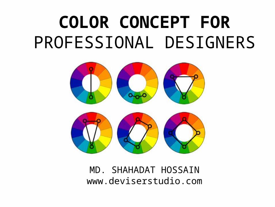
COLOR CONCEPT FOR PROFESSIONAL DESIGNERS
MD. SHAHADAT HOSSAINwww.deviserstudio.com
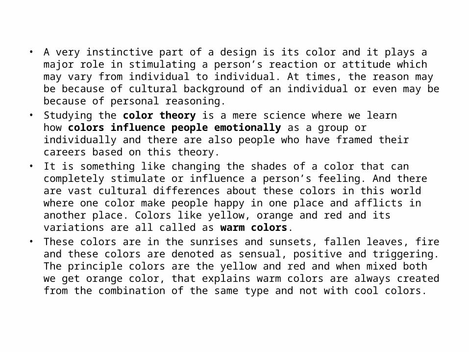
• A very instinctive part of a design is its color and it plays a major role in stimulating a person’s reaction or attitude which may vary from individual to individual. At times, the reason may be because of cultural background of an individual or even may be because of personal reasoning.
• Studying the color theory is a mere science where we learn how colors influence people emotionally as a group or individually and there are also people who have framed their careers based on this theory.
• It is something like changing the shades of a color that can completely stimulate or influence a person’s feeling. And there are vast cultural differences about these colors in this world where one color make people happy in one place and afflicts in another place. Colors like yellow, orange and red and its variations are all called as warm colors.
• These colors are in the sunrises and sunsets, fallen leaves, fire and these colors are denoted as sensual, positive and triggering. The principle colors are the yellow and red and when mixed both we get orange color, that explains warm colors are always created from the combination of the same type and not with cool colors.
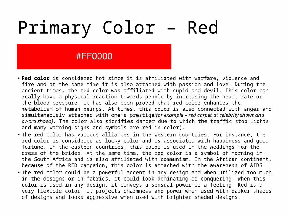
Primary Color – Red
• Red color is considered hot since it is affiliated with warfare, violence and fire and at the same time it is also attached with passion and love. During the ancient times, the red color was affiliated with cupid and devil. This color can really have a physical reaction towards people by increasing the heart rate or the blood pressure. It has also been proved that red color enhances the metabolism of human beings. At times, this color is also connected with anger and simultaneously attached with one’s prestige(for example – red carpet at celebrity shows and award shows). The color also signifies danger due to which the traffic stop lights and many warning signs and symbols are red in color).
• The red color has various alliances in the western countries. For instance, the red color is considered as lucky color and is associated with happiness and good fortune. In the eastern countries, this color is used in the weddings for the dress of the brides. At the same time, the red color is a symbol of morning in the South Africa and is also affiliated with communism. In the African continent, because of the RED campaign, this color is attached with the awareness of AIDS.
• The red color could be a powerful accent in any design and when utilized too much in the designs or in fabrics, it could look dominating or conquering. When this color is used in any design, it conveys a sensual power or a feeling. Red is a very flexible color; it projects charmness and power when used with darker shades of designs and looks aggressive when used with brighter shaded designs.
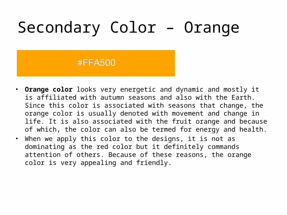
Secondary Color – Orange
• Orange color looks very energetic and dynamic and mostly it is affiliated with autumn seasons and also with the Earth. Since this color is associated with seasons that change, the orange color is usually denoted with movement and change in life. It is also associated with the fruit orange and because of which, the color can also be termed for energy and health.
• When we apply this color to the designs, it is not as dominating as the red color but it definitely commands attention of others. Because of these reasons, the orange color is very appealing and friendly.
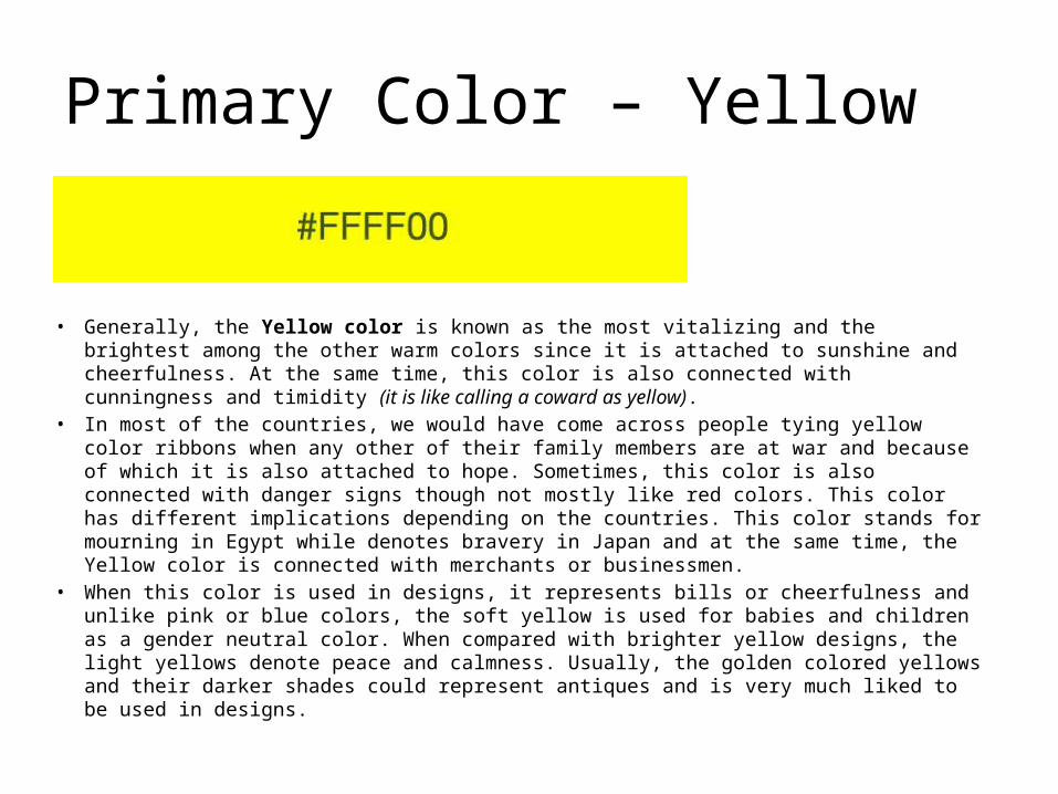
Primary Color – Yellow
• Generally, the Yellow color is known as the most vitalizing and the brightest among the other warm colors since it is attached to sunshine and cheerfulness. At the same time, this color is also connected with cunningness and timidity (it is like calling a coward as yellow).
• In most of the countries, we would have come across people tying yellow color ribbons when any other of their family members are at war and because of which it is also attached to hope. Sometimes, this color is also connected with danger signs though not mostly like red colors. This color has different implications depending on the countries. This color stands for mourning in Egypt while denotes bravery in Japan and at the same time, the Yellow color is connected with merchants or businessmen.
• When this color is used in designs, it represents bills or cheerfulness and unlike pink or blue colors, the soft yellow is used for babies and children as a gender neutral color. When compared with brighter yellow designs, the light yellows denote peace and calmness. Usually, the golden colored yellows and their darker shades could represent antiques and is very much liked to be used in designs.
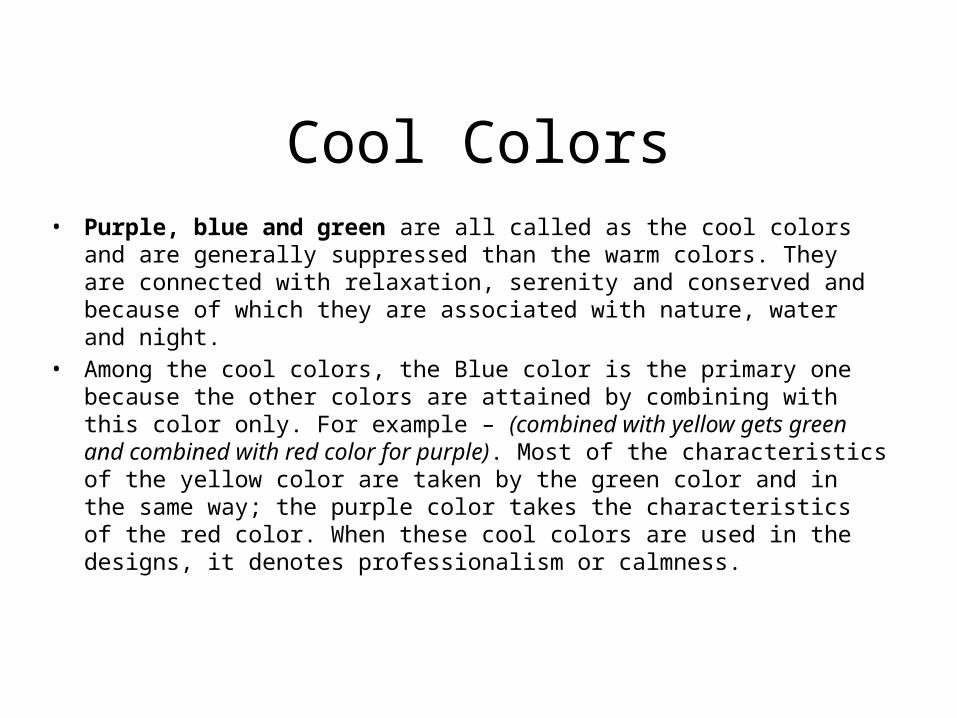
Cool Colors• Purple, blue and green are all called as the cool colors and are generally
suppressed than the warm colors. They are connected with relaxation, serenity and conserved and because of which they are associated with nature, water and night.
• Among the cool colors, the Blue color is the primary one because the other colors are attained by combining with this color only. For example – (combined with yellow gets green and combined with red color for purple). Most of the characteristics of the yellow color are taken by the green color and in the same way; the purple color takes the characteristics of the red color. When these cool colors are used in the designs, it denotes professionalism or calmness.
Primary Color – Blue
• In the language of English, the Blue color represents sadness or depression. It can also be associated with authority and quietness. The light blue colors denote friendliness and freshness while the dark blues are more trustworthy and powerful. In many country’s tradition and culture, this color is generally connected with the religious and spiritual significance. (For instance, the Virgin Mary wears a blue robe in the churches).
• The implications of the blue color largely depend on the degree of its shade and complexion. The design is distinguished on the shade or the type of blue color you choose. The bright colors in designs denote refreshment and energy while light blue colors denote calmness and relaxation. The dark blue colors in designs are very apt for company sites or in the sites that largely needs dependability and strength.

Secondary Color – Purple
• The Purple color is always connected with supremacy or royalty. This color is attained when we combine the blue and red colors and thus it has the characteristics of both the colors. In general, purple stands for fantasy and creativeness while this color is associated with mourning in the country of Thailand. Generally, light purples are very soft and stand for romance and spring while dark purples are connected with prosperity and aristocracy. When this color is used in designs, it gives a royal and a luxury effect.
Secondary Color – Green
• Green is an earthly color that denotes birth and development and also indicates prosperity and recurrence and at the same time, this color also stands for jealousness and hatred. Most of the characteristics of blue and some characteristics of yellow are also affiliated with the green color. When this color is applied in designs, it gives a harmonizing and an adapting effect and is also quite resistant. The green color would also be suitable for designs that are described to recurrence, prosperity, nature and perseverance. Olive green colors stands for the universal while the brighter greens are vitalizing and energetic. The darker greens are associated with stability and wealth.

Thank You
Md. Shahadat HossainGraphic Designer
Hire MeFiverr : www. goo.gl/mhkzRW