Collection of my images
18
COLLECTION OF MY IMAGES
-
Upload
chloe-howcroft -
Category
Education
-
view
96 -
download
6
Transcript of Collection of my images

COLLECTION OF MY IMAGES

Here are all of the images I took, all of which are for my contents page. As aforementioned in my planning, I aimed to experiment with different shots and angles, so as to capture the best images possible.
CONTENTS PAGE

This is the selection of images I think are the most effective, which I have already begun to manipulate, as they will probably be placed in my magazine. The next few sides will include descriptions on how I have manipulated some of these images, with explanations as to why I have done so in that way.

These are some of the images that did not come out as effectively as the others; i.e. they are out of focus.

DOUBLE PAGE SPREAD


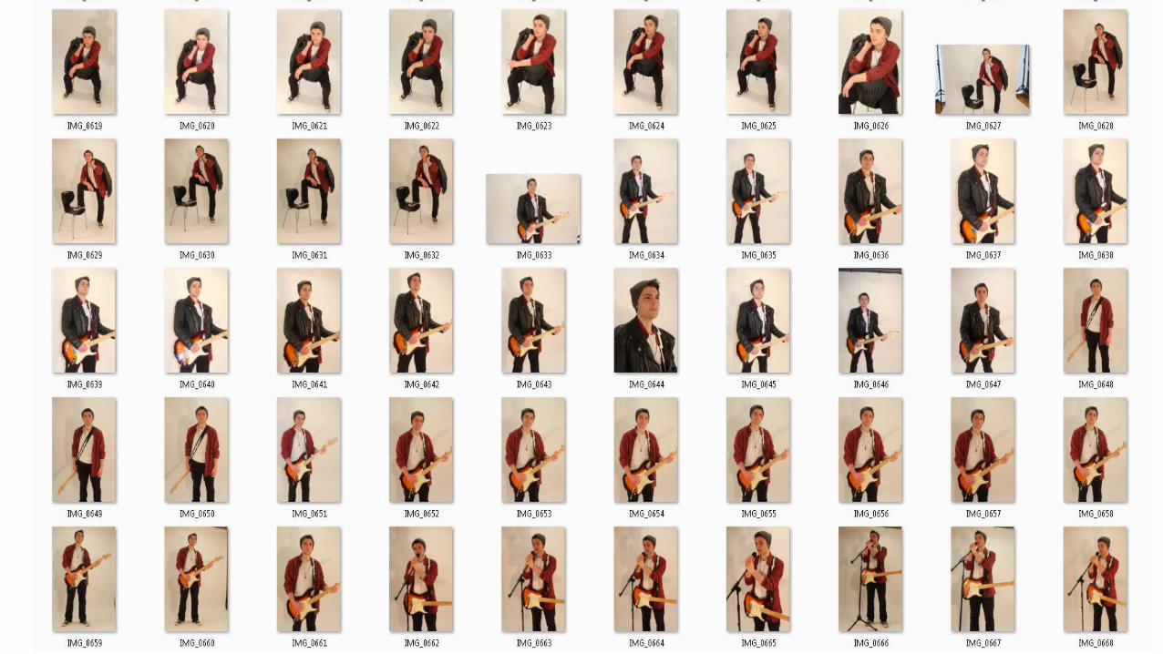
These are the images that I may potentially use for my double page spread because they really capture the message I am trying to convey: my upcoming artist is a hardworking, dedicated individual, who is very passionate about their music. At the same time, he is very laid back, hence he is casually sitting down, working on his music. It also represents the indie rock music fairly well with his laid-back approach to life, which can be seen through his relaxed approach towards the camera to make him appear friendly and inviting. The images that I have edited initially using iPiccy are using a black and white filter to look slightly retro and stripped back which adds for an atmospheric effect.

These are the images which did not come out so well. The bottom 3 images, in particular, came out too dark which means that you can’t see the subject of my image, Josh, very well. Also, the other images were either blurry, slightly out of focus, or simply did not fit the message very well.

FRONT COVER


With this image, I have the idea to use it as an album cover – which is fitting given that I aim to include a ‘FREE CD’ in my magazine.
These images would potentially be used for my main front cover image. I particularly like the long shot, because this fits well with my drafts for my front cover. My focus was to capture a long shot or medium shot, which means I could then work the headlines, sub headlines and other features around this image, which will be the centre of visual interest.


These images could potentially be used for my double page spread as well, as a whole image covering an entire page. This fits well with one of my plans for my double page spread, and especially with these props, particularly with the microphone and the last image with the guitar and the chair, I can create an interesting story around these images. That said, I believe I will still stick to using the wide shot, with Josh in the recording studio, as it truly emphasises my message of Josh being a hardworking upcoming artist. The recording studio is also a professional location to capture for a professional looking product.

I dislike these photos because they are too out of focus, and Josh isn’t looking in the camera for some of them. I prefer having Josh looking into the camera, especially for my front cover image, so then, through eye contact, the story can really engage with and captivate the customers.