Coldplay-Digipak deconstruction
7
Digipak deconstruction Coldplay Viva La Vida
-
Upload
ben-amatruda -
Category
Documents
-
view
322 -
download
0
description
Transcript of Coldplay-Digipak deconstruction
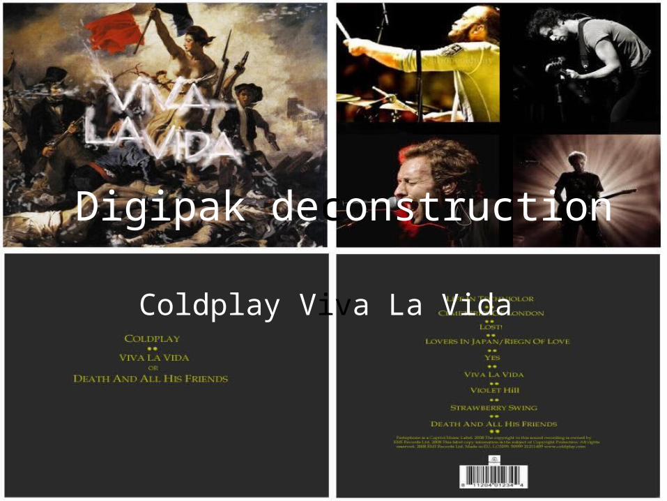
Digipak deconstruction
Coldplay Viva La Vida
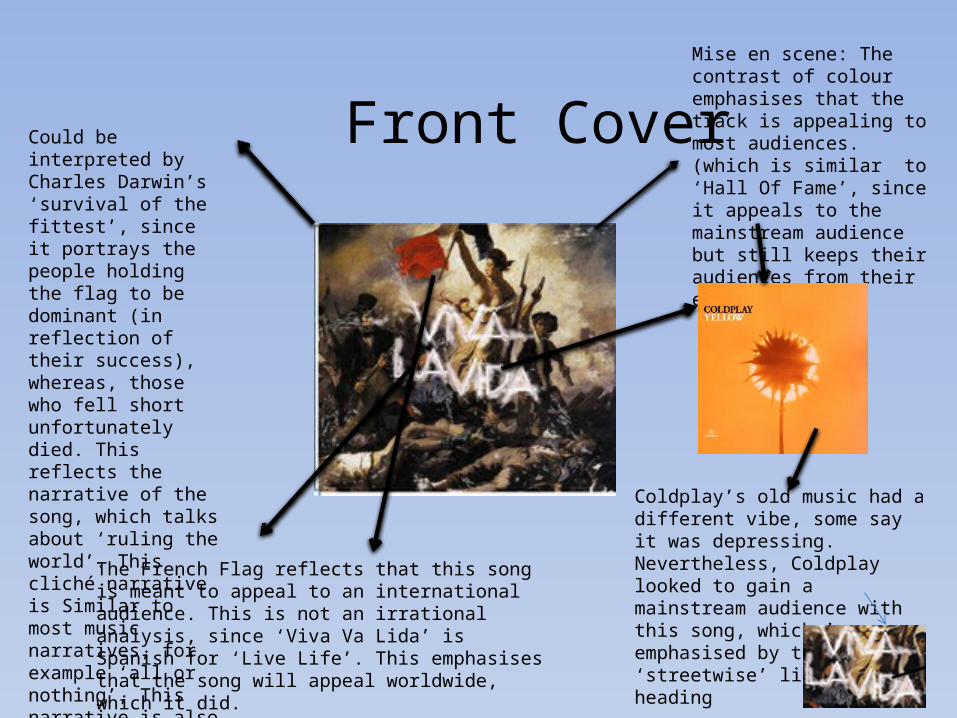
Front CoverMise en scene: The contrast of colour emphasises that the track is appealing to most audiences. (which is similar to ‘Hall Of Fame’, since it appeals to the mainstream audience but still keeps their audiences from their earlier albums)
Could be interpreted by Charles Darwin’s ‘survival of the fittest’, since it portrays the people holding the flag to be dominant (in reflection of their success), whereas, those who fell short unfortunately died. This reflects the narrative of the song, which talks about ‘ruling the world’. This cliché narrative is Similar to most music narratives, for example ‘all or nothing’, This narrative is also used in ‘Hall of fame’.
Coldplay’s old music had a different vibe, some say it was depressing. Nevertheless, Coldplay looked to gain a mainstream audience with this song, which is emphasised by the ‘streetwise’ like graffiti heading
The French Flag reflects that this song is meant to appeal to an international audience. This is not an irrational analysis, since ‘Viva Va Lida’ is Spanish for ‘Live Life’. This emphasises that the song will appeal worldwide, which it did.
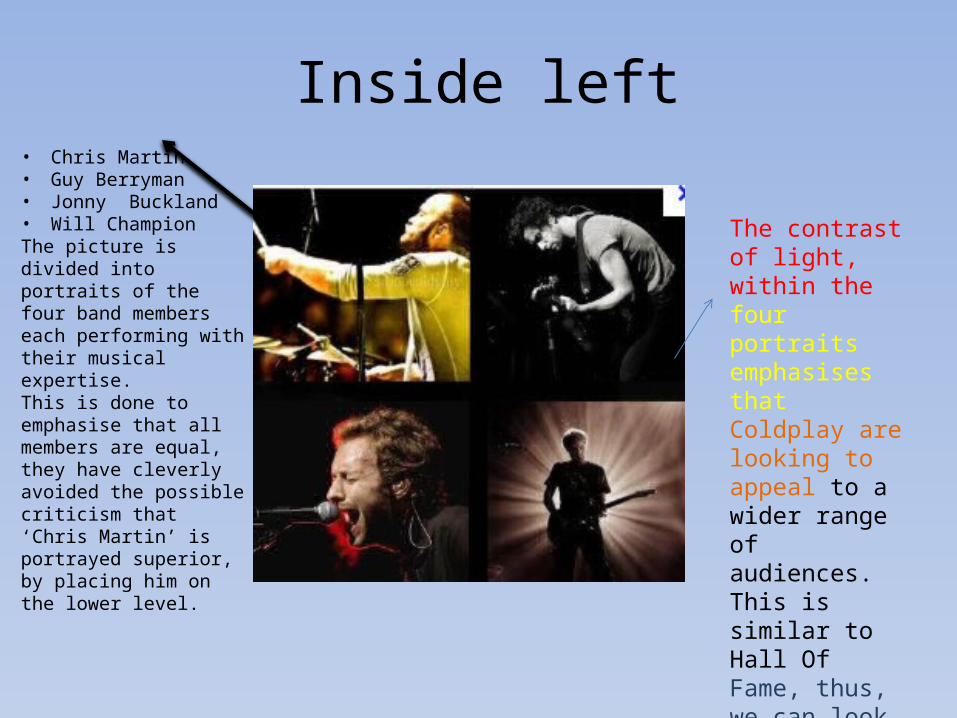
Inside left• Chris Martin• Guy Berryman• Jonny Buckland• Will ChampionThe picture is divided into portraits of the four band members each performing with their musical expertise.This is done to emphasise that all members are equal, they have cleverly avoided the possible criticism that ‘Chris Martin’ is portrayed superior, by placing him on the lower level.
The contrast of light, within the four portraits emphasises that Coldplay are looking to appeal to a wider range of audiences. This is similar to Hall Of Fame, thus, we can look to use a contrast of light within our digipak.
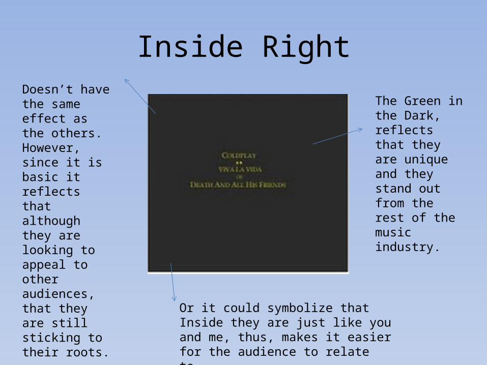
Inside RightDoesn’t have the same effect as the others. However, since it is basic it reflects that although they are looking to appeal to other audiences, that they are still sticking to their roots.
Or it could symbolize that Inside they are just like you and me, thus, makes it easier for the audience to relate to.
The Green in the Dark, reflects that they are unique and they stand out from the rest of the music industry.

The Back
Reflecting their message to the audience, drawing away from the message of love and heartbreak, which is constantly referred to within the music industry.
Just has to be there, so it can sell.
The structure shows that the fans are the backbone of the band. Since, they wouldn’t be able to achieve without their fans. Which naively fans always believe. Thus, works sufficiently well.
Helping create my digipak
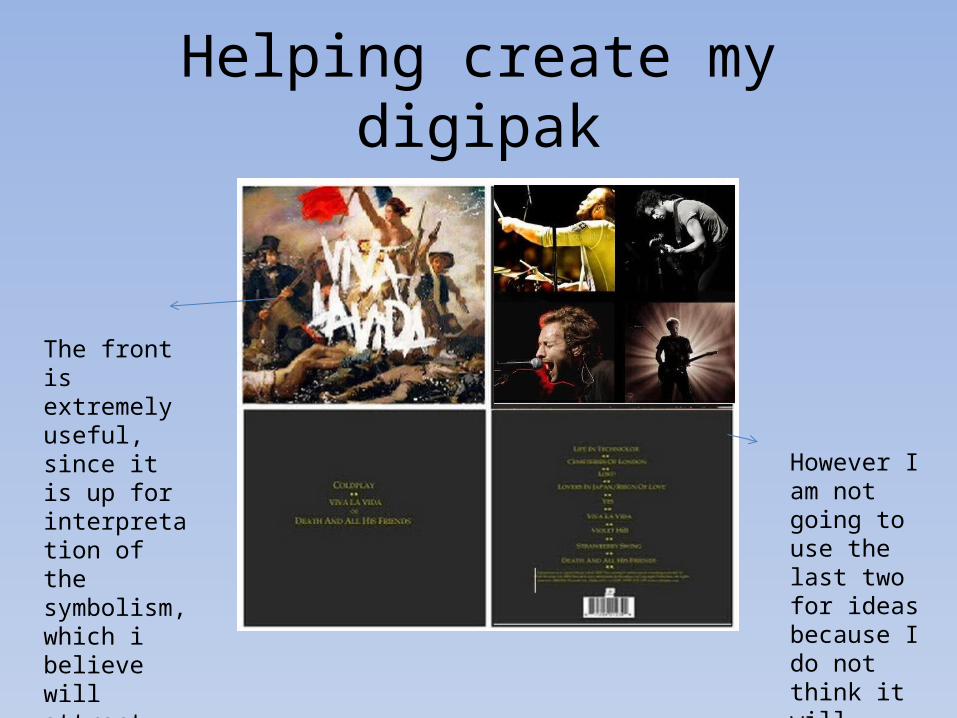
The front is extremely useful, since it is up for interpretation of the symbolism, which i believe will attract the audience, because audiences like making links.
However I am not going to use the last two for ideas because I do not think it will appeal to teenagers.

.....I am very keen on this idea because it reflects equality and the British public love to try and promote this.
I think the title lightens up the mood of the picture, however I’m not keen on the graffiti, but my target audience most probably will do therefore, I will consider using this technique.
I think the contrast of light works very well, thus, I will consider using this when creating my digipak.