CLASSE: 4PLSC ALUNNI: CASOTTO, MARIUZ, PLETTCLASSE: 4PLSC ALUNNI: CASOTTO, MARIUZ, PLETT FORENSIC...
9
CLASSE: 4PLSC ALUNNI: CASOTTO, MARIUZ, PLETT FORENSIC GRAPHOLOGY The present work aims at sharing the results of the information gathered during the session on forensic graphology by the expert Ms. Sara Cordella, a forensic graphologist herself. It is part of what goes under the name of “percorsi per le competenze trasversali e per l’orientamento”, a learning session considered compulsory in the curriculum of Italian State Secondary schools. the idea is to offer students an occasion to experiment what some job positions may be like so that the experience may work as guidance. The professional profile of a graphologist is strictly connected with the interpretation of the way ones writes. It follows that a graphologist should be provided with documents, letters or other texts that represent the object of their interpretative work / should have access to the text of he/she who is the owner of the text under analysis. The 1 st section of the work will be devoted to illustrating the instructions and guide lines provided during the learning sessions. Indeed, they are related to the different writing aspects of the texts under discussion. The 2 nd section will offer some illustrating examples from different sources. The 3 rd section will record our efforts: we translated the guide-lines into an interpretative practice to show the competences we have gained. The conclusion will discuss the process work and its results commenting on points of strength and weakness. THE 1 ST AND 2 ND SECTION The work will go on focusing the attention on some of the 101 graphological signs reported into Moretti’s “Trattato di grafologia”, reporting also some illustrating samples. In particular, the work will analyse the Curved and Angular sign, the Letters Leaning sign and the Parallel writing sign. • The Curved and the Angular sign 1. The Curved sign The Curved sign proceeds without stumbling and stopping and with a round course. It is a sign of adaptation, sociality, extroversion of feeling, goodness, openness to understanding. Indeed, who writes in a curved way is generous, lovable, helpful, open. So, the Curved sign revolves around two basic meanings: adaptability and altruism. This is because the Curved sign indicates that the personality favours the overall approach as it seeks a meeting using a movement that goes around. However, when the curves increase in intensity, it takes on a negative connotation because the adaptability could become surrender. Indeed, a too curved-calligraphy is typical of the people who lose the resistance.
Transcript of CLASSE: 4PLSC ALUNNI: CASOTTO, MARIUZ, PLETTCLASSE: 4PLSC ALUNNI: CASOTTO, MARIUZ, PLETT FORENSIC...

CLASSE: 4PLSC ALUNNI: CASOTTO, MARIUZ, PLETT
FORENSIC GRAPHOLOGY
The present work aims at sharing the results of the information gathered during the session on forensic graphology by the expert Ms. Sara Cordella, a forensic graphologist herself. It is part of what goes under the name of “percorsi per le competenze trasversali e per l’orientamento”, a learning session considered compulsory in the curriculum of Italian State Secondary schools. the idea is to offer students an occasion to experiment what some job positions may be like so that the experience may work as guidance. The professional profile of a graphologist is strictly connected with the interpretation of the way ones writes. It follows that a graphologist should be provided with documents, letters or other texts that represent the object of their interpretative work / should have access to the text of he/she who is the owner of the text under analysis. The 1st section of the work will be devoted to illustrating the instructions and guide lines provided during the learning sessions. Indeed, they are related to the different writing aspects of the texts under discussion. The 2nd section will offer some illustrating examples from different sources. The 3rd section will record our efforts: we translated the guide-lines into an interpretative practice to show the competences we have gained. The conclusion will discuss the process work and its results commenting on points of strength and weakness. THE 1ST AND 2ND SECTION The work will go on focusing the attention on some of the 101 graphological signs reported into Moretti’s “Trattato di grafologia”, reporting also some illustrating samples. In particular, the work will analyse the Curved and Angular sign, the Letters Leaning sign and the Parallel writing sign. • The Curved and the Angular sign
1. The Curved sign
The Curved sign proceeds without stumbling and stopping and with a round course. It is a sign of adaptation, sociality, extroversion of feeling, goodness, openness to understanding. Indeed, who writes in a curved way is generous, lovable, helpful, open. So, the Curved sign revolves around two basic meanings: adaptability and altruism. This is because the Curved sign indicates that the personality favours the overall approach as it seeks a meeting using a movement that goes around. However, when the curves increase in intensity, it takes on a negative connotation because the adaptability could become surrender. Indeed, a too curved-calligraphy is typical of the people who lose the resistance.
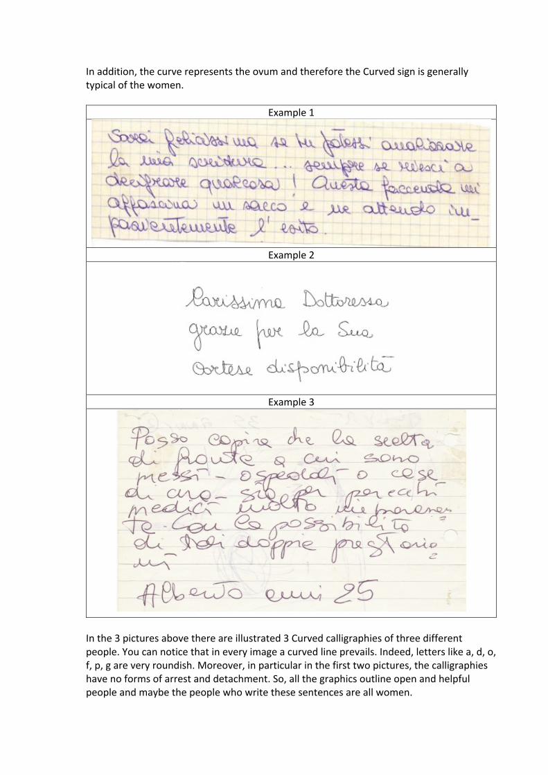
In addition, the curve represents the ovum and therefore the Curved sign is generally typical of the women.
Example 1
Example 2
Example 3
In the 3 pictures above there are illustrated 3 Curved calligraphies of three different people. You can notice that in every image a curved line prevails. Indeed, letters like a, d, o, f, p, g are very roundish. Moreover, in particular in the first two pictures, the calligraphies have no forms of arrest and detachment. So, all the graphics outline open and helpful people and maybe the people who write these sentences are all women.

2. The Angular sign The Angular sign presents angularity in the lines, angles at the upper and lower vertices. It is a sign of introversion of feeling, resistance to change, egoism, understood as the inner drive aimed at highlighting and enhancing uniqueness. So, who has an angular calligraphy is generally wary, closed and selfish. The Angular sign revolves around the concept of the graphic action’s arrest followed by its resumption, because every snag allows the person to centre on him/herself, obscuring the needs of others. The angle is the most direct of all the possible forms of arrest, since it is based on an abrupt interruption of the movement. In addition, the angle represents the spermatozoon and therefore the Angular sign is generally typical of men.
Example 1
Example 2
Example 3
.

The 3 pictures above illustrate 3 different Angular calligraphies as you can notice by the significant presence of angles and arrests. It follows that maybe the people who have got this type of calligraphy are resistance to change and think to themselves and probably are all men.
• Letters Leaning sign
Letters leaning is the sign that represents the lack of psychic breath: it is the confidence we have in dealing with the thoughts and emotions that implies the feeling of anxiety and anguish. Who writes in this way perceives reality around him/her as a threat and lives in an anxious state that doesn’t allow him/her to face life serenely. This sign is present in the adolescents’ writing and is normal because they are still forming their personality. Therefore, if the sign has been present for a long time, it means that the adolescent has not overcome yet the separation from the maternal figure. On the contrary, when the sign is present in the adult figure is different because the adult probably hasn’t developed its possibilities staying in an adolescent insecurity. In this case the adult tries to find protection and is afraid of being abandoned by his/her partner.
Example 1
Example 2
Example 3

The element that combines these three images is due to the fact that the letters are leaned against each other, thus creating an inclined movement. Through these calligraphies shines a feeling of defence due to the diffidence, to the uncertainty in the ideas and to the insecurity in oneself.
• Parallel writing
Parallel writing requires parallel literal axes, independently from global grade. The following psychological features are associated to this type of writing: - Complete loyalty to principles, methods and directives; - Will as absolute behaviour directive; - Accurate attention for everything; - Precision. Furthermore, other behavioural aspects are associated: - Rigidity of uses and behaviour; - Excessive formalism; - Contrasts for inability to comprehend and adapt to others’ ideas; - Tendency to be suspicious and jealous; - Possessiveness.
Example 1
Example 2

Example 3
In the three pictures above it is possible to notice a common feature: axes are parallel. In general, it is common to associate a tendency to be very precise and meticulous to who wrote these sentences. This precision refers to all life aspects, from the working one (e.g. ability to follow precisely every directive) to the private one (e.g. tendency to be jealous or suspicious).
THE 3RD SECTION The present section will provide 3 different analysis of 3 different calligraphies made by us to show the competences we have gained. 1. Considering the following picture:
• The writing is at the centre of the sheet of paper. It means the person himself is the
keystone around which every decision is made; • The writing shows a small calibre because it is between 1 and 4 mm. It follows that the
person has the ability to synthetize; • The attention to maintain the line underlines the rigidity and firmness, the will to do
everything perfectly and in order and the ability to reach goals through linear ways; • Analysing the pressure is difficult because there isn’t the 3D, but you can understand that
the pression is light because the letters are so light that they often leave an evanescent, incomplete, very light trace. It shows a tendency to lose energy, but at the same time a tendency to perceive. So, the person is sensitive, generous and interested in the emotional aspects;

• The space between the words is sometimes large and other times small. It represents the space between the thought and the action. It follows that, when it is large, it means the person is thinking before writing and acting. On the contrary, when it is small, it means the person is more instinctive and he acts without thinking;
• Taking into consideration the letters, they are detached. Maybe the person chose this specific style because detaching the letters you can always understand what is written. Therefore, it implies the fear not to be understood, but at the same time removing often the pen from the paper implies more difficulty to write. In addition, the person tends to learn by fragments and so he loses the synthesis, but on the other hand he has strong analytical abilities;
• Letters like “l” or “d” are tends to go higher. It concerns with the fantastic dimension and means that the writer is imaginative and tends to the abstract things.
2. Considering the following picture:
• Focusing the attention on the position of the text in relation to the sheet of paper, in this
case it is central. It is usually linked with a rational person who tries to make always the right choice;
• The notes have an axes’ inclination towards the left, so it consists on a reversed writing. The left side generally represents the past, the relationship with the mother. The letters are pointed backwards, reflecting the inner attitude of a person who, due to past frustrations and disappointments, struggles to trust others and to imagine the future and therefore to progress, to plan and to invest in herself. So, this type of writing reveals a tendency to close in oneself and outlines a person inclined to repress emotions and not to show herself clearly to others;
• Regarding the gait of writing, it is very regular. This indicates the trust and stability of the person, in other words, it reveals a remarkable self-control;
• The caliber of the letters is big because it is more than 4 mm. It means the writer has good ability to analyze. In addition, the letters’ size is regular, and it is conforming to what has been said before, because it underlines a self-controlled person. What has just been said is verifiable also by analyzing the space between the letters, which is almost absent and therefore it reaffirms the writer’s introversion;

• Going on considering the individual letters within the words, the high letters like “d”, “l” “b” don’t tend to go high So probably the writer isn’t very fantastic, but she prefers the concrete dimension;
• Finally, the small space between the words underlines the instinctive personality of the writer, who thinks and act without thinking too much since she leaves little space between every word .
3. Considering the following picture:
• The first thing to analyse is the position of the text in relation to the sheet of paper, which
in this case is central. It means that the person is a keystone around which every decision is made. But this doesn’t mean that the person is egocentric but, that she tries to make the most appropriate choice;
• The left margin is narrower than the right one, it follows that the person is very closed to her origins and to her family, and at the moment she has no desire of independence;
• The poles of the letters (t, l, p, d) don’t tend either upwards or downwards, so the person is very rational and doesn’t let herself be influenced by others’ opinions;
• All poles’ letters are perpendicular to the base one, so the calligraphy is straight, and it implies a sign of self-control and composure;
• The writer has got firmness and tries to reach her goals in a way or another since she maintains the line;
• It is not a very angular writing but a curved one that underlines the person is generous with others and is able to adapt herself very easily to the changes;
• There are some crumpled letters (such as D, a, p, o) that are a symbol of a person who has a difficulty entering into relationship with others, often for fear of live the memory of negative experiences;
• Talking about the pressure, the energy used is light, easily discharged, indicating great sensitivity, delicacy of mind and more interest in the psychological emotional aspects. It’s an indication of a sensitive and empathic nature and underlines the inclination to get rarely wrong.
• The calibre of calligraphy is about 3mm (quite big) therefore the person hides a basically introverted character, leading a detailed analysis of the events: for her nothing happens by chance but is the result of an accurate premeditation;
• The space between the words is small, it follows that the person has a fairly instinctive character and often leaves no space for her thought.