Chromophilia -loving colours
62
-
Upload
joanna-bodzek -
Category
Documents
-
view
224 -
download
2
description
Is a CONCEPT focused on the role thatCOLOUR plays in ARTs and fashion. The maingoal of the project is to make people aware ofcolour forecasting mechanisms while developing a whole new approach to understanding colour.
Transcript of Chromophilia -loving colours
CHROMOPHILIA loving colours
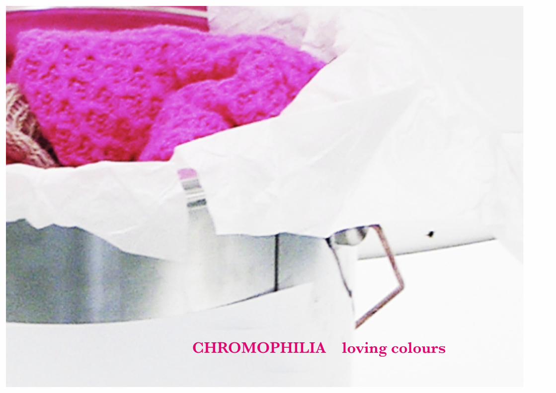
CHROMOPHILIA loving colours
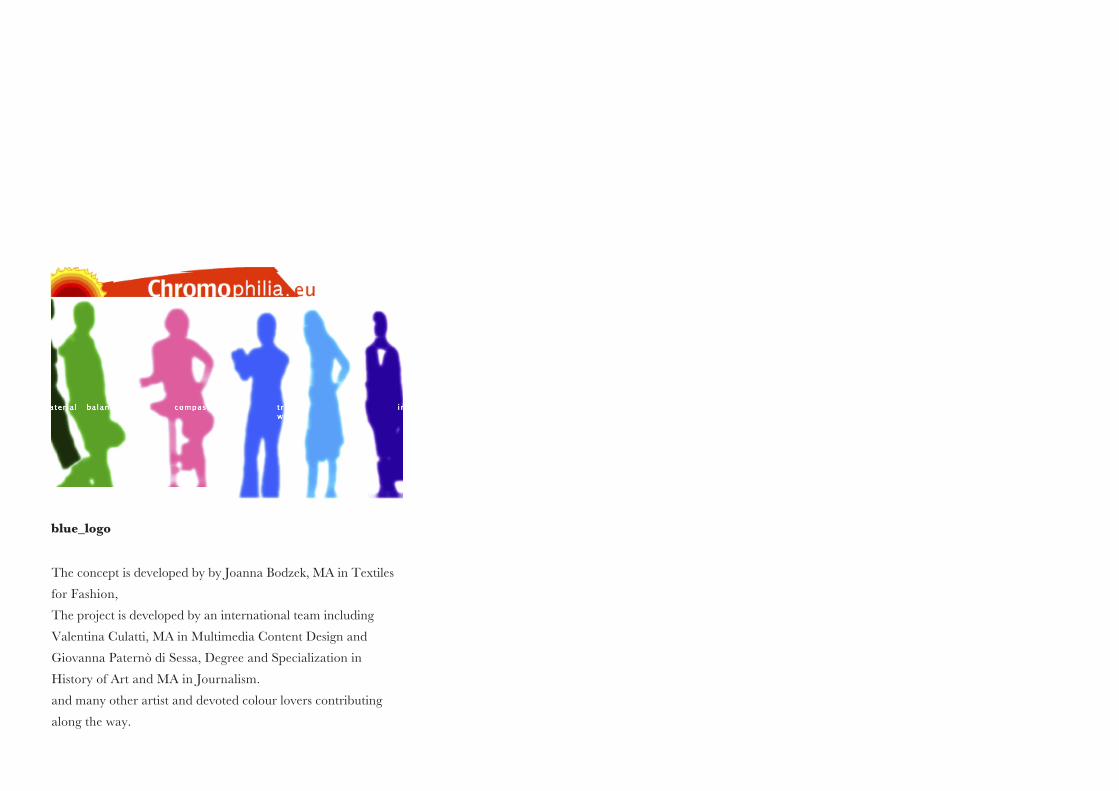
The concept is developed by by Joanna Bodzek, MA in Textiles
for Fashion,
The project is developed by an international team including
Valentina Culatti, MA in Multimedia Content Design and
Giovanna Paternò di Sessa, Degree and Specialization in
History of Art and MA in Journalism.
and many other artist and devoted colour lovers contributing
along the way.
blue_logo


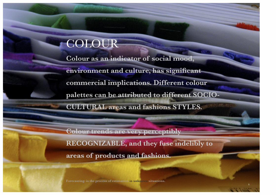
COLOURColour as an indicator of social mood,
environment and culture, has significant
commercial implications. Different colour
palettes can be attributed to different SOCIO-
CULTURAL areas and fashions STYLES.
Colour trends are very perceptibly
RECOGNIZABLE, and they fuse indelibly to
areas of products and fashions.
Forecasting: is the process of estimation in unknown situations. 1
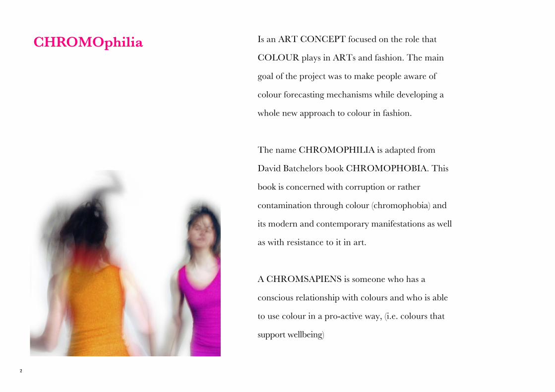
CHROMOphilia Is an ART CONCEPT focused on the role that
COLOUR plays in ARTs and fashion. The main
goal of the project was to make people aware of
colour forecasting mechanisms while developing a
whole new approach to colour in fashion.
The name CHROMOPHILIA is adapted from
David Batchelors book CHROMOPHOBIA. This
book is concerned with corruption or rather
contamination through colour (chromophobia) and
its modern and contemporary manifestations as well
as with resistance to it in art.
A CHROMSAPIENS is someone who has a
conscious relationship with colours and who is able
to use colour in a pro-active way, (i.e. colours that
support wellbeing)
2
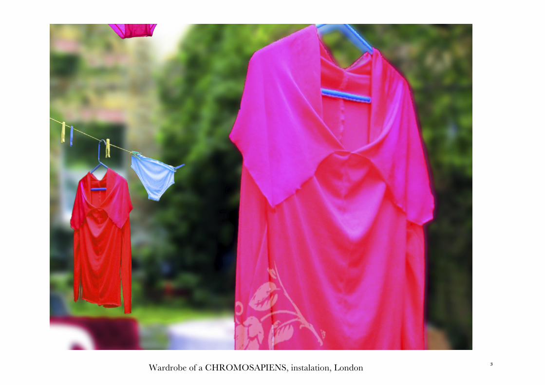
Wardrobe of a CHROMOSAPIENS, instalation, London 3
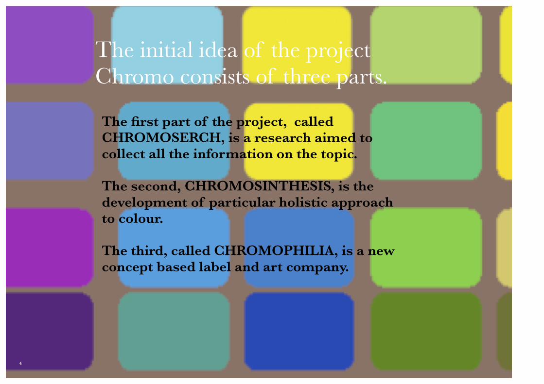
The first part of the project, called CHROMOSERCH, is a research aimed to collect all the information on the topic.
The second, CHROMOSINTHESIS, is the development of particular holistic approach to colour.
The third, called CHROMOPHILIA, is a new concept based label and art company.
The initial idea of the project Chromo consists of three parts.
4
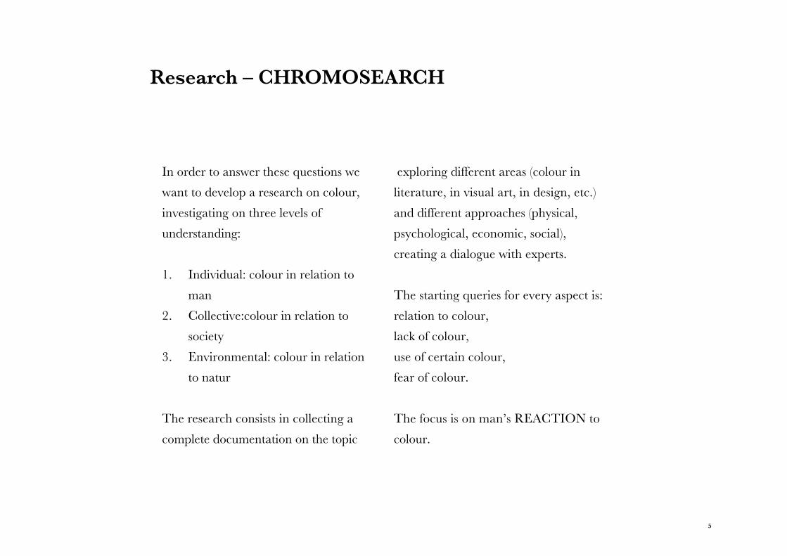
Research – CHROMOSEARCH
In order to answer these questions we
want to develop a research on colour,
investigating on three levels of
understanding:
1. Individual: colour in relation to
man
2. Collective:colour in relation to
society
3. Environmental: colour in relation
to natur
The research consists in collecting a
complete documentation on the topic
exploring different areas (colour in
literature, in visual art, in design, etc.)
and different approaches (physical,
psychological, economic, social),
creating a dialogue with experts.
The starting queries for every aspect is:
relation to colour,
lack of colour,
use of certain colour,
fear of colour.
The focus is on man’s REACTION to
colour.
5
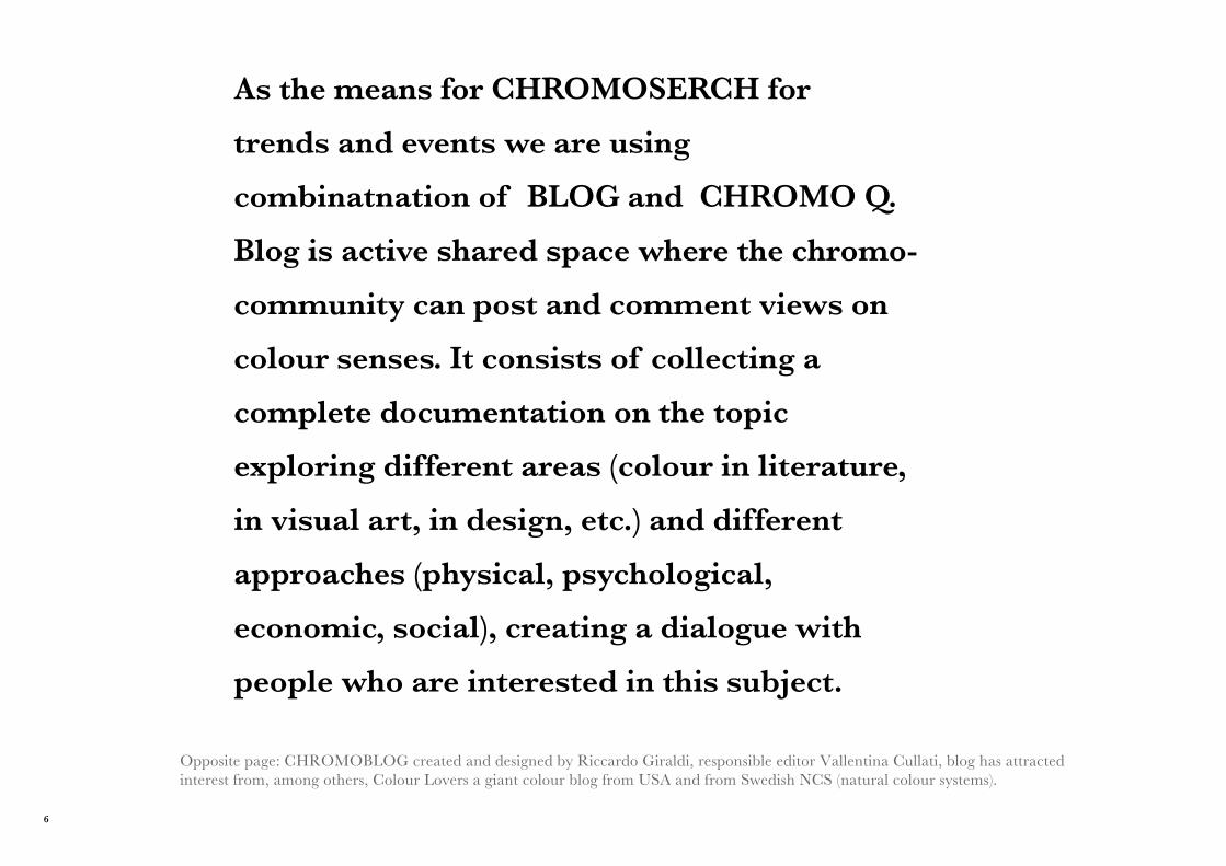
As the means for CHROMOSERCH for
trends and events we are using
combinatnation of BLOG and CHROMO Q.
Blog is active shared space where the chromo-
community can post and comment views on
colour senses. It consists of collecting a
complete documentation on the topic
exploring different areas (colour in literature,
in visual art, in design, etc.) and different
approaches (physical, psychological,
economic, social), creating a dialogue with
people who are interested in this subject.
Opposite page: CHROMOBLOG created and designed by Riccardo Giraldi, responsible editor Vallentina Cullati, blog has attracted interest from, among others, Colour Lovers a giant colour blog from USA and from Swedish NCS (natural colour systems).
6
7
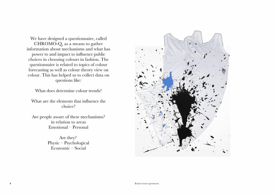
Initial visual experiments.
We have designed a questionnaire, called CHROMO-Q, as a means to gather
information about mechanisms and what has power to and impact to influence public
choices in choosing colours in fashion. The questionnaire is related to topics of colour forecasting as well as colour theory view on colour. This has helped us to collect data on
questions like:
What does determine colour trends?
What are the elements that influence the choice?
Are people aware of these mechanisms?in relation to areas
Emotional – Personal
Are they?Physic – Psychological
Economic – Social
8
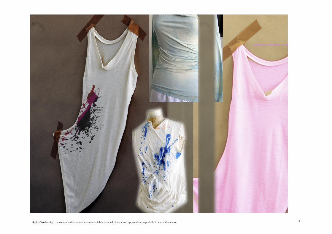
Style: Conformity to a recognized standard; manner which is deemed elegant and appropriate, especially in social demeanor. 9
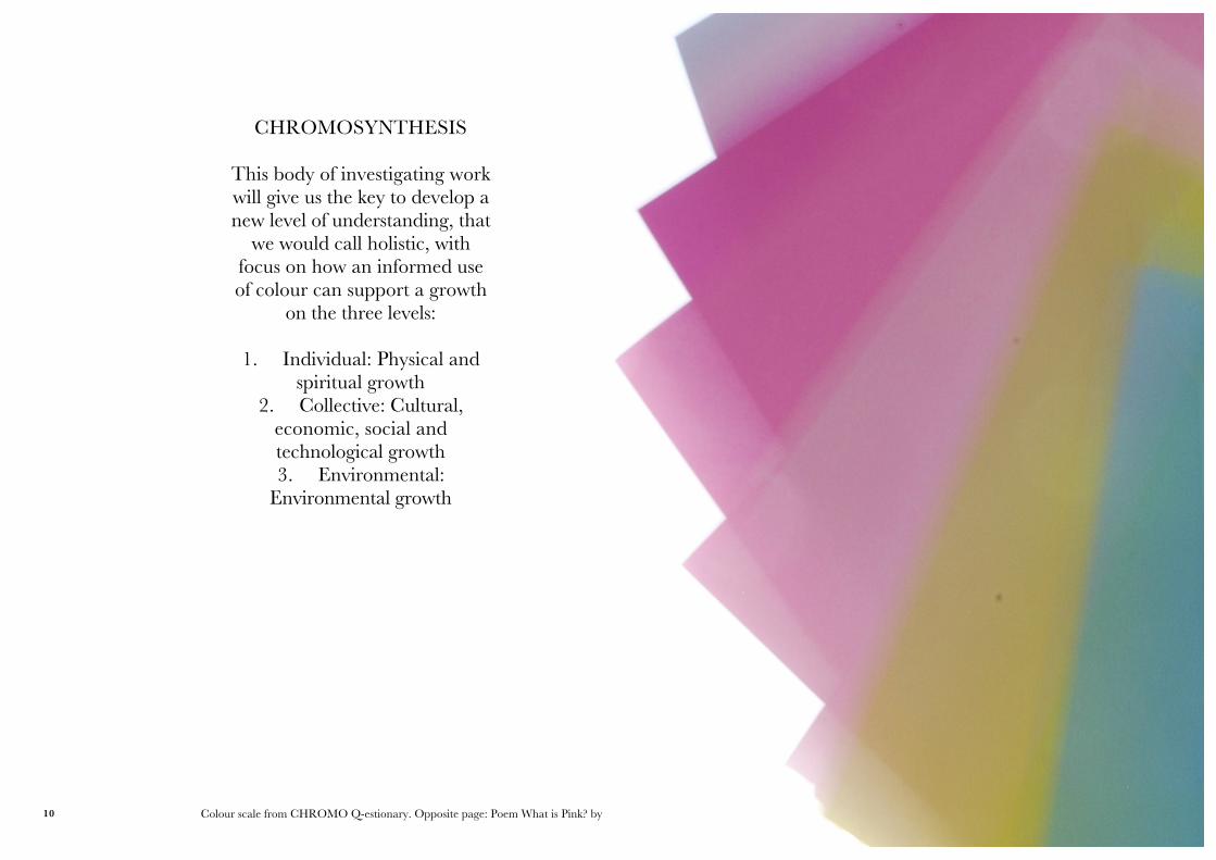
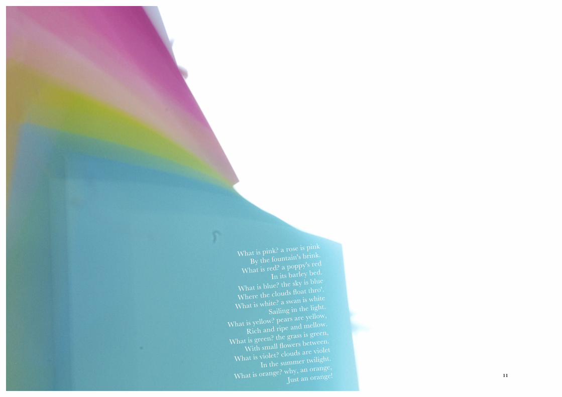
Colour scale from CHROMO Q-estionary. Opposite page: Poem What is Pink? by Christina Rossetti
What is pink? a rose is pink
By the fountain's brink.
What is red? a poppy's red
In its barley bed.
What is blue? the sky is blue
Where the clouds float thro'.
What is white? a swan is white
Sailing in the light.
What is yellow? pears are yellow,
Rich and ripe and mellow.
What is green? the grass is green,
With small flowers between.
What is violet? clouds are violet
In the summer twilight.
What is orange? why, an orange,
Just an orange!
CHROMOSYNTHESIS
This body of investigating work will give us the key to develop a new level of understanding, that
we would call holistic, with focus on how an informed use of colour can support a growth
on the three levels:
1. Individual: Physical and spiritual growth
2. Collective: Cultural, economic, social and technological growth3. Environmental:
Environmental growth
10
What is pink? a rose is pink
By the fountain's brink.
What is red? a poppy's red
In its barley bed.
What is blue? the sky is blue
Where the clouds float thro'.
What is white? a swan is white
Sailing in the light.
What is yellow? pears are yellow,
Rich and ripe and mellow.
What is green? the grass is green,
With small flowers between.
What is violet? clouds are violet
In the summer twilight.
What is orange? why, an orange,
Just an orange! 11
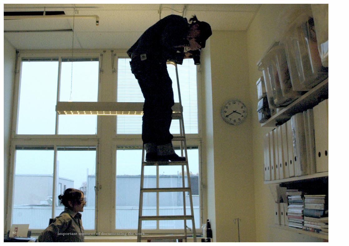
important moment of documenting the work... 12
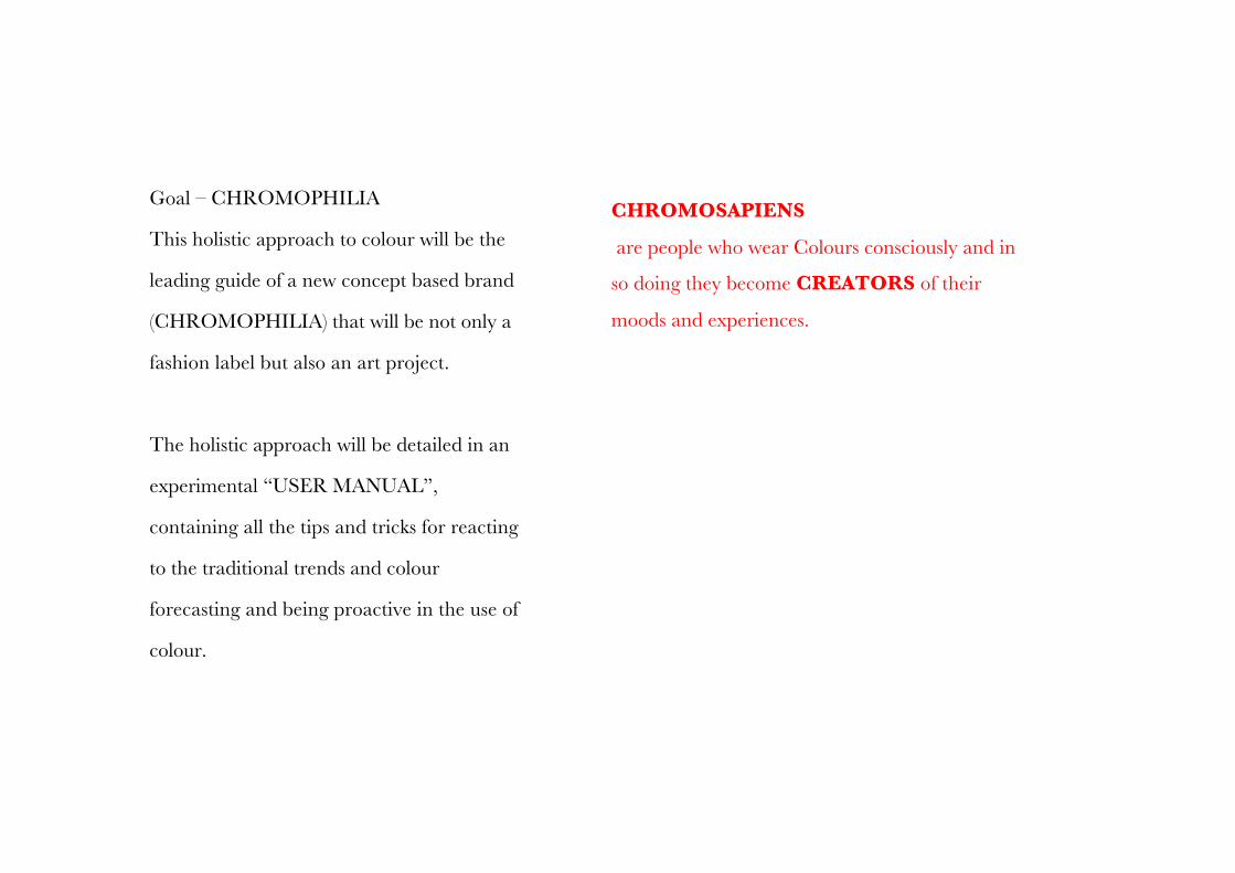
Goal – CHROMOPHILIA
This holistic approach to colour will be the
leading guide of a new concept based brand
(CHROMOPHILIA) that will be not only a
fashion label but also an art project.
The holistic approach will be detailed in an
experimental “USER MANUAL”,
containing all the tips and tricks for reacting
to the traditional trends and colour
forecasting and being proactive in the use of
colour.
CHROMOSAPIENS
are people who wear Colours consciously and in
so doing they become CREATORS of their
moods and experiences.
13
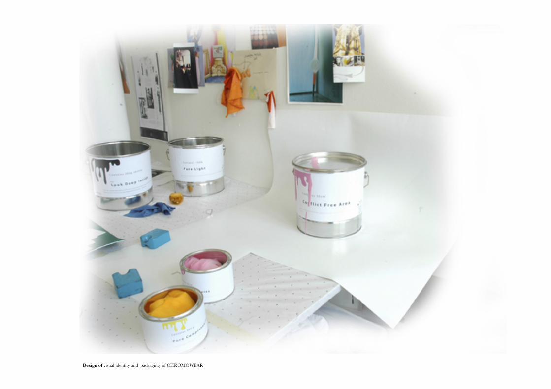
Design of visual identity and packaging of CHROMOWEAR14
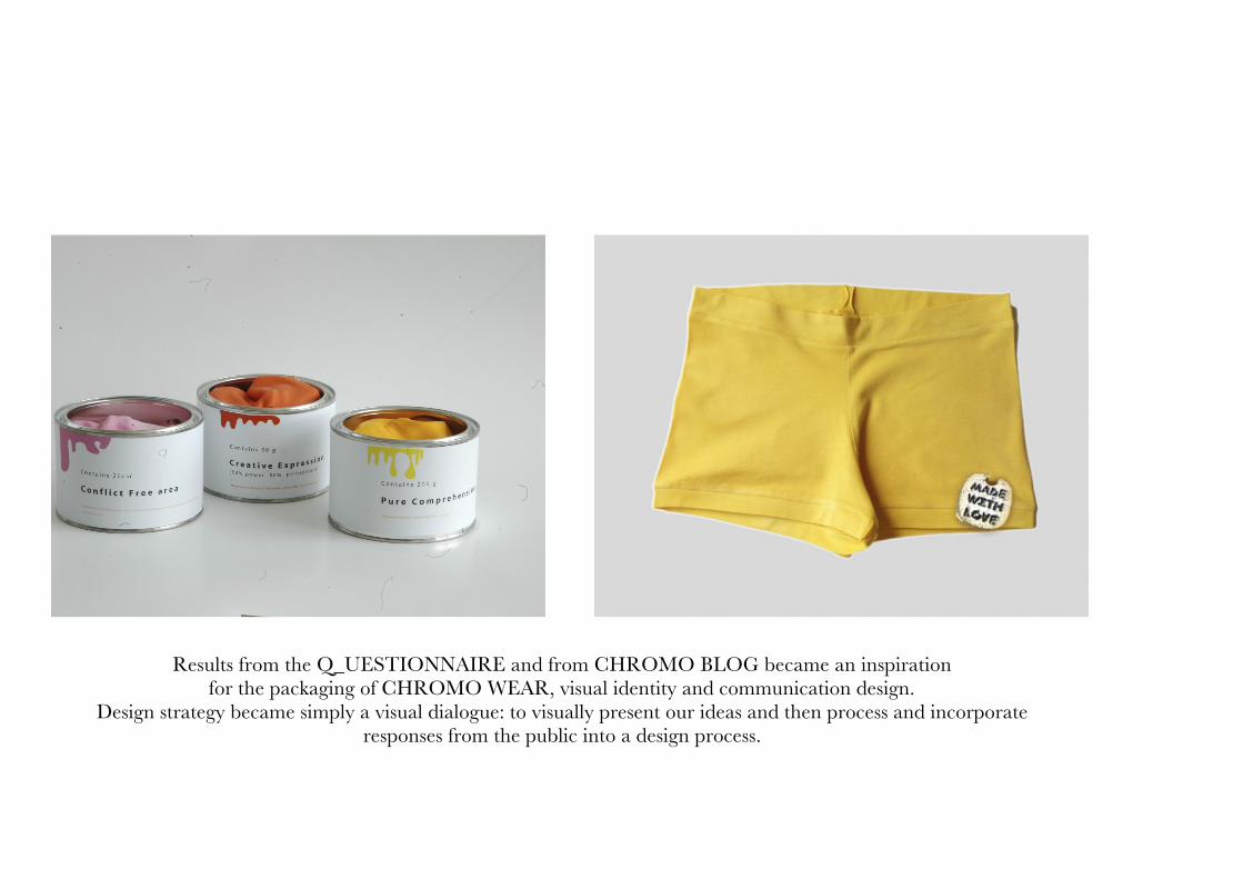
Results from the Q_UESTIONNAIRE and from CHROMO BLOG became an inspiration for the packaging of CHROMO WEAR, visual identity and communication design.
Design strategy became simply a visual dialogue: to visually present our ideas and then process and incorporate responses from the public into a design process.
15
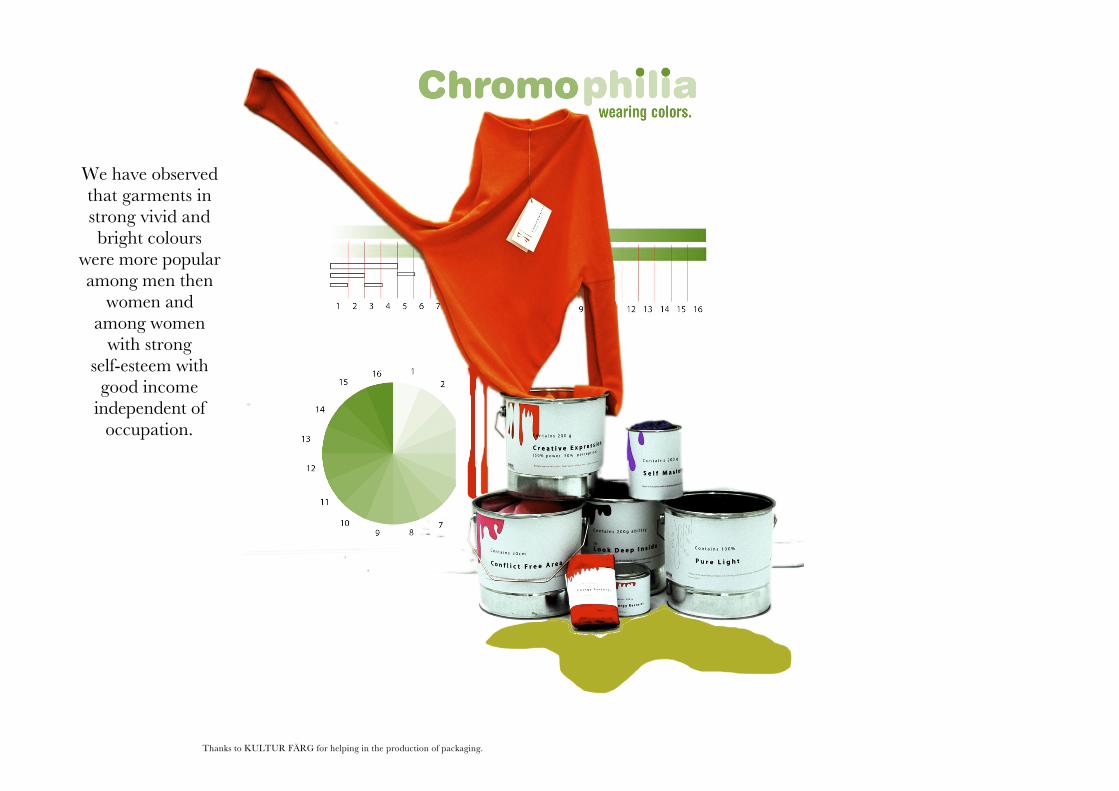
Thanks to KULTUR FÄRG for helping in the production of packaging.
We have observed that garments in strong vivid and bright colours
were more popular among men then
women and among women
with strong self-esteem with
good income independent of
occupation.
16
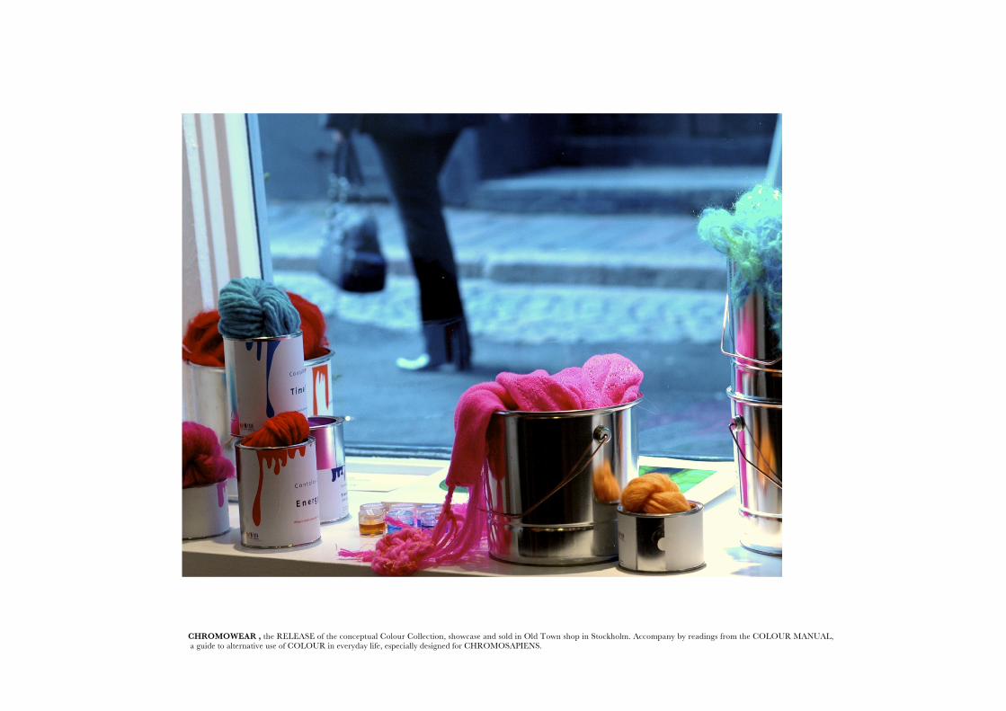
CHROMOWEAR , the RELEASE of the conceptual Colour Collection, showcase and sold in Old Town shop in Stockholm. Accompany by readings from the COLOUR MANUAL, a guide to alternative use of COLOUR in everyday life, especially designed for CHROMOSAPIENS.
17
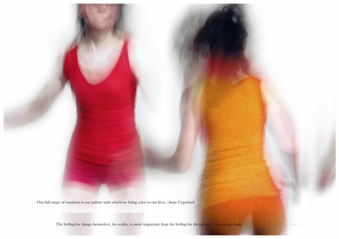
The feeling for things themselves, for reality, is more important than the feeling for the picture. (Vincent van Gogh)
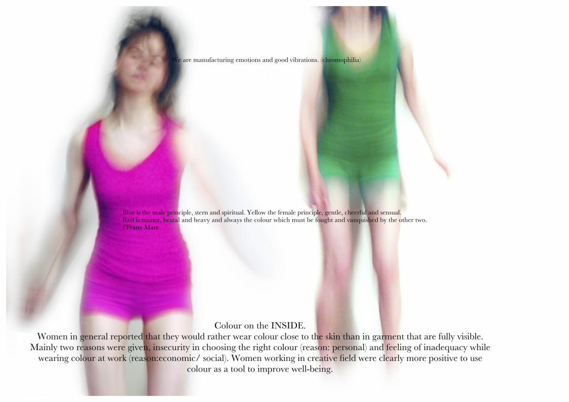
We are manufacturing emotions and good vibrations. (chromophilia)
Our full range of emotions is our palette with which we bring color to our lives. (Anne Copeland)
Blue is the male principle, stern and spiritual. Yellow the female principle, gentle, cheerful and sensual. Red is matter, brutal and heavy and always the colour which must be fought and vanquished by the other two. /Franz Marc
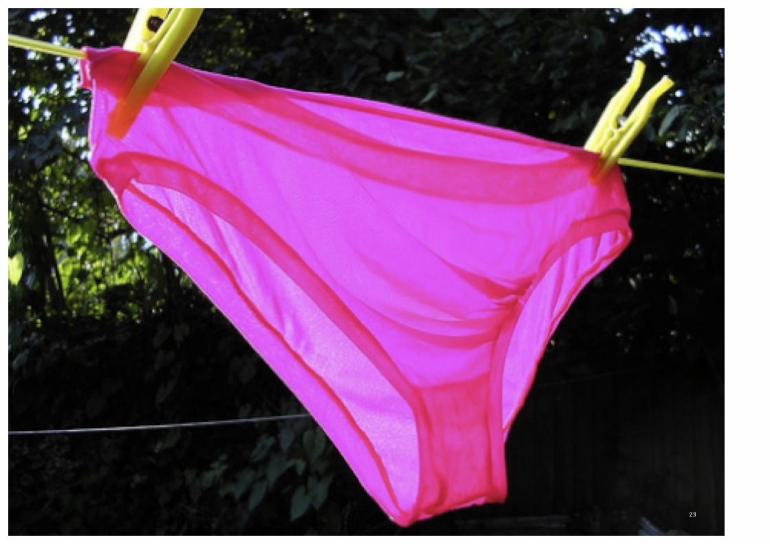
Colour on the INSIDE. Women in general reported that they would rather wear colour close to the skin than in garment that are fully visible.
Mainly two reasons were given, insecurity in choosing the right colour (reason: personal) and feeling of inadequacy while wearing colour at work (reason:economic/ social). Women working in creative field were clearly more positive to use
colour as a tool to improve well-being.18
We are manufacturing emotions and good vibrations. (chromophilia)
Blue is the male principle, stern and spiritual. Yellow the female principle, gentle, cheerful and sensual. Red is matter, brutal and heavy and always the colour which must be fought and vanquished by the other two. /Franz Marc
Colour on the INSIDE. Women in general reported that they would rather wear colour close to the skin than in garment that are fully visible.
Mainly two reasons were given, insecurity in choosing the right colour (reason: personal) and feeling of inadequacy while wearing colour at work (reason:economic/ social). Women working in creative field were clearly more positive to use
colour as a tool to improve well-being.19
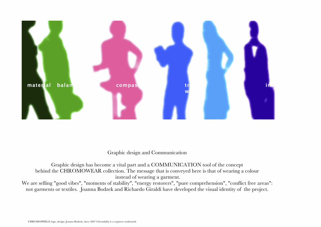
Graphic design and Communication
Graphic design has become a vital part and a COMMUNICATION tool of the conceptbehind the CHROMOWEAR collection. The message that is conveyed here is that of wearing a colour
instead of wearing a garment.We are selling "good vibes", "moments of stability", "energy restorers", "pure comprehension", "conflict free areas":
not garments or textiles. Joanna Bodzek and Richardo Giraldi have developed the visual identity of the project.
CHROMOPHILIA logo, design: Joanna Bodzek, since 2007 Chromhilia is a registere trademark.
20
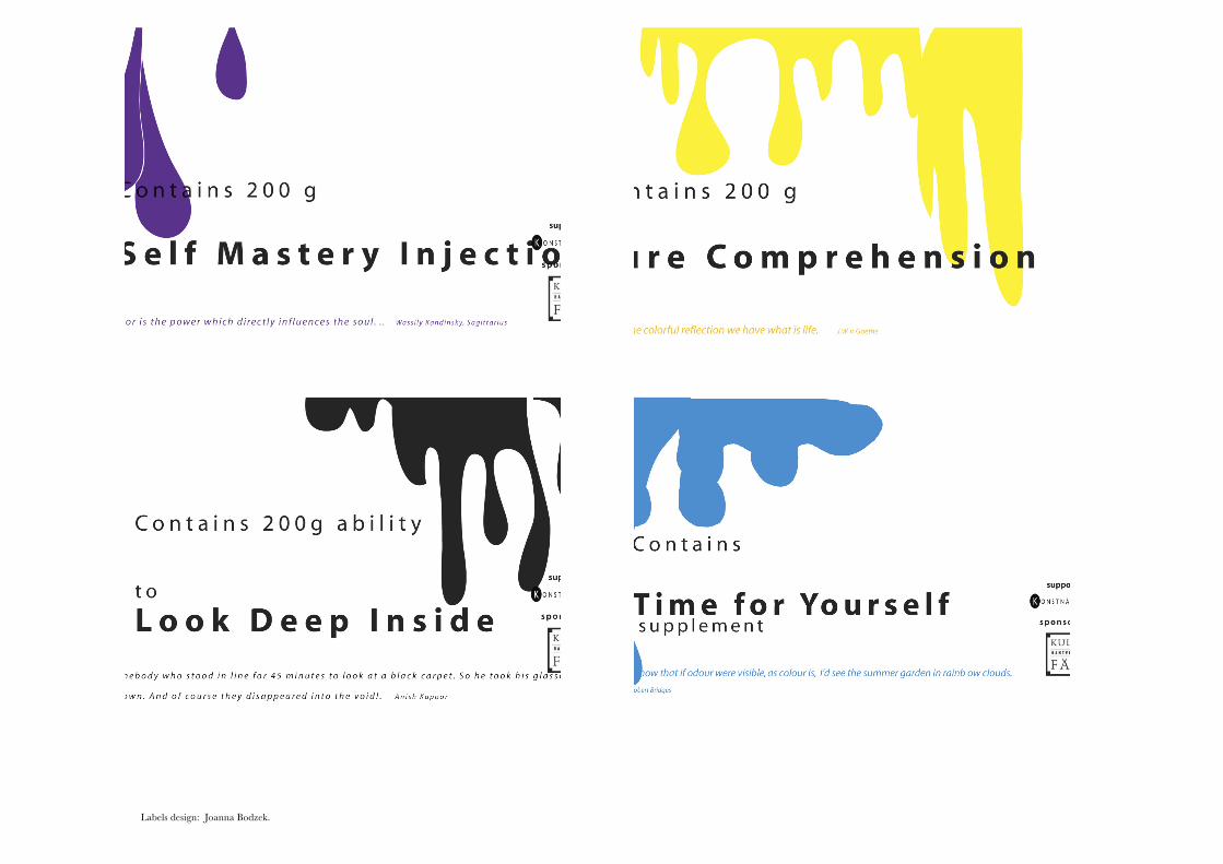
Labels design: Joanna Bodzek. 21
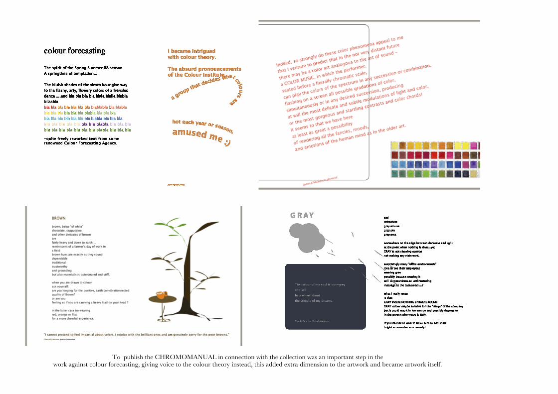
To publish the CHROMOMANUAL in connection with the collection was an important step in the work against colour forecasting, giving voice to the colour theory instead, this added extra dimension to the artwork and became artwork itself.
22
23
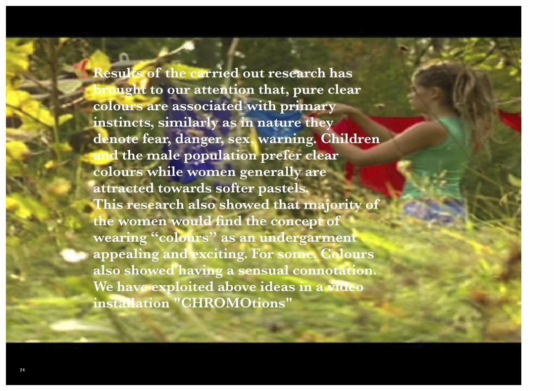
Results of the carried out research has brought to our attention that, pure clear colours are associated with primary instincts, similarly as in nature they denote fear, danger, sex, warning. Children and the male population prefer clear colours while women generally are attracted towards softer pastels.This research also showed that majority of the women would find the concept of wearing “colours” as an undergarment appealing and exciting. For some, Colours also showed having a sensual connotation. We have exploited above ideas in a video installation "CHROMOtions"
24
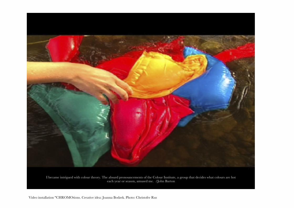
I became intrigued with colour theory. The absurd pronouncements of the Colour Institute, a group that decides what colours are hot each year or season, amused me. /John Barton
Video installation "CHROMOtions. Creative idea: Joanna Bodzek. Photo: Christofer Rus 25

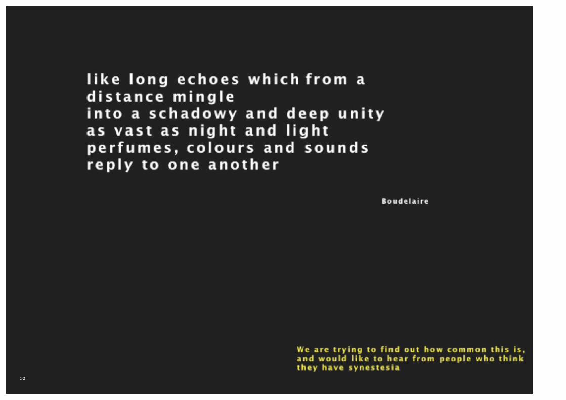
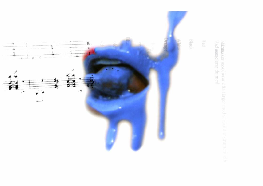
I have been fascinated by Synesthesia and this has influenced, and still does, large part oh the visual experimental work by CHROMOPHILIA.
This search for colour choosing mechanisms, trends and emotional responses to colour
brought us unexpectedly to the
world of performance art where
CHROMOPHILIA was presented in June
2008 at the International
Performance Festival “Frictions” in Uppsala
Art Museum in Sweden.
26
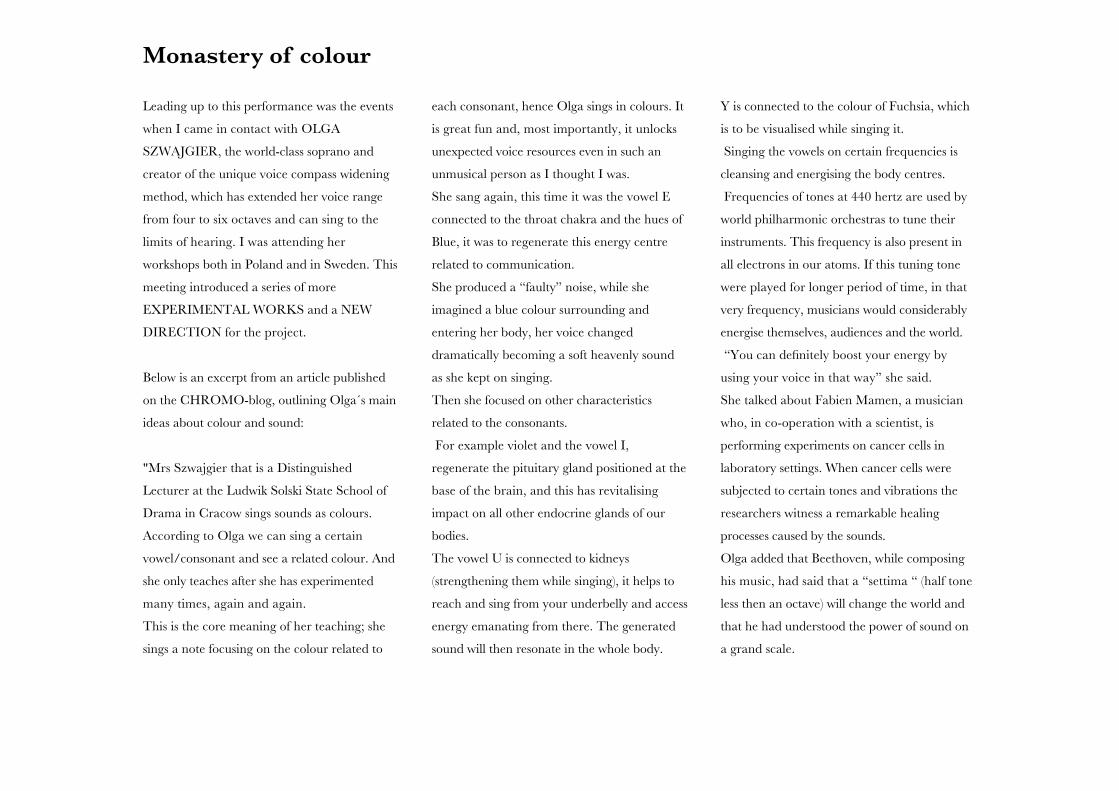
Monastery of colour
Leading up to this performance was the events
when I came in contact with OLGA
SZWAJGIER, the world-class soprano and
creator of the unique voice compass widening
method, which has extended her voice range
from four to six octaves and can sing to the
limits of hearing. I was attending her
workshops both in Poland and in Sweden. This
meeting introduced a series of more
EXPERIMENTAL WORKS and a NEW
DIRECTION for the project.
Below is an excerpt from an article published
on the CHROMO-blog, outlining Olga´s main
ideas about colour and sound:
"Mrs Szwajgier that is a Distinguished
Lecturer at the Ludwik Solski State School of
Drama in Cracow sings sounds as colours.
According to Olga we can sing a certain
vowel/consonant and see a related colour. And
she only teaches after she has experimented
many times, again and again.
This is the core meaning of her teaching; she
sings a note focusing on the colour related to
each consonant, hence Olga sings in colours. It
is great fun and, most importantly, it unlocks
unexpected voice resources even in such an
unmusical person as I thought I was.
She sang again, this time it was the vowel E
connected to the throat chakra and the hues of
Blue, it was to regenerate this energy centre
related to communication.
She produced a “faulty” noise, while she
imagined a blue colour surrounding and
entering her body, her voice changed
dramatically becoming a soft heavenly sound
as she kept on singing.
Then she focused on other characteristics
related to the consonants.
For example violet and the vowel I,
regenerate the pituitary gland positioned at the
base of the brain, and this has revitalising
impact on all other endocrine glands of our
bodies.
The vowel U is connected to kidneys
(strengthening them while singing), it helps to
reach and sing from your underbelly and access
energy emanating from there. The generated
sound will then resonate in the whole body.
Y is connected to the colour of Fuchsia, which
is to be visualised while singing it.
Singing the vowels on certain frequencies is
cleansing and energising the body centres.
Frequencies of tones at 440 hertz are used by
world philharmonic orchestras to tune their
instruments. This frequency is also present in
all electrons in our atoms. If this tuning tone
were played for longer period of time, in that
very frequency, musicians would considerably
energise themselves, audiences and the world.
“You can definitely boost your energy by
using your voice in that way” she said.
She talked about Fabien Mamen, a musician
who, in co-operation with a scientist, is
performing experiments on cancer cells in
laboratory settings. When cancer cells were
subjected to certain tones and vibrations the
researchers witness a remarkable healing
processes caused by the sounds.
Olga added that Beethoven, while composing
his music, had said that a “settima “ (half tone
less then an octave) will change the world and
that he had understood the power of sound on
a grand scale.
27
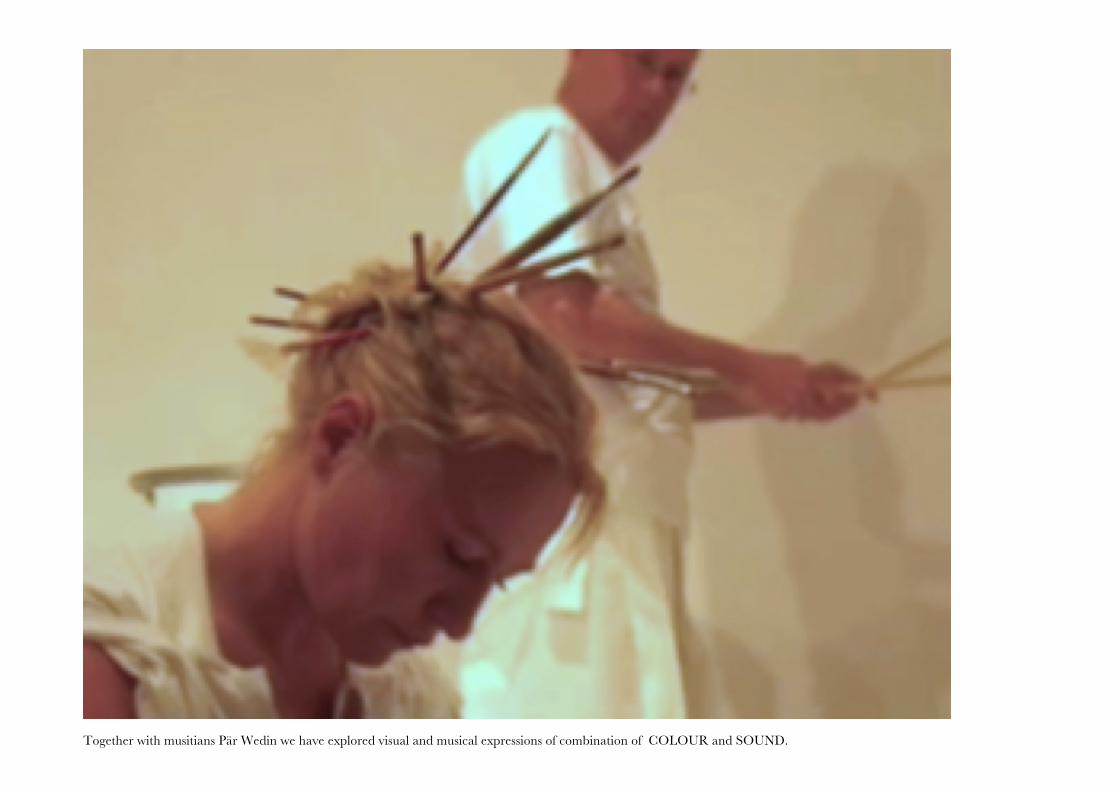
Together with musitians Pär Wedin we have explored visual and musical expressions of combination of COLOUR and SOUND.28

Pär Wedin, sound and colour composition. 29
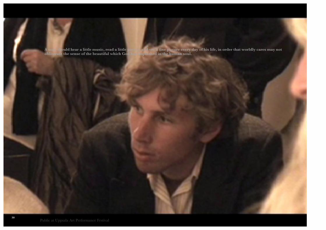
A man should hear a little music, read a little poetry, and see a fine picture every day of his life, in order that worldly cares may not obliterate the sense of the beautiful which God has implanted in the human soul.
/ Goethe
Public at Uppsala Art Performance Festival30
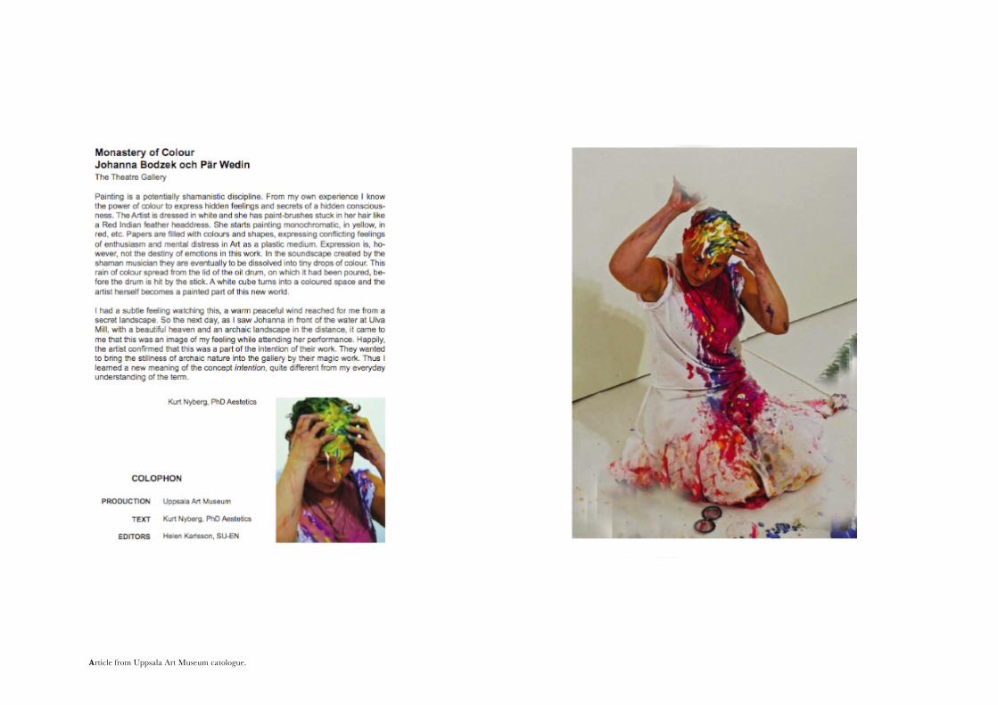
Article from Uppsala Art Museum catologue. 31
32
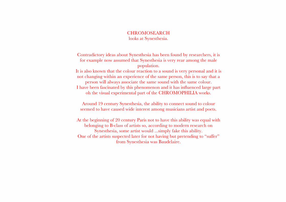
CHROMOSEARCH looks at Synesthesia.
Contradictory ideas about Synesthesia has been found by researchers, it is for example now assumed that Synesthesia is very rear among the male
population. It is also known that the colour reaction to a sound is very personal and it is not changing within an experience of the same person, this is to say that a
person will always associate the same sound with the same colour. I have been fascinated by this phenomenon and it has influenced large part
oh the visual experimental part of the CHROMOPHILIA works.
Around 19 century Synesthesia, the ability to connect sound to colour seemed to have caused wide interest among musicians artist and poets.
At the beginning of 20 century Paris not to have this ability was equal with belonging to B-class of artists so, according to modern research on
Synesthesia, some artist would ...simply fake this ability.One of the artists suspected later for not having but pretending to “suffer”
from Synesthesia was Baudelaire.
33
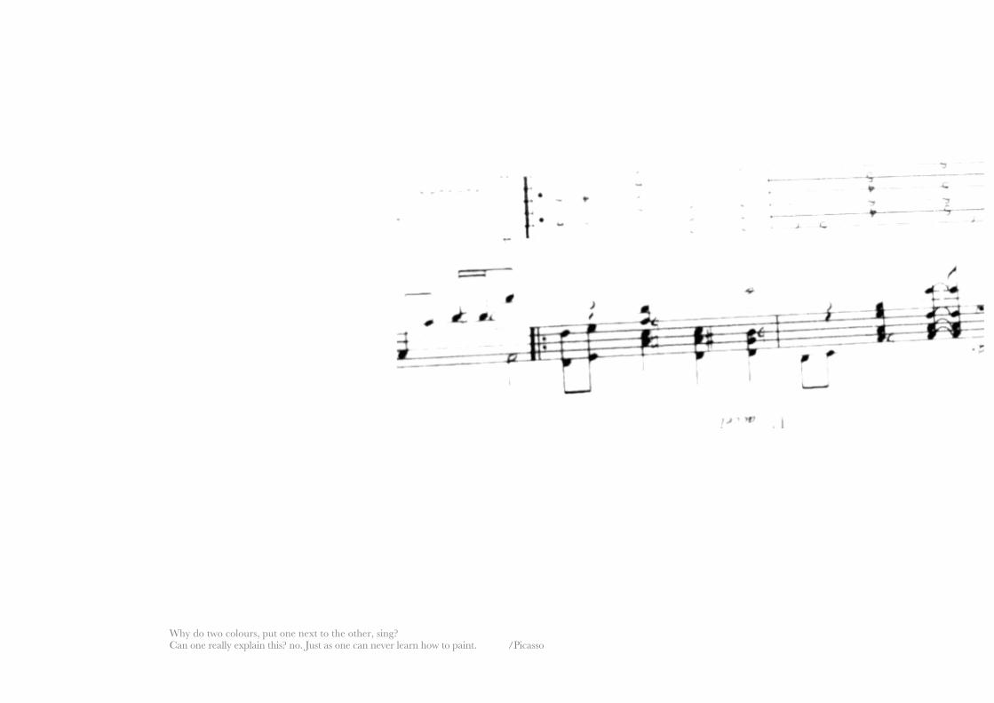
Why do two colours, put one next to the other, sing? Can one really explain this? no. Just as one can never learn how to paint. /Picasso
34
Why do two colours, put one next to the other, sing? Can one really explain this? no. Just as one can never learn how to paint. /Picasso
35
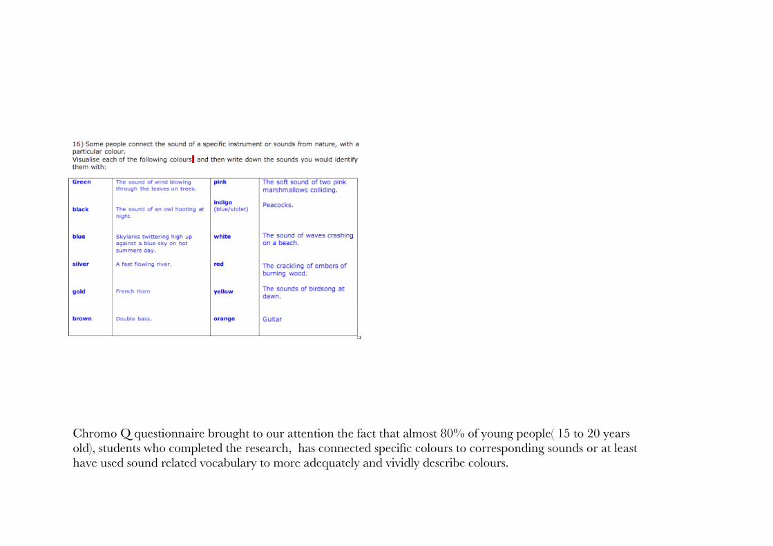
Chromo Q questionnaire brought to our attention the fact that almost 80% of young people( 15 to 20 years old), students who completed the research, has connected specific colours to corresponding sounds or at least have used sound related vocabulary to more adequately and vividly describe colours.
36
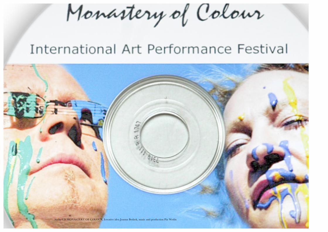
Audio CD MONASTERY OF COLOUR, Icreative idea Joanna Bodzek, music and production Pär Wedin 37
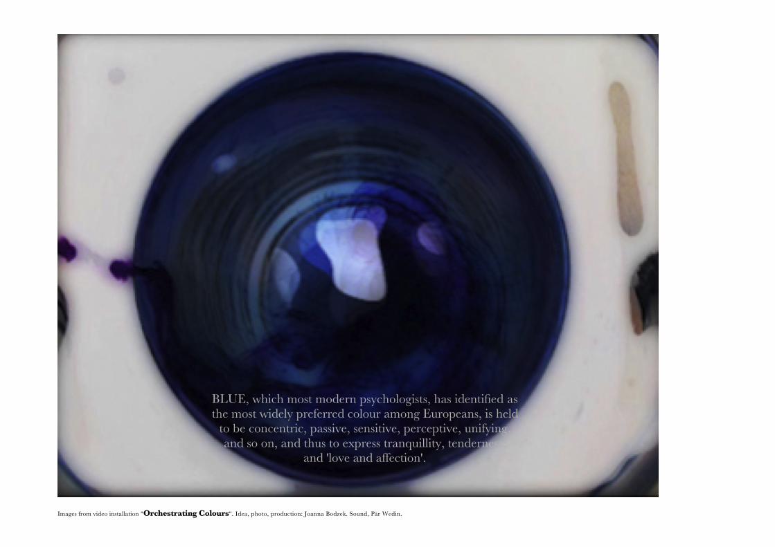
Images from video installation "Orchestrating Colours". Idea, photo, production: Joanna Bodzek. Sound, Pär Wedin.
BLUE, which most modern psychologists, has identified as the most widely preferred colour among Europeans, is held
to be concentric, passive, sensitive, perceptive, unifying, and so on, and thus to express tranquillity, tenderness,
and 'love and affection'.
38

It seems to me the aesthetics of colour have developed very littleduring this century precisely because they have been to exclusively concerned withlaboratory testing, and too little with colour-preferences as expressed in the practical choices ofeveryday life.
/ John Gage in "Colour and meaning"
Green--mmmm
black -ooooo
Blue-ahhh
silver-brrrr
Gold-uuuuu
brown-lllllllu
Pink-fuuuuu
indigo (blue/ violet)-fiiiii
White-sszzzz
red-haaaaa
39
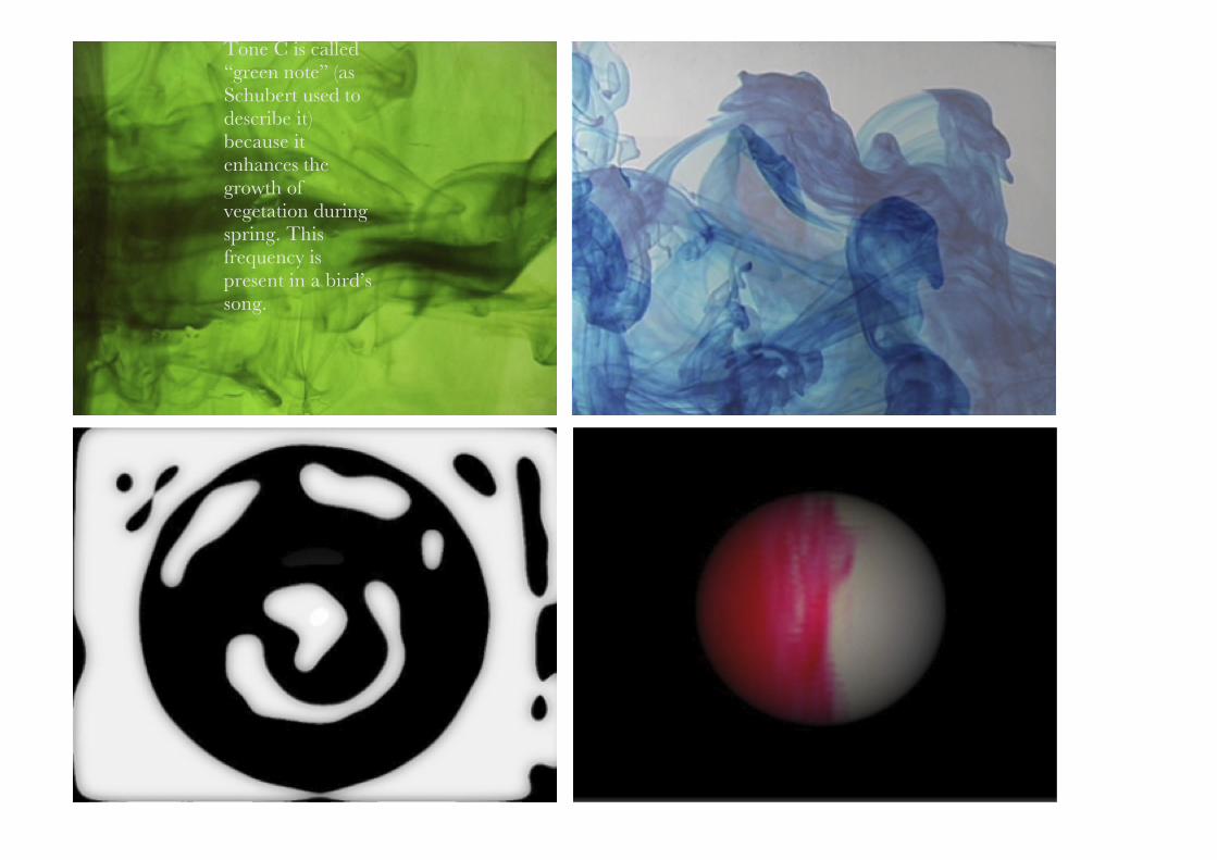
Tone C is called “green note” (as Schubert used to describe it) because it enhances the growth of vegetation during spring. This frequency is present in a bird’s song.
40
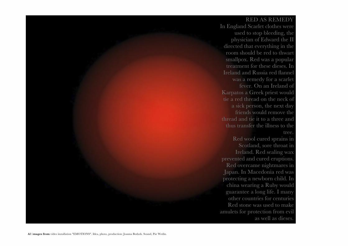
All images from video installation "EMOTIONS". Idea, photo, production: Joanna Bodzek. Sound, Pär Wedin.
RED AS REMEDYIn England Scarlet clothes were
used to stop bleeding, the physician of Edward the II
directed that everything in the room should be red to thwart smallpox. Red was a popular treatment for these dieses. In
Ireland and Russia red flannel was a remedy for a scarlet
fever. On an Ireland of Karpatos a Greek priest would tie a red thread on the neck of
a sick person, the next day friends would remove the
thread and tie it to a three and thus transfer the illness to the
tree.Red wool cured sprains in
Scotland, sore throat in Ireland. Red sealing wax
prevented and cured eruptions. Red overcame nightmares in
Japan. In Macedonia red was protecting a newborn child. In
china wearing a Ruby would guarantee a long life. I many other countries for centuries Red stone was used to make
amulets for protection from evil as well as dieses.
41
42
43
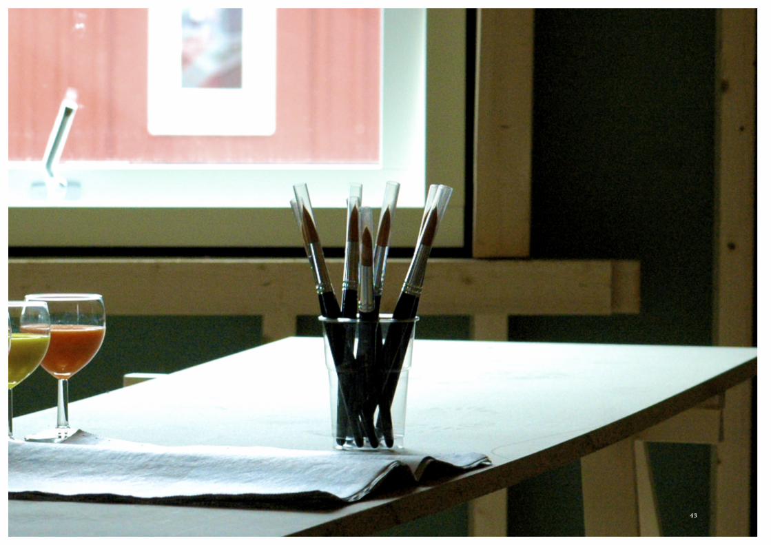
CHROMO WORKSHOP: Creativity Mobilization Trough Colour
“Art is the plank after the shipwreck, that saves someone…”—Constantin Brancusi
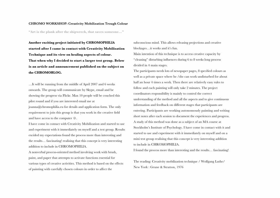
Another exciting project initiated by CHROMOPHILIA
started after I came in contact with Creativity Mobilisation
Technique and its view on healing aspects of colour.
That when why I decided to start a larger test group. Below
is an article and announcement published on the subject on
the CHROMOBLOG.
…It will be running from the middle of April 2007 and 6 weeks
onwards. The group will communicate by Skype, email and be
showing the progress via Flickr. Max 10 people will be couched this
pilot round and if you are interested email me at
[email protected] for details and application form. The only
requirement to join this group is that you work in the creative field
and have access to the computer ☺.
I have come in contact with Creativity Mobilization and started to use
and experiment with it immediately on myself and a test group. Results
excided my expectations found the process more than interesting and
the results… fascinating! realising that this concept is very interesting
addition to include in CHROMOPHILIA.
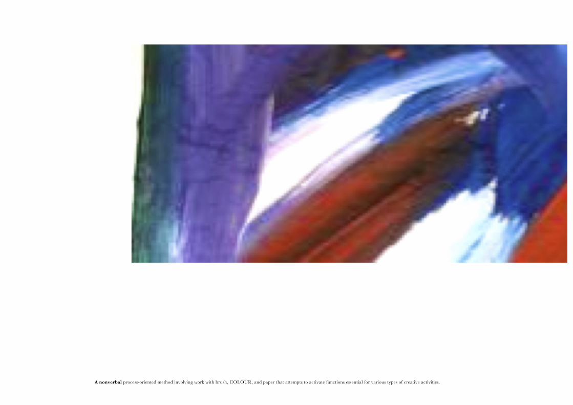
A nonverbal process-oriented method involving work with brush,
paint, and paper that attempts to activate functions essential for
various types of creative activities. This method is based on the effects
of painting with carefully chosen colours in order to affect the
subconscious mind. This allows releasing projections and creative
blockages…it works and it’s fun.
Main intention of this technique is to access creative capacity by
“cleaning” disturbing influences during 6 to 8 weeks long process
divided in 4 main stages.
The participants needs lots of newspaper pages, 8 specified colours as
well as a private space where he /she can work undisturbed for about
half an hour 4 times a week. Then there are relatively easy rules to
follow and each painting will only take 2 minutes. The project
coordinators responsibility is mainly to control the correct
understanding of the method and all the aspects and to give continuous
information and feedback on different stages that participants are
entering. Participants are working autonomously painting and writing
short notes after each session to document the experiences and progress.
A study of this method was done as a subject of an MA course at
Stockholm’s Institute of Psychology. I have come in contact with it and
started to use and experiment with it immediately on myself and on a
mini test group realising that this concept is very interesting addition
to include in CHROMOPHILIA.
I found the process more than interesting and the results… fascinating!
The reading: Creativity mobilization technique / Wolfgang Luthe/
New York : Grune & Stratton, 1976
44
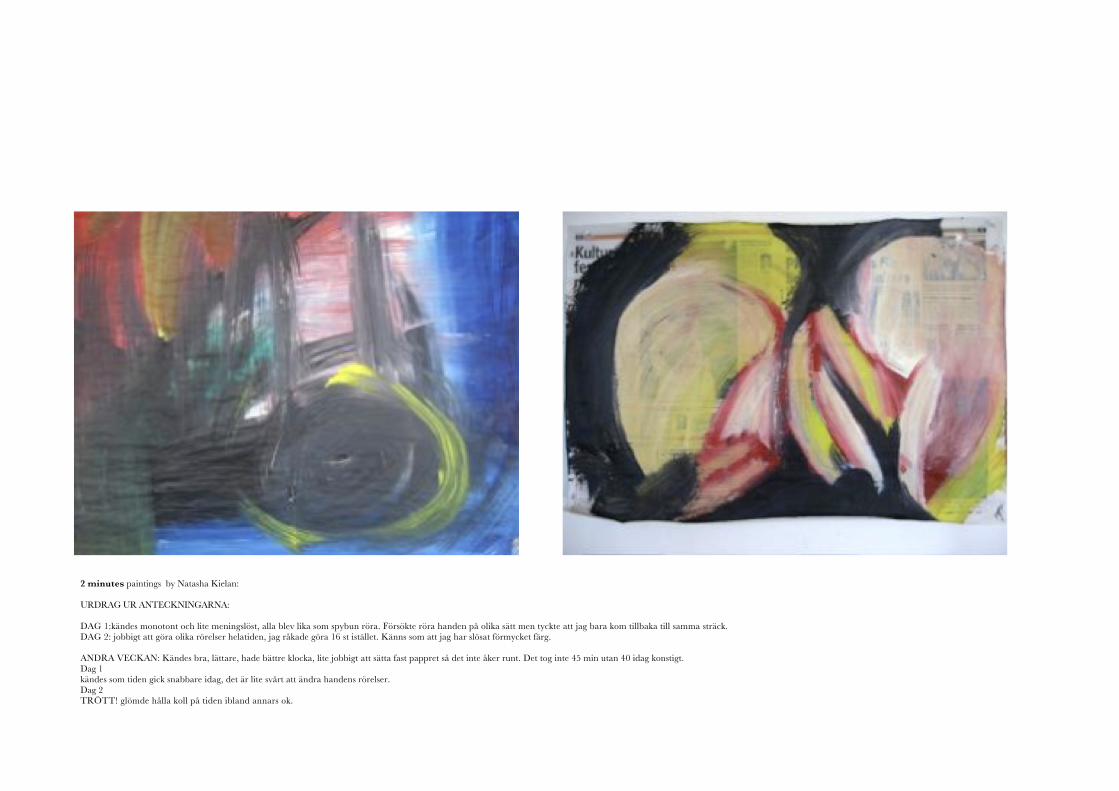
2 minutes paintings by Natasha Kielan:
URDRAG UR ANTECKNINGARNA:
DAG 1:kändes monotont och lite meningslöst, alla blev lika som spybun röra. Försökte röra handen på olika sätt men tyckte att jag bara kom tillbaka till samma sträck.DAG 2: jobbigt att göra olika rörelser helatiden, jag råkade göra 16 st istället. Känns som att jag har slösat förmycket färg.
ANDRA VECKAN: Kändes bra, lättare, hade bättre klocka, lite jobbigt att sätta fast pappret så det inte åker runt. Det tog inte 45 min utan 40 idag konstigt.Dag 1kändes som tiden gick snabbare idag, det är lite svårt att ändra handens rörelser.Dag 2TRÖTT! glömde hålla koll på tiden ibland annars ok.
45
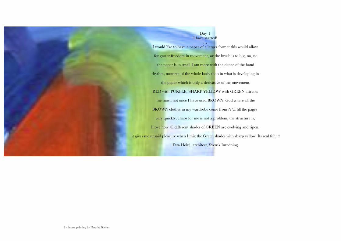
A nonverbal process-oriented method involving work with brush, COLOUR, and paper that attempts to activate functions essential for various types of creative activities. 2 minutes painting by Natasha Kielan
Day 1I have started!
…I would like to have a paper of a larger format this would allow
for grater freedom in movement, or the brush is to big, no, no
the paper is to small I am more with the dance of the hand
rhythm, moment of the whole body than in what is developing in
the paper which is only a derivative of the movement,
RED with PURPLE, SHARP YELLOW with GREEN attracts
me most, not once I have used BROWN. God where all the
BROWN clothes in my wardrobe come from ???.I fill the pages
very quickly, chaos for me is not a problem, the structure is,
I love how all different shades of GREEN are evolving and ripen,
it gives me unsaid pleasure when I mix the Green shades with sharp yellow. Its real fun!!!!
Ewa Holuj, architect, Svensk Inredning
46
A nonverbal process-oriented method involving work with brush, COLOUR, and paper that attempts to activate functions essential for various types of creative activities. 2 minutes painting by Natasha Kielan
Day 1I have started!
…I would like to have a paper of a larger format this would allow
for grater freedom in movement, or the brush is to big, no, no
the paper is to small I am more with the dance of the hand
rhythm, moment of the whole body than in what is developing in
the paper which is only a derivative of the movement,
RED with PURPLE, SHARP YELLOW with GREEN attracts
me most, not once I have used BROWN. God where all the
BROWN clothes in my wardrobe come from ???.I fill the pages
very quickly, chaos for me is not a problem, the structure is,
I love how all different shades of GREEN are evolving and ripen,
it gives me unsaid pleasure when I mix the Green shades with sharp yellow. Its real fun!!!!
Ewa Holuj, architect, Svensk Inredning
47
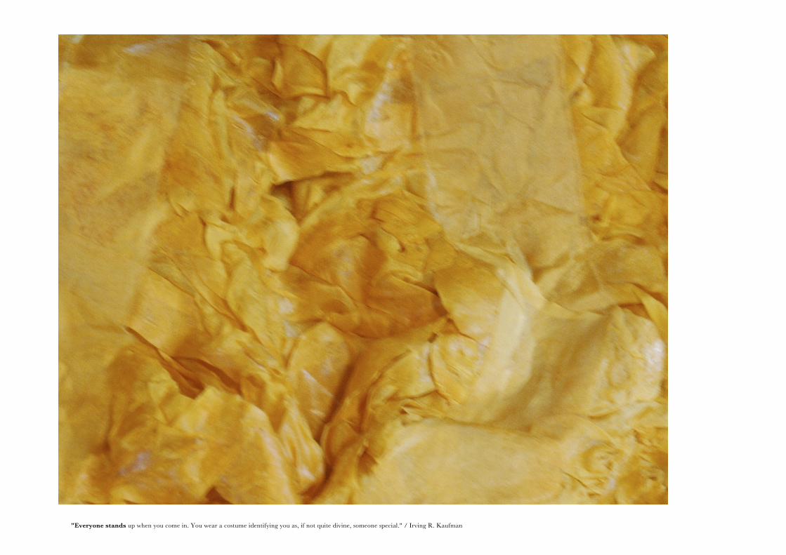
"Everyone stands up when you come in. You wear a costume identifying you as, if not quite divine, someone special." / Irving R. Kaufman Irving R. Kaufman
48
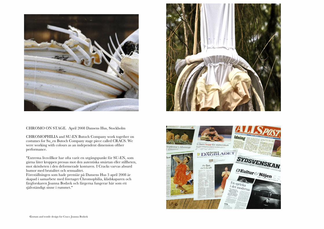
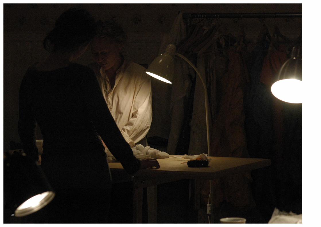
Costum and textile design for Cracs: Joanna Bodzek
CHROMO ON STAGE. April 2008 Dansens Hus, Stockholm
CHROMOPHILIA and SU-EN Butoch Company work together on costumes for Su_en Butoch Company stage piece called CRACS. We were working with colours as an independent dimension ofther performance.
"Extrema livsvillkor har ofta varit en utgångspunkt för SU-EN, som gärna låter kroppen pressas mot den autentiska smärtan eller stillheten, mot skönheten i den deformerade konturen. I Cracks varvas absurd humor med brutalitet och sensualitet.Föreställningen som hade premiär på Dansens Hus 3 april 2008 är skapad i samarbete med företaget Chromophilia, klädskaparen och färgforskaren Joanna Bodzek och färgerna fungerar här som ett självständigt sinne i rummet."
49
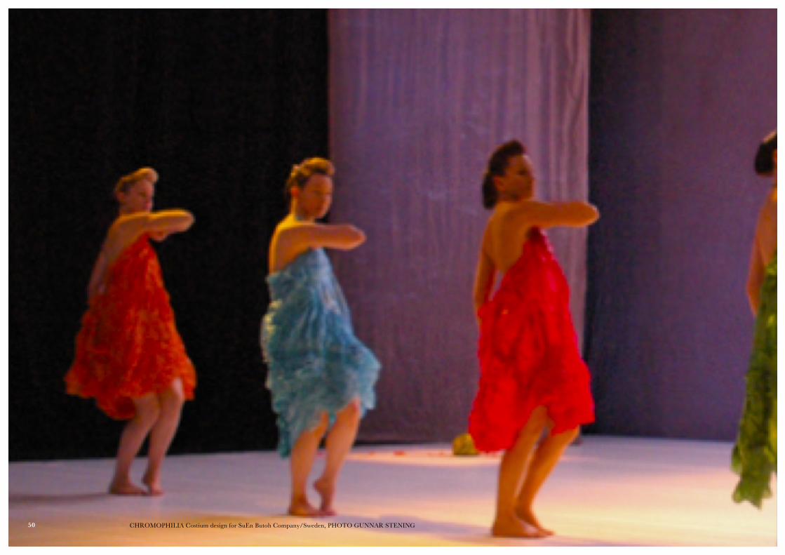
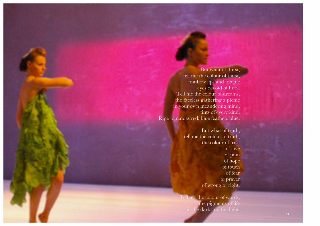
CHROMOPHILIA Costium design for SuEn Butoh Company/Sweden, PHOTO GUNNAR STENING
But what of thirst,tell me the colour of thirst,
rainbow lips and tongueeyes devoid of hues.
Tell me the colour of dreams,the faceless gathering a picnic
in your own meandering mind,tints of every kind.
Ripe tomatoes red, blue feathers blue.
But what of truth,tell me the colour of truth,
the colour of trustof loveof painof hope
of touchof fear
of prayerof wrong of right.
Tell me the colour of words,the pigments of life
in the dark and the light.50
But what of thirst,tell me the colour of thirst,
rainbow lips and tongueeyes devoid of hues.
Tell me the colour of dreams,the faceless gathering a picnic
in your own meandering mind,tints of every kind.
Ripe tomatoes red, blue feathers blue.
But what of truth,tell me the colour of truth,
the colour of trustof loveof painof hope
of touchof fear
of prayerof wrong of right.
Tell me the colour of words,the pigments of life
in the dark and the light.51
Thanks to Konstnärsnämnden!
We would like to thank Konsnärsnämden for making it possible to develop
and see CHROMOPHILIA project becoming a reality for us and for the
public that has seen it. It has been such a learning curve for all of us an
resulted in artistic configurations and art works we would never imagine to
get involved in in the beginning of the project.
To get this funding was a very important step in the chromophilia project
and gave our self -confidence a push forward and as a result all involved
have definitely developed new creative sides!
This economical base that the funding gave us has enabled us to realise our
dream, cooperate, learn, make mistakes and then make new improvements
and learn again.
52
THANKS TO EVERYONE WHO DIRECTLY AND INDIRECTLY CONTRIBUTED TO CHROMOPHILIA AND THIS DOCUMENTATION.
Thanks to !
Konstnärsnämnden for the GOLDEN Cash that has been a stable and
absolute necessary base to grow the CHROMOPHILIA upon.
Royal College of Art in London for letting us access excellent resources for
research on a subject of colour. And especially to Neil Parkinson .
Thanks to VALENTINA who has worked like mad with developing and
maintaining the blog, writing and shaping its content even without much
support, it has now been spotted by Colour Lovers and the Colour spot. She is
also the woman behind the writing of the text in the book, fearlessly rewritten
in some parts by Joanna Bodzek.
Göran Bergström for his insightful and unstoppable support and advice.
Gosia Bodzek för working and helping with words and letters.
53
54


© 2008 JOANNABODZEK
Supported by: