Chris Brown - Kinetic Type Boards
7
Chris Brown | DIGITAL MEDIA DESIGNER MAKING THE INVISIBLE VISIBLE -KINETIC TYPE THE BRIEF We were given a brief to create a piece of motion graphics using only text from an excerpt from a BBC Radio station. Our piece had to be between around 10-20 seconds and ran along the theme of ‘Making the Invisible Visible’ as in making something that you cannot see, the audio and the radio waves, and turning it into something that you can. I think the idea behind these would for them to be used as a sort of ident for the radio channel or the specific programme that the audio is taken from. I was given BBC Radio 3, which to begin with, was rather annoying. When I was first looking into the station to get a bit more information about it, I found that they played mostly back to back music - mostly Classical and occasionally some Jazz. I was looking at their programming schedule and the kind of programmes that they had on and there were hardly any that featured dialogue, like a chat or debate show. ere were one or two that came to my interest, which were one show called ‘e Essay’ which the BBC website describes as a “Series of programmes debating and exploring arts and cultural topics” (BBC.co.uk) which I thought sounded great but aſter listening to a few I found that they talked about fairly mundane topics and some were quite in depth so I couldn’t really find a short extract that would hold on its own and also be interesting enough. Secondly, I found a show on a Sunday night called ‘Jazz Line-Up’ hosted by DJ Julian Joseph which is described as a“Programme exploring jazz music, focussing both on established, mainstream players and on the new generation of younger artists.” (BBC.co.uk). is sounded perfect for my brief so I listened to one or two programmes and I heard an Interview with Jazz Musician Herbie Hancock that was quite interesting and there were two quotes that immediately jumped out at 01
-
Upload
chris-brown -
Category
Documents
-
view
221 -
download
1
description
Kinetic Type Brief portfolio boards
Transcript of Chris Brown - Kinetic Type Boards

Chris Brown | DIGITAL MEDIA DESIGNER MAKING THE INVISIBLE VISIBLE -KINETIC TYPE
THE BRIEF
We were given a brief to create a piece of motion graphics using only text from an excerpt from a BBC Radio station.
Our piece had to be between around 10-20 seconds and ran along the theme of ‘Making the Invisible Visible’ as in making something that you cannot see, the audio and the radio waves, and turning it into something that you can. I think the idea behind these would for them to be used as a sort of ident for the radio channel or the specific programme that the audio is taken from.
I was given BBC Radio 3, which to begin with, was rather annoying. When I was first looking into the
station to get a bit more information about it, I found that they played mostly back to back music - mostly Classical and occasionally some Jazz.I was looking at their programming schedule and the kind of programmes that they had on and there were hardly any that featured dialogue, like a chat or debate show.
There were one or two that came to my interest, which were one show called ‘The Essay’ which the BBC website describes as a “Series of programmes debating and exploring arts and cultural topics” (BBC.co.uk) which I thought sounded great but after listening to a few I found that they talked about fairly mundane topics
and some were quite in depth so I couldn’t really find a short extract that would hold on its own and also be interesting enough.
Secondly, I found a show on a Sunday night called ‘Jazz Line-Up’ hosted by DJ Julian Joseph which is described as a“Programme exploring jazz music, focussing both on established, mainstream players and on the new generation of younger artists.” (BBC.co.uk).
This sounded perfect for my brief so I listened to one or two programmes and I heard an Interview with Jazz Musician Herbie Hancock that was quite interesting and there were two quotes that immediately jumped out at
01
Chris Brown | DIGITAL MEDIA DESIGNER MAKING THE INVISIBLE VISIBLE -KINETIC TYPE
RESEARCH
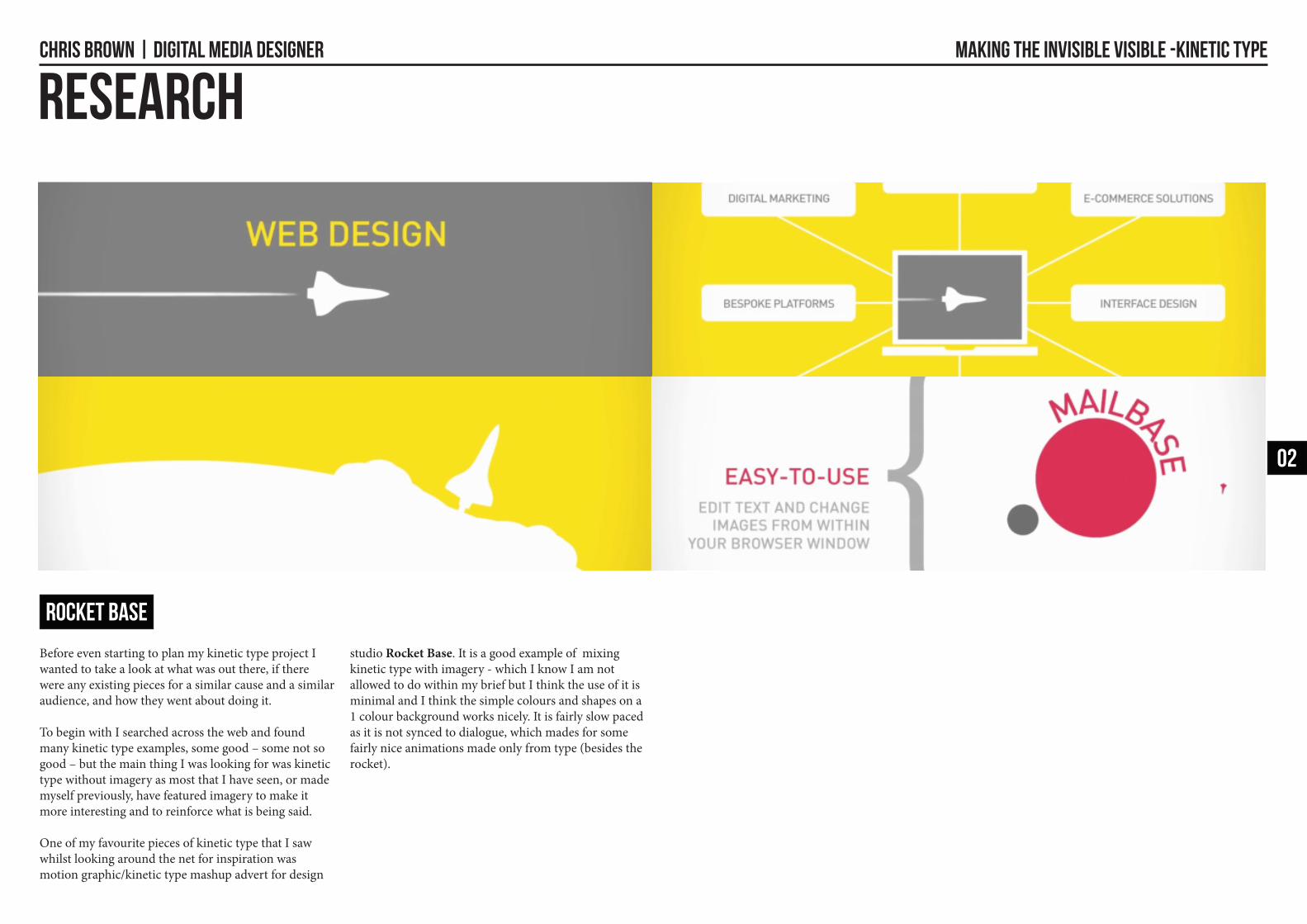
Before even starting to plan my kinetic type project I wanted to take a look at what was out there, if there were any existing pieces for a similar cause and a similar audience, and how they went about doing it.
To begin with I searched across the web and found many kinetic type examples, some good – some not so good – but the main thing I was looking for was kinetic type without imagery as most that I have seen, or made myself previously, have featured imagery to make it more interesting and to reinforce what is being said.
One of my favourite pieces of kinetic type that I saw whilst looking around the net for inspiration was motion graphic/kinetic type mashup advert for design
studio Rocket Base. It is a good example of mixing kinetic type with imagery - which I know I am not allowed to do within my brief but I think the use of it is minimal and I think the simple colours and shapes on a 1 colour background works nicely. It is fairly slow paced as it is not synced to dialogue, which mades for some fairly nice animations made only from type (besides the rocket).
02
Rocket Base

Chris Brown | DIGITAL MEDIA DESIGNER MAKING THE INVISIBLE VISIBLE -KINETIC TYPE
RESEARCH
I then looked at another fantastic piece of kinetic type, that yet again, isn’t synced to audio but I don’t think that this has a bit impact on its flow or aesthetics too much.
love how the different and obvious changes of typography make a dramatic effect in this piece. I think though, that unless done extremely well as shown in this example, too many different typefaces would get confusing and not look right. The only time I think I would want to use a different typeface besides from my main one is to put emphasis on a particular word or to differentiate between different people.
After looking at these and several others I started to have a few ideas about the style that I wanted to use in
my kinetic type animation.
I still however needed to try out some style tests and research into my target audience to see what would be suitable for them and so I could see where my piece was headed and what it might look like so I could begin planning it.
03
MAKE IT BETTER (CLIM)

Chris Brown | DIGITAL MEDIA DESIGNER MAKING THE INVISIBLE VISIBLE -KINETIC TYPE
RESEARCH
Before I could look into the specific target audience I had to decide what audio clip I was going to use.
I still thought that the strongest two were the ones that I had found from the ‘Jazz Line-Up’ show.
The two quotes that I found the most interesting and that I had to chose between were:
“In general, speaking to the musicians about the music, letting them tell their story ... that’s a highlight for me”
(Julian Joseph, BBC Radio 3 DJ)
I think this quote was good, but it was a bit too short, coming it at just over 9 seconds - I also think that the other is more applicable to everything on BBC Radio 3 and something that everyone can relate to.
“You know, life is like that; you want to take the best aspects of all of the people you admire, and somehow absorb it into yourself and produce something … you know, uniquely you, or something that you like. That’s what it really means … to do this job”
(Julian Joseph, BBC Radio 3 DJ)
I think that this second quote was a lot more meaningful and was also quite a bit longer, so was much more suited for my animation. I liked some of the topics that he was chatting with about and in one of the shows that I thought when he was interviewing herbie hancock.
I also think that some of thew things he brings up within this quote I can use to create specific animations/movements that relate to what he is saying.Now that I had chosen my audio clip I could begin to look into my target audience, which was Jazz listeners.
After some googling, I found that the target demographic for BBC Radio 3 was the older generation and that the average age of listeners was 57. (Telegraph) 1
Most enjoy classical music and/or Jazz (as this is all that is played on the station) - something that will be useful knowing when I research this.
I looked into Jazz and Classical visuals and I some definite trends. I wanted to look more into the Jazz side as my quote was from a Jazz show. Most of the music that is played is from around 1950’s - 1960’s and has a particular look about it, the new orleans/american jazz style. I looked as some Jazz album covers and the sort of typefaces and colours that they used as these could influence what I use in the final animation.
I then started looking into possible typography/colour combinations that worked together and that I could use.
I made a few styleboards with these on so I could easily compare them and see which ones work best. I made one using the BBC Radio 3 colours and fonts, as this is an obvious theme to explore as people instantly recognise that font/colour combination as BBC as it is used in all of their branding/advertisements.
I also looked into some Jazz fonts/colours and textures that I could feature.
Finally, I also still liked the idea of simple bold fonts and 2/3 colour simplicity that Rocket Base and several other successful pieces of kinetic type used when I was researching that I think looked very effective and was a nice visual style and wasn’t too biased towards any age group/sex demographics etc.
1 - http://www.telegraph.co.uk/culture/tvandradio/5308344/Radio-3-named-Station-of-the-Year.html
0404

Chris Brown | DIGITAL MEDIA DESIGNER MAKING THE INVISIBLE VISIBLE -KINETIC TYPE
EXPERIMENTATIONI then started to look at my quote in more detail and break it down to see if there were any specific movements or meanings behind them that would make my animation stronger in the long run, as if I could theme it to be like what is being said, the viewer will find it far easier to understand. It broke down like this:
You know- Try and make it relate to the person watching, maybe make it come out into the screen like it is pointing.
life is like that- Zoom into letters as he is talking about life as a whole? Put inside a circle?
you want to take the best aspects of all of the people you admire-When it says take have the words stack up and then the take be separate or be pulled out of the other words. The word admire would be above, stressing being looked up to/admiration.
and somehow absorb it-Something that looks like a sponge? Sucks all the letters up? or all the words merge to make the next word/s.
into yourself-Yourself would suck up the words/letters and maybe get bigger? Probably be in a different font? Or more bold/on a different colour background.
and produce something-Have this come out of the yourself word? Or it zoom inside the letters and be in the bottom of one and then go outside the letter.
… you know,-Same as the first one, obvious cut/transition point.
uniquely you,-Different font/colour from the one featured in the majority of the video.
or something that you-Can’t really do much with this, just animate the words nicely. Have something in bold?
like-Have like and maybe some more likes spawn out of it!
Thats what it really means-Animate words nicely.
… to do this job-Nice ending
I then drew some rough storyboards for the idea of what I would like my kinetic type to look like – I was quite pleased with the animations I had come up with and doing this beforehand definately made me think more about how my kinetic type was going to turn and how it is going to flow. It definitely led to the animations having more meaning as instead of just randomly making them.
0405

Chris Brown | DIGITAL MEDIA DESIGNER MAKING THE INVISIBLE VISIBLE -KINETIC TYPE
OUTCOME
I then went on to create my kinetic type animation using After Effects. I achieved most of the effects by laying out all of the text in advance and then moving a 3D camera around in Z-Space and rotating the objects over a certain period of time. I also added motion blur to the type as I thought this added to the quick camera motions and made it look a bit more polished.
In the end I used a mix of monochromatic colours, with the background either light grey or extremely dark grey, not black and white. I made it like this so the text always was a contrast to the background. I used the font Gotham Bold which was simple and clear and easy to read. I had to change some of my planned camera movements/layouts that I had storyboarded previously as the words are spoken a lot faster than I thought and it was not until I went to animate it that I realised this
and some of the camera movements were too quick and the text was unreadable. Some are still quite quick but they are just about readable and most of the viewers will be listening to the audio also so this will make what is being shown clear even if it not entirely readable at the speed that it is.
I think that changing some of these camera movements actually meant that I had to create some more which I actually now think look better - it also makes a change of pace when he pauses and on long pieces of text as before I planned to have almost constant camera movement which would have been quite bad.
06

Chris Brown | DIGITAL MEDIA DESIGNER MAKING THE INVISIBLE VISIBLE -KINETIC TYPE
EVALUATION
I think that overall my animation fits the brief and makes the viewer think about what is being said.
I am pleased with the outcome and how it looks - although it does look slightly generic, as there is a lot of plain kinetic type out there. I think it suits the target audience with a ‘no fills’ sort of look that is easy on the eye and simple.
I also wanted to rotoscope it to make it stand out a bit more but this would have been extremely time consuming and given my time constraints this wasn’t really possible. I also was unsure about how I was going to approach rotoscoping some sections such as the colour inversions etc. I don’t think that the video not being rotoscoped detracts from its suitability for its target audience either.
I will hopefully complete the rotoscoping at a later date as this would only improve the piece further.
If I was to do this piece again I think that I would make more storyboards and try out some more simple test visuals before creating the full animation so I could compare them and see which one works best or wether I could combine them to make something really interesting.
I think if this was actually used to promote the BBC Radio 3 ‘Jazz Line-Up’ show it would be successful as the audience would find it interesting and it is thought provoking and leaves you wanting to find out what it is like.
0706