cheesehead
40
1 Table of Contents Line Drawings 2-5 Value Drawings 6-9 Color and Texture Drawings 10-15 Shape Drawings 16-25 Drawing 1 27-39
-
Upload
kendal-mindt -
Category
Documents
-
view
212 -
download
0
description
computer graphics
Transcript of cheesehead

1
Table of Contents
Line Drawings 2-5
Value Drawings 6-9
Color and Texture Drawings 10-15
Shape Drawings 16-25
Drawing 1 27-39

2
Craft- Open Adobe Illustrator, new document, while using a Bamboo pad and using the brush tool to make horizon-tal and vertical lines to create the shape of a bottle/cups. Change the stroke size when needed. Using only 100 strokes make the shape of the object. Use only one color for each.
Composition- Most of the lines are horizontal. Using only one color per image. Using short lines and long lines to make the bottle. The first one tried making the eye’s go straight to the top of the bottle by making the lines closer together. The second one I switched the colors up and some places the lines are closer together and the stroke size is bigger. The third one I switched the color up again and at the top of the bottle that’s
Line Drawings
where the eye goes too since the lines are vertical instead of horizontal. The fourth one I think the eye is just drawn to it since it’s a longer bottle. Nothing special was done to it. The last one is a cup not a bottle so I think that’s one of the reasons the eyes are drawn to it. At the top you can kind of see inside of it, just barely. And at the base of cup the lines are going in a different direction.
Concept- This a water bottle made out of lines. Exploring the use of lines to create a water vessel. The second one is a beer bottle. The third one is a different type of water bottle. The fourth is a wine bottle. And the last one is a cup. This helps learning how to make shape with using few lines. It still looks like a water bottle with few lines.

3
Water Bottle
“... it still looks like a water bottle with few lines.”

4
Wine Bottle “... learning how to make
shape with using few lines.”

5
“... learning how to make shape with using
few lines.”
Party Cup“Exploring the use of
lines to create a water vessel.”
6
Value Drawings
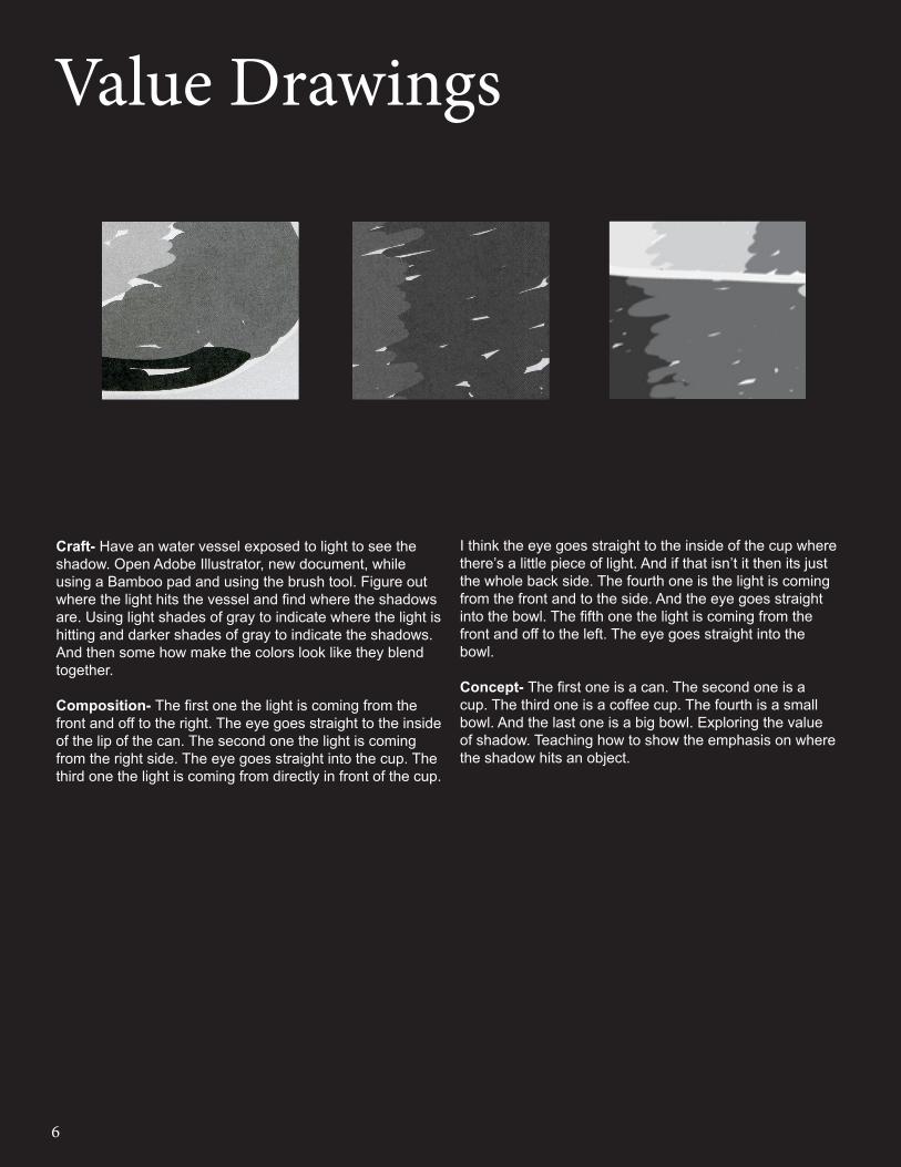
Craft- Have an water vessel exposed to light to see the shadow. Open Adobe Illustrator, new document, while using a Bamboo pad and using the brush tool. Figure out where the light hits the vessel and find where the shadows are. Using light shades of gray to indicate where the light is hitting and darker shades of gray to indicate the shadows. And then some how make the colors look like they blend together.
Composition- The first one the light is coming from the front and off to the right. The eye goes straight to the inside of the lip of the can. The second one the light is coming from the right side. The eye goes straight into the cup. The third one the light is coming from directly in front of the cup.
I think the eye goes straight to the inside of the cup where there’s a little piece of light. And if that isn’t it then its just the whole back side. The fourth one is the light is coming from the front and to the side. And the eye goes straight into the bowl. The fifth one the light is coming from the front and off to the left. The eye goes straight into the bowl.
Concept- The first one is a can. The second one is a cup. The third one is a coffee cup. The fourth is a small bowl. And the last one is a big bowl. Exploring the value of shadow. Teaching how to show the emphasis on where the shadow hits an object.

7
Cup
“The eye goes straight into the cup.”

8
Bowl
“Exploring the value of shadow. Teaching how to
show the emphasis on where the shadow hits an
object.”

9
Grey Bowl
“Using light shades of gray to indicate where
the light is hitting...”

10
Color and Texture Drawings
Craft- Have a water vessel exposed to light to see the shadow. Open Adobe Illustrator, new document, and use a Bamboo pad and use the brush tool. Figure out where the light hits the vessel and find where the shadows are. Using light shades of a color to indicate where the light is hitting and use darker shades of the color to indicate the shadows. Use letters or numbers to create the shape of the bottle and background. use a completely different color for the background and make the letters or numbers bigger/thicker. Make the letters or numbers for the bottle smaller/thinner to make the shape of the bottle and to indicate the shadows and texture of the bottle. And for the other bottles just use colors to create the shape of it and to indicate the shadows.
Composition- The first of the solid color bottles the light is coming from behind the bottle. The eye goes straight to the dark blue shadow in the middle. The second one the light is coming from the right side. The eye goes straight the light green shadow.
The third one the light is coming from left side. I think the eye goes straight to the label or to the dark shadow on the right. The first of the letter/number bottles the light comes from behind. The eye goes straight to the dark red shadow. The second one the light is coming from behind. The eye goes straight to the dark purple shadow. The third one the light is coming from the left side. The eye goes straight to the dark shadow on the left side of the bottle.
Concept- The first set are all bottles of solid colors. The second set are bottles made up of letters and numbers. The first one is made up of K’s, the second one is made up of 3’s, and the third one is made up of 6’s. Exploring the world of color and texture. Using different shades of a color to represent the shadows. The same thing applies to the texture with the color.

11
Green Bottle “Exploring the world of color
and texture.”

12
Blue Bottle
“Using light shades of a color to indicate where the light is
hitting...”

13
Blue Bottle 6 Blue Bottle
“The eye goes straight to the dark shadow on the left side of the bottle.”

14
“K” Orange Bottle
“Using different shades of a color to represent the shadows”

15
Purple “3” Bottle “...just use colors to create
the shape of it and to indicate the shadows.”
16
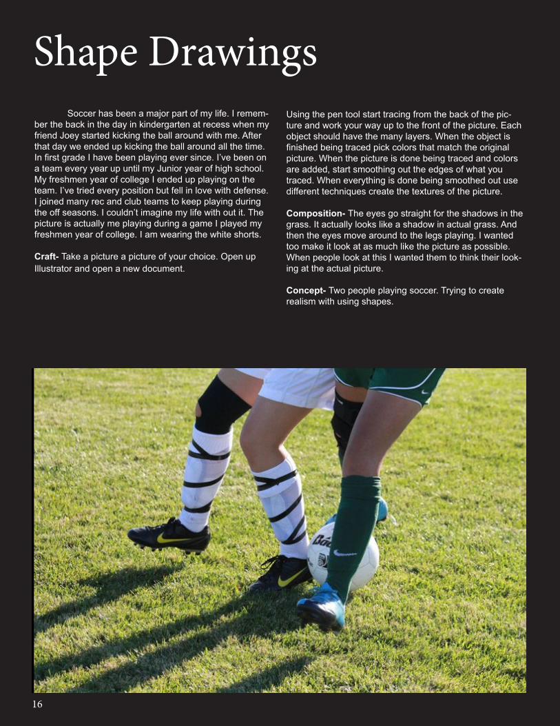
Shape Drawings Soccer has been a major part of my life. I remem-ber the back in the day in kindergarten at recess when my friend Joey started kicking the ball around with me. After that day we ended up kicking the ball around all the time. In first grade I have been playing ever since. I’ve been on a team every year up until my Junior year of high school. My freshmen year of college I ended up playing on the team. I’ve tried every position but fell in love with defense. I joined many rec and club teams to keep playing during the off seasons. I couldn’t imagine my life with out it. The picture is actually me playing during a game I played my freshmen year of college. I am wearing the white shorts.
Craft- Take a picture a picture of your choice. Open up Illustrator and open a new document.
Using the pen tool start tracing from the back of the pic-ture and work your way up to the front of the picture. Each object should have the many layers. When the object is finished being traced pick colors that match the original picture. When the picture is done being traced and colors are added, start smoothing out the edges of what you traced. When everything is done being smoothed out use different techniques create the textures of the picture.
Composition- The eyes go straight for the shadows in the grass. It actually looks like a shadow in actual grass. And then the eyes move around to the legs playing. I wanted too make it look at as much like the picture as possible. When people look at this I wanted them to think their look-ing at the actual picture.
Concept- Two people playing soccer. Trying to create realism with using shapes.

17
“I wanted to make it look at as much like the picture as
possible.”
Soccer

18
Extreme Chrom
The only thing that changed on this picture is the color. Using a extreme chromatic colors it gives an extreme crazy look. Almost cartoonish. The eyes go straight for the legs. Just because the colors are so crazy the eyes are drawn to them. And then the eyes move around to the shadows.The concept was too explore how color can effect the picture. And to show how the gradient effect with the colors can make a picture feel abstract all together.

19
The only thing that changed on this picture is the color and the line. Using a monochromatic red it gives it a more feminine look. And using a subtle brush it gives it more of a bold look. The eyes go straight for the shadows in the grass. Since its so dark on the light background. And then the eyes move around to the legs . I wanted make it look at as much like the picture as possible with using a monochromatic color and a bolder line. The concept was too explore how color can effect the picture. And to show how the gradient effect with the colors can make a picture feel abstract all together.
MonochromaticSubtle Brush

20
The only thing that changed on this picture is the line. Using a extreme brush it gives it a more rough look. The eyes go straight for the shadows in the grass, since its so dark against the light green background. And then the eyes move around to the legs. Using this type of line keeps the picture the same but at the same time it changes the look of it. The concept was too explore how color can effect the picture. And to show how the gradient effect with the colors can make a picture feel abstract all together.
Extreme Brush Original
21
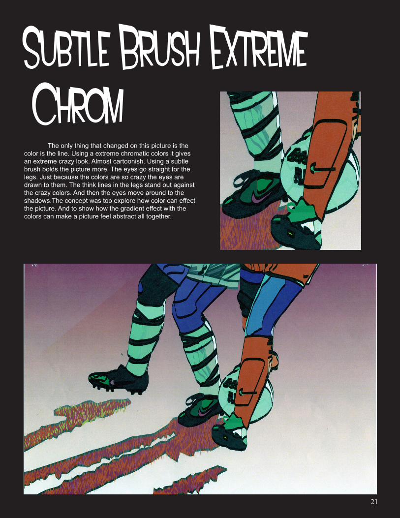
The only thing that changed on this picture is the color is the line. Using a extreme chromatic colors it gives an extreme crazy look. Almost cartoonish. Using a subtle brush bolds the picture more. The eyes go straight for the legs. Just because the colors are so crazy the eyes are drawn to them. The think lines in the legs stand out against the crazy colors. And then the eyes move around to the shadows.The concept was too explore how color can effect the picture. And to show how the gradient effect with the colors can make a picture feel abstract all together.
Subtle Brush Extreme Chrom

22
The only thing that changed on this picture is the color. Using a monochromatic red it gives it a more feminine look. The eyes go straight for the shadows in the grass. Since its so dark on the light background. And then the eyes move around to the legs. I wanted make it look at as much like the picture as possible with using a monochromatic color. The concept was too explore how color can effect the picture. And to show how the gradient effect with the colors can make a picture feel abstract all together.
Monochromatic

23
The only thing that changed on this picture is the color is the line. Using a extreme chromatic colors it gives an extreme crazy look. Almost cartoonish. Using a extreme brush it makes the picture look more rough. The eyes go straight for the legs. Just because the colors are so crazy the eyes are drawn to them. The think lines in the legs stand out against the crazy colors and add a little more to them too. And then the eyes move around to the shadows.The concept was too explore how color can effect the picture. And to show how the gradient effect with the colors can make a picture feel abstract all together.
Extreme Brush Extreme Chrom

24
The only thing that changed on this picture is the line. Using a subtle brush it gives it a more bold look. The eyes go straight for the shadows in the grass, since its so dark against the light green background. And then the eyes move around to the legs. It still looks like the original picture just with bolder lines, The concept was too explore how color can effect the picture. And to show how the gradient effect with the colors can make a picture feel abstract all together.
Subtle Brush Original
25
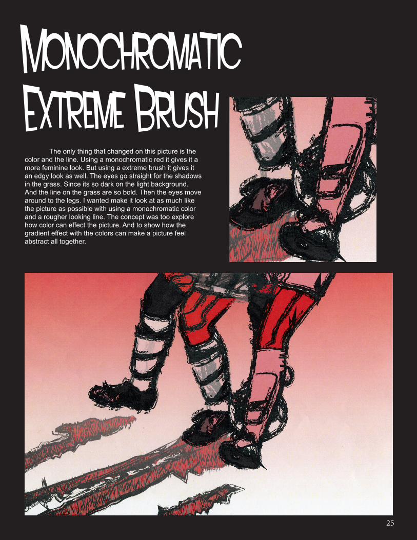
The only thing that changed on this picture is the color and the line. Using a monochromatic red it gives it a more feminine look. But using a extreme brush it gives it an edgy look as well. The eyes go straight for the shadows in the grass. Since its so dark on the light background. And the line on the grass are so bold. Then the eyes move around to the legs. I wanted make it look at as much like the picture as possible with using a monochromatic color and a rougher looking line. The concept was too explore how color can effect the picture. And to show how the gradient effect with the colors can make a picture feel abstract all together.
Monochromatic Extreme Brush

26
Color Squiggles

27
First I started off with a blank sheet of white paper. Looking at a display of bottles I started drawing from left. Drawing very lightly I just drew the shape of the bottles not worrying about texture or the designs of the bottle. Once I had all of the bottles drawn, I started the background. Using my pencil I went around and drew crazy shapes to make it look interesting. Once I had the background drawn out I used Prismacolor colored pencils. This time I worked from right to left. When the background was done I took my pencil and outlined the bottles to make them stand out against the color.
I wanted to use bright vibrant colors to make the white bottles pop out more and those would be the first thing people see. I wanted people to noticed the colors around the bottle. The red in the middle pops out and draws your eye to it. The last bottle on the right the color moves with the shape of it so the colors, eyes are drawn to that.
The object of this project was to focus more on the background and work with negative space. This also gave us the opportunity to work with dif-ferent kind of material other than just pencil.
Color Squiggles
“I wanted people to notice the
colors around the bottle.”

28
My Hand

29
First I started off with a blank sheet of white paper. Looking at my hand holding a blending stick I started drawing my thumb first. I found it easier to start with this since its in front of everything. Once I got my thumb finished I started drawing the rest of my hand and the stick. Once I had the outline of my hand done I then started to add in the texture of the crease marks.
This was my first hand drawing. I tried to make it look as much as my hand as I could. I think it turned out pretty good. I didn’t want to shade it in because I thought it wouldn’t look that realistic to me.
“This was my first hand
drawing.”

30
Bags

31
First I started off with a blank sheet of paper. Taking a brown paper lunch bag, crumple it up as much as needed. When its in an interesting shape start drawing it. The first drawing is just the outline of the bag. Nothing else is. The second one is the same but this time you add shading to it. And the third one is a quick sketch with cross hatch. This was done as quickly as possible.
The point of this assignment was to show us the different ways the same object can look. The first one that draws the eyes is the shading one. That one took the most time and had the mot detail to it. The eye goes to the cross hatch one next. Just because it look different and it doesn’t really look like a bag. And then the last one would be the outline one just because its so light.
“... show us the different ways the same object can
look.”

32
Random Stuff

33
First I started off with a blank sheet of white paper. Looking at a display of objects I started drawing from the left. Drawing lightly to start with I drew the vase. I moved on to the vegetable behind it. I moved the fancier vase, then the oil candleholder and then the shoe. I worked toward the front with those three objects. And the little pumpkin was drawn last.
When everyone thing was drawn I then added shading and texture trying to get it to look realistic as I could. Once the shading was done I added the designs and textures if there were any on the objects. When all of the shading and designs and textures were done I outlined all of the shapes.
The purpose of this assignment is to fit all of the objects on a page and make it as accurate as possible. This also works on the shading and detailing. Just seeing how your eye see things from your point of view.
“Just seeing how your eye sees things from your
point of view.”

34
Ribbon

35
First I started off with a blank sheet of white paper. Taking a ribbon with wire, twist and turn it until it is in a shape that looks interesting. Start by drawing lightly, the outline of the ribbon. Try to get the angles to look like the actual ribbon. Once the ribbon is drawn add the shadows where there are bends. Add the light marks by doing the same thing. When all the shading is done go back and darken the outline of the ribbon.
I wanted the ribbon in a bendy way so that there were more shadows to work with. I had the shiny part and the dull part equally through the picture. This way you can tell the difference of shadows and light marks.
The object of this project is to focus on angles, shading and where light hits a shinny surface. This gave us the opportunity to work with the blending stick and a chance to perfect shadowing and light marks.
“...focus on angles,
shading and where light hits a shinny surface.”
36
Office Room

37
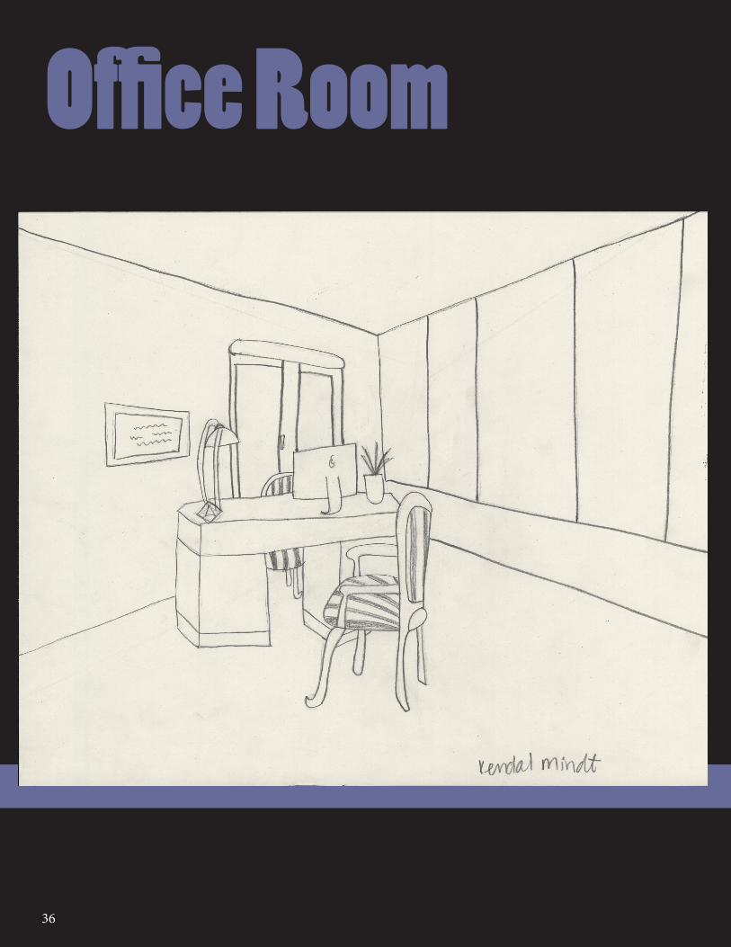
"Working on getting the angles just
right."
First I started off with a blank sheet of white paper. Looking at a picture of a room, I started by drawing lightly, the floors and the ceiling. Once I got the floors and the ceiling right I drew the desk. I drew everything in the foreground first and then I drew everything in the background. When everything was drawn out I went back and made the lines darker and added some shading to the chairs.
I wanted the room to look exactly like the picture. Working on getting the angles just right. Getting it to look 3D in a way. The object of this project was to focus on getting the angles of objects right.

38
My Stuff

39
“...works on the shading
and detailing.”
First I started off with a blank sheet of white paper. Using personal objects lay them. Looking at the display I started drawing the hat in the back. Then I moved to the IPod and then the pool ball. I worked back to front with these objects.
When everyone thing was drawn I then added shading and texture trying to get it to look realistic as I could. Once the shading was done I added the designs and textures if there were any on the objects. When all of the shading and designs and textures were done I outlined all of the shapes.
The purpose of this assignment is to fit all of the objects on a page and make it as accurate as possible. This also works on the shading and detailing. Just seeing how your eye see things from your point of view.

40
All Artwork Made By:
Kendal Mindt