Chapter 4 Visualization of Multivariate Data · With multivariate data, we may also be interested...
38
Chapter 4 Visualization of Multivariate Data Lecturer: Zhao Jianhua Department of Statistics Yunnan University of Finance and Economics
Transcript of Chapter 4 Visualization of Multivariate Data · With multivariate data, we may also be interested...
Chapter 4 Visualization of MultivariateData
Lecturer: Zhao Jianhua
Department of StatisticsYunnan University of Finance and Economics

Outline
4.1 Introduction
4.2 Panel Displays
4.3 Surface Plots and 3D Scatter Plots4.3.1 Surface plots4.3.2 Three-dimensional scatterplot
4.4 Contour Plots
4.5 Other 2D Representations of Data4.5.1 Andrews Curves4.5.2 Parallel Coordinate Plots
4.6 Other Approaches to Data Visualization
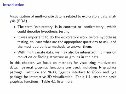
Introduction
Visualization of multivariate data is related to exploratory data anal-ysis (EDA).
• The term ‘exploratory’ is in contrast to ‘confirmatory’, whichcould describe hypothesis testing.
• It was important to do the exploratory work before hypothesistesting, to learn what are the appropriate questions to ask, andthe most appropriate methods to answer them.
• With multivariate data, we may also be interested in dimensionreduction or finding structure or groups in the data.
In this chapter, we focus on methods for visualizing multivariatedata. Several graphics functions are used, including R graphicspackage, lattice and MASS, rggobi interface to GGobi and rgl
package for interactive 3D visualization. Table 1.4 lists some basicgraphics functions. Table 4.1 lists more.
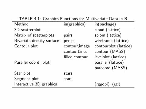
TABLE 4.1: Graphics Functions for Multivariate Data in RMethod in(graphics) in(package)
3D scatterplot cloud (lattice)Matrix of scatterplots pairs splom (lattice)Bivariate density surface persp wireframe (lattice)Contour plot contour,image contourplot (lattice)
contourLines contour (MASS)filled.contour levelplot (lattice)
Parallel coord. plot parallel (lattice)parcoord (MASS)
Star plot starsSegment plot starsInteractive 3D graphics (rggobi), (rgl)
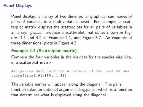
Panel Displays
Panel display: an array of two-dimensional graphical summaries ofpairs of variables in a multivariate dataset. For example, a scat-terplot matrix displays the scatterplots for all pairs of variables inan array. pairs: produce a scatterplot matrix, as shown in Fig-ures 4.1 and 4.2 in Example 4.1, and Figure 3.7. An example ofthree-dimensional plots is Figure 4.5.
Example 4.1 (Scatterplot matrix)
Compare the four variables in the iris data for the species virginica,in a scatterplot matrix.
#virginica data in first 4 columns of the last 50 obs.
pairs(iris [101:150 , 1:4])
The variable names will appear along the diagonal. The pairsfunction takes an optional argument diag.panel, which is a functionthat determines what is displayed along the diagonal.

To obtain a graph with estimated density curves along the diagonal,supply the name of a function to plot the densities. The followingpanel.d plot the densities.
panel.d <- function(x, ...) {
usr <- par("usr")
on.exit(par(usr))
par(usr = c(usr [1:2], 0, .5))
lines(density(x))
}
In panel.d, the graphics parameter usr specifies the extremes ofthe user coordinates of the plotting region. Before plotting, applyscale to standardize each of the one-dimensional samples.
x <- scale(iris [101:150 , 1:4])
r <- range(x)
pairs(x, diag.panel = panel.d, xlim = r, ylim = r)
The pairs plot is displayed in Figure 4.1.

Sepal.Length
−2 0 1 2 −2 0 1 2
−2
01
2
−2
01
2 Sepal.Width
Petal.Length
−2
01
2−2 0 1 2
−2
01
2
−2 0 1 2
Petal.Width
Fig.4.1: Scatterplot matrix (pairs)
comparing four measurements of iris
virginica species in Example 4.1.
Observation: The length variables are positively correlated, and thewidth variables appear to be positively correlated. Other structurecould be present in the data that is not revealed by the bivariatemarginal distributions.

Illustrate the scatterplot matrix function splom in lattice.
library(lattice)
splom(iris [101:150 , 1:4]) #plot 1
#for all 3 at once , in color , plot 2
splom(iris [,1:4], groups = iris$Species)#for all 3 at once , black and white , plot 3
splom(∼iris [1:4], groups = Species , data = iris ,
col = 1, pch = c(1, 2, 3), cex = c(.5 ,.5 ,.5))
}
The last plot (plot 3) is displayed in Figure 4.2. It is displayed here inblack and white, but on screen the panel display is easier to interpretwhen displayed in color (plot 2). Also see the 3D scatterplot of theiris data in Figure 4.5.
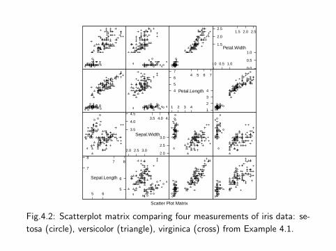
Scatter Plot Matrix
Sepal.Length
7
87 8
5
6
5 6
Sepal.Width3.5
4.0
4.53.5 4.0 4.5
2.0
2.5
3.0
2.0 2.5 3.0
Petal.Length4
5
6
74 5 6 7
1
2
3
4
1 2 3 4
Petal.Width1.5
2.0
2.51.5 2.0 2.5
0.0
0.5
1.0
0.0 0.5 1.0
Fig.4.2: Scatterplot matrix comparing four measurements of iris data: se-
tosa (circle), versicolor (triangle), virginica (cross) from Example 4.1.
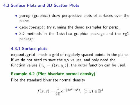
4.3 Surface Plots and 3D Scatter Plots
• persp (graphics) draw perspective plots of surfaces over theplane.
• demo(persp): try running the demo examples for persp.
• 3D methods in the lattice graphics package and the rgl
package.
4.3.1 Surface plots
expand.grid: mesh a grid of regularly spaced points in the plane.If we do not need to save the x,y values, and only need thefunction values {zij = f(xi, yj)}, the outer function can be used.
Example 4.2 (Plot bivariate normal density)
Plot the standard bivariate normal density
f(x, y) =1
2Πe−
12(x2+y2), (x, y) ∈ R2

In this example, zij = f(xi, yj) are computed by the outer function.
#the standard BVN density
f <- function(x,y) {
z <- (1/(2*pi)) * exp(-.5 * (x^2 + y^2)) }
y <- x <- seq(-3, 3, length= 50)
z <- outer(x, y, f) #compute density for all (x,y)
persp(x, y, z) #the default plot
persp(x, y, z, theta = 45, phi = 30, expand = 0.6,
ltheta = 120, shade = 0.75, ticktype = "detailed",
xlab = "X", ylab = "Y", zlab = "f(x, y)")
The second version of the perspective plot is shown in Figure 4.3.
R note 4.1
• outer(x, y, f) apply the third argument f to the grid of(x, y) values. The returned value is a matrix of function valuesfor every point (xi, yj) in the grid.
• For a presentation, adding color (say, col = "lightblue")produces a more attractive plot. box can be suppressed by box= FALSE.

Example 4.3 (Add elements to perspective plot)
Use the viewing transformation returned by the perspective plot ofthe standard bivariate normal density to add points, lines, and text.
X
−3−2
−1
0
1
2
3
Y
−3
−2
−1
0
1
23
f(x, y)
0.05
0.10
0.15
Fig.4.3: Perspective plot of the stan-
dard bivariate normal density in Ex-
ample 4.2.
#store viewing transformation in M
M=persp(x, y, z, theta = 45, phi = 30,
expand = .4, box = FALSE)
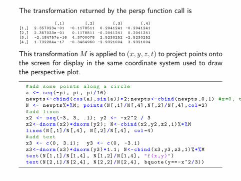
The transformation returned by the persp function call is
[,1] [,2] [,3] [,4]
[1,] 2.357023e -01 -0.1178511 0.2041241 -0.2041241
[2,] 2.357023e -01 0.1178511 -0.2041241 0.2041241
[3,] -2.184757e -16 4.3700078 2.5230252 -2.5230252
[4,] 1.732284e -17 -0.3464960 -2.9321004 3.9321004
This transformation M is applied to (x, y, z, t) to project points ontothe screen for display in the same coordinate system used to drawthe perspective plot.
#add some points along a circle
a <- seq(-pi, pi, pi/16)
newpts <-cbind(cos(a),sin(a))*2; newpts <-cbind(newpts ,0,1) #z=0, t=1
N <- newpts%*%M; points(N[,1]/N[,4],N[,2]/N[,4],col=2)
#add lines
x2 <- seq(-3, 3, .1); y2 <- -x2^2 / 3
z2<-dnorm(x2)*dnorm(y2); N<-cbind(x2,y2,z2 ,1)%*%M
lines(N[,1]/N[,4], N[,2]/N[,4], col=4)
#add text
x3 <- c(0, 3.1); y3 <- c(0, -3.1)
z3<-dnorm(x3)*dnorm(y3)*1.1; N<-cbind(x3,y3 ,z3 ,1)%*%M
text(N[1,1]/N[1,4], N[1,2]/N[1,4], "f(x,y)")
text(N[2,1]/N[2,4], N[2,2]/N[2,4], bquote(y==-x^2/3))
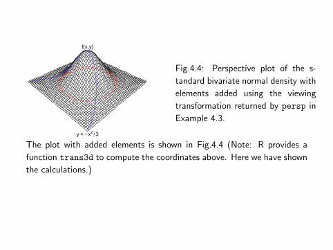
f(x,y)
y = − x2 3
Fig.4.4: Perspective plot of the s-
tandard bivariate normal density with
elements added using the viewing
transformation returned by persp in
Example 4.3.
The plot with added elements is shown in Fig.4.4 (Note: R provides a
function trans3d to compute the coordinates above. Here we have shown
the calculations.)

Other functions for graphing surfaces
Use wireframe(lattice) to display a surface plot of the bivariatenormal density similar to Figure 4.3.
Example 4.4 (Surface plot using wireframe(lattice))
wireframe requires a formula z ∼ x ∗ y, where z = f(x, y) is thesurface to be plotted. x, y and z must have the same number ofrows. Generate matrix of (x, y) coordinates by expand.grid.
library(lattice)
x <- y <- seq(-3, 3, length= 50)
xy <- expand.grid(x, y)
z <- (1/(2*pi)) * exp(-.5 * (xy[ ,1]^2 + xy[ ,2]^2))
wireframe(z ∼ xy[,1] * xy[,2]) }
An interactive 3D display is provided by the graphics package rgl.One of the examples in the demo of rgl package shows a bivariatenormal density.
library(rgl)
demo(bivar) #or demo(rgl) to see more

4.3.2 Three-dimensional scatterplot
cloud (lattice) function produces 3D scatterplots, which couldexplore whether there are groups or clusters in the data. To applycloud, provide a formula z ∼ x∗y, where z = f(x, y) is the surface.
Example 4.5 (3D scatterplot)
Use cloud to display a 3D scatterplot of the iris data. There arethree species of iris and each is measured on four variables. Thefollowing code produces a 3D scatterplot of sepal length, sepalwidth, and petal length (similar to (3) in Figure 4.5).
library(lattice)
attach(iris)
#basic 3 color plot with arrows along axes
print(cloud(Petal.Length ∼ Sepal.Length * Sepal.Width ,data=iris , groups=Species )}
The iris data has four variables, so there are four subsets of threevariables to graph. To see all four plots on the screen, use the moreand split options. The split arguments determine the location of theplot within the panel display.
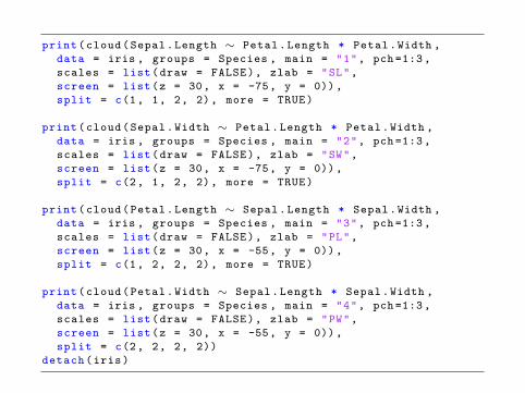
print(cloud(Sepal.Length ∼ Petal.Length * Petal.Width ,
data = iris , groups = Species , main = "1", pch=1:3,
scales = list(draw = FALSE), zlab = "SL",
screen = list(z = 30, x = -75, y = 0)),
split = c(1, 1, 2, 2), more = TRUE)
print(cloud(Sepal.Width ∼ Petal.Length * Petal.Width ,
data = iris , groups = Species , main = "2", pch=1:3,
scales = list(draw = FALSE), zlab = "SW",
screen = list(z = 30, x = -75, y = 0)),
split = c(2, 1, 2, 2), more = TRUE)
print(cloud(Petal.Length ∼ Sepal.Length * Sepal.Width ,
data = iris , groups = Species , main = "3", pch=1:3,
scales = list(draw = FALSE), zlab = "PL",
screen = list(z = 30, x = -55, y = 0)),
split = c(1, 2, 2, 2), more = TRUE)
print(cloud(Petal.Width ∼ Sepal.Length * Sepal.Width ,
data = iris , groups = Species , main = "4", pch=1:3,
scales = list(draw = FALSE), zlab = "PW",
screen = list(z = 30, x = -55, y = 0)),
split = c(2, 2, 2, 2))
detach(iris)

1
Petal.LengthPetal.Width
SL
2
Petal.LengthPetal.Width
SW
3
Sepal.LengthSepal.Width
PL
4
Sepal.LengthSepal.Width
PW
Fig.4.5: 3D scatterplots of iris data produced by cloud (lattice) in Example
4.5, with each species represented by a different plotting character.

Observation: three species of iris are separated into groups or clus-ters, which is evident in these plots. One might follow up withcluster analysis or principal components analysis to analyze the ap-parent structure in the data.
R note 4.2
• The screen option sets the orientation of the axes. Settingdraw = FALSE suppresses arrows and tick marks on the axes.
• To split the screen into n rows and m columns, and put the plotinto position (r, c), set split equal to the vector (r, c, n,m).
• One unusual feature of cloud is that unlike most graphics func-tions in R, cloud does not plot a panel figure unless we printit.

4.4 Contour Plots
• A contour plot represents a 3D surface (x, y, f(x, y)) in theplane by projecting the level curves f(x, y) = c for selectedconstants c.
• The functions contour (graphics) and contourplot (lattice)
produce contour plots.
• The functions filled.contour in the graphics package andlevelplot function in the lattice package produce filled con-tour plots. Both contour and contourplot label the contours bydefault.
• A variation of this type of plot is image (graphics), which usescolor to identify contour levels.
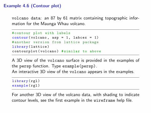
Example 4.6 (Contour plot)
volcano data: an 87 by 61 matrix containing topographic infor-mation for the Maunga Whau volcano.
#contour plot with labels
contour(volcano , asp = 1, labcex = 1)
#another version from lattice package
library(lattice)
contourplot(volcano) #similar to above
A 3D view of the volcano surface is provided in the examples ofthe persp function. Type example(persp).An interactive 3D view of the volcano appears in the examples.
library(rgl)
example(rgl)
For another 3D view of the volcano data, with shading to indicatecontour levels, see the first example in the wireframe help file.
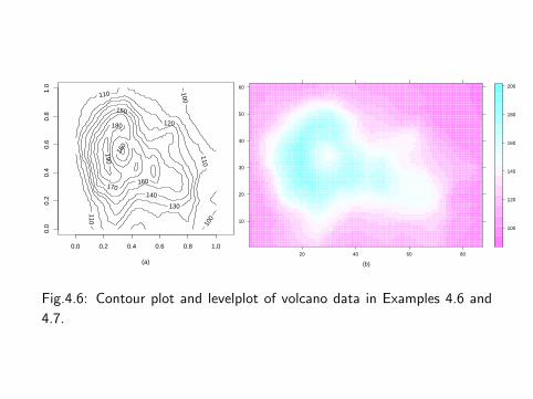
(a)
100
100
110
110
110
120
130
140
150
160
160
170
180
190
0.0 0.2 0.4 0.6 0.8 1.0
0.0
0.2
0.4
0.6
0.8
1.0
(b)
10
20
30
40
50
60
20 40 60 80
100
120
140
160
180
200
Fig.4.6: Contour plot and levelplot of volcano data in Examples 4.6 and
4.7.
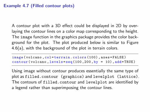
Example 4.7 (Filled contour plots)
A contour plot with a 3D effect could be displayed in 2D by over-laying the contour lines on a color map corresponding to the height.The image function in the graphics package provides the color back-ground for the plot. The plot produced below is similar to Figure4.6(a), with the background of the plot in terrain colors.
image(volcano ,col=terrain.colors (100) , axes=FALSE)
contour(volcano ,levels=seq (100 ,200,by = 10),add=TRUE)
Using image without contour produces essentially the same type ofplot as filled.contour (graphics) and levelplot (lattice).The contours of filled.contour and levelplot are identified bya legend rather than superimposing the contour lines.
Compare the plot produced by image with the following two plots.
filled.contour(volcano ,color=terrain.colors ,asp =1)
levelplot(volcano , scales = list(draw = FALSE),
xlab = "", ylab = "")
The plot produced by levelplot is shown in Figure 4.6(b).
• A limitation of 2D scatterplots is that for large data sets, thereare often regions where data is very dense, and regions wheredata is quite sparse. In this case, the 2D scatterplot does notreveal much information about the bivariate density.
• Another approach is to produce a 2D or flat histogram, withthe density estimate in each bin represented by an appropriatecolor.

Example 4.8 (2D histogram)
Simulated bivariate normal data is displayed in a flat histogram withhexagonal bins. hexbin in package hexbin produces a basic versionof this plot in grayscale.
library(hexbin)
x <- matrix(rnorm (4000) , 2000, 2)
plot(hexbin(x[,1], x[,2]))
−3 −2 −1 0 1 2 3
−3
−2
−1
0
1
2
3
x[, 1]
x[, 2
]
124568911121315161819202223
Counts
Fig.4.7: Flat density his-
togram of bivariate normal
data with hexagonal bins pro-
duced by hexbin in Example
4.8.

• Compare Figure 4.7 with Figure 10.11 on page 308. Note thatthe darker colors correspond to the regions where the densityis highest, and colors are increasingly lighter along radial linesextending from the mode near the origin. The plot exhibitsapproximately circular symmetry, consistent with the standardbivariate normal density.
The bivariate histogram can also be displayed in 2D using a colorpalette, such as heat.colors or terrain.colors, to represent thedensity for each bin. A similar type of plot is implemented in thegplots package. The plot (not shown) resulting from the followingcode is similar to Figure 4.7, but with color and square bins.
library(gplots)
hist2d(x, nbins = 30,
col = c("white", rev(terrain.colors (30))))
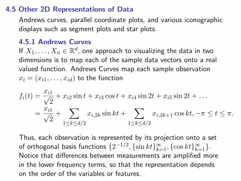
4.5 Other 2D Representations of Data
Andrews curves, parallel coordinate plots, and various iconographicdisplays such as segment plots and star plots.
4.5.1 Andrews CurvesIf X1, . . . , Xn ∈ Rd, one approach to visualizing the data in twodimensions is to map each of the sample data vectors onto a realvalued function. Andrews Curves map each sample observationxi = (xi1, . . . , xid) to the function
fi(t) =xi1√
2+ xi2 sin t+ xi3 cos t+ xi4 sin 2t+ xi5 sin 2t+ . . .
=xi1√
2+
∑1≤k≤d/2
xi,2k sin kt+∑
1≤k≤d/2
xi,2k+1 cos kt,−π ≤ t ≤ π.
Thus, each observation is represented by its projection onto a setof orthogonal basis functions {2−1/2, {sin kt}∞k=1, {cos kt}∞k=1}.Notice that differences between measurements are amplified morein the lower frequency terms, so that the representation dependson the order of the variables or features.

Example 4.9 (Andrews curves)
• Measurements of leaves for two types of leaf architecture arerepresented by Andrews curves (leafshape17 in DAAG pack-age). Three measurements (leaf length, petiole, and leaf width)correspond to points in R3.
• To plot the curves, define a function to compute fi(t) for arbi-trary points xi in R3 and −π ≤ t ≤ π. Evaluate the functionalong the interval [−π, π] for each sample point xi.
library(DAAG)
attach(leafshape17)
f <- function(a, v) {
#Andrews curve f(a) for a data vector v in R^3
v[1]/sqrt (2) + v[2]*sin(a) + v[3]*cos(a)}
#scale data to range [-1, 1]
x <- cbind(bladelen , petiole , bladewid)
n <- nrow(x)
mins <- apply(x, 2, min) #column minimums
maxs <- apply(x, 2, max) #column maximums
r <- maxs - mins #column ranges
y <- sweep(x, 2, mins) #subtract column mins
y <- sweep(y, 2, r, "/") #divide by range
x <- 2 * y - 1 #now has range [-1, 1]
#set up plot window , but plot nothing yet
plot(0, 0, xlim = c(-pi, pi), ylim = c(-3,3),
xlab = "t", ylab = "Andrews Curves",
main = "", type = "n")
#now add the Andrews curves for each observation
#line type corresponds to leaf architecture
#0= orthotropic , 1= plagiotropic
a <- seq(-pi , pi , len =101)
dim(a) <- length(a)
for (i in 1:n) {
g <- arch[i] + 1
y <- apply(a, MARGIN = 1, FUN = f, v = x[i,])
lines(a, y, lty = g)
}
legend(3, c("Orthotropic", "Plagiotropic"), lty = 1:2)
detach(leafshape17)

−3 −2 −1 0 1 2 3
−3
−2
−1
01
23
t
And
rew
s C
urve
sOrthotropicPlagiotropic
Fig.4.8: Andrews curves for
leafshape17 (DAAG) data
at latitude 17.1: leaf length,
width, and petiole measure-
ments in Example 4.9. Curves
are identified by leaf architec-
ture.
The plot reveals similarities within plagiotropic and orthotropic leafarchitecture groups, and differences between these groups. In gen-eral, this type of plot may reveal possible clustering of data.
R note 4.4To identify the curves by color, replace lty with col parameters inthe lines and legend statements.

R note 4.3In Example 4.9 the sweep operator is applied to subtract thecolumn minimums above. The syntax is
sweep(x, MARGIN , STATS , FUN="-", ...)
By default, the statistic is subtracted but other operations arepossible. Here
y <- sweep(x, 2, mins) #subtract column mins
y <- sweep(y, 2, r, "/") #divide by range
sweeps out (subtracts) the minimum of each columns (margin =2). Then the ranges of each of the three columns (in r) are sweptout; that is, each column is divided by its range.
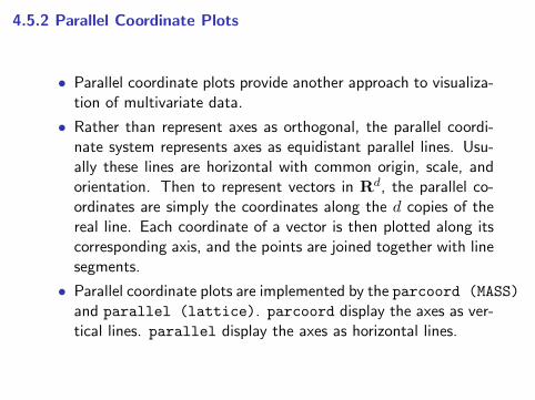
4.5.2 Parallel Coordinate Plots
• Parallel coordinate plots provide another approach to visualiza-tion of multivariate data.
• Rather than represent axes as orthogonal, the parallel coordi-nate system represents axes as equidistant parallel lines. Usu-ally these lines are horizontal with common origin, scale, andorientation. Then to represent vectors in Rd, the parallel co-ordinates are simply the coordinates along the d copies of thereal line. Each coordinate of a vector is then plotted along itscorresponding axis, and the points are joined together with linesegments.
• Parallel coordinate plots are implemented by the parcoord (MASS)
and parallel (lattice). parcoord display the axes as ver-tical lines. parallel display the axes as horizontal lines.

Example 4.10 (Parallel coordinates)
• Use parallel (lattice) to construct a panel display of par-allel coordinate plots for crabs (MASS) data.
• Crab data frame has 5 measurements on each of 200 crabs,from four groups of size 50. The groups are identified by species(blue or orange) and sex.
• The graph is best viewed in color. Here we use black and white,and for readability select only 1/5 of the data.
library(MASS)
library(lattice)
trellis.device(color = FALSE) #black and white display
x <- crabs[seq(5, 200, 5), ] #get every fifth obs.
parallel(∼x[4:8] | sp*sex , x)
The resulting parallel coordinate plots are displayed in Figure 4.9(a).The labels along the vertical axis identify each axis correspondingto the five measurements (frontal lobe size, rear width, carapacelength, carapace width, body depth). Much of the variability be-tween groups is in overall size.

(a)
FL
RW
CL
CW
BD
Min Max
BF
OF
FL
RW
CL
CW
BDBM
Min Max
OM
(b)
FL
RW
CL
CW
BD
Min Max
BF
OF
FL
RW
CL
CW
BDBM
Min Max
OM
Fig.4.9:Parallel coordinate plots in Example 4.10 for a subset ofthe crabs (MASS) data. (a) Differences between species (B=blue,O=orange) and sex (M, F) are largely obscured by large variationin overall size. (b) After adjusting the measurements for size ofindividual crabs, differences between groups are evident.
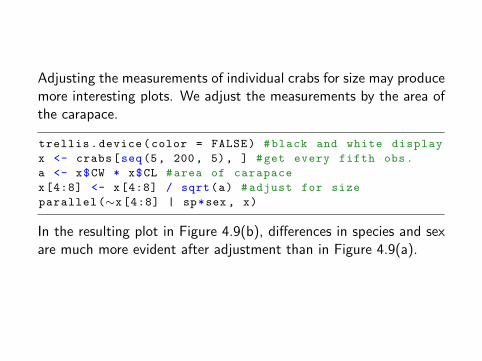
Adjusting the measurements of individual crabs for size may producemore interesting plots. We adjust the measurements by the area ofthe carapace.
trellis.device(color = FALSE) #black and white display
x <- crabs[seq(5, 200, 5), ] #get every fifth obs.
a <- x$CW * x$CL #area of carapace
x[4:8] <- x[4:8] / sqrt(a) #adjust for size
parallel(∼x[4:8] | sp*sex , x)
In the resulting plot in Figure 4.9(b), differences in species and sexare much more evident after adjustment than in Figure 4.9(a).
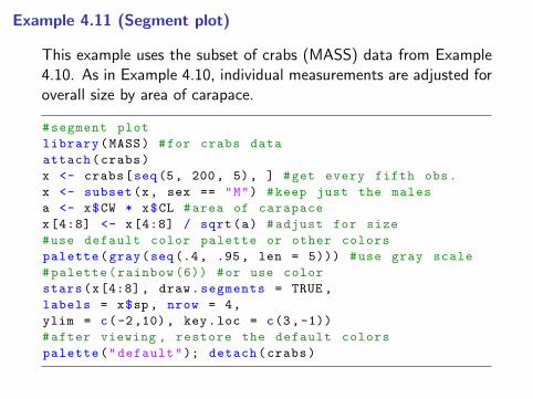
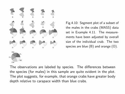
Example 4.11 (Segment plot)
This example uses the subset of crabs (MASS) data from Example4.10. As in Example 4.10, individual measurements are adjusted foroverall size by area of carapace.
#segment plot
library(MASS) #for crabs data
attach(crabs)
x <- crabs[seq(5, 200, 5), ] #get every fifth obs.
x <- subset(x, sex == "M") #keep just the males
a <- x$CW * x$CL #area of carapace
x[4:8] <- x[4:8] / sqrt(a) #adjust for size
#use default color palette or other colors
palette(gray(seq(.4, .95, len = 5))) #use gray scale
#palette(rainbow (6)) #or use color
stars(x[4:8] , draw.segments = TRUE ,
labels = x$sp , nrow = 4,
ylim = c(-2,10), key.loc = c(3,-1))
#after viewing , restore the default colors
palette("default"); detach(crabs)
B B B B B
B B B B B
O O O O O
O O O O O
FLRW
CL
CWBD
Fig.4.10: Segment plot of a subset of
the males in the crabs (MASS) data
set in Example 4.11. The measure-
ments have been adjusted by overall
size of the individual crab. The two
species are blue (B) and orange (O).
The observations are labeled by species. The differences betweenthe species (for males) in this sample are quite evident in the plot.The plot suggests, for example, that orange crabs have greater bodydepth relative to carapace width than blue crabs.
4.6 Other Approaches to Data Visualization
• Asimov’s grand tour [14] is an interactive graphical tool thatprojects data onto a plane, rotating through all angles to revealany structure in data. The grand tour is similar to projectionpursuit exploratory data analysis (PPEDA) [100].
• Principal components analysis (PCA) similarly uses projections.Dimension is reduced by projecting onto a small number ofprincipal components that collectively explain most of variation.
• Chernoffs faces [46] are implemented in faces(aplpack) andin faces(TeachingDemos) [254]. Mosaic plots for visualiza-tion of categorical data are available in mosaicplot. Packagevcd for visualization of categorical data. Functions prcomp andprincomp provide PCA.
• Many packages for R fall under the data mining or machinelearning umbrella; for a start see nnet, rpart, and randomForest.More packages are described on the Multivariate Task View andMachine Learning Task View on the CRAN web.