Chapter 3 - Text Revamped by Hamzah Asyrani Sulaiman.
34
Chapter 3 - Text Revamped by Hamzah Asyrani Sulaiman
-
Upload
sophie-donna-morris -
Category
Documents
-
view
226 -
download
2
Transcript of Chapter 3 - Text Revamped by Hamzah Asyrani Sulaiman.

Chapter 3 - TextRevamped by Hamzah Asyrani Sulaiman

Text

Text has a dual nature
it is visual representation of language, and a graphic element in its own right

Text in digital form also a representation of language
that is, we need to relate bit pattern stored in a computer’s memory or transmitted over a network to the symbols of a written language.

When we display the text
its visual aspect becomes relevant with such issues as the precise shape of the characters, their spacing, layout of lines, paragraphs and larger divisions of text on the screen or page
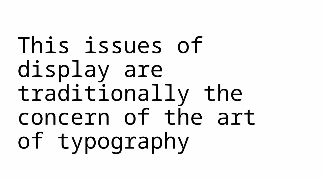
This issues of display are traditionally the concern of the art of typography

Character Sets

In keeping with the text’s dual nature, it is convenient to distinguish between the lexical content of a piece of text and its appearance.

Lexical Content
the characters that make up the words and other units such as punctuation or mathematical symbols.

The appearance of the text
comprises its visual attributes such as the precise shape of the characters, their size and the way the content is arranged on the page or screen.

Example

Content the part of text that carries its meaning or semantics, while the appearance is a surface attribute that may affect how easy the text is to read or how pleasant it is to look at but does not substantially alter its meaning.

Abstract characters are grouped into alphabets.
Each particular alphabet forms the basis of the written form of a certain language or group of languages.

Any set of distinct symbols can be an alphabet including the set of symbols used in an ideographic writing system such as those used for Chinese and Japanese, where each character represents a whole word or concept.
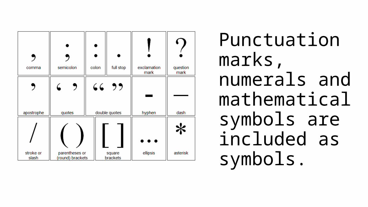
Punctuation marks, numerals and mathematical symbols are included as symbols.

FontsWhen a document's text is to be displayed visually,
characters (abstract information elements) must be mapped to abstract glyphs.

A glyph is the actual artistic representation of an abstract glyph, in some typographic style, in the form of outlines or bitmaps that may be drawn on the screen or paper.

A font is a set of glyphs, all observing the same basic motif according to design, size, appearance, and other attributes associated with the entire set, and a mapping from characters to abstract glyphs.

It can be confusing because often times you find out that people use the term "font" openly to refer to many things in typography.
Traditionally, font is a term used when discussing a set of characters of a certain typeface and in the same family. A font has also been used to describe a software used to produce a typeface in your design, which explains why we have our fonts licensed.
A glyph is the variety of designs of a certain character. If you have a collection of 3 different designs of the letter A, you have 3 glyphs.

Classification of Fonts

There are thousands of fonts available, each with its own special personality. Some broad characteristics are used to classify them

Monospaced Font:
Courier
Each letter occupies the same amount of horizontal space, so that the text looks as if it was typed on a typewriter.
Proportional Font:
Georgia
Each letter occupies an amount of horizontal space proportional to the width of the glyph so that the text looks like as if it was printed in a book.
Monospaced vs. proportional
http://www.ehow.com/info_8755836_proportional-vs-monospace-fonts.html

23
Serif vs. Sans Serif• Another very broad distinction in fonts are
between• serif• sans serif
• The serif is the little strokes added to the ends of character shapes.
• Examples of serif fonts: Times, New Century Schoolbook, Bookman and Palatino.
• Examples of sans serif fonts: Helvetica, Arial, Optima and Avant Garde.
• Notice the difference between serif and sans serif in the following illustration:
T TTimes Arial
24
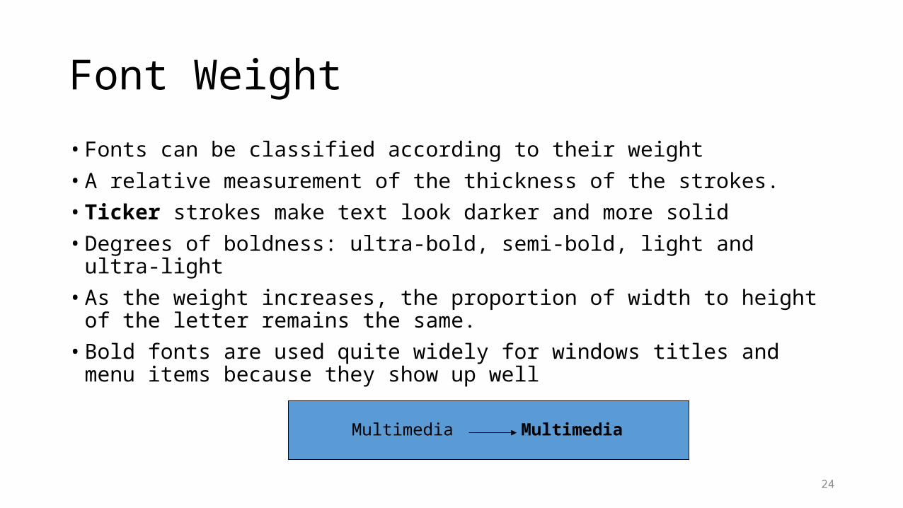
Font Weight
• Fonts can be classified according to their weight
• A relative measurement of the thickness of the strokes.
• Ticker strokes make text look darker and more solid
• Degrees of boldness: ultra-bold, semi-bold, light and ultra-light
• As the weight increases, the proportion of width to height of the letter remains the same.
• Bold fonts are used quite widely for windows titles and menu items because they show up well
Multimedia Multimedia

25
Font Shape
• Distinguish between fonts with an upright shape and an italic shape
• Italic fonts imitate a certain style of handwriting and have letters that are slanted to the right
• Most italic fonts are variation on or designed as companions to upright fonts
• There are some fonts with an italic shape which are designed on their own usually intended to have the character of handwriting; where something more human than a conventional typeface is desired
• Fonts are also designed with either solid or outline forms

26
Font Terminology
• Font is measured in point sizes where 1 point is approximately 1/72 of an inch
• The x-height is the measurement of the height of the character x or without any ascender of descender
• The width of the letters is called the set and is fixed relative to the point size.
• The spaces between the letters in one word (tracking) can be adjusted in a process called kerning.
doppelgangerbaseline
ascenders
descendersset
X-heightbody size

27
Reading and Layout
• Layout of text and the printed page can affect the readability of the content.
• Justification: Text which has a uniform left edge (left justified) is normally the easiest to read.
• Choice of font: In general, a serif font is most readable for body text and sans serif font for headings where there is not too much text to read.
• Distraction: Keep the reading area free of distractions. E.g. Patterned background, different coloured letters, variation in size etc.

28
• Breaks: It is important to have breakpoints which the reader can use as reference outside the sentences to see where the are. E.g. Paragraph, Pictures, Non textual items.
• Spacing: More spaced out text is easier to read. Closely packed text is difficult to read because the eye has to be precise about the fixation points.

29
Using Text in Multimedia• Bold or emphasize text to highlight ideas or concept,
but do not make text look like a link or a button when it is not.
• Use meaningful words or phrases for links and menu items.
• Use anti-aliased text for a gentle and blended look for titles and headlines.
• To make the text stand out, explore the effects of different colours and placing the text on various background.
• For attention-grabbing results, try graphically altering and distorting the text. E.g. wrap your word onto a sphere or splash it with rainbow colours.

30
• On a web page, put vital text elements and menus in the top 320 pixels. Studies of surfer habits have discovered that only 10 to 15 percent of surfers ever scroll any page.
• Use few different fonts as possible in the same work, but vary the weight and size of the typeface using italic and bold styles.
• Vary the size of the font in proportion to the importance of the message you are delivering.
• Serif fonts are traditionally used for body text in printed material because the serifs are said to help guide the reader’s eye along the line of text.
• Sans serif fonts are used for headlines and bold statements.

31
Web Safe Fonts
Web safe fonts are the fonts practically everybody can see since they are the most common on most computers. Let's take a closer look at them.
Arial BlackIts best use is for headlines in large sizes.
ArialOne of the most common fonts is Arial. It is a sans serif font. Arial is clean and quite easy to read even in small sizes. Similar font: Helvetica
Comic SansAnother sans serif font with a somewhat more "artistic" look.

32
Courier NewThe only monospaced font among the web safe
fonts. Monospaced means that every character has exactly the same width. An 'i' takes up just as much space as an 'm'.
ImpactA thick and sans serif font. Looks best in a little
larger sizes since it tends to get quite messy in smaller. Often used on professional sites as headlines and such.
Times New RomanIt's a serif font. However, the serifs make the font very
hard to read when used in smaller sizes.
VerdanaAnother sans serif font. Like Arial it is easy to read in small sizes. You will find this font used by a lot of professional
sites. Similar fonts: Tahoma, Trebuchet

33
Working with textGuidelines need to be considered:
a) be concise- avoid too many text- A picture is worth a thousand words
b) use appropriate type of font- to focus an attention of the
audience- increase readibility, - setting a tone (mood or expression)
c) easy to read- avoid decorative font – hard to read
- - screen with too many text will hard to read
34
• d) take into consideration the style and color• - italic the style if necessary• - use appropriate color base on the theme given
• e) be consistent• - never use more than 3 type of fonts• - the size must be consistent