Chapter 2 Solution Manual for Business Statistics …...Chapter 2: Displaying and Describing...
31
Chapter 2 Solution Manual for Business Statistics 3rd Edition by Sharpe Link download full: https://testbankservice.com/download/solution-manual-for- business-statistics-3rd-edition-by-sharpe A large national retailer of electronics conducted a survey to determine consumer preferences for various brands of point and shoot digital cameras. The table summarizes responses by brand and gender. Female Male Total Cannon Power Shot 73 59 132 Nikon Cool Pix 49 47 96 Sony Cyber Shot 58 33 91 Panasonic Lumix 35 30 65 Fujifilm Finepix 45 28 73 Olympus S/V 37 41 78 Other Brands 86 67 153 Total 383 305 688 2.1.3 Create and use frequency and relative frequency distributions and their displays. 1. Identify the variables and tell whether each is categorical or quantitative. 2.1.3 Create and use frequency and relative frequency distributions and their displays. 2. Find each of the following percentages. a. What percent of the responses were males who prefer Nikon? b. What percent of the male responses prefer Olympus? c. What percent of the consumers who choose Nikon were females? 2.3.4 Determine if displays of data are appropriate. 3. What is the marginal distribution of brands? 2.2.4 Determine if displays of data are appropriate. 4. Prepare an appropriate chart to display the marginal distribution of brands. 2.3.4 Determine if displays of data are appropriate. 5. Write a sentence or two about the conditional relative frequency distribution of the brands among female respondents. 2-1 Copyright © 2015 Pearson Education, Inc.
Transcript of Chapter 2 Solution Manual for Business Statistics …...Chapter 2: Displaying and Describing...

Chapter 2
Solution Manual for Business Statistics 3rd
Edition by Sharpe
Link download full:
https://testbankservice.com/download/solution-manual-for-
business-statistics-3rd-edition-by-sharpe
A large national retailer of electronics conducted a survey to determine consumer
preferences for various brands of point and shoot digital cameras. The table summarizes responses by brand and gender.
Female Male Total
Cannon Power Shot 73 59 132
Nikon Cool Pix 49 47 96
Sony Cyber Shot 58 33 91
Panasonic Lumix 35 30 65
Fujifilm Finepix 45 28 73
Olympus S/V 37 41 78
Other Brands 86 67 153
Total 383 305 688
2.1.3 Create and use frequency and relative frequency distributions and their displays.
1. Identify the variables and tell whether each is categorical or quantitative.
2.1.3 Create and use frequency and relative frequency distributions and their displays.
2. Find each of the following percentages.
a. What percent of the responses were males who prefer Nikon? b. What percent of the male responses prefer Olympus? c. What percent of the consumers who choose Nikon were females?
2.3.4 Determine if displays of data are appropriate.
3. What is the marginal distribution of brands?
2.2.4 Determine if displays of data are appropriate.
4. Prepare an appropriate chart to display the marginal distribution of brands.
2.3.4 Determine if displays of data are appropriate. 5. Write a sentence or two about the conditional relative frequency distribution of the brands among female respondents.
2-1
Copyright © 2015 Pearson Education, Inc.

2-2 Chapter 2 Displaying and Describing Categorical Data
2.2.1 Determine if displays of data are appropriate.
6. Consider the following side by side bar chart for the data above:
Does the chart indicate that brand preference is independent of gender? Explain.
Copyright © 2015 Pearson Education, Inc.

Quiz A 2-3
Chapter 2: Displaying and Describing Categorical Data – Quiz A – Key
A large national retailer of electronics conducted a survey to determine consumer preferences for various brands of digital cameras. The table summarizes responses by
brand and gender.
Female Male Total
Cannon Power Shot 73 59 132
Nikon Cool Pix 49 47 96
Sony Cyber Shot 58 33 91
Panasonic Lumix 35 30 65
Fujifilm Finepix 45 28 73
Olympus S/V 37 41 78
Other Brands 86 67 153
Total 383 305 688
1. Identify the variables and tell whether each is categorical or
quantitative. Gender and Brand; both categorical.
2. Find each of the following percentages.
a. What percent of the responses were males who prefer Nikon?
6.8% (47/688)
b. What percent of the male responses prefer Olympus?
13.4% (41/305)
c. What percent of the consumers who choose Nikon were females?
51.0% (49/96)
3. What is the marginal distribution of brands?
132 for Cannon Power Shot, 96 for Nikon Cool Pix, 91 for Sony Cyber Shot, 65 for
Panasonic Lumix, 73 for Fujifilm Finepix, 78 for Olympus S/V and 153 for other brands.
4. Prepare an appropriate chart to display the marginal distribution of
brands. Either a bar chart (shown below) or a pie chart is appropriate.
Copyright © 2015 Pearson Education, Inc.

2-4 Chapter 2 Displaying and Describing Categorical Data
5. Write a sentence or two about the conditional relative frequency distribution of the brands among female respondents.
Among females, 19.1% prefer Cannon, 12.8% prefer Nikon, 15.1% prefer Sony,
9.1% prefer Panasonic, 11.7% prefer Fujifilm, and 9.7% prefer Olympus. The remaining 22.5% of females preferred other brands.
6. Consider the following side by side bar chart for the data above:
Does the chart indicate that brand preference is independent of gender? Explain.
Brand preference appears to be independent of gender for about half of the brands. The other half of the brand preferences seem to have preference based on gender. These
data provide little evidence of a difference in digital camera choice based on gender.
Copyright © 2015 Pearson Education, Inc.
Quiz B 2-5
Chapter 2: Displaying and Describing Categorical Data – Quiz B
Name
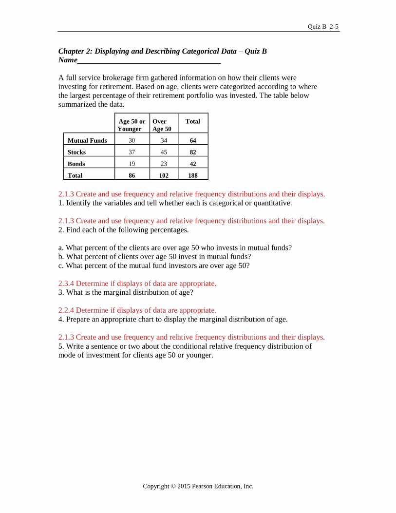
A full service brokerage firm gathered information on how their clients were
investing for retirement. Based on age, clients were categorized according to where
the largest percentage of their retirement portfolio was invested. The table below
summarized the data.
Age 50 or Over Total
Younger Age 50
Mutual Funds 30 34 64
Stocks 37 45 82
Bonds 19 23 42
Total 86 102 188
2.1.3 Create and use frequency and relative frequency distributions and their displays.
1. Identify the variables and tell whether each is categorical or quantitative.
2.1.3 Create and use frequency and relative frequency distributions and their displays.
2. Find each of the following percentages.
a. What percent of the clients are over age 50 who invests in mutual funds?
b. What percent of clients over age 50 invest in mutual funds?
c. What percent of the mutual fund investors are over age 50?
2.3.4 Determine if displays of data are appropriate.
3. What is the marginal distribution of age?
2.2.4 Determine if displays of data are appropriate.
4. Prepare an appropriate chart to display the marginal distribution of age.
2.1.3 Create and use frequency and relative frequency distributions and their displays. 5. Write a sentence or two about the conditional relative frequency distribution of mode of investment for clients age 50 or younger.
Copyright © 2015 Pearson Education, Inc.

2-6 Chapter 2 Displaying and Describing Categorical Data
2.4.3 Create and use frequency and relative frequency distributions and their displays.
60
50
40
30
20
10
0 Younger Older Younger Older Younger Older
Investment Mutual Funds Stocks Bonds
Percent within levels of Investment.
6. Consider the following side by side bar chart for the data above:
Does the chart indicate that mode of investment is independent of age? Explain.
2.5.4 Create and use frequency and relative frequency distributions and their displays. 7. A newspaper examined the town's two hospitals and found that over the last six
months at Mercy Hospital 79% of the patients survived while at County Hospital 90%
survived. The table below summarizes the findings.
Lived Died Total % who lived
Mercy Hospital 790 210 1000 79.0%
City Hospital 900 100 1000 90.0% On closer investigation, it was observed that there was a difference in survival between patients who were admitted in poor condition or worse compared with patients admitted
in fair condition or better. The following tables were created:
Patients admitted in poor condition or worse:
Lived Died Total % who lived
Mercy Hospital 210 200 410
City Hospital 40 70 110
Copyright © 2015 Pearson Education, Inc.
Quiz B 2-7
Patients admitted in fair condition or better:
Lived Died Total % who lived
Mercy Hospital 580 10 590
City Hospital 860 30 890
a) Fill in the four blanks in the two tables above with percentages. b) Compare the percentages in the first table with those in the next two tables. Do
you observe anything unusual? c) Which hospital would you choose and why?
Copyright © 2015 Pearson Education, Inc.
2-8 Chapter 2 Displaying and Describing Categorical Data
Chapter 2: Displaying and Describing Categorical Data – Quiz B – Key
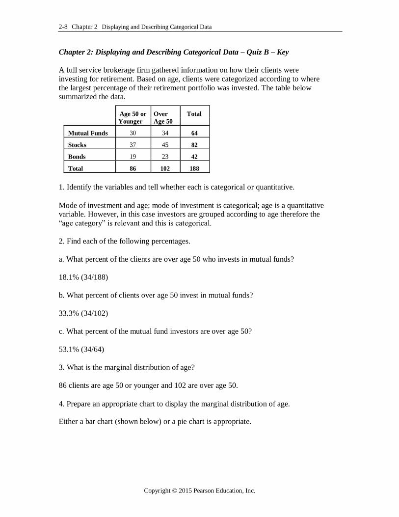
A full service brokerage firm gathered information on how their clients were
investing for retirement. Based on age, clients were categorized according to where
the largest percentage of their retirement portfolio was invested. The table below summarized the data.
Age 50 or Over Total
Younger Age 50
Mutual Funds 30 34 64
Stocks 37 45 82
Bonds 19 23 42
Total 86 102 188
1. Identify the variables and tell whether each is categorical or quantitative.
Mode of investment and age; mode of investment is categorical; age is a quantitative variable. However, in this case investors are grouped according to age therefore the
“age category” is relevant and this is categorical.
2. Find each of the following percentages.
a. What percent of the clients are over age 50 who invests in mutual funds?
18.1% (34/188)
b. What percent of clients over age 50 invest in mutual funds?
33.3% (34/102)
c. What percent of the mutual fund investors are over age 50?
53.1% (34/64)
3. What is the marginal distribution of age?
86 clients are age 50 or younger and 102 are over age 50.
4. Prepare an appropriate chart to display the marginal distribution of age.
Either a bar chart (shown below) or a pie chart is appropriate.
Copyright © 2015 Pearson Education, Inc.

Quiz B 2-9
Chart of Number of Clients
100
80
60
40
20
0 50 or Younger Over 50
Age
5. Write a sentence or two about the conditional relative frequency distribution of mode of investment for clients age 50 or younger.
More clients (43%) age 50 or younger invested their retirement savings primarily in
stocks rather than in any other mode of investment, 35% invested in mutual funds
while only 22% invested in bonds.
Copyright © 2015 Pearson Education, Inc.
2-10 Chapter 2 Displaying and Describing Categorical Data
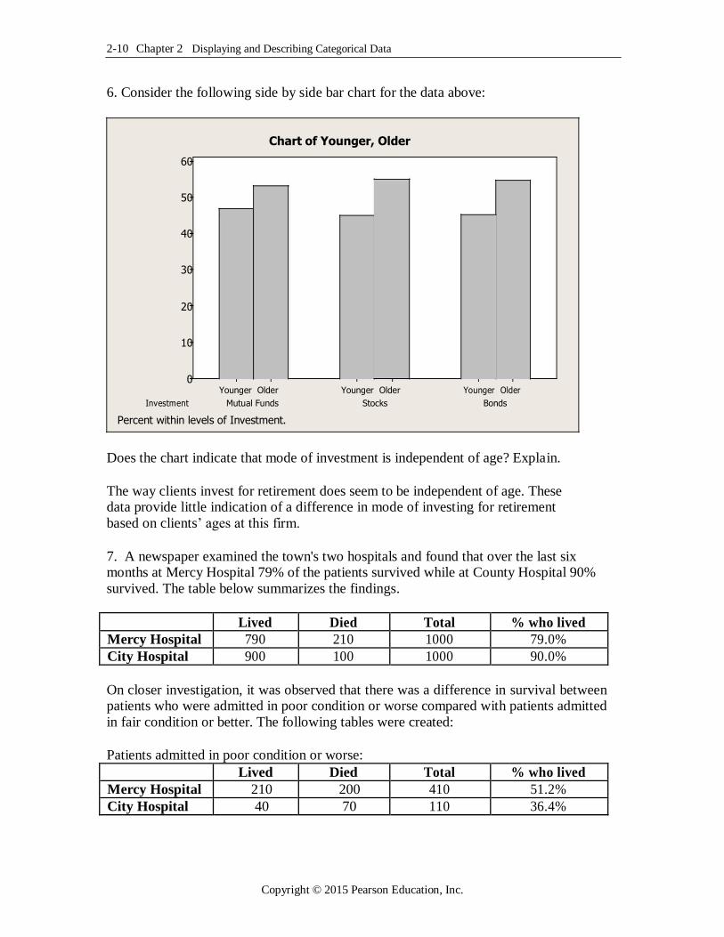
6. Consider the following side by side bar chart for the data above:
Chart of Younger, Older
60
50
40
30
20
10
0 Younger Older Younger Older Younger Older
Investment Mutual Funds Stocks Bonds
Percent within levels of Investment.
Does the chart indicate that mode of investment is independent of age? Explain.
The way clients invest for retirement does seem to be independent of age. These data provide little indication of a difference in mode of investing for retirement
based on clients’ ages at this firm.
7. A newspaper examined the town's two hospitals and found that over the last six months at Mercy Hospital 79% of the patients survived while at County Hospital 90%
survived. The table below summarizes the findings.
Lived Died Total % who lived
Mercy Hospital 790 210 1000 79.0%
City Hospital 900 100 1000 90.0%
On closer investigation, it was observed that there was a difference in survival between patients who were admitted in poor condition or worse compared with patients admitted
in fair condition or better. The following tables were created:
Patients admitted in poor condition or worse:
Lived Died Total % who lived
Mercy Hospital 210 200 410 51.2%
City Hospital 40 70 110 36.4%
Copyright © 2015 Pearson Education, Inc.
Quiz B 2-11
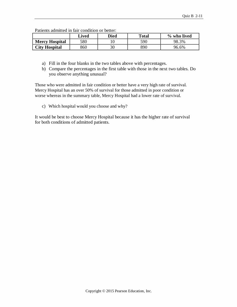
Patients admitted in fair condition or better:
Lived Died Total % who lived
Mercy Hospital 580 10 590 98.3%
City Hospital 860 30 890 96.6%
a) Fill in the four blanks in the two tables above with percentages. b) Compare the percentages in the first table with those in the next two tables. Do
you observe anything unusual?
Those who were admitted in fair condition or better have a very high rate of survival.
Mercy Hospital has an over 50% of survival for those admitted in poor condition or
worse whereas in the summary table, Mercy Hospital had a lower rate of survival.
c) Which hospital would you choose and why?
It would be best to choose Mercy Hospital because it has the higher rate of survival for both conditions of admitted patients.
Copyright © 2015 Pearson Education, Inc.
2-12 Chapter 2 Displaying and Describing Categorical Data
Chapter 2: Displaying and Describing Categorical Data– Quiz C – Multiple Choice
Name
2.1.3 Create and use frequency and relative frequency distributions and their displays. 1. A automobile marketing firm conducts a study to see what types of cars people owned before buying an American car. The results are shown below.
Previous Ownership Frequency
American 760
Japanese 375
Korean 72
German 37
Other 24
Total 1268
The relative frequency of those who owned Japanese cars previously who now bought American cars is A. 59.9 %
B. 29.6%
C. 5.7%
D. 14.9%
E. 2.9%
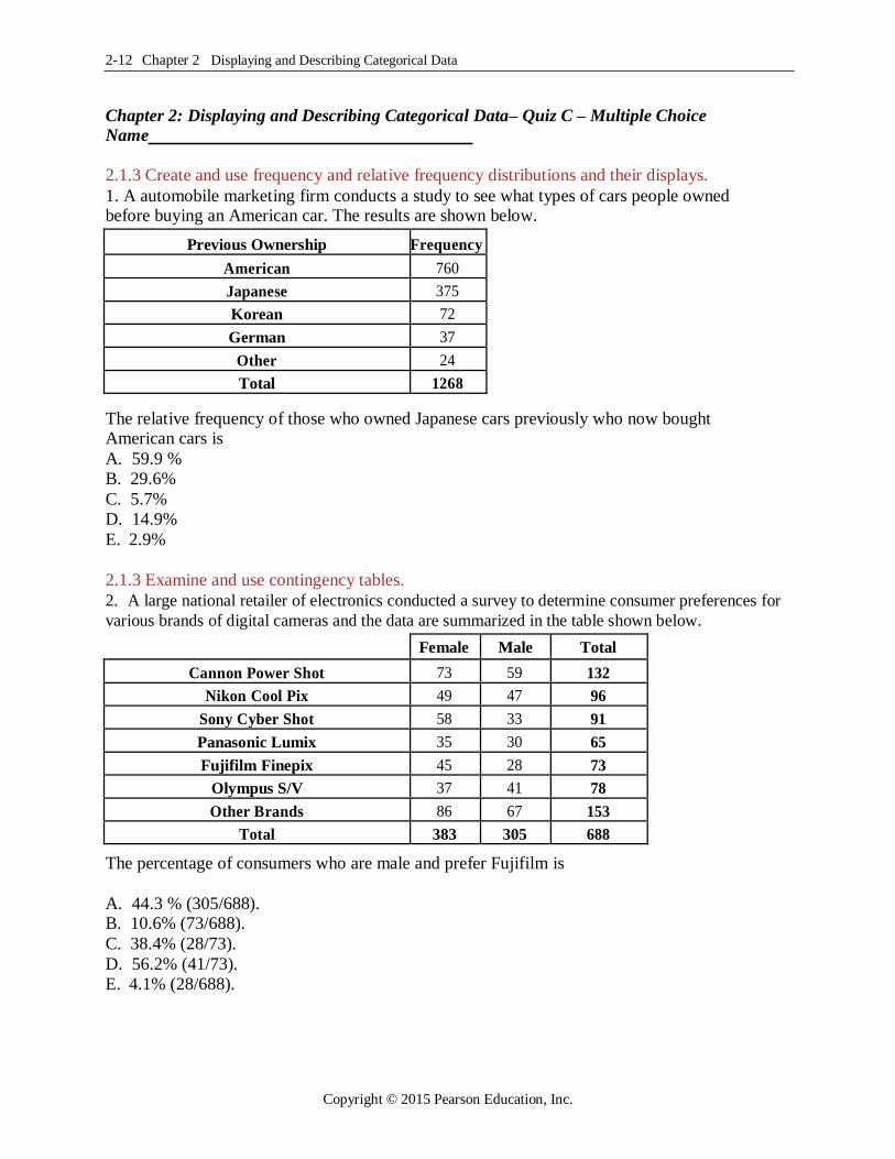
2.1.3 Examine and use contingency tables. 2. A large national retailer of electronics conducted a survey to determine consumer preferences for
various brands of digital cameras and the data are summarized in the table shown below.
Female Male Total
Cannon Power Shot 73 59 132
Nikon Cool Pix 49 47 96
Sony Cyber Shot 58 33 91
Panasonic Lumix 35 30 65
Fujifilm Finepix 45 28 73
Olympus S/V 37 41 78
Other Brands 86 67 153
Total 383 305 688
The percentage of consumers who are male and prefer Fujifilm is
A. 44.3 % (305/688). B. 10.6% (73/688). C. 38.4% (28/73).
D. 56.2% (41/73).
E. 4.1% (28/688).
Copyright © 2015 Pearson Education, Inc.
Quiz C 2-13
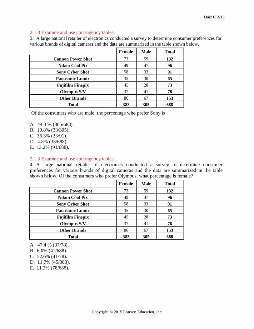
2.1.3 Examine and use contingency tables. 3. A large national retailer of electronics conducted a survey to determine consumer preferences for
various brands of digital cameras and the data are summarized in the table shown below.
Female Male Total
Cannon Power Shot 73 59 132
Nikon Cool Pix 49 47 96
Sony Cyber Shot 58 33 91
Panasonic Lumix 35 30 65
Fujifilm Finepix 45 28 73
Olympus S/V 37 41 78
Other Brands 86 67 153
Total 383 305 688
Of the consumers who are male, the percentage who prefer Sony is
A. 44.3 % (305/688). B. 10.8% (33/305). C. 36.3% (33/91).
D. 4.8% (33/688).
E. 13.2% (91/688).
2.1.3 Examine and use contingency tables. 4. A large national retailer of electronics conducted a survey to determine consumer
preferences for various brands of digital cameras and the data are summarized in the table shown below. Of the consumers who prefer Olympus, what percentage is female?
Female Male Total
Cannon Power Shot 73 59 132
Nikon Cool Pix 49 47 96
Sony Cyber Shot 58 33 91
Panasonic Lumix 35 30 65
Fujifilm Finepix 45 28 73
Olympus S/V 37 41 78
Other Brands 86 67 153
Total 383 305 688
A. 47.4 % (37/78).
B. 6.0% (41/688).
C. 52.6% (41/78).
D. 11.7% (45/383).
E. 11.3% (78/688).
Copyright © 2015 Pearson Education, Inc.
2-14 Chapter 2 Displaying and Describing Categorical Data
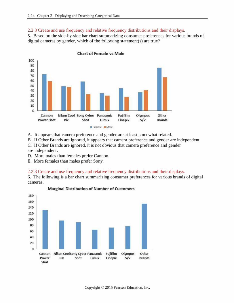
2.2.3 Create and use frequency and relative frequency distributions and their displays. 5. Based on the side-by-side bar chart summarizing consumer preferences for various brands of digital cameras by gender, which of the following statement(s) are true?
A. It appears that camera preference and gender are at least somewhat related.
B. If Other Brands are ignored, it appears that camera preference and gender are independent. C. If Other Brands are ignored, it is not obvious that camera preference and gender are independent. D. More males than females prefer Cannon.
E. More females than males prefer Sony.
2.2.3 Create and use frequency and relative frequency distributions and their displays. 6. The following is a bar chart summarizing consumer preferences for various brands of digital cameras.
Copyright © 2015 Pearson Education, Inc.
Quiz C 2-15
This bar chart shows
A. the marginal distribution of brands.
B. the conditional distribution of brands.
C. the contingency distribution of brands.
D. the distribution for a quantitative variable.
E. none of the above.
2.1.4 Find conditional and marginal distributions and make comparisons. 7. A company interested in the health of its employees started a health program including
monitoring blood pressure. Based on age, employees were categorized according to ranges of blood pressure by age intervals. Data are shown in the table below.
Age
BP Under 30 30-49 Over 50 Total
Low 27 38 31 96
Normal 48 90 92 230
High 23 59 72 154
Total 98 187 195 480
The percentage of employees who are over age 50 and have high blood pressure is
A. 46.8% (72/154).
B. 32.1% (154/480).
C. 31.6% (59/187).
D. 36.9% (72/195).
E. 15.0% (72/480).
2.1.4 Find conditional and marginal distributions and make comparisons. 8. A company interested in the health of its employees started a health program including monitoring blood pressure. Based on age, employees were categorized according to ranges
of blood pressure by age intervals. Data are shown in the table below.
Age
BP Under 30 30-49 Over 50 Total
Low 27 38 31 96
Normal 48 90 92 230
High 23 59 72 154
Total 98 187 195 480
Of all employees, the percentage who are over 50 and have high blood pressure is
A. 46.8% (72/154).
B. 15.0% (72/480).
C. 31.6% (59/187).
D. 36.9% (72/195).
E. 47.2% (92/195).
Copyright © 2015 Pearson Education, Inc.

2-16 Chapter 2 Displaying and Describing Categorical Data
2.1.4 Find conditional and marginal distributions and make comparisons. 9. A company interested in the health of its employees started a health program including
monitoring blood pressure. Based on age, employees were categorized according to ranges
of blood pressure by age intervals. Data are shown in the table below.
Age
BP Under 30 30-49 Over 50 Total
Low 27 38 31 96
Normal 48 90 92 230
High 23 59 72 154
Total 98 187 195 480
Of all employees, the percentage of those under 50 years old is
A. 17.1% (82/480).
B. 40.6% (195/480).
C. 13.5% (65/480).
D. 36.9% (72/195).
E. 49.4% (285/480).
2.1.4 Find conditional and marginal distributions and make comparisons. 10. A company interested in the health of its employees started a health program including monitoring blood pressure. Based on age, employees were categorized according to ranges of
blood pressure by age intervals. Data are shown in the table below. .
Age
BP Under 30 30-49 Over 50 Total
Low 27 38 31 96
Normal 48 90 92 230
High 23 59 72 154
Total 98 187 195 480
The percentage of employees with normal or low blood pressure is
A. 67.9% (326/480).
B. 47.9% (230/480).
C. 41.7% (96/230).
D. 80.0% (384/480).
E. 20.0% (96/480).
Copyright © 2015 Pearson Education, Inc.
Quiz C 2-17
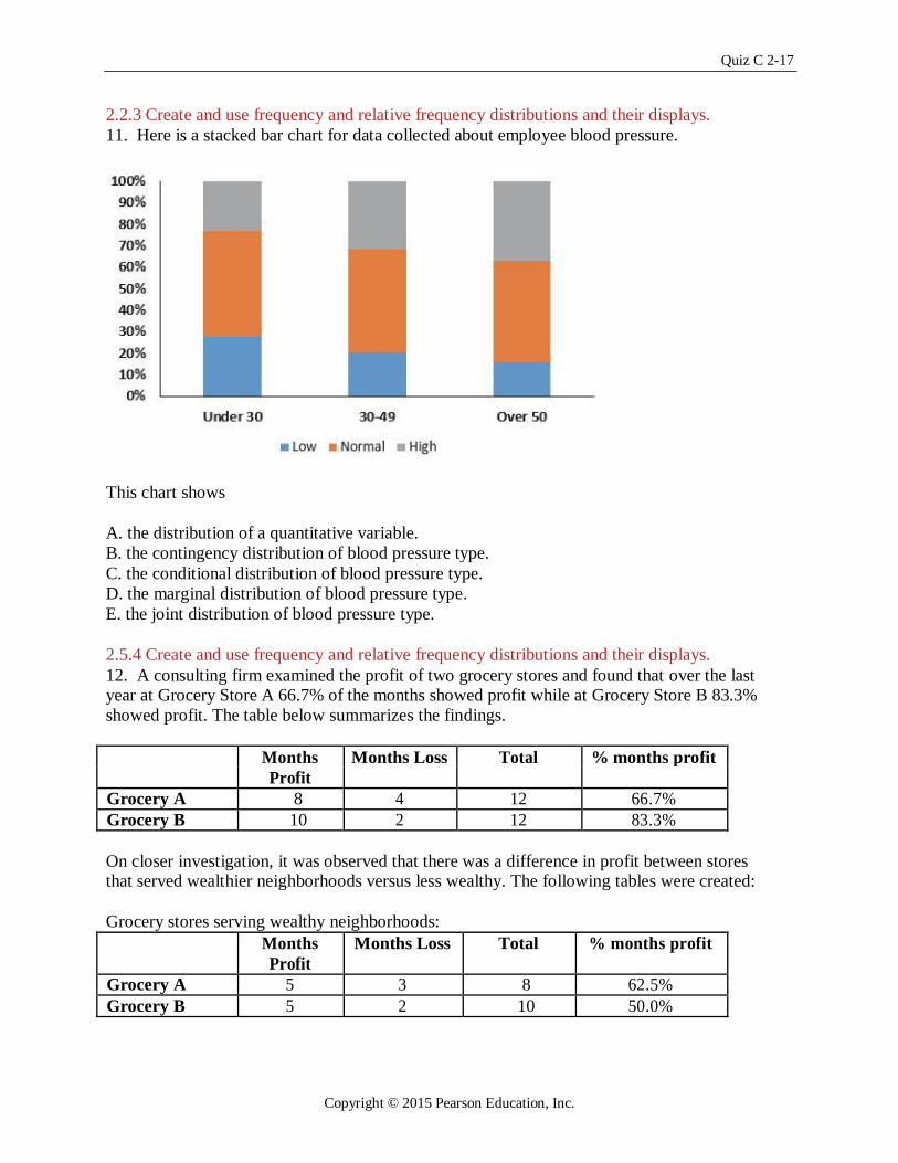
2.2.3 Create and use frequency and relative frequency distributions and their displays.
11. Here is a stacked bar chart for data collected about employee blood pressure.
This chart shows
A. the distribution of a quantitative variable.
B. the contingency distribution of blood pressure type.
C. the conditional distribution of blood pressure type.
D. the marginal distribution of blood pressure type.
E. the joint distribution of blood pressure type.
2.5.4 Create and use frequency and relative frequency distributions and their displays. 12. A consulting firm examined the profit of two grocery stores and found that over the last year at Grocery Store A 66.7% of the months showed profit while at Grocery Store B 83.3%
showed profit. The table below summarizes the findings.
Months Months Loss Total % months profit
Profit
Grocery A 8 4 12 66.7%
Grocery B 10 2 12 83.3%
On closer investigation, it was observed that there was a difference in profit between stores that served wealthier neighborhoods versus less wealthy. The following tables were created:
Grocery stores serving wealthy neighborhoods:
Months Months Loss Total % months profit
Profit
Grocery A 5 3 8 62.5%
Grocery B 5 2 10 50.0%
Copyright © 2015 Pearson Education, Inc.
2-18 Chapter 2 Displaying and Describing Categorical Data
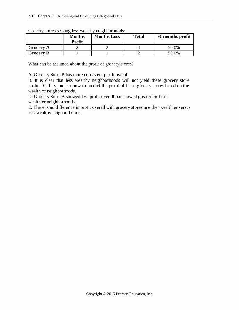
Grocery stores serving less wealthy neighborhoods:
Months Months Loss Total % months profit
Profit
Grocery A 2 2 4 50.0%
Grocery B 1 1 2 50.0%
What can be assumed about the profit of grocery stores?
A. Grocery Store B has more consistent profit overall. B. It is clear that less wealthy neighborhoods will not yield these grocery store
profits. C. It is unclear how to predict the profit of these grocery stores based on the
wealth of neighborhoods. D. Grocery Store A showed less profit overall but showed greater profit in wealthier neighborhoods. E. There is no difference in profit overall with grocery stores in either wealthier versus less wealthy neighborhoods.
Copyright © 2015 Pearson Education, Inc.
Quiz C 2-19
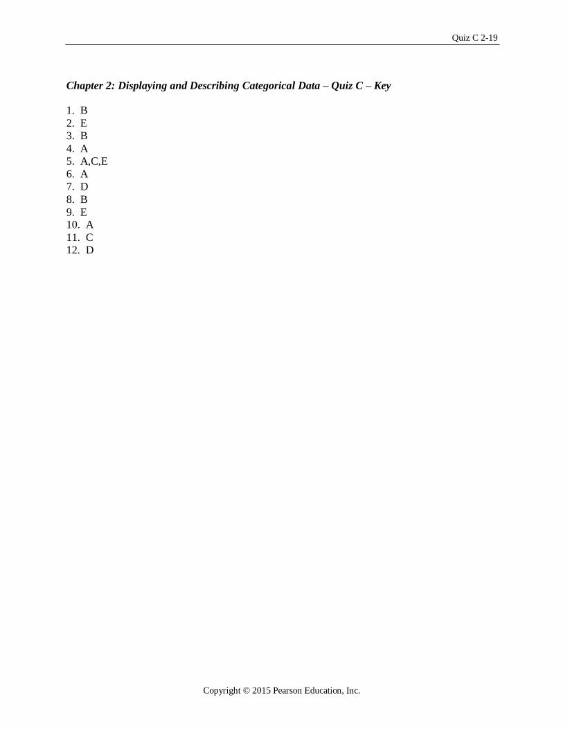
Chapter 2: Displaying and Describing Categorical Data – Quiz C – Key
1. B
2. E
3. B
4. A
5. A,C,E
6. A
7. D 8. B
9. E 10. A 11. C
12. D
Copyright © 2015 Pearson Education, Inc.
2-20 Chapter 2 Displaying and Describing Categorical Data
Chapter 2: Displaying and Describing Categorical Data– Quiz D – Multiple
Choice Name
2.1.3 Create and use frequency and relative frequency distributions and their displays. 1. A restaurant uses comment cards to get feedback from its customers about newly
added items to the menu. It recently introduced homemade organic veggie burgers. Customers who tried the new burger were asked if they would order it again. The data
are summarized in the table below. What percentage of customers would definitely order
the veggie burger again?
Response Frequency
Definitely would. 10
Most likely would. 40
Maybe 12
Definitely would not. 3
A. 10%
B. 15%
C. 20%
D. 40%
E. 77%
2.1.3 Create and use frequency and relative frequency distributions and their displays. 2. A restaurant uses comment cards to get feedback from its customers about newly
added items to the menu. It recently introduced homemade organic veggie burgers.
Customers who tried the new burger were asked if they would order it again. The data
are summarized in the table below. What percentage of customers would most likely
or definitely order the veggie burger again?
Response Frequency
Definitely would. 10
Most likely would. 40
Maybe 12
Definitely would not. 3
A. 10%
B. 15% C. 40%
D. 50%
E. 77%
Copyright © 2015 Pearson Education, Inc.

Quiz D 2-21
2.2.1 Determine if displays of data are appropriate. 3. A restaurant uses comment cards to get feedback from its customers about newly added
items to the menu. It recently introduced homemade organic veggie burgers. Customers who
tried the new burger were asked if they would order it again. Which of the following would
be an appropriate method for displaying the data shown in the table?
Response Frequency
Definitely would. 10
Most likely would. 40
Maybe 12
Definitely would not. 3
A. Contingency table. B. Segmented bar chart. C. Pie chart.
D. Both A and B.
E. Both B and C.
2.2.1 Determine if displays of data are appropriate. 4. In May, 2010, the Pew Research Center for the People & the Press carried out a
national survey to gauge opinion on the Arizona Immigration Law. Responses (Favor,
Oppose, Don’t Know) were examined according to groups defined by political party
affiliation (Democrat, Republican, Independent). Which of the following would be appropriate for displaying these data?
A. Contingency table.
B. Pie charts. C. Segmented bar chart.
D. Side by side bar chart.
E. All of the above.
2.1.3 Examine and use contingency tables. 5. A regional survey was carried out to gauge public opinion on the
controversial Arizona Immigration Law (results shown below). How many respondents are Republican and favor the law?
Response Democrat Republican Independent
Favor 50 93 35
Oppose 85 45 60
Don't Know 5 7 20
A. 93
B. 45
C. 145
D. 7
E. 85
Copyright © 2015 Pearson Education, Inc.

2-22 Chapter 2 Displaying and Describing Categorical Data
2.2.3 Create and use frequency and relative frequency distributions and their displays. 6. A regional survey was carried out to gauge public opinion on the controversial
Arizona Immigration Law. The results are displayed in the segmented bar chart
below. Which of the following statements is true?
Opinion of Arizona Immigration Law by Political Party
100 Response
Don't Know
Oppose
Favor
80
60
D a t a
40
20
0 Democrat Republican Independent
Percent within variables.
A. A greater percentage of Republicans oppose the law compared to Democrats.
B. A greater percentage of Republicans oppose the law compared to Independents. C. Opinion about the law appears to be independent of political party affiliation.
D. A greater percentage of Democrats oppose the law compared to Republicans.
E. The segmented bar chart is not appropriate for these data.
2.1.4 Find conditional and marginal distributions and make comparisons. 7. A regional survey was carried out to gauge public opinion on the controversial
Arizona Immigration Law. Based on the results displayed in the table below,
what percent of respondents is Independent?
Response Democrat Republican Independent
Favor 50 93 35
Oppose 85 45 60
Don't Know 5 7 20
A. 35%
B. 9%
C. 29%
D. 45%
E. 25%
Copyright © 2015 Pearson Education, Inc.

Quiz D 2-23
2.1.4 Find conditional and marginal distributions and make comparisons. 8. A regional survey was carried out to gauge public opinion on the controversial
Arizona Immigration Law (results shown below). What percent oppose the law?
Response Democrat Republican Independent
Favor 50 93 35
Oppose 85 45 60
Don't Know 5 7 20
A. 48%
B. 45%
C. 32%
D. 25% E. 61%
2.1.4 Find conditional and marginal distributions and make comparisons. 9. A regional survey was carried out to gauge public opinion on the controversial Arizona Immigration Law (results shown below). Of respondents who are
Democrat, what percent oppose the law?
Response Democrat Republican Independent
Favor 50 93 35
Oppose 85 45 60
Don't Know 5 7 20
A. 13%
B. 35%
C. 22%
D. 45%
E. 61%
2.1.4 Find conditional and marginal distributions and make comparisons. 10. A regional survey was carried out to gauge public opinion on the controversial
Arizona Immigration Law (results shown below). Of respondents who oppose the law, what percent is Democrat?
Response Democrat Republican Independent
Favor 50 93 35
Oppose 85 45 60
Don't Know 5 7 20
A. 13%
B. 35%
C. 22%
D. 45%
E. 6
Copyright © 2015 Pearson Education, Inc.

2-24 Chapter 2 Displaying and Describing Categorical Data
Chapter 2: Displaying and Describing Categorical Data – Quiz D – Key
1. B
2. E
3. C
4. E
5. A
6. D
7. C 8. A
9. E 10. D
Copyright © 2015 Pearson Education, Inc.
Quiz E 2-25
Chapter 2: Displaying and Describing Categorical Data– Quiz E – Multiple Choice
Name
2.1.3 Create and use frequency and relative frequency distributions and their displays. 1. A clothing store uses comment cards to get feedback from its customers about newly
added items. It recently introduced plus size fashion wear. Customers who purchased
the items were asked to fill out an online comment survey giving 10% off the next
purchase. The data are summarized in the table below. What percentage of customers
were at least satisfied with the item(s) purchased (Satisfied or Very satisfied)?
Response Frequency
Very satisfied. 15
Satisfied. 30
Less than fully satisfied. 12
Not satisfied. 4
A. 49.2%
B. 73.8%
C. 24.6%
D. 26.2%
E. 68.9%
2.1.3 Create and use frequency and relative frequency distributions and their displays. 2. A clothing store uses comment cards to get feedback from its customers about newly added items. It recently introduced plus size fashion wear. Customers who purchased
the items were asked to fill out an online comment survey giving 10% off the next
purchase. The data are summarized in the table below. What percentage of customers
would be less likely to purchase another item (Less or Not fully satisfied)?
Response Frequency
Very satisfied. 15
Satisfied. 30
Less than fully satisfied. 12
Not satisfied. 4
A. 10%
B. 15% C. 40%
D. 50%
E. 77%
Copyright © 2015 Pearson Education, Inc.

2-26 Chapter 2 Displaying and Describing Categorical Data
2.2.1 Determine if displays of data are appropriate. 3. A clothing store uses comment cards to get feedback from its customers about newly
added items. It recently introduced plus size fashion wear. Customers who purchased
the items were asked to fill out an online comment survey giving 10% off the next
purchase. The data are summarized in the table below. Which of the following would be an appropriate method for displaying the data shown in the table?
Response Frequency
Very satisfied. 15
Satisfied. 30
Less than fully satisfied. 12
Not satisfied. 4
A. Contingency table. B. Segmented bar chart. C. Pie chart.
D. Both A and B.
E. Both B and C.
2.2.1 Determine if displays of data are appropriate.
4. Accenture, a consulting firm, conducted an online survey of 500 US consumers in September 2013. Based on their response to the question “What is your motive for
shopping late in the season?” which of the following would be an appropriate method for
displaying the data shown in the table?
Response Male Female
Too busy to shop earlier 115 75
More time to save for gifts 50 80
Better discounts available 65 20
Part of the holiday tradition 15 5
None of the above 120 60
A. Contingency table.
B. Pie charts.
C. Segmented bar chart.
D. Side by side bar chart. E. All of the above.
Copyright © 2015 Pearson Education, Inc.

Quiz E 2-27
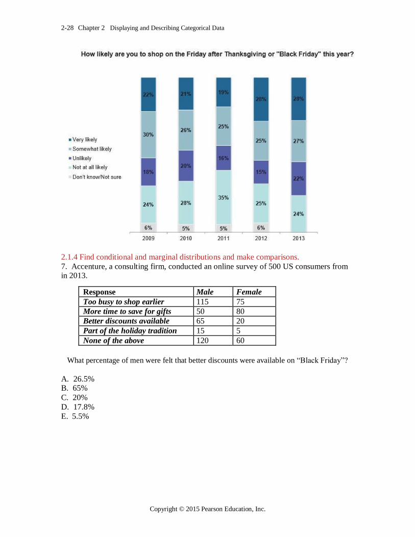
2.3. Examine a contingency table. 5. Accenture, a consulting firm, conducted an online survey of 500 US consumers from
2009 to 2013. The results are displayed in the segmented bar chart below. How many respondents in 2012 are at least somewhat likely to shop on “Black Friday”?
A. 265
B. 275
C. 140
D. 230
E. 95
2.2. Determine if a display of data is appropriate. 6. Accenture, a consulting firm, conducted an online survey of 500 US consumers from
2009 to 2013. The results are displayed in the segmented bar chart below. Which of the
following statement(s) is (are) true?
A. A smaller percentage of shoppers over the past 5 years are undecided about shopping
on “Black Friday”. B. In 2013, there was an increase in Very likely to shop on “Black Friday” over 2012. C. From 2011 to 2013, there was a decrease in Not at all likely to shop on “Black Friday”. D. A greater percentage of shoppers over the past 5 years are at least somewhat likely to shop on “Black Friday”. E. The segmented bar chart is not appropriate for these data.
Copyright © 2015 Pearson Education, Inc.
2-28 Chapter 2 Displaying and Describing Categorical Data
2.1.4 Find conditional and marginal distributions and make comparisons. 7. Accenture, a consulting firm, conducted an online survey of 500 US consumers from in 2013.
Response Male Female
Too busy to shop earlier 115 75
More time to save for gifts 50 80
Better discounts available 65 20
Part of the holiday tradition 15 5
None of the above 120 60
What percentage of men were felt that better discounts were available on “Black Friday”?
A. 26.5% B. 65% C. 20%
D. 17.8%
E. 5.5%
Copyright © 2015 Pearson Education, Inc.

Quiz E 2-29
2.1.4 Find conditional and marginal distributions and make comparisons. 8. Accenture, a consulting firm, conducted an online survey of 500 US consumers from in 2013.
Response Male Female
Too busy to shop earlier 115 75
More time to save for gifts 50 80
Better discounts available 65 20
Part of the holiday tradition 15 5
None of the above 120 60
What percentage of those who thought that better discounts were available on “Black Friday” were female?
A. 81.3%
B. 33.3%
C. 11.1%
D. 47.2%
E. 23.5%
2.1.4 Find conditional and marginal distributions and make comparisons.
9. Accenture, a consulting firm, conducted an online survey of 500 US consumers in September 2013. Based on their response to the question “What is your motive for
shopping late in the season?” which of the following would be appropriate method(s) for displaying the male only data shown in the table?
Response Male Female
Too busy to shop earlier 115 75
More time to save for gifts 50 80
Better discounts available 65 20
Part of the holiday tradition 15 5
None of the above 120 60
A. Contingency table.
B. Pie chart.
C. Segmented bar chart. D. Side by side bar chart.
E. All of the above.
Copyright © 2015 Pearson Education, Inc.

2-30 Chapter 2 Displaying and Describing Categorical Data
2.1.4 Find conditional and marginal distributions and make comparisons. 10. Accenture, a consulting firm, conducted an online survey of 500 US consumers in September, 2013.
Response Male Female
Too busy to shop earlier 115 75
More time to save for gifts 50 80
Better discounts available 65 20
Part of the holiday tradition 15 5
None of the above 120 60
What percentage of consumers thought that shopping on “Black Friday” is part of the holiday tradition?
A. 8.3%
B. 33.3%
C. 11.1%
D. 12.5%
E. 75.0%
Copyright © 2015 Pearson Education, Inc.

Quiz E 2-31
Chapter 2: Displaying and Describing Categorical Data – Quiz E – Key
1. B
2. E
3. C
4. E
5. A
6. C,D
7. D 8. E
9. B,C 10. C
Copyright © 2015 Pearson Education, Inc.