Chapter 2: Graphical Summaries of Data 16. (A) Section 2.1 ......Chapter 2: Graphical Summaries of...
30
Chapter 2: Graphical Summaries of Data Section 2.1 Exercises Exercises 1 – 4 are the Check Your Understanding exercises located within the section. Their answers are found on pages 48 and 49. Understanding the Concepts 5. frequency 6. relative frequency 7. pareto chart 8. pie chart 9. False. In a frequency distribution, the sum of all frequencies equals the total number of observations. 10. True 11. True 12. False. In bar graphs and Pareto charts, the heights of the bars represent the frequencies or relative frequencies. Practicing the Skills 13. (A) Meat, poultry, fish, and eggs (B) False ($450 < $550) (C) True ($1300 > $1000) 14. (A) Type O (B) False ( 70 46.7% 150 ) (C) True 15. (A) (B) (C) Everyone (E) (D) False (E) True (12.5% < 20%) 16. (A) (B) (C) Other discretionary (D) 8% + 26% + 3% = 37% 17. (A) Families and individuals, Businesses, Governments (B) Produced at home (C) No, Produced at home is. (D) Yes 18. (A) The game (B) True (C) False (men < women) (D) True (both are about 0.65) 19. (A)
Transcript of Chapter 2: Graphical Summaries of Data 16. (A) Section 2.1 ......Chapter 2: Graphical Summaries of...

Chapter 2: Graphical Summaries of Data
Section 2.1 Exercises
Exercises 1 – 4 are the Check Your
Understanding exercises located within the
section. Their answers are found on pages 48
and 49.
Understanding the Concepts
5. frequency
6. relative frequency
7. pareto chart
8. pie chart
9. False. In a frequency distribution, the sum of
all frequencies equals the total number of
observations.
10. True
11. True
12. False. In bar graphs and Pareto charts, the
heights of the bars represent the frequencies
or relative frequencies.
Practicing the Skills
13. (A) Meat, poultry, fish, and eggs
(B) False ($450 < $550)
(C) True ($1300 > $1000)
14. (A) Type O
(B) False (70
46.7%150
)
(C) True
15. (A)
(B)
(C) Everyone (E)
(D) False
(E) True (12.5% < 20%)
16. (A)
(B)
(C) Other discretionary
(D) 8% + 26% + 3% = 37%
17. (A) Families and individuals, Businesses,
Governments (B) Produced at home
(C) No, Produced at home is.
(D) Yes
18. (A) The game
(B) True
(C) False (men < women)
(D) True (both are about 0.65)
19. (A)

(B)
(C)
(D) True
20. (A)
(B)
(C)
(D) True 9.6
30%32
> 20%
21. (A)
(B)
(C)
(D)

(E)
(F) False 68,513
39.8%172,203
< 50%
22. (A)
(B)
(C)
(D)
(E)
(F) True (65% > 50%)
23. (A)
(B)
(C)
(D)
(E)

(F) True. (3800 > 3134)
24. (A)
(B)
(C)
(D)
(E)
(F) True. 62.1% > 50%
(G) False. 10.8% < 10.9%
25. (A)
(B)
(C)

(D)
(E) True. (56.1% > 50%)
(F) True. 43.9% are females
(G) 0.289
26. (A)
(B)
(C)
(D)
(E) True. (64.5% > 50%)
(F) 0.106
27. (A)
(B)
(C)
(D)
(E) True. 30.5% never back up their data.

(F) False.
28. (A)
(B)
(C)
(D)
(E)
(F) 0.132
29. (A)
(B)
(C)
(D) True. (0.735 > 0.5)

30. (A)
(B)
(C)
(D) False. Honda’s and Nissan’s went down.
31. (A)
(B)
(C)
(D)
(E) 0.239
32. (A)
(B)
(C)

(D)
(E) 0.304
33. (A)
(B)
(C)
(D)
(E) False. (64.74 million < 65.62 million)
34. This is not a valid relative frequency
distribution because the proportions do not
sum to 1.
Extending the Concepts
35. (A)
(B)
(C)

(D)
(E) The total frequency is equal to the sum
of the frequencies for the two cities.
(F) The total relative frequency is the total
frequency divided by the sum of all total
frequencies. The relative frequency for
each city is the frequency for that city
divided by the sum of the frequencies
for that city. Since the sum of the
frequencies for each city is not the same
as the sum of the total frequencies, the
total relative frequency is not the sum of
the relative frequencies for the two
cities.
Section 2.2 Exercises
Exercises 1-4 are the Check Your
Understanding exercises located within the
section. Their answers are found on page 67.
Understanding the Concepts
5. symmetric
6. left, right
7. bimodal
8. cumulative frequency
9. False. In a frequency distribution, the class
width is the difference between consecutive
lower class limits.
10. False. The number of classes used has a
large effect on the shape of the histogram.
11. True
12. True
Practicing the Skills
13. Skewed to the left
14. Skewed to the right
15. Approximately symmetric
16. Approximately symmetric
17. Bimodal
18. Unimodal
Working with the Concepts
19. (A) 11
(B) 1
(C) 70-71
(D) 9%
(E) approximately symmetric
20. (A) 3
(B) 19
(C) 3
(D) skewed to the right
21. (A) The sum of the proportions in the last 5
rectangles gives the percentage of men
with levels above 240. The sum is:
0.13 + 0.1 + 0.05 + 0.01 + 0.02 = 0.31,
which is closest to 30%.
(B) 240-260, because 13% > 8%.
22. (A) The sum of the proportions in the last 8
rectangles gives the percentage of
women with pressures above 120. The
sum is: 0.14 + 0.12 + 0.11 + 0.04 + 0.04
+ 0.02 + 0.01 + 0.01 = 0.49, which is
closest to 50%.
(B) 130-135, because 11% > 6%.
23. (A) Right skewed, because there are many
more words of small length than of
larger length.
(B) Left skewed, because there are many
more coins in circulation from recent
years than older years.
(C) Left skewed, because there are many
more high grades than low ones.
24. (A) Right skewed, because there are many
more people with low incomes than
high.
(B) Left skewed, because there are many
more students finishing the exam close
to (if not all of) the allotted 60 minutes.
(C) Right skewed, because there are many
more people with younger ages than old.
25. (A) 9
(B) 0.020
(C) Lower limits: 0.180, 0.200, 0.220,
0.240, 0.260, 0.280, 0.300, 0.320, 0.340.
Upper limits: 0.199, 0.219, 0.239, 0.259,
0.279, 0.299, 0.319, 0.339, 0.359.

(D)
(E)
(F)
(G) 0.109 + 0.037 + 0.004 = 0.15 = 15%
(H) 0.015 + 0.052 = 0.067 = 6.7%
26. (A)
(B)
(C)
(D)
(E)
(F)
(G) 0.097 + 0.04 = 0.137 = 13.7%
(H) 0.119 + 0.035 + 0.007 = 0.161 = 16.1%
27. (A) 10
(B) 3.0
(C) The lower class limits are 1.0, 4.0, 7.0,
10.0, 13.0, 16.0, 19.0, 22.0, 25.0, and
28.0. The upper class limits are 3.9, 6.9,
9.9, 12.9, 15.9, 18.9, 21.9, 24.9, 27.9,
and 30.9.
(D)
(E)
(F)
(G) 0.125 + 0.17 + 0.24 = 0.535 = 53.5%
(H) 0.065 + 0.035 + 0.015 + 0.005 = 0.12 =
12.0%
28. (A) 11
(B) 5
(C) The lower class limits are 0.0, 5.0, 10.0,
15.0, 20.0, 25.0, 30.0, 35.0, 40.0, 45.0,
and 50.0. The upper class limits are 4.9,
9.9, 14.9, 19.9, 24.9, 29.9, 34.9, 39.9,
44.9, 49.9, and 54.9.
(D)
(E)
(F)
(G) 0.288 + 0.315 = 0.603 = 60.3%
(H) 0.027 + 0.027 + 0.027 = 0.081 = 8.1%
29. (A)
(B)

(C)
(D)
(E) Unimodal
(F)
(G) Both are reasonably good choices for
class widths. The number of classes are
both at least 5, but less than 20. Also,
neither class widths are too narrow or
too wide.
30. (A)
(B)

(C)
(D)
(E) skewed to the left
(F)
(G) Both are reasonably good choices for
class widths. The number of classes are
both at least 5, but less than 20. Also,
neither class widths are too narrow or
too wide.
31. (A) Answers will vary. Here is one
possibility:
(B)
(C) Answers will vary. Here is one
possibility:

(D)
(E) skewed to the right
(F) Answers will vary. Here is one
possibility:
(G)
(H) The one with 9 classes is more
appropriate than the one with only 5
classes. This is because the one with
only 5 classes is too wide. Only the most
basic features of the data are visible.
32. (A)
(B)
(C)

(D)
(E) skewed to the right
(F) Answers will vary. Here is one
possibility:
(G)
(H) The graphs with nine classes are more
appropriate much than those with only 4
classes. This is because only the most
basic features of the data are visible,
when the class widths are too wide, as
they are in the graphs containing only
four classes.
33. (A)
(B)
(C) skewed to the right
34. (A)
(B)
(C) skewed to the left
35. (A)

(B)
36. (A)
(B)
(C)
(D)
37. (A)
(B)
38. (A)
(B)
39. (A)

(B)
(C)
(D)
40. (A)
(B)
(C)
(D)
(E)
(F)

(G)
(H)
41. (A)
(B)
(C)
(D)
42. (A)
(B)

(C)
(D)
43. Because “30 or more” represents an open
ended class.
44. Yes. The last class would become 30-34.9.
Extending the Concepts
45. We need to solve the following equation: 0.2
+ 0.3 + 0.15 + x + 0.1 + 0.1 = 1 Answer: x =
0.15
46. (A) The respective class widths are 1, 0.5,
0.5, 1, 1, and 3.
(B)
This histogram gives a distorted picture
of the data because it makes it look like
this is a bimodal distribution, when in
reality, Figure 2.6 shows that the data
has one mode and is skewed to the right.
(C)
(D)
(E) The histogram in part (D) also has only
one mode and is skewed to the right, just
as the histogram in Figure 2.6. The
differing class widths in a density
histogram do not distort the data
because dividing the relative frequency
by the class width puts the
proportionality into the respective
classes.
47. (i) is skewed and (ii) is approximately
symmetric
48. Skewed to the right because the first two
classes have relative frequencies of 0.2 and
0.37, whereas the rest are all less than 0.15.
Section 2.3 Exercises
Exercises 1 and 2 are the Check Your
Understanding exercises located within the
section. Their answers are found on page 78.
Understanding the Concepts
3. leaf
4. stems
5. time-series plot
6. time
7. True
8. False. In a stem-and-leaf plot, each leaf
must be a single digit.
9. True
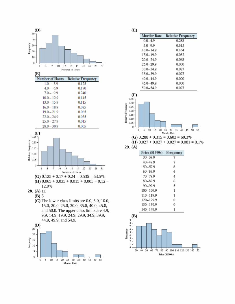
10. False. In a time-series plot, the horizontal
axis represents time.
Practicing the Skills
11.
12.
13. The list is: 30 30 31 32 35 36 37 37 39 42 43
44 45 46 47 47 47 47 48 48 49 50 51 51 51
52 52 52 52 54 56 57 58 58 59 61 63
14. The list is: 14.4 14.6 14.8 14.9 15.1 15.2
15.2 15.4 15.5 15.7 15.7 15.8 16.0 16.1 16.1
16.1 16.2 16.3 16.7 16.7 16.9 18.2 18.3 18.8
15.
16.
Working with the Concepts
17. (A)
(B)
(C) The one in part (A) is more appropriate
because part (B) has too many stems
with no leaves. The stem-and-leaf plot
in part (A) shows that most prices are in
the 30’s, 40’s, and 50’s, and that the
data is skewed to the right.
18. (A)
(B)
(C) The one in part (B) is more appropriate
because most of the leaves are on three
stems (temperatures in the 50’s, 60’s,
and 70’s). For this reason, the stem-and-
leaf plot in part (A) does not reveal
much detail about the data.
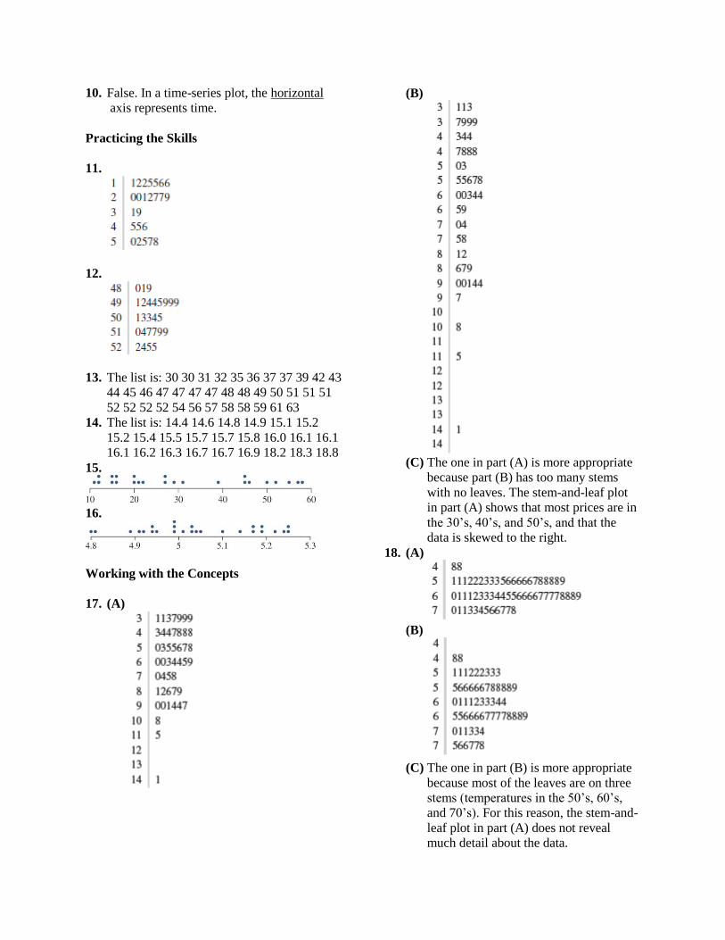
19. (A)
(B) Both plots show that more leaves are on
stem 1 than all other stems. However,
the advantage to the split stem-and-leaf
plot in part (A) is that it much better
shows how the emissions data is skewed
to the right.
20.
21. (A)
(B) Leaf 1 represents the ages of the
Wimbledon winners and Leaf 2
represents the ages of the winners of the
Master’s. From this back-to-back split
stem-and-leaf plot, we clearly see that
the Wimbledon champions tend to be
younger.
22. (A) In the following back-to-back split stem-
and-leaf plot, Leaf 1 displays the lengths
of time of the PG movies and Leaf 2
does so for the R rated movies.
(B) They are roughly similar. Notice that
the rows are roughly equal.
23. Yes, there are some gaps in the dotplot
below for the Macon, GA temperature data.
24. This dotplot shows that the data is skewed to
the right.
25. (A)
(B) Increasing: 89-92, 00-03, and 07-10
Decreasing: 92-00, 03-07 (06 = 07), and
10-12.

26. (A)
(B) Decreasing over that period.
27. (A)
(B) It increased in the 50’s, 60’s, 80’s, and
00’s. It decreased in the 70’s and 90’s.
(C) It caused a big decrease.
(D) It increased from 1965 to 1969, and then
decreased from 1969 to 1975.
28. (A)
(B) Female enrollment is growing faster.
29. (A) $800 billion
(B) $300 billion. From $700 billion to $1
trillion.
(C) True. $1100 is approximately twice
$600.
(D) False. Almost, but it dipped from 2008
to 2009.
30. (A) 1980. As evidenced by 0 gold medals.
(B) 85
(C) Staying about the same
31. (A) 115 inches
(B) 1910
(C) Less than
(D) True. It occurred in the 1880s.
(E) False.
32. (A) 1999
(B) The two events decreased their average
salaries.
33. (A) False. It increased in 5 years and
decreased in only 2.
(B) True.
(C) False. 2005 spent less than 2009.
(D) True.
34. (A) 1991
(B) 2011
(C) True.
(D) False. It increased in 5 of those years.
Extending the Concepts
35. (A)
(B)
(C) They both have the same shape (skewed
to the right), because the class width in
the histogram is 5, as is each line for
each stem 5. The number of leaves in
each stem is the frequency of
occurrence, which is also the height of
the bars in the histogram.

Section 2.4 Exercises
Exercises 1 and 2 are the Check Your
Understanding exercises located within the
section. Their answers are found on page 85.
Understanding the Concepts
3. 0
4. proportional
5. (i). Graph (A) presents an accurate picture,
because the baseline is at zero. Graph (B)
exaggerates the decline, because the baseline
is above zero.
6. The bar graph does presents a more accurate
picture because its baseline is correctly
placed at 0. The time-series plot exaggerates
the rate of the increase.
7. The bar graph is more accurate. The pictures
of the dollars make the difference appear
much larger than the bar graph does. The
reason is that both the height and length of
the dollar has been increased.
8. Graph (B) presents the more accurate
picture, because it follows the area principle.
In Graph (A), the area of the larger image is
about four times that of the smaller image.
This exaggerates the difference.
9. The bar graph is an accurate depiction
because the baseline is at 0.
10. It is misleading because the baseline is not
placed at zero.
11. (A) It is misleading because you can see the
tops of the bars in the three-dimensional
graph. This often causes them to look
shorter than they really are.
(B)
12. It is misleading because the baseline is not
placed at zero.
13. (ii) is more accurate. The plot on the left has
its baseline at zero, and presents an accurate
picture. The plot on the right exaggerates the
increase.
14. Option (ii) is the correct one, because it
correspondingly matches up with graph (A)
which is the correct one. Graph (B) does not
have a baseline value of zero, so it gives the
incorrect description of option (i).
Extending the Concepts
15. (A)
(B) Yes, it makes the differences look
smaller, because the scale on the y-axis
extends much farther than the largest bar
height.
(C) Figure 2.23 does. It has a baseline of
zero (unlike Figure 2.24), with a more
accurate depiction of the range of data
values than the graph in part (A) above.
Chapter Quiz
1.
2.

3.
4.
5. The classes are: 5.0-7.9, 8.0-10.9, 11.0-
13.9, 14.0- 16.9, and 17.0-19.9. The class
width is 3.
6. True
7. (A)
(B)
8.
9.
10. 11 11 15 15 19 19 19 22 22 23 25 27 28 30
30 38 44 45 47 48 50 51 53 53 55 56 58
11.
12.
13.

14.
15. Twice
Review Exercises
1. (A) Somewhat
(B) True
(C) False. Roughly 36% believe these ways,
which is less than half.
(D) True
2. (A)
(B)
(C) False, they account for 21.2%, which is
less than 30%.
3. (A)
(B) False, this statement was almost true. It
did increase for every county except
Denver.
(C) Adams. It went up 4%.
4. (A)
(B)
(C) False. 48% is less than half.
5. (A) 7
(B) 10
(C) 5 1
50 10 10%
(D) Unimodal
6. (A) 8
(B) 20
(C) The lower class limit are 20, 40, 60, 80,
100, 120, 140, and 160. The upper class
limits are 39, 59, 79, 99, 119, 139, 159,
and 179.

(D)
(E)
(F)
(G) 12
.23551
23.5%
(H) 15
.29451
29.4%
7. (A)
(B)
(C)
(D)
8. (A)
(B)
(C)
(D)

9.
10. (A)
(B)
(C)
(D)
11. (A)

(B)
(C) The one with split stems in part (B)
provides a more appropriate level of
detail.
12.
13. (A)
(B) They are inversely related. That is, as
digital sales increase, physical sales
decrease.
14. (A)
(B)
(C) The total units sold has been increasing,
but the total retail value has been
decreasing. This is because the total sold
is going up due to increased units sold
of the cheaper format (digital).
15. Option (i) is the correct statement, because
the second graph is misleading due to the
fact that its baseline does not start at zero.
Write About It
1. A frequency bar graph and the relative
frequency bar graph for the same data are
identical except for the scale on the vertical
axis. This is because the relative frequency
bar graph converts the frequencies to their
corresponding proportional equivalents.
2. The main difference between frequency
distributions for qualitative and quantitative
data is that there are no natural categories
for quantitative data. For quantitative data,
the data must be divided into classes
3. Answers will vary.
4. Answers will vary.
5. Answers will vary.

Case Study: Do Late-Model Cars Get Better
Gas Mileage?
1.
2. A class width of one is too narrow for these
data because there are many classes with 0
or 1 car in them.
3.
4. We can see from the relative frequency
histogram below, that it is unimodal, with
very little skew.
5. Answers will vary. Here is a frequency
distribution with a class width of 2.
6. Answers will vary. Here is a relative
frequency distribution with a class width of
2.
7. We can see from the relative frequency
histogram below, that it is unimodal, with
slight skew to the left.
8. 2013 cars tend to have the higher MPG’s.

9. The back-to-back stem-and-leaf plot
(displayed immediately below) illustrates
the comparison better than the histograms
(displayed above) do. This is because all of
the data in the comparison is right there in
one plot, as opposed to having to look
between two different histograms.