Using Lattice to Plot Grouped Data Richard Pugh 4 th December 2012.
Upload
damian-jenningsCategory
view
223download
2
Chapter 2:Charts and
Graphs

LO1 Explain the difference between grouped and un- grouped data and construct a frequency distribution from a set of data and explain what the distribution represents.
LO2 Describe and construct different types of quantitative data graphs, including histograms, frequency polygons, ogives, and stem and leaf plots. Explain when these graphs should be used.
LO3 Describe and construct different types of qualitative data graphs, including pie charts, bar charts, and Pareto charts. Explain when these graphs should be used.
LO4 Display and analyze two variables simultaneously using cross tabulation and scatter plots.
Learning Objectives

• Ungrouped data– have not been summarized in any way– are also called raw data
• Grouped data– have been organized into a frequency distribution
Ungrouped Versus Grouped Data

Example of Ungrouped Data

Example of Grouped Data

Constructing a Frequency DistributionStart With Data Range

• The number of classes should be between 5 and 15.– Fewer than 5 classes cause excessive summarization.– More than 15 classes leave too much detail.
• Class Width– Divide the range by the number of classes for an approximate class
width– Round up to a convenient number– So if the number of classes is 6, then
Deciding on the Number of Classes and on the Class Width

• The midpoint of each class interval is called the class midpoint or the class mark.
Class Midpoint
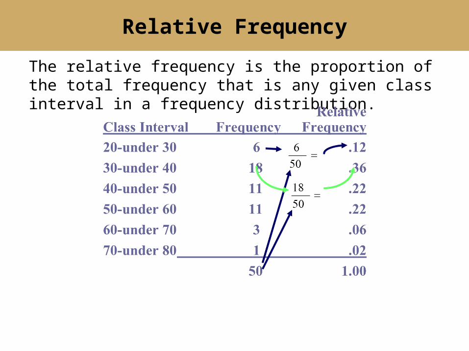
The relative frequency is the proportion of the total frequency that is any given class interval in a frequency distribution.
Relative Frequency
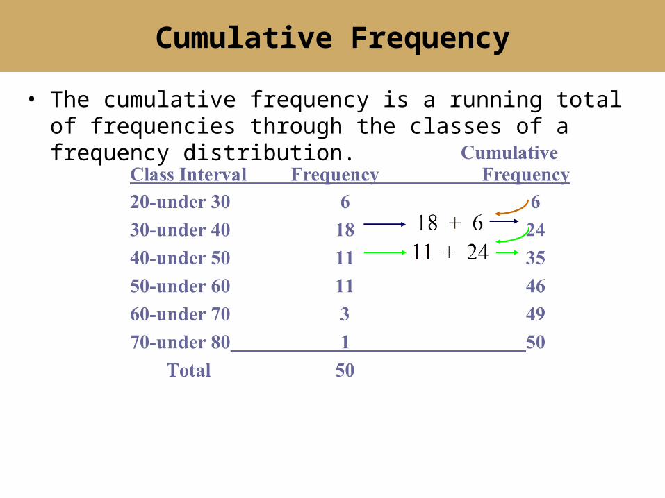
• The cumulative frequency is a running total of frequencies through the classes of a frequency distribution.
Cumulative Frequency

Class Midpoints, Relative Frequencies, and Cumulative Frequencies
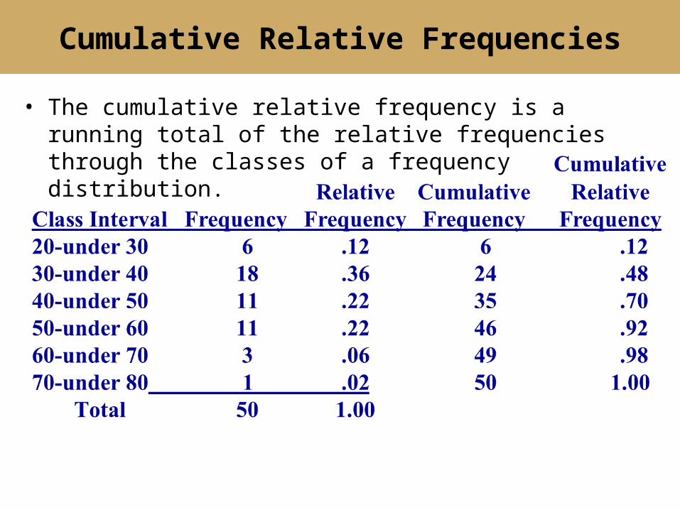
• The cumulative relative frequency is a running total of the relative frequencies through the classes of a frequency distribution.
Cumulative Relative Frequencies
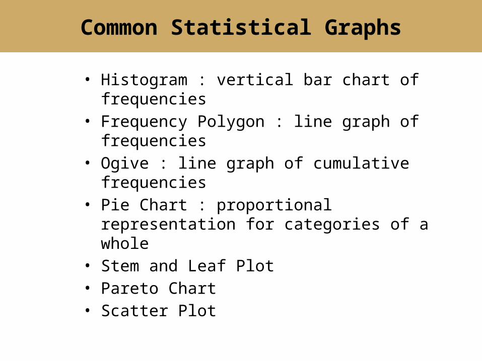
• Histogram : vertical bar chart of frequencies• Frequency Polygon : line graph of frequencies• Ogive : line graph of cumulative frequencies• Pie Chart : proportional representation for
categories of a whole• Stem and Leaf Plot• Pareto Chart• Scatter Plot
Common Statistical Graphs

Histogram
Class Interval Frequency20-under 30 630-under 40 1840-under 50 1150-under 60 1160-under 70 370-under 80 1
80706050403020
20
15
10
5
0
Years
Frequency
10
20
1
3
1111
18
6

Histogram Construction
Class Interval Frequency20-under 30 630-under 40 1840-under 50 1150-under 60 1160-under 70 370-under 80 1
80706050403020
20
15
10
5
0
Years
Frequency
10
20
1
3
1111
18
6

Frequency Polygon
Class Interval Frequency20-under 30 630-under 40 1840-under 50 1150-under 60 1160-under 70 370-under 80 1
908070605040302010
20
15
10
5
0
Years
Frequency

Ogive
CumulativeClass IntervalFrequency20-under 30 630-under 40 2440-under 50 3550-under 60 4660-under 70 4970-under 80 50
80706050403020
50
40
30
20
10
0
Years
Frequency

Cumulative Relative Frequency (Ogive)
Cumulative
RelativeClass IntervalFrequency20-under 30 .1230-under 40 .4840-under 50 .7050-under 60 .9260-under 70 .9870-under 80 1.00
9080706050403020100
1.0
0.8
0.6
0.4
0.2
0.0
Years
Cum
ula
tive R
ela
tive F
requency

Complaints by Train Passengers

Complaints by Train Passengers
Stations, Etc.40%
Train Performance
21%
Equipment15%
Personnel14%
Schedules, Etc.10%

Second Quarter Truck Production (Hypothetical values)

Pie Chart Calculations for Company A

Second Quarter Truck Production
39%39%
17%4%
1%
A B C D E
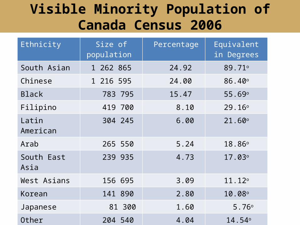
Visible Minority Population of Canada Census 2006
Ethnicity Size of population Percentage Equivalent in Degrees
South Asian 1 262 865 24.92 89.71o
Chinese 1 216 595 24.00 86.40o
Black 783 795 15.47 55.69o
Filipino 419 700 8.10 29.16o
Latin American 304 245 6.00 21.60o
Arab 265 550 5.24 18.86o
South East Asia 239 935 4.73 17.03o
West Asians 156 695 3.09 11.12o
Korean 141 890 2.80 10.08o
Japanese 81 300 1.60 5.76o
Other 204 540 4.04 14.54o
Total 5 068 095 100.00 360o

Visible Minorities of Canada 2006

Safety Examination Scores for Plant Trainees

Construction of Stem and Leaf Plot

Pareto Chart

Cross tabulation is a process for producing a two-dimensional table that displays the frequency counts for two variables simultaneously.
Cross Tabulation

Scatter Plot
A scatter plot is a two-dimensional graph plot of pairs of points
from two numerical variables.

COPYRIGHT
Copyright © 2014 John Wiley & Sons Canada, Ltd. All rights reserved. Reproduction or translation of this work beyond that permitted by Access Copyright (The Canadian Copyright Licensing Agency) is unlawful. Requests for further information should be addressed to the Permissions Department, John Wiley & Sons Canada, Ltd. The purchaser may make back-up copies for his or her own use only and not for distribution or resale. The author and the publisher assume no responsibility for errors, omissions, or damages caused by the use of these programs or from the use of the information contained herein.