Chapter 1: Examining Distributions. 1.1 Displaying Distributions with graphs.
Upload
dwain-thomasCategory
view
241download
0
Chapter 11
Displaying Distributions with Graphs
Chapter 11 1
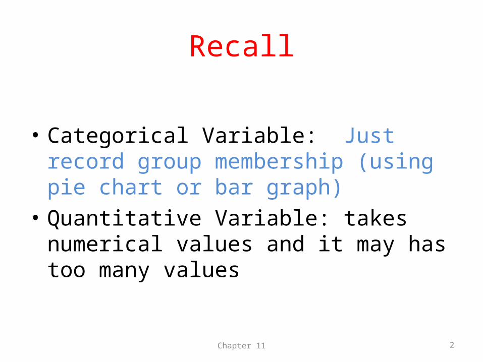
Recall
• Categorical Variable: Just record group membership (using pie chart or bar graph)
• Quantitative Variable: takes numerical values and it may has too many values
Chapter 11 2
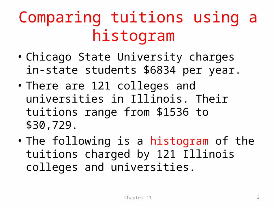
Comparing tuitions using a histogram
• Chicago State University charges in-state students $6834 per year.
• There are 121 colleges and universities in Illinois. Their tuitions range from $1536 to $30,729.
• The following is a histogram of the tuitions charged by 121 Illinois colleges and universities.
Chapter 11 3
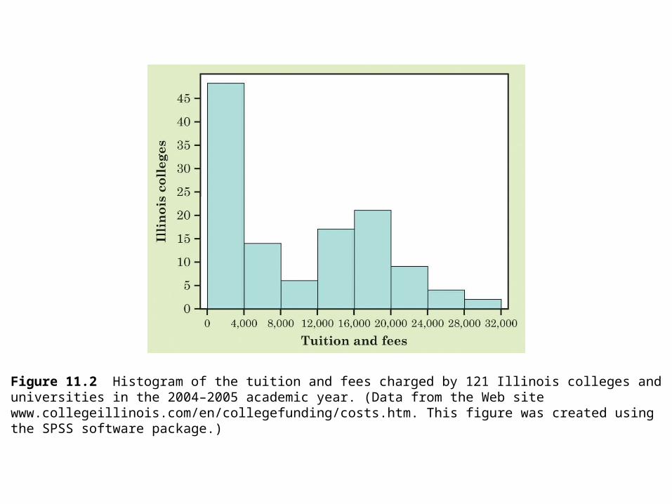
Figure 11.2 Histogram of the tuition and fees charged by 121 Illinois colleges anduniversities in the 2004–2005 academic year. (Data from the Web site www.collegeillinois.com/en/collegefunding/costs.htm. This figure was created usingthe SPSS software package.)
Comparing tuitions using a stemplot
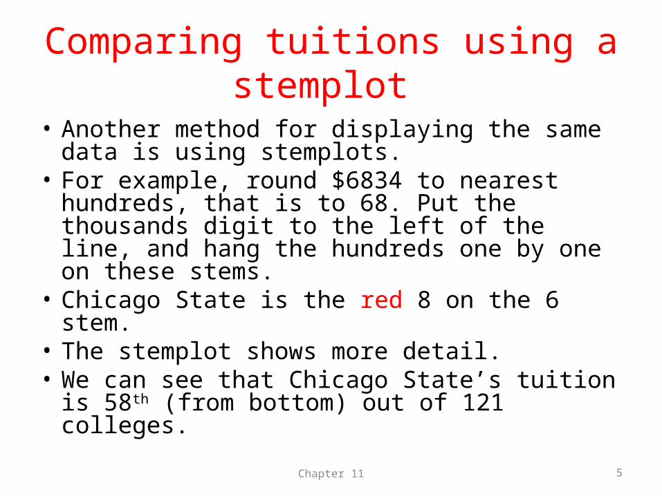
• Another method for displaying the same data is using stemplots.
• For example, round $6834 to nearest hundreds, that is to 68. Put the thousands digit to the left of the line, and hang the hundreds one by one on these stems.
• Chicago State is the red 8 on the 6 stem.• The stemplot shows more detail. • We can see that Chicago State’s tuition is 58th
(from bottom) out of 121 colleges.
Chapter 11 5
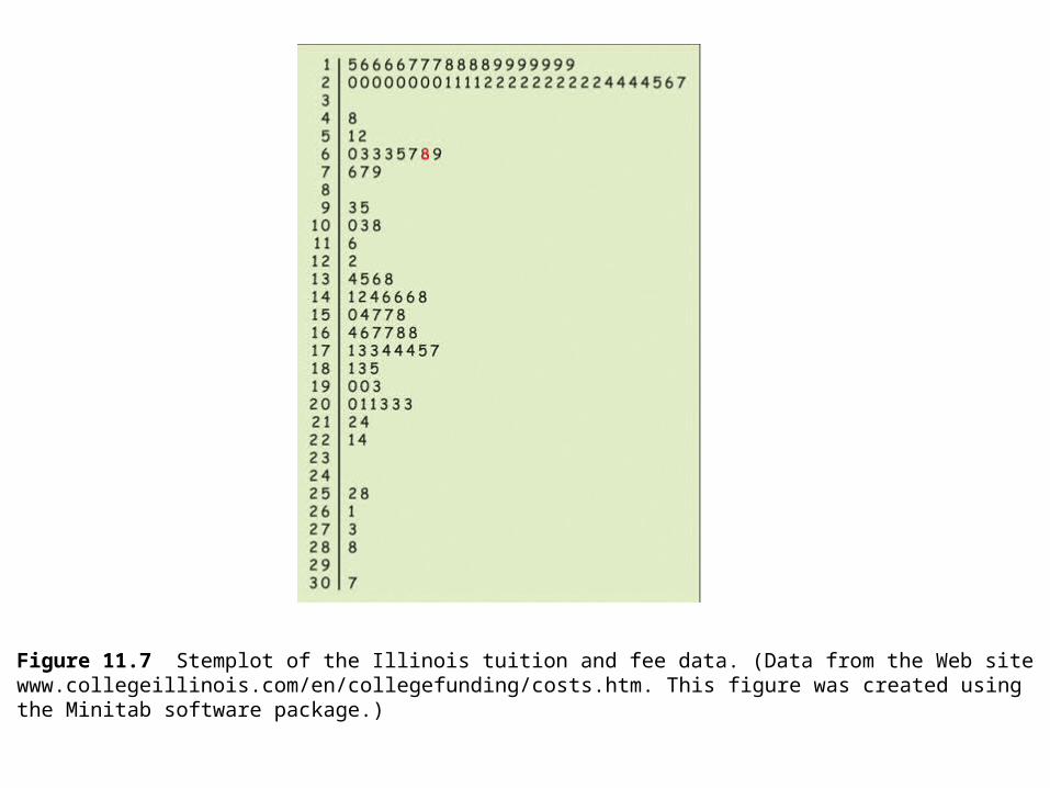
Figure 11.7 Stemplot of the Illinois tuition and fee data. (Data from the Web sitewww.collegeillinois.com/en/collegefunding/costs.htm. This figure was created usingthe Minitab software package.)
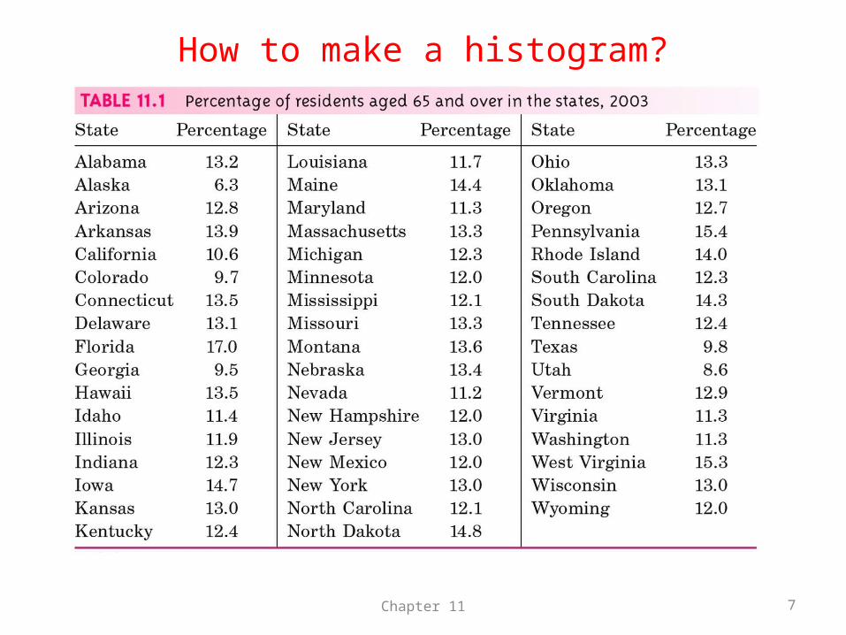
How to make a histogram?
Chapter 11 7
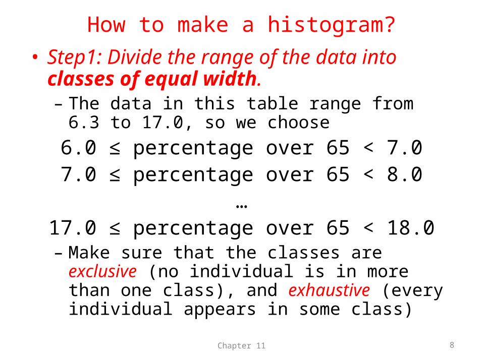
How to make a histogram?• Step1: Divide the range of the data into classes of
equal width. – The data in this table range from 6.3 to 17.0, so we
choose6.0 ≤ percentage over 65 < 7.07.0 ≤ percentage over 65 < 8.0
…17.0 ≤ percentage over 65 < 18.0
– Make sure that the classes are exclusive (no individual is in more than one class), and exhaustive (every individual appears in some class)
Chapter 11 8
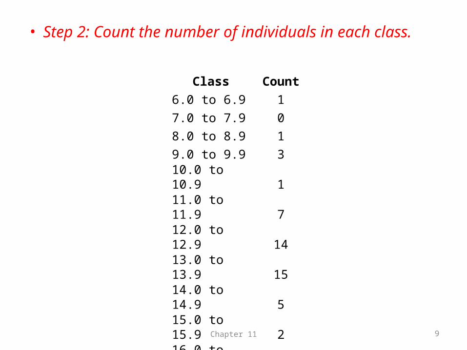
• Step 2: Count the number of individuals in each class.
Chapter 11 9
Class Count6.0 to 6.9 17.0 to 7.9 08.0 to 8.9 19.0 to 9.9 310.0 to 10.9 111.0 to 11.9 712.0 to 12.9 1413.0 to 13.9 1514.0 to 14.9 515.0 to 15.9 216.0 to 16.9 117.0 to 17.9 0
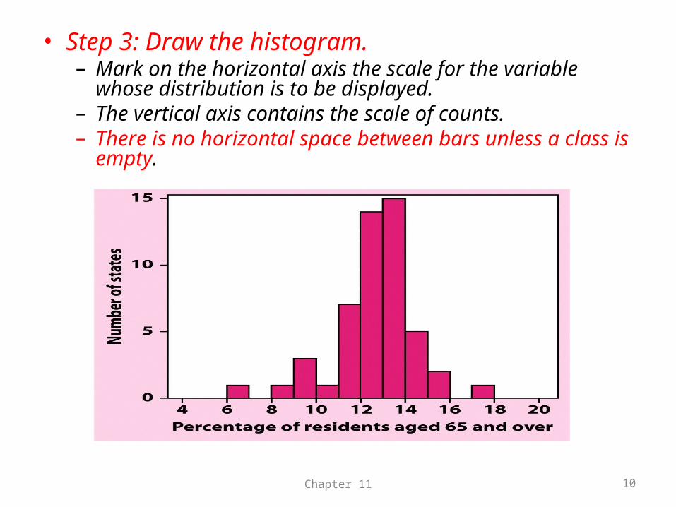
• Step 3: Draw the histogram.– Mark on the horizontal axis the scale for the variable whose
distribution is to be displayed.– The vertical axis contains the scale of counts. – There is no horizontal space between bars unless a class is
empty.
Chapter 11 10
Chapter 11 11
Interpreting Histograms
Outliers
• Extreme values, far from the rest of the data• May occur naturally• May occur due to error in recording• May occur due to error in measuring
Chapter 11 12
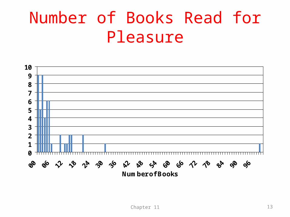
Number of Books Read for Pleasure
0123456789
10
Number of Books
Chapter 11 13
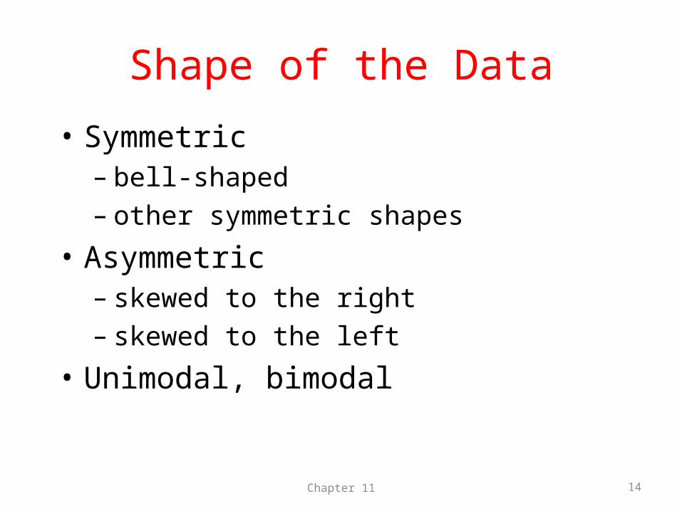
Shape of the Data
• Symmetric– bell-shaped– other symmetric shapes
• Asymmetric– skewed to the right– skewed to the left
• Unimodal, bimodal
Chapter 11 14
Chapter 11 15
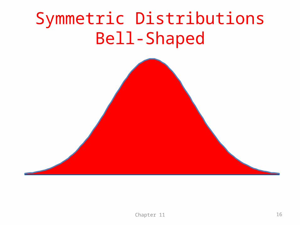
Symmetric DistributionsBell-Shaped
Chapter 11 16
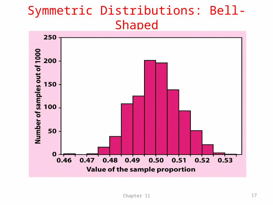
Symmetric Distributions: Bell-Shaped
Chapter 11 17
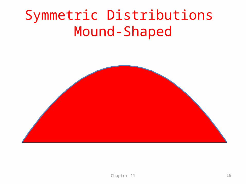
Symmetric Distributions Mound-Shaped
Chapter 11 18
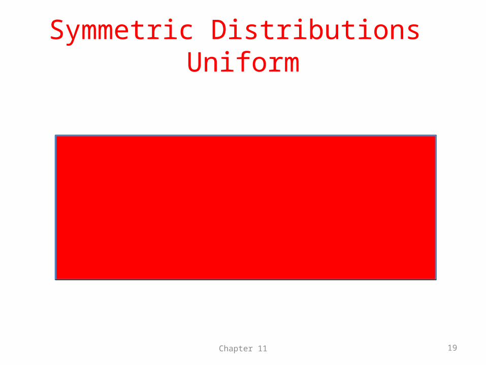
Symmetric Distributions Uniform
Chapter 11 19
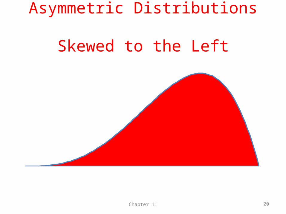
Asymmetric Distributions Skewed to the Left
Chapter 11 20
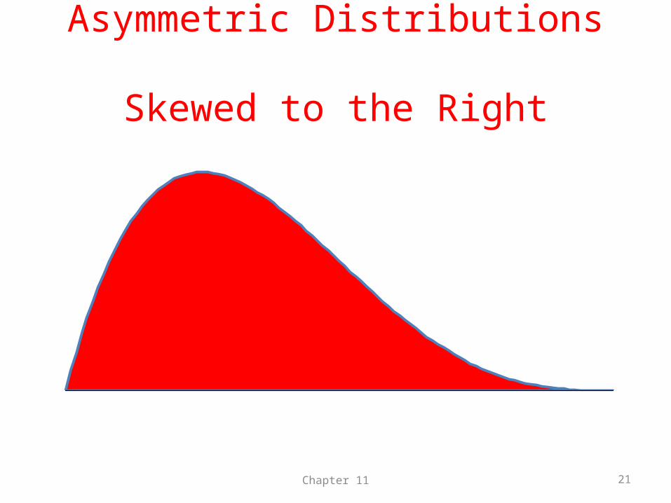
Asymmetric Distributions Skewed to the Right
Chapter 11 21
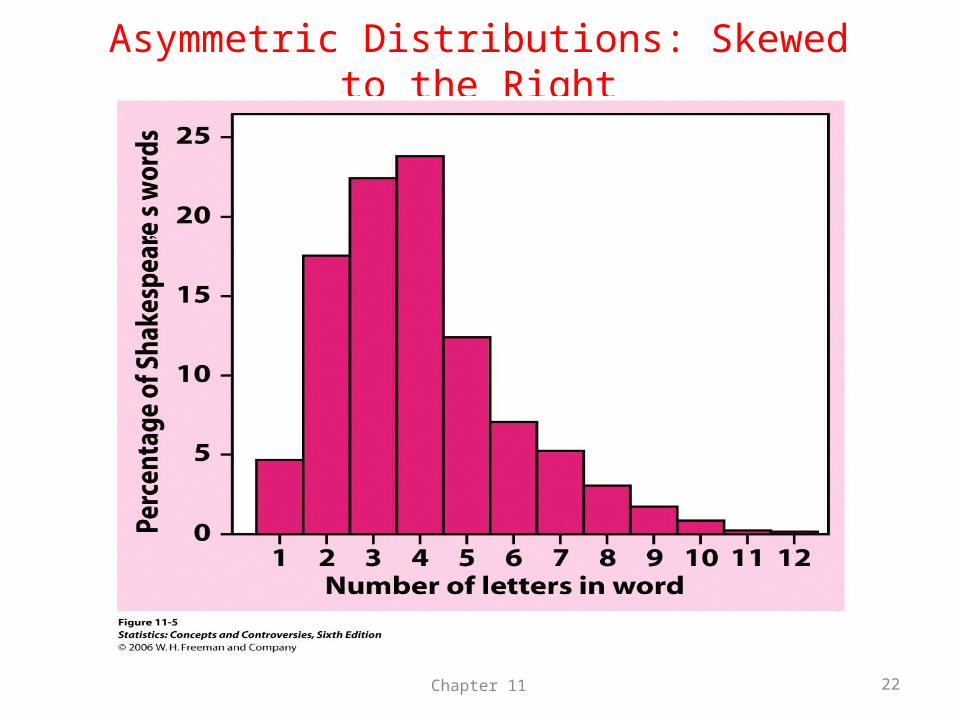
Asymmetric Distributions: Skewed to the Right
Chapter 11 22
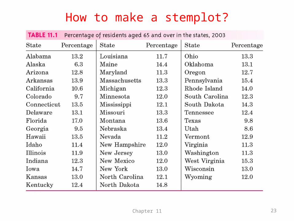
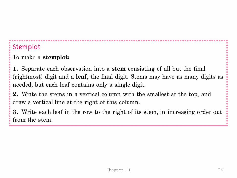
How to make a stemplot?
Chapter 11 23
Chapter 11 24
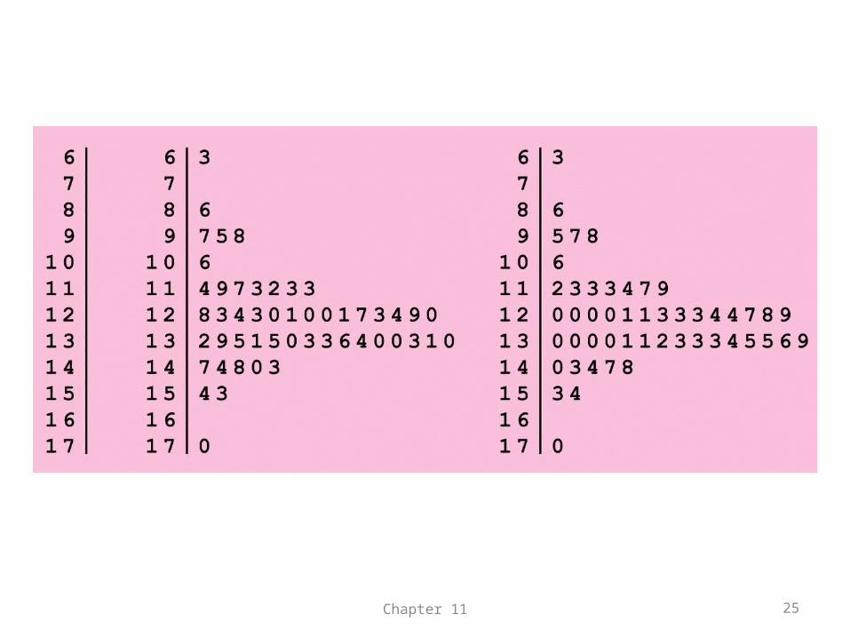
Chapter 11 25
Chapter 11 26
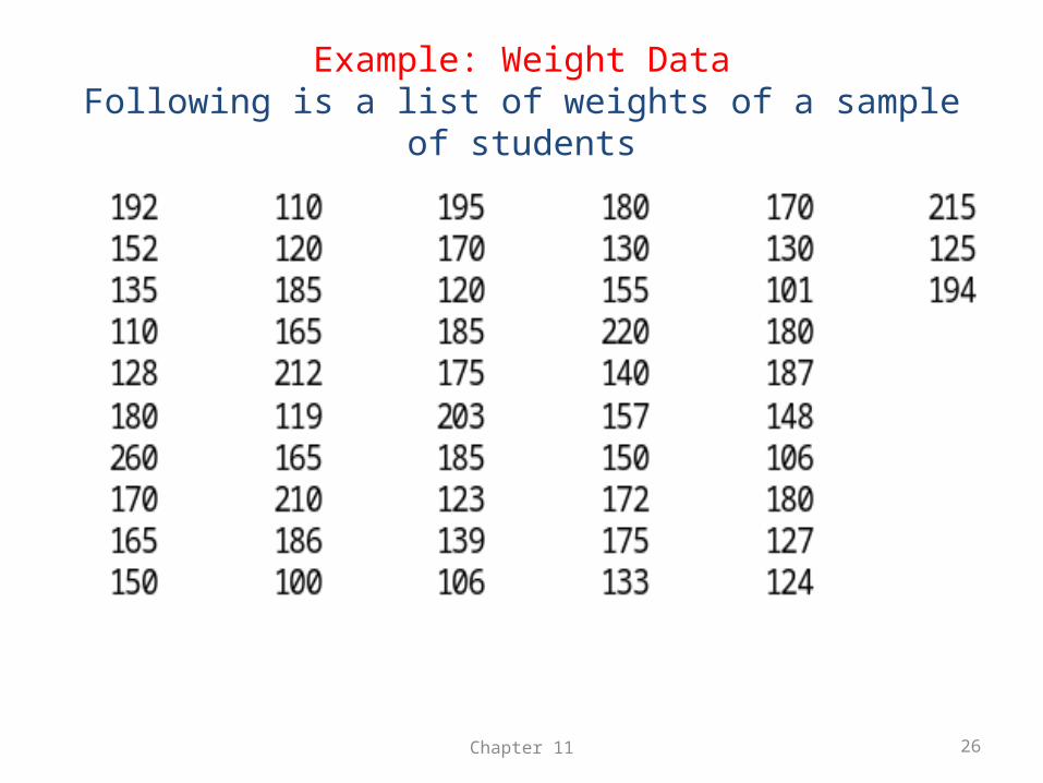
Example: Weight DataFollowing is a list of weights of a sample of students
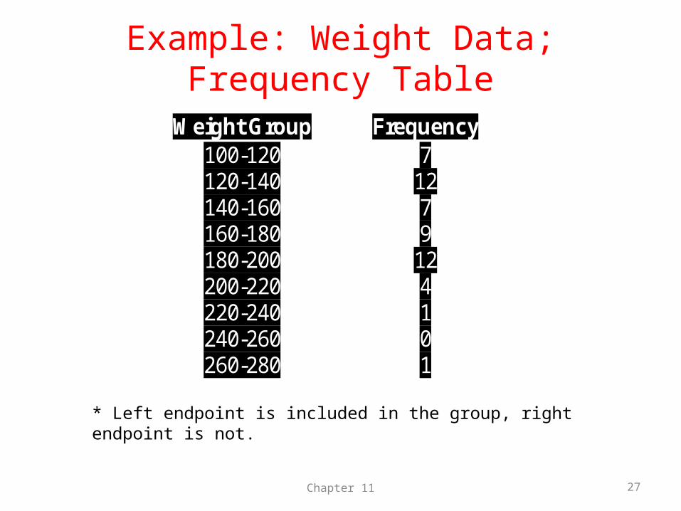
Example: Weight Data; Frequency Table
Chapter 11 27
Weight Group Frequency 100-120 7 120-140 12 140-160 7 160-180 9 180-200 12 200-220 4 220-240 1 240-260 0 260-280 1
* Left endpoint is included in the group, right endpoint is not.
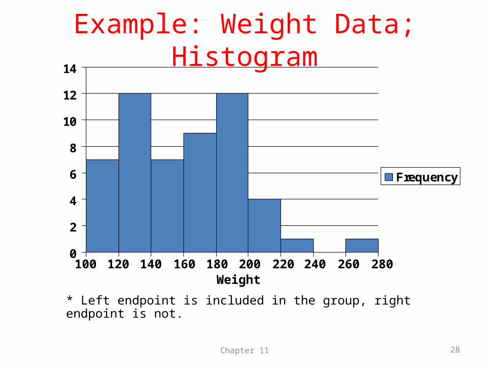
Example: Weight Data; Histogram
0
2
4
6
8
10
12
14
Frequency
Chapter 11 28
100 120 140 160 180 200 220 240 260 280Weight
* Left endpoint is included in the group, right endpoint is not.
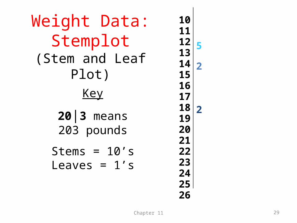
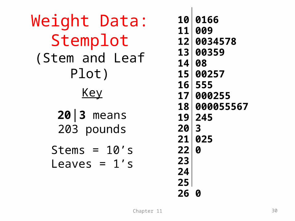
Weight Data:Stemplot
(Stem and Leaf Plot)
Chapter 11 29
1011121314151617181920212223242526
Key
20|3 means203 pounds
Stems = 10’sLeaves = 1’s
2
2
5
Weight Data:Stemplot
(Stem and Leaf Plot)
Chapter 11 30
10 016611 00912 003457813 0035914 0815 0025716 55517 00025518 00005556719 24520 321 02522 023242526 0
Key
20|3 means203 pounds
Stems = 10’sLeaves = 1’s
Key Concepts
• Displays (Stemplots & Histograms)
• Graph Shapes– Symmetric– Skewed to the Right– Skewed to the Left
• Outliers
Chapter 11 31
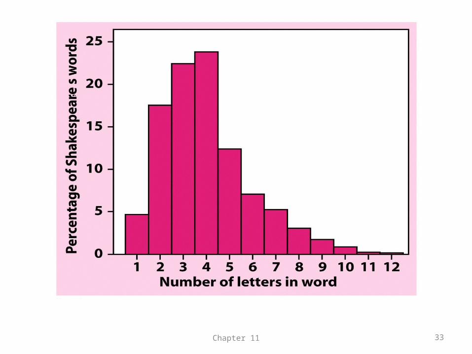
Example: Shakespeare’s words
• The following figure shows the distributions of lengths of words used in Shakespeare’s plays.
• Notice that the vertical scale is not the count of words but the percentage of all words that have each length.
• The curve is skewed to the right which is natural because short words are common and long ones are rare.
Chapter 11 32
Chapter 11 33
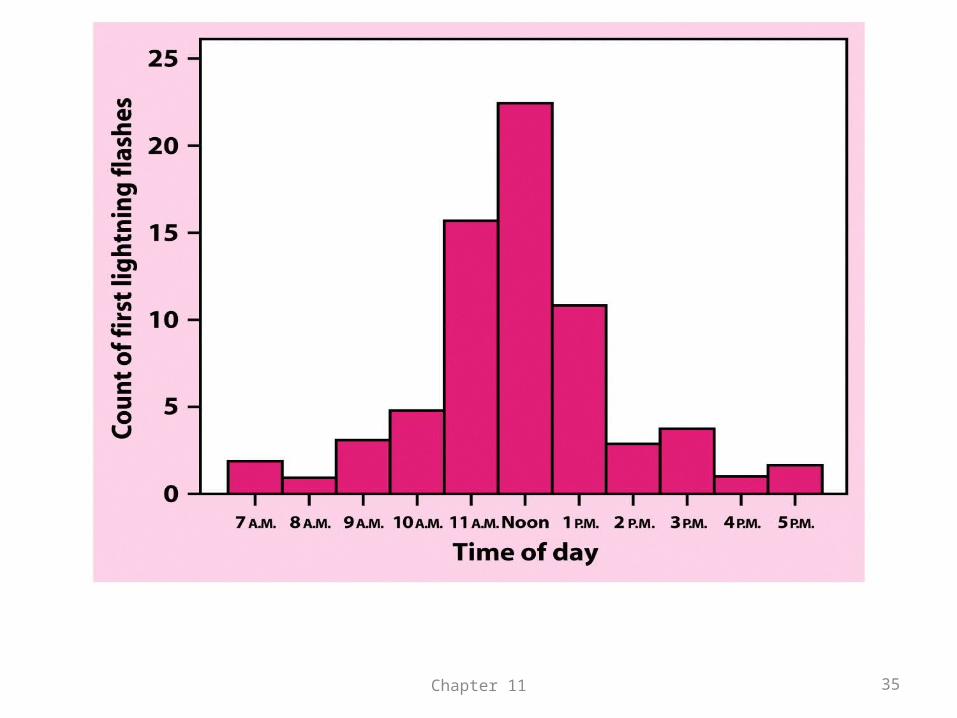
Exercise 11.3
• Lightning strikes. The following figure comes from a study of lightning storms in Colorado. It shows the distribution of the hour of the day during which the first lightning flash for that day occurred.
• Describe the shape, center, and spread of this distribution. Are there any outliers?
Chapter 11 34
Chapter 11 35
Exercise 11.4
• Where do the young live? The following figure is a stemplot of the percentage of the residents aged under 18 in each of the 50 states. The stems are whole percentages and the leaves are tenths of a percent.
Chapter 11 36
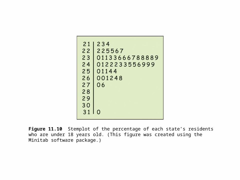
Figure 11.10 Stemplot of the percentage of each state’s residentswho are under 18 years old. (This figure was created using the Minitab software package.)
• Utah has the largest percentage of young adults. What is the percentage for this state?
• Ignoring Utah, describe the shape, center, and the spread of this distribution.
• Is the distribution for young adults more or less spread out than the distribution in the figure for older adults?
Chapter 11 38
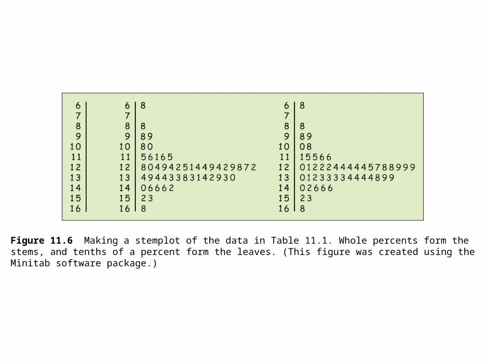
Figure 11.6 Making a stemplot of the data in Table 11.1. Whole percents form thestems, and tenths of a percent form the leaves. (This figure was created using theMinitab software package.)
Answer for 11.4
• Utah has 31.0% young adults• Without Utah , the distribution is roughly
symmetric, centered at about 24.2%, spread from 21.2% to 27.6%
• The distribution of young adult is less spread out than the distribution of older adults.
Chapter 11 40
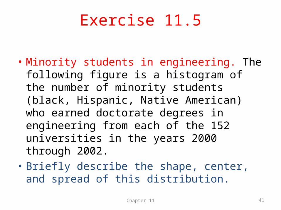
Exercise 11.5
• Minority students in engineering. The following figure is a histogram of the number of minority students (black, Hispanic, Native American) who earned doctorate degrees in engineering from each of the 152 universities in the years 2000 through 2002.
• Briefly describe the shape, center, and spread of this distribution.
Chapter 11 41
Figure 11.11 The distribution of number of engineering doctorates earned by minoritystudents at 152 universities, 2000 to 2002. (Data from the 2003 National Science Foundation Survey of Earned Doctorates, found at the Web site webcaspar.nsf.gov/. This figure was created using the SPSS software package.)
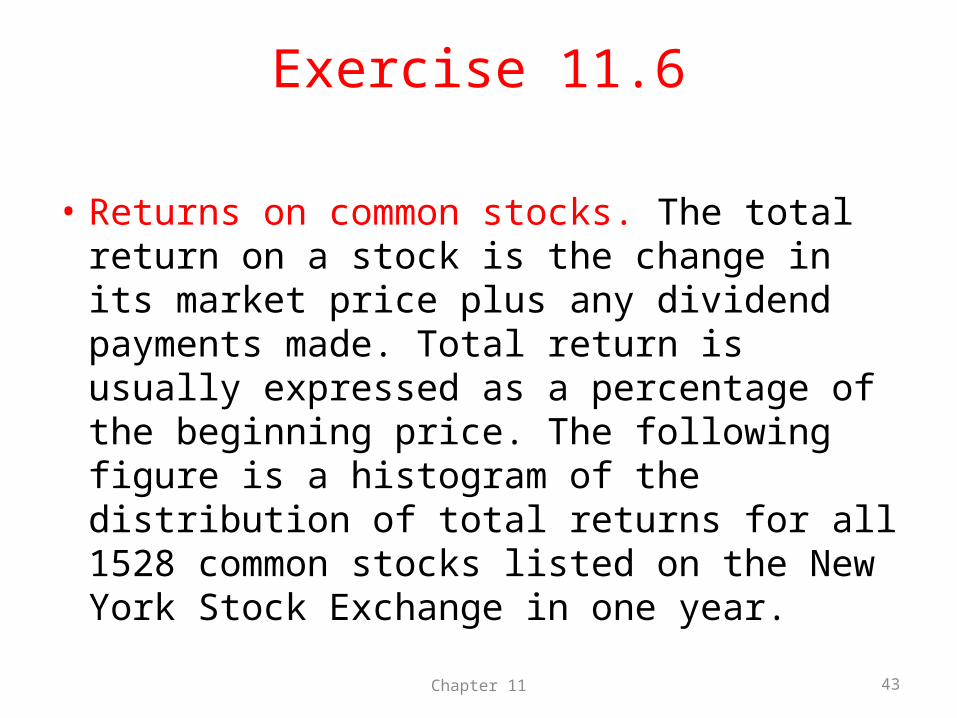
Exercise 11.6
• Returns on common stocks. The total return on a stock is the change in its market price plus any dividend payments made. Total return is usually expressed as a percentage of the beginning price. The following figure is a histogram of the distribution of total returns for all 1528 common stocks listed on the New York Stock Exchange in one year.
Chapter 11 43
Figure 11.12 The distribution of total returns for all New York Stock Exchangecommon stocks in one year. (Based on J. K. Ford, “Diversification: how many stocks will suffice?” American Association of Individual Investors Journal, January 1990, pp. 14–16.)
• Describe the overall shape of the distribution of total returns.
• What is the approximate center of this distribution? Approximately what were the smallest and largest total returns? (This describes the spread of the distribution.)
• A return less than zero means that owners of stock lost money. About what percentage of all stocks lost money?
Chapter 11 45
Answer for 11.6
• The distribution is roughly symmetric• The center is about 15%• The smallest return was between -70% and -
60%, while the largest was between 100% and 110%
• About (1+1+1+1+3+5+11=23%) of stocks lost money.
Chapter 11 46
Exercise 11.8• Automobile fuel economy. Government regulations
require automakers to give the city and highway gas mileages for each model of car. The following table gives the highway mileage (miles per gallon) for 31 model year 2004 midsize cars. Make a stemplot of the highway gas mileages of these cars.
• What can you say about the overall shape of the distribution?
• Where is the center (the value such that half the cars have better gas mileage and half have worse gas mileage)?
• Two of these cars are subject to the “gas guzzler tax” because of their low gas mileage. Which two?
Chapter 11 47
Chapter 11 48
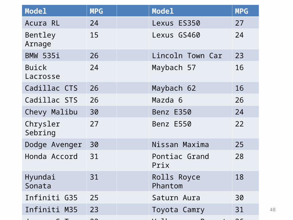
Model MPG Model MPG
Acura RL 24 Lexus ES350 27
Bentley Arnage 15 Lexus GS460 24
BMW 535i 26 Lincoln Town Car 23
Buick Lacrosse 24 Maybach 57 16
Cadillac CTS 26 Maybach 62 16
Cadillac STS 26 Mazda 6 26
Chevy Malibu 30 Benz E350 24
Chrysler Sebring 27 Benz E550 22
Dodge Avenger 30 Nissan Maxima 25
Honda Accord 31 Pontiac Grand Prix 28
Hyundai Sonata 31 Rolls Royce Phantom 18
Infiniti G35 25 Saturn Aura 30
Infiniti M35 23 Toyota Camry 31
Jaguar S-Type R 22 Volkswagen Passat 26
Kia Optima 31 Volvo S80 AWD 24
Kia Spectra 32


![[Chapter 5. Multivariate Probability Distributions]people.math.umass.edu/~daeyoung/Stat515/Chapter5.pdf · [Chapter 5. Multivariate Probability Distributions] ... ity distributions](https://static.fdocuments.us/doc/165x107/5b32d34e7f8b9a2c328dc4ef/chapter-5-multivariate-probability-distributions-daeyoungstat515chapter5pdf.jpg)