CHANGING DIRECTION DURING PAINTING - Amazon S3-+SketchBook/Mull... · CHANGING DIRECTION DURING...
11
CHANGING DIRECTION DURING PAINTING THE CHASE A Tutorial by Shaun Mullen www.mull-art.com A U T O D E S K SketchBook Pro for iPad
-
Upload
vuonghuong -
Category
Documents
-
view
219 -
download
0
Transcript of CHANGING DIRECTION DURING PAINTING - Amazon S3-+SketchBook/Mull... · CHANGING DIRECTION DURING...

CHANGING DIRECTION DURING PAINTING
THE CHASE
A Tutorial by Shaun Mullen
www.mull-art.com
A U T O D E S K SketchBook Pro for iPad
Introduction
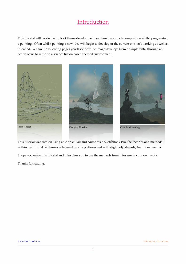
This tutorial will tackle the topic of theme development and how I approach composition whilst progressing a painting. Often whilst painting a new idea will begin to develop or the current one isn’t working as well as intended. Within the following pages you’ll see how the image develops from a simple vista, through an action scene to settle on a science fiction based themed environment.
From concept Changing Directon Completed painting
This tutorial was created using an Apple iPad and Autodesk’s SketchBook Pro, the theories and methods within the tutorial can however be used on any platform and with slight adjustments, traditional media.
I hope you enjoy this tutorial and it inspires you to use the methods from it for use in your own work.
Thanks for reading.
w w w. m u l l - a r t . c o m! C h a n g i n g D i r e c t i o n
1
Stage One
Stage one, I’m starting with a general theme, in this case ‘Treasure Island’, I create a simple line drawing to roughly show the idea.
From the title I know I need the three elements, that being the is-land, water and of course the sky.
The story part of the image hasn’t been established or a focal point which will attract any attention. Its obvious from this early line sketch that I’m going to have to work on the story.
Stage Two
I realize that there’s too much sky in the piece and al-
though great for practicing, to paint entire skies isn’t enthralling enough to capture the imagination of the viewer.
I raise that sketch layer so I can add more foreground elements. By adding that foreground land mass helps me push back the distant rock island and will give a nice contrast against the sea when painted. I intentionally try to have clear distinct sections which help with depth (background, middle ground & foreground).
When sketching at this stage I have an idea form of including a pi-rate ship anchored off the land and perhaps add the stereo-typical
one legged pirate stood watching over the scene. To allow myself more
freedom I leave including those elements until further in the painting process. Leaving parts allows me to be more creative during the paint process.
Stage Three
The painting begins, I always start with the sky as this is the furthest element in the piece. For this particular sky I paint a gradient of blue, darker at the top and I add a touch of pinky grey towards the horizon line to hint at distance.
The colours for the sky will be reflected in the water and the atmos-pheric elements which help divide the different planes of depth.
w w w. m u l l - a r t . c o m! C h a n g i n g D i r e c t i o n
2
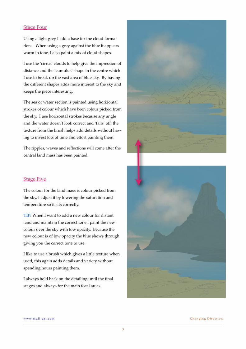
Stage Four
Using a light grey I add a base for the cloud forma-tions. When using a grey against the blue it appears warm in tone, I also paint a mix of cloud shapes.
I use the ‘cirrus’ clouds to help give the impression of distance and the ‘cumulus’ shape in the centre which I use to break up the vast area of blue sky. By having the different shapes adds more interest to the sky and keeps the piece interesting.
The sea or water section is painted using horizontal strokes of colour which have been colour picked from the sky. I use horizontal strokes because any angle and the water doesn’t look correct and ‘falls’ off, the texture from the brush helps add details without hav-ing to invest lots of time and effort painting them.
The ripples, waves and reflections will come after the central land mass has been painted.
Stage Five
The colour for the land mass is colour picked from the sky, I adjust it by lowering the saturation and temperature so it sits correctly.
TIP: When I want to add a new colour for distant land and maintain the correct tone I paint the new colour over the sky with low opacity. Because the new colour is of low opacity the blue shows through giving you the correct tone to use.
I like to use a brush which gives a little texture when used, this again adds details and variety without spending hours painting them.
I always hold back on the detailing until the final stages and always for the main focal areas.
w w w. m u l l - a r t . c o m! C h a n g i n g D i r e c t i o n
3
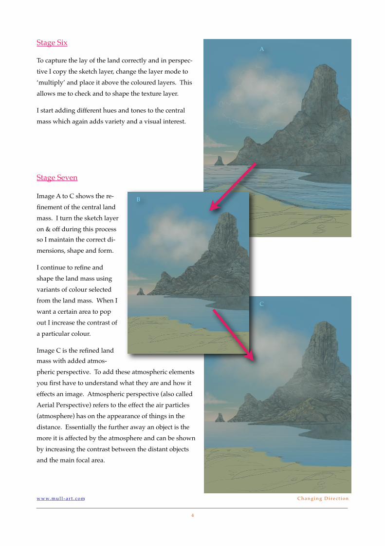
Stage Six
To capture the lay of the land correctly and in perspec-tive I copy the sketch layer, change the layer mode to ‘multiply’ and place it above the coloured layers. This allows me to check and to shape the texture layer.
I start adding different hues and tones to the central mass which again adds variety and a visual interest.
Stage Seven
Image A to C shows the re-finement of the central land mass. I turn the sketch layer on & off during this process so I maintain the correct di-mensions, shape and form.
I continue to refine and shape the land mass using variants of colour selected from the land mass. When I want a certain area to pop out I increase the contrast of a particular colour.
Image C is the refined land mass with added atmos-pheric perspective. To add these atmospheric elements you first have to understand what they are and how it effects an image. Atmospheric perspective (also called Aerial Perspective) refers to the effect the air particles (atmosphere) has on the appearance of things in the distance. Essentially the further away an object is the more it is affected by the atmosphere and can be shown by increasing the contrast between the distant objects and the main focal area.
w w w. m u l l - a r t . c o m! C h a n g i n g D i r e c t i o n
4
A
B
C
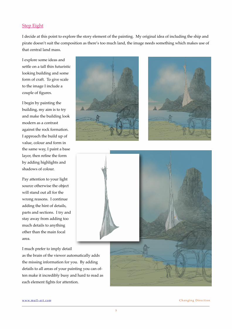
Step Eight
I decide at this point to explore the story element of the painting. My original idea of including the ship and pirate doesn’t suit the composition as there’s too much land, the image needs something which makes use of that central land mass.
I explore some ideas and settle on a tall thin futuristic looking building and some form of craft. To give scale to the image I include a couple of figures.
I begin by painting the building, my aim is to try and make the building look modern as a contrast against the rock formation. I approach the build up of value, colour and form in the same way, I paint a base layer, then refine the form by adding highlights and shadows of colour.
Pay attention to your light source otherwise the object will stand out all for the wrong reasons. I continue adding the hint of details, parts and sections. I try and stay away from adding too much details to anything other than the main focal area.
I much prefer to imply detail as the brain of the viewer automatically adds the missing information for you. By adding details to all areas of your painting you can of-ten make it incredibly busy and hard to read as each element fights for attention.
w w w. m u l l - a r t . c o m! C h a n g i n g D i r e c t i o n
5
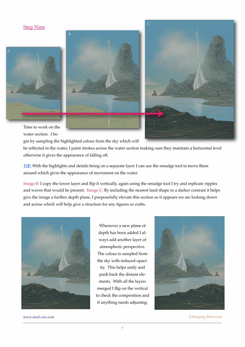
Step Nine
Time to work on the water section. I be-gin by sampling the highlighted colour from the sky which will be reflected in the water, I paint strokes across the water section making sure they maintain a horizontal level otherwise it gives the appearance of falling off.
TIP: With the highlights and details being on a separate layer I can use the smudge tool to move them around which gives the appearance of movement on the water.
Image B: I copy the tower layer and flip it vertically, again using the smudge tool I try and replicate ripples and waves that would be present. Image C: By including the nearest land shape in a darker contrast it helps give the image a further depth plane, I purposefully elevate this section so it appears we are looking down and across which will help give a structure for any figures or crafts.
Whenever a new plane of depth has been added I al-ways add another layer of atmospheric perspective.
The colour is sampled from the sky with reduced opaci-
tiy. This helps unify and push back the distant ele-ments. With all the layers
merged I flip on the vertical to check the composition and if anything needs adjusting.
w w w. m u l l - a r t . c o m! C h a n g i n g D i r e c t i o n
6
A
B
C
Step Ten
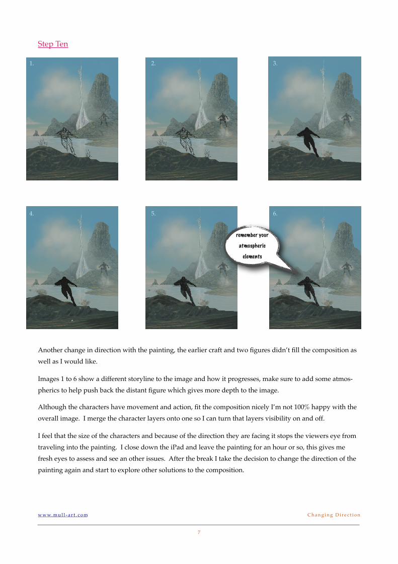
Another change in direction with the painting, the earlier craft and two figures didn’t fill the composition as well as I would like.
Images 1 to 6 show a different storyline to the image and how it progresses, make sure to add some atmos-pherics to help push back the distant figure which gives more depth to the image.
Although the characters have movement and action, fit the composition nicely I’m not 100% happy with the overall image. I merge the character layers onto one so I can turn that layers visibility on and off.
I feel that the size of the characters and because of the direction they are facing it stops the viewers eye from traveling into the painting. I close down the iPad and leave the painting for an hour or so, this gives me fresh eyes to assess and see an other issues. After the break I take the decision to change the direction of the painting again and start to explore other solutions to the composition.
w w w. m u l l - a r t . c o m! C h a n g i n g D i r e c t i o n
7
1. 2. 3.
4. 5. 6.
remember your
atmospheric
elements
Step Eleven
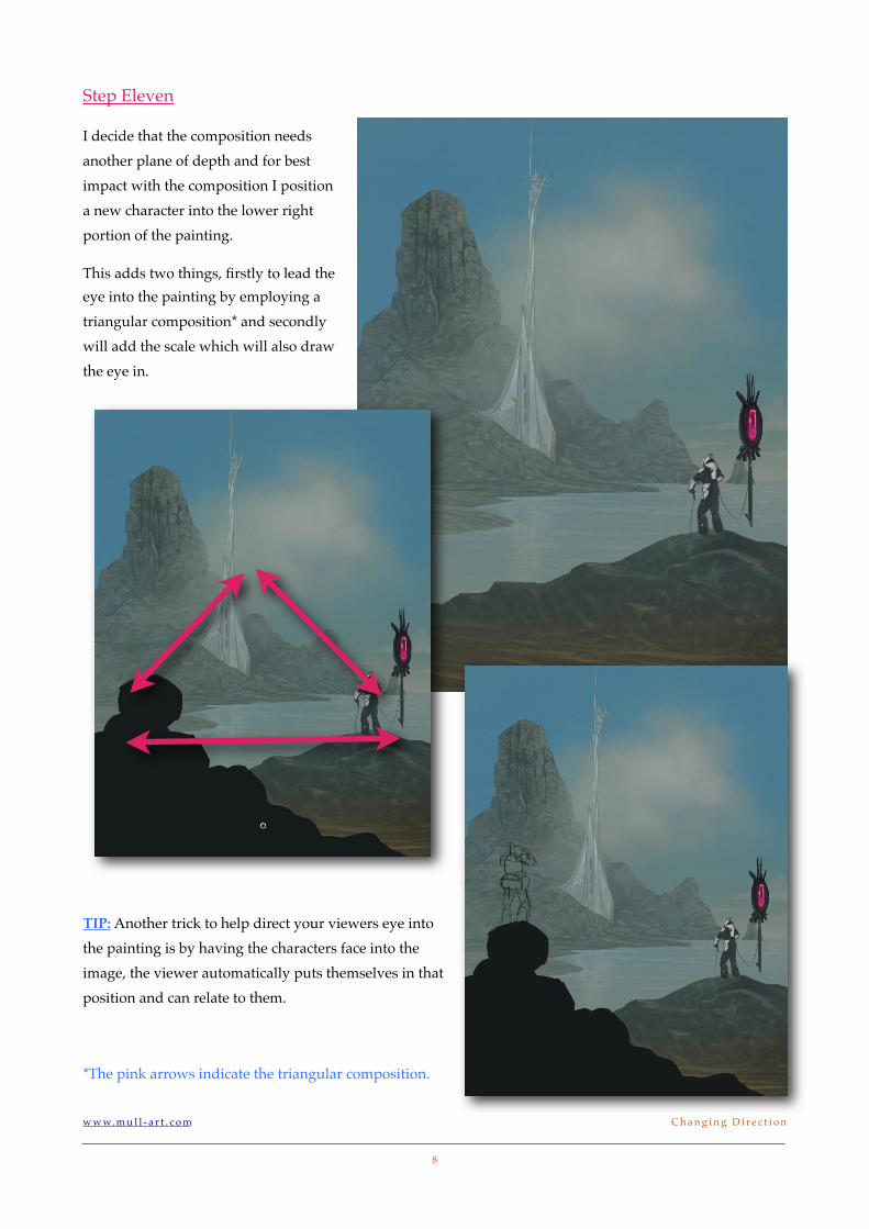
I decide that the composition needs another plane of depth and for best impact with the composition I position a new character into the lower right portion of the painting.
This adds two things, firstly to lead the eye into the painting by employing a triangular composition* and secondly will add the scale which will also draw the eye in.
TIP: Another trick to help direct your viewers eye into the painting is by having the characters face into the image, the viewer automatically puts themselves in that position and can relate to them.
*The pink arrows indicate the triangular composition.
w w w. m u l l - a r t . c o m! C h a n g i n g D i r e c t i o n
8

Step Eleven
The nearest rock formation I leave relatively dark, almost as if in shadow which increases the appearance and the effect of depth to the image.
For the characters I try and copy the look and feel of the architecture to help unify all the components together.
The pose of the characters have been purposefully drawn with some direc-tional cues which I hope increases the flow of the viewers eye over the im-age.
The arm is positioned in line with the distant rock formation and the build-ings foundation, the knees points upwards and in towards the building which is the central focal point.
The pink arrows highlight the directional cues.
I continue to refine and make adjustments, add details and some specular highlights to show material changes.
I add a small pink flare in the distant land mass to hint at the scale of the building but you need a keen eye to notice it. The next page shows the completed painting.
w w w. m u l l - a r t . c o m! C h a n g i n g D i r e c t i o n
9
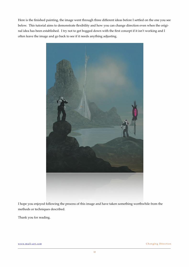
Here is the finished painting, the image went through three different ideas before I settled on the one you see below. This tutorial aims to demonstrate flexibility and how you can change direction even when the origi-nal idea has been established. I try not to get bogged down with the first concept if it isn’t working and I often leave the image and go back to see if it needs anything adjusting.
I hope you enjoyed following the process of this image and have taken something worthwhile from the methods or techniques described.
Thank you for reading.
w w w. m u l l - a r t . c o m! C h a n g i n g D i r e c t i o n
10