Ch 6 - Menu-Based and Form Fill-In Interactions Yonglei Tao School of Computing & Info Systems GVSU.
30
Ch 6 - Menu-Based and Form Fill-In Interactions Yonglei Tao School of Computing & Info Systems GVSU
-
Upload
ralf-hensley -
Category
Documents
-
view
217 -
download
0
Transcript of Ch 6 - Menu-Based and Form Fill-In Interactions Yonglei Tao School of Computing & Info Systems GVSU.

Ch 6 - Menu-Based and Form Fill-In Interactions
Yonglei Tao
School of Computing & Info Systems
GVSU

Menus
Lists of options Textual or graphical
A way of organizing system capabilities Navigate to a new menu/screen Perform an function Select data/parameters Display information
And also a learning tool

Menu-Based Interaction
Based on recognition as opposed to recall No need to remember commands Users search from a list of possible choices Avoids user error List provides constraints
Structure decision making

Advantages & Disadvantages
For the novice user Help build a mental model of the task No need to remember options Present choices among alternatives
For the expert user Understand the task very well and know what
choices one needs Need to “translate” what one wants to do into
an allowable action sequence

Advantages & Disadvantages
Easy to learn, to use, and to relearn Suitable to tasks in which steps and likely
input values are predictable Consumes screen space

Pull-Down Menus

Mark Toggles and Settings

Cascading Menus
Cascading Menus

Expanding Menus
Default condensed menu Menu after Check for Updates Full
menu
was selected

Pop-Up Menus

Tear-Off Menus

Layered Context-Dependent Menus

Other Menu Types
Keyboard-based menus Picture menus

Challenges in Menu Design
Limited space and many choices Need to accommodate both novice
users performing simple tasks and expert users performing complex tasks

Menu Organization
Dividing tasks into broad categories Also following standards
Categories should be meaningful in the context of the user’s task A way to promote task match Easy to locate, remember
No overlapping No irrelevant items

An Example

Design Issues
Breadth and depth Limit the depth of menu structures when
possible If a menu requires scrolling or overruns the
space available, it is definitely too long
Using visual separators Isolate destructive actions from
frequently used items

Design Issues (Cont.)
Menus for long lists Scrolling Combo boxes Fisheye Sliders Two-dimensional
Follow platform standards

Menu Options
Descriptive, unambiguous Consistent in placement, order, wording,
highlighting etc. Mnemonics Accelerators for frequently used ones

Menu Options (Cont.)
Displaying options All, relevant ones only, or graying-out some Inaccessible (grayed out) options should remain
on the menu in their usual location Ordering
Natural Frequency-based Alphabetical

Navigational Structure
Single Linear Simultaneous Tree- structured Networked

Navigational Structure
Single Sequential Hierarchal
Star Networked

Navigation Aids
Menu map Look-ahead Navigation history

Physical Access to Menu
Choose input devices for access Touch screens Pointing devices (mouse, stylus, …) Keyboards
Consider users with low-level typing skills having difficulty with precise pointing

Form Fill-in Interaction
Similar to paper forms A familiar metaphor Tasks with a lot of data entry
Provide guidance about expected content and format for the data to be entered
Especially useful for users who are familiar with the task at hand but need the cueing Such as using tax software
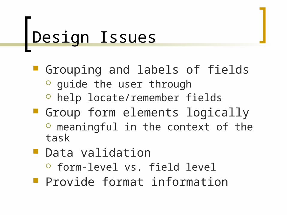
Design Issues
Grouping and labels of fields guide the user through help locate/remember fields
Group form elements logically meaningful in the context of the task
Data validation form-level vs. field level
Provide format information

Navigation
Forms can be presented using Single scrolling screens Multiple linked pages
Provide navigation supportInform the user about the length of paged forms and where they are within the structure

Advantages & Disadvantages
Advantages Low memory requirements Self-explanatory Present a context for input information
Disadvantages Require valid input in valid format Require familiarity with interface controls Can be tedious to correct mistakes Take up a lot of screen space

Question and Answer
Also called wizards

1-30
Discussion Low memory requirements Self-explanatory Simple linear presentation Can be tedious to correct mistakes Navigation
Easy navigation to Prev and Next Difficult to any other page An alternative design – Turbo Tax