
CASE STUDY CASO STUDIO CAS D’ETUDE - … · Eurovia / Millot TP / ICF), Cofex Régions (nailed...
10
CASE STUDY CASO STUDIO CAS D’ETUDE di /de /of Joseph di Pasquale
-
Upload
truongnhan -
Category
Documents
-
view
215 -
download
0
Transcript of CASE STUDY CASO STUDIO CAS D’ETUDE - … · Eurovia / Millot TP / ICF), Cofex Régions (nailed...
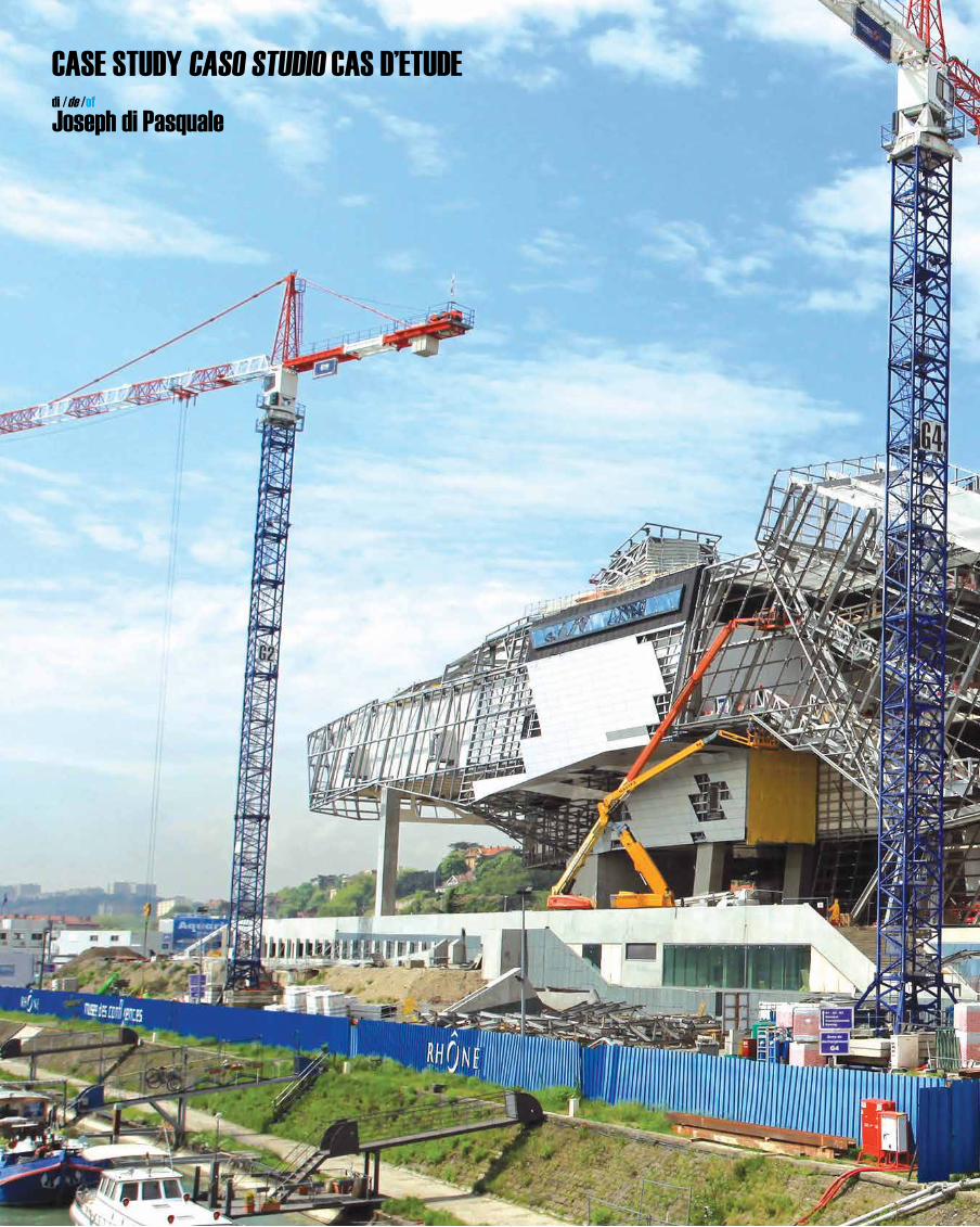
CASE STUDY CASO STUDIO CAS D’ETUDE di /de /of
Joseph di Pasquale
LYOn, FrAnCE
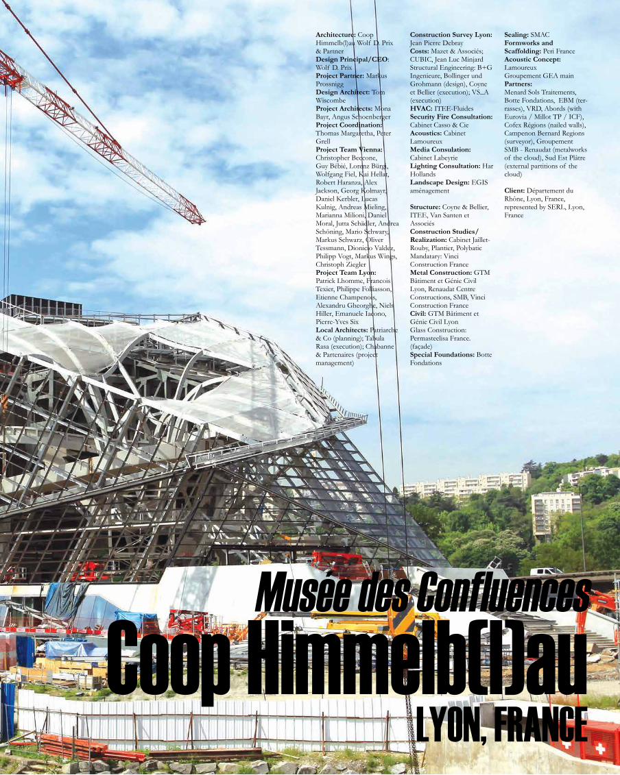
Musée des Confluences
Coop Himmelb(l)au
Architecture: Coop Himmelb(l)au Wolf D. Prix & Partner Design Principal/CEO: Wolf D. PrixProject Partner: Markus ProssniggDesign Architect: Tom WiscombeProject Architects: Mona Bayr, Angus SchoenbergerProject Coordination: Thomas Margaretha, Peter GrellProject Team Vienna: Christopher Beccone, Guy Bébié, Lorenz Bürgi, Wolfgang Fiel, Kai Hellat, Robert Haranza, Alex Jackson, Georg Kolmayr, Daniel Kerbler, Lucas Kulnig, Andreas Mieling, Marianna Milioni, Daniel Moral, Jutta Schädler, Andrea Schöning, Mario Schwary, Markus Schwarz, Oliver Tessmann, Dionicio Valdez, Philipp Vogt, Markus Wings, Christoph ZieglerProject Team Lyon: Patrick Lhomme, Francois Texier, Philippe Folliasson, Etienne Champenois, Alexandru Gheorghe, Niels Hiller, Emanuele Iacono, Pierre-Yves SixLocal Architects: Patriarche & Co (planning); Tabula Rasa (execution); Chabanne & Partenaires (project management)
Construction Survey Lyon: Jean Pierre DebrayCosts: Mazet & Associés; CUBIC, Jean Luc MinjardStructural Engineering: B+G Ingenieure, Bollinger und Grohmann (design), Coyne et Bellier (execution); VS_A (execution)HVAC: ITEE-FluidesSecurity Fire Consultation: Cabinet Casso & Cie Acoustics: Cabinet Lamoureux Media Consulation: Cabinet LabeyrieLighting Consultation: Har HollandsLandscape Design: EGIS aménagement
Structure: Coyne & Bellier, ITEE, Van Santen et AssociésConstruction Studies/Realization: Cabinet Jaillet-Rouby, Plantier, PolybaticMandatary: Vinci Construction FranceMetal Construction: GTM Bâtiment et Génie Civil Lyon, Renaudat Centre Constructions, SMB, Vinci Construction FranceCivil: GTM Bâtiment et Génie Civil LyonGlass Construction: Permasteelisa France. (façade)Special Foundations: Botte Fondations
Sealing: SMACFormworks and Scaffolding: Peri FranceAcoustic Concept: LamoureuxGroupement GEA main Partners: Menard Sols Traitements, Botte Fondations, EBM (ter-rasses), VRD, Abords (with Eurovia / Millot TP / ICF), Cofex Régions (nailed walls), Campenon Bernard Regions (surveyor), Groupement SMB - Renaudat (metalworks of the cloud), Sud Est Plâtre (external partitions of the cloud)
Client: Département du Rhône, Lyon, France, represented by SERL, Lyon, France
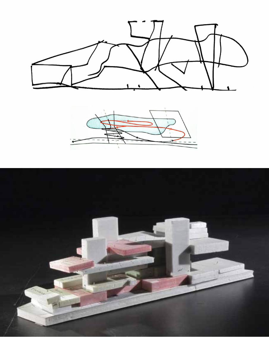
Circulation diagram
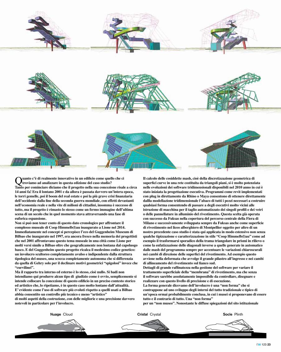
Socle Plinth Cristal CrystalNuage Cloud
The elements
Socle Plinth Cristal CrystalNuage Cloud
The elements
Quanto c’è di realmente innovativo in un edificio come quello che ci troviamo ad analizzare in questa edizione del caso studio?
Tanto per cominciare diciamo che il progetto nella sua concezione risale a circa 14 anni fa! Era il lontano 2001 e da allora è passata davvero un’intera epoca, le torri gemelle, poi il boom del real estate e poi la più grave crisi finanziaria dell’occidente dalla fine della seconda guerra mondiale, con effetti devastanti nell’economia reale e nella vite di milioni di cittadini, insomma è successo di tutto, ma il progetto è rimasto lo stesso come un fermo immagine dell’ultima scena di un secolo che in quel momento stava attraversando una fase di euforica espansione.Non si può non tener conto di questo dato cronologico per affrontare il complesso museale di Coop Himmelb(l)au inaugurato a Lione nel 2014. Immediatamente nel concept si percepisce l’eco del Guggenheim Museum di Bilbao che inaugurato nel 1997, era ancora fresco nella memoria dei progettisti che nel 2001 affrontavano questo tema museale in una città come Lione per molti versi simile a Bilbao oltre che geograficamente non lontana dal capoluogo basco. E del Guggenheim questo progetto ricalca il medesimo codice genetico: un involucro scultoreo completamente avulso e indipendente dalla struttura tipologica del museo, una scocca completamente autonoma che si differenzia da quella di Gehry solo per il declinare motivi geometrici “spigolosi” invece che “curvilinei”.Ma il rapporto tra interno ed esterno è lo stesso, cioè nullo. Si badi non intendiamo qui produrre alcun tipo di giudizio come è ovvio, semplicemente si intende collocare la concezione di questo edificio in un preciso contesto storico ed artistico che, lo ripetiamo, è in questo caso molto lontano dall’attualità.E’ evidente come l’uso di software più evoluti rispetto a quelli usati a Bilbao abbia consentito un controllo più tecnico e meno “artistico” di molti aspetti della costruzione, con delle migliorie e una precisione davvero notevoli in particolare per l’involucro.
Il calcolo delle cosiddette mash, cioè della discretizzazione geometrica di superfici curve in una rete costituita da triangoli piani, si è molto potenziata nelle evoluzioni dei software tridimensionali disponibili nel 2010 anno in cui è stato iniziata la progettazione esecutiva. Programmi come revit implementati con plug in direttamente da Rhino o Maya consentono di ottenere direttamente dallla modellazione tridimensionale l’abaco di tutti i pezzi necessari a costruire qualsiasi forma consentendo di passare a degli esecutivi molto vicini alle istruzione di macchina per il taglio automatizzato dei singoli profili e dei vetri o delle pannellature in alluminio del rivestimento. Questa scelta già operata con successo da Fuksas nella copertura del percorso centrale della Fiera di Milano e successivamente sviluppata sempre da Fuksas anche come superficie di rivestimento nel liceo alberghiero di Montpellier oggetto per altro di un nostro precedente caso studio è stata qui applicata in modo estensivo non senza qualche tipizzazione e caratterizzazione in stile “Coop Himmelb(l)au” come ad esempio il trasformarsi sporadico della trama triangolare in prismi in rilievo o come la enfatizzazione delle diagonali inverse a quelle generate in automatico dalle mash del programma sempre per accentuare le variazioni chiaroscurali nei cambi di direzione delle superfici del rivestimento. Ad esempio questo avviene nella deformata che avvolge il grande pilastro all’ingresso e nei cambi di allineamento del rivestimento sul fianco sud.Dettagli di grande raffinatezza nella gestione del software per variare il trattamento superficiale della “membrana” di rivestimento, ma che senza il software sarebbe assolutamente impossibile da controllare, disegnare e realizzare con questo livello di precisione e di esecuzione.La forma generale dicevamo dell’involucro è una “non forma” che si contrappone ad uno sviluppo degli interni del tutto tradizionale e tipico di un’epoca ormai probabilmente conclusa, in cui i musei si proponevano di essere tutto e il contrario di tutto. Una “non forma” per un “non museo”. Nonostante le diffuse spiegazioni del sito istituzionale
l’AI 123 23
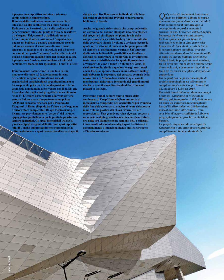
il programma espositivo non riesce ad essere completamente comprensibile.Il museo delle confluenze: nome con una chiara allusione sia alla confluenza tra i fiumi Saona e Rodano su cui è costruito, e sia alle confluenze più genericamente intese dal punto di vista delle culture e delle genti. Usi, costumi e tradizioni: un po’ di tutto e un po’ di niente insomma. L’importante è pagare un biglietto e passare una giornata uscendo dal museo avendo al sensazione di essere meno ignoranti di quando ci si è entrati. Se poi si è anche consumato un pasto “culturale” nella caffetteria del museo e comprato qualche libro nel bookshop allora il programma funzionale è completo, e i soldi dei contribuenti francesi ben spesi dopo 14 anni di attesa!
E’ interessante notare come in una foto di una maquette di studio sul funzionamento interno dell’edificio vengano utilizzati una serie di regolarissimi parallelepipedi organizzati intorno a tre corpi scala principali la cui disposizione e la cui geometria non ha nulla a che vedere con il guscio che li avvolge, che dagli stessi progettisti viene chiamato “cloud”. E’ chiaro il riferimento alla “nuvola” che sempre Fuksas aveva disegnato un anno prima (2000) nel concorso vincitore per il Palazzo dei Congressi di Roma (il quale tra l’altro a tutt’oggi non è ancora stato completato). Da qui l’ispirazione per il carattere prevalentemente “sospeso” del volume, appoggiato e puntellato in pochi punti da pilastri non sempre aggraziati. Gli spazi interstiziali tra questi parallelepipedi vengono definiti come spazi espositivi “fluidi”, anche qui probabilmente riprendendo la differenziazione tra spazi convenzionali e spazi aperti
che già Rem Koolhaas aveva individuato alla base del concept vincitore nel 1999 del concorso per la biblioteca di Seattle.
Anche nel grande atrio vetrato che comprende tutta un’estremità del volume allungato il talento plastico dei progettisti si sviluppa nel punto focale della composizione che è costituito dal grande imbuto che dalla copertura sfonda il volume e arriva a toccare la quota zero e attorno al quale si sviluppano passerelle ed elementi di collegamento verticale. Un’ulteriore declinazione ludica delle possibilità che il software concede nel deformare la membrana di rivestimento, tentazione irresistibile che ha spinto il progettista a “bucare” da cima a fondo il volume dell’atrio. Il risultato è molto simile a quello che negli stessi mesi anche Fucksas sperimentava con un software analogo nell’elaborare la copertura del percorso centrale della nuova Fiera di Milano dove anche in quel caso la membrana si deformava formando dei grandi imbuti che toccavano il suolo diventando di fatto enormi pilastri di sostegno.
Potremmo quindi definire questo museo delle confluenze di Coop Himmelb(l)au una sorta di meraviglioso compendio dell’architettura più avanzata della fine del secolo scorso magistralmente rielaborata in un volume plastico dai chiari riferimenti neo espressionisti. Una grande nuvola spigolosa, sospesa a mezz’aria scolpita geometricamente con sfaccettature ora nette ora sfumate che ne rendono netti e stilizzati i lineamenti. Al suo interno degli spazi tradizionali e completamente e intenzionalmente antitetici rispetto all’involucro esterno.
Qu’y a-t-il de réellement innovateur dans un bâtiment comme le musée
que nous analysons dans ce cas d'étude ?Pour commencer il faut dire que la conception de ce projet remonte à environ 14 ans! C'était en 2001, et depuis, beaucoup de choses se sont passées, les tours jumelles, puis le boom du real estate et enfin la plus grave crise financière de l'occident depuis la fin de la seconde guerre mondiale, avec des effets dévastateurs dans l'économie réelle et dans les vies de millions de citoyens. Malgré tout, le projet est resté le même, tel un arrêt sur image de la dernière scène d'un siècle qui, à ce moment-là, était en train de traverser une phase d'expansion euphorique.On ne peut pas ne pas tenir compte de ce fait chronologique en affrontant le complexe muséale de Coop Himmelb(l)au, inauguré à Lyon en 2014.On saisit immédiatement dans ce concept l'écho du Guggenheim Museum de Bilbao, qui, inauguré en 1997, était encore vif dans les souvenirs des concepteurs lorsqu’ils affrontaient en 2001ce thème muséal dans une ville comme Lyon, sous bien d'aspects similaire à Bilbao et géographiquement proche du chef-lieu basque. Ce projet calque le code génétique du Guggenheim : une enveloppe sculpturale complètement indépendante de la
Que
ntin
Laf
ont
FF 0206
FF 0206
EE
0205
DD
0204
EE
0205
DD
0204
ADAPTATIONGARDE-COPRS
MISE A JOUR GOSELON DETAIL 10/ 5105
Coupe générale B-B
Facade sud
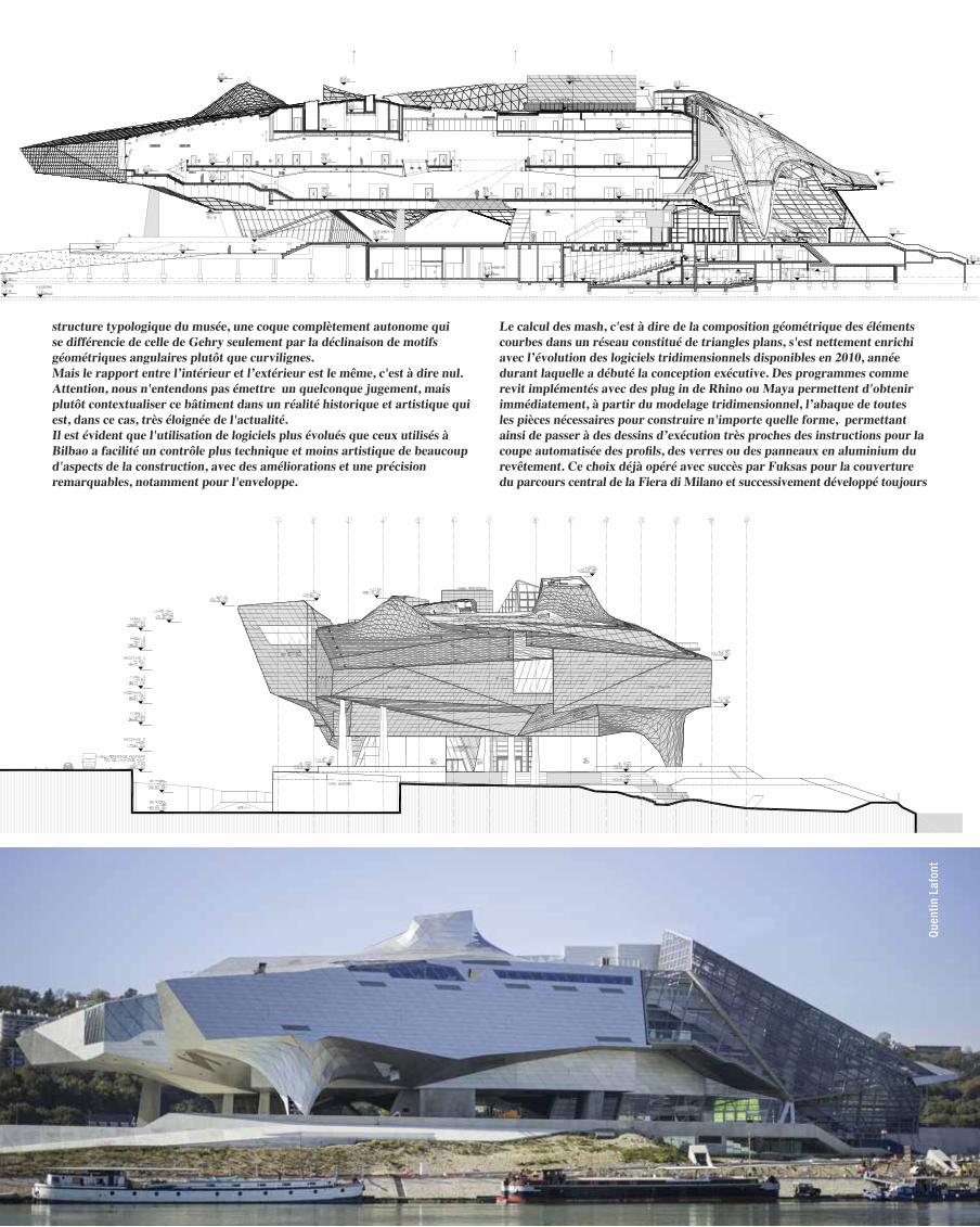
structure typologique du musée, une coque complètement autonome qui se différencie de celle de Gehry seulement par la déclinaison de motifs géométriques angulaires plutôt que curvilignes.Mais le rapport entre l’intérieur et l’extérieur est le même, c'est à dire nul. Attention, nous n'entendons pas émettre un quelconque jugement, mais plutôt contextualiser ce bâtiment dans un réalité historique et artistique qui est, dans ce cas, très éloignée de l'actualité.Il est évident que l'utilisation de logiciels plus évolués que ceux utilisés à Bilbao a facilité un contrôle plus technique et moins artistique de beaucoup d'aspects de la construction, avec des améliorations et une précision remarquables, notamment pour l'enveloppe.
Le calcul des mash, c'est à dire de la composition géométrique des éléments courbes dans un réseau constitué de triangles plans, s'est nettement enrichi avec l’évolution des logiciels tridimensionnels disponibles en 2010, année durant laquelle a débuté la conception exécutive. Des programmes comme revit implémentés avec des plug in de Rhino ou Maya permettent d'obtenir immédiatement, à partir du modelage tridimensionnel, l’abaque de toutes les pièces nécessaires pour construire n'importe quelle forme, permettant ainsi de passer à des dessins d’exécution très proches des instructions pour la coupe automatisée des profils, des verres ou des panneaux en aluminium du revêtement. Ce choix déjà opéré avec succès par Fuksas pour la couverture du parcours central de la Fiera di Milano et successivement développé toujours
Que
ntin
Laf
ont
CRISTAL / CRYSTAL
ABORDS / SURROUNDINGS
SOCLE / PLINTH
NUAGE / CLOUD
The elements
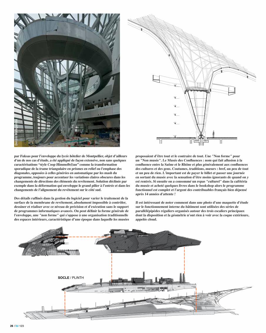
GRAVITY WELL SECTIONGravity well sectionpar Fuksas pour l’enveloppe du lycée hôtelier de Montpellier, objet d’ailleurs
d'un de nos cas d'étude, a été appliqué de façon extensive, non sans quelques caractérisations “style Coop Himmelb(l)au” comme la transformation sporadique de la trame triangulaire en prismes en relief ou l'emphase des diagonales, opposées à celles générées en automatique par les mash du programme, toujours pour accentuer les variations claires obscures dans les changements de directions des éléments du revêtement. Solution déclinée par exemple dans la déformation qui enveloppe le grand pilier à l’entrée et dans les changements de l’alignement du revêtement sur le côté sud.
Des détails raffinés dans la gestion du logiciel pour varier le traitement de la surface de la membrane de revêtement, absolument impossible à contrôler, dessiner et réaliser avec ce niveau de précision et d'exécution sans le support de programmes informatiques avancés. On peut définir la forme générale de l'enveloppe, une "non forme" qui s'oppose à une organisation traditionnelle des espaces intérieurs, caractéristique d’une époque dans laquelle les musées
proposaient d’être tout et le contraire de tout. Une "Non forme" pour un "Non musée". Le Musée des Confluences : nom qui fait allusion à la confluence entre la Saône et le Rhône et plus généralement aux confluences des cultures et des gens. Coutumes, traditions, mœurs : bref, un peu de tout et un peu de rien. L'important est de payer le billet et passer une journée en sortant du musée avec la sensation d’être moins ignorants de quand on y est rentrés. Si ensuite on a consommé un repas "culturel" dans la cafétéria du musée et acheté quelques livres dans le bookshop alors le programme fonctionnel est complet et l'argent des contribuables français bien dépensé après 14 années d'attente !
Il est intéressant de noter comment dans une photo d'une maquette d'étude sur le fonctionnement interne du bâtiment sont utilisées des séries de parallélépipèdes réguliers organisés autour des trois escaliers principaux dont la disposition et la géométrie n'ont rien à voir avec la coque extérieure, appelée cloud.
Duc
cio
Mal
agam
ba
l’AI 12326
Glazing
Secondary structure
Primary structure
Gravity well
Cela fait clairement référence au nuage qu'avait dessiné Fuksas une année auparavant (2000) dans le concours lauréats pour le Palais des Congrès de Rome (projet encore non achevé aujourd'hui). C'est de là que vient l'inspiration du volume suspendu soutenu en quelques points par des piliers.Parmi ces parallélépipèdes, les espaces interstitiels sont aménagés comme des espaces d'exposition "fluides", en reprenant la différenciation entre les espaces conventionnels et les espaces ouverts que Rem Koolhaas avait déjà définis dans son projet lauréat du concours pour la bibliothèque de Seattle en 1999.Dans le hall vitré qui occupe une extrémité du volume allongé, le talent plastique des concepteurs culmine dans le dessin du grand entonnoir qui traverse verticalement le volume entouré de passerelles et des éléments de liaison verticale.C'est une autre déclinaison ludique des possibilités que le logiciel concède dans la déformation de la membrane du revêtement, une tentation irrésistible qui porté le concepteur à trouer le volume du hall. Le résultat évoque celui que Fuksas expérimentait avec un logiciel analogue dans l'élaboration de la couverture du parcours central de la nouvelle Fiera di Milano où la membrane se déformait en créant de grands entonnoirs qui touchent le sol en devenant d’énormes piliers de soutien.
Nous pourrions donc définir ce Musée des Confluences de Coop Himmelb(l)au une sorte de merveilleux résumé de l'architecture plus avancée de la fin du siècle dernier, magistralement réélaborée en un volume plastique aux références néo expressionnistes. Un grand nuage angulaire, suspendu dans l'air, sculpté géométriquement avec des facettes parfois nettes parfois nuancées qui rendent les lignes précises et stylisées. A son intérieur, des espaces traditionnels et intentionnellement antithétiques par rapport à l'enveloppe externe.
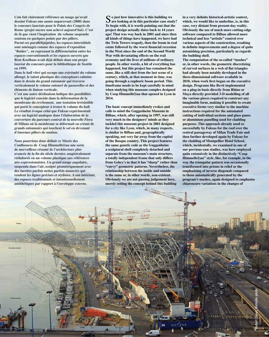
So just how innovative is this building we are looking at in this particular case study?
To begin with, it is worth pointing out that the project design actually dates back to 14 years ago! That was way back in 2001 and since then all kinds of things have happened, we have had the Twin Towers tragedy, then the boom in real estate followed by the worst financial recession in the West since the end of the Second World War with devastating effects on the real economy and the lives of millions of ordinary people. In other words, a bit of everything has happened, but this project has remained the same, like a still shot from the last scene of a century, which, at that moment in time, was going through a euphoric boom period. This timeframe needs to be kept carefully in mind when studying this museum complex designed by Coop Himmelb(l)au that opened in Lyon in 2014.
The basic concept immediately evokes and calls to mind the Guggenheim Museum in Bilbao, which, after opening in 1997, was still very much in the designers’ minds as they tackled this museum project in 2001 designed for a city like Lyon, which, in many respects, is similar to Bilbao and, geographically speaking, not very far away from the capital of the Basque country. This project features the same genetic code as the Guggenheim: a sculptural shell completely detached and separate from the museum’s main structure, a totally independent frame that only differs from Gehry’s in that it has “sharp” rather than “curvy” geometric patterns. Nevertheless, the relationship between the inside and outside is the same or, in other words, non-existent. Obviously we are not passing judgement here, merely setting the concept behind this building
in a very definite historical-artistic context, which, we would like to underline, is, in this case, very distant from present-day reality. Obviously the use of much more cutting-edge software compared to Bilbao allowed more technical and less “artistic” control over various aspects of the construction, resulting in definite improvements and a degree of quite astonishing precision, particularly as regards the building shell.The computation of the so-called “mashes” or, in other words, the geometric discretizing of curved surfaces in a web of flat triangles had already been notably developed in the three-dimensional software available in 2010, when work first began on the executive design. Programs like Revit implemented on a plug-in basis directly from Rhino or Maya directly provided 3-D modelling of all the various pieces required to construct any imaginable form, making it possible to create executive forms very similar to the machine instructions required for the automated cutting of individual sections and glass panes or aluminium panelling used for cladding purposes. This approach already used so successfully by Fuksas for the roof over the central passageway of Milan Trade Fair and then further developed again by Fuksas for the cladding of Montpellier Hotel School, which, incidentally, we examined in one of our previous case studies, was here employed quite extensively in the distinctively “Coop Himmelb(l)au” style, like, for example, in the way the triangular pattern was occasionally transformed into prisms in relief or the emphasising of inverse diagonals compared to those automatically generated by the program’s mashes, again designed to emphasise chiaroscuro variations in the changes of
©H
uber
t Ca
net,
Ballo
ïde
phot
o
41
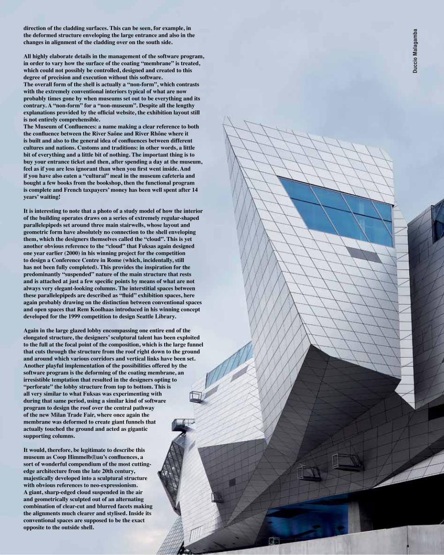
direction of the cladding surfaces. This can be seen, for example, in the deformed structure enveloping the large entrance and also in the changes in alignment of the cladding over on the south side. All highly elaborate details in the management of the software program, in order to vary how the surface of the coating “membrane” is treated, which could not possibly be controlled, designed and created to this degree of precision and execution without this software. The overall form of the shell is actually a “non-form”, which contrasts with the extremely conventional interiors typical of what are now probably times gone by when museums set out to be everything and its contrary. A “non-form” for a “non-museum”. Despite all the lengthy explanations provided by the official website, the exhibition layout still is not entirely comprehensible.The Museum of Confluences: a name making a clear reference to both the confluence between the River Saône and River Rhône where it is built and also to the general idea of confluences between different cultures and nations. Customs and traditions: in other words, a little bit of everything and a little bit of nothing. The important thing is to buy your entrance ticket and then, after spending a day at the museum, feel as if you are less ignorant than when you first went inside. And if you have also eaten a “cultural” meal in the museum cafeteria and bought a few books from the bookshop, then the functional program is complete and French taxpayers’ money has been well spent after 14 years’ waiting!
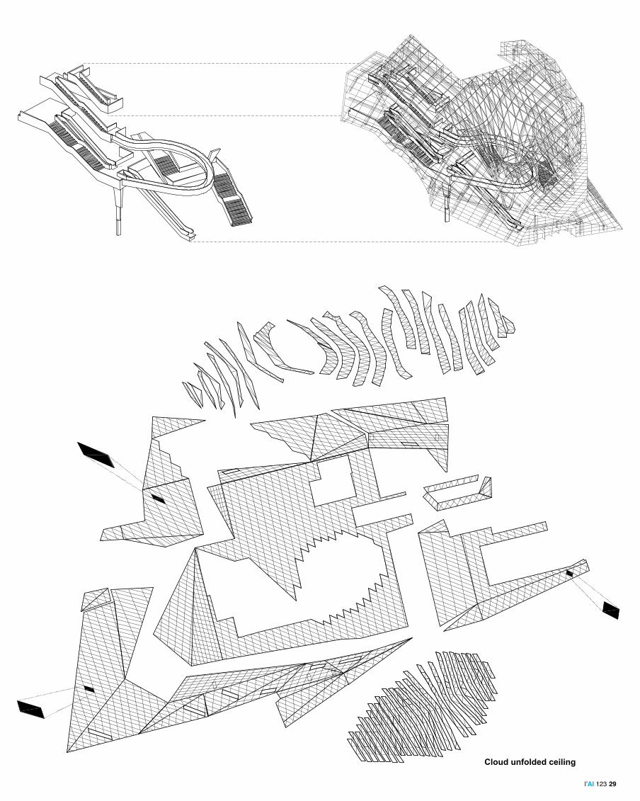
It is interesting to note that a photo of a study model of how the interior of the building operates draws on a series of extremely regular-shaped parallelepipeds set around three main stairwells, whose layout and geometric form have absolutely no connection to the shell enveloping them, which the designers themselves called the “cloud”. This is yet another obvious reference to the “cloud” that Fuksas again designed one year earlier (2000) in his winning project for the competition to design a Conference Centre in Rome (which, incidentally, still has not been fully completed). This provides the inspiration for the predominantly “suspended” nature of the main structure that rests and is attached at just a few specific points by means of what are not always very elegant-looking columns. The interstitial spaces between these parallelepipeds are described as “fluid” exhibition spaces, here again probably drawing on the distinction between conventional spaces and open spaces that Rem Koolhaas introduced in his winning concept developed for the 1999 competition to design Seattle Library.
Again in the large glazed lobby encompassing one entire end of the elongated structure, the designers’ sculptural talent has been exploited to the full at the focal point of the composition, which is the large funnel that cuts through the structure from the roof right down to the ground and around which various corridors and vertical links have been set. Another playful implementation of the possibilities offered by the software program is the deforming of the coating membrane, an irresistible temptation that resulted in the designers opting to “perforate” the lobby structure from top to bottom. This is all very similar to what Fuksas was experimenting with during that same period, using a similar kind of software program to design the roof over the central pathway of the new Milan Trade Fair, where once again the membrane was deformed to create giant funnels that actually touched the ground and acted as gigantic supporting columns.
It would, therefore, be legitimate to describe this museum as Coop Himmelb(l)au’s confluences, a sort of wonderful compendium of the most cutting-edge architecture from the late 20th century, majestically developed into a sculptural structure with obvious references to neo-expressionism. A giant, sharp-edged cloud suspended in the air and geometrically sculpted out of an alternating combination of clear-cut and blurred facets making the alignments much clearer and stylised. Inside its conventional spaces are supposed to be the exact opposite to the outside shell.
Duc
cio
Mal
agam
ba
CRYSTAL CIRCULATIONThe Crystal: Circulation
CLOUD UNFOLDED CEILING
Cloud unfolded ceiling
Cloud unfolded ceiling
l’AI 123 29


![VINCENT MILLOT arXiv:0804.0128v1 [math.AP] 1 Apr …0804.0128v1 [math.AP] 1 Apr 2008 SYMMETRY OF LOCAL MINIMIZERS FOR THE THREE DIMENSIONAL GINZBURG-LANDAU FUNCTIONAL VINCENT MILLOT](https://static.fdocuments.us/doc/165x107/5ad45e887f8b9a0d2d8c4c04/vincent-millot-arxiv08040128v1-mathap-1-apr-08040128v1-mathap-1-apr.jpg)