Carleton College Identity Guidelines IDENTITY GUIDELINES 2 return to table of contents CARLETON...
12
Carleton College Identity Guidelines UPDATED: JULY 2015
Transcript of Carleton College Identity Guidelines IDENTITY GUIDELINES 2 return to table of contents CARLETON...
Carleton College Identity GuidelinesU P D AT E D : J U LY 2 0 1 5
1COLLEGE IDENTITY GUIDELINESINTRODUCTION
These guidelines were created to help ensure a consistent body of communications to support the Carleton College identity. You’ll find detailed information about our visual identity elements as well as helpful sample applications demonstrating how the provided tools and assets can work together. Please use these guidelines to maintain the integrity of our visual identity.
Table of Contents
Introduction 1
Brand Identity Elements 2
Wordmark 2
Color 3
Associated Symbols 4
Symbol Colors 5
Wordmark Lockups 7
Typography 9
Examples 11
Need assistance or have questions? Please contact Teresa ScalzoDirector of Creative Services, [email protected]
2COLLEGE IDENTITY GUIDELINESBRAND IDENTITY ELEMENTS
return to table of contents
CARLETON WORDMARK
CLEAR SPACE
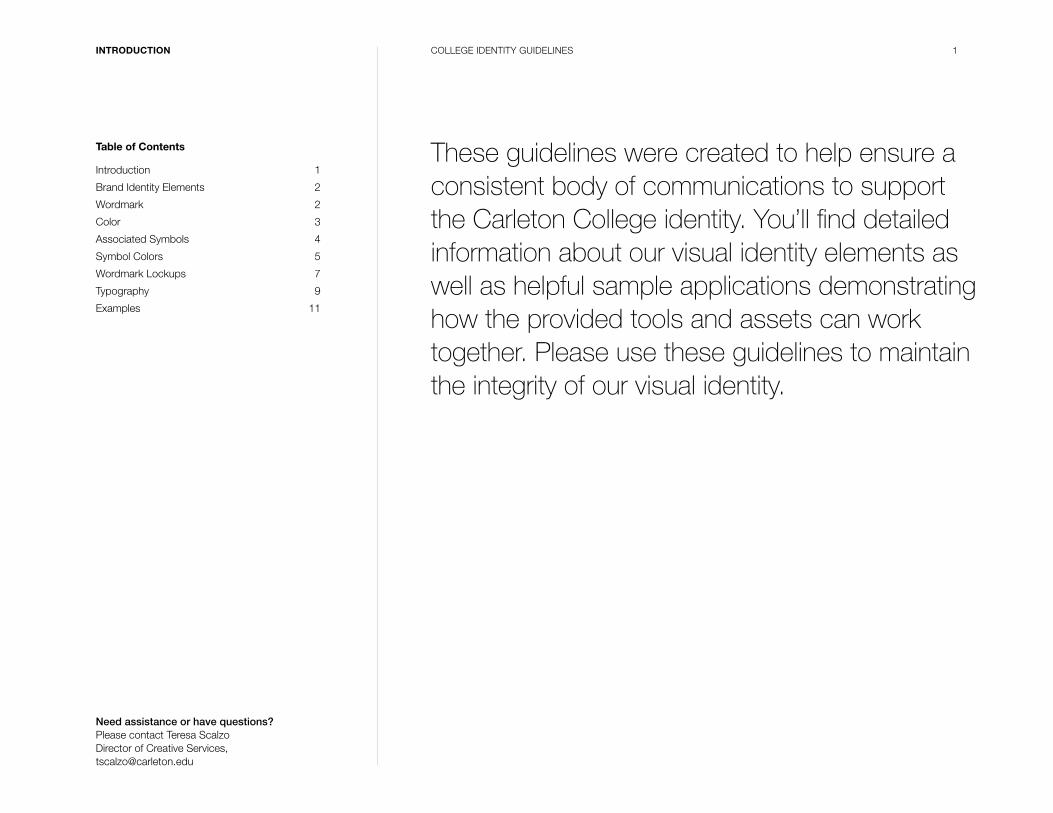
Wordmark
The Carleton wordmark is our official logo. Although
we are officially named Carleton College, the word
College has been dropped from the wordmark to
provide greater flexibility and more visual emphasis with
our brand identity. The wordmark must be included
on all publications and other visual communications
developed for the College. Please use this updated
version for all new communication materials.
Clear Space
A minimum amount of clear space must always surround
the wordmark to separate it from other elements, such
as headlines, text and imagery. Proper use of clear space
ensures greater visual impact and legibility.
The minimum amount of clear space for the wordmark
is equal to the “X-height” in the wordmark. This minimum
amount of clear space should exist on all four sides of
the logo as demonstrated to the right. When possible,
additional clear space is preferred.
Minimum Size
To ensure proper legibility, avoid producing the
wordmark smaller than 0.75" wide.
Never re-create the Brand Identity Elements. Electronic files for all approved versions are available. Located at Carleton College.edu: https://apps.carleton.edu/creativeservices/styleguide
MINIMUM SIZE
0.75"
X
X-HEIGHT
X
X X
3COLLEGE IDENTITY GUIDELINESBRAND IDENTITY ELEMENTS
return to table of contents
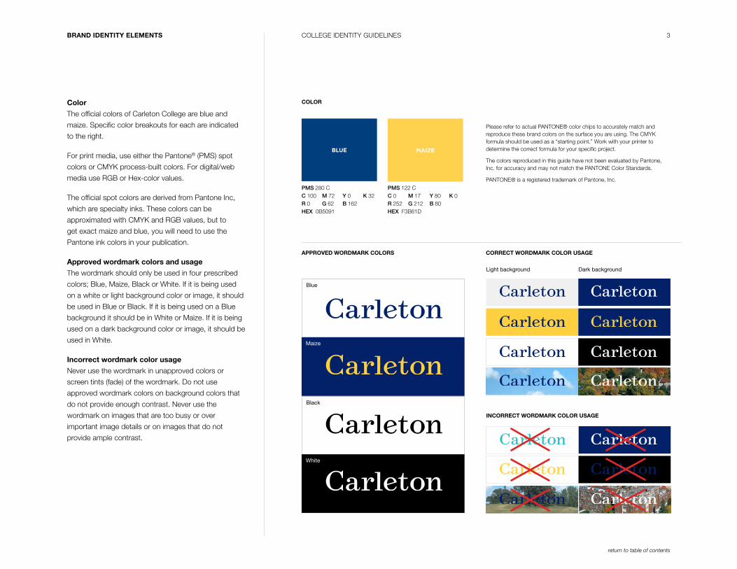
Color
The official colors of Carleton College are blue and
maize. Specific color breakouts for each are indicated
to the right.
For print media, use either the Pantone® (PMS) spot
colors or CMYK process-built colors. For digital/web
media use RGB or Hex-color values.
The official spot colors are derived from Pantone Inc,
which are specialty inks. These colors can be
approximated with CMYK and RGB values, but to
get exact maize and blue, you will need to use the
Pantone ink colors in your publication.
Approved wordmark colors and usage
The wordmark should only be used in four prescribed
colors; Blue, Maize, Black or White. If it is being used
on a white or light background color or image, it should
be used in Blue or Black. If it is being used on a Blue
background it should be in White or Maize. If it is being
used on a dark background color or image, it should be
used in White.
Incorrect wordmark color usage
Never use the wordmark in unapproved colors or
screen tints (fade) of the wordmark. Do not use
approved wordmark colors on background colors that
do not provide enough contrast. Never use the
wordmark on images that are too busy or over
important image details or on images that do not
provide ample contrast.
Please refer to actual PANTONE® color chips to accurately match and reproduce these brand colors on the surface you are using. The CMYK formula should be used as a “starting point.” Work with your printer to determine the correct formula for your specific project.
The colors reproduced in this guide have not been evaluated by Pantone, Inc. for accuracy and may not match the PANTONE Color Standards.
PANTONE® is a registered trademark of Pantone, Inc.
COLOR
APPROVED WORDMARK COLORS CORRECT WORDMARK COLOR USAGE
INCORRECT WORDMARK COLOR USAGE
BLUE MAIZE
PMS 280 CC 100 M 72 Y 0 K 32R 0 G 62 B 162HEX 0B5091
PMS 122 CC 0 M 17 Y 80 K 0R 252 G 212 B 80HEX F3B61D
Light background Dark background
Blue
Maize
White
Black
4COLLEGE IDENTITY GUIDELINESBRAND IDENTITY ELEMENTS
return to table of contents
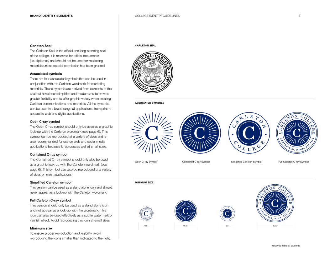
Carleton Seal
The Carleton Seal is the official and long-standing seal
of the college. It is reserved for official documents
(i.e. diplomas) and should not be used for marketing
materials unless special permission has been granted.
Associated symbols
There are four associated symbols that can be used in
conjunction with the Carleton wordmark for marketing
materials. These symbols are derived from elements of the
seal but have been simplified and modernized to provide
greater flexibility and to offer graphic variety when creating
Carleton communications and materials. All the symbols
can be used in a broad range of applications, from print to
apparel to web and digital applications.
Open C-ray symbol
The Open C-ray symbol should only be used as a graphic
lock-up with the Carleton wordmark (see page 6). This
symbol can be reproduced at a variety of sizes and is
also recommended for use on web and social media
applications because it reproduces well at small sizes.
Contained C-ray symbol
The Contained C-ray symbol should only also be used
as a graphic lock-up with the Carleton wordmark (see
page 6). This symbol can also be reproduced at a variety
of sizes on most applications.
Simplified Carleton symbol
This version can be used as a stand alone icon and should
never appear as a lock-up with the Carleton wordmark.
Full Carleton C-ray symbol
This version should only be used as a stand alone icon
and not appear as a lock-up with the wordmark. This
icon can also be used effectively as a subtle watermark or
varnish effect. Avoid reproducing this icon at small sizes.
Minimum size
To ensure proper reproduction and legibility, avoid
reproducing the icons smaller than indicated to the right.
CARLETON SEAL
ASSOCIATED SYMBOLS
MINIMUM SIZE
0.5" 0.5"0.75" 1.25"
Open C-ray Symbol Simplified Carleton SymbolContained C-ray Symbol Full Carleton C-ray Symbol
5COLLEGE IDENTITY GUIDELINESBRAND IDENTITY ELEMENTS
return to table of contents
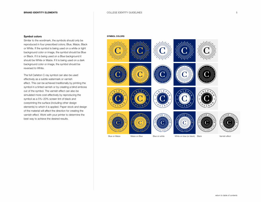
Symbol colors
Similar to the wordmark, the symbols should only be
reproduced in four prescribed colors; Blue, Maize, Black
or White. If the symbol is being used on a white or light
background color or image, the symbol should be Blue
or Black. If it is being used on a Blue background it
should be White or Maize. If it is being used on a dark
background color or image, the symbol should be
reversed to White.
The full Carleton C-ray symbol can also be used
effectively as a subtle watermark or varnish
effect. This can be achieved traditionally by printing the
symbol in a tinted varnish or by creating a blind emboss
out of the symbol. The varnish effect can also be
simulated more cost-effectively by reproducing the
symbol as a 5%–20% screen tint of black and
overprinting the surface (including other design
elements) to which it is applied. Paper stock and design
of the material will affect the direction for creating the
varnish effect. Work with your printer to determine the
best way to achieve the desired results.
Maize on BlueBlue on Maize Blue on white BlackWhite on blue (or black) Varnish effect
SYMBOL COLORS
6COLLEGE IDENTITY GUIDELINESBRAND IDENTITY ELEMENTS
return to table of contents
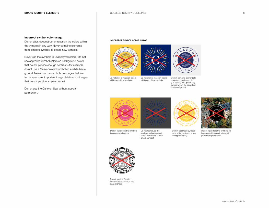
Incorrect symbol color usage
Do not alter, deconstruct or reassign the colors within
the symbols in any way. Never combine elements
from different symbols to create new symbols.
Never use the symbols in unapproved colors. Do not
use approved symbol colors on background colors
that do not provide enough contrast—for example,
do not use a Maize-colored symbol on a white back-
ground. Never use the symbols on images that are
too busy or over important image details or on images
that do not provide ample contrast.
Do not use the Carleton Seal without special
permission.
INCORRECT SYMBOL COLOR USAGE
Do not alter or reassign colors within any of the symbols
Do not use Maize symbols on a white background (not enough contrast)
Do not use the Carleton Seal unless permission has been granted
Do not alter or reassign colors within any of the symbols
Do not reproduce the symbols in unapproved colors
Do not combine elements to create modified symbols (i.e. placing the Open C-ray symbol within the Simplified Carleton Symbol)
Do not reproduce the symbols on background colors that do not provide ample contrast
Do not reproduce the symbols on background images that do not provide ample contrast
7COLLEGE IDENTITY GUIDELINESBRAND IDENTITY ELEMENTS
return to table of contents
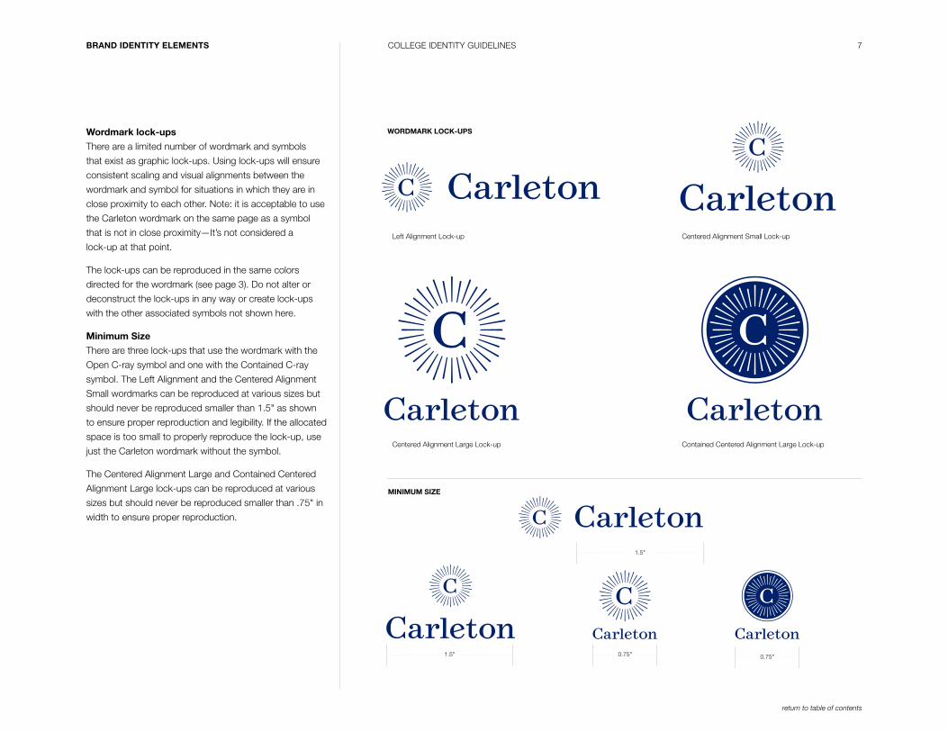
Wordmark lock-ups
There are a limited number of wordmark and symbols
that exist as graphic lock-ups. Using lock-ups will ensure
consistent scaling and visual alignments between the
wordmark and symbol for situations in which they are in
close proximity to each other. Note: it is acceptable to use
the Carleton wordmark on the same page as a symbol
that is not in close proximity—It’s not considered a
lock-up at that point.
The lock-ups can be reproduced in the same colors
directed for the wordmark (see page 3). Do not alter or
deconstruct the lock-ups in any way or create lock-ups
with the other associated symbols not shown here.
Minimum Size
There are three lock-ups that use the wordmark with the
Open C-ray symbol and one with the Contained C-ray
symbol. The Left Alignment and the Centered Alignment
Small wordmarks can be reproduced at various sizes but
should never be reproduced smaller than 1.5" as shown
to ensure proper reproduction and legibility. If the allocated
space is too small to properly reproduce the lock-up, use
just the Carleton wordmark without the symbol.
The Centered Alignment Large and Contained Centered
Alignment Large lock-ups can be reproduced at various
sizes but should never be reproduced smaller than .75" in
width to ensure proper reproduction.
Left Alignment Lock-up Centered Alignment Small Lock-up
Contained Centered Alignment Large Lock-upCentered Alignment Large Lock-up
MINIMUM SIZE
0.75" 0.75"1.5"
WORDMARK LOCK-UPS
1.5"
8COLLEGE IDENTITY GUIDELINESBRAND IDENTITY ELEMENTS
return to table of contents
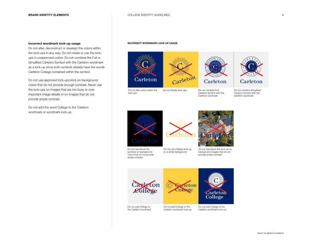
Incorrect wordmark lock-up usage
Do not alter, deconstruct or reassign the colors within
the lock-ups in any way. Do not rotate or use the lock-
ups in unapproved colors. Do not combine the Full or
Simplified Carleton Symbol with the Carleton wordmark
as a lock-up since both symbols already have the words
Carleton College contained within the symbol.
Do not use approved lock-upcolors on background
colors that do not provide enough contrast. Never use
the lock-ups on images that are too busy or over
important image details or on images that do not
provide ample contrast.
Do not add the word College to the Carleton
wordmark or wordmark lock-up.
INCORRECT WORDMARK LOCK-UP USAGE
Do not Rotate lock-ups
Do not use a Maize lock-up on a white background
Do not alter colors within the lock-ups
Do not add College to the Carleton wordmark
Do not add College to the Carleton wordmark lock-up
Do not add College to the Carleton wordmark lock-up
Do not reproduce the lock-up on background images that do not provide ample contrast
Do not combine Simplified Carleton Symbol with the Carleton wordmark
Do not combine Full Carleton Symbol with the Carleton wordmark
College CollegeCollege
Do not reproduce the symbols on background colors that do not provide ample contrast
9COLLEGE IDENTITY GUIDELINESBRAND IDENTITY ELEMENTS
return to table of contents
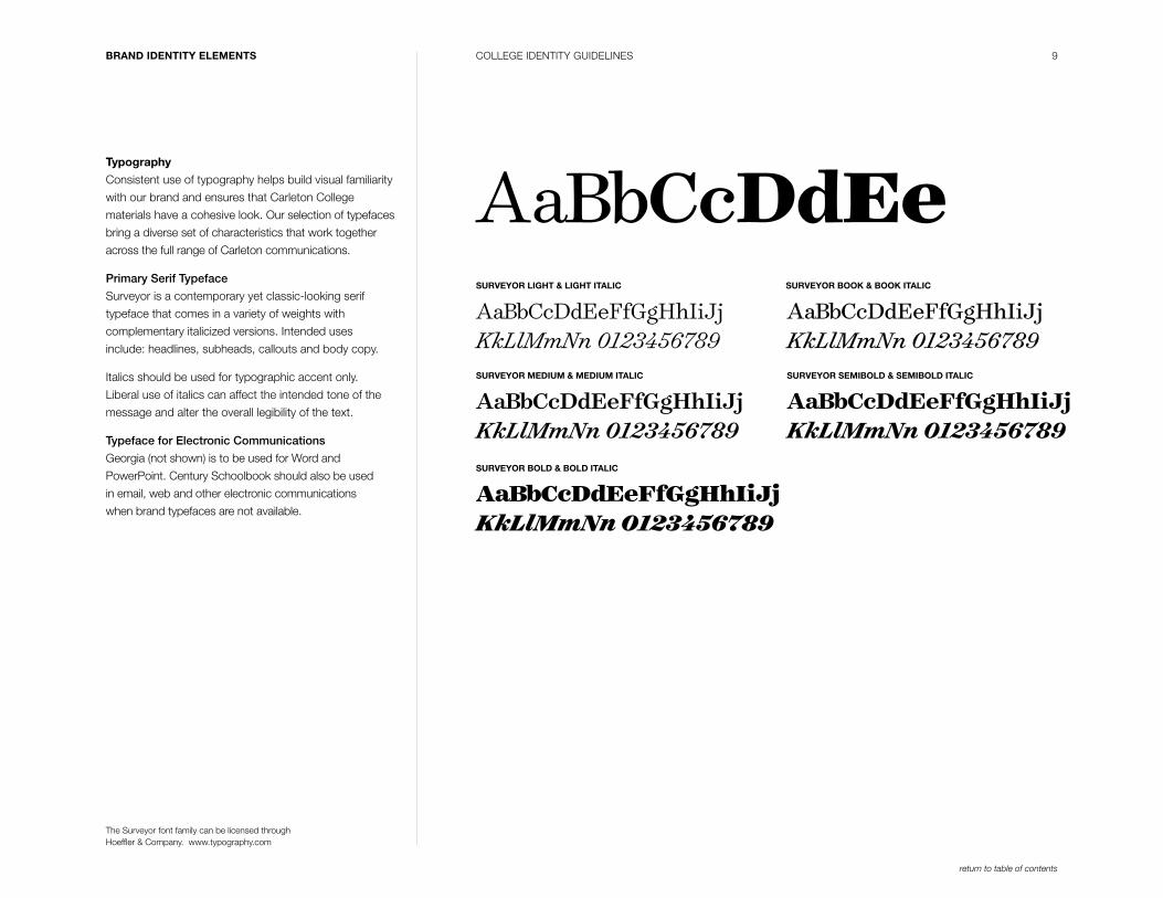
Typography
Consistent use of typography helps build visual familiarity
with our brand and ensures that Carleton College
materials have a cohesive look. Our selection of typefaces
bring a diverse set of characteristics that work together
across the full range of Carleton communications.
Primary Serif Typeface
Surveyor is a contemporary yet classic-looking serif
typeface that comes in a variety of weights with
complementary italicized versions. Intended uses
include: headlines, subheads, callouts and body copy.
Italics should be used for typographic accent only.
Liberal use of italics can affect the intended tone of the
message and alter the overall legibility of the text.
Typeface for Electronic Communications
Georgia (not shown) is to be used for Word and
PowerPoint. Century Schoolbook should also be used
in email, web and other electronic communications
when brand typefaces are not available.
SURVEYOR LIGHT & LIGHT ITALIC
SURVEYOR MEDIUM & MEDIUM ITALIC
SURVEYOR BOOK & BOOK ITALIC
SURVEYOR SEMIBOLD & SEMIBOLD ITALIC
SURVEYOR BOLD & BOLD ITALIC
AaBbCcDdEeAaBbCcDdEeFfGgHhIiJj KkLlMmNn 0123456789
AaBbCcDdEeFfGgHhIiJj KkLlMmNn 0123456789
AaBbCcDdEeFfGgHhIiJj KkLlMmNn 0123456789
AaBbCcDdEeFfGgHhIiJj KkLlMmNn 0123456789
AaBbCcDdEeFfGgHhIiJj KkLlMmNn 0123456789
The Surveyor font fam ily can be licensed through Hoeffler & Company. www.typography.com
10COLLEGE IDENTITY GUIDELINESBRAND IDENTITY ELEMENTS
return to table of contents
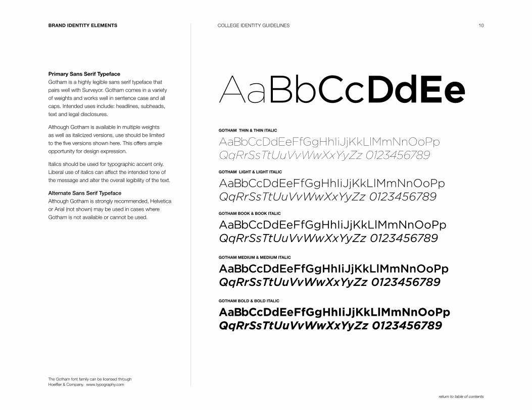
Primary Sans Serif Typeface
Gotham is a highly legible sans serif typeface that
pairs well with Surveyor. Gotham comes in a variety
of weights and works well in sentence case and all
caps. Intended uses include: headlines, subheads,
text and legal disclosures.
Although Gotham is available in multiple weights
as well as italicized versions, use should be limited
to the five versions shown here. This offers ample
opportunity for design expression.
Italics should be used for typographic accent only.
Liberal use of italics can affect the intended tone of
the message and alter the overall legibility of the text.
Alternate Sans Serif Typeface
Although Gotham is strongly recommended, Helvetica
or Arial (not shown) may be used in cases where
Gotham is not available or cannot be used.
GOTHAM THIN & THIN ITALIC
GOTHAM LIGHT & LIGHT ITALIC
GOTHAM BOOK & BOOK ITALIC
GOTHAM MEDIUM & MEDIUM ITALIC
GOTHAM BOLD & BOLD ITALIC
AaBbCcDdEeFfGgHhIiJjKkLlMmNnOoPp QqRrSsTtUuVvWwXxYyZz 0123456789
AaBbCcDdEeFfGgHhIiJjKkLlMmNnOoPp QqRrSsTtUuVvWwXxYyZz 0123456789
AaBbCcDdEeFfGgHhIiJjKkLlMmNnOoPp QqRrSsTtUuVvWwXxYyZz 0123456789
AaBbCcDdEeFfGgHhIiJjKkLlMmNnOoPp QqRrSsTtUuVvWwXxYyZz 0123456789
AaBbCcDdEeFfGgHhIiJjKkLlMmNnOoPp QqRrSsTtUuVvWwXxYyZz 0123456789
The Gotham font fam ily can be licensed through Hoeffler & Company. www.typography.com
AaBbCcDdEe
11
return to table of contents
CARLETON COLLEGE IDENTITY GUIDELINESBRAND IDENTITY ELEMENTS
VIEW BO OK FALL 2015
We areinspiredby you.
1 8E ST
66
1 8EST
66
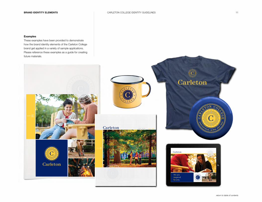
Examples
These examples have been provided to demonstrate
how the brand identity elements of the Carleton College
brand get applied in a variety of sample applications.
Please reference these examples as a guide for creating
future materials.