
BY DANIELLE BÄCK NICOLAI V. K E V B S V B
43
NATIONAL EVIDENCE ON AIR POLLUTION AVOIDANCE BEHAVIOR BY DANIELLE BÄCK, NICOLAI V. KUMINOFF, ERIC VAN BUREN, AND SCOTT VAN BUREN* Do Americans adjust their outdoor leisure to mitigate the harmful effects of air pollution? We investigate this question by matching information on air pollution and public health warnings to daily time use diaries recorded by approximately 33,000 adults across the United States between 2003 and 2010. Surprisingly, people spend more time outdoors as pollution rises, partly due to correlation be- tween pollution and weather. Conditional on weather, we find that children and older adults reduce outdoor leisure when pollution reaches very unhealthy levels. However, this avoidance behavior does not appear to be driven by the Environmental Protection Agency’s health warnings. * Corresponding Author: Kuminoff: Arizona State University, Dept. of Economics, Tempe, AZ 85287 (e-mail: kumi- [email protected]). Bäck: Harvard Medical School, Boston, MA 02115 (e-mail: [email protected]). E. Van Buren: University of North Carolina, Dept. of Biostatistics, Chapel Hill, NC 27599 (e-mail: [email protected]). S. Van Bu- ren: University of North Carolina, Dept. of Biostatistics, Chapel Hill, NC 27599 (e-mail: [email protected]). Sever- al colleagues provided helpful comments and suggestions on this research. We especially thank Branko Boskovic, Mark Duggan, Ed Schlee, V. Kerry Smith, Reed Walker, and participants at the University of Arizona Energy and Environmental Policy Workshop. We are also grateful to Levi Wolf for assistance with GIS software, and to several individuals for assis- tance with air quality data, particularly John White, Nick Mangus, and Susan Stone at the Environmental Protection Agen- cy, and Dianne Miller at Sonoma Technology.
Transcript of BY DANIELLE BÄCK NICOLAI V. K E V B S V B

NATIONAL EVIDENCE ON AIR POLLUTION AVOIDANCE BEHAVIOR
BY DANIELLE BÄCK, NICOLAI V. KUMINOFF, ERIC VAN BUREN, AND SCOTT VAN BUREN*
Do Americans adjust their outdoor leisure to mitigate the harmful
effects of air pollution? We investigate this question by matching
information on air pollution and public health warnings to daily
time use diaries recorded by approximately 33,000 adults across the
United States between 2003 and 2010. Surprisingly, people spend
more time outdoors as pollution rises, partly due to correlation be-
tween pollution and weather. Conditional on weather, we find that
children and older adults reduce outdoor leisure when pollution
reaches very unhealthy levels. However, this avoidance behavior
does not appear to be driven by the Environmental Protection
Agency’s health warnings.
* Corresponding Author: Kuminoff: Arizona State University, Dept. of Economics, Tempe, AZ 85287 (e-mail: kumi-
[email protected]). Bäck: Harvard Medical School, Boston, MA 02115 (e-mail: [email protected]). E. Van Buren:
University of North Carolina, Dept. of Biostatistics, Chapel Hill, NC 27599 (e-mail: [email protected]). S. Van Bu-
ren: University of North Carolina, Dept. of Biostatistics, Chapel Hill, NC 27599 (e-mail: [email protected]). Sever-
al colleagues provided helpful comments and suggestions on this research. We especially thank Branko Boskovic, Mark
Duggan, Ed Schlee, V. Kerry Smith, Reed Walker, and participants at the University of Arizona Energy and Environmental
Policy Workshop. We are also grateful to Levi Wolf for assistance with GIS software, and to several individuals for assis-
tance with air quality data, particularly John White, Nick Mangus, and Susan Stone at the Environmental Protection Agen-
cy, and Dianne Miller at Sonoma Technology.

1
The U.S. Environmental Protection Agency (EPA 2011) estimates that the an-
nual benefits of the Clean Air Act will be $2 trillion by 2020, outweighing costs
by a factor of 31 to 1. Approximately 85% of these benefits stem from predicted
reductions in mortality. The historical link between air pollution and mortality is
well documented. Numerous studies have credibly identified concentration re-
sponse functions of the effects of air pollutants on mortality and morbidity.1 Yet,
the mechanisms that underlie these reduced form models are not fully understood.
Concentration response functions embed the collective decisions people have
made in the past about their own exposure to air pollution, without revealing any
direct evidence on those choices. Understanding this choice process is important
for regulatory evaluations.
Consider a regulation targeting air pollution. The distribution of benefits will
depend partly on how the improvements to air quality vary across space, partly on
how people adjust their locations in space, and partly on how people adjust the
duration of their exposure to pollution at each point in space. Several studies
have investigated the first two mechanisms (e.g. Aufhammer, Bento, and Lowe
2009, Aufhammer and Kellogg 2011, Smith, Sieg, Banzhaf, and Walsh 2004,
Banzhaf and Walsh 2008, Kuminoff, Smith, and Timmins 2013). In contrast,
there is almost no direct evidence on the third. Neidell (2009) and Zivin and
Neidell (2009) provided some of the first revealed preference evidence of air pol-
lution avoidance behavior through an innovative study of the effects of smog
alerts on attendance at a zoo and observatory in Los Angeles during the 1990s.
We build on their work in this paper by using daily time use diaries to provide the
first direct national evidence on how American adults adjusted the duration and
intensity of their exposure to air pollution during the 2000’s.
1 EPA’s pollution response functions are calibrated by scientific consensus. The effect of particulate matter on national mortality is set to lie roughly equidistant between the results of epidemiological cohort studies by Pope et al. (2002) and
Landen et al. (2006). Economists have used novel instruments to improve the identification of other concentration re-
sponse functions. Leading examples include Chay and Greenstone (2003), Neidell (2004, 2009), Currie and Neidell (2005), Currie et al. (2009), Currie and Walker (2011), Schlenker and Walker (2011), and Zivin and Neidell (2012).

2
In 1999, the EPA developed the Air Quality Index (AQI) to inform the general
public about the health implications of exposure to outdoor air pollution. The
AQI is scaled from 0 to 500 with larger numbers indicating greater risk of nega-
tive health outcomes. Index values are calculated on a daily basis for each of the
five criteria pollutants regulated under the Clean Air Act.2 The highest daily AQI
value for any of the five pollutants in a given county defines that county’s overall
AQI rating for that day. To make the health implications of the AQI easily under-
stood, EPA divides the index into six color-coded ranges: good (a score of 0-50)
is represented by the green, moderate (51-100) is yellow, unhealthy for sensitive
groups (101-150) is orange, unhealthy (151-200) is red, very unhealthy (201-300)
is purple, and hazardous (301-500) is represented by the color maroon. Predicted
and realized AQI values are printed in local newspapers, broadcast on televised
weather reports, posted on websites such as weather.com, displayed on electronic
billboards above freeways, and sent to people through smartphone apps. More
than ever before, consumers have access to real time information about the health
implications of their exposure to pollution.
The purpose of our research is to investigate the extent to which American
adults adjust their outdoor leisure in response to air pollution. We focus on three
questions. First, do people reduce the amount of time they spend outdoors on
days with poor air quality? Second, do subpopulations who are particularly sensi-
tive to pollution adjust more? Third, do people use the daily AQI as a basis for
their decisions about outdoor leisure?
Our analysis draws on the most comprehensive and detailed data available on
individual time allocation, air pollution, health warnings, and weather. We have
assembled data from the American Time Use Survey describing the choices for
outdoor leisure made by more than 33,000 individuals living in metropolitan
counties across the United States between 2003 and 2010. We observe how and
2 These include particulate matter, sulfur dioxide, carbon monoxide, nitrogen oxide, and ground level ozone.

3
where each individual spent their time over a 24-hour period and whom they
spent it with. We observe the county-level AQI value on that day, as well as the
temperature, precipitation, snowfall, and humidity. We also observe the individu-
al’s demographic and economic characteristics.
We find that, on average, Americans do not reduce their outdoor leisure as air
pollution worsens. In fact, people spend more time outdoors! This perverse re-
sult appears to be driven by correlation between weather, geography, and pollu-
tion. Conditioning on weather, geography, and individual demographic character-
istics, we do find evidence of avoidance behavior on the part of some sensitive
groups. Adults appear to significantly reduce the amount of time they spend out-
doors with sensitive family members—their children and parents (i.e. seniors)—
when the AQI enters the very unhealthy range. In contrast, we find evidence of
no adjustment for another sensitive group—people engaged in outdoor exercise.
In order to test the hypothesis that people use the AQI to inform their deci-
sions for outdoor leisure we develop a regression discontinuity design similar to
Neidell (2009) and Zivin and Neidell (2009). Looking at observations just above
and just below the AQI color thresholds, we find no evidence to support this hy-
pothesis. Finally, we document a special relationship between air pollution and
outdoor leisure in Southern California. Relative to the rest of the country, people
living in Southern California tend to spend more time outdoors on the summer
and fall weekends, which is also when their air quality tends to be at its worst.
This implies the marginal benefit per capita from improving air quality is likely to
be larger in Southern California than in other areas with large urban populations
and similar problems with air quality, such as Phoenix, AZ.
The rest of the paper proceeds as follows. Section I briefly reviews the rele-
vant medical, epidemiological, and economic literature. Section II describes the
data. Section III presents our evidence on the relationship between outdoor lei-
sure and air pollution. Then section IV presents results from our econometric

4
analysis of avoidance behavior. Finally, section V summarizes our findings and
their policy relevance. A supplemental appendix provides additional details on
the data and robustness checks on our main results.
I. Related Literature
There is strong evidence that air pollution increases mortality and morbidity.
In one of the most influential studies of this causal relationship, Pope et al. (2002)
use a prospective cohort sample of 1.2 million people to determine the conse-
quences of long-term exposure to particulate matter (PM2.5).3 They conclude
that “each 10 microgram per cubic meter elevation in long-term average PM2.5
ambient concentrations was associated with approximately a 4%, 6%, and 8% in-
creased risk of all-cause, cardiopulmonary, and lung cancer mortality, respective-
ly.” Similar conclusions can be found throughout the epidemiological literature
(e.g. Bobak and Leon 1992, Dockery and Pope 1994, Pope et al. 1995, and Bell et
al. 2004). Multiplying these response effects by the value of a statistical life gen-
erates the enormous benefit measures that underlie EPA’s prospective analyses of
the Clean Air Act.
Economists have added to this literature by using novel identification strate-
gies to document negative effects of air pollution on worker productivity (e.g.
Crocker and Horst Jr. 1981; Zivin and Neidell 2012), on the accumulation of hu-
man capital (e.g. Currie et al. 2007, Sanders 2012), and on health outcomes expe-
rienced by sensitive subpopulations, particularly infants and seniors (e.g. Chay
and Greenstone 2003, Currie and Neidell 2005, Currie and Walker 2011, and
Schlenker and Walker 2011). For example, in one of the most spatially compre-
hensive studies to date, Chay and Greenstone (2003) analyze 1970s data on air
3 A prospective cohort study is one in which a healthy sample is selected at the onset; as time passes and illnesses arise, re-
searchers look for evidence of common risk factors for a given illness. The sample used by Pope et al. initially consisted of
healthy individuals aged 30 and over who agreed to participate in the American Cancer Society’s Cancer Prevention Study II. Survey data on the individuals and their vital statistics were merged with air pollution data at the metropolitan level.

5
pollution and infant mortality in approximately 500 U.S. counties. They find that
a 10% reduction in particulate matter caused a 4%-5% reduction in infant mortali-
ty. More recently, Schlenker and Walker (2011) demonstrate that carbon monox-
ide emitted by idling aircrafts at Los Angeles International Airport caused local-
ized increases in asthma cases, acute respiratory problems, new heart conditions,
strokes, and bone fractures among seniors.
Can these negative health outcomes be mitigated inexpensively through an in-
formation campaign? Or are consumers already making fully informed decisions
about their own exposure to pollution? While EPA has ensured that most Ameri-
cans can easily find information about local air quality, it is not clear whether the
average American goes to the trouble of obtaining this information.
There is mixed evidence on the extent to which consumers are swayed by in-
formation campaigns. On the one hand, aggregate consumption has been shown
to adjust to new information about health risks posed by poor restaurant hygiene
(Jin and Leslie 2003), mercury contamination of seafood (Shimshack, Ward, and
Beatty 2007), and physical proximity to hazardous waste sites (Gayer, Hamilton,
and Viscusi 2000). On the other hand, a change in aggregate consumption does
not prove that most consumers adjusted their behavior. Indeed, there is evidence
that many people ignore information about environmental risks and nuisances, un-
less they are legally compelled to pay attention. For example, Pope (2008a,b)
finds that homebuyers in North Carolina routinely ignored information about
flood risk and airport noise in the vicinity of houses they were buying, until laws
were passed requiring them to sign disclosure statements certifying that they were
aware of the (dis)amenities. Similarly, Sloan, Smith, and Taylor (2002) argue that
anti-smoking campaigns have not been the main determinant of the long-term de-
cline in smoking. These findings raise doubts about whether the average consum-
er would use EPA’s air quality index to inform their allocation of leisure time.
The most direct revealed preference evidence on air pollution avoidance be-

6
havior comes from a pair of innovative studies by Neidell (2009) and Zivin and
Neidell (2009).4 Both analyze the effect of smog alerts on attendance at the Los
Angeles Observatory, Zoo, and Botanical Gardens during the 1990s.5 Neidell
(2009) uses discontinuities in the provision of information to distinguish the re-
sponsiveness to information about air quality from the responsiveness to air quali-
ty itself. He finds that attendance dropped by 13% at the zoo and by 6% at the
observatory on days when a smog alert was issued relative to days with similar
levels of air pollution, but no smog alert. On the second consecutive day of an
alert, however, there is less evidence of adjustment, suggesting that the costs of
substituting activities may be increasing over time (Zivin and Neidell 2009).
The reductions in zoo and observatory attendance documented by Neidell and
Zivin and Neidell (2009) raise several important questions about behavioral ad-
justments. First, what did people do with the time that they would have spent at
the zoo / observatory? Did they stay indoors the entire time? Or did they spend
some of that time at a different outdoor location exposed to air pollution? Se-
cond, what happened to attendance at outdoor venues offering cooler or less ex-
pensive opportunities for recreation, such as waterslides and public parks? Third,
do avoidance behaviors differ for subpopulations that are more susceptible to the
health effects of air pollution such as people engaged in vigorous physical activi-
ty? Finally, can results for Los Angeles be generalized to the rest of the country?6
We have developed a unique database that allows us to investigate these and other
important questions about avoidance behavior.
4 There is some stated preference evidence from small scale surveys suggesting that households containing people with respiratory conditions are more likely to engage in avoidance behavior (Bresnahan, Dickie, and Gerking 1997, Mansfield,
Johnson, and Van Houtven 2006). 5 The Observatory and Zoo / Botanical Gardens are located next to each other in Griffith Park, Los Angeles. 6 Sorting models of household location choice hypothesize that people choose to live in highly polluted areas, in part, be-
cause they are relatively tolerant to air pollution (Kuminoff, Smith, and Timmins 2013). Such tolerance could reflect a
lower individual cost of avoidance behavior, or it could reflect a general lack of concern about the health effects of pollu-tion exposure.
7
II. Data
We assembled the data for this analysis by linking information from three
publicly available sources: (i) county level air quality index values extracted from
EPA’s Air Quality System; (ii) weather conditions recorded at individual monitor-
ing stations by the National Climatic Data Center; and (iii) time use diaries, de-
mographic characteristics, and residential locations of individuals participating in
the American Time Use Survey. We obtained daily data from each source from
January 1, 2003 to December 31 2010 and then merged them at the highest possi-
ble level of spatial resolution—a county. This allows us to provide the first na-
tional database to link individual decisions about outdoor leisure time to public in-
formation about the health implications of exposure to outdoor air pollution.
A. The Air Quality Index (AQI)
In July 1999, the EPA created the Air Quality Index (AQI).7 The AQI is
scaled from 0 to 500 with larger numbers indicating greater health risks of expo-
sure to outdoor air pollution. Index values are a function of observed levels of the
five criteria pollutants regulated under the Clean Air Act: ground-level ozone,
particulate matter, carbon monoxide, sulfur dioxide, and nitrogen dioxide. Ambi-
ent concentrations of each pollutant are translated into an AQI value that repre-
sents the associated health risk. A county’s overall AQI score on any given day is
then determined by the highest AQI value observed for any of the five pollutants
at any monitoring station in the county.
To convey information about health risk to the public, EPA partitions the AQI
into six color-coded ranges shown in table 1. The EPA defines “sensitive groups”
as children, seniors, anyone who is active outdoors, and anyone with heart disease
7 Air quality reporting began with the Pollutant Standards Index (PSI), developed in 1976 for states and local governments to use on a voluntary basis. The PSI aggregated the five criteria pollutants regulated under the Clean Air Act into an overall
index. In 1979, the EPA first required mandatory reporting of PSI values in Metropolitan Statistical Areas (MSAs) con-
taining more than 250,000 persons. In July 1999, the EPA replaced the PSI with the AQI in order to reflect newer stand-ards on particulate matter 2.5 and ozone.

8
or a respiratory condition.8 As the AQI increases, people are advised to reduce
their outdoor exertion and to spend less time outdoors. The last column of table 1
illustrates EPA’s specific recommendations in the case of ozone. Similar recom-
mendations are made for the other four criteria pollutants (EPA 2009).
Table 1: Air Quality Index, Health Concerns, and Recommended Actions
Note: This table was compiled from information provided on EPA’s AIRnow website and publication #EPA-456/F-09-002 available here: http://www.epa.gov/airnow/aqi_brochure_08-09.pdf.
Under the Protection of the Environment Law, each state is required to use
major media outlets to report daily AQI values to residents of all metropolitan sta-
8 Ozone may affect the lungs by irritating the respiratory system reducing lung function, inflaming the cells that line the lungs, making the lungs more susceptible to infection, aggravating asthma (or other chronic lung disease), and causing
permanent damage. Particulate matter can also aggravate lung or heart disease, increase emergency room visits and mor-
tality rates for older adults, create chest pain, shortness of breath, or fatigue, or increase susceptibility to respiratory infec-tions. Physical activity may exacerbate these effects as individuals absorb more of the pollutants.
Air Quality Index (AQI) Values
Levels of Health Concern
Colors Actions to Protect Your Health From Ozone
When the AQI is in this range:
..air quality conditions are:
...as symbolized by this color:
0-50 Good Green None
51-100 Moderate Yellow Unusually sensitive people should
consider reducing prolonged or heavy outdoor exertion
101-150 Unhealthy for Sensitive Groups
Orange
The following groups should reduce
prolonged or heavy outdoor exertion:
People with lung disease, asthma
Children and older adults
People who are active outdoors
151 to 200 Unhealthy Red
The following groups should avoid
prolonged or heavy outdoor exertion:
People with lung disease, asthma
Children and older adults
People who are active outdoors
Everyone else should limit prolonged
or heavy exertion
201 to 300 Very Unhealthy Purple
The following groups should avoid all
outdoor exertion:
People with lung disease, asthma
Children and older adults
People who are active outdoors
Everyone else should limit outdoor
exertion.
301 to 500 Hazardous Maroon

9
tistical areas containing over 350,000 residents.9 As of 2010, this requirement
covered 65% of the U.S. population. To satisfy EPA guidelines, a report must in-
clude the AQI level, the critical pollutant, the categorical label and color, and spe-
cial warning statements for sensitive groups if the AQI exceeds 100.10
Current AQI levels (usually reported at the county level) and next day
forecasts (in some areas) are included as a regular feature of televised weather re-
ports on local news stations and in the weather sections of local and national
newspapers such as USA Today and LA Times. AQI values are also reported on
popular websites for local weather information, such as weather.com. Anyone
searching the internet for their local air quality is likely to be directed to air-
now.gov, EPA’s official website for current air quality information. People can
also arrange to have their local AQI automatically downloaded to their computers,
tablets, and smartphones using apps such as myAirQuality and AIRNow. In addi-
tion, the EPA has developed tools for parents and educators to teach children
about the AQI. For example, Why is Coco Orange? is a children’s story in which
Coco the chameleon changes his skin color to match the AQI, while learning how
to adjust the intensity of his play to protect himself from the harmful effects of air
pollution.11
The EPA also sponsors a school flag program that raises colored
flags matching the current AQI to notify teachers, coaches, and students about the
implications of exercise. Older children and science teachers are encouraged to
experiment with “Smog City 2” a computer simulation that allows students to ex-
plore the mechanisms generating pollution. Thus, there is an abundance of air
quality information for those who care to obtain it.
With help from the EPA, we obtained the county-level AQI values that were
9 Daily reporting of the AQI means at least five days per week. In the EPA’s Guidelines for the Reporting of Daily Air
Quality, the agency notes that states must “distribute to the local media, provide via a recorded telephone message, or pub-
lish on a publicly accessible Internet site” 10 The EPA Guidelines for the Reporting of Daily Air Quality state that “whenever the AQI exceeds 100, reporting agen-
cies should expand reporting to all major news media, and at a minimum, should include notification to the media with the
largest market coverage for the area in question.” 11 Copies can be ordered or downloaded from www.airnowlgov/picturebook.

10
reported to the general public every day from 2003 through 2010. There is con-
siderable variation in the AQI across space and time. Figure 1 provides an illus-
tration by comparing daily AQI values for two California counties located about
80 miles apart: Sacramento (on the left) and San Francisco (on the right).
Figure 1: Air Quality Indices for Sacramento and San Francisco, California
Note: The figure illustrates daily air quality index values for Sacramento County (left) and San Francisco County (right)
from January 1, 2003 through December 31, 2010, with an overlay of the corresponding AQI color. These data were ex-
tracted from EPA’s Air Quality System.
The average daily AQI score for San Francisco was 38.5. This is very close to
the national median (37.9). In contrast, Sacramento has some of the worst air pol-
lution in the country. It is a federal nonattainment area for both ozone and partic-
ulate matter and its average AQI of 60.9 puts it in the 98th
percentile.
Together, San Francisco and Sacramento illustrate three key sources of varia-
tion in air pollution that underlie our econometric tests of avoidance behavior.
First, the AQI can vary greatly over a small geographic area at a point in time, re-
flecting spatial heterogeneity in the concentration of pollution sources relative to
wind patterns and landscape features. Second, air pollution varies seasonally at a
point in space, often producing a cyclical pattern of AQI values. The AQI gener-
ally peaks in mid to late summer (when more sunlight and drier air increase ambi-
ent ozone) and/or in the winter (when furnaces, woodstoves, and idling cars in-
crease particulate matter). Third, there are many days when the AQI is just above
0
50
100
150
200
250
300
350
1-Jan-03 1-Jan-04 1-Jan-05 1-Jan-06 1-Jan-07 1-Jan-08 1-Jan-09 1-Jan-10
0
50
100
150
200
250
300
350
1-Jan-03 1-Jan-04 1-Jan-05 1-Jan-06 1-Jan-07 1-Jan-08 1-Jan-09 1-Jan-10
moderate
unhealthy: sensitive groups
unhealthy
very unhealthy
hazardous
good

11
or just below one of the color coded information thresholds.12
This is important.
While a small change in the AQI itself is difficult to perceive, crossing a color
threshold produces a discontinuous change in the level of health concern reported
to the public. Observing AQI values that lie just above and just below an infor-
mation threshold in similar geographic areas and time periods can, in principle, al-
low us to disentangle avoidance behavior in response to AQI health warnings
from avoidance behavior in response to visual pollution cues, such as smog. This
feature of our identification strategy is very similar to 1990s smog alert studies of
Los Angeles by Neidell (2009) and Zivin and Neidell (2009).
B. Weather
Weather conditions are likely to affect both air quality and the amount of time
people spend outdoors. We control for local weather using the National Climate
Data Center’s daily summaries of the weather recorded at individual monitoring
stations. The variables we collected include the minimum temperature observed
over the course of a day, the maximum temperature, precipitation, snowfall, max-
imum relative humidity, and minimum relative humidity. Most counties have
several weather stations. We constructed county-level measures of weather by
taking the median of each variable over the weather stations in that county. 13
Unfortunately, data on humidity were only available for 58% of all county-
days.14
We attempted to fill in these gaps in our data with information from near-
by counties. Specifically, we used GIS software to calculate the distance between
county centroids and then we matched each county to all other counties within 30
12 A fourth distinct pattern in the AQI data is a slight but steady improvement over the 2000’s. For example, the national
percentages of all daily AQI observations that were good and unhealthy changed from 77% and 0.39% in 2003 to 83% and
0.14% in 2010. See the supplemental appendix for additional details. 13 A few counties contain weather stations with extreme observations relative to other stations in the county. Using the
median limits the influence of these data points. For example, Pierce County WA contains Mount Rainer (elevation 14,000
feet), but its largest city is Tacoma (elevation 400 feet). On January 2, 2003, the weather station on Mount Rainer recorded a daily maximum temperature of 36 and 13 inches of snowfall, while the three weather stations located near the county’s
population centers recorded maximum temperatures of 56, 57, and 59 and no snowfall. Using the median temperature (57)
thus ensures that our measure reflects the weather conditions experienced by the local population. 14 Other variables such as wind speed and cloud cover were reported too infrequently to use.

12
miles. The humidity reading at the nearest reporting county within that 30-mile
radius was then used as a proxy for the missing humidity variable. We use these
proxy data as control variables in some, but not all specifications of our models.
Weather affects air quality in predictable ways. More than 75% of counties
have a positive correlation between daily AQI and daily maximum temperature
(reflecting the role of light and heat in the formation of ozone). Likewise, more
than 95% of counties have a negative correlation between AQI and precipitation
(since precipitation removes particles from the air). However the magnitudes of
these correlations vary greatly due to climate and geography. For example, the
interquartile range of county-specific correlation coefficients between AQI and
daily maximum temperature is [ ].15 Thus our data include considerable
variation in air quality, both within and across counties, conditional on weather.
C. Time Spent Outdoors
Our data on time use are drawn from public use micro data samples of the
American Time Use Survey (ATUS).16
The ATUS data are generated by asking a
subset of adults from the outgoing rotation of the Current Population Survey
(CPS) to keep a diary of their activities for one day. The diary format is quite de-
tailed. People track what they are doing (e.g. sleeping, watching television, shop-
ping, playing basketball), where they are doing it (e.g. home, a friend’s house, a
shopping mall, a park), how much time they spend doing it, and who else joined
them in the activity (e.g. children, parents, spouses, friends, relatives). These data
have previously been used to document trends in leisure time (Aguiar and Hurst
2007) and to investigate the relationships between leisure time and food consump-
tion (Bertrand and Schanzenbach 2009) and unemployment (Kreuger and Mueller
15 The distribution of correlation coefficients is summarized in the supplemental appendix. 16 ATUS is conducted by the Bureau of Labor Statistics in conjunction with the U.S. Census Bureau. It is the first federal
survey designed to measure how individuals divide their day between activities. ATUS was developed in the 1990s, a full pilot test was conducted in 2001, and it was implemented fully beginning in January 2003.

13
2012; Aguiar, Hurst, and Karababbounis 2012).17
Our study is the first to use
ATUS to examine the relationship between leisure time and air quality.18
We use self-reported information on individuals’ locations and activities
throughout the day to develop measures of their “daily minutes outdoors” and
“daily minutes engaged in physical outdoor activity”. Our interest in the latter
measure stems from the fact that EPA defines anyone engaged in physical activity
as a sensitive group. The coding process was generally straightforward. Most
leisure activities are clearly designated as occurring in either indoor or outdoor lo-
cations. However, the flexibility in ATUS’s coding lexicon does occasionally
create ambiguity, in which case we used our best judgment. For example, the in-
dividuals who report playing basketball variously list their locations as being a
gym, their own house, a friend’s house, a park, and so on. While a basketball
hoop can technically be placed inside a house with a tall ceiling, we feel comfort-
able assuming that all basketball games not played at a gym are played outdoors.
Similarly, we assume that individuals who report “own home” as the location for
a run are actually running on indoor treadmills.
Running, biking, and baseball are representative examples of the activities we
define to be physical outdoor activity. Fishing, boating, and yoga are examples of
the activities that are included in our measures of time spent outdoors but exclud-
ed from our measure of physical activity. We do not count them as “physical ac-
tivity” because they are less likely to involve aerobic exercise that would acceler-
ate the rate of pollutant intake relative to ordinary breathing. Finally, if someone
drives to an indoor location, such as a grocery store or theatre, we do not count
17 The ATUS webpage provides a more comprehensive list of publications and working papers using their data on leisure
time: http://www.bls.gov/tus/research.htm. 18 In research conducted simultaneously with ours, Sexton and Beatty (2013) examine the impact of air quality alerts on
time use in Core Business Statistical Areas. Unlike our AQI measure of actual air quality conditions, the alerts are issued
in a preventative fashion based on forecasts in a given locality and surrounding locations. Interestingly, the correspond-
ence between advance alerts and actual air pollution is weak. Nearly half the time an alert is issued, air pollution ends up
being in the healthy or moderate range. Sexton and Beatty find evidence that sensitive groups respond to alerts by substi-
tuting away from outdoor leisure altogether instead of adjusting their outdoor leisure over the course of a day to spend
more time outdoors when the air quality is relatively better.

14
the time they spend walking to and from their car as time spent outdoors. We
consider that time to be incidental to their chosen leisure activity. As a result, we
find that a slight majority of respondents spend no leisure time outdoors on the
date we observe them.19
The ATUS activity codes and location codes that under-
lie our measures of outdoor leisure time are summarized in appendix table 1.
By matching our ATUS sample to the general monthly CPS files, we are able
to obtain detailed information on the demographic characteristics of ATUS partic-
ipants. We use variables such as education, age, gender, race, wage, and occupa-
tion as proxy measures for physical, cultural, and economic factors that may help
to explain heterogeneity in individual leisure time. Finally, we use the diary date
and home county of each ATUS participant to match their outdoor leisure to local
air quality and weather.
D. Summary Statistics and Data Caveats
Table 2 reports summary statistics for the explanatory variables in our analy-
sis. It is readily apparent that ATUS is a stratified sample. Each weekday com-
prises 10% of the observations whereas Saturdays and Sundays are oversampled
such that half of all observations occur on weekends.20
Figure 2 illustrates our
geographic coverage. Because so many counties are missing data on humidity,
we distinguish between counties with complete data, counties with complete data
except humidity, and counties where we have no data. Counties are excluded
from our analysis for one of four reasons: (i) the county has fewer than 100,000
residents, the minimum size at which a respondent’s home county is identified in
public use samples of ATUS and CPS data; (ii) core weather variables are never
reported for the county, (iii) the county is too small to be represented in the ATUS
19 On average, people who spend no time in outdoor leisure spend 11 additional minutes sleeping, 21 additional minutes watching television, and 59 additional minutes working. The supplemental appendix provides a more detailed comparison
of average time allocation patterns between people do and do not spend any time outdoors. 20 The hourly wage variable contained in the ATUS is top-coded such that the weekly wage can be no more than $9.999.99. However, this is not likely to affect our results because only 0.12% of our observations are top-coded.
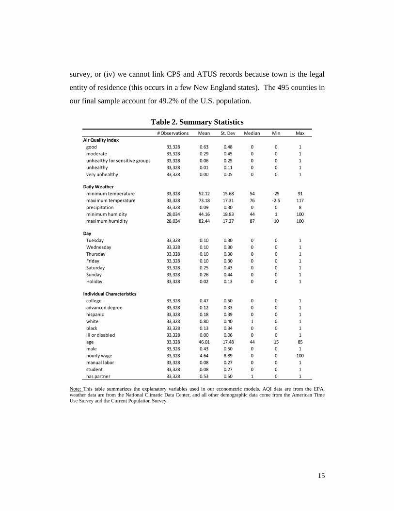
15
survey, or (iv) we cannot link CPS and ATUS records because town is the legal
entity of residence (this occurs in a few New England states). The 495 counties in
our final sample account for 49.2% of the U.S. population.
Table 2. Summary Statistics
Note: This table summarizes the explanatory variables used in our econometric models. AQI data are from the EPA,
weather data are from the National Climatic Data Center, and all other demographic data come from the American Time Use Survey and the Current Population Survey.
# Observations Mean St. Dev Median Min Max
Air Quality Index
good 33,328 0.63 0.48 0 0 1
moderate 33,328 0.29 0.45 0 0 1
unhealthy for sensitive groups 33,328 0.06 0.25 0 0 1
unhealthy 33,328 0.01 0.11 0 0 1
very unhealthy 33,328 0.00 0.05 0 0 1
Daily Weather
minimum temperature 33,328 52.12 15.68 54 -25 91
maximum temperature 33,328 73.18 17.31 76 -2.5 117
precipitation 33,328 0.09 0.30 0 0 8
minimum humidity 28,034 44.16 18.83 44 1 100
maximum humidity 28,034 82.44 17.27 87 10 100
Day
Tuesday 33,328 0.10 0.30 0 0 1
Wednesday 33,328 0.10 0.30 0 0 1
Thursday 33,328 0.10 0.30 0 0 1
Friday 33,328 0.10 0.30 0 0 1
Saturday 33,328 0.25 0.43 0 0 1
Sunday 33,328 0.26 0.44 0 0 1
Holiday 33,328 0.02 0.13 0 0 1
Individual Characteristics
college 33,328 0.47 0.50 0 0 1
advanced degree 33,328 0.12 0.33 0 0 1
hispanic 33,328 0.18 0.39 0 0 1
white 33,328 0.80 0.40 1 0 1
black 33,328 0.13 0.34 0 0 1
ill or disabled 33,328 0.00 0.06 0 0 1
age 33,328 46.01 17.48 44 15 85
male 33,328 0.43 0.50 0 0 1
hourly wage 33,328 4.64 8.89 0 0 100
manual labor 33,328 0.08 0.27 0 0 1
student 33,328 0.08 0.27 0 0 1
has partner 33,328 0.53 0.50 1 0 1

16
Figure 2. Geographic Coverage
While our database is the first to link micro data on outdoor time use to local
air quality, there are two notable limitations. First, ATUS is not a panel. We only
observe each individual over a single 24-hour period, precluding the use of indi-
vidual fixed effects during the estimation. Instead, we use a difference in differ-
ences strategy that relies on the random sampling within ATUS’s stratified re-
search design to compare time use by the average individual (conditional on co-
variates) under different air quality conditions. This limitation is shared by all
studies using ATUS data as well as the studies of air pollution avoidance behavior
in Los Angeles (Aguiar and Hurst 2007, Neidell 2009, Zivin and Neidell 2009,
Aguiar, Hurst, and Karababbounis 2012, Kreuger and Mueller 2012).
Another limitation is that the data do not allow us to investigate spatial substi-
tution. We observe each individual’s home county and time allocation condition-
al on their county’s AQI, but we cannot observe whether they adjusted the physi-
cal location of their outdoor leisure to avoid air pollution. For example, if the lo-

17
cal air quality is bad a prospective hiker could drive up to the mountains to go
hiking, either in their home county or in a nearby county. In our opinion, such ad-
justments are likely to be rare. Travel costs are likely to make intertemporal sub-
stitutions cheaper. Furthermore, while studies such as Aufhammer and Kellog
(2011) and Auffhammer, Bento, and Lowe (2009) clearly demonstrate that air
pollution varies within counties, the public information about air quality does
not.21
III. The Relationship between Outdoor Leisure and Air Quality
Table 3 documents the statistical relationship between outdoor leisure and lo-
cal air quality. Panel A summarizes our sample size by AQI category. The data
consist of 33,328 ATUS diary days and approximately one third of these observa-
tions occur on days where the AQI is within 10 points of an information thresh-
old. For example, we observe 1,582 diary days on which the AQI is close to the
threshold between moderate and unhealthy for sensitive groups; 789 days just be-
low the threshold and 793 days just above.
Panel B reports the shares of ATUS respondents who spent time outdoors,
spent time in physical outdoor activity, and spent time outdoors with their own
parents and/or children. Panel C reports the average number of minutes these in-
dividuals spent outdoors. It is striking that as pollution increases the general pop-
ulation is both more likely to go outdoors and likely to increase the duration of
their exposure. Moreover, these effects increase for sensitive groups! People en-
gaged in physical activity are 18% more likely to spend time outdoors on an un-
healthy day compared to a good day, and the number of minutes they spend in-
creases by 15%. Likewise, ATUS respondents are 17% more likely to spend time
outdoors with their parents or children on an unhealthy day compared to a good
21 In the popular media, the AQI is almost always reported at the level of a county. In principle, the general public could
go to the same trouble of collecting and processing raw monitor data as studies such as Auffhammer and Kellog (2011) and Auffhammer et al. (2009). But we believe this is unlikely.

18
day. The only potential evidence of avoidance behavior is a sharp drop in time
spent with parents/children when the AQI moves from unhealthy to very un-
healthy.
Table 3: Air Quality, Time Use, and Weather: 2003-2010
Note: An ATUS diary day refers to our ability to observe all of the activities performed by one individual during a single
24-hour period. The AQI data are from the EPA, the weather data are from the National Climatic Data Center, and the time
spent outdoors data are from the American Time Use Survey.
The seemingly perverse behavior in panels B and C is likely driven by weath-
er. Panel D illustrates that, on average, as air pollution worsens, temperature rises
and precipitation falls. People are likely going outdoors when the weather is nicer
good moderateunhealthy
sensitiveunhealthy
very
unhealthy
total 21,087 9,617 2,142 390 92
within 10 AQI points of upper bound 6,761 789 213 30 --
within 10 AQI points of lower bound -- 3,526 793 139 78
outdoors 39 42 45 46 45
physical outdoor activity 30 32 34 36 37
outdoors with their parents / children 12 13 14 14 13
outdoors 105 106 108 113 113
strenuous outdoor activity 84 83 91 97 104
outdoors with their parents / children 79 76 87 92 34
minimum temperature ( F ) 50 54 60 63 65
maximum temperature ( F ) 70 77 86 91 92
precipitation ( in ) 0.12 0.04 0.02 0.01 0.004
probability of occurring on weekend 29 28 28 33 45
D. Mean daily conditions
Air Quality Index Category
A. Number of observations (ATUS diary days)
B. Percent of ATUS respondents spending any time:
C. Mean minutes for ATUS respondents spending any time:

19
in spite of the air pollution, not because of it. The last row of the table also illus-
trates that unhealthy and very unhealthy days disproportionately occur on week-
ends. If an unhealthy day were equally likely to occur any day of the week, then
the probability of occurring on a weekend would be 2/7=.285. In contrast, after
we adjust for ATUS’s oversampling of weekends, we find that the probabilities of
unhealthy and very unhealthy days on weekends are 0.33 and 0.45 respectively.
This pattern appears to be caused by California’s “weekend ozone effect”.
Emissions of ozone precursors are generally expected to be lower on week-
ends than on weekdays. Nonetheless, ozone readings around the San Francisco
and Los Angeles metro areas tend to be systematically higher on weekends com-
pared to weekdays between March and October, the time of the year when ozone
is the predominant trigger for air quality warnings. This counterintuitive phe-
nomenon is well known to atmospheric scientists, if not entirely understood (Cali-
fornia Air Resources Board 2003).22
Table 4: Weekday and Weekend Exposure to Air Pollution
Note: Average minutes are calculated over all diary days in the ATUS sample, regardless of
whether an individual spent any time outdoors.
The weekend ozone effect is especially important for people living in Los An-
geles, San Bernardino, Riverside, Fresno, and Kern counties (5% of the U.S. pop-
ulation). Between 2003 and 2010, these five southern California counties ac-
counted for more unhealthy air days (i.e. AQI > 150) than all other counties with
populations exceeding 500,000 combined (1,258 compared to 1,057). Moreover,
22 For more information on the weekend ozone effect and its possible causes, see the July 2003 special issue of the Journal of Air and Waste Management.
good moderateunhealthy
sensitiveunhealthy
very
unhealthy
Weekdays 32 36 42 35 38
Weekends 51 54 55 64 54
Average minutes spent outdoors

20
unhealthy air days were twice as likely to occur on weekends in the 5-county area
relative to the rest of the country (36% versus 18%). Thus, the air quality in these
five highly populated counties is often at its worst when both the weather is nicest
and when people tend to have the most leisure time (weekends from March
through October). Table 4 summarizes the consequences—the average person
spends 83% more time outdoors on unhealthy weekends than on unhealthy week-
days and 25% more time outdoors on unhealthy weekends than on good week-
ends. Thus avoidance behavior is obviously not the main force behind the aver-
age person’s allocation of leisure time. Nevertheless, a positive relationship be-
tween pollution and outdoor leisure does not preclude the presence of some
avoidance behavior.
IV. Econometric Tests of Avoidance Behavior
This section summarizes the results from simple tests of whether people
choose to reduce their exposure to air pollution, conditional on weather, day of
the week, and individual demographic characteristics. We consider the extensive
margin decision of whether to spend any time outdoors separately from the inten-
sive margin decision of how much time to spend outdoors, conditional on going
outdoors.
A. Models
Equation (1) summarizes our basic econometric model.
(1)
The dependent variable measures the number of minutes spent outdoors by person
i observed during month m in county c. The treatment effect, , is a vector of in-
dicators for the five AQI categories. is a vector including controls for weather
along with indicators for day of the week and for whether the diary day was a hol-

21
iday. is a vector describing the individual’s demographic characteristics, spe-
cifically whether they have a 2 or 4 year college degree, whether they have a
graduate degree, their race, gender, and student status, whether they live with a
partner, a quadratic function of age, their hourly wage, whether they are a manual
laborer, and whether they missed work that day due to a serious illness or disabil-
ity. Finally, is a county-month fixed effect.
The fixed effects are intended to capture variation in spatial and temporal fac-
tors affecting the opportunity cost of spending time outdoors. Examples include
seasonal variation in television programming, variation in the amount of daylight
(due to latitude, time of the year, and time zone), and variation in the mapping be-
tween weather and comfort. That is, many people would prefer to be outside on a
100-degree day in Phoenix, Arizona (with near zero humidity) than on a 100-
degree day in Washington, DC (with high humidity). Furthermore, residents of
Phoenix may be better adapted to 100+ degree days than residents of San Diego.
While we can attempt to model the complex relationship between temperature,
humidity, and comfort using flexible polynomial functions of the weather varia-
bles, we believe that the fixed effects will be more effective in capturing spatio-
temporal variation in weather and heterogeneity in local adaptations to it.
We estimate several additional models that are variations on (1). These in-
clude probit models of the extensive margin decision for whether to spend time
outdoors, and a regression discontinuity design that focuses on observations just
on either side of an AQI information threshold. The later research design allows
us to test for avoidance behavior in response to AQI information separately from
avoidance behavior to air pollution itself. We also consider several alternative
specifications of the treatment and control variables as robustness checks. All
specifications use robust standard errors, generally clustered at the county level.

22
B. Extensive Margin
Table 5 reports our main results for the extensive margin decision of whether
or not to spend any leisure time outdoors. The top of the table describes the con-
trol variables used in each of 6 models and panels A through C summarize our es-
timated impact of avoidance behavior on three outcomes: (A) outdoor leisure in
general, (B) physical activity in particular, and (C) outdoor leisure with the re-
spondent’s parents and/or children. The coefficients on the four AQI categories
are measured relative to the excluded category, good.
Column 1 just reiterates the positive association between air pollution and the
probability of going outdoors from tables 3 and 4. This relationship disappears
when we add controls for weather, day of the week, and individual demographics
in column 2. Most of the control variables are statistically significant at the 1%
level with intuitive signs. As we would expect, people are more likely to spend
their leisure time outdoors on weekends, holidays, and when temperatures are
warmer and drier. Likewise the probability of going outdoors is decreasing in the
hourly wage. It is also lower for males and people with college education, likely
reflecting a higher probability of working full time. Coefficients for the control
variables are suppressed for brevity here, but available upon request.
Columns 3-5 add increasingly refined sets of fixed effects. In column 3 we
add indicators for month and county. Column 4 replaces these with state-by-
month indicators, which are in turn replaced by county-by-month indicators in
column 5. There is a tradeoff here. The county-by-month indicators provide the
most flexibility in controlling for unobservables, but they also add nearly 6000
explanatory variables to the regression.

23
Table 5: Testing for Avoidance Behavior at the Extensive Margin
Note: The first five columns reports results from probit models of the decision for whether or not to spend any leisure time
outdoors. The sixth column reports results from a linear probability model. The control variables for weather, day, and demographics include minimum and maximum temperature, precipitation, snowfall, age, age2, wage, and indicators for day
of the week, holiday, college degree, advanced degree, race, occupation, student, lives with a partner, and ill or disabled.
*p<.1, **p<.05, ***p<.01.
In panel A, adding spatiotemporal fixed effects to the model suggests the
probability of going outdoors decreases systematically as the air pollution in-
(1) (2) (3) (4) (5) (6)
controls for weather, day, demographics x x x x x
county fixed effects x
month fixed effects x
state-by-month fixed effects x
county-by-month fixed effects x x
probit model x x x x x
linear probability model x
Moderate 0.07*** 0.02 0.03 0.04** 0.04** 0.02**
Unhealthy sensitive 0.15*** 0.03 -0.01 -0.02 0.01 0.00
Unhealthy 0.17*** 0.04 -0.07 -0.09 -0.04 -0.01
Very unhealthy 0.13 -0.03 -0.17 -0.16 -0.15 -0.06
Pseudo R2 (or R2) 0.001 0.018 0.048 0.042 0.084 0.14
observations 33,328 33,328 33,313 33,195 31,853 33,328
Moderate 0.05*** 0.02 0.01 0.04** 0.02 0.01
Unhealthy sensitive 0.11*** 0.05 0.00 0.01 0.01 0.00
Unhealthy 0.15** 0.07 -0.04 -0.04 0.00 0.00
Very unhealthy 0.18 0.12 -0.06 0.01 -0.04 -0.01
Pseudo R2 (or R2) 0.001 0.019 0.055 0.044 0.087 0.14
observations 33,328 33,328 33,298 33,137 31,037 33,328
Moderate 0.05*** 0.01 0.03 0.02 0.05* 0.01*
Unhealthy sensitive 0.08** -0.03 -0.07 -0.07* -0.05 -0.01
Unhealthy 0.18*** 0.03 -0.07 -0.07 -0.05 -0.01
Very unhealthy -0.02 -0.27 -0.39** -0.38** -0.41** -0.07*
Pseudo R2 (or R2) 0.001 0.074 0.096 0.095 0.135 0.13
observations 33,328 33,328 33,163 32,371 26,462 33,328
C. Time outdoors with parents and/or children
A. Time outdoors
B. Physical activity

24
creases. However, the coefficients are not precisely estimated. P-values for the
coefficients on unhealthy and very unhealthy lie between 0.1 and 0.3. The results
in panels B and C provide some evidence that the results for the general popula-
tion are driven largely by people spending time with their parents or children. In-
terestingly, there appears to be virtually no response for people engaged in physi-
cal activity.23
The statistically significant coefficients on very unhealthy in columns 4-5 of
panel C suggest an 8% to 10% reduction in the probability that the average re-
spondent chose to spend leisure time outdoors with his or her parents or children
on a day when the AQI exceeded 200 between 2003 and 2010. In comparison,
the linear probability model in column 6 suggests a 7% reduction. These findings
are consistent with those of Neidell (2009). His table 3 reports a 19% to 24% re-
duction in attendance by children and seniors at the Los Angeles zoo on smog
alert days between 1989 and 1997. The threshold for a smog alert is nearly the
same as for a very unhealthy day.24
Moreover, while our study period begins six
years after his ends, the geography of the treatment counties is similar because the
majority of very unhealthy days in our sample occurred in Los Angeles.25
Given
the similarity in treatment and geography, the fact that our estimated response ef-
fects are smaller than Neidell’s is consistent with the idea that not everyone who
chose to avoid the zoo and observatory would have necessarily chosen to forego
all forms of outdoor leisure.
23 The general pattern of results is also robust to a variety of alternative specifications summarized in the supplemental ap-
pendix. These include data cuts that allow us to add controls for humidity and to separately estimate the effects for sub-populations such as people spending time with parents only, people spending time with children only, and respondents who
are over the age of 65. 24 According to Neidell, smog alerts were issued when the PSI exceeded 200. The PSI is the precursor to the AQI. 25 Los Angeles accounts for 78% of all the very unhealthy days in our ATUS sample. This occurs partly because Los An-
geles accounts for a large proportion of all the very unhealthy AQI days in the U.S. and partly because Los Angeles is one
of the most populous counties in the nation and has a correspondingly large ATUS sample. Los Angeles does not account for the majority of days that are deemed unhealthy for anyone.

25
C. Intensive Margin
Table 6 reports our main results for the intensive margin decision of how
much time to spend outdoors. These models are estimated for the subset of indi-
viduals who report spending at least some time outdoors. The format for the table
is the same as table 5 and scaling the dependent variable in terms of minutes al-
lows a direct interpretation of the coefficients.
The overall pattern of results is similar as the extensive margin. We see sug-
gestive evidence of avoidance behavior in the general population in panel A, but
most of the coefficients are imprecisely estimated and small in magnitude. In
comparison, there is no evidence of adjustment on the part of physically active in-
dividuals. The coefficients in panel B models with fixed effects are close to zero
even when the air pollution is very unhealthy.
Once again, panel C strongly suggests the presence of avoidance behavior on
the part of adults spending time with their own parents and/or children. Our pre-
ferred specifications in columns 3-5 suggest that moving from a good AQI day to
a very unhealthy AQI day causes people to reduce the amount of time they spend
outdoors by an economically significant amount of approximately 40 minutes
(from a baseline of about 80 minutes). However, it is also notable that we do not
see evidence of any reduction in outdoor activity on days when the AQI is un-
healthy or unhealthy for sensitive groups.26
Since the majority of very unhealthy
days occurred in Los Angeles, one possible explanation for the apparent non-
response to weaker information treatments is that people have become condi-
tioned to pay attention to the Los Angeles smog alerts, but not to the AQI.
26 These results are robust to a wide variety of alternative specifications summarized in the supplemental appendix. These
include data cuts that allow us to add controls for humidity and to separately estimate the effects for subpopulations such as
people spending time with parents only, people spending time with children only, and respondents who are over the age of 65.

26
Table 6: Testing for Avoidance Behavior at the Intensive Margin
Note: The table reports results from models of the decision for how much leisure time to spend outdoors. The control variables for weather, day, and demographics include minimum and maximum temperature, precipitation,
snowfall, age, age2, wage, and indicators for day of the week, holiday, college degree, advanced degree, race, oc-
cupation, student, lives with a partner, and ill or disabled. Measures of statistical significance are based on robust standard errors clustered at the county level: *p<.1, **p<.05, ***p<.01.
D. Has the Air Quality Index Changed Behavior?
Our regression discontinuity design exploits the idea that people are unlikely
to visually perceive small changes in air pollution near an AQI threshold. As we
(1) (2) (3) (4) (5)
controls for weather, day, demographics x x x x
county fixed effects x
month fixed effects x
state-by-month fixed effects x
county-by-month fixed effects x
Moderate 0.50 -3.56 1.09 -1.74 2.06
Unhealthy sensitive 2.22 -7.15 -4.93 -3.83 1.76
Unhealthy 7.67 -3.14 -1.03 2.45 12.40
Very unhealthy 8.08 -16.92*** -7.59 -13.55 -2.35
R20.00 0.08 0.12 0.12 0.28
observations 13,544 13,544 13,544 13,544 13,544
Moderate -1.48 -6.00** -4.07 -4.58* -1.06
Unhealthy sensitive 6.78 -3.48 -3.81 -2.95 2.22
Unhealthy 12.87 -1.63 -2.99 1.49 8.10
Very unhealthy 19.90** -2.85 0.33 -2.19 6.71
R2 0.00 0.07 0.11 0.12 0.30
observations 10,394 10,394 10,394 10,394 10,394
Moderate 2.56 -1.38 -1.28 -1.42 -1.94
Unhealthy sensitive 8.93* 2.47 1.79 4.39 0.11
Unhealthy 4.12 -3.46 -4.05 -1.28 3.91
Very unhealthy -27.18*** -41.67*** -41.22*** -42.30*** -39.98***
R2 0.00 0.10 0.18 0.19 0.47
observations 3,928 3,928 3,928 3,928 3,928
A. Time outdoors
B. Physical activity
C. Time outdoors with parents and/or children

27
cross each threshold, air pollution changes continuously whereas public infor-
mation about the health risks of exposure to air pollution changes discontinuously.
Therefore if people were to adjust their behavior based on AQI health warnings,
then we would expect to see discrete drops in the average person’s outdoor leisure
as we move from just below an AQI threshold to just above it, conditional on
weather, day of the week, and other covariates.
Figure 3: Extensive Margin Residuals around Information Thresholds
A. Time Outdoors B. Physical Activity C. Parents / Children
Note: This figure illustrates the mean residual at each AQI level around the thresholds from unhealthy for sensitive groups to unhealthy (150). Residuals are based on the probit models in column 5 of table
5, omitting the indicators for AQI categories. Panel A corresponds to the dependent variable time out-
doors, panel B corresponds to time spent in physical outdoor activity, and panel C corresponds to time
spent outdoors with parents and/or children. Each figure shows linear trends fitted separately on each
side of the threshold.
Figures 3 and 4 provide some initial evidence against the hypothesis that the
AQI changed behavior. Figure 3 plots residuals from probit models equivalent to
the ones in column 5 of table 5, except that we exclude the AQI categorical indi-
cators. Thus, the residuals will reflect any adjustment to the AQI after we control
for weather, day of the week, and the other covariates. Each panel focuses on the
threshold between unhealthy for sensitive groups and unhealthy. We focus on
this threshold for two reasons. First, EPA’s unhealthy designation is the first to
convey a health warning to the general population (table 1). It also conveys a
strengthened warning for sensitive groups. Second, we are able to exploit a rela-
tively large number of observations (352) within 10 AQI points of the threshold.

28
Each data point represents an average over all of the residuals we observe for that
AQI level. Linear trends are then fitted to the average residuals on each side of a
threshold. Similarly, figure 4 summarizes residuals for the linear fixed effects
model of behavior at the intensive margin from column 5 of table 6.
Consistent with our earlier results, the unhealthy segments of each panel in
figures 3 and 4 have downward sloping trend lines, suggesting that people tend to
spend less time outdoors as air pollution worsens, conditional on all other covari-
ates. However, visual inspection of the residuals at each of the 6 thresholds sug-
gests that people did not adjust their behavior in response to discrete changes in
AQI health warnings. That is, we never observe a discrete drop in the residuals as
we cross the information threshold.
Figure 4: Intensive Margin Residuals around Information Thresholds
A. Time Outdoors B. Physical Activity C. Parents / Children
Note: This figure illustrates the mean residual at each AQI level around the thresholds from unhealthy for sensitive groups to unhealthy (150). Residuals are based on the models in column 5 of table 6,
omitting the indicators for AQI categories. Panel A corresponds to the dependent variable time out-
doors, panel B corresponds to time spent in physical outdoor activity, and panel C corresponds to time spent outdoors with parents and/or children. Each figure shows linear trends fitted separately on each
side of the threshold.
Table 7 reports results from a more formal test of the responsiveness to infor-
mation. We estimate models for the moderate to unhealthy for sensitive groups
threshold and for the unhealthy for sensitive groups to unhealthy threshold. In
each of the 12 models summarized in the table, we limit our analysis to diary days
that fall within 5 AQI points of a threshold. The treatment effect is simply an in-

29
dicator for the threshold itself. Limiting the analysis to a small neighborhood
around the information thresholds means that our sample sizes are relatively
small. This precludes the use of county-by-month fixed effects. We instead esti-
mate more parsimonious models with fixed effects for months and states.
If people respond to the AQI information by reducing time outdoors, then we
would expect to see large negative coefficients. In contrast, most of the estimated
effects are small, positive, and insignificant. These point estimates reinforce the
residual analysis in figures 3-4, suggesting that changes in AQI categories did not
cause people to spend less time outdoors.
Table 7: Regression Discontinuity Results
Note: This table reports results from regression discontinuity models. The last three columns are based
on marginal effects from probit models. All specifications include controls for weather, weekends, and
fixed effects for months and states. Robust standard errors are clustered by county in panel A and by state in panel B.
In summary, our regression discontinuity analysis provides no statistically
significant evidence to suggest that AQI health warnings have caused people to
adjust their behavior. At the same time, we cannot conclude the AQI had no ef-
time
outdoors
physical
activity
parents /
children
time
outdoors
physical
activity
parents /
children
10.0 3.9 6.6 -0.5 0.1 1.8
(11.5) (13.5) (10.9) (2.8) (3.8) (1.6)
95% CI lower bound -13.5 -23.7 -15.7 -5.9 -7.3 -1.4
# observations 378 378 378 898 886 818
21.0 28.7 4.9 -3.1 7.6 2.6
(14.5) (9.0) (5.0) (3.1) (3.8) (3.5)
95% CI lower bound -10.9 8.9 -6.2 -9.1 0.2 -4.2
# observations 95 95 95 154 156 137
Estimates
A. Within 5 points of threshold: moderate to unhealthy sensitive
B. Within 5 points of threshold: unhealthy sensitive to unhealthy
Estimates
Change in Minutes of: Change in Probability of:

30
fect. We have too few data points near the unhealthy to very unhealthy threshold
to support a regression discontinuity design with any degree of statistical preci-
sion (only 53 diary days where people go outside). To consider an extreme sce-
nario for the lower two thresholds, we report lower bounds on 95% confidence in-
tervals around our point estimates in table 7. For example, the lower bounds in
panel A would suggest that the average adult who is spending time outdoors with
his parents or children reacts to an AQI warning of unhealthy for sensitive groups
by spending 16 fewer minutes outdoors (down from a baseline of 84 minutes).
Likewise, the probability of this group participating in any outdoor leisure de-
clines by 1.4% at the 95% confidence bound (down from a baseline of 13.5%).
Even in this extreme scenario, the reductions seem modest.
Thus, people do not appear to be paying much attention to EPA’s health warn-
ings about current air pollution, despite the serious health risks involved. While
we do find that adults spending time with their parents and children decrease their
outdoor leisure when pollution reaches very unhealthy levels (table 5-6), our re-
gression discontinuity analysis suggests that the adjustments we observe may re-
flect responses to visual stimuli that coincide with very high levels of air pollution
such as dust storms, smoke from forest fires, and smog. At the same time, there is
growing evidence that people respond to advance information about future air
pollution such as smog alerts issued by local authorities (Neidell 2009; Zivin and
Neidell 2009; Sexton and Beatty 2013). This is not inconsistent with our find-
ings. Sexton and Beatty observe that nearly half of all alerts are issued unneces-
sarily in the sense that air quality actually ends up being in the healthy to moder-
ate range. If people respond to these false alarms by reducing their outdoor lei-
sure, then the high frequency of false alarms will significantly weaken the rela-
tionship between leisure time and actual air pollution. This suggests there may be
large welfare gains from developing more accurate forecasting tools and/or en-
couraging sensitive groups to pay attention to actual pollution levels rather than
31
forecasts that often end up being wrong.
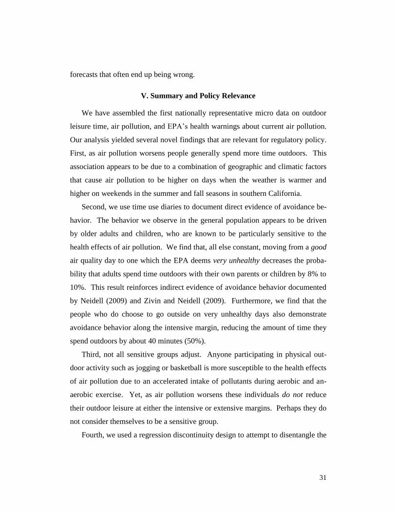
V. Summary and Policy Relevance
We have assembled the first nationally representative micro data on outdoor
leisure time, air pollution, and EPA’s health warnings about current air pollution.
Our analysis yielded several novel findings that are relevant for regulatory policy.
First, as air pollution worsens people generally spend more time outdoors. This
association appears to be due to a combination of geographic and climatic factors
that cause air pollution to be higher on days when the weather is warmer and
higher on weekends in the summer and fall seasons in southern California.
Second, we use time use diaries to document direct evidence of avoidance be-
havior. The behavior we observe in the general population appears to be driven
by older adults and children, who are known to be particularly sensitive to the
health effects of air pollution. We find that, all else constant, moving from a good
air quality day to one which the EPA deems very unhealthy decreases the proba-
bility that adults spend time outdoors with their own parents or children by 8% to
10%. This result reinforces indirect evidence of avoidance behavior documented
by Neidell (2009) and Zivin and Neidell (2009). Furthermore, we find that the
people who do choose to go outside on very unhealthy days also demonstrate
avoidance behavior along the intensive margin, reducing the amount of time they
spend outdoors by about 40 minutes (50%).
Third, not all sensitive groups adjust. Anyone participating in physical out-
door activity such as jogging or basketball is more susceptible to the health effects
of air pollution due to an accelerated intake of pollutants during aerobic and an-
aerobic exercise. Yet, as air pollution worsens these individuals do not reduce
their outdoor leisure at either the intensive or extensive margins. Perhaps they do
not consider themselves to be a sensitive group.
Fourth, we used a regression discontinuity design to attempt to disentangle the

32
extent to which avoidance behavior is driven by EPA’s health warnings issued
through the AQI relative to other stimuli. While our sample sizes are too small to
provide a definitive answer, it does seem clear that EPA’s health warnings about
current air pollution are not the primary factor driving the avoidance behaviors we
observe. This is consistent with prior evidence on inattention to public infor-
mation about health risks and environmental nuisances (Pope 2008a,b; Sloan,
Smith and Taylor 2002).
The apparent lack of attention to health warnings about current air pollution is
particularly interesting in light of evidence that people reduce outdoor leisure in
response to smog alerts issued by local authorities. While the alerts are more
highly publicized than the AQI, nearly half of all alerts end up being false alarms
(Sexton and Beatty 2013). As a result, there may be large welfare gains from de-
veloping better forecasting tools or information campaigns that encourage sensi-
tive groups to pay attention to actual pollution levels rather than highly uncertain
forecasts.
Our findings have several additional policy implications. For example, they
suggest there is scope for improving benefit-cost analyses of federal regulations
by recognizing that human exposure to pollutants tends to be higher on the week-
ends in Southern California and higher during the warmer months of the year in
most major metropolitan areas. Thus, the benefit of a marginal improvement in
air quality on a summer or fall weekend in Sothern California is likely greater
than the benefit of that same reduction on a winter weekday. Furthermore, anal-
yses that focus solely on health effects and ignore preexisting avoidance behav-
iors may tend to systematically understate the welfare gains to consumers. In ad-
dition to the direct health effects, a reduction in pollution may increase consumer
welfare by mitigating the costs associated with adjusting one’s preferred alloca-
tion of time.

33
REFERENCES
Aguiar, Mark, and Erik Hurst. 2007. “Measuring Trends in Leisure: The Allocation of
Time Over Five Decades.” Quarterly Journal of Economics. 122(3): 969-1006.
Aguiar, Mark, Erik Hurst, and Loukas Karababbounis. “Time Use During the Great Re-
cession.” American Economic Review, forthcoming.
Auffhammer, Maximilian, and Ryan Kellogg. 2011. “Clearing the Air? The Effect of
Gasoline Content Regulation on Air Quality.” American Economic Review,
101(6): 2687-2722.
Auffhammer, Maximilian, Antonio M. Bento, and Scott E. Lowe. 2009.
“Measuring the Effects of the Clean Air Act Amendments on Ambient PM10
Concentrations: The Critical Importance of a Spatially Disaggregated Analysis.”
Journal of Environmental Economics and Management. 58(1): 15-26.
Banzhaf, H. Spencer and Randall P. Walsh. 2008. "Do People Vote with Their Feet? An
Empirical Test of Tiebout's Mechanism." American Economic Review, 98(3):
843-63.
Bell, Michelle L., Aidan McDermott, Scott L. Zeger, Jonathan M. Samet, and Francesca
Dominici. 2004. “Ozone and Short-term Mortality in 95 US Urban Communities,
1987-2000.” Journal of the American Medical Association, 292(19): 2372-2378.
Bertrand, Marianne, and Diane Whitmore Schanzenbach. 2009. "Time Use and Food
Consumption." American Economic Review, 99(2): 170-76.
Bobak, Martin and David A. Leon. 1992. “Air Pollution and Infant Mortality in the
Czech Republic, 1986-88.” Lancet, 340(24):1010-1014.
Breshnahan, Brian W., Mark Dickie and Shelby Gerking. 1997. “Averting Behavior and
Urban Air Pollution.” Land Economics, 73(3): 340-357.
California Environmental Protection Agency, Air Resources Board. 2003. The Ozone
Weekend Effect in California. Staff report.
Chay, Kenneth Y. and Michael Greenstone. 2003. “The Impact of Air Pollution on Infant
Mortality: Evidence from Geographic Variation in Pollution Shocks Induced by a
Recession.” The Quarterly Journal of Economics, 118(3): 1121-1167.
Crocker, Thomas D. and Robert L. Horst Jr. 1981. “Hours of Work, Labor Productivity,
and Environmental Conditions.” Review of Economics and Statistics. 63(3): 361-
368.

34
Currie, Janet, Eric Hanushek, E. Megan Kahn, Matthew Neidell and Steven Rivkin. 2009.
“Does Pollution Increase School Absences?” Review of Economics and Statistics,
91(4): 672-694.
Currie, Janet and Matthew Neidell. 2005. “Air Pollution and Infant Health: What Can We
Learn from California’s Recent Experience?” The Quarterly Journal of Econom-
ics, 120(3): 1003-1030.
Currie, Janet and Reed Walker. 2011. “Traffic Congestion and Infant Health: Evidence
from E-ZPass.” American Economic Journal: Applied Economics, 3: 65-90.
Dockery, D. W. and C. A. Pope III. 1994. “Acute Respiratory Effects of Particulate Air
Pollution.” Annual Review of Public Health, 15: 107-132.
Gayer, Tex, James T. Hamilton, and W. Kip Viscusi. 2000. “Private Values of Risk
Tradeoffs at Superfund Sites: Housing Market Evidence on Learning about Risk”.
Review of Economics and Statistics. 82(3): 439-451.
Jin, Ginger, Zhe, and Phillip Lesile. 2003. “The Effects of Information on Product Quali-
ty: Evidence from Restaurant Hygiene Grade Cards.” Quarterly Journal of Eco-
nomics, 118(2): 409-451.
Krueger, Alan B., and Andreas I. Mueller. 2012. "Time Use, Emotional Well-Being, and
Unemployment: Evidence from Longitudinal Data." American Economic Review,
102(3): 594-99.
Kuminoff, Nicolai V., V. Kerry Smith, and Christopher Timmins. 2013. “The New Eco-
nomics of Equilibrium Sorting and Policy Evaluation Using Housing Markets.”
Journal of Economic Literature, forthcoming.
Laden, F., J. Schwartz, et al. 2006. Reduction in Fine Particulate Air Pollution and Mor-
tality: Extended Follow-up of the Harvard Six Cities Study. American Journal of
Respiratory and Critical Care Medicine 173: 667-672.
Mansfield, Carol, F. Reed Johnson, and George Van Houtven. 2006. “The Missing Piece:
Valuing Averting Behavior for Children’s Ozone Exposures.” Resource and En-
ergy Economics, 28: 215-228.
Neidell, Matthew. 2004. “Air Pollution, Health, and Socio-economic Status: The Effect
of Outdoor Air Quality on Childhood Asthma.” Journal of Health Economics,
23(6): 12099-1236.
Neidell, Matthew. 2009. “Information, Avoidance Behavior, and Health: The Effect of
Ozone on Asthma Hospitalizations.” Journal of Human Resources, 44(2): 450-

35
478.
Pope, C. Arden, III, Michael J. Thun, Mohan M. Namboodiri, Douglas W. Dockery, John
S. Evans, Frank E. Speizer, and Clark W. Heath, Jr. 1995. “Particulate Air Pollu-
tion as a Predictor of Mortality in a Prospective Study of U.S. Adults.” American
Journal of Respiratory and Critical Care Medicine, 151(3): 669-674.
Pope, C. Arden, III, Richard T. Burnett, Michael J. Thun, Eugenia E. Calle, Daniel Krew-
ski, Kazuhiko Ito, and George D. Thurston. 2002. “Lung Cancer, Cardiopulmo-
nary Mortality, and Long-Term Exposure to Fine Particulate Air Pollution.” Jour-
nal of the American Medical Association, 287(9): 1132-1141.
Pope, Jaren C. 2008a. “Buyer Information and the Hedonic: The Impact of a Seller Dis-
closure on the Implicit Price for Airport Noise.” Journal of Urban Economics, 63:
498-516.
Pope, Jaren C. 2008b. “Do Seller Disclosures Affect Property Values? Buyer Information
and the Hedonic Model.” Land Economics, 84(4): 551-572.
Sexton Alison, and Timothy Beatty. 2013. “Who Responds to Air Quality Alerts?”
Working paper.
Schlenker, Wolfram and W. Reed Walker. 2011. “Airports, Air Pollution, and Contempo-
raneous Health.” NBER Working Paper 17684.
Sloan, Frank A, V. Kerry Smith, and Donald H. Taylor, Jr. 2002. “Information, addiction,
and ‘bad choices’: lessons from a century of cigarettes.” Economics Letters, 77:
147-155.
Shimshack, Jay P., Michael B. Ward, and Timothy K.M. Beatty. 2007. “Mercury Adviso-
ries: Information, Education, and Fish Consumption.” Journal of Environmental
Economics and Management. 53(2): 158-179.
Smith, V. Kerry, Holger Sieg, H. Spencer Banzhaf, and Randy Walsh. 2004. "General
Equilibrium Benefits for Environmental Improvements: Projected Ozone Reduc-
tions under EPA’s Prospective Analysis for the Los Angeles Air Basin." Journal
of Environmental Economics and Management, 47(3): 559-84.
U.S. Environmental Protection Agency, 2011. “The Benefits and Costs of the Clean Air
Act from 1990 to 2020.” Final Report.
U.S. Environmental Protection Agency, 2009. Air Quality Index: A Guide to Air Quality
and Your Health. EPA-456/F-09-002.

36
Zivin, Joshua G. and Matthew Neidell. 2009. “Days of haze: Environmental information
disclosure and intertemporal avoidance behavior.” Journal of Environmental Eco-
nomics and Management, 58(2): 119-128.
Zivin, Joshua S. and Matthew J. Neidell. 2012. “The Impact of Pollution on Worker
Productivity.” American Economic Review, forthcoming.

37
Appendix
Table A1: Activities and ATUS Codes Used to Define Time Spent Outdoors and Time in Physical Activity
Note: Time spent outdoors during work is not included in our measure (if actcode=05010). The tewhere variable is available from the ATUS data, and takes on only one value per
activity. This variable takes a value of 1 if the location is in the home or yard, 9 if the location is outdoors and away from home, 14 if the activity is done while walking, 17 if the
activity is done while biking, and 31 if the location is at a gym or health club.
Activity Code Activity Location Classification Additional Restrictions (if any)
Any Any Besides Working Outdoors Away from Home Outdoors tewhere=9 & actcode≠0501
Any Any Walking Outdoors tewhere=14
Any Any Biking Outdoors tewhere=17
1312 Playing Baseball Anywhere Strenuous, Outdoors
1313 Playing Basketball Not at Gym Strenuous, Outdoors tewhere≠31
1314 Biking Not at Gym or at Home Strenuous, Outdoors tewhere≠31 & tewhere≠1
1318 Climbing/Spenunkling/Caving Not at Gym Strenuous, Outdoors tewhere≠31
1319 Dancing Outdoors Away from Home Strenuous, Outdoors tewhere=9
13110 Participating in Equestrian Sports Outdoors Away from Home Strenuous, Outdoors tewhere=9
13113 Playing Football Outdoors Away from Home Strenuous, Outdoors tewhere=9
13114 Golfing Anywhere Strenuous, Outdoors
13116 Hiking Anywhere Strenuous, Outdoors
13118 Hunting Anywhere Strenuous, Outdoors
13119 Participating in Martial Arts Outdoors Away from Home Strenuous, Outdoors tewhere=9
13120 Playing Racquet Sports Outdoors Away from Home Strenuous, Outdoors tewhere=9
13121 Participating in Rodeo Competitions Not at Gym Strenuous, Outdoors tewhere≠31
13122 Rollerblading Anywhere Strenuous, Outdoors
13123 Playing Rugby Anywhere Strenuous, Outdoors
13126 Playing Soccer Not at Gym Strenuous, Outdoors tewhere≠31
13127 Playing Softball No Restriction Strenuous, Outdoors
13130 Playing Volleyball Not at Gym Strenuous, Outdoors tewhere≠31
13131 Walking Not at Gym or at Home Strenuous, Outdoors tewhere≠31 & tewhere≠1
13132 Participating in Water Sports Not at Gym Strenuous, Outdoors tewhere≠31
13124 Running Outdoors Away from Home Strenuous, Outdoors tewhere=9
13125 Skiing/Ice Skating/Snowboarding Outdoors Away from Home Strenuous, Outdoors tewhere=9
13128 Using Cardiovascular Equipment Outdoors Away from Home Strenuous, Outdoors tewhere=9
13133 Weightlifting/Strength Training Outdoors Away from Home Strenuous, Outdoors tewhere=9
13134 Working Out, Unspecified Outdoors Away from Home Strenuous, Outdoors tewhere=9
13199 Playing Other Sports Outdoors Away from Home Strenuous, Outdoors tewhere=9
1531 Building Houses/Wildlife Sites/Other Structures Anywhere Strenuous, Outdoors
1316 Boating Anywhere Outdoors
13112 Fishing Anywhere Outdoors
13136 Yoga Outdoors Away from Home Outdoors tewhere=9

38
SUPPLEMENTAL APPENDIX: NOT FOR PUBLICATION
A. Data Collection and Coding
After obtaining the raw weather data from NCDC, we used filters to eliminate
a few apparent errors, such as temperatures above 150°F or below -150°F, and
negative values for precipitation. Weather station identification numbers were
used to match weather stations to counties, and we merged in county FIPS codes
for each.27
The process of assembling data on individual time use began by col-
lecting the ATUS data from bls.gov/atus along with CPS monthly extraction files
from: http://www.census.gov/cps/. Individual identifying codes were used to
merge demographic characteristics from the CPS to the ATUS diary records from
2003 through 2010. County FIPS codes were reported for all individuals living in
counties with over 100,000 residents. Finally, we used the county FIPS codes and
observation dates to merge the data on time use, weather, and air quality at the
county-day level. The files and code needed to replicate our data construction and
results are provided in the folder labeled “replicate”.
Table SA1: Total Observations at Each Stage of Data Assembly
Note: By construction, these columns are nested left to right. Hence, all observations in (3) are contained in (2), and so on.
After 2003, the ATUS sample was reduced by 35%, as reflected in this table.
27 Each station has a combination of Cooperative Station ID (coopid) and Weather Bureau Army/Navy ID (wbnid) unique to it. The file matching these numbers to counties is available here: http://cdo.ncdc.noaa.gov/cdo/sodstn.txt.
(1) (2) (3) (4) (5)
Year ATUS National Sample Matched to County Matched to Real or Proxy Matched with Real Weather Matched to Real Weather Data and
Weather Data and AQI Data Data and AQI Data Real Humidity Data and AQI Data
2003 20,720 8,287 7,233 6,995 3,828
2004 13,973 5,426 4,709 4,557 2,452
2005 13,038 3,995 3,466 3,332 1,819
2006 12,943 4,149 3,582 3,436 2,071
2007 12,248 4,034 3,453 3,313 2,077
2008 12,723 4,237 3,649 3,510 2,219
2009 13,133 4,345 3,684 3,563 2,197
2010 13,260 4,354 3,552 3,396 1,964
Total 112,038 38,827 33,328 32,102 18,627
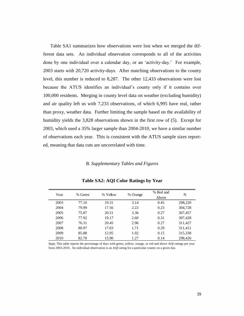
39
Table SA1 summarizes how observations were lost when we merged the dif-
ferent data sets. An individual observation corresponds to all of the activities
done by one individual over a calendar day, or an ‘activity-day.’ For example,
2003 starts with 20,720 activity-days. After matching observations to the county
level, this number is reduced to 8,287. The other 12,433 observations were lost
because the ATUS identifies an individual’s county only if it contains over
100,000 residents. Merging in county level data on weather (excluding humidity)
and air quality left us with 7,233 observations, of which 6,995 have real, rather
than proxy, weather data. Further limiting the sample based on the availability of
humidity yields the 3,828 observations shown in the first row of (5). Except for
2003, which used a 35% larger sample than 2004-2010, we have a similar number
of observations each year. This is consistent with the ATUS sample sizes report-
ed, meaning that data cuts are uncorrelated with time.
B. Supplementary Tables and Figures
Table SA2: AQI Color Ratings by Year
Note: This table reports the percentage of days with green, yellow, orange, or red and above AQI ratings per year
from 2003-2010. An individual observation is an AQI rating for a particular county on a given day.
% Red and
Above
2003 77.10 19.31 3.14 0.45 298,220
2004 79.99 17.56 2.22 0.23 304,728
2005 75.87 20.51 3.36 0.27 307,457
2006 77.92 19.17 2.60 0.31 307,428
2007 76.31 20.45 2.96 0.27 311,427
2008 80.97 17.03 1.71 0.29 311,411
2009 85.88 12.95 1.02 0.15 315,338
2010 82.70 15.90 1.27 0.14 298,426
Year % Green % Yellow % Orange N

40
Table SA3: Spatial Heterogeneity in the Correlation Between
Air Quality and Weather: 2003-2010
Note: This table reports the distribution of correlation coefficients calculated between daily AQI and weather varia-bles within each county between 2003 and 2010. For example, the 50th percentile for Col. (1) shows that the median
county (Berks County, PA) had a correlation coefficient of 0.31 between AQI and maximum temperature. The AQI
data are from the EPA and the weather data are from the National Climatic Data Center.
Table SA4: Time Use for People with Some or No Minutes Outdoors
Note: This table reports average time allocations for the subsets of people who do and do not report spend-ing any leisure time outdoors.
(1) (2) (3) (4)
Percentiles Max Temp Min Temp Precipitation Snowfall
min -0.56 -0.59 -0.50 -0.33
1% -0.42 -0.48 -0.29 -0.17
5% -0.18 -0.28 -0.24 -0.13
10% -0.04 -0.13 -0.21 -0.10
25% 0.14 0.04 -0.18 -0.07
50% 0.31 0.20 -0.15 -0.04
75% 0.42 0.33 -0.10 -0.02
90% 0.51 0.43 -0.06 0.01
95% 0.56 0.47 -0.04 0.04
99% 0.68 0.62 0.02 0.11
max 0.86 0.77 0.18 0.33
(1) (2) (3) (4)
Average Minutes Spent Outdoors>0 Outdoors = 0 Difference p value
Attending Religious Services 7 10 -3 0.0000
Eating & Drinking 72 67 6 0.0000
Food & Drink Preparation 27 26 1 0.0027
Household Activities 75 77 -2 0.0432
Indoor Exercise/Recreation 8 7 1 0.0220
Other 168 176 -8 0.0588
Other Relaxing/Leisure 53 59 -6 0.0000
Outdoor Exercise 106 . . .
Physical Care for Children 11 13 -2 0.0000
Reading for Personal Interest 27 23 4 0.0000
Shopping, Except Food or Groceries 18 19 -1 0.0010
Sleep 517 527 -11 0.0313
Socializing With Others 41 43 -2 0.0133
Washing/Grooming 40 40 0 0.3110
Watching Television 149 170 -21 0.0000
Work 114 174 -59 0.0000
Work-Related Activities 7 9 -2 0.0000
Total Minutes 1440 1440 -106
Total People 19784 13544

41
Table SA5: Extensive Margin Robustness Checks
Note: These results are based on probit models comparable to those summarized in table 5. All specifi-
cations use county-by-month fixed effects and controls for weather, day of the week, and demographic characteristics of respondents. See the main text for additional details.
Table SA6: Intensive Margin Robustness Checks
Note: The table reports results from probit models of the decision for whether or not to spend any leisure time outdoors. The control variables for weather, day, and demographics include minimum and maximum temperature, minimum and
maximum humidity, precipitation, snowfall, age, age2, wage, and indicators for day of the week, holiday, college degree,
advanced degree, race, occupation, student, lives with a partner, and ill or disabled. Measures of statistical significance are based on robust standard errors clustered at the county level: *p<.1, **p<.05, ***p<.01.
with parents
and/or children;
humidity variables
excluded
with children
only
with parents
only
ATUS
respondents
over age 65
Moderate 0.07** 0.07* -0.05 0.05
Unhealthy sensitive -0.01 0.00 -0.24* -0.11
Unhealthy 0.01 0.02 -0.20** -0.11
Very unhealthy -0.26 -0.22 -0.66 -0.15
Pseudo R2 0.136 0.155 0.3 0.086
observations 25,434 15,128 8,052 2,879
Moderate -6.65* -6.54 -1.98 1.87 -1.85 -6.25* -5.31 10.13* 7.44 3.03
Unhealthy sensitive 1.83 6.53 8.81 -2.64 -8.63 3.42 11.15 -7.37 -6.80 -17.89
Unhealthy 6.35 11.36 20.89* -4.80 -10.87 10.01 16.75 28.94 35.02 31.69
Very unhealthy -63.20*** -60.42*** -47.48*** -91.84*** -95.83* -63.04*** -58.23*** -36.93*** -36.70*** -38.28***
observations 4,007 3,377 2,141 586 495 3,503 2,957 2,406 2,202 1,331
state-month dummies X X X X X X X X X X
humidity constructed X X X X
humidity actual X X
Parents only Children only ATUS Respondant ≥ 65Parents / Children

42
Figure SA1: Outdoor Leisure with Parents / Children and the AQI
Note: The figure on the left displays a fitted linear trend to raw data on the share of respondents who report spending time
with parents and/or children, by AQI category. The figure on the right fits linear trends to the average number of minutes
spent outdoors. 95% confidence bands around these trends are also displayed. Five data points with AQI values greater than 250 are truncated to improve clarity.


![17a Nicolai Fran[1]](https://static.fdocuments.us/doc/165x107/563dbb10550346aa9aa9f2e5/17a-nicolai-fran1.jpg)